Introduction
The Following is an excerpt from the SLR Lounge Lightroom Preset System v5 and accompanying workshop from the Lightroom Workshop Collection v5. The Lightroom Preset System is designed to take you from Ordinary to Extraordinary photos in just a few seconds and clicks within Lightroom 4 and Lightroom 5.
Overview
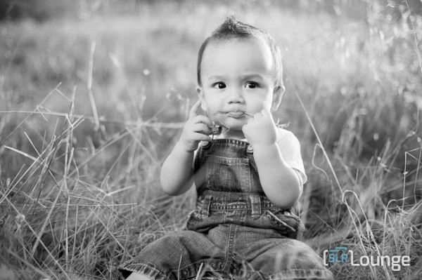
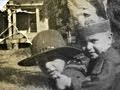
In this tutorial we’re going to go over how to turn a regular color portrait into a nice high contrast black and white image. For this tutorial we have a portrait of a baby out in a field. The overalls, details in the field, and overall background blur will be complimented by a high contrast black and white edit. The SLR Lounge Lightroom Preset System v5 has presets specifically for high contrast black and white portraits which we are going to apply to this photo. If you don’t have the preset system, we’ll list all of our Develop settings so you can achieve the same look.
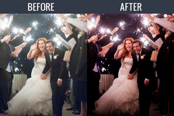
Here’s what our photo will look like before and after we’re done with the edit.
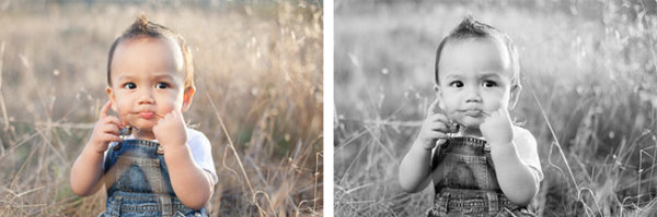
Unedited Photo on Left | High Contrast Black and White on Right
Lightroom Preset System v5 Mixology
For those who have the Preset System, you can follow the Mixology Recipe below to get to the same results. If you don’t have the Preset System, please read the article or watch the video below to see exactly how this look was achieved.
Develop Mixology
- 01-10 BASE – SOFT: 13b. Light Crush – B&W
- 03-70 ADJUST – VIGNETTING: 71c. Neutral – Zeroed
Written Tutorial
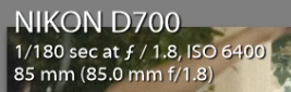
Step 1: Checking The EXIF Data
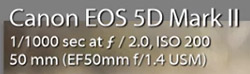
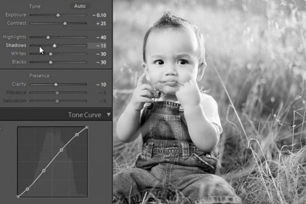
We press “i” to pull up our EXIF data so we can see exactly how this image was shot. This image was shot with a 50mm lens at f/2. We want to keep in mind that the depth of field is shallow, and we may have to add sharpening to this image.
Step 2: Apply Preset
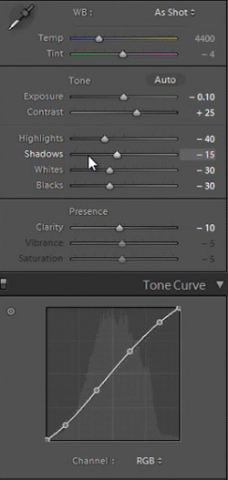
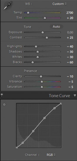
We’re starting with our “01-10 BASE – SOFT: 13b. Light Crush – B&W” preset, and after we lower the Exposure to -0.10 we have a nice high contrast black and white look. Then we apply a “03-70 ADJUST – VIGNETTING: 71c. Neutral – Zeroed” vignette preset so we can get a subtle edge darkening.
In the develop settings the Contrast was raised and the Shadows and Blacks have been dropped. This is giving our nice deep shadows and blacks, and adding to the high contrast look we’re editing for. The Highlights and Whites have also been dropped in order to bring the highlights in the skin closer to the mid tones.
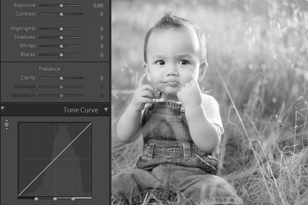
With Settings Zeroed Out
Here’s what our image looks like with a simple black and white conversion (convert by hitting “V”), without the adjustments in Contrast, Highlights, Shadows, Whites, Blacks, and Tone Curve.
With High Contrast Settings
Here’s our image with Contrast, Highlights, Shadows, Whites, Blacks, and Tone Curve adjustments applied.
In the image below you can see a huge difference that the adjustments make. The eyes stand out, there’s more details in the hair and grass, and there’s more texture in the clothes. All these subtle details combined add quality to an otherwise flat black and white image.
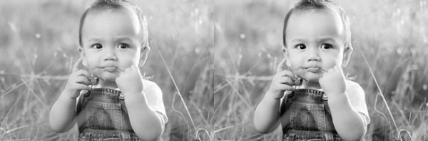
All Settings Zeroed On Left. High Contrast Adjustments on Right
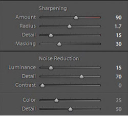
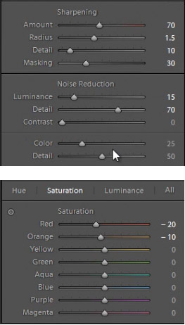
In our Sharpening settings our preset applied our standard amount, but the image is still a bit soft because of the shallow depth of field caused by shooting this image at f/2.0. To get a nice sharp portrait we raise the Amount, Radius, and Detail. The preset also adjusted our Noise Reduction settings, giving the subject in our portrait nice soft skin. All of the “SOFT” presets have this standard amount of Noise Reduction applied in order to soften and smooth out skin without going so far to kill fine details.
Here’s what our image looks like before and after our presets are applied.
Before
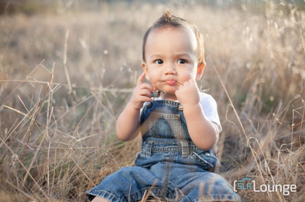
After
Watch the Video Tutorial
If you would like to see exactly how all of the settings and adjustments were applied, please watch the video from the SLRLounge YouTube Channel.
Conclusion and Learn More
We hope you all enjoyed this tutorial. If you are interested in learning more or purchasing the SLR Lounge Lightroom Preset System v5 or the newly released Lightroom Workshop Collection v5, please click any of the links in this article.
Post originally from: Digital Photography Tips.
Check out our more Photography Tips at Photography Tips for Beginners, Portrait Photography Tips and Wedding Photography Tips.
Creating a Black and White High Contrast Portrait Edit in Lightroom
The post Creating a Black and White High Contrast Portrait Edit in Lightroom by Post Production Pye appeared first on Digital Photography School.


You must be logged in to post a comment.