A contribution by Andrew S. Gibson author of Understanding EOS: A Beginner’s Guide to Canon EOS Cameras.
If you were to ask me for two ways that you could improve the composition of your photos, the first piece of advice I would give you is to keep the composition as simple as possible. Eliminate anything that isn’t part of the story from the frame.
The second part of the answer is to focus on tonal contrast. Now, many discussions of composition tend to concentrate on the basics, such as the rule-of-thirds, leading lines, use of colour and so on. Not many people seem to be talking about tonal contrast. That’s a shame, because it’s an element that can really improve your composition.
What is Tonal Contrast?
Tonal contrast is created when light tones and dark tones lie alongside each other. Here’s an example:

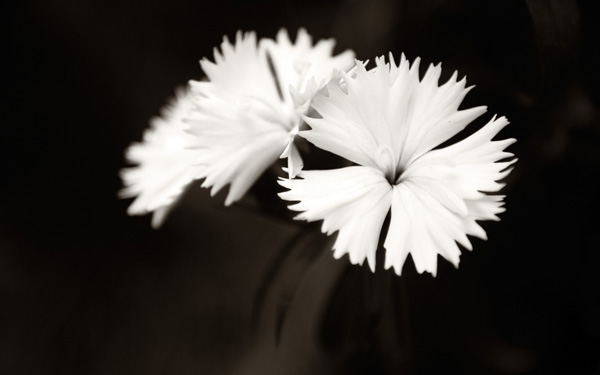
The tonal contrast in this photo is created by the difference in brightness between the white flower and the dark green background.
In any photo it is natural for the eye to go straight to the highlights. That is what is happening here – the viewer’s eye is pulled by the lightest tones in the image, the flower, and then travels slowly around the rest of the image, taking in the detail. It sets up a kind of visual dynamism between the light and dark tones.
Here’s another example of tonal contrast in action:

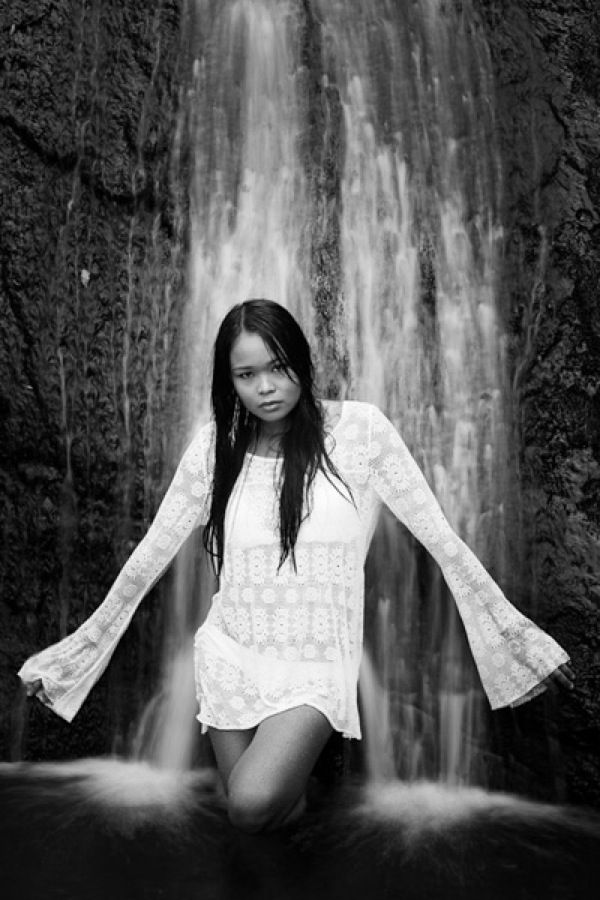
Here, the tonal contrast is provided by the difference in brightness between the white parts of the waterfall and my model’s clothing, and the dark tones of the water and the rocks.
Working in Black and White
Tonal contrast is the basis of many successful black and white images. Indeed, if you need help to see the tones in your colour photos an easy way to do so is to open them in Photoshop and reduce the colour saturation to zero. This is what happens to the two photos above when we do that:

It is easier to see tonal contrast in black and white images because there is no colour to distract your eye from the brightness values within the photo.
You will also notice that the composition of these images is very simple. Simplicity helps improve composition by eliminating distractions.
Let’s look at another example:

This is a photo that I took in an antiques market in Shanghai. You can see my two principles of composition in action here:
Simplicity: I moved in close to concentrate on the dominoes.
Tonal contrast: The ivory coloured dominoes are offset by the dark tones of the box they are in.

Here is the desaturated version. The tonal contrast is even clearer in this image.
There are a few more points I’d like to make here:
- Tonal contrast is a great basis for a successful black and white image. The desaturated versions of the above photos all work fairly well. It won’t take much more work to turn them into striking monochrome images.
- Images with strong tonal contrast tend to work well in both black and white and colour. An interesting exercise you could try is to go back through photos that you have already taken and select some that feature strong tonal contrast. Then convert them to black and white. I think you will be able to create some strong monochrome images if you do this.
- Keeping your compositions simple helps make the most out of tonal contrast. If you include too much within the frame, the impact of any tonal contrast is lessened.
Finally, please note that reducing the colour saturation to zero is usually not the best way to convert a colour image to monochrome. The aim here is purely to make the tones easier to recognise by eliminating the distraction of colour.
Does that mean that every image requires tonal contrast to be successful? No, it doesn’t. It is merely one tool of many at your disposal. The key concept to understand is that learning to recognise and utilise tonal contrast helps you create stronger photos.
For example, if you have arranged a photo shoot with a model in a location with a dark background, you could ask her to wear something light in order to set up tonal contrast between her clothes and the background.
Lack of tonal Contrast
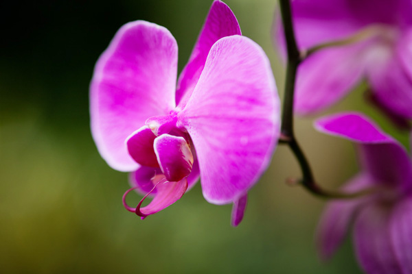
There are times when tonal contrast is not evident in a photo, yet the composition is still successful. Here’s an example:
Now let’s look at the desaturated version:
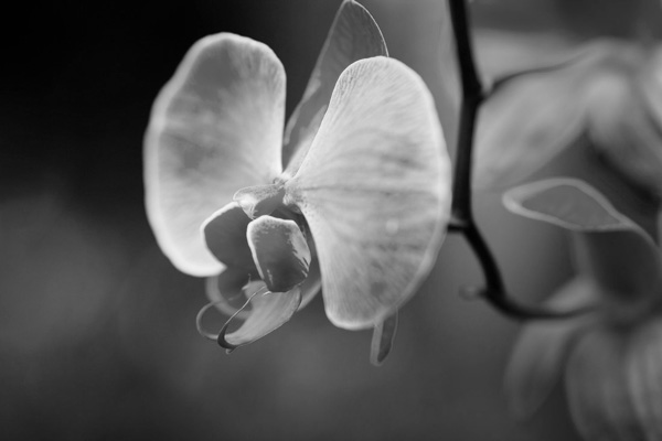
You can see that there isn’t much tonal contrast. Yet the photo works because the purple flower is complemented nicely by the green background. This is called colour contrast and in this image more than compensates for the lack of tonal contrast.
Andrew S. Gibson is the author of Understanding EOS: A Beginner’s Guide to Canon EOS Cameras. He is a professional writer and photographer based in Wellington, New Zealand.
Post originally from: Digital Photography Tips.
Check out our more Photography Tips at Photography Tips for Beginners, Portrait Photography Tips and Wedding Photography Tips.
Improving Composition with Tonal Contrast