RSS
 

Archive for June, 2013

Ziggurat Hat: Deconstructing The DEVO Energy Dome

30 Jun

[ By Steve in Design & Graphics & Branding. ]

DEVO Energy Domes
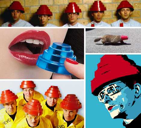
Designed by New Wave band DEVO and worn in concert for 30+ years, the geeky DEVO Energy Dome has emerged as a key touchstone of late 20th century pop culture.

Are We Not Men Without Hats?

DEVO Energy Dome(image via: Tumblr/Robotcosmonaut)

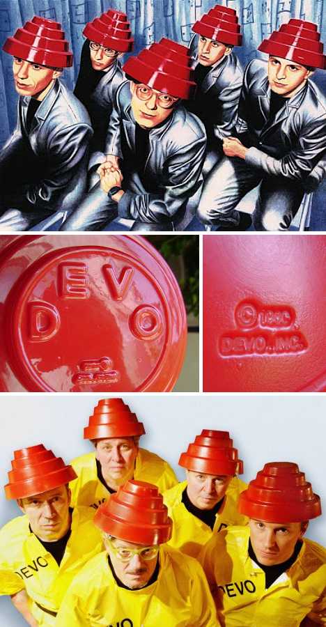
Originally mocked, maligned and misunderstood by many, the DEVO Energy Dome first appeared around 1980 and made its public debut on the cover of the band’s third album, Freedom Of Choice. According to DEVO founding member Mark Mothersbaugh, “We designed them, Jerry (fellow band member Gerald V. Casale) and I. We were influenced both by German Bauhaus movement and geometric fashion, and Aztec temples. We just liked the look. It looked good, and it didn’t look like any other bands out there.” Amen to that.

DEVO Energy Dome red(images via: 2 or 3 lines, Rock and Misc Collectibles and TimeOut Sydney)

“It was designed according to ancient ziggurat mound proportions used in votive worship,” continues Casale. “Like the mounds it collects energy and recirculates it. In this case the Dome collects energy that escapes from the crown of the human head and pushes it back into the Medula Oblongata for increased mental energy.” We wonder what covering an Energy Dome with tinfoil might do… don’t try this at home, kids.

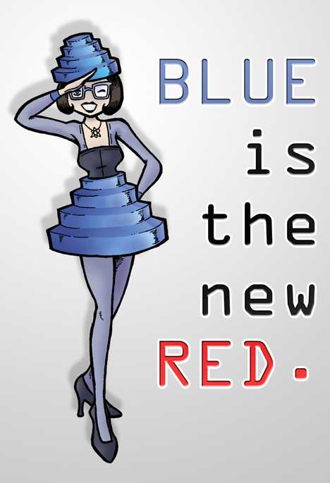
Something Blue For Everybody

DEVO Energy Dome For Women Mr-DNA(image via: Mr-DNA)

Original DEVO Energy Domes were vivid red in hue but over the years different colored Domes have appeared: green for a televised appearance on Solid Gold, white for a 1984 Diet Coke TV commercial and charcoal gray when the band were guests on VH1′s TrueSpin. Blue is the new red, however, and we can thank DeviantArt member Mr-DNA for the dome-tastic image above.

DEVO Energy Dome blue
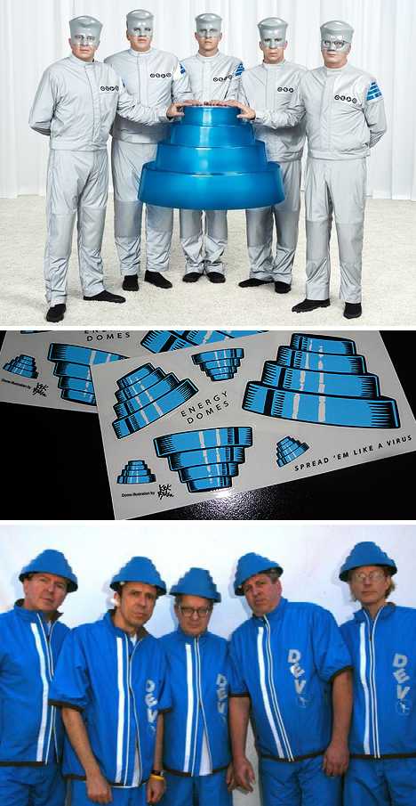
(images via: Wall Street Journal, DEVO OBSESSO and MSN Entertainment)

Energy Domes in various shades of blue have been showcased on several different occasions, most notably during the promotional campaign for DEVO’s ninth studio album, 2010′s Something For Everybody.

DEVO Something For Everybody Natasha Romanova(image via: Computer Bild)

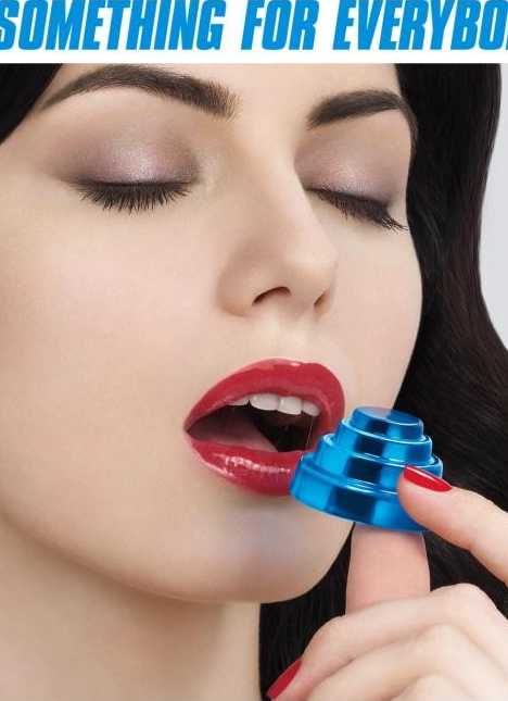
The cover shot for Something For Everybody is jaw-dropping on multiple levels yet the image’s focal point – a beautiful woman about to bite into a miniature blue jelly Energy Dome – alerts us to the fact that this can only be the work of DEVO. The so-called “Sexy Candy Dome Girl”, by the way, is actually Russian model/musician Natasha Romanova from the band Discrete Encounter. The more you know!

Next Page:
Ziggurat Hat Deconstructing The Devo Energy Dome

Share on Facebook


[ By Steve in Design & Graphics & Branding. ]

[ WebUrbanist | Archives | Galleries | Privacy | TOS ]


WebUrbanist

 
Comments Off on Ziggurat Hat: Deconstructing The DEVO Energy Dome

Posted in Creativity


30. Juni 2013

30 Jun

Ein Beitrag von: P.S.

wald


kwerfeldein – Fotografie Magazin

 
Comments Off on 30. Juni 2013

Posted in Equipment


browserFruits Juni #5

30 Jun

Was kocht Ihr denn heute Leckeres? Vielleicht findet Ihr ja Inspiration durch unsere neue Serie Augenschmaus, in der wir tolle Foodbilder und die dazu passenden Rezepte vorstellen. Und wenn Euer Lieblingsgericht noch fehlt, dann könnt Ihr natürlich mitmachen! Wie genau, das erfahrt Ihr hier. Und nun viel Spaß mit den browserFruits.


Fotospecial: Wüsten

Flickr

500px


Deutschsprachig

• Ein Fotograf erhält die Rekordsumme von 14.000 € Schadensersatz wegen Nichtnennung seines Namens als Urheber.

• Diese Anleitung für Blumenkränze ist nicht nur für Bräute interessant, sondern auch für Portraitfotografen. Zudem gibt es ganz wunderbare Beispielbilder von Susann Probst zu bewundern.

• Der großartige US-amerikanische Mode- und Werbefotograf Bert Stern starb in der vergangenen Woche am 26. Juni 2013. Bekannt wurde er vor allem durch seine Serie „The Last Sitting“ mit Marilyn Monroe, kurz vor ihrem Tod.

• Die Rumänin Dana Popa fotografierte zwangsprostituierte Mädchen in Moldawien, die alle den gleichen Spitznamen bekommen: Natasha.


International

• Maximale Ästhetik mit minimalen Mitteln: Dave R. Watsons „Works On Paper“ beeindrucken durch ihre pure Schlichtheit.

• Ein sehr wahrer Artikel in der Huffington Post darüber, warum man im Sinne seines eingekauften Fotografen eine „Unplugged“-Hochzeit erwägen sollte. Sprich: Fotografierverbot für die Gäste.

• Gruselig, aber sehr kreativ: Asger Carlsen macht Skulpturen aus Fleisch und Knochen, die verdammt echt aussehen, aber moderner Fotobearbeitung zu verdanken sind. (NSFW)

• Die Getty Critics behaupten, dass jedes Stockfoto Makel hat. Diese werden dort auch ungeschönt angesprochen.

• Leselust? „Henri Cartier-Bresson: Living and Looking“ ist ein hochinteressantes zweiteiliges Interview mit der Straßenfotografie-Legende, das erst nach dem Tode der Journalistin von ihrer Tochter gefunden und publiziert wurde. Teil 1 und Teil 2.

• Kennt Ihr das großartige, streckenweise surreal-inszenierte Portfolio von Cole Rise? Noch nicht? Na dann schaut es Euch an!

• Ein Artikel darüber, was man aus antiken Fotos so alles herausholen kann und welche Restaurationsverfahren es gibt.

• uglybelgianhouses.com ist eine überwältigende Zusammenstellung sagenhaft hässlicher belgischer Einfamilienhäuser. Aber Vorsicht, bitte nur mit fortgeschrittener Sarkasmusfähigkeit konsumieren.

• Großartige und vor allem lustige Verlobungsbilder.

• Und weil Bilder ja auch präsentiert werden müssen, gibt es hier ein paar schöne Tipps für dekorative Bilderrahmen zum Selbermachen.


Neuerscheinungen und Tipps vom Foto-Büchermarkt

buchtipps

• Mario Sorrenti* wurde schnell bekannt durch seine gewagten Aktbilder in den großen Modemagazinen. Die Reihe „Stern Spezial Fotografie“ widmet sich in der aktuellen Nummer 72 diesem Mode- und Celebrity-Fotografen und gibt Einblick in sein Portfolio. Für 18 €.

• Edward Weston* lebte von 1886 bis 1958. Seine Bilder sind voller Stille, Leidenschaft und Intensität. Für nur 9,99 € ist sein Portfolio beim Verlag TASCHEN erschienen.


Videos

Spannend-skurriles Making-Of von Boogie zu seinem neuesten Projekt „Demons“. Das Tumblr mit den Ergebnissen gibt es übrigens hier.


Und auch unsere Redakteurin Laura hat ein tolles Making-Of-Video von einem ihrer Selbstportraits gemacht.


Ausstellungen

DIFFERENT DISTANCES
Zeit: 8. Juni -? 20. Juli 2013
Ort: Swedish Photography, Karl-Marx-Allee 62, 10243 Berlin
Link

Yamamoto Masao
Zeit: 8. Juni – 20. Juli 2013
Ort: Galerie Albert Baumgarten, Kartäuserstraße 32, 79102 Freiburg
Link

Zoe Helali – One Woman Show
Zeit: 22. Juni – 21. Juli 2013
Ort: Carpentier Galerie, Meinekestraße 13, 10719 Berlin
Link

Neue Bescheidenheit – Architektur in Zeiten der Verknappung
Zeit: 4. Mai – 21. Juli 2013
Ort: Bielefelder Kunstverein, im Waldhof, Welle 61, 33602 Bielefeld
Link

Frank Gaudlitz – Sonnenstraße
Zeit: 6. Juni – 24. Juli 2013
Ort: vhs-photogalerie, Rotebühlplatz 28, 70173 Stuttgart
Link

Arnd Weider – Fotografie
Zeit: 17. Mai – 26. Juli 2013
Ort: Galerie im Rathaus Tempelhof, Tempelhofer Damm 165, 12099 Berlin
Link

FOKUS – BEWEGUNG – ZEIT – INTERAKTION
Zeit: 14. Juni – 26. Juli 2013
Ort: Pflüger68, Pflügerstraße 68, 12047 Berlin
Link

Andreas Mühe
Zeit: 7. Juni – 27. Juli 2013
Ort: Galerie carlier | gebauer, Markgrafenstraße 67, 10969 Berlin
Link

Anna Schwalbe
Zeit: 15. Mai – 27. Juli 2013
Ort: Galerie f5,6, Ludwigstrasse 7, 80539 München
Link

Frontier Stories – Nikolaus Grünwald
Zeit: 22. Juni – 27. Juli 2013
Ort: Galerie Norbert Nieser, Grosse Falterstrasse 31/3, 70597 Stuttgart
Link

THE FLOOD WALL II
Zeit: 22. Juni – 28. Juli 2013
Ort: exp12, Greifswalder Straße 217, 10405 Berlin
Link

Mehr aktuelle Ausstellungen


* Das ist ein Affiliate-Link zu Amazon. Wenn Ihr darüber etwas bestellt, bekommen wir eine kleine Provision, Ihr bezahlt aber keinen Cent mehr.


kwerfeldein – Fotografie Magazin

 
Comments Off on browserFruits Juni #5

Posted in Equipment


Photographic Digital Printing [REVIEW]

30 Jun

Photographic Digital Printing.jpgIn my experience, personal printing is a declining art. Walk through any retail photo dept and you’ll see hordes of people sitting at digital print stations pumping out bundles of 6×4 inch prints from their precious memory sticks and CDs.

Many of these keen printers will be women, turning happy snap family digi shots into photo records, destined for albums.

The Photographic Digital Printing book will be of no use to them… after all, those auto digi printers do a fine job!

However, it’s the real, rusted on photographers who want quite a bit more from their printing efforts.

As author David Taylor says: ‘It used to be so simple. Once, there was little choice if you wanted a printer. Generally, the same manufacturer made the only printer available for a particular computer printer model. … Printers allow a photographer to control every aspect of image making, from the initial exposure through to the final print.’

Things have sure changed since then: the range of printer types has exploded for one thing. The range of media has similarly expanded, as has the ‘ink’ used.

Ink? Well, for starters there are colour laser printers at affordable prices. Possibly, the only brake on laser printers moving into photo printing further is their inability to use coated papers due to the laser’s heat.

Dye sublimation printers are another type that have positive aspects but, again, fall foul of a limited range of papers and size limits.

Inkjet printers are ubiquitous and are able to produce prints at relatively low cost onto an amazing range of papers and surfaces.

Inkjet printers are divided into two subsets: dye-based and pigmented. The book goes into considerable detail on each type, with descriptions about how ink is placed onto paper, the technology involved and their comparative benefits and disadvantages. This information should be of considerable benefit to new buyers tossing up on the pluses and minuses of each.

Other topics follow: computer to printer communication; printer makers; the various media you can print to. In this area, the range is truly amazing: paper in a wide variety of surfaces, weights and types. Then there is canvas media, transparent film and other surfaces.

On the topic of paper alone, the book spends 20 pages delving into the fibres used, weight, opacity, sizes, surfaces, finish, brightness and texture. Would you like to use Baryta paper, water coloured, calendared or resin coated paper? Perhaps your printing needs will be answered by using artisan papers made by such companies as Hahnemüle or Canson or St Cuthbert’s Mill?

If you have reached around page 50 in the book you will need to make a commitment to take the whole business seriously, commit yourself to the whole technology — or simply head back to your local photo print shop! It’s a serious game!

Strapped in? With David Taylor at the helm, let’s explore more topics: colour and calibration; colour channels; colour management; profiling; image preparation; bit depth; using JPEG or RAW files; understanding histograms.

There is much information about the role of Photoshop in print making. A great deal of this information will cross over and be of help in your original image capture. After all, it’s difficult to print an incorrectly exposed or post processed image. So the book moves into detailed descriptions on how to work with curves, layers, sharpening, etc.

In the closing chapters of the book we finally get to make a print! And even then the info keeps rolling!

How to store a print. How to mount a print. Book binding. Exhibiting. Black and white printing. And troubleshooting.

For me, the big surprise is that there is so much information in such a small book and information which is camera and printer non-specific — unlike some other publications which are dedicated to brand name printers.

An excellent book on the subject.

Author: D Taylor.
Publisher: Ammonite Press.
Distributor: Capricorn Link.
Size: 18x15x1cm. 192 pages.
ISBN: 978 1 90770 874 9.
Price: Get a price on Digital Printing (The Expanded Guides: Techniques) by (David Taylor) at Amazon (currently 24% off).

Post originally from: Digital Photography Tips.

Check out our more Photography Tips at Photography Tips for Beginners, Portrait Photography Tips and Wedding Photography Tips.

Photographic Digital Printing [REVIEW]


Digital Photography School

 
Comments Off on Photographic Digital Printing [REVIEW]

Posted in Photography


30 June, 2013 – Leica Vario X Report

30 Jun

Many people are finding the Leica Vario X intriguing. It isn’t the Mini-M that "marketing" teased it would be, as discussed in our earlier report by Sean Reid, but the new diminuative Leica seems to be capturing a lot of people’s attention. Nick Rain’s new report tells us more.

"Michael’s and Jeff’s tutorial videos are absolutely awesome, not only because of the information transmitted but also because of the casual, conversational style which somehow really makes things stick in your memory."


The Luminous Landscape – What’s New

 
Comments Off on 30 June, 2013 – Leica Vario X Report

Posted in News


Submitting Your Photos to Online Forums

30 Jun

A contribution from Lori Peterson

Every day photographers use Facebook and other photo sharing websites, such as Instagram, for sharing images with their clients and potential customers. This ability to share has made it much easier to get instant feedback from the images that are posted and for photographers to see what their client base is actually looking for.

Facebook has overwhelmingly provided photographers with a unique way of interacting with other photographers. Online photography forums and groups are plenty in the World Wide Web. Photographers can submit images to have them critiqued, they can have them considered for publications, and they can even win awards for their online submissions.

Submitting online forums

While some photographers may think that these forums and groups are a waste of time, there are others who will tell you that you are missing out on a lot of opportunities by not participating. The internet is always opening up new possibilities for people, especially in the world of photography.

Photographers and artists will typically create a Curriculum Vitae instead of a traditional resume. A Curriculum Vitae is basically a summary of your qualifications and will include any exhibits and publications that have showcased your work. There are many juried art and photography forums online. Winning awards can be the jump-start on your Curriculum Vitae for helping you to obtain grants, get into art exhibits, and get your work published. It will also give insights to any exhibit curator as to your creative process and what your specific vision for your art is.

Submitting online forums 2

There are many forums online you can submit to, such as Just Color & Art (JCA), Lemonade and Lenses, Cameraraw, View Bug, or Pixoto.

Once you submit to any of these forums, photographers of all other skill levels will see your work. When you post in the online forums you have to be prepared for the critiques (yes, even the dreaded unsolicited ones!). Those critiques (both asked for and those not asked for) give you a rare opportunity to get insights from other photographers, other eyes, and other artists. Don’t take any negative critiques personally. Remember, art is very subjective. But do read the comments and consider where they are coming from. Could you have increased your shutter speed? Would a higher or lower ISO made for a better shot? Obviously, you can’t go back and change those things, but they are food for thought for future images.

Some businesses have taken to Facebook and it’s availability of online forums to look for photographers who are local to them for product photography, real estate photography, and even headshots for their company. Keeping your work current and out there for people to see can lead you to new ways to make money as a photographer.

Online forums can also spark photographer friendships. Having a photographer friend who is not your local competition can be a wonderful asset. Photographers are generally willing to listen and help out when they can. Friendships between photographers can be helpful when you are learning something new, trying out new ideas, or even when you are feeling overwhelmed or frustrated. Having a like-minded person listen to you and bounce ideas around can really help you to re-focus your time, energy, and mind where it needs to be.

Another boost to submitting to online forums? Increased SEO (Search Engine Optimization) for your photography website or blog. When you post from your photography page you are creating a cross-link between the forum and your page. Using specific keywords and updating your blog posts and website with any awards, recognitions, or honors from online forums can also help increase your SEO. 

There are many benefits to utilizing online photography forums and you will have to decide whether or not it is right for your specific business model. They are a very unique way for photographers to interact and learn from one another. They provide an opportunity for learning, friendships, and in some cases, they can lead to employment opportunities. Utilizing online forums can also help you to get your work seen by potential publishers and grant committees.

Lori Peterson is an award winning photographer based out of the St. Louis Metro Area. Her dynamic work ranges from creative portraits to very unique fine art photography. Lori’s work can be seen at www.loripetersonphotography.com and also on her blog at www.loripetersonphotographyblog.com. You can follow her on Facebook at https://www.facebook.com/LoriPetersonPhotography.

Post originally from: Digital Photography Tips.

Check out our more Photography Tips at Photography Tips for Beginners, Portrait Photography Tips and Wedding Photography Tips.

Submitting Your Photos to Online Forums


Digital Photography School

 
Comments Off on Submitting Your Photos to Online Forums

Posted in Photography


29. Juni 2013

29 Jun

Ein Beitrag von: zweiengelundeinbachmann

© Zweiengelundeinbachmann


kwerfeldein – Fotografie Magazin

 
Comments Off on 29. Juni 2013

Posted in Equipment


Street Mural Turns Into an Animation as People Drive By

29 Jun

[ By Delana in Art & Street Art & Graffiti. ]

in between flipbook mural

Remember making hand-held flipbooks when you were a kid? Those cute little books that made primitive cartoons when you flipped through the pages quickly could amuse and entertain for hours. Recently, Argentinian street artist Hyuro brought that joyful amusement to Copenhagen on a long wall that many cars pass by every day.

copenhagen animated graffiti wall

deer mural copenhagen

In/between consists of 87 aluminum panels, each showing a piece of an animation. When seen all together from a moving car, the animation shows the short story of a deer running through a forest and then emerging. The animated mural is a classy, sophisticated piece of graffiti that the whole city gets to enjoy.

Hyuro and her helper painted the entire mural/animation by hand over the course of two weeks. Hyuro’s project was chosen in a competition held by artistic community ArtRebels, which drew submissions from artists all over the world.

Share on Facebook


[ By Delana in Art & Street Art & Graffiti. ]

[ WebUrbanist | Archives | Galleries | Privacy | TOS ]


WebUrbanist

 
Comments Off on Street Mural Turns Into an Animation as People Drive By

Posted in Creativity


Anna träumt von Menschen und Eulen

29 Jun

Annas Bilder wirken entrückt. Sie zeigen sehr oft Portraits und erinnern an Filmstandbilder. Sie hält die Zeit an und doch läuft sie weiter, während Du schaust. Du verlierst Dich im Blick des anderen, folgst dem seinigen und damit ins Uferlose.

Anna fotografiert noch nicht lange. Nach ihrem ersten vollendeten Studium hatte sie einfach keine Lust mehr auf Texte. Sie wollte Bilder machen und so hat sie es noch einmal gewagt. Hat sich an der Ostkreuzschule beworben, wurde angenommen und studiert seitdem dort Fotografie und Gestaltung.

© Anna Eckold

Die Kamera rettet sie vor der Antriebslosigkeit, sagt sie.

Man denkt, heute versinke ich, nichts klappt und dann geht man fotografieren – und rettet sich, überwindet die Realität, man schafft eine neue, in Bildern.

Geboren und aufgewachsen ist sie in St. Petersburg. Die Stadt jedoch blockierte sie, hatte sie regelrecht belagert zwischen dem Wunsch zu sein und etwas sein zu müssen. Berlin dagegen empfindet sie als sehr befreiend, eine Stadt, in der sie sich neu erfinden darf.

© Anna Eckold

Am meisten faszinieren sie an der Fotografie die Menschen.

Da ist immer diese Gratwanderung zwischen der offensichtlichen Schönheit und der ungeschönten Weiblichkeit oder Männlichkeit.

Es sei schwierig, dann nicht die Mitte zu verfehlen. Aber ob das unbedingt sein muss, diese Mitte, das fragt sie sich auch. Denn eigentlich sei es ja viel interessanter, Portraits zu machen, die irgendwo da beginnen, wohin man normalerweise nicht gelangt, eben am Tiefpunkt oder am Aufschwung und gerade nicht in der Mitte.

Sie lässt ihre Bilder lange liegen, bevor sie sie entwickelt oder bearbeitet. Sie braucht die Distanz zum Machen und Erkennen. Denn gerade die Bilder, die ihr etwas bedeuten, die brauchen Zeit, damit sie sehen kann, was sie da überhaupt fotografiert hat.

© Anna Eckold

Anna spricht damit etwas aus, was viele Fotografen überhaupt motiviert, zur Kamera zu greifen. Fotografie ist die Motivation, etwas zu tun, hinauszugehen, zu kommunizieren und etwas mitzunehmen aus diesem Prozess.

Möchtest Du Annas Bildern folgen, dann schau bei Flickr vorbei oder besuch ihre Webseite.


kwerfeldein – Fotografie Magazin

 
Comments Off on Anna träumt von Menschen und Eulen

Posted in Equipment


Colour Contrast: Making the Most of Orange and Blue

29 Jun

Colour contrast: using orange and blue

One of the principles behind using colour in photography is that of using contrasting colours. To understand the concept we need to look at a colour wheel – a type of diagram used by designers to show the relationships between colours:

Colour contrast: using orange and blue

Diagram by Wikipedia contributor Jacobolus

Contrasting colours are those that appear on opposite sides of the colour wheel. Today I’m going to look at two specific colours, orange and blue.

Why these two? They happen to be very useful colours to work with because they appear a lot in nature (even though you might not be aware of it). It’s all to do with the colour of the ambient light, which ranges from cool blue to warm orange, depending on the light source.

Incidentally, this is reflected by the colour temperature slider in Lightroom. One end is blue, and the other is orange:

Colour contrast: using orange and blue

Blue light

In low light, in fog or rain, or at twilight the natural colour of the light is blue. In these conditions, any photo you take has a blue colour cast.

The easiest way to see a colour cast in your photo is to set white balance to daylight. If the colour of the light is blue, then it will come out blue in your photo.

If you use auto white balance the camera will warm the photo up to compensate for the blue colour cast of the light. That’s useful sometimes, but it’s not desirable if you want to create a moody image.

Blue light is atmospheric. That’s because some colours evoke an emotional response, and blue is one of them. It is a cold colour – it connotes cold, misery, bad weather, even depression.

Colour contrast: using orange and blue

I took this photo in thick fog.The natural colour of the light is blue. The blue colour cast in this photo creates mood.

Orange light

Orange coloured light also occurs naturally. Light originating from the sun in the late afternoon, early evening or at sunset has an orange colour cast. So does light emitted by tungsten bulbs and burning flames.

Anything lit by these light sources will have a warm orange colour cast. Again, you will see it clearly if you set white balance to daylight.

Orange is another colour that evokes emotion. It is the colour of warmth and energy. It reminds us of things like the heat of summer or emotional warmth. Like blue, the psychological effect can be quite powerful.

Colour contrast: using orange and blue

The light source in this photo is the tungsten bulbs inside the lanterns. The natural colour of this light is orange.

You can see that blue and orange are opposites in many respects. They are opposites on the colour wheel, and also in the emotions and feelings that they represent.

Combining blue and orange

One way to show contrast between two things is to place them together. There is a famous photo by Annie Leibovitz of a jockey and a basketball player, side by side (you can see it here). Placing both sportsmen side by side emphasises their respective height, and the difference in stature between them.

It’s the same with blue and orange. Include both in the same image to add to the power of this colour combination. The coldness of the blue tones emphasises the warmth of the orange ones, and vice versa. Here are a few examples:

Colour contrast: using orange and blue

Most of the scene is lit by fading daylight, which has a natural blue colour. There is some warm light coming from the right, where the sun has set. The orange streak of light over the horizon comes from a plane flying by during the exposure.

Colour contrast: using orange and blue

This photo was taken when it was nearly dark. The landscape is lit by the fading light, which has a natural blue colour. My model is whirling a burning object around. The light from the fire is orange.

Colour contrast: using orange and blue

Finally, here is a photo created using the steel wool spinning technique. It’s taken at dusk, and the landscape is lit by the blue coloured light of the fading daylight. The light from the burning steel wool is orange, and so are the lights from the distant city buildings over the water.

If you want to try steel wool spinning yourself, click the link to read an article I wrote about it on my website. Please pay attention to the safety instructions in the article – steel wool spinning is potentially dangerous.

Mastering Photography

Colour contrast: using orange and blue

My latest ebook, Mastering Photography: A Beginner’s Guide to Using Digital Cameras introduces you to digital photography and helps you make the most out of your digital cameras. It covers concepts such as lighting and composition as well as the camera settings you need to master to take photos like the ones in this article.

By the way, the cover photo is another great example of using the orange and blue colour contrast. The building and flag are lit by the setting sun, so they have an orange colour cast. The summer sky is deep blue. You can take this sort of photo just about anywhere during the golden hour at the end of the day.

Post originally from: Digital Photography Tips.

Check out our more Photography Tips at Photography Tips for Beginners, Portrait Photography Tips and Wedding Photography Tips.

Colour Contrast: Making the Most of Orange and Blue


Digital Photography School

 
Comments Off on Colour Contrast: Making the Most of Orange and Blue

Posted in Photography