RSS
 

Archive for August, 2014

Lighting Tutorial: Types Of Light Modifiers

31 Aug

Image from Alana Tyler Slutsky's Surrealia series featured on Fashion Photography Blog (FashionPhotographyBlog.com)LIGHT MODIFIERS


Hello FashionPhotographyBlog.com readers! The past couple of days we’ve discussed different types of light sources, lights and meters. Now the fun stuff: Light Modifiers! (Please, try to contain your excitement.)

Light Modifiers are anything that can be used to alter and shape the output of light.  There are three ways to modify light: block, bounce and diffuse.  Light modifiers don’t have to be store bought- technically, a modifier is anything that alters the light.  It can be a piece of tinfoil from your kitchen or some fabric thrown over a flash to diffuse the light.

BOUNCING LIGHT


Reflectors The most commonly known types of reflectors are bounce reflectors. These are typically white, silver or gold.  With these, you literally bounce the light off of the reflector and back onto your subject.  Be careful not to bounce light at a funny, unflattering angle.  Different colors create different effects.  A silver reflector will create a cooler color of light while a gold reflector will “warm up” the light bounced back onto your subject.

Reflector Bouncing Light Example As Seen on Fashion Photography Blog (FashionPhotographyBlog.com)

Gold Reflector Image As Seen on Fashion Photography Blog (FashionPhotographyBlog.com)

Gold Vs Silver Reflector Example As Seen on Fashion Photography Blog (FashionPhotographyBlog.com)

Gold vs. Silver Reflector

BLOCKING LIGHT


Rather than using a reflector to bounce light into an image, you can hold up a black card or board, this will take light away. It works the same way as a reflector, but instead of bouncing light onto your subject, it will cut down on light reflected back to the subject.  Black absorbs light, thus resulting in less light on the subject when a black bounce board is held up to it.

Black velvet is the best fabric you can use if you want to not reflect light.  Want a pitch black background?  Get a giant piece of black velvet!

Cinefoil is great for manipulating light.  It works in conjunction with the light modifiers we’ve previously discussed.  Cinefoil is like really thick black aluminum foil which can tolerate high heats.  It can be clipped directly onto a light source and used to control where the light falls.

Rosco Cinefoil Roll Image As Seen on Fashion Photography Blog (FashionPhotographyBlog.com)

Roll of Rosco Cinefoil

Turning A Softbox Into A Striplight Using Cinefoil As Seen On Fashion Photography Blog (FashionPhotographyBlog.com)

Using Cinefoil to turn a Softbox into a Striplight

DIFFUSING LIGHT


By placing material in between a light source and the subject, you’re diffusing it.  By placing some form of diffusion material in front of a light, you take away it’s specular qualities.  The light will now be softer with gradual transitions between light and shadow (see Light, Part I – The Science of it All for more on diffused and specular light).

You can buy diffusion material at a store, which can get pricey, or you can look around your house for diffusion materials.  As long as light passes through the material it can act as diffusion.  Shower curtains, tissue paper, lightweight fabrics and sometimes sheets act as great diffusers.

Often times, the inside of a reflector will be made of diffusion material.  By taking the reflective covering off you now have a diffuser!

Light Reflectors & Diffusers Example Image As Seen on Fashion Photography Blog (FashionPhotographyBlog.com)

Scrims are fantastic when trying to diffuse light on location.  A scrim is essentially a large piece of diffusion material stretched over a frame.  You’ll typically need some sort of stand system or an assistant to hold it up while you shoot.

Scrim Being Used On Annie Leibovitz's Set As Seen on Fashion Photography Blog (FashionPhotographyBlog.com)

Scrim in use on Annie Leibovitz's set

These next modifiers are technically defined as Light Shaping Tools because they’re placed on the light to modify it’s output.  These are not all the modifiers out there, but a summary of the most common types.

There are several different types of light modifiers on the market, they include but are not limited to:

Umbrellas create a large diffused light.  The light hits the umbrella and bounces back to the subject.  It can be hard to control.  There are two common types of umbrellas: reflective (which come in silver, white or sometimes gold) and shoot through.  Umbrellas are typically held onto a light by sliding the rod through the reflector which holds it in place.

Light Umbrella Image As Seen on Fashion Photography Blog (FashionPhotographyBlog.com)

On light Reflectors are not to be confused with bounce reflectors.  All strobe lights come with a device called a Reflector.  The purpose of the reflector is to guide the light.  If you use a flash unit bare bulb (no source of modifier on it) the light goes everywhere.  A reflector is used to direct the spread of light into one direction.  They create a specular (hard) light source.

Profoto Zoom Reflector Image As Seen on Fashion Photography Blog (FashionPhotographyBlog.com)

Profoto "Zoom Reflector”

Soft Boxes directly diffuse light and create soft shadows.  They are black on the exterior and lined with silver reflective material.  A white diffusion material goes over the front which creates soft diffused light.  A good softbox won’t “leak” any light to the outside world.  They’re held onto the light source with something called a Speed Ring.  All speed rings are specific to their light manufacturer (not all lights use the same speed ring).  Softboxes are collapsable and are put together by inserting metal rods into the speed ring, which holds it in place.   There are many types of softboxes, and they come in all different sizes, but they essentially all do the same thing.

The most common soft boxes are either square or rectangular.

Profoto 2x3 Softbox Image As Seen on Fashion Photography Blog (FashionPhotographyBlog.com)

Profoto 2'x3' Softbox

Striplight or Stripbank is a thin softbox.  Think of it as taking a full softbox and cutting it in half.

Profoto 1x4 Striplight Image As Seen on Fashion Photography Blog (FashionPhotographyBlog.com)

Profoto 1'x4' Striplight

Octaboxes or Octabanks are octangular softboxes.

Profoto 36 Inch Ocotobox Image As Seen on Fashion Photography Blog (FashionPhotographyBlog.com)

Profoto 36' Octabox

Image from Alana Tyler Slutsky featured on Fashion Photography Blog (FashionPhotographyBlog.com)

Lit with a large Octabank to the right of the camera

Beauty Dishes are another form of a reflector.  They bounce onto a circular piece of metal which reflects the light back into a large bowl like reflector and then onto the subject.  Beauty dishes come in white or silver.  A sock (form of diffusion material) can be placed over the front to diffuse the light.  They create a contrasting light. Beauty dishes are a personal favorite of mine!

Profoto Softlight Reflector In White Image As Seen on Fashion Photography Blog (FashionPhotographyBlog.com)

Profoto Softlight Reflector in white

Image from Alana Tyler Slutsky featured on Fashion Photography Blog (FashionPhotographyBlog.com)

Taken with Beauty Dish to camera right and Background light with grid

Grids (Honeycombs) are put on a light and act like a spotlight.  Grids direct light from a wide beam to a certain spot.  Generally grids are placed in reflector, but you can also get a grid for your beauty dish or soft box.  Grids come in different degrees which determine how condensed the light becomes.

Profoto 10" Honeycomb Grid Image As Seen on Fashion Photography Blog (FashionPhotographyBlog.com)

Profoto 10° honeycomb grid

White Softlight Reflector Example As Seen on Fashion Photography Blog (FashionPhotographyBlog.com)

Image from Alana Tyler Slutsky featured on Fashion Photography Blog (FashionPhotographyBlog.com)

Shot with 20° grid

Snoots turn a larger light source into a narrower light, similar to a spotlight by controlling and condensing the cone of light.

Profoto Snoot Image As Seen on Fashion Photography Blog (FashionPhotographyBlog.com)

Profoto Snoot

Image from Alana Tyler Slutsky featured on Fashion Photography Blog (FashionPhotographyBlog.com)

A Snoot was the only light source here, camera right

Barndoors control the direction of a light.  They either clip onto the light or a reflector and each of the four doors can be moved independently. Careful, they get hot!

Profoto Barn Doors For Zoom Reflector Image As Seen on Fashion Photography Blog (FashionPhotographyBlog.com)

Profoto Barndoors for Zoom Reflector

That pretty much sums up the basics of lights and light modifiers.  Keep your eyes open for the next week’s lighting tutorial, where we’ll dive into some standard lighting techniques.

Be sure to check out Zack Arias blog for an EXCELLENT comparison of light modifiers and their effect on a model.

If there is anything at all you don’t understand or are curious about, feel free to email me at alana@alanatylerslutsky.com.

– A


IMAGE SOURCE:

Feature image & image 1: photography by Alana Tyler Slutsky from her Surrealia series. To view the rest of the photos from this series visit her website.

Image 2: alasmedia.wikispaces.com

Image 3, 5-13, 15, 17, 18, 20 & 22: Alana Tyler Slutsky

Image 4: bhphotovideo.com

Image 14, 16, 19 & 21: Alana Tyler Slutsky Photography

Fashion Photography Blog
 
Comments Off on Lighting Tutorial: Types Of Light Modifiers

Posted in Uncategorized


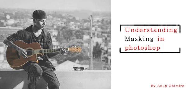
Understanding Masking in Photoshop

31 Aug

Header

Masking is one of those techniques that will change the way you use Photoshop. Understanding this technique can help you to jump from being a beginner level Photoshop user, to a more advanced one. In this article, I will explain how masking really works in Photoshop, its few key concepts, and how Masking helps you to perform non-destructive editing.

The skills you need to get started masking in Photoshop are being able to use the brush tool to paint color, understand two colors black and white, and knowledge of how layers work in Photoshop, which I assume you have very sound knowledge on.

What is masking what does it do in Photoshop?

If you can relate the word masking with the mask, it may make some sense. Why do we use a mask, to cover the face, right? So why would we use masking on a layer, to cover or uncover the content of any layer. With a mask you can control the transparency of a layer. But that is what opacity and fill is for, right? Yes, opacity and fill do control the transparency, but it works for whole layer. What if you would like to have only the right part to be transparent and the left part to be completely visible? That’s when masking comes into play.

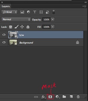
Masking works in two ways. First, you simply add a mask on any layer by clicking the third option on the bottom of layer palette. The other way is by using adjustment layers, which always comes with a mask.

Background without mask

This image shows a layer with no mask applied. I have highlighted the third option on the layer palette. That is where you add a mask.

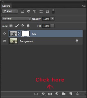
Adding mask white

Clicking on the mask option will create a white layer mask on the layer selected.

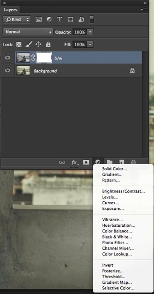
Adjustment layer

This image shows an adjustment layer. They help you to perform non-destructive editing, and every adjustment layer created this way, comes with a white mask.

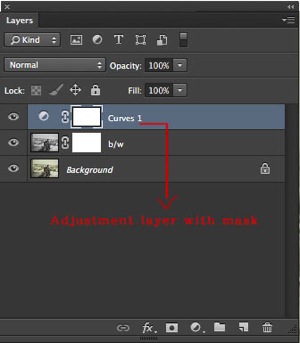
Adjustment layer with white mask

This shows that a new curve adjustment layer has been applied with the white mask.

While working with masking please remember that white shows the content where as black hides. If your mask is white, the mask is transparent and the layer is fully revealed, whereas if the mask is black it is opaque and the layer below will show through. Below are a few examples that will help you to understand masking better.

A handy saying to help you remember: white reveals, black conceals

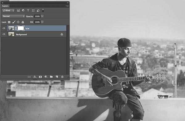
White mask

The image above shows, that the white mask reveals the content of the layer it is affecting. I duplicated the background layer and desaturated it with Shift+Command+U on a Mac (Shift+Control+U on PC).

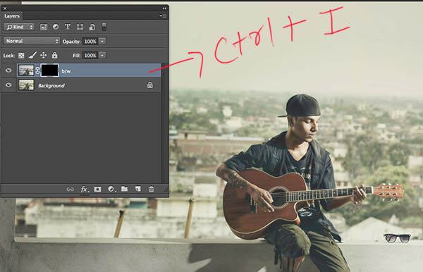
Black mask

With Ctrl/Cmd+I, you can invert the white mask into a black one. Since black hides the effects, the image has now been changed from back and white to color, from its original state (the layer below is now visible)

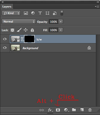
When you first add a mask it will initially be white, but you can change it into black either by inverting the mask, Cmd/Ctrl+I, or you can fill with black or white. Alternately, by simply pressing Alt while clicking to create the mask would also result in a black mask.

Creating black mask

Additional tip

  • Step 1. First click D on your keyboard (default), which will fill your background color with white, and foreground color with black.
  • Step 2 Select the mask
  • Step 3 Press ALT+Backspace to fill with the foreground color (black) and Ctrl+Backspace for to fill with the background colour (white). You can use X to swap the foreground and background colors.

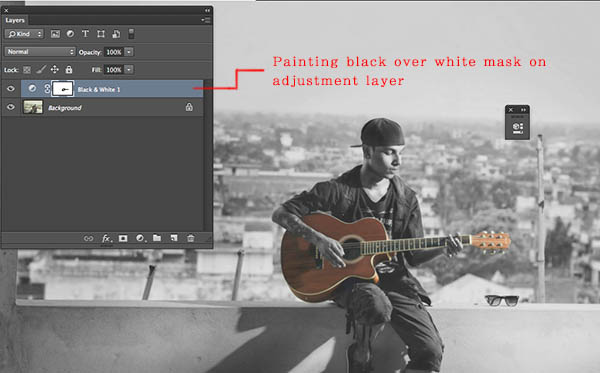
You can now paint on the mask with the brush key selected. Make sure your foreground color is opposite to the color of the mask. If you are painting with black on a white mask, the content of that part of layer is becoming transparent while the white parts remain as is. If you are painting white over a black mask, then that part would be back to its original form. You can play around with the percentage of fill and opacity to get more control over your workflow.

Painting with black on mask

Here I painted the guitar with a black brush over the white mask, resulting in the visibility of color from the layer below.

Additional tip

Simply press your number on the number pad and your opacity will change as per. If you press shift plus the number, then its fill will change.

  • 4=40%
  • 4+9= 49%
  • 0+4 = 4 %

Do you have any other masking tips and tricks? Please share in the comments below if you do, or if you have any questions.

The post Understanding Masking in Photoshop by Anup Ghimire appeared first on Digital Photography School.

Digital Photography School
 
Comments Off on Understanding Masking in Photoshop

Posted in Photography
 

31. August 2014

31 Aug

Ein Beitrag von: Mariola Zoladz

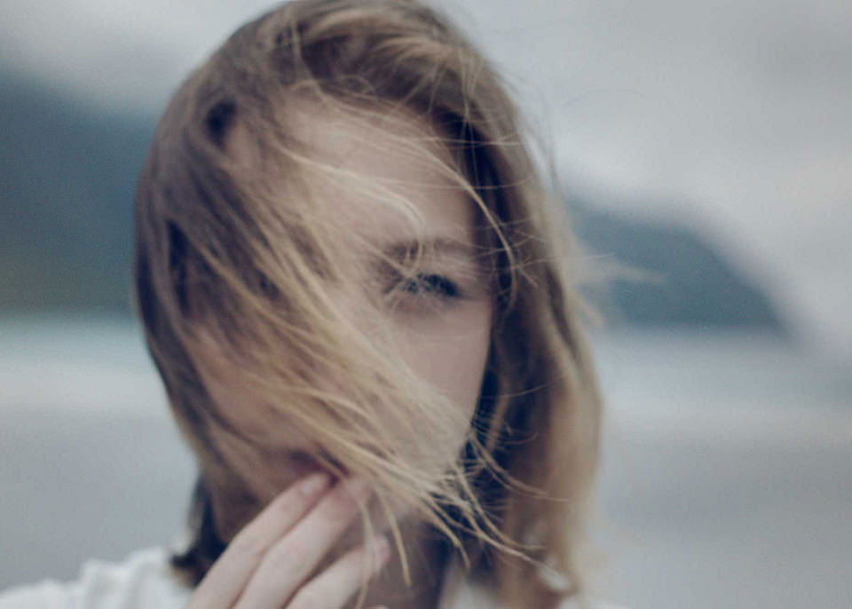
Nahes Mädchenportrait im Wind


kwerfeldein – Fotografie Magazin | Fotocommunity

 
Comments Off on 31. August 2014

Posted in Equipment


Readers’ Showcase: Black and White photography
31 Aug

While it’s easy to get swept up in the stream of product announcements at this time of year, it’s also a good idea to remember why we buy that gear – to make great photos. What better way to do it than to showcase the excellent work of our own community? This week we asked users of our Black and White Photography forum to submit their favorite shots for inclusion in our Readers’ Showcase. As usual, the photos submitted were of a very high quality. See gallery

Articles: Digital Photography Review (dpreview.com)

 
Comments Off on Readers’ Showcase: Black and White photography
Posted in Uncategorized


browserFruits August, Ausgabe 5

31 Aug

Während wir in den letzten Zügen zur Auswertung unserer Aktion mit Wacom liegen, lohnt sich für Euch heute ein Blick auf Facebook. Hier verlosen wir einen Gutschein für ein Acrylbild mit Aufhängung von Saal Digital im Wert von über 100 €. Die Verlosung läuft jedoch nur noch bis heute Abend um 20 Uhr, also nicht trödeln, sonst verpasst Ihr es. Und nun viel Spaß mit den browserFruits.


Fotospecial: Irrlichter

Flickr

500px


Deutschsprachig

• Sieben interessante Tipps für Smartphone-Fotos.

• Herr Ripke, wenn man schon auf’s Burning Men geht, dann bitte im Goldanzug, Prinzessinnenkostüm oder nackt. Aber schicke Bilder.

• Wie groß diese Welt ist und wie nahezu unbedeutend klein wir wirken, zeigen diese Fotos.

• Für manche Experimente lassen einige Fotografen tatsächlich ihre Kamera kochen.

• Den Jugendfotopreis gibt es nun schon seit über 50 Jahren. Die Gewinnerbilder geben nicht nur Einblick in jugendliches Lebensgefühl, sondern zeigen auch politische und gesellschaftliche Veränderungen. Einestages zeigt einige der spannendsten Fotos.


International

• Die diesjährigen Finalisten der EyeEm Awards sind herausragend. Mobile Fotografie noch als separate Kategorie zu sehen, fällt angesichts dieser Bilder schwer.

• Landschaftsfotografen wird ja immer angekreidet, dass sie – insbesondere was Farben betrifft – übertreiben. Es gibt jedoch Orte auf dieser Erde, die ganz ohne HDR und Photoshop eine bunte Farbigkeit innehaben, die kaum zu glauben ist.

• Ihr kennt sicher das Sprichtwort „Warum in die Ferne schweifen, wenn das Gute liegt so nah?“ Das dachte sich auch Matthew Albanese auch und baut seither Landschaften einfach selbst.

• Datenvisualisierung küsst Fotografie: Der südafrikanische Fotograf Dillon Marsh kombiniert Fotos von Kupferminen mit computergenerierten Volumen, die das Fördervolumen einer jeden Mine darstellen.

• Wie sieht der Alltag von amerikanischer Soldaten aus? Magnum-Fotograf Peter van Agtmael zeigt seinen ernüchternden Einblick und entzaubert ein wenig den Traum, den uns Hollywood gern glauben lässt.

• Portrait-Doppelbelichtungen kann man auch anders gestalten: David Samuel Stern schneidet sie aus und flechtet sie ineinander. Das Ergebnis ist verblüffend.

• Ungarische Nachkriegshäuser haben eine erstaunliche Farbenvielfalt. Katharina Roters sie dokumenntiert.

• Die tschechische Fotografin Dita Pepe stellt sich ihr Leben vor und wie es aussehen könnte. Dafür fotografiert sie sich kurzerhand selbst mit verschiedenen Männern und Kindern.

• Die Gewinner des Traveller Photo Contests von National Geographic sind auch sehr sehenswert.


Neuerscheinungen und Tipps vom Foto-Büchermarkt

Buchtipps

• „Flight Attendants“* ist ein Fotobuch von Brian Finke. Er verbrachte zwei Jahre seines Lebens damit, durch die Welt zu fliegen und uniformierte Flugbegleiterinnen zu fotografieren. Das Buch ist bereits etwas älter, wird aber momentan frisch auf Lensculture vorgestellt.

• Seit 20 Jahren bereist Marco Paoluzzo Island und fotografiert leidenschaftlich die großartige Landschaft. In „Iceland: My zen garden and other stories“* zeigt er seine Lieblingsbilder, darunter einige unveröffentlichte.


Zitat der Woche

If you wait, people will forget your camera and the soul will drift up into view.

Steve McCurry –

Mehr Zitate


Videos

Ryan Tatar fotografiert am liebsten analog und lässt seine Bilder crossen. Ein kleines Video berichtet über seine Arbeit.


Diese Portraits wurden aufgenommen, als die Personen einen Stromschlag bekamen.


Nochmal Burning Man, hier aber als Zeitraffer-Video:


* Das ist ein Affiliate-Link zu Amazon. Wenn Ihr darüber etwas bestellt, erhält kwerfeldein eine kleine Provision, Ihr bezahlt aber keinen Cent mehr.


kwerfeldein – Fotografie Magazin | Fotocommunity

 
Comments Off on browserFruits August, Ausgabe 5

Posted in Equipment


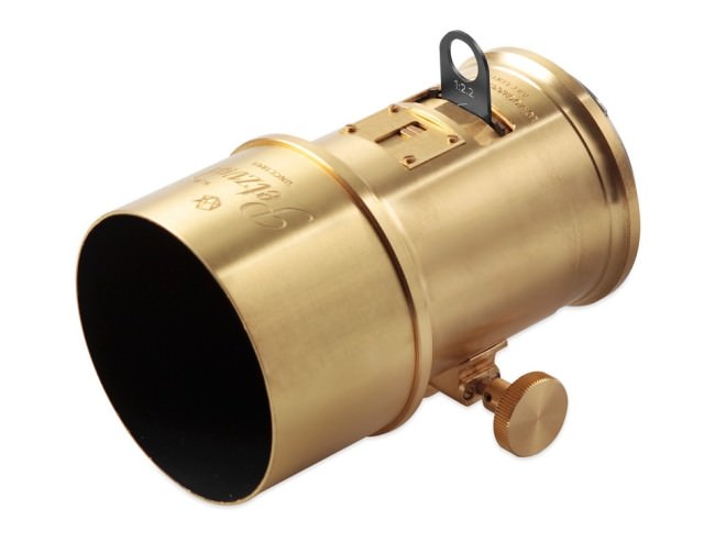
Testbericht: Lomography x Zenit Petzval Lens

31 Aug

Ein Beitrag von: Tamara Skudies

Lomography startete im Juli 2013 auf Kickstarter das Petzval-Projekt. Mit Hilfe von über 3.000 Unterstützern und mit Zenit konnten sie die Petzval produzieren! Die Linse ist eine Neuauflage des legendären Petzval-Objektivs aus dem Jahr 1840, das in Wien entworfen wurde.
Das Petzval-Objektiv war die erste Portraitoptik in der Fotogeschichte und wurde von Josef Maximilian Petzval konstruiert. Die Linse hatte damals zwei Verbesserungen gegenüber den schon vorhandenen Objektiven. Zum einen war es mit einer Blende von 3.6 etwa 22 Mal lichtstärker und zum anderen wurde die Zusammensetzung der Linsen zum ersten Mal berechnet anstatt nur geschätzt.

Das von Voigtländer produzierte Objektiv wurde bis 1862 60.000 Mal hergestellt. Ein Nachteil der Konstruktion war ein starker Schärfeabfall an den Rändern, der heutzutage aber zugleich den Charme des ganzen Objektives ausmacht.

Das neue Petzval-Objektiv wird aus Messing gefertigt und verfügt über eine Glasoptik von Zenit. Der „Nachteil“ der alten Konstruktion wurde natürlich beibehalten, denn ein modernes Objektiv, das die Feldkrümmung minimiert, sollte es ja nicht werden. Das verleiht den Bildern den besonderen Look.

Petzval-Objektiv

Möchte man weiche Bilder, nimmt man eine offene Blende und will man mehr Schärfe, nutzt man eine der kleineren. Mit einer Brennweite von 85 mm ist sie perfekt für Portraits geeignet. Zudem passt die Linse je nach vorliegendem Anschluss auf (analoge und digitale) Canon-EF- und Nikon-F-Kameras. Man bekommt zu der Linse ein Paket verschiedener Steckblenden von f/2.2 bis f/16 und kann vier weitere experimentelle Steckblenden zusätzlich erwerben.

Technische Details

Fokuslänge: 85 mm
Maximale Blende: f/2.2
Blenden: Waterhouse Blendenset, bis zu f/16
Bildkreis: 44 mm
Bildfeld: 30°
Linsenaufsätze: Canon EF und Nikon F
Elektronische Kontakte: Nein
Geringste Fokusdistanz: 1 m
Fokus Mechanismus: Gear Rack Focusing
Filtergewinde: 58 mm
Bildkreis: 44 mm

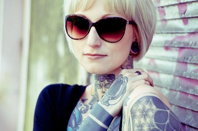
Portrait einer Frau mit Sonnenbrille.

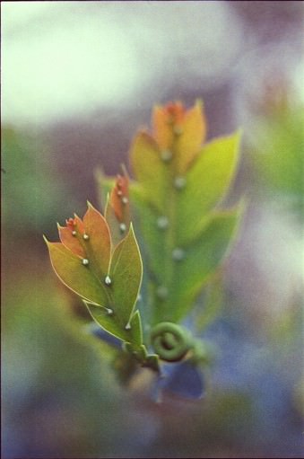
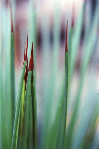
Bunte Blätter.Grashalme.

Das Auspacken der Linse war schon toll, denn wenn man sie in die Hand nimmt, gibt sie einem das Gefühl einer besonderen Wertigkeit. Die Verarbeitung war bei meinem Modell gut und die Aufmachung war sowieso atemberaubend schön.

Ich hatte die messingfarbene Variante und wurde glatt gefragt, ob das eine Leica sei, obwohl hinten ein hässlicher schwarzer Canonklotz dran hing. Das ist eigentlich der einzige Nachteil, denn ich hätte die Optik viel lieber für M42 oder meine Pentacon Six, denn Adapter auf Canon- oder Nikonmodelle sind ja heutzutage kein Problem. Mit dem Wunsch bin ich, glaube ich, auch nicht die einzige.

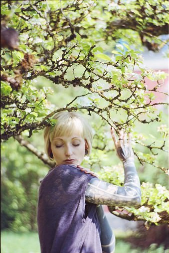
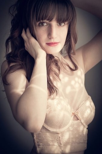
Blonde Frau in einem Magnolienbaum.Frau in Unterwäsche.

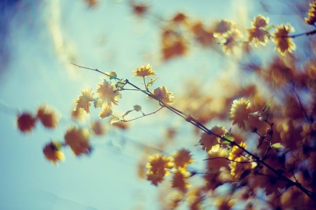
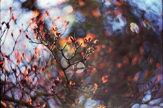
Äste mit Blüten vor blauem Himmel.

Ich testete die Linse mit meinen analogen Canons (EOS 1000 oder EOS 500) und mit meiner digitalen Canon 5D Mark II. Für Portraits machte ich ein paar Termine aus, um zu sehen, wie die Bilder damit werden. Am meisten machte ich jedoch mit ihr Naturaufnahmen. Für beides ist die Linse geeignet.

Bei Portraits würde ich aber zu einer geschlosseneren Blende raten. Meine meisten Bilder sind mit f/2.2, f/2.8 oder f/4 gemacht. Die Blende 6 hatte ich nicht und 8 war mir zu klein, da ich ein Freund von geringer Schärfentiefe bin. Somit hatte ich ein paar unscharfe Ergebnisse, mit denen ich aber gut leben konnte.

Mit der Zeit bekommt man aber ein Gefühl dafür, mit der Linse und ihrem besonderem Einstellrad links unten am Objektiv scharf zu stellen. Mich hat diese Art des Scharfstellens begeistert und ich finde es sogar praktischer als die übliche Variante. Etwas umständlich ist eher die Blendeneinstellung, da man für jede Blendenöffnung eine Stecklinse besitzt, die man oben in das Objektiv stecken muss.

Auch daran gewöhnt man sich mit der Zeit und meistens habe ich auch nicht oft gewechselt. Die Steckblenden haben an den Seiten zwei schmale Stücke, die man an seine Optik anpassen kann, damit sie nicht herausfallen können. Ich konnte dies beim Testgerät natürlich nicht machen und habe die Optik immer auf unendlich oder ganz nah gestellt, damit ich die Stecklinsen nicht verliere.

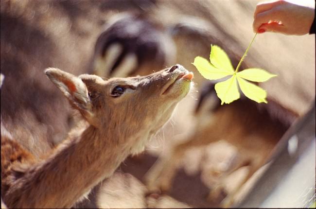
Reh wird ein Kastanienblatt hingehalten.

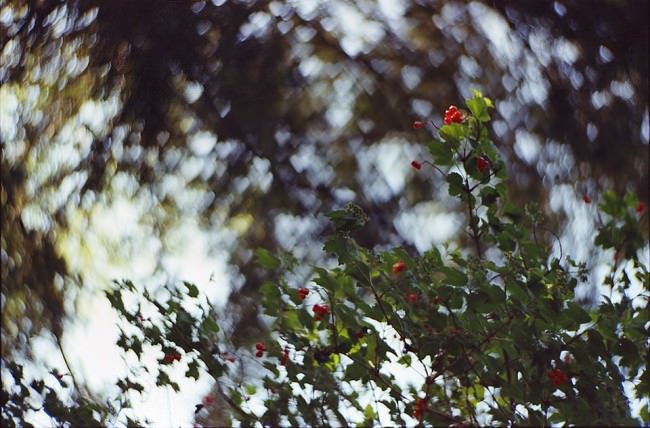
Ast mit grünen Blättern und roten Beeren.

Leider habe ich keine Tests mit Blende 8 oder aufwärts gemacht, was mich wirklich ärgert. Dafür baute ich mir aus einem festen schwarzen Papier meine eigene experimentelle Steckblende mit Herzform, die mir sehr viel Spaß bereitet hat.

Zudem nutzte ich die Optik im botanischen Garten mit einer +2-Nahlinse, die es mir ermöglichte, näher an meine Motive ran zu gehen. Der „Swirl“-Effekt ist zum Glück nicht bei jedem Hintergrund möglich, was auch das Fotografieren mit einem schönen weichen Bokeh ohne die runde Unruhe ermöglicht.

Beachten sollte man auch die Unschärfe im Randbereich, die das Scharfstellen erschwert oder sogar unmöglich macht. Der Schärfepunkt sollte also eher zentral liegen. Wer absolute Schärfe wünscht, sollte sich eine andere Linse kaufen. Für mehr Schärfe ist es wohl besser, mit geschlossener Blende zu fotografieren, aber ich wollte ja den Charme der Linse unbedingt haben mit der ganzen Unschärfe. Im offenen Blendenbereich sind die Ergebnisse eher weich und haben einen geringen Schärfebereich.

Ein Ast

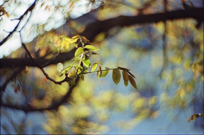
Bunte Äste im Gegenlicht.

Die Optik ist eher was für Fotos mit Charme als für technisch perfekte Bilder. Aber gerade deshalb habe ich mich in sie verliebt. Wäre der Preis nicht 549 €, würde ich mir sicher auch eine kaufen. Der Andwendungsbereich der Optik liegt meines erachtens hauptsächlich bei Portraits und Naturaufnahmen. Dafür finde ich den Preis etwas zu hoch, aber sie lässt mir nach wie vor keine Ruhe. Im großen und ganzen ist der Preis okay für die Optik, sie ist nun einmal etwas ganz Besonderes und mit keiner anderen Linse zu vergleichen.

Als die Linse vorgestellt wurde, hätte ich sie schon am liebsten gehabt. Dann bekam ich die Möglicheit, sie zu testen und hatte die Angst, dass wenn ich sie erst einmal hätte, ich sie auch wirklich unbedingt brauche. So ist es nun auch und mein Verstand kämpft mit meinem Herzen.

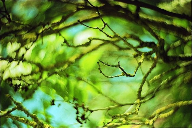
Moosbewachsene Äste.

Ich hatte nicht wirklich irgendwelche Erwartungen an die Linse, außer daß ich sie wohl noch schöner als mein Helios 58 mm ist, das ja auch einen leichten Swirl-Effekt hat. Viele fragen ja, warum man sich ein teures Petzval kaufen sollte, wenn es das Helios günstig gibt. Ich konnte jetzt beides vergleichen und muss sagen, dass das Petzval noch mal einen stärkeren Charme auf Fotos bannt als das wirklich tolle Helios.

Falls sich ein edler Spender findet oder jemand sein Petzval günstig verkaufen will – ich nehm’s gern! Jetzt gibt es ja bald die Möglichkeit, die Optiken in den Geschäften zu begutachten und sicher auch mal an seiner Kamera zu testen. Macht dies aber nur, wenn Ihr den passenden Geldbeutel dafür habt!


kwerfeldein – Fotografie Magazin | Fotocommunity

 
Comments Off on Testbericht: Lomography x Zenit Petzval Lens
Posted in Equipment


30. August 2014

31 Aug

Ein Beitrag von: Anna Heimkreiter

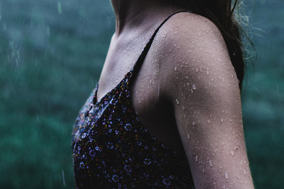
Man sieht den Oberkörper einer Frau im Regen.


kwerfeldein – Fotografie Magazin | Fotocommunity

 
Comments Off on 30. August 2014

Posted in Equipment


Augenblicke

31 Aug

Ein Beitrag von: Jonas Hafner

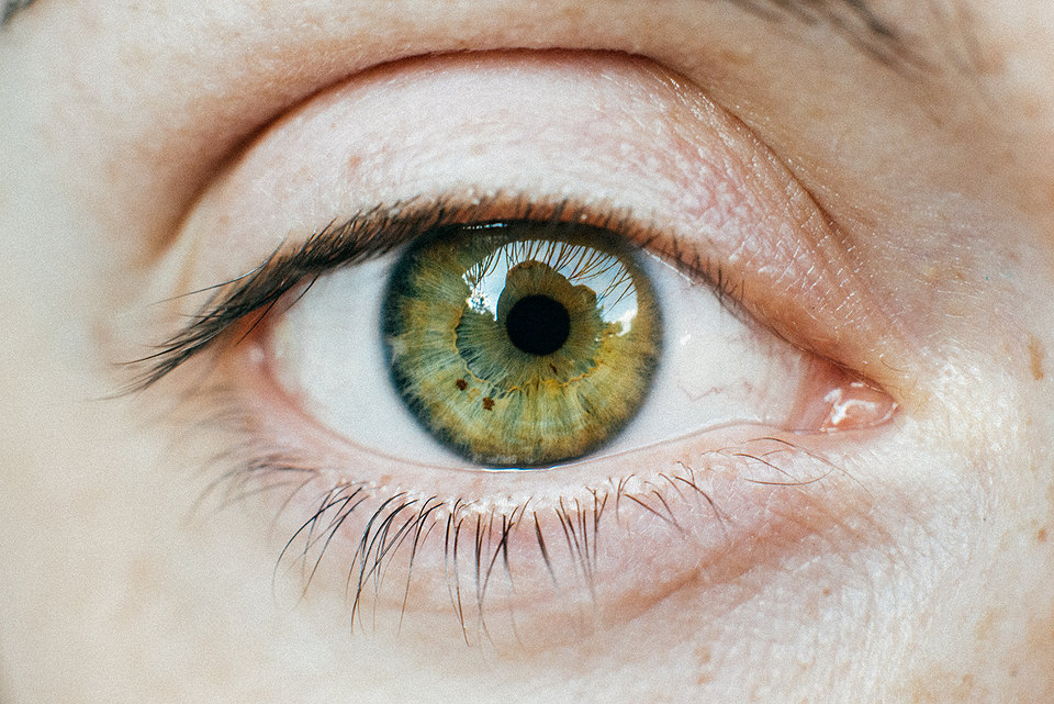
Während meines Staatsexamens bekam ich als viertes Prüfungsfach Augenheilkunde zugelost. Zu dieser Zeit konnte man sich auf Facebook kaum noch vor Kirschblütenfotos retten. Mich dagegen starrten Hunderte mehr oder minder kranke Augen an. Als ich irgendwann das Lehrbuch zur Seite legte und betrübt zu meiner verstaubten Kamera sah, kam mir eine Idee.

Immer wieder hört man, dass Fotografen ein gutes Auge haben müssten. Viel wichtiger als eine gute Kamera sei dies. Doch wie sehen diese Augen eigentlich aus, die durch den Sucher blicken und die Welt auf eine ganz besondere Weise betrachten?

Im Juli hatte ich die Chance, dieser Frage auf den Grund zu gehen und die Augen vieler wunderbarer und talentierter Fotografen abzulichten, um schlussendlich ein kleines Gruppenbild zu basteln.

Eine der Teilnehmerinnen brachte mir extra ihre Makroringe zum Treffen mit, sodass ich mein Projekt umsetzen konnte, denn ein Makroobjektiv besitze ich leider nicht. Das Ganze war gar nicht so einfach und auch die Fotografen, die dieses Mal vor der Kamera standen, mussten sich ganz schön anstrengen, die Augen offen zu halten, während ich mit dem Objektiv so nah kam.

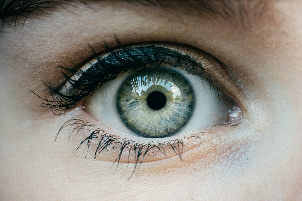
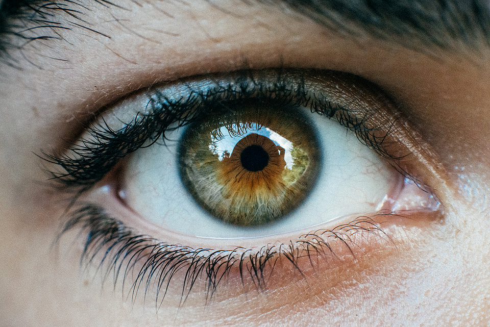
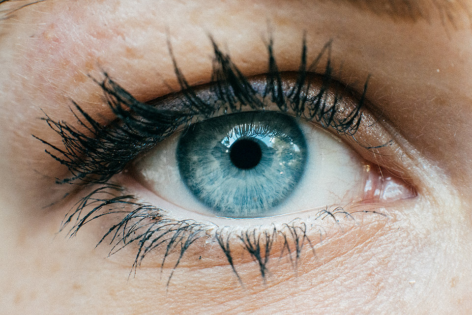
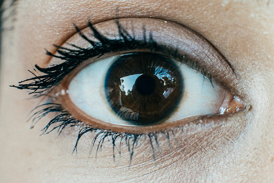
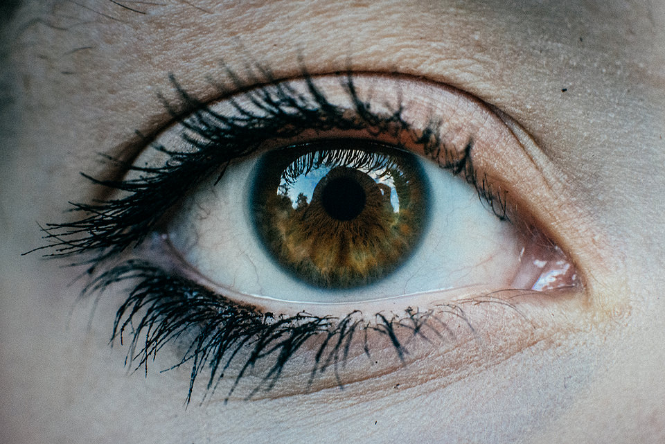
Nahaufname eines Auges

© Jonas Hafner

© Jonas Hafner

© Jonas Hafner

© Jonas Hafner

© Jonas Hafner

© Jonas Hafner

© Jonas Hafner

© Jonas Hafner

© Jonas Hafner

© Jonas Hafner

© Jonas Hafner

© Jonas Hafner

© Jonas Hafner

© Jonas Hafner

Ob sich die Augen von Fotografen nun von denen anderer Menschen unterscheiden, mag ich nicht zu beurteilen, jedoch verbinde ich mit jedem einzelnen Auge eine Person, die mir während des Treffens ans Herz gewachsen ist. Und zum ersten Mal habe ich wirklich das Gefühl, den richtigen Augenblick festgehalten zu haben.


kwerfeldein – Fotografie Magazin | Fotocommunity

 
Comments Off on Augenblicke

Posted in Equipment


Fuji X-T1 Versus X-E2 – Which Comes Out on Top?

31 Aug

This video by Munetake Kayo over at BigHeadTaco compares some of the features of both of these popular Fuji mirrorless cameras.

If you’re considering getting a more compact camera and downsizing from a DSLR, or maybe upgrading from a point and shoot camera – you might end up looking at one of these Fuji cameras.

I know for me, as a previous film shooter, the X-T1 has a lot of appeal and it currently sitting on my list to get. So I was interested to see this comparison and it actually solidified my choice.

Check out the Fuji X-T1 versus X-E2 in the video review and see what you think

Not convinced? Here’s a review of the X-T1 by dPS writer Paul Burwell.

So are you ready to get either of them? What are you shooting with?

The post Fuji X-T1 Versus X-E2 – Which Comes Out on Top? by Darlene Hildebrandt appeared first on Digital Photography School.


Digital Photography School

 
Comments Off on Fuji X-T1 Versus X-E2 – Which Comes Out on Top?

Posted in Photography


Interior Land Art: Riverbed Really Runs Through this Museum

31 Aug

[ By WebUrbanist in Art & Installation & Sound. ]

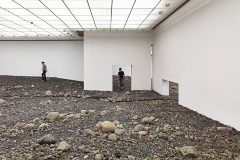
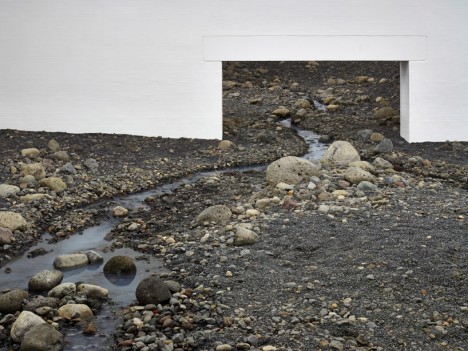
river interior museum gallery

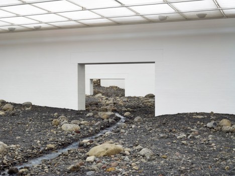
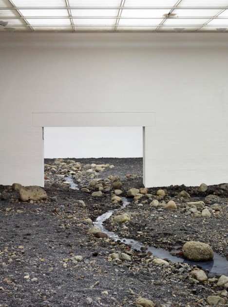
Art rarely gets as gritty and real as this, particularly in a gallery, with rocks, earth and water running through simple doors, between white-walled rooms and under uniform interior lighting.

riverbed walking closeup example

Olafur Eliasson, a Danish and Icelandic artist, created Riverbed as one of a series of installations for the Louisiana Museum of Modern Art in Denmark, challenging visitors to experience both museums and landscapes in new ways.

riverbed zoomed in doors

Meanwhile, the spaces become both intimate and perhaps uncomfortable as the earthwork slopes upward into ultimately-inaccessible areas.

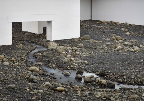
river runs through art

The artist explains: “What I’m interested in with my work at the Louisiana isn’t really that you experience an object or an artwork. I am interested in how you connect this landscape to the rest of the world and ultimately, how you experience yourself within it.”

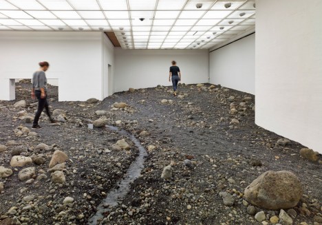
riverbed walking visitor tour

Traditional floor tiles slowly give way to a rugged landscape of stones and dirt, leading up to the sides of a real river inexplicably traversing the gallery interior.

riverbed art installation denmark

Aside from other references, the work is a nod to the sculpture garden that used to sit in the same spaces where this section of interior galleries now stands.

riverbed dirt rock water

“When we’re in our familiar surroundings, in our circle of family and friends, our senses are very finely tuned, but the further away we get from the local context, the cruder the sensing becomes. I wonder if our focus on the atmospheric can give us a relationship with something that is very abstract and far away.” (Images by Anders Sune Berg)

Share on Facebook


[ By WebUrbanist in Art & Installation & Sound. ]

[ WebUrbanist | Archives | Galleries | Privacy | TOS ]


WebUrbanist

 
Comments Off on Interior Land Art: Riverbed Really Runs Through this Museum

Posted in Creativity