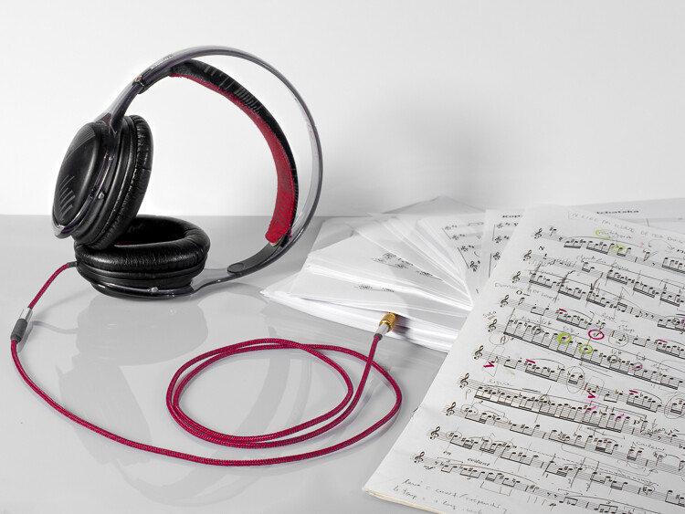
If you are workng with one light, you already know that a single light can create many possibilities but also can force compromises. Do you place the light for the best modeling on someone's face? Or do you cheat it a bit to minimize those deep shadows you just created?Read more »
Strobist
Archive for July, 2016
Lighting 102: The Two-Light Kit
How to Boost Your Creativity by Including Props in Your Photography
Props: are they a blessing or a curse? In photography, props can often make or destroy a photo, and because of this some people try to avoid them, some are afraid to use them, and other people love to use them.
I moved from being afraid to loving props because I found they are amazing tools to unlock creativity.
Why use props?
Usually, the role of the props in photography is to help add character and interest to a photo, or to add context to the scene.
Some kinds of photography, such as conceptual photography, cannot exist without props, as they are needed to translate the abstract concept or message into an image.
Props in commercial photography
In tabletop photography (product, food photography, and still life), props are used to build the scenography of the photo you are crafting.
The teapot, the plate, and tea leaves are all elements of the scenography used for the pile of chocolate biscuits in this a classic food photograph.
Props in landscape photography
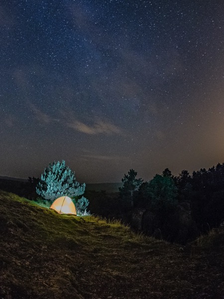
Props are sometimes present even in landscape photography, usually with the task to add interest to the foreground. A classic example would be to photograph a camp site in the wilderness, with a lit tent under a starry sky.
This tent is, indeed, just a prop. I brought it along with me solely with the intent to add interest to this nocturnal landscape.
Props and portrait photography
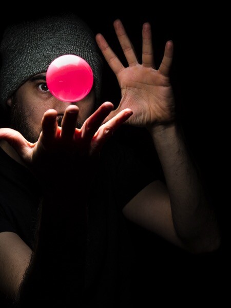
Using props will also help you to create more interesting portraits. Are you into self-portraiture? Cool, but there is only so much you can do with your face, and after a while you will probably feel the need to start using props, The more creatively you can use them, the better and more interesting your portrait will be.
So, props are all those objects that photographers add into the scene they’re photographing that are not the main subject of the image. I don’t consider hats, jewelry, wristwatches, and all those accessories your model wears for a portrait, to be props.
Another plus with props, especially in portraiture, is that they can help your model to be more comfortable in front the camera by giving him/her something to do or to focus on, thus forgetting about you and your camera.
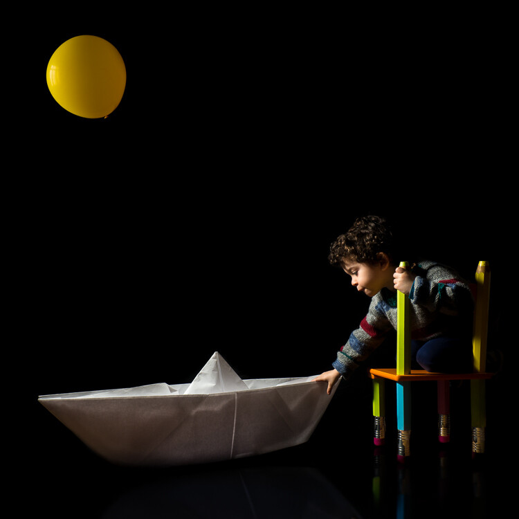
A prop in the hands of a 3 year old toddler (my son in this case) can lead to interesting results without making a fuss.
Things to look out for using props
So where is the problem with the use of props? Why people can be negative about them? My guess is because they are so widely used in photography that the risk of fall into photographic clichés is quite high.
Below are five tips to help you be creative with props, instead to fear them.
Before you continue allow me a final word. While it is true that many things can be do inside editing software, to really exercise your creativity don’t be a lazy photographer, craft your images for real as much as possible.
I consider the flame and the smoke in this photo of a hot pepper to be props. The fun in crafting the image with real fire and smoke was unbelievable.
Tip #1: Use a classic prop in a fresh way
Old film cameras are classic props in portraiture, and the ways to use them are variations of my son’s portrait you saw above.
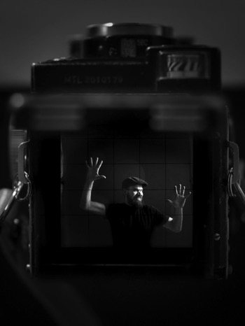
Among those cameras, the most photogenic ones are, in my opinion, the TLR (twin lens reflex) cameras, such as Rolleiflex, Rolleicord and Yashica. Because these cameras have a huge focusing screen you have to look into from above, the usual way to use these props is to have your model look down into the camera.
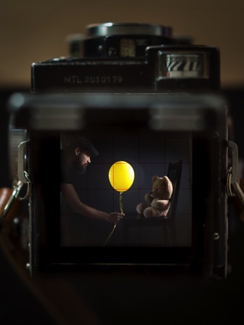
A less common way to use those TLR cameras as props is to take advantage of their massive focusing screen, which is many time larger than any SLR camera viewfinder, and to photograph the scene the TLR camera is seeing.
Once you get the setup right, don’t stop after the first shot, but experiment with poses and props.
Tip #2: Build your own props
Another way to get creative with props is to craft them yourself. This will not only ensure you have unique props to work with, but the whole process of making the props will make you think more creatively about how to use them.
A one meter long, origami paper boat, and a yellow balloon are good props to make one of my son’s fantasy and childish adventures come to life.
If you are into origami, and tired of taking the usual portraits of your children, you could try to create adventures for them by folding big paper planes or animals, or whatever you know how to do with a piece of paper. Plus, you can find plenty of origami tutorials waiting for you online.
Once again, it is true you could easily compose the adventurous portrait of your child by adding elements to the photo later in Photoshop. But, again, what fun would that be for both of you?
Tip #3: Break the physical laws and go surreal
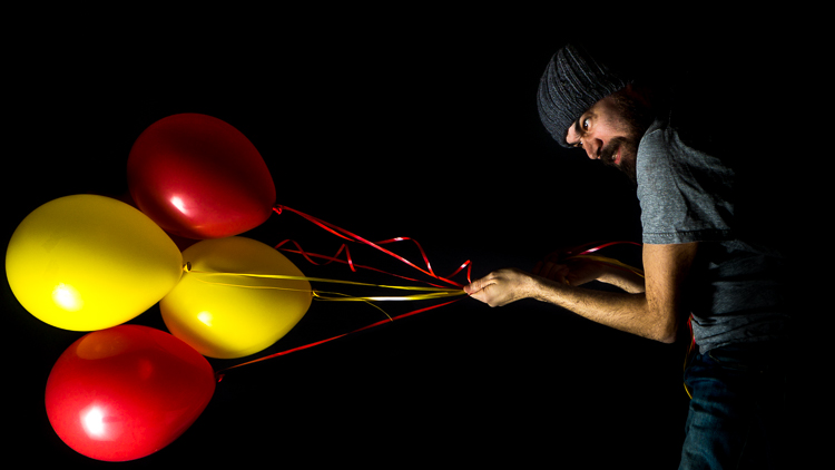
One of my favorite prop to work with are helium balloons, those you usually buy for parties. They are colorful, cheap, long lasting and very versatile.
Inspiration for their use is everywhere; have you watch the animation movie Up recently? Cool, wouldn’t it be fun to fly away holding tight to a bunch of balloons?
Up, up we go. Here the low key really helped a lot to make the pose believable.
What about breaking the physical law by playing “tug of war” with those balloons, instead?
Up and Down are quite arbitrary in this kind of photos. Here I was lying down on the floor but I tried to keep my shoulder off the ground, so that once I turned the photo 90 degrees counterclockwise, the pose was still believable. The low key helped by getting rid of the floor.
Tip #4: Prep your props
Sometimes, you can obtain something original just by prepping up a classic prop, such as the omnipresent book. Books are often used to fill a still life scene, or to get more interesting portraits.
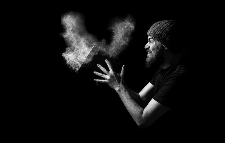
A funny contrast between the surprised grown up, rude, and bearded man, and the book of one of Winnie the Pooh adventures.
To make things more interesting, dynamic and less cliché, you can prep a book by sprinkling body powder on its pages and then have your model to blow the dust off while you take the photo. Or have him slam the book shut just before you fire the shutter, so to record of white powder flying out the book creating clouds.
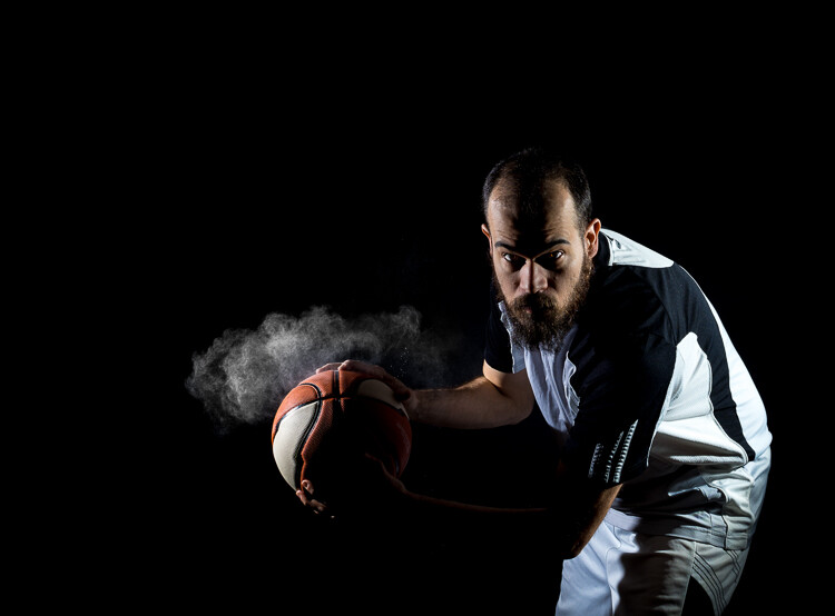
Powder makes things much more interesting, and the only limit is your creativity (or the absence of a working vacuum cleaner to clean up after the mess). You can sprinkled some body powder on a ball (another common prop) and make your model hit it with the hands just before taking the photo. You will capture great puffs of powder, helping to convey a feeling of action and power.
Tip #5: Go crazy with conceptual photography
While it is challenging per se, I consider conceptual photography to be the best playground to learn to be creative with props.
When you do conceptual photography, your subject will be a concept, and the challenge is to translate it into an image by using props. At first, keep it easy, and don’t be afraid to get inspired by the work of other photographers.
Because you want to convey a message, even with the simplest setup, you have to pay attention on how you place your props into the scene.
In the previous photo, the dark, out-of-focus chicken in the background is there to give the idea of the chicken moving away from the egg. While the broken shell with marks on its inside make the viewer think of it as the chicken prison. Had I placed the chicken in the foreground, in-focus and well lit as the egg’s shell, the message would have lost some strength.
When you do conceptual photography, do not focus on the photography aspect at first, but let your ideas and concepts spawn naturally from your everyday life. Are you cooking your favorite food? In that moment the idea that photography is a bit like cooking could strike you.
In photography, as in cooking, you combine what reality puts in front your lens (the ingredients) to create your vision of such reality (the finished food).
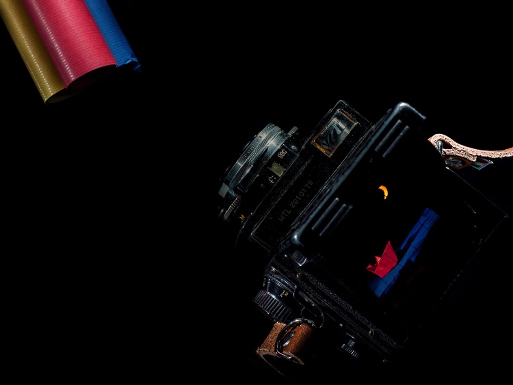
This idea struck me once and this was my personal way to translate it into a photo: the ingredients are the colorful paper rolls in front the lens of an old TLR camera, and those ingredients combine in-camera to reveal an origami nocturnal seascape crafted using the paper from the rolls. Photography magic.
The fun of doing the origami seascape for real and the challenge to frame, focus, and light it, so I could photograph the scene through my old TLR camera, was so much more than just use an editing software to copy/paste, move, rotate, resize and bled all the different elements together.
Once you start this game, you can find concepts everywhere; was your Mexican food too spicy even for a chili lover as you are? Something like that could pop in your mind.
Bonus tip: The hunt for props
Now you know how you can get creative with props in many ways, even using common ones, but it is always good to hunt for more interesting ones.
A good way to hunt for unique and weird props is to visit flea markets and shops selling kitchen supplies, vintage clothes, and such. And then, as usual, once you’ve got your props, use them in a fresh and unconventional way.
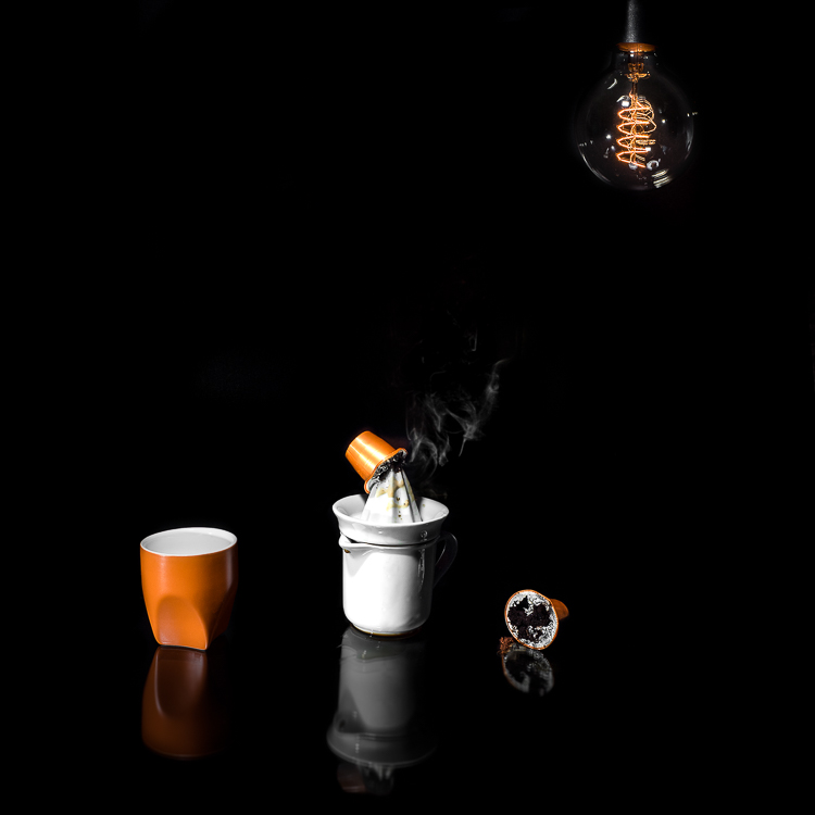
A variation of the concept shown in the photo opening this article; the same concept can be photographed in many different and original ways. Creativity is your only limitation.
Once again, the way you use and prep the props is crucial to create a convincing image. The coffee stains on the table and the squeezer, the squashed and broken capsules, and the smoke from a hidden candle, make the viewer understand what the meaning of the photo is, and the reason behind those props.
Conclusions
Don’t be afraid to use props in your photography to add something more. Just remember to use them wisely and creatively to push your photography further, and to avoid falling into photography clichés.
googletag.cmd.push(function() {
tablet_slots.push( googletag.defineSlot( “/1005424/_dPSv4_tab-all-article-bottom_(300×250)”, [300, 250], “pb-ad-78623” ).addService( googletag.pubads() ) ); } );
googletag.cmd.push(function() {
mobile_slots.push( googletag.defineSlot( “/1005424/_dPSv4_mob-all-article-bottom_(300×250)”, [300, 250], “pb-ad-78158” ).addService( googletag.pubads() ) ); } );
The post How to Boost Your Creativity by Including Props in Your Photography by Andrea Minoia appeared first on Digital Photography School.
Flagships compared: Canon EOS-1D X Mark II versus Nikon D5
2016 is an Olympics year, and while Brazil may be scrambling to get everything ready, Canon and Nikon are fully prepared. Both manufacturers launched brand new flagship DSLRs this spring, just in time for the world’s sports and action photographers to learn how to use them ahead of the games, which start next month.
Having two major DSLRs launched into the same marketplace aimed at the same kind of photographers at the same time is a good opportunity to see how they compare. We’ve recently published full, detailed reviews of both the Canon EOS-1D X Mark II and Nikon D5, but in this article we’ll be highlighting the major differences between the two models.
Dynamic range
The Canon EOS-1D X Mark II offers greater dynamic range at base ISO than the Nikon D5 – and than any previous Canon DSLR. Source: Bill Claff
On the face of it, the Canon EOS-1D X Mark II and Nikon D5 offer a very similar sensor specification. And at 20 and 21MP respectively, their output resolution is indeed almost identical, but there are differences.
Unusually, in the contest between Canon and Nikon, the EOS-1D X Mark II’s sensor has the wider dynamic range at base ISO, which represents a major step forward for Canon’s pro lineup. Although not a match for the best-in-class performance offered by Sony’s current full-frame sensors, the 1D X Mark II bests the D5 by around one stop. Oddly, in terms of dynamic range, the D5 has moved backwards compared to its predecessor, the D4S.
The practical upshot of this is that the EOS-1D X Mark II is much more suitable for the sort of ‘expose for the highlights and pull the shadows up later’ approach to photography that makes sense in tricky lighting conditions. With the D5, you have to chose. Expose for highlight detail and color and lose definition in midtones and shadows, or expose for midtones and say goodbye to the brighter areas. With the EOS-1D X Mark II, while not best-in-class, Raw files are much more flexible.
High ISO performance
Even at ISO 64,000 the Nikon D5’s image quality is superb, and the AF system is capable of 3D Tracking in near darkness.
Of course, not everyone requires super-wide dynamic range from Raw files. For some photographers (and we suspect most photojournalists) high ISO Raw, and particularly JPEG, image quality will be more important. In this respect the D5 offers marginally superior performance to the EOS-1D X Mark II, although the difference isn’t that great within what any sensible photographer would consider a ‘normal’ ISO sensitivity span.
The D5 yields better quality JPEGs at ISO 409,600 (the EOS-1D X Mark II’s maximum setting) but above this, its additional ISO sensitivity settings (all the way up to 3.28 million) become progressively less useable. More useful is the D5’s backlighting of major controls, which is a huge benefit when changing settings at night.
Autofocus
The Nikon D5’s 153-point AF system is the most capable that we have ever seen.
As flagship sports and action cameras, the Canon EOS-1D X Mark II and Nikon D5 incorporate the best autofocus systems that their respective manufacturers know how to make.
In Canon’s case that’s a 61-point AF system, supported by a 360,000-pixel metering sensor to aid with subject tracking (‘iTR’ in Canon-speak) and face detection. Of the full 61 points, 41 are cross-type and the center point is sensitive down to -3EV in single-shot AF mode. Additionally, the 5 central points are dual-cross type, containing a long base-line x sensor in addition to the and + cross sensor for enhanced AF precision with F2.8 and faster lenses. Indeed, we’ve found these 5 points to have nearly mirrorless (contrast-detect) levels of precision, important for shallow depth-of-field photography.
The D5’s AF system features 153 points, 99 of which are cross-type, and of which 55 can be directly manually selected. The entire AF array is sensitive down to a rated -3EV, and the center point can still be used at -4EV. The D5’s metering sensor features 180,000 pixels, and works with the autofocus to create a ‘3D AF tracking’ system with face detection.
While the Canon EOS-1D X Mark II’s autofocus is very good, and leagues ahead of earlier-generation professional Canon cameras, the D5 leaves it in the dust. The D5’s AF system is without question the most capable of any camera that we have ever seen. The almost spooky reliability of 3D AF tracking, despite a lower resolution metering sensor for subject analysis, is a game-changer for all kinds of photography – not just fast action.
Easy to miss in the D5 (partly because Nikon hides it so well) is automatic AF point calibration. This is a massive time-saver when calibrating fast lenses for accurate focus, and a major selling point over the EOS-1D X Mark II (and earlier Nikon cameras).
Video
Both the Canon EOS-1D X Mark II and Nikon D5 offer 4K video, but the Canon is the better video camera. Its 1.34X crop in 4K mode is less aggressive and Dual Pixel AF transforms performance.
Again, in terms of video specification the EOS-1D X Mark II and D5 might appear to offer a very similar set of features. Both can shoot high-definition video, and both also boast 4K recording. But the exact breakdown of features – and how they are implemented – is quite different.
Of the two cameras, the EOS-1D X Mark II is unequivocally the better choice for video. Canon has been producing high-end video cameras for a long time (although in the DSLR market, Nikon got there first – just – with the D90) and the company’s experience in this field really shows. The EOS-1D X Mark II can shoot HD footage up to 120fps, which is great for slow-motion capture, and 4K at up to 60p. The D5 tops out at 60p and 30p respectively.
The EOS-1D X Mark II also imposes a less aggressive crop factor in 4K video mode: 1.34X as opposed to ~1.5X. This isn’t a huge difference, but it does mean that it’s easier to shoot wide-angle footage on the 1D X II. In addition, the EOS-1D X Mark II’s Dual Pixel AF system works brilliantly well in video mode, both in terms of speed and accuracy of AF acquisition, and also tracking. The combination of DPAF and touch-to-focus makes for a very refined shooting experience, and even swift and accurate AF for static subjects in stills. The D5’s contrast-detection AF system in live view and video is primitive by comparison.
There are a couple of points in Nikon’s favor though – unlike the EOS-1D X Mark II the D5 can offer zebra striping for highlight monitoring, and it can output clean 4K footage over HDMI to an external recorder. In addition, the D5’s entire ISO sensitivity span is available in 4K video recording, whereas by default, the EOS-1D X Mark II caps ISO at 12,800 (expandable to 204,800 with a custom function).
Rear LCD
The Nikon D5’s rear LCD screen offers 2.36-million dot resolution, color calibration, and a broad range of touch-sensitivity features.
The rear screens on the Canon EOS-1D X Mark II and Nikon D5 are the same size, but the D5’s display offers significantly higher resolution, at 2.36 million dots (to the 1.62 million dots of the 1D X II). Although the Canon’s screen is very sharp and detailed, the D5’s is noticeably better when compared side by side.
It’s not all about resolution though, and the D5 has a couple of extra tricks up its sleeve. If you find that how pictures look on the back of the camera is different to how they appear on a profiled computer, the D5’s rear LCD can be calibrated using a blue-amber, magenta-green color wheel.
And while the screens on the back of both cameras are touch-sensitive, the implementation of touch features on the Nikon D5 is much broader. In the EOS-1D X Mark II, pretty much the only thing you can do by touch is to set AF point in live view. In combination with Dual Pixel AF this works brilliantly, but touch-sensitivity is much more deeply integrated into the Nikon D5’s ergonomics. Move to the next slide to read more.
Operation and Handling
The Nikon D5’s touch-sensitive feature set is much more useful than the Canon EOS-1D X Mark II. In review mode, images can be scrolled or ‘scrubbed’ through and focus can be checked with a double-tap.
In terms of handling, as always when comparing cameras from different manufacturers, the question of which is ‘better’ is largely subjective. But that’s not to say that there aren’t some measurable differences between the Canon EOS-1D X II and the Nikon D5. For starters, there’s that rear LCD screen.
Canon is determined that no unwary professional photographer should ever do anything by accident. That was the logic behind the original EOS-1D’s ’press button A, press button A again, scroll, stand on your head then press button B’ control logic, and it remains a Canon obsession to this day. As such, the company has basically deactivated the EOS-1D X Mark II’s touch-sensitivity feature except for one action – AF point selection in live view.
Nikon isn’t as stingy in this regard, and on the D5, you can perform several operations by touch – possibly the most useful being scrolling through and zooming (by pinch or double tap) quickly into images in image review mode.
In terms of customization, both of these cameras are highly configurable, but the D5 is a level up from the EOS-1D X Mark II. Nearly every custom button on the D5 gets a comprehensive list of assignable functions, much more generous than that offered by the EOS-1D X II. Furthermore, nearly every custom button can be assigned to activate and initiate any AF mode – uniquely allowing for things like momentary disabling of subject tracking, or the ability to switch between tracking a subject you specify vs. one the camera automatically chooses. This makes it easy to adapt to changing scenarios, or instantly try a different AF mode when one doesn’t work.
Shooting speed
The Canon EOS-1D X Mark II can shoot at up to 14fps with autofocus. This comes in very handy for capturing fast and erratic action like this rodeo rider.
Both the Canon EOS-1D X Mark II and Nikon D5 are – probably – approaching the limit of how fast DSLRs can be made to take pictures before shaking themselves to bits. The EOS-1D X Mark II is the quicker of the two cameras, topping out at 16 fps in live view mode, while the D5 lags a little behind at 14 fps. With autofocus and autoexposure, the Canon can shoot at up to 14 fps, while the D5 maxes out at 12 fps. It’s worth noting the Canon can shoot at 16 fps and still display a review image between each shot – allowing you to follow your subject – while the screen on the Nikon stays blacked-out when firing at its 14 fps maximum frame rate.
Furthermore, the 4K frame grab feature on the EOS-1D X Mark II effectively allows for a 60 fps silent shooting – with AF. Rolling shutter is minimal, so this is actually a usable way of capturing the decisive moment when it comes to very fast action. The D5 can shoot silently at 30 fps for 5s, but you only get 5MP stills out of it in this mode.
On the numbers alone, the EOS-1D X Mark II has the edge in terms of speed – just. But frames per second is only one part of the equation when it comes to action photography. Remember what we said about the two cameras’ AF systems…
Memory cards
Both the Canon EOS-1D X Mark II and Nikon D5 support CompactFlash media, but the EOS-1D X Mark II offers an additional slot for faster CFast media. The Nikon D5 is available in two versions – one with twin CompactFlash slots, and one with twin XQD slots.
Here’s a funny thing – there are actually two Nikon D5s on the market. There’s one with twin CompactFlash slots, and another one with twin XQD card slots. There’s only one version of the Canon EOS-1D X Mark II, and it comes fitted with one CompactFlash slot, and one CFast slot. Confusingly, CF and CFast cards are not mechanically cross-compatible, but the slots for both media – and the cards themselves – look almost identical at a glance.
So the risk of accidentally jamming the wrong card into the wrong slot is certainly higher in the EOS-1D X Mark II than the D5, but which media choice is better?
Currently available XQD and CFast 2.0 cards provide roughly similar performance (400-500mb/s max read speed). The biggest practical difference right now is price: a high-speed (510mb/s read) 128GB CFast 2.0 card costs about twice as much as a 440mb/s XQD card of the same capacity.
Of course if you don’t shoot high frame-rate bursts in Raw mode and don’t want to record 4K video, all of this is academic. Just stick with good old trusty CompactFlash.
Battery life
The Nikon D5’s incredible battery life means that it can shoot for thousands of frames per charge – a huge selling point for action photographers and anyone working in remote conditions.
It goes without saying that the Canon EOS-1D X Mark II and Nikon D5 are tough, durable cameras. Maybe one is tougher than the other, but to be honest we don’t have the time (or the necessary credit limit) to test them to destruction. But there’s more to durability than just physical toughness. A major consideration when using a camera in rough conditions – especially in remote or primitive locations – is battery life.
The Canon EOS-1D X II’s battery life is CIPA rated at 1210 shots per charge. Not bad. But the D5 is rated at an incredible 3780 shots – almost three times as many pictures per charge.
Now, CIPA ratings should be taken with a pinch of salt, since they’re based on a series of use-case tests meant to approximate ‘normal’ use and in our experience, actual battery life is almost always better than the rating. We’ve shot well over 2000 frames per charge on the EOS-1D X Mark II without coming near to running its battery flat. But the Nikon D5’s endurance in normal use really is quite extraordinary. Unless they’re shooting a lot of 4K video, we suspect that most D5 shooters will never need to carry a spare battery.
How do they compare?
Obviously, very few (if any) photographers out there are seriously asking ‘which of these two cameras should I buy?’ For one thing, we suspect that a large portion of of eventual EOS-1D X Mark II and D5 shooters will have had their gear purchased by an agency or publication. Meanwhile, those who pay for their own gear have most likely been locked into one or other system for so long that a comparison between the two flagships is of academic interest only.
But that’s not the point of this article. In examining the two flagship DSLRs from the two biggest camera manufacturers, we’re effectively looking at the state of the art for DSLRs at this point in time. So in the final summing up, how do they compare?
It’s not a huge surprise that overall, both cameras perform very well indeed. Their identical scores and gold awards testify to that. The Canon EOS-1D X Mark II is slightly faster when shooting stills, and significantly better as a video camera. Meanwhile, the Nikon D5 offers a market-leading AF system (for stills, at least) and a much more satisfying touch-screen implementation, with more extensive customization options.
The D5’s extraordinary battery life means also that it can keep shooting for much longer between charges, and it can capture full-color images in conditions literally too dark for the human eye to discern anything. On the other hand, at base ISO in daylight, the EOS-1D X II’s extra Raw dynamic range makes it more useful for shooting in brighter, more contrasty conditions.
Ultimately, on the understanding that the question ‘which should you buy?’ is largely hypothetical in this case, we’d certainly recommend the Canon EOS-1D X Mark II for landscape photography and 4K video. If you need the world’s best AF system, and a camera that can shoot forever and literally see in the dark, then the D5 is the better option.
- Read our full Canon EOS-1D X Mark II review
- Read our full Nikon D5 review
Want to compare more cameras? Click here
Did we miss anything? Let us know in the comments.
Articles: Digital Photography Review (dpreview.com)
How to Achieve Background Blur or Bokeh
If I show you two different portraits, one with a blurred background and one with a sharp background, you will automatically prefer the one with the creamy bokeh. Why? Because that’s just how it is. No, the bokeh effect is very flattering because it isolates the main subject by separating it from the background.
If you did not know, bokeh means blur in Japanese, and it is purely aesthetic.
Most portrait photographers blur their backgrounds, and I certainly do it because when I take a picture of someone, I want the viewer to focus on the person’s face and not what’s going on behind them.
I always want good background blur when I shoot portraits, that’s one of the main reasons why I shoot on Aperture Priority and let the camera do all the rest of the work. My minimum shutter speed has to be 1/100th, so I increase my ISO to 400 to compensate – this is for portraits with natural light.
Bokeh basically depends on how shallow your depth of field is (note that the further the background is from your subject, the smoother the bokeh). Depth of field depends on three main things
The Aperture Matters!
The bigger your aperture (smaller the f-number), the shallower your depth of field (e.g., f/2.8 is a large aperture opening, and it creates shallow depth of field).
The first thing I did not understand when I first started photography is that I used the biggest aperture on my lens but the background was not completely blurred.
At that time I used the 18-55mm canon kit lens with its maximum aperture of f/3.5. The user’s manual on my camera told me to just use the smallest f/stop on my lens and I would automatically blur the background. However, they did not mention a lot of other factors to get this result, like how big should my aperture be. After hours of trying to get a background blur with my aperture of f/3.5, I was left very frustrated because I did not get the results that I saw on the internet.
I later understood that bokeh depended a lot on how big my aperture was – I wanted to get bokeh for portraits with a focal length of 50mm. I had to buy a lens with a bigger aperture to get a completely blurred background, and the Canon 50mm f/1.8 was the answer. It is a relatively cheap lens to get started with portraits. You can find other lenses with an aperture of f/1.4 or f/1.2 but the bigger the aperture, the more expensive the lens.
With a regular lens like 50mm, you will start getting nice bokeh starting from f/2.8. So lesson number one is to buy a lens with a really big aperture – this is the first way to achieve flattering background blur. You probably know this already, but this is important to mention before giving the two other points.
With a big aperture, you will be sure to get a nice background blur. But, there are other ways you can blur your background without having a wide aperture.
The camera to subject distance controls the depth of field
Let me show you my point: lift your right thumb (or left thumb -it doesn’t really matter) in front of your right eye and stare at it while closing your left eye. While focusing on your thumb, notice that you cannot clearly see the background. Now move your thumb farther away from your eye, keeping your thumb in focus. You will notice that the background won’t be blurred anymore. This works with your camera the same as it down with you eyes. The closer you get to your subject, the more blurred the background will be.
I understood this when I finally managed to get nice bokeh with my kit lens (I still did not have my beloved 50mm f/1.8). I used to practice my photography, and background blur on a tree. The f/3.5 aperture was not good enough for me so I tried different things. The first satisfying bokeh I got was when I focused my camera really close to the tree.
If you take a second and think, you will realize that all the macro photography images have a shallow depth of field, therefore a smooth bokeh. This is because macro photographers get really close to their subjects.
Even if you have an aperture of, let’s say f/5.6, if you get your camera really close to your subject, you will have a blurry background.
Note that macro photographers use special lenses that enables them to take images really close to their subjects. Standard lenses have a limit regarding their focussing distance. If you cannot afford a lens with a big aperture nor a macro lens, extension tubes are a good solution to extend your focusing distance.
The shorter the distance between your subject and the camera, the shallower the depth of field will be. The bokeh really depends on that distance, because I can shoot a landscape scene with an aperture of f/1.8, and there will be no background blur. That is because there is a huge distance between my camera and the subject I’m trying to photograph.
The lens focal length changes the perceived depth of field
If you cannot get close to your subject, but still want to isolate it with a background blur, then use a long focal length lens.
Image taken with a long telephoto lens.
The cool thing with longer focal length lenses, is that you can photograph portraits, wildlife, macro, and isolate anything you can’t get close to. The other advantage is that you don’t need a large aperture, an aperture of f/6.3, for example, will give you creamy backgrounds.
A longer focal length will appear to give you a shallower depth of field, because the subject is compressed, and the isolation between your subject and the background is more important.
A shorter focal length will appear to give you a larger depth of field. Let’s go back to the example of the tree. If I put my aperture at f/4 on a 16mm lens in front of the tree, the background will appear quite sharp. Whereas if I focus on the tree from the same distance, with the same aperture, but with a focal length of 50mm, I will notice that I get a background blur and a shallow depth of field.
Conclusion
So you must be thinking: the best bokeh you can get is to have a long telephoto lens, focused really close to your subject, with a really wide aperture. That’s pretty much it!
The sad part is that these lenses are very expensive. But, I have two portrait lenses, and together they cost less than $ 400 – and, I am still able to take good looking portraits with nice bokeh. So it’s about combining these things, the best you can with the tools you have.
googletag.cmd.push(function() {
tablet_slots.push( googletag.defineSlot( “/1005424/_dPSv4_tab-all-article-bottom_(300×250)”, [300, 250], “pb-ad-78623” ).addService( googletag.pubads() ) ); } );
googletag.cmd.push(function() {
mobile_slots.push( googletag.defineSlot( “/1005424/_dPSv4_mob-all-article-bottom_(300×250)”, [300, 250], “pb-ad-78158” ).addService( googletag.pubads() ) ); } );
The post How to Achieve Background Blur or Bokeh by Yacine Bessekhouad appeared first on Digital Photography School.
New technology alters perspective in selfies, generates 3D images, and more
A team of researchers from Princeton University and Adobe Research have detailed a new project in which they use a 3D computer model of a head and a virtual ‘full perspective’ camera to manipulate the perspective of a single portrait. The manipulations simulate various shooting distances and the warps typically seen at those depths, potentially allowing software adjustments that create selfies with corrected perspective distortion.
A demo system (currently in beta) on lead researcher Ohad Fried’s website allows you to upload your own images to explore the technology.
The front-facing lenses found in smartphones cameras are often wide-angle, fixed focal length, to make them as flexible as possible, but the close-up nature of selfies tends to show distortions such as large noses or sloping foreheads. Interestingly, these distortions can change how the individuals are perceived; the subjects in portraits taken at close distances are often described in ways that include ‘approachable’ and ‘peaceful’ while subjects in portraits taken at longer distances are more often described as ‘smart,’ ‘strong,’ and ‘attractive.’
While it might be beneficial to take selfies at longer distances and longer focal lengths to eliminate the distortion, there is no practical way to do so with present phone technology. This newly developed technology could change that, however, with the researchers explaining: ‘our framework allows one to simulate a distant camera when the original shot was a selfie, and vice versa, in order to achieve various artistic goals.’
The researchers based their method on existing approaches to manipulating images, including the type of technology used in face-swapping apps. The key difference was using a ‘full perspective’ virtual camera model rather than a more simplistic, ‘weak perspective’ model, enabling them to compensate for the wider range of perspective adjustments needed for portraits taken at very close distances. This new method is able to estimate the camera distance and edit the perceived camera distance. Its modeling of depth also allows slight changes in the position of the virtual camera, allowing the photos to be slightly ‘re-posed’.
The technology promises than just correcting selfie perspective. The ability to slightly correct perspective and map facial features to a 3D model allows the creation of stereo pairs of images (3D anaglyphs) from a single image, or could make it possible to animate changes in facial expressions.
Articles: Digital Photography Review (dpreview.com)

World’s First Floating Underwater Tunnels to Span Fjords in Norway
[ By WebUrbanist in Architecture & Cities & Urbanism. ]
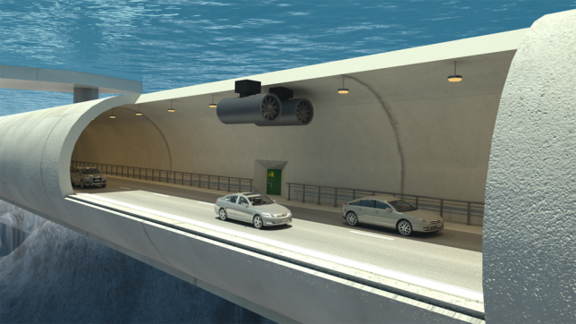
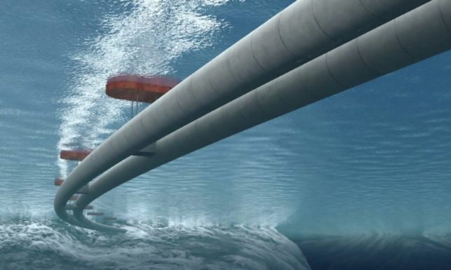
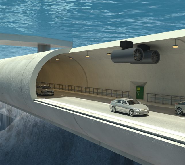
Norway is working to create the world’s first “submerged floating bridges,” suspended from surface pontoons and engineered to span its vast network of wide and deep fjords. A system of truss-framed tubes hung 100 feet below the surface will be wide enough for two traffic lanes. They will also be easier, faster and cheaper to construct than underground tunnels or over-water bridges, at least in the complex sites for which they are being planned.
Norway already has over a 1,000 traffic tunnels (including a few dozen subsurface ones), but anchoring these to the ground in deep fjords is impractical. Also, long spans mean more complex engineering (and higher costs) for surface bridges. The nation currently relies heavily on a system of less-efficient ferry routes that can be unpredictable and impacted by weather.
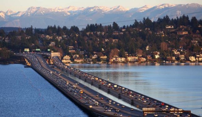
Floating bridges on the surfaces of water bodies are common in places like Seattle, where a combination of length and depth makes traditional bridges more difficult and less cost-effective. Essentially, underwater tunnel bridges would work the same way, except the pontoon supports will reside above rather than below the roadways.
Underwater bridges also have advantages for nautical traffic, allowing ships to pass over them and between surface buoys. Normal bridges (unless they can be raised and lowered) create long-term height caps for the kinds of sea vessels that can pass below them.
So far, the country has committed $ 25 billion to pursuing this project, stating with an analysis of wind and waves to determine how best to stabilize this new type of subsurface bridge. Initial plans call for a first tunnel to span the 4,300-feet deep, 3,300-feet wide Sognefjord.
[ By WebUrbanist in Architecture & Cities & Urbanism. ]
[ WebUrbanist | Archives | Galleries | Privacy | TOS ]
Using Lightroom’s Transform and Crop Tools to Improve Composition
Everybody loves to get it right in camera. But if you don’t, you have plenty of tools to help you make it right. Lightroom is one of the best available, and the easiest to use. In this article I’ll show you how you can use Lightroom’s Transform and Crop Tools to improve your composition.
The Transform Tab
First, let’s talk about the Transform tab, in the Develop module. Transform is relatively new to Lightroom. It’s an improved version, split-off of the Lens Correction tab. Essentially, Transform helps you straighten crooked or skewed images.
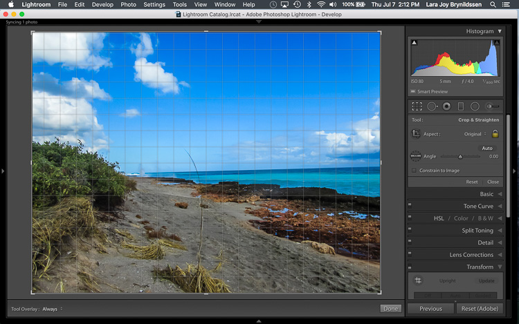
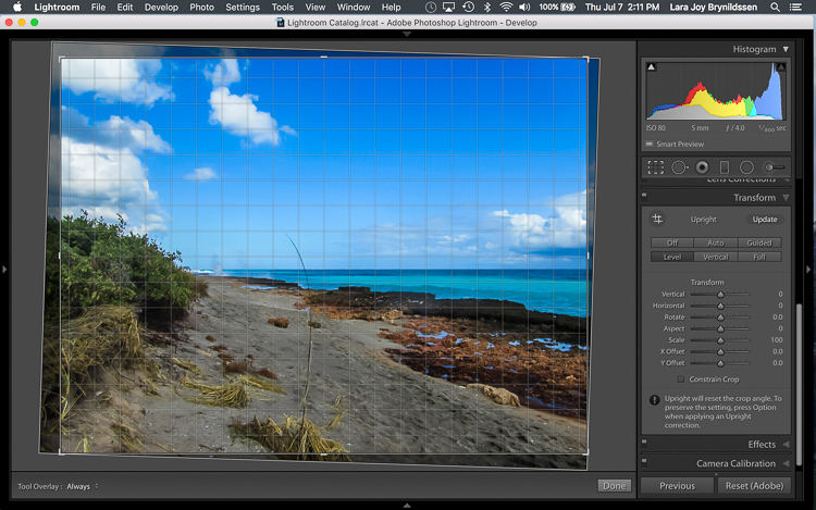
Here, in the first example above – a lovely seascape – there is a crooked horizon. Before opening the Transform tab, press the R key to activate the Crop Tool. Now press the O key (letter not number) to toggle the Grid overlay. With the Crop Tool still activated, click on the Transform tab in Lightroom and choose Level.
The Level option is perfect for images like this, when there are no strong vertical lines that need correction. It simply straightens the horizon so it no longer slopes crookedly. With the Grid overlay turned on, it’s easy to verify that the horizon is now straight. Here’s the image after the crop is applied.
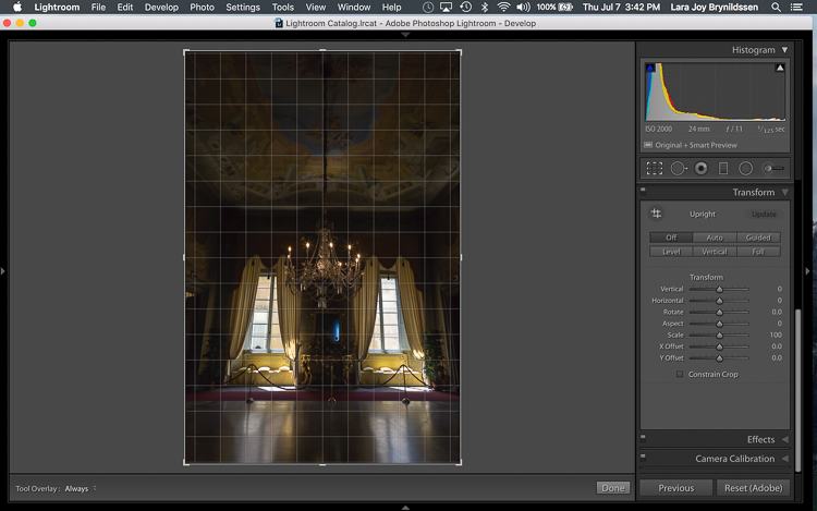
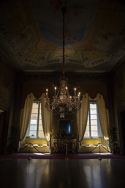
In this next example (below) – an interior image of an old Italian mansion – the windows are falling over backwards.
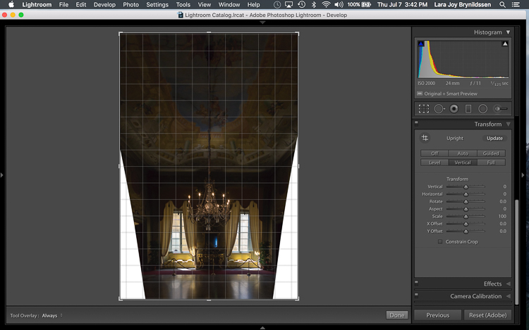
Here the Vertical option in the Transform tab does a great job of straightening the perspective. The windows align perfectly with the horizontal and vertical lines of the Grid overlay.
But as you can see, straightening the image has created a few problems. The image was so crooked (perspective distortion) that now there is a lot of white space to crop out. The good news is that when fixing these issues, composition can be improved too.
Composing with the Crop Tool in Lightroom
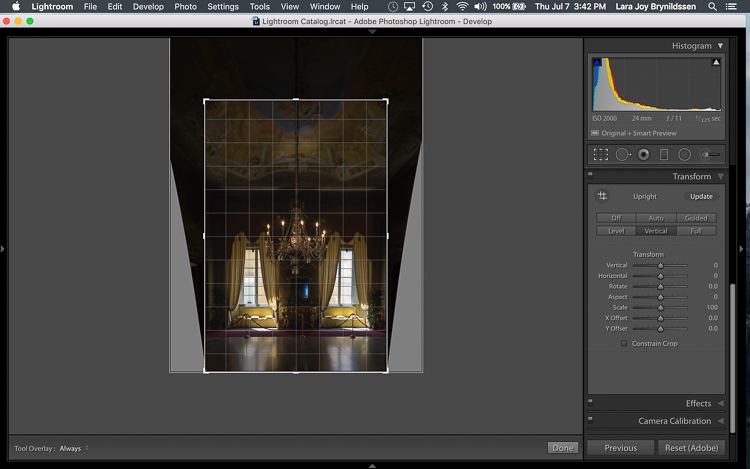
The white space can be eliminated, and the composition strengthened, by creatively using the Crop Tool in Lightroom. The next step is to adjust the composition with the Crop Tool by moving it around the image.
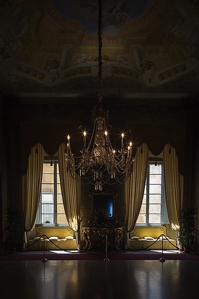
In this image, to eliminate all of the white space and direct the viewer’s focus to the chandelier and windows, grab the Crop Tool at the top centre point, and draw down. This eliminates both the unnecessary ceiling, and the white spaces on either side of the image.
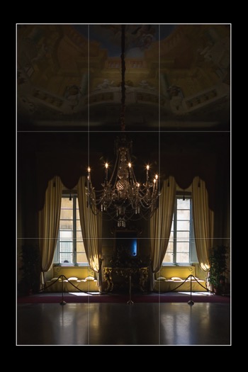
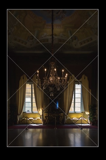
Now that the image is starting to look better, scroll through the Crop Tool overlays and review the newly cropped image to see which ones work. By reviewing your images with different Crop Tool overlays, you can strengthen your intuitive sense of strong composition.
To review each of the overlays, press the O (oh not zero)) key. You’ll toggle through the following:
- Rule of Thirds (below left)
- Diagonal (below right)
- Golden Triangle
- Golden Ratio (similar to the Rule of Thirds overlay)
- Golden Spiral
- Aspect Ratios
- Grid
In the example images above, both the Rule of Thirds and the Diagonal overlays clearly show that the composition is strong.
Here’s the final image (before correction is above left, after is on the right). Now let’s take a quick peek at one more image, and one more feature in Lightroom.
Flipping the Golden Spiral and Golden Triangle Overlays
You’ve probably toggled through the overlays and disregarded both the Golden Triangle and the Golden Spiral because they just never work. Unlike most of the overlays, neither the Golden Spiral nor the Golden Triangle is symmetrical. That means that you need to flip the overlays around a few times to find the orientation that aligns with your image. By pressing the Shift key and the O key at the same time, you can change the orientation of both the Golden Spiral and the Golden Triangle. Changing the orientation makes those overlays a lot more useful.
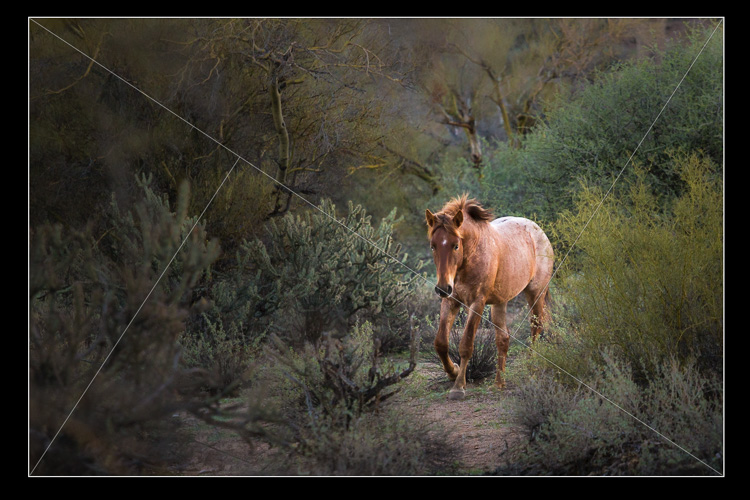
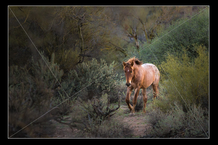
Here, in this image of a wild stallion (below), before flipping the Golden Triangle orientation, this overlay doesn’t work at all. Looking at it you might question whether or not the image had a strong enough composition to start with.
By pressing Shift plus the O key, and flipping the overlay orientation, the stallion fits neatly into his own triangle. His legs and nose are also no longer bisected by one of the diagonals. In addition, he’s positioned towards the back of the triangle. The top diagonal edge of the triangle that contains the stallion shows us that he is moving forward into the composition, towards the viewer, which is naturally pleasing to the eye. The other triangles neatly organize the foliage surrounding the stallion. Even the beam of sunlight highlighting the stallion falls within the main triangle, further confirming that this image is well composed.
With a little practice, some judicious use of the Transform tab and Crop Tool, you’ll master composition in no time. How do you use these tools to help you? Please share in the comments below.
googletag.cmd.push(function() {
tablet_slots.push( googletag.defineSlot( “/1005424/_dPSv4_tab-all-article-bottom_(300×250)”, [300, 250], “pb-ad-78623” ).addService( googletag.pubads() ) ); } );
googletag.cmd.push(function() {
mobile_slots.push( googletag.defineSlot( “/1005424/_dPSv4_mob-all-article-bottom_(300×250)”, [300, 250], “pb-ad-78158” ).addService( googletag.pubads() ) ); } );
The post Using Lightroom’s Transform and Crop Tools to Improve Composition by Lara Joy Brynildssen appeared first on Digital Photography School.
8 creative tips for shooting waterfalls
8 Tips For Shooting Waterfalls
Photographing waterfalls can be a tricky endeavor – especially when shooting in conditions where the light can change drastically depending upon the weather conditions. If you’ve ever struggled to get the waterfall shot you envisioned, you’ve come to the right place. This article will cover everything from basic tips to more advanced techniques to make shooting waterfalls a breeze.
Choose the Right Gear for the Job
The most important piece of gear that you will need beyond a camera and lens is a sturdy tripod. This is an absolute must when shooting longer exposures. Here’s a list of a few more important pieces of gear that will come in handy in the field:
- Tripod: Any time you’re shooting long exposures a tripod is a must
- Selection of lenses: I generally try to cover a focal range of 16mm to 300mm to give myself a number of options in the field
- ND filter: I typically don’t use ND filters as I generally shoot fairly short exposures, but they can come in handy depending upon the lighting conditions and the type of water texture you hope to achieve
- CPL: I always use a circular polarizer when shooting waterfalls as it can really help give the vegetation more ‘pop’ – the above image is an example of where a CPL can make big difference in terms of how the foliage appears in your photo and it can also help enhance the appearance of wet rocks and reflections in the water
- Remote Shutter Release: This isn’t a necessity but it certainly can make shooting waterfalls a bit easier
- Rocket Air Blaster and Lens Cleaning Cloths: Let’s face it; you’re going to get wet. Using these two products, plus a waterproof housing (or zip lock baggies) can help to keep your lens and camera dry while shooting
- Bag of Rice: You never know when disaster may strike, so I always bring a large bag or canister of rice with me in the event that my camera decides to take a dip
Shoot in Diffused Light
If you’ve ever tried to shoot a waterfall in direct sunlight then you’ll know how difficult it can be. Shooting with an ND filter can help to resolve some of these issues but shooting in diffused light is the best solution to the problem. When planning a waterfall shooting trip I always take a look at the weather forecast and check sunrise/sunset times before heading out to a location.
In general, I’ve found that shooting during the hours just after sunrise offers the best results as morning light can provide some impressive shooting conditions. The image you see here was shot about 3 hours after sunrise at Metlako Falls in the Columbia River Gorge, OR.
Choose the Shutter Speed
It seems like it was only a few years ago that using extremely slow shutter speeds while shooting waterfalls was all the rage, but lately I find myself using shorter shutter speeds to really capture the texture in the water. The rate at which the water is falling dictates how quick or slow of a shutter speed you will need to use when shooting in lower light conditions. To give you an idea, the above image (Panther Creek Falls, WA) was shot at a shutter speed of 1/4 second to freeze the water and capture some of the texture as it cascaded down the rock face.
Choosing a longer shutter speed will soften up the water a great deal and in some cases that’s just what the scene calls for. It really all comes down to personal taste. Experiment with the shutter speed while you’re out in the field – the more options you have the better!
Save the Foliage
If you’ve ever shot a waterfall on a breezy day you know that it’s nearly impossible to utilize slower shutter speeds while simultaneously ‘freezing’ the foliage in the frame. You almost always see motion blur in the vegetation surrounding the waterfall.
To solve this problem I always take at least two exposures: one for the waterfall at your favorite shutter speed to obtain the right amount of water texture, and an additional exposure taken at a much faster shutter speed to freeze the foliage in place. In the above example I blended two exposures together to get sharp foliage along with the amount of water movement I was trying to achieve with the longer exposure.
Choose Your Composition Carefully
Choosing a strong composition can be challenging when shooting waterfalls. Here are a few of the key guidelines that I follow when shooting images like the one you see above:
- Find a leading line or an ‘S’ to work with in your composition
- Let the water flow guide you to the focal point
- Shoot downstream of the waterfall to add depth
- Utilize rocks and other elements in the scene to guide your eye to the focal point
- Don’t be afraid to try out several variations – I always shoot at least 3 or 4 compositions at any given location
Think Outside of the Box
One of my favorite things to do while shooting waterfalls is to think outside of the box in regards to composition. Taking an abstract approach to shooting a waterfall can lead to some really fun results. Use different focal lengths and experiment with tighter compositions that may only show a small portion of the waterfall.
I always try to shoot at least a handful of abstract shots while I’m in the field because let’s face it: it’s just plain fun to get the creative juices flowing!
Adjust Your Exposure
Getting the exposure right can be a tricky business when shooting waterfalls. When using longer shutter speeds it’s very important to constantly meter your exposure to make sure that you aren’t losing detail in the water by clipping your highlights. Check the histogram to make sure that you are staying to the left or dead center in your exposure. As the light changes you will have to do this quite often so definitely keep an eye on it!
Provide a Sense of Scale
Waterfalls come in all shapes and sizes, but it’s often difficult to provide a sense of scale while shooting them. Adding a human element to your photo can really bring a whole new sense of wonder and scale to your image. Special thanks to Max Foster for snapping this photo of me at Spirit Falls, WA.
Share your own pictures in our Landscape and Travel photography forum
Articles: Digital Photography Review (dpreview.com)
Dazzling images from the Astronomy Photographer of the Year 2016 shortlist
Astronomy Photographer of the Year 2016 shortlist
Flash Point © Brad Goldpaint (USA)
The Perseid Meteor Shower shoots across the sky in the early hours of August 13, 2015, appearing to cascade from Mount Shasta in California, USA. The composite image features roughly 65 meteors captured by the photographer between 12:30am and 4:30am.
The Royal Museums Greenwich has announced the shortlist for its eighth annual Insight Astronomy Photographer of the Year competition. More than 4500 entries were received from over 80 countries; winners will be announced on September 15, with winning images going into a free exhibition at the Royal Observatory. One overall winner will walk away with £10,000, and runners-up will take home £500 each.
Here are just a handful of the more than 130 images that made the shortlist – head to the Royal Museums Greenwich site to learn more about the competition.
Astronomy Photographer of the Year 2016 shortlist
Seven Magic Points © Rune Engebø (Norway)
The rusty red swirls of the circular, iron sculpture Seven Magic Points in Brattebergan, Norway mirror the rippling aurora above.
Astronomy Photographer of the Year 2016 shortlist
Frozen Giant © Nicholas Roemmelt (Germany)
The celestial curve of the Milky Way joins with the light of a stargazer’s headlamp to form a monumental arch over the Cimon della Pella in the heart of the Dolomites mountain range in northeastern Italy.
Astronomy Photographer of the Year 2016 shortlist
M8: Lagoon Nebula © Ivan Eder (Hungary)
New stars are formed in the undulating clouds of M8, also commonly referred to as the Lagoon Nebula, situated some 5,000 light years from our planet.
Astronomy Photographer of the Year 2016 shortlist
Parallel Mountains © Sean Goebel (USA)
The shadow of Manua Kea, the highest peak in the state of Hawaii, is projected by the rising sun over the volcano, Hualalai, whilst the Full Moon soars above them, higher again.
Astronomy Photographer of the Year 2016 shortlist
Northern Lights over Jokulsarlon, Iceland © Giles Rocholl (UK)
A couple takes in the awe-inspiring sight of the Northern Lights streaking across the night sky over the lagoon at Jokulsarlon, Iceland on Valentine’s night of 2016.
Astronomy Photographer of the Year 2016 shortlist
Just Missed the Bullseye © Scott Carnie-Bronca (Australia)
The International Space Station (ISS) appears to pierce a path across the radiant, concentric star trails seemingly spinning over the silhouettes of the trees in Harrogate, South Australia.
Astronomy Photographer of the Year 2016 shortlist
Painted Hills © Nicholas Roemmelt (Germany)
With very little light pollution, the glimmering stars of the Milky Way bathe the colourful layers of the Painted Hills of Oregon in a natural glow.
Astronomy Photographer of the Year 2016 shortlist
Antarctic Space Station © Richard Inman (UK)
A view of the Halley 6 Research Station situated on the Brunt Ice Shelf, Antarctica, which is believed to be the closest thing you can get to living in space without leaving Earth, making it perfect to be used for research by the European Space Agency. As the Sun’s light dissipates into the horizon, the aurora can be seen swirling overhead.
Articles: Digital Photography Review (dpreview.com)

Weekly Photography Challenge – Speed
Earlier I shared a collection of images that show speedy subjects.
Weekly Photography Challenge – Speed
Your job this week is to find and photograph a subject that is fast. Try and capture speed in whichever way you want – freeze it or blur it. Remember shutter speed controls motion in your image.
Share your images below:
Simply upload your shot into the comment field (look for the little camera icon in the Disqus comments section) and they’ll get embedded for us all to see or if you’d prefer upload them to your favourite photo sharing site and leave the link to them. Show me your best images in this week’s challenge. Sometimes it takes a while for an image to appear so be patient and try not to post the same image twice.

googletag.cmd.push(function() {
tablet_slots.push( googletag.defineSlot( “/1005424/_dPSv4_tab-all-article-bottom_(300×250)”, [300, 250], “pb-ad-78623” ).addService( googletag.pubads() ) ); } );
googletag.cmd.push(function() {
mobile_slots.push( googletag.defineSlot( “/1005424/_dPSv4_mob-all-article-bottom_(300×250)”, [300, 250], “pb-ad-78158” ).addService( googletag.pubads() ) ); } );
The post Weekly Photography Challenge – Speed by Darlene Hildebrandt appeared first on Digital Photography School.
You must be logged in to post a comment.