RSS
 

Archive for April, 2018

Composition Checklist for Beginners

30 Apr

At a recent meetup with several photographers, during a discussion on composition, one of the beginners commented: “Why isn’t there a composition checklist for all the things we need to think about?” It was a good question and was the inspiration that prompted this article.

It’s not about the gear

You can have the most expensive camera gear and the most amazing light. You could be in a fabulous scenic location, or shooting a stunning model. There are many situations that might provide you with the opportunity to shoot breathtaking images, but if the composition is not spot on, then it doesn’t matter how fancy or expensive your gear is.

Composition Checklist for Beginners - flower blooming

The reverse is true also, you can craft amazing images with beginner grade gear (even your cell phone) if your understanding of composition is good. When you know the rules and guidelines, can work them to your advantage, and even push the barriers and be really creative. No one will care what gear you used to get the shot, they will go “Wow, you must have an amazing camera!”

Learn the composition basics

Even though there are many different kinds of photography, whether you do street, landscapes, macro, studio or anything else, there are a lot of basic composition concepts that apply. Not every concept will need to be considered for every image but having a good understanding of the basics will get you a long way.

Truly understanding composition was one of the major steps in my photography making a big step up in improvement. Like every new idea, you have to put some effort into learning the idea, practicing, learning from your mistakes and practicing again and again. When you can frame up a well-composed shot without consciously thinking about what you are doing and why then you can really start to think about new ways to frame and shape your images.

First, you have to master the basics.

roller derby - Composition Checklist for Beginners

Getting Started

First of all, these are not rules. While there are some guidelines you should consider when creating an aesthetically pleasing image, it is entirely possible to ignore them all and still make a stunning image. It is, however, a lot easier to do that when you know what the guidelines are first. So this is a list of concepts you should consider for each image, not rules you absolutely have to follow.

Some things are easy and obvious, or so you might think. Yet the number of images with noticeably crooked horizons you see posted online is a testament to the fact that this stuff is not always obvious, and is hard to learn. Be kind to yourself and take it in stages. Maybe even write your list down and carry it in your camera bag as a handy reminder.

Also, every image will have different elements in it, and different concepts will apply. So pick and choose the ones that work for you and the scene in front of you. As an example, there are things you would do when framing up a landscape that won’t apply when shooting street photography shots.

So be sensible, pick a few that make sense to you or that apply to the way you shoot. Then practice them until it’s like breathing – it just happens automatically when you pick up the camera and frame a shot. When you get to that stage, add some more concepts to your process, and absorb those the same way.

Composition Checklist

So here is the checklist of things to look for in your composition as a starting point.

  1. Is the horizon straight?
  2. Is the subject strong and obvious within the image?
  3. Are the edges of the frame clean? Is anything poking into the frame that distract the viewer? Are there elements of the image that lead the eye out of the frame that could be positioned better?
  4. Is the background clean – are there distracting elements like a car parked in the background, or a fence or a house that doesn’t fit? Can you move or change the angle to remove that element?
  5. Is the foreground tidy? Are you shooting a landscape or natural scene where there might be branches or leaves or twigs in the foreground that could be tidied away?
  6. The position of people in the shot. Do they have a lamp post or a tree growing out of the top of their head? Have you chopped heads, feet, arms, or legs off?
  7. Eye contact – when shooting a group of people, do we have eye contact with all your subjects?
  8. Camera position – are you at the right height/angle for the best composition?
  9. Point of focus – when taking photos of people/creatures/animals have you focused on the eye? Do you have a catchlight in the eye?
  10. Is the Rule of Thirds being used effectively?
  11. Do you have a sense of scale – particularly valid for large landscape scenes?
  12. How does the eye travel around the image? Where does it go first? Where does it end up? Is that the story you want to tell the viewer?
  13. Lens choice – does the lens you are using affect the composition in a positive or negative way? Would a different lens be worth considering?
  14. Less is more – what truly needs to be in the frame? What can you leave out?
  15. Is it sharp? Do you want it to be?

Considering Composition in More Detail

#1 – Is the horizon straight?

It would seem fairly easy to notice if the horizon is straight when you are taking a shot. It is also extremely easy to fix in post-processing, yet so many images are posted online that have crooked horizons, varying from a little bit to quite a lot. Our brains automatically hiccup when they encounter it, so it is a genuine composition issue that needs to be resolved.

You can take the time to set the camera up so it is completely level. When shooting a panorama, timelapse, video and similar things, it is worth the extra effort. For general purpose use, it can be easily edited in post-production.

tilted horizon example - Composition Checklist for Beginners

The horizon is about 3 degrees tilted down to the left – just enough to make your brain twitch.

#2 – Is the subject strong and obvious within the image?

There are some composition concepts that are fairly straightforward and obvious, like point #1 above. Then there are some that are more open to interpretation.

This point could be considered one of those things. However, I then propose this question to you. If the subject is not strong or obvious then how do we know what the point of your image is?

Composition Checklist for Beginners - green garden image

There are a lot of competing elements in this image, where do we start?

#3 – Are the edges of the frame clean?

Are there things poking into the frame that distract the viewer? Look for elements in the image which lead your eye out of the frame. Could they be positioned better?

Running your eye around the edge of the frame when composing your shot is a valuable step that can save you a lot of time. This is one lesson I personally had to learn the hard way and it applies to most general styles of photography.

Are there things poking into the frame from outside it that impose themselves on the image and distract the viewer? Are there blurry elements in the foreground that you could move or change your point of view to reduce their impact? Is there half a car or a building partially visible in the background perhaps?

Quite often when you are framing a shot, you are focused so intently on the subject, that you may neglect to see the whole image. So you may miss these extra details that can make or break the shot.

purple flower - Composition Checklist for Beginners

The extra leaf and bud in the top left corner are distracting.

#4 – Is the background clean?

Are there distracting elements like a car parked in the background, or a fence or a house that doesn’t fit? Can you move or change the camera angle to eliminate that element from the image?

This is an extra step on top of point #3 above – putting more effort into assessing the background.

Are you taking a nice landscape and there is a farm shed clearly visible? Perhaps there is a truck parked in the distance or a vehicle on the road you need to wait to move out of frame. Are the colors harmonious? Is the sky doing nice things? Is the sun a bit too bright in the clouds?

colonial mansion - Composition Checklist for Beginners

This lovely colonial mansion had a very modern hospital and school behind it and was difficult to frame it up to reduce those jarring elements.

#5 – Is the foreground tidy?

Are you shooting a landscape or natural scene? Are there branches, leaves, or twigs in the foreground that could be tidied away?

This is particularly relevant in nature and landscape photography, but still worth remembering in general.

Is what you have in the foreground adding to the image or distracting from the subject? Is there rubbish or stuff on the ground that looks messy? Are there twigs too close to the lens so they are blurry? Can you move any branches or things out of the way or do you need to change the angle of shooting instead?

Composition Checklist for Beginners - red mushroom

Look at all the mess of cones and twigs in the foreground, all blurry and untidy.

#6 – The position of people or the subject

Do any people in your image have lamp posts or a tree growing out of the top of their heads? Have you chopped heads, feet, arms, or legs off awkwardly?

Often a problem for posed outdoor shots, this is essentially a specific element of point #3 above – checking the background in relation to your subjects.

Is the camera straight, is the angle flattering? Are people squinting into the sun? Is the lighting good? Do you have all their body parts within the frame? Is everyone looking in the same direction or interacting in the desired manner?

cat photo - Composition Checklist for Beginners

His eyes are sharp but I cut his front paws off, not good.

#7 – Eye contact

When shooting a group of people, do we have eye contact with all the subjects?

Quite often when shooting people they will generally be looking at the camera. However, if some are and some are not, it has a weird kind of dissonance to the viewer. So make sure you have some way of engaging the people so they look at you and take several shots.

If worst comes to worst you can work some Photoshop magic to blend a few frames together if it’s a critical image.

Composition Checklist for Beginners

Notice they are not all looking at the camera.

#8 – Camera position

Are you at the right height and camera angle for the best composition?

Being at eye level with your subject makes a big difference to the feel of an image. When photographing people, the camera angle does have an effect on how flattering the shot might be to the subject.

You may want to push some creative boundaries and do something different for a particular scene. Street photography is one genre where the height and angle can directly impact the story you are telling.

On average most people tend to stand and shoot from that position, but what if you get down really low?  What if you find some stairs or some way to get higher up?  What if you shoot straight down on top of your subject rather than side on?

Start to think more creatively about how you use composition to evoke a mood or tell a story about a scene.

white swan - Composition Checklist for Beginners

This image works because I was flat on the shore at a similar height to the swan. Had I been standing you would not have seen the wonderful curve in the bird’s neck.

#9 – Point of focus

When taking photos of people, creatures or animals have you focused on their eyes? Do you have catchlight in the eyes?

If you have a subject with eyes in the image that is looking at the camera it is important to have the focus point on the eye. Faces of people, birds, and animals are very dimensional and it can be easy to get the focus point on the tip of the nose or forehead or somewhere else. So if you have a living creature looking at your camera, focus on their eye.

Another trick to make them look alive and engaged is to angle your shot so that there is some light reflected off the dark iris. This is called a catchlight and is important especially for animals and birds that have large dark eyes. Fashion photographers use fancy round beauty dish lights to give a distinctive ring effect in their shots.

Composition Checklist for Beginners - cat photo

The nose is sharp but the eyes are just a bit out of focus which is not desirable.

#10 – Is the Rule of Thirds being used?

While the Rule of Thirds is more of a guideline than a hard and fast rule, it is a good one for a beginner to take on board. It is easy to remember and does help you create a more dynamic and interesting image when used well.

So if you intend on using it, add it to your mental checklist.

birds - Composition Checklist for Beginners

The subject in this image is more or less in the middle, but if you crop it to use Rule of Thirds the image doesn’t work as well.

#11 – Do you have a sense of scale in your landscape scenes?

Big mountain vistas are lovely. But sometimes they can become bland and uninteresting because they lack a sense of scale to truly appreciate them.

One recommendation is that a foreground element can be used to both ground the image and provide scale for the big vista behind it. Some photographers like to use themselves as a prop to help add scale as well.

Composition Checklist for Beginners - man in landscape scene

#12 – How does the eye travel around the image?

Where does your eye go first? Where does it end up? Is that the story you want to tell the viewer?

What do you have in the image to engage the eye? Are there different elements or points the eye can travel around? Does it have contrast? Are there elements that lead the eye out of the image? Are there elements that lead the eye into or around an image?

spider web in a tree - Composition Checklist for Beginners

#13 – Lens choice

Does the lens you are using affect the composition in a positive or negative way? Would a different lens be worth considering?

This can cross the boundary between a technical consideration and a creative one. Sometimes there may be a valid reason to use a specific lens, a faraway subject likely to fly away demands the use of a long lens. A tiny flower might be better shot with a macro lens. Telephoto lenses compress the elements in an image, making them seem closer together. Wide angle lenses create a lot of distortion around the edges, especially at minimal focal lengths.

Beyond that are the creative choices. Yes, you could shoot the front of this house with a wide focal length, but what if you put a zoom on and highlighted the fancy door knocker or handle? Is the lens you are using giving a flattering look to the person you are shooting?

Composition Checklist for Beginners - large eagle wings spread

A different lens would have allowed me to zoom out far enough to get this entire bird in the frame *sigh*.

#14 – Less is more

What truly needs to be in the frame? What can you leave out?

A mistake a lot of beginners make is to include too many elements in an image. It can be cluttered, messy, and confusing as to the point of the image.

Sometimes that can be used to advantage in things like street photography, but usually, less is more. A strong obvious subject and minimal distraction around it is a very aesthetically pleasing combination but it can be difficult to learn how to frame images up this way.

Composition Checklist for Beginners - landscape scene

So much going on here, its a bit overwhelming with no clear subject. It’s a pretty scene but is the composition effective?

#15 – Is the image sharp?

Do you want it to be? Not every image need to be 100% sharp. You can use aperture to creative effect by selecting a narrow depth of field. ICM or Intentional Camera Movement adds blur and movement as well. Use of specialty lenses like those from Lensbaby gives you many different ways to add soft focus or special effects to enhance your image.

Many street shots have blurred movement and creative focus elements, either the photographer or the subject (or both) may be moving.

Some people insist that images be absolutely as sharp as they can be, but that is a creative choice up to you, the photographer.

Composition Checklist for Beginners - motion blur from moving water

A bit of slow shutter speed on the waves for a soft creative swirl effect.

Summary

Some of the items on the checklist are basic sensible things that apply to most images. Some are more advanced technical considerations. Others may only apply if you are considering trying some more creative approaches to your composition

There are many other specific technical concepts that are not covered in this composition checklist. When you are ready for them, you can find plenty of information here on dPS to guide you.

This list is designed to cover the most basic ideas and thoughts that a beginner might need to keep in mind when first starting to think about properly composing and framing up their images. Good news, if you have made the step to start making your images with deliberate intention, that means you already have your feet on the path to becoming a better photographer.

Pick a few key items from this composition checklist that apply to your style of photography and try to remember them deliberately everytime you shoot. Eventually, it will become so automatic, you adjust for them without thinking, your mental muscle memory will have kicked in.

Are there any key concepts you feel should be included in this list?  By all means, let me know in the comments below.

The post Composition Checklist for Beginners appeared first on Digital Photography School.


Digital Photography School

 
Comments Off on Composition Checklist for Beginners

Posted in Photography


Tips for Converting an Old Camera for Shooting Infrared Photography

30 Apr

A few years ago I become friends with a guy who likes dong infrared photography. It was something that I had tried when I was shooting film, but never quite figured out. My friend had converted an old camera of his and it seemed like a good idea. At the time, I had two old cameras and thought perhaps I could use one of them for infrared. However, the price was too high then.

Tips for Converting an Old Camera for Shooting Infrared Photography

Port Arthur and the main Penitentiary looks a lot better in infrared.

Move forward to a few years, and after buying a second-hand camera from a friend, I found myself in the same position. I had two extra camera bodies, so why not convert one to infrared.

You can do this by putting a filter on the end of the lens, but from searching around for information, getting the camera converted specifically for infrared seemed like a better alternative.

What is infrared photography

Perhaps before going any further, it might be good to get an understanding of what infrared photography is actually all about.

Infrared photography is the capture of part of the spectrum of light that is invisible to the naked human eye. Infrared light is at the top end of the spectrum and is not visible to the eye, so to capture it with a camera some special techniques and equipment are required.

It isn’t an easy concept to understand, but once you get out there and start doing it, you will figure out what works and what doesn’t.

Tips for Converting an Old Camera for Shooting Infrared Photography

Late winter at Alowyn Gardens. It never snows here, but the infrared camera makes it look like it had.

Different ways of doing infrared

As with most types of photography, there are various ways to go about it. Infrared photography is no different.

Computer conversion to infrared

You can find ways to do infrared conversions on the computer. There are processes that you can use that will help give you that infrared look, however, it is just a look and won’t be the same as doing it with filters or a dedicated camera. If you are curious, though, you could try this first before investing any extra money into it.

 Filters

leannecole-infrared-photography-0200

Alowyn Gardens again, looking again like winter and snow, or perhaps a frost.

There are filters that you can get to put on your lens that will help you to get infrared-style images. These will let the IR light through to your sensor. The advantage is that you don’t have to give up a camera body to do this. I’ve never tried them, so I can’t comment on how good they are or are not.

Camera

One thing a lot of photographers who love this kind of photography do is to get one of their cameras converted to be dedicated just for doing infrared photography. Some do this themselves, or you can take it to camera repair place to do it for you.

I took mine to a place to get the infrared conversion done. I’m always wary of playing around with the sensor. They have to remove the filter that comes with the camera and replace it with one that will let through the infrared light, and block all visible light.

Tips for Converting an Old Camera for Shooting Infrared Photography

Late winter at Alowyn Gardens. It never snows here, but the infrared camera can give it that look.

Choosing which sensor filter

You do have to choose which filter you want and some places will give you many choices. Where I sent my camera there were only two options.

The first choice is the 720nm filter. This will give you close to a full infrared effect, but it will allow you to put some color into your images. The second is the 850nm which would give you very rich dark blacks and perfect if all you want to do is black and white infrared.

For me the choice was easy, I wanted to get some of that color. Not all the time, but it was important to have a choice, so I went with the 720nm filter.

Tips for Converting an Old Camera for Shooting Infrared Photography - color infrared image

The 720nm sensor filter allows you to get some color, like having a blue sky.

What to photograph in infrared

Like any type of photography, you can photograph anything with an infrared camera or one with a special filter. However, not everything will have the same effect or give you great results. You really need to experiment with it to see what will work.

People

Portraits can be quite weird, and the infrared light does strange things to the skin and facial features. The hair can look funny too and the lips almost disappear. I don’t know that many people would enjoy getting their portrait done this way. Perhaps for a special event or something, maybe. Who knows.

infrared portrait - Tips for Converting an Old Camera for Shooting Infrared Photography

The infrared camera gives Chris a completely different look.

Trees and nature – give your scene the look of winter

Trees are fantastic for this type of photography. All the leaves come out looking white. The more moisture the leaves have the whiter they are in the image. The gum trees in Australia don’t have quite the same effect as trees that are not indigenous to the area.

It makes photographing in rain forests pointless as everything shows up as white and doesn’t have the same effect as it does with a color image. It’s hard to see any definition between the plants.

Tips for Converting an Old Camera for Shooting Infrared Photography - b/w of trees and forest in IR

Australian natives are a little different with infrared photography.

One thing I found was that dead trees looked amazing in infrared. If you photograph them surrounded by lots of other trees, or on their own you would get a very different look. They stand out with an elegance that color photography just doesn’t give them.

When traveling around Tasmania with my infrared converted camera I was looking for dead trees everywhere.

dead trees in IR b/w - Tips for Converting an Old Camera for Shooting Infrared Photography

Dead trees on the side of the road in Tasmania.

Architecture

One of the first times using the camera was in the city of Melbourne. I just walked around and took photos of the buildings and streets to see what could be captured in infrared.

The images were disappointing. Once converted to black and white they didn’t look any different than other images done with a normal camera. They did have a quality that gave them an antique look, but other than that there was no discernable differences.

b/w IR architecture - Tips for Converting an Old Camera for Shooting Infrared Photography

St Paul’s Cathedral in Melbourne, it looks like any black and white image, though taken with the infrared camera.

While on that same trip to Tasmania there did seem to be some buildings that were really suited  to infrared, like some old sandstone structures. Places like Port Arthur, where all of the buildings are made of stone, came out looking really good with the camera.

When visiting Port Arthur I took images with the infrared camera and the normal one. Once the photos were on the computer it seemed clear that the ones done with the special camera were by far more interesting. Many of the images were processed, some hand colored and then published on social media. The color images of the same subjects were boring in comparison.

Processing

All the images taken with the infrared camera need to be processed. You may find the sepia quality of the images quite good, but there is so much you can do to them. You can convert straight to black and white or play around with the white balance to get some color in the images.

hand colored IR image of a church - Tips for Converting an Old Camera for Shooting Infrared Photography

A small church in Tasmania, the sky was made blue because of the filter and the stone was hand colored on the computer later.

Experimenting

Really, this is what photography is all about. Get out there with your camera to see what you can capture, what will work, and what doesn’t. Each subject will look different with infrared photography, but you should try every type of photography you can think of to take images and then review your results.

Right now, I’m experimenting with a red filter on the lens. The images are interesting, but I need to try it a lot more.

Tips for Converting an Old Camera for Shooting Infrared Photography

Cascade Brewery is an old sandstone building that came out well. In the background, you can see the snow on Mount Wellington.

Finally

While it can be an expensive exercise converting a camera to infrared, if you have an old body lying around, then you might want to consider it. You can do a lot of experimenting with it and you will likely not regret getting it done.

If you like the look of this sort of photography, then there are also other options. It is amazing how much the world can change with infrared and it is a great way to add something different to your portfolio.

The post Tips for Converting an Old Camera for Shooting Infrared Photography appeared first on Digital Photography School.


Digital Photography School

 
Comments Off on Tips for Converting an Old Camera for Shooting Infrared Photography

Posted in Photography


Hex Raven DSLR Bag Review

29 Apr

Hex Raven DSLR Bag
$ 239.95 | HexBrand.com

Finding a backpack that doesn’t scream “I’m a camera bag,” but can still hold all of my gear while not killing my back has long been a struggle for me. I’m 5’3″ and most backpacks that can hold a lot of equipment are impossible for me to carry for any extended period of time. Living in a city, typically when I head out for an assignment close to home I’ll opt to bring less gear so that it will fit into a smaller, understated backpack. But for assignments that require more gear or travel, a smaller bag just won’t cut it.

The design looks different than your typical padded camera backpack

That’s why I was immediately intrigued by the Hex Raven DSLR bag – although I had never heard of the company before – as the design looks different than your typical padded camera backpack. The Hex’s square shape and matte black material were particularly appealing to me. It also looked like it could hold a ton of equipment – a very good thing considering I’d be spending a week in Austin, Texas covering SXSW and a short time later a week on the road touring with a band from Brooklyn. I knew that my typical one body, two lens, one speedlight setup just wasn’t going to cut it for these two jobs.

Specifications

  • Exterior: 20 x 12 x 8in / 50 x 30.5 x 20cm
  • Interior: 20 x 12 x 4in / 50 x 30.5 x 10cm
  • Laptop Compartment: 20 x 12 x 3in / 50 x 30.5 x 8cm
  • Weight: 5lbs / 2.3kg

Design & Construction

The Hex Raven DSLR bag’s exterior is made of matte black tarpaulin with waterproof zippers. The straps are thick, air-mesh padded. The front of the bag has two compartments. The top one is accessed by undoing the buckles. Beneath the flap is a zippered compartment that is fleece-lined and can hold up to a 17″ laptop as well as a small tablet. This section of the Hex is easily accessed, making it convenient to remove these larger items in the rush to get through airport security.

Top front storage

Undoing the bag’s buckles reveals a zippered compartment that offers a fleece-lined laptop sleeve and separate space for a tablet.

Lower front storage

There are two lower zippered pockets. The main space offers room to organize and store items you might want quick access to.

There are two zippered areas on the lower front of the bag, which are great for stashing keys, pens, notebooks, spare batteries or memory cards.

On the right side of the bag you’ll find two more small flat zippered pockets, which are fairly easy to access when the thing is on your back – they’re great for holding any odds and ends that you might need such as chapstick, business cards, a small wallet or your phone. On the opposite side of the bag there are straps to attach a tripod.

You can attach a tripod to the side of the backpack using the two straps. The opposite side has two very small zippered pockets.

Camera equipment is accessed through the bag’s back panel which is made of EVA foam and air-mesh. The back panel zips along three sides of the bag. The inside features padded partitions that are customizable depending on the amount of gear inside. There are also two zippered back pockets and a velcro pouch on the inside for even more storage options.

This bag features ample storage, has the ability to hold a ton of gear and its construction feels like it can handle life on the road while keeping your camera equipment safe. The zippers on the Hex bag were a little stiff right out of the box, but after a few weeks of use that stiffness has disappeared—I no longer feel like I have to fight with the Hex bag to access my gear.

A zipper on the very top of the Hex bag makes it easy to access your primary camera without having to open the main gear section.

Although the bag was quite flat when it was empty as I filled it up with my equipment to prepare for my trip to Austin I became skeptical—I wasn’t sure whether its bulk would become overwhelming.

In Use

I was thoroughly impressed by the amount of gear I was able to fit into the Hex: two bodies (a Canon 5D IV and a 5D III), four lenses (35mm, 50mm, 24-70mm and a 70-200mm), a speedlight, an LED on camera light, four batteries, two chargers, a point and shoot film camera, portable HD, a laptop, a laptop charger and an iPad. That being said, as I prepared to head to the airport and catch my flight to Austin I wasn’t sure that the monster would actually be able to fit under my seat (fully loaded the Hex was almost as large as my carry on roller bag).

The bag distributed the weight quite nicely

Although the Hex was certainly heavy with all of this gear, the bag distributed the weight quite nicely. Like many photographers, I’m used to feeling an acute amount of shoulder pain while carrying gear around; I didn’t notice this with the Hex bag.

The various storage options within the bag also made it easy to access the pieces of gear I needed, both while going through security and while waiting for my flight – without pulling everything out. Although getting the Hex under the seat in front of me (really my biggest concern in using the bag as a carry on for my flight) was a bit of a struggle, it wasn’t impossible. However, someone with longer legs might find the situation untenable. Here, the amount of individual storage spaces within the bag also made a big difference, as it was easy to grab what I wanted when I wanted it without unpacking the whole thing.

The Hex was great for safely and comfortably transporting and later storing large amounts of valuable camera equipment

Although having a bag with room for so many lenses and a backup body is a plus, realistically the Hex is just too oversized to make sense in the small music venues bands play during SXSW or a cramped photo pit at a larger show—but the Hex was great for safely and comfortably transporting and later storing large amounts of valuable camera equipment while I was traveling.

A few weeks later I was prepping to hit the road for a week with a touring band from Brooklyn. My gear storage needs were more or less the same but because we would be traveling by van, space was limited. My photo gear needed to take up way less space than the band’s gear, but still be easy to access so I could edit as we drove from city to city.

Its shape and style don’t make it immediately clear that it’s a camera bag

Although the Hex was still too bulky to be a good fit for inside the small venues where the band was playing, its non-descript look made me feel okay about leaving it inside the locked van in numerous cities with my back up equipment still inside. Its shape and style don’t make it immediately clear that it’s a camera bag, which I’d like to think makes it a little less of a target.

Bottom Line

The Hex Raven is well designed and feels like it is built to last. The amount of pockets make it easy to organize a large amount of equipment, and they’re functional when it comes to finding specific items in a hurry. It’s certainly a little pricey for a camera backpack, but considering the sheer amount of gear that it can accommodate, its durable construction and the classy design, it seems worth the price tag.

I would be interested in checking out a scaled-down version of the Hex for day-to-day use.

Although the bag is too bulky to be good for everyday use, as a travel bag I appreciate its understated design, storage options and the way in which it evenly distributed weight. I would certainly be interested in checking out a scaled-down version of the Hex for day-to-day use.

What We Like:

  • Ample organizational pockets for camera equipment and other odds and end
  • Understated design
  • Doesn’t scream ‘camera bag’
  • Padded shoulder straps + good weight distribution
  • Durable construction
  • Good travel bag

What We Don’t Like:

  • High price for a camera backpack
  • Not great for everyday use
  • On the bulky side when fully loaded with gear

Articles: Digital Photography Review (dpreview.com)

 
Comments Off on Hex Raven DSLR Bag Review

Posted in Uncategorized


The Highs and Lows of ISO and How to Use it to Your Best Advantage

29 Apr

Treating ISO as the foundation of the exposure triangle and only adjusting it when you really need to will help you produce more consistently creative photographs.

Asian woman taking a photo - all about ISO

ISO 100 (allowing a wide aperture setting).

ISO stands for International Standards Organization, which does not really help you understand what it is. But it does indicate the standard is international and it is constant across all brands and types of cameras.

The ISO is the measurement of how responsive your camera’s sensor is to light. The lower the numeric value, the less responsive, the higher the value, the more responsive.

Editor’s note: ISO is actually much more complicated than that but for purposes of this article, this is generally considered the easiest explanation of ISO to understand, especially for beginners. 

Close up of twp people holding DSLR cameras - ISO settings

ISO 400

Low ISO

Choosing a low ISO setting, say less than 400, is best when there’s a lot of light or when you have a tripod and the style of photograph you want to make allows you to use a long exposure. When the ISO setting is low, the sensor is less responsive to light, so, therefore, it requires more light to create a well-exposed photograph.

Using a low ISO setting will result in better technical quality photos generally. There will be little or no digital noise, the colors and contrast in your images will be better.

Woman standing in a fresh market holding vegetables - ISO 100

ISO 100 allowing for a slow shutter speed in bright light. My friend was standing very still and my camera was on a tripod.

High ISO

Choosing a higher ISO setting is best when the light is low or you are not able to make a long exposure. Higher ISO setting means your camera’s sensor is more responsive to light, so it needs less light to reach the sensor to create a well-exposed photograph.

It also means the technical quality of your images may be affected by digital noise, colors may be less vibrant and overall image contrast is flatter. How much, depends on how high you have your ISO setting and your camera model.

Sensor technology is rapidly changing and, if you have a newer, higher-end model of camera you can more confidently choose to make photos at higher ISO settings than with older, lower-quality cameras.

Sky lanterns being released in Chiang Mai during Yee Ping festival - high ISO

ISO 6400. Allowing a fast enough shutter speed to avoid motion blur in the lantern in low lighting conditions.

When and Why to Adjust the ISO

Unlike shutter speed and aperture settings, the ISO setting has no direct creative impact on your photographs. If you think the inclusion of obvious digital noise in an image mimics a creative value similar to film grain I suggest you do some more serious study on the matter.

Adjusting the ISO can assist you to achieve the shutter speed and/or aperture settings you desire to create the style of photograph you have in mind.

Street scene at night in Thailand - ISO

ISO 100 allowing a very slow shutter speed (long exposure).

ISO and Aperture Creativity

If you are wanting to blur a background using a wide aperture setting when the light is bright, you will need to adjust your ISO to one of the lowest settings to accomplish this. If you were to use a high ISO setting you may not be able to obtain a good exposure with a wide enough aperture setting, so your background will not be as soft looking as you want it to be.

Asian woman portrait - ISO

ISO 160 allowing a wide aperture setting to achieve a blurred background.

Alternatively, if you want to create an image where everything in your composition is in sharp focus, it is best to choose a higher ISO, especially when the light is not so bright. By choosing a higher ISO you will be able to set your aperture to a higher f-stop number and achieve a greater depth of field than if your camera were set to a lower ISO value.

ISO and Shutter Speed Creativity

Choosing a low ISO can assist you in achieving a slow shutter speed when you want to create a photograph incorporating some motion blur. If you are photographing a moving subject, like a waterfall, and wish capture a lovely silky effect in the water, you will need to use a slow shutter speed.

This is easier to do when your ISO setting is low.

Mae Ya Waterfall - low ISO

ISO 50 on a bright day to set the shutter speed slow enough to capture motion blur in the water.

Freezing action by using a fast shutter speed will often require you to choose a higher ISO setting, especially if the light is not so bright. Being able to adjust your shutter speed so that is will render a fast moving subject as though it’s frozen in time will often mean balancing your exposure with a higher ISO.

Auto ISO

If you are comfortable with having your camera in control of your exposure, then Auto ISO is a good option to consider. If you set your ISO to Auto as you adjust your aperture and/or shutter speed settings, the ISO will modify itself to make an exposure the camera finds appropriate.

Night time photo of Chedi Luang Thailand - ISO 800

ISO 800

If you do choose to work with Auto ISO, I recommend you do some testing first to discover what maximum ISO setting you are comfortable with for your camera.

To do this, take a series of photos of the same subject in the same lighting conditions and double your ISO setting each time. Then compare all the photos (look at them close-up and full image) and find the ISO setting for the image you are comfortable with, the one just before you see too much digital noise.

Editor’s note: Try not to overly pixel-peep. By looking at your images at 100% on your computer screen you will not get a true feeling for the amount of noise which will be visible at a normal viewing distance. 

Many cameras have a means to set a maximum when using Auto ISO. So you can now set this to the number you determined with the test above.

Practical Conclusions

Three Asian woman review an image on a DSLR monitor - ISO

ISO 320

Adjusting your ISO setting is generally only necessary when you want to achieve a specific effect or when the light conditions change.

When we do our photography workshops we always make sure to choose some locations which are outdoors and some which are indoors. This gives us the opportunity to demonstrate when it’s good to make an adjustment to the ISO setting.

Thai Wood Carver - ISO

ISO 2000 allows for a shutter speed fast enough to freeze the action in this low light setting.

If you are photographing outdoors on a bright day, your ISO setting will most likely be between ISO 100 and ISO 400. If you go inside, especially to a dimly lit building with few windows, you may find yourself struggling to obtain a good exposure with a fast enough shutter speed if you are only adjusting your aperture and shutter speed settings.

By adjusting your ISO so your camera’s sensor becomes more responsive in the low light you will be more flexible and capable of being more creative with your camera.

?

The post The Highs and Lows of ISO and How to Use it to Your Best Advantage appeared first on Digital Photography School.


Digital Photography School

 
Comments Off on The Highs and Lows of ISO and How to Use it to Your Best Advantage

Posted in Photography


Chris and Jordan of Camera Store TV are coming to DPReview!

29 Apr

We’re very pleased to announce that Chris Niccolls and Jordan Drake of The Camera Store TV are coming to DPReview! Over the past eight years, Chris and Jordan have grown The Camera Store TV into one of the best general interest photography channels on YouTube, with a mixture of entertaining and educational content that covers everything from the latest cameras to how not to carry your camera bag.

We’ve admired what Chris and Jordan do for a long time, and we’ve been trying to find ways of working with them for almost as long. So we’re very pleased to announce that as of April 28th, they’re leaving their old gig behind and coming to work for us. Why would they want to do that? In Chris’s words:

“DPReview is synonymous with editorial integrity, and technical accuracy of the highest degree. Jordan and I are excited to combine our expertise and on-screen personalities with the in-depth knowledge and integrity that DPReview is known for”.

They’re not moving to Seattle (that was a little too much to ask) but as of today Chris and Jordan will be creating new videos under the DPReview brand, and we’ll be uploading them to our own YouTube channel on a weekly basis. As well as the entertaining features that Camera Store TV has always been known for, Chris and Jordan will be working with us to create videos that complement our own long-form product reviews.

We hope you’re as excited as we are to welcome to Chris and Jordan to DPReview.

Subscribe to our YouTube channel to get new episodes every week

Articles: Digital Photography Review (dpreview.com)

 
Comments Off on Chris and Jordan of Camera Store TV are coming to DPReview!

Posted in Uncategorized


DPReview TV Episode 1: Sony a7 III review

29 Apr

It’s official – we’ve joined forces with Chris Niccolls and Jordan Drake, formerly of The Camera Store TV, to bring you an all-new video series. To kick off the series, they take an in-depth look at the Sony a7 III. Take a look as they put the camera to work in the field – from landscapes in the Canadian Rockies to some low-light portraits at a local pinball spot.

Read our in-depth a7 III review for even more analysis, and be sure to subscribe to our YouTube channel for more from Chris and Jordan!

Read our a7 III review

Subscribe to our YouTube channel

Articles: Digital Photography Review (dpreview.com)

 
Comments Off on DPReview TV Episode 1: Sony a7 III review

Posted in Uncategorized


How to Make Custom Camera Raw Profiles for Lightroom & Photoshop

29 Apr

Adobe just released a huge update to Camera RAW for Lightroom and Photoshop, which includes the ability to make creative custom camera RAW profiles!

Above is a video tutorial showing you how you can make your own creative RAW profiles for Lightroom and Photoshop, and below I’ve also detailed the process with photos so you can follow along and get started making your own RAW profiles.

Here’s a closer look at the process detailed in the video.

Getting started

To start, you need to open a RAW file into the Camera RAW Plugin for Photoshop. To do this, copy a RAW file to your desktop, and then either right-click the file and choose to open with Photoshop, or while in Photoshop, use the File > Open menu option to locate and open the RAW file (or just double-click it inside Bridge).

Custom camera raw profiles 001

Custom camera raw profiles 002

Ideally you’ll want to choose an image that’s appropriate for the type of look you’re going to create for your profile. For example, if you plan to make a profile for your landscape images, use a RAW file of a landscape for this process.

Make your desired adjustments

Regardless of the image you choose, once you have the image open into Camera RAW you need to create the look you want for your profile.

Custom camera raw profiles 003

You do this using any/all the tools and sliders available in Camera RAW. In the example in the video, I made some adjustments to Split Toning and the point Curve.

Custom camera raw profiles 004

Custom camera raw profiles 005

So my image now looks like this:

Custom camera raw profiles 006

Create your profile

Your look will, of course, be different. But regardless of that, once you’ve created the look you want for your profile, go to the “Presets” tab of Camera RAW.

Custom camera raw profiles 007

At the bottom of the Presets tab is a little icon for creating a new preset.

Custom camera raw profiles 008

To create a new profile, hold down either the Option key (MAC users) or the ALT key (WINDOWS users) while clicking the new preset icon.T his will open the New Profile dialog box.

Custom camera raw profiles 009

You’ll want to name your new profile, just type into the first box at the top.

By default, any sliders/adjustments you’ve made in Camera RAW will be checked in the list below (notice in the example that Split Toning and Point Curve are pre-checked to be included in the profile.)

If for some reason you don’t want an adjustment included in your profile, you can just uncheck that adjustment.

After naming your profile and making any changes to included adjustments, click the “OK” button to save your profile.

How to find and use your new profile

Custom camera raw profiles 010

Back in Camera RAW in Photoshop, you can now navigate to the Basic panel and click the “Browse” icon (circled in red above) to expand the profile browser.

Custom camera raw profiles 011

At the bottom of the browser, you’ll find your new user profile!

The new profile will also be available in Lightroom. However, if you had Lightroom open while you made the new profile, you’ll need to close and relaunch it to reload the profiles.

Once Lightroom is open, go into the Develop Module, expand the Basic panel (if it’s not already expanded), and click the same browse icon that you saw in Photoshop.

Custom camera raw profiles 012

That will expand the profile browser which will look nearly identical to the one in Camera RAW for Photoshop. Then just click to select your new profile when you want to use it on an image.

In either Lightroom or Photoshop, just click that browse icon again to close the profile browser after you’ve made your profile selection.

And that’s it. You’ve now made your very own RAW profile!

Take it a step further

Now, you can stop here, and use this process to create as many profiles as you need to streamline and speed up your editing workflow. But there’s more you can do when creating your custom profiles, and this has to do with LUTs.

If you already don’t know about them, LUT is an acronym for Look Up Table, and it’s a way of manipulating the colors in your image. What LUTs do is remap the colors of your image according to the instructions in the LUT.

For example, you might have a LUT that remaps all instances of the color blue into the color red. When that LUT is applied to your image, anywhere the color blue appears, it will now be red. That’s a very simplified explanation of LUTs, but it gives you the general idea of what they do.

If you don’t care about LUTs and you don’t plan to use them, you don’t need to go any further. But if you do use LUTs and want to include them in your profile, here’s how to do it.

Using LUTs

First, you need a LUT. You can either include a LUT you get from somewhere online or create your own. I can’t go into detail on creating LUTs here, as that’s an entire topic on its own, and there are too many methods for creating LUTs to cover. If you’d like to see one example of how to create a LUT, I’ve included an example in the video above.

Regardless of where you get your LUT, it should be a “.CUBE” file

With your LUT file ready and saved somewhere you can find it, open a RAW file into Camera RAW as detailed above.

With your image open in Camera RAW, the very first thing you need to do is change the RAW profile. The default new is Adobe Color, so you need to change that to Adobe Standard (the previous default profile before this latest update).

Custom camera raw profiles 013

The reason you have to do this is that you need a profile that doesn’t already have a LUT so that you don’t have two different LUTs in a profile conflicting with each other. Prior to this update to Camera RAW, profiles didn’t include LUTs, so using Adobe Standard makes sure there is only one LUT in the profile you are about to create.

With Adobe Standard selected, you can now make any other Camera RAW adjustments you want to include in your profile, just as you did above. After making those adjustments, go to the presets panel and open the New Profile dialog by holding Alt/Option and clicking the “New Preset” icon at the bottom of the window (as detailed above).

With the dialog open, name your preset, and then down near the bottom, click the “Load Cube File” option. With the option highlighted, click it again to open the file browser.

Custom camera raw profiles 014

Find your “.CUBE” file and load it. Once it’s loaded in, you’ll notice some options in that section are now available to edit. The most important options are the Min, Amount, and Max options.

Custom camera raw profiles 015

These options correspond to the Amount slider you get with a creative/user created profile applied to an image.

Custom camera raw profiles 016

This amount slider is ONLY available for creative/user-generated profiles, and this slider changes how intensely the profile is applied to your image.

The slider always defaults to 100. This is the baseline whenever you apply a creative profile. To adjust the intensity of the profile on the image, you can decrease the slider down to a minimum of 0, or increase it to a maximum of 200.

Moving the slider up increases how intensely the profile is applied to your image, and decreasing it, in turn, decreases how intensely the profile is applied.

Now, back to the Min, Amount, and Max settings. These three values correspond to the values of the amount slider.

  • The Min value corresponds to the Amount Slider value of 0.
  • The Amount value corresponds to the Amount Slider value of 100.
  • The Max value corresponds to the Amount Slider value of 200.

What this means is that you can set the intensity levels of the Amount Slider for applying the LUT to your RAW file by adjusting the Min, Amount, and Max values.

Here’s an example. Let’s say I have a LUT, that when applied to an image with no adjustments, makes the image look like this:

Custom camera raw profiles 017

When creating the profile using this LUT, if I leave the Min, Amount, and Max values at their defaults (0, 100, 200), then when I click to apply that profile, by default, my image will look very similar to what you see above.

Custom camera raw profiles 018

If however, I want to change the intensity of the LUT so that when the profile is applied that it looks like this by default:

Custom camera raw profiles 019

I would change the “Amount” value in the “New Profile” dialog to 30. (I’ll explain how I arrived at the value of 30 in a moment.)

When changing the “Amount” value, you’ll also want to consider changing the “Max” value. If you leave the “Max” value at 200, the Amount slider will still work for the profile, and when set to 200, the look will be twice as intense as when the LUT is applied with no changes to intensity (as detailed above).

Custom camera raw profiles 020

If you change the “Max” value to 100, then when the slider is at 200, it will look similar to having the LUT was applied with no changes to intensity.

I know this is a little confusing. What’s important to understand is that by adjusting the Min, Amount, and Max values, you’re setting the default for how the LUT is applied to the image with the profile, and the range of how the LUT will be applied to the image with the Amount Slider.

Now, I came up with the value of 30 by experimenting when creating the profile and the LUT that I used to include in that profile (the process is detailed in the video).

Unfortunately, the process in the video won’t be very helpful unless you create a LUT using the exact same process.

Instead, what I recommend to determine the value you’ll want to use, is to first just create the profile with the LUT and leave the Min, Amount, and Max values alone.

Then, apply that profile to one of your images. If by default the look is too intense, use the Amount slider to reduce the intensity until it looks the way you’d like it to look by default.

Once you’ve found a slider value you’re happy with, make note of that number. For instance, if you reduce the Amount slider to 25, write that down.

Then, go through the process of creating the profile again. This time, when you include the LUT, set the Amount value to 25, and the Max value to 100.

Now, with this new profile applied, by default, it’ll look like you want it without having to make adjustments to the Amount Slider. (This will, of course, vary from image to image, and you’ll likely make some Amount adjustments, but this will give you the baseline you want to start with.)

With this done you can then delete the profile and continue on using your now optimized profile with embedded LUT!

Conclusion

That’s how you create your own custom Camera RAW profiles, and how to include LUTs in them! If you have any questions let me know in the comments below.

The post How to Make Custom Camera Raw Profiles for Lightroom & Photoshop appeared first on Digital Photography School.


Digital Photography School

 
Comments Off on How to Make Custom Camera Raw Profiles for Lightroom & Photoshop

Posted in Photography


Top 10 Ways to Improve Flickr for 2018

28 Apr

Having spent thousands of hours on Flickr over the past 15 years or so, on a personal level I’ve become fairly invested in the site. To date I’ve published over 140,000 of my photographs there. I publish 40 or so new photos there every single day. It’s my primary archive of my photography work on the internet. I’ve also been actively involved in groups over the years which have led to many personal friendships for me. I’ve favorited over 720,000 photos that I’ve browsed over the years. I blog about it. I search it for photos to map as I’m going about my project of documenting America. It’s my favorite site on the internet.

That said there are some significant ways that Flickr can improve and given the new recent ownership change I thought now would be a good time to write about some of the ways Flickr can improve from here. Jef Poskanzer another early Flickr user also made his own excellent to do list for Flickr here.

The power of Flickr in my opinion has always been the community. I think there are ways that Flickr can recapture some of the community spirit that it did have in years past and grow to become the primary community for photographers on the web going forward. This will take work but will be worth it in the end for the community, it’s users and now SmugMug.

Flicker Meetup, 7-7-2005, #3
Flickr Meet Up, Crossroads Cafe, 2005.

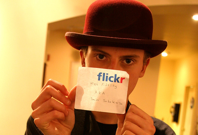
1. Community. In the earliest days of Flickr when a new user would join co-founder Caterina Fake would greet them personally on the site and welcome them — not a bot or a script, but Caterina herself. While this would not scale today, I think the original founders of Flickr realized how important community development was in the early success of the site. I remember shortly after I joined Flickr going to some of my first photo meetups in San Francisco at a local coffeehouse. Flickr’s other co-founder Stewart Butterfield would show up and so would Cal Henderson and many of the other early Flickr staff and engineers. They eventually brought Heather Champ on as Community Manager and her sole focus was in managing this new community that was growing at Flickr.

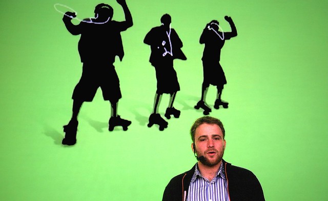
Stewart and the Skatepods
Flickr Co-Founder Stewart Butterfield introducing Flickr Photographers at a group show at the Apple Store, 2005.

Back in those early days Heather organized an event at the San Francisco Apple Store where some Flickr photographers shared their photos on the giant large screen upstairs in the old Apple Store off Market Street. There was a show where Flickr photographers from all over the world sent in a photo and Flickr printed them all for a group gallery show at 111 Minna. There were active meetups and drinkups and photowalks and even a giant party hosted by Flickr once a year. Flickr Fiesta, Flickr Turns 2, Flickr Turns 3…

I think what Flickr realized early on was that getting users to connect personally offline after first meeting online could be a powerful thing. Friendships were created. A group I was in started doing phototrips together. We did a trip to Miami, a trip to Detroit, a trip to Las Vegas a trip to Toronto. These trips would originate and be planned out in groups on Flickr. When out of town Flickr friends came to town you’d meet up and go shooting together. Meeting Mr. Chalk for the first time in person was fantastic! Because Flickr was the online community bringing all of these people together, it became a very beloved site for so many early Flickr users.

The challenge now is to try and restore much of that sense of community that over the years has been lost in my opinion. I think SmugMug should invest in this aspect of Flickr more than any other. They should hire perhaps a few community managers. They should host events. They should engage directly with the most active users on the site and promote Flickr evangelists from their user base who work to build and maintain that photography community at Flickr. I think Don MacAskill (SmugMug’s CEO) is the type of guy who will be good at this. It was good to see him engaging publicly about the acquisition on Hacker News shortly after the purchase. Management most of all has a role in actively engaging with the users of the site following the early example of Caterina Fake.

2. Groups. Much of Flickr’s early success was built around groups. More than just places to post a photo about a certain topic the group threads were vibrant conversations. Conversations about photography and Flickr itself sure, but also conversations about politics, about popular movies and television, about really anything and everything. Through some redesign over the years group discussions lost ground to the photos themselves. Discussions became harder and harder to track and follow. Facebook showed up and many people moved conversations over there, etc.

There are some significant ways that Flickr could rebuild group conversations.

The single most significant thing Flickr could do to improve group discussions would be to allow users to subscribe to individual discussion threads and then give them a central page where those conversations are bumped as activity/conversations happens in those threads. These are the conversations that I care the most about.

Many Flickr users belong to many different groups. Having to go to each individual group discussion page one by one just does not work for monitoring all of the conversations you are a part of. I may really care about a conversation about William Eggleston’s photography, but if there is only one new update to that conversation a week, as much as I care about it, I may not be checking it as regularly as I should. What’s more, the best time to see a conversation is as quickly after it happens as possible because that’s when others in that conversation still might be online. If I reply to a conversation 10 minutes after it happens that generates much more activity than if I reply 1 day after it happens. Giving users the ability to track all of the conversations they are interested in across the site would be a powerful tool.

Conversation begets more conversation. Activity begets activity. Give users the tool to track all of the group conversations across Flickr that they care about. This thread subscription page should be easily accessed in the mobile app as well.

After building conversation subscriptions, Flickr should also allow users to hide conversations in groups. Groups can get very noisy at times. The most recent group discussion is bumped to the top of the discussion page. If I don’t care about Game of Thrones, but that is the conversation that is repeatedly being bumped to the top of the threads I should allowed to hide it and make it disappear for me.

Flickr should identify 50 or so of the most active groups and have their community managers personally be involved in those groups and conversations. People should know that they can interact with management there. Flickr’s help forum is a bit like this, but the help forum is really only about Flickr help which can be boring at times. Flickr should promote these groups across the site and do everything that they can to make them as active as possible. If the discussions are not active in a group people stop coming. If the discussions are active it becomes a wonderful watering hole where people will spend hours online engaging with each other.

In the early days of Flickr Stewart Butterfield was active in Flickr Central threads. He’d frequently chime in and interact with the community there. This was a great thing.

I should also be able to mute certain users in a group. Inevitably trolls can/will invade groups and while some trolls can be charming and funny, others can be destructive. Allowing me to mute certain people gives me a bit of control over these conversations.

Groups should have photo pools, but these should really be secondary to the discussion threads and the groups pages should be designed to reflect this.

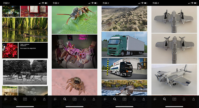
Flickr Explore
Some sample photos from yesterday’s Flickr Explore page.

3. Explore is so broken. There are so many bad photos regularly in Explore. The algorithm screens out more active users (like myself and many others). I looked at Explore for the first time in months yesterday and what do I see? Exactly the type of photos I don’t want to see on Flickr. Macro photos of insects. Lots of photos with signatures and watermarks. Three photos in a row of a LEGO airplane. Some screengrab of some user mocking Explore. Photos of big trucks and other transport. I don’t mind great train shots actually, but shots of boring city busses and big trucks that some Flickr transport fans collect are less interesting to me.

As much as I dislike Instagram and their world of ads, of all things, Instagram is doing a great job with their version of Explore. When I click on the search bar on Instagram it populates their version. What do I see there? Lots of photos of neon signs. Interesting analog photography. Great architecture.

The problem is that everyone sees the exact same version of Explore. In today’s world of AI Flickr should be smart enough to look at the photos I’m favoriting and serve me up my own customized version of Explore. Photos that I might be interested in based on what it knows about me.

Do I never favorite the classic bee on a flower shot? Then don’t show more to me. Someone who favorites 10,000 Second Life screengrabs might like to see more of them that they don’t know about on the site. I don’t. I love neon signs. Show me the most kickass photos of neon signs that I haven’t seen yet on the site from the past 24 hours. If I hate watermarked photos and never favorite them, don’t show them to me. If someone else watermarks their own photos and only favorites watermarked photos, show lots of them to them.

4. Maps. Although Stig’s excellent Flickr Fixr already fixes this, put a link to the Google Maps location under the map of a geotagged photo on Flickr. Google’s maps are the best in the world — and while it may be too expensive to actually license the maps to embed themselves, put a link there so users can go actually find the place. As it is now the Flickr maps are worthless. They won’t show you where something is. They will provide you the general vicinity of where something is, but they won’t show you exactly where it is.

If I am going on a trip and want to research a new city on Flickr, I want to know EXACTLY where things are so I can build a Google Map to go see and photograph those things myself.

5. Fix the Yahoo Log In. This is probably easy to do and from what I’ve read Don MacAskill is already on this one as a first priority. The Yahoo Login system (and especially for those using old legacy AT&T, PacBell, etc, versions of the login) is much too difficult to use. Pre-yahoo Flickr had a very simple user name / password log in that you set yourself. Users should be given an easy option to have that again and to get back into their Yahoo accounts that so many seem to be locked out of.

6. Fix the jumpy problem in photos from your contacts. Jef Poskanzer mentioned this one in his post as well. For years now whenever you browse photos by your contacts, right before you are about to favorite a photo on that page Flickr will inexplicably jolt and jump to some other random area on the page making you lose your place. Worse, right when you press the favorite button, because the page has suddenly jolted somewhere else you will accidently click on a photo which will take you away from that page and you have to press the browser back bar to get back and reload your contact’s photos page from the beginning. It’s a frustrating user experience and something that has been broken for YEARS now. It is time to fix it. Photos from your contacts is a very popular page and it is a problem that your most active users are having.

Flickr No Connection Issue

7. Flickr app connection issues. The Flickr photo app has a connection problem that other apps don’t. Just about every single day at some point you get a red “no internet connection” message at the bottom of the app. Even if you are connected to the internet and even if all your other apps work just fine. Flickr will not work. The only way to make the Flickr app work again is to quit the app and relaunch it. I think what may be happening is that at some point the Flickr app loses internet connection and isn’t smart enough to try and re-establish connection. So the app is dead and the only way to re-establish the connection is to quit it and relaunch it.

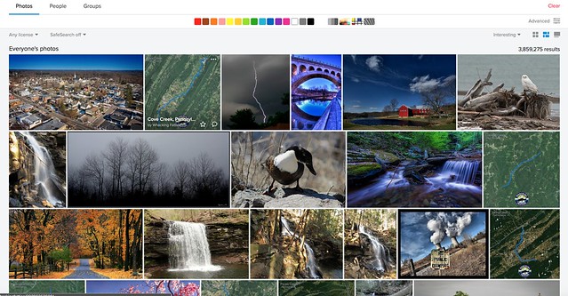
Searching Pennsylvania by Interestingness

8. Fix search. I’ve got a trip to Pennsylvania planned in a few months. Why when I search “Pennsylvania” (over 3.5 million photos on Flickr by the way) and sort by interestingness is the 2nd most interesting photo on all of Flickr a dumb aerial map screengrab with a squiggly blue line with a “whacking fatties” watermark? The photo has zero faves, zero comments and only 11 views. In fact there are four “whacking fatties” screengrabs in the top 20 most interesting of the millions of photos of Pennsylvania. This is dumb. If Flickr’s interestingness algorithm is so broken that it puts this photo as the 2nd most interesting photo in all of Pennsylvania at least give me the option to sort the photos by favorites. If I sort the photos by favorites chances are that some of the most favorited photos might be better and more interesting photos. While favorites alone might not be the best indicator of what photos are most interesting, at least give me that option. Alternatively, stop showing photos with low faves, comments, views on the first page of search results by interestingness.

9. Fix recent activity. The recent activity page is the most important page on Flickr. I load it more than any other page. For me (and many others) recently it stopped loading. It times out the majority of the time and returns a server error. I can get around this error by changing my recent activity settings from “since the beginning” to “in the last month” but I shouldn’t have to. I should be able to get it to load reliably 100% of the time since the beginning. Your most active users are users are your most valuable users. This should be fixed.

10. Let users favorite multi photo batches from the Flickr homepage. At present if I go to the main flickr homepage at flickr.com and I hover over a single photo there I’m given an option to favorite that photo by pressing a little star. This is great. But if I hover over a batch of photos that a user has uploaded I am not given this option. The only way there I can favorite a photo is to click through on the photo and leave a favorite. Flickr should treat all photos whether individual or batch on that page the same giving me a hover over star to favorite the photos.

Bonus: The “taken on” date on a photo’s photo page, really should be a hyperlink that you can click that will take you to that date in your camera roll.

That’s all for now. Much more later. See you on Flickr.

You can find me on Flickr here. ?


Thomas Hawk Digital Connection

 
Comments Off on Top 10 Ways to Improve Flickr for 2018

Posted in Photography


Tips for Selecting What Gear to Take Along for Travel Photography

28 Apr

Travel photography is exciting. There’s always this sense of finding new and exotic places to capture. Of course, if you work hard you can find new and exotic places to photograph right near home. But there’s something about travel that truly sparks the imagination.  It’s really about capturing the look and feel of a place that isn’t your home.

Tips for Packing for Travel Photography

I used a 70-200mm lens here to compress the space between the sheep and the village beyond.

The thing is that it’s difficult to travel with camera gear, especially large DSLRs and their rather bulky lenses. Then there’s the expense. You could potentially be traveling with some very expensive equipment.

If you’re a hobbyist photographer, the loss of that gear could be devastating. I’ve known several individuals who have lost their gear while out traveling and have found that their insurance didn’t cover the whole loss. For these hobbyists, it was a blow from which they couldn’t recover.

So while travel photography with a DSLR can be exciting, it can also be stressful. That’s why every professional travel photographer will tell you all about the importance of packing wisely when traveling with your DSLR.

So without further ado let’s take a look at some helpful tips for traveling the world with your DSLR.

Be economical in choosing lenses

Weight is a factor if you don’t want to pay the fees for extra baggage. So when packing for travel photography, it’s best to economize your lenses. Instead of taking every lens you own, consider packing ones that give you a full range of focal lengths without doubling up.

If you have a 70-200mm lens why pack the 85 mm prime? Instead, a wise decision may be to take your zoom lenses. Choose a wide angle like the Canon 16-35mm. Granted the lens is heavy. The 70-200mm isn’t a lightweight either, but if you are only going to take two lenses then it’s not such a big issue.

Tips for Packing for Travel Photography - truck in a driveway

Shot with a wide angle lens. This image was taken from the rooftop of a hotel.

Choose lightweight lenses

Prime lenses aren’t a bad idea for travel either. They usually have a wider aperture which is great for low light, and if you’re visiting a dark castle somewhere in Europe that can be really useful. Primes are much lighter than their zoom counterparts, and with a little practice, you can get used to shooting with just prime lenses.

It takes a little more thought than zooming in and out but you can capture amazing images with prime lenses. If you’re going to pack a general set of lenses for travel your bag might include the following, a 24mm for wide angles, the 50mm for general shots and an 85 mm for a little more range.

Tips for Packing for Travel Photography - gnarly tree branches

I had to use a zoom lens for this shot. The tree just wasn’t accessible from up close and I wouldn’t have been able to shoot at this level if I were closer. The telephoto was essential for this shot.

Choose lenses for a purpose

The lenses you choose to take with you might also be determined by the type of photography you’re planning on doing while you’re traveling. Perhaps you’re going on safari to Kenya. If that’s the case, you’re going to be focused on capturing wildlife, so your longer telephoto lens is going to be essential, and you might choose to take something in the 100-400mm range. I would argue that adding a nice light 50mm prime to your bag might be all that you need in that situation.

I recently visited the city of Havana, Cuba. I knew I wasn’t going to be going outside of the city and that my focus was on shooting architecture and street scenes. So, in that case, I left my telephoto lenses at home. On the busy streets, it would have been difficult to pull out my 100-400mm and shoot comfortably. So I chose to pack a wide-angle lens and my nifty 50mm. That was all I needed within the cramped streets of Havana.

This is in contrast to a trip I took last month to Wales. I was going to shoot both landscapes as well as city scenes, and I was hoping to capture some images of birds as well. So I chose to pack a little more weight. I chose to leave my prime lenses at home and took three zoom lenses; the 16-35mm, the 70-200mm and the 100-400mm.

Tips for Packing for Travel Photography - garbage can in an alley with graffiti

Shot with a prime lens. Graffiti alley in Toronto is a great place to use a mid-range focal length.

Just use your phone

I know a number of travel photographers who challenge themselves to shoot just one trip a year using nothing but their phones. The results are truly beautiful and they love the ease of traveling with just a phone.

Many smartphones have fantastic cameras and can capture huge RAW images. So it’s definitely worth a try. Limit yourself to your phone and see what kinds of images you can capture.

Tips for Packing for Travel Photography - city scene

I took this shot using my phone. It’s 5000 px on the long edge, a large file. I could never have gotten this with the gear I had with me that day.

Embrace the excitement

Travel photography is exciting. Taking your camera to places that are new and different from home can truly raise adrenaline levels. It’s a lot of fun, and I highly recommend you get out there to visit other places and explore with your camera.

Embrace the challenges of packing for the trip as well. It’s part of the excitement. You’ll be challenged to shoot great images with a limited amount of gear. There’s nothing wrong with that. Take the challenge by the horns, pack wisely, and push yourself to try and capture great images of far-off places with just a few simple tools.

Tips for Packing for Travel Photography - forest shot

This would have been impossible to capture without my wide angle lens. We were just too close to the falls for anything mid-range.

The post Tips for Selecting What Gear to Take Along for Travel Photography appeared first on Digital Photography School.


Digital Photography School

 
Comments Off on Tips for Selecting What Gear to Take Along for Travel Photography

Posted in Photography


Why smartphone cameras are blowing our minds

28 Apr

An modified version of this article was originally published February 20, 2018.

There’s no getting around physics – smartphone cameras, and therefore sensors, are tiny. And since we all (now) know that, generally speaking, it’s the amount of light you capture that determines image quality, smartphones have a serious disadvantage to deal with: they don’t capture enough light.

But that’s where computational photography comes in. By combining machine learning, computer vision, and computer graphics with traditional optical processes, computational photography aims to enhance what is achievable with traditional methods. Here’s a rundown of some recent developments in smartphone imaging – and why we think they’re a big deal.

Intelligent exposure and processing? Press. Here.

One of the defining characteristics of smartphone photography is the idea that you can get a great image with one button press, and nothing more. No exposure decision, no tapping on the screen to set your exposure, no exposure compensation, and no post-processing. Just take a look at what the Google Pixel 2 XL did with this huge dynamic range sunrise at Banff National Park in Canada:

Sunrise at Banff, with Mt. Rundle in the background. Shot on Pixel 2 with one button press. I also shot this with my Sony a7R II full-frame camera, but that required a 4-stop reverse graduated neutral density (‘Daryl Benson’) filter, and a dynamic range compensation mode (DRO Lv5) to get a usable image. While the resulting image from the Sony was head-and-shoulders above this one at 100%, I got this image from a device in my pocket by just pointing and shooting.

The Pixel 2 was able to achieve the image above by first determining the correct focal plane exposure required to not blow large bright (non-specular) areas (an approach known as ETTR or ‘expose-to-the-right’). When you press the shutter button, the Pixel 2 goes back in time 9 frames, aligning and averaging them to give you a final image with quality similar to what you might expect from a sensor with 9x as much surface area. While it’s not quite that simple – sensor efficiency and the number of usable frames for averaging can vary – it’s not far off: consider the Pixel 2 can hold its own to the 5x larger RX100 sensor when given the same amount of total light per exposure.

When you press the shutter button, the Pixel 2 goes back in time 9 frames

How does it do that? It’s constantly keeping the last 9 frames it shot in memory, so when you press the shutter it can grab them, break each into many square ’tiles’, align them all, and then average them. Breaking each image into small tiles allows for alignment despite photographer or subject movement by ignoring moving elements, discarding blurred elements in some shots, or re-aligning subjects that have moved from frame to frame. Averaging simulates the effects of shooting with a larger sensor by ‘evening out’ noise.

That’s what allows the Pixel 2 to capture such a wide dynamic range scene: expose for the bright regions, while reducing noise in static elements of the scene by image averaging, while not blurring moving (water) elements of the scene by making intelligent decisions about what to do with elements that shift from frame to frame. Sure, moving elements have more noise to them (since they couldn’t have as many of the 9 frames dedicated to them for averaging), but overall, do you see anything but a pleasing image?

Autofocus

Improvements in autofocus, combined with the extended depth-of-field inherent to smaller sensors, are bringing focus performance of smartphones nearer and nearer to that of high performance dedicated cameras. Dual Pixel AF on the Google Pixel 2 uses nearly the entire sensor for autofocus (binning the high-resolution sensor into a low-resolution mode to decrease noise), while also using HDR+ and its 9-frame image averaging to further decrease noise and have a usable signal to make AF calculations from.

Google Pixel 2 can focus lightning fast even in indoor artificial light, thanks to Dual Pixel AF, allowing me to snap this candid before it was over in a split second. Technologies like ‘Dual PDAF’ autofocus – used by recent iPhones – don’t quite offer this level of performance (the iPhone X lagged and caught a less interesting moment seconds later when it eventually achieved focus), but offer potential image quality benefits.

And despite the left and right perspectives the split pixels in the Pixel 2 sensor ‘see’ having less than 1mm stereo disparity, an impressive depth map can be built, rendering an optically accurate lens blur. This isn’t just a matter of masking the foreground and blurring the background, it’s an actual progressive blur based on depth.

Instant AF and zero shutter lag allowed me to nail this candid image the instant after my wife and child whirled around to face the camera. A relatively new autofocus technology on recent iPhones we’re seeing is ‘Dual PDAF’ autofocus, where a 1×2 microlens is placed over a green-blue pixel pair where the blue color filter has been replaced by a green one. This can offer some benefits over masked pixels, which sacrifice light and can affect image quality, and over dual pixel AF by not requiring as much deep trench isolation as split photodiodes require to prevent color cross-talk.

However, current implementations only utilize this modified microlens structure in 2 pixels out of an 8×8 pixel region, which means only 3% of the pixels are used for ‘Dual PDAF’ AF. That means less light and information available compared to the full-sensor Dual Pixel AF approach which, combined with the lack of the multi-frame noise reduction the Pixel 2 phones benefit from even for AF, meant more misfocus or shots captured after the decisive moment. Like every technology though, we expect generational improvements.

Portrait Lighting

While we’ve been praising the Pixel phones, Apple is leading smartphone photography in a number of ways. First and foremost: color accuracy. Apple displays are all calibrated and profiled to display accurate colors, so no matter what Apple or color-managed device (or print) you’re viewing, colors look the same. Android devices are still the Wild West in this regard, but Google is trying to solve this via a proper color management system (CMS) under-the-hood. It’ll be some time before all devices catch up, and even Google itself is struggling with its current display and CMS implementation.

But let’s talk about Portrait Lighting. Look at the iPhone X ‘Contour Lighting’ shot below, left, vs. what the natural lighting looked like at the right (shot on a Google Pixel 2 with no special lighting features). While the Pixel 2 image is more natural, the iPhone X image is arguably more interesting, as if I’d lit my subject with a light on the spot.

Apple iPhone X, ‘Contour Lighting’ Google Pixel 2

Apple builds a 3D map of a face using trained algorithms, then allows you to re-light your subject using modes such as ‘natural’, ‘studio’ and ‘contour’ lighting. The latter highlights points of the face like the nose, cheeks and chin that would’ve caught the light from an external light source aimed at the subject. This gives the image a dimensionality you could normally only achieve using external lighting solutions or a lot of post-processing.

Sure the photo on the left could be better, but this is the first iteration of the technology. It won’t be long before we see other phones and software packages taking advantage of—and improving on—these computational approaches.

HDR and wide-gamut photography

And then we have HDR. Not the HDR you’re used to thinking about, that creates flat images from large dynamic range scenes. No, we’re talking about the ability of HDR displays—like bright contrasty OLEDs—to display the wide range of tones and colors cameras can capture these days, rather than sacrificing global contrast just to increase and preserve local contrast, as traditional camera JPEGs do.

iPhone X is the first device ever to support the HDR display of HDR photos. That is: it can capture a wide dynamic range and color gamut but then also display them without clipping tones and colors on its class-leading OLED display, all in an effort to get closer to reproducing the range of tones and colors we see in the real world.

iPhone X is the first device ever to support HDR display of HDR photos

Have a look below at a Portrait Mode image I shot of my daughter that utilizes colors and luminances in the P3 color space. P3 is the color space Hollywood is now using for most of its movies (it’s similar, though shifted, to Adobe RGB). You’ll only see the extra colors if you have a P3-capable display and a color-managed OS/browser (macOS + Google Chrome, or the newest iPads and iPhones). On a P3 display, switch between ‘P3’ and ‘sRGB’ to see the colors you’re missing with sRGB-only capture.

Or, on any display, hover over ‘Colors in P3 out-of-gamut of sRGB’ to see (in grey) what you’re missing with a sRGB-only capture/display workflow.

iPhone X Portrait Mode, image in P3 color space iPhone X Portrait mode, image in sRGB color space Colors in P3 out-of-gamut of sRGB highlighted in grey

Apple is not only taking advantage of the extra colors of the P3 color space, it’s also encoding its images in the ‘High Efficiency Image Format’ (HEIF), which is an advanced format aimed to replace JPEG that is more efficient and also allows for 10-bit color encoding (to avoid banding while allowing for more colors) and HDR encoding to allow the display of a larger range of tones on HDR displays.

But will smartphones replace traditional cameras?

For many, yes, absolutely. Autofocus speeds on the Pixel 2 are phenomenal, assisted by not only dual pixel AF but also laser AF. HDR+ like image stacking algorithms will only get better with time, averaging more frames or frames of various time intervals. The Huawei P20 can do exactly this and results are impressive. The P20 can also combine information from both color and higher-sensitivity monochrome sensors to yield impressive noise – and resolution – performance. Dual (or even triple) lens units give you the focal lengths of a camera body and two or more primes, and we’ve seen the ability to selectively blur backgrounds and isolate subjects like the pros do. Folded optics can give you far reaching zoom.

Below is a shot from the Pixel 2 vs. a shot from a $ 4,000 full-frame body and 55mm F1.8 lens combo—which is which?

Full Frame or Pixel 2? Pixel 2 or Full Frame?

Yes, the trained—myself included—can pick out which is the smartphone image. But when is the smartphone image good enough?

Smartphone cameras are not only catching up with traditional cameras, they’re actually exceeding them in many ways. Take for example…

Creative control…

The image below exemplifies an interesting use of computational blur. The camera has chosen to keep much of the subject—like the front speaker cone, which has significant depth to it—in focus, while blurring the rest of the scene significantly. In fact, if you look at the upper right front of the speaker cabinet, you’ll see a good portion of it in focus. After a certain point, the cabinet suddenly-yet-gradually blurs significantly.

The camera and software has chosen to keep a significant depth-of-focus around the focus plane before blurring objects far enough away from the focus plane significantly. That’s the beauty of computational approaches: while F1.2 lenses can usually only keep one eye in focus—much less the nose or the ear—computational approaches allow you to choose how much you wish to keep in focus even if you wish to blur the rest of the scene to a degree where traditional optics wouldn’t allow for much of your subject to remain in focus.

B&W speakers at sunrise. Take a look at the depth-of-focus vs. depth-of-field in this image. If you look closely, the entire speaker cone and a large front portion of the black cabinet is in focus. There is then a sudden, yet gradual blur to very shallow depth-of-field. That’s the beauty of computational approaches: one can choose extended (say, F5.6 equivalent) depth-of-focus near the focus plane, but then gradually transition to far shallower – say F2.0 – depth-of-field outside of the focus plane. This allows one to keep much of the subject in focus, bet achieve the subject isolation of a much faster lens.

Surprise and delight…

Digital assistants. Love them or hate them, they will be a part of your future, and they’re another way in which smartphone photography augments and exceeds traditional photography approaches. My smartphone is always on me, and when I have my full-frame Sony a7R III with me, I often transfer JPEGs from it to my smartphone. Those images (and 720p video proxies) automatically upload to my Google Photos account. From there any image or video that has my or my daughter’s face in it automatically gets shared with my wife without my so much as lifting a finger.

Better yet? Often I get a notification that Google Assistant has pulled a cute animated GIF from my movie it thinks is interesting. And more often than not, the animations are adorable:

Splash splash! in Xcaret, Quintana Roo, Mexico. Animated GIF auto-generated from a movie shot on the Pixel 2.

Machine learning allowed Google Assistant to automatically guess that this clip from a much longer video was an interesting moment I might wish to revisit and preserve. And it was right. Just as it was right in picking the moment below, where my daughter is clapping in response to her cousin clapping at successfully feeding her… after which my wife claps as well.

Claps all around!

Google Assistant is impressive in its ability to pick out meaningful moments from photos and videos. Apple takes a similar approach in compiling ‘Memories’.

But animated GIFs aren’t the only way Google Assistant helps me curate and find the important moments in my life. It also auto-curates videos that pull together photos and clips from my videos—be it from my smartphone or media I’ve imported from my camera—into emotionally moving ‘Auto Awesome’ compilations:

At any time I can hand-select the photos and videos, down to the portions of each video, I want in a compilation—using an editing interface far simpler than Final Cut Pro or Adobe Premiere. I can even edit the auto-compilations Google Assistant generates, choosing my favorite photos, clips and music. And did you notice that the video clips and photos are cut down to the beat in the music?

This is a perfect example of where smartphone photography exceeds traditional cameras, especially for us time-starved souls that hardly have the time to download our assets to a hard drive (not to mention back up said assets). And it’s a reminder that traditional cameras that don’t play well with such automated services like Google and Apple Photos will only be left behind simpler services that surprise and delight a majority of us.

The future is bright

This is just the beginning. The computational approaches Apple, Google, Samsung and many others are taking are revolutionizing what we can expect from devices we have in our pockets, devices we always have on us.

Are they going to defy physics and replace traditional cameras tomorrow? Not necessarily, not yet, but for many purposes and people, they will offer pros that are well-worth the cons. In some cases they offer more than we’ve come to expect of traditional cameras, which will have to continue to innovate—perhaps taking advantage of the very computational techniques smartphones and other innovative computational devices are leveraging—to stay ahead of the curve.

But as techniques like HDR+ and Portrait Mode and Portrait Lighting have shown us, we can’t just look at past technologies to predict what’s to come. Computational photography will make things you’ve never imagined a reality. And that’s incredibly exciting.

If you’d rather digest this article in video form, watch my segment on the TWiT Network (named after its flagship show, This Week in Tech) show ‘The New Screen Savers’ below. And don’t forget to catch our recent smartphone galleries after the video.


Appendix: Studio Scene

We’ve added the Google Pixel 2 and Apple iPhone X to our studio scene widget. You can compare the Daylight and Low Light scenes below to any camera of your choosing, keeping in mind that we shot the smartphones in their default camera apps without controlling exposure to see how they would perform in these light levels (10 and 3 EV, respectively, for Daylight and Low Light).

$ (document).ready(function() { ImageComparisonWidget({“containerId”:”reviewImageComparisonWidget-19227307″,”widgetId”:589,”initialStateId”:3906}) })

Note that we introduced some motion into the Low Light scene to simulate what the iPhone does when there’s movement in the scene. Hence, the ISO 640, 1/30s iPhone X image is more reflective of low light image quality for scenes that can’t be shot at the 1/4s shutter speed (ISO 125) the iPhone X will tend to drop to for completely static (tripod-based) low light scenes.

The Pixel 2 rarely drops to shutter speeds slower than 1/30s in low light, yet impressively almost matches the performance of a 1″-type sensor at these shutter speeds in low light (though the ‘i’ tab shows the RX100 shot at 1/6s F4, you’d get an equivalent exposure at 1/30s were you to shoot the Sony at F1.8 like the Pixel 2).

Articles: Digital Photography Review (dpreview.com)

 
Comments Off on Why smartphone cameras are blowing our minds

Posted in Uncategorized