RSS
 

Archive for June, 2014

How to Create a Sun-shower Photo on a Cloudy Day

30 Jun

Flowers rain CTObackflash

Yes, You Can Change The Weather!

You just brought home a bunch of beautiful flowers, and you’d love to get an interesting photo of them. You take them outside, but it’s a dark, cloudy day. The light is boring, and the forecast is for several days of overcast weather. By the time the sun finally comes out, your flowers may have wilted.

What should you do? Well, you can change the weather. Really, you can by using your off-camera flash and a simple garden hose to create a sun-shower. Thanks to Canon’s wireless flash system you can, in the words of the Temptations, have sunshine on a cloudy day.

Here’s how to create a sun-shower photo on a cloudy day:

Equipment used:

  • Canon EOS 70D
  • Canon 85mm f/1.8 USM lens
  • Canon 430 EX II Speedlight flash
  • Flashpoint Heavy Duty Lightstand
  • Adorama Universal Swivel Holder
  • Velbon GEO E535D Carbon Fiber Tripod
  • Expoimaging Rogue Gel Universal Lighting Filter Kit

The idea here is to use a wireless flash to recreate the effect of direct sunlight, and adjust the light so it looks natural. Then, to simulate rain, just add water. The flash will create dynamic specular highlights as the water sprinkles through the image. The goal is to go beyond a simple “record” shot of your flowers (or whatever it is you are photographing) and load up your photograph with visually interesting elements.

Step 1: Waterworks

To make this happen, you’ll need a garden hose and sprinkler, with either a nozzle at the end of the hose, or an oscillating sprinkler. If you live in a home with a yard, you most likely already have these. In this example, a hose with a built-in, controllable nozzle was available, so that’s what was used. Make sure the nozzle or sprinkler head is placed in a fixed position, either to the side of or behind the flowers, with the water hitting the flowers but not falling where the flash or camera will be placed.

Caution: Don’t bring your camera gear out yet, it might get wet during this phase.

Setup rainmaker

Be prepared to improvise. In this case, a lawn chair was pressed into service as a way to hold the hose nozzle in place.

Once you’ve adjusted your “rain,” turn off the water and bring out your photo gear.

Choose a longer focal length lens (medium telephoto) and shoot with a wide aperture. This will help blur the background and create separation between background and foreground. An added benefit: the farther working distance between camera and subject will hopefully allow you to position the camera at a safe distance from the path of the water.

Step 2: Composition

Set up your camera (a tripod is highly recommended), focus on the flowers, and compose. Find a dark background to maximize contrast from the “rain,” and leave some room at the top of the image to show the water drops. Just for fun, take a few “before” pictures for future reference.

Flowers noflash

Before – here is the composition, with no added light. It’s okay, but not terribly exciting. Exposure: 1/1000th at f/1.8, ISO 400.

Flowers oncameraflash

Same composition, with the 70D’s built-in flash turned on. You can see more detail, but the lighting is flat and still uninteresting. 1/250th at f/13, ISO 400

Setup behindcamera

All lined up – with the hose aimed at the flowers off to the left, the camera (in this case, a Canon EOS 70D with a Canon 85mm f/1.8 lens) was brought in, and a flash on a light stand was moved behind and slightly to camera right of the flowers. The dark shrubs behind the flowers provide a good contrast.

Step 3: Cue the “sun”

Turn on the flash. Don’t know how to operate a Canon DSLR or G-series compact? Scroll to the end of my article on Using Off-camera Flash to Fix Lighting Problems for Outdoor Portraits to get step-by-step instructions on how to trigger Canon off-camera flash wirelessly. You can control the flash intensity and, through trial and error, find the best exposure for illuminating the flowers.

Flowers plainbackflash

Now we have the backlight flash turned on, but the lighting ratio of ambient to flash light is wrong, and the flowers are overexposed while the effect of the backlighting is barely visible. You may need some trial and error, adjusting the EV and flash intensity settings until you get the right combination. Exposure: 1/250th at f/11, ISO 400

Hint: When adjusting the exposure and flash intensity, check your results in the LCD monitor, but also turn on the histogram to make sure the light is not falling off the chart.

Step 4: Warm up the light

While overhead sunlight is fairly neutral, sunlight in the early and later part of the day takes on a pleasing warm tone. That’s why they call this time of day the Golden Hour. You can emulate this light by using full CTO Orange gel, available in the Expoimaging Rogue Gel Universal Lighting Filter Kit. Now it looks like you’re shooting in late afternoon or evening.

Flowers CTObackflash

Sunset? Nah, it’s the middle of the day. But thanks to the cloud cover and a Full CTO Orange gel over the backlight, it looks like sunset. Exposure: 1/250th at f/11, ISO 400. (make sure to set your shutter speed no higher than your camera’s sync speed)

Setup all

Flowers are placed, flash is gelled, and the “rain” is on. You’re ready for the final shot.

Step 5: Make it rain

Now that the composition and exposure are set and the light is gelled and in place, it’s time to turn on the water.

Flowers rain CTObackflash

It’s a late afternoon sun-shower. This is what your final result could look like. But wait, the drops seem to be going up. Why is that? See below. Exposure: 1/250th at f/11, ISO 400.

In this final shot, the flowers drenched in a sunlit downpour in the middle of a dark, dreary day. There’s one thing that would make this shot better, and that would have been switching to rear-curtain flash sync. In the final example here, the drops appear to be going up because the flash is triggered at the beginning of the exposure. Change your flash settings to rear curtain sync and the drops will be going in the right direction. (There wasn’t time to make the change here because it had started to rain for real, ending the session.)

Have fun transforming your backyard into an outdoor set and creating all kinds of weather.

The post How to Create a Sun-shower Photo on a Cloudy Day by Mason Resnick appeared first on Digital Photography School.


Digital Photography School

 
Comments Off on How to Create a Sun-shower Photo on a Cloudy Day

Posted in Photography


One of a kind? Nikon 1 V3 First Impressions Review

30 Jun

The Nikon 1 V3 offers an 18.4 megapixel 1″-type CMOS sensor, a significant gain in resolution over its 14.2 megapixel V2 predecessor. Since its introduction the 1 system has offered impressive auto focus and burst shooting capabilities so it’s no surprise that the V3 excels in these areas – it offers 20 fps burst shooting with continuous AF and a Hybrid AF system using 171 contrast-detect and 105 phase-detect points. It’s the most promising mirrorless camera Nikon has offered enthusiasts yet, and our full review is underway. In the meantime, take a look at our first impressions and shooting experience. 

related news: Digital Photography Review (dpreview.com)

 
Comments Off on One of a kind? Nikon 1 V3 First Impressions Review

Posted in Uncategorized


30. Juni 2014

30 Jun

Ein Beitrag von: Juste Pixx

Zweite voller Platanenfrüchte, im Hintergrund eine Domkuppel.


kwerfeldein – Fotografie Magazin | Fotocommunity

 
Comments Off on 30. Juni 2014

Posted in Equipment


Der letzte Tag des Sommers

30 Jun

Der letzte Tag des Sommers. Ich klicke die Bilder durch und erkenne hier und da bereits Herbst, ja sogar Winter. Warum heißt die Serie so? Was zeigen mir diese Bilder, die ich nicht richtig erfassen kann, aber mich dennoch interessieren? Ich mag das Klare, Weite. Ich mag die Fetzen, die ich wie ein Puzzle in meinem Kopf zusammenfüge. Langsam formen sich die Fotos zu einer Geschichte. Abschied steht für mich ganz groß darüber. Daher also der Titel.

Ich schreibe den polnischen Fotografen Przemyslaw Matlag kurzerhand an und frage nach weiteren Infos. Die Sprachbarriere ist leider groß und wir einigen uns, dass die Bilder alles erzählen. Zumindest seine Intentionen schreibt er mir auf Englisch, ich übersetze:

Orte, die ich besuchte und Gefühle, die widerhallen. Schnitte in die Realität; dauerhaft in mehr oder weniger 1/60 einer Sekunde festgehalten, um Emotionen, Eindrücke und Gemütszustände zu bewahren. Diese Serie ist ein sehr persönliches Sammelalbum, jedes Bild wurde aus einer unklaren, oft undefinierbaren Notwendigkeit heraus gemacht. Einfach instinktiv.

Nach einiger Zeit haben sich die Aufzeichnungen zu einer Geschichte geordnet. Die Geschichte über die Sehnsucht, die Sehnsucht nach etwas Undeffinierbarem und der Wunsch nach etwas, das vielleicht schon Teil der Vergangenheit oder der Zukunft ist. Oder etwas, was sogar niemals passiert soll.

Ein Wald bei Nacht mit Laterne.

Eine mit Rauhreif bedeckte Wiese.

Ein Stück Teppich mit Hauswand.

Ein weites schneebedecktes Feld mit Strommasten.

Dunkle Gräser.

Ein verlassener Raum mit Fenster.

Ein Mann mit Zigarette hinterm Ohr.

Regen, der auf eine Autoscheibe prasselt.

Eine Heiligenstatue in der Dunkelheit.

Eine Straße, unscharf abgebildet.

Zwei Türen mit Efeuranken.

Blick durch ein Fenster auf eine Häuserfront.

Ein Mann läuft in den Wald.

Ein Wald bei Nacht. Darüber die Mondsichel.

Ein weiter Blick über leeres Meer in der Dämmerung, am Horizont winzige Lichter.

Mehr von Przemyslaw findet Ihr auf seiner Webseite und auf Facebook.


kwerfeldein – Fotografie Magazin | Fotocommunity

 
Comments Off on Der letzte Tag des Sommers

Posted in Equipment


5 Steps to Shoot a Simple-ish Time-Lapse Video With Your DSLR

30 Jun

If you have a new-ish DSLR, then you can probably “train” your camera to make a little movie for you. I’m talking about a time-lapse video, and while it might not be the next Hollywood blockbuster…it could spread like a virus on the Youtubez. 🙂 Read on to get started, and if I’ve done my job well (and you have the Continue Reading

The post 5 Steps to Shoot a Simple-ish Time-Lapse Video With Your DSLR appeared first on Photodoto.


Photodoto

 
Comments Off on 5 Steps to Shoot a Simple-ish Time-Lapse Video With Your DSLR

Posted in Photography


How to use Texture to Improve Your Photos

30 Jun

texture in composition

I recently wrote about the importance of texture in my article about converting photos to black and white in Lightroom and my review of MacPhun’s Intensify app. Today I thought it would be interesting to take a closer look at this compositional element, and how becoming more aware of it can help you create stronger images.

Why is texture important? The primary reason is that it helps you create a sense of depth and tactility within your photos.

Let’s look at some practical examples.

Photo with lots of texture

Here’s a photo I took in a Bolivian town.

texture in composition

Look at all the beautiful textures; in the dog’s fur, the stone he is laying on, the concrete step and wooden door behind him. Can you imagine what the dog’s fur is like to touch? Or the stone, concrete or wood? The textures of those objects help you do that, and bring a two-dimensional image to life.

Photos with some texture

Here’s another photo taken in South America.

texture in composition

There are several contrasts that make the photo interesting. One is the difference in brightness between the church and the sky (tonal contrast). The other is the contrast in texture. The stonework has a rough surface and a lot of texture. The sky has none. The contrast between the rough and the smooth adds an extra layer of interest.

Portraiture is another subject where you can exploit the contrast in texture between the relatively smooth surface of someone’s skin, and a highly textured background. The portrait below is an example of that. The lack of texture in the model’s skin contrasts with the textures in his sweater, hair, and the background.

texture in composition

The contrast between rough and smooth is also common in long exposure photography, where photographers use shutter speeds of a minute or longer to blur the motion of the sea, or other body of water. The result is a photo containing both still elements (such as the concrete jetty and the island in the photo below) and moving elements that have recorded as a smooth, even tone, thanks to the long exposure.

texture in composition

Post-processing and texture

One of the benefits of digital photography is that you can use the tools available in programs like Lightroom to emphasize texture. Or in the case of portraits, to de-emphasize it by applying a local adjustment to smooth skin (my article Four Ways to Improve Your Photos With the Clarity Slider in Lightroom shows you how to do that in more detail).

Here’s a quick tip. Think about enhancing texture as a local adjustment rather than a global one. In the example of the dog above I made two Clarity adjustments in Lightroom. The first was a global adjustment made by setting Clarity to +12 in the Basic panel. The second was a local adjustment made by using the Adjustment Brush to select the dog (see below) and setting Clarity to +41. The result is that the textures of the dog’s fur and the background don’t compete.

texture in composition

The red mask shows where the Adjustment brush has been applied locally to only the dog

Practical Exercise

The aim of this article is to get you thinking about texture and how you can use it to make your photos better. Here are a couple of exercises to help train your eye to see texture:

1. Street photography

Take a walking trip around your neighbourhood, looking for subjects with lots of texture. Think of things like doorways, letterboxes or anything made from concrete or stone. They don’t have to be fantastic photos, the aim is to raise your awareness of texture and get you thinking about how you can use it in your photos.

2. Portrait photography

Find a friend or a model to be your subject and find backgrounds with interesting textures. This could be anything from a wall, a doorway, or a large rock. The idea is to play with the contrast between the relative lack of texture (on skin) and the texture of the background.

Once the exercise is complete, the next step is to experiment with emphasizing texture in post-processing. Whether you use Lightroom, Photoshop or a plug-in like Intensify or Silver Efex Pro2, think about how can you use these tools to emphasize texture, or the contrast in texture between skin and a textured background.

Your turn

Now it’s your turn. How do you use textures in your photos? Do you have any tips for our readers, especially when it comes to post-processing? Let us know in the comments.


Mastering Lightroom: Books One, Two and Three

Mastering Lightroom ebook bundle
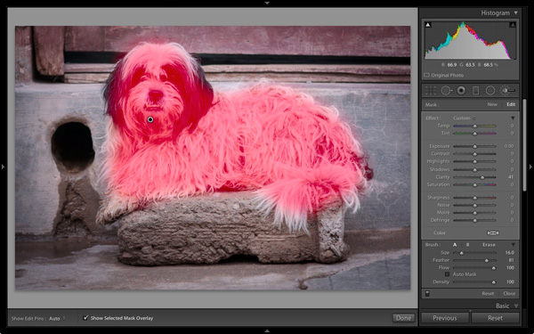
My Mastering Lightroom ebooks are a complete guide to using Lightroom’s Library and Develop modules. Written for Lightroom 4 and 5 books One and Two take you through every panel in both modules and show you how to import and organise your images, use Collections and creatively edit your photos. Book Three shows you how to create stunning black and white images in Lightroom.

The post How to use Texture to Improve Your Photos by Andrew S. Gibson appeared first on Digital Photography School.


Digital Photography School

 
Comments Off on How to use Texture to Improve Your Photos

Posted in Photography


‘Kodak City’ documents former imaging giant’s headquarters

30 Jun

While many American cities have experienced the pains of a large population shift from the urban core to suburbs, there’s a poignancy to the abandoned storefronts in downtown Rochester, New York. The city’s name is inextricably tied to the name Eastman Kodak. Swiss photographer Catherine Leutenegger spent time photographing Rochester and Kodak’s headquarters, first in 2007 and again in 2012, and answered a few of our questions about the project. See gallery

related news: Digital Photography Review (dpreview.com)

 
Comments Off on ‘Kodak City’ documents former imaging giant’s headquarters

Posted in Uncategorized


Air Stylus turns your iPad into a graphics tablet

30 Jun

Avatron, the developer of Air Display, has today released a new iPad app. Air Stylus extends your computer screen to your iPad display and, in combination with a pressure-sensitive pen, turns the latter into a graphics tablet that works with a range of imaging applications including Adobe Photoshop and Apple’s Aperture. Read more

related news: Digital Photography Review (dpreview.com)

 
Comments Off on Air Stylus turns your iPad into a graphics tablet

Posted in Uncategorized


Rezension: Wacom Cintiq Companion

30 Jun

Mitte Februar war es endlich soweit; bei mir trudelte die neueste Errungenschaft aus dem Hause Wacom zum Testen ein: Das Wacom Cintiq Companion. Ein eigenständiger Tablett-PC mit einem Bildschirm, der gleichzeitig Grafik-Tablett ist. Ich verwandelte mich in diesem Moment zu einem Tech-Nerd und konnte sogar kurz die von tollem Design faszinierten Apple-Jünger verstehen.

Dann aber nahm der pragmatische Teil in mir Überhand und sagte: Ist ja alles schön und gut, aber das Gerät ist ganz schön teuer. Ich werde es drei Monate lang testen, dabei damit Spaß haben und es dann zurückschicken, ohne ein Tränchen zu vergießen, denn einen Laptop und ein Grafik-Tablatt habe ich ja schon, was soll das Gerät hier noch anderes können als diese beiden?

Wacom Cintiq Companion mit Tastatur, Stift und Etui

Eigenschaften

Das Wacom Cintiq Companion ist 37,5 ? 24,8 ? 1,7 cm groß, davon 13,3 ” Bildschirmfläche. Am Rand befinden sich vier belegbare Buttons, der sogenannte „Rocker Ring“ mit vier weiteren Buttons und dem Windows-Start-Button in der Mitte. Es gibt zwei Webcams und neben dem Einschalter und dem Rotation-Lock-Schalter ein paar ausgewählte Anschlüsse sowie einen Kippschalter für die Lautstärke.

Im Lieferumfang enthalten sind neben dem Netzkabel der Pro Pen mit Etui, neun Wechsel-Spitzen und Farbringen auch eine Tasche, ein Aufsteller mit drei verschiedenen Winkel-Einstellungen und ein Reinigungstuch für die Bildschirmoberfläche. Optional dazu gibt es eine kleine Bluetooth-Tastatur mit USB-Ladekabel, die ich ebenfalls im Test hatte.

Alle weiteren Details der Spezifikationen findet Ihr bei Interesse auf der Produktseite des Wacom Cintiq Companion von Wacom.

Wacom Cintiq Companion seitlich

Wacom Cintiq Companion mit Zubehör

Erfüllte Erwartungen

Die Darstellung ist einfach toll. Der Bildschirm ist knackscharf, hat satte Farben und feinste Abstufungen auch in den Lichtern und Tiefen, genau so wie ich mir das wünsche bzw. von meinem Eizo-Monitor am Desktop-PC gewohnt bin. Ebenfalls wie ich mir das wünsche: Die Farbdarstellung wird nicht seltsam, wenn ich den Betrachtungswinkel zur Oberfläche verändere.

Der Pro Pen liegt mit seiner umlaufenden Gummierung angenehm in der Hand, seine zwei Tasten sind für mich so erreichbar, wie ich es gewohnt bin und wenn man damit über die Bildschirm-Oberfläche fährt, fluppt es einfach. Die Druckstufen, die Positions- und Neigungserkennung des Stifts sind präzise und fein. Manchmal sogar fast zu fein, wenn man die Details seiner (wackligen) Linienführung unbarmherzig abgebildet sieht.

Menschen wie mir sagt es nicht viel, wenn im Datenblatt steht, dass ein Intel® Core™ i7 Prozessor und 8 GB DDR3 RAM verbaut sind. Fakt ist: Windows läuft flüssig. Wenn ich in Photoshop eine ganze Horde Ebenen à 21 MP übereinander gestapelt habe, bleibt das so und die Wartezeit auf Photomerge, das aus einem Dutzend Fotos (auch à 21 MP) ein ganzes baut, reicht nicht zum Kaffeekochen. So soll es sein, um wohl noch ein paar Jahre damit arbeiten zu können, ohne technisch ins Hintertreffen zu geraten.

© Aileen Wessely; Modell: Luna Leung

Wacom gibt die Laufzeit mit fünf Stunden an. Natürlich je nachdem, was man gerade macht, wie viele Programme noch so laufen und ob die Bildschirmhelligkeit voll aufgedreht ist – kennt man ja. In meinem Bildbearbeitungs- und Collage-Endspurt mit Belastungstest für Photoshop durch über 40 Ebenen für das Titelbild (knapp 30 MP) waren es viereinhalb Stunden. Passt.

Auch angenehm: Beim Hochfahren hört man, dass das Companion anspringt und wenn man es herunterfährt, hört man, dass die Lüftung sich abschaltet, aber im Betrieb ist das Gerät so geräuscharm, dass ich es nicht wahrnehme. Der Bildschirm wird auch im längeren Betrieb (das Maximum am Stück bei mir: ca. 20 Stunden) nicht heiß. Klar, wenn draußen 30 °C im Schatten sind, hätte ich lieber eine gekühlte Oberfläche, aber die zumindest erwärmte Oberfläche war gut auszuhalten.

Das gesamte Design des Geräts mit seinem Zubehör ist einfach angenehm. Minimalistisch, ohne beliebig zu sein und komplett in schönem Schwarz mit ein paar silbernen, grauen, metallischen bzw. blauen Highlights. Die Verarbeitung ist erstklassig, mir sind keine Grate, Passungenauigkeiten oder ähnliches aufgefallen. Dadurch wirken auch Plastik-Teile nicht billig, dazu trägt auch die Oberflächenstruktur und teilweise Gummierung bei.

Ein Mädchen in langem schwarzen Kleid mit Holzkrone und Stab steht vor einem großen Baum in einem Wald, über ihr Lichtreflexionen.

Collage aus sechs Ebenen.

Ein Mädchen in langem schwarzem Kleid steht mit einem Stab in einem überdimensionalen Vogelnest.

Brenizer-Erweiterung aus elf Fotos.

Die Begeisterung liegt im Detail

Was mich am stärksten mitgerissen hat: Es macht einen unfassbaren Unterschied, ob ich einen Stift über ein Grafik-Tablett bewege und mit den Augen auf einen angeschlossenen Monitor schaue, auf den die Bewegungen übertragen werden oder ob ich den Stift auf genau dem Bildschirm bewege, auf den auch meine Augen gerichtet sind. Das hätte ich niemals gedacht und hat meine (durch jahrelanges digitales Malen mit Maus und Stift trainierte) Digitalkreativität einen großen Satz nach vorn katapultiert.

Das Companion lässt sich nicht nur mit dem Stift bedienen, sondern auch mit Touch-Klicks und -Gesten steuern. Großartig finde ich, dass sich diese Touch-Funktion mit einem Klick auf einen Knopf am Rand des Geräts einfach an- und abschalten lässt. Ich habe ziemlich schnell einen Workflow mit sich abwechselndem Einsatz von Stift und Touch entwickelt.

Das Gerät erkennt automatisch die aktuelle Neigung und dreht die Anzeige hochkant oder quer in alle vier Richtungen. Mit einem Schalter lässt sich die aktuelle Orientierung einrasten, sodass sie nicht ungewollt umspringt, wenn man sich mit dem Companion in einer seltsamen Haltung befindet. Man kenn das ja von Smartphones: Wie oft hab ich meines schon zurecht-geschüttelt!

Die erste Übung nach dem Einschalten: Detailstudie in Paint.

Die erste Übung nach dem Einschalten: Detailstudie in Paint.

Am Anfang dachte ich, dass ich sicher schnell einen favorisierten Winkel finden würde, in dem ich den Aufsteller für das Tablett benutze. Aber weit gefehlt: Gerade, wenn ich länger dran arbeite, ist es schön, nach einer Weile die Körperhaltung verändern zu können und in zwei Sekunden einen anderen Winkel passend dazu eingestellt zu haben.

Mittels eines einfachen Kalibrierungsdialogs (auf vier Fadenkreuze in den Ecken tippen) sind Stift und Tablett auch blitzschnell auf den aktuellen Betrachtungswinkel eingestellt und es kann weitergehen.

Der Aufsteller lässt sich natürlich entsprechend der Rotation in zwei Richtungen anbringen und auch komplett flach an das Gerät anklipsen, wenn er nicht benötigt wird. So kann er auch nicht so leicht verloren gehen, weil er nicht getrennt herum liegt, sondern immer dran ist. Auch in der Tasche ist er damit natürlich platzsparend im Hauptfach mitverstaut.

© Aileen Wessely© Aileen Wessely

Überrascht hat mich auch die kleine Tastatur. Man braucht allein schon für den Einrichtungsvorgang von Windows auf jeden Fall eine, ich möchte aber nicht ständig mit der Kabel-Tastatur für meinen Desktop-PC hin und her wechseln. Außerdem ist die natürlich vergleichsweise riesig und für unterwegs nicht zu gebrauchen.

Da ich blind tippe, hätte ich eigentlich erwartet, auf dem etwas verkleinerten Wacom-Tastaturlayout zielsicher die Tasten zu verfehlen, aber dem war nicht der Fall. Das Design ist gerade so stark verkleinert, dass es noch passt. Die Tasten sind gerade so flach, dass meine Finger sich noch gut darauf orientieren können.

In den bisherigen vier Monaten der Benutzung habe ich die Tastatur nur zwei Mal aufladen müssen (via USB-Kabel, Betrieb immer kabellos via Bluetooth). Damit hält Wacom das, was sie versprechen: Aufladen nur ca. alle zwei Monate nötig. Und ich hatte schon befürchtet, dass es sich rächt, sie ab und zu eingeschaltet herumliegen zu lassen, wenn ich sie nicht brauche. Quatsch.

Neu waren für mich im Vergleich zu meinem bisherigen Billig-Tablett die Stift-Funktionen Radierer und Neigungserkennung. Letztere bietet einem zum Beispiel für die Pinsel in Photoshop ganz neue Möglichkeiten und der Radierer ist eine echte Zeitersparnis beim Zeichnen oder digitalen Collagieren.

Kleines Experiment: Animation aus einer Handvoll Fotos.

Gewöhnungssachen

Windows 8 nervt. Punkt. Dafür kann Wacom aber nichts und wenn ich zurückdenke, habe ich den Satz „Windows [Versionsnummer einsetzen] nervt.“ über jede Version von Windows gesagt, anfangen bei 95. Und trotzdem habe ich mich an jede Version gewöhnt, obwohl ich beim Suchen nach verschobenen Einstellungen stundenlang geflucht habe. Ich werde darüber hinweg kommen.

Der Pro Pen klappert. Ich weiß nicht genau, welche Teile es sind, ich schätze mal der Radierer-Einsatz und die Stiftspitze, die beide beweglich gelagert sind, um die fein abgestufte Druckerkennung zu gewährleisten. Am Anfang hat mich das irritiert, da ich von meinem Billig-Stift absolute Geräuschlosigkeit gewohnt war, aber jetzt fällt es mir nicht mehr so auf.

Das Tablett ist mit 1,8 kg kein Leichtgewicht. Zugegeben, dieser Punkt könnte für viele ein Killer-Argument sein, die erwarten, dass man sich das Companion fröhlich pfeifend unter den Arm klemmt und beschwingt loszieht. Ich hab’s versucht und war nach schon nach einigen Minuten unglücklich, das Companion immer wieder von einer Seite auf die andere verlagernd.

Wenn diese sonst wunderbare Tasche für das Gerät einen Gurt hätte, wäre das alles kein Problem, dann ließe sich das Paket einfach umhängen und wäre gut transportabel. Ich werde also irgendwann meine Tasche in guter alter DIY-Manier mit einem Gurt ausstatten, um das Problem zu umgehen. Solange transportiere ich das Companion in meinem Rucksack, wo es – wie mein ähnlich schwerer Laptop – bei Weitem nicht so ins Gewicht fällt.

Mit zwei USB-Ports kann man leben, aber zumindest drei wären viel angenehmer gewesen. Ob ich das Companion als einzigen PC oder ergänzend zu anderen Geräten (wie ich) verwende: Ich möchte ein oder zwei Festplatten für Backups anschließen und auch mal einen Scanner oder Kartenleser. Dann sind die zwei Slots schnell voll und man muss anfangen, herumzustecken. Auch eine Mikrofon-Buchse wäre eine super Sache gewesen, um das Companion als Allrounder einzusetzen.

© Aileen Wessely

Abzüge bei der B-Note

Was mir wirklich, wirklich fehlt, ist ein Standfuß für den Stift, in den ich ihn abstellen kann, wenn ich ihn kurz oder länger nicht brauche, weil ich das Gerät per Touch bediene oder einen längeren Text tippe (bei kurzen kann man ihn sich ja gut zwischen die Finger klemmen). Die Bewegung, den Stift aus einer stehenden statt liegenden Position aufzunehmen, ist einfach angenehmer und er läuft so weniger Gefahr, auf meinem Schreibtisch unter irgendetwas begraben zu werden.

Der eigentliche Bildschirm des Companion ist von mehreren Rand-Elementen umgeben, auf dem an einer Seite zum Beispiel auch die Tasten und auf der anderen der Helligkeitssensor untergebracht sind. Zwischen Rand und Bildschirm-Oberfläche ist eine dünne Rille, in der sich garantiert Krümel, Schmutz und sowas ansammeln werden. Ich freue mich nicht darauf, das in ein paar Monaten säubern zu müssen.

Egal, wie herum ich das Wacom einsetze (als Rechtshänder meistens quer mit den Tasten links): Ich schaffe es beim Arbeiten, gerade beim freien Zeichnen, immer wieder, mit einem Arm den Helligkeitssensor zu verdecken. Dann dunkelt sich der Bildschirm ab und es dauert ein paar Sekunden bis zur nächsten Messung.

Klar, wir haben 2014 und es ist eine Zeit, die idealerweise papier- und kabelarm funktioniert. Leider sieht die Realität anders aus, sodass nicht die ganze Welt mit wunderbarem WLAN-Empfang eingedeckt ist. Eine LAN-Buchse gehört immer noch zu den Dingen, die ich an PCs egal welcher Form nicht missen möchte. Beim Companion fehlt sie mir und ich habe viele Stunden den Akku meines Handys und die Internet-Option meines Mobilvertrags strapaziert.

© Aileen Wessely, Modell: Sina© Aileen Wessely, Projekt: T(r)anzparenz

In der Praxis

Was ich mit dem Companion gemacht habe: Internetkram, also auf den Webseiten surfen, auf denen ich mich eben so rumtreibe, dort Fotos und Videos geschaut, gern auch lange Texte gelesen. Artikel für kwerfeldein recherchiert und geschrieben. Office- und E-Mail-Kram. Vor allem aber ganz viel Bildbearbeitung vom Schnappschuss, der nur eine schnelle Farb-Korrektur braucht, über normale Portraits und Dokumentationen bis zu aufwändigen Collagen oder Kompositionen mit der Brenizer-Methode.

Außerdem habe ich mit Freude gezeichnet. Das erste, was ich nach der Einrichtung getan habe, war, mich einige Zeit in die Studie eines Papierknäuls aus meinem Mülleimer zu vertiefen. Mit pixeligen Strichen in Paint, weil noch nichts anderes installiert war. Und weil ich denke, dass man am Einsatz rudimentärster Software hier gut sehen kann, wie großartig die Hardware ist.

Dazu hat mir das Companion den Anstoß gegeben, mit der Arbeit an einem Musikvideo anzufangen, von dem ich schon rede, seit meine Freunde von Computerfreak den Song „Unbekanntes Pferd“ Ende November gecovert haben. Das Video ist eine gezeichnete Schwarzweiß-Animation, die bei 9 Bildern pro Sekunde auf Foto-Material basiert. Da es noch nicht fertig ist, hier als Vorschau die Anfangssequenz:

Ich habe sicherlich nicht alle Funktionen des Companion getestet. Es hat zum Beispiel auch zwei eingebaute Webcams, von denen ich nur eine genau einmal für einen Schnappschuss eingesetzt habe. Ich bin einfach kein Webcam-Benutzer. Ebensowenig nutze ich zwei Bildschirme, sodass ich keinen Monitor als Erweiterung angeschlossen habe. (Bin aber zuversichtlich, dass Windows 8 das ebenso gut hinbekommt wie seine jüngeren Vorgänger.)

Da ich trotz aller Begeisterung doch einige Kritikpunkte am Companion aufgeführt habe, mag man sich zurecht fragen, warum ich es am Ende behalten – also: gekauft – habe. Der Hauptgrund ist vor allem: Die sehr viel reibungslosere digitale Integration des Workflows, den ich von einem Stift auf Papier gewohnt bin, inspiriert mich ungemein.

Ich habe Projekte in Angriff genommen und begonnen, meinen Stil viel stärker in eine Richtung zu erweitern, die in der diffusen Gegend meines Herzens und meiner Vorstellungen liegt, die dem näher kommt, was ich statt – relativ austauschbaren – Portraits von schönen Menschen in schönem Gebüsch eigentlich machen möchte. Bisher erschien mir der Weg dorthin zu steinig, weil die Umsetzung der Vorstellung in meinem Kopf nicht so unmittelbar möglich war.

Eine Frau mit Gestrüpp auf dem Kopf schaut durch ein Steinfenster, um ihren Kopf haben sich sechs Papiervögel versammelt.

„the bird catcher“ | Modell: Miss Souls. Bei über 40 Ebenen brauchen Operationen wie Hineinzoomen in Photoshop eine Sekunde, aber auch dann geht’s noch flüssig weiter.

Inklusive Tastatur und Mehrwertsteuer hat das Companion einen Preis von 1.849,80 €, den man zurecht als stolz bezeichnen kann. Allerdings hat meine Kamera vor einigen Jahren ungefähr das Gleiche gekostet und ich schätze es so ein, dass ich beide Geräte in einem ähnlichen Umfang nutzen werde und sie mir beide unschätzbare kreative Möglichkeiten bieten. Wenn die 5D mir das Geld wert war, ist es das Companion also auch.

Für wen lohnt sich also die Investition in eine Mischung aus Grafik-Tablett und Tablet-PC mit Super-Monitor? Meiner Meinung nach vor allem für diejenigen, die in der Nachbearbeitung ihrer Fotos nicht nur ein bisschen an den Kurven zupfen, sondern die Grenzen der Fotografie überschreiten wollen. Die sich nicht die Frage stellen, ob das, was sie da gerade tun, eigentlich noch Fotografie ist, sondern die einfach ihre Kunst machen und die Hürden der Ideen auf dem Weg vom Hirn zum Pixel minimieren wollen.


kwerfeldein – Fotografie Magazin | Fotocommunity

 
Comments Off on Rezension: Wacom Cintiq Companion

Posted in Equipment


High ISO Compared: Sony A7S vs. A7R vs. Canon EOS 5D III

30 Jun

The A7S is Sony’s newest entry in its full-frame mirrorless lineup. But where the ‘R’ in A7R stood for resolution, the ‘S’ in the 12MP A7S stands for sensitivity. We’ve recently received a Sony A7S and wasted no time putting it up against the A7R and Canon EOS 5D Mark III to see how it compares.
related news: Digital Photography Review (dpreview.com)

 
Comments Off on High ISO Compared: Sony A7S vs. A7R vs. Canon EOS 5D III

Posted in Uncategorized