RSS
 

Posts Tagged ‘Tonal’

SLC-1L-09: Compressing Tonal Range With Specular Highlights

23 Jul

White marble, dark chocolate, one light source. Problem?

Not at all. Because pretty much everything you can actually see across the top of that box is not really the "correct" tonality of the chocolate. It's all specular highlights.

Controlling the density of specular highlights is what compresses the subject's wide tonal range and unifies everything into one smooth exposure.
__________Read more »
Strobist

 
Comments Off on SLC-1L-09: Compressing Tonal Range With Specular Highlights

Posted in Photography


Understanding Tonal Range in Photography

02 Nov

Understanding tonal range in photography can be the last thing on a photographers mind.

As we progress on our particular paths, there can be times when even the most mindful of us take some things for granted. The simple elements are sometimes overlooked first – such as a sloppy tripod setup or assuming our cameras settings are where we last left them.

In the same vein, the steadfast technical concepts of our photo work are misunderstood, misinterpreted or worse – completely forgotten. This malady spans every level of skill and afflicts both pros and hobbyists alike.

Understanding Tonal Range in Photography 1

Take as an example the most basic building block of any photograph; light. In our weirdly flexible digital age of post-processing, we can sometimes forget what is happening with the luminance values of our images.

Our photographs are displays of contrast between light and dark, but the distance between the two are virtually limitless.

A Brief Word on Tonal Range

All that we’re talking about here today is the measure of brightness from complete dark to complete light. The range between the different brightness levels within our photos determines its degree of contrast. Take a look at this tonal scale:

Understanding Tonal Range in Photography 2

We move from complete darkness on the left (black) to complete light (whites) on the right. This scale applies for both color and black and white photographs. Now, let’s talk about each of these values and how they relate to your photography.

Highlights

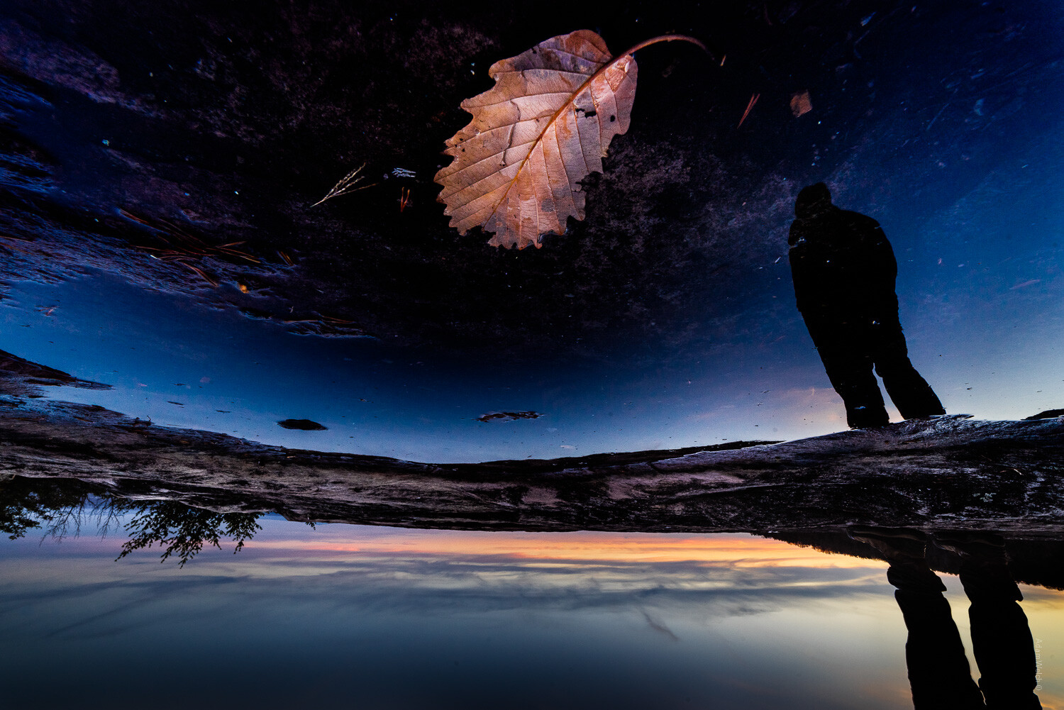
Traditionally, I’ve always thought of highlights as the brightest portions of an image, which is not the case. At least not the case to the utmost extent. In truth, highlights can be considered the areas of a photograph which consist of high luminance values yet still contain discernible detail. Here’s an example of highlight luminance values:

Understanding Tonal Range in Photography 3

Notice that even though these areas are bright, there is still some discernible texture and detail to be made out within the bright spots. If we were to increase the exposure, in camera or with post-processing, it would become so bright that it would lose detail entirely, which brings us to our next point.

Whites

If we increase the brightness to the extent that our highlights become ‘blown out’ (where details are invisible), we have complete white.

Even if the white area doesn’t appear white, it may be considered a total ‘white area’ due to the lack of detail. The following is an example of luminance considered total white:

Understanding Tonal Range in Photography 4

Depending on your photograph, it may or may not be desirable to push the exposure to the point of white-out. We’ll talk more about this as we discuss the relevance of tonal range in regards to constructing your images.

Midtones

A mid-tone is precisely that – all luminance values that are not dark or light are considered to be mid-tones. Most of the time our camera meter will attempt to expose for this average brightness when in ‘Automatic Mode.’

Understanding Tonal Range in Photography 5

While mid-tones help to ensure much information is contained in an image, a photograph consisting of only mid-tones lacks dynamics.

Shadows

Areas that appear as shadows are closely related to highlights albeit in the opposite direction. Shadows are the areas of a photo that are dark but still retain a level of detail.

The above photo is a perfect example of more information in the shadow areas, so let’s use it one more time:

Understanding Tonal Range in Photography 6

These darker areas still possess information seen by the viewer. However, if we darken them to the point where that detail gets lost or ‘burnt out,’ then…you guessed it, they become a completely black luminance value.

Blacks

Any portion a photograph that has zero luminance is considered to be black. Much like the complete white areas earlier, these points within our images don’t have to be utterly devoid of color to be regarded as pure black.

Let’s look at some shadows that are completely burnt out and retain no detail whatsoever:

Understanding Tonal Range in Photography 7

Completely black areas are so dark that you can see nothing. Consider them the ‘dark abyss’ within a photograph. Having these areas within your image isn’t necessarily a bad thing, so let’s talk about that now.

Luminance Values and You

If you ever open a conversation among a group of photographers about the suitability of brightness levels within a photograph, you’d see that the schism is split. Some photographers feel that images should contain no areas of complete black or complete white – that all portions of the photograph should present some level of detail for the viewer.

Understanding Tonal Range in Photography 8

Still, others contend that it’s perfectly fine to either burn or blow out some luminance values for the sake of contrast. Doing this means that there is an area of complete black and complete white so that all the other luminance values fall somewhere between those two absolutes.

While it’s true that it is often desirable to deliver the maximum amount of visual information to your audience, this is not always the case. There are times when a crushed and burnt out shadow or a super-bright highlight are just what you need to bring a photograph home.

Understanding Tonal Range in Photography 9

Final Thoughts

I’m happy to profess my opinion that there is no such thing as a set technique for each photograph you make. It might seem like a simple thing to remember, but it’s easy to overlook the importance of how different levels of brightness affect an image. Let’s take a quick run back through what we’ve learned about luminance values:

  • Highlights – Bright areas within a photo that still maintain detail
  • Whites – Areas of extreme brightness where there is absolutely no information(detail) remaining
  • Midtones – These are neither shadows or highlights but rather a middle value of luminance
  • Shadows – Darker areas of the image that still maintain detail
  • Blacks – Completely ‘burnt out’ portions of a photo that contains absolutely no detail

Like most concepts in photography, it’s essential to have a full understanding of the tonal range falling within your photos. You should use this knowledge to strive for technical excellence and also so you know when to break the rules in favor of fulfilling your creative vision.

How do you make use of tonal range in your images? Share with us your thoughts and images in the comments below.

The post Understanding Tonal Range in Photography appeared first on Digital Photography School.


Digital Photography School

 
Comments Off on Understanding Tonal Range in Photography

Posted in Photography


Three Ways to Apply Tonal Effects in Photoshop

13 Jun

We are used to thinking about photography in terms of color or black and white, but before we arrived here, though, there were a series of processes that resulted in images being monochrome. In this tutorial, I’ll show you how to get those looks so you can think outside the box and achieve different tonal effects that will make your photos unique.

Intro Tonal Effects Photoshop Tutorial

Adding a tonal effect can give your photos from different collections a unified look. It can also help to set the atmosphere of a scene, or simply give a nostalgic and antique look. Before photography became as we know it to be today, there were many experiments and formulas chemists used that became popular throughout history.

Many of them had a particular color. The most popular are sepia and cyan and now it’s possible to achieve these and any other tonal effect with just a few clicks. I’ll show you three different ways to achieve it so you can choose which method suits you best.

#1 – SOLID COLORS

First of all, you need to work with a black and white image. There are many different ways to achieve this in Photoshop. The one I’m choosing is Menu > Image > Adjustments > Black and White because it gives you a lot of control.

Three Ways to Apply Tonal Effects in Photoshop

Once you have your starting image as black and white, you need to add a solid color adjustment layer. To do this go to the Layers palette and click the adjustment layers button on the bottom and choose the Solid Color option from there.

A pop-up window will open where you can choose the color you want for that layer. There’s no right or wrong here, it’s a matter of taste but for a sepia tone go somewhere in between the yellow and the red and when you’re happy just click OK.

Solid Color Tonal Effects Photoshop Tutorial

Now the color should have covered the entire image, which is normal as you added a solid color. But you still need to merge it with the image, so open the blending options menu from the top of the Layers palette and choose Soft Light.

Solid Color Soft Light Tonal Effects Photoshop Tutorial

You can also check out the other blending possibilities to see if there’s something that suits you better, but Soft Light usually works best for me. You can make a final adjustment on the layer opacity if you think it needs tweaking and that’s it!

Sepia Tonal Effects Photoshop Tutorial

#2 – ADJUSTMENT LAYERS

To achieve a cyan tone on your photo you need to start with a black and white image the same as the previous process, so I’ll use the opportunity to show you another way of converting your color photo into black and white.

Go to the Layers palette, add an adjustment layer. and from the drop-down menu choose Black and White. On the Properties window, you’ll have the same adjustments as the previous method as I used above.

The difference is that now you’ll have the black and white adjustment on a different layer so you can come back and tweak it or change the opacity at any time.

Adjustments Layer BlackandWhite Tonal Effects Photoshop Tutorial

Next add another adjustment layer, this time choosing Levels from the menu. In the Properties window, you can see a histogram of your image that shows you the blacks, whites, and mid-tones in your image and a corresponding slider to each of them for you to adjust.

Start moving the sliders to increase the contrast of your image as this will give a better result when you apply the cyan color to it.

Adjustments Layer Levels Histogram Tonal Effects Photoshop Tutorial

The final step you need to do is to add a third adjustment layer, this time using the Hue/Saturation option. On the Properties window move the Hue slider towards the blue end until you find a tone that you like, around the 215 is usually pretty good. If you feel the blue is too intense just decrease the saturation value a little until you are satisfied with the result.

Adjustments Layer Hue Saturation Tonal Effects Photoshop Tutorial

Now you have a snowy photo with a nice cold tone to boost the mood!

Cyan Tonal Effects Photoshop Tutorial

#3 – DUOTONE

If you are thinking that sepia or cyan are very nice effects but it would be even better if you apply both or even more, you don’t have to worry. Photoshop has thought about that too.

First, you have to open your black and white image (or convert your image to black and white as we did above). Then go to Menu > Image > Mode and choose the Duotone option. This is correct even if you want three or four tones, you will modify that later.

Duotone Tonal Effects Photoshop Tutorial

A pop-up window will open where you can choose the number of inks (tones) that you want in your image just by clicking on the drop-down menu. For this example, I’m choosing Tritone so three fields will be available to choose the inks.

Triotone Tonal Effects Photoshop Tutorial

You can set the color of each ink by clicking in the second square which will open a pop-up window with a color picker. So just click on the tone you like and hit OK. Then name it in the field to the right of the ink. Repeat this process for each ink color.

Duotone Color Picker Tonal Effects Photoshop Tutorial

Now the colors you selected are all covering the image in the same way. But you can modify that by choosing which ink will affect more which tones. For example, I choose the magenta for the darkest tones and the yellow for the lighter tones, but you can choose any tone and any adjustment you want.

Just click on the first square which will open the Curves window. By default, it will have a diagonal straight line that goes from 0 (black) to 255 (whites) you can experiment moving it all you like until you get the look of your image right.

Duotone Curves Tonal Effects Photoshop Tutorial

Because of all the possibilities, this is the hardest technique but also the more personalized one that will give you a very unique result. Try it out and let me know in the comments how it goes!

Duotone Tonal Effects Photoshop Tutorial jpg

Your turn

So there you have three methods for applying tonal effects using Photoshop. Do you use any of these for your images? Which method do you prefer? Do you have another technique you like? Please share your tonal effects images and ideas in the comment area below.

The post Three Ways to Apply Tonal Effects in Photoshop appeared first on Digital Photography School.


Digital Photography School

 
Comments Off on Three Ways to Apply Tonal Effects in Photoshop

Posted in Photography


Tonal Tricks and Treats: Sweets Neatly Arranged By Color

22 Dec

[ By Delana in Art & Photography & Video. ]

purple

If you’re one of those people who has to have everything arranged in a very specific way, the art of Emily Blincoe is exactly what you’ll want to spend part of today staring at.

red

yellow

pink

Blincoe is a photographer who created the Sugar Series, a set of photos that depict all different types of sweets arranged neatly by their predominant color.

blue

orange

white

There are familiar candies that you might remember depending on which part of the world you are from, and there are others (Teaberry Gum or tighty whiteys on a stick, anyone?) that might not be quite as recognizable.

green

gold

black

Blincoe’s other series (collectively named Colors Organized Neatly) include similarly color-coded objects, all arranged by their respective hues and neatly laid out on vivid backgrounds.

Share on Facebook


[ By Delana in Art & Photography & Video. ]

[ WebUrbanist | Archives | Galleries | Privacy | TOS ]


WebUrbanist

 
Comments Off on Tonal Tricks and Treats: Sweets Neatly Arranged By Color

Posted in Creativity


Improving Composition with Tonal Contrast

18 Jun

A contribution by Andrew S. Gibson author of Understanding EOS: A Beginner’s Guide to Canon EOS Cameras.

Tonal contrast 1

If you were to ask me for two ways that you could improve the composition of your photos, the first piece of advice I would give you is to keep the composition as simple as possible. Eliminate anything that isn’t part of the story from the frame.

The second part of the answer is to focus on tonal contrast. Now, many discussions of composition tend to concentrate on the basics, such as the rule-of-thirds, leading lines, use of colour and so on. Not many people seem to be talking about tonal contrast. That’s a shame, because it’s an element that can really improve your composition.

What is Tonal Contrast?

Tonal contrast is created when light tones and dark tones lie alongside each other. Here’s an example:

Tonal contrast 2

The tonal contrast in this photo is created by the difference in brightness between the white flower and the dark green background.

In any photo it is natural for the eye to go straight to the highlights. That is what is happening here – the viewer’s eye is pulled by the lightest tones in the image, the flower, and then travels slowly around the rest of the image, taking in the detail. It sets up a kind of visual dynamism between the light and dark tones.

Here’s another example of tonal contrast in action:

Tonal contrast 3

Here, the tonal contrast is provided by the difference in brightness between the white parts of the waterfall and my model’s clothing, and the dark tones of the water and the rocks.

Working in Black and White

Tonal contrast is the basis of many successful black and white images. Indeed, if you need help to see the tones in your colour photos an easy way to do so is to open them in Photoshop and reduce the colour saturation to zero. This is what happens to the two photos above when we do that:

Tonal contrast 4

Tonal contrast 5

It is easier to see tonal contrast in black and white images because there is no colour to distract your eye from the brightness values within the photo.

You will also notice that the composition of these images is very simple. Simplicity helps improve composition by eliminating distractions.

Let’s look at another example:

Tonal contrast 6

This is a photo that I took in an antiques market in Shanghai. You can see my two principles of composition in action here:

Simplicity: I moved in close to concentrate on the dominoes.

Tonal contrast: The ivory coloured dominoes are offset by the dark tones of the box they are in.

Tonal contrast 7

Here is the desaturated version. The tonal contrast is even clearer in this image.

There are a few more points I’d like to make here:

  1. Tonal contrast is a great basis for a successful black and white image. The desaturated versions of the above photos all work fairly well. It won’t take much more work to turn them into striking monochrome images.
  2. Images with strong tonal contrast tend to work well in both black and white and colour. An interesting exercise you could try is to go back through photos that you have already taken and select some that feature strong tonal contrast. Then convert them to black and white. I think you will be able to create some strong monochrome images if you do this.
  3. Keeping your compositions simple helps make the most out of tonal contrast. If you include too much within the frame, the impact of any tonal contrast is lessened.

Finally, please note that reducing the colour saturation to zero is usually not the best way to convert a colour image to monochrome. The aim here is purely to make the tones easier to recognise by eliminating the distraction of colour.

Does that mean that every image requires tonal contrast to be successful? No, it doesn’t. It is merely one tool of many at your disposal. The key concept to understand is that learning to recognise and utilise tonal contrast helps you create stronger photos.

For example, if you have arranged a photo shoot with a model in a location with a dark background, you could ask her to wear something light in order to set up tonal contrast between her clothes and the background.

Lack of tonal Contrast

There are times when tonal contrast is not evident in a photo, yet the composition is still successful. Here’s an example:

Tonal contrast 8

Now let’s look at the desaturated version:

Tonal contrast 9

You can see that there isn’t much tonal contrast. Yet the photo works because the purple flower is complemented nicely by the green background. This is called colour contrast and in this image more than compensates for the lack of tonal contrast.

Andrew S. Gibson is the author of Understanding EOS: A Beginner’s Guide to Canon EOS Cameras. He is a professional writer and photographer based in Wellington, New Zealand.

Post originally from: Digital Photography Tips.

Check out our more Photography Tips at Photography Tips for Beginners, Portrait Photography Tips and Wedding Photography Tips.

Improving Composition with Tonal Contrast


Digital Photography School

 
Comments Off on Improving Composition with Tonal Contrast

Posted in Photography