RSS
 

Posts Tagged ‘contrast’

How to Expose Correctly for High Contrast Wildlife

25 Oct

Photographing wildlife of deeply contrasting colors, such as black bears or white waterfowl, can present certain challenges setting up shots that are properly exposed for the wildlife and also the surroundings. Harsh lighting also makes exposing for these subjects especially difficult. The hurdle to overcome in these cases is to expose for the subject animal(s) properly and still capture a scene that is pleasing to the viewer. What often results are images where the exposure is correct for the surroundings, but the creature is either under or overexposed.

Getting the subject wildlife exposed correctly is a more important aspect because the background can be dealt with later in post-production. In some cases, the background just doesn’t really matter in comparison to the photo capture of the often elusive wildlife in the scene.What follows are methods to use in stark color-contrasting situations. One is for dark colored wildlife such as black bears or ravens, and another for light colored wildlife such as egrets or swans.

What follows are methods to use in stark color-contrasting situations. One is for dark colored wildlife such as black bears or ravens, and another for light colored wildlife such as egrets or swans.

Exposure Details

A reality of photographing wildlife is that when things happen, they happen fast. Lighting may change very quickly and there may not always be time to make adjustments while shooting the action of the wildlife in view.

Most experienced photographers want control of all camera settings and don’t generally choose to shoot in auto modes for shutter speed and aperture in order to control movement and depth of field. So is there was a way to set the shutter speed and aperture and still get the correct exposure without the hassle of continually changing settings as the light changes?

There are many ways of shooting wildlife resulting in a desirable exposure, but probably one of the most overlooked ways is using the Auto ISO setting in Manual mode. To use this method, set the camera in Manual mode, adjust shutter speed and aperture to the settings desired, and then set the ISO to auto-ISO. Most cameras will allow you to set a maximum ISO, so it’s helpful to know at what ISO the images become unacceptably grainy with your camera. However, this still doesn’t entirely solve the problem of correctly exposing for those dark and light animal subjects. To solve these problems you can fine-tune the exposure by using exposure compensation.

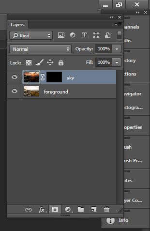
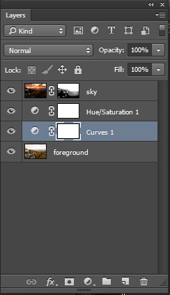
Correcting the background in post-production

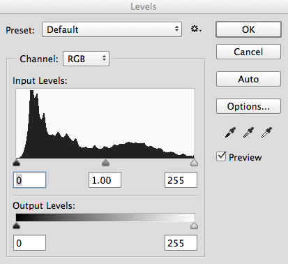
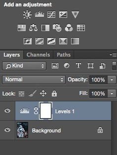
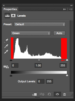
As in any image, if editing is planned it is important that the image be shot in RAW mode. When opening an image in Adobe Raw Converter (ARC) (or Lightroom) and if the exposure for the animal is correct in camera, then only the background may benefit from corrections in post. In most cases for wildlife images, the background hues are green, yellow or blue. To enhance or balance these colors in ARC, go to HSL/Grayscale panel and simply darken or lighten the luminance for green, yellow or blue until the background exposure appears to match the exposure of the animal. A little saturation may also be added. If a little punch or contrast would improve any background flatness, one may use an adjustment brush to add some contrast and clarity to the background. It’s that simple!

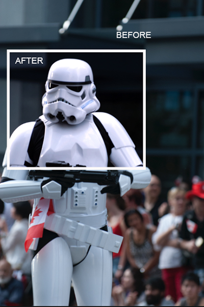
Dark Colored Wildlife

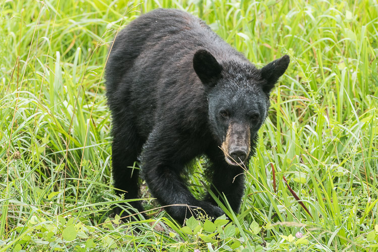
In this image the correct exposure for the black bear over-exposes the green background.

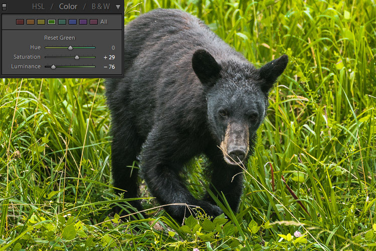
The luminance of the green has been adjusted to decrease the background exposure.

The dark hues of some wildlife will absorb more light than the scene around them, so it becomes necessary to increase the light taken in by the camera by using exposure compensation as mentioned above. For wildlife with dark colored coats or feathers, use exposure compensation and adjust by adding light (+value). This will suffice in most cases, depending on the amount of natural light available.

Keep in mind that the wild subject is the most important component in the image, so if any aspect of the image should be sacrificed in the moment, make it the background. For really dark creatures, such as bears, start out by using a compensation of +1. Remember, don’t worry about the background. The animal is the important exposure!

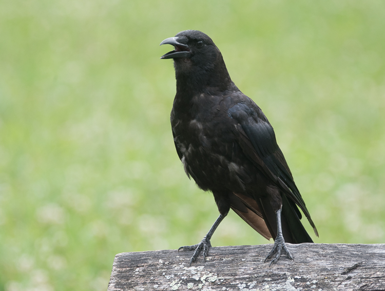
The exposure is correct for the black bird, but the background is washed out and boring.

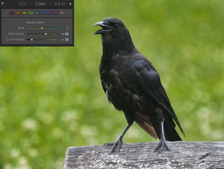
Again, the luminance of the green has been adjusted. Then an adjustment brush has been used to add contrast, creating a vibrant background.

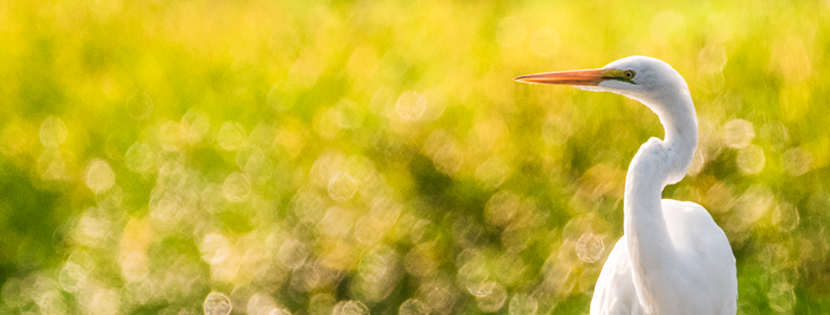
Light Colored Wildlife

Conversely, for light colored animals, use exposure compensation and adjust by subtracting light (- value). The whiter color of many beautiful creatures will reflect much more light than the background will, so it helps to decrease the light the camera takes in so as not to overexpose the animal.

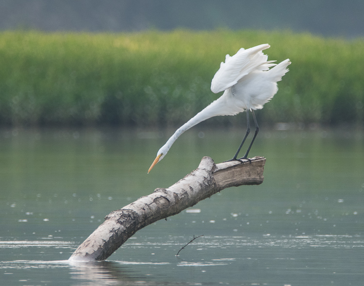
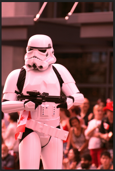
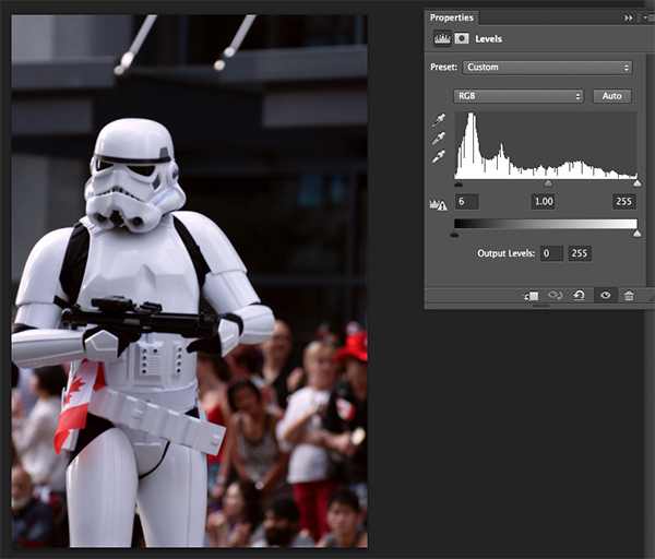
In keeping the white egret from being overexposed, the background appears dull and dark.

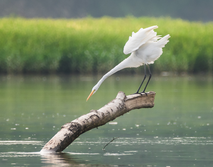
The green and yellow hues were adjusted to add life to the background. Notice that in every case the exposure of the subject is unchanged.

Why can’t I just correct the exposure of the wildlife in post-production?

Of course, this is an option. But there at least two reasons for not correcting the exposure of the subject later on the computer.

  1. Any time a major exposure correction is undertaken, there is a certain amount of digital data of the image that is lost. Therefore, it is best to get the main subject of the image captured as closely as possible in camera. (This is true of any image, not only wildlife subjects.)
  2. When photographing extremely light colored animals, if the white is over-exposed to absolute white there is nothing that can be done in post-production to pull out any detail. Darkening the subject will not bring back any nuance in the creatures coloring, and the image will lose desirable texture. Again, conversely, if the black-coated bear or bird is underexposed to absolute black there is no way to lighten the subject and pull out interesting details from the fur or feathers.

What about the Eagle?

Some animals are doubly challenging as in the case of the American Bald Eagle, with its white head and dark body. These magnificent creatures are almost impossible to photograph in harsh light. If choosing which end of your histogram to sacrifice, my opinion is to expose for the white head.  Again, avoid harsh lighting if at all possible.

Conclusion

Remember, when you’re faced with a choice of settings for an extreme exposure while photographing wildlife, never sacrifice your subject. Whether a light or dark-coated bird or animal, intentionally set up the shot to capture the creature and its distinctive features and keep the background as a secondary consideration. To make sure the subject will be correctly exposed, use a 3-shot bracketed exposure, with an exposure one stop over and another exposure one stop under the setting.

Do you have any wildlife exposure tips? Please leave them in the comments below.

googletag.cmd.push(function() {
tablet_slots.push( googletag.defineSlot( “/1005424/_dPSv4_tab-all-article-bottom_(300×250)”, [300, 250], “pb-ad-78623” ).addService( googletag.pubads() ) ); } );

googletag.cmd.push(function() {
mobile_slots.push( googletag.defineSlot( “/1005424/_dPSv4_mob-all-article-bottom_(300×250)”, [300, 250], “pb-ad-78158” ).addService( googletag.pubads() ) ); } );

The post How to Expose Correctly for High Contrast Wildlife by Bruce Wunderlich appeared first on Digital Photography School.


Digital Photography School

 
Comments Off on How to Expose Correctly for High Contrast Wildlife

Posted in Photography


How to Create Strong Compositions Using Color Contrast

05 Feb

Color contrast and composition

When I wrote about making dramatic images using shadow and contrast, a reader rightly pointed out that a couple of my photos were also good examples of color contrast.

This is interesting because it shows how two photographers can look at the same scene, and see different things. In those examples I saw textures, shadows, and tonal contrast, and instinctively converted them to black and white. But another photographer might place more importance on the strong colors, and make them the centre point of the composition.

Here’s the first of those images. The color contrast here is between the orange car and the blue sky.

Color contrast and composition

If you look at a color wheel, used by artists and graphic designers to show the relationships between colors, you will see that orange and blue are on nearly opposite sides. They are said to be complementary colors (as opposed to analogous colors, which are close to, or next to each other on the wheel).

Color wheel

Diagram by Wikipedia contributor Jacobolus

Using contrasting colors in a composition nearly always results in a strong image. The key is to keep the composition simple, and not to overwhelm it with too many hues.

Here are a couple more examples. The first shows dramatic red stripes on a lighthouse against a dark blue sky (I used a polarizing filter to intensify the colors). Red and blue are also nearly opposite on the color wheel.

Color contrast and composition

The second shows red flowers, against a green background.

Color contrast and composition

These three color combinations – orange/blue, red/blue, red/green – occur a lot in both natural and man-made environments.

Below is the second photo from the earlier article, mentioned above. It uses a different type of color contrast. The green apples are displayed against a grey background. The lack of color in the background makes the green of the apples seem more intense than it is in reality.

Color contrast and composition

This technique of placing a colored object against a dark or neutral background is another that you can use over and over. It’s very effective. Here are two more examples.

The first shows a work created by artist Chris Meek. The grey background emphasises the yellow paintwork, the only strong color in the image.

Color contrast and composition

Image used with the permission of the artist

The second shows a display of pumpkins. The dark grey background emphasizes the intensity of the orange hues.

Color contrast and composition

The key here again is to keep the composition simple. Imagine each of the previous examples with a splash of red in the image somewhere. The red would pull your attention away from the dominant colors, and diminish the impact of the composition.

Another approach to using color contrast is to look for scenes with a limited color palette. Here’s an example – the image below is a portrait of a friend of mine, sitting in front of a gypsy caravan, that she made herself. The image is full of color, but they are mostly shades of two different hues – red and green, which we know are near opposites on the color wheel.

Color contrast and composition

Here’s another example. It’s a colorful image, but again there are two dominant hues – blue and red. The incongruity of the plastic sleeves the chef is using to protect his arms, combines with the color contrast to make a strong composition. The colours are more muted than the earlier examples with this color combination, but it still works.

Color contrast and composition

The images in this article have several things in common: strong use of color (in different ways), simple composition (simplicity often equals strength in design), and good observational skills.

It is is one thing to analyze these things in photos, it is another to train yourself to see them. To do so, you really have to think about the scene in front of you. What colors do you see? Does the light suit the subject? How can you simplify the composition to make those colors stronger? If you can figure out the answers to these questions, your images will be stronger.

Do you have any questions about color contrast, or any photos to show us? Please let us know in the comments below.


Mastering Composition

Mastering Composition ebook by Andrew S. Gibson
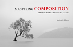
My ebook Mastering Composition will help you learn to see and compose photos better. It takes you on a journey beyond the rule of thirds, exploring the principles of composition you need to understand in order to make beautiful images. You’ll also learn how to use colour to create photos like the ones in this article. Click the link to learn more or buy.

googletag.cmd.push(function() {
tablet_slots.push( googletag.defineSlot( “/1005424/_dPSv4_tab-all-article-bottom_(300×250)”, [300, 250], “pb-ad-78623” ).addService( googletag.pubads() ) ); } );

googletag.cmd.push(function() {
mobile_slots.push( googletag.defineSlot( “/1005424/_dPSv4_mob-all-article-bottom_(300×250)”, [300, 250], “pb-ad-78158” ).addService( googletag.pubads() ) ); } );

The post How to Create Strong Compositions Using Color Contrast by Andrew S. Gibson appeared first on Digital Photography School.


Digital Photography School

 
Comments Off on How to Create Strong Compositions Using Color Contrast

Posted in Photography


How to Use Shadow and Contrast to Create Dramatic Images

24 Dec

shadow and contrast

You can use shadow and contrast to create dramatic images. The key is to forget about shadow detail. You don’t need it. Shadows are meant to be dark and mysterious. This is good – it leaves something to the viewer’s imagination.

Utilize the dynamic range of your sensor. Expose for the highlights, and let the shadows fall where they will. If the light is strong enough, the shadows will contain very little detail.

Harsh light can make dramatic images

I took the following photo in Bolivia. The sun was sinking behind me, casting a strong shadow that had started to touch the underneath of the old car. The shadow fills the bottom third of the image. We don’t need detail in the shadow, although a little doesn’t hurt. Shoot in Raw format, and in most cases you’ll be able to pull some shadow detail out in post-processing, giving you a choice.

shadow and contrast

When I see a dramatic image like this, with strong shadows, my immediate instinct is to convert it to black and white. High contrast scenes look great in monochrome. There’s something about removing colour that emphasizes the depth of the shadows, and the drama of the composition. You can add impact by increasing contrast in Lightroom and emphasizing texture using the Clarity slider. Here’s my black and white conversion of the photo above.

shadow and contrast

Look for naturally contrasty scenes

I took the next photo indoors, in an old manor house that had been converted to a museum. The apples were lit by light coming through a window. The windows were small, so the interior of the room was naturally dark, which is why there is so little detail in the background. It’s a high contrast scene – the area lit by window light ,is much brighter than the rest of the scene.

shadow and contrast

Here’s the same image converted to black and white. Without colour, the emphasis is on the textures and shadows.

shadow and contrast

Silhouettes

The following photo of an approaching storm uses also uses shadow and contrast. The mountains are backlit and silhouetted. The approaching storm clouds are dark and ominous. A brightly lit strip of sky fills the gap between the two dark areas. A silhouetted telegraph pole forms a natural focal point. The drama of the light has created a dramatic image.

shadow and contrast

The image is naturally monochromatic, and converts well to black and white.

shadow and contrast

There are lots of shadows in this seascape. But the ones that caught my eye were the silhouetted figures on the right. After I had set up the shot, two children walked across the beach, and climbed up on the rock. I used a long shutter speed (30 seconds) to blur the water, which also blurred the silhouetted children. I was fortunate because the figures add human interest and scale to the scene. They are a natural focal point that pulls the eye across the photo.

shadow and contrast

shadow and contrast

It also converted well to black and white.

The final image is also one that uses shadow to create mystery and drama. I focused on the grass on the foreground, set a wide aperture, and let the sun go out of focus. I adjusted the white balance in Lightroom to emphasize the warmth of the setting sun. This image is different from the others in that the colour is an important part of the composition and it doesn’t work as well in black and white.

shadow and contrast

Conclusion

One of my aims with this article is to dispel the idea that it is essential to capture lots of shadow detail, and that if you fail to do so, it is some kind of technical shortcoming. Not so – let’s celebrate the fact that camera sensors don’t capture the full range of brightness that our eyes are capable of seeing. Let’s use the interplay of light and shadow to create interesting and dynamic compositions. Let’s create some mystery and leave gaps for the viewer’s imagination to fill in.

Do you use shadows in your images? Please share your images with lots of shadow and contrast in the comments below.


Mastering Composition ebookMastering Composition

My new ebook Mastering Composition will help you learn to see and compose photos better. It takes you on a journey beyond the rule of thirds, exploring the principles of composition you need to understand in order to make beautiful images.


googletag.cmd.push(function() {
tablet_slots.push( googletag.defineSlot( “/1005424/_dPSv4_tab-all-article-bottom_(300×250)”, [300, 250], “pb-ad-78623” ).addService( googletag.pubads() ) ); } );

googletag.cmd.push(function() {
mobile_slots.push( googletag.defineSlot( “/1005424/_dPSv4_mob-all-article-bottom_(300×250)”, [300, 250], “pb-ad-78158” ).addService( googletag.pubads() ) ); } );

The post How to Use Shadow and Contrast to Create Dramatic Images by Andrew S. Gibson appeared first on Digital Photography School.


Digital Photography School

 
Comments Off on How to Use Shadow and Contrast to Create Dramatic Images

Posted in Photography


Add Contrast to Your Images by Using Complementary Colors

02 Oct

When looking at something as cognitive human beings, we naturally get a response. These responses could be emotional, physical, intellectual, etc. There is a whole range of how we respond. This range of reactions is essential for the photographer, no matter if you are shooting wedding photos professionally, landscapes for a hobby, or street photos as a traveler. Just as there is a range of photographic intentions there are ranges of how we interpret what we see. So, how do you see, and what makes you more likely to push the shutter button here and not there?

001 Red and green

From a market in Korea this green sea veggie and the red baskets they are placed in show how saturation can be achieved through color contrast

One reason is color! Colors can be striking, bold, subtle and muted, or they could be vibrant, luscious, and soft. The descriptions of colors goes on and on, as does the names of colors. Pick up an elementary school crayon box and what you’ll notice that what used to have eight colors when I was young, doubled to 16 and now there are even boxes with 152 different colours (I did look back into Crayola history and found they were sold in metal tins of 48 crayons). So again, we could make this as complicated as possible, but I can’t keep track of all those color names, can you? Nor do I want to. I just want better images.

To keep it straight forward and simple we will look at the traditional color wheel. Color wheels for printing and or mixing colors (e.g., oil painting), are not the same, so our focus is simply on what looks good to us, not the pigment mixing of paints, for painters and printers. If you look at the traditional color wheel, the complementary colors are the ones opposite of each other. When these colors are both present, called contrast, then it is pleasing to the eye.

Why, because the different colors excite different cones (or color receptors) in our eye which in turn sends signals to our brain giving us a feeling. As mentioned above colors are described in a variety of ways, as too are feelings. Sometimes complementary colors are more soothing, and sometimes they are more powerful. That often depends on the context and perspective that the colors are in (the surrounding colors), along with their tone (dark or light). Simply put, complementary colors vibrate themselves and give us feeling.

002 Yellow and purple

The contrast of the yellow to the purple direct the eye towards the center of the water lily along with selective focus. Combine color with other techniques to help guide the viewer. From Changchun China International statue park.

One reason that complementary colors tug our hearts in one direction or another is because the complementary color is actually a blend of the other two primary colors. Thus, each primary color has one complementary color which is a mix of the other two primary colors. The traditional complementary colors are red and green, yellow and purple, and blue and orange. Red is a primary color and its complement is green (i.e. a mix of yellow and blue—the other two primary colors). Thus when using complementary colors you are actually stimulating all of your color receptors but in a slightly deceiving way. If we look at the complement of yellow, it is purple. What are the two primary colors that create purple? You got it, red and blue.

003 Blue and orange

The blue background of the volcano after sunset in Guatemala really highlights the orange lava bursting out. A much different feeling would be created if the picture had been taken at golden hour, rather than blue hour.

If we look at many Dutch master painters they were very skilled in the art of light and dark. Using lighter areas to attract your attention to certain areas of the photo, and using darker tones to push areas back into the shadows. If we move forward in the impressionist era, Monet definitely shows his use of complementary colors in his painting Impression, Sunrise (Impression, Soleil levant) in 1872, of the orange sun with the blue seascape. In the post-impressionist era, Van-Gogh’s Starry Night in 1889 of the yellow stars, and the purple night sky is maybe one of the most famous examples of the use of complementary colors.

So back to photography, what does this all mean? Well for one, print out a color wheel and put it in your camera bag. You can never look at color enough. Even back in ancient Greece, Aristotle pondered color and how it seemed to change based on the light around it. Moreover, if you look in the shadow of a primary color you will see hints of its complement. Color is one of the most subjective forms of visual art, and thus, it is very much open for interpretation and experimentation. Like most concepts in photography it is best to know the “rules” then to learn how to break them.

004 No blue

No blue: by subtracting one of the primary colors you can still achieve vibrant and dynamic results.

005 No Red

No Red: Because there is no red, the other colors seem to create more contrast.

006 No Yellow

No Yellow: In a very colorful scene, eliminating one primary color brings continuity to the photo.

Go out and see the world, armed with a little more understanding of what and how we perceive the world around us. Don’t be afraid of color in the natural world. But don’t expect to get it right by just ramping up the saturation slider in post-processing. Colors are vibrating wave forms all around us. Placing complementary colors next to each other gives your photo a little bit more energy.

Looking for the right colors might help you broaden your portfolio and prevent you from over-valuing leading lines or the rule of thirds. It might also help add punch to your textures, rather than sliding that saturation bar all the way up. Complementary colors naturally create contrast so you don’t need to try to create it in post-production. Let complementary colors complement your other strengths as a photographer.

007 color circle from 1708

Traditional Color wheel from the early 1700’s.

Please help continue the tradition by sharing your thoughts and photos below.

googletag.cmd.push(function() {
tablet_slots.push( googletag.defineSlot( “/1005424/_dPSv4_tab-all-article-bottom_(300×250)”, [300, 250], “pb-ad-78623” ).addService( googletag.pubads() ) ); } );

googletag.cmd.push(function() {
mobile_slots.push( googletag.defineSlot( “/1005424/_dPSv4_mob-all-article-bottom_(300×250)”, [300, 250], “pb-ad-78158” ).addService( googletag.pubads() ) ); } );

The post Add Contrast to Your Images by Using Complementary Colors by Branson Quenzer appeared first on Digital Photography School.


Digital Photography School

 
Comments Off on Add Contrast to Your Images by Using Complementary Colors

Posted in Photography


Architectural Photography Using Layer Masking to Correct Contrast and White Balance

17 Dec
Dps 2

A challenging nighttime scene was overcome with multiple exposures and layer masking.

Blending indoors and outdoors in architectural photography can often create a compelling image. Unfortunately, however, it is often fraught with exposure and white balance issues. These issues are compounded at night, when artificial lights inside buildings coupled with the darkness of the night sky create an especially contrasty image with an unattractive colorcast created by the different light sources. Luckily, with multiple exposures and layer masking in Photoshop, you can create a photo that looks a lot like what you saw with your own eyes.

This method is a little different than HDR, which involves taking three or more photos at different exposures, then using automated software to combine them into one image that captures the range of light in the scene. Here, you’ll be taking three or more photos and blending them manually, since HDR software often creates unpleasant artifacts and odd color blending when used in the type of situations presented in this tutorial. You can always try HDR software first, and if the colors don’t seem to bleed, you can skip down to the later part of the tutorial for dealing with the colorcasts.

Dps 1

An image that required three exposures and had a color cast from the lamps.

Shoot three or more exposures on a tripod

You need to shoot as many photos as it takes to capture the dynamic range (the range from light to dark) in the scene. It is really important to shoot in RAW, to get as much mileage out of each photo as possible. A tripod is also necessary, since you’ll probably be taking these at night, and also because you won’t be using HDR software which aligns the images. You can use auto exposure bracketing to capture three images, but at night, exposures on the high end can often exceed 30 seconds, the longest shutter speed most cameras will let you shoot manually. It’s probably easiest to use manual mode, set your ISO to 100 or 200, stop down your aperture to f/7.1 or f/8 (if it’s really dark out, you can open it up wider), and then take a series of shots at increasingly slower shutter speeds until you’ve captured the range of light in the scene. If you need to go past 30 seconds, go into bulb mode (consult your camera’s manual for how to find it), and use a remote trigger release, holding the shutter open as long as you want. Don’t worry about white balance yet.

Dps 3

Processing one of the RAW files in Lightroom. Here you can see where just processing one RAW file wouldn’t be sufficient.

Process each exposure in Lightroom or Camera Raw, then open as layers in Photoshop

First, you are going to process the photos for exposure only, ignoring white balance. If you don’t have Lightroom, you can do this in Adobe Camera Raw. Since you have multiple exposures, you don’t need to go crazy trying to recover lost highlights (overblown bright spots) and shadows (dark parts that look black), but you want to recover them a little bit to give you more leverage later on in the process. There’s no magical formula for processing here. I usually apply lens profile correction, remove chromatic aberration, and do a little noise reduction before bringing down the highlights a little bit and bringing up the shadows and whites a little bit. Once you’re done processing each exposure, select them all, right click, and select “open as layers in Photoshop. Now you’ve got an image with three or more layers all ready to go, but we’re no quite ready to do the layer masking yet.

Dps 4

Go back and reprocess for white balance

White balance is a setting that keeps the whites in the image white, removing any colorcasts. Different light sources have different white balance settings though, so if you have a photo with two or more different light sources (such as the night sky and an artificial light), no matter how you adjust your settings, you’ll always have a color cast somewhere on your photo. What you’re going to do here is reprocess each photo so that you’ve corrected any colorcasts. If you’re lucky, you’ll have no more than two light sources in the photo. Unfortunately, though, there can often be more.

It’s important to note that you only have to correct for colorcasts that are in properly exposed parts of each photo. For instance, in one of your overexposed photos, don’t worry about the white balance for the overblown highlights. You’ll be discarding that part of the photo later. For one of your underexposed photos, don’t worry about correcting for the shadows, since you’ll also be discarding that. Start with your most properly exposed photo, and correct for any colorcast you see (for instance, the lights inside a building have a yellow cast).

All you have to do to correct the white balance is slide those two sliders (one goes from blue to yellow, and the other goes from green to magenta) until the part of the photo with the colorcast looks normal. When you’re done, open that photo in Photoshop, and make it a layer in the other image you have open. Do this by hitting Ctrl-A on Windows, or Command-A on a Mac to select the photo you just opened, then Ctrl-C or Command-C to copy it. Then click on the image with the three layers, and hit Ctrl-V or Command-V to paste it in as a layer. Repeat the processing until you have corrected all colorcasts in the photo. Then, move on to the other exposures, and correct any color casts there (remember, only the properly exposed parts need to be corrected).

Dps 5

Mask in one layer at a time

Once you’ve finally got every exposure and every colorcast accounted for as separate layers, you’re going to mask them in one by one. I start by making all but the bottom two layers invisible and masking in one layer at a time (by the way, the order of the layers does not matter, but having the most properly exposed image on the bottom will probably make things easier). Do this by clicking the little eye to the left of each layer except the bottom two. Then, with the layer one up from the bottom selected, click the layer mask icon (it’s a rectangle with a dot in the middle, found at the bottom of the layer panel). Make sure the paintbrush icon is selected as well (this can usually be found on the left hand side). You may need to adjust your brush size as you go through.

When painting with black on the layer mask, you will cover up the parts of the layer you don’t want appearing (the improperly exposed or color cast parts of the image are what you want to cover up). When you want to go back and reveal parts because you’ve made a mistake, paint with white on the layer mask. Click X on your keyboard to toggle back and forth between black and white.

When you’ve masked out all the parts of the layer you don’t want shown, select the layer on top of that and make it visible (click the space where the eye used to be). Then create another mask and start masking that layer. Keep revealing layers and masking them in until you’re done. In some cases, one part of the photo may be properly exposed in more than one image. In this case, keep the one that looks better to you. Once you’ve finished this process, save the photo as you would normally. If you think you might come back to this photo later and edit it, make sure to save a copy as a PSD.

Dps 6

Sometimes you get lucky, and the part of the image that’s colorcast has a very strong hue to it. If you have a colorcast that’s almost all one color, you can automate the masking process a bit for that layer. In the top pane, go to Select –> color range, then click somewhere in the colorcast. Look at the preview. You want the part of the image that’s your colorcast to be almost completely white, and the rest to look almost completely black. Adjust the fuzziness slider until this is the case, and then click ok. You actually want to select the inverse of that, so go to Select –> inverse. Now click the layer mask icon, and you’ll have a mask that hopefully masks out the colorcast. If it doesn’t look right, undo it and try it again with a different fuzziness setting. This is not a perfect fix. You will still need to do some fine-tuning, but it really helps move things along quicker.

Dps 7

A simple “select color range” layer mask got rid of most of the colorcast in this photo.

Conclusion

This is just one method of conquering the challenges brought on by nighttime architectural photography. As you start working with photos of this nature, you may find a different method that you prefer. Luckily, many photos only require some of the steps detailed in this tutorial. Sometimes you only need one exposure, but you need to process for colorcasts. Other times, the white balance is even, but you need to mask for exposure. It takes practice to master these intricate masking techniques, so don’t give up if you’re unhappy with your results at first. Start with simpler photos with fewer colorcasts and exposures needed before diving into a really complex one. In time you’ll be creating photos that look as natural as they appeared when you saw them in person.

Dps 8

A single exposure that required layer masking to correct colorcasts.

Have you got any tips for doing architectural photography or using layer masking? Please share in the comments below.

googletag.cmd.push(function() {
tablet_slots.push( googletag.defineSlot( “/1005424/_dPSv4_tab-all-article-bottom_(300×250)”, [300, 250], “pb-ad-78623” ).addService( googletag.pubads() ) ); } );

googletag.cmd.push(function() {
mobile_slots.push( googletag.defineSlot( “/1005424/_dPSv4_mob-all-article-bottom_(300×250)”, [300, 250], “pb-ad-78158” ).addService( googletag.pubads() ) ); } );

The post Architectural Photography Using Layer Masking to Correct Contrast and White Balance by Samantha Decker appeared first on Digital Photography School.


Digital Photography School

 
Comments Off on Architectural Photography Using Layer Masking to Correct Contrast and White Balance

Posted in Photography


Using Levels in Photoshop to Image Correct Color and Contrast

03 Dec
Notice the difference some quick adjustments in the Levels tool can make

Notice the difference some quick adjustments using the Levels tool can make

Image editing is an important part of making your good images look spectacular. Photoshop and Lightroom are packed with tools to help you get your images to look great after you have downloaded them on to your computer. While there are many different tools in Photoshop to enhance your image, there are really only a handful of tools that you will use on just about every image; one of those is the levels tool. Photoshop has a levels tool, Lightroom doesn’t unfortunately. Each photographer has a different workflow when editing images, my suggestion is to follow a process that is the same for each image. When you open up an image in Photoshop or Lightroom, the first step is to look at the exposure. Is the image over or underexposed? At this stage of the workflow, you could be looking at a tool like the Shadow and Highlights adjustment, the next one to use would be Levels.

What is the Levels tool?

Levels tool in Photoshop

Levels tool in Photoshop

Levels does two things in one tool, it corrects the tonal range in an image and it corrects the colour balance. Adjustments made using the Levels tool are not only about getting the exposure on your image correct; it also has a second function and that is, it can correct for colour too. Yes, there are other tools within Photoshop that can do this, but the Levels tool can make it really quick and easy.

The Levels tool uses a histogram to show a visual representation of the tonal range in your image. There is a lot to be said about a histogram, but the most important thing to remember is that there is no right or wrong histogram. If you are unsure about how a histogram works, check out: How to read and use Histograms. On the histogram in the Levels tool, you will see a numerical range starting at zero on the left hand side of the graph, and 255 on the right. In the Levels function, zero represents black and if you have pixels that are at zero, that means there is no detail, they are totally black. The right hand side at 255 represents total white. If you have pixels at 255 that means they are totally white, with no detail. If the shape of your histogram is leaning to the left hand side, that means you have a lot of dark pixels in your image and your image is possibly underexposed. If the histogram is more on the right hand side that means you have a lot of bright highlights in your image and it is possibly overexposed. The middle slider is the mid-tone or gamma adjustment. All the pixels that are not highlights or shadows, fall into this category.

How does the Levels tool work?

When you open the Levels tool, very often your first instinct is to push the sliders into a position that makes the image look brighter. That can work, but I suggest that you do the following: Before you make any adjustments, take a look at your image and see if you can pick up a colour cast. This is a tint or colour that affects the whole image, and is often unwanted. For example, if you have a wedding photo of a bride shot on an overcast day and while everything looks okay, there may be a slight blue hue in the image from the overcast light. This means that her dress looks a little blue instead of white. In a case like this, a colour cast is something you want to get rid of. If however you have shot a summer sunset and the whole scene is bathed in warm orange light, this could also be seen as a colour cast, but in that case you would probably not want change it. One way to find colour casts in your images is to look at an area of the image that should be white and see if it has a tint. A colour cast will vary depending on the light you shot under; it could be green, magenta, blue, yellow, orange, or anything in between.

How to use the Levels tool

Make and adjustment layer for Levels

Make and adjustment layer for Levels

You can use the Levels tool on any image that needs the colour or contrast corrected. If you have an image that needs to have the colour cast corrected, like my shot of the Star Wars Stormtrooper does, then do the following:

  1. Open your image in Photoshop.
  2. Click on the adjustment layer icon at the bottom of the Layer panel and create a Levels adjustment layer, or click on the Levels tool icon in the adjustments panel which is directly above the layers panel.

Step 1 – If you need to do colour correction

If your image has a colour cast (the example image does, as there is a slight blue colour because it was overcast weather that day), follow these steps. Not all images need to have the colour corrected, if you are happy with the colour in your image you won’t need to do this. If you do have a colour cast in your image, then do the following:

Bring the white and black sliders to the point where the graph starts moving upwards

Bring the white and black sliders to the point where the graph starts moving upward

Part 1: In the levels tool, click on the drop down box above the histogram that says RGB. This will open up the three channels individually. Click on RED and bring the white slider and black slider in to part of the histogram where it starts to move upwards. Click on the the RGB drop down box again and click on GREEN and do the same, and finally click on BLUE and repeat one more time. This step will only work if there is a colour cast in your image. If there is no colour cast, the histogram will spread to the edges of the graph. In this image, there was a colour cast and this was how the GREEN channel histogram looked.

The red areas in the screenshot above show you where there was no colour information. By sliding the sliders inward to the edge of the graph, you will start to neutralize the colour cast.
Part 2: You will notice that as you make these adjustments, your image may have a very strong colour cast of the channel you are adjusting. Don’t be alarmed, this will all work out once you make the final adjustments.
Part 3: Once you have adjusted for the colour correction in all three colors, you can now adjust the exposure and contrast

Don't be alarmed at the crazy colours you might see during the colour cast adjustments, they will work out in the end.

Don’t be alarmed at the crazy colours you might see during the colour cast adjustments, they will work out in the end.

Step 2 – Adjusting for exposure and contrast

The Levels tool can also adjust your image’s exposure and contrast. In other words, you can use it to make the highlights, shadows and mid-tones brighter or darker – an all-in-one tool. The levels tool is really great to make some quick adjustments to your image, here is how:

Part 1: In the RGB channel, move the white slider in from the right to the edge of the histogram. Do the same for the black slider, adjusting it in to the edge of the histogram on the left. The important tip here is to make sure that you don’t overexpose the highlights and underexpose the shadows. This is called clipping and the best way to see if you are clipping any pixels is to hold down the ALT key when you are adjusting the white and black sliders.
2. Once you have those two sliders adjusted, you can slide the mid tone slider to add some contrast to the scene and this will be the final touch to your levels adjustment.

The final adjustment showing colour correction and contrast correction

The final adjustment showing colour correction and contrast correction

Some final tips to remember

1. Like any tool in Photoshop, if levels is overdone, you will be able to see it in the image. So, be aware of over adjusting your image.
2. Small adjustments always work better than one big adjustment. Make small changes first and see if that works.
3. Use the ALT key to make sure you aren’t losing detail in the shadows and the highlights by clipping your pixels.
4. Add some contrast to your images in levels, that will give your image a bit more pop and will enrich the tones.

The levels tool is a powerful ally to have in your image editing workflow. I use this tool on just about every image I edit. It can really add some contrast and punch to your images so try and use it as often as needed. These techniques take practice, but once you know what to do, the levels tool is quick and easy to use.

Compare the images side by side, there is a subtle but real difference

Compare the images side by side, there is a subtle but real difference

The post Using Levels in Photoshop to Image Correct Color and Contrast by Barry J Brady appeared first on Digital Photography School.


Digital Photography School

 
Comments Off on Using Levels in Photoshop to Image Correct Color and Contrast

Posted in Photography


7 Ways to Handle High Contrast Scenes

02 Dec

Perhaps the greatest challenge you will face in outdoor photography is the high contrast created by the sun and the bright sky versus a darker foreground. That is one of the reason photographers try very hard to shoot at dawn or sunset. Otherwise, the sky is virtually always so much brighter than anything on the ground that it is hard for your camera to deal with the contrast. Either your camera exposes the sky correctly, which makes everything on the ground look black, or the camera exposes the foreground correctly resulting in a blown out (or pure white) sky. If you try to expose in the middle, you will have problems with both highlights and shadows.

The challenge is constant and great, but there are some things you can do to create great pictures no matter what the light. This article will walk you through some ideas for doing that.

1. Fix it in Post-Production

GiantsCauseway

The first thing you can do is try to fix the problem in post-processing. Both Lightroom and Adobe Camera Raw (used in Photoshop and Photoshop Elements) have sliders that can help bring your sky back or add detail to a dark foreground. They won’t bring back a truly blown out sky or pitch black foreground, but you might be surprised at what they can do.

For an overly bright sky, try pulling the Highlights slider down (in other words, pull it to the left). That will usually add detail. If you have blue portions of your sky, another trick is to target the blue portion and make that darker, while keeping the clouds white.  To do that, go to the HSL/Color/B&W panel in Lightroom, or the HSL/Greyscale tab in ACR, and find the Blue slider.  Click on the Luminance tab, and pull the Blue slider down (to the left). That will preserve good highlight tones in the clouds but darken the blue tones to make the sky look much better.

If your foreground is too dark, you can brighten it up using the Shadows slider in the Basic tab of Lightroom or ACR. Pull that slider up (to the right). That will brighten up the darker tones.  You may find, however, that lightening the shadows in this fashion makes the foreground look too flat or washed out. There is a simple cure for that though. Find the Blacks slider, which is just below the Shadows slider, and pull the Blacks slider down (to the left) a little bit. It may seem counter-intuitive to darken the Blacks since you just lightened the Shadows, but this adds contrast back to your foreground. So the foregound will be lighter due to the increase you made to the Shadows, but will still have contrast because of the decrease you made to the Blacks.

2. Consider Converting to Black and White

Horse

The problem you’ll encounter most of the time when you convert your pictures to black and white is a lack of contrast. Very often, photographers convert their pictures to black-and-white only to find that they look dull and flat. You want tones ranging from pure white all the way to pure black. The high contrast you are combating can actually be an asset in black and white photography.

One problem with shooting with a bright sky or at midday, of course, is usually the high contrast. In addition, people are just plain used to seeing the middle of the day, so when they see a picture taken at midday viewers can find it uninteresting. Converting to black and white can solve both of these problems. As mentioned above, the high contrast can be an asset in black and white. Further, black and white is not how people are used to seeing the world, so the photo may look more interesting to them. Of course, this is not a cure-all, and a blown out sky is still a blown out sky, but converting to black and white can occasionally save a really high contrast picture. So, try converting toblack and white if your picture is overly contrasty.

3. Use Fill Flash

People often think about using a flash only in low-light situations. But perhaps a better use for flash is in very bright situations like those we are talking about here. It doesn’t seem to make sense at first, but what you are doing is letting the flash fill in some of the harsh shadows and thereby deal with your high contrast problem.

If you use fill flash, set your camera’s exposure settings so that the sky is properly exposed. You might take a shot or two without the flash to make sure you have it set properly. Then add the flash to brighten up the foreground and keep it from being black. Dial back on the power of the flash unit or the flash exposure compensation to make it look more natural. That should result in a properly lit subject with a sky or background that looks good as well.

4. Use a Graduated Neutral Density Filter

MarinCo

The scenes we are talking about in this article stem from an overly bright background and a dark foreground. The previous tip addressed a way for you to brighten the foreground. Now let’s reverse that and talk about a way to darken the sky so that it is roughly the same exposure as your foreground.

To do that to, you will want to buy a graduated neutral density filter. These are square filters that fit in holders attached to the front of your lens. The top portion of the filter is dark, and it fades to clear glass at the bottom. That way it darkens the sky while having no effect on the foreground. Use one to darken the sky and keep the brightness values within the dynamic range of your camera.

5. Blend Your Exposures

GrandCanyonAll

Another way to deal with contrast that goes beyond the dynamic range of your camera is to bracket your pictures and blend them later. Most cameras have a function in the menu that allows you to set the amount you would like to overexpose or underexpose your pictures. That way when you press the shutter button it will take three pictures: One at normal exposure, one underexposed, and one overexposed. Some cameras will actually allow you to take five or even seven photos.

You can blend these three pictures later in Photoshop by using parts of each exposure for your final photo. For example, you may want to use the sky from the darker, underexposed photo. You may want to use the foreground from the brighter, overexposed photo. There may be elements of each that you want to take from the normally exposed picture. By blending them all together in Photoshop, you will have a picture that is properly exposed across the board.

To accomplish the blending, here’s a quick primer on the process:

  1. Open all your files as layers in the same picture. You can accomplish this in Lightroom by selecting your photos, and then going to Open as Layers in Photoshop (either Photo > Edit In > Open as Layers in Photoshop or right-click and select Open as Layers in Photoshop).  If you don’t have Lightroom, there is a similar function using Adobe Bridge. In addition, in Photoshop you can select photos and open them as layers by choosing File > Scripts > Load Files into Stack, and then using the resulting dialogue box to select the photos you want.
  2. From there, add a layer mask to your top layer (Layer > Layer Mask > Reveal All). The white layer mask you just created does not change anything, and all of this top layer will still show up in your picture. But you have created a mechanism to change that.
  3. To have Photoshop apply portions of the layer below, select your brush tool and set the color to black. Then just brush in where you want the layer below to appear. Remember, anywhere the mask shows white the top layer will show; anywhere the mask shows black it will reveal the layer underneath.
  4. If you want to combine a little of each layer, reduce the opacity of your brush to a lower percentage. Often this process works best by  setting the opacity very low (under 10%) and brushing in the layer below where you want it gradually with a large brush.
  5. When you are done with that process and the photo looks the way you want, merge these layers (Layer > Merge Down). Then repeat the process for the layer below, revealing whatever portions of that layer you want in your final picture.

6. Blend into an HDR File

Thus far, I’ve avoided the option of using High Dynamic Range (HDR) software to deal with the dynamic range problem you face. Of course, you can bracket your photos (as set forth above) and process them using Photomatic Pro, HDR Efex Pro, Photoshop, or other HDR software. That is a topic in and of itself.

For purposes of this article, consider using an HDR file as part of the blending process discussed above. In other words, first bracket your exposures. When you are in front of your computer, create an HDR file using your preferred method. Now, bring your original three exposures and the HDR image into Photoshop using the method outlined above. When you bring them all in, you should have four layers showing.

Then just do the blending process described above. Put the file you think looks the best on top. Next, follow the process set forth above for blending in each of the other layers. If it turns out you don’t want to use one of the layers you can just delete or hide it. Using this method, you should have complete control over the exposure levels in your picture. In addition, this process will provide you the benefit of HDR software without that HDR-look that many photographers try to avoid.

7. Work with it

Tree

This might sound like giving up, but you might consider using the high contrast for effect. For example, you can use the brightness by adding sun’s rays into the picture. You can use the darkness by creating a sillouette. Think about effects like these at the time you are shooting. Sometimes you can turn a problem into an interesting feature of your photograph.

Or, if there is no way to use the high contrast as an effect, you can sometimes minimize it by shooting away from the sun. Not having the sun in your picture will keep the sky from being too bright.  If you are lucky, the sun will lighten up the foreground enough to keep it within the dynamic range of your camera without creating any harsh shadows.

Your Greatest Challenge

Dealing with this problem of dynamic range is perhaps the greatest challenge of the digital photographer. Unless you have thousands of dollars to buy a medium format camera and get the increased dynamic range that the larger sensor size offers, you will need to take steps such as those above when you are shooting outside. Use these tips to overcome this obstacle and make your photos stand out.

The post 7 Ways to Handle High Contrast Scenes by Jim Hamel appeared first on Digital Photography School.


Digital Photography School

 
Comments Off on 7 Ways to Handle High Contrast Scenes

Posted in Photography


5 Easy Steps to Exposure Blending for High Contrast Landscapes

27 Oct
Final Image  Bear Rock, Dolly Sod Wilderness Area, West Virginia

Final Image: Bear Rock, Dolly Sod Wilderness Area, West Virginia. Sunrise and Sunsets can be extremely contrasting and very challenging to capture the wide exposure range.

Here’s a problem I am sure you have encountered, instances where you try to photograph an image that has a greater range of light and dark than your camera can accurately capture. In the example above, when we set our exposure to expose the sky correctly, the foreground objects are severely under-exposed. Likewise, if we set our exposure to correctly expose the foreground, the sky is blown out and loses almost all detail. One solution to this dilemma might be to use HDR software to combine several bracketed exposures into one image. However, this method can be overwhelming and time-consuming to do correctly for a pleasing result. Another solution to this problem could be to use graduated neutral density filters. Unfortunately, a good set of filters can be quite expensive and a cheap set can harm the quality of your image.

A simple solution to this problem scenario may be as easy as taking two exposures, one correctly exposed for the dark areas (in this case the foreground) and the other correctly exposed for the lighter area (in this case the sky). Place your camera on a tripod so that both images will be composed exactly the same.

image correctly exposed for the sky 1/10 of a second @ f/10. ISO 100

Image exposed for the sky: 1/10th of a second @ f/10, ISO 100

Image exposed for the foreground: 1 second @ f/10, ISO 100

Image exposed for the foreground: 1 second @ f/10, ISO 100

Now, let’s look at a simple five step exposure blending process, performed in Photoshop, to resolve this contrast issue.

Step 1: Open your images

Open the two exposures in Photoshop as layers. This can be simply done with the following script. In Photoshop, select: File/Scripts/Load files into stacks (if you use Lightroom just select both thumbnails, right click and choose “Edit in>Open as Layers in PS). Then select your two exposure files. Label the layers for identification. (In this case we label one layer “Sky” and the other “Foreground”). Drag the Sky to the top layer if not already in that position.

Step 2: Add a layer mask

Add layer mask filled with black to top layer.

Add layer mask filled with black to the top layer.

Add a layer mask, as shown below, to the highlighted Sky layer. While holding down the ALT (opt) key, select the Add layer mask button located at the bottom of the layer palette. This will add a layer mask to the Sky layer and automatically fill it with black. The black-filled layer will mask out all of the Sky layer and reveal all of the Foreground layer.

Step 3: Paint over sky

Click on the black layer mask and select the paintbrush tool. Set your paintbrush to paint with white, and set the size of your brush as needed. Set the hardness of your brush to a low number to give it a soft edge while you paint. Paint over the sky area of the image, which will reveal the Sky layer. By adjusting the opacity, size and hardness of the brush as you paint, blend the two exposures together.

Paint with white on your layer mask to reveal the sky in the top image. use different opacities and hardness to make the blending look natural.

Paint with white on your layer mask to reveal the sky in the top image. Use different opacities and brush hardness to make the blending look natural. This is what the mask might look like.

Step 4: Add finishing touches

Add adjustment layers (see below) as needed to adjust colors and contrast of the layers to make the image look natural.

Final layer palette

Final layer palette

Step 5: Save your file

Save your file as a Photoshop document (.PSD). This will preserve your image with layers which you can return to if you need to make further adjustments to improve the image.  You can now can flatten the layers (Layer/ Flatten Image) and Save As a single layer file such as a JPG.

This image was created from three files using Exposure blending. Exposure #1 was exposed for the light green area above the falls and exposure #2 was exposed for the shadow area below the falls. The light was hitting the rock on the left  very hard so a third exposure was need just for that rock.

This image was created from three files using exposure blending. Exposure #1 was exposed for the light green area above the falls and exposure #2 was for the shadow area below the falls. The light was hitting the rock on the left very hard so exposure #3 was needed just for just that rock.

So next time you are faced with an extremely contrasting scene, try this easy exposure blending process to extend the exposure range of your image. Do you have any exposure blending tricks that you use? Post samples of your images.

The post 5 Easy Steps to Exposure Blending for High Contrast Landscapes by Bruce Wunderlich appeared first on Digital Photography School.


Digital Photography School

 
Comments Off on 5 Easy Steps to Exposure Blending for High Contrast Landscapes

Posted in Photography


How to Improve Your Composition Using Juxtaposition and Contrast

09 Oct

Juxtaposition and contrast in composition

Today I’d like to explore two complementary elements juxtaposition and contrast, to help you improve your composition.

Juxtaposition occurs when you place two contrasting subjects side by side. The difference (i.e. the contrast) between the two subjects creates an interesting photo.

A classic example

A great example of this is the Annie Leibovitz portrait (bottom of page linked) of jockey Willie Shoemaker (4’ 11” tall) and basketball player Wilt Chamberlain (7’ 1”). Placing the two men side by side (juxtaposition) emphasizes the difference in their height (contrast). As we’re not used to seeing an extremely short person standing next to a very tall one, the difference in height appeals to our sense of curiosity.

Juxtaposition and contrast in action

Here are some more examples, this time using my own photos, showing how you can use juxtaposition and contrast to improve the composition of your images.

Juxtaposition and contrast in composition

I took this photo in the remote village of Iruya in north-west Argentina. It was late afternoon and I wandered beyond the boundary of the village towards a pass through the mountains. I saw two people walking down a path cut between the rock, one of them leading a donkey.

The juxtaposition here is between the human figures and the mountainside. The contrast is one of scale – the difference in size between the people and the landscape they are passing through.

Juxtaposition and contrast in composition

This photo was also taken in South America, this time in south-west Bolivia. The juxtaposition is between the guanacos in the middle distance and the mountain in the background. The contrast in size gives a sense of distance and scale to the landscape.

This photo is interesting because there is also strong tonal contrast, formed by the light and dark horizontal bands crossing the photo. The effect is emphasized because I used a short telephoto lens (the 55mm end of an 18-55mm kit lens on an APS-C camera), which compressed the landscape and flattened the perspective.

Juxtaposition and contrast in composition

This photo is a simple close-up of a seashell on a beach. The juxtaposition of the white shell against the black sand emphasizes the difference between them. It’s not a coincidence that I chose to convert this photo to black and white. Sometimes, good black and white photography is created simply by juxtaposing a black subject with a white one.

Juxtaposition and contrast in composition

I took this photo at sunset in the Argentinian city of La Plata. The cathedral is one of the largest in the Americas and was only completed in the 1990’s. The juxtaposition here is between the statue in the foreground and the spires of the cathedral. You can’t tell from this photo but the statue is located in a square in front of the cathedral. The two are some distance apart, separated by a road. By finding a position from which I could include both the statue and cathedral together, I created a composition that is more interesting than one containing either the cathedral or the statue alone. There is also a contrast between the gothic architecture of the cathedral and the weathered stonework of the statue that encourages the eye to move between the two.

Juxtaposition and contrast in composition

I photographed this waterfall on the side of Mount Taranaki, a conical volcano on New Zealand’s North Island. I used a tripod to support the camera and a shutter speed of 1/3 second to blur the water.

The juxtaposition here is between the rock and the water. The rocks are still, hard, and have a beautifully textured surface. The water is moving, soft and blurred. This type of contrast is the basis of many long exposure photographs.

Juxtaposition and contrast in composition

Finally, this photo taken in a temple in Shanghai, China, shows a different type of juxtaposition – the power of line. It’s a photo comprised of intersecting lines. The lines created by the incense sticks are perpendicular to the one created by the edge of the burner.

There is another type of contrast too. The line formed by the edge of the burner is much bigger than the sticks of incense. It’s another type of contrast of scale, as seen in some of the earlier photos.

Your turn

Can you think of any other examples of juxtaposition and contrast? Please let us know in the comments, and feel free to add your photos so we can all see what you have done.


Mastering Photography

Composition and line

My latest ebook, Mastering Photography: A Beginner’s Guide to Using Digital Cameras introduces you to digital photography and helps you make the most out of your digital cameras. It covers concepts such as lighting and composition as well as the camera settings you need to master to take photos like the ones in this article.

The post How to Improve Your Composition Using Juxtaposition and Contrast by Andrew S. Gibson appeared first on Digital Photography School.


Digital Photography School

 
Comments Off on How to Improve Your Composition Using Juxtaposition and Contrast

Posted in Photography


How to use the Contrast Checker Technique to Give Your Images More Punch

13 Jul

I am about to reveal a technique that will have your images looking awesome in seconds every time you use it. I am even going to share the Photoshop Action with you so you can edit in lazy mode, I mean efficiency mode! Before I bare all, I need to give you some background information, and I am pretty sure you have been in the exact same position at some point in your photography hobby or career.

DPS Tutorial Image 9

Not long ago, early 2010, I was horrible at photo editing. I was literally tossing my camera in a box and packing it away. My problem was that I was extremely frustrated with the quality of my images. Not necessarily the composition or the subject matter, but I couldn’t get my images to look “good” like all the photographers who were crushing views on Flickr. Thank goodness 500px was not around at the time, I really would have hated my photos.

Just before I sealed the tape on my box of photo gear I discovered High Dynamic Range imaging. Wait, before you judge me, I have been doing it long enough to know the process is not everyone’s cup of tea. However, the HDR process, from the brackets to the tone mapping, forced me to embrace new techniques I never would have dreamed of prior to stumbling upon it.

I started to understand my camera on a level that was foreign to me prior to that time. I also began to accept that it was not necessarily the camera making the great photos, but the person behind it and, more importantly, their post-processing techniques. Nonetheless, I became a tone mapping fool. I tone mapped everything, my car (for the record a Scion xD does not necessarily need to be HDR’ed), candid pictures of my wife, food, candid pictures of my wife eating food, I really tone mapped everything.

You have probably been there before as well, anyone new to HDR thinks it is the greatest thing on everything from the urban landscape to the selfie in the mirror. I would really shy away from the latter of the two! Through all of this understanding and acceptance came another realization, the HDR process can wreak havoc on the contrast in a good photo.

Through the HDR process you are mapping tones from multiple images to obtain one photograph that gets the best of both worlds with a vast amount of detail. The problem with this is that shadow areas lose their depth when too much detail is revealed, and areas that were specular highlights, or inviting highlight blowouts, tend to compress in ways that make them look dark, dingy and stale. Let’s not forget about the hideous over-saturation that can occur if you take the sliders too far.

So how do you combat this? How do you analyze a photograph, HDR or not, and tell what it needs to make it better?

It’s all about contrast

The answer, while simple, holds complexities that can take years to train your eye through trial and error. We are not about to let it take you years to understand. The secret is contrast which is the key to making better photographs right now.

You may know that the Contrast slider exists in nearly every post-processing program, but what is contrast? Simply stated, contrast is the ratio between light and dark in a photograph. If there is no contrast the image appears to look predominantly gray and dismal. On the flip side, an image can be too “contrasty” or devoid of gray (mid tones), a battle between white and black. It is difficult to see this on a color photograph since contrast typically deals with tone.

I studied Fine Art in college, I was a Printmaker (Woodcut, Etching, Screen Printing, and Lithography). I had a fabulous professor. She told me a piece of information once that changed my art forever during a one-on-one critique.

She said if I ever had a question about how harmonious my color print was that I should take a picture of it and convert it to gray scale. If it did not have strong black and white points with a smooth grayscale gradation somewhere in between, then it needed work.

Like any normal college kid, I did not understand her methodology at the time and I rarely took her advice. It was not until nearly ten years later that her advice finally clicked.

The Contrast Checker Technique

You can use this technique in every aspect of your workflow: beginning, middle, and end. It keeps your contrast in check throughout the process. Rightfully so, it is named “Contrast Checker”.

The photograph below is a tone mapped photo of Kansas City, straight from Photomatix Pro. You should always try to tone map your images so that they are not too dark, too light, too saturated, or too stylized.

DPS Tutorial Image 1

Let’s Check the Contrast you can download the image and follow along if you would like (there is also an Action and a video at the end if you learn better from video)

Step one

Create a new Gradient Map Adjustment Layer to create a Black and White photo.

Step two

Ensure that the Gradient Map is set to Black and White. By default the Gradient Map Adjustment Layer will pull from the colors that you have set as your foreground and background in the tool bar. To ensure they are set to Black and White press the “d” key to reset them to the defaults.

Step three

Make a new Curves Adjustment Layer above the Gradient Map. Your Layers Palette should look like this and your photo should be Black and White.

DPS Tutorial Image 2

Step four

While in the Properties of the Curves Adjustment Layer press and hold “Alt” (Option on Mac) and click the Black triangle on the bottom of the Curve.

Step five

Your photo may turn all white with a little bit of black. This is telling you where black is present in your photo. If your photo is all white with no black specks then your photo currently contains no black point. Move it slightly to the right until more black starts to appear.

DPS Tutorial Image 3

Step six

This is called clipping (no detail). By clipping the blacks you are telling Photoshop what you want black to be in the photo. It is important that you do not take this too far, you want a solid black point in the photo, but you don’t want to destroy your shadows either.

Step seven

Now press and hold “Alt” (Option on Mac) and select the White Triangle.

Step eight

Your photo should turn all black with little specks of white. This is telling you where pure white is in your photo. If your photo is all black with no white specks then your photo currently contains no white point. Move it slightly to the left until more white starts to appear.

DPS Tutorial Image 4

Step nine

Just like the blacks it is important that you do not take this too far to the left as you will be clipping too much of the whites. You are going for just a bit of clipping beyond the specular highlights.

Step ten

The reason you are doing this on a grayscale photograph is to ensure that you are only seeing the clippings of the lights and darks. If you were to do the same thing on a color photograph you would see the clippings for all of the colors within their channels. This makes the process a bit more difficult.

Step eleven

At this point you should already be seeing more drama in your photograph, but you can take it a step further.

Step twelve

Click on the Targeted Adjustment Tool within the Properties of the Curves Adjustment Layer. This allows you to target specific areas of the photo and edit them independently on the tone curve.

DPS Tutorial Image 5

Step thirteen

With the targeted adjustment tool selected, as you hover over the image you will see what is being effected on the tone curve. For this image I started with the lighter colored grass. I clicked on it and dragged the cursor up making it even lighter.

DPS Tutorial Image 6

Step fourteen

I also selected the darker colored grass and moved the cursor down to make it darker.

DPS Tutorial Image 7

Step fifteen

I then selected an area in the sky that was close to white, but contained a little bit of detail, and dragged the cursor up to make it brighter.

DPS Tutorial Image 8

Step sixteen

At this point you should be looking at a black and white photograph with much more contrast than you started with.

Step seventeen

The magic happens when you delete the Gradient Map layer to reveal the Curves effect on the original color photograph.

DPS Tutorial Image 9

Step eighteen

If you are not satisfied with the effect the Curve has on the colors in the photo you may change the Blending Option to Luminosity which will only allow it to effect the tones in the image, protecting the color saturation.

For more tips and tricks and to see how the downloadable action for this process works watch the video tutorial below.

The post How to use the Contrast Checker Technique to Give Your Images More Punch by Blake Rudis appeared first on Digital Photography School.


Digital Photography School

 
Comments Off on How to use the Contrast Checker Technique to Give Your Images More Punch

Posted in Photography