I am about to reveal a technique that will have your images looking awesome in seconds every time you use it. I am even going to share the Photoshop Action with you so you can edit in lazy mode, I mean efficiency mode! Before I bare all, I need to give you some background information, and I am pretty sure you have been in the exact same position at some point in your photography hobby or career.

Not long ago, early 2010, I was horrible at photo editing. I was literally tossing my camera in a box and packing it away. My problem was that I was extremely frustrated with the quality of my images. Not necessarily the composition or the subject matter, but I couldn’t get my images to look “good” like all the photographers who were crushing views on Flickr. Thank goodness 500px was not around at the time, I really would have hated my photos.
Just before I sealed the tape on my box of photo gear I discovered High Dynamic Range imaging. Wait, before you judge me, I have been doing it long enough to know the process is not everyone’s cup of tea. However, the HDR process, from the brackets to the tone mapping, forced me to embrace new techniques I never would have dreamed of prior to stumbling upon it.
I started to understand my camera on a level that was foreign to me prior to that time. I also began to accept that it was not necessarily the camera making the great photos, but the person behind it and, more importantly, their post-processing techniques. Nonetheless, I became a tone mapping fool. I tone mapped everything, my car (for the record a Scion xD does not necessarily need to be HDR’ed), candid pictures of my wife, food, candid pictures of my wife eating food, I really tone mapped everything.
You have probably been there before as well, anyone new to HDR thinks it is the greatest thing on everything from the urban landscape to the selfie in the mirror. I would really shy away from the latter of the two! Through all of this understanding and acceptance came another realization, the HDR process can wreak havoc on the contrast in a good photo.
Through the HDR process you are mapping tones from multiple images to obtain one photograph that gets the best of both worlds with a vast amount of detail. The problem with this is that shadow areas lose their depth when too much detail is revealed, and areas that were specular highlights, or inviting highlight blowouts, tend to compress in ways that make them look dark, dingy and stale. Let’s not forget about the hideous over-saturation that can occur if you take the sliders too far.
So how do you combat this? How do you analyze a photograph, HDR or not, and tell what it needs to make it better?
It’s all about contrast
The answer, while simple, holds complexities that can take years to train your eye through trial and error. We are not about to let it take you years to understand. The secret is contrast which is the key to making better photographs right now.
You may know that the Contrast slider exists in nearly every post-processing program, but what is contrast? Simply stated, contrast is the ratio between light and dark in a photograph. If there is no contrast the image appears to look predominantly gray and dismal. On the flip side, an image can be too “contrasty” or devoid of gray (mid tones), a battle between white and black. It is difficult to see this on a color photograph since contrast typically deals with tone.
I studied Fine Art in college, I was a Printmaker (Woodcut, Etching, Screen Printing, and Lithography). I had a fabulous professor. She told me a piece of information once that changed my art forever during a one-on-one critique.
She said if I ever had a question about how harmonious my color print was that I should take a picture of it and convert it to gray scale. If it did not have strong black and white points with a smooth grayscale gradation somewhere in between, then it needed work.
Like any normal college kid, I did not understand her methodology at the time and I rarely took her advice. It was not until nearly ten years later that her advice finally clicked.
The Contrast Checker Technique
You can use this technique in every aspect of your workflow: beginning, middle, and end. It keeps your contrast in check throughout the process. Rightfully so, it is named “Contrast Checker”.
The photograph below is a tone mapped photo of Kansas City, straight from Photomatix Pro. You should always try to tone map your images so that they are not too dark, too light, too saturated, or too stylized.
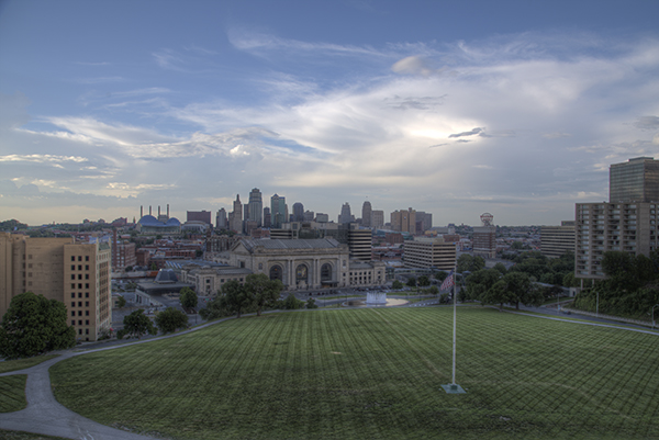
Let’s Check the Contrast you can download the image and follow along if you would like (there is also an Action and a video at the end if you learn better from video)
Step one
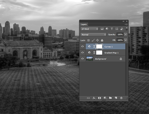
Create a new Gradient Map Adjustment Layer to create a Black and White photo.
Step two
Ensure that the Gradient Map is set to Black and White. By default the Gradient Map Adjustment Layer will pull from the colors that you have set as your foreground and background in the tool bar. To ensure they are set to Black and White press the “d” key to reset them to the defaults.
Step three
Make a new Curves Adjustment Layer above the Gradient Map. Your Layers Palette should look like this and your photo should be Black and White.
Step four
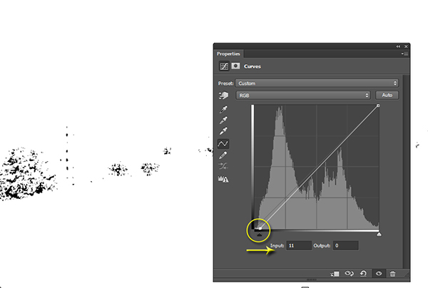
While in the Properties of the Curves Adjustment Layer press and hold “Alt” (Option on Mac) and click the Black triangle on the bottom of the Curve.
Step five
Your photo may turn all white with a little bit of black. This is telling you where black is present in your photo. If your photo is all white with no black specks then your photo currently contains no black point. Move it slightly to the right until more black starts to appear.
Step six
This is called clipping (no detail). By clipping the blacks you are telling Photoshop what you want black to be in the photo. It is important that you do not take this too far, you want a solid black point in the photo, but you don’t want to destroy your shadows either.
Step seven
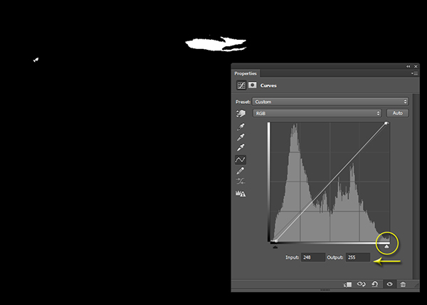
Now press and hold “Alt” (Option on Mac) and select the White Triangle.
Step eight
Your photo should turn all black with little specks of white. This is telling you where pure white is in your photo. If your photo is all black with no white specks then your photo currently contains no white point. Move it slightly to the left until more white starts to appear.
Step nine
Just like the blacks it is important that you do not take this too far to the left as you will be clipping too much of the whites. You are going for just a bit of clipping beyond the specular highlights.
Step ten
The reason you are doing this on a grayscale photograph is to ensure that you are only seeing the clippings of the lights and darks. If you were to do the same thing on a color photograph you would see the clippings for all of the colors within their channels. This makes the process a bit more difficult.
Step eleven
At this point you should already be seeing more drama in your photograph, but you can take it a step further.
Step twelve
Click on the Targeted Adjustment Tool within the Properties of the Curves Adjustment Layer. This allows you to target specific areas of the photo and edit them independently on the tone curve.
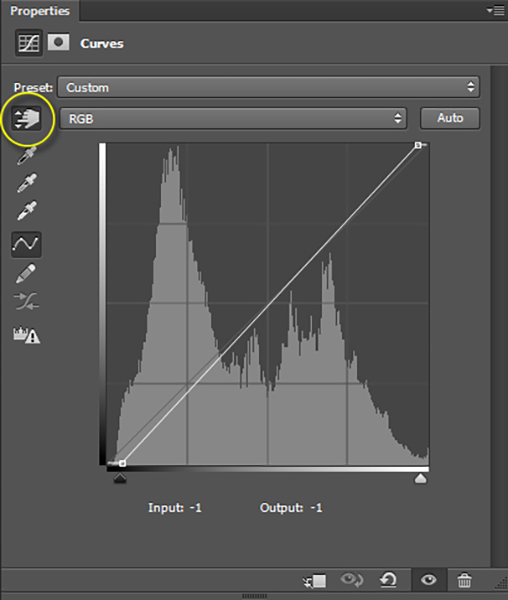
Step thirteen
With the targeted adjustment tool selected, as you hover over the image you will see what is being effected on the tone curve. For this image I started with the lighter colored grass. I clicked on it and dragged the cursor up making it even lighter.
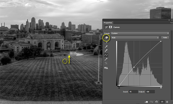
Step fourteen
I also selected the darker colored grass and moved the cursor down to make it darker.
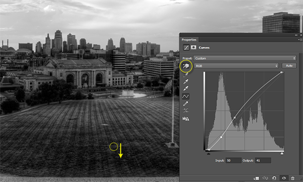
Step fifteen
I then selected an area in the sky that was close to white, but contained a little bit of detail, and dragged the cursor up to make it brighter.
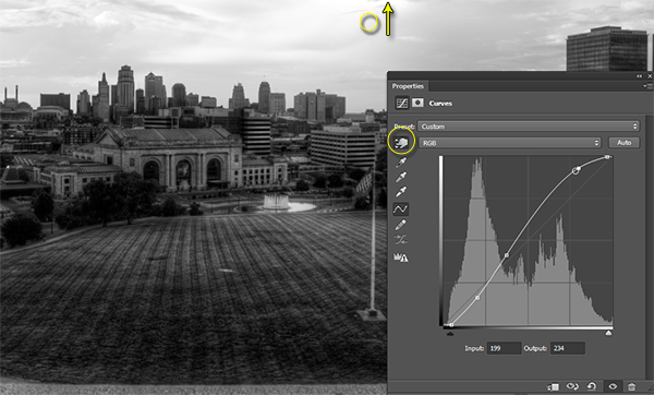
Step sixteen
At this point you should be looking at a black and white photograph with much more contrast than you started with.
Step seventeen
The magic happens when you delete the Gradient Map layer to reveal the Curves effect on the original color photograph.
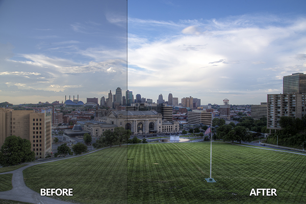
Step eighteen
If you are not satisfied with the effect the Curve has on the colors in the photo you may change the Blending Option to Luminosity which will only allow it to effect the tones in the image, protecting the color saturation.
For more tips and tricks and to see how the downloadable action for this process works watch the video tutorial below.
The post How to use the Contrast Checker Technique to Give Your Images More Punch by Blake Rudis appeared first on Digital Photography School.