Even though I strive to get the best compositional shot in-camera. I do see ‘cropping’ as essential to my post editing workflow. For such a simple post edit technique, it can really enhance and improve composition of the image. I have also found cropping an image, be it small or in a creative sense can transform an image dramatically.
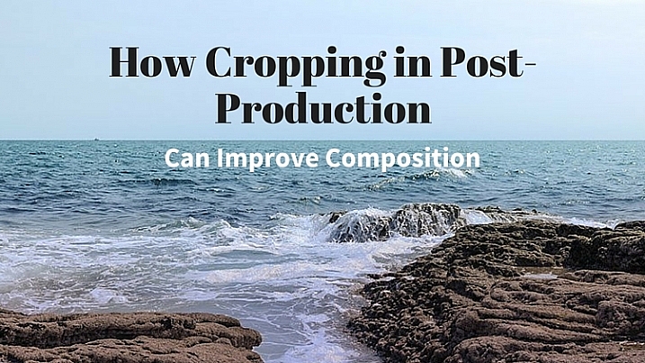
I like to view cropping as reframing the scene. The initial framing of the scene comes when you look through the viewfinder, then next when you have uploaded your images onto your computer for editing.
You get the chance and time to critically see if your image(s) needs cropping and what type is required. For example, there might be some distracting elements in the foreground that you missed when you looked through the viewfinder, or a horizon line isn’t quite as straight as it should be.
In this article, I’m going to illustrate the following reasons why you might crop your images in post-production:
- To straighten lines: keep the horizons even and the vertical lines vertical.
- To move your subject or object: a little more to the left, right, up or down.
- To trim away distracting elements, especially at the sides or the near foreground.
- To zoom in to show impact, especially portrait or head-shots.
- To use the rule of odds – instead of two subjects just use one.
- For creative cropping – rotate image, use perspective crop.
Let’s take the first example, I took this shot handheld when I should have used a tripod. An uneven horizon line does not make for a good composition. The eye is immediately drawn there, for the wrong reason.

Seascape with a crooked horizon line.
However, this is easily remedied in most photo editing programs. As Adobe Photoshop CS6 is my go-to photo editing software. I will be referencing it for the rest of this article.
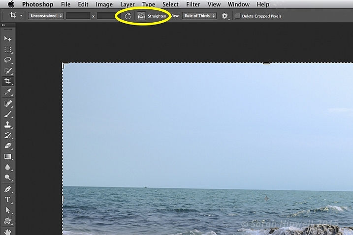
Once you click on the Crop Tool in the Tools panel, there is a dedicated straighten button in the Options Bar.
Click on the Crop Tool in the Tools panel. Go up to the the Options Bar where there is a dedicated Straighten button. Make sure this is selected, click and drag along the crooked horizon line. Release it, and Photoshop straightens the line and crops the image in one action! The same process can equally be applied to vertical lines.

Horizon lines are easily fixed using the Crop Tool in Photoshop.
The Crop Tool in Photoshop CS6 is impressive. It now works non-destructively. But you must make sure Delete Cropped Pixels isn’t ticked up in the Options Bar (leaving this box unticked keeps cropped portions which can be recovered later if needed).
The Crop Tool in Photoshop CS6 works non-destructively if the Delete Cropped Pixels box is unchecked.
Inside most editing programs there is usually a choice of overlay guides, based on traditional compositional concepts like the Rule of Thirds or the Golden Ratio. You can read more about Composition in this article: Easy Tips to Help Beginners Understand Composition The crop overlays are great visual guides for good compositional techniques and makes it much easier to crop your image. I usually set it to Rule of Thirds.
So in the next image, I wanted the focus of this shot to be entirely on the sunflowers. The background, although blurred, is still too distracting with the color of the garments worn by the passersby.

Although the background is blurred, the colour of the garments worn by the passersby is too distracting.
I started with one of the aspect ratio presets. These can be found under this tab Unconstrained. I selected 5 x 7.
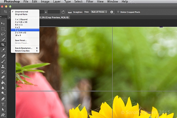
There are various preset aspect ratios when you click on the Unconstrained tab. You can also save your own presets too.
I dragged the top right corner handle of the crop box down, and in towards the centre, to maintain this aspect ratio. By clicking on the image inside the crop box, I was able to move and reposition the image into place.

The sunflowers are now the main focus point in this image, and the green blurred background is complimentary, without being a distraction.
I am strong believer in using my feet to get close to the subject, or if you have a nice telephoto lens, then happy days. Unfortunately for my next shot, I didn’t have the option of either of the above.
I was at the zoo on a family outing, so I wasn’t taking dedicated shots for anyone. I was behind a barrier and a good 30 feet (approx.) away from the seals. I didn’t get time to think or compose for this shot. I just wanted to grab a shot of the seals.

Seals taken at the zoo.
The day was fantastic weather wise, and these seals were really enjoying the sunshine. I wanted to crop in tightly, just on the seals, but I had the megapixels to play with because I had a 24 megapixel camera with me, which can produce a 20×13” at 300 dpi print. The final crop for this image would give me 5.5×4” at 300 dpi print.

I cropped in tight to get a close-up of the seals. I didn’t like the railings at the back, but I would have preferred to have kept the reflection of the seals in the water, but there is always a trade off!
In this next shot, cropping in tight on a subject can convey more impact, especially for portrait shots. No two people reveal the same expression. As a photographer, some subjects are easier to capture an expression over others.

Emmet and Lucy enjoying the nice weather and the chat!
I wanted to convey Lucy looking at Emmet in an adoring fashion, I-only-have-eyes-for-you type of expression.
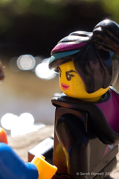
Lucy hanging on to every word that Emmet is saying! The look of I-only-have-eyes-for-you!
Another way to convey impact is to focus on the action. Here, in this shot below, I cropped out my other daughter, so that the focus was on my youngest daughter running to shore.

Fun at the beach.

By cropping out my other daughter, the focus is on the action. It’s also using the Rule of Odds to focus on the single subject.
Cropping an image is a great way to apply the Rule of Odds. A good example of this is in the following shot. The two subjects are side-by-side. By cropping in tight on each subject, I have created two distinct head-shots from one single image.

Two subjects shot sitting on a bench side-by-side.

After the image is cropped, I now have two distinct portraits.
Last but by not least, try and experiment with rotating your image to the left or right, and then cropping. This may be particularly useful with photos of tall buildings, where you want the focus to be on the height of the building.
I had taken the following photo in Berlin some years back from a boat on the river Spree. This modern building was quite impressive, but the reflection of the sky and clouds in the glass, caught my eye. It made for a nice abstract composition.

A shot of a building while in a boat on the river Spree in Berlin. Compositionally, this by itself is not a good shot.
The Crop Tool in Photoshop has another feature, the Perspective Crop Tool. When you click on the Crop Tool and hold, a fly-out menu appears with four options. The Perspective Crop Tool is directly under the Crop Tool.
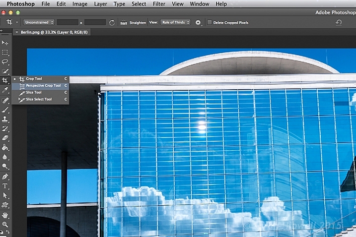
With some editing to highlight the reflection in the glass of this building, I used the Perspective Crop Tool to create an abstract composition.
Starting at one corner, click and drag across to the other corner, and repeat around the lines of the window frame. A grid appears around where you have clicked within the image. Click the commit button at the top in the Options Bar, or press the enter key. Make finer adjustments by clicking back to the regular Crop Tool.

The perspective Crop Tool in action.

I created this abstract composition using the Perspective Crop Tool in Photoshop.
Cropping is, after-all, getting an alternative perspective to enhance a better composition.
To crop or not to crop, that is the question? Share your comments and images below please.
This week on dPS we’re featuring a series of articles about composition. Many different elements and ways to compose images for more impact. Check out the ones we’ve done so far:
- Using Framing for More Effective Compositions
- 7 Tips to Improve Your Skyline Photos
- 33 Images that Exemplify Compositional Elements
- Weekly Photography Challenge – Composition Craziness
- How to Take Control of Aperture and Create Stronger Photos
googletag.cmd.push(function() {
tablet_slots.push( googletag.defineSlot( “/1005424/_dPSv4_tab-all-article-bottom_(300×250)”, [300, 250], “pb-ad-78623” ).addService( googletag.pubads() ) ); } );
googletag.cmd.push(function() {
mobile_slots.push( googletag.defineSlot( “/1005424/_dPSv4_mob-all-article-bottom_(300×250)”, [300, 250], “pb-ad-78158” ).addService( googletag.pubads() ) ); } );
The post How Cropping in Post-Production Can Improve Composition by Sarah Hipwell appeared first on Digital Photography School.
You must be logged in to post a comment.