Andrew’s newest ebook Mastering Composition is now on special for a limited time only at Snapndeals.
Visual weight (also called visual mass) is the principle that some elements of the photo pull the eye more than others.
Take a look at the portrait below. Where does your eye go? It should go straight to the eyes, because they have the most visual weight. They are the element exerting the greatest pull.
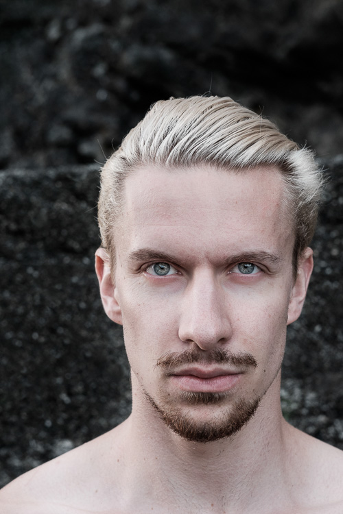
Notice that the model’s eyes are not positioned on the traditional intersection points created by the rule of thirds. That doesn’t stop them from pulling the eye, although it could be argued that their visual weight would be strengthened by placing them on a third.
Let’s look at the principles of visual weight (or visual mass) that you can use to improve the composition of your photos.
1. Light tones
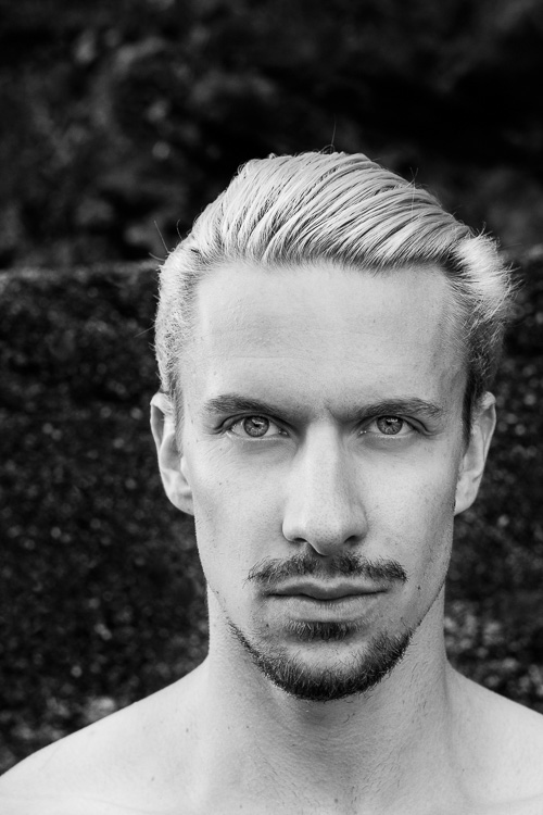
Light tones and highlights pull the eye more than dark ones (the basis of tonal contrast). There is a strong contrast in the portrait above between the model’s skin and hair, and the dark background. It is easier to see in a black and white version of the same photo.
2. People
Curiosity about other people is part of the human condition. Our eye goes straight to any human figure that is present in a photo. Recognixable faces exert a stronger pull, while the eyes (the window to the soul) have the strongest visual weight of all.
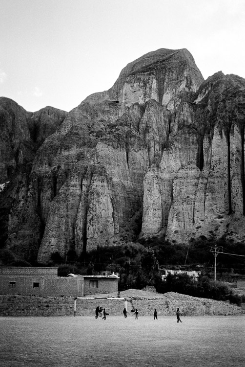
This explains why you can use people, small in the frame, to give scale and context. It works because our eyes go straight to those figures, as long as they stand out from the background (gestalt theory in action).
The people in the photo below are small, yet the eye goes straight to them. The inclusion of the human figures helps give the scene scale, and emphasizes the size of the mountain behind them.
3. Visual weight and size
The larger the element of a photo, the more it pulls the viewer’s eye. This principle works in harmony with the others discussed in this section. A small human figure, for example, can have much more pull than a large, inanimate object. A small splash of red can also pull the eye very strongly. But for objects of similar texture and colour, the larger one has the stronger pull.
For example, the dials in this photo are virtually identical in terms of shape and design. The one on the right has the most visual weight because it is the largest of the two.

4. Sharp or recognizable elements
Objects that are sharp or easy to recognize pull the eye more than ones that aren’t. According to gestalt theory, the mind looks for patterns and shapes that helps it make sense of chaotic scenes. Once something is identified, it gains significance in the frame compared to those that aren’t.
The most obvious example of this is a portrait taken against a strongly blurred background. The visual weight of the background is reduced because it is no longer sharp, and no longer recognizable. The use of negative space also comes into play.

5. High contrast
High contrast subjects have more visual weight than low contrast ones. This is a good principle to apply in post-processing as well as the photo taking stage. Instead of increasing contrast universally across the image, try increasing it more in the areas where you want the viewer’s eye to travel. Lightroom’s Clarity slider is an excellent tool for this.
In this example I used the Clarity slider to emphasise the texture of the old car and help draw the eye to it.

6. Visual weight and colour
Bright, saturated colours draw the eye. But not all colours are equal. Warm hues have more visual weight than cool ones. Red is the strongest colour of all.
Simplifying the composition makes the relationship between the colours in the photo easier to see. A technique you can use, if your subject is brightly coloured, is to position it against a background comprised subdued, less powerful hues like grey, green and brown.
Simplifying works for all aspects of visual weight. Eliminate everything that isn’t necessary. Keep the background as simple as you can. Once you’ve done this, look at the remaining elements and think about how the eye will move around between them, according to the principles of visual weight. The relationships between them become clearer as the composition is simplified.
The red figurine in the centre of the photo below has the most visual weight. I emphasised this in post-processing by using the Clarity slider to increase its contrast and adding a vignette to darken the background.

 Mastering Composition
My new ebook Mastering Composition will help you learn to see and compose photos better. It takes you on a journey beyond the rule of thirds, exploring the principles of composition you need to understand in order to make beautiful images. It’s on special for a limited time only at Snapndeals.
googletag.cmd.push(function() {
tablet_slots.push( googletag.defineSlot( “/1005424/_dPSv4_tab-all-article-bottom_(300×250)”, [300, 250], “pb-ad-78623” ).addService( googletag.pubads() ) ); } );
googletag.cmd.push(function() {
mobile_slots.push( googletag.defineSlot( “/1005424/_dPSv4_mob-all-article-bottom_(300×250)”, [300, 250], “pb-ad-78158” ).addService( googletag.pubads() ) ); } );
The post 6 Tips Using Visual Weight to Improve Your Composition by Andrew S. Gibson appeared first on Digital Photography School.
You must be logged in to post a comment.