Editor’s Note: This is part a series on macro photography this week. Look for a new one each day. The next newsletter will have them all if you miss any!
Macro photography is very popular and you will find lots of images, of all sorts of subjects on the internet. People spend a lot of time taking the photos, planning them, setting them up, and getting all the gear they need to get all the shots they want. Then the photos are loaded onto the computer and minimal processing is done to them.
With this tutorial we are going to look at how you can get your macro images from this:
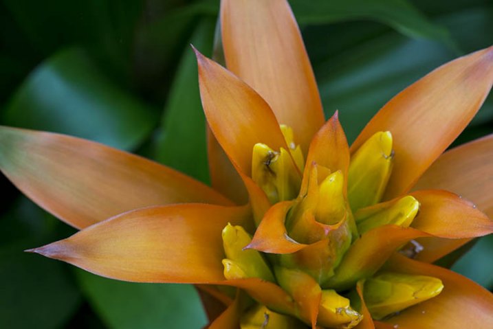
To this:
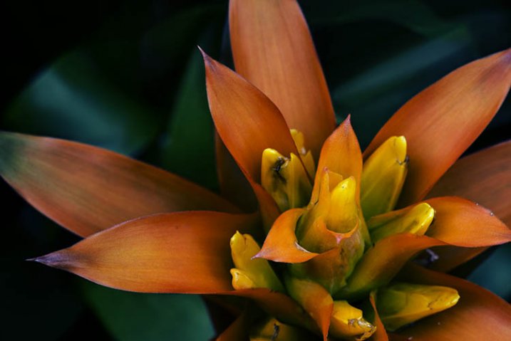
There are many things you can do to your images; what I’m going to show you is only one way. You can try anything really as it’s up to you, it’s your image.
This image was first opened in Adobe Camera Raw and some processing was done to it, just to get the exposure right. From there the macro was opened in Photoshop CC (2014). To explain what some of the instructions are for Photoshop I am including an image below that has the various areas of the interface pointed out, especially the sections that we will be using for this tutorial.
Here is the screenshot of Photoshop with all the various places to find the tools, options, layers and adjustments that were used.
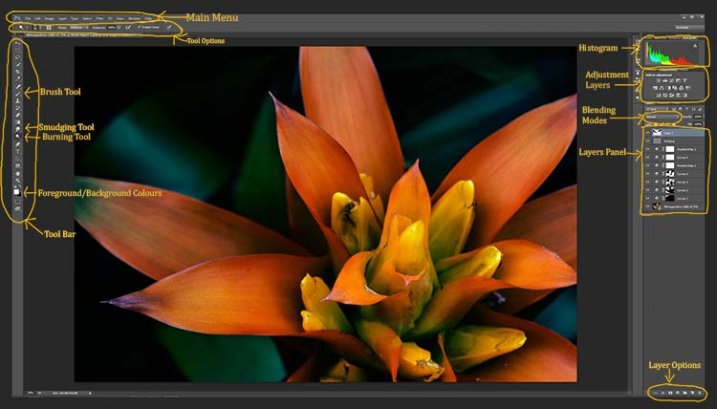
Step #1 – Curves
At this stage we are going to do several adjustment layers using Curves to change the lighting and bring the centre of the flower out more.
Work in adjustment layers so if you decide further down the track that you should have changed something you did earlier, then you still can go back and fix it, change it or delete the layer. The best way to do this is to use adjustment layers. The adjustment layers are often found above the layers panel on the right of your screen or in the layers menu at the top of the Photoshop window (if you don’t see them go to Window > Adjustments and place it above your layers panel). You will also need the brush tool for this, which is in the tool panel, usually found on the left of the window.
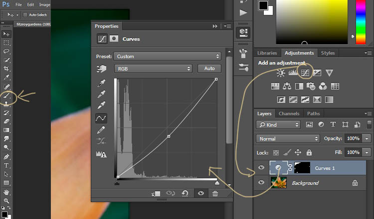
Once you know where each one of those are, you can start doing your layers for the image.
Click on the adjustment curves layer, as in the photo above. Then in the window that pops up, move the curve down to the dark area just a little, like the image above (just click on the straight line and hold the mouse button down while you drag to move it).
Grab your brush tool from the tool panel. Make it the size that you will need for your image. You can change the size by using the square bracket keys on your keyboard – [ or ] , or right click and in the pop-up window moving the slider for the size. The same changes can be made in the options bar for the tool at the top. Click on the second option from the left, the one that has the size of the brush, and you will get the same panel to change the size and hardness of the brush. For this tutorial a brush towards the soft end was chosen so the edges wouldn’t be too hard (Hardness set to 30% or lower).
You will need to click on the layer mask within the layer, it is the white rectangle in the curve layer. When the mask is white it means the adjustment is being applied to the image below, and when it is black it the change has been hidden. If you paint black onto the mask with the brush you are hiding the adjustment. Black on a mask conceals – white reveals. If you make a mistake and hide a bit you want, you can just paint it back in with the opposite color, white.
Start brushing the image, if nothing changes, then the foreground color (which the brush uses) is likely set to white. You will need to change that colour to black. You can also press X on your keyboard too, it will swap the foreground and background colours around.
For each different curves layer I took less and less of the adjustment from the image. The following image will show you what I did to each layer. The white areas are where the curves layer still applies, and the black shows where it was hidden.
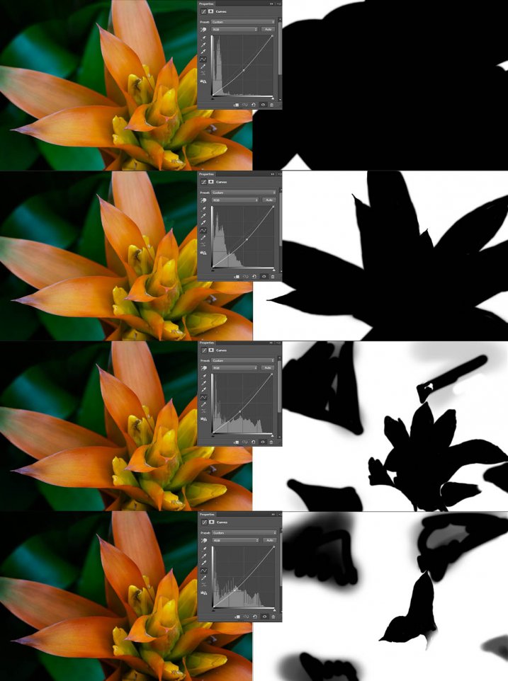
This image was done with curves layers. You don’t have to use the same number of layers, it is up to the image. Some of the background leaves were brought back in the last couple of layers as they were getting too dark. It is something you should be aware of, take notice of what is happening in the background as well.
The centre of the flower is now the same as the original but everything else is darker. The changes should be subtle.
Step #2 – Gradient Map Adjustment Layer
Once the curves were done a gradient adjustment layer was added. The gradient adjustment will change the highlights and shadows; you can decide what colours you want to use.
When you click on the gradient adjustment layer often the black and white gradient comes up and you will notice your image turns to monochrome. If you click on that bar in the window that comes up, you will get a lot more options for the gradient. For this tutorial I used the orange and purple gradient.
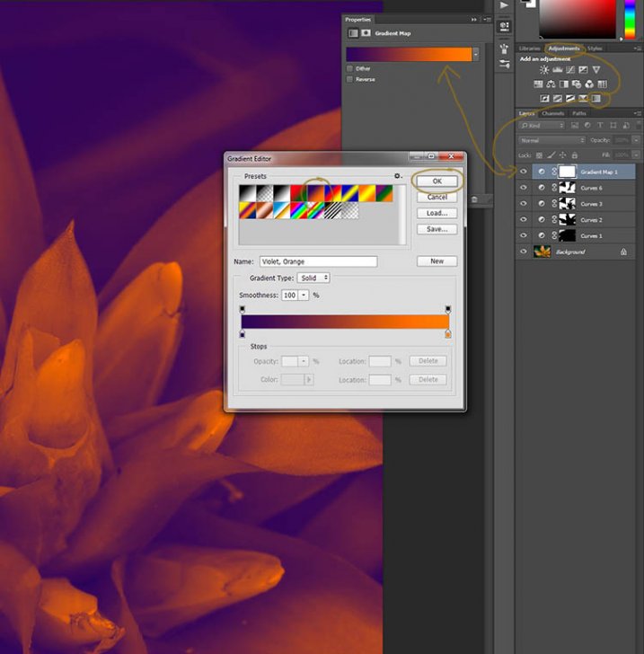
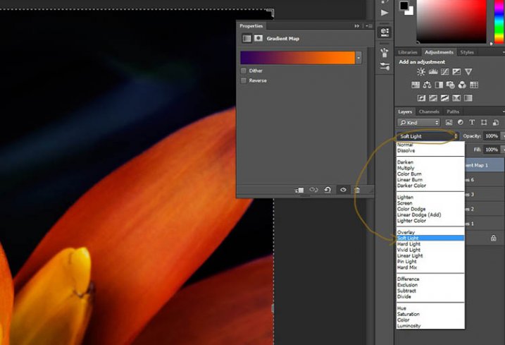
You will see all your highlights turn orange and the dark areas will go purple. You don’t want your image to remain like this, so now you need to blend it. In the image above you can see the blending modes that are above the layers, normal is the default. Click on that and go down to select Soft Light. You will notice the gradient layer is now blended and doesn’t look so horrible.
Just because that gradient has those colours, doesn’t mean you have to stick with them. They are easy to change them to give your highlights and shadows the tones you want.
In the bottom part of the gradient editor you can see the colour slider which is how the change goes from one colour to another, and directly underneath you can see little colours. If you click on one of those, the colour comes up at the bottom.
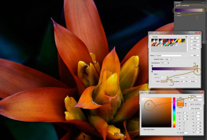
Click on that, you will see the Colour Picker window open up. You can change the colour to whatever you want, and as you do so you should be able to see the effect on your image straight away. If you can’t, then it is likely because you forgot to blend the layer. See the following image.
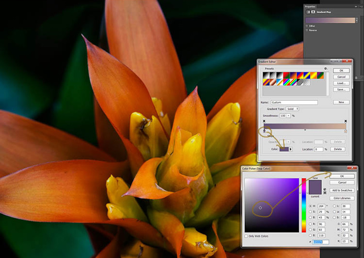
You can see from the images what I changed the colours to; you don’t have to use the same ones. I would recommend trying a few colours to see which ones you like. Purple is my favourite colour, so I use it a lot.
The next step is not always necessary, but often nice to do. All the work that has been done can mean losing the highlights, so to help bring them back you can use a Curves Adjustment Layer.
Step #3 – Adjusting the Highlights
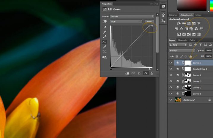
Open a new Curves Adjustment Layer. In the Curves window go to the top right corner and move the line across the top. Watch as you do it and notice if you can see the highlights changing. Sometimes it is good to go too far and then bring it back, just to see what it does. Just be careful not to blow the the highlights out, making them solid white with no detail. Check out the image before to see what to change.
Step #4 – Adding Another Gradient Map Adjustment
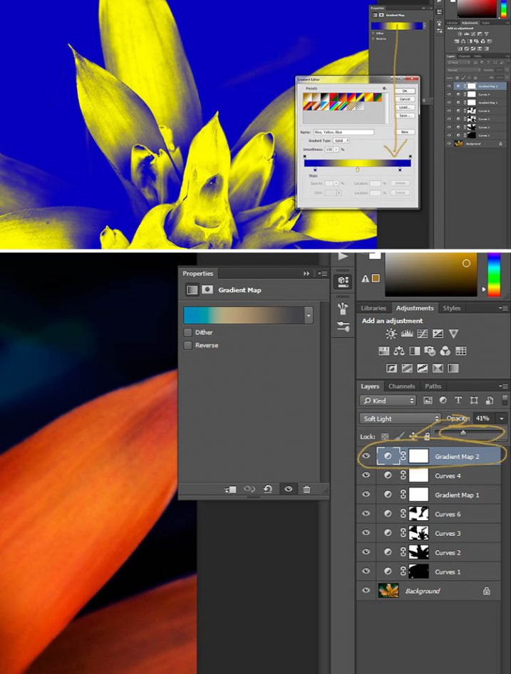
Next another gradient map adjustment layer was added, time time using a different one.
From the above image you should be able to see what colours I choose and follow along the same steps as previously. This time I chose a gradient that changed three areas.
Step #5 – Dodging the Highlights
One thing that I like to do on many of my images is to bring out the highlights, in small ways, with the dodging tool. The dodging tool is a touchy one, to be used carefully.
It is always best never to do anything straight onto your original image layer, so like with everything we have done so far it’s going to be on a separate layer. Go to the top menu and click layer, then new layer. When the window appears you can name the layer, if you want to, I called it “Dodging”.
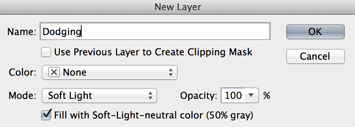
There are a couple of things you need to do so you can use this layer with the Dodge tool. First change the layer blend mode to Soft Light, then under the mode drop down menu you will see a box you can check to “Fill with Soft-Light Neutral Colour 50% Grey”, so check that, then press okay (see above)
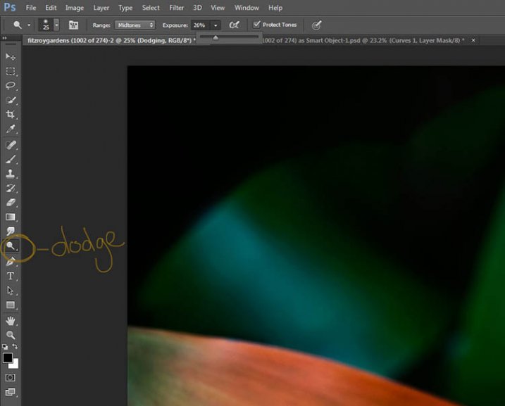
Over in the layers panel you will see what looks like a grey box, this is what you will do the dodging on. Go over to the tool bar on the left and select the dodge tool.
At the top under the main window you will see Exposure, I have set mine at 26% for this image, but you can set it to anything, it depends on how patient you are. In the options bar there is also a setting for the highlights, midtones and shadows, I tend to use midtones. The more you move over an area the more it will go white. In the days of the darkroom they would using dodging to stop the light from getting to certain parts of the area. In Photoshop you can use it to put a little of the highlights back into the image, or to make the highlight pop. It should not be obvious, again subtle is the way to go.
I have changed the layer back to normal mode so you can see what I worked on. Dodging shows up as white on the layer.
You can see that I haven’t done a lot, except bring up some of the highlights a little more.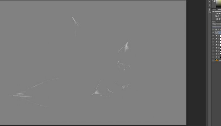
Step #6 – Smudging
Finally I did a little smudging. Sometimes when you do a lot of work to images it can start to look pixelated, or you get some colour separation. I’ve found that the smudge tool can help get rid of that. You will find it in the tools panel.
I did this on a new transparent layer, again not working on the original image.
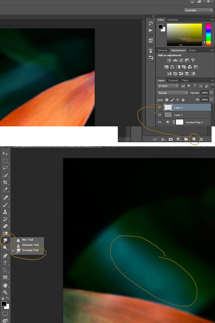
Make sure you check the Sample all Layers in the options bar for the tool at the top, and for this tutorial I left the Strength at 50%. I went over the areas where I thought I had some colour separation to smudge them together. If it were a painting I would get my finger into it and smudge the colours together.
Here is the final image.

It is all about personal taste, so you should do it to your own style. I like it like this, but other people might find it too much, and others may think it isn’t enough. I like the way the flower seems to be coming out of the darkness.
If you have any questions, please ask. I will do my best to answer them.
 Want to learn more about macro photography? Check out Ed Versosky’s Introduction to Close-Up & Macro Photography ebook – just $ 10 (over 30% off) this week with coupon code: DPS. You will need to enter the code to apply the discount.
googletag.cmd.push(function() {
tablet_slots.push( googletag.defineSlot( “/1005424/_dPSv4_tab-all-article-bottom_(300×250)”, [300, 250], “pb-ad-78623” ).addService( googletag.pubads() ) ); } );
googletag.cmd.push(function() {
mobile_slots.push( googletag.defineSlot( “/1005424/_dPSv4_mob-all-article-bottom_(300×250)”, [300, 250], “pb-ad-78158” ).addService( googletag.pubads() ) ); } );
The post How to Give Your Macro Photography a Fine Art Touch in Post-Processing by Leanne Cole appeared first on Digital Photography School.
You must be logged in to post a comment.