[ By WebUrbanist in Design & Graphics & Branding. ]
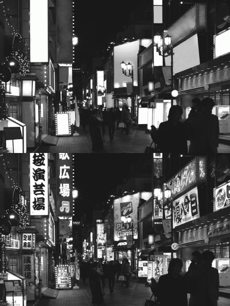
Tokyo seems inseparable from the banners, billboards, logos, slogans and other flashy neon alerts, except when seen through the lens of this French graphic designer in a startling black-and-white image series turned into a alternating GIFs.
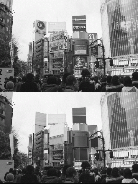
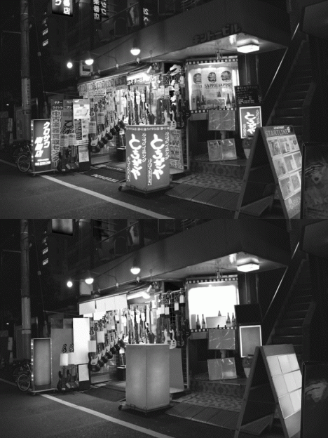
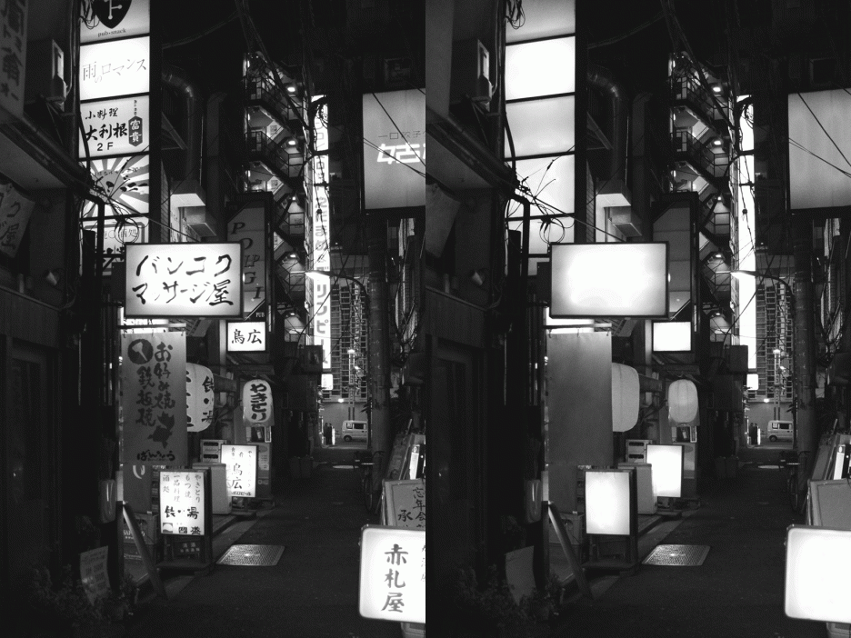
Tokyo No Ads by Nicolas Damiens illustrates just how shocking the contrast is, particularly when switching back and forth between before and after versions. Each of the seven scenes here was meticulously edited with attention to every last pixel of graphics.
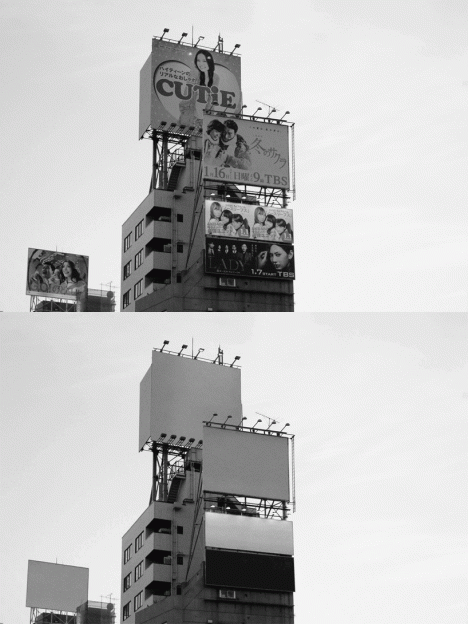
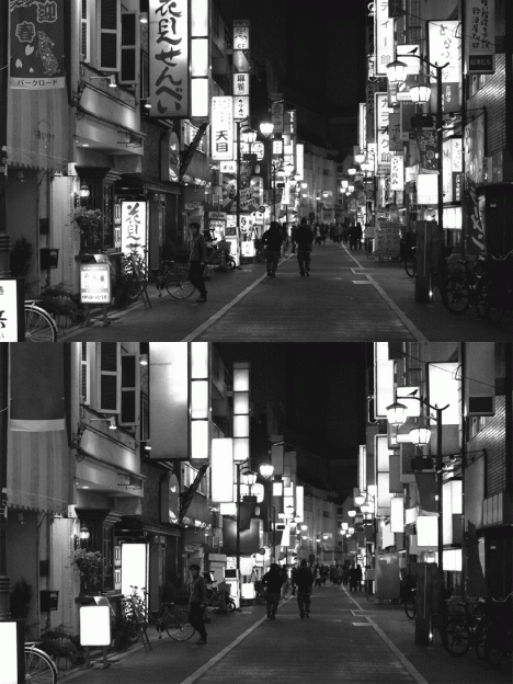
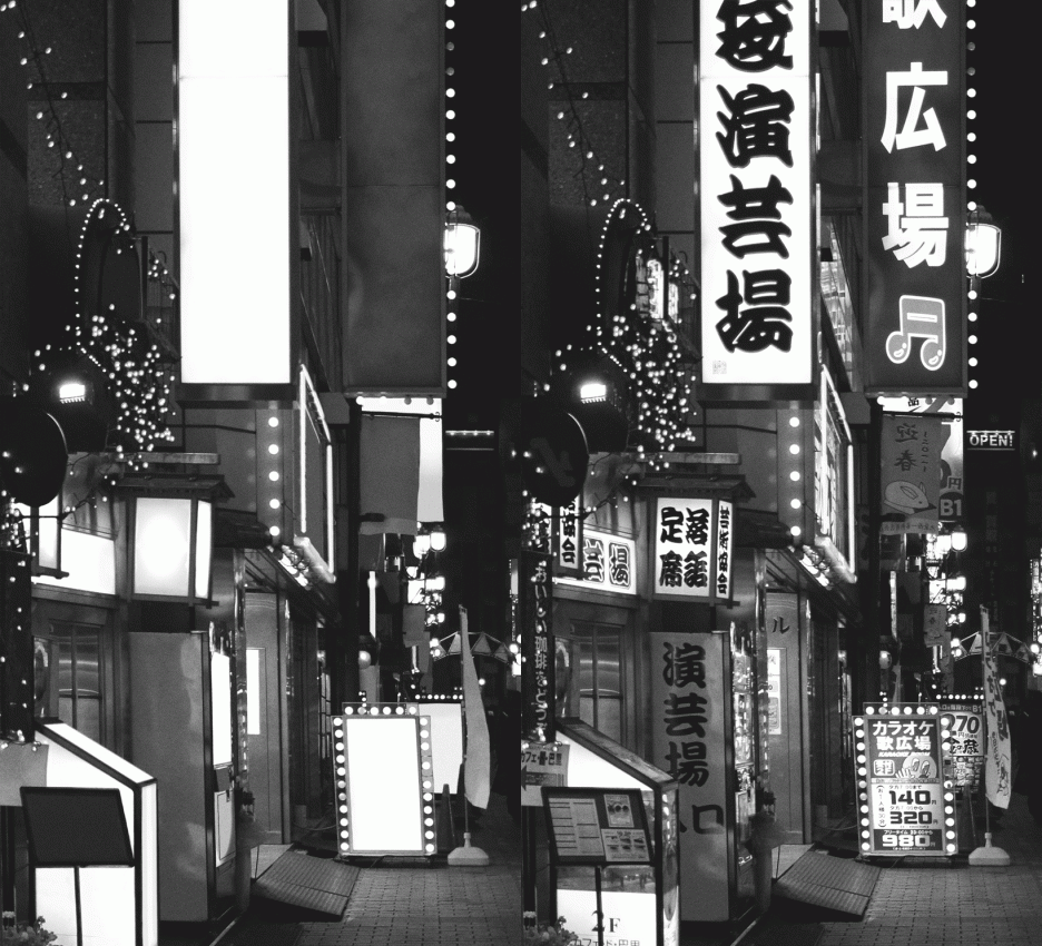
To outsiders, Japan’s capital is nearly synonymous with signage saturation, so stripping them away changes the character of the place dramatically. Promoting everything from TV shows and movies to local shops and businesses, it is almost impossible to find a place in the city not showered in advertising. Perhaps the biggest surprise: the landscape almost looks more alien without its characteristic adverts.


[ By WebUrbanist in Design & Graphics & Branding. ]
[ WebUrbanist | Archives | Galleries | Privacy | TOS ]


You must be logged in to post a comment.