RSS
 

Posts Tagged ‘Signs’

Four Signs it’s NOT Time to Upgrade Your Camera

09 Jul

The post Four Signs it’s NOT Time to Upgrade Your Camera appeared first on Digital Photography School. It was authored by Adam Welch.

I’m reminded about a conversation between Ansel Adams and Ernest Hemingway that went something like this:

Hemingway: You take the most amazing photographs I’ve ever seen! What sort of camera do you use?

Adams: You write the most amazing stories. What sort of typewriter do you use?

Even though I know this chance encounter between two of my favorite Masters never actually occurred (though I secretly hope it did), the weighty implications of this fictional exchange are obvious.

4-signs-its-not-time-to-upgrade-your-camera-3.jpg

The power of a photograph is no more coupled to the superiority of one’s camera than are the words of a good story which move us to emotion. While it’s true that cameras are indeed the tools of our trade, and those tools vary in terms of capability, there seems today to be a sort of “cart before the horse” mentality. It looms heavy over the majority of the photographic community; a mentality which implies that if your photographs aren’t up to your expectations, the quickest remedy is to buy a better camera.

Upgrade, upgrade, UPGRADE! That’s the song often heard. Upgrading your camera is a natural facet of the evolution of any photographer. I’m not in disagreement with that notion. However, what if I told you that getting a new (or new to you) camera should be more of a last resort than a first idea?

Today, we’re going to talk about four signs that it’s NOT time to upgrade your camera.

You’re still “figuring out” what you want to do with your photography

About 300 years ago (it seems), when digital cameras were becoming relatively cost-effective for the average shooter, I began thinking about switching from my film SLR to a DSLR. I searched around and was advised on a camera that would be “magic” for the work I was trying to do. The problem was that I had no real idea of what that work actually would be.

4-signs-its-not-time-to-upgrade-your-camera-4

Much like a certain popular character from a certain popular TV show…”I knew nothing.” I went with the camera others told me I should have and went after the sort of photography jobs (wedding, portraits, events) that were available in my area. I had upgraded my camera – not for any true physical or technical need – but rather because I thought that a new camera was necessary for the task at hand.

In fact, I hadn’t stopped to think about what I wanted to do and how I should go about doing it before I took the plunge. It was like buying brushes before knowing how to paint.

If you’re still wondering what kind of photography is “right” for you, a good starting point would be to continue working with whatever camera you have right now. Shoot everything and anything with it: people, events, landscapes, nature, street, and still life.

Only after you see yourself leaning to one side should you begin thinking about upgrading the tools you need to accomplish a better outcome.

You’re stilling using the “kit lens” that came with your camera

Your brain is an amazingly complex, incredibly capable bio-computer which we’ve only begun to understand. Yet without input and feedback from our senses, the brain is just – well – a brain. It only knows it’s environment based on the information allowed to pass along to its consciousness.

The same is true for our cameras.

A digital camera can sport the most beautifully huge sensor that somehow produces no noise even at 4 billion ISO. Or, has enough megapixels to make enlargements larger than the Earth and still it would be reliant on the information passed to it by its lens. In the end, it is the lens that dictates the quality of the raw informational light the camera will use to build an image.

So why do so many of us put more emphasis on the camera instead of the lens?

Especially today, the lenses which come with bundled camera kits are generally much sharper and faster than previous packages offered ten or fifteen years ago. This is likely due to the higher expectations of the “average photographer” – if there is such a thing.

Still, if the reason you’re considering upgrading your camera is wholly due to a lack of sharpness or low-light performance, then I urge you to first invest in a higher quality lens. Please note that higher-quality does not translate into high prices. Many prime (non-zoom) lenses with maximum apertures of f/2.8 and larger offer excellent optics for under $ 300 with slightly used models going for even less.

Always remember that an inferior camera with a superior lens will almost always perform better than a superior camera with an inferior lens. To that end, consider upgrading your lens before the camera body.

You’ve never gone fully manual

The functional operations of producing a photograph are surprisingly simple. In terms of image-making settings for our camera/lens, there are only three things we can directly control, which determine the overall outcome of our exposures; shutter speed, aperture, and ISO. These are essentially all we have to select to produce a digital image.

However, choosing those three parameters can instantly fill us with terror. Instead of taking full control of our photographs, we often choose to rely on aperture or shutter priority modes (which are usually quite good these days). Alternatively, we release the reigns entirely and allow our cameras to make the big decisions for our exposures by choosing Auto Mode.

4-signs-its-not-time-to-upgrade-your-camera-2

I’ll admit this subject is a slippery slope. I’ve said many modern cameras perform beautifully when operating in these semi-automated shooting modes. Still, without the conscious and deliberate control of the user, a camera is, well, just a camera.

For whatever reason, if you find yourself never determining the “big three” settings of your camera and notice your photos lacking in their technical or creative merits, I urge you to begin shooting in manual mode.  Entirely new doors will open up to you when you begin to understand the relationships between motion and shutter speed, or depth of field and aperture. Not to mention the brilliant nuances of working with ISO settings. Once you’ve discovered these possibilities, it will likely become clear that it doesn’t make sense to upgrade your camera in the hopes for a better automatic shooting experience.

First, try to assume a more dynamic role in determining the technical aspects of your photographic experience. Then decide if it truly is time to upgrade your camera.

You think your photography isn’t as good as someone else

This is the big one. It is the number one reason why you shouldn’t run out and upgrade your camera without first doing some serious self-inventory. You’ve seen someone else’s body of work, and instantly it registers in your mind “if only I had the camera they use,” or “no wonder their pictures are so good, look at that camera!”

In this situation, I default back to that epic fictional meeting between Ansel and Ernest. The obviously secondary nature of the tool of choice becomes readily apparent next to the prowess of its owner. I doubt few of us could pen another “The Old Man and the Sea” if supplied with the stationary and typewriter of Hemingway. It’s unlikely we might reproduce “Moon over Hernandez” if gifted the same camera and film as Ansel Adams used on that fateful evening in New Mexico.

The point is that it’s not the camera that makes the photograph. A camera is merely a conduit for the expression of skill and emotion of the user.

If you find yourself in pure envy of a certain photograph, an easy misstep is to wonder what type of camera or lens they used. The more difficult aspect to understand is that a person made the image; a person who was feeling a certain way at the time of capture – someone who was empowered by their knowledge and skill to produce a photograph.

The camera may have been the method to transform light into a photograph, but the power and the emotion conveyed through that photograph was born elsewhere.

I can assure you, upgrading your camera will not instantly make you a better photographer; only learning can do that. A camera doesn’t make a photograph; only a person can do that.

Some final words on cameras…

We’ve dipped into some heavy ideas in this article when it comes to all the reasons you should think twice before upgrading your camera. However, with anything that involves “art” and self-expression, these ideas are far from being absolutes.

In the end, only you can decide whether or not a new or different camera will nudge you along the path to fulfilling your potential as a photographer. It’s not a process you should enter into lightly or without solid reasoning.

4-signs-its-not-time-to-upgrade-your-camera-2

Socrates said, “Know thyself.” That’s good wisdom.

If you find yourself looking at your current camera with a growing sense of disgust, ask yourself whether the performance you find lacking stems from the tool or the craftsman? In both cases, you can remedy the problem easily. You can obtain new cameras and acquire new knowledge. The trick is knowing which one you need more.


4 signs its not time to upgrade your camera

The post Four Signs it’s NOT Time to Upgrade Your Camera appeared first on Digital Photography School. It was authored by Adam Welch.
Digital Photography School

 
Comments Off on Four Signs it’s NOT Time to Upgrade Your Camera

Posted in Photography


Light Capsules: Projections Bring Building-Side ‘Ghost Signs’ Back to Life

22 Aug

[ By WebUrbanist in Art & Drawing & Digital. ]

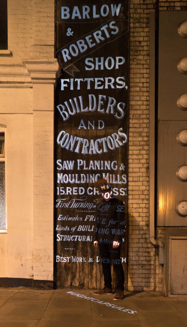
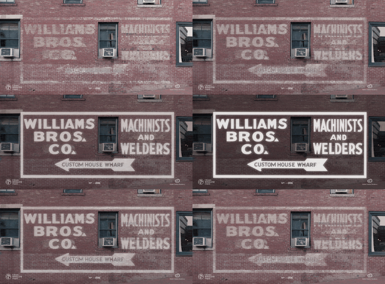
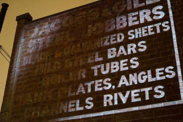
Exposed to the elements, hand-painted signs on building exteriors chip, crack and fade over time, but one artist is shining a spotlight on these historic illustrations, restoring them through animated and layered projections.

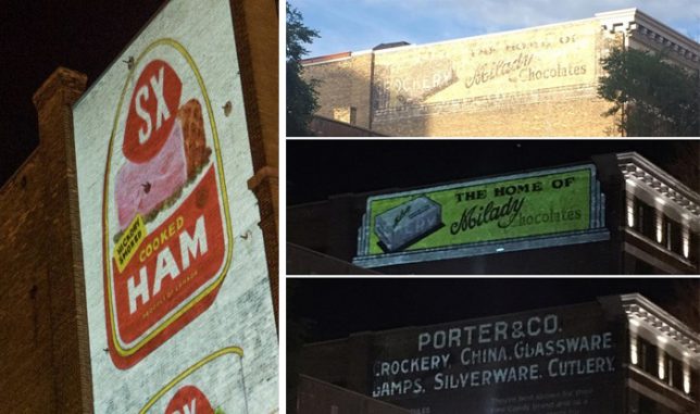
Craig Winslow is meticulous about his work on “Light Capsules,” digging through archived newspapers, magazines and photographs to find ads showing what these signs and their typogrophies originally looked like (in some cases over 100 years ago). The result of one such search recently helped him project over an ad in Winnipeg, Canada for Porter & Co., crockery, china, glassware, lamps, silverware, cutlery, which then switched to another projection for The Home of Milady Chocolates on the same spot.

And it isn’t just about recreation, but also spectacle and preservation. People passing by, used to ignoring faded signs, suddenly stop, look up and start thinking about them and the histories they represent as well as their historic value to a city.

In the last few years, Winslow has brought his projections to cities around the world including Detroit, London and Los Angeles. A lot of the advertisements he projects over provide insights into what was popular in the early 1900s when hand-painted signs were common.

His projections are often layered, cycling through to highlight different stages of ads (or overlapping ones) that have evolved and changed over the decades. Importing digital images, Winslow uses a suite of editing tools to fill in the gaps and create animations.

And while some argue for restoring them outright (using paint), that can be problematic — critics say repainting ruins the authenticity, plus new paints tend to be more vibrant and would be unlikely to represent the original. In a way, Winslow has found a middle ground — his method lets people get a sense of what they looked like without putting the originals at risk.

More from the artist’s website: “There’s an extra element of excitement in signs that are incredibly worn or have multiple layers—The best ghostsigns candidates to become Light Capsules have multiple layers, called palimpsests, providing a compelling canvas which digital recreations can bring a focus to specific layer in time. Projection is ephemeral, non-damaging, and non-invasive, providing a strong preservation solution that traditional mediums can’t provide. Using light as a medium, we can visually explore the stories of every layer, seeing how a building changed throughout the years.”

Share on Facebook


[ By WebUrbanist in Art & Drawing & Digital. ]

[ WebUrbanist | Archives | Galleries | Privacy | TOS ]


WebUrbanist

 
Comments Off on Light Capsules: Projections Bring Building-Side ‘Ghost Signs’ Back to Life

Posted in Creativity


Warming Signs: Clet Abraham Rewrites Rules Of The Road

07 Aug

[ By Steve in Art & Street Art & Graffiti. ]

Guerrilla street artist Clet Abraham may be the Banksy of the boulevard, hacking road signs with stickers and encouraging people to question authority. Our lead image dated August 31st of 2013 comes courtesy of Flickr member Oilvier Ortelpa, who snapped Abraham’s enhanced traffic sign in Brussels, capital of the EU.

Clet Abraham‘s creative road sign hacks turn everyone’s frowns upside down – well, unless you work for the City – but his subversive street sign stencils are meant to be more than just amusing. The Florence, Italy-based guerrilla artist sees graphic, no-nonsense road signs as uncompromising symbols of authority. His clever stencils facilitate alternate interpretations of the signs’ harsh and uncompromising symbolism, and thus invite the public to think twice before blindly obeying those anonymous commands.

One of Abraham’s favorite targets is the ubiquitous red & white NO ENTRY sign. Possibly alluding to the human tragedy of Europe’s migrant crisis, Abraham hopes to provoke more public debate over the concept of NO ENTRY and what it means to not only those hoping to come to Europe but those already living there. Some examples of the artist’s work in his hometown of Florence are shown above, snapped by Flickr member Marianne (Mariannera) in October of 2013.

When In Rome, Hack The Signs

Now 50 years old, Abraham has lived in Florance since 2005 but originally hails from Brittany, France. He studied at the Ecole des Beaux-Arts in Rennes before moving to Rome, where he honed his skills restoring antique artworks – you won’t find any botched frescoes on his resume!

It was the “omnipresence of street signs” in Italy, however, that spurred Abraham “to intervene, both to notify the public of the absurdity of the situation, and to propose a constructive and respectful alternative.”  Flickr member Philosofia captured a small selection of Abraham’s work on the streets of Rome in January of 2012.

Labor Of Love

“My adhesives are developed to add a further level of reading (to street signs),” adds Abraham, “constructed on the base of their original signification in order to maintain its utility but give it some intellectual, spiritual, or simply amusing interest. The final objective? That traffic keeps flowing without us feeling spoken down to!” Flickr member Irene Grassi snapped the above sun-faded stenciled sign in Florence on January 1st of 2015.

Next Page – Click Below to Read More:
Warming Signs Clet Abraham Rewrites Rules Of The Road

Share on Facebook


[ By Steve in Art & Street Art & Graffiti. ]

[ WebUrbanist | Archives | Galleries | Privacy | TOS ]


WebUrbanist

 
Comments Off on Warming Signs: Clet Abraham Rewrites Rules Of The Road

Posted in Creativity


Artistically Enabled: 18 Weird & Creative Handicapped Parking Signs

10 Apr

[ By Steve in Culture & History & Travel. ]

Blue & white Handicapped Parking signs and stencils are one of urban life’s most familiar icons… and then there are those that have been creatively hacked.

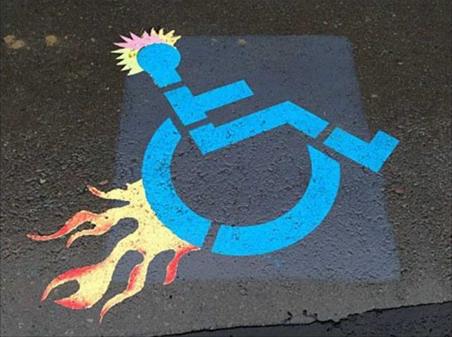
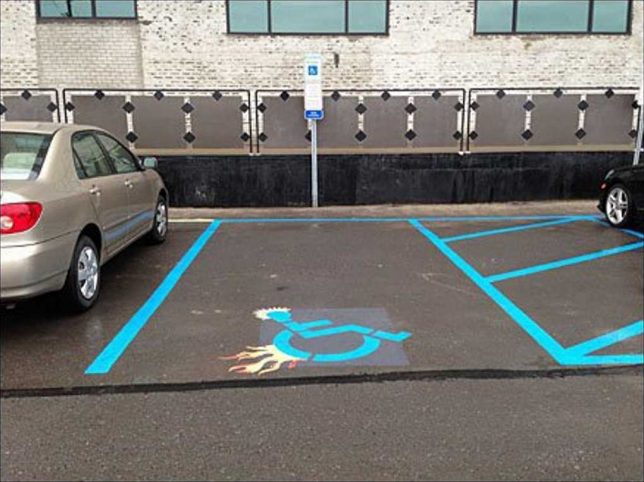
There’s a fine line between amusement and mean-spiritedness but when it comes to visual imagery, outrage is often in the eye of the beholder. With that in mind, this edgy, spiky, flame-enhanced “Parking Space Designator” (is that what the kids are calling them these days?) follows the road blazed by TV’s Dr House and his boss flame-graphic walking cane. You’ll find the stencil on steroids above outside a Retail Boutique Incubator, tentatively attributed to Sean McDougal of Disfunctional Design Store.

Interlocked & Loaded

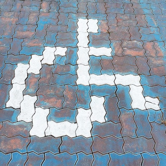
Those interlocking driveway paving stones can be fit together in any number of patterns, including a reasonable, recognizable facsimile of the accessible parking graphic. Flickr user zwei zwei (zwei1189) captured this image on February 5th of 2015.

Brazil Not

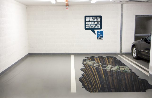
A parking spot reserved for the “Sorcerer” truck, we assume? Not quite – this clever conjunction of a designated handicapped parking space and some awesome eye-fooling 3D graphic art comes from Brazil, where there’s an ongoing problem of able-bodied people parking in handicapped spaces “just for a minute”. Yeah, riiight. The explanatory text on the wall roughly translates from Portuguese to read “When you stop in place for disabled, you make his life more difficult”. It’s a theme we’ll revisit further on in this post.

Hold My Beer And Park This

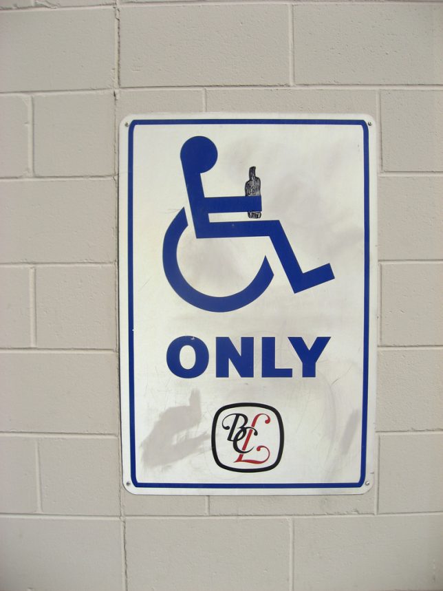
Flickr user Mike Klassen snapped this mildly yet distinctively modified accessible parking sign behind a BC Liquor store in late September of 2008. As for that “fine line” we mentioned previously, well, this edges close to it but we’ll leave the last word to Nathan Ridge, one of the commenters at Klassen’s photo page: “I’ve heard of discrimination against disabled persons, but this is the first time I’ve heard of it the other way around! I love it, especially since I’m in a wheelchair myself!”

Triple Chair Lift

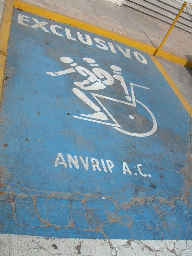
When Mexico sends us their handicapped parking place stencils, they’re not… actually sometimes they ARE sending us their best. Take the “EXCLUSIVO” stencil above, snapped by Flickr user Mary Doyle (buffoonmeatmary) on August 5th of 2007. We can’t say whether this awesome graphic shows a disabled person getting into or out of their wheelchair but either way, the image demands a Six Million Dollar Man bionic sound effect to accompany it.

Elderly Man Driver

Elderly man driver, that elderly man driver, he don’t say nothing but he must know something, he just keeps rolling along… at 10mph under the speed limit until he (or she) parks, right on top of this designated Elderly-only parking space. Who knew this even existed? One might state just being a senior citizen isn’t actually a “disability” in the strict sense, though don’t try convincing any grouchy cane-wielding oldster of that. Flickr user Wee Viraporn snapped what appears to be a standardized stencil on January 3rd of 2010.

Next Page – Click Below to Read More:
Enabled 18 Weird Creative Handicapped Parking Signs

Share on Facebook


[ By Steve in Culture & History & Travel. ]

[ WebUrbanist | Archives | Galleries | Privacy | TOS ]


WebUrbanist

 
Comments Off on Artistically Enabled: 18 Weird & Creative Handicapped Parking Signs

Posted in Creativity


This video is great reminder why you should follow posted signs in National Parks

04 Feb

The 61G lava Ocean Entry event happening on Hawaii’s Big Island has been in the news a lot lately. If you somehow haven’t yet seen the dramatic footage of red-hot lava spewing from the side of a cliff, well, you’re in for a treat. But as enticing as it might be to onlookers and photographers trying to get a better view, mother nature just provided a gentle reminder why you should stay a safe distance away.

See also: exhibit B. It may seem obvious that the edge of a cliff next to a lava ‘firehose’ as it’s called is nowhere for a tripod, but not everyone seems to get that. A park official tells ABC News that she sees people crossing boundaries from designated viewing areas to unsafe zones every day. Geologists are monitoring the area daily for signs of trouble, but the most recent collapse occurred without warning.

Photo courtesy USGS. The image above shows the cliff pre-collapse.

Consider this your daily reminder to obey posted signs in natural areas and to get your shot from a designated viewing area – lava or no lava.

Articles: Digital Photography Review (dpreview.com)

 
Comments Off on This video is great reminder why you should follow posted signs in National Parks

Posted in Uncategorized


Guerrilla Guidance: DIY Street Signs Make Urban Life More Interesting

21 Jan

[ By SA Rogers in Art & Street Art & Graffiti. ]

guerrilla-street-signs-5

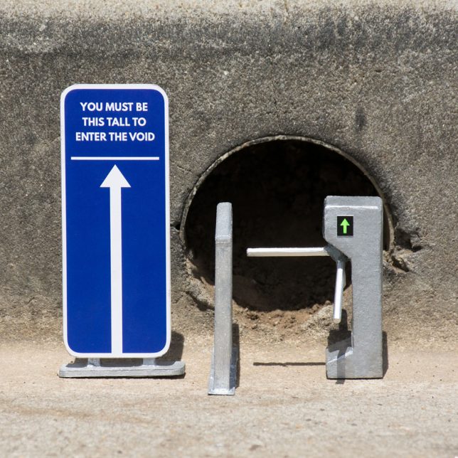
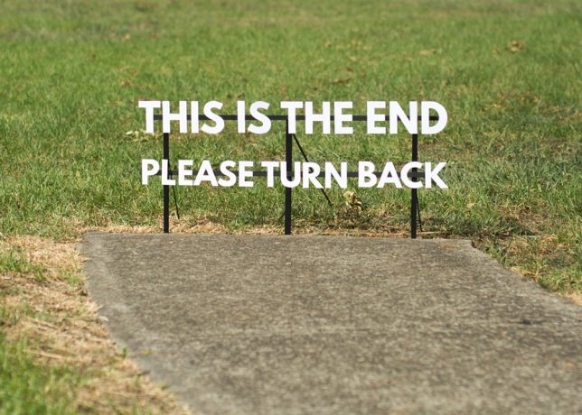
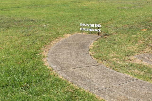
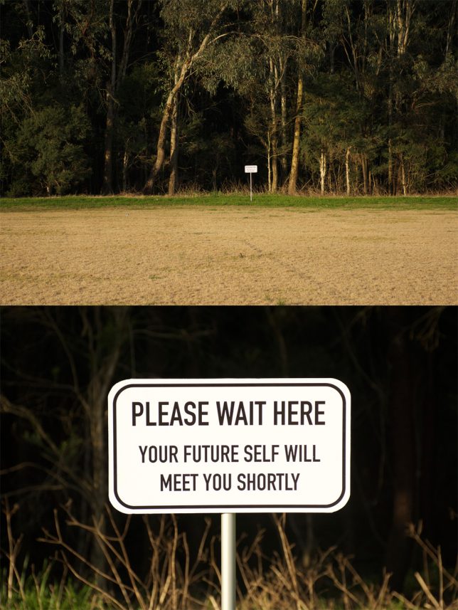
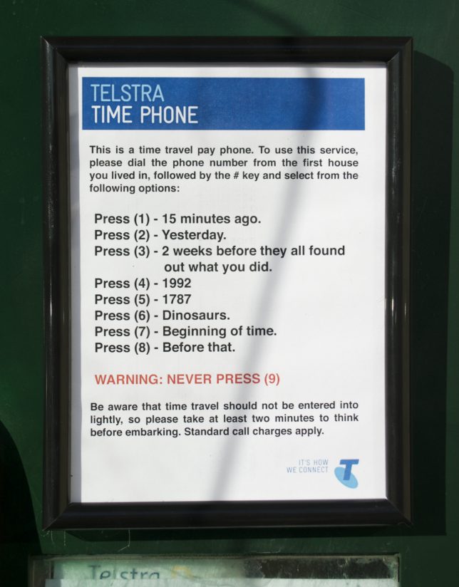
You’re hurrying along the sidewalk on the way to work, running late and not in the greatest mood, when you see a sign in the adjacent field that simply reads “PLEASE WAIT HERE, YOUR FUTURE SELF WILL MEET YOU SHORTLY.” How does that affect your day? Little moments like these can bring some much-needed levity to the world around us, especially in dark times.

marquez-signs-3

guerrilla-street-signs

guerrilla-street-signs-2

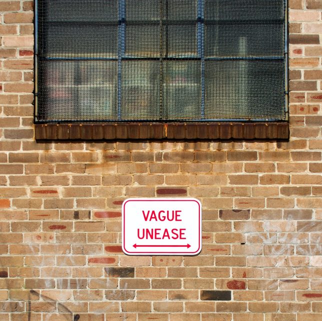
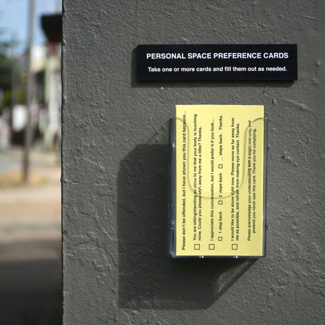
Impeccably produced, often enticing you to push a button or take a card, these guerrilla installations look pretty legit until you stop to read what they say. They’re easy to miss, if you’re hustling too quickly and tuning out your surroundings – but if you take a moment to notice them, they might just make you smile.

marquez-signs-1

marquez-signs-2

guerrilla-street-signs-6

guerrilla-street-signs-7

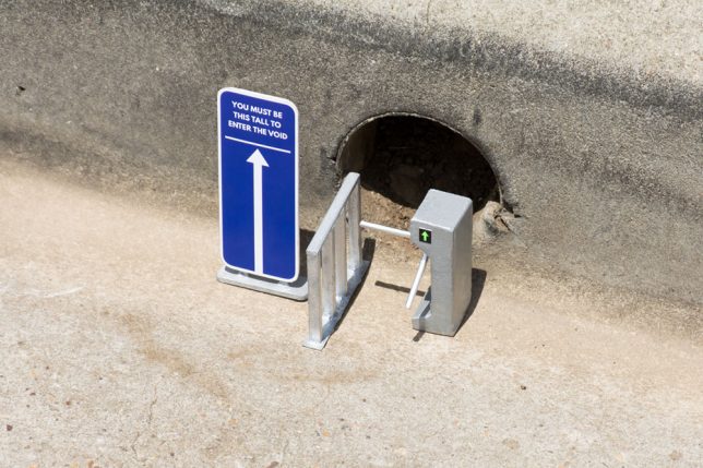
Artist Michael Pederson (aka Miguel Marquez Outside) creates these little interventions and puts them up all over his home city. Sometimes they’re site-specific, referring to things that can be found in the local environment, like a hole in the curb or a sidewalk that ends abruptly.

guerrilla-street-signs-3

guerrilla-street-signs-4

guerrilla-street-signs-8

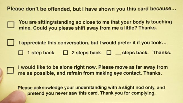
The personal space cards would actually be pretty handy, and who wouldn’t be tempted by a time travel pay phone? Check out more of Pederson’s work at his tumblr and Instagram.

Share on Facebook


[ By SA Rogers in Art & Street Art & Graffiti. ]

[ WebUrbanist | Archives | Galleries | Privacy | TOS ]


WebUrbanist

 
Comments Off on Guerrilla Guidance: DIY Street Signs Make Urban Life More Interesting

Posted in Creativity


Out Of Limits: 15 Retro-Futuristic Soviet Town Welcome Signs

08 Jan

[ By Steve in Design & Graphics & Branding. ]

soviet-town-signs-1a

In Soviet Russia, town welcome you… with retro-futuristic city limits signs that promised more than the blustery, blustering Cold War-era USSR could deliver.

soviet-town-signs-1b

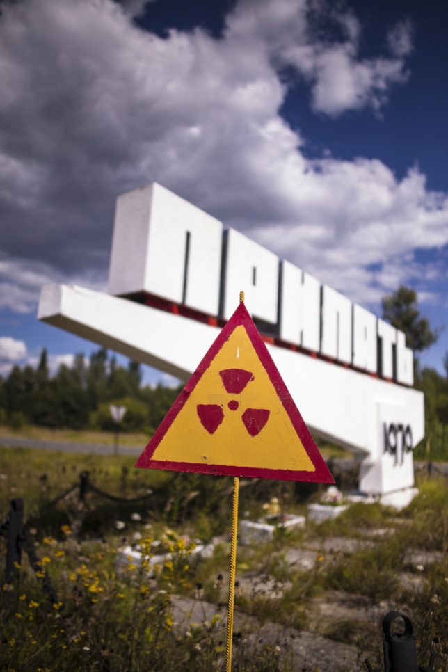
The welcome is, er, radiant in Pripyat, the now-abandoned city established in 1970 to house support staff and workers at the nearby Chernobyl Nuclear Power Plant. Pripyat’s population grew to almost 50,000 by 1986, plummeting to zero when the town was evacuated the day after the plant’s No.4 reactor exploded. Flickr user jesper karstensen snapped our lead image of Pripyat’s forward-looking sign on August 12th of 2013. Flickr user Stanislav (LieErr) captured a view of the sign from a disturbingly different angle five days later on August 17th.
Brave Nuked World

soviet-town-signs-1h

soviet-town-signs-1c

soviet-town-signs-1d

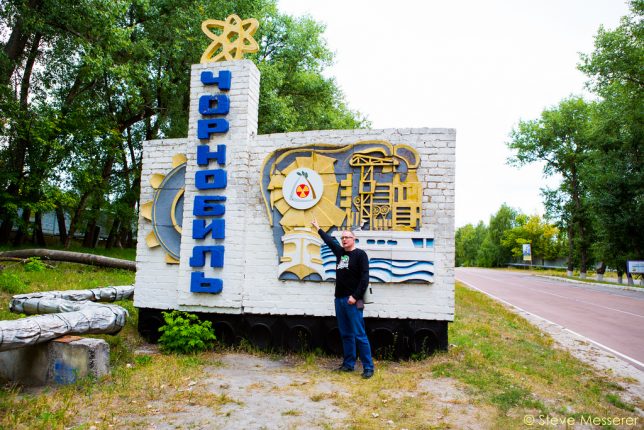
The city of Chernobyl is often confused with Pripyat though the former’s history dates back to the year 1193. Situated just 9 miles from the nuclear power plant whose name it shares, the city was home to about 14,000 people before its evacuation in 1986 – only 704 live there today. The city’s sign was erected in the Soviet era and originally featured a prominent hammer-and-sickle logo as seen in the guide book image at top. Sometime after the fall of the USSR, the logo was covered by a roundel displaying the symbol of the MHC – the Ukrainian Ministry of Emergency Situations.

soviet-town-signs-1e

soviet-town-signs-1f

soviet-town-signs-1g

Photographs taken after 2010-11 show a modified radioactivity symbol fitted in place of the MHC roundel, as seen in Flickr user Steve Messerer‘s images above. Several years later, perhaps due to the current Russia-Ukraine conflict, the radioactivity logo was removed revealing the original embossed soviet logo. The more things change, the more they stay the same, eh comrades?

Welcome to Exclusion Zone

soviet-town-signs-2a

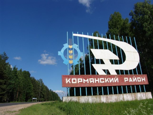
The so-called Chernobyl Disaster spewed radioactive fallout over a wide swath of central Europe and led to the establishment of an Exclusion Zone that spread across the Ukraine’s northern border into neighboring Belarus. Flickr user Ilya Kuzniatsou (belarusian) snapped the above photo of a city sign welcoming visitors to an evacuated town. Call it passive-aggression, post-Soviet style.

You Are My Density

soviet-town-signs-3a

soviet-town-signs-3b

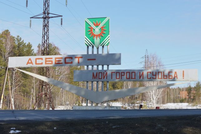
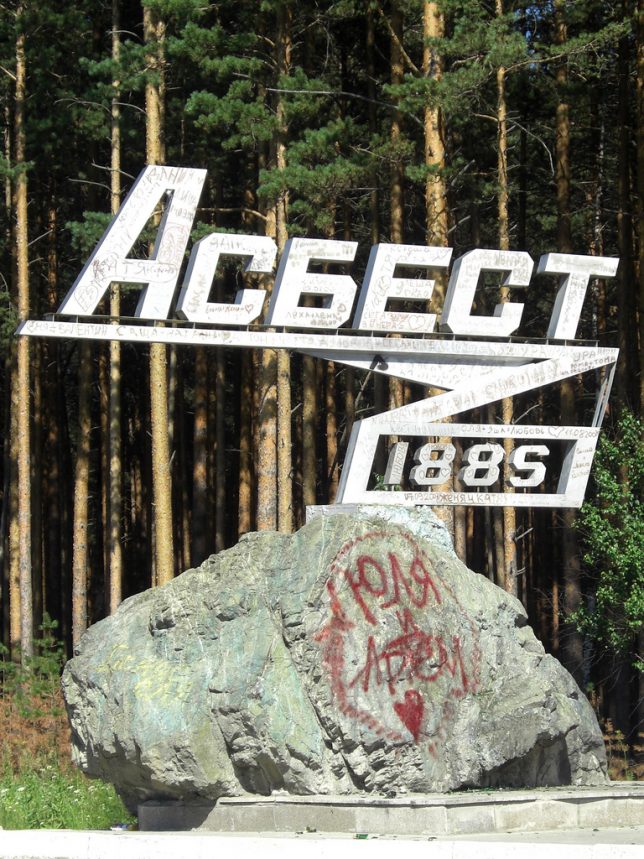
“Asbest is my town and destiny”, proclaims the ominously prophetic welcome sign for the mining town of Asbest, founded in 1885. If you haven’t guessed yet, they extract asbestos there from a mine half the size of Manhattan and 1,000 feet deep – how about that, Todd Hoffman? Asbest‘s population has dropped from over 84,000 in 1989 to about 69,000 in 2010… we’re not sure why *cough*.

Next Page – Click Below to Read More:
Out Of Limits 15 Retro Futuristic Soviet Town Welcome Signs

Share on Facebook


[ By Steve in Design & Graphics & Branding. ]

[ WebUrbanist | Archives | Galleries | Privacy | TOS ]


WebUrbanist

 
Comments Off on Out Of Limits: 15 Retro-Futuristic Soviet Town Welcome Signs

Posted in Creativity


Weekly Photography Challenge – Signs

21 May

You only have to walk down the street to be bombarded with signs, advertising, street markers, building and business names and more. See some here: Sign of the Times – 27 Significant Images of Signage

Natasha Wheatland

By Natasha Wheatland

Natasha Wheatland

By Natasha Wheatland

Weekly Photography Challenge – Signs

So it’s time to take a walk and see what signs you can find. Maybe do some street photography!

Remember all the principals of good photography still apply: good lighting, good composition, a center of interest, sharpness, etc.

Elisa Greco

By elisa greco

Meena Kadri

By Meena Kadri

ACME

By ACME

Share your images below:

Simply upload your shot into the comment field (look for the little camera icon in the Disqus comments section) and they’ll get embedded for us all to see or if you’d prefer upload them to your favourite photo sharing site and leave the link to them. Show me your best images in this week’s challenge. Sometimes it takes a while for an image to appear so be patient and try not to post the same image twice.

googletag.cmd.push(function() {
tablet_slots.push( googletag.defineSlot( “/1005424/_dPSv4_tab-all-article-bottom_(300×250)”, [300, 250], “pb-ad-78623” ).addService( googletag.pubads() ) ); } );

googletag.cmd.push(function() {
mobile_slots.push( googletag.defineSlot( “/1005424/_dPSv4_mob-all-article-bottom_(300×250)”, [300, 250], “pb-ad-78158” ).addService( googletag.pubads() ) ); } );

The post Weekly Photography Challenge – Signs by Darlene Hildebrandt appeared first on Digital Photography School.


Digital Photography School

 
Comments Off on Weekly Photography Challenge – Signs

Posted in Photography


Lights Out: Hong Kong Bans Iconic Neon Signs from City Streets

30 Aug

[ By WebUrbanist in Art & Sculpture & Craft. ]

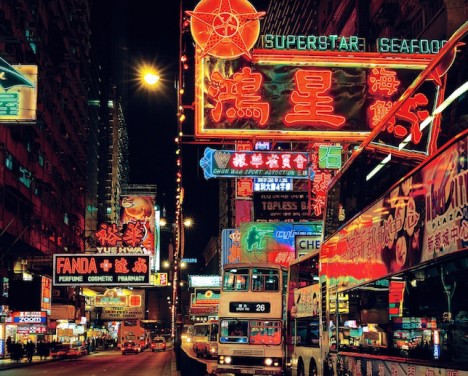
kowloon hong kong lights

In an effort criticized by local businesses as well as global visitors, Hong Kong has deemed neon signage illegal and is ramping up its systematic removal of these historic place-making lights.

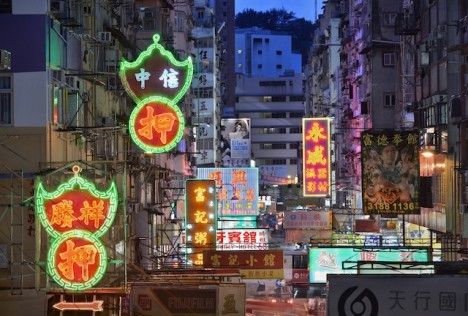
hong kong neon

To fans of the city’s vibrant nighttime glow, such signs define the bustling metropolis as much as any work of architecture or public art, featured prominently in many images taken and movies set on or around Hong Kong Island and Kowloon.

hong kong signage

In the last decade, thousands of signs have been removed through incremental city initiatives while preservationists scramble to save, store and display them. Populated with curators and directors from around the world, including the Tate in London and MoMA in New York City, the new M+ Museum is becoming the de facto guardian of many of these castoffs, collecting physical signs as well as videos, images, maps and other documentation.

sammys kitchen sign

More about the digital arm of their endeavor: “Presented by M+, Hong Kong’s museum for visual culture, “Mobile M+: NEONSIGNS.HK” is an online exhibition that celebrates a key feature of the city’s streetscapes by exploring, mapping and documenting its neon signs. Alongside curatorially-produced essays, videos, slideshows and artist commissions, over 4,000 photos were submitted by the public from 21 March to 30 June 2014 to collectively create a unique neon map of Hong Kong. The site will remain as a lasting record and examination of Hong Kong’s fast disappearing neon signs.”

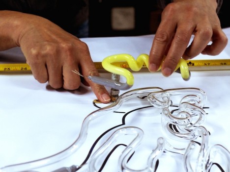
signmaking project

The classic art of neon sign-making involves electrified gas-filled glass pipes, originating in Europe but dating back nearly a century in China. Today, factory-made LEDs are becoming the industry standard. Around the world, the old methods are fading, but many artisanal practitioners continue to fight to restore old signs and keep such practices alive (images by Keith Macgregor, Romain Jacquet-Lagrèze and Mark Pegrum via TheCreatorsProject).

Share on Facebook


[ By WebUrbanist in Art & Sculpture & Craft. ]

[ WebUrbanist | Archives | Galleries | Privacy | TOS ]


WebUrbanist

 
Comments Off on Lights Out: Hong Kong Bans Iconic Neon Signs from City Streets

Posted in Creativity


Sans Ads: See Tokyo Scrubbed Clean of Signs & Advertisements

23 Mar

[ By WebUrbanist in Design & Graphics & Branding. ]

tokyo ad free art

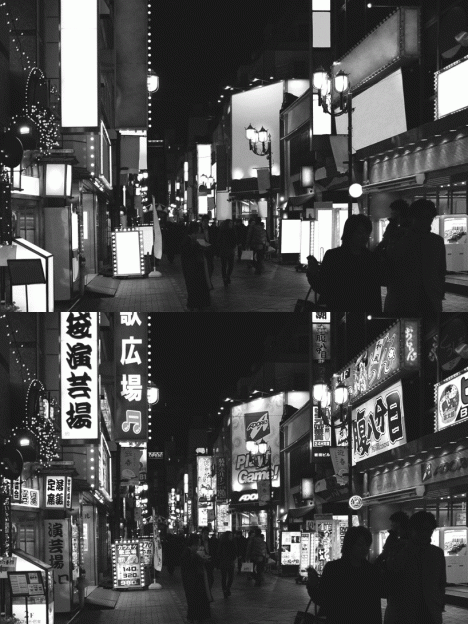
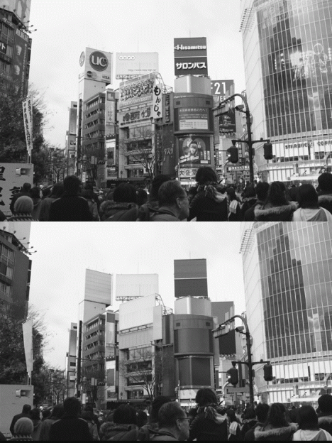
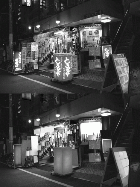
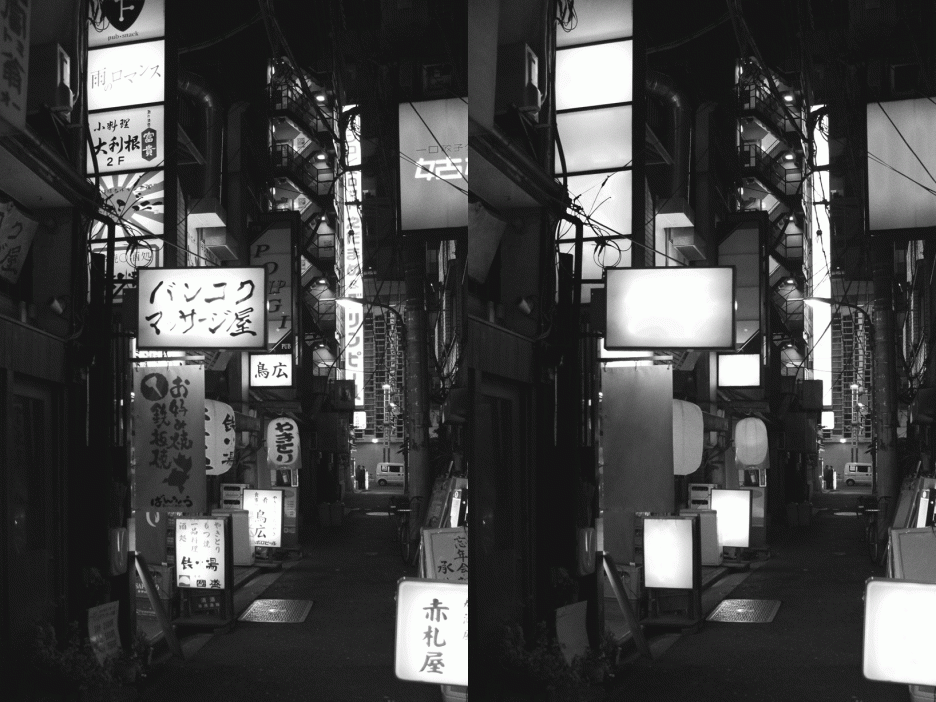
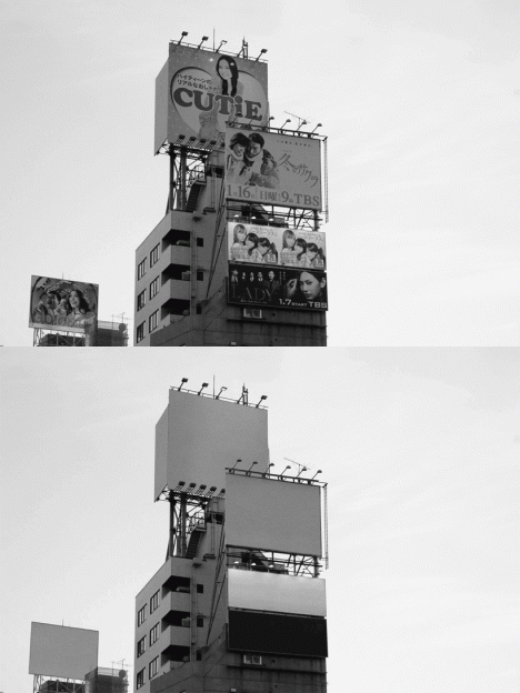
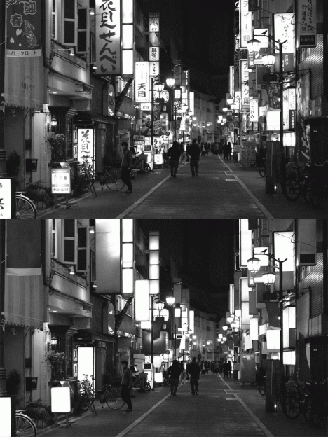
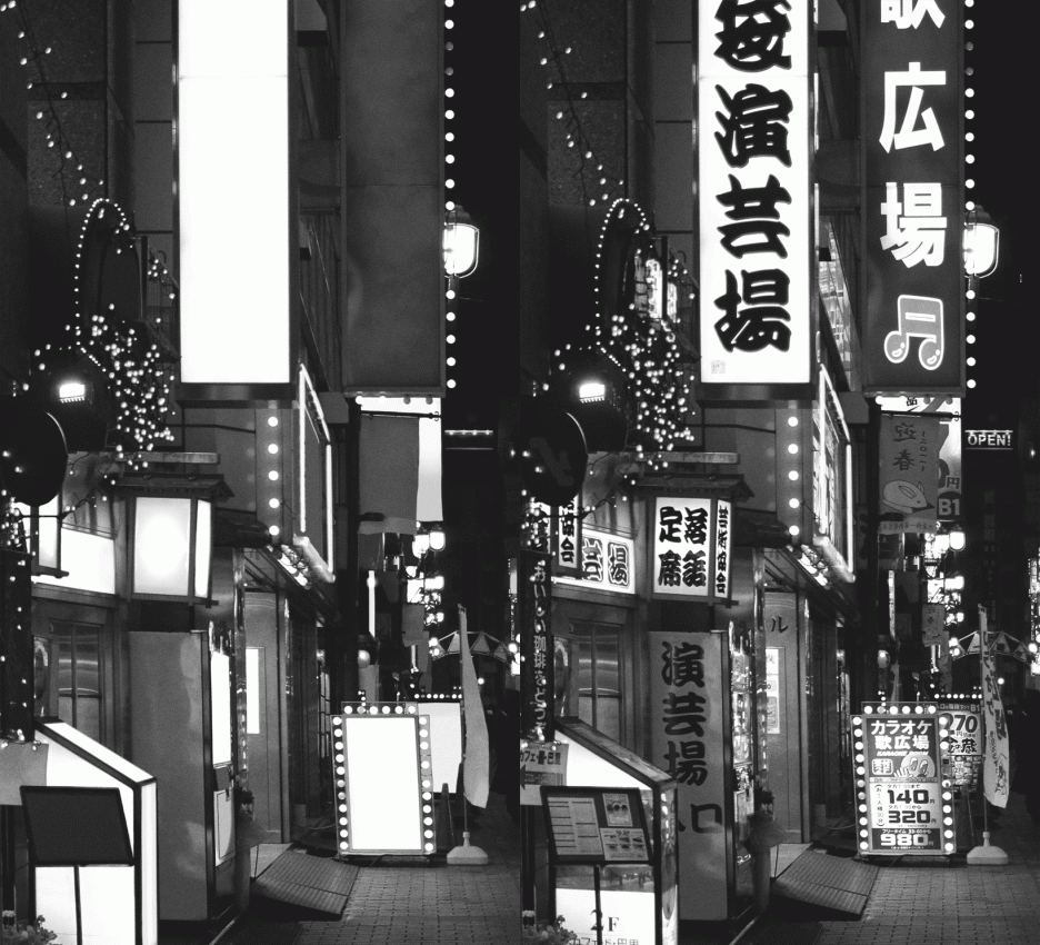
Tokyo seems inseparable from the banners, billboards, logos, slogans and other flashy neon alerts, except when seen through the lens of this French graphic designer in a startling black-and-white image series turned into a alternating GIFs.

tokyo no ads new

tokyo vendor sans ads

tokyo without advertisements signs

Tokyo No Ads by Nicolas Damiens illustrates just how shocking the contrast is, particularly when switching back and forth between before and after versions. Each of the seven scenes here was meticulously edited with attention to every last pixel of graphics.

tokyo with blank billboards

tokyo street no neon

tokyo scrubbed white clean

To outsiders, Japan’s capital is nearly synonymous with signage saturation, so stripping them away changes the character of the place dramatically. Promoting everything from TV shows and movies to local shops and businesses, it is almost impossible to find a place in the city not showered in advertising. Perhaps the biggest surprise: the landscape almost looks more alien without its characteristic adverts.

Share on Facebook


[ By WebUrbanist in Design & Graphics & Branding. ]

[ WebUrbanist | Archives | Galleries | Privacy | TOS ]


WebUrbanist

 
Comments Off on Sans Ads: See Tokyo Scrubbed Clean of Signs & Advertisements

Posted in Creativity