RSS
 

Posts Tagged ‘Website’

New Fujifilm X/GFX website and app offers news, events, deals, interviews and tips

17 May

Fujifilm X-Series and GFX users can now tune in to the latest Fuji offers and inspiration via a new website and app created by Fujifilm USA. The site will host interviews with X and GFX professionals, run technique articles to help users get the most from their kit, and showcase collections of images shot with Fujifilm equipment.

FujifilmXGFX.com was launched yesterday by Fujifilm USA, but there are no actual geographic restrictions on access to the content, so it can be enjoyed by anyone. An app, launched at the same time is essentially a mobile version of the site, and will carry the same articles formatted for the small screen. The company promises give-aways and news of special deals, as well as a finder function to help users locate their closest Fujifilm dealer.

In addition, the company has launched a printed newspaper called Fujifilm X/GFX USA Bulletin that will feature highlights from the website, and which will be given away free in camera stores.

To see the new site visit fujifilmxgfx.com

Press Release

Fujifilm Launches New FUJIFILM X/GFX USA Website and Mobile App

Offering Exciting News, Local Events, Inspirational Photography, Tutorials, and Regular Sweepstakes for FUJIFILM Digital Camera Users in the United States

Valhalla, N.Y., May 15, 2018 – FUJIFILM North America Corporation today announced the launch of its new website and mobile app for FUJIFILM digital camera users in the United States. The newly designed website brings together the latest FUJIFILM X Series and GFX system news, information about upcoming photography events, and inspiring features to help FUJIFILM photographers stay up to date and creatively energized.

Recent articles include a photographic trip to Antarctica with Dan Westergren and his FUJIFILM GFX 50S, a gallery of images shot by professional photographers using the new FUJIFILM X-H1 camera, and detailed rundowns of the exciting new features being added to FUJIFILM cameras via firmware updates.

Created by FUJIFILM North America Corporation, FUJIFILMXGFX.com brings together the finest photography, latest news, and essential techniques. It also helps visitors to find information on their nearest Authorized GFX system and X Series Dealers, including X Series Premier Dealers, making it the ultimate website experience for Fujifilm photographers.

As well as hearing about promotions and events, photographers who register on the website will be the first to learn about the regular competitions, sweepstakes and promotional offers that are featured in the Promotions & Giveaways section. These include photography gear giveaways, limited-time deals, Education Program information, and other great benefits that are not to be missed.

“We are excited to launch a platform that displays the image quality and creative possibilities of the GFX system and X Series line of digital cameras,” said Yuji Igarashi, General Manager of the Electronic Imaging Division & Optical Devices Division at FUJIFILM North America Corporation. “It’s basically a go-to website and app offering a range of resources, for all FUJIFILM photographers.”

The mobile app, FUJIFILM X/GFX USA, encompasses all features of the FUJIFILM X/GFX USA website and formats them especially for smart devices. It is available for download on iTunes for Apple users and Google Play for Android users.

App users are able to activate notifications, so they’ll never miss out on the latest news and promotions. Like the FUJIFILM X/GFX USA website, the app also includes FUJIFILM Focus, a special space dedicated to the latest information about Fujifilm-supported events, product announcements, FUJIFILM X-Photographer profiles, promotions, giveaways and much more.

And the next time you visit an Authorized X Series Dealer, keep your eyes open for your free copy of the FUJIFILM X/GFX USA Bulletin. This is a regularly printed newspaper featuring a selection of the best content from the FUJIFILM X/GFX USA website, including news, interviews and beautiful images to inspire you. Pick up your free copy of the FUJIFILM X/GFX USA Bulletin while stock lasts.

Articles: Digital Photography Review (dpreview.com)

 
Comments Off on New Fujifilm X/GFX website and app offers news, events, deals, interviews and tips

Posted in Uncategorized


Re.photos: This website lets anyone create and share then-and-now photos

04 Jan

If you’re both a photography fan and history buff, then you might want to check out a platform called re.photos. The website/social network, which launched a couple of months ago, allows anyone to share interactive then-and-now images—so-called “rephotography”—that compare a modern version of a location or subject with an older image of the same spot.

Re.photos is the brainchild of retired computer science professor Oliver Vornberger, and it’s extremely easy to use. Users simply upload both a before and an after photo, then place markers on a few points on the images so that the system knows how to align them.

Speaking to PetaPixel in November, Vornberger said that a student of his is working on improving the platform’s algorithm so that manually placing markers isn’t necessary. Eventually, the whole system should be as easy as uploading a before and after picture, and letting the website do the rest of the work.

In addition to automatically aligning images—taking the hard work out of creating these comparisons manually—re.photos serves as an exploration platform for finding rephotography from other users. Rephotography created by users can be searched using descriptions, username, titles, tags such as date or location, and category such as interior, nature, and people.

To check out the platform for yourself, or upload a few before and afters of your own, click here.

Articles: Digital Photography Review (dpreview.com)

 
Comments Off on Re.photos: This website lets anyone create and share then-and-now photos

Posted in Uncategorized


Winners of the Portfolio Website CMS Giveaway

27 Feb

A big thank you to all entrants of our recent portfolio website CMS giveaway. We were excited to see such a great response, you rock guys! We won’t drag things out any longer. Drumroll please… And the lucky winners of the MotoCMS giveaway are: 1st Place Winner – Wayne Johnson Prize: Full License for MotoCMS 3.0 “I’m Wayne a portrait Continue Reading

The post Winners of the Portfolio Website CMS Giveaway appeared first on Photodoto.


Photodoto

 
Comments Off on Winners of the Portfolio Website CMS Giveaway

Posted in Photography


Win a Pro-Level Portfolio Website CMS for FREE

15 Feb

In this giveaway you can win one of 5 great prizes provided by our friends at MotoCMS. Whether you’re professionally into photography or you just plan to start making money out of your photos, you probably know by now that a good website managing software is a gold find for your business. Something that would have a lot of design Continue Reading

The post Win a Pro-Level Portfolio Website CMS for FREE appeared first on Photodoto.


Photodoto

 
Comments Off on Win a Pro-Level Portfolio Website CMS for FREE

Posted in Photography


List of Resources for Making a Photography Website

08 Feb

I’ve just made a new photography website for my fashion, portrait, and event photography. This meant researching the different options currently available (as of December 2015) for creating photography websites. So whether you’ve just gotten your first camera, or are a seasoned pro looking to update your photography website, here are some options to consider.

I’ll make some recommendations about specific companies that I’ve used. Most articles would make money on these through affiliate links; but there are no affiliate links here (I get no benefit recommending them), these are just companies that I’ve been happy with.

Editor’s note: none these companies have not been researched or checked by dPS, and are solely the recommendations of the author. As with any purchase please do your own due diligence, read online reviews, and do trial periods where possible, before choosing your web suppliers. dPS is not responsible for any issues that may arise if you follow these suggestions.

make-photography-website8727-2

Why make a photography website?

Now that the majority of photos aren’t printed, sometimes they can get lost in your hard drives and forgotten. Sharing the pictures you make with family and friends is much easier when your photos are online. Depending on the photography website you use, you can also get useful feedback on your pictures, or even sell them to buyers around the world. Now is also the best time to start getting followers, if you haven’t already done so.

As well as sharing, developing, and selling your photography online, having a photography website helps encourage you, and gives you a sense of accountability so you keep practicing. Old photos are also one of the most valuable things we own, professional or amateur, and photo albums are often what most people would choose to save in a fire. Keeping your memories online not only shows you how your photography has improved, but also keeps them safe in the cloud. When my Western Digital hard drive arbitrarily malfunctioned and lost all of my photos, I was thankful to have uploaded my favourite ones online.

Make a photography website for free

Alan O'Rourke

By Alan O’Rourke

There are several excellent free options to get your photography online.

  • Flickr – Like a resurrected giant, Flickr offers a huge 1 TB of complimentary storage and has a thriving community.
  • Facebook – A humble Facebook page (not your personal profile but a business page) for your pictures is an ideal way to start to gain a following.
  • Google Plus – Less popular lately, but better quality, and good if you want to be found online by the Google search engine.
  • Instagram– Even if this isn’t your main site, it’s very useful to have as a photographer.
  • Tumblr – A clean, free way to create a blog and feature your most recent photography.
  • 500px – A relative newcomer, the 500px design is clean and contemporary; their free option is fine.
  • Behance – A professional space for your best photos that looks more prestigious.

Make a photography website

As well as the free options, you might like to make a photography website that you have more control over. Personally after much research I opted for a self-hosted WordPress site using a pre-designed theme that I customized. To do so you will need;

A Domain name

The domain name is your address on the internet. For example: http://digital-photography-school.com is the domain name, or URL for dPS. I get my domain names from www.Internet.bs or www.NameCheap.com.

Hosting

This is your real estate on the internet. You need a place to park your site, that is called hosting. Your host online is where all the files for your site will be stored (hosted).

I use www.LiquiLayer.com (really excellent, personal support) and www.HostDeal.com. I’ve heard good things about www.HostGator.com, www.DreamHost.com and www.HostWinds.com, but haven’t used any of those personally.

make-photography-website_1413

Content Management System

This simplifies building your website tremendously. I use WordPress and highly recommend it. Most web hosts will give you options to install it very easily.

WordPress Theme

This provides a structure for your website. There are both free and paid options available, which allow you to make a great looking site faster. Here are my favourites:

SLR Lounge’s WordPress Theme – I recently discovered this free WordPress photography theme and used it to build my latest website. It has a clean, simple style and creating the site took a few days.

Screen Shot 2016-01-30 at 1.16.20 PM

Home page of my new site

Screen Shot 2016-01-30 at 1.17.21 PM

Portrait page

MySiteMyWay’s InFocus Theme – (Paid theme) I’ve used MySiteMyWay’s themes for several websites. As well as the design, I’ve been incredibly happy with the ongoing support, which has saved me a huge amount of time, and allowed me to do things I wouldn’t otherwise have been able to do.

Screen Shot 2016-01-30 at 1.22.01 PM

Home page

Screen Shot 2016-01-30 at 1.22.31 PM

Gallery page

The X Theme – (Paid option) It’s a silly name, but this Premium WordPress theme looks good, and they have done very well with updating it. There is a lot of features available here for more advanced internet users and web designers.

Screen Shot 2016-01-30 at 1.28.18 PM

Themeforest – (Free and paid options) Themeforest is the marketplace for WordPress themes online. Because they are constantly being released and updated, and because creating a website can be quite a personal choice, it is worth having a look here to see which themes are currently rated highly.

Designers

It can be helpful to hire a designer/ coder to help you with creating your photography website.

  • Fiverr – This is my go-to site for getting help with websites and so on. It’s cheap, fast, and so far I’ve been very happy with the results.
  • Elance – More professional than Fiverr; expect to pay more as well.

Pay monthly for a photography website

If designing a site isn’t for you, there are quite a few companies that can help. I don’t use these options personally because I like being able to move my website to another hosting provider if I want, or archive a site and bring it back later.

  • Smugmug – An established player that will allow you to show, share and sell your photos.
  • SquareSpace – The choice of many top professionals, although caveat emptor, several are sponsored. It’s quite pricey, but the designs it offers for photographers really look incredible, and it’s the easiest way to get a good looking photography website online quickly and easily.

Some bonus photography related companies

While we’re on the subject, here are a few companies that are very useful for photographers.

  • WeTransfer – Ideal for sending large files or even whole photoshoots. Their free option is excellent, and the paid version is great for photographers who want more options.
  • Dropbox – Very well integrated, and a great way to back up your photos online.
  • Google Drive – Again, an excellent option to save and send photos.
  • PicSurge.com – I use this a lot. It’s a well-designed site that allows you to show photos in good looking galleries that remain live for years. It lets you password-protect your images, and allows clients/family/friends to download files individually or collectively – and it’s free!

Conclusion

So those are some of the main options to consider if you want to make a photography website in 2016, and some reasons why you might want to consider doing so if you haven’t already. Hopefully this has been useful – please feel free to share your own websites in the comments below!


Editor’s note: please see this page for website resources, personally recommended by dPS founder and chief, Darren Rowse, over on his other site dedicated to blogging – ProBlogger. If you’re really interested in blogging you may wish to sign up there to get free weekly blogging tips.

googletag.cmd.push(function() {
tablet_slots.push( googletag.defineSlot( “/1005424/_dPSv4_tab-all-article-bottom_(300×250)”, [300, 250], “pb-ad-78623” ).addService( googletag.pubads() ) ); } );

googletag.cmd.push(function() {
mobile_slots.push( googletag.defineSlot( “/1005424/_dPSv4_mob-all-article-bottom_(300×250)”, [300, 250], “pb-ad-78158” ).addService( googletag.pubads() ) ); } );

The post List of Resources for Making a Photography Website by Ben Evans appeared first on Digital Photography School.


Digital Photography School

 
Comments Off on List of Resources for Making a Photography Website

Posted in Photography


Nikon KeyMission 360 price and specs appear on retailer’s website

03 Feb

The Nikon KeyMission 360 action camera was unveiled at an event in early January, and while Nikon offered some details about the model, it did not reveal the price. Now, nearly a month later, the camera has surfaced on German retailer Cyberport’s website with a list price of €499 and a features list.

The KeyMission 360 records 4K UHD video, is waterproof to depths of 30m/100ft, shockproof from heights up to 2m/6.6ft, and has electronic image stabilization, according to Nikon. The product listing includes some additional specs, including support for microSDHC/SDXC media cards, WiFi, NFC, Bluetooth, an integrated microphone, non-removable Li-Ion battery and USB 2.0.

Nikon said during its January event that it is aiming for a Spring 2016 release; it has not confirmed pricing.

Via: NikonRumors

Articles: Digital Photography Review (dpreview.com)

 
Comments Off on Nikon KeyMission 360 price and specs appear on retailer’s website

Posted in Uncategorized


10 Photography Website Mistakes That Might be Repelling Your Potential Clients

19 Oct

If you are serious about your photography business, then you most likely have your own photography website already (if not, you should set one up right away). You are probably really proud of it and consider it the best website under the sun. However, numerous mistakes can be found on almost every photographer’s site. These mistakes could be fatal for your business, since they can easily repel your potential clients. We are talking big agencies, companies and even government organizations, not just regular consumers who want you to be their wedding photographer.

Here’s some good news: these mistakes can be fixed easily once you know what they are based on.

We have recently researched thousands of photographers’ websites when looking for professional vacation photographers for our new project. We were quite surprised by the number of mistakes we had encountered on them. On top of that, several particular mistakes kept constantly repeating!

Some seem obvious, some of them not, but almost every photographer’s website is guilty of at least one or two of these mistakes. So, here comes the checklist of some of the most common photography website mistakes that might save some of your serious assignments:

1) Your name is missing

This is probably the most obvious mistake. However, you would be really surprised how many websites are anonymous. A nickname may be great, it might help you look like a mysterious artist, but it definitely won’t help you to get new inquiries.

Your name is your only brand. You should be proud of it and present it to the public as much as you can. So put your name out there! Visibly! And buy yourself a domain with your name if possible.

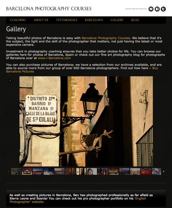
1 example of good website be proud of your name

Example of good website, be proud of your name: Kristina Kislitsyna

2) You’re using cheap web templates

Do you want to run a successful photography business? Then you have to invest in it, at least a little. Start with investing in a decent website. A few hundred bucks and a skilled friend will have the work done in a blink of an eye, you’ll have a nice, basic, yet original website.

However, I implore you, do avoid those cheap template websites with the provider‘s logo all over the place.

3) Your contact information is missing

Email address is the key. Your client needs to find it quickly and easily. Contact forms might not seem like a bad choice at first, however, they most certainly are. Lots of big clients prefer to contact you via email, because they want to have a copy of the email that they send to you.

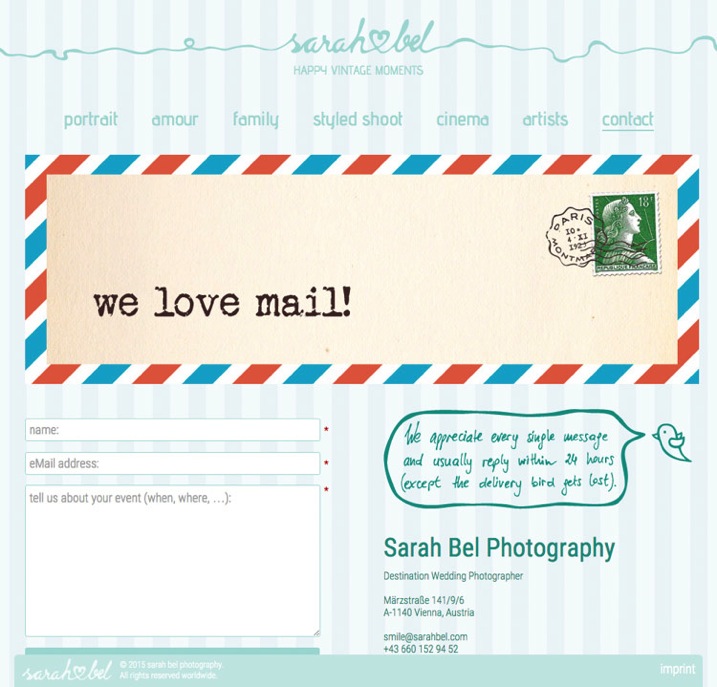
If you insist on having a contact form, put your email address next to it and let your client decide. Here’s a secret tip – insert your email address as an image with your email on it so bots cannot find it and you save yourself from getting tons of spam.


2 example of good website put your email address next to the contact form and let your client decide www sarahbel com

Put your email address next to the contact form and let your client decide: Sarah Bel Photography

4) Check your spam box

This one is closely connected to the previous point. Inquiries from agencies, companies, and other projects often end up in the spam box or junk folder. It doesn’t matter which email service you use to communicate with your client, but it is essential to check your spam box every few days. This is the only way to avoid those embarrassing moments when you respond to an important inquiry after several months, and indeed, it is usually too late at that point.

5) There’s music playing on your website

Do I have to add anything else? Hello, it’s 2015! Everyone is listening to Spotify or YouTube while browsing the internet. The last thing people want is to be interrupted by the blasting of your favourite music.

6) Your pricing is hidden

It’s okay if you don’t want to share the pricing on your website, it’s also okay if you want to share it, but you definitely need to decide which way you want to go! If you want to show your prices, do so visibly, clearly, and in a special menu category. If you don’t want to share them, then say so clearly (and add your email address at that point, so that the client can contact you regarding the pricing details right away).

There’s nothing weirder and more suspicious than a small hidden grey link to a PDF pricing guide that cringes at the bottom right corner of an About Me page.

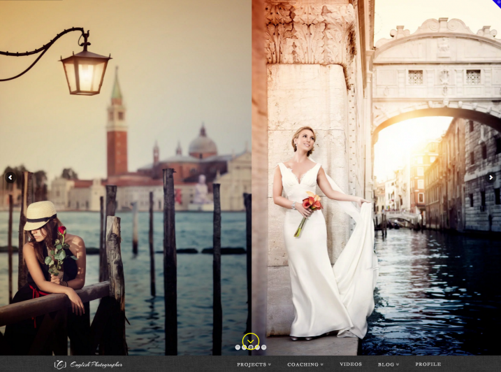
3 example of good website clear statement about where to find pricing www verapavlovaphotography com

Example of what to do – clear statement about where to find pricing: Vera Pavlova Photography

7) Your website is too slow

On photography websites, this is most often caused by high-resolution and uncompressed photos. I know, we are photographers and we are proud of our latest cameras with great dynamic range and stuff. Still, these things are usually not that important for our potential clients. You need your website to be fast! And because of that, you need to compress photos for your website – compress them big time (150-200kb is a good maximum file size for website images, any bigger will slow your site down). Speed is the king in the realm of photography websites.

8) There’s no English version

This one is for photographers from non-English speaking countries. Yes, English is the most important language in the business world nowadays, so you need to have an English version of your website if you want to target the worldwide market. If you don’t have the time, or the resources, to prepare two language versions, then go for an English only site.

4 example of good website two language versions including English www barulaphoto com

Example of a website with two language versions including English: Baru la Photo

9) Your location is missing

Lots of (semi)professional photographers try to target the whole world, thus the only location info that you can find on their website is “available worldwide”. Okay, it’s great to know that you’re willing to travel, but clients are sometimes looking for local know-how. Always specify your location (at least by the city).

10) There are no links to social media

Social media is the new place to check testimonials and references to your work. It is crucial for your potential clients to be able to quickly find their way to your profiles on social media. The rule “the more, the better” applies here 100% – Facebook, Twitter, Pinterest and Instagram are necessary. You name the others…

5 example of good website clearly visible links to social media www austinsheppardphotography com

Example of clearly visible links to social media: Austin Sheppard Photography

Summary

You put a great amount of energy and time to build up your website. It would be pity to reduce the possibility of attracting potential clients just by making some small mistakes that you can get rid of quite easily. I hope that this article will show some practical examples of such possible changes.

We would also love to hear from you! Are there any other mistakes that you suggest avoiding on photography websites?

googletag.cmd.push(function() {
tablet_slots.push( googletag.defineSlot( “/1005424/_dPSv4_tab-all-article-bottom_(300×250)”, [300, 250], “pb-ad-78623” ).addService( googletag.pubads() ) ); } );

googletag.cmd.push(function() {
mobile_slots.push( googletag.defineSlot( “/1005424/_dPSv4_mob-all-article-bottom_(300×250)”, [300, 250], “pb-ad-78158” ).addService( googletag.pubads() ) ); } );

The post 10 Photography Website Mistakes That Might be Repelling Your Potential Clients by Matej Slezak appeared first on Digital Photography School.


Digital Photography School

 
Comments Off on 10 Photography Website Mistakes That Might be Repelling Your Potential Clients

Posted in Photography


MotoCMS 3.0: The Best Option to Build a Photo Portfolio Website

18 Jul

Photography and web design are going hand in hand. A good-looking website requires stylish photo content to attract audience, as well as to compete with other web pages. And as photography gains more popularity year by year, this rivalry becomes much fiercer. So, acquiring good looking, attractive, creatively different photo web page is a high-priority task for every photographer who Continue Reading

The post MotoCMS 3.0: The Best Option to Build a Photo Portfolio Website appeared first on Photodoto.


Photodoto

 
Comments Off on MotoCMS 3.0: The Best Option to Build a Photo Portfolio Website

Posted in Photography


How to Use Video for Your Photography Website

12 Jun

In modern society websites are all about storytelling and conveying the right message. Designers try to “make it big” by using proper images and videos to give users the maximum impact. Videos rose in popularity in 2014, and have been a growing trend ever since. Being a sister medium to photography, video can help you enhance your online brand presentation Continue Reading

The post How to Use Video for Your Photography Website appeared first on Photodoto.


Photodoto

 
Comments Off on How to Use Video for Your Photography Website

Posted in Photography


Give Your Photographs The Stage They Deserve – Make Sure Your Website is Mobile Ready

12 Oct

If you post amazing professional-quality photographs to your website and nobody can access them, are they really that amazing? Nobody will know. All that hard work, focus, determination, and artistic ability -POOF – all for nothing. This is exactly what is happening to many very talented photographers. They pour their heart and soul into their art form and then entrust it to outdated technology that doesn’t adequately display their work on mobile devices.

ResponsivePortfolioSite

How important is being mobile friendly?

With the proliferation of mobile devices, it’s no surprise that many people do most of their web browsing on the go. Consider the following eye-opening statistics found on visual.ly:

  • Mobile search queries have grown five times in the past two years.
  • Nine out of 10 mobile phone searches result in a purchase or visit.
  • Three out of every five searches are conducted on a mobile device.
  • 99% of Smartphone owners use their mobile browsers at least once a day.
  • 52% of all local searches are conducted on a mobile device.
Mobile Search Statistics

Those are startling numbers, especially if you’re not keeping up with the changing face of the web. Unfortunately, it seems that there has been a lag in photographers adopting the appropriate web technology to showcase their work in a way that accommodates mobile users. To ensure that your site and your photography work are presented in an impactful way, it must be optimized specifically for mobile viewing.

Desktops and mobile devices don’t always play nice

Just building a site for the desktop doesn’t guarantee that the results will transfer to phones and tablets, or even the new smart watches. You do not want interested viewers to open your site on a mobile device and find a helter-skelter layout with distorted or inaccessible images. If this happens, it puts you in a difficult spot – you’re left hoping that they remember and desire to seek out your site for a second time when they’re back at a desktop computer. That’s wishful thinking considering the deluge of distractions we all encounter every day and the somewhat shrinking attention spans of the high-definition, high-speed digital generation. Here today, gone tomorrow, or maybe sooner in the case of your hard work and aspirations.

One of the worst-case scenarios you could be in is with a portfolio site that is completely based on Adobe Flash, leaving you to lose a whole group of mobile users who will rapidly look elsewhere when your site doesn’t load on their device. No one likes seeing a blank screen or a message saying, “This content cannot be displayed on your device.”

FlashOnlySite

Mobile devices often will not play Flash websites

Making your work accessible

It’s vital to give your audience exactly what they want – fast, fluid access to your dazzling work anytime anywhere. If they can’t clearly navigate your web site, it raises questions in their minds about your professionalism and your commitment to viewers and to your art form. This is not a good place to be for a proud, ambitious photographer. The good news, however, is that there are readily available solutions that you could leverage whether you already have an existing site or are starting one from scratch.

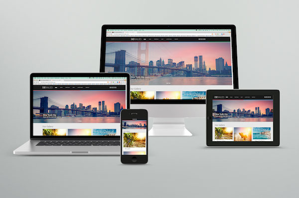
The key to optimizing the mobile user’s experience is to have a site that uses responsive web design or adaptive web design. These are two types of site programming that ensure a seamless transition of your content from the desktop to all mobile devices, regardless of screen size. Anything less than that, and you’re severely limiting exposure for your work and jeopardizing your chance of making a significant first impression. Negative experiences can turn into negative reviews. These travel fast in the digital age, and it’s difficult to change those perceptions once they’re public.

Using an adaptive design, you get a site that is specifically designed for particular browser sizes found on most mobile devices. In a lot of cases, the mobile site almost looks like a native app. Problogger.net (also run by dPS owner Darren Rowse) is an example of such a site. With this type of design, the experience on a mobile device is a bit different than that of a desktop, but you could still access the content in a readable format. This results in a fast and easy to read site that is user-friendlier on small web browsers.

ProBlogger Adaptive

Example of an adaptive design

A Responsive site is even better in that it is flexible in displaying the same content across a large array of devices while keeping much of the same styles. It maintains a fluid layout by using elements that are automatically resizable and could be placed where they fit best on the screen. This even works great on desktops when you want to shrink the browser window.

A perfect example of a website with a responsive design is Digital Photography School’s own site. If you’re accessing the site from a desktop browser, notice how the site responds fluidly as you resize the window. If you’re reading this from a mobile device, you’re still able to read the content just fine without having to manipulate the browser by zooming in and out or doing a lot of horizontal scrolling.

ResponsivePhotoSite

dPS is a responsive site

Simple changes make a HUGE difference

Updating your site from a clunky old format is quite simple, and the tools are readily available. Most people who have a blog use a Content Management System (CMS) such as WordPress, Joomla, or Drupal. These systems allow you to change the overall look and feel of your site by offering different designs or themes. There are plenty of available themes that are already responsive or adaptive right out of the box. These range in cost from free up to $ 100. A simple web search will reveal many sites that specialize in offering a variety of this type of themes. I’ve had great success using Theme Forest.

In addition to themes that are optimized for mobile browsing, these CMSs also allow you to install plugins that display the same content in a mobile-only theme. In some cases, especially if you already have an existing site, this might be the easier route to take.

Rock the mobile web

At some point, we’ve all experienced the disconnect between the artistic or creative world and the technology world. But in the modern age, you really can’t draw a distinction without suffering the consequences. It’s much wiser to embrace the role of technology in displaying art – in this case photography – and use it to your advantage.

With just a bit of effort, you can make sure that you nail that vital first impression with your fans and give your work the digital stage that it deserves!

The post Give Your Photographs The Stage They Deserve – Make Sure Your Website is Mobile Ready by Jorge Hassan appeared first on Digital Photography School.


Digital Photography School

 
Comments Off on Give Your Photographs The Stage They Deserve – Make Sure Your Website is Mobile Ready

Posted in Photography