If you are serious about your photography business, then you most likely have your own photography website already (if not, you should set one up right away). You are probably really proud of it and consider it the best website under the sun. However, numerous mistakes can be found on almost every photographer’s site. These mistakes could be fatal for your business, since they can easily repel your potential clients. We are talking big agencies, companies and even government organizations, not just regular consumers who want you to be their wedding photographer.
Here’s some good news: these mistakes can be fixed easily once you know what they are based on.
We have recently researched thousands of photographers’ websites when looking for professional vacation photographers for our new project. We were quite surprised by the number of mistakes we had encountered on them. On top of that, several particular mistakes kept constantly repeating!
Some seem obvious, some of them not, but almost every photographer’s website is guilty of at least one or two of these mistakes. So, here comes the checklist of some of the most common photography website mistakes that might save some of your serious assignments:
1) Your name is missing
This is probably the most obvious mistake. However, you would be really surprised how many websites are anonymous. A nickname may be great, it might help you look like a mysterious artist, but it definitely won’t help you to get new inquiries.
Your name is your only brand. You should be proud of it and present it to the public as much as you can. So put your name out there! Visibly! And buy yourself a domain with your name if possible.

Example of good website, be proud of your name: Kristina Kislitsyna
2) You’re using cheap web templates
Do you want to run a successful photography business? Then you have to invest in it, at least a little. Start with investing in a decent website. A few hundred bucks and a skilled friend will have the work done in a blink of an eye, you’ll have a nice, basic, yet original website.
However, I implore you, do avoid those cheap template websites with the provider‘s logo all over the place.
3) Your contact information is missing
Email address is the key. Your client needs to find it quickly and easily. Contact forms might not seem like a bad choice at first, however, they most certainly are. Lots of big clients prefer to contact you via email, because they want to have a copy of the email that they send to you.
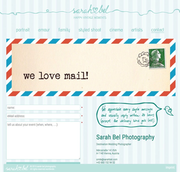
If you insist on having a contact form, put your email address next to it and let your client decide. Here’s a secret tip – insert your email address as an image with your email on it so bots cannot find it and you save yourself from getting tons of spam.

Put your email address next to the contact form and let your client decide: Sarah Bel Photography
4) Check your spam box
This one is closely connected to the previous point. Inquiries from agencies, companies, and other projects often end up in the spam box or junk folder. It doesn’t matter which email service you use to communicate with your client, but it is essential to check your spam box every few days. This is the only way to avoid those embarrassing moments when you respond to an important inquiry after several months, and indeed, it is usually too late at that point.
5) There’s music playing on your website
Do I have to add anything else? Hello, it’s 2015! Everyone is listening to Spotify or YouTube while browsing the internet. The last thing people want is to be interrupted by the blasting of your favourite music.
6) Your pricing is hidden
It’s okay if you don’t want to share the pricing on your website, it’s also okay if you want to share it, but you definitely need to decide which way you want to go! If you want to show your prices, do so visibly, clearly, and in a special menu category. If you don’t want to share them, then say so clearly (and add your email address at that point, so that the client can contact you regarding the pricing details right away).
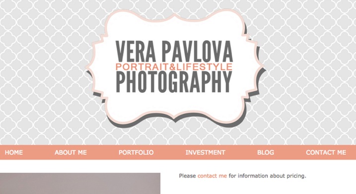
There’s nothing weirder and more suspicious than a small hidden grey link to a PDF pricing guide that cringes at the bottom right corner of an About Me page.

Example of what to do – clear statement about where to find pricing: Vera Pavlova Photography
7) Your website is too slow
On photography websites, this is most often caused by high-resolution and uncompressed photos. I know, we are photographers and we are proud of our latest cameras with great dynamic range and stuff. Still, these things are usually not that important for our potential clients. You need your website to be fast! And because of that, you need to compress photos for your website – compress them big time (150-200kb is a good maximum file size for website images, any bigger will slow your site down). Speed is the king in the realm of photography websites.
8) There’s no English version
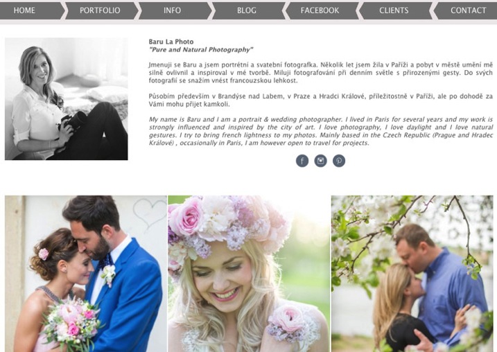
This one is for photographers from non-English speaking countries. Yes, English is the most important language in the business world nowadays, so you need to have an English version of your website if you want to target the worldwide market. If you don’t have the time, or the resources, to prepare two language versions, then go for an English only site.

Example of a website with two language versions including English: Baru la Photo
9) Your location is missing
Lots of (semi)professional photographers try to target the whole world, thus the only location info that you can find on their website is “available worldwide”. Okay, it’s great to know that you’re willing to travel, but clients are sometimes looking for local know-how. Always specify your location (at least by the city).
10) There are no links to social media
Social media is the new place to check testimonials and references to your work. It is crucial for your potential clients to be able to quickly find their way to your profiles on social media. The rule “the more, the better” applies here 100% – Facebook, Twitter, Pinterest and Instagram are necessary. You name the others…

Example of clearly visible links to social media: Austin Sheppard Photography
Summary
You put a great amount of energy and time to build up your website. It would be pity to reduce the possibility of attracting potential clients just by making some small mistakes that you can get rid of quite easily. I hope that this article will show some practical examples of such possible changes.
We would also love to hear from you! Are there any other mistakes that you suggest avoiding on photography websites?
googletag.cmd.push(function() {
tablet_slots.push( googletag.defineSlot( “/1005424/_dPSv4_tab-all-article-bottom_(300×250)”, [300, 250], “pb-ad-78623” ).addService( googletag.pubads() ) ); } );
googletag.cmd.push(function() {
mobile_slots.push( googletag.defineSlot( “/1005424/_dPSv4_mob-all-article-bottom_(300×250)”, [300, 250], “pb-ad-78158” ).addService( googletag.pubads() ) ); } );
The post 10 Photography Website Mistakes That Might be Repelling Your Potential Clients by Matej Slezak appeared first on Digital Photography School.