[ By Steph in Design & Products & Packaging. ]

How would Zaha Hadid’s signature brand of futuristic bio-inspired architecture translate to the design of a lightsaber if she were a Jedi? The project ‘Design x Saber’ mashes up the iconic Star Wars weapon with some of the design world’s biggest names of the 20th and 21st centuries, from the midcentury modern furniture sensibilities of Ray and Charles Eames to the graphic minimalist fashions of Issey Miyake.
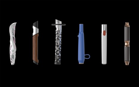
Y Studios, a San Francisco-based research company, identified five distinguished designers whose styles could be creatively applied to the Star Wars universe and then created a signature lightsaber for each one. Hadid’s saber, for instance, features a curvaceous white web wrapping around an iridescent metallic core for the hilt.
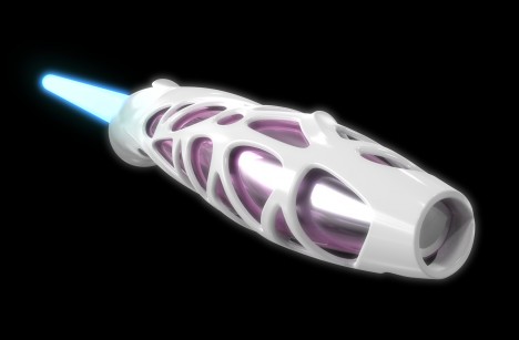
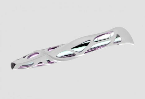
“With the Hadid saber, we wanted to explore movement through the form as an idea for designing the hilt,” says the studio. “By taking an exoskeletal structure and wrapping it around a chrome metal insert, it gave us a natural grip zone that related directly to the Hadid aesthetic. The simple, flowing and always changing curvature draws the eyes around the hilt from all angles, making it a true 360 degree design example.”
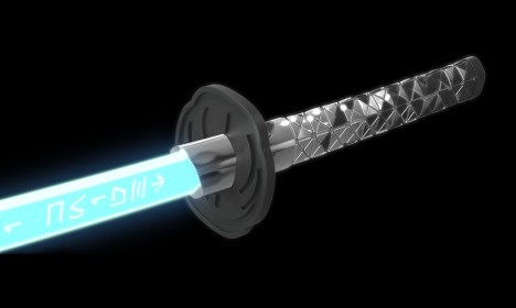
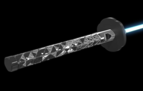
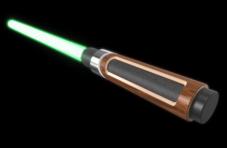
Miyake’s saber features a black faceted texture inspired by his famous Bao Bao bag paired with the silhouette of a Japanese katana sword, with the Aurebesh characters for ‘Jedi knight” etched into the blade. The Eames design, made primarily of wood, takes after the designer brothers’ most sought-after creation, the iconic Eames lounge chair made of plywood and leather.
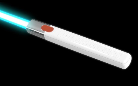
German industrial designer Dieter Rams is best known for his pleasingly simple, pure white aesthetic and a “less but better” principle for good design; his saber is appropriately clean and balanced, free of unnecessary ornamentation. See the others and get more details at the Y Studios Vimeo channel.


[ By Steph in Design & Products & Packaging. ]
[ WebUrbanist | Archives | Galleries | Privacy | TOS ]











































You must be logged in to post a comment.