RSS
 

Posts Tagged ‘understand’

Before you invest in LED lights, make sure you understand CRI

30 May

LED lighting technology is all the rage, and there are great reasons to invest in LED lights. (Beyond using them as a lightsaber.) However, photographers are keenly aware that it’s not just the light that’s important, but also the quality of light you have.

One tool we can use to assess the color accuracy of a light is the color rendering index, or CRI, which provides some information about how accurately a light can reveal color compared to an ‘ideal’ light. A light which perfectly emulates the color accuracy of natural daylight would have a CRI score of 100.

Companies love to state CRI numbers on their products, leading you to believe that they can provide the color accuracy you’re looking for. However, while a higher CRI number is generally better, it’s important to understand how that number is generated, and why it’s not as definitive as manufacturers like to make it sound.

Learn more at premiumbeat.com

Articles: Digital Photography Review (dpreview.com)

 
Comments Off on Before you invest in LED lights, make sure you understand CRI

Posted in Uncategorized


How to Understand Your Camera’s Light Meter and Get the Exposure You Want

26 May

Regardless of how you shoot, and whichever shooting mode you prefer to use, there is one item that remains constant – the light meter. Somehow, either you or your camera has to know how much light in on your scene in order to determine the optimal combination of aperture size, shutter speed, and ISO sensitivity to get the photo you want. This tool, which may not seem all that relevant to new photographers, is called a light meter.

Understanding what your camera’s light meter does and how it works is critical to advancing your skills and helping you get the shots you really want. Hopefully, this article will help you get a grip on it.

How to Understand Your Camera's Light Meter and Get the Exposures You Want

An analogy to help you understand the light meter

Before I get into a discussion about how the light meter works, think about the last time you cooked some meat on the grill. Whether it was a steak, some pork chops, or even just a couple hamburgers – you likely had a vision in your mind of what the finished product would be.

For backyard chefs like me who aren’t very good at this sort of thing, we have to use a meat thermometer to make sure our food is properly cooked. There’s always the question of where to put the thermometer to check and see if the meat is done. Or, in photography terms, check to see if the meat is properly exposed. You can touch it to the surface, poke it through to the middle, or insert the thermometer at various points around your dinner in order to get a good overall reading.

Each method would work for a different scenario, but it all depends on what you are cooking and how you want the finished food to turn out.

How to Understand Your Camera's Light Meter and Get the Exposures You Want

Your camera’s light meter is like measuring the temperature using a meat thermometer. Placement is crucial for an accurate reading.

How the camera light meter works

When you point your camera at a scene you also need a way of measuring the incoming light so you know how much of it there is and what settings you (or your camera) need to control in order to get the shot you want. It’s just like measuring the temperature of your food with a thermometer to make sure it’s done properly.

Most cameras today use a process called TTL Metering, which stands for through-the-lens. It means that your camera examines the light coming in through the lens and evaluates the brightness of the scene. Then you, or your camera, can adjust the settings in order to make sure your photo is exposed how you want. You may not ever notice the light meter at work or even see that it’s there at all unless you shoot in Manual Mode. But trust me, it’s constantly monitoring the light whether you know it’s working or not.

View the metering scale in Manual Mode

To see the light meter doing its thing, put your camera in Manual Mode and look for a series of dots or vertical lines at the bottom of your camera’s viewfinder.

How to Understand Your Camera's Light Meter and Get the Exposures You Want

In Manual Mode, look at the bottom of the screen in your viewfinder. Notice the scale with zero in the middle. That is the light meter at work.

The number scale at the bottom of the image above is an example of a camera’s light meter, and the tiny little triangle shows whether the picture is properly exposed or not. In this case, the triangle is at 0, which means the image is neither under or overexposed, but changing the aperture, shutter speed or ISO would make the triangle move up or down the line accordingly and result in a picture that is either a little too bright or a little too dark.

What part of the scene is the camera measuring the light from?

While that is all well and good, it’s only part of the story because it doesn’t explain how your light meter actually functions. Is it looking at all the incoming light or just some of it? Where in the frame is it looking as it measures the light? Understanding the answers to these questions is the key to unlocking the power of your camera’s light meter, and it all has to do with what’s known as metering modes.

How to Understand Your Camera's Light Meter and Get the Exposures You Want

Measuring the Light

Most cameras today have a few basic ways of measuring the incoming light:

  1. Matrix or Evaluative Metering – the camera looks at the light in the entire scene and averages it, (Nikon puts a bigger emphasis on the area where your lens is focused as well). Nikon calls this Matrix Metering, Canon calls it Evaluative.
  2. Center-Weighted Average Metering – looks at the light of the entire scene and averages it, but with emphasis on the center of the frame. Nikon and Canon both call this Center-Weighted Average Metering.
  3. Partial Metering – this measures the light only in a small portion of the center of the frame (about 8-12% of the scene). This is a Canon metering mode, Nikon does not have one similar.
  4. Spot Metering – measures the light only in a small area around the central autofocus point (about 1.5-3% of the frame). Nikon and Canon both call this Spot Metering.

Other camera manufacturers have different names for these modes, but suffice it to say the way in which your camera measures incoming light can have a huge impact on whether your photo is properly exposed. As an example, here are three shots that were taken with different metering modes.

Image #1, taken with Matrix (Nikon) or Evaluative (Canon) Metering.

Image #2, taken with Center-Weighted Metering.


Image #3, taken with Spot Metering.


Reflective versus incident metering

There’s another aspect of light metering that comes into play when setting up a shot. It has to do with how TTL metering works as opposed to a handheld light meter.

Reflective metering

The former, (the type of metering used in DSLRs), works by measuring the amount of light that comes through the lens. But the problem with that is that unless you are pointing your camera directly at the light source, the light being measured is actually bouncing off your subject first.

All the colors we see in the world around us get their hues and tonal values by absorbing every color of light except for what is bounced off of them. As many of us learned in grade school, light is made up of a spectrum of colors including red, orange, yellow, green, blue, indigo, and violet. A green tree leaf absorbs every color of light except for green. A red car absorbs every color except for red, and so on.

reflective metering - camera light meter

When your camera measures incoming light, it’s looking at the amount of light being bounced off your subject, not the amount of light actually hitting your subject. This has huge implications and can dramatically affect your exposure. In the illustration above, the subject is wearing clothes that absorb most colors of light except for blue, which means there is still a great deal of light being bounced off him and sent to the camera. However if the child changes clothes things can change a great deal.

reflective metering dark subject - camera light meter

In the illustration above, even though the amount of light hitting the boy has not changed, the camera will read the scene much differently because he is now wearing a dark shirt and pants. The camera will think it needs more exposure to compensate for what it thinks is less light on the scene, and the overall image will be overexposed as a result.

Here’s a real-world example of how this works:

reflective metering - camera light meter

Nikon D7100, 200mm, f/2.8, 1/8000th of a second.

In the photo above, so much light was being reflected off the girl’s white shirt that my camera had a hard time metering the scene properly. Much of the sunlight was bouncing off the shirt and coming directly back to my camera, so it responded by using a very fast shutter speed and low ISO value in an effort to make sure the shirt was properly exposed. Unfortunately, the rest of the scene was underexposed as a result.

Nikon D7100, 200mm, f/2.8, 1/1500th.

This was a few seconds later in the exact same spot, and all I did was have her put on a brown shirt. With much of the light from the sun being absorbed by the dark color of her outfit, my camera created a much brighter exposure by using a slower shutter speed. Not as much light was being captured by the TTL metering system so the camera thought more light was required for a good exposure.

Incident metering

This phenomenon can be particularly troublesome if you are shooting a wedding; grooms often wear dark tuxedoes whereas brides will usually be dressed in dazzling whites, which can really throw off your camera’s TTL metering system. The solution is to use an external handheld light meter, such as the Sekonic L-308S-U, which actually measures the amount of light falling on the subject.

Handheld light meter for incident light metering (light falling on the subject).

In the image above you can see that the meter shows you need an aperture value of f/16, shutter speed of 1/125th of a second, and ISO 100 in order to get a properly exposed scene. These numbers will likely be different from what the camera’s TTL system measures because some light will invariably be absorbed by the subject, which is why an external system like this can be so useful.

Here’s how the diagram from earlier would look if the setup involved an external handheld incident light meter.

incident metering - handheld light meter

You will often see wedding photographers using a light meter such as this in order to get a more accurate reading of how much light is hitting the wedding party during formal photos. This is especially true if they’re using a system of flashes or external speedlights because they need to know how much extra light the scene will require or tolerate.

When shooting a wedding it is quite common for the bride to wear a white dress, which reflects a great deal of light, and the groom to wear a dark tuxedo which absorbs almost all light. This can wreak havoc with a TTL metering system, and an external light meter is a great way to address the problem.

light metering - camera light meter

Conclusion

The overall goal here is to understand how the light meter in your camera functions. This, in turn, will help you know how you will need to alter the exposure settings to get the shot you want.

I hope this article has been helpful in explaining how the light meter works, how light is reflected off your subjects, and why your camera may not see a given scene quite like you expect it to. Ultimately it’s important to remember that there is no one correct way of metering a scene. Any of the metering modes and methods will work as long as you know what you are shooting and what type of results you are trying to achieve.

Knowing the difference between the various metering modes and types, and understanding how light is measured as it hits your camera can help you get the shots you want. None of these methods are any better or worse than the other, but each one has its own strengths and weaknesses. The more you know about how all of this works the better equipped you will be to get precisely the photographs you want.

The post How to Understand Your Camera’s Light Meter and Get the Exposure You Want by Simon Ringsmuth appeared first on Digital Photography School.


Digital Photography School

 
Comments Off on How to Understand Your Camera’s Light Meter and Get the Exposure You Want

Posted in Photography


Drone footage helps scientists understand how narwhals use their tusks

18 May

Narwhals are famous for their long ivory tusks, which reach lengths of up to nine feet. Documentary filmmaker Adam Ravetch and Fisheries and Oceans Canada used video captured by drones to discover a previously unknown use for the tusk: it’s used to tap and stun fish before eating them.

Articles: Digital Photography Review (dpreview.com)

 
Comments Off on Drone footage helps scientists understand how narwhals use their tusks

Posted in Uncategorized


How to Understand the Curves Tool in Photoshop

31 Mar

After you’ve mastered Levels, it’s time to take a step up to the tool that is probably the most useful for color and contrast control in Photoshop: Curves. As with levels, you should play around with the basic Curves command to get a feel for it. For safety’s sake, begin by duplicating your background layer, either from the Layer>New Layer from Copy menu, or use the shortcut Control/Command + J. You should make a habit of learning shortcuts because it speeds up your workflow.

The Curves Dialog

Here’s our starting image for this tutorial, shot on a hazy day at Formentor in Mallorca.

How to Understand Curves in Photoshop

Formentor, the northern tip of Mallorca

Use Control/Command + M to invoke the Curves dialog. Taking a look, you’ll see the main part of the dialog is the Curve itself. By default it’s a straight line from bottom left to top right – this is the baseline. There’s faded histogram in the background that corresponds to the tones in the image. There are two other tools to help you work in Curves.

There are two other tools to help you work in Curves. The first is the Channel Overlays, which show you the changes you make when applying curves to the individual red, green, and blue channel curves. The second is Intersection Lines, which appear when you drag a point on the curve. They let you see where the point is relative to the grid. The Channels Overlays, the Histogram, the Baseline, and the Intersection lines can all be turned off in the “Show” section of the dialog box. They’re all on by default.

How to Understand Curves in Photoshop

Another default is that the darker tones are on the left, and the lighter tones are on the right. It can be swapped by clicking the “Show Amount of:” option from Light (0-255) to Pigment/Ink %. Unless you have a specific reason to change it, leave it on the default option Light. The final option is for the Grid. You can change from quarters to tenths by alternating the grid size icon. Alternatively, you can Alt or Option click directly on the Grid to toggle between them.

Starting with Curves

To change the Curve, you click on the baseline to create a control point (we’ll just call them points from here). By dragging the point up, you will lighten the image at those tones and surrounding tone. Drag down, and you’ll see the image darken at the tones around your point.

The most basic change you can make is to click on the center of the curve and drag up. This lightens the mid-tones and acts in a similar way to the Brightness slider, but with more control over the center-point of the effect. By the way, you don’t even need to drag the point. Instead, you can click to create a point and then use the Up/Down/Left/Right arrow keys to move it. A single arrow click moves 1 point (in the range 0-255), while holding the Shift key down as well, moves it 10 points. For utter precision, you can enter the number directly into the Input (that’s the point you click) and Output (that’s the place it moves to).

How to Understand Curves in Photoshop

While it will work as a brightness tool, Curves is really about contrast. Contrast defines the relationship between the tones in your photo. A high contrast image will generally have strong shadows and highlights, with a lot of saturation. Low contrast photos will look flat and almost gray. That’s not to say low contrast is bad, it can be ethereal like the woods in fog, or a flared backlit portrait at sunset. A lot of photos can benefit from an increase in contrast.

So how can you do this? Well, you’ll need to make the shadows darker and the highlights lighter.

Creating Contrast

First of all, click on the line about a quarter of the way in from the left. Next, drag the point you’ve created down. This will darken your entire image. You don’t need to drag it down much to see a difference. After this, you should create a second point, this time about three-quarters of the way along and drag it up a little. Again, only a small amount is needed for this to work.

If you look at your curve, you’ll notice it resembles an S-shape. This S-Curve is probably one of the most common ways for you to create contrast with Curves. Our sample photo has better contrast now, but it is still a little dark, we’ll come to that shortly.

How to Understand Curves in Photoshop

Notice how the line now resembles the shape of the letter S.

As another way of working, start by placing a point in the center. This will be your anchor point. You’re not going to move this one. Now create the point for your shadows and drag it down. You’ll notice that as you drag the shadows down, the highlights will move up automatically across from the anchor point. By clicking and dragging the center up, you both brighten the image and increase contrast. If you want to control the image more, just add more points.

How to Understand Curves in Photoshop

Endpoints and Input

You’re not restricted to making just curves. You can also move the endpoints of the line in. This results in a look that’s similar to when you move the black and white points using Levels. This adjustment makes a huge difference with this image, where most of the tonal information is in the center of the histogram. Notice that as you move the endpoints in the black and white points on the Input Slider move to a corresponding position – so you could also just move these sliders.

How to Understand Curves in Photoshop

Moving the endpoints in curves.

To finish up this look, you can add a little S-Curve after moving the end points. You’ll notice that the increased contrast has also led to increased color saturation.

How to Understand Curves in Photoshop

Erase and Rewind

At any point that you want to start again without closing the dialog and reopening it, you can hold down the Alt or Option key, and click the Reset button that appears instead of the Cancel button.

How to Understand Curves in Photoshop - reset

If you only want to remove a single point, you’ve got a few options. Drag the point right off the grid. Or, you can click on a point and press the Delete key. The last option is to Control/Command+click on a point to remove it.

Presets

Just by way of mention, you should try the Curves presets in the menu to get a feel for what particular points can do to a curve. You can also save any curve you create yourself by clicking on the tiny cog beside the menu and choose “Save Preset”. Your Curves preset will then get added to the menu.

How to Understand Curves in Photoshop

Auto and Options

Just like Levels, there’s an Auto function for Curves. It too depends on the Options section. Rather than repeat it verbatim, go check out the Auto section in the Levels article.

Auto Curves - How to Understand Curves in Photoshop

Using Curves as an Adjustment Layer

Up to now, what you’ve done has been destructive editing. You’re completely changing the layer to which you apply the Curve. Instead, it’s best to use Curves as an Adjustment layer. From the bottom of the Layers panel, click the split circle icon and choose Curves.

How to Understand Curves in Photoshop

The Curve will appear in the Properties panel. Using the information you’ve got so far it should be no problem editing a file like this. I’ve started by pressing the Auto button, then added a curve to both increase contrast and brightness.

How to Understand Curves in Photoshop

Sectioning your photo with Curves Adjustment layers

So far you’ve been using Curves on the entire image. Not all areas in a photo may need the same work, but it’s easy for you to select different areas to work on.

Press L to bring up the Lasso tool, or select it in the toolbar. If it’s not the main lasso, use Shift+L to cycle through the options. At the top, enter 15px in the Feather option. You’re going to select the sky first. In order to draw outside the photo edge, hold down the Alt/Option key. You need to do this so the Feather, which softens the edge of the selection, doesn’t soften the edge of the photo. Join the two ends of the lasso to make a selection.

selection - How to Understand Curves in Photoshop

Now, create a new Curves Adjustment Layer. Notice that the mask beside the curve is white on top, and black on the bottom? That means your curve will only affect the top of the image. White means the effect is revealed, whereas black means it’s concealed. You can use the brush tool to add to a mask or remove from it using a black brush. Shades of gray will work too but act like an opacity control.

You can now go and edit the curve for the sky, separately to the main curve. Another advantage to using Curves as an adjustment layer is you can overdo the look of the curve, and then bring it back using the layer’s opacity slider.

How to Understand Curves in Photoshop

Before Curves adjustments.

How to Understand Curves in Photoshop

Here’s the version after curves have been applied.

The Tip of the Iceberg

Curves is a pretty useful tool and more versatile than Levels for advanced contrast control. You’ve seen a lot of what can be done here, but there’s also the color changes that can be done using the individual color channel curves, but that’s a topic for another article.

The post How to Understand the Curves Tool in Photoshop by Sean McCormack appeared first on Digital Photography School.


Digital Photography School

 
Comments Off on How to Understand the Curves Tool in Photoshop

Posted in Photography


How to Understand the Lightroom Tone Curve

20 Feb

With all the editing options available in the Lightroom Develop module it can be tough to know where to start when you pull up a picture and start making changes. The Basic panel covers elementary adjustments like exposure and white balance; Detail lets you adjust sharpness and noise reduction; Effects allows you to add a vignette, and so on. The Tone Curve panel seems downright strange at first, with a light gray histogram and a diagonal line going right through the middle of it. But this panel can actually be used to tweak and enhance your images quite a lot if you know how it works.

It won’t give you the same level of finely-tuned control you may want for individual colors, and can’t help you remove spots or blemishes. But it does give you a huge amount of power to change the overall visual impact of a picture and with a few clicks of the mouse can take it from average to awesome.

How to Understand the Lightroom Tone Curve

What is the Tone Curve?

The Tone Curve panel can be thought of almost like the contrast slider on steroids. Most photographers use it to add a sense of punchiness or vibrancy to their pictures. You can also do the opposite and make the overall exposure a bit more even-handed by bringing down the highlights while bringing up the shadows.

How you use the Tone Curve is going to depend on your editing style and the pictures you are working with, but suffice it to say that if you’ve been using the contrast slider you may find yourself quite pleased with the editing power offered by the tone curve. To understand how it works I’m going to use the following image as an example and apply a few simple edits using only the tone curve.

Using the Tone Curve

How to Understand the Lightroom Tone Curve

Straight out of the camera, with no edits.

This picture is an unedited RAW file straight from my camera, but with a few tweaks of the Lightroom Tone Curve, it can be transformed into a much more vibrant photo. To get started with these edits on any picture, enter the Develop module of Lightroom and click the Tone Curve panel (on the right side) which brings up a grayscale graph with a diagonal line going from one corner to the other (as shown below).

How to Understand the Lightroom Tone Curve

Look carefully in the background of the graph and you will see a histogram which is the exact same as the one at the top of the Lightroom Develop module. This shows you where the color values are in your image and whether you have a lot of colors that are very bright, very dark, or somewhere in the middle.

What the diagonal line and the sliders below it allow you to do is change the intensity of various parts of your picture. You can make the light parts lighter or the dark parts darker. For instance, here is the original image with a bit of adjustment to the lights.

Adjusting the curve

How to Understand the Lightroom Tone Curve

This adjustment has taken the lighter portions of the image (mostly the blue sky in the background) and made them even brighter while leaving the darker portions of the image alone. Now I’ll take the editing process a bit further by clicking on the bottom-left part of the diagonal line and dragging it down instead of up.

With just two simple edits on the Tone Curve, the image is now much more pleasing than the initial version, and things are just getting started. In making the bright portions lighter and the dark portions darker it has given the picture an improved sense of contrast and vibrancy. The same thing can happen with your images too.

Using the sliders

You may also notice if you do these edits on your own that the adjustments you make to the tone curve are also quantified in the sliders below the graph, as you can see below.

How to Understand the Lightroom Tone Curve

You can also use these sliders to adjust the values of the tone curve if you choose, and you may also notice that there are more than just two sliders, one each for lights and darks. The highlights are the very brightest portion of the image, whereas the shadows are the very darkest portions, and as you adjust these sliders (or the tone curve itself) you will see the colorful histogram at the top of the Develop module change accordingly.

If you lower the numerical value of the shadows or darks (or simply drag that portion of the line down) you will notice the histogram creep towards the left which is another visual illustration of the edits you are performing. The same holds true for the highlights and lights.

Use in moderation

I recommend that if you are using the tone curve to enhance your pictures, that you are careful not to push the histogram too far to the right or the left. Ideally, you want the darkest parts of your image to be pure black, but not so much more that whole sections of your photo get muddied in the process. The same goes for the lighter portions, as you can see in the following example.

How to Understand the Lightroom Tone Curve

There are a couple of things to note in the above image, so I want to break it down a bit.

First, you will see that the picture of the leaf is vastly different from its original incarnation at the top of this article. It has much more contrast and is in my opinion, too heavily edited. Some people like this look though, and using the tone curve is a good way to achieve it.

Second, if you look carefully at the bottom portion of the diagonal line in the tone curve you will see that it flatlines until after it starts to overlap part of the shadowy gray histogram behind it. This means that much of the color in the darker portions of the image has been crushed to be completely black, and the same thing has happened to the lighter portions. You can see this at the top of the S-shaped curve where it hits the top of the graph while there is still gray histogram data left on the right-hand side. All that color data has been discarded, which is why huge swaths of the bright blue sky in the picture now show up as completely white.

Finally, the colorful histogram on the right side shows that instead of a well-exposed picture, much of the data is now extremely bright or extremely dark which is a sign that the picture is very high contrast.

Curve presets

You can also use two built-in presets by clicking on the “Point Curve” options in the lower-left portion of the panel for a medium or high contrast image, but I generally don’t use those. Normally when making adjustments to the tone curve I keep things subtle and avoid such high contrast situations. Because many photographers prefer this style, Adobe has limited the way in which the tone curve can be edited by default.

When you click and drag on the white line it affects a rather large swath of the whole line, which is a nice way of making sure your adjustments are evenly reflected across much of the image. However, you can have a bit more fine-tuned control over your edits by clicking the small little mini-graph icon in the lower right corner of the tone curve panel.

The Point Curve

Using the Point Curve to make adjustments gives you much more control over your image, but if you’re not careful things can quickly get out of hand. It’s always a good idea to try things out, especially in a program like Lightroom where all your edits are nondestructive. But generally, I like to stick with the default tone curve adjustment because it’s a bit more forgiving in its edits.

How to Understand the Lightroom Tone Curve

I wouldn’t normally edit a picture to look like this, but I wanted to illustrate how the point curve can give you much different results from the traditional tone curve.

RGB Curves

You might notice the “RGB” option in the lower-right portion of the point curve as well, which gives you even greater control over your edits. Click this to edit the individual Red, Green, and Blue channels of your image and perform the same types of adjustments (i.e. adjust the brightness and darkness) but on each individual color separately.

I rarely use it, but this can be quite useful if you want to give your pictures a certain type of color cast or edit a single color (e.g. blue skies, green grass) to have more impact. If you find yourself going a little overboard while editing the point curve and want to remove some of your edits, just double-click on a point to delete it.

Targeted adjustments

Finally, another way to edit the tone curve that some people find useful is to click the little circle (targeted adjustment tool) in the top-left corner of the tone curve panel. Then you can click and drag on specific parts of your image (say, a bright sky or a dark river) to make them lighter or darker. It’s an easy way to make targeted adjustments right on the image itself without trying to guess at which part of the tone curve graph to edit.

Conclusion

I hope this gives you a bit more understanding as to what the tone curve does. If you’ve never tried it before I highly recommend giving it a chance. If you want to add just a little bit of punch to your pictures, whether portraits, landscapes, sports, wildlife, or just about anything else, click over to the Tone Curve and try a couple of adjustments. You can’t really go wrong with a little bit of a classic S-curve, where you raise the highlights and lower the shadows, but you might find other types of edits that work well for specific pictures too.

Do you have any tips that work for you when using the Lightroom Tone Curve? Any secrets that you want to share that I forgot to mention here? Please leave your thoughts in the comments below.

googletag.cmd.push(function() {
tablet_slots.push( googletag.defineSlot( “/1005424/_dPSv4_tab-all-article-bottom_(300×250)”, [300, 250], “pb-ad-78623” ).addService( googletag.pubads() ) ); } );

googletag.cmd.push(function() {
mobile_slots.push( googletag.defineSlot( “/1005424/_dPSv4_mob-all-article-bottom_(300×250)”, [300, 250], “pb-ad-78158” ).addService( googletag.pubads() ) ); } );

The post How to Understand the Lightroom Tone Curve by Simon Ringsmuth appeared first on Digital Photography School.


Digital Photography School

 
Comments Off on How to Understand the Lightroom Tone Curve

Posted in Photography


How to Understand and Use the Lightroom Histogram

21 Dec

The histogram in Lightroom is a useful tool that is easily overlooked. Its main purpose is to help you understand the relationship between the sliders in the Basic panel and the tones in your photos. It helps you get brightness levels spot on and edit images without losing highlight detail.

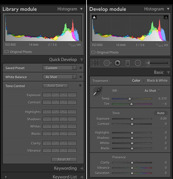
Where is the Lightroom histogram?

The histogram is found in two places, at the top of the right-hand panels in both the Library and Develop modules. In the Library module, it helps you see what is happening to your image when you make adjustments in the Quick Develop panel. You also need it in the Develop module so you can see how any adjustments you make during post-processing affect the histogram.

The Lightroom histogram

What does the LR histogram tell you?

The histogram tells you whether you have any clipped highlights or shadows. It also tells you how much contrast the photo has. This information lets you decide whether you need to adjust exposure and contrast. It also tells you whether the original photo was over or underexposed. The histogram changes as you move sliders around in the Basic panel, so you can immediately see the effect.

Important: Please note that the following features work with the Develop module histogram, but not the Library module histogram.

How to check for clipping

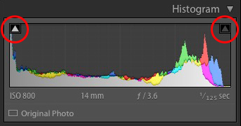
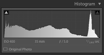
Clipping is indicated by the Show Shadow Clipping and Show Highlight Clipping triangular icons in the top left and right (circled below). Use the keyboard shortcut key J to show and hide clipping.

The Lightroom histogram clipping

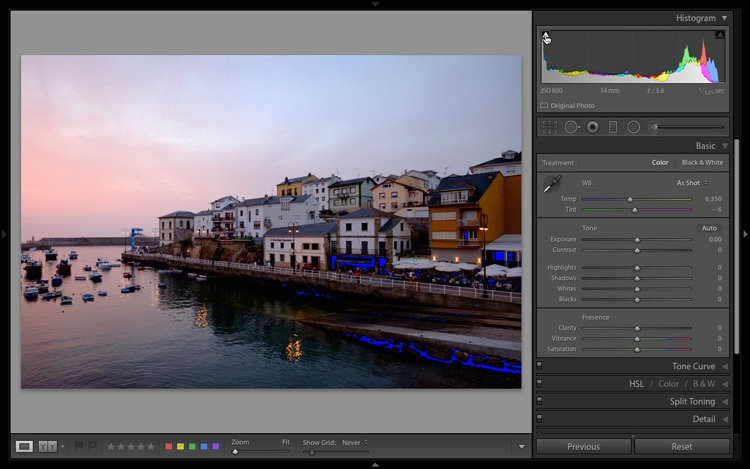
In this histogram, the Show Shadow Clipping icon is colored white to show that the image contains clipped shadows (this is perfectly normal in many images and nothing to worry about).

If you click on (or hover over) the Show Shadow Clipping icon, those clipped shadows are shown in blue in the photo.

The Lightroom histogram clipped shadows

The Show Highlight Clipping icon on the right is colored gray to indicate that there are no highlights clipping. This is a good sign, as most photographers expose to preserve highlight detail.

The Clipping icons also come in useful to indicate if you are losing detail in the highlights or shadows as a result of making adjustments in the Basic panel.

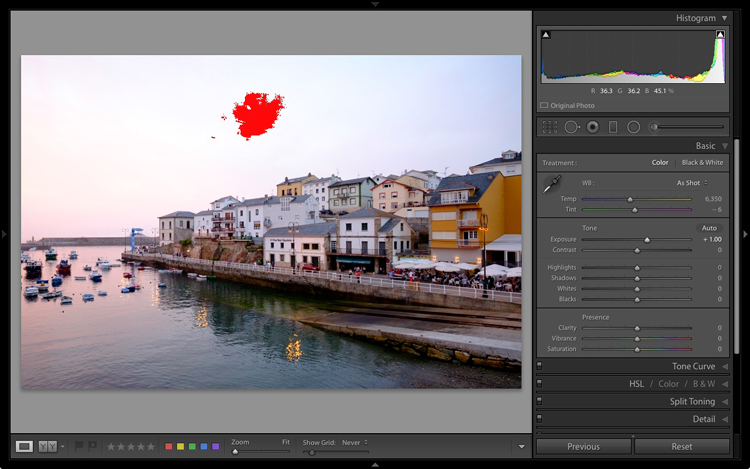
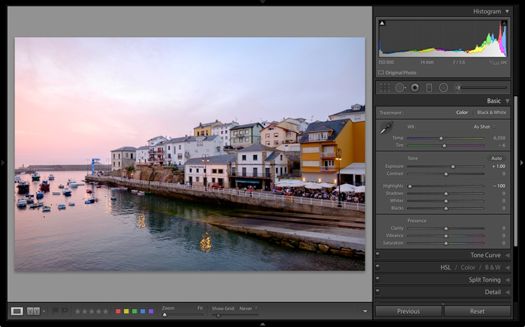
If I set Exposure to +1.00 for this particular image, the histogram tells me that I have lost detail in the sky. The Show Highlight Clipping icon is colored white to indicate this. If you click the icon, clipped highlights are displayed in red in the image. You can see from the screenshot that only a small part of the sky is clipped. This may not be important, but it indicates that perhaps I increased the Exposure too much.

The Lightroom histogram clipped highlights

If I set Highlights to -100 the detail comes back in the sky and there is no clipping. Notice how the histogram has changed from above to the one below.

The Lightroom histogram

This simple example shows you how you can push sliders around, using the histogram to make sure that you don’t lose highlight or shadow detail.

The histogram and underexposure

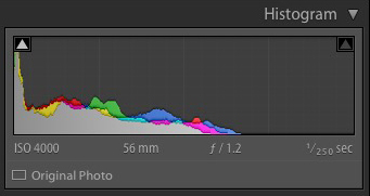
If there is a gap on the right side of the histogram it probably indicates that the image was underexposed (an exception would be if the photo has lots of dark tones but few light ones – like a photo of a black cat sitting on a black rug).

Here’s an extreme example. The photo generating this histogram was underexposed by over a stop.

The Lightroom histogram underexposed image

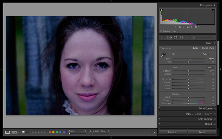
A look at the photo confirms the histogram is correct and that it is underexposed (too dark).

The Lightroom histogram

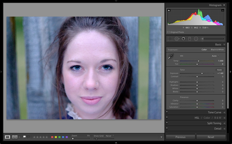
While it is best to get the exposure right in the first place, you can fix this by moving the Exposure slider to the right. As you do so, the histogram also moves to the right. The Exposure slider is quite clever and increases brightness mostly in the mid-tones to prevent highlight clipping. You may be able to push it a long way to the right without losing any highlight detail.

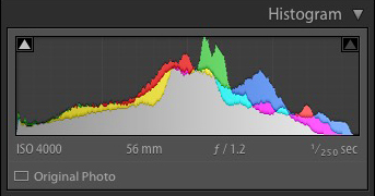
Here, I set Exposure to +1.6, and the histogram looks much better.

The Lightroom histogram

This is what the photo itself looks like after that simple adjustment. Now it is ready for further refinement.

The Lightroom histogram

If you see a gap on the right side of the histogram yet the brightness of the photo looks okay to your eye, it could be a sign that the brightness of your monitor is set too high. If this is the case, you will find your photos look dark when printed or viewed on other people’s monitors. Ideally, you want to calibrate your monitor to be the correct brightness.

The histogram and contrast

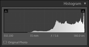
If the histogram is bunched together and doesn’t cover the entire range of the graph this indicates that the photo has low contrast. This is most likely to happen when shooting in flat light.

Here’s a histogram that demonstrates this.

The Lightroom histogram low contrast

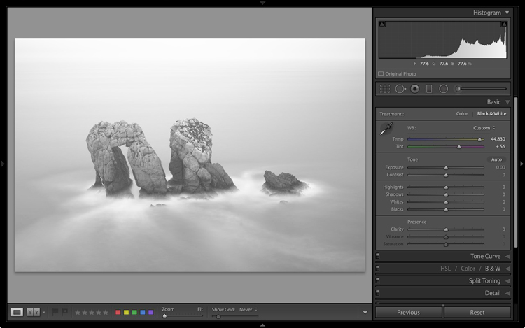
The histogram belongs to a black and white photo taken on a cloudy day in warm and humid conditions. The spray coming from the sea reduced the contrast of the scene, resulting in a very flat image.

The Lightroom histogram

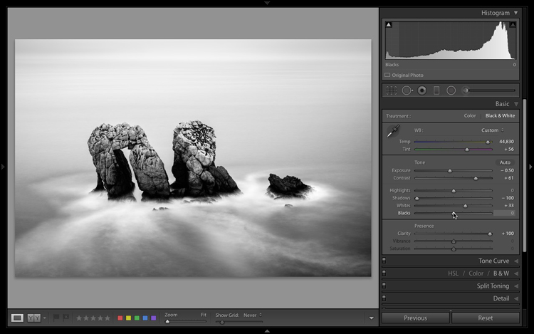
I used the Tone sliders to increase contrast and stretch the histogram so that it filled the space available. The histogram acted as a guide that told me exactly what was wrong with the image and helped me add the contrast back into the photo that it lacked.

The Lightroom histogram contrast adjusted

The histogram and the Tone sliders

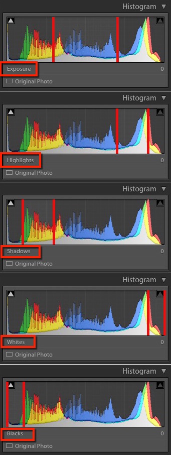
There are five zones in the Lightroom histogram.

When you move the mouse over the Exposure, Highlights, Shadows, Whites or Blacks sliders in the Basic panel the zone that is affected by that slider is shown in light gray in the histogram. I’ve added red lines to make it clear where each zone falls.

lightroom-histogram-zones

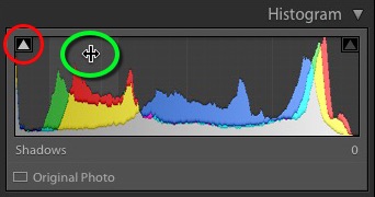
The same zones are shown when you move the mouse over the histogram itself. The name of the slider that controls the tones in that part of the histogram is displayed underneath.

This diagram (right) shows the zone that corresponds to the Shadows slider.lightroom-histogram-sliders


When you see the icon with the two arrows (circled in green), hold the left mouse button down and move side to side to adjust move the Shadows slider left or right. The histogram will change as you do so. This technique gives you control over the Tone sliders from the histogram itself.

Each slider controls a particular zone, but bear in mind that those adjustments also make changes in the other zones. Don’t worry if this sounds complicated – it will make perfect sense once you try it out for yourself. The key is to practice, and you will soon understand the relationship between the Tone sliders and the histogram.

Luminance and color histograms

If you’re processing a color photo you’ll notice part of the histogram is colored. Lightroom is actually showing you four histograms in one. On top is the luminance histogram, shown in gray. This shows brightness values only and has nothing to do with color. This is similar to the luminance histogram on your camera. The other three histograms are colored red, green and blue and correspond to the color channels in the image (some cameras also show these histograms).

You’ll also see some additional colors (like yellow) where the red, green and blue histograms overlap.

Saturation and the histogram

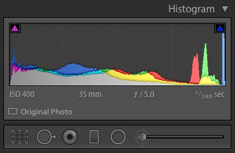
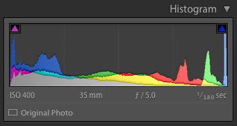
The color controls in the Basic panel affect the color histograms. The easiest way to show you is by demonstrating how the Saturation slider affects the color histograms. Here is a histogram belonging to a color photo, with Saturation set to zero.

The Lightroom histogram

This is what happened when I set Saturation to +100. Increasing Saturation means that the colors are stronger. The result is that the peaks of the color histograms are higher.

The Lightroom histogram

You’ll also notice that the Shadow Clipping icon (on the left) has turned magenta, and that the Highlight Clipping icon (on the right) has turned blue. These indicate that there is clipping in the shadows, but only in magenta hues, and that there is clipping in the highlights, but only in the blue channel.

This is an extreme example because in real life you will never increase Saturation to +100. But there may be times when you make adjustments that clip colors rather than brightness values. It probably doesn’t matter in images viewed on a computer screen, but it may do with images that are printed on paper or reproduced in a book or magazine.

Finally, when I move the Saturation slider to -100, which removes all color from the photo, the color histograms disappear and we are just left with the luminance histogram. This is a useful tip if you would ever like to see the luminance histogram by itself.

The Lightroom histogram

Conclusion

That concludes our overview of the histogram in Lightroom. Hopefully, you can see what a useful tool it is for processing photos in Lightroom. If you have any questions about the histogram, please let me know in the comments below.


If you enjoyed this article and woudl like to learn more about Lightroom then please check out my Mastering Lightroom ebooks.

googletag.cmd.push(function() {
tablet_slots.push( googletag.defineSlot( “/1005424/_dPSv4_tab-all-article-bottom_(300×250)”, [300, 250], “pb-ad-78623” ).addService( googletag.pubads() ) ); } );

googletag.cmd.push(function() {
mobile_slots.push( googletag.defineSlot( “/1005424/_dPSv4_mob-all-article-bottom_(300×250)”, [300, 250], “pb-ad-78158” ).addService( googletag.pubads() ) ); } );

The post How to Understand and Use the Lightroom Histogram by Andrew S. Gibson appeared first on Digital Photography School.


Digital Photography School

 
Comments Off on How to Understand and Use the Lightroom Histogram

Posted in Photography


How to Understand the Mysteries of ISO for Beginners

03 Jul

Josh Cripps has many really helpful videos on his YouTube channel. In this one he will help you get a handle on one of the elements of the exposure triangle that is often confusing and perplexing to many beginners – ISO.

Watch as his gives real world examples, learn what ISO is, when to change it, when you should raise it or lower it and why. Ultimately having a better grasp of ISO will help you take better photos, and get the results you want.

He also mentions his teacup video where he explains the relationship of aperture and shutter speed. You can see that one below for your reference as well:

I hope these videos have given you a good idea about ISO and how to use it in your photography.

googletag.cmd.push(function() {
tablet_slots.push( googletag.defineSlot( “/1005424/_dPSv4_tab-all-article-bottom_(300×250)”, [300, 250], “pb-ad-78623” ).addService( googletag.pubads() ) ); } );

googletag.cmd.push(function() {
mobile_slots.push( googletag.defineSlot( “/1005424/_dPSv4_mob-all-article-bottom_(300×250)”, [300, 250], “pb-ad-78158” ).addService( googletag.pubads() ) ); } );

The post How to Understand the Mysteries of ISO for Beginners by Darlene Hildebrandt appeared first on Digital Photography School.


Digital Photography School

 
Comments Off on How to Understand the Mysteries of ISO for Beginners

Posted in Photography


How to Understand and Use Lightroom’s Loupe Info Overlay

01 Dec

Lightroom Loupe Info Overlay intro image

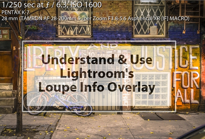
The Lightroom Loupe Info Overlay feature provides valuable information about your photos. Used intelligently it can help you find your photos, and can even help you improve your photography skills. I’ll explain what it is, how to enable and disable it, how to configure it, and some reasons why the Loupe Info Overlay is such a valuable feature.

What is the Loupe Info Overlay?

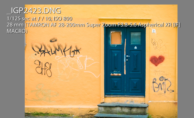
Loupe Info Overlay is a small text overlay which appears in the top left corner of your images in the Develop module inside Lightroom, and when you are viewing images in Loupe view in the Library module. The Loupe Info Overlay confuses many first time Lightroom users when they turn it on, often accidentally, and then struggle to turn it off again.

What Lightroom Loupe info overlay looks like

Turning the Overlay Off and On

To view the Loupe Info Overlay you must be viewing an image in the Develop module, or in the Library module in Loupe (or single image) view. To display the Loupe Info Overlay, tap the I (i) key on your keyboard. Tap the i key repeatedly (but slowly so you can see what you are doing) to rotate through the three options for the Loupe Info Overlay.

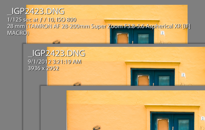
They are: (1) Loupe Info Overlay off; (2) Loupe Info 1; and (3) Loupe Info 2. You will see that there are two different overlays which can be separately configured to show a range of information about your images.

The three states of the Lightroom Loupe Info Overlay

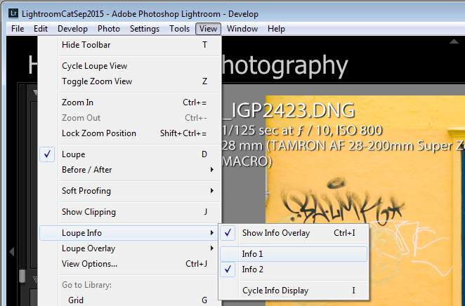
You can also display the Loupe Info Overlay using the Lightroom menus: choose View > Loupe Info and then select Info 1 or Info 2 to display one of the two overlay options. If Show Info Overlay is selected then selecting it again will hide the Loupe Info Overlay.

How to turn the Loupe Info Overlay on and off

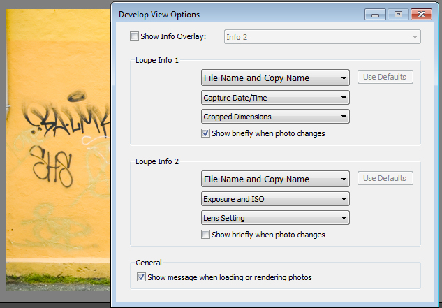
Each Info Overlay is comprised of three lines of information, and you can select only one piece of information from a list of options for each line. The defaults for the Loupe Info Overlays are:

Loupe Info Overlay 1:

  • File Name and Copy Name
  • Capture Date/ Time
  • Crop Dimensions

Loupe Info Overlay 2:

  • File Name and Copy Name
  • Exposure and ISO
  • Lens Setting

Default settings for the Loupe Info Overlay

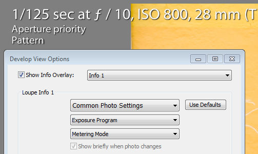
These items can be changed if you select View > View Options, and in the Library Module click the Loupe View tab. Select the Show Info Overlay checkbox and then choose the Info Overlay to show from the dropdown list – it’s a good idea to show the one you are going to change so you can see what it looks like and if the information you are seeing is what you want to see.

To change the information that appears in any of the three lines of the Info Overlay click the appropriate dropdown list – there are three for Loupe Info 1 and three for Loupe Info 2, all in the order they appear on your screen.

Some settings for the lines of information in the Loupe info overlay

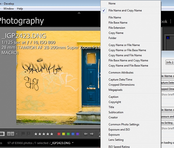
From any of the lists you can select None to turn that line off so nothing displays there, or choose from any of the options on the list. These include a range of file name options, Common Attributes (whether the image is flagged, rated, has a label, or is a virtual copy), the crop dimensions and megapixels.

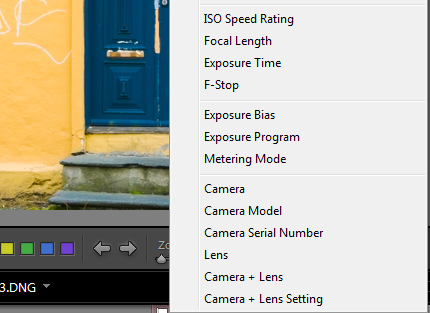
Also in the list are various items which are extracted from the image metadata such as Copyright, Title, Creator, and Common Photo Settings which include Shutter Speed, Aperture, ISO, the Lens, and the Focal Length. These are also available as individual options so, if you don’t want to see all that detail, you can choose to see Exposure Time, ISO, F-stop, Exposure Bias, Exposure Program, Metering Mode, or Camera + Lens Settings.

More settings for the Loupe info overlay

Of the options available, Common Photo Settings is a good one to use if you want to see a lot of information about each shot.

How the Loupe Info Overlay can make you a better photographer

If you plan to use the information from the Loupe Info Overlay to improve your photography, then consider setting the options for one of the Loupe Info Overlays to include Common Photo Settings, Exposure Program and, for example, Metering Mode. This will give you valuable insight into your camera settings at the time you took each shot.

Suggested settings for loupe info overlay that can help you troubleshoot problem shots

I use the Info Overlay to help photographers who are having issues with their photos. If you set the Loupe Info Overlay to show the camera settings you can determine why, for example, an image is out of focus, too light, or too dark. An out of focus shot may be caused by a shutter speed that is too slow, so that the subject or camera has moved while the shot is being captured. Being able to see the shutter speed will help you determine if it is the reason your photos aren’t sharp.

If you are shooting in manual mode and the shots are too dark (underexposed) it may be that you’re using too fast a shutter speed, too small an aperture, or a combination of both. An overly light (overexposed) image can be caused by too large an aperture, too slow a shutter speed, or both. Displaying aperture, shutter speed and ISO may help you troubleshoot your exposure issues.

Overexposed and underexposed images can also be caused by an incorrect exposure compensation setting. It’s not uncommon for a beginner photographer to set an exposure compensation value without realizing the impact of what they have done. If you set the Loupe Info Overlay to display Exposure Bias you can see if exposure compensation is the cause of incorrect exposure.

The Loupe Info Overlay is a useful tool which can display a wealth of information, some of which can help you troubleshoot problems you are having with your photos.

Now it’s over to you: do you use the Lightroom Info Overlay and, if so, what information do you set it to display and why?

googletag.cmd.push(function() {
tablet_slots.push( googletag.defineSlot( “/1005424/_dPSv4_tab-all-article-bottom_(300×250)”, [300, 250], “pb-ad-78623” ).addService( googletag.pubads() ) ); } );

googletag.cmd.push(function() {
mobile_slots.push( googletag.defineSlot( “/1005424/_dPSv4_mob-all-article-bottom_(300×250)”, [300, 250], “pb-ad-78158” ).addService( googletag.pubads() ) ); } );

The post How to Understand and Use Lightroom’s Loupe Info Overlay by Helen Bradley appeared first on Digital Photography School.


Digital Photography School

 
Comments Off on How to Understand and Use Lightroom’s Loupe Info Overlay

Posted in Photography


How to Understand Depth of Field to Avoid Blurry Photos

21 Sep

Last week we released our brand new course – Photo Nuts and Shots which is all about teaching the tools, techniques and thought processes for creative photography. It’s by on of our most popular ebook authors, Neil Creek and features over two hours of video teaching.

We asked Neil to create this course as he has a natural knack of explaining technical concepts in a way that makes the intricacies of photography easy to understand.

We’re so convinced that this course will help you that we want to share a couple of minutes from one of the modules about avoiding blurry images with you here today.

Neil Creek runs through an additional 35 minutes of golden focus advice in this lesson – available in full when you purchase the course online today.

Keep in mind that this is just one of ten creative photography lessons included in Photo Nuts and Shots.

So you’ll not only discover practical tips and tricks for producing tack sharp photos, but get step-by-step guidance on:

  • Using light effectively
  • Avoiding and embracing lens flare
  • Composition techniques
  • Choosing creative exposure settings
  • Thinking flexibly on location
  • And much more!

With Neil’s comprehensive demonstrations and easy-to-understand teaching style, it’s like having your very own professional photography mentor.

All packaged in over two hours of streamable and downloadable video content for the terrific introductory price of USD $ 39. That’s 33% off!

Don’t miss out – take the full course today.

We’ve extended the 33% saving to our first course, Photo Nuts and Bolts, too (although you can certainly take one without the other). So both are USD $ 39 each, but for a limited time only. And you can rest assured that all of our video courses come with a 60-day money-back guarantee.   

googletag.cmd.push(function() {
tablet_slots.push( googletag.defineSlot( “/1005424/_dPSv4_tab-all-article-bottom_(300×250)”, [300, 250], “pb-ad-78623” ).addService( googletag.pubads() ) ); } );

googletag.cmd.push(function() {
mobile_slots.push( googletag.defineSlot( “/1005424/_dPSv4_mob-all-article-bottom_(300×250)”, [300, 250], “pb-ad-78158” ).addService( googletag.pubads() ) ); } );

The post How to Understand Depth of Field to Avoid Blurry Photos by Darren Rowse appeared first on Digital Photography School.


Digital Photography School

 
Comments Off on How to Understand Depth of Field to Avoid Blurry Photos

Posted in Photography


Easy Tips to Help Beginners Understand Composition

20 Sep
Title-portrait-subject's-eye-above-the-horizon-line

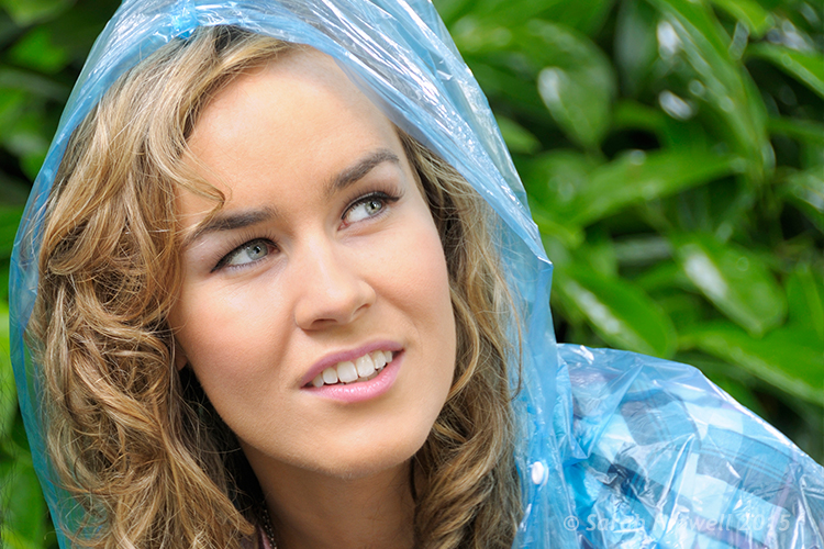
Place your subject to the right or left of centre. For portraits, the eyes should be above the centre line for a pleasant good composition.

Composition is all about the balance of the elements in your photograph. This also includes colors tones and textures. This is what separates a snapshot from a great shot. If you want to achieve a good composition, you need to plan it out and see where each element is going to be placed before you take the shot.

You may have heard photographers talk about seeing the shot in their head before they have actually taken the shot. It’s this ‘seeing’ that I’m going to describe in more detail. I’ll also demonstrate a few useful tips to train your eye in seeing or framing a scene with or without a camera, and in post-editing.

A good composition in a photo will most likely have followed a compositional rule. These are very useful to know. I’ve chosen five of these principles to describe how they work. I prefer to call them principles or guides rather than rules. There are many more, but these five are a good place to start.

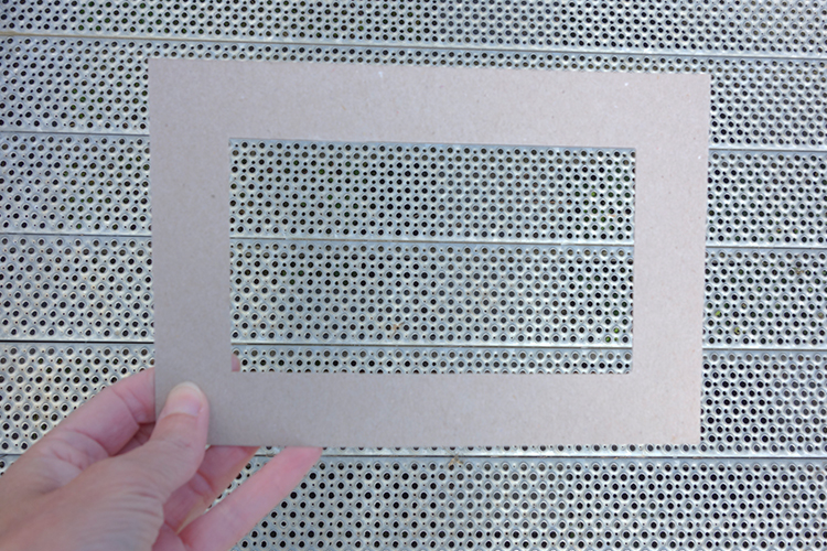
cut-out-cardboard-frame

Cut-out cardboard frame for training your eye to see.


Let’s get back to seeing your shot or framing the scene. For this exercise, you won’t need a camera. You might get funny looks but bear with me. Choose any place, location that you want.

Cut out a frame from cardboard or any material you want as long as it’s a rectangle. See above.

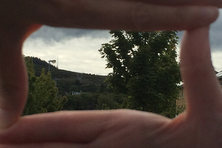
You could equally use your hands, but I preferred using the cardboard frame.


frame-the-scene-hands

Framing your shot using hands.


As you will see, the frame narrows your field of vision and helps to block out distractions and look for the main focal point, which is what the viewer’s eye is drawn to. I can’t emphasize enough that this simple exercise will help you train your eye to see better in terms of composition. Don’t forget to get down low and look up too.


What-we-see

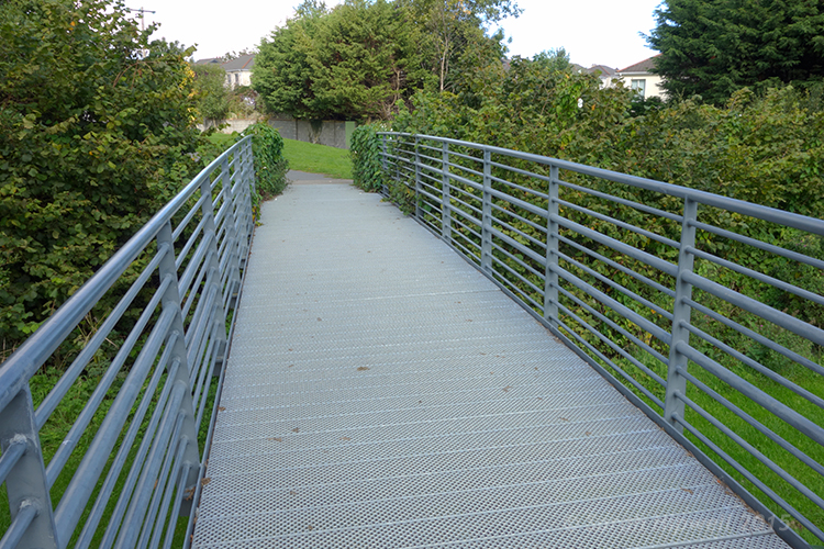
Take this metal bridge, for example. Not a very interesting photo.


framing-the-shot-bridge

By using the cardboard frame to ‘see’ the potential for an interesting shot.


final-image-how-we-see

Bring it into your post-editing software and create an interesting texture shot.

Another useful tip that I would highly recommend is a trip to your local art gallery to see great works of art. Not only is it visually pleasing, but you get the chance to study how these great artists used composition to great effect. So the next time that you happen to be in such a museum, observe and take note. Ask why you liked a particular painting? How were the elements in the painting arranged or placed? Where was the horizon line – a third up from the bottom? What about color and texture?

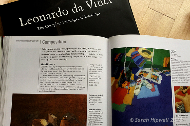
Okay, what if you don’t live near an art gallery? Then maybe a visit to your local library could be an option? Libraries are such a wonderful resource. In the art section alone, you have great masters, such as Leonardo da Vinci, Rembrandt and so forth. And of course, the masters in the photography world such as Henri Cartier-Bresson and Ansel Adams, to name just a couple.

Art-books

Go to your local library for inspiration from the masters in the art world to see how they used composition in their works.


Before you go and get your camera, let me explain the following five compositional principles I believe are a great starting point for beginners.

Rule of Thirds

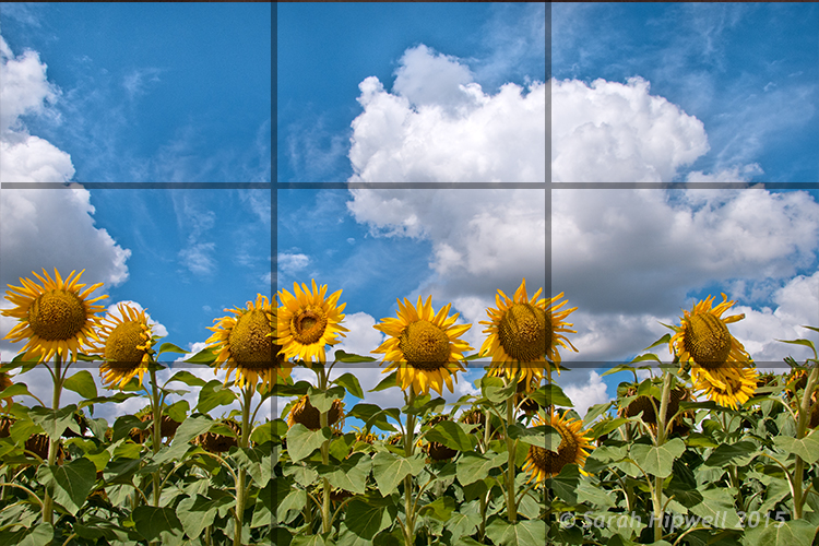
You may have already heard of this one. This is an actual formula based on mathematical principles of harmony and proportion. It has been used by artists for centuries. So think of your photo with imaginary lines that are drawn dividing the image into thirds both horizontally and vertically. You place important elements of your composition where these lines intersect. Similar to a tic-tac-toe game.

rule-of-thirds

How the rule of thirds looks like. Where the lines intersect are the points in which to place your elements.

Rule of Odds

This may sound a bit odd (sorry, excuse the pun), but our brain looks for evenness and symmetry. So this principle asserts that having an odd number of objects in an image will be more interesting and, therefore, more pleasing. By having one or three elements is better than two.

Rule-of-odds

Odd numbers of elements are more pleasing and interesting than even ones.

Lines

Keep the horizontal lines level and the vertical lines straight. This is particularly important if you shoot landscapes, seascapes and cityscapes. Leading lines are also very effective for drawing the viewer to where the focal point is.

lines-straight

The red lines are to show the horizontal lines are even and the vertical lines are straight.

Color and textures

Color and textures are a great way to demonstrate good composition.

Color-and-rule-of-thirds

Here is an example of color and rule of thirds for this composition. Notice the curve elements.

Negative space

This is an abstract concept which describes the space around your subject, otherwise known as ‘white space’ that draws your eye to it. Basically like ‘sky’ or a blurred background that provides the main emphasis on the subject.
Think of it in terms of letting your main subject or object breathe by giving it room.

As photography is about creativity, rules are not meant to be strictly adhered to. In the bikini photo, although I used two of them and they are symmetrical, I used color to contrast the elements and by not placing them in the centre gives the photo a more pleasing compositional effect.

knowing-how-to-break-the-rules-color-as-composition

Although I used two pairs of elements and I know that these are even, the color contrast and using the rule of thirds still makes this image a good composition.

Right, let’s get the camera out. Most DSLR cameras have built-in grid lines and some have a virtual horizon or a spirit level. If your camera has none of these options, you can always add a leveling aid, such as a hot shoe-mounted spirit level or use the focusing points within the viewfinder.

Use your tripod to help you frame your shot so that you get a good composition. Look through the viewfinder, see what elements are in the frame. Then take a look at the scene in front of you with both eyes, then go back to your viewfinder, recompose, then shoot.

Practice will improve your understanding and shooting better compositions. Don’t expect to get it in one go. Give yourself time.

Last, but not least, cropping your images in post-editing. Whether you use Camera Raw, Photoshop or Lightroom, cropping your photos will give you a better understanding of how the principles of composition apply.

You can easily straighten crooked horizon lines by using the Crop Tool or get rid of barrel distortion in buildings using the Lens Correction filter in Photoshop. Or simply change the image dramatically from the one you shot originally. All of these edits can be done non-destructively, so you can crop to your hearts content!

original-title-shot

This is how the photo at top of this article was shot, yet when I cropped in tight on the model to the right, it gave me a different shot.

To summarize, like any complex subject that goes beyond just one article, I hope I have illustrated some useful tips to show the importance of composition in your photography. Please share your comments below.

googletag.cmd.push(function() {
tablet_slots.push( googletag.defineSlot( “/1005424/_dPSv4_tab-all-article-bottom_(300×250)”, [300, 250], “pb-ad-78623” ).addService( googletag.pubads() ) ); } );

googletag.cmd.push(function() {
mobile_slots.push( googletag.defineSlot( “/1005424/_dPSv4_mob-all-article-bottom_(300×250)”, [300, 250], “pb-ad-78158” ).addService( googletag.pubads() ) ); } );

The post Easy Tips to Help Beginners Understand Composition by Sarah Hipwell appeared first on Digital Photography School.


Digital Photography School

 
Comments Off on Easy Tips to Help Beginners Understand Composition

Posted in Photography