RSS
 

Posts Tagged ‘tones’

The Easiest Way to Achieve Rich Skin Tones in Photoshop!

10 Aug

The post The Easiest Way to Achieve Rich Skin Tones in Photoshop! appeared first on Digital Photography School. It was authored by Caz Nowaczyk.

In this video by PiXimperfect, you’ll learn the easiest way to achieve rich and beautiful skin tones in Photoshop.

?

In this tutorial, advanced Photoshop masking tools are used to target only the skin tones in the image. After selecting the skin tones, adjustment layers are used to add color to it.

The easiest way to achieve rich skin tones in Photoshop:

  1. Open your image in Photoshop.
  2. To begin your selection of the skin, go to Menu->Select->Color Range.
  3. To select the skin correctly, be sure to select “Sample Colors” (not “Skin Tones” because this feature doesn’t capture the skin tones with accuracy).
  4. Firstly, decrease the Fuzziness value to around 15, and then select the first Eyedropper tool. Using the eyedropper tool, click on one part of the skin in your image. To see what your selection is, ensure that you mark Selection in the Color Range window.
  5. Now select the second Eyedropper with the + symbol to extend the selection of the skin range. To do this, click and drag your Eyedropper tool across all skin tones until you have selected them all. Make sure no area is left out.
  6. You don’t want to keep the selection harsh, so go to the Fuzziness Slider and change it to around 55, and then click OK.
  7. Now that you have a selection of your skin tones, or colors similar to your skin tones, click on the Adjustment Layer icon in the Layers Palette. Choose “Solid Color.” This opens up the color palette window. In the RGB section, put in the following numbers – R: 255, G: 46, B: 1, and click OK.
  8. Change the Blend Mode in your Layers Palette from “Normal” to “Linear Light.” Rather than lower the Layer opacity, you are going to lower the “Fill” to around 5-10%.
  9. Take a look at your image and see if any areas have turned out too harsh with the blend. If so, choose your mask, then select the Paintbrush tool and paint those areas (with your brush color set to White) to soften the transition. You can decrease your brush flow if you want to.

That’s it!

Do you have any other tips you’d like to share with us? Do so in the comments section!

You may also find the following helpful:

Basic Skin Smoothing in Photoshop

Understanding Masking in Photoshop

How to Blend in Adjustments Using Layer Masking in Photoshop

How to Use the Clone Stamp Tool in Photoshop to Make Clear Skin

How to Correct Skin Blemishes Using the Patch Tool in Photoshop

How to Replace Colors in Your Images Using Photoshop

How to Enhance Colors Using Photoshop’s Color Range Tool


The post The Easiest Way to Achieve Rich Skin Tones in Photoshop! appeared first on Digital Photography School. It was authored by Caz Nowaczyk.


Digital Photography School

 
Comments Off on The Easiest Way to Achieve Rich Skin Tones in Photoshop!

Posted in Photography


How to Use Neutral Tones to Craft Realistic Edits for Landscape Photos

24 Jul

When you look at a white wall, how does it make you feel? Dingy? Cold? Warm and radiant? Modern? Sophisticated? Clean?

White and light gray, sometimes referred to as “neutral tones”, are some of the most powerful colors in the spectrum. We can distinguish many shades of white, and bounced light from a neutral source influences the tint of every other color nearby.

Neutral tones set the mood of an image more than any other colors. You’ve probably transferred a photo to your computer where the white balance was noticeably off: a night shot where everything was too green and cool, or an indoor photo that was orange. White balance is an easy fix in most photo editing software, but neutrals don’t end there: by tweaking them creatively, you can take your photos to the next level.

Sella towers - How to Use Neutral Tones to Craft Realistic Edits for Landscape Photos

What are the sources for neutral tones?

It’s possible to have a photo without white and grays, but most of the time scenes are full of them. These are some of the more common sources in landscape photography.

Clouds

Those water-saturated cotton balls do a great job of reflecting light. On a sunny day they tend to be slightly warm, while storm clouds are a fantastic source for chilly gray tones. However, clouds are not a good source for neutrals when shooting after golden hour or before sunrise.

Overblown sky

When shooting after sunrise and before sunset, the sky will typically be overexposed if you properly expose the rest of the image. It’s not usually desirable, but in a few instances an overblown sky is a good source of white.

Sass de putia - How to Use Neutral Tones to Craft Realistic Edits for Landscape Photos

Water

Lakes and shorelines are my favorite method to introduce strong neutral tones to landscape photos. You can use bodies of water to reflect an overcast sky, and along the coast, you can shoot a long exposure to blur the white foam from the waves.

Both tend to create pure neutrals, so you can completely change the mood of an image with tiny adjustments.

Man o war - How to Use Neutral Tones to Craft Realistic Edits for Landscape Photos

Fog

The most powerful way to introduce mystery and dreariness, fog is often the largest source of gray tones in your image.

Hohenwerfen castle - How to Use Neutral Tones to Craft Realistic Edits for Landscape Photos

Snow

Winter photography enjoys the most magical source for neutral tones. Tinting snow just a bit cooler or warmer profoundly impacts the scene’s mood.

Mount hood - How to Use Neutral Tones to Craft Realistic Edits for Landscape Photos

Moon and stars

When shooting astrophotography, the stars tend to cast a cold white light, and the moon a warmer light.

Gimmelwald - How to Use Neutral Tones to Craft Realistic Edits for Landscape Photos

Haystack rock - How to Use Neutral Tones to Craft Realistic Edits for Landscape Photos

Architecture

Man-made structures that ought to be white or gray such as; lighthouses, white-washed brick houses, winding gravel roads, and expansive castles — are often the subject of an image. Consequently, they make a compelling neutral source.

South stack lighthouse - How to Use Neutral Tones to Craft Realistic Edits for Landscape Photos

Why are neutral tones important?

Out of the camera, even after editing, your neutral tones may not really be neutral. They may be heavily tinted. Introducing off-white into your neutral sources is an important technique for crafting compelling edits.

Keep in mind that the viewer will expect those subjects to look neutral, so if you push the white balance too far or don’t balance the warms and cools, it will begin to look over-edited. A tiny change in neutrals has 10 times the power of changing your colors and blacks.

So, in general, start with subtle adjustments and revisit the photo often under different lighting conditions. Some of the most common ways to pollute neutral tones are:

  • Pushing saturation or vibrance.
  • Over-saturating an image shot at a high ISO.
  • Shifting the white balance too far from pure white to bring out colors in the sky or a dark foreground.

With those caveats in mind, here are four ways your neutral tones can support the rest of the image.

Strumble head lighthouse - How to Use Neutral Tones to Craft Realistic Edits for Landscape Photos

1. Neutral tones root an image’s color palette

With strong neutrals, viewers can believe almost any edits in an image: sunsets that pop, overly blue skies, or glassy teal water. But the moment you introduce color into an element that should obviously be white or light gray, the image’s believability disintegrates.

This is why split toning is rarely a magic pill for making a great photo. Toning the highlights and mid-tones often ends up tinting your neutral sources.

The foam in this shot of Spirit Falls (below) is pure white, but the rest of the image has been significantly warmed and tinted green to bring out the beautiful colors. The contrast between the pure white foam and warm greens creates the impression that the water is refreshingly chilly.

Spirit falls - How to Use Neutral Tones to Craft Realistic Edits for Landscape Photos

2. Neutral tones help you resurrect the colors you remember

After shooting a stunning sunset, it can be disappointing to open the RAW image in your editing software and find that the colors are missing. In most cases, the detail and colors are there, but it’s up to you to revitalize them. Neutral tones will help.

Start by identifying elements in the photo that ought to be white or gray, then adjust white balance and tint accordingly. This will give you a great starting point.

It may still be underwhelming, but now that your neutrals are about right, start selectively bumping the saturation, temperature, and tint on the colorful subjects in your composition. You might add a graduated filter to the sky portion of the image and warm or cool it to help them pop.

Roads end - How to Use Neutral Tones to Craft Realistic Edits for Landscape Photos

Sunsets create a powerful contrast between the warm sky and cool shadows. The image of Road’s End above is primarily cool since the most of the image is in shadow.

However, the sea foam reflects both the warms and cools, so in post-production, I played with the global white balance until both tones came out. Afterward, I introduced a strong magenta cast to bring out the pinks in the sky and foreground.

3. Neutral tones set the overall mood

In reality, neutral tones are rarely neutral. By slightly tinting neutrals, you can communicate aspects of the scene. Here are some examples.

Time of day

Night photography is typically cooled, while sunset or midday photos are warmed. This shot of Mount Bachelor was taken after during civil twilight, so the only source of warm light was the grass in the foreground and hints of alpenglow on the snow. Everything else was left cool.

Mount bachelor - How to Use Neutral Tones to Craft Realistic Edits for Landscape Photos

Temperature

An overly warm image can communicate a hot day, and on chilly days, the overall white balance can be left cool. This is especially powerful if your image has a small, warm light source to draw the viewer’s eye.

Morning fog over this lake in Snowdonia introduced a neutral source and warming the color raises the perceived temperature.

Snowdonia - How to Use Neutral Tones to Craft Realistic Edits for Landscape Photos

Weather

Clear days can be tinted slightly pink to warm the scene, while an incoming storm should incorporate a greener tint.

Oregon is rich with various biomes, and Smith Rock State Park feels like a desert on a clear day. The strong magenta cast brings out colors in the rocks and reinforces the cloudless sky.

Smith rock - How to Use Neutral Tones to Craft Realistic Edits for Landscape Photos

Clarity

When the fog rolls in, it tends to chill the image and evoke mystery. A hazy day adds depth and layers to an image and tends to warm the image at golden hour.

In this shot from Bavaria, the haze on the mountain range adds warmth and communicates just how distant the mountains are.

Geroldsee - How to Use Neutral Tones to Craft Realistic Edits for Landscape Photos

4. Neutral tones help to bring out or tone down a region

Neutrals don’t have to be the same color or white balance! They can help root the mood and color palette of a local section of the image.

For example, snow beneath some trees in the foreground should be cool, and snow on a mountain under sunrise should be warm.

The different white balances communicate the temperature contrast between the foreground and background. Furthermore, since cool colors recede while warm colors pop forward, the warm snow in the background entices the viewer’s eye up from the ice-covered lake in the foreground.

Lost lake -- How to Use Neutral Tones to Craft Realistic Edits for Landscape Photos

What if my image doesn’t have any neutral tones?

It’s not impossible to realistically edit images without strong neutrals. But since your viewer has no neutral reference to root the color palette, you will need a compelling balance of warms and cools to convince the viewer you didn’t artificially crank up the white balance.

This shot from the village of Brunate (below) doesn’t have any substantial neutrals. Although the fog could be considered a neutral source, it strongly reflects the colors in the sky. However, the overpowering warmth in the top left sky is balanced by cooler tones in the rest of the image, which keeps the white balance from being entirely warm and pink.

The contrast also draws the viewer’s eye from the village in the foreground to the beautiful sky in the background.

Brunate - How to Use Neutral Tones to Craft Realistic Edits for Landscape Photos

Conclusion

Crafting realistic edits in landscape photography is a subjective experience. But by carefully preserving your neutrals, you grant yourself almost unlimited creative liberties in the editing process.

So next time you want a fall photograph to feel like a shot from Rivendell, identify the sources of neutral tones in your image and apply these techniques.

The post How to Use Neutral Tones to Craft Realistic Edits for Landscape Photos appeared first on Digital Photography School.


Digital Photography School

 
Comments Off on How to Use Neutral Tones to Craft Realistic Edits for Landscape Photos

Posted in Photography


How to Control Your Background Tones by Manipulating Light Fall-Off

04 May

In this article, I’ll show you how to control your background by manipulating light fall-off.

When using studio lighting, one of the most frustrating things to deal with can be backgrounds. Sure, if you have space, time and the money, you can just stock up on seamless backgrounds covering white, black and everything in between. But if you are on a budget, or are already taxing the limits of your storage space, that’s often not a viable option.

The good news is that it’s entirely possible to take a white or grey background, whether it’s a wall or a seamless backdrop, and manipulate your light so that the background appears black or any shade of grey you can imagine.

The method discussed in this article is quite easy.

How to Control Your Background by Manipulating Light Fall-Off - portrait with black background

Understanding how the rate of fall-off effects your lighting will grant you great control over how your background appears in your photos.

Move the light

To control your background, all that you have to do is move your light. It’s counterintuitive though. To get a darker background, you will move the light closer to your subject. For a lighter background, you would move the light further away.

This approach has the effect of changing the background; however, it also completely alters the quality of light falling on your subject.

For this demonstration, I used a small softbox (around 3×4′) placed directly in front of and above the subject. In the sequence of images below, you can clearly see that the light source is simply moved backward in increments of two feet. Also, you’ll see that the softbox was angled upwards slightly as it moves back so that it points toward the subject and not the floor.

How to Control Your Background by Manipulating Light Fall-Off

The light source is two feet away from the subject and angled down at forty-five degrees.

How to Control Your Background by Manipulating Light Fall-Off

At four feet, the light had to be angled upwards slightly so that it remained pointed at the subject.

How to Control Your Background by Manipulating Light Fall-Off

At six feet, the light on the subject gets noticeably harder, but the background appears as it is in life (its actual shade).

How to Control Your Background by Manipulating Light Fall-Off

The light source as seen 10 feet from the subject.

In terms of the background, the way this works is through light fall-off. As the light source gets closer to your subject, the rate of light fall-off increases.

In the simplest terms possible, this means that as you move your light closer to your correctly exposed subject (remember to recalculate your exposure everytime you move your light), the light reaching your background loses intensity at a higher rate, making the background appear darker.

In this progression (starting left to right) the light begins two feet away from the subject and is moved back in two-foot increments until it is 10 feet away in the right-hand frame.

For these examples, I used a middle grey background to better illustrate the dramatic changes in tonality as the light is moved.

In the first image on the left, the light is two feet away from the subject, rendering the grey backdrop nearly black. At four feet away, in the second image, the background gets noticeably lighter. By the fifth image, at 10 feet away, the grey tone of the background almost matches the subject’s light grey shirt.

Because the light was moving away from the subject in each frame, the exposure had to be metered for each change. The image on the left was shot at f/11, while the one on the right was shot at f/2.8, which is a total of four stops of difference in exposure.

Left: soft light with the light source two feet away. Right: hard light then it’s 10 feet away. Here you can clearly see the difference in the quality of light. Pay close attention to the tonal transition between the shadow and highlight areas of both images.

It’s important to note that moving the light closer, or further away, will also have a dramatic effect on how the light appears on your subject. As the quality of light is altered on the background, it also changes on your subject. Bringing it in close will change both the softness and intensity of the light on your subject, making it both brighter in terms of exposure and softer (quality of light is directly related to the size of the light source and distance from the subject).

Moving the light away from your subject will result in a lighter backdrop. Aside from that, this will also result in harder light on your subject. Just be aware that a lot of subjects won’t suit being lit with hard light and be careful with how far you go, and you should be fine.

Move the light too far back, however, and you may as well be using a small flash from a closer distance. For example, the softbox used here from 10 feet away is only barely distinguishable from a bare speedlight at a closer distance.

The end

That’s it. This technique is easy to put into practice even if you don’t yet understand the technicalities of the Inverse Square Law that makes it work. It isn’t foolproof, however, and you may want to have other tricks up your sleeve if you’re in a position where you don’t have enough space to work with.

Background lights and flags can both go a long way to helping you solve exposing your background the way you want as well. This method is just one other option to add to your skillset, hopefully bringing you one step closer to getting things right in camera.

The post How to Control Your Background Tones by Manipulating Light Fall-Off appeared first on Digital Photography School.


Digital Photography School

 
Comments Off on How to Control Your Background Tones by Manipulating Light Fall-Off

Posted in Photography


How to Correct Skin Tones Using Lightroom’s Color Curves

27 Oct

Lightroom gives you a million and one ways to complete most photo edits. Having options is important. No two photos are alike, so no two edits are alike either. In this article, I’ll show you how to correct skin tones using Lightroom’s color curves.

There are times when the best way to edit color in general, and skin tones in particular, is to use Lightroom’s Color Curves. After reading this tutorial, you’ll be able to; measure RGB skin tone numbers to give you a general idea of which edits your photo needs, and correct the color issues using Lightroom’s Color Curves
skin-tones-Lightroom-curves-13.jpg

Finding the color numbers

The image below is a photo that came out of the camera with a pretty good white balance and skin tone. Do you see the numbers under the histogram? Those are Red, Green and Blue (RGB) numbers.
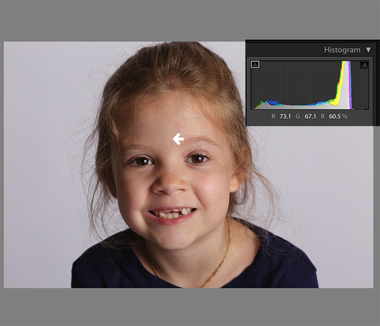
Skin tones Lightroom curves 01

You can display the RGB numbers for your photos too. In Lightroom’s Develop module, hover your cursor over the area you want to measure. Look under the histogram for the corresponding RGB measurements.

These measurements tell us that the pixels next to the arrow in the screen shot had the following measurements:

  • Red: 73.1%
  • Green: 67.1%
  • Blue: 60.5%

RGB numbers are usually measured on a scale of 0-255, unless you are working in Lightroom. In Lightroom, you generally see them on a percent scale. 0% is the darkest value for any color, it’s so dark that there is no visible detail in that area. 100% is the brightest, and is so bright that no detail is visible.

Analyzing the color numbers

When analyzing RGB numbers for skin tone, look for the following indicators:

  • Red should be higher than Green. Green should be higher than Blue. This pattern is universal to all skin tones, regardless of age or ethnicity.
  • Each color should have at least a 2% difference, usually more, between it and the next number. Do you know how to identify a pure gray? That is a pixel that measures exactly the same in its Red, Green and Blue numbers. So skin whose RGB numbers are very close to each other is going to look gray. Not very appealing, right?
  • If any colors measure 94% or above, you probably have overexposure to deal with.
  • If any colors measure 6% or below, you probably have underexposure to deal with.

The RGB numbers in the photo above are consistent with expectations. This means that the skin is within “proper range” of a well-exposed photo with good white balance.

What do to with bad numbers?

What happens, however, if your photo doesn’t look so good straight out of camera?
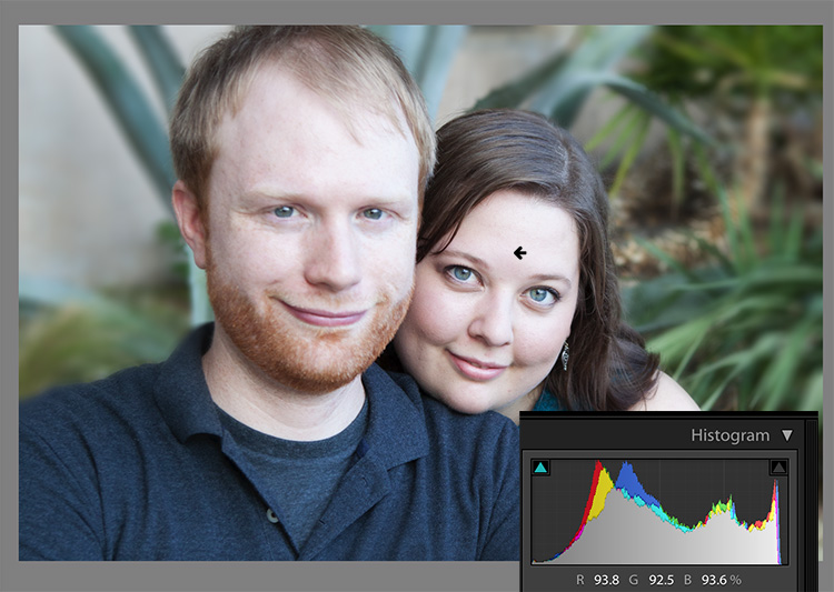
Skin tones Lightroom curves 02

In this photo, the measurement point was just next to the arrow on her forehead. The numbers read: Red 93.8%, Green 92.5%, and Blue: 93.6%.

Anytime you see a photo with skin tones that measure like this, your eyes are going to tell you that something is off before the numbers do. The benefit of using the numbers is that they give you the direction to which your edits for the image need to go.

The numbers in this photo cause concern because:

  • Anything higher than 94% or so in Lightroom is bright enough that your image, if you print it, might not render good detail in those areas. That means that these areas are too bright.
  • Blue is higher than Green. Red should always be the highest and Blue the lowest otherwise the skin tone will appear cold.
  • The RGB numbers are too close together – they are approaching gray. This skin in this photo is lifeless as a result.

Correcting the skin tones

To fix this image, you would start by tweaking exposure. Proper exposure is a huge component of proper skin color. In fact, it’s often impossible to assess skin tone issues correctly without correcting exposure first.

A little-known bit of Lightroom awesomeness is that it’s easy to correct exposure while keeping an eye on the RGB numbers. In the Develop module, double click in the numeric entry field for Exposure so that the number is highlighted. Next, hover your cursor over the area of skin you are measuring without clicking. Use the up or down arrows on your keyboard to change exposure until a more appropriate measurement for the Red value appears under the histogram.
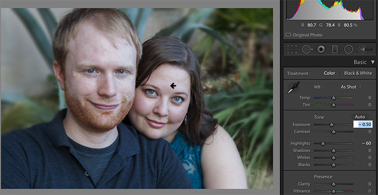
Skin tones Lightroom curves 03

Adjust Highlights (or Shadows, Whites, or Blacks) in the same way. Activate the numeric input field for editing then hover the cursor over the arrow you want to measure. Use the arrow keys on your keyboard to increase or decrease the adjustment.

Exposure for this photo is better with the adjustments you see above, but color is still off. When the RGB numbers are as close together as you see here, it’s often better to use Color Curves than the White Balance sliders to fix the issue.

Using Color Curves instead of White Balance Sliders

Color Curves has two major advantages over the white balance (WB) sliders.

You might have noticed already that Lightroom measures three colors (red, green and blue) for each pixel. However, the White Balance sliders don’t allow for editing the most important component of skin color – red. But, you can edit Red tones using Lightroom’s Color Curves.

The other big benefit of using Color Curves is that you can adjust colors in limited parts of the tonal range. For instance, if you reduce yellow in an image using the Temperature slider in the White Balance section, you are reducing yellow globally (everywhere in the image equally). Using Color Curves, however, you could reduce yellow only in the shadows, without taking away the yellow that properly belongs in the mid tones and highlights of an image.

To find Color Curves in Lightroom, scroll down to the Tone Curve section. By default, it shows you the parametric curve, which looks like this:
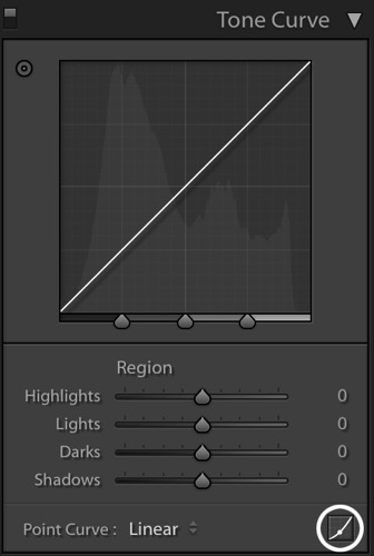
Skin tones Lightroom curves 04

Click on the small button in the lower right corner of the Curves panel to access the Point Curve. (It’s circled in the screen shot above.)

Now you are looking at the Point Curve interface:
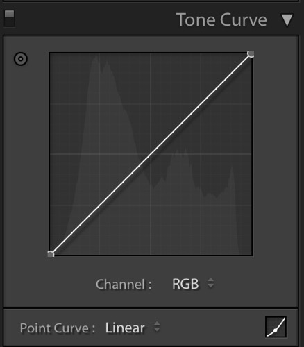
Skin tones Lightroom curves 05

Using the Channel drop down menu, select the color you’d like to adjust.
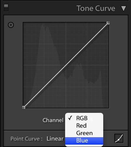
Skin tones Lightroom curves 06

Which color channel to edit?

At this point, you may be wondering about adjusting colors other than red, green, and blue. For instance, what if your photo has too much yellow or orange? Think about it like this.

Each of the three colors measured in Lightroom has an opposite:

  • Red is the opposite of cyan
  • Green is the opposite of magenta
  • Blue is the opposite of yellow

Reducing any one of those colors using Color Curves, increases that color’s opposite. In other words, reducing blue is the same as increasing yellow.

Looking at the Curves panel, do you see the histogram behind the straight line? When you click and drag the straight line to create a curve, this tells Lightroom to adjust the pixels corresponding to that part of the histogram.

Say, for instance, that you wanted to add blue to the mid tones of an image. You would select the Blue channel and click the line in the middle of the histogram, where the midtones live. Dragging the line up would add blue to the bright parts of your photo’s tonal range.

Dragging up increases the color the channel is named after – blue, in this case. If it increases blue, that means that it’s also decreasing blue’s opposite, yellow.
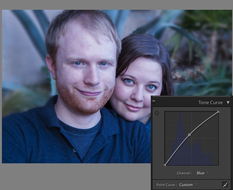
Skin tones Lightroom curves 07

Dragging down decreases the color the channel is named after.
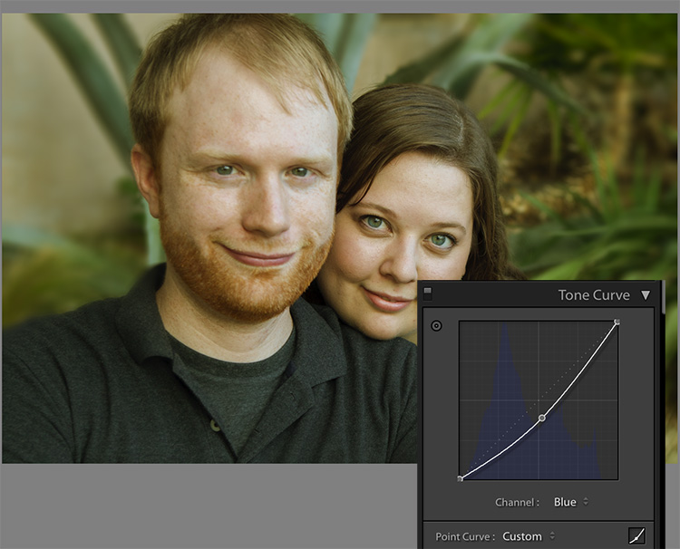
skin-tones-lightroom-curves-08b

Using the Targeted Adjustment Tool for Curves

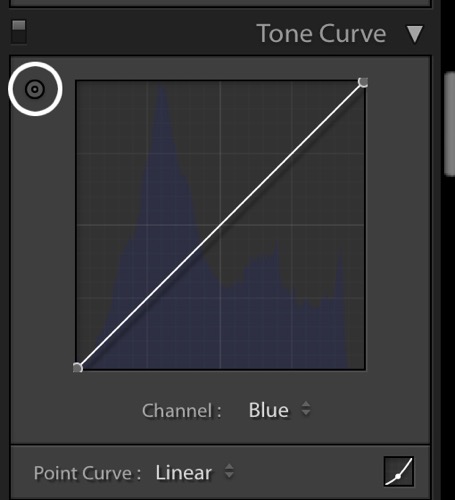
That’s the way it works in general. But you can get much more precise color control by using Lightroom’s Targeted Adjustment Tool. Click on the button at the top left corner of your Curves panel to activate it (circled below).
Skin tones Lightroom curves 08

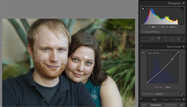
Hover this tool over the spot you’re using to measure the skin tone in your photo, but don’t click! Use the up and down arrows on your keyboard while keeping an eye on the RGB numbers beneath your histogram until the both the appearance of the photo and the RGB numbers improve.

Moving the blue curve down, as in the screenshot below, provides better separation between the Green and Blue measurements. It also gives the photo the warmth it’s lacking.
Skin tones Lightroom curves 09

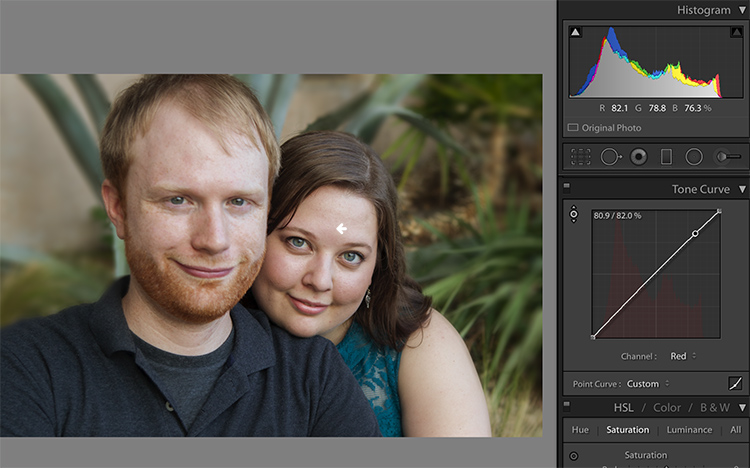
If the image still lacks vibrance, as this one does, move to the Red curve and increase the Red channel. Adding a touch of red is the best way to counteract gray skin.
Skin tones Lightroom curves 10

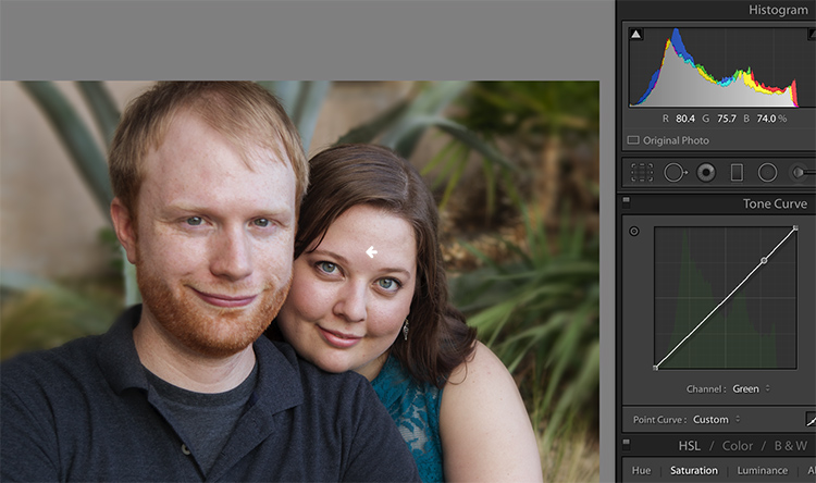
Next, decreasing green (to add magenta) makes the skin color, as well as the corresponding RGB numbers, look just about right.
Skin tones Lightroom curves 11

Tweaking things

However, the warmth of the plants behind them is overpowering the subjects. To downplay it, return to the Blue channel.

Using the Targeted Adjustment Tool, add Blue to the the shadows by hovering over a dark area of the photo and hitting the up arrow on your keyboard.
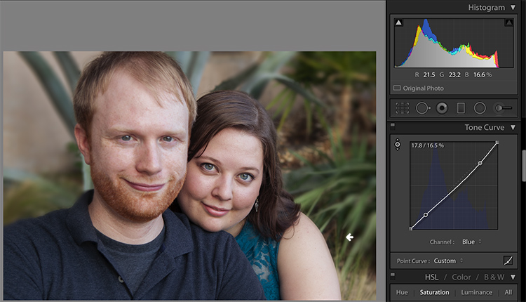
Skin tones Lightroom curves 12

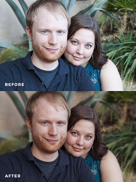
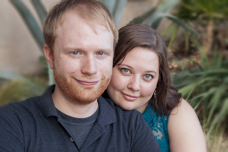
Compare the original and edited photos here:
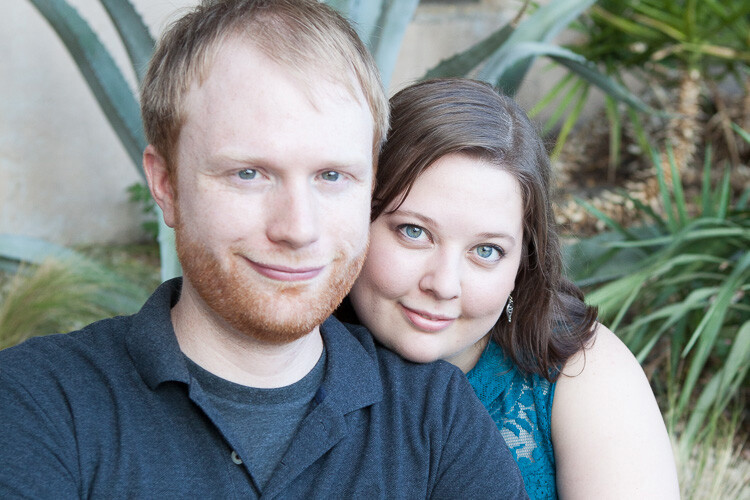
Before
Before

After

After

Editing your own images with Color Curves and RGB numbers

Keep the following tips in mind when editing your own images.

#1 – First, a big caveat to anyone who has heard that using RGB numbers to edit will solve all skin tone problems! There are as many proper RGB measurements as there are people in the world. As you study RGB numbers, let trends in the numbers and generalities guide your edits, but don’t try for an exact numeric match.

#2 – Measure skin tones in the middle range of brightness. Look for mid-tones rather than bright highlights or deep shadows. Also avoid measuring on cheeks, the end of the nose, or other areas that are usually redder than others.

#3 – In general, when I’m editing photos, I look for tones in these ranges:

  • Red is highest > Green is middle > Blue is lowest – always.
  • The Red channel is usually between 70% and 90%. Very light skin can be as high as 94%. Very dark skin can go as low as 40-50%.
  • The Blue channel is usually between 30% and 80%.
  • It’s not possible to generalize how many percentage points difference should be between Red and Green, or Green and Blue. However, skin that has warmer tones will have less Blue in proportion to Red and Green.

#4 – Small movements of your tone curve impact your image dramatically. Don’t go overboard!

Conclusion

Studying the patterns in the RGB numbers of your photos is a great way to develop your editing eye. Everyone has photos that aren’t quite right. Analyzing the relationship between the numbers and the appearance of the photo will help you get to the point where you can eyeball a photo’s needs without referring to the RGB numbers at all.

Any questions? We could talk about this topic all day. Comment below and tell me what you think.

googletag.cmd.push(function() {
tablet_slots.push( googletag.defineSlot( “/1005424/_dPSv4_tab-all-article-bottom_(300×250)”, [300, 250], “pb-ad-78623” ).addService( googletag.pubads() ) ); } );

googletag.cmd.push(function() {
mobile_slots.push( googletag.defineSlot( “/1005424/_dPSv4_mob-all-article-bottom_(300×250)”, [300, 250], “pb-ad-78158” ).addService( googletag.pubads() ) ); } );

The post How to Correct Skin Tones Using Lightroom’s Color Curves by Erin Peloquin appeared first on Digital Photography School.


Digital Photography School

 
Comments Off on How to Correct Skin Tones Using Lightroom’s Color Curves

Posted in Photography


3 Tips for Getting Great Skin Tones Using Adobe Camera Raw

10 Apr

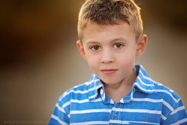
Skin tones can be one of the more difficult aspects of a photograph to master. Getting pleasing skin tones will make your image appear more eye-catching and attractive. If you know the right steps to take, skin can be pretty simple to master. Using these three simple tricks, using only Adobe Camera Raw (ACR), your skin tones will appear more balanced and pleasing to the eye.

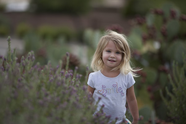
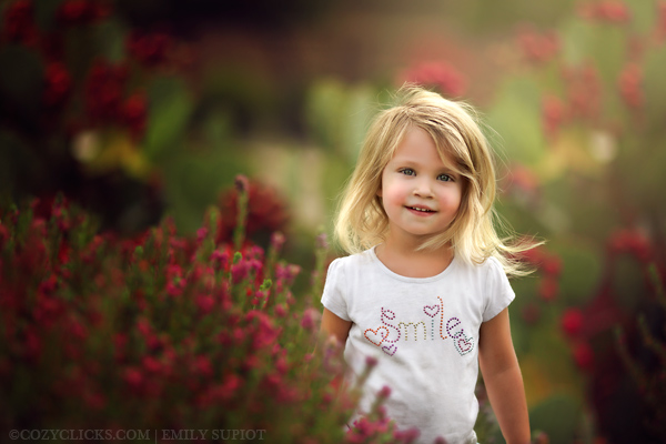
Before3 1

After3 1

Note: working in Lightroom you can do the this as well, because the sliders and options are the same!

White Balance

When trying to get great looking skin tones, the first thing you should pay attention to is the white balance. Correct white balance will set the stage for great skin tones. If the white balance is too cool, your skin will appear gray or bluish. On the other hand, if the white balance is too warm, the skin will look yellow or orange. Neither of these options are very pleasing to the eye, and make the skin more difficult to work with later on.

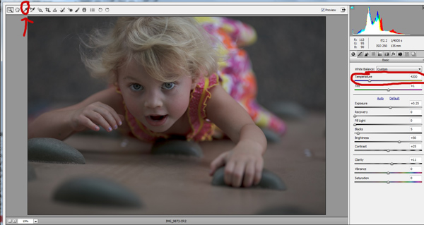
To see if your white balance is accurate, use the white balance targeted adjustment tool. It looks like an eye-dropper and is located at the top of the screen. It is the third tool over from the left. Click on the dropper, then click on an area of your photo that is white. The whites of the eyes are a good place to start. This should give you a good indication of where the white balance should be set. If your image still appears too warm or cool to your taste, use the temperature slider located to the right of your screen, it is the first one. Adjust this by sliding it to the right or left until your get a pleasing white balance. You may have to adjust Tint as well.

Whitebalance1

Exposure

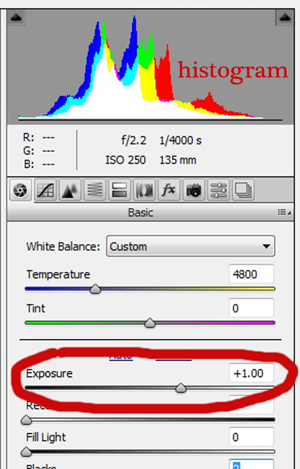
Next, make sure your exposure is correct. Take a look at the histogram located in the upper right hand corner of the screen. Ideally, you want it to look like a smooth bell curve, with the high point of the curve right in the middle. Check to make sure that the curve does not go too far to the left or the right. This may indicate that your photo is over or underexposed, causing your skin tones to either be gray and dark, or too bright and blown-out in some spots.

Exposure 2

If your curve does fall too far to one side, use the exposure slider to fix it. Located three sliders down on the right hand side of your screen, move it either left or right. Watch your histogram. When the majority of the curve is in the middle, you’ve got it! In some photos, there will be parts of your image that are very bright or dark, and cause your histogram to spike on parts of the curve. This happens often when you have a bright sky in the background. If this is the case, your curve will be off the chart on the right edge of the histogram. In an image like this, you would look at where the majority of your curve lies and ignore the parts of the curve that are out of range.

For more information see: How to Read and Use Histograms

Luminance

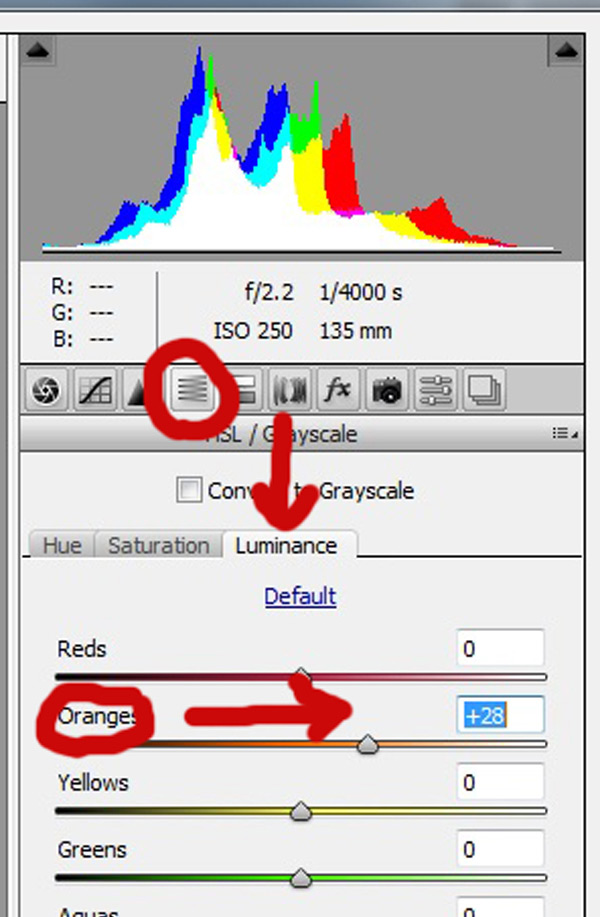
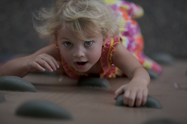
Finally, to give your skin tones just a little more brightness you will want to locate the luminance sliders (look for the HSL panel, the L stands for Luminance). You will see a horizontal strip of buttons directly under the histogram on the right panel. The fourth one to the left is HSL/Grayscale, click on that button. After selecting that option, three tabs will appear. Click on the Luminance tab. Choose the orange slider, which is two down, and move it to the right. You will notice that this affects mainly the skin in your photo and leaves the other areas of the image untouched. The more you move it to the right, the brighter the skin will appear. Keep moving the orange slider back and forth until the skin is the brightness you prefer.

Luminance 2

Before1 1

After1 1

Once you have adjusted your RAW image using these three steps, you can open it up in Photoshop to do any fine tuning or adjustments on the remainder of your photo. Your skin tones, however, should already look great and need little, if any additional work.

Before2 1

After2 1

Do you have any other tips for making great looking skin tones using ACR? Please share them in the comments below.

googletag.cmd.push(function() {
tablet_slots.push( googletag.defineSlot( “/1005424/_dPSv4_tab-all-article-bottom_(300×250)”, [300, 250], “pb-ad-78623” ).addService( googletag.pubads() ) ); } );

googletag.cmd.push(function() {
mobile_slots.push( googletag.defineSlot( “/1005424/_dPSv4_mob-all-article-bottom_(300×250)”, [300, 250], “pb-ad-78158” ).addService( googletag.pubads() ) ); } );

The post 3 Tips for Getting Great Skin Tones Using Adobe Camera Raw by Emily Supiot appeared first on Digital Photography School.


Digital Photography School

 
Comments Off on 3 Tips for Getting Great Skin Tones Using Adobe Camera Raw

Posted in Photography


Photography Challenge – Chill Out with Cool Tones

29 Nov

Today I rounded up 37 great examples of images in cool tones. The tone or color of your image can create or shift the mood and meaning if your image and is a very powerful compositional tool when used well.

This week your goal is to practice creating cool tones in your photography.

Photography challenge – cool tones

Here are a few examples of images with cool tones.

Kelsi  Barr

By Kelsi Barr

Chris Smith

By Chris Smith

Brandon Watts

By Brandon Watts

You can create a color tint in your image a few different ways:

  • By shooting at blue hour
  • Adjusting your white balance
  • Changing the color in post-processing
  • Using a colored filter on your lens

It’s your turn to get shooting, show me your blue or cool images.

Share your cool tone images here:

Simply upload your shot into the comment field (look for the little camera icon in the Disqus comments section) and they’ll get embedded for us all to see or if you’d prefer upload them to your favourite photo sharing site and leave the link to them. Show me your best images in this week’s challenge.

Here are some more  examples:

Barbara Willi

By Barbara Willi

Matthew Paulson

By Matthew Paulson

Edward Townend

By Edward Townend

Zacharmstrong

By zacharmstrong

Aphotoshooter

By aphotoshooter

Leland Francisco

By Leland Francisco

Giorgos~

By Giorgos~

Ateens Chen

By Ateens Chen

Dave Campbell

By Dave Campbell

The post Photography Challenge – Chill Out with Cool Tones by Darlene Hildebrandt appeared first on Digital Photography School.


Digital Photography School

 
Comments Off on Photography Challenge – Chill Out with Cool Tones

Posted in Photography


How to Photograph Mixed Skin Tones

29 Aug

by Elena Wilkins

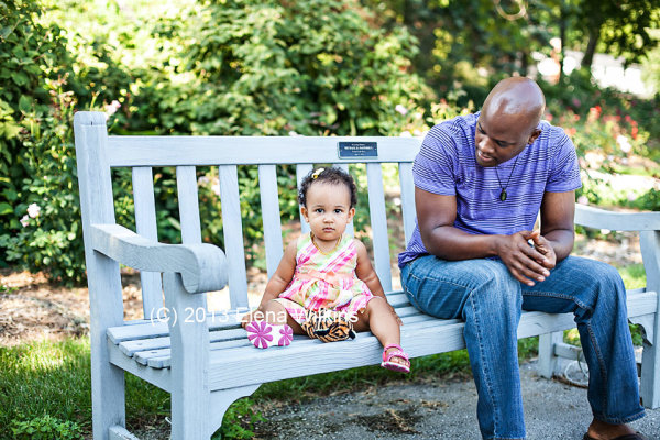
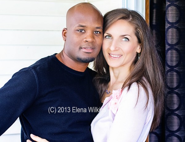
If you ever had my family as your clients, you could feel a tad lost at how to photograph us. Why? Well, there are three of us, and we come in a wide range of skin tones—from my fairly light skin, to my husband’s, pretty dark and handsome; our child fits right in between. We are a true colored family—a perfect fusion of all tones—a photographer’s conundrum, or, maybe even, a nightmare!

Who do you expose for? The mom? The child? Or the father? All three of us would need different camera settings… or a few tricks to make magic happen.

Because very few photographers get enough experience to properly shoot families like mine, or people of darker color in general, and even fewer know to properly process such images to perfection, we always find it hard to find the “perfect” photographer for us. I remember the first time I organized a multi-photographer photo shoot in the Northwest (Washington State), and brought my husband to it—he was everyone’s favorite model to practice on, since he happened to be the very first person of darker hue for most of the photographers at the event. Since I am the photographer and often the subject in our family images, I have been able to perfect these skills.

In this post I will share a few of my tricks, which helped me successfully satisfy not only my picky taste, but many of my darker complexion clients, as well as families, much like mine, with mixed skin tones.

But first, meet my colorful family.

My perfect child. It is the mother’s right to think that her child is the cutest and most perfect :) .

How-to-Photograph-Mixed-Skin-Tones-5

The beautiful duo—both loves of my life.
How-to-Photograph-Mixed-Skin-Tones-4

How-to-Photograph-Mixed-Skin-Tones-3

Things to keep in mind for this post:

  1. as a photographer, I use only natural light—I shoot almost exclusively outside, on location, and barely ever use fill flash, even with darker skin people;
  2. studio techniques for photographing people of color or mixed skin tones might be slightly different—I will not be covering them in this post;
  3. I do not use reflectors, since I shoot solo, but they might be helpful, if you have an assistant;
  4. I shoot RAW, so that I could easily adjust highlights and shadows in post processing;
  5. when I refer to people of color, I mean ALL people, since all of us are of some color :) ,
  6. I live by a motto: get images right in the camera as much as possible to cut down on post processing time—I usually spend no more than 30-60 seconds per image in post processing.

5 Tips and Tricks to Photograph People of Color

1. It’s all about clothing

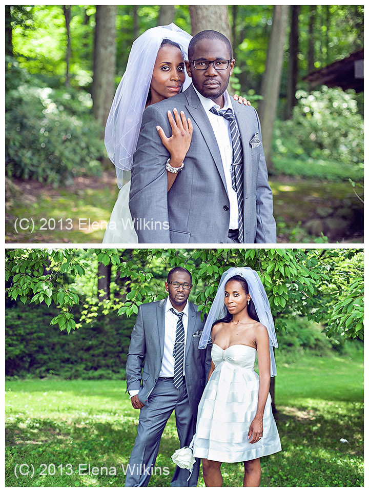
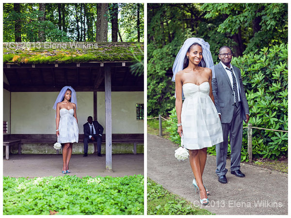
If at all possible, I ask my dark skin complexion clients not to wear white clothing. It makes life easier. In cases of wedding, as you can imagine, this is not an option. Sometimes I do have clients who want to be wearing white clothing specifically—I never say no! I will discuss how to make those images magical in post processing shortly.

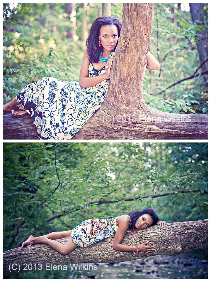
During my initial consultation with clients, we discuss best clothing options for the shoot, depending on the look we want to achieve and the mood they want to create. Often my clients come with a few sets of clothing to the shoot and a wide range of jewelry (for the ladies, and I help them coordinate to create the best, and the most magical images.

I coordinated every piece of clothing and accessories for this shoot, at my client’s request

I coordinated every piece of clothing and accessories for this shoot, at my client’s request

2. Away from Bright Lights

I love to shoot either early in the morning or in the evening, when the sun goes down, lavishing its golden rays to create perfect magic. In cases, especially with weddings, if that is not an option, and I have to shoot in the afternoon sun, I look for evenly shaded areas, so there is no competition between the natural light and my subjects’ skin. If all else fails, I do use fill flash.

This image was shot in an evenly shaded area, away from harsh light. I exposed for Francesca’s face.

This image was shot in an evenly shaded area, away from harsh light. I exposed for Francesca’s face.

3. Expose for the Skin

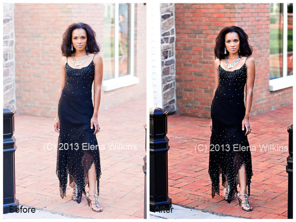
When shooting a darker skin complexion person, expose for the face. Get the face right, and the rest of the image will fall into place.

If she is wearing complimentary colored clothing, concentrate on getting perfect skin tone, so you won’t need to spend too much time in post processing, and also have something to show your client during the shoot to inspire her with her beauty.

Courtnee’s face was my focus; the brick, as gorgeous as it is, was easily darkened back to its beauty in post processing with a quick action and a few brush strokes

Courtnee’s face was my focus; the brick, as gorgeous as it is, was easily darkened back to its beauty in post processing with a quick action and a few brush strokes

4. Balancing Whites and Darker Skin Tones

If your clients are wearing light clothing, especially true with weddings, make sure not to blow out highlights, so you can adjust it in post processing. This is why I shoot RAW, without exception, when it comes to weddings. I want to make sure I still can tone down my whites in post processing.

In these images I focused on my clients’ faces, making sure not to blow out whites, so I would still get detail in the dress, the shirt and the veil in post processing. In post processing, I used Bridge/Camera Raw, I brought down highlights and whites, bumped shadows, and then finished magic in Photoshop, selectively processing areas of the images that needed extra attention.

In these images I focused on my clients’ faces, making sure not to blow out whites, so I would still get detail in the dress, the shirt and the veil in post processing. In post processing, I used Bridge/Camera Raw, I brought down highlights and whites, bumped shadows, and then finished magic in Photoshop, selectively processing areas of the images that needed extra attention.

In these images I exposed for Candice, since she was the focal point of the images, and ensured that whites were not blown out, so they could be fixed, if needed, in post processing

In these images I exposed for Candice, since she was the focal point of the images, and ensured that whites were not blown out, so they could be fixed, if needed, in post processing

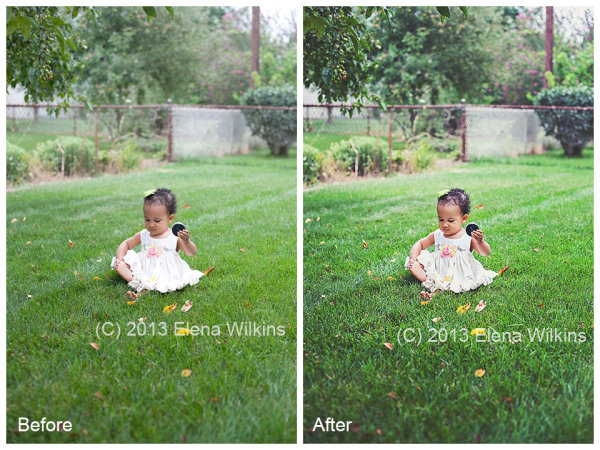
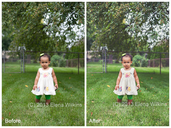
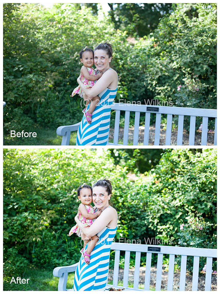
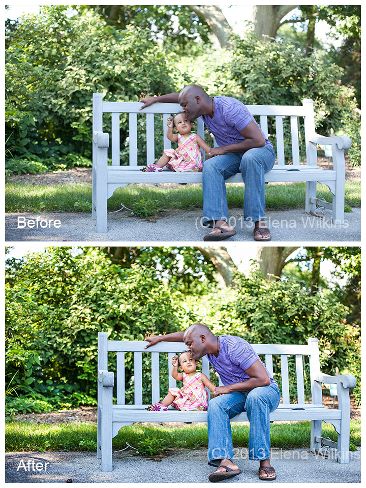
In this image of my little girl, she was facing away from direct light, I made sure to get her face just right, in camera, which left some of the highlights in her dress just a tad too bright. Not to worry! I was able to fix that in post processing, in less than 20 seconds!

In this shot, since she was facing direct light, I made sure not to blow out highlights, so, her face turned out a tad darker, but the dress was not blown out. In post processing I lightened the face and darkened the dress. The image turned out magical, although she might not have been too happy to be interrupted for the image during her playtime.

In this shot, since she was facing direct light, I made sure not to blow out highlights, so, her face turned out a tad darker, but the dress was not blown out. In post processing I lightened the face and darkened the dress. The image turned out magical, although she might not have been too happy to be interrupted for the image during her playtime.

I will mention actions used in processing these two image at the end of the post

I will mention actions used in processing these two image at the end of the post

5. Go for the Mid-Range: Photographing Mixed Skin Tones in the Same Image

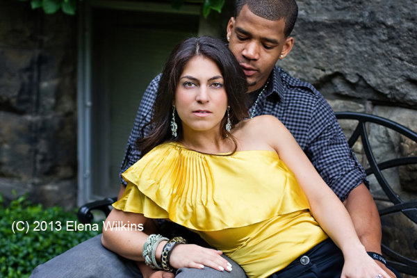
If you are photographing people of different skin tones in the same image, go for the mid-range; the rest can be adjusted in post-processing. I always make sure that the lightest person is not too light, while the darkest person is not too dark. If the lightest person turns out too light, you might have a case of blown highlights, and no Photoshop tricks will fix that. If the darkest person turns out too dark and you will try to adjust it in post processing, there might be too much digital noise on that person’s face, compared to the rest of the image.

When I photograph my husband and myself, I usually take a couple of test shots to make sure I do now pale completely next to him. Having over ten years of experience, however, these days I normally do a quick test shot with just him in it, since I know how I would look next to him.

When I photograph my husband and myself, I usually take a couple of test shots to make sure I do now pale completely next to him. Having over ten years of experience, however, these days I normally do a quick test shot with just him in it, since I know how I would look next to him.

Magic Happens in Post Processing

How to Post Process Images with Mixed Skin Tones

While batch processing is the best thing since sliced bread, as you can imagine it is not always possible in situations such as I just described. Batch post-processing can be done only to a point—you could not just throw all images of clients with mixed skin tones into Lightroom and have magic happen. Some selective image post-processing (processing only parts of the images) will need to be done.

Most of us are visual people, so instead of trying to explain something with a thousand words, I created a ten minute video to show you how I photograph and post-process images of clients with mixed skin tones to perfection.

How to Photograph Mixed Skin Tones from Elena Wilkins on Vimeo.

Here are the images used in the video, and, as promised, a list of actions I used in post-processing.

How-to-Photograph-Mixed-Skin-Tones-2

Actions used:

  • Boost action from Pioneer Woman Set 1 (used to boost tones for the entire image)
  • Touch of Light | Touch of Darkness by MCP Actions (used selectively)
  • MCP High Definition Sharpening action by MCP Actions (used for the entire image)
  • Polished Picture Sparkling Eyes by Polished Picture (used to sharpen eyes only)
same set of actions used to process this image

same set of actions used to process this image

In the two images of my little girl, after adjusting them in Bridge/Camera Raw (I decreased highlights to -82, bumped up shadows by +50 and added contrast at +24), I used the same actions as in these images, with an addition of:

  • Polished Pictures Funky Curves (Ruby curve at 40% and Matte curve at 25%, I then painted back her face at 60%).

I hope that having read this post you will feel more equipped to photograph people of color and know how you can create magic in post-processing.

Happy Shooting!

Elena Wilkins is a lifestyle and wedding photographer. Since becoming a Mom, she took a break from full-time photography, concentrating on raising her baby and running a health and nutrition blog Vegalicious, which is filled with images of delicious foods and her colorful family. She still photographs occasional weddings and sessions, dedicating herself to serving people who need her expertise the most—people of color and families with mixed skin tones. She is getting ready to relaunch her photography web-site, Color Fusions, which she will dedicate to sharing tips and tricks of the trade, and serving her colorful clients.

Post originally from: Digital Photography Tips.

Check out our more Photography Tips at Photography Tips for Beginners, Portrait Photography Tips and Wedding Photography Tips.

How to Photograph Mixed Skin Tones


Digital Photography School

 
Comments Off on How to Photograph Mixed Skin Tones

Posted in Photography


Photoshop: Darkening bright tones | lynda.com

28 Oct

This specific tutorial is a single movie from chapter two of the Photoshop CS3 Portrait Retouching Essentials course presented by lynda.com author Chris Orwig. Watch more at www.lynda.com The complete course has a total duration of 10 hours and 19 minutes. Photoshop CS3 Portrait Retouching Essentials table of contents: Introduction 1. Retouching Roadmap 2. Correcting Color and Tone 3. Cleaning Up Images in Camera Raw 4. Cleaning Up Images in Photoshop 5. Structural Image Enhancements 6. Reducing and Removing Wrinkles 7. Enhancing Eyes 8. Enhancing Eyelashes and Eyebrows 9. Improving Hair 10. Improving Faces and Bodies 11. Fixing Teeth 12. Improving Makeup 13. Enhancing Skin 14. Softening Skin Conclusion
Video Rating: 0 / 5

 
Comments Off on Photoshop: Darkening bright tones | lynda.com

Posted in Retouching in Photoshop


Digital Photography Lesson – Skin tones part 2 of 4

27 Mar

I caught this show on my television and absolutely love it. I wish it was on more often. I tivo-ed it and figured I’d share it with others. If you want to learn more about taking great photography, this is the show. This one is about shooting with contrasting skin tones.
Video Rating: 4 / 5


Digital Photography Lesson – Skin tones part 1 of 4

15 Feb

I caught this show on my television and absolutely love it. I wish it was on more often. I tivo-ed it and figured I’d share it with others. If you want to learn more about taking great photography, this is the show. This one is about shooting with contrasting skin tones.

In this episode Mark discusses lighting ratios.
Video Rating: 4 / 5