RSS
 

Posts Tagged ‘Sense’

Review: Does the Canon Rebel T8i DSLR make sense in an increasingly mirrorless world?

25 Nov

Introduction

$ (document).ready(function() { SampleGalleryV2({“containerId”:”embeddedSampleGallery_2419057207″,”galleryId”:”2419057207″,”isEmbeddedWidget”:true,”selectedImageIndex”:0,”isMobile”:false}) });

The Canon EOS Rebel T8i (also known as the EOS 850D or Kiss X10i in some markets) is a 24MP DSLR camera that is compatible with the company’s EF and EF-S mount lenses. It has an optical viewfinder, but it also has a usable and responsive touchscreen interface and live view experience that’s a match for the company’s mirrorless camera options.


For much of the world, shifting consumer preferences towards mirrorless cameras have left DSLRs looking like relics of history, though Europe and the Americas remain holdouts. Last year, Europeans still bought about 1.4 DSLRs for every mirrorless camera sold, while in the Americas the ratio was even higher at 1.7:1.

So why might you consider a DSLR in our increasingly mirrorless world? Some photographers still prefer DSLRs for their crisp, lag-free through-the-lens viewfinders, and there’s a much wider array of lenses available to DSLR shooters without the need for adapters.

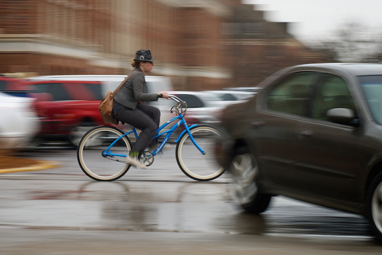
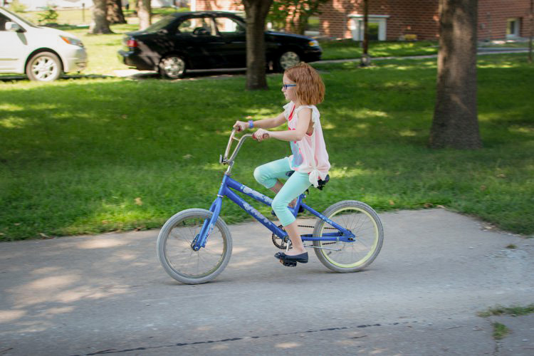
ISO 2500 | 1/100 sec | F5 | Canon EF-S 18-55mm @ 44mm

Yet relatively few manufacturers are left in the consumer DSLR market. Only Canon, Nikon and Ricoh (which makes Pentax-branded DSLRs) remain, making new models few and far between. Among these, Canon’s EOS Rebel series are the biggest sellers. The Rebel T8i now sits at the top of that line, replacing 2017’s T7i.

Priced at $ 749.99 body-only or $ 900 with an EF-S 18-55mm IS STM kit lens, the Canon T8i is available immediately.

Key specifications

  • 24-megapixel APS-C image sensor
  • EF or EF-S lens compatibility
  • ISO 100 to 25,600, extends to 51,200
  • 7 fps continuous shooting, or 7.5 fps in live view
  • 45 point, all cross-type phase-detect AF
  • 0.51x pentamirror viewfinder with 95% coverage
  • 3.0″ vari-angle touch-screen LCD
  • 24p 4K video with 1.6x crop, or full-sensor 1080p60
  • 800 shot battery life, or 310 shots with live view
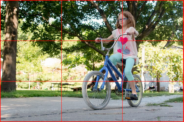
Out-of-camera JPEG.
ISO 250 | 1/100 sec | F5.6 | Canon EF-S 18-55mm @ 55mm

Back to top


What’s new and how it compares

The AF-ON button and rear dial make the T8i a more flexible camera for users to learn and grow with than lesser Rebels.

Externally, the 24-megapixel Canon T8i looks very similar to its predecessor from most angles, although there are some control tweaks to be found on its rear panel including a new rear control dial and AF-On button. While Wi-Fi and Bluetooth connectivity remain, NFC has been dropped as the constant Bluetooth connection speeds up the connection process the way NFC used to. Lastly, the flash must now be raised manually when needed, as it can no longer pop up by itself. As we’ll see later on, this is a good thing.

On the inside, while the sensor resolution and sensitivity range are unchanged, a faster image processor allows a modest increase in burst performance. It’s now rated at 7 frames per second through the viewfinder, or 7.5 fps in live view mode, up from 6 fps in the T7i. There’s also a somewhat finer-grained 384-zone metering sensor in place of the earlier 315-zone sensor.

The Rebel T8i uses a familiar 24MP sensor with Dual Pixel AF that offers solid noise performance and resolution.

Canon has also added support for 4K movie capture, although this comes with several limitations including a significant focal length crop, contrast-detection autofocus (rather than the more reliable Dual Pixel AF you get in lesser Full HD modes) and a fixed 24 fps frame rate. And autofocus algorithms have been refined to add eye detection in live view mode, and face detection when shooting through the viewfinder.

How it compares…

Compared with two of its mirrorless rivals, the Nikon Z50 and Sony a6100, the Canon T8i offers much better battery life, so long as you stick to its optical viewfinder. The T8i is quite a bit bulkier though, despite not offering weather-sealing.

Canon T8i Nikon Z50 Sony a6100
MSRP (body) $ 749.99 $ 859.95 $ 750
Sensor 24.1MP APS-C 20.9MP APS-C 24MP APS-C
Type DSLR Mirrorless Mirrorless
Sensitivity (native) 100-25600 100-51200 100-32000
Lens mount Canon EF / EF-S Nikon Z Sony E
Viewfinder type Optical pentamirror SLR 2.36M-dot OLED EVF 1.44M-dot EVF
Viewfinder magnif. / coverage 0.51x, 95% 0.68x, 100% 0.71x, 100%
LCD 3” fully articulating 3.2” tilting 3” tilting
Touch-screen Yes Yes Yes
Included flash Pop-up Pop-up Pop-up
Weather-sealing No Yes No
Max. burst 7.0 fps (viewfinder) / 7.5 fps (live view) 5 fps (mechanical) / 11 fps (electronic) 11 fps (mechanical)
Max. shutter 1/4000 1/4000 1/4000
Video 4K/24p, 1080/24-60p 4K/24-30p, 1080/ 24-120p 4K/24-30p, 1080/ 24-120p
4K crop 1.6x None 1.2x (4K/30p)
Battery life (CIPA) 800 shots (OVF); 310 shots (Live View) 320 shots 420 shots
Dimensions 131 x 103 x 76mm 127 x 94 x 60mm 120 x 67 x 59mm
Weight 515 g 450 g 396 g

One thing that’s hard to capture in a table are the differences between the camera’s AF systems. In its optical viewfinder, the T8i’s 45 autofocus points are centrally clustered, which can get in the way of creative compositions. Switch into live view and you have autofocus points spread across the frame, the same as the other options give you on their rear screens and their electronic viewfinders.

Out-of-camera JPEG.
ISO 500 | 1/60 sec | F4 | Canon EF-S 18-55mm @ 18mm

Compared to the smaller and more affordable Canon Rebel SL3, the T8i offers more sophisticated autofocus through its slightly smaller finder, though the SL3 offers you a third more shots per charge. On the mirrorless side of the equation, the T8i bests the Canon EOS M50 Mark II’s 235-shot battery life whether you’re using the optical viewfinder or live view, but the mirrorless model is lower-priced, significantly more compact / lightweight and offers faster 10 fps burst capture.

Back to top


Body, handling and controls

Although its body is plastic, the Canon T8i is very solid in-hand, with no creaks or flexing. It’s also pretty light and compact for a DSLR. The main controls are well-placed and easy to locate by touch.

The new AF-On button is ideally situated for quick autofocus adjustments with a slight thumb motion. (And via a custom setting, can be set to AF-Off instead.) The Wi-Fi button and indicator lamp are gone but won’t be missed, as you won’t need them often. We recommend connecting via Bluetooth, which maintains a constant connection that draws little power, and also makes connecting via Wi-Fi to send images a snap.

Out-of-camera JPEG.
ISO 100 | 1/125 sec | F5.6 | Canon EF-S 18-55mm @ 55mm

The new rear control dial is also a nice addition, though since it’s integrated with the four-way controller, it can’t be reached without adjusting your grip. On the plus side, it’s only active when the exposure metering system is brought to life by a half-press of the shutter button or you’re in a menu, preventing accidental settings changes.

There will always be some photographers that prefer an optical viewfinder; the T8i’s is serviceable, but it’s on the small and dim end of the spectrum.

Sadly, the pentamirror viewfinder is dim and tunnel-like compared with the electronic finders of mirrorless rivals and even some rival SLRs, such as the less-expensive Pentax K-70 (which has a larger pentaprism design which is brighter than pentamirror designs).

The rear LCD is crisp and easy to see even under sunlight if you turn up the brightness. Its fully-articulated mechanism allows framing from most angles, even for selfies.

The vari-angle LCD allows selfie-shooting too, but the ergonomics aren’t ideal when holding the camera backwards. Out-of-camera JPEG.
ISO 2000 | 1/60 sec | F4 | Canon EF-S 18-55mm @ 18mm

The on-screen UI is standard Canon. It’s fairly clear and logically laid-out, and can be navigated with buttons, dials or the very precise touchscreen. Your most-used options can be saved in the My Menu section for quick recall.

Battery life is excellent when shooting stills through the viewfinder, and I never needed a second battery even during lengthy day trips. (I passed 500 frames captured without the charge level indicator dropping even a single bar, which impressed me.) If you shoot a lot of video or use live view frequently, the LCD can burn through power fairly quickly, though. For that reason, the T8i goes to sleep by default after ten seconds unless in menus or live view / playback modes.

Top plate controls are fairly typical Canon, and the quick switch over to video mode is a nice touch.

A standalone charger is included in the bundle, so you can leave a second battery charging while using the camera. Unfortunately in-camera charging via USB isn’t supported, so you can’t share a charger and cable with another device when you want to pack light. As well as USB, there are HDMI, microphone and remote control ports.

Back to top


Image quality

With the same sensor resolution and sensitivity range as its predecessor, you might expect similar image quality from the Canon T8i: and you’d be right. As an affordable camera aimed at entry-level photographers, it’s good enough but won’t win any awards. That’s not to say there are no differences, however.

Out-of-camera JPEG.
ISO 800 | 1/80 sec | F4.5 | Canon EF-S 18-55mm @ 24mm

Out of camera JPEGs mostly showed pleasing color both outdoors and under artificial light, although I found the latter a little more variable, with some images a tad warm and others a little on the cool side. In both the green fully-automatic mode and program autoexposure, the T8i’s metering proved pretty accurate, and at lower sensitivities there was a fair amount of fine detail as well, although I felt the default sharpening was a touch aggressive.

Comparison of ISO 100 and 25,600. See the sample gallery for a full ISO sensitivity series.

ISO sensitivity in auto mode is limited to a maximum ISO of 6400 by default, and that seems like a good cutoff point. Some noise and loss of saturation starts to become noticeable by ISO 3200, but it’s not until you reach ISO 6400 that it really begins to intrude. You’re best off avoiding ISO 12800 and above as there’s a significant loss of fine detail to noise, and colors can look decidedly washed out.

Out-of-camera JPEG.
ISO 3200 | 1/80 sec | F4.5 | Canon EF-S 18-55mm @ 18mm

Of course, shooting in Raw format helps somewhat as you can rely on the greater processing power of your computer to help tame noise while still holding onto color and detail. And there’s a fair bit of scope to correct exposure within a couple of stops, as well. Raws can also be processed in-camera, which is a nice touch for making quick adjustments on the go.

We’re honestly pleased to find that the T8i’s flash must be manually raised; previous Canon Rebels would often raise their automatically in situations where it actually has a negative impact on your images.

One notable change is that the Rebel T8i no longer tends to overexpose nearby subjects by raising and firing the flash when it’s not really needed, since it can no longer pop up automatically. You need to pay attention to your shutter speeds, though, and either raise the ISO, or lift the flash yourself. Sadly, there’s no warning in the viewfinder when shutter speeds stray below the point where exposures can safely be shot hand-held.

Back to top


Autofocus

The Canon T8i’s autofocus system has two distinct operating modes, depending upon whether you’re using the optical viewfinder or live view modes. Both systems are capable of locking focus quickly and accurately in good light. In darker conditions, both take a bit longer to achieve a lock, but if I was capable of seeing the subject through the viewfinder, the camera could usually manage to focus on it within a couple of seconds.

A simplified look at the T8i’s optical viewfinder AF system.

When shooting through the viewfinder there are a total of 45 autofocus points, all of which are cross-type. As you can see in the above illustration, they only cover about two thirds of the frame width and a little over a third of the frame height. For live view mode, almost the entire frame is covered vertically, and significantly more of its width as well.

Out-of-camera JPEG.
ISO 500 | 1/60 sec | F4 | Canon EF-S 18-55mm @ 18mm

Live view also offers both face and eye detection and lets you select which face or eye to focus on using the four-way controller or touch-screen. Viewfinder shooting only has face detection, and you can’t directly control which face to focus on, although if you aim directly at a particular face before half-pressing the shutter button, the camera will then try to follow that face.

Both systems detect faces pretty well, and the tracking implementation is fairly robust. In testing with my son running and riding a bike directly towards me, the T8i was able to accurately track his location and keep the focus locked on his face most of the time until he was very close to the camera. This isn’t by any means a sports shooter, but I think it’s more than capable of keeping up with amateur photographers’ needs in this respect.

Out-of-camera JPEG.
ISO 100 | 1/60 sec | F7.1 | Canon EF-S 18-55mm @ 27mm

Really, my only complaint with autofocus is that it can be confusing if you’re frequently switching between live view and viewfinder shooting. Each mode is configured separately, so for example switching one mode to continuous servo AF won’t affect the other mode’s setup. On the other hand, this separation of settings could be useful if you’re switching from shooting stills in the viewfinder and video in live view. Which brings us to…

Back to top


Video

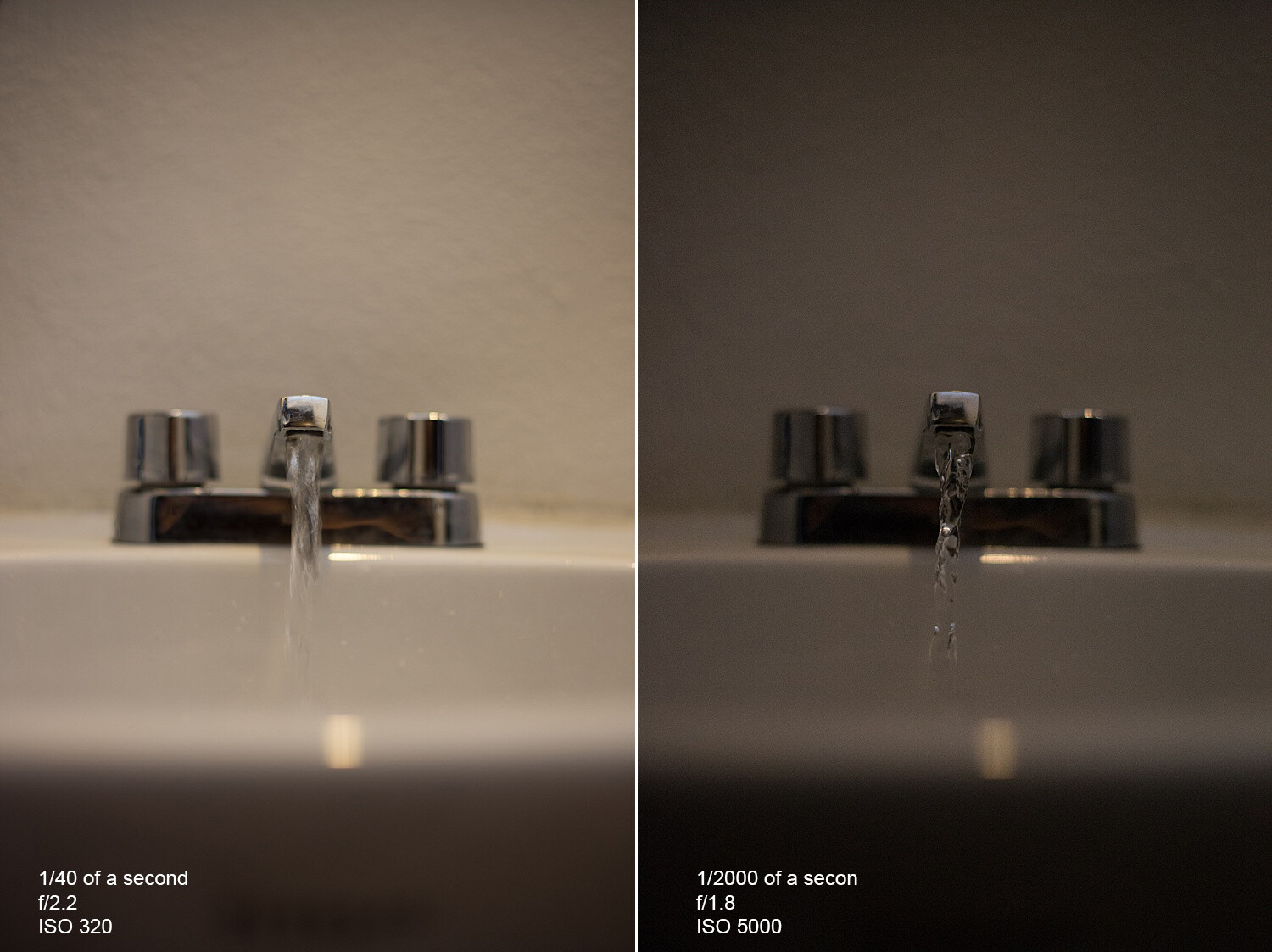
The addition of 4K video is one of the bigger changes in the Canon T8i, but it’s really rather a shame that it comes hobbled by several significant limitations.

First and most importantly, there’s that significant 1.6x focal length crop on top of the crop imposed by its APS-C sensor size. In other words, a 2.6x effective crop even before you enable digital IS, which crops in still further. In 4K mode without digital IS, the optional 18-55mm kit lens yields an effective 47-143mm range, so your wide-angle options are seriously limited.


4K video has a significant focal length crop. Both videos above were shot at the same location and focal length. Note also the false-color artifacts in the water ripples in the Full HD clip.

The longer effective focal length also means that even with both optical and digital IS active, the stabilization system can struggle to smooth camera shake in 4K, especially if you’re walking.

4K mode comes with a fixed 24 frames per second capture rate, too, and uses contrast-detection autofocus which, compared to phase detection, is slower and has slight but noticeable hunting.

Dual Pixel AF, seen in this demo, is only available in Full HD. In 4K, you can expect more distracting hunting before the Rebel locks on to its targets.

The good news is that if you can put up with those limitations, 4K image quality is fairly good, with lots of crisp detail and pleasing color. And while there’s definitely some rolling shutter effect present, causing verticals to lean during subject motion or quick pans, it’s far from the worst I’ve seen.

Enabling Movie Digital IS causes a significant focal length crop, too. Both of these Full HD clips have optical stabilization active, but the second clip with Enhanced IS still can’t entirely steady the motion of walking, even at a wide 18mm (29mm equiv.) focal length.

But I think it’s better to look at this as a Full HD camera which can also shoot 4K with more distant subjects and relatively sedate motion in a pinch. In Full HD, where you get phase detection AF and access to frame rates as high as 60 fps, there’s less fine detail but focusing is quicker and more confident, and motion is rendered more smoothly. The biggest downside is that Full HD seems more prone to moiré and false color artifacts.

The T8i lacks significant scope for slow-motion video, but does offer a time-lapse movie mode, as well as supporting manual exposure, focus peaking and external audio recording.

Back to top


Conclusion

At the end of the day, the Canon Rebel T8i leaves me with rather mixed emotions. On the one hand, for fans of DSLRs like myself, there are fewer and fewer choices on offer, and it does pack quite a lot into a fairly compact, lightweight package by DSLR standards.

But on the other hand, it trails its mirrorless camera rivals in terms of both autofocus and burst capture performance. And the feature which differentiates it most clearly from those rivals – that mirror-based optical viewfinder – gives a disappointingly small and dim view of your subject.

Out-of-camera JPEG.
ISO 12800 | 1/60 sec | F4 | Canon EF-S 18-55mm @ 18mm

While 4K video capture is finally available in the Rebel T8i, it also comes with some major limitations that make it feel more as if it was added to fill out the spec sheet than for real-world use.

But with all of that said, the T8i does give you pretty good still image quality and usable high-definition video capture. And it does so at a pretty affordable pricetag, as well, and with battery life that’s in a totally different ballpark to mirrorless rivals if you tend to rely on the viewfinder.

The Rebel T8i isn’t the future for Canon, but it offers plenty of features and good ergonomics at an affordable pricetag.

There’s definitely something to be said for the vast range of Canon EF and EF-S mount lenses on offer, too; though keep in mind there isn’t a ton of variety in the more affordable EF-S range, and the EF lenses, designed for larger full-frame sensors, are bigger and pricier. And with Canon focusing on its new RF mount, we wouldn’t expect a glut of new EF and EF-S lenses to suddenly appear down the line.

Out-of-camera JPEG.
ISO 25600 | 1/25 sec | F5.6 | Canon EF-S 18-55mm @ 55mm

So, does the Canon T8i represent the future for Canon? Probably not. But does it offer plenty of camera for the money, particularly for the less experienced photographers at which it’s aimed? I’d say so, despite my reservations about its viewfinder and 4K video capabilities.

And I think that makes it a worthwhile buy, especially if you happen to spot it for sale below its list price.

What we like What we don’t
  • Through-the-lens optical viewfinder is crisp and lag-free
  • Good ergonomics and solid build
  • Compatible with a vast range of Canon EF and EF-S lenses and accessories
  • Excellent battery life (if you stick to the optical viewfinder)
  • Good still image quality, albeit not as good as some newer models
  • Fully articulating touchscreen display is very versatile
  • Relatively small, dim viewfinder, even by APS-C DSLR standards
  • Wide-angle possibilities are very limited for 4K capture
  • No PDAF and only 24fps for 4K, too
  • Full HD video is prone to moiré and false color
  • Less point-dense AF than mirrorless rivals
  • No in-body stabilizer
  • AF points for viewfinder shooting clustered near the center of the frame
  • No ability to charge battery over USB

Sample gallery

$ (document).ready(function() { SampleGalleryV2({“containerId”:”embeddedSampleGallery_4631840432″,”galleryId”:”4631840432″,”isEmbeddedWidget”:true,”selectedImageIndex”:0,”isMobile”:false}) });


Scoring

Canon EOS Rebel T8i (EOS 850D / EOS Kiss X10i)
Category: Entry Level Interchangeable Lens Camera / DSLR
Build quality
Ergonomics & handling
Features
Metering & focus accuracy
Image quality (raw)
Image quality (jpeg)
Low light / high ISO performance
Viewfinder / screen rating
Performance
Movie / video mode
Connectivity
Value
PoorExcellent
Conclusion
The Canon EOS Rebel T8i is well-built with comfortable ergonomics and provides solid image quality for users that prefer an optical viewfinder. Unfortunately, its video capabilities aren't that impressive, and the viewfinder autofocus system is a little basic compared to what you get on mirrorless cameras through their electronic finders. Still, if you're in the market for a reasonably affordable DSLR, the EOS Rebel T8i is worth a look.

Good for
Amateur photographers looking for a solid camera to learn and grow with, users looking for a fairly compact camera with an optical viewfinder.

Not so good for
Photographers that want the best autofocus and exposure performance through the viewfinder, users that are looking for good 4K video and those looking for even more compact options.
80%
Overall score

RegularScoreCompareWidget({“mainElementId”:”scoringWidget”,”mainProduct”:”canon_eos850d”,”scoringSchema”:{“id”:”SLRs”,”variables”:[{“id”:”BuildQuality”},{“id”:”ErgonomicsAndHandling”},{“id”:”Features”},{“id”:”MeteringAndFocusAccuracy”},{“id”:”QualityRaw”},{“id”:”QualityJpeg”},{“id”:”LowLightHighISO”},{“id”:”ViewfinderScreenRating”},{“id”:”Optics”},{“id”:”Performance”},{“id”:”Movie”},{“id”:”Connectivity”},{“id”:”Value”}],”categories”:[{“id”:”EntryLevel”,”label”:”Entry Level Interchangeable Lens Camera / DSLR”,”shortLabel”:”Entry Level”},{“id”:”MidRange”,”label”:”Mid Range Interchangeable Lens Camera / DSLR”,”shortLabel”:”Mid Level”},{“id”:”EntryLevelFullFrame”,”label”:”Entry Level Full Frame Camera”,”shortLabel”:”Entry Level Full Frame”},{“id”:”MidRangeFullFrame”,”label”:”Mid Range Full Frame Camera”,”shortLabel”:”Mid Range Full Frame”},{“id”:”SemiProfessional”,”label”:”Semi-professional Interchangeable Lens Camera / DSLR”,”shortLabel”:”Semi-professional”},{“id”:”SemiProfessionalFullFrame”,”label”:”Semi-professional Full Frame Camera”,”shortLabel”:”Semi-professional Full Frame”},{“id”:”Professional”,”label”:” Professional Interchangeable Lens Camera / DSLR”,”shortLabel”:”Professional”},{“id”:”LargeSensorCompactEntry”,”label”:”Entry Level Large Sensor Compact Camera”,”shortLabel”:”Entry Level Large Sensor Compact”},{“id”:”LargeSensorCompactEnthusiast”,”label”:”Enthusiast Large Sensor Compact Camera”,”shortLabel”:”Enthusiast Large Sensor Compact”},{“id”:”VideoCamera”,”label”:”Video Camera”,”shortLabel”:”Video Camera”}]},”helpText”:”Choose one or more cameras from the drop-down menu, then roll your mouse over the names to see how their scores compare to the camera on review.”})
Articles: Digital Photography Review (dpreview.com)

 
Comments Off on Review: Does the Canon Rebel T8i DSLR make sense in an increasingly mirrorless world?

Posted in Uncategorized


Making Sense of the Exposure Triangle – ISO, Aperture, and Shutterspeed Made Simple

26 Feb

The post Making Sense of the Exposure Triangle – ISO, Aperture, and Shutterspeed Made Simple appeared first on Digital Photography School. It was authored by Jackie Lamas.

making-sense-of-the-exposure-triangle

Ever hear other photographers talking about shooting in manual mode, and using terms like ISO, aperture, and shutter speed and have no idea what they’re talking about? Then this article is for you. While making sense of the Exposure Triangle may seem overwhelming, you’ll learn everything there is to know so that you can get shooting in manual mode quicker!

Image: Canon 6D, 28mm, f/5.6, 1/250, ISO 400

Canon 6D, 28mm, f/5.6, 1/250, ISO 400

Everything in photography has to do with light

All three settings, ISO, aperture and shutter speed are collectively called the Exposure Triangle. They work together to allow more or less light to enter the camera depending on the light that you see with your eye in a given situation.

making-sense-of-the-exposure-triangle

For example, the brighter the light outside, the less you need to enter your camera to record the image. The less light around you, the more light you’ll need the camera to capture in order to make the image visible.

Each part of the Exposure Triangle works together to create a good exposure while controlling the camera fully to suit your creative direction.

What is ISO?

When making sense of the exposure triangle, you first need to understand ISO. ISO is the light sensitivity of the camera’s sensor.

So, think of this as your eye. When it’s really bright outside, your eyes tend to be less sensitive and need to strain less to focus, see, and look at the world around.

Image: When it’s particularly bright outside, like in this photo, use a lower number ISO.  Cam...

When it’s particularly bright outside, like in this photo, use a lower number ISO.  Camera settings: f/5.0, 1/800, ISO 200, 85mm shot on Canon 6D.

On the other hand, when you’re in a dark location with little to no light, your eyes strain and become more sensitive to any lights in the scene, helping you see better at night as well.

The same thing happens to a camera’s sensor. The more sensitive, the more light you’ll be able to pick up. The less sensitive, less light will enter the camera.

making-sense-of-the-exposure-triangle

ISO is measured in numbers ranging from 50 to 25,600 on some models. There is usually a button on your camera that is labeled ISO. This is where you’ll be able to change the ISO depending on the lighting situation.

Image: Here, we used auto mode to get an idea of the exposure we would need to take a photo of these...

Here, we used auto mode to get an idea of the exposure we would need to take a photo of these stuffed animals setting the ISO at 100.

The ISO also affects the quality of the image, so be careful when you’re using higher ISO numbers. They tend to record a lot of digital noise (or grain points) that you see when zoomed in.

Image: As you can see in this photo, using a high ISO added more light than we needed.

As you can see in this photo, using a high ISO added more light than we needed.

Using a higher ISO can help you in low light situations when you want to keep a relatively fast shutter speed to avoid camera shake. However, you need that boost in light to help expose correctly.

Image: When you use a high ISO, your camera is more sensitive to light and causes digital noise – li...

When you use a high ISO, your camera is more sensitive to light and causes digital noise – little points on your image that make it look grainy.

Aperture

When making sense of the exposure triangle, you need to understand aperture next. Aperture, is the opening and closing of the lens. Measured in F-numbers, it affects both the amount of light entering the camera, and the depth of field in your image.

making-sense-of-the-exposure-triangle

Camera settings f/2.5, 1/100, IS0 400, 50mm. In order to get the baby’s hand in focus and nothing else, we had to use an open aperture of f/2.5.

The depth of field is how much is in focus from foreground to background. A lower f-number will open your lens and let more light in, but it will also give you a narrower focus range (a shallow, or small depth of field). While a higher f-number will close your lens, and lessen the light entering, it will give you a wider focus range (a wide, or large depth of field).

making-sense-of-the-exposure-triangle

This is especially important to keep in mind when taking portraits so that you can determine how much you want in focus.

For an individual portrait, any f-number between f/2.8 and f/5.6 works great. You still have your subject in focus but you do get some bokeh (blurry background due to a low f/number).

making-sense-of-the-exposure-triangle

Here we have a more open aperture and therefore less is in focus.

For groups of people, you’ll want a high f-number like f/8 or f/11 because, at a lower f/number, you have less depth of field. This means your plane of focus is narrower. If you have people standing outside the plane of focus, they will be blurry. Therefore, in order to have everyone in focus, a high f/number is best because it gives you a wider plane of focus.

making-sense-of-the-exposure-triangle

Here we are using a closed aperture, allowing more to be in focus.

Again, opening and closing of the lens affects how much light enters the camera. Eventually, in manual, you’ll have to compensate with one of the other two settings to make up for the lack of light or excess of light entering your camera.

Image: To capture the bird and the landscape surrounding it, we used an aperture of f/9. Other camer...

To capture the bird and the landscape surrounding it, we used an aperture of f/9. Other camera settings are ISO 400, 1/250, at 28mm.

Use Av or A mode on your camera to play with aperture. The camera will set the shutter speed for you to maintain correct exposure. However, you’ll be able to see a noticeable difference in your depth of field and in light entering your camera.

Shutter speed

When making sense of the exposure triangle, shutter speed is the next thing you need to know. Shutter speed dictates the length of time that the shutter is open.

Image: To get a silhouette, you’ll need a fast shutter speed. This image has a shutter speed o...

To get a silhouette, you’ll need a fast shutter speed. This image has a shutter speed of 1/1000, f/16, ISO 400, 28mm.

Shutter speed is measured from seconds to fractions of a second (slow to fast shutter speeds). The slower the shutter speed, the longer it stays open to capture light. The faster it opens and closes, the less light is captured to make your photo.

making-sense-of-the-exposure-triangle

For example, on a really bright afternoon, use faster shutter speed in order to create a good exposure. In a low light situation, like a nighttime scene or a dark cafe, a slower shutter speed can help capture enough light to make the photo.

making-sense-of-the-exposure-triangle

In these two photos, we only changed the shutter speed and kept the other camera settings the same. You can see a significant difference in light.

Keep in mind, the slower the shutter speed, the more chance of camera shake occurring. Camera shake is an accidental blur due to the camera shaking, either in your hands, or due to some other force.

At slower shutter speeds, usually 1/125th of second or slower you are more likely to get camera shake. At faster shutter speeds this isn’t a problem as the camera opens and closes too quickly to register the shake.

making-sense-of-the-exposure-triangle

Using a slow shutter speed can give you interesting images with movement. Camera settings f/6.3, 1/13, ISO 400, 50mm.

Shutter speed also allows you to show movement in your photos or freezes moments. Slow shutter speed will show more movement, for example, a child running or playing. While a faster shutter speed will freeze the moment or action that you’re capturing.

Manual Mode

Manual mode is where you have to set all three adjustments manually, therefore, giving you complete control of the light and look of your photo.

Think of these three as a pulley system, all working together. When one is moved, one or both of the other settings must also adjust and compensate.

making-sense-of-the-exposure-triangle

The photo on the left has a slow shutter speed, an open aperture, and low ISO. The slow shutter speed and open aperture help light enter. It also allows the camera to pick up the movement of the water.

In the photo on the right, we get more of an action shot of the water. This is because we have now changed the ISO to 1/2000 sec – a pretty fast shutter speed. With this fast shutter speed, we had to compensate for the loss of light from the fast shutter speed. So, we added light by using a higher ISO and a more open aperture. Even so, it wasn’t enough to get a correct exposure as the photo is a little dark.

The best way to get started in manual mode is to think about what kind of photo you want to make. Are you shooting still life? Is there enough light? Do you want to control your focus range? Is this a portrait? All of these things can help you to determine where to start.

making-sense-of-the-exposure-triangle

For example, you’re taking photos of your kid’s soccer game in the early evening, and there is still a lot of light left, but it’s not harsh. You want to freeze the action of the game, and so you’d start by setting a fast shutter speed first.

If you’re taking a portrait of someone, then you’d start with the aperture in order to control your depth of field. Then you’d adjust the other two settings accordingly.

Image: Camera settings f/5.6, 1/100, IS0 400, 53mm.

Camera settings f/5.6, 1/100, IS0 400, 53mm.

For landscapes, you’d likely start with aperture and shutter speed. You may need a small aperture (eg f/11) to capture a wide plane of focus. Depending on whether there is water in your landscape, you may want to freeze the water or give it a silky look by slowing your shutter speed right down.

Knowing what you’re shooting and type of light will give you a starting point

Also, in manual mode, there is a built-in light meter. This meter looks like a tiny ruler either at the bottom of the live view or inside the viewfinder. It helps you determine if your photo is too bright (metering to the right), or too dark (metering to the left).

When the line is in the middle, or at zero, you’ve got what the camera considers a perfectly-exposed photo.

making-sense-of-the-exposure-triangle

The ruler at the bottom of the live view, or through the viewfinder, can help you expose your photos correctly. To the right of the ruler your photo will be brighter, and to the left, it will be darker.

Aim to keep it in the middle as you practice in manual mode. Sett one of the adjustments and then move the other two to add or take away light accordingly until the meter is in the middle.

It’s all about practice and really getting to know what each setting does on its own before switching to full manual. This can feel overwhelming, so try using one of the other modes, like Tv/S or Av/A modes first. Doing so may give you a better understanding of the settings and more control over your photos.

making-sense-of-the-exposure-triangle

Camera settings f/22, 30 seconds, ISO 200, 28mm.


Image: Camera settings f/10, 1/640, ISO 400, 50mm.

Camera settings f/10, 1/640, ISO 400, 50mm.

Conclusion

The technical side of photography can sometimes seem overwhelming and it seems like there is always something new to learn before feeling confident. Making sense of the exposure triangle will set your creativity free and give you full control of your camera.

The post Making Sense of the Exposure Triangle – ISO, Aperture, and Shutterspeed Made Simple appeared first on Digital Photography School. It was authored by Jackie Lamas.


Digital Photography School

 
Comments Off on Making Sense of the Exposure Triangle – ISO, Aperture, and Shutterspeed Made Simple

Posted in Photography


Making Sense of Lens Optics for Crop Sensor Cameras

20 May

If you have been considering getting a new camera or have been considering upgrading a camera, you have probably heard all about crop sensor cameras but what does it mean? How does crop factor affect lens selections? When you are considering systems, often it is not just the camera bodies you must consider, but the selection of lenses for that system as well.

Sensor Optics and Equivalences

Making Sense of Lens Optics for Crop Sensor Cameras - crop sensor optics

Crop Sensor Optics

Most new photographers often start out with crop sensor cameras because they are usually less expensive. But as you become more advanced does it make sense to upgrade to a full frame system? If you are thinking about upgrading is there a reasonable upgrade path?

For example, should you buy full frame lenses to use with your crop sensor body? It seems so confusing and to be fair, it is a little complicated and the simple rules of thumb don’t tell the whole story. Rather than look at the differences in camera sensors themselves (they are all pretty good), let’s try to make sense of the lenses themselves.

Making Sense of Lens Optics for Crop Sensor Cameras - different lenses

Similar focal length lenses – the Olympus micro 4/3rds 40-150mm f/2.8 (80-300mm equivalent) and Canon’s 100-400mm f/4.5-5.6 (for full frame).

Lens sizes

If you are looking at lenses you will see many different focal lengths and apertures. Even from the same manufacturer for the same camera body, there are often different aperture and focal length combinations. Since an important part of photography is optics, how can you begin to compare lenses for different size sensors? How do the lenses relate to the camera body you are looking at?

Making Sense of Lens Optics for Crop Sensor Cameras - two lenses for comparison

Nifty 50mm (full frame on the left) and micro 4/3rds 25mm (50mm equivalent) on right.

Going further, how do different size crop sensors affect lens optics? Is an f/2.8 lens on a crop sensor camera actually f/2.8 lens or is it something else? What about bigger format cameras? Why do the smaller apertures (f-stops) seem so big but the images so gorgeous with great background separation and bokeh?

This all relates to lens optics and crop sensor equivalences, one of the great mysteries of photography that most photographers don’t really understand.

Lens Optics Basics

To understand lens optics you need to understand what a lens does to the light coming into it. The light coming through a lens actually inverts, flipping the image upside down. The light then projects onto the digital sensor after passing through the lens. 

Making Sense of Lens Optics for Crop Sensor Cameras - diagram of lens focal length

Focal length and image flip onto the sensor.

Most lenses are defined by the focal length and maximum aperture. The higher the focal length, the closer distant objects seem. So, for example, sports and bird watchers typically want much larger focal lengths to get in close.

Lower numbers widen the field of view to make more things fit within the image (wide angle lenses) and are often the tools of the trade for landscape photographers. In 35mm equivalents, a 200mm lens is a long lens and a 20mm lens is a very wide lens.

Making Sense of Lens Optics for Crop Sensor Cameras - aperture diagram

Relative aperture size illustration.

The aperture f-stop number represents the size of the iris or hole in the lens. A lens will be rated based upon the largest aperture the iris can open. The more light you let in, the slower the shutter speed you will need. Because of this property, larger maximum aperture lenses are called faster lenses. For example, an f/2.8 lens is considered pretty fast and an f/5.6 lens (think kit lens) would be considered pretty slow.

Optical Math

Let’s keep the geeky math minimal, but it really helps understand lens optics. 

Focal length is not a measurement of the actual length of a lens, but a calculation of an optical distance from the point where light converges to form a sharp image on the digital sensor at the focal plane in the camera. Aperture, on the other hand, is the size of the hole created by the iris in the lens. Aperture is geometrically related to the focal length of the lens. For example, an f/2.8 lens on a 100 mm focal length lens is 100 divided by 2.8 = 35.7 mm. As the lens focal length dictates the size of the aperture, it is independent of the size of the sensor but dependent on the focal length.

Making Sense of Lens Optics for Crop Sensor Cameras - similar lenses

Utility lenses covering a similar range – the Canon 24-105mm f/4, and the Olympus 12-40mm Making Sense of Lens Optics for Crop Sensor Cameras f/2.8 (24-80mm equivalent).

Zoom lenses may have more than one aperture because the iris doesn’t get bigger as the lens gets longer. Since it is a math relationship, the longer focal length with the same iris opening makes the aperture smaller. More expensive zoom lenses have the same aperture for the entire range but that is a bit of an engineering feat as the iris must get larger as the lens zooms to a longer focal length.

Camera Sensor Format Refresher

In the golden age of film photography, there were multiple formats dictated by film stock. One of the more common sizes was 35mm film dictated by sprocket film stock that was 34.98 ±0.03mm (1.377 ±0.001 inches) wide. Back in the film days, there were multiple formats too, with larger and smaller film stock available that also affected lens sizes and performance.

When digital sensors were originally developed for still cameras, larger sensors were prohibitively expensive, so smaller sensors were used. There is a wide range of sensor sizes and this variety of sensor sizes affects the mechanics of how lenses on cameras operate.

When a sensor is close to the size of 35mm film stock, it is called full frame. Anything smaller is called a crop sensor. Anything bigger is generally called medium format although there is a lot of variability in sizes larger than full frame. Sensors not only vary in size but also geometry.

Making Sense of Lens Optics for Crop Sensor Cameras - crop sensor sizes

Crop sensor relative sizes

Sensor sizes

Generally speaking, a full frame sensor is in the shape of a rectangle that is roughly 36mm x 24mm which is a length to width ratio of 3:2 covering an area of 862mm sq. Conversely, a micro 4/3rds crop sensor is 17.3mm x 13mm (ratio of 4:3) covering an area of 224.9mm sq. A Nikon/Pentax APS-C crop sensor is 23.6mm x 15.7mm (ratio of 3:2) covering an area of 370mm sq, whereas a Canon APS-C sensor is 22.2mm x 14.8mm (ratio of 3:2) but only 328.5mm sq. Larger formats (bigger than full frame) tend to be square.

Many times the crop factors are calculated by the size of the diagonal distance from corner to corner of the sensor.  For example, a full frame sensor is twice the diagonal as a micro 4/3rds sensor, therefore the crop ratio is 2x. For a Nikon APS-C crop sensor the ratio is 1.5x and for a Canon APS-C crop sensor, it is 1.6x.

Making Sense of Lens Optics for Crop Sensor Cameras - sensor footprints and sizes

Comparison of the sensor footprints

Square versus Round

Lenses are round whereas sensors are rectangular or square. So, all cameras cut off part of the image because the round lenses project a circular image on the sensor which is a rectangle. This means that the edges of the image circle are cut off.

Camera manufacturers design their lens/camera combinations so that the entire sensor gets great coverage from the image circle (this is called covering power). This can create problems when you have a mismatch between the sensor size and the size of the sensor for which the lens was made.

Making Sense of Lens Optics for Crop Sensor Cameras -

Image circle with full frame and micro 4/3 frame overlaid

So, How Does Crop Factor Affect Images?

There are lots of factors that affect your images. The sensor size does affect images, but so does focal length and aperture size but those are physical properties of the lens and are not affected by the crop factor. At least not directly.

To illustrate the effect of crop sensors on light gathering and focal length, a series of test images were set up (these are not overly scientific but more illustrative). Using an Olympus EM1 Mark II (Micro 4/3rds sensor – 2 times crop factor) and a Canon 5D Mark IV (full frame).

Making Sense of Lens Optics for Crop Sensor Cameras - Olympus camera

Olympus EM1 Mark II, micro 4/3rds camera

Making Sense of Lens Optics for Crop Sensor Cameras - Canon camera

Canon 5D Mark IV full frame camera.

To illustrate the focal difference conversion and the light gathering conversion, the cameras were set up side by side using only the focal length conversion. The geometry of the sensors is not exactly the same so they have been cropped to match each other (8×10 ratio).

Making Sense of Lens Optics for Crop Sensor Cameras - two cameras shooting the same scene

Camera size comparison (full frame on the left, micro 4/3 on the right)

Both cameras were targeted at the same vista.

Making Sense of Lens Optics for Crop Sensor Cameras - side by side cameras

Test setup side by side cameras.

Rules of Thumb Versus Reality

Focal lengths are commonly converted into equivalents for full frame sensors to give the same the field of view by multiplying the focal length by the sensor’s diagonal ratio. For example, a 25mm lens on a micro 4/3rd sensor is the equivalent of a 50mm lens on a full frame camera (crop factor is 2:1).

A Canon EFS (crop sensor) lens to match a 50mm lens is 31mm. This works in reverse too. If you put a full frame lens on a crop sensor camera body, the focal length is multiplied (the same 50mm lens becomes like a 75mm lens on a crop sensor). This rule of thumb works.

Editor’s note: The optics are not the same, but this is a generally accepted method of understanding crop sensors.

Making Sense of Lens Optics for Crop Sensor Cameras - two photos of a bridge

At 24mm equivalents – same shutter speed and ISO, full frame on left and Micro 4/3 on the right (both at f/4, ISO200, 1/160th).

Aperture and Depth of Field

Another rule of thumb that doesn’t work so great is to add a stop or two for the aperture (depending upon the crop). Why doesn’t it work? Well, there is more at play here.

The aperture affects the light gathering ability of a lens but with a crop sensor camera, the smaller sensor causes the depth of field (area in focus) to be larger.  What that means is that an f/2.8 lens at 200 ISO sensitivity should have very close to the same shutter speed on any camera body (there are variations in light meters from one camera body to another). So an f/2.8 lens is always an f/2.8 for light gathering.

Making Sense of Lens Optics for Crop Sensor Cameras - two bridge photos side by side

At 70mm equivalents – same shutter speed and ISO, full frame on the left and Micro 4/3 on the right (both at f/4, ISO200, 1/80th).

To make things more complex is the look of an image. The bokeh on a crop sensor will never be quite as good as a full-frame sensor because the extra area of a full frame sensor changes the depth of field (the amount of the image in focus) relative to a crop sensor. This is not a function of the lens as much as the sensor size. This can be pretty subtle but it is a factor, particularly for portraits.

Making Sense of Lens Optics for Crop Sensor Cameras

At 200mm equivalents – same shutter speed and ISO, full frame on the left and Micro 4/3 on right (f/4, ISO 200, 1/30th).

Making Sense of Lens Optics for Crop Sensor Cameras

At 200mm equivalents – same shutter speed and ISO, full frame on the left and Micro 4/3 on right (f/4, ISO 200, 1/40th).

Full Frame Lenses on Crop Sensor Cameras

Lenses tend to last much longer than cameras with good lenses lasting as long as two or three camera body iterations. So many people go by the adage of investing in glass. So if you are using a crop sensor body that will accept full frame lenses, why not buy full frame lenses until you are ready to buy the full frame body? The answer is not necessarily because it may not be as sharp as your crop lenses even if the lens seems nominally the same size.

Full frame lenses are more expensive than crop lenses but you are often paying for other features including weather sealing and better more durable construction. Because of large differences in sensor sizes, getting full frame lenses on a crop sensor means you are only using the very center portion of the lens but the detail is more concentrated on that area. This can challenge the optical quality of the full frame lenses.

They are often better quality but not enough better to account for the size differences between the sensors. So unless you know you are upgrading your camera imminently, you may not want to use the full frame lenses on crop bodies.

Another consideration is that you have to use the crop factor in reverse.  On a Canon crop body (1.6 crop factor) a 24mm lens becomes a 38.4mm lens. This means that you can’t get as wide of an angle of view on a crop body with wide lenses.

Making Sense of Lens Optics for Crop Sensor Cameras

A full frame lens on a crop body will increase the focal length by the crop factor

Conclusion

There are lots of misconceptions regarding lenses when comparing them across sensor sizes. Understanding the basic function, light gathering capabilities, and geometric relationships can help you compare lenses within camera systems and across sensor sizes.

There are great lenses available for all camera systems that can produce fantastic results. Lenses are as important at the camera body. So when choosing a system, make sure you have the lens selection you need for your particular style of photography.

The post Making Sense of Lens Optics for Crop Sensor Cameras appeared first on Digital Photography School.


Digital Photography School

 
Comments Off on Making Sense of Lens Optics for Crop Sensor Cameras

Posted in Photography


How to Add a Sense of Scale to Your Landscape Photos

14 Feb

You might find that sometimes you take pictures of grand, scenic landscapes only to have viewers not react to the picture the way you had hoped. You present them with a well composed, properly exposed photo of a dramatic scene, but the viewers quickly pass it by. Why is this happening with your landscape photos?

Adding a Sense of Scale to Your Landscape Photos - Grand Canyon

One reason might be that the viewer cannot get a sense of the scale of the scene.  They cannot tell if they are looking at something really big, or just something that looks big in a picture. Viewers are used to being tricked by the camera, such that small things look huge.

Remember that a picture is just a two-dimensional representation of a scene and it is hard for the viewer to put things in the right context. You only have a split second to do so, or the viewer has likely moved on to other things.

Using items to add a sense of scale

It can be tricky to relay a sense of proper perspective in your photographs. For example, you might have a photo of some cliffs, but it might not be clear to the viewer whether these cliffs were 7 feet tall or 700 feet tall.

It happens to me all the time, and my hard drive is littered with photos of large cliffs and mountains that did not translate into compelling photographs because there is no sense of scale. In the example below, however, I think you get a sense of the height of these cliffs. How?

Adding a Sense of Scale to Your Landscape Photos - cliffs

I think it is because of the castle in the middle of the picture. It is just a tiny item, but your eye picks up on it and uses it to put the rest of the picture into context.

It is probably not something you really think about, but it happens nonetheless. You know that castles are fairly tall, and you subconsciously use that knowledge to add a sense of scale to the entire picture.

Finding items to use to add a sense of scale

The same dynamic works in other contexts. Your picture doesn’t need to be dramatic cliffs like the one above. It can be any landscape or coastal scene.

Look for things that your viewer knows. Those items give them something to use to add a sense of scale to the picture. It can be anything. Sometimes the item you use is the actual subject of the picture. For example, in this picture below, the lighthouse provides an actual subject or center of interest for the picture.

lighthouse - Adding a Sense of Scale to Your Landscape Photos

In addition to providing a point to the picture, the lighthouse is also providing your viewer with a sense of scale. It makes the viewer’s mind more comfortable with the entire image. The viewer has a better idea of what they are looking at, and the relative size of all the elements.

Small things provide scale too

You don’t have to use a large structure like a lighthouse to provide this sense of scale though. You can also include small things that just give your viewer a little clue. In the case of landscapes, perhaps a bird or birds in the distance will help. In fact, animals of any kind often work. In the picture below, the herd of cows provides context for the picture.

cows - Adding a Sense of Scale to Your Landscape Photos

When there is nothing else available, just use trees. We have a sense of the general height of trees and our mind will use that to provide context to the photo. Of course, there are trees everywhere (you almost cannot avoid them) so that should be easy to do.

Keep the people in your pictures

The final item I want to mention is the one that you may struggle with, and that is adding people to your pictures. This is an incredibly powerful tool. We, humans, are amazingly adept at recognizing people in a picture and we will use that to provide context to the entire scene.

Therefore, there is no more powerful way to add a sense of scale than by including people to your pictures. Your viewer will see those people in the pictures and naturally use them to gain a sense of scale.

little people on a cliff - Adding a Sense of Scale to Your Landscape Photos

To do this, you will have to reverse your thinking in a lot of ways, particularly if you are a landscape photographer. You probably spend a lot of time trying to avoid having people in your pictures.

You probably ask the people you are with to step out of your frame. Or you might spend a lot of time standing around waiting for people to move. In many cases, you will still want to do that, but sometimes – to add this sense of scale – you might want to include those people in your image.

Adding a Sense of Scale to Your Landscape Photos

Conclusion

There is no magic bullet to creating a sense of scale in your images. It is something I get asked about from time to time, and I do not have a quick answer. The good news is that just thinking about it puts you ahead of the curve.

So next time you are out shooting, look around and find things that will work for you. Use them to add that sense of scale. Hopefully, the ideas in this article will provide you with some things you can use for your images.

The post How to Add a Sense of Scale to Your Landscape Photos by Jim Hamel appeared first on Digital Photography School.


Digital Photography School

 
Comments Off on How to Add a Sense of Scale to Your Landscape Photos

Posted in Photography


How to Show a Sense of Scale in Your Photography

02 Nov

Picture this: You’re standing in front of an awe-inspiring natural wonder, a giant mountain or an extraordinary monument. Eagerly, you raise your camera to your eye and *click* you snap a shot.

There, on the LCD screen on the back of your camera, you see that all the majesty of the scene has disappeared.

How to Show a Sense of Scale in Your Photography

A photo of Skogafoss waterfall in Iceland, taken to show the scale and majesty of the scene.

In its transition from reality to the screen on your camera, your subject has lost its grandeur and sense of scale – there’s no true representation of how impressive the scene is. Has this happened to you?

Photography works with only two dimensions, for the most part. The world, on the other hand, is viewed in three dimensions. Missing that extra dimension can be a big deal.

Without giving a bit of thought to your composition, you can lose a lot of the sense of scale – making even the most remarkable subject matter look completely unremarkable on camera.

Understanding lens distortion

A camera doesn’t necessarily see the same thing our eyes do. Depending on your type of lens, and how much zoom you are using, there can be quite a difference between the image and reality.

Wide-angle lenses can make a real mess of perspective, making objects close to the camera seem significantly bigger than ones farther off. This can be used to your advantage for creative shots, but it will completely ruin the sense of scale.

How to Show a Sense of Scale in Your Photography - gnome

From up close and seen with a wide-angle lens of 17mm, this gigantic-looking gnome looms over the fence it is sitting on.

A gnome photographed from a distance to show how lens distortion influences scale

A gnome photographed from a distance to show how lens distortion influences scale.

A gnome telephoto - How to Show a Sense of Scale in Your Photography

At a focal length of 55mm, the sense of scale is restored and we can see that the gnome is actually quite small compared to the fence.

The more you zoom in (use a longer focal length), the less distorted your object will appear. Unfortunately, if you are taking pictures of large buildings or natural wonders, this has fairly limited application. It isn’t always possible to jog several hundred meters down the road in order to have room to zoom into 200mm when photography a tall building.

If we want to get the entire object in the frame, we’ll need to make some compromises with lens distortion, which leads us to our next trick for properly showing scale.

Provide a reference

So how can we tell if something is big?

Well, it’s not usually a problem in real life to know if an object is big or not. But in photography, we don’t always have the same opportunity to glance around and get a sense of proportion. This bothersome little detail can mean that even a huge, incredible wonder in real life can look insignificant.

How to Show a Sense of Scale in Your Photography

A photo of a mountain, with a reference point of a village below to show scale.

So how can we make sure that immense size is properly appreciated? Provide a familiar reference point to define scale. By including people or common objects in a scene, the viewer can quickly understand the scale.

Skip giving that reference point and your mighty mountains could just as well be macro shots of pebbles, for all your viewer knows.

An image showing the scale of the Gullfoss waterfall - How to Show a Sense of Scale in Your Photography

This is the incredible Gullfoss in Iceland, but without a clear point of reference, we don’t have a strong idea of its scale.

Image showing hikers on the Gullfoss waterfall - How to Show a Sense of Scale in Your Photography

Use of a longer lens helps us to see that those tiny specks on the rock are actually hikers – and helps us to understand that this waterfall is massive!

Showing Distance

How can we tell if something is far away?

Again, it isn’t difficult to recognize distance in real life. Once again, two-dimensional pictures have a habit of looking extremely flat without paying a bit of attention to what is included in the frame.

Well, for starters, you can use depth-of-field to provide a sense of depth. When the background drops off into a blur, it helps the viewer to more easily recognize distance.

Depth-of-field refers to the amount of area that is in focus in a picture. You can make sure that the background falls out of focus by using one or combining multiple of the following methods:

  • Selecting a wide lens aperture
  • Zooming in on your subject
  • By having a significant distance to the background behind your subject
How to Show a Sense of Scale in Your Photography

A man exploring the mountain photographed to show a narrow depth of field.

But you’ll need to do more than just shoot with a wide aperture if you want a mountain range to look imposing.

Another good technique you can use is to layer your background elements. This is easiest to recognize with mountains.

A man taking a photograph in a mountain range - How to Show a Sense of Scale in Your Photography

Including the whole scene

Sometimes showing the true scale of a scene requires a bit of give and take – you need to make a few compromises.

Zooming in and capturing expressions or the human element can cause you to lose the sense of scale. On the other hand, zooming out can cause your image to lose any interaction or interest.

A man sitting in the rocks on the edge of a mountain - How to Show a Sense of Scale in Your Photography

The hiker is sitting on the edge of a cliff – but without zooming back the viewer has no idea how big the drop is.

The best way to account for this is to simply be aware of it as you set up your shot. Balance the objects in the frame and decide what is the priority and purpose of the shot. If you want to show the scale of a scene, you probably won’t be able to take a tight shot that shows reactions or emotions.

A hiker in the mountains, photographed to show the scale of the cliffs - How to Show a Sense of Scale in Your Photography

By pulling back a bit, we can see the entire cliff – but now we can’t see the hiker’s expression!

Changing up your perspective

Sometimes capturing the majesty of a scene requires a creative perspective. Many photographers forget to explore the potential that comes from mixing up the camera’s point of view.

Taking a low shot can help add emphasis or might to a scene.

 How to Show a Sense of Scale in Your Photography

A low angle shot of a waterfall, showing its grandeur

Using a drone to cruise overhead and look down over an area can also be a fun way to show scale. The bird’s eye view perspective can be used to discover new angles of looking at otherwise familiar landscapes.

How to Show a Sense of Scale in Your Photography

Drone – image by dPS author Suzi Pratt.

Using Lines

Lines have always been an important element of any composition. They give an image a sense of movement and can direct the viewer’s eye around a shot, especially when they all tend towards a single vanishing point on the horizon.

A group of hikers photographed using leading lines to show distance - How to Show a Sense of Scale in Your Photography

The strong lines in this image help us to understand the size of this mountain trip.

Using leading lines is also a way to provide a sense of depth and show distance. You get a quick comparison of the distance between objects in the frame, giving you a quick point of reference to work with for the rest of the picture.

Recognizing and using natural lines in a scene is a surefire way to create a dynamic and interesting composition.

A deliberate approach to photography

By having the different techniques that can be used to show a sense of scale top of mind when you are out exploring with your camera, you can increase your chance of coming back with some real keepers.

It’s a common complaint of beginner or casual photographers that they can’t quite seem to make their pictures look as impressive as real life. But with a bit of practice, you can shoot pictures that leave your audience in awe!

The post How to Show a Sense of Scale in Your Photography by Frank Myrland appeared first on Digital Photography School.


Digital Photography School

 
Comments Off on How to Show a Sense of Scale in Your Photography

Posted in Photography


How to Make Sense of Photography Hardware Terminology

01 Sep

There are many different pieces of hardware that help to hold camera equipment together and attach things to stands. Here is an overview of some of the photograph hardware you need to understand. It’s not glamorous but having the right parts will help you get things done.

Tripod connection

Ever since the early days of photography, the need to keep the camera steady has been a prominent issue. The long exposure times and the size of the equipment in those days made it impossible to handheld the camera with sharp results. So, the tripod was invented and to this day it remains as the go-to solution to stabilize your photographic equipment.

The tripod is connected to the camera via a thumbscrew that secures both parts. Virtually every camera on the market has a threaded hole on the bottom dedicated to the attachment of a tripod.

Photography hardware 01

Tripod mount on the bottom of most cameras.

As recommended by The Royal Photographic Society and regulated by ISO 1222:2010 these female threads are compatible with one of these two stud sizes used on tripod plates:

  • The 1/4 20 stud that measures 1/4 inch or 6.5 mm in diameter and has 20 threads per inch.
  • The 3/8 16 stud that measures 3/8 inch or 9.5 mm in diameter and has 16 threads per inch.
Photography hardware 02

Tripod insert.

The 1/4 20 thread is the most common and used in the majority of equipment in the market. Meanwhile the 3/8 16 is used for heavier equipment as it is much sturdier and able to stand heavier load. It is fairly easy to convert between the two threads with adapters like this male 1/4 to 3/8 or female 3/8 to 1/4.

Photography hardware 03

Connecting light stands to gear

Even though camera tripod connection is the main use for these threads, there are a lot more uses for them as well. These are the standard size for a vast array of photography accessories connection compatibility.

The spigot connection complements the threaded system as it is quick and easy to use, and it is not limited by the thread tightness positioning. It is used as a building block for many things around the studio from holding flash heads on a light stand to background and reflectors holding systems.

Photography hardware 04

A 3/8″ spigot left, and ¼” one on the right.

The combination of these two systems allows the mounting of accessories like a flash and umbrella swivel bracket. You can use the spigot system to connect to the tripod and the 1/4 thread for a flash cold shoe.

Photography hardware 05

All the female and male thread combinations are possible with a conversion kit. It is composed of three elements, a spigot with 1/4 and 3/8 female thread, a 1/4 to 3/8 male converter and a double 1/4 male stud.

Photography hardware 06

Combining this three pieces in different positions allows all the threaded spigot combinations and interlocking of different pieces of hardware. Sets are available that contain all of these pieces.

Other uses

There are many other things you can connect using these bits. A good example is the use of a magic arm. It is a really sturdy system for holding things in place and has many thread options on each side.

Photography hardware 07

Connecting it to a clamp with a female thread is a great combination for holding reflectors, lights, or positioning production accessories in your photography set.

Photography hardware 08

Another great accessory that allows the combination of all these pieces of equipment in the same place is the universal junction sphere. This handy little gadget has multiple 3/8 threads and allows many accessories to be mounted on the same base.

Photography hardware 09

Conclusion

So, here are just a few examples of photography hardware accessories that are not of great use by themselves, but make powerful tools when connected together. It is just a matter of picking the right combination to get the job done!

Let us know in the comments what combinations you use.

The post How to Make Sense of Photography Hardware Terminology by Ivo Guimaraes appeared first on Digital Photography School.


Digital Photography School

 
Comments Off on How to Make Sense of Photography Hardware Terminology

Posted in Photography


How Including People or Manmade Objects in Your Landscapes Can Add a Sense of Scale

25 May

My natural instinct as a landscape photographer has always been to keep people and manmade objects out of my images. I want to create images of nature that are pure and free (or at least appear to be free) of human interference. That said, over the past few years, I have started to backtrack on this a bit, especially when the camera fails to show the true scale of a landscape. In this article, I’ll share a small collection of images from my portfolio that include situations where allowing people or objects into the scene made the image a success.

Add a manmade object to show size

Na Pali Coast Sunset Sony A7RII and Sony 16-35 f/4 | ISO 500, f/4.5, 1/800th.

Here is (quite possibly) the most beautiful and rugged stretch of coastline on Earth, the Na Pali Coast of Kauai. I’ve photographed it from land, sea and air and still there is just no way to truly capture how incredible it is in person. On my most recent trip to the Garden Isle, I took my workshop group on a sunset cruise up to photograph whales and the Na Pali Coast.

As we were taking in the incredible scenery, I noticed one of the many helicopters that tour the coastline cutting through the scene. Using my Sony FE 16-35 f/4 lens, I framed a shot with the helicopter (flying right to left) on the right side of the frame (it’s the tiny little white spot) with plenty of space on the left side to see where it was headed. Take away the helicopter and it’s still an incredible scene, but without the helicopter, there’s just no way to accurately communicate how massive these cliffs are.

Use tourists to show scale

Balanced Rock Sunset Sony A7 and Canon 16-35 f/2.8 | ISO 100, f/11, 1/20th.

One of the easiest to reach landmarks in Arches National Park (located in Moab, Utah) is Balanced Rock. You just drive to the parking lot, and you’re pretty much there. But to get the sunset in the background, you’ll need to walk to the other side.

As our group was getting into position for what was turning out to be a beautiful sunset, a tourist climbed right up onto the rocks and started taking selfies. Ugh. Well, instead of getting upset, I decided to make lemonade out of the lemons and yelled over to him, asking if he’d mind throwing his hands up in the air. We were able to get a shot showing just how huge this sandstone rock formation really is, and the pose of the tourist turned out quite nice.

Go with the flow

Grand Canyon Lookout Sony A7RII and Sony 16-35 f/4 | ISO 100, f/7.1, 1/10th.

Like the previous image, sometimes you just have to go with the flow. As Bruce Lee so famously said, “Be water, my friend.”

As the sun set over Grand Canyon National Park in Arizona, I was in position to walk away with some really nice shots of the pink glow over the canyon. And just like in Moab, I saw a tourist walk right into the frame as I was about to press the shutter. This time though, he was much closer to the camera and as luck would have it, he was dressed in a cowboy hat, boots, and a leather backpack. Perfect! I never said a single word to this guy, he just stood there looking out over the canyon holding onto the tip of his cowboy hat. I assume he posing for someone else, but I was plenty happy to steal a few frames for myself.

Add yourself into the shot

Delicate Arch Beneath the Milky Way Sony A7S and Sony 16-35 f/4 | ISO 4000, f/4, 30 seconds.

You can’t always have people walk into your frame at the perfect time, wearing clothing that perfectly matches the location you’re photographing. Sometimes you have to take matters into your own hands, as I did here at Delicate Arch in Arches National Park.

My workshop group and co-instructor Mike were down inside the “bowl” beneath the arch and I stayed up top to light paint the arch for them during their 30-second exposures. We had walkie-talkies and Mike would give me a countdown to begin painting the arch in different ways. Since I couldn’t really concentrate on getting any of my own shots, I set my Sony A7S on a tripod, put it in time-lapse mode and just hoped to come out with one or two shots at the end of the night.

In the image above, that light shining under the arch is yours truly. I was standing beneath it, wearing a headlamp, so the students could get a silhouette of me looking up at the arch. After the shot, I looked over toward my camera (not on purpose though) and the direct light caused a starburst effect. This turned out to be my favorite image I’ve taken at this location by far. Not bad for the “set it and forget it” method!

Conclusion


Sometimes there just isn’t a good way to transfer a three-dimensional landscape to a two-dimensional photograph. Things always get lost in translation to some extent. At the end of the day, we are part of nature and if including a human or manmade object into an image help give the viewer a more accurate sense of scale, I say go for it.

The post How Including People or Manmade Objects in Your Landscapes Can Add a Sense of Scale by James Brandon appeared first on Digital Photography School.


Digital Photography School

 
Comments Off on How Including People or Manmade Objects in Your Landscapes Can Add a Sense of Scale

Posted in Photography


How to Use Framing to Create a Sense of Scale

02 Aug

One thing that can be difficult to get across when taking pictures is a true sense of how large something is in real life. A skyscraper that appears towering and imposing in person, can come across as unimpressive, or stripped of its majesty when photographed. Natural formations that inspire awe and self-reflection, often seem puny and insignificant when we go through our photos later at home or on our phones.create-sense-of-scale-bok-center

This is something I have had happen many times in my own journey as a photographer, and while it can be tricky to create a sense of scale, there’s a way to use the concept of framing to capture the massive size of things in the world around you.

What is framing?

Framing has to do with the way the elements in a picture are positioned, in relation to one another. I struggled with the concept of framing for scale for a long time, before I really got the hang of it. But if you really want to show how big something is, it helps to put something else in the picture with it. This concept might seem a little counterintuitive, but adding elements to the foreground, background, or image sides, helps to not only give the viewer a sense of scale by showing how big the object is in relation to something else, but often it helps make the picture more compelling from a compositional perspective.

As an example, here’s a picture I took when I visited the Grand Canyon a few years ago. I really wanted to capture the sheer size of this natural wonder, so naturally I pointed my camera out from a precipice and took a few pictures. Sadly, the resulting images look flat, muddy, and downright boring – almost the polar opposite of the Canyon itself.

An incredibly boring picture of one of the most amazing natural formations I have ever seen.

An incredibly boring picture of one of the most amazing natural formations I have ever seen.

The problem with this image is it does nothing to impart a sense of scale to the viewer. In order to truly appreciate how big the canyon is, we need other visual information in the frame, to which we may compare the background elements. Fortunately, one of my friends took a much better picture that includes a few foreground elements, which although they block out some of the Canyon, help to capture the grandeur of this natural wonder.

create-sense-of-scale-grand-canyon-foreground

A much better picture, even though part of the Grand Canyon is blocked out.

The second picture works because it contains several layers: me, the trees, the plateau, and a glimpse of the rest of the Canyon. Of course this concept, like much in the world of photography, is quite subjective and some might think the top picture looks better because you can see more of the canyon itself. However, in my opinion the bottom image is more interesting because of the multiple compositional layers, while at the same time helping the viewer understand just how big the Grand Canyon really is.

How to apply framing to show scale

You can see the same principle at work in the following pair of shots as well. The first one was zoomed in a little and focused just on the crane, which is fine, but it doesn’t really tell the story of how big the crane is, or how much it towers over the surrounding buildings.

create-sense-of-scale-crane-unframed

To adequately capture the size of this piece of construction equipment I stood in the same place, but zoomed out a little bit, in order to frame the crane between two of the surrounding buildings. The result is a picture that adds a great deal of additional context, which helps the viewer to understand the size of the subject in the photo.

create-sense-of-scale-crane-framed

Often these types of framing decisions are not all that complicated. It can be as simple as stepping a few meters in any direction, or zooming in and out with your camera. Another example is this set of two images taken at the Philbrook Museum in Tulsa, Oklahoma. It’s a grand building with a rich history, but unless the building is properly framed it can look like any other house.

create-sense-of-scale-philbrook-unframed

Looking at the above image you might get the idea that this dwelling is somewhat old, with a bit of a terrace in front. But, it doesn’t really capture a true sense of the scale, not only of the house, but its surrounding gardens.

create-sense-of-scale-philbrook-framed

In the second image (above), the size of the mansion is smaller in the image, yet it seems much larger because it is framed on the sides by rows of trees, as well as the lower portion of the photo which shows many distinct levels of the terrace. It’s somewhat ironic that stepping back and re-framing a shot like this, so that the subject is smaller in the frame, can actually make it appear larger. But, you will find this phenomenon to be true across a wide range of photographic situations in which you want to convey the true size of something.

Don’t overdo it

Of course, just as important as knowing how to frame your subjects is knowing when to hold back a little bit. The picture below shows the student union of Oklahoma State University, one of the largest student unions in the country. Yet when it is framed between two trees on the sides and a hedge in the foreground, it almost gets dwarfed and seems somewhat diminutive in size.

create-sense-of-scale-student-union-framed

One reason the framing is not useful here is because it actually covers up part of the building, whereas in the previous example the technique was used enhance the large subjects. There are also several visual cues, such as windows and stairs, that on their own do a good job of imparting a sense of size to the viewer. To properly showcase how big this structure is, it’s enough to simply show it on its own.

create-sense-of-scale-student-union-unframed

The above examples are just a few illustrations of how you can use the idea of framing to capture a sense of scale, but I’m curious about your own personal approach. How do you use various photographic techniques to truly capture the size of your subject? Leave your thoughts and images in the comments below.

googletag.cmd.push(function() {
tablet_slots.push( googletag.defineSlot( “/1005424/_dPSv4_tab-all-article-bottom_(300×250)”, [300, 250], “pb-ad-78623” ).addService( googletag.pubads() ) ); } );

googletag.cmd.push(function() {
mobile_slots.push( googletag.defineSlot( “/1005424/_dPSv4_mob-all-article-bottom_(300×250)”, [300, 250], “pb-ad-78158” ).addService( googletag.pubads() ) ); } );

The post How to Use Framing to Create a Sense of Scale by Simon Ringsmuth appeared first on Digital Photography School.


Digital Photography School

 
Comments Off on How to Use Framing to Create a Sense of Scale

Posted in Photography


Making Sense of Exposure

24 Sep

When I first started out in photography I had a tough time wrapping my head around one of its most fundamental concepts: exposure. I learned everything I could about things like aperture, light, shutter speed, highlights, shadows and dynamic range, but all these were planets orbiting a central sun called exposure and I couldn’t nail down exactly what that meant. I heard terms like “expose for the highlights” and “try to get a good exposure” sandwiched between people talking about “double exposure” and “long exposure” and my head was swimming. I figured things out eventually, but it took trial and error and cries for help to my fellow photographers (not to mention a lot of online research and books). So, then, let me help other aspiring image-makers learn a thing or two by making sense of exposure.

what-is-exposure-building

A properly exposed architecture photo.

Here’s the most basic, but informative, definition I can offer of exposure: it’s how bright or dark your photograph is. If a photo is too bright, it’s considered to be overexposed. Too dark, and it’s underexposed. But the Goldilocks-approved version of almost any picture is what’s known as a proper exposure – it’s neither too dark nor too light. All other bits aside, when people talk about getting a properly-exposed image, or tweaking camera settings to get a good exposure, all it really means is getting an image that’s not too bright or not too dark.

what-is-exposure-birthday

The bright sunlight made getting a proper exposure a bit tricky, but understanding how it works helped me get the photo I was looking for.

Sounds simple, right? It is, and yet it’s much more because photography is not just about getting things to be neither too bright or too dark. It’s up to you as a photographer to know not only how to get an image that’s properly exposed but how to adjust your camera’s settings to get the exposure you want. You might look at a given scene and decide that you want things to be a bit too bright or too dark, or you would really like some of the darker areas of the image to show up brighter, or you want to get a picture of something in broad daylight that’s normally too bright for your camera to deal with. Or perhaps you like images with extremely dark and light areas and you want to purposely create a sense of contrast while also maintaining a certain type of exposure. In Auto mode your camera will almost always try to get what it thinks is a properly-exposed image, but if you can work up the courage to try Aperture Priority, Shutter Priority, or even Manual mode you can start to control the various parameters that combine to make an image and, thus, get the precise type of exposure you want – not what your camera thinks you want.

what-is-exposure-trees-sunrise

Knowing how to adjust my exposure was critical to capturing this image. My camera’s Auto function would have left me with an unusable photo.

So how do these other elements affect exposure, and what can you do to manipulate them to get the exposure you want? This is a simple breakdown of the three most important things you need to know:

Aperture: The size of the opening in your camera lens that lets light pass through to the image sensor. A larger aperture will let more light pass through, while a smaller one will not let much light pass through.

Shutter Speed: How long the curtains in front of the image sensor are open. A longer shutter speed will let more light pass through, while a shorter shutter speed will not let much light pass through.

ISO: How sensitive your image sensor is to light. Lower ISO values mean your camera is not very sensitive to light, which means a proper exposure requires either a longer shutter speed, a wider aperture, or both. High ISO values mean your camera is very sensitive to light, which means a proper exposure requires either a shorter shutter speed, smaller aperture, or both.

what-is-exposure-silhouette

In this shot, I used a special light-blocking tool called a neutral density filter in order to get the desired exposure.

What does all this mean in practice, and how can you adjust these elements to get the exposure you want? To illustrate a few basic principles, here are some photos that show what can be done to manipulate your camera in order to get the proper exposure (combination of light and dark) that you want.

This first picture has a proper exposure: there’s some bright areas, some dark areas, and a mix of both in various sections of the photo.

what-is-exposure-even

Early morning on campus with a good overall exposure. 50mm, ISO 100, f/4.0, 1/2000 second.

Now take a look at the next one, which has been exposed for the highlights. This means I wanted to take the bright areas of the picture, specifically the sidewalk as it recedes to the horizon, and make that part be properly exposed. To do this, I had to decrease my shutter speed quite a bit, which meant that only a little bit of light was captured. Since there was so much light shining on the sidewalk, a little bit was all I needed. You’ll notice that the result illustrates a bit of a trade-off: the very bright portions of the  image are now more properly balanced and you can make out a lot more detail in the sidewalk, but the darker portions are now really dark and you can’t see much of anything.

what-is-exposure-highlights

The same scene, exposed for the highlights. 50mm, ISO 100,f/4.0, 1/5000 second.

I also took a photo of the same scene but exposed for the shadows. Since the dark areas of a given composition are not reflecting much light, you’ll need to find a way of capturing as much of it as possible. In this case, I chose to use a much longer shutter speed in order to let in much more light. Once again, you can see an immediate trade-off: the dark areas are much more colorful, but the bright areas are way too bright. If I wanted to emphasize the trees, shrubs and other greenery this is one way to do that, even though it would come at the expense of some of the color and detail on the sidewalk.

what-is-exposure-shadows

The same scene, exposed for the shadows. 50mm, ISO 100,f/6.7, 1/90 second.

If you want to try altering the exposure of a given photograph the simplest way is to use your camera’s exposure compensation function to quickly over – or under – expose your composition. Alternatively, you can manually adjust the parameters like Aperture, Shutter Speed and ISO to get the desired result. If you want to get really creative you can use different metering modes on your camera (spot, center-weighted, average, etc.) to adjust how your camera takes various sources of light into account in order to get the exposure you are looking for.

As a side note, you might have heard about a technique called HDR which stands for High Dynamic Range, and involves taking multiple exposures of the same scene and combining them on your computer using a program like Photoshop. This means you get the best of all worlds: properly exposed highlights and shadows along with a good overall balance of color throughout the image. It’s just another tool in your kit that you can utilize to get the exact image you are going for, which is why understanding exposure is so critical to photography. By knowing what it is and how to control the exposure of a scene to get the picture to turn out how you want, you can take more control over your pictures and start making creative decisions instead of leaving things up to your camera.

I hope this article clears up some confusion you might have about the subject of exposure, as it’s the kind of piece I wish I had in front of me several years ago. Do you still have questions about what exposure is all about? What are your favorite tips and tricks to deal with exposure? Leave your thoughts in the comments below.

googletag.cmd.push(function() {
tablet_slots.push( googletag.defineSlot( “/1005424/_dPSv4_tab-all-article-bottom_(300×250)”, [300, 250], “pb-ad-78623” ).addService( googletag.pubads() ) ); } );

googletag.cmd.push(function() {
mobile_slots.push( googletag.defineSlot( “/1005424/_dPSv4_mob-all-article-bottom_(300×250)”, [300, 250], “pb-ad-78158” ).addService( googletag.pubads() ) ); } );

The post Making Sense of Exposure by Simon Ringsmuth appeared first on Digital Photography School.


Digital Photography School

 
Comments Off on Making Sense of Exposure

Posted in Photography


How to Create Better Photos by Adding a Sense of Motion

10 Sep

Photographing subjects in motion can be kind of tricky because of the very nature of photography as an art form: cameras capture still images, not moving pictures (unless you are Harry Potter and like to read the Daily Prophet).

Of course, one solution is to record a movie with your camera or phone, but even a movie is in itself a series of still images projected quickly, that only give the illusion of motion. Each individual frame is not moving, but put together it appears as though everything you see is changing. Another solution, and one I generally prefer, is to use some knowledge of composition to create a sense of motion in a single photograph. It’s not all that difficult, but these techniques do require a bit of knowledge, a lot of practice, and in the end your photos will be much more dynamic and interesting as a result.

motion-and-composition-bike-car

One of the most basic elements of composition is called the Rule of Thirds. It has to do with putting your subjects off-center in order to add more visual impact to your photos. It’s not a hard-and-fast rule, and some people swear by it while others reject it altogether, but understanding how it affects motion photography can go a long way towards giving your pictures an extra boost. To offer an example, take a look at the following image of my niece on her bike.

motion-and-composition-bike-center-panning-2

My niece on her bike. There’s clearly a sense of motion, but putting her in the center is not the best use of photographic compositional space.

This image involves a technique called panning, which helps create the illusion of motion by tracking a moving subject with your camera, while the shutter is open. But, take a look at how the girl is framed – she in the center of the image, and you can see her surroundings on all sides. It seems like a good picture at first, but take a look at how a simple compositional change can have a dramatic impact on the sense of motion created by the image.

motion-and-composition-bike-center-panning

Putting the subject off-center shows not just that the girl is biking, but the space into which she is traveling.

I took this second picture using spot focus on my camera which allowed me to select which focusing point to use, and selected a point on the left side of the frame. Doing this placed my niece right along one of the vertical gridlines, if we look at this image as it relates to the classic Rule of Thirds:

motion-and-composition-bike-left-panning-grid

Both the girl, and her bicycle, line-up with the one-third dividing lines, which helps create a more pleasing and dynamic composition.

Aligning my subject on the left third of the image (and the horizontal center of the bike along the bottom third) has done a couple of things. First, it makes for a more pleasing image due to the off-center placement of my subject. It allows us to see more context overall, since she is on one side and not dominating the entire image. Second, the other goal this placement accomplishes has to do with motion – we see her not only biking, but biking to somewhere. By showing us where she is going, our minds essentially create a greater sense of movement because we can see more context.

This works almost any time you have an object in motion, whether you employ the panning technique or not. Simply placing your subject on one side of the image (often along one of the dividers according to the Rule of Thirds) such that it is moving in the direction of the rest of the image (put more space in front of the subject than behind), will help your photos will seem much more dynamic and interesting. It helps your viewers to get a sense that they were actually there with you at the moment of the picture.

If panning isn’t quite your thing, you can still employ some compositional techniques to create a greater sense of motion. Here’s a picture of my other niece riding her bike that I took from a standing position. I see pictures like this posted online quite a bit, and while they are not bad photos, a change to how they are composed can dramatically alter the visual impact.

motion-and-composition-bike-center-2

My other niece biking, taken from a standing position without much thought put into overall composition.

Again you see that she is in the center of the image (above), and while this picture is perfectly serviceable, there is a lot that can be done to create a greater sense of motion. Here’s another picture of the same scenario, but taken from ground level as she approached me down the alley.

motion-and-composition-bike-right-2

Altering my angle to be low to the ground, and putting the girl on the right-hand side, creates a much more dynamic photo. This was shot with a DSLR but could have easily been taken with any camera or even a mobile phone.

I had to lie on the ground to get this shot, but the results were well worth it. The low angle helps make the shot much more interesting, and the open space on the left side shows us the empty street that she will soon be riding on. This general framing is used all the time in photos of moving objects, and is a favorite of the advertising industry as well: you will often see pictures of sports cars not from the top and side (as in the first of these two bike photos) but from a low angle, and the front wheels turned away from the viewer, much more akin to the second photo. And sure enough, this image also conforms quite well to the good old-fashioned Rule of Thirds.

motion-and-composition-bike-right-grid-2

There are other ways to play with composition to create a sense of motion in photos; the Rule of Thirds is just the beginning. This photo of a man walking past a fountain violates the first rule about showing the subject on one side moving towards the rest of the image, but it works because we’re not so much interested in where he is going but what the entire scene is about.

motion-and-composition-fountain

Putting the subject on the left side of this photo creates a different mood and tone than if the man were on the right-hand side.

By using a longer shutter speed, and holding my camera still I was able to capture motion, not only in the man walking, but the water rolling off the fountain. If the position of the man and the fountain were reversed it might look as though he is walking into it. But as it is, the motion of my human subject is one part of the picture as a whole, and the falling water adds another dynamic layer to the image.

The placement of the man creates a bit of tension as well; he is clearly carrying something, and from the words on the wall it’s obvious that he is walking past a library. Is he a student that’s late for class? Is he walking fast to catch up to some friends who are out of the frame? Putting him on the right-hand side would make the image seem a bit more casual and informal. But, intentionally composing this shot so that he is about to walk out of the frame, imparts a different feeling on the viewer that can be very effective when used properly. Also note that both the fountain and the man line up roughly with the traditional Rule of Thirds grid, which helps create a more pleasing composition all around.

I should note that the reliance on the Rule of Thirds can become a crutch, and there are many creative ways to take motion-based images without it. What about you? What are some compositional tricks you have found to help create a sense of motion in your photographs? Do you have any favorite motion images to share? Leave your thoughts in the comments below.

googletag.cmd.push(function() {
tablet_slots.push( googletag.defineSlot( “/1005424/_dPSv4_tab-all-article-bottom_(300×250)”, [300, 250], “pb-ad-78623” ).addService( googletag.pubads() ) ); } );

googletag.cmd.push(function() {
mobile_slots.push( googletag.defineSlot( “/1005424/_dPSv4_mob-all-article-bottom_(300×250)”, [300, 250], “pb-ad-78158” ).addService( googletag.pubads() ) ); } );

The post How to Create Better Photos by Adding a Sense of Motion by Simon Ringsmuth appeared first on Digital Photography School.


Digital Photography School

 
Comments Off on How to Create Better Photos by Adding a Sense of Motion

Posted in Photography