RSS
 

Posts Tagged ‘Sense’

A Sense of Motion with 26 Speedy Panning Images

13 Feb

In the last couple of weeks we’ve looked at both images of long exposure masterpieces, and ones with fast shutter speeds that freeze the action. This week is kind of a combination of the two.

Panning is a technique that uses a slow shutter speed but adds a sense of motion in the background. Here are some great examples of panning images.

Photograph Pizza! by Vikramaditya Rai on 500px

Pizza! by Vikramaditya Rai on 500px

Photograph MX2 by Darek Siusta on 500px MX2 by Darek Siusta on 500px

Photograph F1 trial Circuito De Jerez by AJ Villamayor on 500px

F1 trial Circuito De Jerez by AJ Villamayor on 500px

Photograph Speed by Harag Ionut on 500px Speed by Harag Ionut on 500px

Photograph panning by Cristian Todea on 500px

panning by Cristian Todea on 500px

Photograph movin by David Jones on 500px movin by David Jones on 500px

Photograph Lamborghini Gallardo by Federico Sciuca on 500px

Lamborghini Gallardo by Federico Sciuca on 500px

Photograph Rainyday trampan by Jani Mäki on 500px Rainyday trampan by Jani Mäki on 500px

Photograph Yamaha Number 85 by Howie Mudge on 500px

Yamaha Number 85 by Howie Mudge on 500px

Photograph Panning by Zyad ??El - Kadiki on 500px Panning by Zyad ??El – Kadiki on 500px

Photograph Havana Ride by Nevzat Gökmen on 500px

Havana Ride by Nevzat Gökmen on 500px

Photograph Wet border collie dog in midair by Robert Hainer on 500px Wet border collie dog in midair by Robert Hainer on 500px

Photograph ... running horses by Carlo  Scherer on 500px

… running horses by Carlo Scherer on 500px

Photograph Off to the races! by Bill Killillay on 500px Off to the races! by Bill Killillay on 500px

Photograph Horsing Around by Thomas R. Tucker on 500px

Horsing Around by Thomas R. Tucker on 500px

Photograph speed by tanyavindasius on 500px speed by tanyavindasius on 500px

Photograph Panning bike by Alberto Baruffi on 500px

Panning bike by Alberto Baruffi on 500px

Photograph Untitled by Andrea Trenti on 500px

Untitled by Andrea Trenti on 500px

Photograph Tour de France Cycling. Opening stage Time Trial. by KevinWinzeler.com  ~ sports, lifestyle on 500px

Tour de France Cycling. Opening stage Time Trial. by KevinWinzeler.com ~ sports, lifestyle on 500px

Photograph TGV by Quentin Douchet on 500px

TGV by Quentin Douchet on 500px

Michael

By Michael

Luca Boldrini

By Luca Boldrini

Damianos  Chronakis

By Damianos Chronakis

Sam Javanrouh

By Sam Javanrouh

Rakib Hasan Sumon

By Rakib Hasan Sumon

Scott Ableman

By Scott Ableman

googletag.cmd.push(function() {
tablet_slots.push( googletag.defineSlot( “/1005424/_dPSv4_tab-all-article-bottom_(300×250)”, [300, 250], “pb-ad-78623” ).addService( googletag.pubads() ) ); } );

googletag.cmd.push(function() {
mobile_slots.push( googletag.defineSlot( “/1005424/_dPSv4_mob-all-article-bottom_(300×250)”, [300, 250], “pb-ad-78158” ).addService( googletag.pubads() ) ); } );

The post A Sense of Motion with 26 Speedy Panning Images by Darlene Hildebrandt appeared first on Digital Photography School.


Digital Photography School

 
Comments Off on A Sense of Motion with 26 Speedy Panning Images

Posted in Photography


4 Ways to Add a Sense of Motion to Your Urban Photography

27 Sep

It is great to walk around a new city, or a new part of a familiar city, and just explore. You never know what will be on the next block or around the next corner. When you bring your camera along with you, you can often capture a few nice skyline photos, some interesting pictures of buildings, and perhaps some street photos of people going about their daily life.

CityMotion1 Panama

But you know what is often missing from these photos? A sense of movement, and that’s what cities are all about. Cities are not just collections of buildings. They are dynamic environments full of hustle and bustle. The trouble, of course, is that it is hard to capture this movement in a still image.

So I want to show you a few techniques for adding that sense of motion to your urban pictures – how to capture the city in motion

#1 – Add streaking headlights and taillights

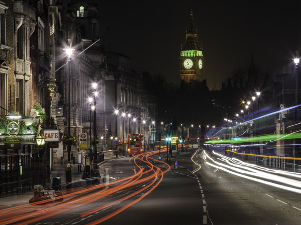
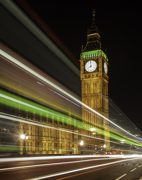
A common way you can add movement to your urban photos is by including streaking headlights and taillights. But don’t stop with capturing only the streaking lights, without regard to capturing the city. Streaking lights can work really well as an accent to a photo of your city. In other words, the streetlights don’t necessarily need to dominate the image, but rather just add a sense of movement to the overall image.

CityMotion6 Whitehall

The key to capturing this effect is to set up your shot on a tripod with a long exposure and take shots as traffic moves past you.

CityMotion4 Westminster

There are no set exposure settings because the ambient light is always different. Start with something like a 20 second exposure at f/8 and adjust from there. Try triggering the shutter just before traffic enters your frame. You will probably need to take several of these pictures to make sure you’ve got it right.

#2 – Panning

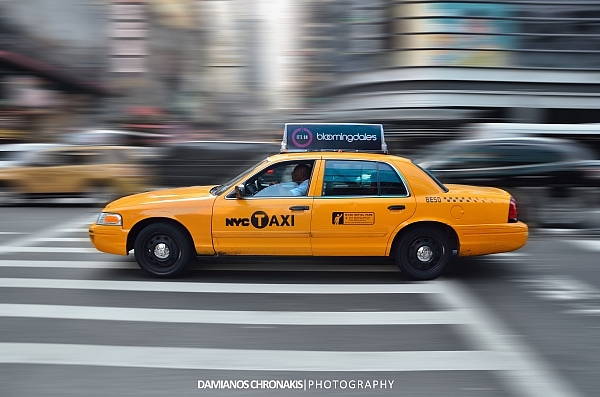
CityMotion3 NYCcab

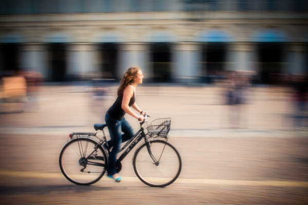
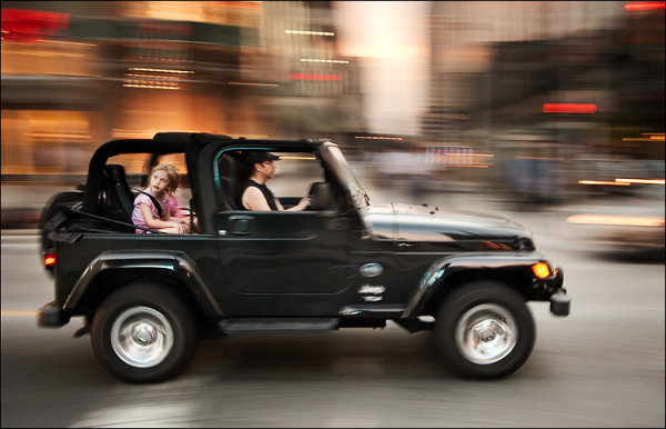
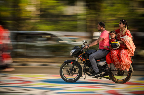
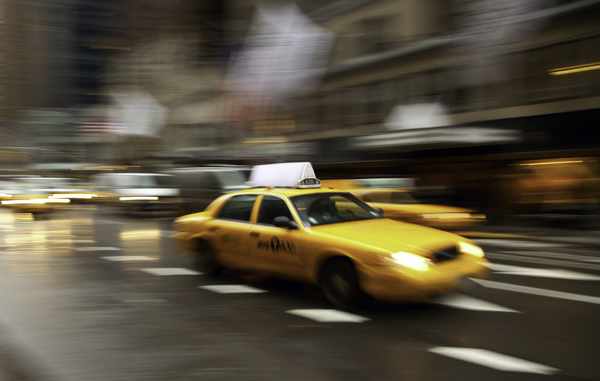
Another great but often overlooked technique for capturing motion in the city is panning. Panning is where you follow a subject with your camera so that the subject is in focus and reasonably sharp, while the background is blurry and shows a sense of motion.

CityMotion11 ChicagoTrain

Panning is great because it doesn’t require a tripod and can’t be done at any time of day. What you do is follow a moving subject with your camera at a moderately slow shutter speed. The best shutter speed for this technique tends to be between a 1/30th and an 1/8 of a second. Since the camera is moving at the same rate as the subject, the subject should be reasonably sharp, while the background will be blurred.

You can use this technique on anything that is moving, whether it be a train, a car, or even a bicyclist or skateboarder. My favorites tend to be the iconic vehicles of the city.

When you get back to the computer, you can accentuate the effect a bit in Photoshop by sharpening your subject a little bit, while at the same time adding a slight blur to the background.

CityMotion5 Trafalgar

#3 – Capture movement of vehicles

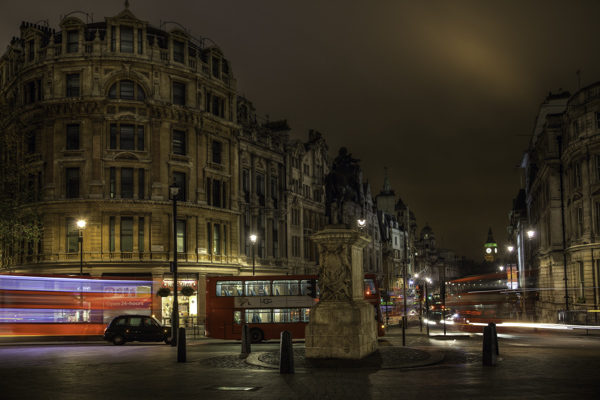
When it comes to vehicles, don’t limit yourself to streaking taillights and headlights. It often works really well just to add a slight blur to vehicles in your frame to add a sense of movement. In fact, a lot of times this adds more of a sense of movement than just having lines streaking across the image.

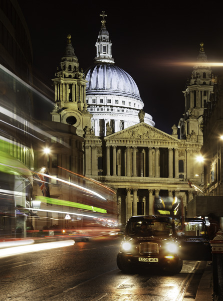
CityMotion8 Ludgate

You will want to use a tripod for these types of shots. It is important that everything be sharp except the blurred vehicle. To capture the movement, a shutter speed of just a few seconds works really well. You will probably have to take several shots to get a good one.

#4 – Capture the movement of people

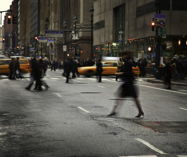
CityMotion2 OxfordCircus

The final way to capture movement in an urban setting is by capturing people in motion. This is used much less than the other techniques, largely because it is harder. People don’t have lights that streak across the screen. In addition, you have to get closer and it is more personal. But when done well, the results can be dramatic.

CityMotion9 Tube

The best way to go about it is to set up shop where you know people will be walking past you. Train stations, subway stations, and other places where people rush in and out, work really well for this. If you can use a tripod to keep the background sharp, do so.
The shutter speed will need to be a bit slower than what you use to capture moving vehicles because people move so much slower. Typically a shutter speed of about 1/2 to 1/10th of a second works pretty well.

This is another one you can do any time of day, any day of the year. It is a good thing to work on when conditions are not right for other photography you want to do.

CityMotion7 NYClady

Conclusion

Including movement can add a missing element to your urban and street photography. It is also something that you can get out and do on any particular day or night. Plus it requires no special gear. If you have a camera and a tripod, you are good to go.

So head out and try some of these techniques, and if you have any questions about it just leave it in the comments below.

The post 4 Ways to Add a Sense of Motion to Your Urban Photography by Jim Hamel appeared first on Digital Photography School.


Digital Photography School

 
Comments Off on 4 Ways to Add a Sense of Motion to Your Urban Photography

Posted in Photography


Bad Ads? Funeral Services Struggle with Sense of Humor

19 Apr

[ By Steph in Design & Guerilla Ads & Marketing. ]

Funeral Home Ads 1

This billboard, reportedly spotted in a subway station in New York City, may not be the most tactful way to drum up business for a funeral home. But you have to admit, it’s clever. Naturally, the funeral industry doesn’t have too much trouble with supply – everyone dies eventually – but they have to compete with each other just like any other business. Are the ads that manage to stand out in poor taste, or just bringing a much-needed sense of humor to the realities of death?

Funeral Home Ads 2

The Devanny-Condron Funeral Home in Massachusetts raised a few eyebrows with this billboard congratulating a local resident on her 100th birthday. Conflict of interest, anyone? In Florida, the Beckman-Williamson Funeral Home & Crematory used a little dark humor to get attention in the form of ‘Thank You for Smoking’ lighters.

Funeral Home Ad 4

These ads are funny, sure, but probably not helping diffuse the public perception of the funeral industry as a bunch of vultures lurking around waiting to pick at people’s bones. That’s especially true considering the hundreds of suicides and murders that take place on subway tracks, and the millions of smoking-related fatalities. But other ads seen as insensitive – like the one below, touting funeral pre-arrangements as a romantic Valentine’s Day gift – are simply trying to call attention to a basic fact of life that most people ignore until the last possible minute.

Funeral Home Ads 3

Attitudes about death vary wildly between cultures, religions and geographic areas, so it’s no surprise that what one person finds incredibly tacky is greeted with a smile and a shrug by another. The mere existence of cell phone-shaped caskets is enough to testify to that fact.

And while it’s easy to laugh at things like Compton’s drive-thru funeral parlor (complete with bulletproof glass) – which many people see as cheapening the lives of the dead, making the mourning process as casual as grabbing a burger and fries – perhaps there’s more to it than that. After all, your attitude about death would probably be different if you lived in a place where drive-by shootings happen on a near-daily basis, and gang-related cemetery shootouts aren’t uncommon. If you’re interested in the demystification of mortality, check out the Order of the Good Death.

Share on Facebook


[ By Steph in Design & Guerilla Ads & Marketing. ]

[ WebUrbanist | Archives | Galleries | Privacy | TOS ]


WebUrbanist

 
Comments Off on Bad Ads? Funeral Services Struggle with Sense of Humor

Posted in Creativity


Making Sense of Lightroom’s Grid View

23 Oct

Using Lightroom's Grid View

In last week’s article about Lightroom you learnt how to use Collections and Smart Collections to organise your images. Today, I’m going to take a closer look at the Grid View (part of the Library module) and show you how to customise the display.

If you’re not in Grid view, just press the ‘G’ key. It’s a keyboard shortcut that will take you to the Grid view from any part of Lightroom.

The Grid View displays thumbnails of photos contained in the currently selected Folders, Collections or search results. Here, I used the Shift+Tab shortcut to remove the left-and right-hand panels, the filmstrip and the module picker button panels from the view:
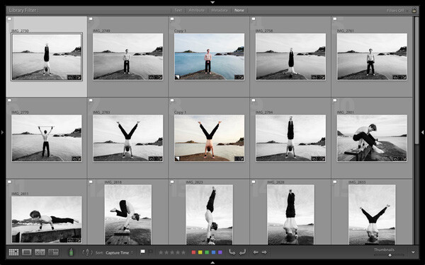
Using Lightroom's Grid View

These are the three main sections of the Grid View:
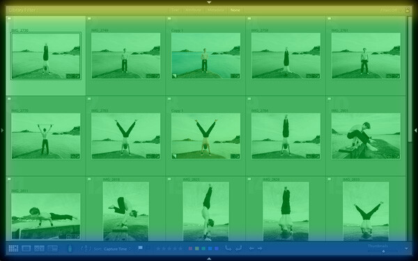
Using Lightroom's Grid View

The Filter bar: marked in yellow. Press the backward slash (‘\’) key to reveal the Filter bar if you don’t see it. You can use the same key to hide it.

The Content window: marked in green. This is where Lightroom displays the image thumbnails.

The Toolbar: marked in blue. Press ‘T’ to reveal it if you don’t see it. The same key also hides the Toolbar.

The Toolbar

There are several items on the Toolbar of immediate interest:

Using Lightroom's Grid View

These icons represent the four view modes of the Library module. From left to right they are Grid View, Loupe View, Compare View and Survey view. The Grid view icon is highlighted to indicate that it is the active view mode (I will look at the other view modes in future articles).

Using Lightroom's Grid View

The Thumbnails slider is on the right-hand side of the Toolbar. Use it to set the size of the thumbnails in the Content window.
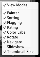
Using Lightroom's Grid View

Finally, if you click the white arrow on the very right of the Toolbar, you’ll see the above menu. Each menu item corresponds to an item on the Toolbar. The ticks indicate which items are displayed on the Toolbar. Click on any of the menu items to add or remove them.

The Content window

The Content window is where Lightroom displays thumbnails. Each thumbnail, plus the grey border around it, is called a cell. There are two types of display: Compact cells and Expanded cells.

Compact cells

This is what the Compact cell display looks like:
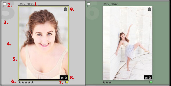
Using Lightroom's Grid View

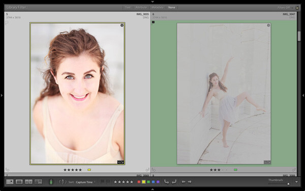
I’ve numbered the important parts:

1. The filename of the photo.

2. The white flag indicates this photo has been flagged as a pick.

3. The big number 5 shows this image is the fifth in the sequence in the currently selected folders or Collections.

4. The light grey border means this photo is selected.

5. The yellow border shows that the yellow colour label has been applied to this image. This photo is selected, so Lightroom displays a thin border. If the image is not selected, Lightroom applies the colour label to the entire border. That is why the thumbnail on the right is surrounded by a thick green border.

6. These stars show that the image has a five star rating.

7. The yellow square also indicates the colour label.

8. There are two icons at the bottom right of the photo (you may see different icons depending on what you have done to the image). The icon on the left indicates that the photo has been added to at least one Collection. The icon on the right tells you that the photo has Develop adjustments.

Tip: If you hover the mouse over an icon and keep it still, Lightroom will display a label telling you what the icon means. It appears after about two seconds.

9. The grey circle in the top right indicates that the photo has been added to at least one Collection.

Tip: To see what Collections the photo has been added to right-click on the thumbnail and go to the ‘Go to Collection’ option. Click on a Collection name to open that Collection in Grid View.

Expanded cells

Here is the Expanded cell display. The cells are larger than the Compact cells, and contain a little more information. I’ve marked the parts that are different:
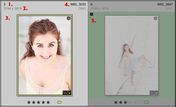
Using Lightroom's Grid View

1. The size of the number indicating that this is the fifth photo in the currently selected folders or Collections has changed.

2. These figures show the dimensions of the photo in pixels.

3. There is no flag here, indicating that this photo hasn’t been flagged as a pick or flagged as a reject.

4. The filename of the photo, with the file type (in this case, DNG) underneath.

5. The black flag indicates that this photo has been flagged as a reject. Lightroom fades out the thumbnail so you can see it has been rejected.

View Options

Lightroom lets you customise the layout of the cells so the display shows as much or as little as you wish. Go to View > View options (or use the keyboard shortcuts PC: Ctrl+J, Mac: Cmd+J) to bring up the Library View Options window. Again, I’ve marked some of the interesting menu options:

Using Lightroom's Grid View

1. Show Grid Extras. This is where you chose between Compact Cells and Expanded Cells. Untick the Show Grid Extras box if you want to simplify your display. Doing so removes the information displayed around the thumbnails in Grid View.

2. Show clickable items on mouseover only. If you untick this box every thumbnail is displayed with arrows in the bottom corners that you click to rotate the image, and a grey flag if the image is unflagged. With this box ticked, these icons are only displayed when you move the mouse over the image:
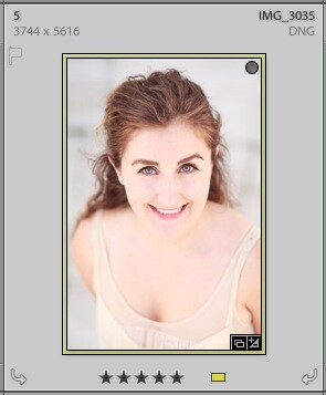
Using Lightroom's Grid View

3. If the colour labels annoy you, or you just don’t use them, untick this box to turn them off. The menu on the right lets you adjust the intensity of the colour tint.

4. The rest of the View Options let you customise what icons and information are displayed alongside the thumbnails.

Your thoughts

How do you customise Lightroom? I’d be interested to hear your thoughts, whether they are about the Grid View or another part of Lightroom. Leave a note in the comments if you have anything to share.

Mastering Lightroom Book One: The Library Module
Using Lightroom's Grid View

My latest ebook Mastering Lightroom Book One: The Library Module is a complete guide to using Lightroom’s Library module to import, organise and search your photo files. You’ll learn how to tame your growing photo collection using Collections and Collection Sets, and how to save time so you can spend more time in the Develop module processing your photos.

Post originally from: Digital Photography Tips.

Check out our more Photography Tips at Photography Tips for Beginners, Portrait Photography Tips and Wedding Photography Tips.

Making Sense of Lightroom’s Grid View

The post Making Sense of Lightroom’s Grid View by Andrew Gibson appeared first on Digital Photography School.


Digital Photography School

 
Comments Off on Making Sense of Lightroom’s Grid View

Posted in Photography


Does A Point & Shoot Camera Still Make Sense For You?

17 Dec

With the increase in capability of smartphone cameras, the argument for purchasing a point and shoot camera is quickly becoming moot. This year’s Black Friday sales figures tell the tale, with a reported 36% drop in unit sales compared to 2011, even when the price of devices stayed essentially the same (moving from an average of $ 101 in 2011 to $ 106 in 2012). The writing may be on the wall.

On the other side of the coin, for ‘experienced’ photographers, are the shortcomings with current generation smartphones:

  • Non-variable aperture
  • Little or no optical zoom
  • Poor noise performance at high ISO (very small sensor size)
  • Less pixels (noting that this is not a sole reason to purchased one camera over another)
  • Supplemental lighting (flash) is often sub-par
  • Dynamic Range suffers

Camera companies are already struggling as competition increases year after year and the market shifts. Phones, after all, are more easily updated via firmware (apps) and have the advantage of almost always being in a pocket when a photo needs to be taken. Plus they are currently light-years ahead on the grounds of ‘share-ability’ and connectedness that a new generation of owners seems to be demanding.

I have been without a point and shoot camera since I acquired my iPhone 4s this last Spring. It can’t do everything I want in a Point and Shoot. I want to shoot in RAW and I want optical zoom. But the hurdle to get me to buy a second device, at around $ 300 for the model I would want (likely a ‘tough’ camera for my type of travel and use by my daughter), is too high at this point in time.

What can the camera manufacturers do to entice people like me back to Point and Shoot cameras?

1) Keep making the ‘tough’ models. This will likely be my next purchase.

2) Make sharing very easy. I know this is difficult without putting a cell phone in the camera, but maybe that is the way to go. Or tether the camera off existing cell phones via Bluetooth or Wifi.

3) Keep the form factor small. They have this going for them as smartphones seem to be growing with a desire for bigger screens.

4) GPS is quite handy for me, but not for everyone.

5) The flash on Point and Shoots almost always rivals smartphone flashes. This needs to be highlighted and retained and is a reason I would use one in dark settings, instead of a smartphone.

What about you?

Would you buy a point and shoot camera this year or would you prefer to switch to a smartphone?

And what about those of you who own both? Do you use one more than the other?

Post originally from: Digital Photography Tips.

Check out our more Photography Tips at Photography Tips for Beginners, Portrait Photography Tips and Wedding Photography Tips.

Does A Point & Shoot Camera Still Make Sense For You?


Digital Photography School

 
Comments Off on Does A Point & Shoot Camera Still Make Sense For You?

Posted in Photography


Using Tight Framing to Create a Sense of Infinity

16 Oct

CroppingThe way you frame and crop your shots has power to give a sense of size to a scene that may not actually be there.
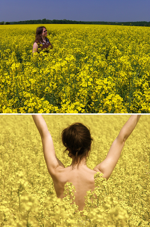
For example – the shot to the left of a field of tulips is framed in such a way that there is not beginning or end to the tulips anywhere inside the frame.

While the field tulips may in fact end just beyond the edge of the frame in any direction – the feeling that this framing gives is that of a never ending sea of tulips.

To get the effect the photographer has managed to get the angles right so that there’s no horizon and they’ve filled the frame with their subject.

To see the same principles illustrated again – check out the two following images. The first shot actually contains a lot more flowers than the second one – but because there’s a break in the flowers with the horizon there’s a sense that the flowers are limited to a certain area. Whereas the second scene could actually have a lot less flowers in it – but they go on and on in the mind of those viewing the shot.

Infinity

The same principles can be applied to numerous other situations. For example the same thing is done in the following image of a sailing boat:

Sailing

The boat is seemingly in the middle of an ocean – as there’s no end to the water in the frame. However the inclusion of land in any direction or even a horizon would have interrupted the water and given the image a different feeling.

Again it is a combination of the angle that the photographer is shooting from (from slightly above) and the framing of the subject.

Post originally from: Digital Photography Tips.

Check out our more Photography Tips at Photography Tips for Beginners, Portrait Photography Tips and Wedding Photography Tips.

Using Tight Framing to Create a Sense of Infinity


Digital Photography School

 
Comments Off on Using Tight Framing to Create a Sense of Infinity

Posted in Photography


HTC EVO 3D – new lockscreen & weather animations with Sense 3.0

08 Aug

Link: www.smartkeitai.com The HTC EVO 3D not only comes with Android 2.3.3, but it also features HTC’s updated interface, Sense 3.0. In this video, we take a look at two new prominent features of the Sense experience, the customizable lockscreen and redesigned weather animations. As you will see, the lockscreen can be switched with different features and there are now four changeable shortcuts along the bottom to launch directly into specific applications upon unlocking the device. The weather animation have been revamped as well, which is a welcome addition since the older animations were starting to feel somewhat stale. HTC EVO 3D Unboxing Video: www.smartkeitai.com HTC EVO 3D Benchmark tests: www.smartkeitai.com Visit us: smartkeitai.com Follow us twitter.com Subscribe to our channel: youtube.com Like us: facebook.com If you enjoyed the video, please give it a thumbs up and subscribe to our channel.
Video Rating: 4 / 5