RSS
 

Posts Tagged ‘room’

The City Is Your Living Room: 15 Modern Street Furniture Designs

01 Sep

[ By SA Rogers in Design & Furniture & Decor. ]

city furniture main

Smart, well-designed urban seating encourages more interaction with the cities we live in and with each other, infusing them with vibrancy and a sense of connection. It’s even cooler when it’s built right into a park or sidewalk as a multifunctional element to add some sculptural visual interest, delineate different zones or offer opportunities for fitness and play.


Just a Black Box: Furniture Transforms Into Kiosk

city furniture black box 1

city furniture black box 2

city furniture black box 3

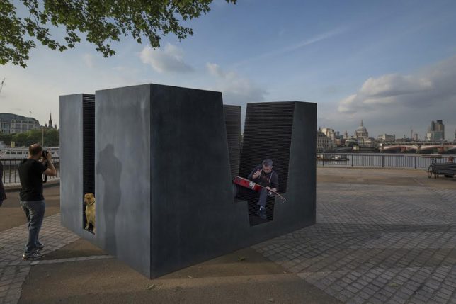
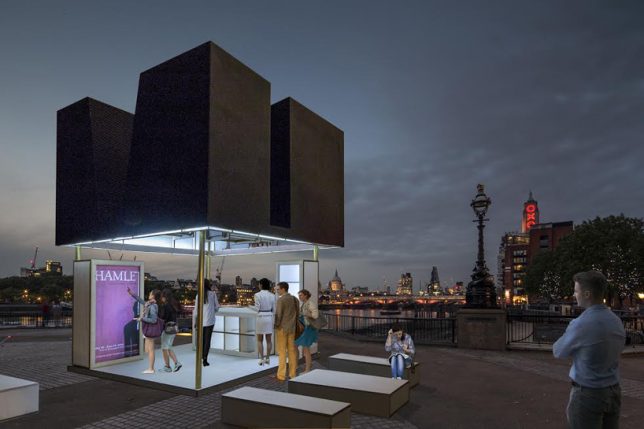
A cube of semi-private seating by day, ‘Just a Black Box’ by Max Boano and Jonas Prismontas transforms into a kiosk for commercial or public use at night (or whenever else it’s desired.) The box elevates itself on its own hidden hydraulic columns to become a customizable space that can be used for retail, cafes, bike repair, selling tickets or even as a mini theater.

3 Urban Hammock Installations

city furniture hammock

city hammocks 2

city hammocks 3

city hammocks 4

city hammocks 5

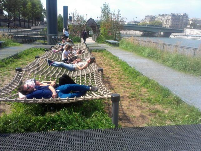
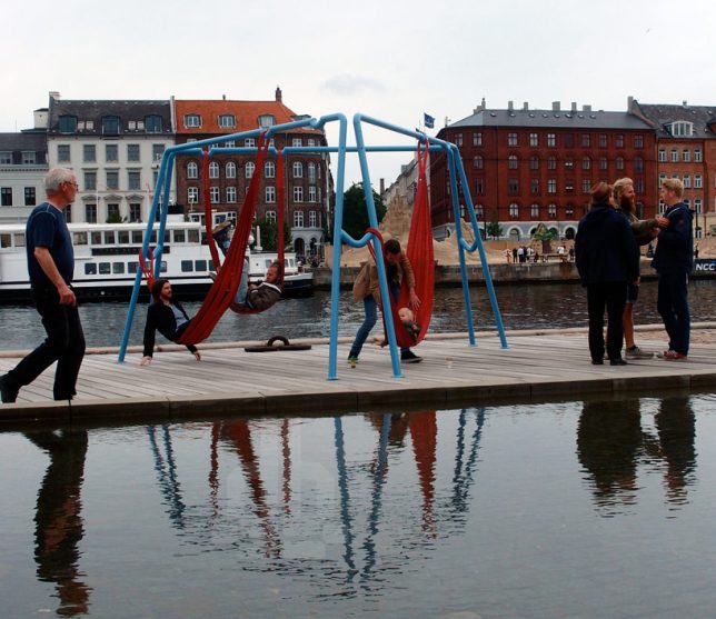
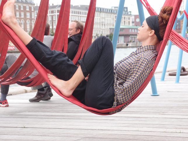
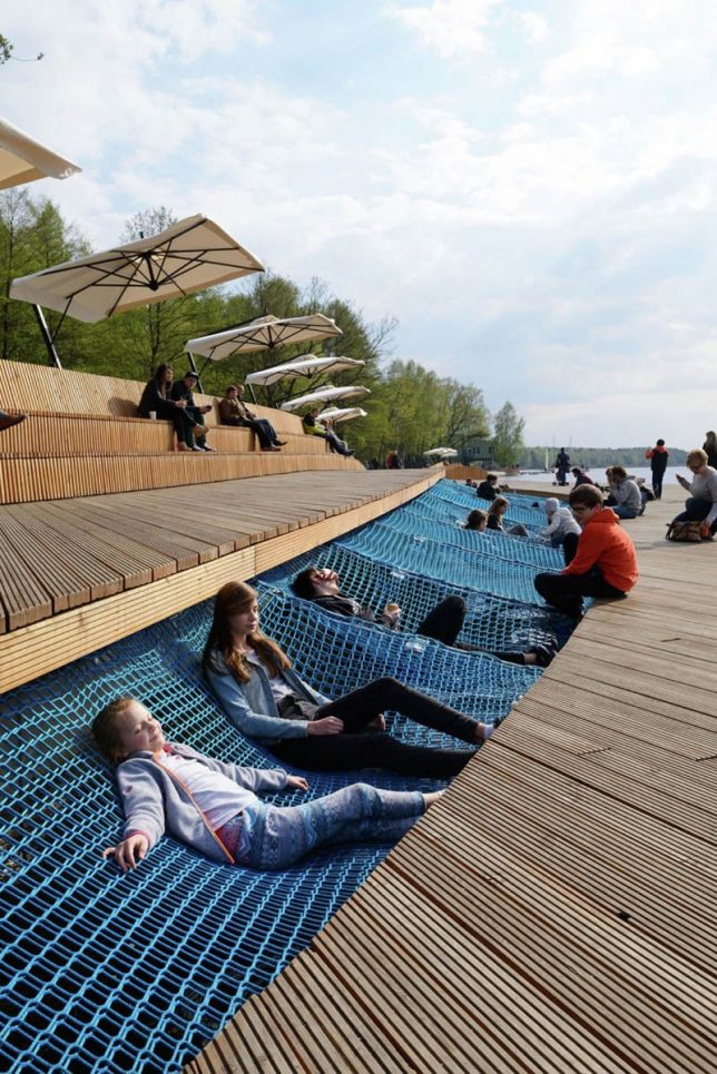
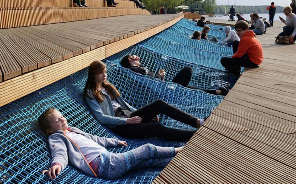
Comfy hammocks come to public spaces in various forms to create some of the most nap-worthy urban furniture you’ll ever see, including a series of nets strung over the grass by The Chartered Institute of Housing, bright blue hammocks inserted into a void in a promenade along Paprocany Lake in Poland, and re-purposed fire hoses hung from a steel grid in Copenhagen.

Vanke Cloud City by Lab D+H

city furniture cloud city 1

vanke cloud city 3

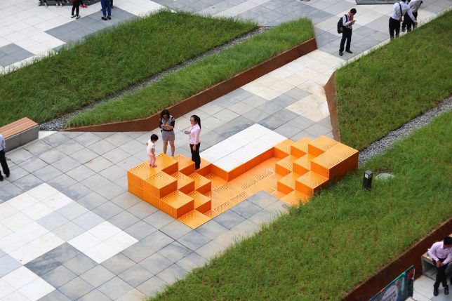
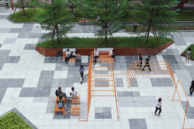
Vanke Cloud City is a mixed-use development project in Guangzhou, China boasting a series of creative public seating strategies by Lab D+H. The Cloud Line is a continuous tubular steel structure offering benches, monkey bars, parallel bars and other uses, while Cloud Seat is a modular set of interacted spaces made of perforated steel plate, with vertically stacked seating.

Meeting Bowls for NYC

meeting bowls meeting bowls


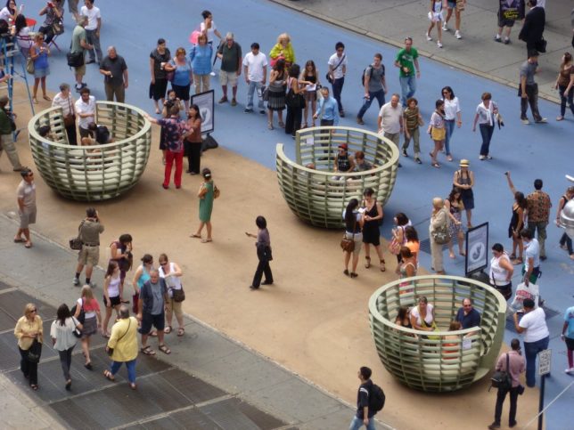
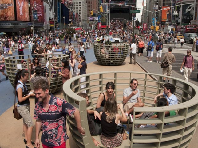
Small groups can get together and chat face-to-face in a comfortable, breezy space with ‘Meeting Bowls’ by the Madrid-based design firm mmmm… in partnership with the Times Square Alliance. The urban furniture installation was situated in the center of Manhattan’s busiest plaza in summer 2011to facilitate interactions and dialogue between friends and strangers alike. The base of each bowl gently rocks to imitate the sensation of floating.

Next Page – Click Below to Read More:
The City Is Your Living Room 15 Modern Street Furniture Designs

Share on Facebook


[ By SA Rogers in Design & Furniture & Decor. ]

[ WebUrbanist | Archives | Galleries | Privacy | TOS ]


WebUrbanist

 
Comments Off on The City Is Your Living Room: 15 Modern Street Furniture Designs

Posted in Creativity


Google brings the National Parks to your living room with 360-virtual tours

26 Aug

In honor of the National Parks Centennial birthday celebration, Google has partnered with the National Parks Service to bring a unique and exciting virtual immersion experience to your fingertips. The Hidden Worlds of National Parks is a new exhibit that is part of Google’s larger Arts and Cultures Exhibit and Documentary series. In this new series, users will be able to visit and interact with some of the more obscure National Parks in the United States, such as the Dry Tortugas in Florida and the Kenai Fjords in Alaska through VR and 360 degree video tours. 

In the video experience a National Parks service ranger will guide you through one of the five park options. Users will be taken on unique guided tours such as a hike through the lava flows in Hawai’i, a kayaking trip through the Fjords in Alaska or a snorkeling trip through the coral reefs in the Dry Tortugas of Florida.  

The virtual tours are available online and in the Google Arts & Culture App which is available for both iOS and Android device platforms. 

Articles: Digital Photography Review (dpreview.com)

 
Comments Off on Google brings the National Parks to your living room with 360-virtual tours

Posted in Uncategorized


Expanding the ISS: Inflatable Space Hotel Room Sent into Orbit

13 Apr

[ By WebUrbanist in Boutique & Art Hotels & Travel. ]

space hotel room

A new space hotel room will be the first addition to the International Space Station in years, part of a test to see whether inflatable rooms can serve as more compact and space architecture on demand, unlike rigid frame space hotel concepts.

The Bigelow Expandable Activity Module (BEAM) developed by an aerospace company in Las Vegas is comprised primarily of a light and flexible fabric that unfolds when inflated, creating a bubble-shaped room. The eventual plan: use this as a prototype for space tourism, creating housing when and where it is needed both attached to and beyond the ISS.

NASA Deputy Administrator Lori Garver is given a tour of the Bigelow Aerospace facilities by the company's President Robert Bigelow on Friday, Feb. 4, 2011, in Las Vegas.  NASA has been discussing potential partnership opportunities with Bigelow for its inflatable habitat technologies as part of NASA's goal to develop innovative technologies to ensure that the U.S. remains competitive in future space endeavors. Photo Credit: (NASA/Bill Ingalls)

Launched into orbit with help from SpaceX, the module is lighter and more compact, thus more cost- and fuel-efficient to ship, and, when not in use: it can also fold back down for storage. A testing period over the next few years will help researching astronauts evaluate its performance, including its ability to withstand micro-meteoroid impacts, radiation and temperature fluctuations.

Share on Facebook


[ By WebUrbanist in Boutique & Art Hotels & Travel. ]

[ WebUrbanist | Archives | Galleries | Privacy | TOS ]


WebUrbanist

 
Comments Off on Expanding the ISS: Inflatable Space Hotel Room Sent into Orbit

Posted in Creativity


Remodeling a Room? Think Like a Photographer

22 Dec

Long-time readers of this site are already familiar with my family, having watched my kids grow up in photos. Seen above, on the left, is my daughter Emily. You guys met her when she was eight.

She’s seventeen now, and headed off to college next year. Which meant this is the last time we’ll put up a Christmas tree while we are all living here together.

I have always tried take lots of photos around the holiday season. And even more so, now that the kids will be graduating soon. And as we have successively remodeled many of the rooms in our house, I have made it a point to pay special attention to the lighting.

Why? Because you can get a lot of bang for your buck when it comes how a room looks just by thinking like a photographer during the remodel. And another bonus is that your quick available light grab shots will look much better, too. Even if you are just using your iPhone to shoot it.

Take the living room, for instance. Before remodel, it was lit mainly by a small, four-bulb fixture attached to a ceiling fan. You can probably imagine just how flattering this wasn’t. And it was something that bugged me enough to lobby to get rid of the fan just so we could have more of a choice about our lighting.

In the end, I got the okay. And I have long been happy that we did it. Here’s a quick run-through on the decision process for this room, in the hopes that it’ll inspire you to think about how you can use your lighting skills to improve the quality of any room you might choose to remodel in the future.
__________
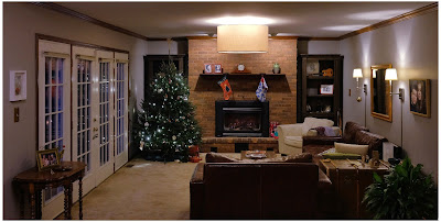
Here’s a photo of the living room as it exists now. Mind you, this is purposely shot available light, as that is kinda the point. The lighting in the room is not designed to exist in an overall interior shot. (In fact, that’s kind of impossible if the lights are part of the subject matter.)

But here it is, exposed for the room rather than for the light sources, to give you a sense of how the lights are distributed.

First and most important is the drum lamp hanging from the center of the ceiling. Remember the four-banger bare-lamp light I mentioned earlier? That’s long gone, and replaced by what is essentially a soft box pointing straight down. It’s three feet across; a legit beauty light.

And the arrangement of the room around the light means that anyone sitting in the room is sitting under a quality light source, and at a good angle. The only harsh place to be around this light would be directly under it. And you can’t go there. Because guess where we put the coffee table.

So if you are sitting on the sofa or the love seat or the chair, you look good. When you’re in the room the effect is not unlike sitting in a lounge in a nice hotel, where they have taken the time to design the light for the effect that they want.

And standing or sitting, pretty much anywhere in the room, a snapshot of you is gonna be reasonably flattering at the very least. And that’s true whether it was shot on a purpose-built camera or a smartphone. To wit, the example at top of the page.

Over at camera right are two wall lamps, which serve to fill the shadows of the overhead “key” light—or to become pretty nice rim lights for someone sitting on the couch. No major surgery here, as the lamps came with conduit assemblies to run the cords right down the wall. They’re just plugged in behind the couch.

At back are two “can” lights in the ceiling, washing down on the fireplace. They just keep it from going super dark back there. (And of all of the lights, they are the only ones that are built-in, and pre-dated the remodel.)

Two other items of note. One, the lights are all on dimmers. This gives us tons of control of both the absolute level of light and the lighting ratios between the different planes. You really can accomplish a lot of looks with a few different planned-out light sources and some dimmers.

And two, all of the lights are LEDs. Which means that this entire room—seven bulbs—totals only about 36 watts of energy consumption. And that is if they are on full-blast, which they almost never are. I just nuked them up to buy myself some exposure here. We normally keep them pretty subtle and balanced. But that also would look bad in a photo because a light cannot easily serve as both subject matter and light source.

But dialed down, I would guess we are typically lighting the room with around ten watts of power, total. It’s just well-distributed.
__________

Remodel Like a Photographer

When choosing lights for a room remodel, here are some things to think about.

• If you can spring for a big, soft main source, splurge. You won’t regret it. This could mean a drum lamp (we had ours made here) or a light that bounces off the ceiling. In our case, the main light does both. Unseen (from almost exactly my camera position) is a smaller version that hangs down over our dining table. The two light their assigned spaces beautifully and tie the double room together visually.

• Think of task lights as doing double-duty. First, they accent a room. Second, they fill the main light. Oh, wait, make that three—they can also create mood by dimming them down and using them without the main.

• LED bulbs are getting better and better—they have passed CFL lights—and will save you tons of money over their lifespan. Good quality ones are as low as $ 5 at Home Depot (these are Philips, FYI.) The room shot above is a poor representation of the light color/quality. That’s because the lights are serving as both light source and subject. If I chose one or the other (as in the top photo) they would look good. And to the eye they look great.

• Dimmers on each circuit and dimmable LED bulbs will give you lots of options to shape the room. Just make sure to use modern “triac” style dimmers (most all sold today are this type). Those work best with LED lights and also don’t just waste energy through resistors when you dim down.

• In the overall cost scheme of remodeling a room, decent lighting design (and the forethought of a photographer’s approach to lighting) is about the best value you can get for your dollar. I’ve done this with every single room we have remodeled, and have been really pleased with the results.
__________

While we’re here, from our family to yours, Merry Christmas.

Oh, and check back in next week if you get a chance. We are going to unwrap a project we’ve been hard at work on for three years.
Strobist

 
Comments Off on Remodeling a Room? Think Like a Photographer

Posted in Photography


Room to Read in a Digital World: 14 Modern Library Designs

03 Sep

[ By Steph in Architecture & Public & Institutional. ]

modern libraries monterrey 1

Shifting from paper to digital media hasn’t diminished the role of libraries in our communities, with many modern designs expanding to serve as cultural hubs with cafes, soundproof video rooms and even lookout points with panoramic views of the surrounding city. These 14 designs combine older traditions with new materials, programs and functions, juxtaposing thousands of years of collected knowledge with dazzling structures made of steel, timber and glass.

Revamped Medieval Tower Library

modern libraries medieval tower

modern libraries medieval tower 2

modern libraries medieval tower 3

The crumbling medieval Torre del Borgo in northern Italy gets a new life thanks to a stabilizing renovation that added a stacked timber volume for addition space and outfitted the inside with a ribbon-like black staircase. Architect Gianluca Gemini strengthened the existing walls, added more windows  and created a means of getting to each of the four levels that also functions as a sculptural centerpiece.

Historic Chapel Turned Modern Library  in Italy

modern libraries chapel 1

modern libraries chapel 2

modern libraries chapel 3

modern libraries chapel 4

A sleek perforated aluminum tower contrasts with the traditional architecture of a former chapel in Lonate Ceppino, Italy, transforming it into the ‘Elsa Morante’ public library. DAP studio contrasts old and new, airy and solid, connecting the modern volume to the pre-existing structure with glazed passageways.

Monterrey Library by Anagrama

modern libraries monterrey 1

modern libraries monterrey 2

modern libraries monterrey 3

Built-in wooden bookshelves curve up and connect to form a cocoon-like architectural feature at the Monterrey library by Mexico City-based studio Anagrama. Set within a staircase, this unusual space doubles as a reading room, with padded bench seats  on either side of the steps.

Barn-Like Timber Dainville Library

modern libraries dainville

modern libraries dainville 2

modern libraries dainville 3

Formerly a farm building, the squat brick section of the original Danville Library gets a beautiful and functional barn-like addition to bring it into the modern era, with timber slats adding architectural interest and screening the interior from direct sunlight. The new gabled areas by BplusB architects give the interior a cathedral-like feel.

New Library for Baghdad by AMBS Architects

modern libraries baghdad

modern libraries baghdad 2

modern libraries baghdad 3

The first new library for Baghdad since the 1970s, this unusual structure by AMBS architects takes its shape from the arabic Kufic word for ‘read.’ Stretching out into a lake, the building will feature the world’s largest reading room as well as a massive double-curved glass roof to flood the interiors with natural light.

Next Page – Click Below to Read More:
Room To Read In A Digital World 14 Modern Library Designs

Share on Facebook


[ By Steph in Architecture & Public & Institutional. ]

[ WebUrbanist | Archives | Galleries | Privacy | TOS ]


WebUrbanist

 
Comments Off on Room to Read in a Digital World: 14 Modern Library Designs

Posted in Creativity


Weird Wooden Room: See the Sea From A New Perspective

30 Jun

[ By Steph in Art & Installation & Sound. ]

wooden room 1

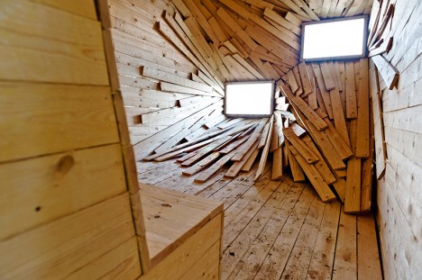
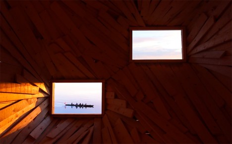
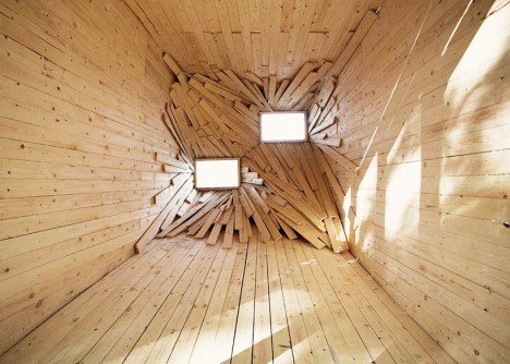
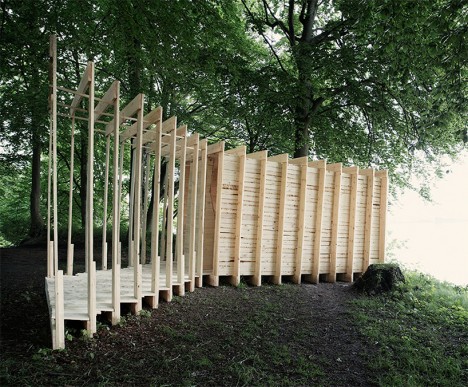
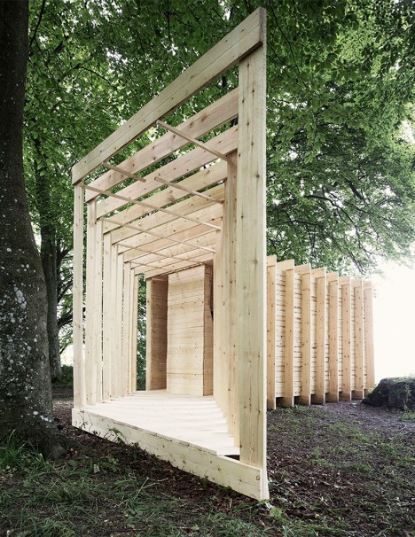
Two perfect rectangles of sea and sky are framed like paintings within a surreal wooden observation structure, inviting visitors to experience coastal Denmark from a new perspective. ‘New Horizon’ is a sculpture by Paris-based firm Atelier 37.2 created for the 2015 Sculpture by the Sea festival, drawing in guests from a forested path right to the edge of a hill overlooking the water.

wooden room 2

wooden room 6


wooden room 5

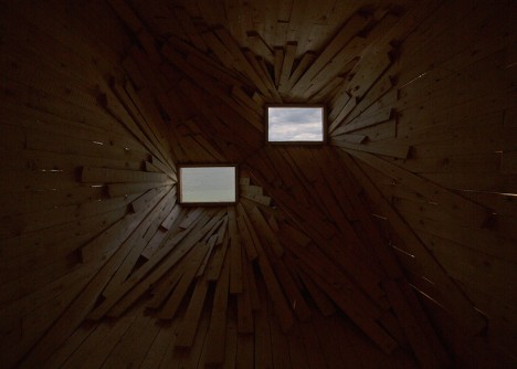
The accordion-like structure stretches in two angled sections, one open to the surrounding woods and the other an enclosed room filled with a chaotic assemblage of planks. This room looks dramatically different depending on the time of day, with sunlight streaming in and highlighting the space itself in the morning. As the sun makes its way to the other side of the sky, the space darkens, putting the focus squarely on the framed viewpoints.

wooden room 4 wooden room 3

As the artists themselves describe it: “Playing with classical perspective deconstruction, from the inside the horizon line disappears. Experience the landscape as two monochromatic ever-changing Rothko paintings.”

Share on Facebook


[ By Steph in Art & Installation & Sound. ]

[ WebUrbanist | Archives | Galleries | Privacy | TOS ]


WebUrbanist

 
Comments Off on Weird Wooden Room: See the Sea From A New Perspective

Posted in Creativity


Room in a Box: Portable Tool-Free Bedroom Set in 30 Minutes

26 Jun

[ By WebUrbanist in Design & Furniture & Decor. ]

room boxxx

Containing a room’s worth of essential furniture you can take on the bus or train, this all-in-one-box solution costs just $ 150, is easier to assemble than IKEA equivalents and much lighter too, with wheels as well for added mobility.

room box assembly

room box in a box

While requiring no tools or glue, the would-be catch is that the kit is made of cardboard – however, its makers have delivered on over 40 projects of that same material to date, making them experts at rendering it robust and durable. For those who only need some of the composite pieces: each element can also be converted to other purposes – the bed supports, for instance, can be stacked into shelves or other forms of storage.

room box bed

room box design

The box contains a chair, desk, bin, dresser and bed supports which double as storage, each designed to be load-bearing as well as water-resistant, able to be reused for years by students or other young adults. The entire system can be assembled or deconstructed within a half hour and the pieces weigh around seven pounds each, all making moves between dorm rooms and storage much simpler.

room box shelves

room in a box

From the creators of Room in a Box: “Every piece of furniture can be assembled with no tools or glue by folding and slotting the pieces, and can be taken down and packed back into the box.  When you are done with the furniture it can be recycled or reused in its entirety. This makes for versatile furniture which can be used in many different ways and configurations.  The design of the furniture also includes sliding drawers for storage (with stoppers) which double as handy moving boxes.  “

Share on Facebook


[ By WebUrbanist in Design & Furniture & Decor. ]

[ WebUrbanist | Archives | Galleries | Privacy | TOS ]


WebUrbanist

 
Comments Off on Room in a Box: Portable Tool-Free Bedroom Set in 30 Minutes

Posted in Creativity


Split Personality: Chaos vs Calm in Half-Painted Hotel Room

04 Jun

[ By Steph in Art & Installation & Sound. ]

half painted hotel room 1

This hotel room is a little bit minimalist, a little bit rock n’ roll, and if you’re too much of the former persuasion, the chaos of the latter half might irritate your less-is-more sensibilities. Seen straight-on, the installation by Kiev artist Pavel Vetrov looks like a Photoshopped illusion, or perhaps a split view of a before-and-after design project. Which side is the before and which the after depends on your aesthetic preferences.

half painted hotel room 2

half painted hotel room 3

A razor-sharp line divides the two halves of the room, beginning at the top of the back wall, traveling right through the center of the bed and across the floor to the other wall. Everything from the duvet and TV cabinet to the books and a canvas propped against the brick gets the half-painted treatment.

half painted hotel room 3

half painted hotel room 4

half painted hotel room 5

On the minimalist side, nearly everything is colorless, save for a few pops of vibrancy in the wall art. The other side is a creative explosion of paint and prints, with designs scrawled all over nearly every surface.

half painted hotel room tilt

The installation is inspired by a 2012 project called ‘Panic Room’ by French graffiti artist TILT, who took one half of a monochromatic hotel room and completely obliterated every hint of white. The original state of the room reflects a feeling of calmness, while the other half is utterly chaotic, hence the project’s name.

Share on Facebook


[ By Steph in Art & Installation & Sound. ]

[ WebUrbanist | Archives | Galleries | Privacy | TOS ]


WebUrbanist

 
Comments Off on Split Personality: Chaos vs Calm in Half-Painted Hotel Room

Posted in Creativity


16 Fun Kids Room Ideas Will Make You Want to Shrink Yourself

17 Mar

[ By Steph in Design & Furniture & Decor. ]

treehouse bedroom

Why don’t rooms for adults come with cool tent-shaped beds, oversized Legos, slides, tree houses and secret compartments? These fun and imaginative kids room ideas include furniture with built-in entertainment, fort kits, fully customized themed rooms complete with murals and even a three-story slide built into the design of the house.

Tent, Playhouse and Camper Beds

kids furniture tent beds

kids furniture playhouse beds

kids furniture caravan bed

Design firm Mathy by Bols has created a series of handmade kids beds shaped like tents, caravans and treehouses. The A-frame Cabin Tent Bed features a closable side panel and a bottom section that pulls out to offer storage or a second mattress, the Camper Bed looks like a mini teardrop trailer with a toy box mounted to one side, and the Treehouse Bunk Bed will definitely have kids fighting over who gets to sleep on top.

Fold-Up Staircase to Slide Converter

kids furniture staircase slide 1

kids furniture staircase slide 2

Any staircase turns into a slide in seconds with the ‘SlideRider,’ an extra-long foam mat with safety bumpers on the sides that stretches over stairs and then folds up neatly when it’s time to put it away.

Imaginative Wooden Kids Beds with Slides

kids furniture wooden beds 1

kids furniture wooden beds 2

kids furniture wooden beds 3

Each design in the Rhapsody collection of kids’ beds from CedarWorks is a fantasy world of its own, with a variety of play areas built in ranging from slides to ‘secret’ rooms. They offer so many opportunities for self-entertainment, you might just get a little bit of extra sleep in the morning while the kids keep themselves busy.

LEGO-Inspired Kids Furniture Collection

kids furniture lego inspired

Kids Furniture LEGO 2

The LEGO Furniture Collection for Kids by Lola Glamour uses the look of these iconic plastic brick toys to make a big visual impact in children’s rooms. The ones mounted to the bed hide drawers and cabinets, while the rest are purely decorative.

Custom Treehouse Bedroom

kids furniture treehouse bedroom

kids furniture treehouse bedroom 2

A swing, a fake tree, climbing ropes and a storage platform that doubles as a stage aren’t even the coolest things about this imaginative kids’ bedroom idea – that honor goes to the awesome miniature treehouse tucked up into the corner of the room next to windows overlooking the yard.

Next Page – Click Below to Read More:
16 Kids Room Designs Thatll Make You Want To Shrink Yourself

Share on Facebook


[ By Steph in Design & Furniture & Decor. ]

[ WebUrbanist | Archives | Galleries | Privacy | TOS ]


WebUrbanist

 
Comments Off on 16 Fun Kids Room Ideas Will Make You Want to Shrink Yourself

Posted in Creativity


Home Room: Plug-and-Play Modules Make Instant Living Spaces

17 Feb

[ By WebUrbanist in Design & Fixtures & Interiors. ]

cubitat bed pull out

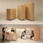
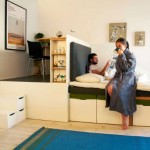
Resembling a house turned inside out, the Cubitat is a hybrid architectural and interior design prototype designed to be a modular all-in-one solution that can turn any empty space into your new home on demand.

cubitat interior architecture hyrbid

In essence, it takes the idea of a mobile kitchen island and expands the concept to include everything you need to live, containing a bathroom inside and featuring an array of furniture and fixtures on its exterior.

cubitat bathroom interior design

Certain novel applications seem particularly promising, like quickly upgrading old condo spaces or converting open-plan warehouses, factories or schools, for instance, into instant apartments.

cubitat shower storage space

A pullout bed on one side slides open while panels above reveal a series of shelves, including one that can be fitted with television. A sink and stove, some storage and other kitchen amenities can be found on an adjacent face of the cube. Individual pieces and parts can be swapped out over time as needs change or things wear out as well.

cubic habitat module

A collaboration between Luca Nichetto and Urban Capital, the design is made to be as portable as possible, constructed from prefabricated parts but also made to be assembled and deconstructed with ease. It features durable laminate surfaces on the outside and warm wood accents within (all materials could, of course, also be customized by buyers).

cubitat mobile home kitchen

From the designers: “Fitting the bathroom in was our biggest challenge. The only way to approach it was to start with that, and place everything else around it. There’s no reason why it couldn’t be built with that as the central piece, with smaller cubes plugged in around it, like a giant Rubick’s cube. Just plug in all your ’colours’ once the middle is in place.”

Share on Facebook


[ By WebUrbanist in Design & Fixtures & Interiors. ]

[ WebUrbanist | Archives | Galleries | Privacy | TOS ]


WebUrbanist

 
Comments Off on Home Room: Plug-and-Play Modules Make Instant Living Spaces

Posted in Creativity