RSS
 

Posts Tagged ‘Process’

5 Creative Ways to Process Infrared Photographs in Photoshop

21 Jun

Digital cameras have made the process of infrared photography relatively simple and very accessible, compared to the days of shooting with infrared film. No darkroom is required and all you need to get started is an infrared filter on your lens (click through to read my article on How to do Surreal Digital Infrared Photography Without Expensive Gear or Camera Conversions) and to mount your camera on a tripod. Maybe you’ve tried digital infrared photography already. You’ve learned all the correct infrared shooting and compositional techniques so you know you have great images in your camera, but how do you transform those strange looking red or violet frames into stunning infrared photographs?

Here are 5 creative ways to process your digital infrared images in Photoshop to create arresting photos in color, and Black and White.

1) Color infrared one-click post-processing method
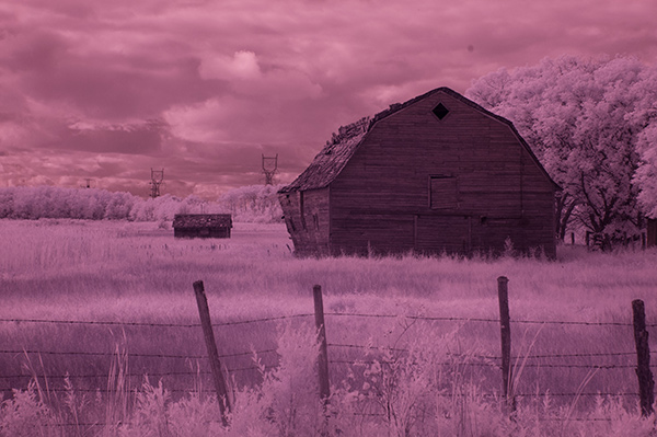
_DSC5456AsShot

As shot, before Auto Tone

This is the quick and instant method. Open your image in Photoshop and go to Image> Auto Tone. Look at the difference this one click makes! In fact Auto Tone should be the first thing you do to all your infrared images.
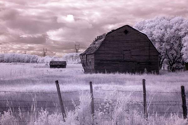
infrared image with autotone applied

Same image after Auto Tone has been applied

This has become a perfectly delightful infrared image. It has a variety of textures and colors for interest. However you may want to further process it to add more WOW and impact. The next step adds a few more tweaks that will help you do this.

 2) Color infrared gradient method

After you apply Auto Tone, you can also apply a Gradient Layer and set the blending mode to Soft Light, or Hard Light – you’ll need to experiment a bit depending on the tonal qualities of your original image. You can also adjust the opacity of this gradient layer.  If you are familiar with layer masks, you may want to mask out any areas where the gradient might be too strong.

Here is the same image with the Gradient Layer added. Can you see how it adds a little more depth and drama?
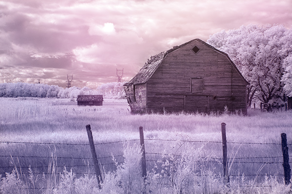
infrared image with post processing added.

Infrared Image with a Gradient Layer Added
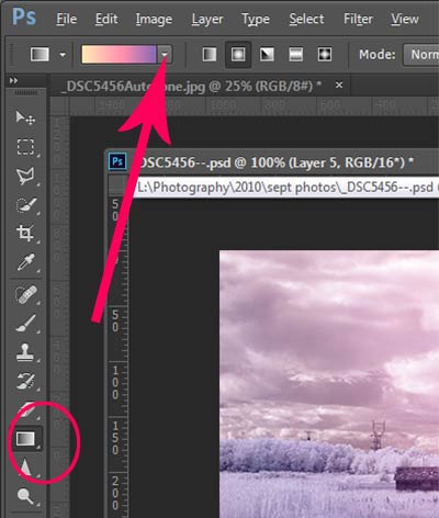
gradient-toolTo add a Gradient Layer, go to your Layers palette, and click on the new layer icon at the bottom (it’s the one that looks like a sheet of paper with the corner turned up) or you can use  the keyboard shortcut Shift+Ctrl+Alt+N.  I find it quicker to use the icon in this case. While this new layer is active, go to the Tools palette and select the Gradient tool. On the context menu on top of the window you’ll see the Gradient library and you can select your pre-set gradient from there.

Now, back on your layer, drag your mouse to get the gradient on your image.  Select the blending mode to soft light or hard light and then adjust the opacity. This is where your artistic eye comes into the picture.  Play around with these settings until you have something you like.

Here is another infrared image processed the same way. You don’t have to use the same gradient each time – experiment a bit and see how things turn out. It’s art after all!
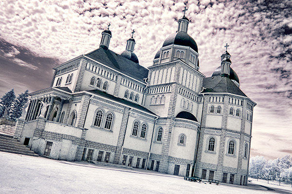
infrared image with a gradient texture.

3) Using the Camera Raw filters and the Channel Mixer

One of the key concepts in infrared photography is to have a very distinct separation of color tones between the sky, and your high infrared reflecting subjects. This is usually the grass and foliage in your scene, or it could be buildings or other subjects that reflect infrared light because of their paint or construction materials.  But it’s important to have this separation because you need the sky to be dark, and you’ll want the foliage to be light, if not pure white.

Happily, in Photoshop you can give a tonal boost to your images in a couple of way,s in addition to the Auto Tone setting.  After you’ve applied Auto Tone, look for the Camera Raw Filter under Filters. If your image is not a RAW file you can still use these adjustments, although it is best to shoot RAW when capturing infrared photos.

In the Camera Raw Filter, to get this color separation between the light and dark areas of your image, use the the Basics filters and  HSL/ Greyscale Slider to adjust the colors until you get a clear difference between the cyan and red shades.

 Original image as shot:

1as-shot-infraredimage

After applying Auto Tone and Using the Camera Raw Filters:
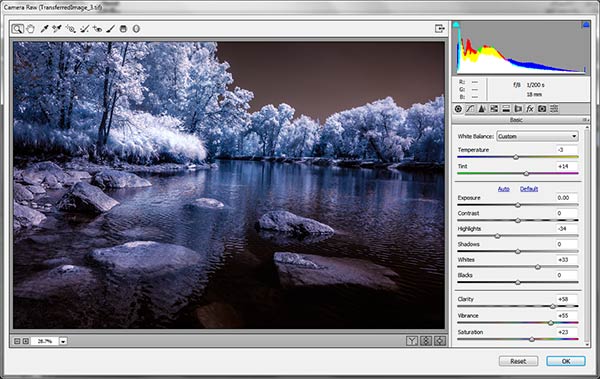
2cameraraw

Notice how these adjustments bring out the red in the sky and the blue in the leaves.

Now to the Channel Mixer

Go to Image>Adjustments>Channel Mixerchannelmixer
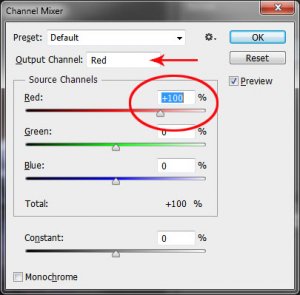
Here we will “swap” the channels to get a nice  blue sky and red or purple, and in a few quick steps, white foliage. Your Channel Mixer will look like this:

In the Red Output Channel, change the Red slider from +100 to 0, and the Blue slider from 0 to +100. Change the Output Channel drop-down to Blue, and make the Blue slider +100 and the red slider 0.  Your image will look something like this:
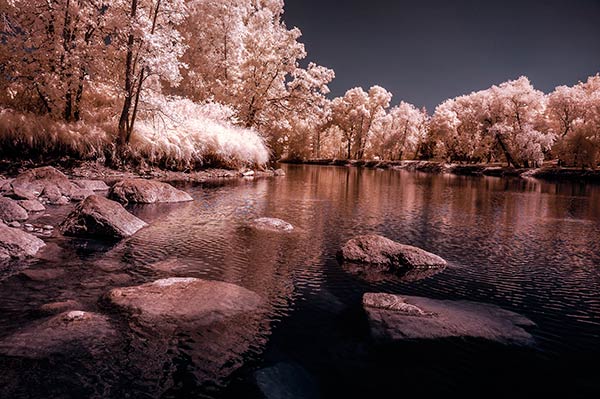
3infraredwithchannelmixer

There is a clear color difference now between the blue sky and the red foliage.  It doesn’t matter if the foliage of your image is purple and  the sky blue, as long as you can see a clear difference in colors with the sky having some shade of blue.

Now the last part. Go back into your Raw Filters, and in the Basic panel, move the White Balance Color Temperature slider to the left to get a nice blue sky.  In the HSL/ Greyscale tab, use the sliders in the Saturation tab to desaturate the colors of your foliage.  Your image should have a blue sky and white leaves and grass. Gorgeous!

The final image

4infraredwithcameraraw2-FINAL

 4) Instant Black and White infrared processing

This is a “quick and dirty” method for getting the classic infrared look from your captures. You’ll get the tell-tale light colored foliage, and dark skies. For best results your image should have a clear sky with some clouds for effect. Overcast skies detract from the image, leave things without enough contrast, and very flat. No clouds make the sky seem like a vast black void – not too interesting.
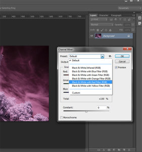
2StepprocessingblackandwhiteinfraredClassic black and white infrared images tend to be non-contrasty, so from an artistic perspective a blue sky with wispy or puffy clouds can really add interest to your image, create a powerful story, and keep that soft contrast intact.

  1. Open your image in Photoshop
  2. Go to Image>Auto Tone
  3. Next go to Image>Adjustments>Channel Mixer>Black and White with Red Filter (From there you can adjust the sliders to get the effect you want)
  4. To get the classic infrared glow, check to make sure that in the Tools palette the colors are set to the default – black foreground and white background. To be sure, a simple way to set this is to hit the letter D to reset the colors to the default state.
  5. Then duplicate your layer (Ctrl J), and go to
  6. Filters>Filter Gallery>Artistic>Diffuse Glow
  7. In the Diffuse Glow filter, set the sliders so you can see some halo glows around the white areas of your image. You will have to adjust these to suit your image but it will create the classic graininess and glow of film infrared photos.

If the glow amount is too strong and you’re getting blown out highlights, you can decrease the opacity of your glow layer in the Layers Palette. A little experimentation goes a long way. Remember your History palette in case you want to go back a few steps.
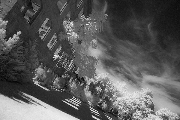
4blackandwhiteinfraredFianlwithglow

5) Advanced Black and White infrared processing

This is the method I use most for processing Black and White infrared images. It’s easy and it gives you far more control of your final result.

  1. Open your image in Photoshop
  2. Go to Image>Auto Tone
  3. Now create an adjustment layer for Color Balance.
  4. Layer> New Adjustment Layer> Color Balance

Again, the idea is to get as much color distinction between the sky and any foliage. Color Balance provides an addition method of doing this – in Black and White processing, as well as for color.

  • Move the sliders for Midtones, Shadows and Highlights until you have a nice, distinct separation of your color tones betweeb your foliage and your sky.
  • Finally add a new adjustment layer for Black & White
  • Layer> New Adjustment Layer> Black & White
  • Now use the sliders to get the full range of Black and White tones, paying special attention to maintaining detail in the white highlights in the trees, while making sure that the dark areas also have some detail
  • To apply the infrared glow, follow from Step 5 in the first method.

This image is called CREEP. Can you see why?
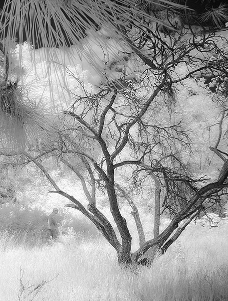
blackandwhiteinfrared

flowerheartCW

I love the softness and translucency of Black and White, infrared photography. Post-processing really brings out all the infrared characteristics that draw viewers in, and gets the emotions flowing. Using these five processing techniques will get you off to a fine start, but these are only five of many ways you can process your digital infrared images in Photoshop. If you have a favorite post processing formula I’d love to see how you do it. Post your infrared shots too.

The post 5 Creative Ways to Process Infrared Photographs in Photoshop by Alex Morrison appeared first on Digital Photography School.

Digital Photography School

 
Comments Off on 5 Creative Ways to Process Infrared Photographs in Photoshop

Posted in Photography


How to Make Stronger Photographs Through the Process of Visual Design

18 Jun

Sails 600

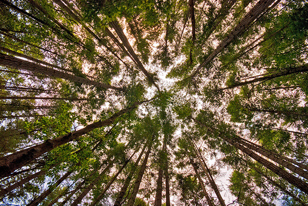
Photography is an art that relies on light. It also relies heavily on the visual message. You have no way of communicating anything to your viewer except through the visual language you use. If you use strong visual elements, your images will be effective and people will stop and look. If you want to convey a message, use the most powerful visual imagery you can: color to enhance your scene, light to punctuate it, and use shapes and texture to fill in the details. Doing this will not only be more satisfying for you as a photographer, but will make your visual language stronger and your message more compelling.

It is right to assume that photography is about being able to see a scene, and then photograph it. I am going to challenge that assumption, and say that there is something vastly more important that comes after you “see” the scene, and before you photograph it. Most often, the next step is called composition.

Loosely defined, composition speaks about how the image is put together, what the components are in the scene, and how they work together. Very often, the first thing that we think of when we hear composition is, you guessed it, the Rule of Thirds. I truly believe that the Rule of Thirds is a good place to start, but it is by no means the only compositional tool. In fact, some of the most iconic images of our time have broken this very rule. So, the next step after you have decided on a scene is not to just snap away. Put some serious thought into how you will visually design your image, and then capture that scene photographically. After that, grab the camera!

Forest-Canopy-600b

What is visual design?

Visual design sounds like a fancy word for composition, but in reality it takes composition to the next level. It is not simply about making sure everything is aligned on a grid à la the Rule of Thirds. Rather, it is about working with the flow and dynamic elements in your scene. In this article I will discuss the nuances and tools you can use to improve your composition to get the most out of any scene.

There have been many times when I have looked at a photograph and I could almost feel the wind in the scene or smell the salty sea air. The photographer captured the image in such a way that when I looked at the scene, it evoked my memory of similar scenes I had witnessed in real life. At a very high level, people relate to images in a few different ways.

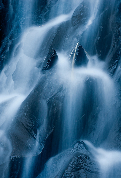
Waterfall 600Photographs evoke emotions, memories or feelings based on what the person sees in the image. In many ways, the viewer’s perception is their reality. So, if the image is of a loved one, the person looking at the photograph will immediately be transported to a memory of that person, good or bad. That memory could cause them to be quite emotional. The reaction to the image could be utterly visceral depending on what emotion is recalled. The same is true in a landscape scene or a seascape scene. The goal of every photographer should be to visually translate the scene in such a way that the viewer can either relate to the scene or would like to be in that scene.

The goal here is to change your perception on composition, to help you break out of the mental constraints of the Rule of Thirds, and open up new pathways to explore in photographic visual design. Don’t get me wrong, I am not suggesting that the Rule of Thirds is bad; it is still a very relevant and useful tool. All I am saying is that it should not be your only tool.

What do we have to work with?

Light, color, and shape all play an integral role in visual design. Using these tools is a good start; however, now we will discuss some details about making more powerful visual design choices. The idea here is to move your images from good to spectacular. The new elements we will be talking about are:

  • Form
  • Color and color relationships
  • Texture
  • Unity
  • Coherence
  • Balance and rhythm
  • Space (positive and negative)

Form and texture

Form is similar to shape, but in this context I am referring to form in a more three-dimensional sense. Form is enhanced when there is side light to emphasize the shape of the object in the image. When the sun lights a rounded, polished rock from one side, the rounded form of the rock is emphasized. This gives the viewer some critical information about the object. Side light also emphasizes texture and that too is a key piece of information. With side lighting, you can emphasize the object’s shape and form to the point that the viewer can almost “feel” the three-dimensional aspects of the image. This is a really strong way to communicate visually.

009

At a higher level, when you want to communicate form and texture, side lighting is your best friend; soft side lighting is even better. The important idea to remember here is that side lighting adds dimensionality to your image. Try this on your next photo shoot: take a look where the sun is and take a photo of the subject with the sun over your shoulder. Then move to the side of the subject and take another shot. The difference will astound you. If you do this in the soft glow of sunrise or sunset, your results will be that much better.

Using color in your design

We all know how important color is. Think of your favourite image in color, then strip that color out and somehow it is not necessarily as impactful. That’s not to diminish the fact that black and white photography can be equally impressive – it absolutely is, however, to keep this article in context, we’ll leave black and white for a future article.

004

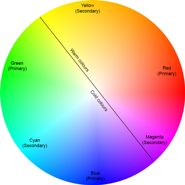
color gives the viewer crucial information about the scene. The warm colors of a fiery sunset or the cold blues of a glacier convey critical information about the scene. The overall color in your scene can determine how the viewer interprets it, so be purposeful with your use of color. If you want to convey warmth, choose reds, oranges, and yellows for your scene. If you want to convey cold, use blues, grays, and greens in your scene. You can see which colors are warm and which colors are cold if you look at the visual color wheel.

Colour Wheel

Certain colors draw the viewers’ eyes into the scene. Reds and yellows in particular cause the viewer to look at those colors (it’s not arbitrary that emergency vehicles are painted red and yellow warm colours,as they demand your attention). Be careful when you see anything that is red or yellow in your scene. It can either add value to the scene, if it is the subject of your image, or it could be distracting if it is not the subject of your image (in the background).

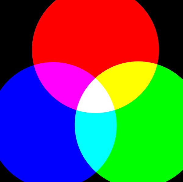
Rgb cmy

Let’s talk about color theory briefly. This is by no means an exhaustive guide to color theory, rather a quick introduction into it. Your camera can “see” three colors: Red, Green and Blue (RGB). These three colors are the primary colors in the visual color wheel (different to the color wheel used when painting). There are secondary colors too, namely, Cyan, Magenta and Yellow. These six colors and their combinations make up the visual color wheel. The hue (color) and saturation (richness or intensity) of all of these colors give us multitudes of combinations of colors. Understanding this aspect color theory will help you make better choices about color when photographing.

Using primary and secondary colors together makes your images compelling. So, looking at the color wheel, images that have red and yellow in the scene make very interesting photographs. Images with red and green in the scene work well too. The next time you look at a scene to photograph, try and look at what predominant colors are in the scene and try to photograph those colors only. This alone can make your images much more striking and visually interesting.

Take some time to practice intentionally composing your images using these techniques.

Ipad 005


The preceding article is a full-length excerpt from the CLARITY eBook series. Join other dPS readers today and dramatically improve your photography by learning the step-by-step process of visual storytelling and techniques for making stronger photographs. Get your CLARITY photography eBooks today!

The post How to Make Stronger Photographs Through the Process of Visual Design by Barry J Brady appeared first on Digital Photography School.

Digital Photography School

 
Comments Off on How to Make Stronger Photographs Through the Process of Visual Design

Posted in Photography


John Keys brings 19th Century process to 21st Century England

01 Jun

johnkeys14.jpg

John Keys is a UK-based photographer who captures the streets of England’s north-east with a 19th Century camera using the wet plate collodion process. Although long since abandoned by most professional and enthusiast photographers, collodion has come back into fashion in recent years for its unique look. click through for a look at John’s work and to learn more about how – and why – he chooses to work with a Victorian photographic medium.

News: Digital Photography Review (dpreview.com)

 
Comments Off on John Keys brings 19th Century process to 21st Century England

Posted in Uncategorized


Do you Edit or Post Process your Photos?

09 Nov

It is time for another reader poll – this time we’re going to talk ‘post production’.

Every time we talk about processing images we get a diversity of responses from readers. Some process every image, others some and some never edit any of their images – either because they don’t have the tools, are nervous or don’t believe in it.

So we thought we’d ask the question – do you edit or post process your photos?

Note: There is a poll embedded within this post, please visit the site to participate in this post’s poll.

Please tell us about your response in comments below – particularly if you’re in the ‘no’ camp.

Post originally from: Digital Photography Tips.

Check out our more Photography Tips at Photography Tips for Beginners, Portrait Photography Tips and Wedding Photography Tips.

Do you Edit or Post Process your Photos?

The post Do you Edit or Post Process your Photos? by Darren Rowse appeared first on Digital Photography School.


Digital Photography School

 
Comments Off on Do you Edit or Post Process your Photos?

Posted in Photography


Breaking Down the Creative Process

03 Nov

I’ve been thinking quite a bit lately about the creative process. When we talk about “creativity,” people generally end up putting themselves into one of two categories– creative or not creative. I’m always amused– and a bit leery– when people who consider themselves creative say that they have no creative process. That ideas “just come” to them. I’m not buying it. I can’t help but ask if ideas really do just come to them, or have they refined and streamlined their process to the point that they don’t even recognize it as a process? And if there really is a process, can someone who thinks they aren’t creative follow a series of steps that can help them become creative? The truth is, everyone has creative potential.

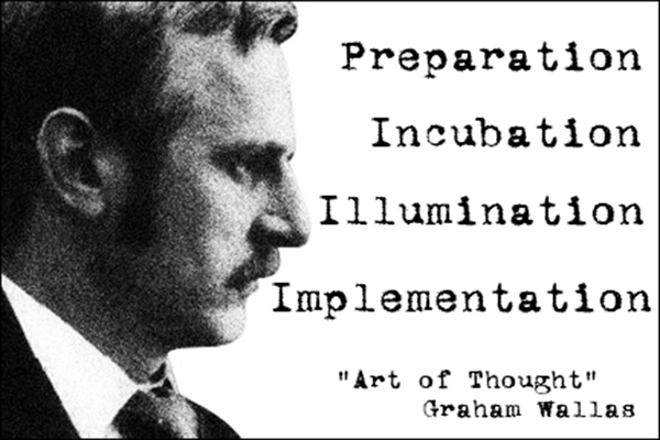
Graham Wallas (1858-1932) was an English social psychologist and co-founder of the London School of Economics. In Art of Thought – The Model of Creativity, written in 1926, Wallas broke down what we now refer to as the “creative process” into four distinct stages– Preparation, Incubation, Illumination, and Implementation. I’ve seen his approach described in several sources recently and over the years, but few ever seem to give any proper credit to the source material, espousing these thoughts and concepts as if they were original ideas. And so, Graham Wallas– this one’s for you, with my thanks.

guyer-photography-graham-wallas

Preparation

It sounds simple, and maybe a bit obvious, but this first step really does lay the foundation for the entire process. Writers write, read, research, and revise. Musicians practice and rehearse. They listen to music– sometimes their own, sometimes that of their influences. Painters experiment with color and visit museums. They sketch. As a photographer, what are you doing to prepare? Do you have influences and inspiration? Do you look to other art forms? How will you nurture an idea once it’s formed? We all draw from different emotional resources, but one thing that every creative has in common at this stage in the process is that the steps can actually be pretty boring. We may enjoy walking through museums or scouting locations, and they may get the creative juices flowing,  but they are not the exciting part of the process. Preparation is, quite simply, evaluating your creative options and beginning to come up with a plan.

Incubation

For me, this is where the fun begins– partially because half the time I don’t even realize it’s happening.  This is the stage where those first hints of a hopefully great idea are bouncing around in my head.  This is when I’m sitting in the car at a red light and happen to notice how the sun is hitting an object.  This is the stage when I’m flipping through a magazine  and an off-handed remark in an article brings the whole project into focus (no pun intended).  During the incubation step your conscious AND subconscious minds are working on the idea.  Wallas talked about the incubation stage being one where no real direct thought was given to the project or idea. Have you ever tried forcing an idea? It doesn’t usually work, right? Just like you sometimes have to take a break and clear your head, diverting your thoughts to other problems or projects– or to nothing at all– during the incubation stage may be just what you need for you to find yourself at…

Illumination

This is the “A-hah!” moment.  When this moment hits, your creative urge is so strong that you just have to get the idea out of your head and into its medium (camera, canvas, paper, etc.)– usually to the point that you have no problem ignoring or losing track of everything else going on around you.  The biggest problem with my illumination moments is that they usually happen at the most inconvenient times (in the shower, driving, middle of the night, etc.). It’s going to happen when it happens. You’ve had all these preparatory elements bouncing around– incubating– inside your head that when they do finally snap into a coherent form, it’s almost like the wheels on a Vegas slot machine coming to rest in perfect alignment.

Implementation

This is where your idea sees the light of day.  You’re taking conscious, positive steps towards executing your idea. Remember, though, that implementation in and of itself does not mean that your idea is going to be a success. This is also the point where a good creative begins to evaluate the idea and determine whether it was a good or bad idea.  Until you have something tangible to show for your idea, it’s almost impossible to decide whether this theoretical notion you’ve been nurturing through the process can be a success.  How many times has the idea or image in your head not matched the photo in your camera?  For every great idea, there are several I wish I’d never had.

Bringing it All Together

Obviously, we’re not talking about flow charts or checklists. Each of these “steps” is really more like part of a gradient– soft edges overlapping as you move from dark to light. As you know from your own experience, sometimes this process runs start-to-finish in the blink of an eye, but it can also take weeks. You just never know. While they may not always be clearly defined as you process each idea or project, it can be extremely helpful knowing what they are and how to identify them. Being able to recognize where you are on a creative journey can often be the confidence boost you need to see something through from preparation to implementation.

Post originally from: Digital Photography Tips.

Check out our more Photography Tips at Photography Tips for Beginners, Portrait Photography Tips and Wedding Photography Tips.

Breaking Down the Creative Process

The post Breaking Down the Creative Process by Jeff Guyer appeared first on Digital Photography School.


Digital Photography School

 
Comments Off on Breaking Down the Creative Process

Posted in Photography


Fujifilm X-series studio comparisons updated with new ACR 7.4 raw process

06 Apr

newplugin_2.jpg

Following the recent public release of Adobe Camera Raw 7.4, we’ve updated our studio comparison database with new raw conversions of files from the Fujifilm X-Pro 1, X-E1 and X100S. We’ve been using the release candidate version of ACR 7.4 for some time, which contained significant improvements to Adobe’s treatment of files from Fujifilm’s X-TRANS sensors. The official public release version of ACR 7.4 brings some further (very minor) tweaks. Click through for links to the studio comparison pages in our X-Pro 1 and X-E1 reviews, and X100S preview, now with ACR 7.4 raw conversions. 

News: Digital Photography Review (dpreview.com)

 
Comments Off on Fujifilm X-series studio comparisons updated with new ACR 7.4 raw process

Posted in Uncategorized


HOW TO: Film & Process Your Youtube Videos in HD!

16 Feb

CAMERA Nikon D5000 Lens: VR, Nikon DX AF-S Nikkor 18-55mm 1:3.5-5.6G Save Type as: SONY AVC Template: Internet 1280×720-25p EDITING SOFTWARE Sony Vegas Movie Studio HD Platinum 10.0 Twitter: www.twitter.com
Video Rating: 4 / 5


How to Process Landscape Photos in Lightroom 4

24 Dec

Lightroom is a powerful editor with a huge set of tools, though we usually need a limited set for specific photo types. So I’d like to go through editing of a landscape photo to see what cool things Lightroom 4 offers us. Let’s see what we can do on the example of one of my photos I took in the Continue Reading

The post How to Process Landscape Photos in Lightroom 4 appeared first on Photodoto.


Photodoto

 
Comments Off on How to Process Landscape Photos in Lightroom 4

Posted in Photography


I’m a ‘Typical Photographer’ and This Is How Much I Post Process

23 Dec

OK, I’m going to come right out and say it … there are a lot of lies in photography! It’s out there now and I suggest we all take some time to let it sink in before we do anything rash.

Of course we all know this but it’s not a subject that a lot of people openly talk about.  Before I say any more let me be completely straight.  I’m not saying that there are a whole load of photographers out there actively seeking to deceive you, more that most of us (me included) tell ‘little white lies’ about our images. Of all the subjects open for favorable interpretation is the amount photographers post process their pictures.

No Biggie?

I’m not saying for one minute that anyone is looking to be intentionally deceptive, most of the time all we are really talking about is the omission of a few minor finishing touches.  So what’s the big deal? Well there isn’t really any big problem as such, however I remember as a beginner how frustrating it was trying to work out how much of a great image was due to gear, processing or falling that the skill of the photographer.   Becoming a great photographer takes time, patience and practice and its understandable why more experienced photographers might want to protect their trade secrets.

Post Processing in Modern Photography

A common view is that post processing is a phenomenon that has only come about with the age of digital photography.  To a certain extent this is true however we need to be careful not to lump all forms of image manipulation into the same category.  In the age of film it was still possible to alter not only the basics such as aperture, shutter speed but also things like ISO, white balance and the overall aesthetic of the final image.   It’s true to say that these adjustments were less convenient than they are today (you had to physically swap out your film etc) but we shouldn’t confuse the convenience of modern technology with any form of deception.  It has always been necessary to ‘adjust’ the final image to achieve something more like reality and despite the capability of todays cameras and equipment this remains the case.  The reality is that even the best photographers make at least minor adjustments to their images.

So How Much?

So as a beginner what you really want to know is how much processing do most people and how do you know if you are doing too much?  When I started to get serious about photography this was a question that took up far too much of my time. To give you a sense of a typical photographers workflow here is a quick summary of my typical post processing routine and a few examples of how my images typically look before and after.

My Basic Workflow

My basic advice is this; only do as much post processing as necessary to achieve the look you want.  If your goal is to achieve an image that is realistic to real life then assuming you have a decent initial image you should be able to do this fairly quickly.  If however you want to achieve a more artistic result then you may need to take a bit longer.

The majority of my images are either travel or portraiture and therefore my basic post processing workflow is relatively simple.  Pretty much every image I take goes through the following five-step process, although for specific effects I will often do more.  Just so you know, I shoot all of my images in RAW with Lightroom being my editing software of choice.

  • Crop & Straighten – To clean up and correct any issues with composition.
  • White Balance – To correct any colour casts and ensure the image colour is as accurate as possible.
  • Exposure – To improve the overall tonality and dynamic range of the image.
  • Contrast & Clarity – To bring back any missing punch and bring out emphasis and detail.
  • Sharpening – Where necessary the last step is to apply selective sharpening to bring out any key details.

To give you an idea as to what this really looks like in the real world, here are a few examples of images I have taken and how they looked like before and after processing.

Example 1 – Travel Landscapes

Typical post processing for landscapes will include straightening and cropping to improve composition, followed by basic exposure and contrast adjustments. Finally I add some saturation and vibrance for impact.

Example 2 – Street Portrait

For travel portraits, its all about the white balance to ensure that the subject skin tones are spot on. After that I add contrast and boost detail with sharpening.

Example 3 – Studio Work

For studio portraits, white balance is again key followed by basic exposure and composition adjustments. In this case I may also spend more time working on more artistic effects and specialised image touch ups.

The Two Minute Rule

Obviously when you are starting out its important to spend time developing your processing skills, however as you start to get a handle on this its also very important to get efficient.  Not only will doing so stop you from wasting hours in front of your computer screen, but its also the best way limit the potential for over processing.  The ‘Two Minute Rule’ is the probably the best ‘pro tip’ I have ever heard and is something which has fundamentally changed my approach to photography.  The basic idea is to limit the time you spend processing any image to no more than two minutes.  Imagine that, just two minutes to do everything you need to get an image to look exactly as you want it to?  Basically you should be asking yourself if an images needs more than two minutes of work in post, is it worth the effort?  I’m not going to try and convince you that I follow this rule religiously but it is a really powerful way to focus your post processing efforts and I would certainly encourage you to consider building this into your own routine.  Limiting the time you spend in post will stop you from trying to rescue dud images and also give you a rough guide as to when you may have gone too far.

The ‘So What?’ for Beginners

If you are a beginner or someone getting started in post processing, what am I really telling you?  Simply it is this, most of this images you see will be post processed.  Whether this is to overcome the limitations of our equipment, correct mistakes or achieve a specific ‘look’ most photographers will process their photos. The important thing is not to worry about what others are doing, rather on if you are doing the right things to create the images you are looking for.  Focus on learning the techniques which will help deliver the photograph you want and use this as a way to hone your individual style and workflow to become an even better photographer.  If you get this right, then it won’t be long before you can start fibbing about your photographs too!

Post originally from: Digital Photography Tips.

Check out our more Photography Tips at Photography Tips for Beginners, Portrait Photography Tips and Wedding Photography Tips.

I’m a ‘Typical Photographer’ and This Is How Much I Post Process


Digital Photography School

 
Comments Off on I’m a ‘Typical Photographer’ and This Is How Much I Post Process

Posted in Photography


Photograph and Photoshop a Cross Process effect – Week 70

19 Nov

A wet day doesn’t stop photography expert Gavin Hoey www.gavtrain.com from taking and making a cross processed style of image.

 
Comments Off on Photograph and Photoshop a Cross Process effect – Week 70

Posted in Photography Videos