The post Soft Proofing in Lightroom: The Essential Guide appeared first on Digital Photography School. It was authored by Charlie Moss.
If you’ve ever printed without first soft proofing in Lightroom, you might have been surprised to find that your print didn’t match the image that you saw on your screen. Your print may have included inaccurate colors or incorrect tones.
All because you didn’t soft proof!
But don’t worry. It’s not a complicated process to soft proof your photos.
And I guarantee:
If you start soft proofing images before printing them, you won’t end up with prints that turn out different from how you expect them to look.
So let’s discover all the key features of soft proofing, and how you can use it to get your prints looking beautiful.
What is soft proofing in Lightroom?
Soft proofing is the process of previewing an image prior to printing – in order to get a better idea of what that image might look like when actually printed. Soft proofing gives you the opportunity to make changes before sending along the digital file to be printed.
The result, after soft proofing in Lightroom, is that your print will match the image you created on your computer.
Taking this extra proofing step is the key to getting top-quality printed images.
Why is soft proofing important?
Without soft proofing, it’s almost impossible to tell what your printed photograph is going to look like.
Why?
Because every printer and printing surface will interact in a different way, meaning that your results will vary wildly from printer to printer and from printing medium to printing medium.
Now, if you consistently order from the same print lab or you have your own printer at home, you may learn to predict the adjustments you need to get your images looking right. But this will only come from experience with particular printer and printing surface combinations.
And as you can imagine, gaining this experience can be expensive, especially when you’re ordering premium prints and products!
Why you need a calibrated display
First things first:
Before you do any soft proofing at all, you need a calibrated display.
A calibrated display is essential if you want your prints to match the photographs you see on your computer monitor.
By calibrating your display, you ensure that the colors are accurate. Most monitors will not have perfect color reproduction out of the box (not even the expensive ones!). Monitors are often too blue or too magenta, too light or too dark.
Also, monitors don’t hold their color calibration for long periods of time – you need to keep calibrating them every three to four weeks.
What is a printer profile?
An ICC printer profile is a file that describes how a printing machine and paper will interact.
A printer has to convert your image file into instructions for how to put ink on the paper, and each printer will do this slightly differently.
But ICC printer profiles give you a way to predict how the printer will turn your digital file into a physical print.
In fact, a good print lab will offer custom ICC printer profiles for you to download on your own computer. This lets you soft proof your digital photographs before sending them to be printed.
How to load printer profiles into Lightroom
Soft proofing begins with downloading printer profiles.
Once you have downloaded the necessary printer profiles from your favorite print lab’s website, you’ll need to add them to your computer so that software such as Adobe Lightroom and Photoshop can find them.
Fortunately, this is very simple. You just move the files to the correct operating system folder as follows:
Mac: Library/ColorSync/Profiles/
Windows: Windows\system32\spool\drivers\color
Now the different profiles will be ready for use when you start soft proofing in Lightroom.
How to soft proof in Lightroom
Once a file is ready for printing (i.e., you’ve edited it to your heart’s content), head over to the Lightroom Develop module.
There, in the bottom left-hand corner of the main window, you’ll find an option labeled Soft Proofing. Tick that box.
Once you’ve activated the soft proofing option, you’ll find that your photograph moves onto a white background and some new options appear in the top right-hand corner of the screen (as indicated above).
If you click the Profile option in the new Soft Proofing panel, you’ll find a list of profiles to choose from. If your new ICC printer profiles haven’t yet appeared on the list, then select Other at the bottom of the dropdown menu.
A window will pop up, and you can select from the different ICC print profiles that are installed on your computer. Each option you pick will appear in Adobe Lightroom for soft proofing.
Once you’ve selected your profiles and closed the window, pick the profile you want to use and make sure the Simulate Paper & Ink box is checked.
Soft proofing challenges
The challenge with soft proofing is that, as you can see below, the image won’t look the same as the original file once you’ve applied the soft proofing ICC print profile.
In the example below, I’ve applied a profile for a metallic flex paper, and you can see that the image on the right is quite a bit darker than the original image. This means the print will likely be darker than we intended.
To fix this problem, hit the button labeled Create Proof Copy:
This will create a duplicate image with your print profile embedded so you can make adjustments for printing. By creating a proof copy first, Lightroom will leave your finished image unchanged – even as you make adjustments to your file for printing.
You see, on this new copy of the image, you can make adjustments while still in soft proofing mode. That way, you can ensure that what gets printed is exactly what you intended.
So simply make adjustments to the proof preview using the Lightroom sliders until you like the result!
Here’s one final technical check worth running:
The gamut warning feature.
In the left-hand corner of the histogram is a button that looks like a computer screen:
If you toggle this setting on, your image may gain some striking blocks of color.
The colors are simply warning you which areas of the image will not reproduce properly when you go to print. To get the best quality print, you should do your best to reduce (and ideally remove) all of these problem areas.
To get rid of the warnings, try adjusting the saturation and exposure of your image.
Soft proofing in Lightroom: Conclusion
Many people see soft proofing for printing as unnecessary. They may get acceptable results already when printing, and they may have even learned to compensate while editing their photos to get the best prints.
However, if your prints don’t match the images you’re seeing on the screen, it’s because you haven’t done any soft proofing. With enough experience, you’ll learn the adjustments to make for perfect print results. But this is a process, one where you have to learn by making mistakes – so don’t be discouraged if things don’t work out the first time.
When you make your next print, give soft proofing in Lightroom a try. Calibrate your monitor, then soft proof your images with the correct ICC print profiles.
I guarantee it will improve the quality of your print!
Now over to you:
Have you ever tried soft proofing your prints? How did it go? Do you think you’ll start soft proofing before printing, now that you’ve read this article? Share your thoughts in the comments below!
The post Soft Proofing in Lightroom: The Essential Guide appeared first on Digital Photography School. It was authored by Charlie Moss.
The post Beginner’s Guide to Light Painting appeared first on Digital Photography School. It was authored by Bruce Wunderlich.
Do you want to use light painting for stunning results? Do you want to discover all the ins-and-outs of light painting so you can create otherworldly images at night?
You’ve come to the right place.
In this article, I’m going to share everything you need to know about light-painting techniques.
And by the time you’re done, you’ll be able to light-paint your images with ease!
Let’s dive right in.
Mill Falls in Logan, Ohio. The main source of light for this scene was the street lights on the bridge over the river. The bridge was light-painted with a high-powered spotlight. I also added light to the rocks in the foreground. The exposure was 69 seconds, and I set the aperture to f/14 to maximize the starburst on the street lights. This image won me a Photographer’s Choice award in the 2014 Shoot the Hills photo contest.
What is light painting?
Light painting is a photography technique that uses a moving light source (e.g., a flashlight) to add light to a subject while taking a long-exposure photograph. A scene or object can be brought to life by painting with a beam of light.
When light painting, you, the photographer, become an entirely different kind of artist. Instead of just capturing an image as it’s presented, you create the image that the camera is capturing.
Now, light painting may take lots of patience and practice to perfect, but the results can be very rewarding.
And it’s important to recognize the simplicity of lighting painting – it’s a lot like any low-light photography, except you are putting an external light source in motion to enhance an image.
Let’s take a look at some of the basics for beautiful light painting photography.
Schoolhouse in the snow. This was a long, 170-second exposure, shot at f/8 (for depth of field) and ISO 100. Notice the light coming from inside the schoolhouse, added from the outside by shining a flashlight through windows at the back of the building.
Tools for light painting
Before you start doing light painting, you’ll need to make sure you have the proper tools:
Camera – Any digital camera capable of manual settings (including Bulb mode).
Tripod – One of the most important tools to produce light paintings. In most cases, your shutter is going to be open for several minutes, and it is very important that your camera does not move during the exposure.
Shutter release – Either use a cable release or a remote shutter release to begin your exposure. If you don’t have either of these, use your camera’s self-timer function to initiate the shot. It is very important that you never touch your camera or tripod during the exposure.
Stopwatch – A stopwatch or some other way of timing your exposures is helpful, since most light-painting exposures will use Bulb mode.
Light source – Many different types of lights can be used for light painting. These light sources are your “brushes” and may include flashlights, torch lights, lasers, glow sticks, flashes, cell phones, and even candles. Just about anything that can produce light can be used for light painting. Note that different light sources will produce different colors of light. For example, an LED light source will produce a cooler (blue) colored light, while a halogen source will produce a much warmer (orange) colored light.
Color gels – Color gels can be used to alter the tint of your light and add color to your painting.
30 seconds | f/8
Camera settings
Now let’s take a look at the best camera settings for light painting:
Mode – Shoot in Manual mode, which allows you to set your shutter speed and aperture.
Image quality – Set your image quality to RAW, which allows you to capture as much information as possible. (This is not a necessity, but it is an important recommendation.)
White balance – If you want to balance out your artificial light source, choose either the Incandescent or Tungsten white balance setting. However, sometimes experimenting with other white balance settings can produce some interesting light effects. Daylight white balance is a good starting point if you want to maintain the original colors of your artificial light sources. Auto White Balance is not recommended.
ISO – Use a low ISO, such as 100.
F-stop or aperture – Stop down to f/8 or f/10, which allows you to get more depth of field and enables you to use a longer shutter speed.
Shutter speed – Set your shutter speed to Bulb mode (your final shutter speed will be determined by the amount of ambient light in the scene).
LCD brightness – Lower the brightness of your LCD preview, because the normal setting is too bright at night and will make your image look bright when it’s actually underexposed.
Histogram – Use your histogram to check your exposure. If the histogram skews heavily to the left, your image is going to be too dark.
Blinkies – Turn on your blinkies (a highlight warning) to help you determine if your highlights are exposed properly. It is perfectly acceptable for your brightest highlights to be slightly clipped if the rest of your image is properly exposed.
Image stabilization – Set this to Off. With your camera on a tripod, having image stabilization turned on can actually fool your camera or lens and cause blurring in your image.
Long exposure noise reduction – The recommended setting is Off. This can be set to On, but it will cause your exposure time to double (because the camera takes a second black exposure to help remove noise). If your camera is set to a reasonable ISO, the noise level will be low enough in most cases that in-camera noise reduction is unnecessary. Still, it is a good idea to check your noise levels in advance, and some older cameras may require this setting to be On to get acceptable noise levels.
This vase was backlit with a candle and I painted the flowers with a small penlight. 30 seconds | f/16 | ISO 100.
Begin with ambient light
The first step – before the actual light painting – is to determine the correct exposure for any ambient light in your scene.
Unfortunately, determining base exposures can be time-consuming when you’re experimenting with three- to four-minute shutter speeds.
Here’s a little trick that can help expedite this process:
Set your ISO to six stops higher than the ISO you plan to ultimately use. For example, if you are planning to shoot at ISO 100, set your ISO to 6400.
With your camera set to ISO 6400, experiment to find out how many seconds you will need for a nice exposure. Every second of exposure at ISO 6400 is equal to one minute at ISO 100.
Once you’ve determined the proper shutter speed at ISO 6400, set your ISO back to 100 and prepare your exposure in minutes instead of seconds. (Many camera’s lowest ISO is 200, so 6 stops higher would be ISO 12800. And if your camera’s lowest ISO is 50, six stops higher would be ISO 3200.)
A 30-second exposure at ISO 800. For this image, I increased the ISO to shorten the exposure to 30 seconds, because a longer exposure would cause a noticeable blur on the stars. Light painting was applied from the front of the subject, without letting the light shine directly back at the camera.
Focusing
Correctly focusing your camera is an important step – and in the dark, it can sometimes be difficult to pull off. The simplest way to get perfect focus is to shine a light source at a spot in your scene that you’ve determined must be in focus.
Then, using autofocus, focus on the light.
Finally, switch your lens from autofocus to manual focus (so that your focus point won’t change).
But remember:
If you move the camera, you must turn your autofocus back on and refocus.
(Back button focusing is another great way to achieve focus when light painting.)
The exposure
At this point, you should have determined your exposure time, and your camera should be focused on your subject.
So now it’s time to begin your exposure and start painting!
Most cameras allow you to set exposures of up to 30 seconds. For exposures over 30 seconds, set your shutter speed to Bulb. Use your cable release or remote to trigger your shutter button. Your shutter will remain open until you press the release again. Use your stopwatch, or the timer on your phone, to time the exposure length.
This vintage 1971 bus was painted using one LED flashlight on the outside, with a second light inside to illuminate the bus interior.
Painting techniques
Light painting is subjective, so you’re free to approach it however you like.
But here is some advice for getting the most impressive results:
Paint from the sides – Don’t just stand behind your camera and wave the light across your image. Painting flat surfaces from the side will allow you to bring out textures.
Use lots of different angles – For instance, when painting the ground, hold the beam low and pan the light along the floor. This will keep the ground from appearing flat, and it’ll bring out all the details of the surface. Also, by adding light from many angles, the resulting image will have an interesting three-dimensional effect.
Don’t stand between the camera and your light source – If you do this, you will show up as a silhouetted ghost in the final photo!
Wear dark, non-reflective clothing and keep moving – Again, you do not want to appear as a ghost in your image!
Don’t shine the light source back at the camera – Otherwise, you’ll create a bright spot in the image.
Use a flashlight with a red filter when you check your camera to make adjustments. The red light will keep you from ruining your night vision.
Different surfaces are going to react to light differently – Wood surfaces may require more light than shiny surfaces such as metal or glass, because rougher surfaces absorb more light than smooth surfaces.
Keep your light moving – Move the beam in slow strokes to add lots of light and make faster strokes in areas where less light is needed.
Paint in up-and-down or side-to-side strokes, just like you’d work with real paint.
You probably won’t get the shot you want on the first try – It may take multiple attempts to get an image that you’re satisfied with. For this reason, try to keep track of how much light you add to each surface. Develop a plan so that you can make adjustments to each exposure until you get the image you’ve visualized.
A beginner’s guide to light painting: Conclusion
I’ve shared lots of tips and techniques to get you started with light painting, but there is so much more you can do with the medium! Be creative and fearless about trying new things.
Once you start to get the hang of light painting, there is no limit to the images you can create – all you need is a camera and a few creative light sources.
Now over to you:
Which of these light painting tips is your favorite? Have you tried light painting before? Do you have any additional tips or tricks for great light painted photos? Share your thoughts in the comments below!
The post Beginner’s Guide to Light Painting appeared first on Digital Photography School. It was authored by Bruce Wunderlich.
The post How to Shoot Images for Book Covers: The Essential Guide appeared first on Digital Photography School. It was authored by Charlie Moss.
There’s lots of information out there about making money shooting stock images. However, the most successful stock photographers have a secret – they’re shooting niche content for specialist agencies! There are lots of different specialist fields that you might consider, but in this blog post, I’ll walk you through how to shoot images for book covers.
Let’s get started.
How to break into the book cover industry
There are several specialist book cover stock agencies that exist purely to match clients with photographers and illustrators. These agencies can be a great way to get into shooting book covers.
However, book cover stock agencies do require a good portfolio as part of your application. If you don’t already have a portfolio suitable for a book cover agency and you want to get started right away, you can try networking with potential clients on social media – Instagram is a great place to connect with other creatives.
Think about format and layout
One of the most important things to think about when it comes to shooting book cover images is the aspect ratio. Book covers are almost always produced in a vertical format, so landscape images generally won’t be of interest to book cover designers.
Left: Canon EOS 5D Mark II| Canon EF 100mm f/2.8 Macro USM | 100mm | 1/125s | f/8.0 | ISO 100 | Window Light + Reflector Right: Canon EOS 5D Mark II| Canon EF 70-200mm f/2.8 IS II USM | 70mm | 1/640s | f/2.8 | ISO 800 | Available Light
Books can be printed in all different sizes, meaning that no single aspect ratio is the best for shooting cover photos. Therefore, book cover designers will usually need to crop images to make them fit on a cover.
Keep this need to crop in mind when you shoot images for book covers, and make sure you don’t place any interesting parts of the subject or composition near the edge of the frame. This will give a designer more options when using your images in different book cover layouts.
Leave some blank space
When you shoot images for book covers, you can’t just think about the photo. You also need to leave room for the title of the book and the author. In other words, there should be at least one place in your book cover shot that is plain enough to place text.
Left: Fujifilm X-T20 | Fujifilm XF 35mm f/1.4 R | 35mm | 1/280s | f/1.4 | ISO 200 | Window Light Right: Fujifilm X-T20 | Fujifilm XF 35mm f/1.4 R | 35mm | 1/3500s | f/1.4 | ISO 200 | Available Light
You can achieve these plain sections by using simple colors, by shooting areas with less detail, or by using a shallow depth of field to blur backgrounds and foregrounds.
There’s no rule dictating where book cover designers must put the title and author text. However, it’s good practice to shoot several variations of each image, including compositions that leave room in the middle of the photo, as well as compositions that leave room at the top and bottom.
Plan your images out
If you’re finding it hard to shoot compositions that allow for text placement, then go old school and get out your sketchbook.
Take a pen and paper, draw some empty rectangles, and start imagining all the different places a designer might put the title and name of the author. You can then start to imagine how and where you might leave blank space.
These are a set of sketches based on the bestseller listings of a popular bookseller. The boxes show the text location on the cover of each book.
To take your shots to the next level, think about the props you’d like to use in your photos and how they might fit into the sketches you just made.
Playing around in a sketchbook can really improve your images and save you lots of time.
Finding inspiration
If you’re trying to come up with ideas for potential book cover images, I highly recommend browsing through a bookstore. You don’t have to do this in person; there are plenty of opportunities to browse book covers on the internet, as well!
You’ll quickly get a feel for the different styles of cover images across various genres.
It’s also a good idea to follow the social media feeds of publishers in your favorite genres. Many publishers regularly post pictures of upcoming books, which will give you a sense of industry trends.
If you’re an author, but not a photographer
So you’re a self-published author who wants to do the design work for your book yourself? That’s great, and all of the tips above still apply. However, you might find some of our beginner’s articles helpful; these will help you understand the creative potential of your camera.
It’s also important to be realistic when shooting images for your book cover; photography isn’t instinctive for everyone, and the best photographs are usually the result of years of hard work and practice.
However, if you put your mind to it and you learn the basics, there really is no reason why you shouldn’t shoot photos for your own book cover. Though it’s always worth asking a few trusted friends for their opinion when it comes to the final layout – especially if you have friends who buy and read a lot of books!
How to shoot images for book covers: Conclusion
Whether you want to diversify your photography business and start shooting images for a book cover agency, or you simply want to create your own book cover for your self-published book, the tips above should get you started. Follow traditional rules of composition, make space for titles and other text, and seek out inspiration in your genre.
Ultimately, if you’re looking to start shooting images for book covers, the best advice is to jump right in. Put together a portfolio, then get it out there for people to see. Ask around to determine which stock agencies work best for photographers you know, and see if you can get your pictures on a new bestseller!
The post How to Shoot Images for Book Covers: The Essential Guide appeared first on Digital Photography School. It was authored by Charlie Moss.
The post Vanishing Point in Photoshop: The Essential Guide appeared first on Digital Photography School. It was authored by Ana Mireles.
Have you ever used Vanishing Point in Photoshop? If you’re only using the Transform tools to give perspective to image elements, you’re missing out on a fantastic opportunity.
The Vanishing Point filter is often overlooked; most photographers believe it’s only useful in a 3D workspace.
But here’s the truth:
Vanishing Point is actually a hugely useful tool, one that I absolutely recommend you learn how to use.
In this article, I’ll explain what the Vanishing Point filter is – and how you can use it to simplify and improve your photography.
Let’s get started!
What is Vanishing Point in Photoshop?
Vanishing Point is a Photoshop filter that allows objects and edits in your image to be scaled and oriented according to the image’s perspective.
You can find Vanishing Point under the Filter menu (simply click Filter, then Vanishing Point).
Once you’ve selected the Vanishing Point filter, Photoshop opens a special workspace for all your in-perspective edits.
Why is Vanishing Point important?
A vanishing point is what gives depth to an image.
For example, if you photograph a wall parallel to your camera’s sensor, the wall (and the overall image) should look flat.
But if you instead photograph the wall at an angle and you capture the way it vanishes toward a point in the distance, the wall – and the scene – appears three-dimensional.
Take a look at the arrows in the image above.
The wall is flat, with no depth.
But the railing moves toward the horizon, where (if it continued to stretch onward) it would vanish.
The Vanishing Point filter allows you to make adjustments to your photos in perspective, so that you achieve a realistic final result that perfectly mirrors the scene’s perspective.
(Do you see how the arrow stretching along the railing appears to fade into the scene? That’s because I added it with Vanishing Point!)
Working with Vanishing Point: The basics
When you launch the Vanishing Point filter, you might be wondering what to do and how to use it.
It looks similar to the normal Photoshop interface, but where do you start?
Here are the answers to some of the most common Vanishing Point questions:
How do you create a perspective plane?
Click the Create Plane Tool at the top of the toolbar on the left.
Then click on the corners of the plane you want to create.
(Here, you need to carefully follow in-perspective elements.)
Photoshop will immediately add your plane to the image, like this:
Now, when the lines that form the plane are blue, it means everything is working well. Yellow or red lines mean that Photoshop doesn’t accept the plane you’re tracing.
Once you’ve created a plane, try moving the corner points until you get it right. You can zoom in if you need to be more precise.
Everything you paste and everything you edit inside that plane (while you’re in the Vanishing Point workspace) will be put into that perspective.
How do you save a perspective plane?
When you’re done working inside Vanishing Point, click OK (in the top right) to accept the changes. This will add the perspective plane as part of your file.
If you save and close your image, the perspective plane will be saved, too. When you open your file again, you can launch the Vanishing Point filter, and the perspective plane(s) that you created will be present and editable.
How do you delete a perspective plane?
To delete a plane, simply select it, then press the Backspace key.
To select your plane, just click on it using the Edit Plane Tool. You’ll know your plane is selected if you can see the edge nodes around it.
Can you create more than one plane?
Yes, you can create multiple planes. And these can be separate or connected.
If you want to create a separate second plane, just finish working on your first plane, then click another part of the image and start afresh.
If you want to have your two planes connected, you need to tear the second plane off from the first. To do this, press the Ctrl/Cmd key and drag one of the edge nodes to create the next plane.
By default, the second plane will be at a 90-degree angle from the first. If this is not the way you want it, you can use the Angle controller you’ll find in the toolbar at the top of the Vanishing Point window:
How do you use Vanishing Point in Photoshop to paste objects in perspective?
First, make sure the object you want to add in perspective is present on a layer. Select the object (you can use Ctrl/Cmd + A to select all), then hit Ctrl/Cmd + C to copy it to your clipboard.
Once you have the object on your clipboard, add a new blank layer above the background image. This is because anything you do inside the Vanishing Point workspace will be applied to the layer that is selected when you actually open the filter.
Next, open the Vanishing Point filter and create a perspective plane that follows the perspective you want to give to the new element.
Once this is done, paste the new element into the Vanishing Point workspace by pressing Ctrl/Cmd + V. It will be pasted as a floating selection without perspective, but that’s okay.
Feel free to scale or modify the object. Then, once you’re satisfied with its shape and size, click on it and drag it inside the plane.
You’ll notice that the object will change shape and size according to its position in the plane. It will get smaller as it gets farther away from the camera, and bigger as it gets closer to the camera.
That’s it – now you can click OK to get back to the normal workspace. You’ll find the pasted element (in perspective) on the new layer. You can then use the Layer Style options to add shadows and create more realistic composites.
You can use this paste-in-perspective technique to showcase your photos on a billboard, create graffiti on a wall, or apply logos to product packaging photographs.
Advanced tips and techniques for working with Vanishing Point
Pasting elements in perspective is one of the most common uses for the Vanishing Point filter in Photoshop.
However, there are some other cool things you can do with the feature, including:
Painting in Vanishing Point
Inside the Vanishing Point workspace, you’ll find a Brush tool. With it, you can paint, write, or draw in perspective.
Therefore, the brushstrokes will get smaller as they move farther away from the viewer (to simulate depth).
You can choose the size of the brush, the hardness, and the color. Unfortunately, you can’t use brushes you’ve loaded into the normal workspace.
Cloning in Vanishing Point
You can also clone with the Vanishing Point filter. This is very useful, because the Clone Stamp tool will follow the angle and the size of the perspective plane.
Choose the size and hardness of your Stamp Tool in the top toolbar. Make sure that Heal is turned off.
Then source the pixels that you want to clone. To do this, hold the Alt/Option key and click on the target pixels (note that you must click somewhere inside the perspective plane).
Finally, clone the pixels onto a different part of the perspective plane.
You can clone the same way you’d use the regular Clone Stamp tool. However, the results will be very different.
Look at the composite below, which shows an original image, the image modified with standard Clone Stamp methods, and the image modified with the Stamp Tool in Vanishing Point.
When I sourced the pixels from the top of the brick wall using the regular Clone Stamp tool, the bricks had a different angle; when I cloned them from the side, they had a different size.
However, when I used the Vanishing Point Stamp Tool, I was able to add pixels in-perspective.
You can also use the Vanishing Point Stamp Tool as a Healing Brush by turning on the Heal option in the top toolbar.
Using the Marquee Tool in Vanishing Point
The Marquee Tool is the only selection instrument available inside the Vanishing Point workspace.
It’s very straightforward to use; just click and drag around the area that you want to select.
If you have two connected planes, the selection will “bend” to follow the perspective in both planes.
This is extremely useful if you want to duplicate elements that run through two planes. Look at the example above – I just selected an area, copied it, and pasted it again. It behaved according to the perspective of the plane, which allowed me to keep any depth and make the entire duplication job look more natural.
For better blending, you can feather the selection, just as you would in the regular workspace.
How to use Vanishing Point in Photoshop: Conclusion
Vanishing Point in Photoshop can make your work easier and faster when you’re dealing with perspective.
So make sure to give it a try!
Now it’s your turn:
What do you think of Vanishing Point? Is it a tool you plan to use in the future? Share your thoughts, questions, and tips in the comments below!
The post Vanishing Point in Photoshop: The Essential Guide appeared first on Digital Photography School. It was authored by Ana Mireles.
The post Backlighting in Photography: The Ultimate Guide to Beautiful Backlit Images appeared first on Digital Photography School. It was authored by Simon Ringsmuth.
When used creatively and intentionally, backlighting can be an incredible tool to take your photography to the next level.
However, the concept of backlighting seems somewhat counterintuitive.
After all, when your subject is backlit, the main source of light is coming from behind, not from the front – and conventional photography wisdom generally says that your subject should be well-lit from the front.
So how can you create backlighting that looks good? How can you capture backlit images that really stun the viewer?
In order to understand how to use backlighting, you should know what the term means.
So what actually is backlighting?
The following diagram depicts a standard photography scenario with the main source of light behind the camera.
Using this type of setup, the subject is well-lit, and there is a shadow cast on the wall directly behind the subject. The result is a detailed, evenly-exposed image that conforms to the basic principles of photography.
In contrast, backlighting reverses the subject and the light source.
The light goes behind the subject (and points toward the camera), which causes the shadow behind the subject to vanish. Backlighting results in a photograph where the subject is usually much darker than normal.
Also, placing the light behind the subject often results in a silhouette or glow effect. This makes the final image look different from a normal photograph and can be jarring, at least at first.
But with a little practice, you can use this technique to create images that are unique and stand out from the crowd.
Backlighting in portraits
Backlighting is a tried-and-true portrait photography technique – one that can get you some stunning photos.
How does this work?
It helps to see some actual portrait photos that illustrate the concept of backlighting versus frontlighting. This first image is a fairly standard portrait shot:
Nikon D750 | Nikon 70-200 f/2.8G ED VR II | 122mm | 1/350s | f/4 | ISO 800
The subjects are lit from the front, and the image is evenly exposed without any harsh shadows. It’s a great photograph, and it meets all the normal criteria for a maternity shot someone would want to put in a frame or a photo book.
Now, let’s look at another photo of this couple, this time shot using backlighting:
Nikon D750 | Nikon 70-200 f/2.8G ED VR II | 180mm | 1/3000s | f/2.8 | ISO 400
The parents-to-be are shrouded in shadow (which I was able to boost in Lightroom, thanks to the RAW file format), and the woman’s hair is glowing with a brilliant golden halo. The man has a glowing outline around his head, and the entire scene has a slightly mystical quality to it.
This is all due to the creative use of backlighting.
When you light your subjects from behind, you can get images like this, which pack glowing hair, brilliant outlines, and a beautiful background. This type of photo does take practice, but with a little trial and error, you can use backlighting to get similar results.
Here’s a head and shoulders portrait of a young man:
Nikon D750 | Nikon 70-200 f/2.8G ED VR II | 200mm | 1/250s | f/2.8 | ISO 100
The sunlight is coming from the front, his face is evenly lit, and the background is colorful and easy to see.
Now compare that image to its backlit counterpart:
Nikon D750 | Nikon 70-200 f/2.8G ED VR II | 200mm | 1/180s | f/2.8 | ISO 320
His hair suddenly looks like it’s on fire, and his ears have a bit of a glow. The right side of the background is lush and green, whereas the left side, where the sun is positioned, is almost entirely blown out. Even the man’s shoulders are outlined in gold, and the photo has an energy to it that the frontlit photo just can’t match.
As you can see, knowing how to use backlighting to your advantage can result in portraits that stand out from the pack. It may be a little tricky at first, especially if you’re using natural light instead of studio light.
But with a little practice, you’ll get the hang of backlighting – and you’ll get the type of pleasing reactions from your clients you never knew you were missing.
Backlighting isn’t just for portraits, though! It can be used in a variety of situations for creative, inspiring images, including nature photography:
Backlighting in nature
To illustrate the power of backlighting for nature photography, check out this backlit landscape image:
Once you start looking for the light, you’ll notice shots like this everywhere. In fact, one of the best ways to learn backlighting is to go out in nature and simply experiment by putting your subjects between the camera and the sun.
Sunrise and sunset are great times to try out backlighting. Look for situations where your subjects are at a bit of a distance; it also helps to have a general idea of where the sun will be at dawn and dusk. Metering with backlight is tricky, so I like to use Aperture Priority to control the depth of field and then dial in exposure compensation to get my shots as light or as dark as I want.
A rule of thumb I like to use in these situations:
Expose for the highlights, then bring up the shadows in Lightroom. Basically, try not to make your photo too bright, because you may end up with clipped highlights (i.e., white, informationless areas that cannot be darkened).
Nikon D750 | Nikon 70-200 f/2.8G ED VR II | 200mm | 1/4000s | f/22 | ISO 100
You can also look for more mundane subjects on which you can practice, like interesting leaves:
When shooting in nature, the main source of light is the sun, but you don’t have to use direct sunlight. In the image above, the mid-afternoon sun made these leaves glow. The sun isn’t in the frame, but it still lit the leaves from the back and gave me a fun photo opportunity.
I used a similar technique for the image below. You can see how my use of backlighting made this large blade of grass appear almost translucent. The shot was not an accident, and I was only able to capture it by looking for new ways to shoot familiar subjects. In this case, I was only photographing a simple piece of grass!
Most people would pass by this scene without a second thought, but it just goes to show how backlighting can give new life to even mundane subjects.
Silhouette backlighting
One interesting way to use backlighting is to obscure your subject altogether. This technique is known as silhouette backlighting, and it can be a fun and creative way to showcase people, animals, and other objects.
How does this work?
You create silhouette images by shooting directly into the light source – which completely darkens your subject. The result is a photo that shows a shape or outline instead of a well-exposed subject.
To get the image below, I pointed the camera at my main source of light, then waited for someone to walk by. The fountain itself doesn’t emit light, but instead reflects what comes from the sun – and it was so bright that it completely darkened my subject. The image tells a story, even without seeing any details of the person.
I knew where the sun was positioned, so I waited patiently until a person walked into the frame. By putting my subject directly between the camera and the main source of light, I was able to capture a silhouette. The end result is much more interesting than a normal, properly-exposed image taken in broad daylight.
Silhouettes aren’t just for people. You can use silhouette backlighting for a variety of subjects; all it takes is a little creativity and a willingness to try something different.
Some type of Manual mode (either full Manual or Aperture Priority with exposure compensation) is best for these shots. It’ll give you better control over the final image, and you won’t need your camera to make exposure decisions in tricky lighting conditions.
Nikon D750 | Nikon 70-200 f/2.8G ED VR II | 200mm | 1/4000s| f/2.8 | ISO 100
One of my favorite ways to use silhouette backlighting is to create sun stars, like this:
I start by putting a large building between my camera and the sun.
Then I move around until the sun is poking out from behind a corner of the building. I shoot with a small aperture, usually f/8 to f/11, and I shift the camera position until I get the shot just right.
This technique takes practice, but you can easily get the hang of it in under 15 minutes.
Use Aperture Priority and exposure compensation, and look for ways to use the light that might not have occurred to you before.
Backlighting in photography: Conclusion
If you’ve never experimented with backlighting, then I encourage you to give it a try and see what happens.
You might think shots like the ones in this article are beyond your skills, but all it takes is a bit of practice, a dash of patience, and a willingness to try something different.
Backlighting is a fun, creative technique, and you might just find yourself using it far more than you expected!
Have you ever tried backlighting? What did you think of it? Share your thoughts in the comments below!
The post Backlighting in Photography: The Ultimate Guide to Beautiful Backlit Images appeared first on Digital Photography School. It was authored by Simon Ringsmuth.
The post Dodging and Burning in Lightroom: A Comprehensive Guide appeared first on Digital Photography School. It was authored by Rick Ohnsman.
Digital photographers who have never worked with film or never even set foot in a darkroom still encounter terms from the early days of photography. The phrase “dodging and burning” is a throwback to those times.
Now, the reasons for using this technique still apply, but the tools and methods for dodging and burning are much easier today. In fact, you can do effective dodging and burning in most post-processing programs, including Lightroom.
So let’s dig into the what, why, and how of dodging and burning in Lightroom – and show you how this technique can improve your photos.
Working with an enlarger in the orange glow of a safelight. This is how photos used to be printed.
A history lesson
Adobe’s “Lightroom” is a tip of the hat to the place photos were made in days gone by, the darkroom. I had a makeshift darkroom in a corner of my garage and remember the tanks and trays of smelly chemicals, working in the orange glow of a safelight, developing negatives, and making prints. It was a laborious process, and one for which there was no “undo” when a mistake was made.
The standard darkroom workflow went something like this:
Load the film (sheet film for larger “view cameras,” roll film for smaller cameras)
Make shots in the field
Return to the darkroom, and in total darkness or using a film bag, put the film in a developing tank
Develop the film in a multi-step series of chemical baths (develop, rinse, stop bath, rinse, fix, rinse, Photo-Flo, rinse, dry)
At this point, you’d have your negatives, which were film with reversed lights and darks (and colors if you were using a color film.) Next, you’d need to print. Photos were prints; you couldn’t view images on a computer screen.
(Later came reversal film, “slides” that still were physical renditions of your photo but able to be shown with a projector.)
If you were a DIY photographer and made your own prints in a darkroom, you had to have a lot of tools – including a device like this, called an enlarger. People who think photo printing is challenging today have no idea how it used to be!
At this point in the darkroom workflow, you’d be getting to the dodging and burning part.
You’d put your negatives in an enlarger – a projector of sorts which would shine the negative image down onto a piece of photo paper.
(This was all done in the darkroom under a “safelight,” which allowed you to see your work because the orange color wouldn’t expose the photo paper.)
Now, you had to decide how much time was needed to expose the photo paper to the light in order to make a proper exposure. Often, you’d create a “test strip,” a print where you’d create a succession of incremental exposures (shown below). Of course, that would have to be developed in a series of chemical baths, too.
How long should you expose the photo paper to the negative image projected by the enlarger? Better print a test strip.
Finally, you’d be ready to make your print. You’d put a piece of photo paper under the enlarger, set your timer for the exposure duration you established, hit Start, and expose the paper to the light of the projected negative image.
But wait! What if you wanted some parts of the image to be darker and others lighter?
Well, the amount of time the paper was exposed to the light determined how dark the image was.
So if you used an instrument to block light from portions of the image during the projected exposure or, in a second exposure, exposed select portions of the paper to more light, you’d selectively brighten or darken parts of the final print.
The term for selectively blocking the light from the photo paper is “dodging,” and the term for exposing areas of the photo paper to more light is “burning.”
You could buy a dodging kit – or you could just get some wire and make some cardboard cutouts.
Granted, that was a long story just to explain these key terms, but you need to feel the pain just a bit. Imagine doing all those things, then developing the photo paper, spending time and money, only to find that your print didn’t turn out as you hoped. Frustrating, right?
(Guess you weren’t the…wait for it…”artful dodger” you thought you were.)
These are the origins of the terms: “Dodging” meant using various tools to block the light from reaching the photo paper, thus lightening that part of the print. Burning used tools to allow extra light to reach portions of the paper, thus darkening those areas of the print.
Lighten and darken
We have it so much easier, cheaper, and safer with digital photography. No chemicals, no working in the dark, and maybe best of all, the ability to experiment, undo, and replicate the finished results with ease.
So while you will still hear about dodging and burning in Lightroom (as well as in Photoshop and most other digital editing programs), and the tools are still labeled as such, let’s substitute something easier to understand:
Dodging = Lightening.
Burning = Darkening.
Why dodge and burn?
When we use the sliders in Lightroom to adjust our image, we are working with “global” controls. These uniformly apply the effect to the entire image.
For instance, increase or decrease the Exposure slider, and the entire image will get lighter or darker.
What we may want to do is selectively control portions of the image, making some areas darker and some areas lighter. A major reason for doing this is because viewers tend to look at brighter portions of an image first, concentrating less on darker areas.
So to emphasize and deemphasize portions of our image, we may wish to selectively lighten or darken them.
(Remember, lighten=dodge and darken=burn).
The “quick and dirty” method
Dodging and burning in Lightroom can be complicated – but it can also be very simple, and that’s what I’m going to discuss in this section.
Here’s how it works:
Bring up the image you wish to edit in the Develop module of Lightroom. Perform whatever global adjustments you like using the sliders.
Select the Adjustment Brush tool. Double-click the word “Effect” to zero all the sliders. First, we’ll work on areas we wish to lighten (dodge) in the image.
Now let’s “load” the brush. In the Basic panel, drag the Exposure slider up to about +1.0. Set your Feather, Flow, and Density all to 100. This will likely create too much of an effect, but will make it easier to see what you’re doing. You can always back off the brightness later by bringing down the Exposure slider.
Pick an area of the image you wish to lighten and start painting on it with the brush. You will see the area get lighter. Only work on one area. When you’ve painted over all the desired sections, go back to the Exposure slider and drag it up or down to get the final amount of lightness you desire. Click Done when finished with this area.
To work on another area of the image, click the Adjustment Brush again (which will add a new “pin”) and repeat the steps explained above. Because adjustments with the sliders will affect everything done via that “pin” adjustment, you will have more control if you work on multiple smaller areas, rather than lightening multiple areas all at once so you’re forced to apply the same degree of lightening (dodging) to each one.
To darken areas of the image, you can use the same procedure, though you’ll need to drag the Exposure slider in the negative ( -) direction.
Combine global adjustments with simple dodging and burning in Lightroom and you can get a nice result. Before (left) and after (right).
With the Adjustment Brush and the Exposure slider, you can selectively lighten (dodge) and darken (burn) areas of your image.
It works, but maybe you’d like to refine your skills a bit, which is what the next sections are all about:
Tools of the trade
When we talk about dodging and burning in Lightroom, we have three tools we can use:
Adjustment Brush
Radial Filter
Graduated Filter
These tools allow you to select areas of your image where you can apply lightening and darkening.
Let’s discuss how each of these tools might be used and look at some examples that illustrate these concepts.
The Adjustment Brush
The Adjustment Brush in Lightroom allows you to selectively “paint” the area of the photo you wish to affect. It might help to think of how you’d control an airbrush rather than a regular paintbrush.
You can make several changes to the Adjustment Brush, including:
Size: Changes the size of the brush. Roll the mouse wheel, use the left and right bracket keys, or use the slider.
Feather: Changes how hard the edge of the brush is and how rapidly the effect falls off. Use Shift while rolling the mouse wheel, Shift and the bracket keys together, or the Feather slider.
Flow: Controls how quickly the effect is applied with each stroke of the brush. Use the slider to adjust the flow, or with the Adjustment Brush selected, change the flow with the number keys on the keyboard. Using multiple strokes will build up the effect.
Density: Controls the maximum opacity of the brush effect. For example, if the Flow was at 100 but the Density was at 50, one stroke of the brush would apply the effect at 50% opacity.
The Radial Filter
The Radial Filter works somewhat like the Adjustment Brush – but rather than allow you to paint randomly, your adjustments are restricted to a circle or oval shape.
You can control the size and shape of the Radial Filter, and you can also feather the edges. Plus, you can control whether the effect takes place inside the circle or outside the circle.
I often use the Radial Filter with the Invert box checked (so only the inside of the circle is affected), and then adjust the filter strength with the Exposure and Feather sliders. You can create what appears to be a spotlight and use it to selectively lighten (dodge) areas of your image.
Some other tips for working with the Radial Filter:
Hold down the Shift key when you drag out the Radial Filter to constrain it to a circle
Use the “handles” on the top, bottom, and sides to drag the Radial Filter into other oval shapes
Once the Radial Filter is created, move the cursor just outside the shape until you see the double-headed arrow and then drag to rotate the shape
Get another “spotlight” to use on a different area by right-clicking a previously-created Radial Filter pin, choosing Duplicate, and then dragging the new Radial Filter off to the next place you want to work.
The Coquille River Lighthouse near Bandon, Oregon doesn’t use the light any longer. But with some creative use of the Radial Filter…
…we can turn the light on! A Radial Filter was used to dodge the lighthouse itself, to put a light in the tower, and (as highlighted by the green overlay) to create a light beam.
The finished result.
A Radial Filter was applied to the first window to dodge it, then the Filter was duplicated and moved to each of the other windows. The window at the bottom-right shows how the round shape of the filter can be modified using the Erase brush – which you can switch to by holding down the Alt (Option on Mac) key. The window is showing red because the mask overlay is turned on.
The Graduated Filter
The Graduated Filter can also help you lighten and darken selective areas of your image, but in a more gradual way.
While you might not immediately think of the Graduated Filter as a dodging/burning tool, the concept is the same – you can use it to choose which areas of your image are affected. While it’s a separate subject, combining the Graduated Filter with range masking in Lightroom can provide a very powerful method of selective dodging and burning, which is why I suggest you also read up on range masking.
You might want to burn (darken) a sky in Lightroom. The Graduated Filter is a great tool to use – and combined with the Range Mask, it can help you keep the effect where you want it and away from where you don’t, such as the trees in this shot. The red overlay shows where the effect will be placed.
The vignette
A vignette is used for darkening or lightening the edges of your photo.
When used to darken the frame edges, a vignette puts more attention on the center, brighter areas of the image, and helps direct the viewer to the center of the photo.
The Post-Crop Vignetting option is found under the Effects tab in the Lightroom Develop module.
Behind the mask
Any of the tools you use for selective dodging and burning – the Adjustment Brush, the Radial Filter, or the Graduated Filter – are all applying “masks” to your work, controlling how and where the effect is applied.
Often, it can help to see exactly where the masks are applied.
When we first choose one of our dodging and burning tools and begin to work with it, Lightroom will create a “pin,” a marker showing that an effect has been applied.
There is a control to choose when a pin will be displayed, which pins are active, and where the mask has been applied. You can even choose the color of the mask to help you best see it while editing. Hold down Shift, and each time you tap the “O” key, the mask will cycle through its available colors: red, green, white, and black. Use whichever color helps you best see where you’re working.
Turning on the mask overlay can help you see where your effect is being applied.
Paint on, paint off
Even once you’ve created a dodge or burn effect, there are ways to further refine your selected areas.
Let’s take a quick look at a few of them.
Adjustment Brush: If you need to erase portions of your mask, turn on the overlay so you can see what you’re doing (hit the “O” key). Hold down the Alt (Option on Mac) key, and the “+” sign in the middle of the brush pin will change to a “-” sign. Keep holding down the Alt key, and erase the portions of the mask you don’t want.
Radial and Graduated Filters: After applying a radial or gradient mask, click the word Brush (at the top of the adjustment panel). Then hold down the Alt/Option key so the symbol turns to a “-” sign. Finally, brush out portions of the radial mask you don’t want.
Auto Mask: Checking this box will help the Adjustment Brush find edges and may assist you in selectively masking areas. I suggest you do some further reading to understand how this tool works.
Using the histogram
One feature of the histogram is the ability to show any shadow or highlight clipping. Tap the “J” key, and if any shadows are clipped they will show in blue, while clipped highlights will show in red.
By using the tools we’ve already discussed, you may be able to “rescue” such areas by selectively lightening or darkening them.
There could also be images where you purposely want to black out or white out areas. The “J” key will show you any clipping, then you can dodge or burn areas you wish to black out or white out.
Have a look at the images below, where I used this technique:
You don’t want to completely clip your highlights or shadows in a photo…except when you do. This was the straight-out-of-camera (SOOC) photo. It needed some cleanup.
Here, I’m using the Adjustment Brush for some “extreme burning,” a way to black out the background and remove distractions in this shot.
Here is the final edited shot.
I used the same technique for this photo. The rose shot against the black background was cleaned up by burning the background until the shadows were totally clipped. The rose on the white background was cleaned up by dodging the background until the highlights were totally clipped. Turn on the clipping indicator (hit the “J” key), set up your Adjustment Brush, check the Auto Mask box, and go to work.
Complexifying the light
When I was first learning to use Lightroom, I spent quite a few hours watching French photographer Serge Ramelli’s Youtube videos. He would often use the term “complexifying the light” when speaking about dodging and burning, and when talking about how you could use dodging and burning to make images more interesting.
I suggest you take a look at some of his tutorials; below is an image I edited with similar techniques.
Less is more
A good chef knows that a little salt can enhance the flavor of a dish, but too much can ruin it. A good photo editor learns that any manipulation of an image needs to be subtle, enhancing the image while not drawing attention to itself.
After a session of dodging and burning, it’s a good idea to get away from the screen for a while, then come back and view the image again. If you didn’t know, would you suspect that areas had been lightened or darkened with dodging and burning techniques?
I think you’ll often find that – especially when learning – you’ll need to dial back the sliders a touch to make the effects more subtle.
The technical and the aesthetic
As with all of photography, there are two sides to dodging and burning.
First, there’s the technical side, which requires learning the tools and techniques for dodging and burning in Lightroom.
The other component is aesthetic; you need to understand how to artistically view your image and decide where to dodge and burn to better direct the eye of your viewer to and through the image.
The technical side requires study to learn the tools. The aesthetic side requires artful contemplation and practice.
The Union Pacific 844 is a “thundering beast,” the only steam locomotive owned by a North American Class I railroad that has never been retired. I wanted to capture its might. This unedited shot didn’t quite do it.
But bring to bear the diversity of editing tools in Lightroom, including some dodging and burning, and you get an edited version that does a much better job of capturing my vision.
Dodging and burning in Lightroom: Conclusion
There are many photo-editing programs, tools, and techniques for dodging and burning your photos.
Some photographers may favor Photoshop, Luminar, ON1, Corel PaintShop Pro, or any of the dozens of other choices.
So feel free to choose your weapon.
But realize that no one will ask you what tool you used to improve your image. Master the tool you choose and wield it well. For me, dodging and burning in Lightroom is one tool for adding flair to my photos.
Now over to you:
Do you do dodging and burning in Lightroom? Do you want to? Share your thoughts, tips, and tricks in the comments below!
The post Dodging and Burning in Lightroom: A Comprehensive Guide appeared first on Digital Photography School. It was authored by Rick Ohnsman.
The post 13 Snow Photography Tips: A Beginner’s Guide appeared first on Digital Photography School. It was authored by Dena Haines.
Does your heart jump a little on a snowy winter day?
Do you want to run outside and start shooting?
I know how you feel; I love snow photography, too!
So if you’re after some stunning snow photos…
…then read on!
13 snow photography tips: a beginner’s guide
The tips in this article will help you get some great photos in the snow – while also keeping your camera safe.
So make sure to keep these tips and techniques in mind the next time you head out for a snow photoshoot!
1. Focus on contrast
Autofocus can have a hard time when everything is white. So you’ll need to be extra-careful, and do your best to focus on a contrast-heavy area of your snow scene.
It helps to focus on something dark, like the bark that’s just below a lump of snow on a tree branch.
Remember:
Your camera’s autofocus system uses contrast to focus, so a plain white mound of snow may cause issues.
Press your shutter halfway. If the focus won’t lock on, move your focus point to a darker area of the subject and try again. This usually does the trick.
2. Camera settings
Set your camera to shoot in RAW. When you take photos in RAW, you will have more information to work with when editing – whereas JPEG files are compressed, so they don’t allow for much post-processing latitude.
(Learn more about why you should shoot in RAW here.)
Choose Evaluative metering (which is called Matrix metering on Nikon cameras). Evaluative metering will do a good job of getting you a correct exposure, and it’s what I used for all the photos in this post.
If the weather is really sunny, you may also want to try Spot or Partial metering to see if it can handle the light better.
Exposure compensation. Your camera will try to make snow look gray, so set your exposure compensation to +1 or +2. That will keep the snow looking white. You can also adjust the exposure during editing.
3. Shoot in Aperture Priority mode
Aperture Priority mode (AV on Canon, A on Nikon) will allow you to quickly change your depth of field. When shooting in Aperture Priority, the camera will choose the ISO (if the camera is set to Auto ISO) and the shutter speed, so all you have to do is switch between aperture settings.
This is great in cold weather (where cold fingers make it tough to change settings on the fly), and allows for a lot of creativity.
4. Capture snow while it’s still fresh
There’s nothing like a fresh snowfall.
If you want footprint-free snow, you should plan the photos you’re going to take and the order you’ll take them in (so you don’t trample the snow during the shooting process!).
Capturing fresh snow might also mean going out early to shoot (before the kids get up!).
5. Keep your batteries warm
In cold weather, your batteries won’t last long. So charge two, and keep one in an inside pocket.
When the battery in your camera runs low, replace it with the warm one. Then put the drained battery in your pocket; you may even be able to use it again once it warms up.
6. Bag your camera
Condensation can form on the outside and inside of your camera when you bring it in from the cold. That’s scary, but it’s easy to avoid.
When you are heading out into the cold, just bring along a large zip-lock bag. I usually keep one in my camera bag or jacket pocket.
Then, when you’re ready to go inside, put your camera in the bag and make sure the lock is sealed tight.
Once you’re in the house, put your camera somewhere it can warm up slowly. When the camera reaches room temperature, you can take it out of the bag and use it normally.
I leave my camera bag in the car while I’m taking photos. But before getting back into the car, I put my camera in the zip-lock bag, then in the camera bag. That way, the camera comes up to temperature slowly and condensation doesn’t form.
7. Don’t let the weather stop you
Snowy landscapes look good in both sunny and cloudy weather.
On cloudy days, when everything is white, include elements that will break up the monotony and add interest to your photo.
Also, if it’s snowing, use an umbrella to protect your camera. And if it’s too cold to go out, roll down your car window, grab your shot, and roll it back up.
While I don’t take my camera out in super cold weather, some people do. Read more about protecting your camera and yourself in cold weather (by David Shaw, who’s in Alaska and knows all about cold weather!)
8. Act fast
Snow can change quickly. It can start or stop falling in an instant.
And when the sun comes out, snow can start melting very fast. Those beautiful trees can go from dazzling to drab in no time at all.
So don’t wait.
Get out there and do some snow photography!
9. Be patient
Light can change fast.
The sun can go behind a large cloud and totally change how the snow looks. You may need to wait for the sun to come out again. This can be hard when it’s cold, but it’s worth it!
After all, sunshine and shadows add beauty and drama to a snowy scene.
10. Keep all your images
Don’t delete any photos from your camera.
Instead, wait until you’re warm and comfy and you’re sitting in front of the computer.
You’ll be able to see your photos more clearly, and your fingers won’t freeze!
11. Play with perspective
Shoot from different perspectives. Try to show the way snow blankets the ground, weighs things down, and clings to everything.
But watch out for falling snow. It’s not so nice to have a clump land on your camera!
12. Play with shutter speed
Shutter Priority mode allows you to choose your shutter speed while the camera takes care of the rest (assuming you’re using Auto ISO).
And by experimenting with your shutter speed, you can create all sorts of cool effects!
For instance, with a fast shutter speed, you can freeze falling snow in midair.
With a slow shutter speed, you can turn those flakes into long white streaks.
Nice, right?
13. Capture some bokeh
A sunny winter day is a great time to create bokeh. And with all that sparkling snow and ice, this shouldn’t be too hard!
To create bokeh in your photos, look for a subject that has something bright or shiny in the background.
This could be the light reflected off the ice or melting snow. Use a wide-open aperture (e.g., f/2.8 or f/4), and make sure there is some distance between your subject and the shiny background.
With a shallow depth of field (from the wide aperture), your subject will be in focus, but not the shiny background elements.
And this will create lovely background bokeh, like in the photo below:
Let it snow!
Will you be out taking photos on the next snow day? I’m planning on it, and I hope you are, too.
Have fun with your snow photography, and experiment with different settings for creative results. Just remember to dress for the weather and bag your camera.
If you have some snowy photos to share, I would love to see them! I hope you’ll share your favorite snow photography tips, too – just add them in the comments below!
The post 13 Snow Photography Tips: A Beginner’s Guide appeared first on Digital Photography School. It was authored by Dena Haines.
The post How to Use a Snoot in Photography: The Complete Guide appeared first on Digital Photography School. It was authored by Simon Bond.
What is a snoot in photography, and how can you use one for stunning photos?
That’s what this article is all about.
I’m going to take you through everything you need to know about snoots – including what they are, why they matter, and how you can use them to capture stunning images.
So if you’re ready to become a snoot expert…
…then let’s get started.
What is a snoot?
A snoot is basically a tube that goes over the front of your flash unit and creates a hard, concentrated beam of light.
Two examples of snoots mounted to flashes.
A snoot allows you to light your main subject – without lighting the surrounding scene. And this can be great for dramatic, low key photography.
A snoot is good for directing the light and creating low key images with lots of contrast. Canon 5D Mark II | Canon 50mm f/1.2L | 1/20s | f/2 | ISO 400
Now, you can pick up a snoot from plenty of off-camera lighting manufacturers. (More on that in a moment!)
But because snoots are simple, you can actually make your own, which is what the next section is all about.
Making your own DIY snoot
You can make your own snoot using basic household objects. You just need to make a tube that fits over your flash!
There are some design elements you must consider, though. For instance, you’ll want a color-neutral material, because if your snoot includes intense colors, you might get unwanted casts in your photos.
Bearing this in mind, here are the two simplest options for creating snoots:
Cereal box: Cut the box into a rectangular prism with a hole at either end. Add black tape around the outside of the snoot to prevent light from leaking out.
Pringles tube: Cut a hole in one end of the Pringles tube for the flash to fit inside, making sure the tube sits straight on your flash (so you get a clear, directed beam of light).
In either case, you can modify the type of light the snoot creates by making the snoot longer or shorter.
Just remember:
The longer the snoot, the smaller and more concentrated your source of light will be.
Buying a snoot
The other option is to buy a snoot, and there are plenty of good snoots available for you to choose from.
Here’s a nice snoot you can grab at a great price.
That said, given how easy it is to make an effective snoot yourself, if you’re going to buy one, you may want it to have some sort of extra functionality.
That’s why I highly recommend the Rogue FlashBender, which can be used as a snoot, a reflector, or a softbox.
(In other words: You get your money’s worth!)
When to use a snoot in photography
A snoot can be a highly useful tool in the studio.
Broadly speaking, a snoot produces hard light, which creates lots of shadows. A snoot also creates lots of contrast between your subject and the background (assuming the background isn’t lit independently).
Let’s take a look at a few cases where you might want to use a snoot:
Spotlight
Have you ever used a flashlight on a dark night to light up your face in a spooky way?
If so, you’ve essentially spotlighted your face – and broadly speaking, you’re doing the same with a flash and snoot.
Now, you can go for that spooky effect with a snoot, but you can also direct your light in different ways for different spotlight effects. You can highlight various parts of your subject while keeping the background dark, which tends to look both stunning and dramatic.
Low key effect
Low key photography involves partially underexposing your shots for a mostly black image.
Like this:
This is an example of low key light produced by a snoot. Canon 5D Mark II | Canon 135mm f/2L | 1/60s | f/5.6 | ISO 640
And a snoot is the perfect tool to create this type of image.
Simply direct your light at the main subject, whether that’s a still life or a model’s face. And ensure the light falls off before hitting the background for that dark, dramatic, low key look.
Rim light
You can use snoots to create beautiful rim lighting – which is any form of light that hits the edge of your subject.
And one of the most useful forms of rim lighting is the hair light.
By using a snoot to direct rim light (i.e., hair light) onto the back of a model’s head, you can add depth and interest to a photo, without impacting the front of the subject or the background.
For the best results, keep the rim light a little to the side and out of frame.
Of course, a rim light is only part of a lighting setup, so you’ll want to use it in conjunction with other lights. That way, you can capture a portrait like this one:
A hair light helps create a better-quality portrait photo. Canon 5D Mark III | Canon 135mm f/2L | 1/200s | f/3.2 | ISO 100
Flare
While photographers generally keep their off-camera lights out of the frame…
…there may be times when you want the lights to appear in your photos!
Specifically, you can use a snoot to create lens flare, as shown in the photo below:
Snooted strobes can be used to create lens flare when pointed toward the camera. Canon 5D Mark II | Canon 17-40mm f/4L | 42 seconds | f/5 | ISO 250
Now, you can create this artistic effect with several light modifiers (or just a naked flash).
But a snooted flash will help you control the light, so the source appears to be some sort of street light, rather than a flash unit.
How to use a snoot effectively
When using a snoot in photography, you’ll want to think about a few key factors, including:
The direction of the light
The distance of the flash
The length of the snoot
The brightness of the flash
These will dramatically impact how your photos turn out – so if you’re looking to really fine-tune your snoot photography, make sure you pay careful attention to the next few sections.
Direction of the light
Thinking about the direction of light is important in all forms of photography, but it is essential when working with a concentrated beam of light.
By positioning your snoot behind the subject, in front of the subject, or off to the side of the subject, you’ll get dramatically different results – so before taking a single shot, ask yourself:
What am I hoping to achieve with this snoot?
And position your snooted flash accordingly.
Distance of the flash
The distance from the flash to the main subject has three effects when used with a snoot:
First, the farther the flash is from the subject, the less bright the light becomes. If you position your light at the back of the room, you’ll get a darker image (though you can always adjust your exposure to compensate for the reduced light intensity).
Second, the farther the flash is from the subject, the harder the light becomes. If you’re looking for a softer effect with more gradual shadows, you’ll want to keep your snooted flash close to your subject – whereas if you’re after a harder effect with abrupt transitions from light to shadow, then you’ll need to increase the distance between the flash and the subject.
Third, as the distance between the flash and the main subject increases, the light radius becomes larger. This allows you to light more of your subject – so if you want to light your subject’s entire body, move the snooted flash back, whereas if you want to light only your subject’s head, you’ll need to move the flash in close.
Length of the snoot
Snoots can come in different lengths, with longer snoots offering a more concentrated beam of light, and shorter snoots producing wider lighting effects. Depending on the snoot length, you can create a precise spotlight effect, or you can widen the flash beam to light the entire scene.
Some snoots are actually adjustable, and if you make DIY snoots, you can create several of differing lengths.
Brightness of the flash
Of course, the brightness of the flash also needs to be considered.
You see, the light you’re creating with a snoot is going to be hard light. The subject will be lit, and the background will likely be dark.
But if you wish to show some background detail via ambient light, you can reduce the intensity of the flash and increase the exposure on your camera.
The key is to make sure the area lit by the flash is correctly exposed, then adjust your aperture, shutter speed, and ISO accordingly.
How will you use a snoot in photography?
The smoke in this photo was picked up by directed light from a strobe. Canon 5D Mark II | Canon 135mm f/2L | 1/200s | f/7.1 | ISO 160
Using a snoot in photography gives you plenty of artistic options.
A snoot is a simple, cheap, and effective way of doing something different with your photography.
So make sure you remember the tips and techniques I shared in this article…
…and start practicing with a snoot right away.
Have you tried photographing with a snoot? How did it go? Share your thoughts and photos in the comments below!
The post How to Use a Snoot in Photography: The Complete Guide appeared first on Digital Photography School. It was authored by Simon Bond.
The post Cropping Your Photos In-Camera and in Post-Production: A Guide appeared first on Digital Photography School. It was authored by Kevin Landwer-Johan.
Cropping your photos either in-camera or during post-production helps to create more interesting compositions. Capturing a strong composition as you take a photo is always satisfying, but can be difficult.
Learning to compose well takes time and practice. However, you can often create better compositions by carefully cropping your photos as you are editing them.
Cropping is cutting or trimming parts of your photo. This is most often done to improve the composition or to alter the aspect ratio.
In the past, cropping involved a straight edge and a blade. These days, cropping happens on the computer and is much less aggressive; you can always hit “Undo” and try again if you make a mistake.
Cropping in-camera is a common term that’s not particularly correct. Cropping means a part of a photo is cut off. This alters the aspect ratio. You cannot do this when you are composing your images; you can only do this after you’ve taken them.
In other words:
You can compose your photos to include or exclude whatever you like, but this is not really cropping.
Some purists believe cropping your photos is wrong. They maintain that the image you capture should not be altered by cutting part of it out.
Other photographers are quite happy to leave excessive space around their main subject and crop to compose a better image as they are post-processing.
I say, “Each to their own.” My preference is to compose well, then crop well when editing if I need to.
But only if I need to.
Cropping photos always reduces the number of pixels in an image. Cutting off a lot of a photo can affect its clarity and the ability to enlarge it (compared to an image that remains full and uncropped).
Beginner photographers can benefit from cropping photos for two main reasons:
First, cropping your photos well can improve a poor composition. You can rescue a photo by reducing the amount of empty space or taking out distracting elements. When you have not taken the time to compose well, or are not yet sure how to create a good composition, cropping can help draw attention to your main subject.
Second, learning to crop well will help you better understand strong composition. It’s often easier to see how to improve a photo by cropping when you are sitting at your computer than when you’re trying to remember how to set an accurate exposure in the field.
As you sit and look at a photo you’re editing, think about how it can be improved by trimming off the top or bottom. Or maybe by bringing the left or right edges closer to your main subject.
When there’s no time pressure, you can experiment with how you want your compositions to look. You can make copies of a photo and try different crops to see which one you like best.
The main rule of composition I follow is to fill the frame. If I find that I have not done this well enough when I am taking a photo, it is my first consideration when I start to crop.
Maybe there’s something in the photo I had not noticed when I was taking it. Someone may have stepped into the edge of the frame as I pressed the shutter release. Sometimes, I’ll trim an edge so my main subject lines up with one of the rule of thirds gridlines, or sits at the intersection of these lines.
Will your photo look better if you crop it? That is the most important question to answer before trimming a photo. If you think your image will look better, go ahead and crop. But be purposeful about what you do.
Consider the lines in your photo. Often, lines in a composition will be affected if you crop. Part of the digital cropping process can include rotating your image. This allows you to straighten a crooked horizon or get vertical lines in your photo looking natural.
Think about the rule of thirds. Will cropping help your photo conform to this compositional standard? It can be much easier to apply this rule during post-processing than when you are taking a photo. You can often be much more precise when editing, depending on what your subject is.
Look for distracting elements. Does everything fill the frame and support the main subject of your photograph? If not, think about how you could crop these elements out. Sometimes, it might be power lines at the top of your photo. Or a power pole or a person at one edge.
Square framing will transform the composition into something completely different. For some subjects, this will be perfect. Not many of us use square format cameras, so to achieve this look we must crop during the editing process.
Think about cropping as you compose. Sometimes, you’ll see that a square will frame your subject better than a rectangle. Or that a wide, panoramic style will suit your subject better. I’ll often think about how I will crop an image as I am taking it if my subject does not fit the 3:2 ratio of my camera’s sensor.
How do you crop your photo to fit a specific aspect ratio?
Sometimes, you may need to fit a photo to a specific aspect ratio, such as when you want to update your Facebook or website banner image.
Here’s how I do that:
First, I’ll do a quick search to find the current size requirements of the place I want to use the image.
Then I’ll make a new blank canvas in Photoshop or Affinity Photo, one that matches the aspect ratio I need.
Next, I’ll drag and drop the photo I want to use onto that blank canvas.
Then I’ll resize the image and position it to appear the way I want it to look.
When changing the aspect ratio of a photo, you need to consider how it will look and what you’ll be cropping out. Often, banner images are wider than a 3:2 camera-sensor ratio, so the top and/or bottom of the image will be sacrificed. Profile photos often need to fit a square format.
Placing your photo in a blank frame that fits the correct aspect ratio allows you to move it around within the space to see how it best fits, or if it doesn’t.
Cropping your photos can help you learn to create better compositions. When taking your time to ponder an image on your computer monitor, you can often see how you could have framed the shot better.
Aim to fill your frame. Experiment with copies of your photos. Crop each copy differently to see which composition you like best.
And by repeating this process with every image you edit, you’ll soon find that you’re cropping fewer of your photos.
The post Cropping Your Photos In-Camera and in Post-Production: A Guide appeared first on Digital Photography School. It was authored by Kevin Landwer-Johan.
The post How to Merge Photos in Affinity Photo: A Step-by-Step Guide appeared first on Digital Photography School. It was authored by Kevin Landwer-Johan.
If you want to merge photos in Affinity Photo, the process is surprisingly simple. But there are a few tips and tricks that will help you merge two or more photos – and help you make adjustments so your final image looks just the way you want it.
Digital imaging allows for endless manipulation and combining of photographs. Having a clear idea of what you want to achieve will make for a more efficient workflow. If you’re more interested in messing around and experimenting with how you can merge photos in Affinity, give yourself some time to play around. The possibilities are endless.
Getting started with merging photos may seem daunting. But the tools in Affinity Photo are designed to help you merge photos easily. The process can be completed quickly or it can take ages, depending on the photos you choose and the degree of detail you want.
Here’s a Tuktuk driver leaning on his vehicle in Khao San Road, Bangkok. This part of the city is very popular with budget travelers and is known for its bars and cheap accommodations.
What is a photo merge in Affinity Photo?
A photo merge in Affinity Photo is the combination of two or more images to create a new one. You can merge similar or very different images.
For instance, I love creating photomontages. This involves merging many photos to create a single, cubist-like picture.
Merging several near-identical photos with different exposure values is known as high dynamic range (HDR) blending. You can also take a series of photos to make a panoramic image and merge them in Affinity Photo. These are very specific merging techniques that will not be covered in this article – but you will notice there are options under the top File menu for these functions.
In this article, I’ll take you through a step-by-step workflow for how to merge two photos in Affinity Photo. This will be helpful if you have two similar images you want to combine into one final, great-looking result.
For example:
If you’ve taken some portraits and your subject has blinked in many of the photos, you can use this technique to select their eyes from a photo where they are open and merge them with photos where their eyes are closed. That way, you can combine the best pose and facial expression with the best shot of your subject’s eyes.
How to merge photos in Affinity: A step-by-step guide
Now let’s take a look at how to merge two images in Affinity Photo, starting with:
Step 1: Select your photos
One of the most critical aspects of merging photos in Affinity is selecting suitable images. This depends on what your aim is. You may want to create a very realistic-looking merge, or you might want to make an image that is a complete fantasy.
Knowing what you want to achieve with your merge project will guide you in selecting photos. Picking photos taken with the same or a similar focal length lens is important when you want to achieve a realistic look. Trying to combine one photo taken with a 20mm lens and another with a 200mm lens will not look natural.
Photos taken from a similar perspective are also easier to merge for a more natural look. If you have one image taken from a low angle and the other taken looking down from above, then it will be very difficult to merge them so the final image looks realistic.
Lighting is also an important consideration. Having one of your photos taken in the shade and the other in full sunshine will make it more challenging to combine them for a natural-looking result.
To keep things simple, I am using two photos taken with the same lens and at the same location from a similar perspective:
Select the photo you want as the foreground. Copy and paste it onto your background image.
If one of the photos is bigger than the other, you’ll need to resize it. Select the Move Tool from the Tools panel (or tap the “V” key to select it).
Then click on the layer you want to resize in the Layers panel. Click and drag a corner of the bounding box that surrounds the photo. If you are resizing the background layer, you’ll first need to check the padlock icon in the Layers Panel to unlock it.
You can reduce the opacity of your top layer as you resize and position your photos. Drag the slider in the Layers panel down to about 50%. This makes it easier to see when your photo is the right size and in the best location. Then turn the opacity level back up to 100% again.
Step 3: Mask out unwanted content
Using the Selection Brush Tool (“W” on the keyboard), carefully select the areas of the foreground photo that you want to keep. This tool will auto-select based on contrast. So where there are elements with little contrast between what you’re selecting and the background, you may have to manually refine your selection.
Zoom in on problem areas and reduce the brush size, then select with precision. In places where the selection accidentally covers an area you don’t want to select, press and hold the Alt key (Option on a Mac) and paint over the area to deselect it.
Finally, look over the entire edge of your selection to ensure you’ve only selected areas that you want to be selected.
Once you’re satisfied with your selection, click the Refine button in the Tool menu above the image. A dialogue box will appear with various options, all designed to help you refine your selection. Use the various sliders to make adjustments. How much you need to move the sliders is somewhat based on the size and resolution of the photos you’re working on.
When you’re finished, click Apply.
At the bottom of the Layers panel, click on the Mask Layer icon. This is a light rectangle with a dark circle in it. The unwanted parts of your image will become masked out. You can make further alterations to this layer mask using the Brush tool. To remove more of the image, paint with a black brush. You can switch to a white brush to restore the areas you painted out.
Step 4: Make further adjustments
Now your two images should be merged and looking more how you want them to.
However, depending on the photos you’re working with, you may still want to make some changes. If the lighting in both photos is different, you can use a Linear or Radial Gradient filter to add light.
In my example, I used a Blur filter on the background image to help create a sense of depth. To do this, select Filters>Blur>Gaussian Blur from the top menu. Move the slider until you have a satisfactory amount of blur.
I also used a Levels adjustment on my background layer so that it better matched the tones of my foreground photo.
This step can be endless. There are many adjustments you can make to get your two photos looking as similar or as different as you like.
How to merge photos in Affinity: conclusion
You can merge photos in Affinity Photo with great ease and effectiveness.
Note that having a clear idea of what you want to create helps speed up the process of merging images. When you are not sure of the final outcome, you can spend endless hours experimenting until you get a result you are happy with.
Practice with the various tools and learn how to use them well. Duplicating your layers and preserving the originals is a good safety step. If you’ve duplicated your layers and hidden them, you can always revert back to the original if you make a mistake or overwork a layer.
Have fun while you learn to merge photos in Affinity. Take your time, experiment, and be as creative as you like!
The post How to Merge Photos in Affinity Photo: A Step-by-Step Guide appeared first on Digital Photography School. It was authored by Kevin Landwer-Johan.


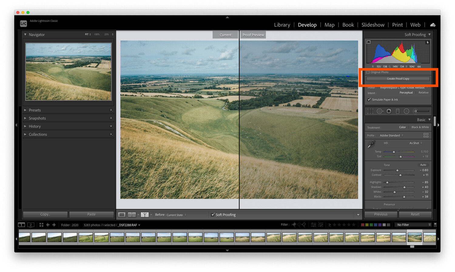


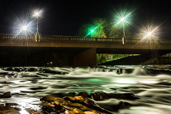


You must be logged in to post a comment.