RSS
 

Posts Tagged ‘Guide’

Posing Guide: 21 Sample Poses to Get You Started with Photographing Couples

12 Dec

The post Posing Guide: 21 Sample Poses to Get You Started with Photographing Couples appeared first on Digital Photography School. It was authored by Guest Contributor.

poses for photographing couples

This is a guest post by Kaspars Grinvalds from Posing App.

In this posing guide series, we’ve looked at posing female subjects, posing male subjects, and posing children. In those individual portraits, the main subject is a single person with a single personality. But couple photography is more about connection, interaction, and above all, feelings between two people. Generally, you’re working with very deep and passionate feelings, which is what makes couple photography so delightful and positive.

Couples are pretty easy to engage in a photoshoot. If they are initially a bit shy or feeling uncomfortable, just ask them to show you how they felt and looked when they met for the first time. You will touch them on an emotional level, providing you with natural and loving expressions in their portraits.

However, creating strong couple poses presents its own difficulties. That’s why we’re offering 21 simple, easy poses for photographing couples – so you can get started taking stunning couple photos, today.

1. Standing face to face (but looking at the camera); one partner should hold an arm on the other partner’s chest

Make sure you take both close-up and vertical shots.

Posing Guide: 21 Sample Poses for Photographing Couples

2. Standing close together and looking toward one another

Ask the couple to stand very close to one another to create intimate close-up portraits. Don’t be afraid to zoom in and crop real tight!

intimate close up pose

3. Hugging from behind

This is a very easy and cordial pose, with one partner holding the other from behind. The couple may look straight into the camera or at each other. They can even kiss for a more emotive shot.
Posing Guide: 21 Sample Poses for Photographing Couples

4. Holding from behind

This is a fun and loving pose, with one partner holding onto the other partner’s back and shoulders.

Pay attention to hand positioning; it should be simple and natural.

Posing Guide: 21 Sample Poses for Photographing Couples

5. Holding from behind (alternative)

This is just a variation on the previous pose, with one partner holding the other from behind.

Remember that the couple doesn’t necessarily have to look into the camera. For better results, make them interact with each other by talking, offering flirtatious looks, laughing, etc.
Posing Guide: 21 Sample Poses for Photographing Couples

6. Holding and looking out

This pose creates a very romantic mood, and it works best when outdoors with some open space in the background.

Shoot only slightly from behind the couple.

And remember that you have to be far enough to the couple’s side to capture each person’s closest eye. Otherwise, you will create an impersonal, empty shot.

Posing Guide: 21 Sample Poses for Photographing Couples

7. Looking up

Find some elevation and shoot your subjects from above.

A common pose shot from an unusual angle is always creative and will often reward you with surprisingly good results.

shoot from above

8. Intimately holding hands

This is another romantic pose. It works best outdoors with some open space in the background.

It also works very well as a silhouette against a bright background (in front of a sunset, for example).

Posing Guide: 21 Sample Poses for Photographing Couples

9. The gentle, staggered pose

This is an easy-to-create pose for a full-height shot. It’ll give your photos a calm and affectionate mood.

Posing Guide: 21 Sample Poses for Photographing Couples

10. The piggyback pose

This one’s a fun pose, but don’t assume that it only works with younger people. If an older couple feels fine with it, this pose will work superbly with them, as well.

Try different framings, take full-height shots, half-height shots, and close-ups.

Posing Guide: 21 Sample Poses for Photographing Couples

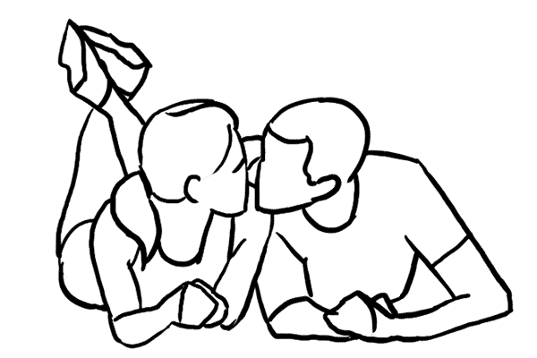
11. Standing face to face and kissing

This is a very nice way to show the affection a couple felt when they first met each other.

It works very well in crowded places, such as a famous meeting point in a city, at a train or metro station, etc.

couple kissing

12. Jumping and hugging

This pose offers a little bit of fun!

The crucial part is the leg positioning of your jumping subject; each leg should be bent at different angles.

Oh, and take a close-up portrait shot, as well.

woman jumping into a man's arms

13. Walking and holding hands

Take shots of the partners walking hand in hand as they approach from a distance.

Shoot in Burst mode only, because the majority of your shots will look awkward thanks to the leg movement. Therefore, the second part of your job is to select the photos with the best leg movement and positioning afterward.

couple pose holding hands

14. Walking and holding each other

This is another pose with a walking couple. This time, the couple should walk close together and hold onto each other.

As with the previous pose, take several shots and choose the ones with the most elegant leg positioning.

Posing Guide: 21 Sample Poses for Photographing Couples

15. Walking away from the camera

Never forget that there are often good opportunities when shooting from behind! This is a simple pose, but one that looks amazing when done right.

couple walking together

16. Lying on the ground

For this one, the couple should lie close together on the ground.

Ask them to lift their upper bodies a bit and use their arms for support. One partner might embrace the other partner gently. Shoot from a very low angle.

couple lying together on the ground

17. Lying on the ground and looking at each other

Here’s another variant with the couple lying on the ground, but this time with a little space between the partners.

Posing Guide: 21 Sample Poses for Photographing Couples

18. Cuddling on the ground

This is a nice example of an asymmetrical pose, with one person positioned slightly above the other.

Posing Guide: 21 Sample Poses for Photographing Couples

19. Lying together, looking up

This is an informal and fun way to pose – with the couple lying on their backs.

couple lying on backs

20. Sitting together on a sofa

Here’s a very cordial pose; ask the couple to sit comfortably on their favorite sofa.

couples sitting on a couch

21. The classic maternity pose

Shooting a couple may mean maternity photography.

Some poses from this couples series work pretty well for such an occasion. Simply adjust the pose accordingly to show the couple’s feelings about the baby!

This one here is a classic, and looks nice for pretty much any couple:

maternity pose

Grab our printable posing guide for photographing couples

Here’s 16 of our favorite couple poses for you to print and take with you on your next couple shoot:

Posing Guide for Photographing Couples

Also, make sure you look at these couple poses as a starting point only.

That’s the reason why they are rough sketches instead of real photos. You cannot, and should not, repeat the poses exactly; instead, adjust the poses creatively according to your shooting environment and scenario.

Check out the other posing guides in this series

  • Posing Guide: Sample Poses for Photographing Women (Part 1)
  • Posing Guide: Sample Poses for Photographing Women (Part 2)
  • Posing Guide: Sample Poses for Photographing Men
  • Posing Guide: Sample Poses for Photographing Children
  • Posing Guide: Sample Poses for Photographing Groups of People
  • Posing Guide: Sample Poses for Photographing Weddings

Grab our guide to portrait posing

Posing Guide: 21 Sample Poses to Get You Started with Photographing Couples

The post Posing Guide: 21 Sample Poses to Get You Started with Photographing Couples appeared first on Digital Photography School. It was authored by Guest Contributor.


Digital Photography School

 
Comments Off on Posing Guide: 21 Sample Poses to Get You Started with Photographing Couples

Posted in Photography


Your Quick Guide to Understanding Photoshop Adjustment Layers

09 Dec

The post Your Quick Guide to Understanding Photoshop Adjustment Layers appeared first on Digital Photography School. It was authored by Simon Ringsmuth.

photoshop adjustment layers a quick guide

Adjustment layers are one of the most essential aspects of editing images in Photoshop. They let you apply rich, detailed edits to your photos that go well beyond what you can accomplish in other programs.

Now, adjustment layers can be a bit difficult to understand if you’re used to a more streamlined application like Lightroom, Apple Photos, or Luminar. But with a bit of practice, you can easily master Photoshop adjustment layers and take your photo editing to the next level!

Photoshop adjustment layers magnolia seed
Nikon D7100 | 50mm f/1.8G | 50mm | 1/500s | f/2.8 | ISO 250

What are Photoshop adjustment layers?

When you open a picture in Photoshop, you can’t just start dragging sliders to change its appearance. Before you can do much of anything, you need to start with layers, which serve as the bedrock of everything that makes Photoshop so powerful.

Photoshop adjustment layers leaf
Nikon D7100 | 50mm f/1.8G | 50mm | 1/250s | f/2.8 | ISO 450

To help visualize the concept of adjustment layers, think about a physical picture sitting on your desk. If you wanted to give the picture a green tint, you could simply drape a sheet of green cellophane over it.

That’s exactly how adjustment layers work in Photoshop: They let you change the visual properties of your image without destroying the underlying file. You can add as many adjustment layers as you want and use them to change things like white balance, exposure, hue/saturation, and over a dozen other properties.

In other words:

Photoshop adjustment layers are like stacking sheets of digital cellophane on top of your images. Each layer can be controlled individually and combined with layer masks to apply edits to specific parts of your images. All of this might seem needlessly complicated compared to the simplicity of other programs, but once you get the hang of Photoshop adjustment layers, you’ll never want to go back.

Photoshop adjustment layers dandelion
Nikon D7100 | 50mm f/1.8G | 50mm | 1/2000s | f/2.8 | ISO 100

Another way to think about Photoshop adjustment layers is by comparing them to panels in the Develop module of Lightroom.

However, the Develop panels only offer a handful of adjustments that you can use. Photoshop lets you stack as many layers as you need – even multiple layers of the same type of adjustment – so you can tweak your images as much as you could possibly want. There is a bit of a learning curve, but the results are well worth the effort.

How to add an adjustment layer

The first step when working with adjustment layers is to load an image into Photoshop. Then click on the Adjustments panel, which is usually located above the Layers panel.

(If you don’t see the Adjustments panel, go to the Window menu and choose Adjustments.)

Photoshop adjustment layers
Load an image into Photoshop and then click the Adjustments panel.

The Adjustment panel offers sixteen adjustments to choose from, and sorting through all of these can be overwhelming (especially if you’re used to the simple, straightforward editing parameters available in Lightroom).

Photoshop adjustments
Each one of these icons is a specific type of adjustment. Hover your cursor over each one to see a brief description.

Some of these adjustments are similar to what you might find in Lightroom, such as Brightness/Contrast and Color Balance. But using the adjustments is much different from working in Lightroom and, in some ways, more complicated. Fortunately, that also means you can get much better results.

To see how this process works, I’ve included an image (below) that clearly needs some editing. Thankfully, Photoshop adjustment layers are here to help!

Photoshop adjustment layers Minnesota
Fujifilm X100F | 23mm | 1/4000s | f/8 | ISO 200

I’ll start by adding a Brightness/Contrast adjustment layer, which is a simple matter of just clicking the Brightness/Contrast icon in the Adjustments panel. Immediately, two sliders appear, which you can use to make the picture brighter or darker and to add or remove contrast.

Brightness/Contrast editing parameters
After clicking an adjustment layer icon, the available editing parameters show up for you to start working with.

A few seconds later, my picture is much improved, thanks to a brightness boost. However, there is still a lot of work left to do.

Photoshop adjustment layers Minnesota
Brightness +75, Contrast -5

One other thing happens when you click an adjustment layer icon that you might not notice but is critically important:

The Layers panel will create a layer specifically for that adjustment.

adjustment layers
Clicking an adjustment icon automatically adds a new layer to your image with the selected adjustment as its title.

This new layer, along with all the icons associated with it, is what gives an adjustment so much flexibility. In Lightroom, you can enable and disable individual panels in the Develop module, but you don’t have this level of control over your adjustments.

masking icon

Note the different icons in the short screen capture above:

  • Indicates layer visibility: Click this to hide or show the adjustment.
  • Layer thumbnail: Double-click this to show the editing parameters (sliders, eyedroppers, etc.) for the adjustment layer.
  • Indicates layer mask is linked to layer: Click this to unlink the adjustment layer mask from the adjustment. If you’re new to adjustment layers, you can just ignore this altogether.
  • Layer mask thumbnail: This is a very tiny preview of the layer mask that is created by default when you click on a new adjustment layer icon. Click this to show the editing parameters of the mask.

While my picture of the Minnesota sign is better than when I started, it still needs a lot of improvement. The next thing I want to do is set the white balance, but this option is missing from the Adjustments panel.

Instead, you have to use the Curves adjustment, then click the gray point eyedropper. Next, click a neutral or slightly gray portion of your image to counteract any color casts. Note that this process essentially replicates the White Balance function of Lightroom.

curves adjustment
Select the gray point tool, then click a slightly gray or neutral area of your photo to set the white balance of the image.

One thing you might notice is that the Curves options in Photoshop are much more comprehensive than the Curves options in Lightroom. This should give you an indication of how much more flexibility you have with adjustment layers. You can use Curves to do everything you would do in Lightroom, along with much, much more.

The final operation to fix this image involves a Hue/Saturation adjustment layer. Click on the Hue/Saturation icon to bring up a panel that looks like this:

Photoshop adjustment layers
The Hue/Saturation adjustment layer parameters

The key to this panel is the hand icon in the top-left. Click it, then click on a part of your image that you would like to saturate or de-saturate.

In this case, I want to start with the grass below the sign. Clicking and dragging to the right makes it much greener, and gives a sense of vibrance that is sorely missing from the original.

Photoshop adjustment layers Minnesota
The grass and foreground elements really pop, thanks to a quick tweak with the Hue/Saturation adjustment layer.

This is a good start, but I need to fix the sky, and that is where a layer-based approach really starts to come in handy.

Instead of editing the sky with the adjustment layer I just created, I can add a new adjustment layer and use that for the sky. This allows me to control my Hue/Saturation edits for individual parts of the image, instead of having just one Hue/Saturation adjustment layer that affects the entire scene.

Minnesota statue with boosted sky colors
The sky colors are now improved. These edits are applied using a layer separate from the grass edits, and thus can be controlled independently.

While the resulting picture is much better than the original, there is still some tweaking that needs to be done for it to truly feel finished.

Adjustment layer masks, explained

Eagle-eyed observers might notice something amiss with the picture above:

The Minnesota sign now has a purple tint to it.

Never fear, adjustment layers are here! Click the white rectangle next to a layer name to edit its mask:

layer masks

You see, by painting black onto a layer’s mask, you prevent that area of the photo from being affected by the adjustment. So if you don’t want the sign to be affected by the Hue/Saturation adjustment layer, simply paint black over the portion of the mask that covers the sign!

Here’s how it works:

First, select the Brush tool (press B or click the Brush icon in the left-hand toolbar).

Make sure your foreground color is white and your background color is black (to do this quickly, just hit D).

Now it’s time to actually paint the mask. Press the X key to switch between white (revealing) and black (hiding), and the [ and ] keys to increase or decrease the size of the brush.

For tricky shapes like the sign, you can use the Magic Wand tool to select the shape. Then, with the shape still selected, use the Brush tool to mask (remove) the adjustment from that portion of the image.

Photoshop adjustment layers Minnesota

A closer inspection of the Layers panel now shows a black silhouette over the portion that has been masked out of the top Hue/Saturation adjustment layer. I have also renamed the top two layers so as to accurately describe the type of effect they have on the image.

(Double-click a layer name to rename it, and press Enter when you finish typing.)

Photoshop adjustment layers
The mask for the Hue/Saturation Sky adjustment layer shows a black patch where the adjustment has been concealed.

Nondestructive editing

One mistake some beginners make when editing images in Photoshop is applying adjustments directly to the original photo. This can be done using the Image>Adjustments menu, which gives you common editing options such as Brightness/Contrast, Hue/Saturation, and more. Unlike adjustment layers, these edits are not easy to work with, nor are they easy to alter once they have been implemented.

Photoshop adjustment layers, on the other hand, are nondestructive. You can tweak and change layers after they have been implemented, and you can easily delete them. That’s why layer adjustments are much more flexible than edits applied directly to an image.

Photoshop adjustment layers
Adjustment layers can be renamed, re-sorted, locked, disabled, and made transparent. And that’s just the beginning!

You can perform all manner of custom tweaks and changes to adjustment layers, such as:

  • Showing/hiding a layer by clicking the eye icon
  • Editing the adjustment by clicking the light/dark circle icon
  • Adjusting the opacity of a layer
  • Changing the blend mode, which adjusts how the layer interacts with layers below it
  • Adjusting the order of the layers by clicking and dragging
  • Locking a layer to prevent further changes by clicking the lock icon

Photoshop adjustment layers open up new editing possibilities that simply cannot be achieved in Lightroom. For example, the image of a leaf from the beginning of this article can be altered with a selective color adjustment in a matter of seconds. All I need to do is add a Black & White adjustment layer. I can then select the leaf with the Magic Wand tool and paint over the selection on the layer mask.

leaf in color with black and white background
Adding a selective color black and white effect took about four seconds.

Photoshop adjustment layers: conclusion

If you have a Creative Cloud Photography subscription, you can use Photoshop in addition to Lightroom at no extra charge. Now, if the sheer level of options and buttons in Photoshop makes you want to run to the comfort and safety of Lightroom, I get it. I have been there, too, and I still have that feeling from time to time.

However, learning to use Photoshop adjustment layers is one of the first steps in understanding how powerful and flexible Photoshop can be. If you have not yet tried working with layers, take a moment to test them out. See what layers can do for you.

You might be surprised at how easy it is!

The post Your Quick Guide to Understanding Photoshop Adjustment Layers appeared first on Digital Photography School. It was authored by Simon Ringsmuth.


Digital Photography School

 
Comments Off on Your Quick Guide to Understanding Photoshop Adjustment Layers

Posted in Photography


A Guide To The Limitations of Repairing Camera Lenses

04 Dec

There is one heart-stopping moment for every photographer. It happens when the prized possession that they spent hundreds or thousands of dollars to buy falls to the ground. If you’ve ever experienced it, you know the gut-wrenching agony and how the seconds feel like hours until you pick up your camera and begin to examine it. You know the cold Continue Reading

The post A Guide To The Limitations of Repairing Camera Lenses appeared first on Photodoto.


Photodoto

 
Comments Off on A Guide To The Limitations of Repairing Camera Lenses

Posted in Photography


Treat yourself 2020: The ultimate photographers’ gift guide

27 Nov

A gift guide just for you

It’s been a doozy of a year but thankfully, it wasn’t all sour grapes. While many aspects of society ground to a halt, manufacturers still had cool and exciting products in their pipelines that they managed to bring to market.

And while opportunities to get and out shoot may be limited at the moment, we can still dream big. And what better way to do that than by ‘browser window shopping’. What follows is a rundown of the headiest products of 2020, the ones photographers really want. So pour a tall cold one and get ready to treat yourself!

Canon EOS R5

There’s no two ways about it, the gold award-winning Canon EOS R5 is our favorite mirrorless camera over $ 3000 and perhaps Canon’s most impactful full-framer since the 5D Mark II. And while the RF mount is still relatively new, there’s no shortage of fast aperture primes and F2.8 zooms available, including ‘the holy trinity’ of the 15-35mm, 24-70mm and 70-200mm.

Well-suited to enthusiasts and professionals alike, the R5 offers outstanding image quality, excellent ergonomics, fast burst shooting and fabulous autofocus performance, not to mention lovely oversampled 4K. In short, if you really want to treat yourself to the best of the best, it’s the camera to get.

View our Canon EOS R5 sample gallery

Fujifilm X100V

Of course, not everyone wants or needs an interchangeable lens camera, for some of us, the simplicity and GAS-reducing nature of a fixed lens camera offers greater appeal. Lucky for folks in this camp, two new large-sensor, fixed lens cameras are featured on this year’s list including the glorious Fujifilm X100V.

Which begs the question: What do you get when you take a wonderfully designed camera and tweak it over the course of four generations based on user feedback, without straying from the original ethos? Why, the X100V of course. Building on its legacy, the ‘V’ bring all sorts of lovely refinements to the series including a newly designed lens with better corner/close-up sharpness, an updated sensor and AF system, better build-quality, a tilting touchscreen and more!

View our Fujifilm X100V sample gallery

Leica Q2 Monochrom

Another fixed-lens, large-sensor camera launched this year is a ‘Monochrom’ version of the Leica Q2, a staff favorite here at DPR. The camera’s B&W-only sensor offers improved dynamic range and noise performance over its color sensor counterpart. Plus, the super sharp 28mm F1.7 lens and moody monochrome output make it the perfect all-in-one option for street photographers, live music shooters and/or anyone who loves shooting after the sun goes down.

And while some may find 28mm a tad too wide, the camera’s 47MP full-frame sensor provides ample resolution for cropping. Plus the Q2 Monochrom handles just like the standard Q2, which is to say it’s built like a tank and both straightforward and immensely gratifying to shoot with. And immense gratification is what ‘treat yourself’ is all about.

View our Leica Q2 Monochrom
sample gallery

GoPro Hero9 Black

GoPro’s latest flagship, the Hero9 Black, is a seriously impressive piece of kit and easily the most compelling action camera to come out in quite some time. For filmmakers, it can shoot up to 5K/30p, offering room to crop in post, assuming you’re outputting 4K, or 4K/60p. And GoPro’s Hypersmooth video image stabilization is jaw-droppingly good. On the stills side, resolution has jumped from 12MP on previous models to 20MP on Hero9 Black.

The camera isn’t just capable though, it’s also well-designed: control/menus are accessed via the rear touchscreen and the whole unit is water/freeze/dust-proof without the need for a case. It also provides improved battery life over predecessors, a front-facing ‘live’ screen and even the option to attach an accessory wide angle lens. In short, it’s the perfect companion for anyone’s extreme lifestyle, whether that means leisurely bike rides to the park or free-climbing rock faces. Treat yourself!

iPhone 12 Pro & 12 Pro Max

iPhones, like GoPros, tend to see iterative yearly updates, but occasionally a new model drops with enough advancements that it’s impossible to ignore. The iPhone 12 Pro is that model and the ultimate ‘treat yourself’ device, not just from a photo/video shooting perspective but also when it comes to displaying and viewing your work.

Apple devices have been able to shoot HDR photos and videos for some time, but this new model (like all iPhone 12 models) can now display 10-bit Dolby Vision HDR on a beautiful OLED screen, right from within the photo app: an industry first!

The camera is also impressive. It consists of three 12MP modules, including standard wide-angle (with a 47% larger sensor than its predecessor), an ultra-wide and telephoto options. Additionally, the phone will make use of Apple’s new Raw format, ProRaw, in beta now and coming soon. And, as if that’s not enough, Apple claims the device has enough processing power to make it 50% faster than any phone currently on the market (not to mention, it’s 5G-enabled). Now that’s a treat!

View our iPhone 12 sample gallery

Sigma 85mm F1.4 DG DN Art

Everyone needs a good 85mm portrait lens and Sigma’s latest 85mm offering for mirrorless full-frame E-mount and L-mount makes a strong case for inclusion in your kit.

One thing that truly sets it apart from others like it, including 2016’s Sigma 85mm F1.4 DG HSM Art, is its compact and lightweight design. However, despite a comparatively smaller footprint, this lens remains optically outstanding, offering really good sharpness at all apertures (including in the corners), minimal chromatic aberrations and well-controlled ghosting and flare.

It’s also ‘dust and splash proof’ and impressively well-built. And at $ 1200, the Sigma is priced more affordably than the competition, too. Which is to say, it checks all the boxes for what make an outstanding F1.4 portrait lens – a difficult feat and a major treat.

Watch our video review of the Sigma 85mm F1.4 DG DN Art

DJI Mavic Air 2

Have you been holding out for the right moment to spread your wings and treat yourself to a drone? Well my friends, the moment is now. DJI’s new Mavic Air 2 represents the most lust-worthy enthusiast drone to launch in some time.

The perfect balance of size and capability, Air 2 fits in the palm of your hand but can deliver great stills image quality from its 1/2″ 48MP CMOS sensor, including both Raw and JPEGs formats. It can also shoot up to 4K/60p video and offers a variety of accident avoidance technologies as well features like subject tracking, HDR video and a panorama mode. Battery life is a useful 34 minutes and perhaps most importantly, the Mavic Air 2 is easy and enjoyable to fly.

Read our DJI Mavic Air 2 review

Olympus 150-400mm F4.5 TC1.25x

I’ve tried my best to keep this year’s ‘Treat Yourself’ guide somewhat mount-agnostic, but certain new glass is just too darn difficult to ignore. Take, for instance, the new Olympus 150-400mm F4.5 TC1.25x for Micro Four Thirds bodies. It’s not for everyone, but for a certain type of photographer, this is the the ultimate optical treat!

I’m talking of course about nature and wildlife photographers. Olympus’ king of tele-s packs a whopping 300-800mm equiv. focal range into a surprisingly well-sized, well-weighted body. But that’s not all! A 1.25x built-in teleconverter bumps that reach to an impressive 1000mm (at the cost of 2/3 EV of light). And, as is the case with most high-end Olympus gear, this lens is sealed against dust and moisture, and built to take some punishment – just be sure to protect that big, beautiful 95mm front element!

View our Olympus 150-40mm F4.5 TC1.25x sample gallery

DJI Pocket 2

The second iteration of DJI’s pocket-friendly vlogging machine is a real winner. This little unit is easy-to-use, offers a nice wide 20mm field-of-view (wider than its predecessor) and shoots high quality, super-smooth 4K video. It also features an updated four-way directional in-camera microphone, capable of recording good quality audio without the need for an accessory mic. And did we mention it’s pocketable?

Basically, the Pocket 2 is the perfect no-fuss, all-in-one vlogging machine and the right piece of kit for sharing your adventures with the world. And while now might not be a great time to leave your house and embark on any adventures, the Pocket 2 will be waiting for you when it’s safe to travel again. So go on and treat yourself to this tiny wonder.

Watch our DJI Pocket 2 video review


There you have it, our favorite lust-worthy gear of the year. Here’s hoping 2021 has even more treats in store. Until next time, Treat yourself!

Articles: Digital Photography Review (dpreview.com)

 
Comments Off on Treat yourself 2020: The ultimate photographers’ gift guide

Posted in Uncategorized


A Guide to Repairing Camera Lens Scratches

25 Nov

That feeling when you take the lens cap off to reveal a scratch. How did that get there? When did that happen? Is it going to affect my photos? These are just some of the questions that will no doubt run through your head should you find yourself in this situation. Cameras and their lenses are expensive pieces of equipment Continue Reading

The post A Guide to Repairing Camera Lens Scratches appeared first on Photodoto.


Photodoto

 
Comments Off on A Guide to Repairing Camera Lens Scratches

Posted in Photography


Buying guide: The best gifts for film photographers in 2020

21 Nov

Introduction

Do you love film photography, or are you shopping for someone who does? Lucky you / them! Film photography is exploding in popularity and the folks in on the fun tend to be some the coolest cats in town: sorry, digital peeps.

Cool cats deserve cool gifts. And so we’ve combed the analog universe, searching high and low for the hottest gear to include in this guide. It’s filled with fun stuff that should please even the pickiest analog avenger, and most budgets. From funky film stocks, to home developing and digitizing solutions, these are the best film photography gifts in 2020.

Note: Gifts are listed in order from least to most expensive.

Fujifilm Neopan 100 Acros II – $ 12 a roll – A classic film stock, resurrected from the dead

Fujifilm’s beloved B&W film stock is back, baby! Discontinued in 2018, the Japanese film producer announced a new and improved Acros II in November of 2019, much to the delight of monochrome fanatics everywhere. Available in 35mm and 120 formats, Acros II offers silky smooth grain, excellent sharpness and lovely tonality; the perfect film for a nice sunny day.

It’s nostalgic, yet practical, and a film certainly worthy of a spin through any analog lovers’ camera, whether they shot the OG version or not.

See our Fujifilm Acros II sample gallery

The Solarcan – $ 20 – A cool recyclable pinhole camera

The Solarcan is a long exposure camera, which, you guessed it, is built from a can. The intended use is for documenting the path of the sun across a horizon over a long period of time – we’re talking weeks or months. Originally launched on Kickstarter back in 2017, this single-use pinhole camera is a fun project for any analog nerd also interested in astronomy. Plus, it’s recyclable!

Each Solarcan is preloaded with a piece of B&W photographic paper (Solarcan Color is coming soon) and includes instructions for use, mounting materials and a storage tube to keep it light tight until exposure time. The Solarcan is also available in a five-pack ($ 80), which we recommend for added experimentation. Note: this item ships from the United Kingdom.

Lomography Analogue Aqua camera – $ 40 – An inexpensive waterproof 35mm camera

I’m giddy with excitement just thinking about how fun Lomography’s reloadable waterproof cameras are. For folks in the Northern Hemisphere facing a dreary winter, summer swims may seem like a far-off memory. But sunny skies and COVID-free days will someday soon (hopefully) be back upon us. And when the time does come again to take the watery plunge, the film-lover in your life will have the perfect camera to document it.

The Analogue Aqua is basically one of Lomography’s $ 20 disposable cameras sandwiched into a watertight plastic case. There are two version of the camera, one with Lomo Color Negative 400 film and one with Lomochrome Purple film. But it’s worth noting, unlike a traditional ‘disposable’ camera, these ones are not sealed shut and Lomography intends for you to reload them them again and again.

Lomography Fantôme Kino B&W ISO 8 film – $ 45.50 (5-pack) – A cool and new 35mm film stock

Speaking of Lomography, another great idea for the celluloid celebrator is the gift of a new film stock to try. Lomo’s Fantôme Kino B&W ISO 8 – announced earlier this year – is not technically new, since it’s cut from German cine film stock, but it’s newly-available for stills shooters!

This incredibly-low ISO monochrome film is super contrasty and perfect for creating a film noir–style look. And for more B&W fun, we also recommend Lomography’s Babylon Kino B&W ISO 13 film. Unlike Fantôme, it offers subtle tonal changes and plenty of dynamic range. Both are only available in 35mm as of writing.

View our sample gallery: Lomo Fantôme Kino ISO 8 & Babylon Kino ISO 13

The Pixlatr – $ 55 – A better way to digitize negatives

One of the most annoying struggles faced by analog lovers is how to get high-resolution, high-quality digital versions of their negatives. One of the best non-scanning solutions is to photograph negatives using a digital camera and a macro lens. But how the heck do you hold them in place and ensure even lighting?

Thankfully our good pal and DPR’s Film Photography Talk forum moderator, Hamish Gill, invented a solution. The Pixlatr, originally launched on Kickstarter, is a modular film holder that works with most film formats (up to 4×5) and features a semi-translucent back to diffuse light. It’s a simple, versatile and effective solution for anyone who owns a macro lens, a digital camera and a tripod.

Another solution is the Nikon ES-2. It’s a little more straightforward to use than the Pixlatr – it attaches to the end of a lens – but is also nearly three times the cost ($ 145) and only works with 35mm format film.

Analogue Wonderland film subscription box – $ 65 every other month – A reoccurring 35mm film subscription box

Who doesn’t love getting a parcel filled with fun surprises in the mail on a reoccurring basis? UK-based Analog Wonderland is bringing the concept of the ‘curated subscription box’ to 35mm film lovers everywhere. Once signed up, subscribers will receive a box every other month (depending on the length of subscription). Each box contains six different rolls of 35mm film, curated from a selection of 100.

This is not only a fun way for film lovers to try new emulsions, but also a way to connect with other 35mm shooters. Each month all subscribers receive the same film stocks, and Analog Wonderland provides an online space for folks to both discuss their results and compete in friendly competitions.

Lomography HydroChrome Panoramic Camera – $ 80 – A wacky camera with a ‘water lens’

Bear with us on this one, because Lomography’s HydroChrome Panoramic camera is truly wild. Based off a mid-1800’s camera design, this inexpensive panorama camera is built around a 32mm equivalent water-filled lens. Yes, you read that correctly.

While the concept may sound gimmicky, the results are actually pretty compelling and cool. And the camera plays nice will all sorts of liquids, not just water (though we’d avoid anything sticky). For instance, simply adding food coloring, or watered-down coffee can change the results dramatically.

UN Twin Film Pocket & Rama Works Film Canister – $ 20 & $ 110 – A watertight film holder

Is the film shooter in your life also an adventure-seeker? If so, a water/light tight film holder may be the perfect gift, providing peace of mind. And we’ve got two models to choose from: one on the sensible side and one a little more swanky.

First, the sensible: The UN Twin Film Pocket is a straightforward product that will safely store two rolls of 35mm film. It’s built of plastic and features screw-down caps with rubber gaskets as well as a metal clip to attach to a camera or bag strap. These units can be a little tricky to hunt down stateside, but the product is carried by both European and Japanese distributors. That said, we’ve successfully had them sent to the USA, just plan for a little extra time in transit.

On the other end of the spectrum is the Rama Works Film Canister. Sure, it costs 5x as much as the UN Twin Film Pocket, but it is a beauty to behold: machined from a solid block of aluminum and anodized. Note: Only the 120 format version is currently available as the time of writing.

Rama Works Film Canister shown above.

Fujifilm SQ1 Instax Square camera – $ 120 – A larger format Instax Camera

Most folks are probably familiar with Fujifim’s Instax Mini format, but did you know there’s also an Instax Square format, which provides a larger image size? And the hottest new Instax Square model is the Fujifilm SQ1, which dropped earlier this year.

It’s a handsome-looking model that’s easy-to-use, comfortable and capable of excellent results. Available in three chic colors, it’s the perfect camera for documenting social outings, once we’re allowed to gather together again!

For even more Instax photography fun, we also recommend the Fujifilm Wide Instax 300 ($ 90). It’s a good bit chunkier than the SQ1, but makes use of the largest Instax format: Instax Wide. It also offers a bit more creative control than the SQ1.

Lab-Box Daylight Developing Tank – $ 160 – An easier way to develop film at home

Analog shooting and DIY often go hand-in-hand. And nothing beats the thrill of successfully developing your own images at home. But for those a little nervous to dip their toes in the unknown world of loading exposed film to reels in the dark, the Lab-Box Daylight Developing Tank is for you.

Because let’s face it, most home developing mistakes are a result of improperly loading film and/or accidentally exposing it in the process. Lab-Box removes this pain point, though there is a slight learning curve to using the device. But ultimately, once mastered, it should help speed up the workflow of any home developer while also cutting down on the number of botched rolls.


And there you have it, the best film photography gifts in 2020, sure to bring a smile to the faces of emulsive eccentrics everywhere! Happy holidays and happy shooting, from the analog nerds here at DPReview.

Articles: Digital Photography Review (dpreview.com)

 
Comments Off on Buying guide: The best gifts for film photographers in 2020

Posted in Uncategorized


Product Photography 101: The Complete Guide To Perfect Product Photos

20 Nov

Online shopping is the wave of the future. Already, e-retail sales account for 14.1% of all retail sales around the globe. That’s expected to grow to 22%. Every online retailer from small businesses to global giants face the same challenge — how to get customers to buy a product they can’t see. That’s where compelling, true-to-life product photography comes in. Continue Reading

The post Product Photography 101: The Complete Guide To Perfect Product Photos appeared first on Photodoto.


Photodoto

 
Comments Off on Product Photography 101: The Complete Guide To Perfect Product Photos

Posted in Photography


A Beginners Guide to Capturing Motion in Your Photography

10 Nov

The post A Beginners Guide to Capturing Motion in Your Photography appeared first on Digital Photography School. It was authored by Darren Rowse.

Emily Hancock, a professional Hampshire Photographer, submitted the following tutorial on capturing motion in photography.

Motion-Photography-Introduction.png

(Image by T.MoE)

Photographs, by definition, capture and immortalize a small slice of life. There isn’t an easy way for the viewer to infer what happens before or after that moment. However, there are images that need to communicate motion.

For example, you may want to capture a dog running, a train barreling down the tracks, or trees blowing in the wind. Each of these scenes can come alive within your photographs if you learn how to convey motion properly.

Today, I’ll describe how you can use different shutter speeds and panning to capture motion in your photography. I’ll also explain a potential issue you might experience when photographing moving subjects – along with tips to resolve it.

Let’s get started!

Reasons to capture motion

Beginning photographers have likely seen captivating photographs that capture motion. There are several ways to achieve these photos, and each has a slightly different goal.

You see, sometimes there is a need to blur certain elements in the image while focusing sharply on a few subjects in the foreground. Other times, you may want to freeze or blur everything. The direction you take depends on your objective for your photograph.

A lot of photographers capture motion simply to convey that an object is moving. But there are also other reasons to do this. Movement can communicate mood. Trees rustling in the wind suggests serenity, while throngs of people on a busy city block implies hurried activity.

You can also use motion to eliminate elements in a scene that may serve as distractions to the viewer. For example, you may want to photograph a person standing on a sidewalk corner as cars move behind them. By blurring everything but your primary subject (i.e., the man on the corner), you can eliminate potential distractions and focus the viewer’s attention.

Two primary techniques for capturing motion in photography

The shutter speed you use while photographing a scene plays a key role in capturing motion in your image.

The faster the shutter speed, the sharper the focus on your subject. On the other hand, a slower shutter speed will blur a moving object. There are two main approaches here (though I’ll discuss a couple of alternatives in a moment).

1. Blurred subject with the background in focus

light trails
Photo by paulaloe

Let’s assume you’re photographing a speeding train against a wall of trees in the background. You can blur the train while leaving the trees in focus. Doing so would instantly communicate to the viewer that the train is moving quickly.

To accomplish this, you would use a slow shutter speed.

(It’s also important to use a tripod. That way, your camera remains steady.)

You’ll often see this technique used in nighttime photographs with car headlights cutting through the image.

2. Blurred background with the subject in focus

This second technique keeps your subject in sharp focus while the background is blurred.

Using our train example, the train would be in focus and the wall of trees would be blurred, thereby conveying the train’s movement.

Similar to the first method, you’ll need to use a slow shutter speed. However, instead of using a tripod, you’ll be panning your camera along the directional path of your subject.

But what actually is panning?

Panning explained

motion in photography biker moving fast
Photo by fabbriciuse

Most beginning photographers are trained to “secure” their cameras. That is, beginners are taught that the camera should remain as still as possible for certain types of shots.

By contrast, panning requires that you move your camera with your subject. Specifically, you’ll be matching your subject’s rate of movement and the direction in which it is traveling.

In our bike example, assume the man on the bike is moving from east to west. In that case, you’ll need to pan your camera in the same east-to-west direction, matching the speed of the bike. The best results occur when you have a clear view of the moving object and ample room to swivel your camera along a parallel axis.

Panning effectively can be difficult. You can practice and perfect your technique by photographing athletes who move quickly (for example, basketball players). Try to capture their facial expressions while blurring everything in the background. It will take some time to get it right, but once you do, the technique can be a valuable addition to your repertoire.

Other techniques to capture motion

Besides the two main techniques described above, you can also freeze the entire scene or blur everything.

Freezing the entire scene can give your photographs a unique look, especially if the objects strongly imply movement. For example, consider a bird flying in front of a waterfall. Both imply motion to the viewer. Freezing the entire scene captures all that motion and can produce a breathtaking image. You should use a shutter speed of at least 1/1000s for that type of shot.

slow shutter speed
Photo by llimllib

Blurring everything produces the best results when the scene offers bright, contrasting colors or varying tones. In most cases, capturing motion in this manner is done purely for artistic purposes.

Another effective method for capturing motion within your images is “chrono photography.”

skateboarder jumping
Photo by monkeyc

Using the continuous shooting feature on your camera, you can capture a series of shots and join them together in the post-processing stage to create the effect shown above. A tripod is essential when attempting to shoot motion using this method.

chrono photography
Image by Jolantis

Determine the proper shutter speed

A lot of novice photographers ask what the proper shutter speed is, given their objective.

But every situation is unique. One speed doesn’t suit all circumstances. To identify the right shutter speed, you’ll need to ask yourself a few questions:

  1. How fast is your subject moving?
  2. How much distance exists between the camera and the subject?
  3. How much motion do you want your photograph to convey to the viewer?

The faster the shutter speed, the more frozen and crisply-defined your subject will be. Most cameras today will allow you to freeze a scene using 1/8000s or faster.

That being said, the numbers only serve as a rough guideline. You’ll need to experiment with different shutter speeds in a variety of situations.

Potential issue: excess light

Here’s a potential issue you may encounter when trying to capture motion in photography:

When you slow your shutter speed to blur elements in your image, there’s a chance that too much light will enter and impact your photograph (which will result in overexposure).

This is a common problem, but there are a couple of ways to resolve it:

First, check the aperture on your camera. The wider it is, the more likely excess light will enter. Try adjusting the settings to reduce its size.

Second, review your ISO setting. When the ISO is high, the image sensor in your camera may be overly sensitive to light. This can create a too-bright image, as well as unwanted noise, so consider dropping your ISO.

Mastering the art of motion capture

Becoming proficient at capturing motion in photography requires practice and experience. You’ll need to spend time learning how different shutter speeds impact the quality of your images. Even if you’re just setting your camera on its tripod, timing a perfect shot of a fast-moving object can be difficult.

In the end, capturing motion in your photography is part technique and part art. Fortunately, with practice, you can master it!

The post A Beginners Guide to Capturing Motion in Your Photography appeared first on Digital Photography School. It was authored by Darren Rowse.


Digital Photography School

 
Comments Off on A Beginners Guide to Capturing Motion in Your Photography

Posted in Photography


Mastering Noise Reduction in Lightroom: The Essential Guide

04 Nov

The post Mastering Noise Reduction in Lightroom: The Essential Guide appeared first on Digital Photography School. It was authored by Simon Ringsmuth.

Shooting at a high ISO is a great way to retain control over other exposure parameters such as aperture and shutter speed while still getting a usable image.

However, even today’s digital cameras still produce noise and grain when shooting at values like ISO 6400, ISO 12800, and beyond. While an ISO 6400 photo is never going to look as clean as a photo taken at ISO 100, you can use Lightroom noise reduction to clean up your high ISO images.

Mastering noise reduction in Lightroom involves a few tradeoffs. But it’s a great solution for people who need the flexibility of shooting at high ISO values while still getting great results.

Mastering noise reduction in Lightroom infant
Nikon D750 | Nikon 85mm f/1.8G | 85mm | 1/500 sec | f/1.8 | ISO 6400

To understand how to use Lightroom noise reduction, it’s important to learn a little more about ISO.

In a nutshell, ISO is a measure of a camera’s sensitivity to light. When shooting with film, each roll has a single value and cannot be changed until you use up all your exposures and put in a new roll. Digital photography, on the other hand, lets you alter your ISO any time you want.

Higher ISO values let you use smaller apertures or faster shutter speeds because your camera produces a brighter exposure. As a result, you don’t need as much light coming through the lens in order to take a picture. This means that you can use a smaller aperture, faster shutter speed, or both. (Or you can use Auto ISO and let your camera figure out the rest.)

The tradeoff is that increasing your camera’s ISO inevitably leads to noise being introduced to the picture. (Digital noise is kind of like the static you might remember seeing on old television sets.) High ISO shots aren’t as sharp, and colors aren’t as vibrant, thanks to noise. But if shooting at ISO 6400 means you can use a fast shutter speed to avoid motion blur, then it’s generally a tradeoff worth making.

Mastering noise reduction in Lightroom man portrait
Nikon D750 | Nikon 85mm f/1.8G | 85mm | 1/90 sec | f/4.8 | ISO 6400

The best of both worlds would be a high-ISO shot that retains the color and sharpness of a low ISO shot. Unfortunately, that’s not actually possible (at least not with current technology). But mastering noise reduction in software such as Lightroom gives you a great deal of control over reducing high-ISO artifacts while keeping as much detail as possible.

A closer look

The effects of high ISOs aren’t always visible when photos are downsized for the web. To really see what happens at high ISOs, and to understand how to clean it up, you should look at images up close.

Here’s a zoomed-in view of the above image; you can now see the effects of shooting at high-ISO values:

Mastering noise reduction in Lightroom portrait close-up
Up close you can see the speckled background on the left and the lack of definition in the eyebrows. These are just some of the effects of shooting at ISO 6400. Noise reduction settings are at their default values: Luminance 10, Detail 50, and Contrast 0.

Lightroom lets you remedy these ISO artifacts, at least partially, through the Detail panel in the Develop module.

There are two types of noise reduction available: Luminance and Color.

Luminance is the most common form of noise in digital photography and refers to the slight speckled variations in brightness from one pixel to the next. You can see this most clearly in the brown background on the left side of the above photo.

Color noise is often obvious at very high ISO values like 25600 or greater. It looks like random splotches of color scattered around the brightest or darkest portions of an image. In modern digital photography, color noise isn’t nearly as much of an issue in most instances. Most of the time you won’t need to use the Color, Detail, and Smoothness sliders. For most practical purposes, it’s best to stick with luminance noise reduction adjustments.

Lightroom noise reduction sliders mastering noise reduction

To access the noise reduction sliders, click the Detail panel in the Develop module. The noise reduction sliders are grouped with sharpening adjustments because these often go hand-in-hand. Boosting noise reduction can have a smoothing effect on your images which can be somewhat mitigated by adjusting the sharpening sliders.

Getting detailed

When working with luminance noise, there are three sliders to adjust:

  • Luminance
  • Detail
  • Contrast

Luminance is a measure of how much noise to remove, while Detail and Contrast give you finer control over the effects of the noise reduction.

You might notice that Lightroom automatically applies a small amount of noise reduction to every RAW file by default. This is generally a good starting point because RAW files, due to their unprocessed nature, inherently contain more noise than in-camera JPEG files. And it’s almost always recommended to remove some of that noise even if just a tiny bit.

To start the noise removal process, move the Luminance slider to the right. The farther you go, the more pronounced the noise removal effect will be. I generally don’t push it past 50, but your settings will depend on your image and your personal preferences.

Mastering noise reduction in Lightroom portrait close-up
This is the same image as above, but with Luminance set to 50. Notice how the background is much smoother, as are the cheeks. However, the eyelashes have lost much of their sharpness.

After adjusting the Luminance slider to your liking, use Detail and Contrast to bring back parts of your image that might have been lost by the noise reduction algorithm. Move the Detail slider to control the threshold at which the noise reduction starts to kick in. This can help retain some of the details in your image but end up leaving some of the noise intact.

Mastering noise reduction in Lightroom portrait close-up
Bumping the Detail slider up to 80 brings back some of the sharpness around the eyelashes and other areas of the face.

As you adjust the Luminance slider, you will see some parts of your picture get muddy, almost like a layer of petroleum jelly has been smeared across the shot. Use the Contrast slider to bring back some of the high-contrast parts of your image that are most affected by the Luminance slider.

Mastering noise reduction in Lightroom portrait close-up
Moving the Contrast slider up to 40 helps mitigate a bit more of the effects of software-based noise reduction. However, the more you use the sliders, the more processed and artificial your images will look.

As with many aspects of photography, there is no single correct answer for how much noise reduction to use in Lightroom. Some high-ISO images will look fine without too much tinkering, while others require more drastic measures. Mastering noise reduction isn’t about finding one solution that works for every image. It’s about understanding how to use the editing tools to create the best possible outcome for any given photo.

Low ISO versus noise reduction

To really understand how Lightroom noise reduction works, it helps to look at some comparisons of images so you can see the results for yourself.

The following images show different versions of the same scene; one base shot is taken at a very low ISO, while another is taken at a high ISO. I then apply varying degrees of noise reduction and display the results.

I took the first image at ISO 100:

test scene
Nikon D7100 | Nikon 50mm f/1.8G | 50mm | 1 sec | f/8 | ISO 100

Here’s the same scene shot at ISO 6400 for comparison:

test scene
Nikon D7100 | Nikon 50mm f/1.8G | 50mm | 1 sec | f/8 | ISO 6400

When resizing images for the web, some of the issues with shooting at a high ISO are difficult to notice. However, a few artifacts do stand out, such as the muddiness of the solid blue radio toy, and a clear lack of definition in the intricate parts of the ball maze on the left.

For a closer look, here are 100% crops of each image:

test scene crop
A 100% crop of the original ISO 100 image. Note the fine detail in the cactus and the overall clarity of the picture.
test scene crop ISO 6400
A 100% crop of the original ISO 6400 image. Colors are washed-out and subtle texture is obliterated. Note that the green paint lines at the borders of the white lines are completely gone.

When looking at these images close-up, it’s clear that the ISO 6400 photo is noticeably worse. However, if shooting at ISO 6400 or greater will give you the ability to get the shot you want, then it’s a tradeoff worth making.

High-ISO shooting becomes even more practical when you learn to eliminate some of these issues in Lightroom. Using the noise reduction options won’t fix a high-ISO image entirely, but it can go a long way toward cleaning things up.

test scene with noise reduction
A 100% crop of the ISO 6400 image with these adjustments applied: Luminance 80, Detail 60, and Contrast 55. While the ugly noise artifacts have been smoothed out, the image still isn’t as rich and detailed as its low-ISO counterpart.

Mastering noise reduction in Lightroom isn’t just limited to moving three sliders in the Detail panel. It’s best paired with other adjustments such as Texture, Clarity, Contrast, Saturation, etc. There is no one-size-fits-all preset to magically make your ISO 6400 images look as good as ISO 100 images. But with a little work, you can bring back some of the punch and brilliance of your originals.

test scene noise reduction and edits added
A 100% crop of the high-ISO image with previous noise reduction edits applied along with the following: Contrast -15, Shadows +34, Blacks -35, Texture +42, and Saturation +22.

Noise reduction isn’t a cure-all, and it won’t resurrect parts of the image that were never captured to begin with. In the ISO 6400 shot above, no amount of software-based noise reduction can bring back the green paint along the white lines that were clearly present in the low-ISO image.

But careful use of the tools available to you can go a long way toward making a messy picture more than usable.

Mastering noise reduction in Lightroom test scene
Nikon D750 | Nikon 85mm f/1.8G | 85mm | 1/250 sec | f/2.8 | ISO 6400. The sun was setting and I needed a fast shutter speed, so I chose to shoot at ISO 6400 and was able to adjust it in Lightroom. My clients loved the results.

Mastering noise reduction in Lightroom: Conclusion

Mastering noise reduction in Lightroom isn’t a science; each image is different and your own preferences matter most of all. Shoot some test images at ISO 6400 or higher, then see what you can do to clean them up using the tools available to you.

You might be surprised at how much latitude you have when editing. The more you experiment, the more skilled you will get.

And soon you’ll be transforming your photos from noisy messes into near-masterpieces.

The post Mastering Noise Reduction in Lightroom: The Essential Guide appeared first on Digital Photography School. It was authored by Simon Ringsmuth.


Digital Photography School

 
Comments Off on Mastering Noise Reduction in Lightroom: The Essential Guide

Posted in Photography


Color Management in Affinity Photo: The Ultimate Guide

28 Oct

The post Color Management in Affinity Photo: The Ultimate Guide appeared first on Digital Photography School. It was authored by Glenn Harper.

In terms of color management, no photo software is more complete than Adobe Photoshop. It’s easy to take this for granted until you switch programs (which you might do to escape subscription costs).

That’s why this article looks at color management in Affinity Photo, a popular standalone alternative to Photoshop.

Affinity Photo welcome screen color management in Affinity Photo
Affinity Photo welcome screen.

Choosing a working color space in Affinity (Photo Persona)

The working color space you use in an editing program is a bit like a box of crayons. You are defining how big a box you use to describe your photos. Even if you can’t see all the colors inside that “box” on your screen, sometimes there is good reason to use them.

Choose your working space based on the likely output for your images. For example:

  • sRGB = publishing and printing online
  • Adobe RGB = CMYK/inkjet printing
  • ProPhoto RGB = archiving and top-quality workflows

Each choice has its own pros and cons.

The ability to make this choice seems mundane until it’s taken away. Some programs force you to use sRGB as the working space, for instance, which means you forfeit many of the colors digital cameras can capture.

So what does Affinity give us here?

Setting the working color space in Affinity is simple, though it’s not labeled a “working space” as such. You simply go to Preferences>Color>RGB Color Profile. By default, this is set to sRGB. You can change it to suit your photography and the purpose of your photos, as detailed above. Do the same with the 32bit RGB Color Profile setting.

Color management in Affinity photo - color preferences
Color preferences in Affinity Photo.

Other color preferences

For most of us, the color preference settings in Affinity can be left alone, except perhaps for the RGB Color Profile option at the top.

That said, you’ll generally want black point compensation switched on. You also won’t want the software to convert all open files to the working color space. And it’s better to be warned if a photo without an embedded profile is being assigned the working profile. This gives you a heads-up that the color may display incorrectly.

Note that each of the above options can be ticked on and off in the Color Preferences window.

Monitor profile

Affinity Photo accesses the default monitor profile assigned in your operating system. Unlike Photoshop CC (but like Lightroom), I don’t believe you can confirm the prevailing profile via Affinity itself. Past and present monitor profiles appear in drop-down menus, but you should never select these; the monitor profile is automatically applied.

Your monitor profile is a key component of color management in Affinity Photo.

Display profile in Windows color management in Affinity Photo
Windows color management display settings. (You wouldn’t want to use sRGB as a display profile except for diagnostic purposes.)

Soft proofing (Photo Persona)

Soft proofing lets you preview the output color of your photos, whether the output is an inkjet printer, an RGB printer like those often used in minilabs, or even a specific audience (e.g., color-blind individuals). Soft proofing is available in Photoshop CC and Lightroom, but isn’t offered by many other programs. What about Affinity Photo?

In Affinity Photo, soft proofing comes in the form of an adjustment layer. You won’t find it among the menus at the top of the screen like in Photoshop. This is quite handy, because it’s so easy to flick layers on and off to see the effect of soft proofing and edits.

Color management in Affinity photo - soft proofing
Soft proofing using a photo lab’s profile.

Color blindness settings in Affinity are located among the built-in LUT adjustment layers. The LUTs help you visualize colors as seen by three types of dichromats: protanopes, deuteranopes, and tritanopes.

Affinity Photo color blindness LUTs color management in Affinity Photo
Tritanope LUT for visualizing a type of color blindness.

Simulating dynamic range

The simulate paper color option you get in Photoshop is already applied in Affinity. You can’t switch it off.

But you do have the option of switching on black point compensation. This reduces the dynamic range of your screen image to mimic the look of paper and ink. It makes the on-screen photo look duller. That’s why professional photographers sometimes avoid showing clients the comparison.

Affinity photo black point compensation color management in Affinity Photo
Blocked shadows caused by a lack of black point compensation (BPC). Usually, the effect is less drastic than with this Newsprint profile. Note that BPC has more effect with a relative colorimetric rendering intent. It has less of an effect or no effect with other rendering intents.

Gamut differences

The Gamut Check option in Affinity Photo shows you which colors are not reproducible with any given output. You can fiddle with the color of the photo until all color is in gamut, but you’ll often do more harm than good.

It’s better to rely on the rendering intent setting if you want colors to be as close as possible to the original. The relative colorimetric rendering intent keeps colors looking relatively accurate and shifts non-reproducible colors back into gamut, but you’re free to pick the rendering intent that looks best to you.

Affinity Photo gamut warning color management in Affinity Photo
The gray area tells me which area of red will be out of gamut (i.e., not reproducible on output). This is the Gamut Check option in Affinity soft proofing. Its practical use is somewhat limited, since you’ll often do more harm than good by trying to edit colors into gamut.

Creating a duplicate

When soft proofing, you may want to work on duplicate images side by side, so you can reference the original color and tone. In that case, create a duplicate image in Affinity by hitting Select All>Copy>New from Clipboard.

You can make adjustments to the soft-proofed image by adding extra adjustment layers to the background layer.

Duplicate images in Affinity photo side by side
Having a duplicate image is useful if you want to get your output looking similar. A relative colorimetric rendering intent does most of this work for you.

Convert and assign ICC profile settings

As with Photoshop, color management in Affinity Photo includes the ability to assign or convert ICC profiles. The distinction between these two is important. You’d assign a profile if the photo you open has no embedded profile; you give it one that looks okay. This only becomes permanent if you save changes to the image.

Color management in Affinity Photo - assigning the wrong profile
By assigning the wrong profile to this image, I’ve oversaturated the color and started to lose textural detail.

When you convert from one profile to the other and know what color space the image is in, use Convert ICC Profile. One way of confirming the current profile is to look for it in the drop-down list. It should be highlighted:

Color management in Affinity Photo - embedded profile - tagged image
The highlighted profile in the Convert ICC Profile window is the one currently embedded in the image.

The choice of rendering intents when converting between ProPhoto RGB, Adobe RGB, and sRGB working color spaces is usually moot. By default, these matrix profiles use a relative colorimetric rendering intent. The same situation exists in Photoshop.

Embedding profiles

The process of embedding ICC profiles is uncomplicated: You just check a checkbox. This is true whether you’re using Save As in Photoshop or exporting files from Affinity. In Affinity Photo, the Embed ICC Profile option is under the More heading when exporting. It’s checked by default.

There aren’t many instances when you’d deliberately leave the ICC profile out of images. Ironically, photo libraries and gallery websites might do this because the profile adds a couple of kilobytes to each file. In those instances, it’s an economical choice. In the past, photographers removed profiles to avoid confusing minilab printer drivers.

Embedding ICC profiles into images color management in Affinity Photo
Photos in large color spaces generally look okay in browsers as long as the profile is embedded. In Affinity, just as in Photoshop, embedding a profile is merely a matter of checking a box. Or not unchecking it.

Many people’s color woes when publishing photos online stem from not embedding the profile. This is less critical when publishing sRGB images, but photos in larger color spaces will often look dull unless the profile is present.

Simple features, such as the ability to embed or remove ICC profiles, are often absent in photo-editing programs. But here, Affinity keeps pace with Adobe.

Affinity RAW processing color (Develop Persona)

The Affinity Photo Develop Persona assigns the ROMM RGB color space to RAW files. ROMM RGB is the original name for ProPhoto RGB. This color space encompasses the output of a digital sensor, whereas smaller spaces such as Adobe RGB and sRGB do not.

Histogram comparison

In Lightroom, the histogram is in Adobe’s proprietary “Melissa RGB” space. This is the same as the Affinity histogram, but with an sRGB tone response curve applied, which adds slightly more editing headroom in the shadows. Extra marks to Adobe for cleverness.

The Affinity RAW histogram is more akin to that of Adobe Camera RAW. If you convert to ProPhoto RGB or ROMM RGB in Affinity, the histogram should stay the same.

Affinity histogram - Develop Persona
The sRGB profile here has pushed magenta hues off the left side of the RAW histogram. This is one reason to use larger color spaces when creating inkjet prints.

Recent versions of Lightroom enable users to preview the output histogram by turning on soft proofing. In other words, you’ll see which colors will be clipped, if any, in your destination color space. This might influence the edits you make prior to converting the file or even the color space you select. Does Affinity allow this?

If you select an output profile in Affinity Photo’s Basic panel, the histogram changes accordingly. With certain colors, you’ll see sRGB pixels move to the edges of the histogram. This tells you they are nearly or completely clipped. Running the cursor along the histogram shows you how many pixels are present at any level. ROMM or ProPhoto RGB is especially useful for preserving detail in bright yellows.

color management in Affinity Photo
Neither sRGB nor Adobe RGB can contain the yellows in a photo like this.

A common misconception

You needn’t convert RAW files to the same profile as your working RGB space in the Photo Persona. This is a common misconception. Affinity can open and handle images in any color space, just like Photoshop. The working space only represents your most commonly-used color container.

Color management in Affinity Photo: Conclusion

I’ve used many photo-editing programs, and some are more frustrating than others in terms of their color preferences and controls.

Color management in Affinity Photo differs from that in Photoshop, but it doesn’t cut any major corners that I’ve found. So use it with confidence!

And if you have any questions at all, be sure to leave them in the comments section!

The post Color Management in Affinity Photo: The Ultimate Guide appeared first on Digital Photography School. It was authored by Glenn Harper.


Digital Photography School

 
Comments Off on Color Management in Affinity Photo: The Ultimate Guide

Posted in Photography