RSS
 

Posts Tagged ‘Fill’

Holy Housing: Stained Glass Walls & Ceiling Fill Cabin with Color & Light

10 May

[ By WebUrbanist in Architecture & Houses & Residential. ]

The complete opposite of a minimalist Modernist glass-clad house, this rustic and homey backyard cabin exhibits hand-crafted details, rich dark wood and best of all: a gorgeous array of custom stained glass panels.

Built behind her home in Mohawk, New Jersey, this wonderful work of micro-architecture was constructed by glass artist and jewelry maker Neile Cooper as a private personal retreat.

Her Glass cabin is constructed from reused window frames and spare lumber, evidenced by all of the different shapes and sizes that add character and complexity to the structure. The gaps are filled in not with walls but rather with works of her own art, bringing the entire place to live with flowers, birds, stones, minerals and other natural subject materials.

While she is not in the business of building and selling small homes (alas), her jewelry work features similar themes as do many of her other stained glass creations.

Some of her unique wearable pieces use “real butterfly wings. The butterflies I use are farmed all over the world, and collected when naturally expired. They live out their short winged stage in a protected enclosure. Butterfly farming protects the natural habitat of the butterflies through conservation of the natural vegetation and leaves the wild butterfly population intact. I turn these fragile beauties into heirloom pieces, by pressing them in hand-cut glass and encasing them with a silver alloy. “

Share on Facebook


[ By WebUrbanist in Architecture & Houses & Residential. ]

[ WebUrbanist | Archives | Galleries | Privacy | TOS ]


WebUrbanist

 
Comments Off on Holy Housing: Stained Glass Walls & Ceiling Fill Cabin with Color & Light

Posted in Creativity


The Crying Forest: Faces of Indigenous Brazilians Fill the Amazon Rainforest

11 Nov

[ By SA Rogers in Art & Installation & Sound. ]

crying-forest-main

Many times larger than life, the faces of indigenous Brazilian people illuminate the darkened Amazon Rainforest, projected directly onto the trees as a symbolic representation of their connection to the land. The Suruí Tribe, led by chief Almir Surui Narayamoga, are being displaced by massive deforestation that has already destroyed nearly 20% of the forest over the past 40 years, with another 20% projected to be lost within the next 20 years.

crying-forest-3

crying-forest-1

The chief invited French photographer and street artist Philippe Echaroux to bring attention to the plight of the tribe through land-based art. Capturing portraits of individual members of the tribe, Echaroux enlarged the images and projected them onto trees in the village’s section of the rainforest in strikingly beautiful and often eerie compositions.

crying-forest-2

crying-forest-4

“Victims of massive deforestation and gold washers who did not hesitate to violate the Surui’s territory to seize deposits of precious stones, the Surui people want to raise awareness of this horrible and greedy slaughter that endangers a territory and its people,” says Echaroux.

crying-forest-5

crying-forest-6

The installation, entitled ‘The Crying Forest,’ was never meant to be seen in person by the public. It’s almost like a private ceremony just for the forest and the people who know it so intimately – but photographs of the display will be on exhibit at the Taglialatella Gallery in Paris from November 10th through December 15th 2016. You can catch more of Philippe Escharoux’s work on his Instagram.

Share on Facebook


[ By SA Rogers in Art & Installation & Sound. ]

[ WebUrbanist | Archives | Galleries | Privacy | TOS ]


WebUrbanist

 
Comments Off on The Crying Forest: Faces of Indigenous Brazilians Fill the Amazon Rainforest

Posted in Creativity


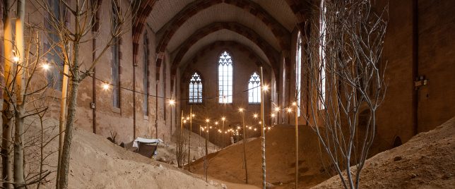
Garden of Whispers: Surreal Sand Dunes Fill 13th-Century Gothic Church

31 Oct

[ By WebUrbanist in Art & Installation & Sound. ]

garden-of-whispers-installation

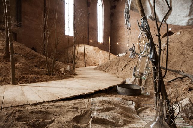
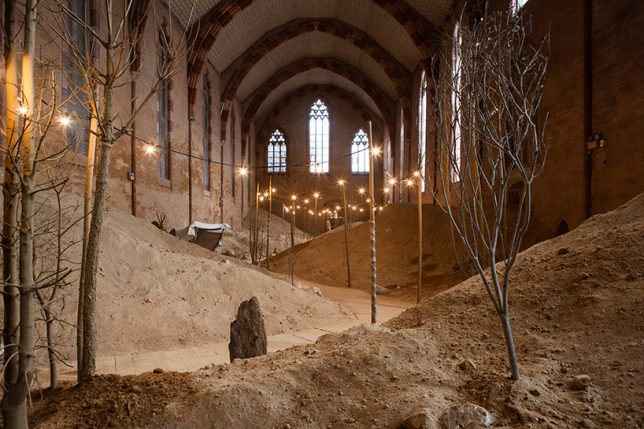
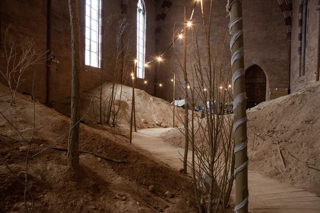
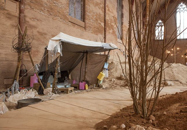
A makeshift wooden walkway winds along a strand-lit and tree-lined path between dunes, creating a surreal environment within the context of this historic church.

surrealistic-church-setting

Set in a religious space in Toulouse, this strange journey is punctuated by small vignettes that speak to the history of the place. In addition to physical installations and visuals, the space features a soundscape of whispered voices playing in the background and array of carefully generated aromas.

staged-sleeping-area

Along their way through the sandscape, visitors will find a full campsite nestled in the low hills as well as other small shelters with pots, pans, bedding and fireplaces – temporary and nomadic signals juxtaposed with a sturdy historical structure.

art-church-installation

The materials date from various ages, including modern plastics as well as ancient-looking tents of rough-hewn wood and fabric. The end result fits the artist’s aim of “creating a timeless experience outside known references.”

staged-lighting

Nor is the experience entirely static – live persons add dynamism to the mix. Artist Hans Op De Beeck “has staged a number of serene figures that quietly perform mundane, everyday acts. From time to time, these silent live performers offer tea to visitors.”

surrealist-path-art

campfire-art-performance

surrealistic-camp-ground

“Overall, the ‘Garden of Whispers’ incorporates a range of historical, religious and mythological references, yet most importantly, aims to offer a profound experience of the present, regardless of explicit references.” The temporary installation will be open to the public through this November.

Share on Facebook


[ By WebUrbanist in Art & Installation & Sound. ]

[ WebUrbanist | Archives | Galleries | Privacy | TOS ]


WebUrbanist

 
Comments Off on Garden of Whispers: Surreal Sand Dunes Fill 13th-Century Gothic Church

Posted in Creativity


Aputure Amaran AL-M9 is a pocket-sized adjustable LED fill light

20 Jul

Still photography and video accessory purveyor Aputure has unveiled the Amaran AL-M9, an affordable pocket-sized LED panel. It uses 9 SMD TLCI 99 bulbs, an integrated rechargeable Li-ion battery, offers 9-step brightness adjustment and 120-degree light beam angle, and is a lightweight at 140g. Aputure bills the Amaran AL-M9 as a multi-purpose light for macro photography and ‘run and gun video,’ among other uses.

Aputure says the Amaran AL-M9 is the size of a credit card with an 11mm thickness, and offers 350 lux at a distance of 0.5m. The light can be attached to a standard 1/4-20” mount, and includes a pair of magnetic diffusion filters.

The Amaran AL-M9 is available for pre-order from Amazon for $ 45 with a launch date of August 6. Shipping is currently estimated to happen between August 17 and 26, however.

Via: PetaPixel

Articles: Digital Photography Review (dpreview.com)

 
Comments Off on Aputure Amaran AL-M9 is a pocket-sized adjustable LED fill light

Posted in Uncategorized


Fragile Cloud: 100,000 Illuminated Balloons Fill Indoor Market

02 Sep

[ By WebUrbanist in Art & Installation & Sound. ]

cloud installation art project

Pulsing with light and life, this incredible art installation provides Covent Garden, a glass-topped marketplace, with a kind of artificial interior skyscape. Created for the London Design Festival, you can watch a time-lapse video of its construction below.

cloud art architecture detail

The ‘Invasions’ of Charles Pétillon are well known for popping up in cramped spaces, photographed, then removed, but this project is scaled far larger than his conventional pieces, is much more public and is also his first work outside of France.

cloud art white balloons

cloud art light night

Over 100 feet long, this amorphous cloud organically weaves its way through a realm of historical brick and metal detail, a shockingly light, bright and fragile intrusion into a sharp-cornered combination of architecture and engineering.

cloud art from above

cloud art amorphous project

cloud art viewers

“The balloon invasions I create are metaphors”, explains Charles Pétillon. “their goal is to change the way in which we see the things we live alongside each day without really noticing them. with ‘heartbeat’ I want to represent the market building as the beating heart of this area – connecting its past with the present day to allow visitors to re-examine its role at the heart of london’s life.”

Share on Facebook


[ By WebUrbanist in Art & Installation & Sound. ]

[ WebUrbanist | Archives | Galleries | Privacy | TOS ]


WebUrbanist

 
Comments Off on Fragile Cloud: 100,000 Illuminated Balloons Fill Indoor Market

Posted in Creativity


Hole in the Ground: 5 Ideas to Fill Downtown Chicago Spire Void

01 Apr

[ By WebUrbanist in Architecture & Cities & Urbanism. ]

chicago spire

Designed by a world-famous architect, the Chicago Spire was set to be the second-tallest building in the world, but now that plans for its construction have been abandoned local firms are stepping up to suggest novel ways to reuse the voided project’s remnant space.

chicago spire void

Submitted to Chicago Magazine, these various schemes to replace the failed vision of Santiago Calatrava are bound to resonate with residents, created by and for the local population and context, featuring everything from underground performance spaces and wildlife sanctuaries to urban lighthouses and swimming holes.

chicago spire amphitheater

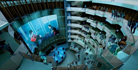
One proposal invites people to occupy the hole in the form of a seven-story underground amphitheater, allowing loud late-night events to operate freely in the subterranean space. This Underground Amphitheater scheme by SPACE Architects + Planners is likened to a headphone buried in the Earth, its emissions audible when you get up close and keep an ear to the ground.

chicago spire bird sanctuary

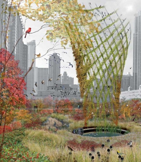
A radically different tactic suggests a steel aviary trellis surrounded by native vegetation. serving as a stopping point and bird-watching spot for migratory species. Dubbed Birds in Horto by designer Hoerr Schaudt, the void in this case remains inaccessible, a mystery at the center of a larger natural park space. “A 10-story spiraling trellis of steel and wood serves as armature for nesting and perching, while a surrounding thicket of native plants, such as crabapple and plum trees, offers sustenance. An elevated walkway lets you observe the warblers, cardinals, and sparrows without disturbing them.”

Next Page – Click Below to Read More:
Hole In The Ground 5 Ideas Fill Downtown Chicago Spire Void

Share on Facebook


[ By WebUrbanist in Architecture & Cities & Urbanism. ]

[ WebUrbanist | Archives | Galleries | Privacy | TOS ]


WebUrbanist

 
Comments Off on Hole in the Ground: 5 Ideas to Fill Downtown Chicago Spire Void

Posted in Creativity


Flowering Potholes: Lovely Tile Plants Fill Ugly Street Voids

05 Nov

[ By WebUrbanist in Art & Street Art & Graffiti. ]

flower art street rose

An uniquely elegant solution to a dirty everyday problem, these gorgeous handcrafted tile mosaics are turning unfilled potholes back into functional pieces of city street surface all over Chicago.

flower art context view

This time with an emphasis on beautification, mosaic maker Jim Bachor is back at it again. He is somewhat widely known in the area for using Chicago flags and and other city-themed infill to patch problematic holes in the urban fabric previously.

flower tiles city streets

flower tile chicago artwork

More on the artist’s background and inspiration: “Volunteering to work on an archaeological dig in Pompeii helped merge these two interests in to my art. In the ancient world, mosaics were used to capture images of everyday life. These colorful pieces of stone or glass set in mortar were the photographs of empires long past. Marble and glass do not fade. Mortar is mortar. An ancient mosaic looks exactly as intended by the artist who produced it over two millennia ago. What else can claim that kind of staying power? I find this idea simply amazing.”

flower artist tile chicago

In part, his work on the streets aims to draw attention to the 500,000+ potholes that remain unfixed at any given time, in part a byproduct of the harsh temperature shifts from winter to summer and back again (or as is said in the Midwest: ‘winter and road repair’ seasons).

flower pothole infill art

flower mosaic pot holes

“Using the same materials, tools and methods of the archaic craftsmen, I create mosaics that speak of modern things in an ancient voice. My work locks into mortar unexpected concepts drawn from the present … it surprises the viewer while challenging long-held notions of what a mosaic should be. Like low-tech pixels, hundreds if not thousands of tiny, hand-cut pieces of Italian glass and marble comprise my work.”

Share on Facebook


[ By WebUrbanist in Art & Street Art & Graffiti. ]

[ WebUrbanist | Archives | Galleries | Privacy | TOS ]


WebUrbanist

 
Comments Off on Flowering Potholes: Lovely Tile Plants Fill Ugly Street Voids

Posted in Creativity


Urban Niche: Townhouse & Courtyard Fill Thin Lot in Hanoi

21 Oct

[ By WebUrbanist in Architecture & Houses & Residential. ]

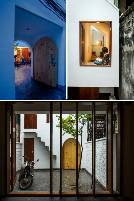
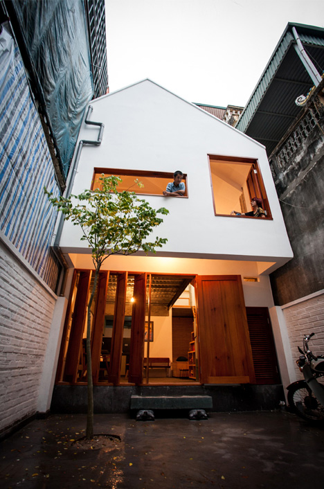
niche urban house hanoi

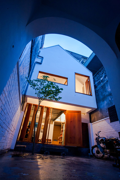
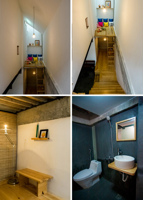
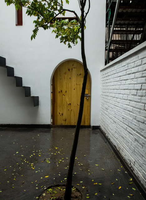
In some situations there is simply no way to add windows to the side of a home – this design rises to the challenge, stretching and reshaping a small urban lot to fit a cozy and low-cost solution in the capital of Vietnam.

niche exterior entry details

niche finishes wood concrete

With a limited budget (around $ 15,000), the client (a musician with a family) sought a space that would feel cozy and private, yet open and close to nature … all difficult propositions to reconcile in a house touching walls with both its residential neighbors.

niche courtyard home design

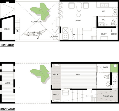
niche house floor plans

The main structure, designed by Adrei-Studio Architecture, was set back from the street to create an open courtyard between a small entry volume and the primary residence.

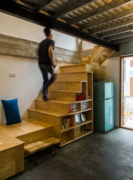
niche home room details

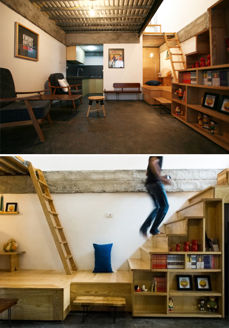
Asymmetrical elements create a sense of movement as one circulates the site, while traditional Vietnamese detailing and warm materials make it feel like a home. Window seats, platform lofts, under-stair storage and other small touches are found throughout.

niche home exterior space

niche main living room

Those seemingly minor touches, in fact, are what make the project: little moves that together go a long way toward creating a sense of place, including various niches, nooks, crooks and crannies created to enliven the interior and connect back to the exterior as well.

Share on Facebook


[ By WebUrbanist in Architecture & Houses & Residential. ]

[ WebUrbanist | Archives | Galleries | Privacy | TOS ]


WebUrbanist

 
Comments Off on Urban Niche: Townhouse & Courtyard Fill Thin Lot in Hanoi

Posted in Creativity


When Photoshop’s Content-Aware Fill Made My Mouth Drop Open

25 Sep

When Adobe began demonstrating Content-Aware Fill in Photoshop CS5 it generated 2 reactions on average. The first fear about the removal of watermarks identifying the work of photographers and the second was an enthusiastic roar about the creative possibilities. Adobe of course was aiming for the later response.  Since the release of Content-Aware Fill I’ve often used it to fill in gaps when my canvas is rotated to straighten an image, remove objects creeping into the edge of my image, etc. With each subsequent version of Photoshop released Content-Aware Fill has seemingly been able to handle more and more complex scenes.

During a recent edit using Photoshop CC I went back to work on some images with contrails reflected in water where the rocky bottom was still visible. At the time the photo was taken I thought it was ultimately unusable, as I wasn’t about to release an image with reflected contrails. For fun I decided to put Photoshop to the test to see how well it could fill in a complex pattern such as this. I was blown away that it took care of the contrails in a single shot.

Unedited – Zoom View

Content-Aware Fill Employed – Zoom View

If you look closely in the zoomed version of the image, the rocks have an organic pattern while the contrail is completely removed. While I expected that the upper right section of the contrail would be handled easily due to its transition to a nearly pure colored gradient, the random rocky pattern on the left  I figured would be too complex to be addressed cleanly. I was pleasantly surprised when I zoomed in at 100% and 200% to see that all the rocks had continuous edges and didn’t have any obvious signs of being edited. It was at this point my mouth dropped open in amazement.

Unedited  – Full Image 

Content-Aware Fill Employed – Full Image

Sunrise at Two Medicine Lake with Sinopah Mountain reflected in the calm water – Glacier National Park

Adobe’s Original Content-Aware Fill Demo

Copyright Jim M. Goldstein, All Rights Reserved

When Photoshop’s Content-Aware Fill Made My Mouth Drop Open

The post When Photoshop’s Content-Aware Fill Made My Mouth Drop Open appeared first on JMG-Galleries – Landscape, Nature & Travel Photography.


Comments

  • nice content aware is mostly his and miss. often miss for me … by Tor Ivan Boine

Related Stories

  • When Photoshop’s Content-Aware Fill Made My Mouth Drop Open – Enclosure
  • Talking Lightroom & Photography
  • Talking Lightroom & Photography – Enclosure
Feed Ads by FeedBlitz
powered by ad choices


JMG-Galleries

 
Comments Off on When Photoshop’s Content-Aware Fill Made My Mouth Drop Open

Posted in Equipment


Live Between Buildings: Narrow Micro-Homes Fill City Gaps

05 Sep

[ By WebUrbanist in Architecture & Houses & Residential. ]

narrow home competition entry

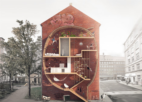
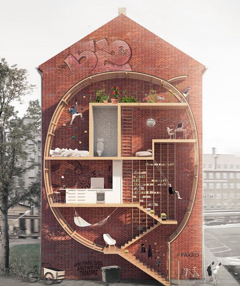
Playful yet thought-provoking, this project asks: what do we do with small leftover spaces in cities … particularly in urban areas where even a few square feet of real estate can cost a fortune?

narrow house competition winners

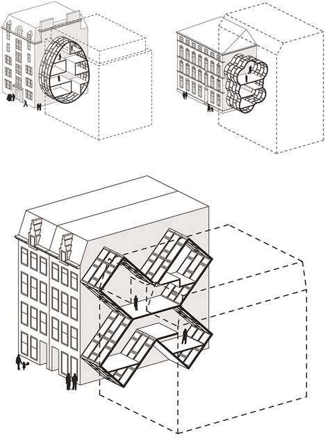
Live between Buildings by Ole Robin Storjohann and Mateusz Mastalski won first place in a Loft 2 competition held by FAKRO, which challenged contestants to rethink loft living and material efficiency without sacrificing light and space.

narrow interstitial house concept

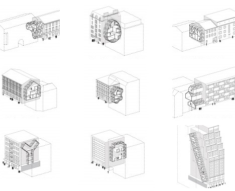
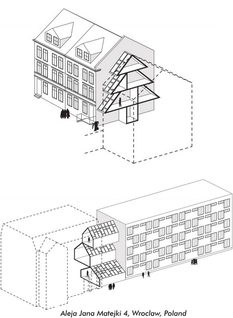
Their various prototype proposals have nearly no ground footprint, being instead suspended in part or entirely between existing structures. In testing the idea, they took actual buildings and voids, abstracted and simplified their forms, all to show how such interventions would work in major cities from New York and London to Amsterdam and Tokyo.

narrow home architectural entries

A wide selection of shapes suggests many possibilities using modular pieces, including half-serious and semi-practical suggestions, such as egg and X shapes, as well as outright silly ones, like a Christmas-tree home or cloud-bubble house, more intended just to illustrate the potential flexibility.

narrow home case studies

Out of a variety of compelling entries, just why did this pair win the award? “The Jury appreciated the way the basic idea – creating small infill-dwellings in-between existing buildings – has been worked out in extended research, thus providing models for various housing types in different cities. The plan can be realized entirely out of roof windows (with some technical adjustments) and offers an innovative idea for using empty spaces in urban fabric. The possibility of shapes is endless. The project was very beautifully drawn and communicated on a single sheet, the section describing both the architectural idea and the exciting occupation of the proposed building.””

Share on Facebook


[ By WebUrbanist in Architecture & Houses & Residential. ]

[ WebUrbanist | Archives | Galleries | Privacy | TOS ]


WebUrbanist

 
Comments Off on Live Between Buildings: Narrow Micro-Homes Fill City Gaps

Posted in Creativity