RSS
 

Posts Tagged ‘Designer’

How to Create Professional Photo Layouts If You Aren’t a Designer

09 Jun

One of the most exciting things about the modern world is the high accessibility of professional tools for regular people. It provides us with a great chance to enjoy thousands of totally diverse pieces of art throughout the Web and beyond it. Now you can find hundreds of online offers to create impressive collages, apply beautiful filters, or add text Continue Reading
Photodoto

 
Comments Off on How to Create Professional Photo Layouts If You Aren’t a Designer

Posted in Photography


This designer end table also functions as a Lightbox for product photography

22 Nov

A Red Dot Design Concept Award for 2019 was recently given to Photo Table, a design concept that transforms a lightbox into a piece of furniture that can be used to display decorative items. The table has a simple, modern design with a dome frame and internal light.

The concept comes from designers with South Korean company Zinus Inc, which says about Photo Table:

For this furniture to be used as a side display table, it should blend in beautifully with any living space, while serving as a tool to make pictures more. To express your lifestyle, directly record personal collections and crafts on the Photo Table and share the images via social media in an instance.

The concept involves a design that can be packed flat and assembled using ‘a minimum number of bolts.’ When assembled, the semi-transparent PET panels form the frame ‘walls,’ which are interchangeable using clips; the background is also described as interchangeable. The table was designed to hide outlines and allow light from external lamps to penetrate, ultimately providing a space where items can be rapidly photographed.

The company doesn’t say whether there are any plans to commercialize the design, but it remains a fun concept that could easily inspire photographers who have the right DIY skills for making their own version.

Articles: Digital Photography Review (dpreview.com)

 
Comments Off on This designer end table also functions as a Lightbox for product photography

Posted in Uncategorized


Designer imagines the perfect keyboard for Adobe software

23 Nov

Designer Vinicius Araújo has created a series of concept images that imagine what a keyboard may look like if it were made by Adobe specifically for Photoshop and its other specialized software. Araújo shared the images on Behance under the handle VA Designer, where he shows a concept that containing half a dozen touch shortcuts, a scroll wheel, colored LED lighting, and a high level of sensitivity.

While various DIYers have developed their own enhanced control methods for some Adobe products—such as using a PS3 gamepad to control Lightroom—and some interesting options do exist, a perfect hardware companion to the software suite remains elusive.

Araújo’s concept imagines what that companion device might look like should one ever be developed.

$ (document).ready(function() { SampleGalleryV2({“containerId”:”embeddedSampleGallery_0008864831″,”galleryId”:”0008864831″,”isEmbeddedWidget”:true,”standalone”:false,”selectedImageIndex”:0,”startInCommentsView”:false,”isMobile”:false}) });

Rather than using color-coded shortcuts, this concept presents a sleek low-profile keyboard with several customizable touch pads on the left, and a small display in the upper right-hand corner. That display shows which tool is currently active in the software, and is joined by a smaller display just above it that shows the application in use.

Above the keyboard’s function keys resides a display somewhat similar to the Touch Bar found on some MacBook Pro laptops. The concept’s upper display, however, is used to present the logos for Adobe software not currently in use; tap one of the logos, and the related application will launch on the computer.

Finally, the concept also includes a scroll wheel that could be used to precisely adjust sliders or select colors in programs like Lightroom and Photoshop. The inclusion of a scroll wheel on a keyboard isn’t a new idea, though; Logitech, for example, recently introduced a keyboard with a scroll wheel for use with products like Adobe Photoshop.

Because this is simply a concept design, it isn’t available to purchase as an actual product, but we’d be curious to hear your thoughts on Araújo’s keyboard. How would you improve upon it? And would you buy it if it were to become reality?

Articles: Digital Photography Review (dpreview.com)

 
Comments Off on Designer imagines the perfect keyboard for Adobe software

Posted in Uncategorized


Ferrari Designer Launches World’s Most Luxurious Sleeper Train in Japan

22 May

[ By WebUrbanist in Technology & Vehicles & Mods. ]

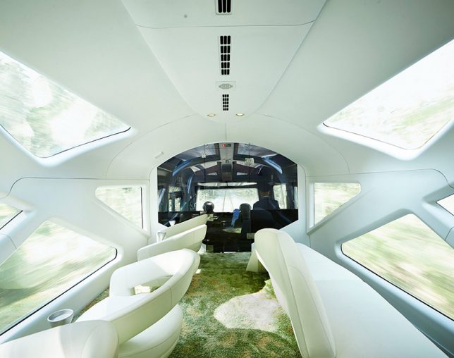
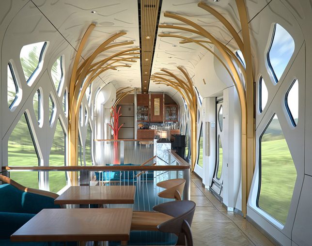
Public transit meets luxury transport in this elegant and open train design with rich interiors as well as copious windows for viewing the passing landscape.

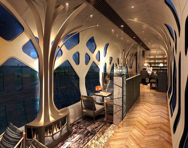
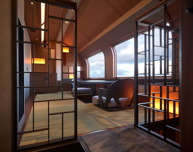
The champagne-colored Shiki-Shima sleeper boasts aesthetics by Ken Kiyoyuki Okuyama, the automotive designer behind the Ferrari Enzo as well as Maserati Quattroporte. Inside, branching window frames are meant to conjure images of tree-lined forests.

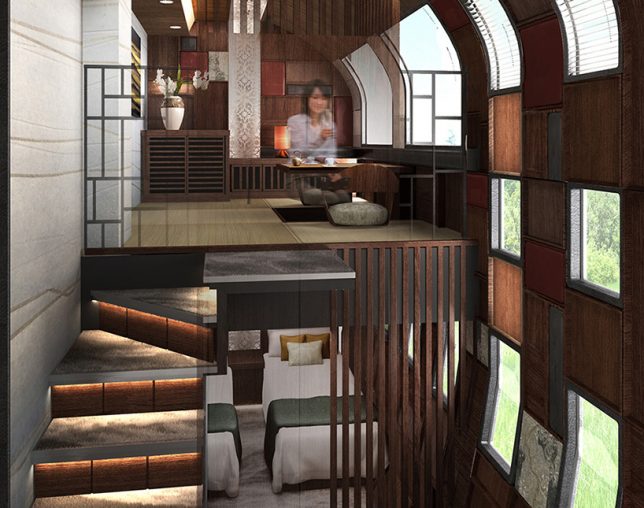
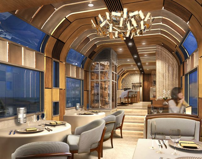
Window geometries on the exterior reflect the different needs of interior spaces, from lovely common rooms and fancy dinner cars to split-level sleeping compartments.

The design is also distinctly Japanese, featuring traditional wood, paper and lacquer interiors with tatami mats and artistic techniques developed over centuries of history.

and brings the elegant physique of a supercar to public transport. with dome cars, large geometric windows and a plush sofas, a trip on the rain suite shiki-shima is comparable to a luxury cruise.

“Okuyama nods to japanese artisanal crafts with his use of bentwood—made by curving wood with steam—to frame the sofas and seating. Meanwhile, oriental carpet mills takes car of the design under foot, using their signature ornate carpets that can already be found in the Vatican palace and Kyoto state guest house. The train consists of 17 rooms in total, with two large suite rooms and 15 smaller ones. JR east, the rail operator behind the luxury masterpiece, seeks to provide ‘a high-grade space’ that is currently unseen in existing railway journeys.”

Share on Facebook


[ By WebUrbanist in Technology & Vehicles & Mods. ]

[ WebUrbanist | Archives | Galleries | Privacy | TOS ]


WebUrbanist

 
Comments Off on Ferrari Designer Launches World’s Most Luxurious Sleeper Train in Japan

Posted in Creativity


Review of Moments Designer

22 Feb

What do you think is the one thing that people treasure the most after they have cut their birthday cake, completed a wedding ceremony, or had their first baby? Well, for most photographers, the answer is rather simple. These are the photographs taken by our fancy gadgets capturing those precious shots so that they remain a part of our clients’ Continue Reading

The post Review of Moments Designer appeared first on Photodoto.


Photodoto

 
Comments Off on Review of Moments Designer

Posted in Photography


Mini Modernists: 15 Designer Toys for Young Architecture Fans

22 Mar

[ By Steph in Design & Products & Packaging. ]

mini modernist blokoksha 2

Foster an appreciation for fine modernist architecture and design from an early age with Bauhaus dollhouses, Eames block sets, mini Corbusier lounge chairs and urban planning board games. There’s a minimalist dollhouse that doubles as a coffee table, a Matryoshka-style set of paper modernist estates and of course, the pleasingly all-white Architecture Studio set by LEGO. Sure, you can get these architectural toys and games under the pretense that they’re for your kids, but we all know it’s really you who’ll be playing with them.

Home Puzzle, Babel Tower Game & Archiblocks by Cinq Points
mini modernists home puzzle 1

mini modernists home puzzle 2

mini modernists home puzzle 3

mini modernists babel tower game

mini modernists home puzzle 4

A 3D puzzle made up of 17 minimalist white pieces that fit together into a house shape, the ‘Home Puzzle’ by Cinq Points is greater than the sum of its parts. The individual pieces are made to resemble pieces of furniture as well as buildings in a town, so kids can use their imagination to change the purpose of each shape. The Babel Tower game is like an architectural version of Jenga, while the Archiblocks construction set is “designed to capture modularity, balance and composition, their form giving them an intergenerational appeal.”

Qubis House Modernist Doll House & Coffee Table
mini modernist qubist 1

mini modernist qubis 2

mini modernist qubis 3

Functioning as a modernist dollhouse for kids and a coffee table for adults, the Qubis Haus features sliding panels made of wood and perspex so the ‘architect’ can create various room layouts. Made of solid birch, it has clean modern lines honoring a period of architecture that’s not often seen in doll houses.

Dollhouse-Sized Modernist Furniture
mini modernist furniture 1

mini modernist furniture 2

mini modernist furniture 3

Not just any old furniture should be placed inside a modernist dollhouse. From the Vitra Design Museum Shop comes a series of iconic pieces in miniature form, true to scale and replicating the originals down to the smallest details including the materials, the grain of the wood and the reproduction of the screws. The collection includes chairs by Charles Eames, Marcel Breuer, Frank Lloyd Wright and Mies van der Rohe.

Eames House Blocks

mini modernist eames blocks

mini modernist eames blocks 2

mini modernist eames blocks 3

Bring the famous Eames House and Studio to your coffee table or playroom with this “authentically engineered” set of 36 alphabet blocks created in direct collaboration with the Eames family. The colors were so carefully matched to the original, the block set requires 29 separate hand-pulled print passes when it’s being produced.

Blokoshka: A Modernist Architectural Matryoshka

mini modernist blokoshka 1

mini modernist blokoksha 2

mini modernist blokoshka 4

Rather than dolls, this nesting paper set reveals one modernist building after another, getting successively smaller and smaller as you pull them apart. The Blokoshka set by ZUPAGRAFIKA comes pre-cut and pre-folded so you can put them together and take them apart as many times as you like (or until the paper starts to disintegrate.) “Inspired by the former Eastern Bloc concrete modernist estates, Blokoshka is a playful tour inside out the ‘sleeping districts’ of Moscow, plattenbau constructions of East Berlin, Warsaw estates built over the ruins of old ghetto, and the panelak blocks in Prague.”

Next Page – Click Below to Read More:
Mini Modernists 15 Designer Toys For Young Architecture Fans

Share on Facebook


[ By Steph in Design & Products & Packaging. ]

[ WebUrbanist | Archives | Galleries | Privacy | TOS ]


WebUrbanist

 
Comments Off on Mini Modernists: 15 Designer Toys for Young Architecture Fans

Posted in Creativity


Dyslexic Designer Creates Custom Typeface Addressing Disorder

21 Jan

[ By WebUrbanist in Design & Graphics & Branding. ]

dyslexic typeface

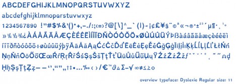
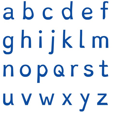
Designed to address the visual processing problems associated with dyslexia, this font uses a set of tailored strategies to make reading easier for those with the disability.

dyslexie bold letters bottoms

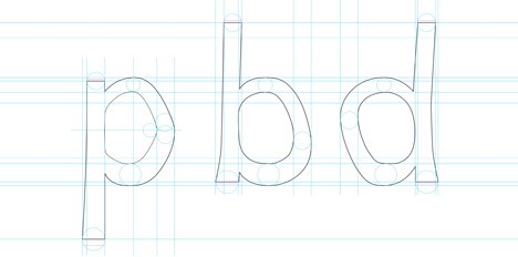
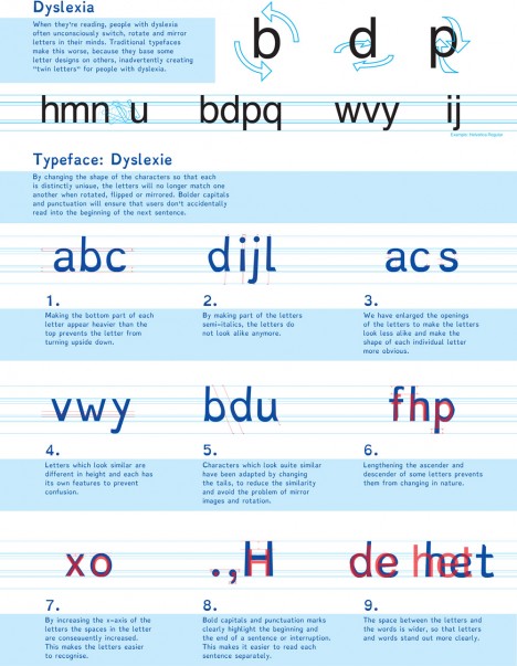
Christian Boer developed Dyslexie from first-hand knowledge of its effects. “When they’re reading, people with dyslexia often unconsciously switch, rotate and mirror letters in their minds,” he explains.

dyslexie regular design lines

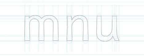
“Traditional typefaces make this worse, because they base some letter designs on others, inadvertently creating ‘twin letters’ for people with dyslexia.”

dyslexie mirroring dislexic address

dyslexic p b q

For simplicity, clarity and consistency, most typefaces involve numerous mirrored letters, such as an ‘m’ that is a doubled ‘n’ which in turn is an upside-down ‘u’, or ‘b’ flipped to become ‘p’s and ‘q’s.

dyslexie design principles

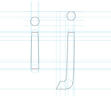
To address this, Boer thickened the bottom portions of letters, making it more clear which end is up and creating clearer distinctions between different characters in the process. Larger spaces and punctuation are also made to make everything more legible.

dyslexie design strategy

“By changing the shape of the characters so that each is distinctly unique, the letters will no longer match one another when rotated, flipped or mirrored,” Boer said. “Bolder capitals and punctuation will ensure that users don’t accidentally read into the beginning of the next sentence.”

Share on Facebook


[ By WebUrbanist in Design & Graphics & Branding. ]

[ WebUrbanist | Archives | Galleries | Privacy | TOS ]


WebUrbanist

 
Comments Off on Dyslexic Designer Creates Custom Typeface Addressing Disorder

Posted in Creativity


Puphaus & Meyou: 2 Designer Dog & Cat Houses for Modern Pets

13 Nov

[ By WebUrbanist in Design & Furniture & Decor. ]

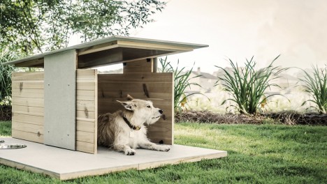
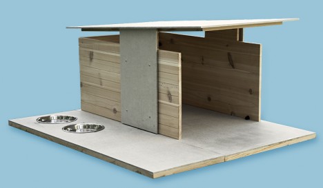
designer backyard dog home

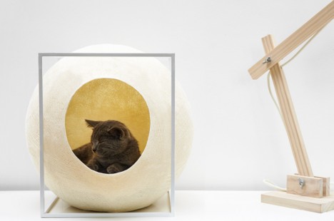
Whether your furry friends are canine or feline, this pair of posh pet architecture companies have your Modernist domesticated animal needs (quite literally) covered.

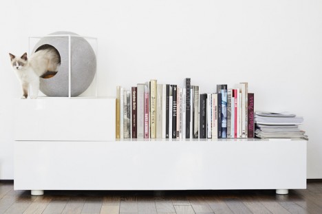
modernist cat furniture

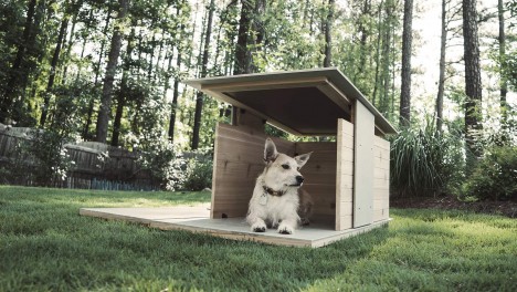
And for those domiciles home to both cats and dogs that do not share space, fear not: the Puphaus is made for the outdoor dog and Meyou created for the indoors cat.

designer dog living

First, the Puphaus borrows domestic architectural design elements but employs a tools-free approach for easy assembly, creating a backyard home for your pup that could be cooler than your own house.

designer dog house

“Sporting backgrounds in graphic and industrial design, dog-loving founders Roy Fleeman and Zach Griggs wanted to design & build something unique for man’s best friend: the Puphaus. Time to ditch the plastic igloos and give our pups some stylish new digs.”

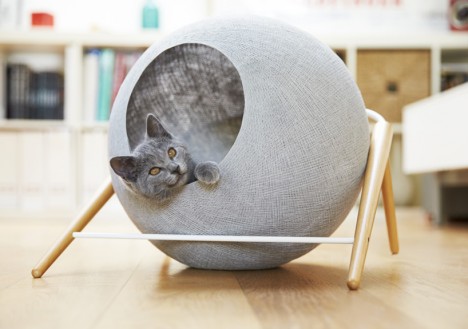
modernist cat ball

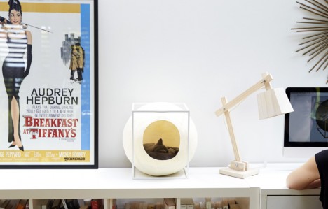
modernist desktop cat

The Meyou line of cat furniture by Parisian designer Aude Sanchez approaches the problem as a question of interior design, aiming to create habitats that will not just look good next to but also become part of your decorative scheme.

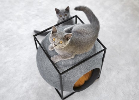
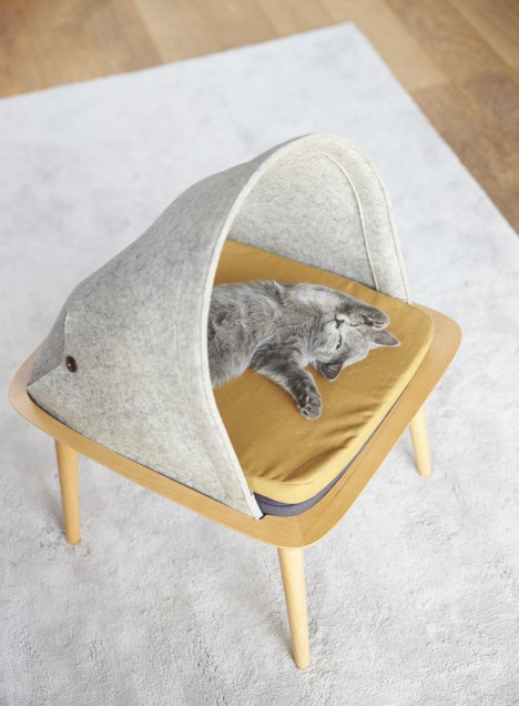
modernist cat bed

modernist cat observer

The resulting cat cocoons are made for curious and playful kitties to use for shelter, napping, hiding or even sharpening their claws.

modernist kitty stool

The Ball, The Cocoon and The Bed are variations on the same design approach, each with slightly different layouts and features – they can work individually or as a set for various rooms.

Share on Facebook


[ By WebUrbanist in Design & Furniture & Decor. ]

[ WebUrbanist | Archives | Galleries | Privacy | TOS ]


WebUrbanist

 
Comments Off on Puphaus & Meyou: 2 Designer Dog & Cat Houses for Modern Pets

Posted in Creativity


The Modern Cyclist: 17 Minimalist Designer Bike Accessories

01 Jun

[ By Steph in Design & Products & Packaging. ]

designer cycling vadolibero shelf

A lot of stuff made for cyclists, from rain gear to storage solutions at home, is just plain ugly. If you’re a discerning bike commuter with an eye for good design, you’ll appreciate these 17 stylish accessories that don’t sacrifice form for function, adding to a bike’s practicality in an aesthetically pleasing way.

Vadolibero Bike Butler + Shelf
designer cycling vado shelf 2

designer cycling vado shelf 3

designer cycling vado shelf 4

Store your bike in style with Vadolibero’s two multifunctional stands. The Bike Butler is billed as “an urban-chic version of the most efficient biker wall-pocket,” with slide-out trays, drawers, a space for keys and sunglasses and a couple hooks. Keep it in the hallway as a means of organizing the small items you normally throw on a table, and corral your bike at the same time. The Bike Shelf is essentially a stage for your bike, putting it on display with lights and everything, but it’s also a functional wardrobe packed with storage space.

Six Smart Cycling Accessories by ECAL

modern cycling ecal 1

modern cycling ecal 2

modern cycling ecal 3

modern cycling ecal 4

modern cycling ecal 5

modern cycling ecal 6

Students at Swiss art and design school ECAL came up with a line of clever biking accessories called ‘Savoir-Faire’ for Milan Design Week 2013. These detachable accessories and modifications either combine several functions in a single object, like the brake/horn on the handlebar, or add extra functions to make a bike more adaptable for everyday use, like snow chains and bottle carriers.

Sleek & Simple Cup Holder

designer cycling bookman cup holder

designer cycling bookman cup holder 2

This minimalist cup holder will help you tote your coffee across town, and consists of no more than two rings and a steel spring, requiring no screws or glue to hold it together. Flip the cup holder over to hold drinks of varying sizes.

Next Page – Click Below to Read More:
The Modern Cyclist 17 Minimalist Designer Bike Accessories

Share on Facebook


[ By Steph in Design & Products & Packaging. ]

[ WebUrbanist | Archives | Galleries | Privacy | TOS ]


WebUrbanist

 
Comments Off on The Modern Cyclist: 17 Minimalist Designer Bike Accessories

Posted in Creativity


Designer Sci-Fi: Ferrari Spaceship Takes Luxury Sky-High

12 May

[ By Steph in Conceptual & Futuristic & Technology. ]

ferrari spaceship 2

Given how far away we still are from personal spacecraft, perhaps it’s not surprising that most design concepts for extra-terrestrial ships haven’t evolved much in the last couple decades. Concerned more with practicalities (and budget constraints) than aesthetics, even NASA has stuck to the same-old same-old when it comes to spacecraft design, but a fun vision of the future from Ferrari’s design director gives us some hope.

ferrari spaceship 1

Known for incorporating Ferrari design sensibilities into all sorts of sketches, Flavio Manzoni doesn’t disappoint with his spaceship concept. Fluid and reflective, the ship is just as sleek as any of the real-life luxury cars that Manzoni has designed, including the LaFerrari supercar.

ferrari spaceship 4

The ship is divided into two shells by a signature red line, and two wings wrap around the lower section of the body.

ferrari spaceship 3

Unveiling the sketches and renderings at Form Trends, Manzoni says it started as just a bit of fun, inspired by his childhood living at the top of a six-story building and imagining a UFO landing on the rooftop terrace.

ferrari spaceship 5

“I tried to imagine something that can fly in the future, since there will be less and less space available on the ground,” says Manzoni. “And I focused on creating a little craft that’s different than my childhood dreamm, when I thought that a car of the future would slip on a cushion.”

Share on Facebook


[ By Steph in Conceptual & Futuristic & Technology. ]

[ WebUrbanist | Archives | Galleries | Privacy | TOS ]


WebUrbanist

 
Comments Off on Designer Sci-Fi: Ferrari Spaceship Takes Luxury Sky-High

Posted in Creativity