RSS
 

Posts Tagged ‘Buildings’

Ghostly Floating Farms: Abandoned Rural Buildings of Russia

02 Jan

[ By Steph in Abandoned Places & Architecture. ]

abandoned farm building ukraine

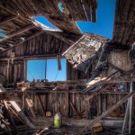
The former USSR boasts some of the world’s weirdest and most hauntingly beautiful abandoned structures, from sci-fi monuments to prison camps and military facilities. Many of Russia’s abandoned wonders are byproducts of the Soviet collapse, including remote stretches of countryside that are no longer feasible to live in due to ill-kept or destroyed roads and infrastructure. Some of the structures that can be found there include intricate hand-carved wooden farmhouses and agricultural buildings that seem to hover in midair.

19th Century Farmhouses in Kostroma
abandoned farmhouse russia 1

abandoned farmhouse russia 5

abandoned farmhouse russia 2

abandoned farmhouse russia 3

abandoned farmhouse russia 4

abandoned wooden farmhouse

abandoned wooden farmhouse 2

These stunning examples of 19th century Russian architectural craftsmanship have sadly fallen into disrepair on the inside, but the exteriors generally look as cool as ever. Some are in better condition than others, looking as if they’re just waiting for their owners to return. Located deep within the forests of Kostroma, the abandoned family homes are likely too far from civilization to support most present-day occupants. Photographer Andrew Qzmn travels through the countryside documenting these forgotten structures, as well as those that are still kept up.

Floating Farm Building, Ukraine
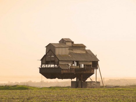
abandoned farm building ukraine
floating potato 2

floating potato

Reportedly located in Ukraine rather than Russia, this farm building might seem like a Photoshop job at first, but a few pictures sent into the blog Curious Places confirm it to be part of a potato sorting facility, with speculation that part of it may have been dismantled since it was actively in use.

Next Page – Click Below to Read More:
Ghostly Floating Farms Abandoned Rural Buildings Of Russia

Share on Facebook


[ By Steph in Abandoned Places & Architecture. ]

[ WebUrbanist | Archives | Galleries | Privacy | TOS ]


WebUrbanist

 
Comments Off on Ghostly Floating Farms: Abandoned Rural Buildings of Russia

Posted in Creativity


Ugly Architecture: 15 of the World’s Most Hideous Buildings

02 Nov

[ By Steph in Architecture & Offices & Commercial. ]

ugly architecture elephant 3

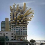
Some buildings are so ugly, the only thing that could possibly improve them is a wrecking ball. It’s even worse when the structures are high-profile and expensive, making you wonder how many people who had to sign off at each stage of planning and construction actually thought to themselves, “Yes, this looks good.” Here are 15 examples of astonishingly ugly architecture that only a mother (or rather, the designers responsible) could love.

The Rock, Wellington International Airport, New Zealand
ugly architecture the rock

Perhaps this addition to the Wellington International Airport by Warren and Mahoney was designed to resemble a robotic cockroach in order to remind us of what will rise up and take our places on earth once we’ve succeeded in making ourselves extinct.

Renmin Ribao Building, Beijing, China
ugly architecture penis building

Beijing’s ‘penis building’ aka the headquarters of the communist People’s Daily newspaper has drawn wonder and incredulity from local residents, as well as worldwide notoriety. But the building will soon be sheathed, as the architect decided to give it a makeover after all the backlash. There’s probably a joke about state-sponsored journalism in there somewhere.

Frank Gehry’s Australian Blunder
ugliest buildings gehry 1

ugliest buildings gehry 2

“The building so ugly, it has to wear a paper bag” is Frank Gehry’s first project in Australia, inspired by a mashup of Sydney architecture and a treehouse. The curving structure was created using 320,000 custom-designed bricks.

ArcelorMittal Orbit Sculpture, London, England
ugly architecture arcelor mittal

ugly architecture arcelor mittal 2

Famed artist Anish Kapoor teamed up with engineer Cecil Balmond to create a sky-high tower in London that looks like a tangle of junk you pulled out of a drawer in your garage. The ArcelorMittal Orbit is a 376-foot-tall sculptural observation point overlooking the Queen Elizabeth Olympic Park.

The Elephant Building, Bangkok, Thailand
ugly architecture elephant building 2

ugly architecture elephant building
Shaped like Thailand’s national animal, the Elephant Building in Bangkok is a 32-story mixed-use complex housing condos, offices and a language school.

Next Page – Click Below to Read More:
Ugly Architecture 15 Of The Worlds Most Hideous Buildings

Share on Facebook


[ By Steph in Architecture & Offices & Commercial. ]

[ WebUrbanist | Archives | Galleries | Privacy | TOS ]


WebUrbanist

 
Comments Off on Ugly Architecture: 15 of the World’s Most Hideous Buildings

Posted in Creativity


Concrete Wonders: 13 Brutalist Buildings in the USA & Britain

26 Oct

[ By Steph in Architecture & Public & Institutional. ]

brutalism US brunel 2

While the most theatrical Brutalist buildings remain in the former USSR, there are plenty more of these controversial concrete complexes around the world, and they draw both admiration and ire in Britain and the United States. While Prince Charles of Wales likes to call them ‘monstrous carbuncles,’ and sloppy Brutalist blunders certainly exist, many modernist concrete structures built between the 1950s and ‘80s are striking in their minimalism and solidity.

Geisel Library, San Diego, California

brutalist US geisel

brutalist US geisel 2

The Geisel Library at the University of California, San Diego (named for the author best known as Dr. Seuss) was made of reinforced concrete to save money, which enabled a more sculptural design. The 8-story structure by William Pereira has two subterranean levels and was “deliberately designed to be subordinated to the strong, geometrical form of the existing library” on the campus.

Tricorn Center, Portsmouth, England
brutalist US tricorn

brutalist US tricorn 2

brutalism US tricorn 3

This weird building called the Tricorn Center was a retail, nightclub and parking garage complex completed in the mid-1960s and so named because it resembles a tricorn hat from above. It was voted the third ugliest building in the UK in the ‘80s, and demolished in 2004. Charles, Prince of Wales famously called it “a mildewed lump of elephant droppings.”

Barbican Estate, London, England

brutalist US barbican

brutalism US barbican 2

brutalism US barbican 3

This residential complex built in the ‘60s and ’70s stands right in the financial district of London, one of the few examples of British brutalist architecture that’s still mostly intact. There are three tower blocks and 13 terrace blocks positioned around a lake and green squares; the towers are each 404 feet tall.

Brunel University, London, England

brutalism US brunel

brutalism US brunel 2

Built in the ‘60s and designed by Richard Sheppard, Robson & Partners, the Brunel University Lecture Center was one of two ‘high Brutalist’ structures prominently featured in Stanley Kubrick’s film A Clockwork Orange.

Brownfield Estate, East London
brutalist US balfron 1

Balfron Tower at the Brownfield Estate, an area of social housing in East London, is often considered the sister building of Trellick Tower. Designed by Erno Goldfinger in 1963, it contains 146 residences and features a separate elevator shaft with skybridge connections on every third floor.

Next Page – Click Below to Read More:
Concrete Wonders 13 Brutalist Buildings In The Usa Britain

Share on Facebook


[ By Steph in Architecture & Public & Institutional. ]

[ WebUrbanist | Archives | Galleries | Privacy | TOS ]


WebUrbanist

 
Comments Off on Concrete Wonders: 13 Brutalist Buildings in the USA & Britain

Posted in Creativity


Temporary Retrofit: Micro-Dwellings for Unoccupied Buildings

15 Oct

[ By WebUrbanist in Architecture & Houses & Residential. ]

modular housing soluation

Designed for empty warehouses or buildings under construction, these material-light shelters provide functionality for liminal interiors either past their prime not yet in use. Places like the infamous Tower of David, a restarted project previously inhabited by skyscraper squatters, would be an ideal candidate for this sort of system.

modular light house

A polyethylene-coated metal grid frames these modest shelters, serving as walls and doors and supporting interior shelves and an exterior fabric facade. A plastic-laminated plywood floor floats above concrete or whatever raw surface is found in a target structure. Nylon nets provide a degree of privacy while letting in light and can be covered by opaque cloth as well.

modular dwelling inside concrete

modular micro warehouse dwelling

modular parking lot structure

Each dwelling can be completed with just $ 1200 and while no heating or cooling is included the system is intended to work well in tropical or other climates supporting open-air living. Since a stable roof and floor are provided, the main task is simply filling in gaps for habitation.

modular dwelling interior design

modular home entrance

All(zone) drew inspiration for their Light House from traditional architecture of Thailand, often designed to be collapsed and moved as needed.

modular housing prototype

modular space visualizatoin

The light and flat-packable materials make it easy to ship these systems in conventional containers or other forms of transit, making them suitable possibilities for emergency shelters as well.

modular sleeping bed space

modular wire shelving

modular living room

The designers tested their prototype by deploying it in a parking garage and staying within their mockup module for a few nights.

Share on Facebook


[ By WebUrbanist in Architecture & Houses & Residential. ]

[ WebUrbanist | Archives | Galleries | Privacy | TOS ]


WebUrbanist

 
Comments Off on Temporary Retrofit: Micro-Dwellings for Unoccupied Buildings

Posted in Creativity


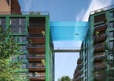
Sky Swimming: Transparent Pool Bridges Two 10-Story Buildings

25 Aug

[ By WebUrbanist in Architecture & Houses & Residential. ]

sky pool london

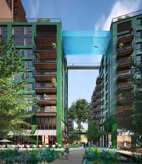
Designed to span over 80 feet and connect a pair of apartment structures in London, this remarkable see-through glass pool will give swimmers the ultimate view of the city on all sides. This record-setting, first-of-its-kind creation reflects recent advances in material science and structurally engineering.

sky pool bridge

In addition to this dazzling connector, a secondary bridge will allow people to walk between roofs, accessing other amenities including a bar and spa. Unlike many deceptive architectural renderings, this audacious structural design has already received planning approval – the real-life version coming in 2017 will indeed be as shown.

sky pool repeat

Developed by Arup Associates in collaboration with project architects of HAL, this water bridge will be 15 feet wide and 9 feet, framed in thick but transparent glass on three sides. Aquarium specialists and engineers were consulted throughout to ensure the safety of the endeavor.

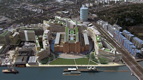
battersea refab

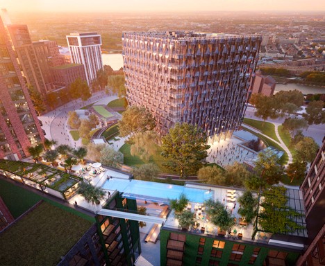
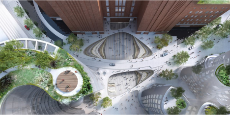
This residential project is part of a larger overhaul being orchestrated by Frank Gehry and Foster + Partners, a master plan which includes eight other major architectural features and renovations surrounding the historic Battersea Power Station.

battersea from above

“My vision for the sky pool stemmed from a desire to push the boundaries in the capability of construction and engineering, I wanted to do something that had never been done before,” said Ballymore’s chairman and CEO, Sean Mulryan. “The experience of the pool will be truly unique, it will feel like floating through the air in central London.”

sky pool india

sky swimming design

Meanwhile, in India, a similar undertaking is underway. The pool designed for the Twilight Star development in Surat, Gujarat, has a shorter span but a bonus feature: it is cantilevered out beyond the edges of the buildings it connects, providing an additional thrill for those willing to take the plunge.

Share on Facebook


[ By WebUrbanist in Architecture & Houses & Residential. ]

[ WebUrbanist | Archives | Galleries | Privacy | TOS ]


WebUrbanist

 
Comments Off on Sky Swimming: Transparent Pool Bridges Two 10-Story Buildings

Posted in Creativity


Artist Nikita Nomerz Gives Russian Buildings A New Look

23 Aug

[ By Steve in Art & Street Art & Graffiti. ]

nikita-nomerz-big-brother
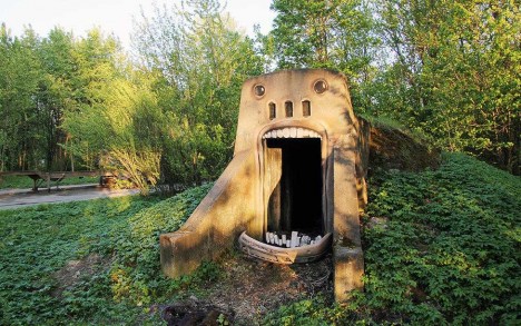
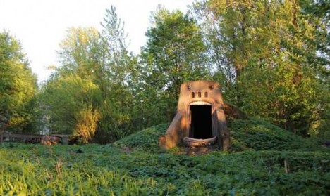
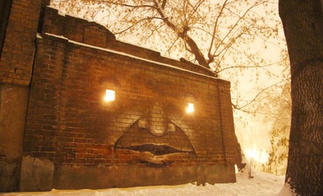
Artist Nikita Nomerz is giving abandoned buildings and structures in Russian cities a new look… and the eerily expressive edifices are looking back!

nikita-nomerz-big-brother2

nikita-nomerz-big-brother3

Hailing from the northwestern Russian city of Nizhniy Novgorod, Nikita Nomerz cut his artistic teeth in the field of hip-hop graffiti. For the past few years, however, his focus has been on street art of a different sort. Nomerz gets his inspiration from the buildings and structures he paints, seeing the inner “soul” of the edifice much as a sculptor imagines the finished statue before the first chip of the chisel. “The Big Brother”, above, is one of Nomerz’ earliest such works dating from 2010. The lowest of the three images was taken in April of 2015 – darned graffiti artists!

nikita-nomerz-sly-smile1

nikita-nomerz-sly-smile2

“When you are doing street art, you create a dialogue with passersby, architecture, nature and with other artists,” explains Nomerz. “Maybe on streets, art is not so durable, but it’s for real alive. Works which has been done on the streets are living their own life.” Since not everyone can see the life still couched within these derelict structures, Nomerz employs his own talent and creativity to bring it to the forefront.

nikita-nomerz-the-glutton

nikita-nomerz-the-glutton2

nikita-nomerz-chinese-residents

Since 2010, Nomerz has been engaged in a wide-ranging project he calls The Living Wall. From St. Petersburg eastward to the Chinese border city of Mudanjiang, Nomerz has left his mark – often quite a large mark – upon cities and towns in need of a little extra character. The bizarrely disturbing piece above is titled The Glutton; the striking installation below, The Chinese Residents. The latter stands out for NOT being created on an abandoned structure.

nikita-nomerz-toothy man

nikita-nomerz-toothy man2

nikita-nomerz-toothy man3

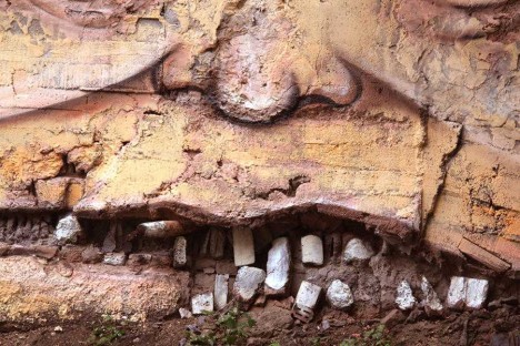
Nomerz’ main medium is spray paint but in some of his works, a little added plaster and some shifting of stone and/or brickwork is performed to enhance the composition. It’s startling how a row of decaying bricks can approximate a grinning mouth, as seen on The Toothy Man above – no doubt the building’s original constructors would be shocked at the transformation!

nikita-nomerz-fire-eyes

nikita-nomerz-glasses1

nikita-nomerz-glasses2

If the eyes are the windows of the soul, then the windows of abandoned buildings must be… OK, let’s not go there. Nomerz has no qualms about bringing out the inherent “personalities” of his inanimate subjects, mind you.

Next Page – Click Below to Read More:
Artist Nikita Nomerz Gives Russian Buildings A New Look

Share on Facebook


[ By Steve in Art & Street Art & Graffiti. ]

[ WebUrbanist | Archives | Galleries | Privacy | TOS ]


WebUrbanist

 
Comments Off on Artist Nikita Nomerz Gives Russian Buildings A New Look

Posted in Creativity


Architecturally Alive: 16 Transforming Kinetic Buildings

14 Jul

[ By Steph in Architecture & Cities & Urbanism. ]

moving architecture kundig 2

Will the cities of tomorrow be filled with intelligent kinetic architecture that moves and transforms of its own accord, as if it has a life of its own? The designers of these 16 structures seem to think so, whether they’re making use of ancient pulley-powered systems or engineering remarkably responsive auto-adaptations to change the look of a structure, shield it from the sun, or make it seem like a living creature in a bid to foster deeper connections between humans and architecture.

Adaptable Snow Cone Lifeguard Station

moving architecture snow cone 1

moving architecture snow cone 2

movign architecture snow cone 3

Modeled on a pine cone, this lifeguard post by RAW Design, Ferris + Associates and Curio adapts to weather conditions on Toronto beaches. The white ‘petals’ can move to either offer shade during the hot summer months or to collect snow in the winter for extra insulation. The petals can also be retracted on one side and closed on the other to guard against heavy winds but still let sunshine in. It was fabricated in three weeks and then re-assembled on-site within 6 hours.

Penumbra Adaptive Window Shading System

kinetic facade 1

moving architecture penumbra 3

moving architecture penumbra 2

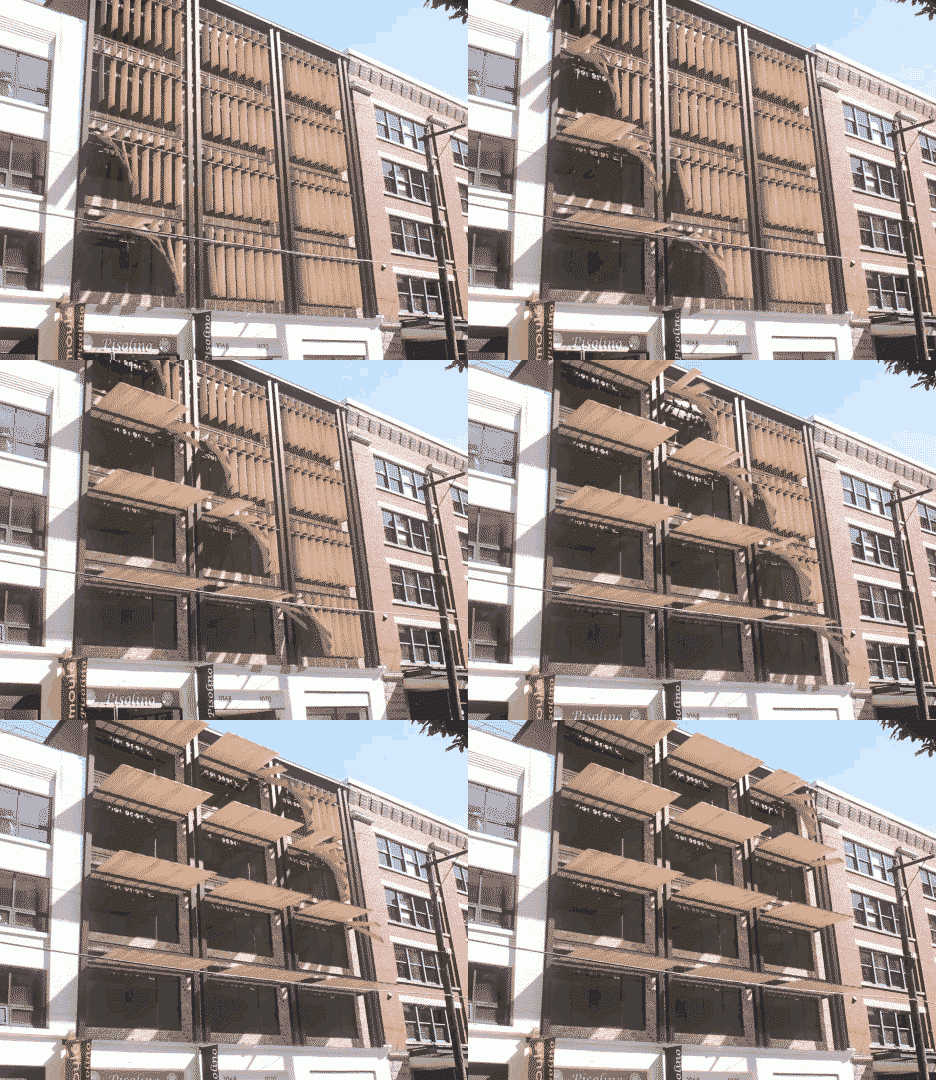
The Penumbra system by Tyler Short is “designed to offer a kinetic and mechanical solution to a problem that would otherwise be nearly impossible to solve with static architectural components: providing shading across a building facade for both low evening sun and high afternoon sun conditions.” The various kinetic elements of the shade system can shift in different ways to deflect light as needed.

Moving Parts by Olson Kundig Architects

moving architecture kundig 4

moving architecture kundig 5

moving architecture delta shelter

moving architecture delta shelter 2

Architect: Tom Kundig

Architect: Tom Kundig

Architect: Tom Kundig

Architect: Tom Kundig

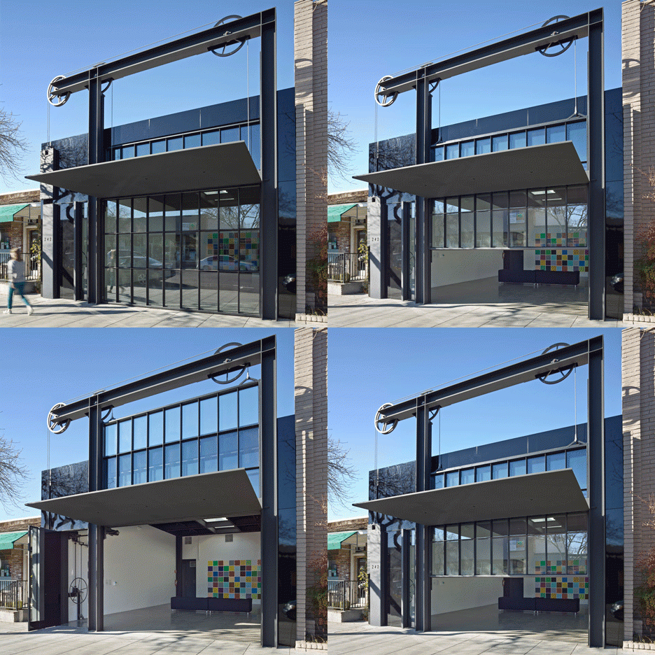
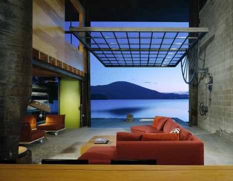
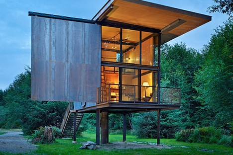
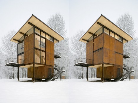
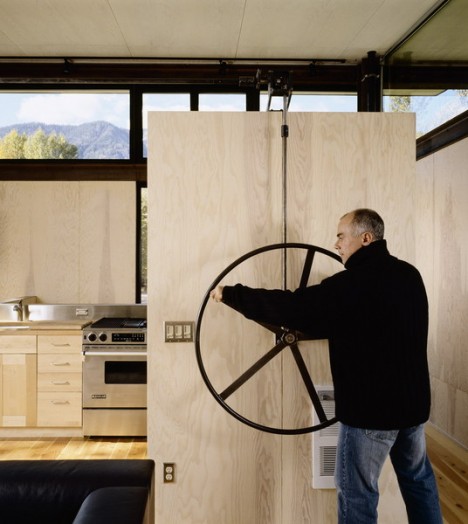
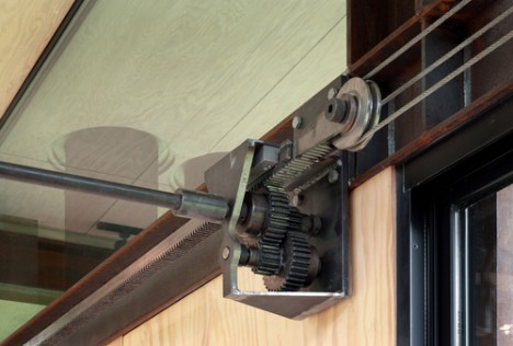
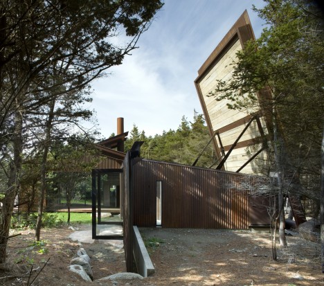
A home with a roof that opens vertically, an art gallery with a hoist-and-pulley facade and a ‘virtually indestructible’ cabin with operable steel panels are among the kinetic projects by Tom Kundig of the firm Olson Kundig. The architect says early exposure to mining, logging and farming industries led to a lifelong fascination with machinery, which he has integrated into all sorts of architectural projects. The idea is to move something large using very little energy, encouraging user participation in the transformation of the space in concert with geometry and physics.

Next Page – Click Below to Read More:
Architecture Thats Alive 16 Transforming Kinetic Buildings

Share on Facebook


[ By Steph in Architecture & Cities & Urbanism. ]

[ WebUrbanist | Archives | Galleries | Privacy | TOS ]


WebUrbanist

 
Comments Off on Architecturally Alive: 16 Transforming Kinetic Buildings

Posted in Creativity


Stealth Structures: 10 Buildings That Aren’t What They Seem

23 Apr

[ By Steph in Travel & Urban Exploration. ]
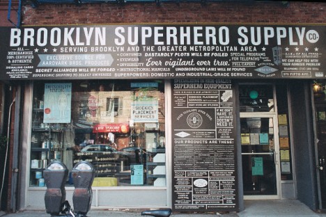
superhero supply

How many houses that you pass each day aren’t really houses at all, but just realistic-looking facades hiding a secret function? Speakeasies and secret clubs masquerade as run-down stores in New York, faux suburban residences hide unexpected operations and weird-looking towers all over Los Angeles contain something you’d never expect.

Top Secret Bar You’d Never Find On Your Own
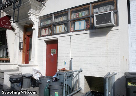
secret toy shop bar 1

secret toy shop bar 2

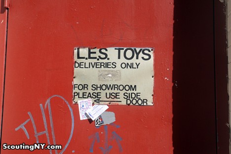
New York City hides all sorts of secrets, among them a number of fake storefronts hiding secret bars, clubs and meeting spaces. Scouting New York listed out eight of the best, including ‘Lower East Side Toys’ on Norfolk Street in Manhattan. It definitely doesn’t look like much from the street, and the door marked with a peeling sign that says ‘Deliveries Only’ seems innocuous enough. But those in the know step right through into The Back Room, a speakeasy-style bar. The takeaway here is that if you think a New York City business is a front for something else, you’re probably right.

Fake Brooklyn Brownstone Hides an Underground Portal
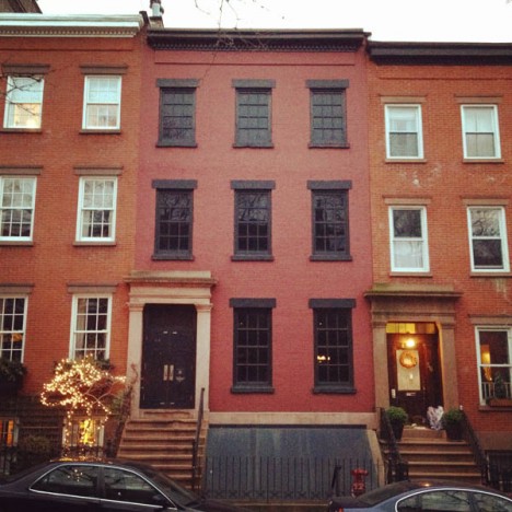
secret brooklyn brownstone 1

secret brooklyn brownstone 2

secret brooklyn brownstone 3

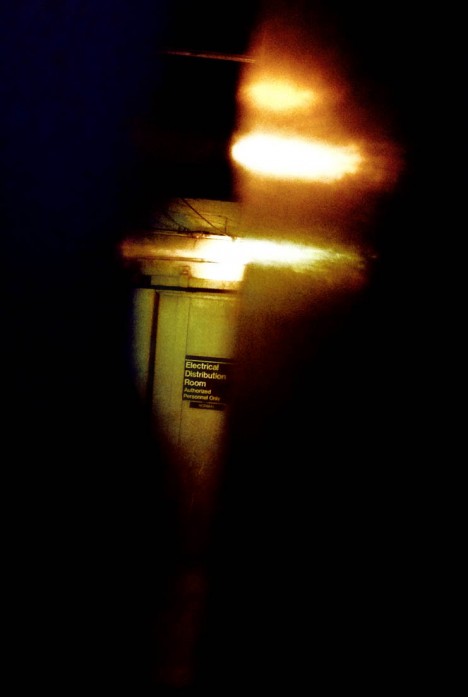
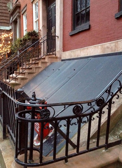
If you’re very observant, you might have noticed when passing by that the windows in this otherwise normal-looking Brooklyn brownstone are curiously blacked out. But that’s just about the only clue that anything is amiss – unless you walk right up to the door and peer through the crack, which reveals not a home but rather a concrete-lined, windowless industrial space. 58 Joralemon Street stands directly above the tracks for New York City’s subway lines 4 and 5, and functions as a ventilation shaft. The MTA disguised it as a courtesy to the residential neighbors.

Chicago Mansion Is Really a Power Substation
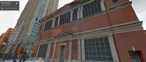
Screen Shot 2015-04-21 at 7.41.13 PM

Screen Shot 2015-04-21 at 7.40.54 PM

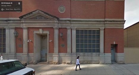
A faux Georgian mansion stands at a Chicago intersection with front doors that don’t open and windows that are never illuminated, no matter the time of day. It’s actually a substation for electrical company Commonwealth Edison, which goes to some trouble to camouflage many of these typically unsightly structures when they’re located in conspicuous spots. This one was designed by Stanley Tigerman, former director of the School of Architecture at the University of Illinois in Chicago. Triggerman made it as authentically Georgian as he could, down to the sturdy brickwork pattern that will help it stand the test of time with minimal maintenance. The blacked-out windows are actually vents.

Superhero Supply Store Doesn’t Really Sell Superhero Supplies
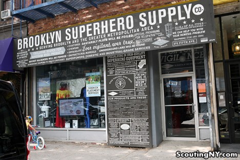
secret superhero supply 1

secret superhero supply 2

You might suspect that something’s amiss with the Brooklyn Superhero Supply Co, given that the products on display in the window and listed on a card outside include antimatter, a collapsible portal, galactic compasses and manuals for all sorts of fantastical weapons that don’t really exist. If you know the secret of the place once inside, you’ll head directly for a secret door hidden in a bookcase, which leads not to the headquarters of the Justice League but rather a student learning and activity center focusing on literacy. A viewing portal in the wall gives visitors a glimpse into this space. Disappointed? You can actually buy a number of products from the shop and the website, including superhero disguise kits, costumes, and even one-gallon cans of immortality. There’s even a musical inspired by it.

Swiss Fortress in Disguise
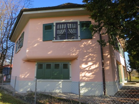
secret fortress villa rose

Would you ever guess that this little pink house in Switzerland is really a fortress? Villa Rose is located on the Toblerone defensive line, built to defend the country from invasion during World War II. If you opened the garage door you’d come face-to-face with a pair of gigantic cannons, a third hidden deeper inside. The fake windows painted onto the second story would only fool onlookers from afar, but when the fortress was active, nobody would have made it close enough to notice. The Villa Rose is now open to the public as a museum.

Next Page – Click Below to Read More:
Stealth Structures 10 Buildings That Arent What They Seem

Share on Facebook


[ By Steph in Travel & Urban Exploration. ]

[ WebUrbanist | Archives | Galleries | Privacy | TOS ]


WebUrbanist
 
Comments Off on Stealth Structures: 10 Buildings That Aren’t What They Seem

Posted in Creativity


Ephemeral Architecture: 27 Paper Buildings & Pavilions

20 Apr

[ By Steph in Art & Sculpture & Craft. ]

paper architecture siliakus 1

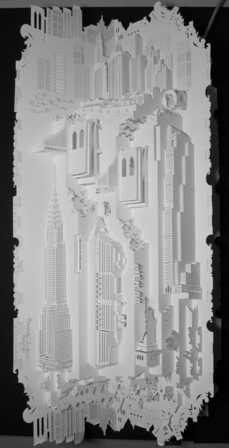
A study in opposites, paper architecture renders what is normally solid and durable in delicate, temporary form, whether recreating intricate silhouettes of miniature cities or building full-scale pavilions, tunnels and other installations. Spires, translucent windows, infinite staircases and undulating ceilings come to life in these 27 works of paper cut sculpture.

Irori Pavilion by Kengo Kuma
paper pavilion irori kuma 2

paper pavilion irori kuma

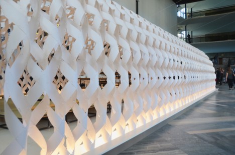
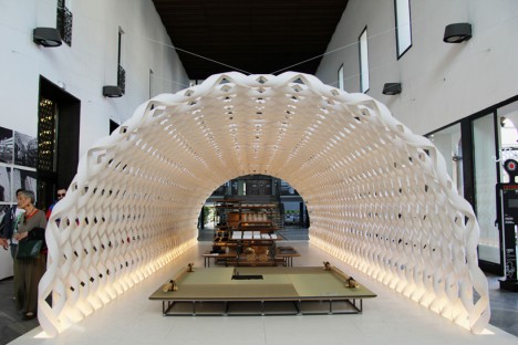
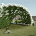
Best known for innovative timber structures, Japanese architect Kengo Kuma applies his signature blend of traditional joinery and modern shapes to a new material for Milan Design Week 2015. Kumar collaborated with Kitchenhouse to create ‘Irori,’ a paper pavilion arching over a contemporary kitchen space. Envisioned as a white cocoon, the structure is made of vulcanized paper, which has more strength than regular paper but maintains its softness.

Paper Miniatures of Modernist Architecture by Zupagrafika

paper architecture modernist poland 2

paper architecture modernist poland

paper architecture eastern block

paper architecture brutal 3

paper architecture brutal 2

paper architecture brutal 1

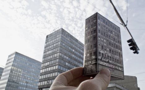
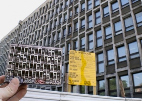
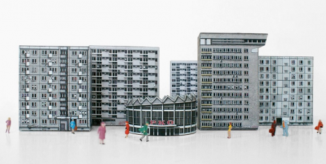
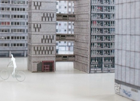
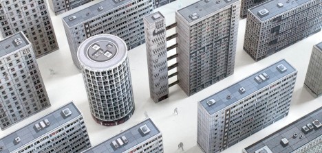
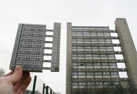
Polish design collective Zupagrafika creates paper cut-outs of modernist buildings found in the city of Poznan and Warsaw as well as London’s divisive concrete Brutalist architecture. Rendered in minute detail down to the graffiti that was found on the buildings at the time of study, the cutouts come in flat form so you can put them together yourself and create little cities. Individual cut-outs are under 5 Euros each.

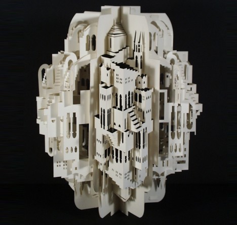
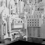
Intricate 3D Paper Architecture by Ingrid Siliakus

paper architecture siliakus 4

paper architecture siliakus 3

paper architecture siliakus 2

paper architecture siliakus 5

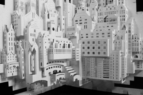
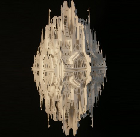
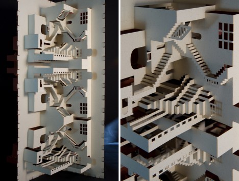
Master paper artist Ingrid Siliakus creates fantasy cities replete with mirror-image towers, arches, spires, stacks upon stacks of skyscrapers and stairs that go nowhere in particular. The Amsterdam-based artist creates an incredible 20-30 prototypes before completing each piece, adding one layer after another of cut and folded paper to the finished product until she deems it done.

Stockholm Pavilion by Kustaa Saksi and Gert Wingårdh

stockholm pavilion 1

stockholm pavilion 2

stockholm pavlion 3

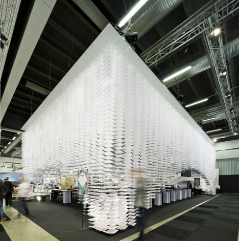
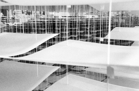
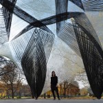
Built for the 2013 Stockholm Furniture & Light Fair, the Stockholm Pavilion by artist Kustaa Saksi and architect Gert Wingårdh is made up of 11,000 illustrated sheets of paper. From the sides, the installation looks like it’s solid white, but step under it and look up to see the colorful patterns emerge.

Next Page – Click Below to Read More:
Ephemeral Architecture 27 Paper Buildings Pavilions

Share on Facebook


[ By Steph in Art & Sculpture & Craft. ]

[ WebUrbanist | Archives | Galleries | Privacy | TOS ]


WebUrbanist

 
Comments Off on Ephemeral Architecture: 27 Paper Buildings & Pavilions

Posted in Creativity


Adaptive Architecture: 12 Transforming, Breathing Buildings

12 Mar

[ By Steph in Architecture & Houses & Residential. ]

transforming buildings sliding house 2

The exterior walls of homes slide back to reveal transparent volumes, the facade of a parking garage ripples like the surface of a nearby river and individual rooms rise high into the sky at the push of a button in these transforming, adapting, kinetic works of architecture.

Kinetic Parking Garage Facade

transforming buildings kinetic garage 1

transforming buildings kinetic facade 2

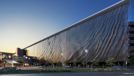
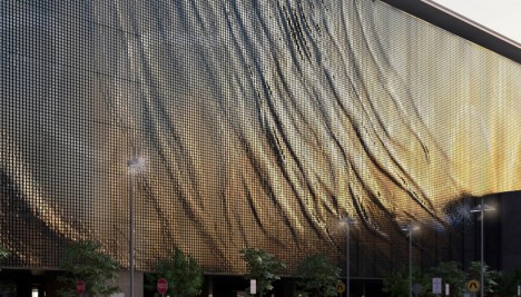
The entire 8-story facade of the Brisbane airport seems to ripple like a vertical body of water thanks to the kinetic effects of 118,000 suspended aluminum panels that shift in the wind. A collaboration between American artist Ned Kahn and Hassell Architecture, the installation makes reference to the city’s most iconic natural feature, the Brisbane River. In addition to its visual appeal, it provides shade to the inside of a parking garage.

Sliding House by DRMM

transforming buildings sliding house 1

transforming buildings sliding house 3

transforming buildings sliding house 4

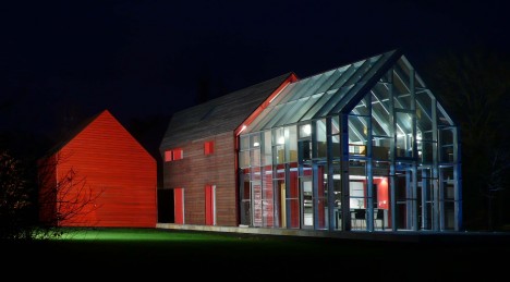
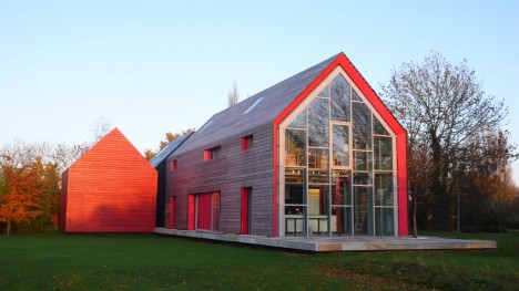
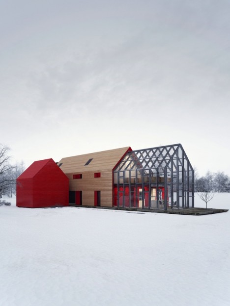
An ordinary-looking residence in the archetypal gabled house shape reveals itself to be a kinetic work of astonishing genius, almost like a performance piece in itself, when the protective outer wood facade slides forward to open a transparent volume to the sky and create new indoor/outdoor spaces. The 20-ton mobile roof/wall structure traverses the site, creating new combinations of living spaces depending on how far it’s pushed on its tracks via electric motors. The tracks could even be extended further in the future to accommodate an indoor/outdoor swimming pool, if the clients desire.

Cafe-restaurant OPEN, Amsterdam by de Architekten Cie

transforming buildings cafe 1

transforming buildings cafe 2

cafe buildings transforming 4

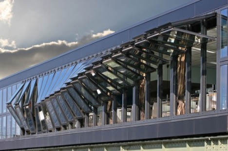
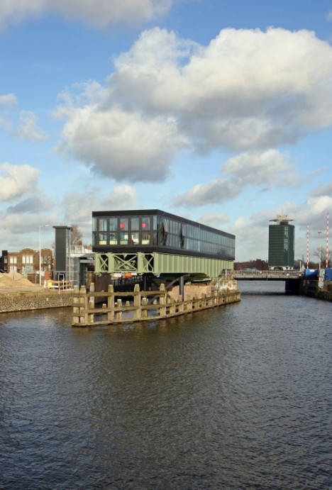
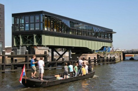
The accordion-like pivoting windows on this unusual reclaimed restaurant in Amsterdam transform the facade in wave-like patterns when they are opened in certain ways, adding visual interest to what would otherwise simply be a steel and glass box. De Architekten Cie built the restaurant upon one of the last surviving pivot railway bridges in the Netherlands, making use of a striking historic feature with panoramic views.

Shapeshifting Sharifi-Ha House

sharifi-ha-test-gif

transforming buildings sharifi-ha 2

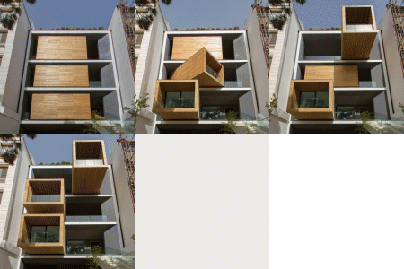
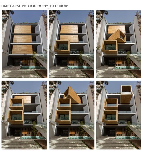
Three dynamic inner volumes sheathed in wood pivot nearly 360 degrees within a concrete shell at the Sharifi-Ha House in Tehran by design firm nextoffice, orienting these rooms in new ways to provide varying degrees of natural daylight and privacy. The push of a button sends the guest room, home office or dining room cantilevering out over the street, spinning to face a new direction or pulling them protectively back into the envelope. When facing straight out, they open up new terraces on each level.

Elevating Towers on Villa Hush Hush

transforming buildings hushhush 1

transforming buildings villa hushhush 2

transforming buildings villa hushhush 3

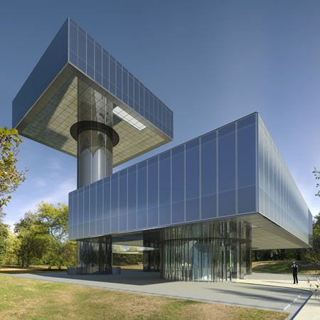
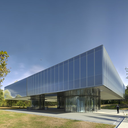
Sections of this incredible morphing home by Marks Barfield Architects can go from ground level to high up in the sky within minutes. Push a button and two of Villa Hush Hush’s four rectangular zones elevate far above the canopy of the adjacent forest, up to 130 feet into the sky.

Next Page – Click Below to Read More:
Adaptive Architecture 12 Transforming Breathing Buildings

Share on Facebook


[ By Steph in Architecture & Houses & Residential. ]

[ WebUrbanist | Archives | Galleries | Privacy | TOS ]


WebUrbanist

 
Comments Off on Adaptive Architecture: 12 Transforming, Breathing Buildings

Posted in Creativity