RSS
 

Posts Tagged ‘Buildings’

Use Photoshop to Correct Perspective Distortion of Buildings in Your Images

25 Jun

Shooting buildings can be tricky. The main reason is that they are tall, and you need to get far away from them if you want to fit them into the frame. If you are shooting in the city, you don’t have the luxury of getting really far away, the best you may be able to do is get farther down the street. What you have to do then, is tilt your camera upwards to get the whole building in, and that’s when it happens – perspective distortion.
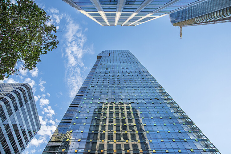
City Scenes can be difficult to photograph

City scenes can be difficult to photograph because of the risk of distortion

When you are using a wide angle lens (which you probably will be when shooting architecture) and you tilt your lens up or down, your image will distort. Architectural photographers would use a tilt-shift lens to counteract this distortion, which can make a really big difference in your image. The only problem is that it is a specialist lens, and it is expensive.

Until a few years ago, that was the only solution for fixing perspective distortion, but in the latest versions of Photoshop, there are a few truly amazing tools that can fix it painlessly. Sometimes the distortion may work well in the image, but if you need to fix it, these techniques can help. To learn more about getting better architectural photos read: Tips for Different Approaches to Architecture Photography

1. Working with distortion

The definition of distortion is: when the straight lines of a subject are either curved in a particular direction, or they converge or diverge. This happens when the focal plane of your camera is pointed upward or downward. This is called perspective distortion. The second most common type of warping is barrel distortion, this type is dependent on the type of lens you are using. Barrel distortion make the image look like it has been inflated in the middle of the scene so it looks like a barrel – wider in the middle, and narrower at the top and bottom. Wide angle lenses tend to distort a fair amount when pointing up or down, and in some cases, you may get barrel distortion in the image too. So, how do we fix this?
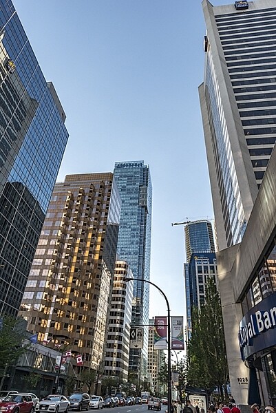
Tall buildings distort easily with a wide angle lens

Tall buildings distort easily with a wide angle lens.

2. Fixing distortion in camera

If you want to avoid perspective distortion, then you will need to keep your focal plane at 90 degrees to your subject. In other words, don’t tilt your camera up or down when you are shooting. This may work well for landscape photography, but when you are shooting tall buildings, it may be very difficult to get that right. Sometimes there is no way to avoid perspective distortion in camera.

Thankfully Photoshop can help you out here. Barrel distortion is a function of the lens you are using, wide angle lenses can make the middle of the image seem bloated or inflated. You can try and fix this by zooming in a little, as wide angles tend to suffer from barrel distortion when they are at their widest focal length. Zooming in is not always possible, so we will fix the bulk of the issues in Photoshop.

3. Fixing distortion in Photoshop

Photoshop has a few functions that can help you fix both perspective and barrel distortion. One of the best tools that has been included with recent versions is the Adaptive Wide Angle Tool. This tool is intuitive and easy to use, but takes a little practice initially. In the past, I would use the transform tools (i.e., Distort, Skew, Perspective and Warp). While these worked really well, it took a fair amount of time to get the corrections to look realistic.

In the examples below, you can see that the building looks shorter and more squat. Some further adjustments would need to be made to correct this, but overall, the buildings are vertical and look correct architecturally.  With the Adaptive Wide Angle tool, this process is easily done, in some cases with only three or four mouse clicks.
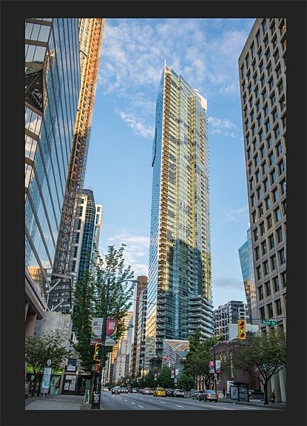
Image of a building before the distortion tool was applied in Photoshop
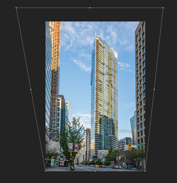
Image of a building before the distortion tool was applied in Photoshop

Same image after the distortion tool was applied

Same image after the distortion tool was applied

4. Adaptive Wide Angle tool

The Adaptive Wide Angle tool sits under the filter menu. Open the image you want to correct (with skew buildings or walls) click on FILTER>ADAPTIVE WIDE ANGLE, and a new box will open up with your image inside it.
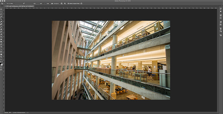
Adaptive Wide Angle tool screen

Image to be corrected, you can see the vertical lines are pretty skew

Depending on how your image is displayed in the box, you may need to scale it to see the whole thing. On the right hand side you will see a box that says Correction. Underneath that you will see a scale slider, adjust it until you can see your whole image in the box. There is a dropdown box in there with other options such as perspective, fisheye, etc., – I find leaving it on Auto seems to work best. The other functions within that box may work in some cases, but by leaving it on Auto and making specific adjustments to the verticals and horizontals in your image, you will get the best results.
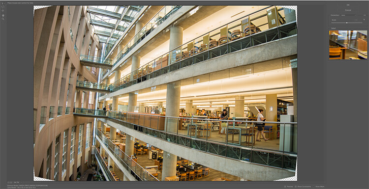
Adaptive Wide angle tool screen

Adaptive Wide angle tool screen

You will then need to identify the walls of the building that are converging or diverging. On the left hand side of the dialogue box, you will see some constraint tools. The tool that is first in the row is simply called the Constraint Tool, this is the one I use most often.

Click on that and move your mouse over to one of the vertical lines of the building, and draw a line down the wall. Start at the top of the building and drag the line down to the bottom, along a vertical wall that should be straight. Click at the bottom of the line when you are done and Photoshop will drop a line down exactly where you dragged. As you click, Photoshop will correct any barrel distortion, but the line will still be skew.

At the bottom of the line you will see a square, right click on the square and three options will pop up: Horizontal, Vertical, and Arbitrary. These are the three ways you have to correct that line. If it is a vertical wall, then click on Vertical. Immediately, Photoshop will bring that wall into a perfect upright position. What you will notice is that it may distort other lines now. That’s okay, find a second vertical that is not correct and repeat this process, once you have done three or four verticals, your building should be perfectly straight, as should the rest of the building. Sometimes what may happen is that the horizontal alignment may shift with all these vertical changes. You can then select a horizontal line in the image and repeat the same process you did for the verticals, just use a line that you know should be horizontal. Also, when you right click, select the Horizontal option in the popup box.

To make sure you are making a precise selection when you draw your line, there is a 100% zoom window on the right hand side. This is really useful, as it can be difficult to be zoomed in to the image, and drag the line down at the same time. This box really helps make sure that you start and finish at the right places on the building.
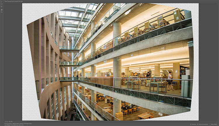
Adaptive Wide Angle tool and image after 3 adjustments have been made

Adaptive Wide Angle tool and image after 3 adjustments have been made

Once you have straightened some of the more skewed verticals, and one or two horizontals, your image should be looking pretty close to perfect. Once you are done, click ok and your image will open up in Photoshop. From there you can edit the rest of the image with all the lines being straight and aligned.

A new tool has recently been launched by Adobe Photoshop for CC users called Guided Upright and you can find it in Camera RAW of the latest version.
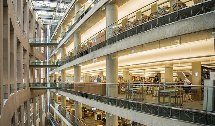
Final image after being edited in the Adaptive Wide Angle tool

Final image after being edited in the Adaptive Wide Angle tool and cropped.

Here is a great short minute video that Adobe has released, take a look, this could also be a useful tool to use.

What’s your go-to method of correcting perspective distortion? Please share in the comments below.

googletag.cmd.push(function() {
tablet_slots.push( googletag.defineSlot( “/1005424/_dPSv4_tab-all-article-bottom_(300×250)”, [300, 250], “pb-ad-78623” ).addService( googletag.pubads() ) ); } );

googletag.cmd.push(function() {
mobile_slots.push( googletag.defineSlot( “/1005424/_dPSv4_mob-all-article-bottom_(300×250)”, [300, 250], “pb-ad-78158” ).addService( googletag.pubads() ) ); } );

The post Use Photoshop to Correct Perspective Distortion of Buildings in Your Images by Barry J Brady appeared first on Digital Photography School.
Digital Photography School

 
Comments Off on Use Photoshop to Correct Perspective Distortion of Buildings in Your Images

Posted in Photography


Dynamic Architecture: 13 Buildings with Moving Parts

04 May

[ By Steph in Architecture & Houses & Residential. ]

moving buildings villa girasole 2

Entire Italian villas spin in circles on wheels, solar-powered shades follow the sun, rooms zoom up into the air on telescopic stilts and windowless facades lift up on one end like shoebox mousetraps, all at the push of a button. These dynamic houses, apartment buildings, pavilions and offices have all sorts of moving parts, transforming as if of their own accord to change the views or keep the interiors cool.
Phalanstery Module

moving buildings phalanstery 1

moving buildings phalanstery 2

phalanstery module 3

phalanstery module 4

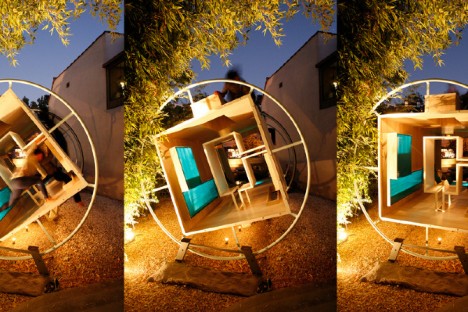
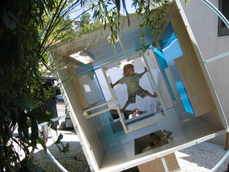
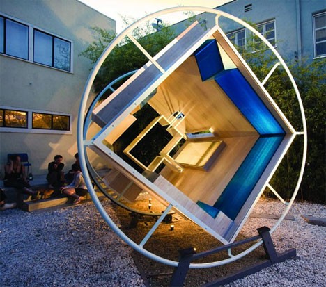
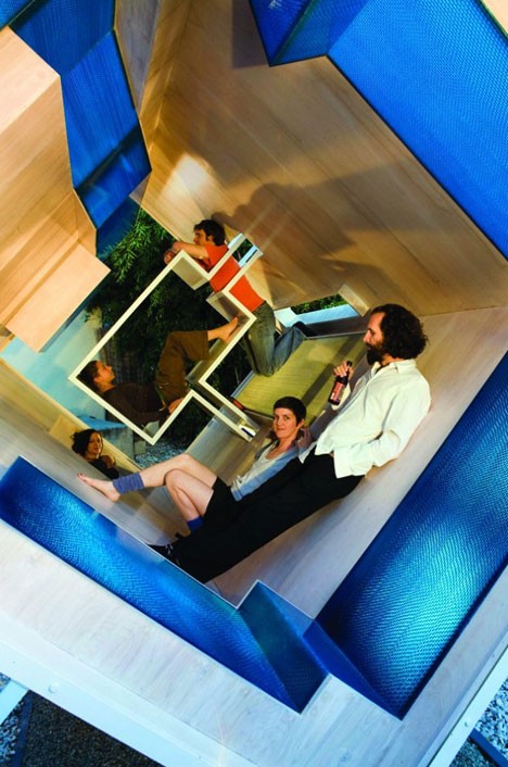
Envisioned as a house for zero-gravity, where all surfaces are treated equally, the Phalanstery Module rotates a full turn per hour, with one of the surfaces becoming parallel to the ground every fifteen minutes. Say the creators, “In the middle of every 7.5 minute conversation, two people are bound to collide. Architectural program and activities become overpowered by the instinctive interpretations of our bodies against measurable dimensions.”

Sharifi-Ha House
moving buildings sharifi-ha

moving buildings sharifi-ha 2

moving buildings sharifi-ha 3

moving buildings sharifi-ha 4
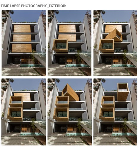
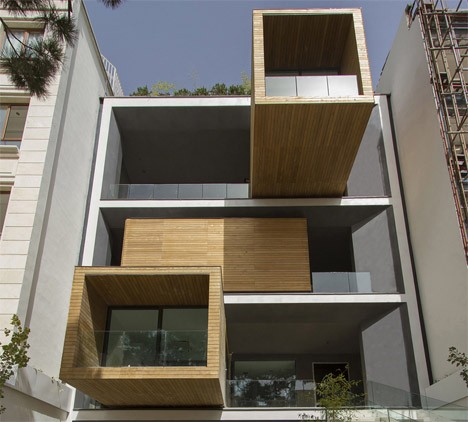
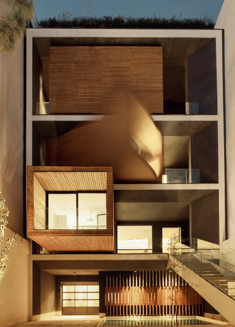
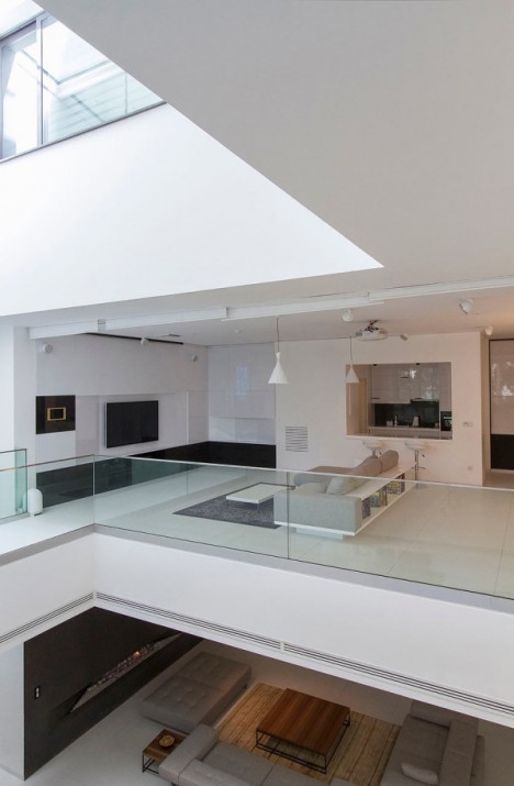
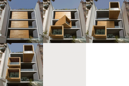
At the push of a button, three wooden volumes tucked inside a main structure turn their glass-capped ends in various directions. The residents of the Sharifi-Ha House by next office i Tehran can choose whether they want these particular rooms to be shaded or illuminated by the sun, as well as the view they prefer. Rotated fully out of their containing spaces, they telescope out over the driveway.

Villa Girasole
moving buildings villa girasole

moving buildings villa girasole 2

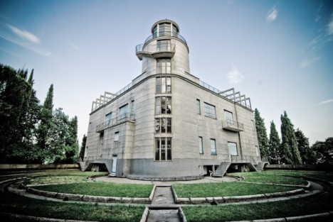
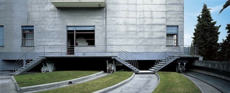
Set on wheels and rails, northern Italy’s Villa Girasole rotates to follow the sun as it arches across the sky throughout the day, just like its namesake, the sunflower. Built in the 1930sby a wealthy engineer the two-story house rotates from a 42-meter-tall tower at the center, moving about 4 millimeters per second. It takes 9 hours and 20 minutes for it to rotate a full turn.

La Caja Oscura
moving buildings caja oscura 1

moving buildings caja oscura 2

moving buildings caja oscura 3

moving buildings caja oscura 4

moving buildings caja oscura 5

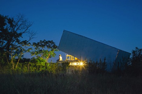
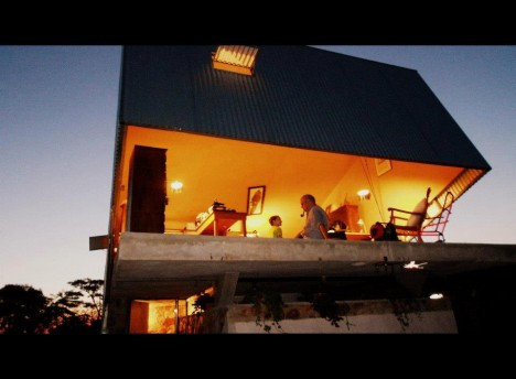
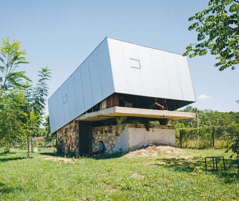
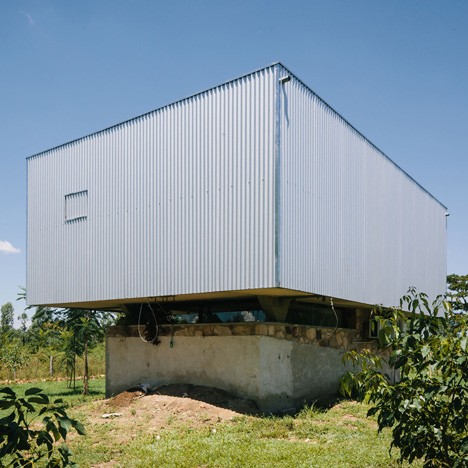
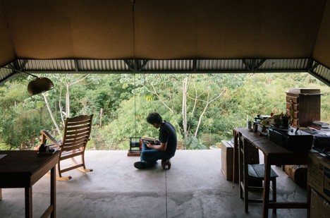
From afar, this house looks like a giant shoebox mouse trap, one end tilted up to reveal an elevated concrete slab. The windowless exterior moves up and down to either open the interior to the elements, or seal it off completely when the owners are gone. Designed by architect Javier Corvalan as the vacation home of a filmmaker, the house transforms with a manual winch. When closed, a pinhole allows the entire structure to function as a camera obscura, projecting an upside-down image of the landscape outside onto the interior walls.

Next Page – Click Below to Read More:
Dynamic Architecture 13 Buildings With Moving Parts

Share on Facebook


[ By Steph in Architecture & Houses & Residential. ]

[ WebUrbanist | Archives | Galleries | Privacy | TOS ]


WebUrbanist

 
Comments Off on Dynamic Architecture: 13 Buildings with Moving Parts

Posted in Creativity


Buildings in Motion: 15 Most Mesmerizing Architecture Gifs

18 Apr

[ By Steph in Art & Drawing & Digital & Photography & Video. ]

architecture gif stampa 2

Architecture spins, zooms, slides, grows, shrinks and blooms like oversized artificial flowers in animated GIF form, with the effects originating from both fantasy motions that the real-life buildings don’t actually perform and functional movable parts. With these graphics we see architecture from a new perspective as it seems to take on a life of its own – and while watching elements of a building click into place from the sky like a game of Tetris is satisfying, it’s also really cool to see how transforming elements of real buildings work, like a massive sliding metal roof that covers or uncovers an all-glass house at the push of a button.

M.C. Escher and the Droste Effect

architecture gif escher

M.C. Escher’s drawing of a landscape. spotted inside a window (Prentententoonstelling or ‘Print Gallery’, 1956), serves as the basis of this Droste effect gif. The artist used a mathematical grid to create the twisted perspective in the original drawing, and then researchers at Leiden University reproduced it on a computer, adjusted the perspective and applied the zooming effect.

Rapid Perspective Shift
architecture gif perspective shift

This somewhat disorienting gif gives us an idea of what it would be like to zoom through a city in a flying car, quickly shifting our perspective of a single building’s corner several times.

8 Animated Architectural Images by Axel de Stampa

architecture gif stampa 4

architecture gif stampa 5

architecture gif stampa 6

architecture gif stampa 7

architecture gif stampa 9

architecture gif stampa 1

architecture gif stampa 2

architecture gif stampa 3

A series of structures by famous architecture firms like MVRDV and Herzog de Meuron come to life in these gifs by Paris-based architects Axel de Stampa and Sylvain Macaux. The Mirador Buidling by the former zooms into place on the ground like a life-sized game of Tetris, while the randomly stacked levels of the latter’s Vitra House appear and disappear. ‘Architecture Animée’ adds a fourth dimension to architecture by quickly applying changes that normally would only be seen with the passage of time.

Sliding Pergolas House
architecture gif pergolas house

We get to see just how the star feature of the ‘Sliding Pergolas House’ in Brazil by FGMF Arquitetos works in this fun gif. The movable roof elements make it possible to shelter some areas of the spacious courtyard while letting sun stream into others.

Next Page – Click Below to Read More:
Buildings In Motion 15 Most Mesmerizing Architecture Gifs

Share on Facebook


[ By Steph in Art & Drawing & Digital & Photography & Video. ]

[ WebUrbanist | Archives | Galleries | Privacy | TOS ]


WebUrbanist

 
Comments Off on Buildings in Motion: 15 Most Mesmerizing Architecture Gifs

Posted in Creativity


Ghosts of Architecture Past: 14 Fossils of Fallen Buildings

05 Apr

[ By Steph in Art & Installation & Sound. ]

ghost architecture 1

Like hazy memories or flickers of imagination, architectural structures either long since lost or never built in the first place interact with three-dimensional space in the form of ghostly sculptures, projections or the imprints they left behind on neighboring buildings. Some are tangible yet illusory, made of transparent materials that make them seem like hallucinations, while others attempt to conjure past, fiction and fantasy with nothing but beams of light or smudges of paint left behind on brick.

Ancient Church Remains Resurrected in Puglia

ghost architecture wire 11

ghost architecture wire 10

ghost architecture wire 12

ghost architecture wire 8

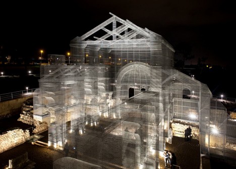
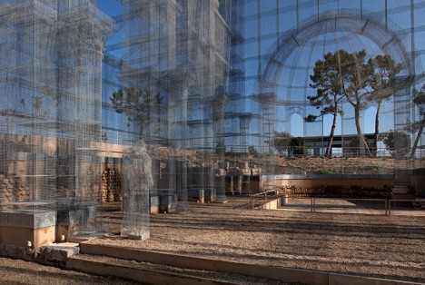
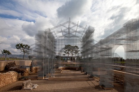
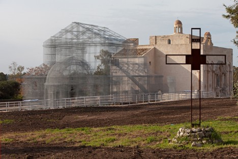
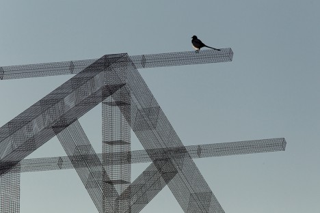
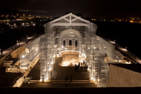
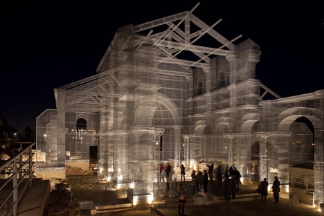
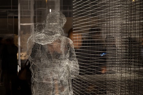
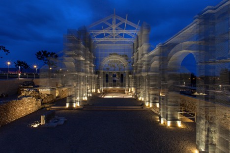
Destroyed by earthquakes in the 13th century, the remains of one of Italy’s great harbor towns are long since abandoned, and only a foundation with a few crumbled stone walls is left to show for a grand early Christian basilica. Italian artist Edoardo Tresoldi raises it from the dead in the ghostly form of wire mesh, giving it a transparent effect that makes it seem not quite real from afar. In fact, the layered mesh creates an optical illusion that makes its Romanesque roof, columns and archways look blurred. This transparency makes it possible to see both the form and shape of the structure and how it interacted with its environment.

ghost architecture wire 4

ghsot artchitecture wire 2

ghost architecture wire 3

ghost architecture wire 5

“The work of Edoardo Tresoldi appears as a majestic architectural sculpture that tells the volume of the existing early Christian church and, at the same time, is able to vivify, and update the relationship between the ancient and the contemporary,” says curator Simone Pallotta. “It is a work that, breaking up the secular controversy of the primacy arts, summarizes two complementary languages into a single, breathtaking scenery.”

Ghosts of Portland’s Industrial Past

ghosts of architecture portland 1

ghosts of architecture portland 2

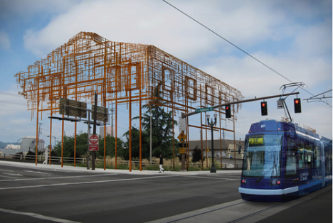
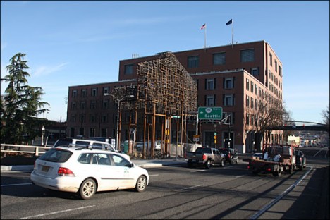
A pair of outdoor sculptures by artists and architects Annie Han and Daniel Mihalyo sketch in vague outlines of Portland’s industrial past along the Willamette River amongst all the new construction. Made of metal mesh and sited near two bridges, ‘Inversion: Plus Minus’ represent the outer shells of ordinary industrial buildings that once existed in the area. If you pass it by without giving it a good look, you might even just assume that it’s scaffolding.

6 Architectural Fossils
ghost architecture fossils 1

ghost architecture fossils 2

ghost architecture fossils 3

ghost architecture fossils 4

ghost architecture fossils 5

ghost architecture fossils 6

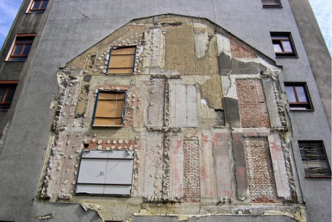
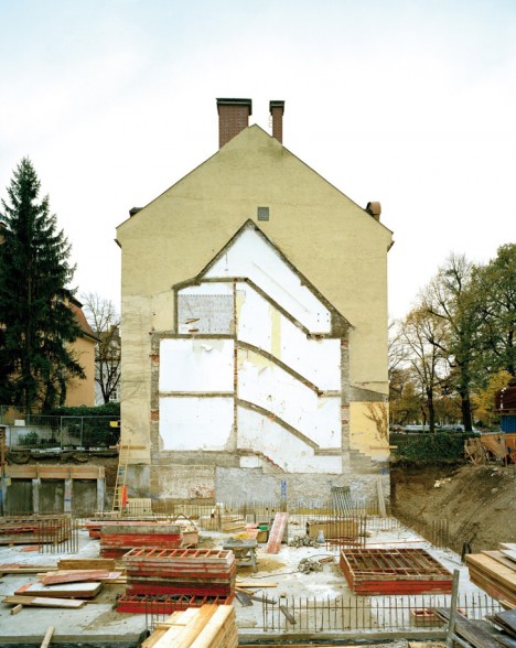
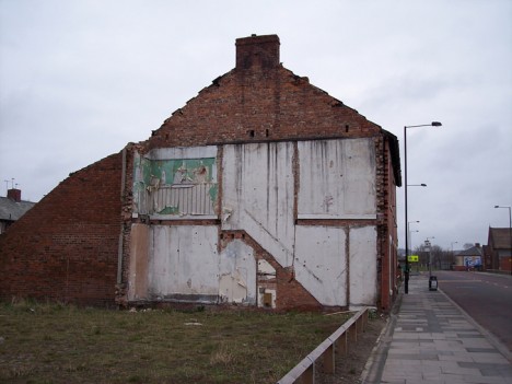
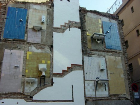
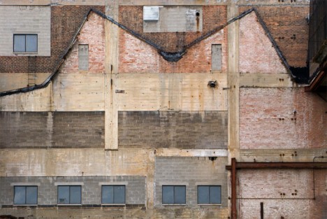
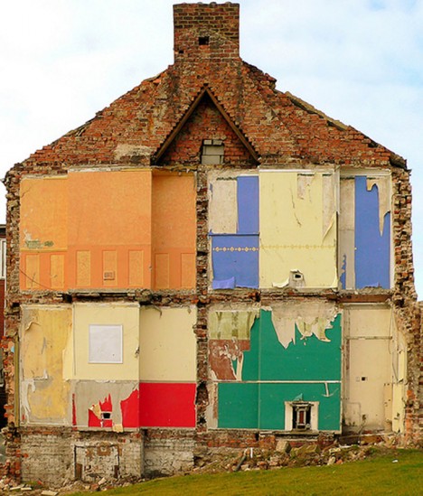
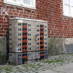
The imprints of buildings long gone can often be seen on their surviving neighbors for decades into the future, sometimes giving us an exact outline of their shapes like fossils on adjacent brick and stone. Not only can you see the rooflines, chimneys and outer walls, but often staircases, fire escapes and individual rooms. It’s especially intriguing when bits of wallpaper still stick to the remaining walls: we see the personalities of the individual spaces, triggering us to think about the lives of their former occupants. In some cases, fixtures like sinks, shower heads and toilets still cling to the tile-clad surfaces. Like a cross between architecture and archaeology, these imprints are reminders of a city’s past, and they’re preserved for public enjoyment by the Flickr group The Unconscious Art of Demolition.

Next Page – Click Below to Read More:
Ghosts Or Architecture Past 14 Fossils Of Fallen Buildings

Share on Facebook


[ By Steph in Art & Installation & Sound. ]

[ WebUrbanist | Archives | Galleries | Privacy | TOS ]


WebUrbanist

 
Comments Off on Ghosts of Architecture Past: 14 Fossils of Fallen Buildings

Posted in Creativity


Nesting Architecture: Folding Models of Eastern Bloc Buildings

13 Mar

[ By WebUrbanist in Art & Sculpture & Craft. ]

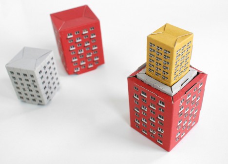
architecture block nesting dolls

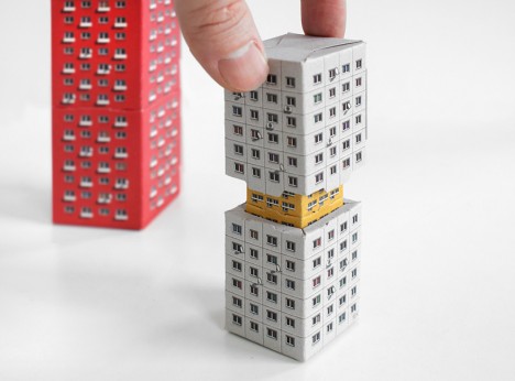
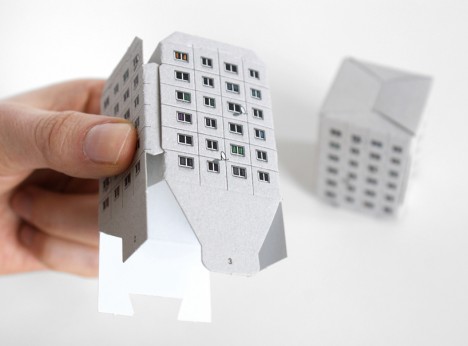
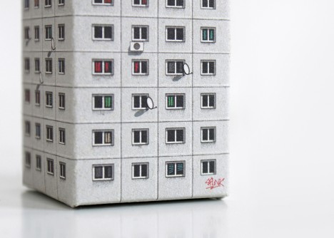
This series of recycled cardboard models references both the functional styles of postwar Soviet architecture as well as the Russian tradition of handcrafted nesting dolls.

architecture nested set

architecture block set

block architecture brutalist postwar

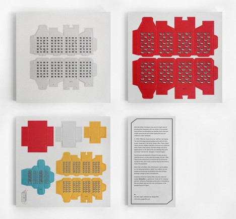
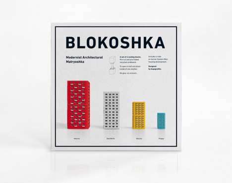
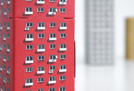
In the wake of World War II, European cities were forced to rebuild in a hurry, focusing on cheap and efficient structures that could effectively be mass-produced. Blokoshka (from: Matryoshka and blocks) by Polish studio Zupagrafika borrows from the pragmatic minimalism of this architectural history.

architecture cardboard sheet

architecture paper construction folding

architecture sheet set assemble

blocksha box set

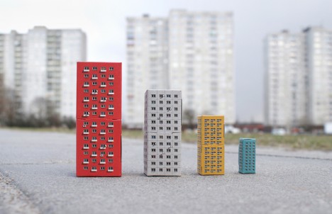
The four units represent four types of building in four places:  the sleeping districts of Moscow, Plattenbau Constructions of East Berlin, ruin-topping estates of Warsaw of moscow, and Panelak blocks of Prague.

architecture tower side

architecture smallest unit

architecture closeup graffiti

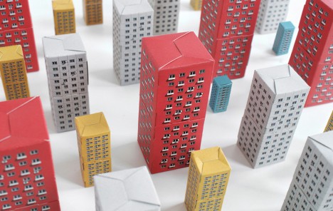
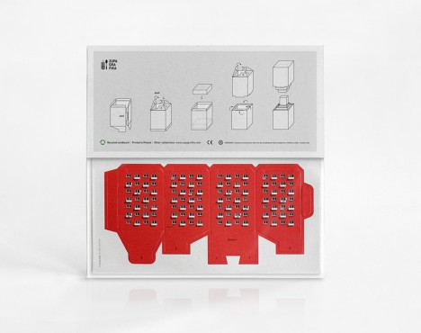
The prefabricated pieces are nestled in sheets of cardboard, ready to be folded into place without the need for glue, scissors or other tools. Each resulting structure tucks neatly into the next, so the sets can be deployed into districts or recombined into shelf-sitting modules.

Share on Facebook


[ By WebUrbanist in Art & Sculpture & Craft. ]

[ WebUrbanist | Archives | Galleries | Privacy | TOS ]


WebUrbanist

 
Comments Off on Nesting Architecture: Folding Models of Eastern Bloc Buildings

Posted in Creativity


Parasite Houses of Paris: Rooftop Prefabs Cling to Buildings

06 Feb

[ By Steph in Architecture & Cities & Urbanism. ]

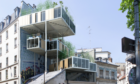
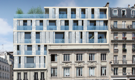
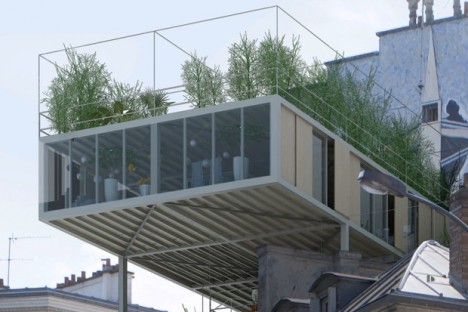
parasitic prefab

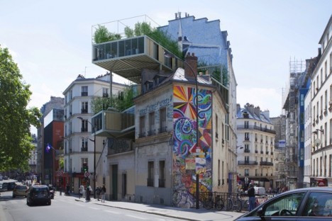
Prefab structures jut out from the roofs of Paris’ charming architecture, adding affordable real estate to the densely-packed, land-scarce city in the only way possible: building up. While other cities across the world are knocking down one older structure after another to build shiny new condos that stretch up into the sky, the new units are often too expensive for the average urban resident, and significantly alter the historic character of each individual place.

parasitic prefab

Whether historically significant or not, the older buildings in most cities help give each location its own particular flavor. Razing them to throw up generic condominiums for people with upper-middle-class incomes not only displaces existing residents, it erases much of each city’s personality. A new project called 3BOX aims to compromise.

parasite houses 1

parasite houses 2

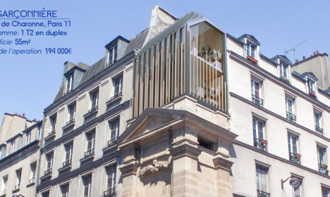
Stéphane Malka Architecture has designed a series of rooftop prefabs that work within the context of Paris’ new property law, the Loi ALUR, which aims to construct 70,000 new dwellings per year while also stabilizing rent. The law comes with a relaxation in planning and zoning, enabling new rooftop construction.

Screen Shot 2016-02-05 at 8.28.32 AM

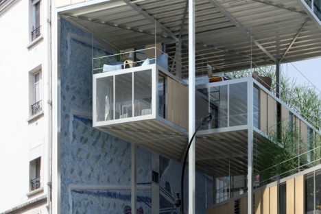
While many of the new dwellings built under Loi ALUR will go on brownfield sites, like those currently owned by French rail company SNCF, others will have to be woven into the fabric of the city in more creative ways. ‘Les Toits Du Monde,’ or the Roofs of the World, offers three different prefab structures bolted onto existing buildings with steel supports.

parasite houses 3

Not everyone will be crazy about altering 19th century buildings with these prefab boxes, no matter how science-fiction it may start to look, but the rooftop terraces help make them more attractive, and they could be a good option for structures with less aesthetic value.

Share on Facebook


[ By Steph in Architecture & Cities & Urbanism. ]

[ WebUrbanist | Archives | Galleries | Privacy | TOS ]


WebUrbanist

 
Comments Off on Parasite Houses of Paris: Rooftop Prefabs Cling to Buildings

Posted in Creativity


Architecture as Art: 13 Unusually Sculptural Buildings

19 Jan

[ By Steph in Architecture & Public & Institutional. ]

artistic architecture alpine hotel 1

When fine art and architecture intersect, especially in our modern era of parametric modeling and 3D printing, the results can be strikingly different from the structures that surround them, in some instances seeming like sculptures were given growth serum and expanded to mind-boggling proportions. Eschewing the ordinary, these buildings feel like a chance for architects to flex their creativity and bring some interesting colors and proportions to their settings.

Melbourne Theater Company
artistic architecture melbourne 1

artistic architecture melbourne 2

artistic architecture melbourne 3

artistic architecture melbourne 4

Abstract shapes glow against a solid black mass on the exterior of this striking complex by Ashton Raggat McDougall, making the Melbourne Recital Centre and MTC Theater some of the most visually unique buildings in the city. The black and white color palette is accented by a vibrant red, with the geometric pattern continuing into the interior, looking three-dimensional when viewed from certain angles.

Tschuggen Grand Hotel
artistic architecture alpine hotel 2

artistic architecture alpine hotel 3

artistic architecture alpine hotel 4

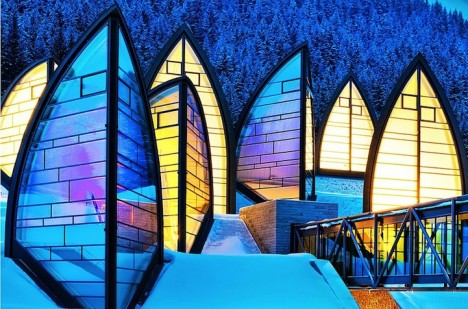
Rising from the Swiss mountainside like shards of ice, architect Mario Botta’s Berg Oase is a sculptural extension of the Tschuggen Grand Hotel. Serving as a wellness center and spa, the arrangement of towering glass wedges bring light streaming into the interior spaces and almost seem like natural structures themselves among the trees and rocks when viewed from afar.

Cloud House
artistic architecture cloud house 1

artistic architecture cloud house 2

artistic architecture cloud house 3

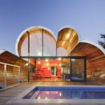
A house shaped like a cloud? Why not? It may look like the occupants would be severely lacking in privacy, considering the two glazed facades, but this building by Australian firm McBride Charles Ryan is actually an extension to a more conventional street-facing home, and is shielded from neighbors’ views by the curved cloud-mimicking sides.

Suzhou Science & Cultural Arts Centre Facade
artistic architecture suzhou 2

artistic architecture suzhou 3

artistic architecture suzhou 1

One way to give a building a dramatic makeover (or just ensure that it stand out from the very start) is to add a parametric facade, like the intricate screen covering the massive Suzhou Science and Cultural Arts Centre in China. Developed by Studio 505, the curving screen is shaped like a parabolic moon crescent and consists of a weatherproofing layer and an outer ornamental mesh screen that provides shading.

Palais Bulles
artistic architecture palais bulles

artistic architecture palais bulles 2

artistic architecture palais bulles 3

artistic architecture palais bulles 4

A classic example of sculptural housing with an aesthetic that’s so outside the norm, it’s almost alien, is Palais Bulles (“Palace of Bubbles.”) Created by architect Antti Lovag in 1989, the curvilinear house is set into a rocky hillside overlooking the Mediterranean Sea in Cannes, France. It’s often used for film festival parties and fashion editorials.

Next Page – Click Below to Read More:
Architecture As Art 13 Unusually Sculptural Buildings

Share on Facebook


[ By Steph in Architecture & Public & Institutional. ]

[ WebUrbanist | Archives | Galleries | Privacy | TOS ]


WebUrbanist

 
Comments Off on Architecture as Art: 13 Unusually Sculptural Buildings

Posted in Creativity


Architecture with Nothing to Hide: 13 Glass Box Buildings

14 Jan

[ By Steph in Architecture & Houses & Residential. ]

glass boxes lomocubes 3

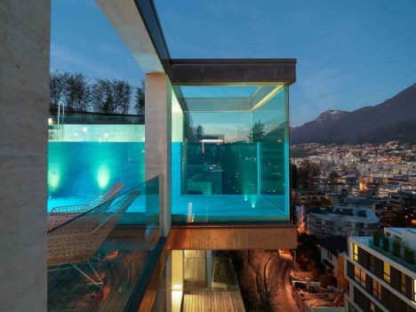
Spotlighting the reflective, shimmering and transparent qualities of glass, architecture primarily made up of glazed volumes interacts with its environment in ways that opaque structures simply can’t, whether they’re overlooking the ocean or in the middle of a busy urban square. Their sense of vulnerability is tempered by this feeling of connection, containing their inhabitants without cutting them off from the world.

Japanese School
glass boxes japanese school

glass boxes japanese school 2

glass boxes japanese school 3

“I wanted to create a building where it isn’t clear if there are any rules at all,” says architect Junya Ishigami of the disorienting Kanazawa Institute of Technology, comprised of little more than 305 steel columns and a whole lot of glass. The structure reflects the trees at its perimeter, seeming to multiply them, making it feel more like a forest itself than a college classroom. Inside, the steel beams mimic tree trunks.

Russet Residence by Splyce Design
glass boxes russet

glass boxes russet 2

glass boxes russet 3

Stacks of glazed boxes jut out from a Vancouver hillside in this modern residence by Splyce Design, stretching out toward the ocean. Some rooms even cantilever from the sides of the house, maximizing the number of interior spaces with an impressive view. All of that frameless glazing helps the home blend in with its surrounding forest environment.

Offices for Junta de Castilla y Leon by Alberto Campo Baeza
glass boxes junta 1

glass boxes junta 2

glass boxes junta 3

How do you make a structure feel simultaneously open and vulnerable, and as secure as a fortress? Build a glass box inside a stone enclosure. Alberto Campo Baeza’s offices for Junta de Castilla y León utilizes sandstone to disguise the very modern building in its historic environment, the walled city of Zamora, Spain. The perimeter walls provide privacy, while the glazed box within soaks up sunlight.

Skyline Residence
glass boxes skyline 1

glass boxes skyline 2

glass boxes skyline 3

The incredible Skyline Residence in Hollywood by Belzberg Architects has its very own drive-in theater on the side of a geometric glazed volume. The entirety of the glass facade opens to the sky on the bottom floor, leading out to a 65-foot hillside infinity pool.
Next Page – Click Below to Read More:
Glitter And Float 13 Glamorous Glass Box Buildings

Share on Facebook


[ By Steph in Architecture & Houses & Residential. ]
[ WebUrbanist | Archives | Galleries | Privacy | TOS ]


WebUrbanist

 
Comments Off on Architecture with Nothing to Hide: 13 Glass Box Buildings

Posted in Creativity


Brazil Nots: Abandoned Buildings Of Utopian Brasilia

11 Jan

[ By Steve in Abandoned Places & Architecture. ]
abandoned-brasilia-1a
Brasilia was designed by visionary architects as a utopian city of tomorrow. Now that tomorrow’s arrived, it appears those plans haven’t panned out.

abandoned-brasilia-1b

abandoned-brasilia-1c

abandoned-brasilia-1d

It took just 41 months to build Brasilia, which was officially inaugurated on April 21st of 1960. The original plans called for a resident population of 500,000 but as of 2011, five times that number lived in the city and its surrounding metropolitan area. Over 50 years of unplanned urban sprawl has resulted in dysfunctional neighborhoods blighted by abandoned structures of all shapes and sizes.

Typical of Brasilia’s dark side is the Torre Palace Hotel. Built in 1973 and boasting 14 stories with a total 140 rooms, the hotel closed in 2013 – a victim of unsolvable financial disagreements among the original builder’s heirs.
abandoned-brasilia-1g

abandoned-brasilia-1e

abandoned-brasilia-1f

Photographer Ricardo Padue and Flickr user -Paulo -Bragga (collspooky) document the current sorry state of the once-swanky former hotel now taken over by looters, squatters and the homeless.

Theater of Pain

abandoned-brasilia-3a

abandoned-brasilia-3b

Designed (like many of Brasilia’s iconic structures) by Oscar Niemeyer, the Claudio Santoro National Theater has spent a significant percentage of its lifespan closed for “repairs”. Lack of funds for operations and maintenance is the culprit here, a situation exacerbated by the world financial crisis of 2008-09. When not hosting theatrical troupes, this strikingly futuristic building shelters drug addicts and the homeless.

Sloppy Cop Shop

abandoned-brasilia-2a

abandoned-brasilia-2c

In some ways Brasilia is the victim of its own design: built as a beacon of enlightenment smack dab in the middle of an historically poor region, the city acted as a magnet for central Brazil’s unemployed, disenfranchised and opportunistic citizens. Unfortunately, opportunities are limited in a city whose raison d’être was to house government ministries, foreign embassies and federal employees.

abandoned-brasilia-2b

abandoned-brasilia-2d

One might expect the city’s police to have their hands full; yet the above Brasilia police station snapped by Flickr user Lúcio Costi Ribeiro is as abandoned as the day is long.

Next Page – Click Below to Read More:
Brazil Nots Abandoned Buildings Of Utopian Brasilia

Share on Facebook


[ By Steve in Abandoned Places & Architecture. ]

[ WebUrbanist | Archives | Galleries | Privacy | TOS ]


WebUrbanist

 
Comments Off on Brazil Nots: Abandoned Buildings Of Utopian Brasilia

Posted in Creativity


Buildings in Bottles: Crafty Test-Tube Architectural Models

03 Jan

[ By WebUrbanist in Art & Sculpture & Craft. ]

test tube architecture

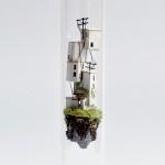
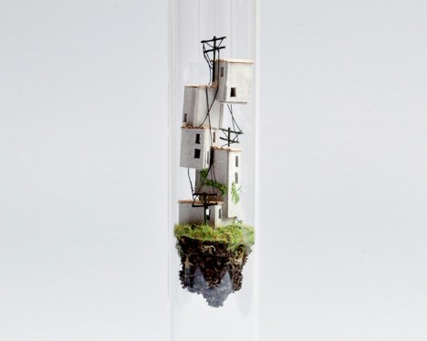
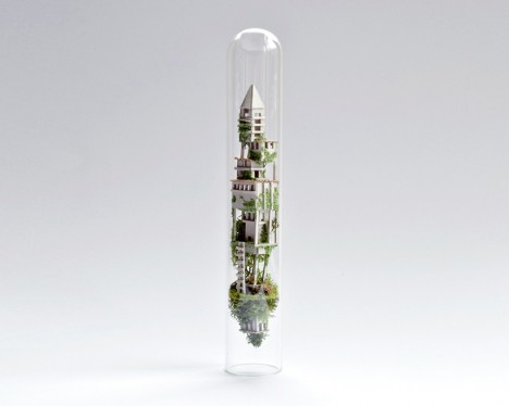
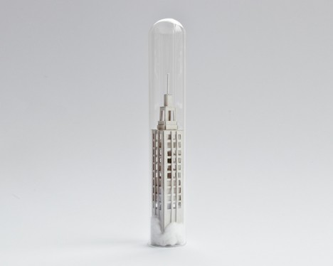
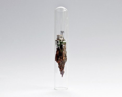
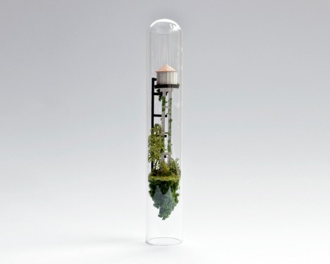
A tiny twist on miniature architecture turns simply-crafted models into hovering micro-habitats, suspended in test tubes like the science experiment of some mad architect.

test tube stack buildings

test tube environment

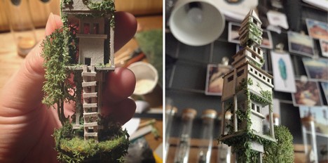
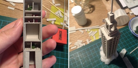
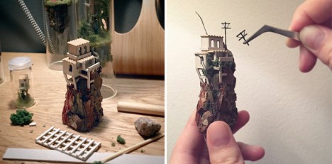
Micro Matter is an ongoing project series by Rosa de Jong, an artist and designer from Amsterdam who uses both manufactured materials (paper and cardboard) as well as natural ones (sticks and moss) to shape small worlds enclosed in glass.

test tube crafting

test tube skyscraper

The scenarios range from partial (the tops of skyscrapers poking above the clouds) to complete (homes resting on floating mountaintops), and vary in structural plausibility as well, bringing to mind less-controlled urban environments in places like Mexico, where ingenuity often trumps order.

test tube miniature mountain

test tube floating

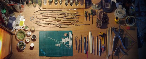
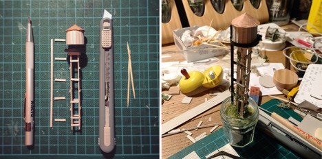
Each creation also comes with a behind-the-scenes look at its construction, including both the materials employed and the tools used to cut the pieces apart and assemble them into new forms.

test tube workspace

test tube water tower

test tube glass sculpture

The results strike a balance between everyday believability – crooked walls and as-needed staircases – and utter fantasy, combining the rigor of a ship-in-a-bottle with the imagination of a science fiction artist.

Share on Facebook


[ By WebUrbanist in Art & Sculpture & Craft. ]

[ WebUrbanist | Archives | Galleries | Privacy | TOS ]


WebUrbanist

 
Comments Off on Buildings in Bottles: Crafty Test-Tube Architectural Models

Posted in Creativity