RSS
 

Posts Tagged ‘Architecture’

Architecture for Airheads: 13 Intriguingly Interactive Inflatable Structures

15 Jun

[ By SA Rogers in Art & Installation & Sound. ]
Who can resist a gigantic bubble that’s big enough to climb into? Inflatables aren’t just practical, packing down to surprisingly small packages and then popping right back up into sizable structures, they’re also just plain fun, whether they act as portable temporary architecture, offer bouncing surfaces, react to movement with light and sound or just casually perch on top of buildings like it’s no big deal.

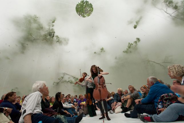
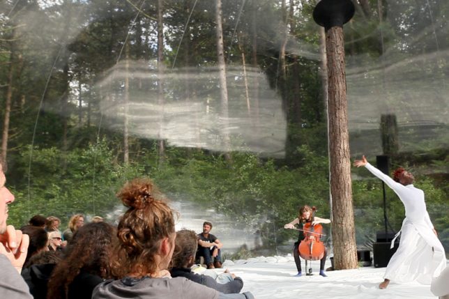
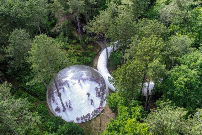
Stage for Oerol Festival by Plastique Fantastique
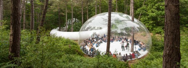
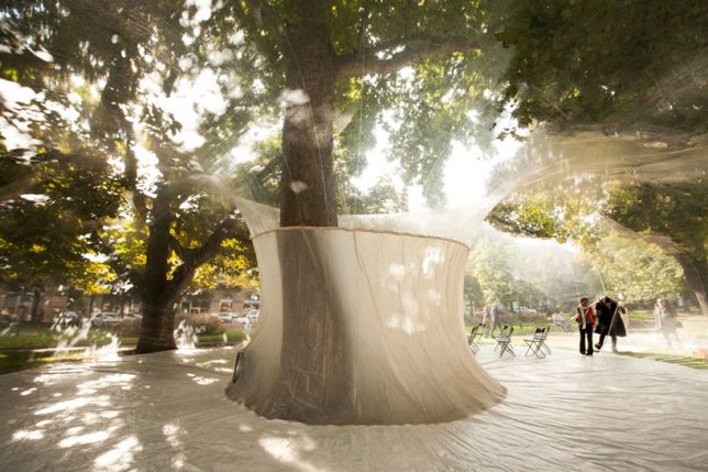
An entire island is used as a stage for events during the Oerol Festival in the Netherlands, and this year, Plastique Fantastique has crafted a special way to enclose some of that space without cutting it off from its surroundings or erecting a permanent structure. This inflatable creation is a transparent orb pierced by a single tree trunk, its skin reflecting the performers as they move

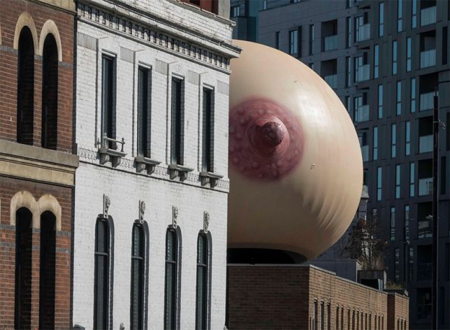
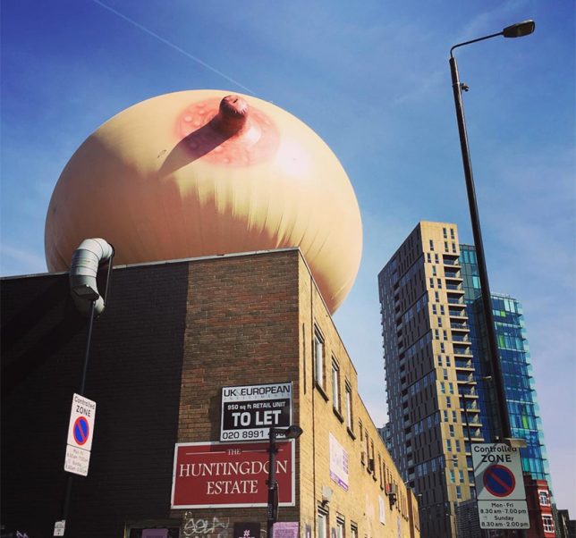
#FreeTheFeed Inflatable Breast Sculpture
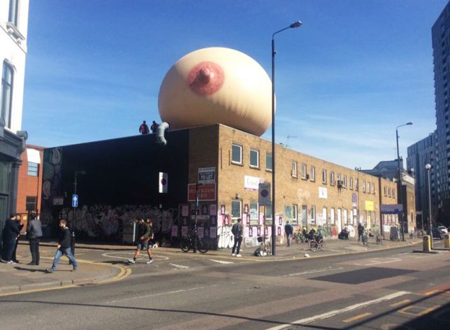
A campaign by Mother London to normalize breastfeeding in public, called #freethefeed, placed a gigantic inflatable breast on top of a brick building in the east London district of Shoreditch during Mother’s Day in the UK. For anyone who might be scandalized at such a sight, nearby flyers explained the project’s educational motives. “It’s hard to believe that in 2017, UK mothers still feel watlched and judged when feeding in public, by bottle or breast. This was our Mother’s Day project. A celebration of every woman’s right to decide how and where they feed their children without feeling guilty or embarrassed about their parenting choices.”

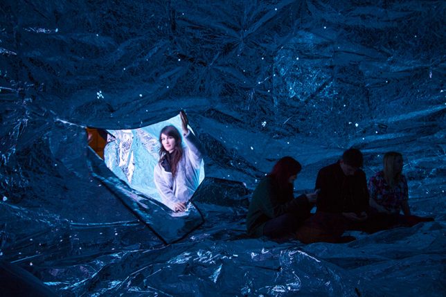
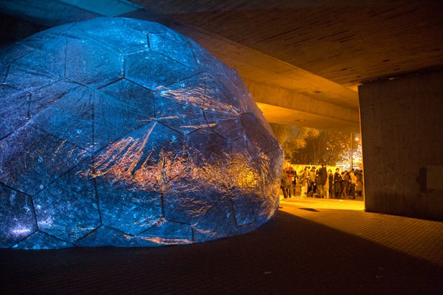
Inflatable Infinity Space

Crinkled metallic fabric creates an inflatable silver sphere in which the cosmos seem to be contained. ‘Osmo’ was created by London-based studio loop.ph for the Light Night Canning Town 2014, placed beneath London’s high-traffic A13 flyover to recreate a stretch of star-filled sky that has been lost to development.

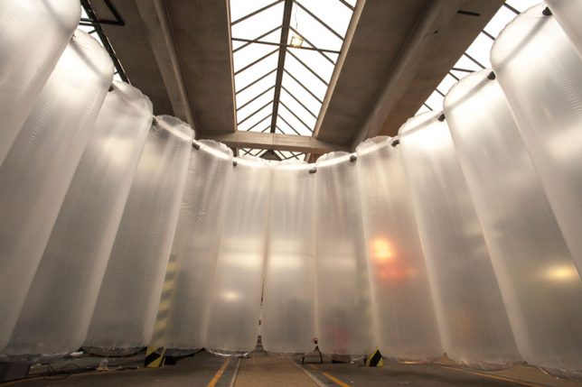
SiloSilo by Plastique Fantastique
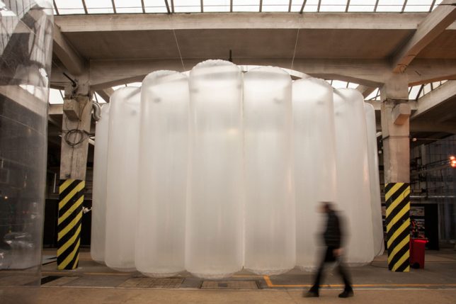
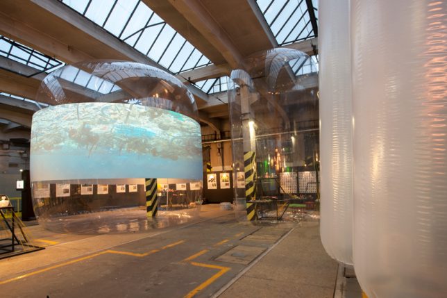
Creating a series of conference spaces and acting as a backdrop for video projection, a bunch of giant inflated cylinders bring awareness to the use of recycled materials as part of the traveling project SiloSilo. For example, a donut-shaped inflatable called ‘MEDUSA,’ which packs down small enough to transport in a box, represents the amount of plastic garbage produced by the city of Pilsen, Czech Republic in just three days.

Inflatable Floating Playground in Dubai

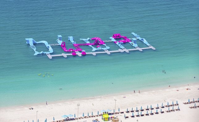
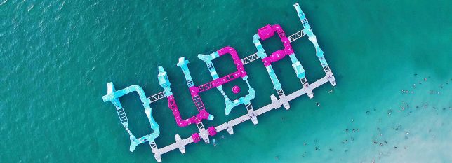
Partiers bounce, jump and dive off a series of inflatable structures spelling out ‘DUBAI’ in the water at Jumeirah Beach residence. The ‘dubaiTAG’ installation by Wibit Sports is made from nearly 100 modular components to create an inflatable waterpark.

Next Page – Click Below to Read More:
Architecture For Airheads 13 Intriguingly Interactive Inflatable Structures

Share on Facebook


[ By SA Rogers in Art & Installation & Sound. ]

[ WebUrbanist | Archives | Galleries | Privacy | TOS ]


WebUrbanist

 
Comments Off on Architecture for Airheads: 13 Intriguingly Interactive Inflatable Structures

Posted in Creativity


Optical Illusion Architecture: These 11 Buildings Are Not What They Seem

08 Jun

[ By SA Rogers in Architecture & Public & Institutional. ]

Pinched, warped, rippled, steeply angled and mirrored until they disappear into the sky, these buildings are not quite what they seem at first glance. Sometimes, it takes a nice long look at their outlines and proportions to determine where their facades actually begin and end, and how they can possibly be balanced so precariously.

Rachel Raymond Mirror House

In the space once occupied by the historic Rachel Raymond House in Belmont, Massachusetts, a beautiful mirrored illusion rose: ‘Mirror House’ by Pedro Joel Costa Architecture and design, which pays tribute to the original home’s modernism while looking to the future.

The Dancing House, Prague

Prague’s ‘Dancing House,’ also known as ‘Fred and Ginger,’ is actually the Nationale-Nederlanden building by architect Vlado Milunic, built in cooperation with Frank Gehry in 1996. One of the dual towers of the building appears to be warped and distorted, as if someone squished it up against the other.

Australian Customs Service Building, Melbourne

From most angles, it’s virtually impossible to tell what’s going on with the facade of the Australian Customs Service Building in Melbourne, clad as it is in an unusual graphic black and white pattern. The theme is reportedly repeated inside.

Pinnacle at Symphony Place, Nashville, Tennessee

The tall and thin mirrored Pinnacle at Symphony Place almost manages to disappear into the sky altogether when conditions are just right, becoming like a ghostly suggestion of a building instead of something decidedly solid and real.

Lucid Stead by Phillip K. Smith III, Joshua Tree, California

Alternating its logs with long stretches of mirror, artist Phillip K. Smith III makes his Joshua Tree installation ‘Lucid Stead’ blend with its environment so effectively it seems to be little more than a few dark brown lines floating in the desert.

Next Page – Click Below to Read More:
Optical Illusion Architecture These 11 Buildings Are Not What They Seem

Share on Facebook


[ By SA Rogers in Architecture & Public & Institutional. ]

[ WebUrbanist | Archives | Galleries | Privacy | TOS ]


WebUrbanist

 
Comments Off on Optical Illusion Architecture: These 11 Buildings Are Not What They Seem

Posted in Creativity


Bamboo Architecture: 14 Sustainable and Spectacular Organic Structures

25 May

[ By SA Rogers in Architecture & Public & Institutional. ]

Extraordinarily flexible yet strong, the fast-growing grass known as bamboo serves as a versatile medium for architectural projects with sculptural flair, especially when it’s bent or woven. These examples of artistic bamboo structures show off the material’s potential and hint at how it could play a role in futuristic yet sustainable architecture and infrastructure in the years to come.

5 Incredible Structures at the Bamboo Architecture Biennale

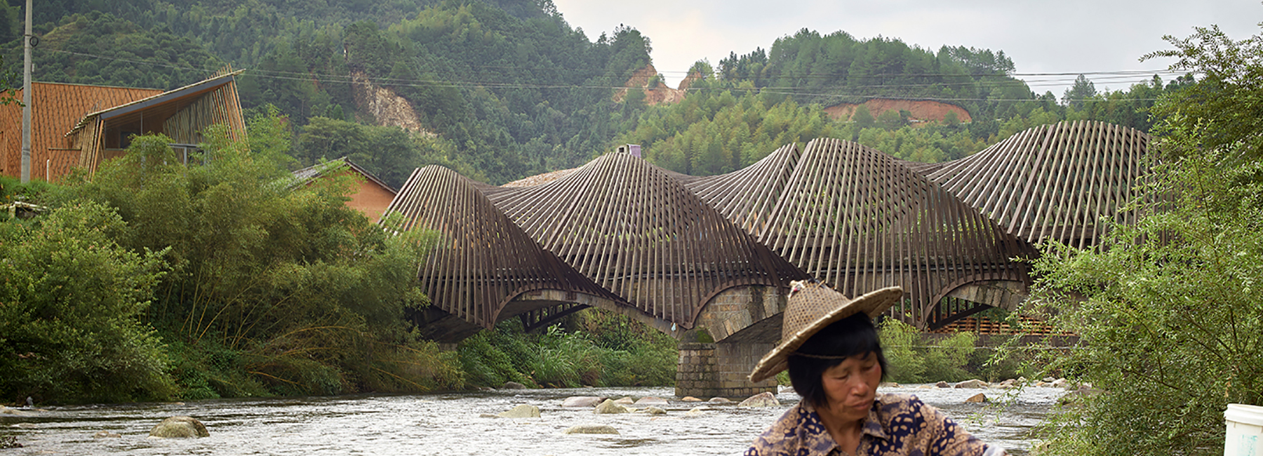
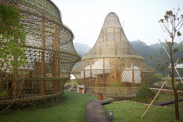
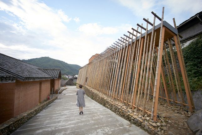
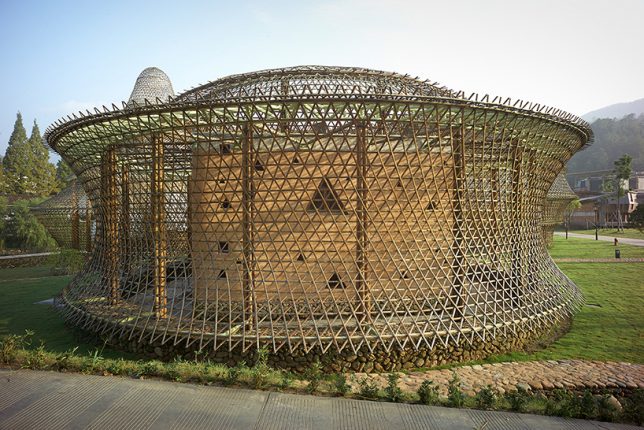
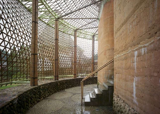
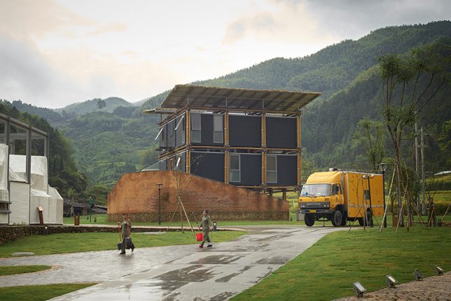
At the first annual Bamboo Architecture Biennale in 2016, which was held in the village of Baoxi, China, 12 architects demonstrated different methods of bamboo construction, including Kengo Kuma, Simon Velez, Anna Heringer and Vo Trong Nghia. Each of the pavilions serves a certain purpose, like Kuma’s ceramics museum and Heringer’s youth hostel. The bamboo bridge (pictured top) by Ge Quantao is especially impressive.

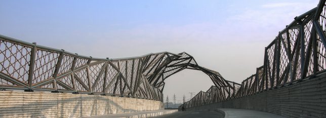
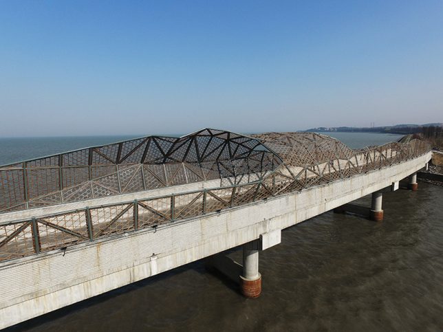
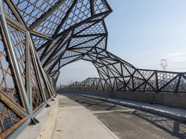
Wuxi Harbor Bridge by Mimesis Architecture Studio

Mimesis Architecture Studio shows how beautifully bamboo can augment structures made from other materials via the Wuxi Harbor Bridge, using it as formwork for the handrails of the deck and to create carbonized bamboo nets along the top of the bridge. These nets are weatherized and strong, not to mention easy and cheap to replace.

Green Ladder: Temporary Pavilion by Vo Trong Nghia

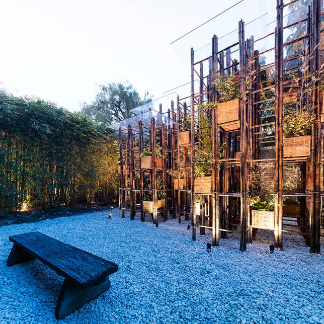
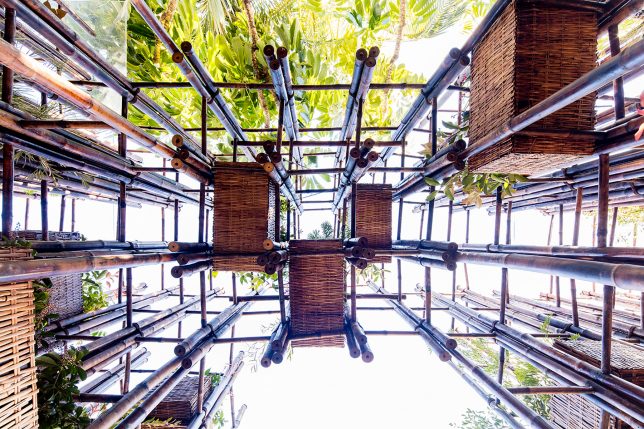
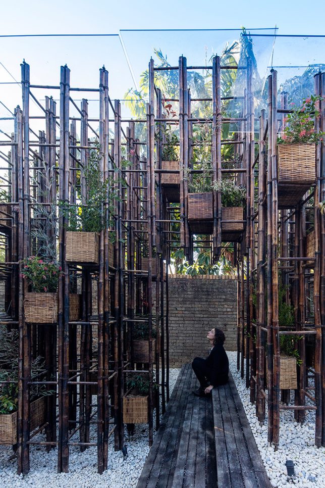
Bamboo poles create a grid-like network supporting planter pots to bring nature back to the city in this pavilion by Vo Trong Nghia. The project aims to raise awareness about the importance of access to nature in cities, especially in vietnam, where green spaces are increasingly rare.

Reconstruction of the Universe: Pavilion by Sun Xun

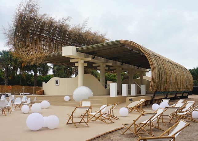
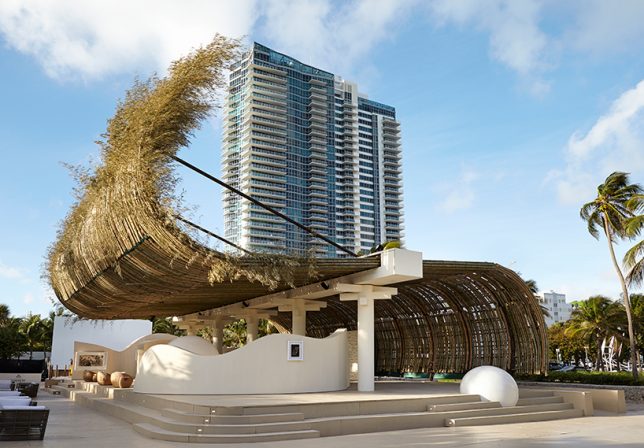
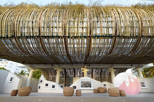
Bamboo curls up and over an outdoor space to act as a shade-providing roof in this project by Chinese artist Sun Xun and Swiss watchmaker Audemars Piguet for Art Basel. It’s made of 1300 madame timber bamboo poles, facing the ocean.

Next Page – Click Below to Read More:
Bamboo Architecture 14 Sustainable And Spectacular Organic Structures

Share on Facebook


[ By SA Rogers in Architecture & Public & Institutional. ]

[ WebUrbanist | Archives | Galleries | Privacy | TOS ]


WebUrbanist

 
Comments Off on Bamboo Architecture: 14 Sustainable and Spectacular Organic Structures

Posted in Creativity


Helping Hands: “Support” Sculpture Braces Venetian Architecture From Below

21 May

[ By WebUrbanist in Art & Installation & Sound. ]

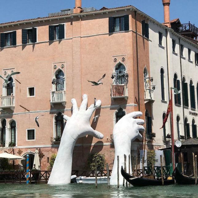
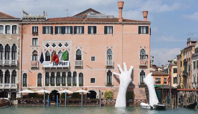
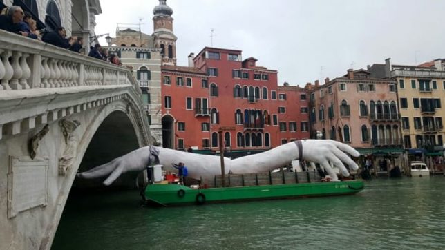
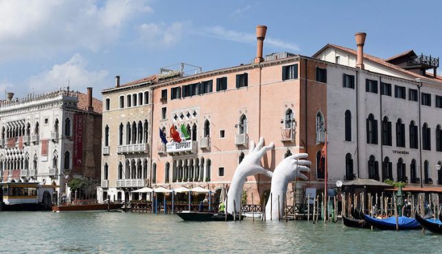
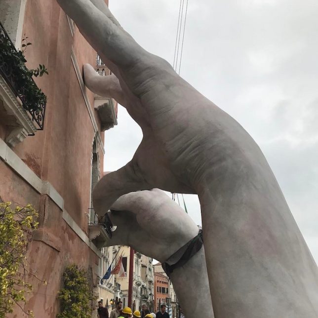
Historic architecture meets modern art on the canals of Venice, where a pair of gigantic hands emerge from the depths to lend support above the waterline.

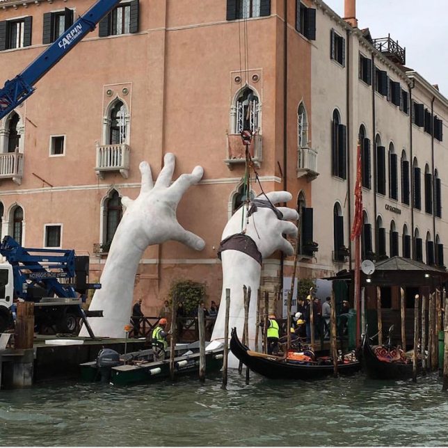
Designed by Lorenzo Quinn, “Support” was put into place a month in advance of the 57th International Art Biennale but is already drawing massive crowds ahead of its official debut.

It was prefabricated and shipped into positioned down the Grand Canal, then assembled and positioned so that it appears to support the Sagredo Hotel, a structure dating back to the 14th century.

Like many historic buildings in the city, this one rises straight up from the water — also like others, it is threatened by the prospect of higher sea levels as well as sinking and settling of the ground below.

“I wanted to sculpt what is considered the hardest and most technically challenging part of the human body. the hand holds so much power – the power to love, to hate, to create, to destroy” says the artist.

“Venice is a floating art city that has inspired cultures for centuries, but to continue to do so it needs the support of our generation and future ones, because it is threatened by climate change and time decay.”

"Cose" interessanti. #biennaledivenezia #venezia #lorenzoquinn #biennalearte2017 #manigrandi #solocosebelle #ENERGIA??????

A post shared by Nicolas Falcone (@nic.falcone) on

Le mani sono strumenti che possono tanto distruggere il mondo quanto salvarlo e trasmettono un istintivo sentimento di nobiltà e grandezza in grado anche di generare inquietudine poiché il gesto generoso di sostenere l'edificio ne evidenzia la fragilità. #venezia#venice#casagredohotel#mani#scultura#arte#support#lorenzoquinn#igersvenezia#igersveneto#loves_united_venice#loves_venezia#loves_veneto#veneziaunica#veneto_best_pics#veneto_in#loves_united_veneto#venetissimo#ig_venice#veniceinlove#loves_united_italy#loves_united_team#loves_united_details#volgoitalia#labellavenezia#volgoveneto#loves_veneto#venezia??

A post shared by Sabrina (@sabri_sini_) on

Stunning #venezia #venice #fondacodeitedeschi #rooftoop #canalgrande #biennalearte2017 #lorenzoquinn

A post shared by Serena (@serena.pavan) on

“Reflecting on the two sides of human nature, the creative and the destructive, as well as the capacity for humans to act and make an impact on history and the environment, Quinn addresses the ability for humans to make a change and re-balance the world around them—environmentally, economically, socially,” writes the Halycon Gallery, which represents Quinn.

Share on Facebook


[ By WebUrbanist in Art & Installation & Sound. ]

[ WebUrbanist | Archives | Galleries | Privacy | TOS ]


WebUrbanist

 
Comments Off on Helping Hands: “Support” Sculpture Braces Venetian Architecture From Below

Posted in Creativity


Ghostly Garden: Classical Wire Mesh Architecture Haunts Abu Dhabi

20 May

[ By SA Rogers in Art & Sculpture & Craft. ]

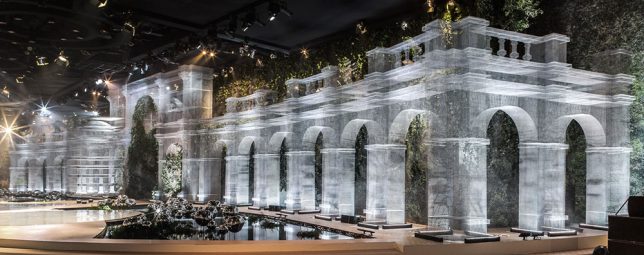
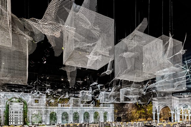
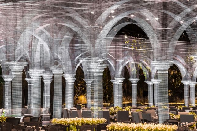
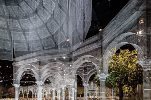
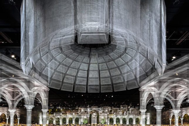
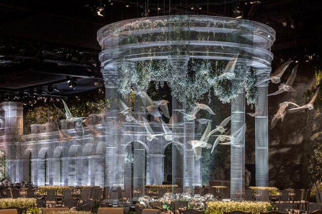
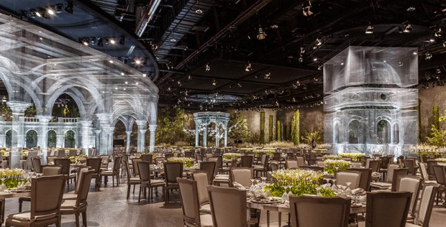
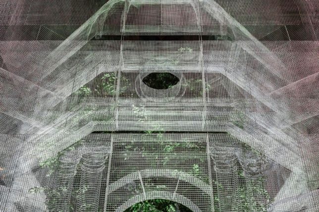
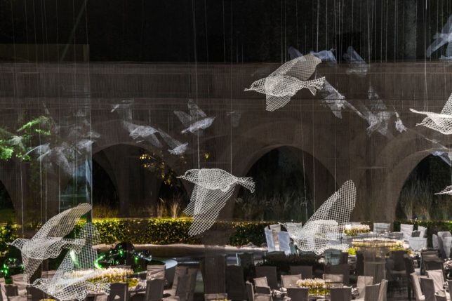
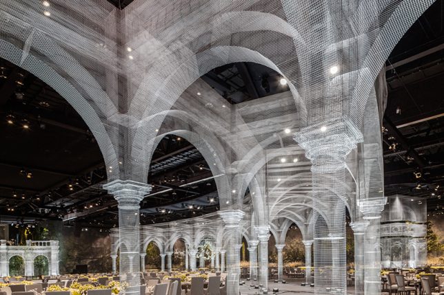
Seeming like a ghostly image of structures long gone overlaid onto the current reality, these wire mesh architectural creations arch over 75,000 square feet of event space in Abu Dhabi. The way the mesh shifts between transparency and opacity depending on how it’s layered, paired with its grid pattern, gives it the look of a light-based projection, yet it’s physical and three-dimensional, crafted in full-scale skeletal form to suggest structures rather than bring them to fruition.

Artist Edoardo Tresoldi previously resurrected an ancient church in Puglia, Italy that had been destroyed by earthquakes in the 13th century right where it once stood, allowing visitors to get a sense of how the structure interacts with the site before and after its demise. This time, Tresoldi sculpts a whole series of architectural sculptures, along with flying birds and cubes that hang suspended in midair.

The Abu Dhabi installation acts as a decorative tableau for a royal event attended by 1,900 guests from all over the Middle East, and took three months to complete, representing the artist’s first time creating a large installation for an indoor space. After the event, some of the structures will be moved and reassembled in public places across the UAE capital, including museums, parks and universities.

Many of these forms are reminiscent of previous Tresoldi works, including an archway used on a fashion runway, and a caged bird. Tresoldi creates figurative wire mesh sculptures, as well. You can see the evolution of his process at his Behance profile.

Share on Facebook


[ By SA Rogers in Art & Sculpture & Craft. ]

[ WebUrbanist | Archives | Galleries | Privacy | TOS ]


WebUrbanist

 
Comments Off on Ghostly Garden: Classical Wire Mesh Architecture Haunts Abu Dhabi

Posted in Creativity


Architecture in Miniature: 13 Modern Dollhouse & Other Tiny Buildings

15 May

[ By SA Rogers in Art & Sculpture & Craft. ]

Fit for the most discerning fans of modern architecture, these dollhouses and other miniature architectural creations feature tiny moving parts, high-end designer furniture, swimming pools, built-in lighting and other fun details, rendered in astonishing realism. You’ll almost wish you could shrink yourself small enough to tour their often-fantastical layouts, which range from the luxurious to the gritty.

Flipped Structures & Tiny Towers by Takahiro Iwasaki

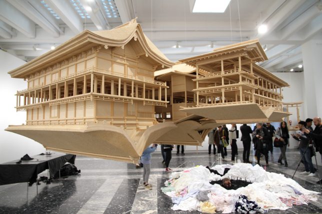
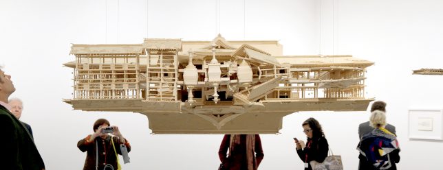
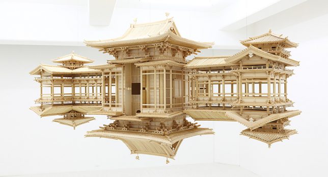
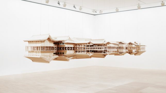
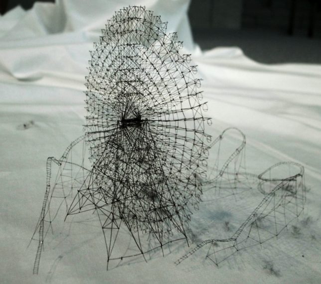
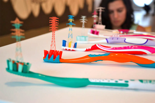
Japanese artist Takahiro Iwasaki makes mirrored wood architectural models and tiny towers made of toothbrush bristles, both in ongoing series inspired by the structures commonly found in Japan. The artist says ‘Reflection Model’ is meant to show that everything can become vastly different depending on your perspective.

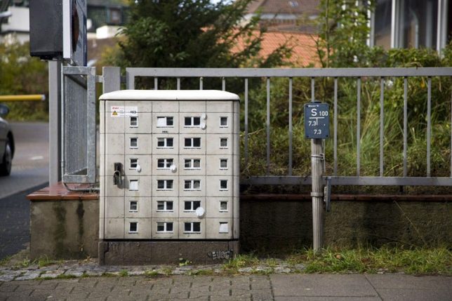
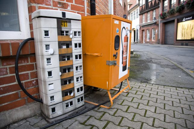
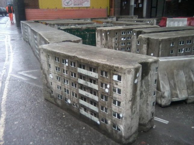
Urban Utility Buildings by EVOL

Grimy rectilinear urban objects become weathered, aging apartment buildings in the hands of street artist EVOL, who uses cardboard, stencils and spray paint to transform them into micro cities.

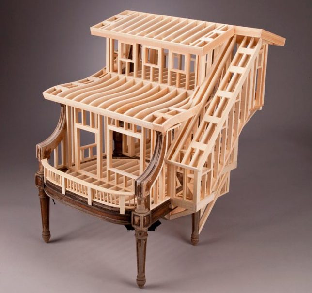
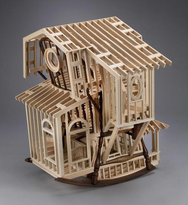
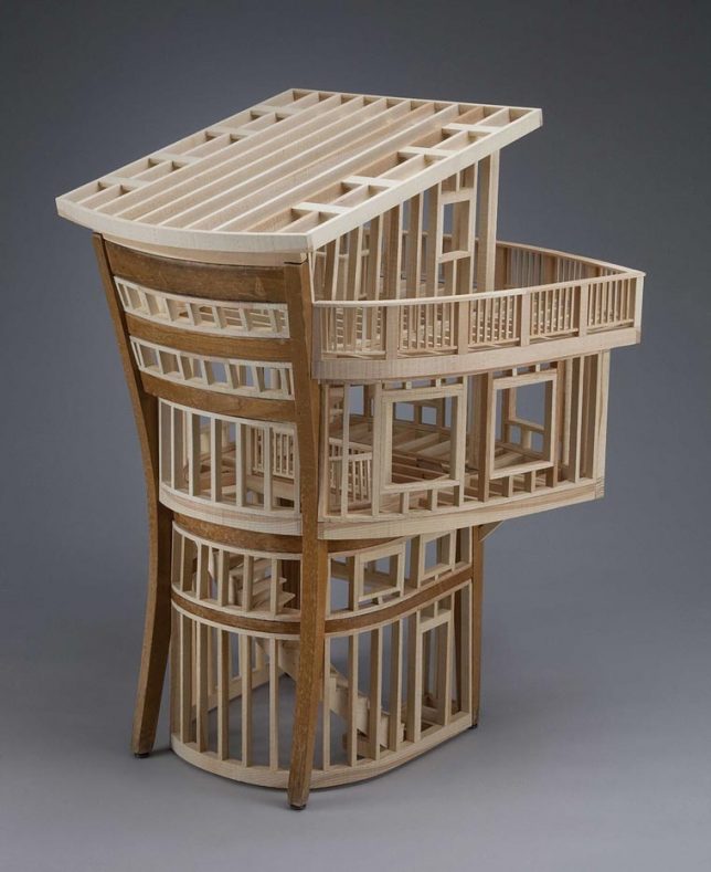
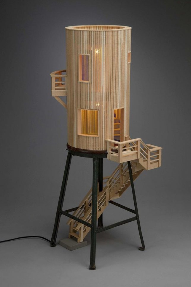
Architectural Furniture by Ted Lott

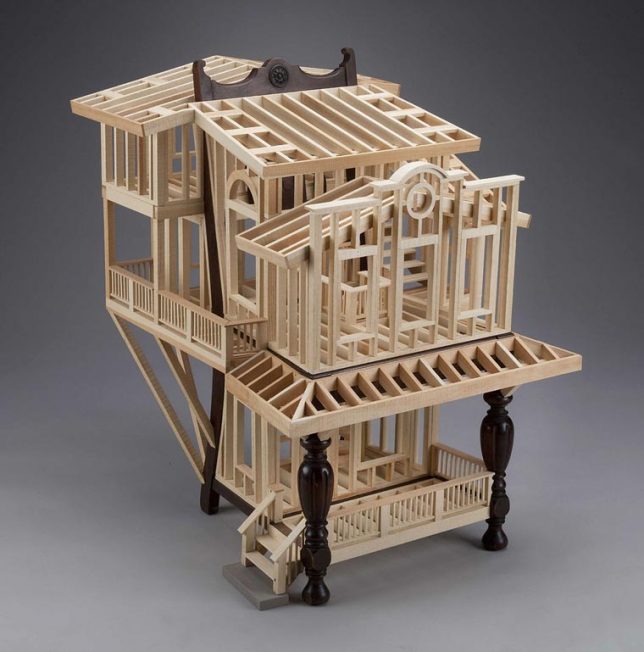
Wooden stools and chairs act as the structural basis for tiny timber-frame buildings by artist Ted Lott. Using found furniture and pine, the artist re-contextualizes stick frame construction, adapting it to the curves of the base object in works that are remarkably skeletal.

Hyperrealistic Architectural Models by Joshua Smith

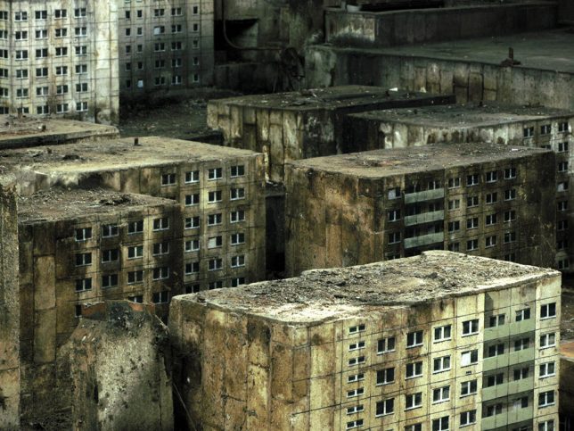
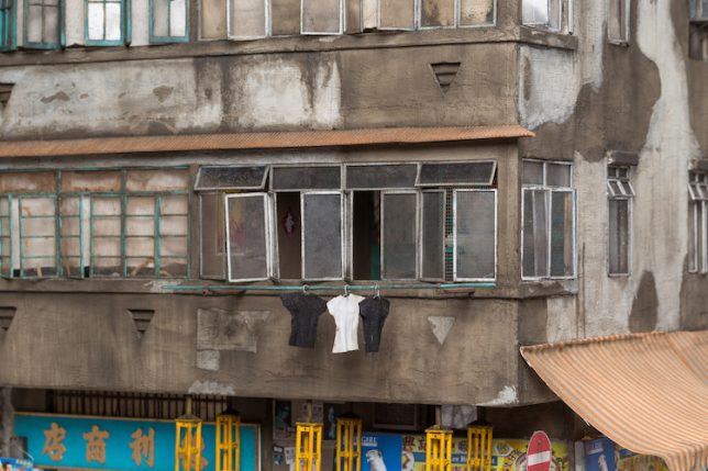
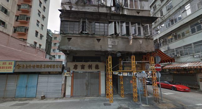
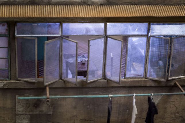
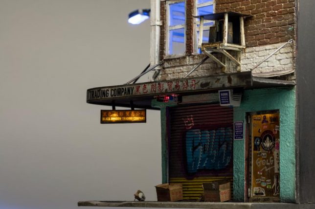
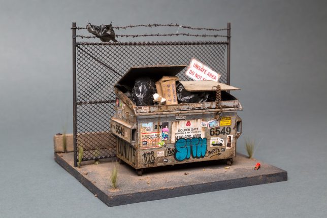
Every last detail on Joshua Smith’s incredible architectural models looks aged, weathered and utterly realistic, from peeling paint and stained awnings to graffiti and posters wheat pasted onto the walls. The artist finds real-life urban buildings to use as a starting point and crafts everything from trash bags in a dumpster to Chinese takeout on tiny rooftop dining tables, from the restaurant on the bottom floor.

Next Page – Click Below to Read More:
Architecture In Miniature 13 Modern Dollhouse Other Tiny Buildings

Share on Facebook


[ By SA Rogers in Art & Sculpture & Craft. ]

[ WebUrbanist | Archives | Galleries | Privacy | TOS ]


WebUrbanist

 
Comments Off on Architecture in Miniature: 13 Modern Dollhouse & Other Tiny Buildings

Posted in Creativity


Transparent Intentions: 13 Glass Additions to Historic Architecture

24 Apr

[ By SA Rogers in Architecture & Houses & Residential. ]

Transparent additions to historic architecture physically expand the space while making the subtlest possible changes to the building exteriors, allowing you to see the original structures right through the glazed walls. Augmenting 500-year-old farmhouses,  Victorian row houses in London and some of Paris’ most iconic-looking apartment buildings, these modern glass extensions aim to blend in with the sky, offering transitions to gardens and bringing natural light into formerly dark interiors.

17th Century Manor Update by Jonathan Tuckey Design

Invisible from the street, this ‘ghostly’ addition to the 17th century Yew Street House in London by Jonathon Tuckey Design lets you see right through its walls to the original stone structure, disrupting its beautiful form as little as possible while adding a gorgeous light-filled dining space.

Farmer’s Cottage in Croatia by Proarh

Zagreb-based architecture firm Proarh renovated a dilapidated traditional Zagorje cottage in Croatia into a modern family home, retaining the external frame while replacing the existing porch with a transparent glass view facing a view of the mountains.

19th Century Parisian Photography Studio to Rooftop Apartments

This glass addition to a 19th century photography studio in Paris by Vincent Parreira Atelier is conceived as an ‘inhabited observatory’ perched atop a Haussmannian building in the city’s Opéra-Madeleine district.

Straatweg Extension by BBVH Architecten

An original masonry structure in Rotterdam, built in the 1930s, gets some much-needed natural light thanks to a two-story, all-glass wing added by BBVH Architecten, which features a transparent roof, facade and upper-level floor with an operable garage-style door leading out to the garden.

‘Salle Labrouste’ Former French National Library

A major overhaul to the French National Library by Bruno Gaudin and Virginie Bregal updated it for the 21st century while retaining its dazzling beauty, adding a glass gallery that serves as a rooftop promenade to link two sides of the structure’s quadrangle.

Next Page – Click Below to Read More:
Transparent Intentions 13 Glass Additions To Historic Architecture

Share on Facebook


[ By SA Rogers in Architecture & Houses & Residential. ]

[ WebUrbanist | Archives | Galleries | Privacy | TOS ]


WebUrbanist

 
Comments Off on Transparent Intentions: 13 Glass Additions to Historic Architecture

Posted in Creativity


Faith Lift: 14 Modern Churches Reinvent Religious Architecture

18 Apr

[ By SA Rogers in Architecture & Public & Institutional. ]

The classic silhouette of a church may be iconic and instantly recognizable, but modern-day religious architecture proves itself to be adaptive after all, evolving into a broad variety of dramatic shapes that frame views of the natural world and prioritize a sense of community. These 14 modern church designs run the gamut from small, modest chapels on the beach to grand, showy structures with undulating rooflines and unexpected interiors.

Cliffside Cross-Shaped Church Concept by OPA

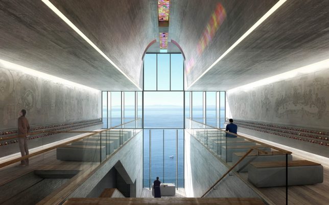
Mimicking its own Casa Brutale design for a residence built into a cliff face, Greece-based firm OPA (Open Platform for Architecture) reveals ‘Chapel of the Holy Cross,’ proposed for the island of Serifos with a single cross-shaped glass facade facing the Aegean Sea. The entire structure is dug into the rock to take advantage of thermal insulation and avoid disrupting the surface landscape.

Synhavnen Church Proposal by NOMOstudio

Submitted as a proposal to a competition to design the first new church to be built in Syndhaven, Copenhagen in 30 years, this design by NOMOstudio is envisioned as a landmark with a deeply sloping roof covered in steps, allowing the public to climb the structure all the way to its peak for spectacular views of the sea.

Seashore Chapel by Vector Architects

Right on the sand of China’s Beidaihe Beach, the ‘Seashore Chapel’ offers a peaceful getaway. “We imagine the seashore chapel as an old boat drifting on the ocean long time ago,” says Vector Architects. “The ocean receded through time and left an empty structure behind, which is still lying on the beach.”

Rainbow Chapel by Coordination Asia

Located within a museum park, ‘Rainbow Chapel’ by Coordination Asia aims to attract young creative couples with a bright, contemporary design enclosed in 3,000 vivid glass panels in 65 colors for a kaleidoscopic effect. Its exterior design of a circle set within a square references fullness and unity contained by honesty and virtue.

Sunset Chapel by BNKR Arquitectura

The sun sets over the sea directly behind the altar cross in ‘Sunset Chapel’ by BNKR Arquitectura, which is set within a forest and designed to mimic an oversized boulder. The faceted concrete structure looks different from every angle, and features slatted openings along its upper level that let in fresh air and sunlight.

Next Page – Click Below to Read More:
Faith Lift 14 Modern Churches Reinvent Religious Architecture

Share on Facebook


[ By SA Rogers in Architecture & Public & Institutional. ]

[ WebUrbanist | Archives | Galleries | Privacy | TOS ]


WebUrbanist

 
Comments Off on Faith Lift: 14 Modern Churches Reinvent Religious Architecture

Posted in Creativity


Beyond Brutalism: Cutting-Edge North Korean Architecture

03 Apr

[ By Steve in Architecture & Cities & Urbanism. ]

north-korea-architecture-1a

The infamous Ryugyong Hotel in Pyongyang may have stolen the spotlight but North Korea can boast many other examples of unusual cutting-edge architecture.

north-korea-architecture-1e

north-korea-architecture-1c

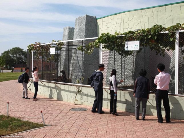
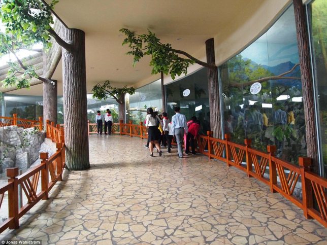
The Korea Central Zoo (also known as the Pyongyang Central Zoo) was founded in 1959 but recently underwent an extensive makeover, re-opening in July of 2016. The zoo was and continues to be criticized for exhibits that include a chain-smoking chimpanzee and various breeds of dogs. Canines are forbidden to be kept as pets in the capital city, ostensibly for hygienic reasons.

north-korea-architecture-1b

north-korea-architecture-1d

north-korea-architecture-1f

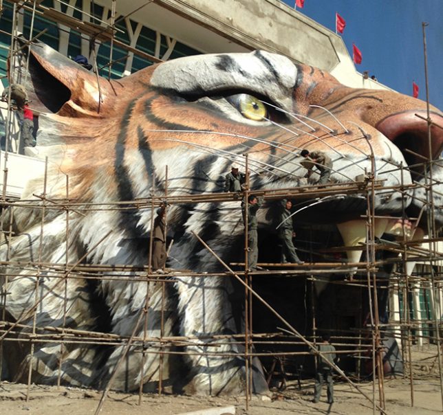
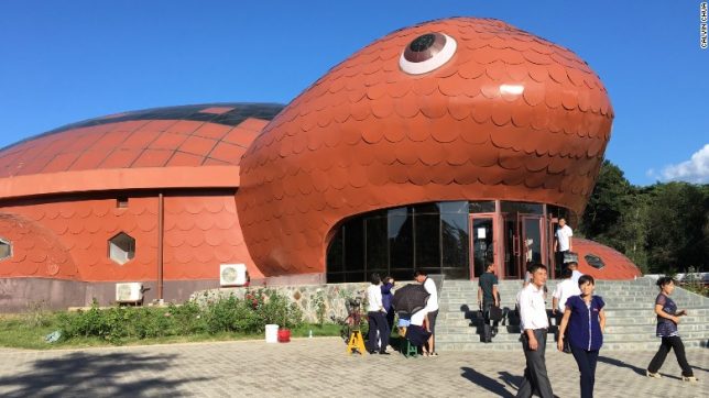
We’re here to discuss architecture, however, and when it comes to the Central Zoo the highlight has to be the huge tiger-head entrance archway. Rather impressive, unless you’re an easily frightened child (or adult). At least the scaredy-cats can find some solace at the turtle-shaped Reptile Enclosure.

Handball Hall

north-korea-architecture-2a

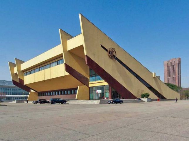
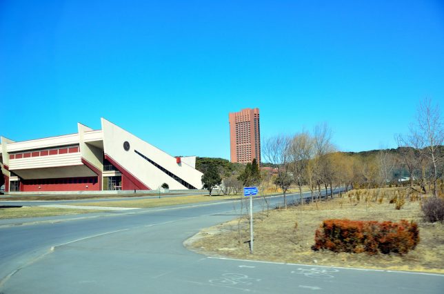
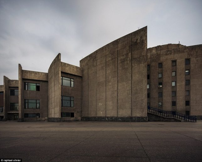
Handball is kind of a big deal in North Korea and the North Korea women’s national handball team has competed at the Asian Women’s Handball Championship no less than six times since 1991 – though they’ve never finished higher than third. The team practices at the strikingly angular and not at all ball-shaped Handball Hall located on Chongchun Street in Pyongyang’s “city of sports” district.

north-korea-architecture-2b

We don’t have a date for the first photo but the image just above snapped by Flickr user Aaron Geddes (Gedsman) in March of 2016 displays some subtle differences.

International Cinema Hall

north-korea-architecture-3a

north-korea-architecture-3c

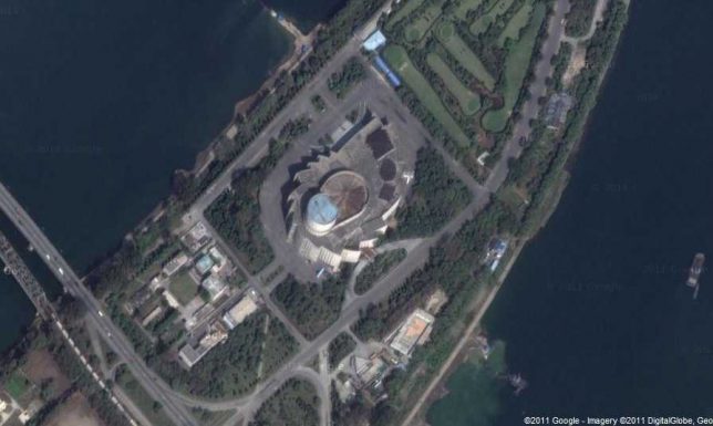
The International Cinema Hall isn’t in use very often as its main raison d’etre is hosting the Pyongyang International Film Festival every other year since 1987.

north-korea-architecture-3b

The sprocket-shaped building sits cheek-by-jowl to a golf course (you read that correctly) on the island of Yanggakdo, located in the Taedong River running through downtown Pyongyang.

Next Page – Click Below to Read More:
Beyond Brutalism Cutting Edge North Korean Architecture

Share on Facebook


[ By Steve in Architecture & Cities & Urbanism. ]

[ WebUrbanist | Archives | Galleries | Privacy | TOS ]


WebUrbanist

 
Comments Off on Beyond Brutalism: Cutting-Edge North Korean Architecture

Posted in Creativity


Forest Cities: Tree-Covered Urban Architecture to Combat Smog in China

03 Mar

[ By WebUrbanist in Architecture & Cities & Urbanism. ]

forest city

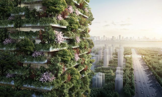
A new series of treescrapers designed for Nanjing, China, aim to combat air pollution with plant-covered towers, but this bold vision may represent hubris more than hope.

Architect Stefano Boeri’s Bosco Verticale (Vertical Forest) project in Milan was an impressive but small-scale version of this vision to turn Chinese cities into greenery-covered cityscapes. “Two towers in a huge urban environment [such as Nanjing] is so, so small a contribution – but it is an example. We hope that this model of green architecture can be repeated and copied and replicated.”

forest city project

And the figures put out to the press are impressive: these new buildings could, according to estimates, remove 25 tons of carbon from the air annually and produces a lot of oxygen in the process. Still, embedded carbon in plants has to go somewhere eventually — leaves and branches that break off of these vertical treescapes will eventually fall to the ground, adding to street-level pollution.

Projects like this face downsides and challenges, too. A lot of embedded energy (and thus: carbon) comes with retrofitting buildings to support plants. There are intensive structural requirements (for soil and trees) but also active system demands, too, that add to inputs and costs. As plants grow, they also have to be maintained — a lot more challenging than just sending window washers up and down the sides of a skyscraper.

forest city village

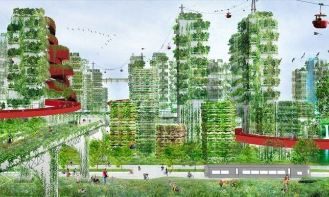
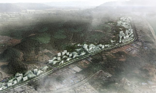
Ultimately, it makes sense to think about how cities can go green, but adding thick and lush greenery to the sides of buildings risks being an act of greenwashing more than one of sustainable design. The ground is a much easier place to plant greenery, plus an easier space for everyone to access and enjoy. Even the above rendering of one of these planned communities makes this point indirectly: there are a lot more trees on the ground than there are on the buildings in the image.

Share on Facebook


[ By WebUrbanist in Architecture & Cities & Urbanism. ]

[ WebUrbanist | Archives | Galleries | Privacy | TOS ]


WebUrbanist

 
Comments Off on Forest Cities: Tree-Covered Urban Architecture to Combat Smog in China

Posted in Creativity