RSS
 

Posts Tagged ‘Architecture’

Lush Life: 12 Verdant Architecture Projects Making Plants a Main Priority

26 Sep

[ By SA Rogers in Architecture & Houses & Residential. ]

Not all architecture incorporating lots of living greenery is doomed to remain an unrealistic rendering, depicting buildings that can’t structurally support the weight of all the soil and water needed to keep full-sized trees alive. Architect Thomas Heatherwick built ultra-strong concrete pillars into his 1000 Trees design, for example. Other buildings take a subtler approach, choosing ivy, potted plants or existing trees rooted in the ground. All of these projects attempt to meld urban architecture with lush gardens in the hopes of cleansing the air, storing CO2 to mitigate climate change and providing enhanced access to green spaces in cities.

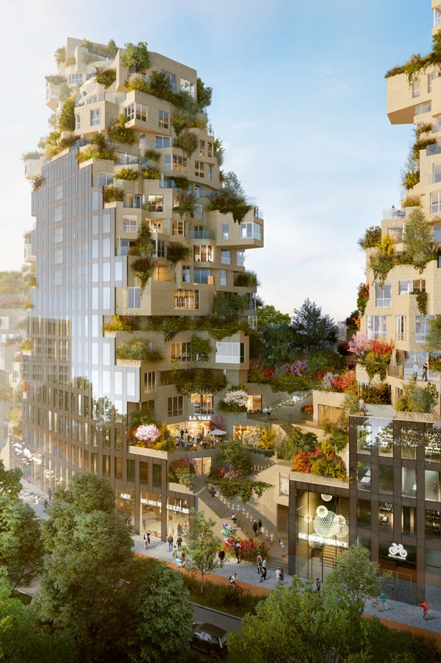
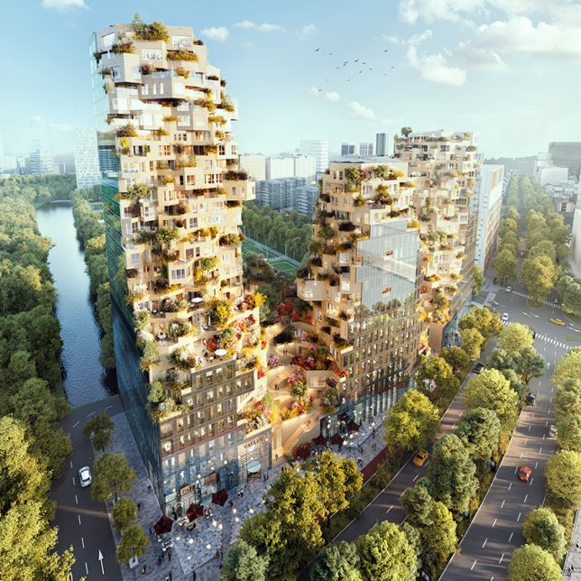
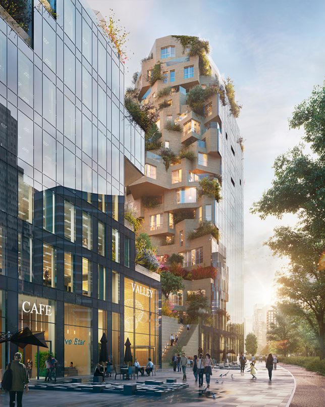
Valley: Green-Terraced Towers by MVRDV in Amsterdam, The Netherlands

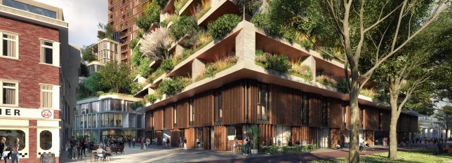
Construction began in August 2017 on MVRDV’s ambitious ‘Valley,’ a mixed-use complex of green-terraced towers in Amsterdam’s central business district. ‘Valley’ is notable not only for its unusual offset stacking of volumes , creating an irregular shape, but also for all the greenery it supports. The towers include 196 apartments, 7 stories of offices, shops, restaurants, cultural facilities and a three-story parking lot.

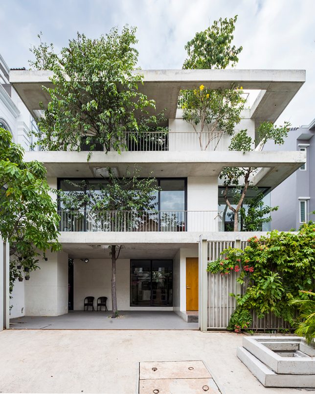
House for Trees by VTN Architects in Ho Chi Minh, Vietnam

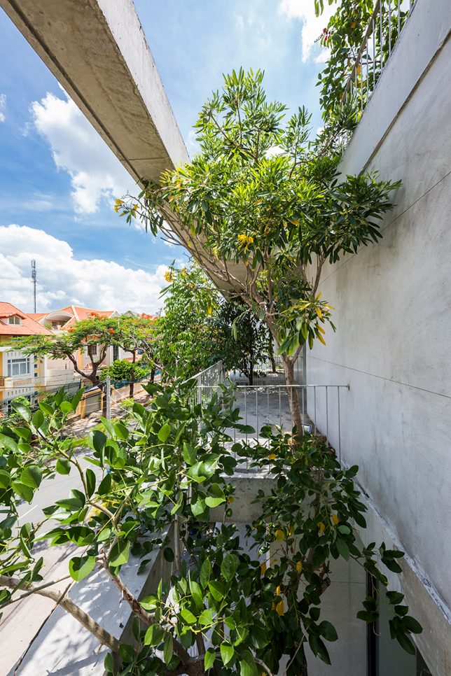
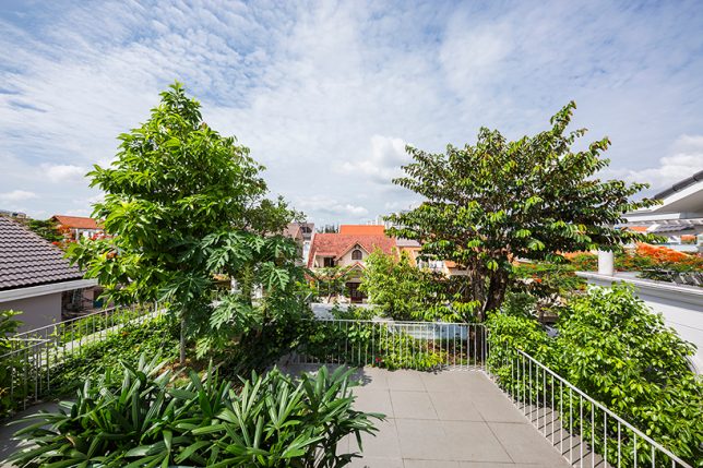
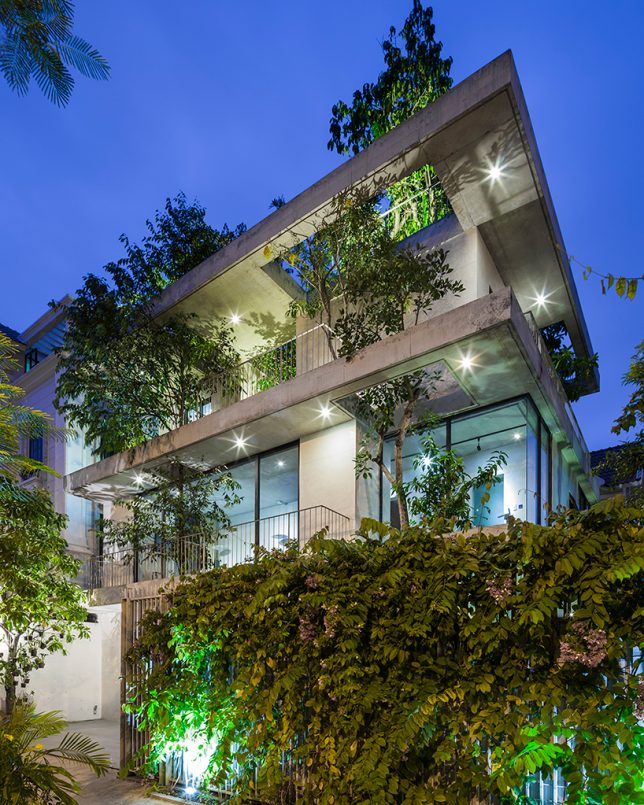
VTN Architects approached ‘House for Trees’ as a way to alleviate the lack of access to green spaces as well as poor air quality found in big cities like Ho Chi Minh. This residential project incorporates trees into its design, envisioned by the firm as a “small park in a dense neighborhood.” The trees are set into deep planter boxes disguised among the concrete volumes of the house, with cut-outs allowing their crowns to rise as high as they like.

Nautilus Eco Resort by Vincent Callebaut in the Philippines

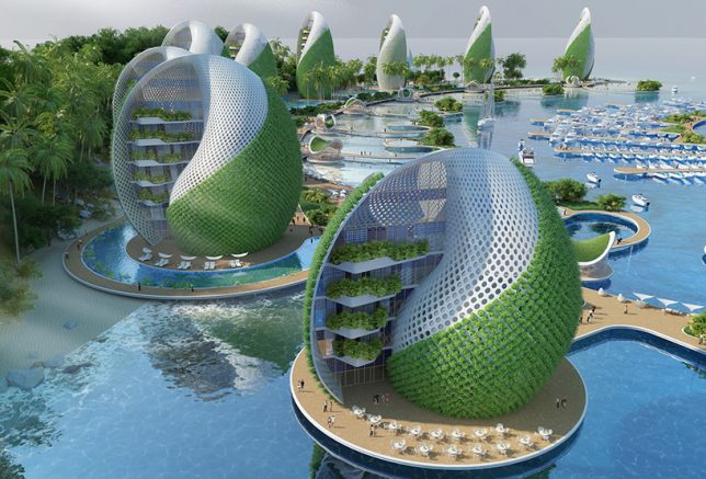
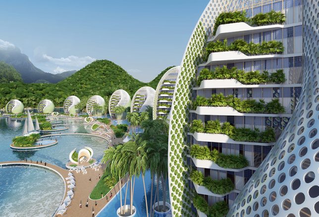
The Nautilus Eco Resort by Vincent Callebaut is designed as a ‘zero emissions, zero waste, zero poverty’ development for the Philippines in response to environmental and social problems in the country, like overfishing, pollution and mass tourism. The project would be built from reused or recycled materials, self-sufficient in producing its own energy and food, and engage volunteer ecotourists in cleaning up plastic waste that washes up onto the area’s beaches. It consists of a series of shell-shaped hotels and apartment towers spiraling around a central island housing a nautical center and scientific research laboratories. The plant walls cool the buildings as they grow food.

Amata + Triptyque Timber Building in São Paulo, Brazil

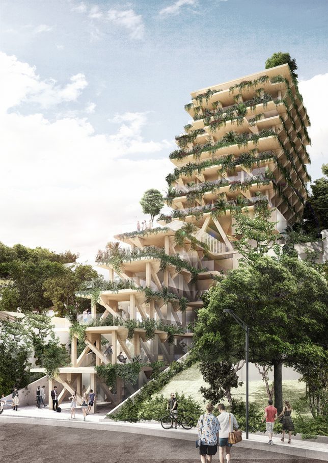
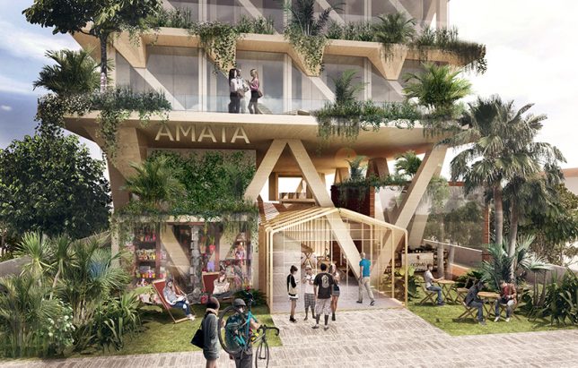
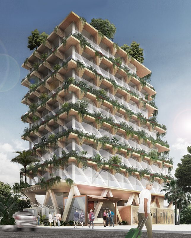
Constructed entirely from Brazilian timber, this building is a collaboration between architecture studio Triptyque and forest management company Amata. The building aims to be a giant carbon sink, contributing towards the fight against climate change. Each square meter of wood is capable of absorbing a metric ton of carbon dioxide from the environment. The 13-story building contains co-working, co-living and dining spaces, the edges of its terraces dripping with living plants.

Next Page – Click Below to Read More:
Lush Life 12 Verdant Architecture Projects Making Plants A Main Priority

Share on Facebook


[ By SA Rogers in Architecture & Houses & Residential. ]

[ WebUrbanist | Archives | Galleries | Privacy | TOS ]


WebUrbanist

 
Comments Off on Lush Life: 12 Verdant Architecture Projects Making Plants a Main Priority

Posted in Creativity


Pop-Up Pavilions: 15 Playful Temporary Architecture Installations

19 Sep

[ By SA Rogers in Architecture & Cities & Urbanism. ]

Pavilions are like playgrounds for architects and designers, allowing them to show off what they can do when they really set their imaginations free. Unfettered by the typical limitations of a permanent structure, they can experiment with new materials and processes, potentially producing innovations they can apply to other structures. These pavilions are often subversive in the urban environment, too, taking over public spaces and giving them back to the people or creating micro housing that falls within grey areas of the law.

Transforming Street Cinema in Venice by Omri Revesz


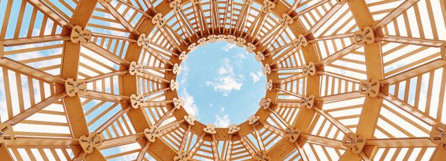
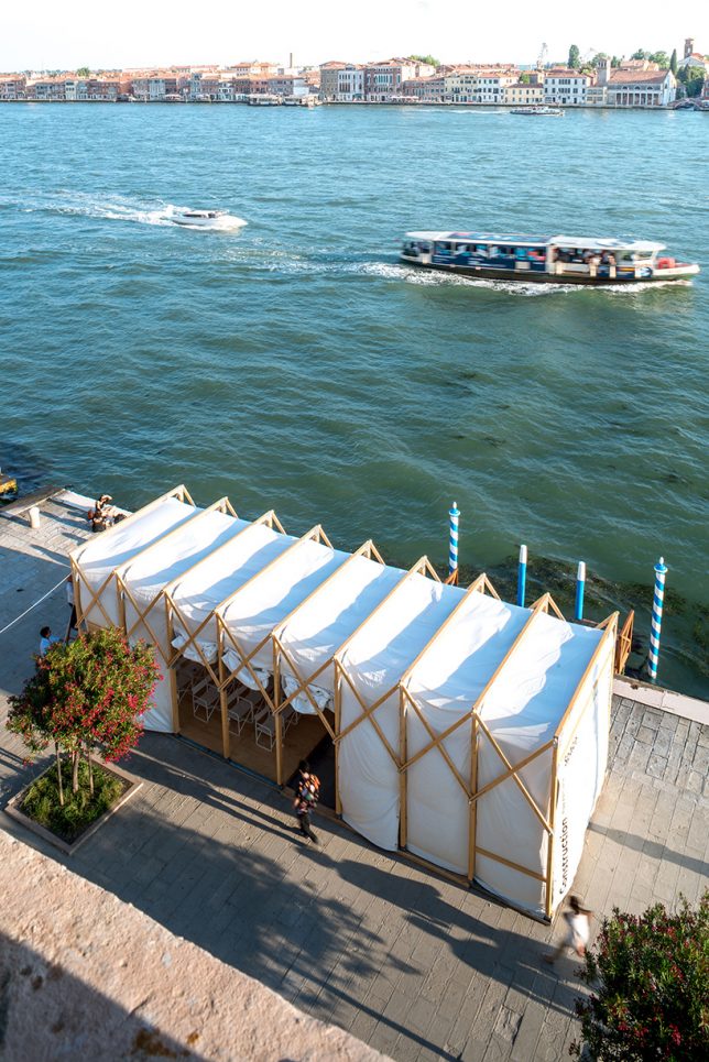
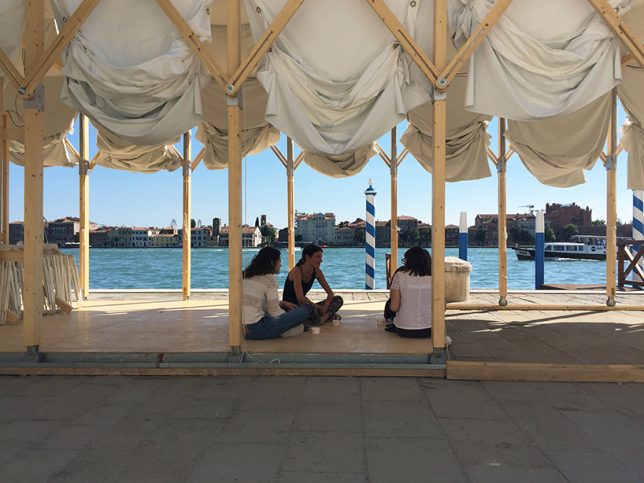
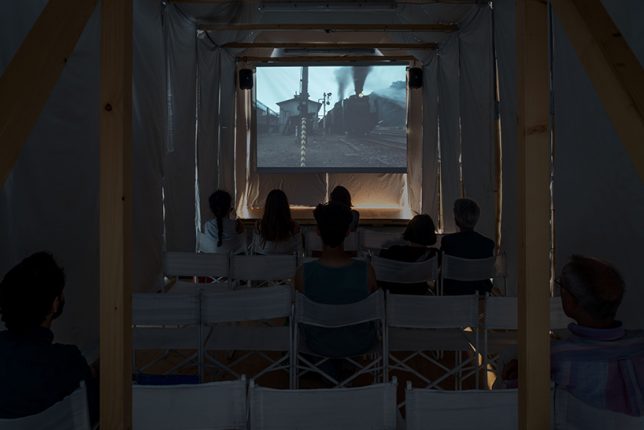
Created for a V-A-C Russian contemporary art foundation exhibition at the Venice Film Festival 2017, this pop-up cinema celebrated the 100th anniversary of the start of the Soviet Revolution. The modular wooden structure is collapsible, its design inspired by the logic of Russian constructivism. Its wooden frame is on wheels set into rails so it can expand to make more space for performances, or contract to create a darker, more intimate setting.

Algae Dome in Denmark by SPACE10

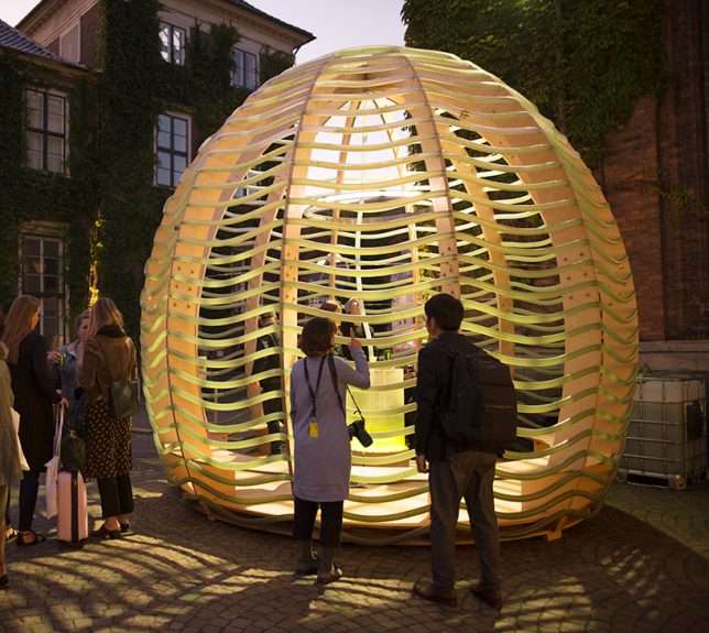
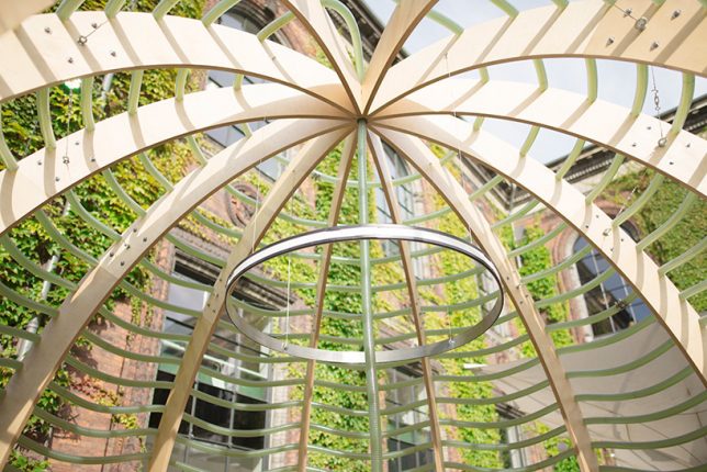
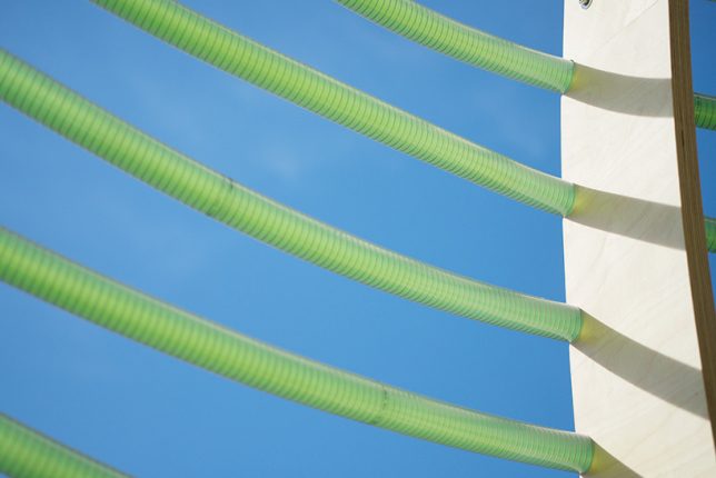
IKEA’s ‘Future living lab,’ known as SPACE10, debuted its ‘Algae Dome’ in Denmark a couple weeks ago, demonstrating how we might be able to grow “the supercrop of the future.” Designed by a team of engineers, the dome-shaped structure supports a network of transparent hoses, regulating their sun exposure so algae grows in the water inside them. The dome produced 450 liters of microalgae in just three days of its demonstration, which SPACE10’s chef crafted into such foods as ‘spiraling chips.’

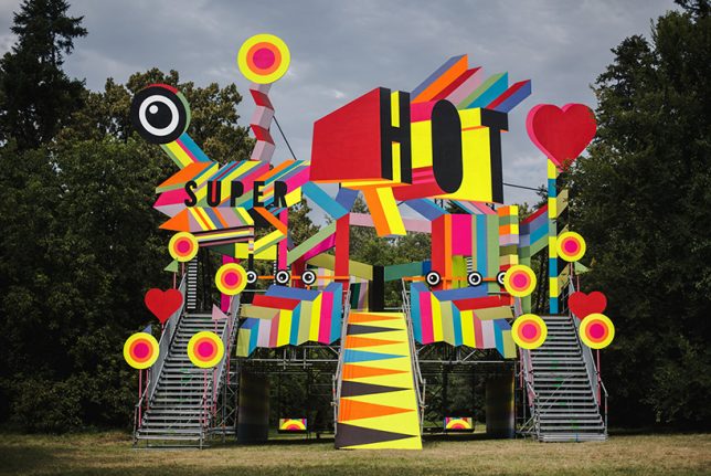
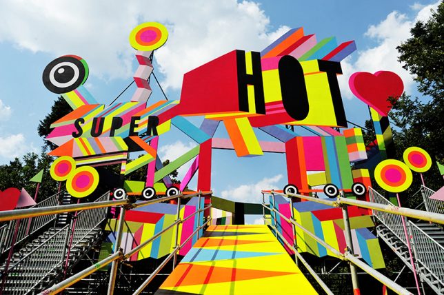
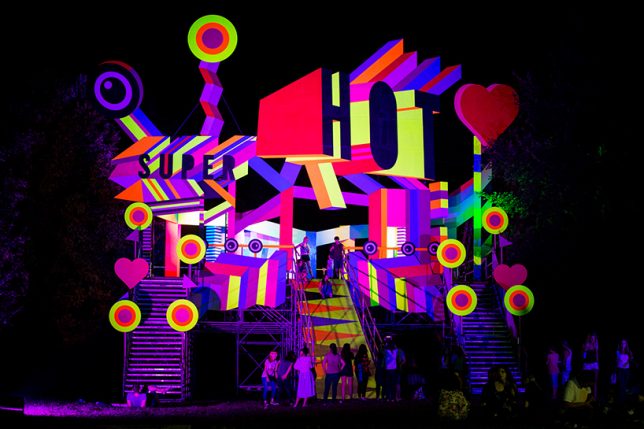
Super Hot Pavilion in Bucharest by Morag Myerscough

Designed for the 7th edition of the ‘Summer Well Festival’ in Bucharest, Romania by artist Morag Myerscough, the ‘Super Hot’ pavilion is envisioned as a fun and whimsical place to stage and take in performances. There’s space within the structure to hang out, dance, play or zoom down a slide.

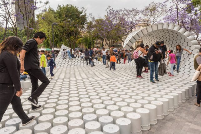
Wave of Buckets in Mexico City by Factor Eficiencia

Hundreds of painter’s buckets are connected into a walkable structure that curls up into a wave at either end, occupying the central Alameda Park in Mexico City. Designed by Factor Eficiencia and 5468796 Architecture, the installation uses the bucket as a symbol of liberation of public spaces. In Mexico, it’s common for entrepreneurs to use buckets to block off certain areas of the city so they can aggressively charge for parking.

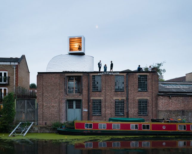
Urban Camouflage Pavilion in London by PUP Architects

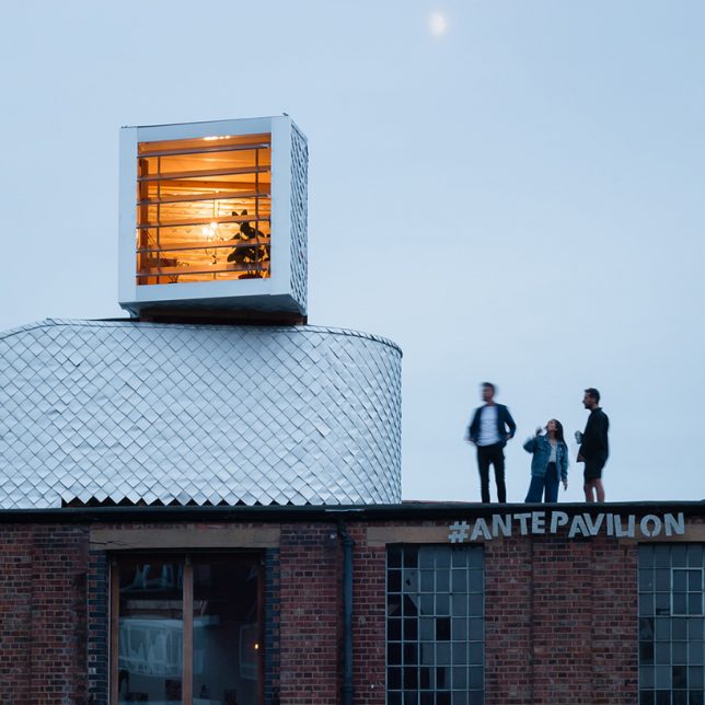
PUP Architects wanted to disguise their pop-up, entitled ‘H-VAC,’ as ordinary rooftop mechanical equipment. Do you think they pulled it off? The designers are taking advantage of UK building legislation that makes it legal to install rooftop equipment without planning permission; they believe that if you can sufficiently disguise rooftop addition as infrastructure, thousands of new micro dwellings could be added to London and other cities. The temporary structure is clad in waterproof tetra-pak shingles and includes two rooms.

Next Page – Click Below to Read More:
Pop Up Pavilions 15 Playful Temporary Architecture Installations

Share on Facebook


[ By SA Rogers in Architecture & Cities & Urbanism. ]

[ WebUrbanist | Archives | Galleries | Privacy | TOS ]


WebUrbanist

 
Comments Off on Pop-Up Pavilions: 15 Playful Temporary Architecture Installations

Posted in Creativity


Alien Architecture: Modern Buildings Recast as Extraterrestrial Ships

01 Sep

[ By WebUrbanist in Art & Photography & Video. ]

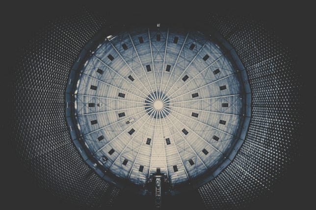
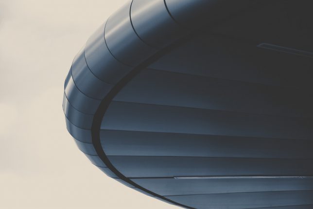
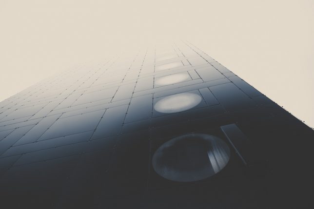
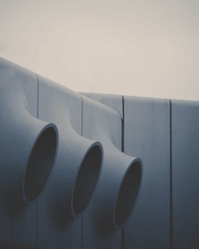
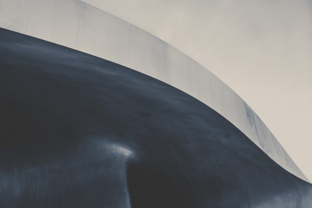
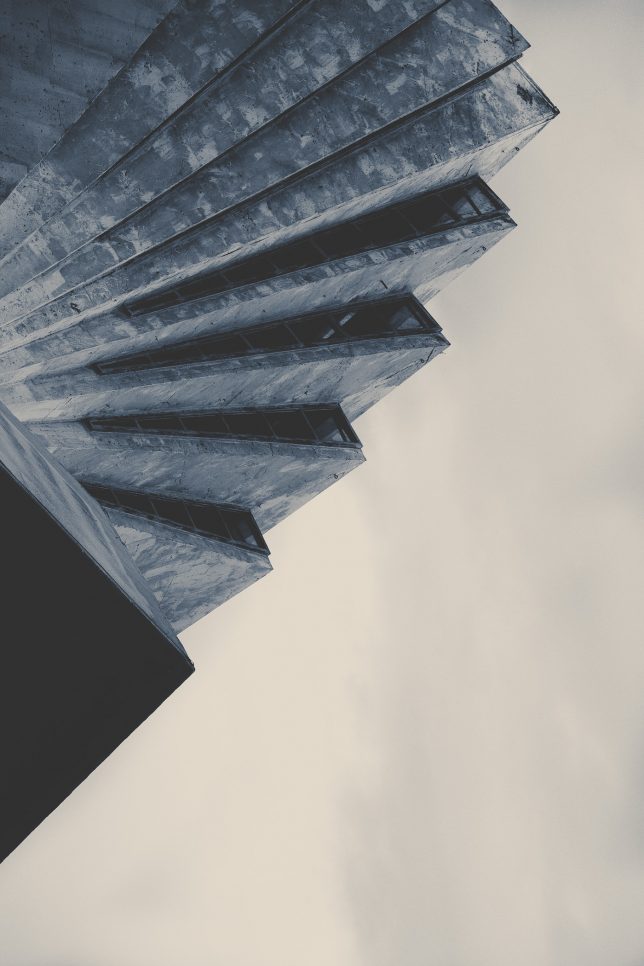
Composition, color and contrast and go a long way toward reframing photographic subjects, in this case: making familiar architectural forms seem like parts of dark and looming alien spaceships.

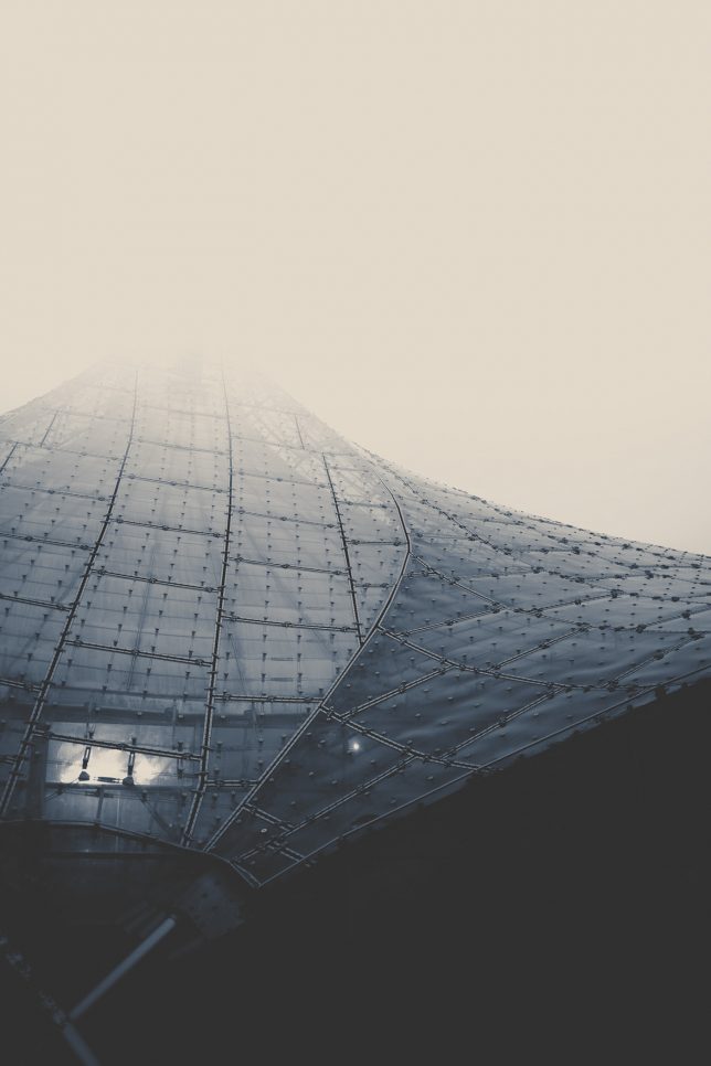
German photographer Lars Stieger has a knack for capturing ordinary building surfaces, materials and details and rendering them uncanny, especially in this Spaceships series photographed across Europe.

Glass-and-metal cladding in the fog can easily looked like the curved hull of an otherworldly vessel in the right light, while intersecting geometries taken out of context call the posters of science fiction classics to mind.

Stieger’s subjects range from the inside of an old gasometer to Olympic parks — often large, public and industrial works of design that already appear a bit strange even under normal circumstances. Check out more from this Spaceships series as well as his other photo sets on Behance and Instagram.

Share on Facebook


[ By WebUrbanist in Art & Photography & Video. ]

[ WebUrbanist | Archives | Galleries | Privacy | TOS ]


WebUrbanist

 
Comments Off on Alien Architecture: Modern Buildings Recast as Extraterrestrial Ships

Posted in Creativity


Anime Architecture: Exhibition Showcases Japan’s Fictional Buildings

03 Aug

[ By SA Rogers in Art & Drawing & Digital. ]

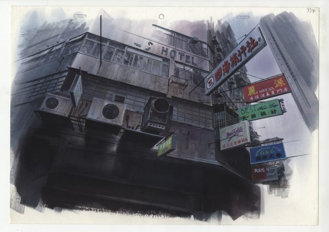
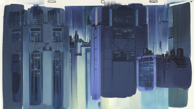
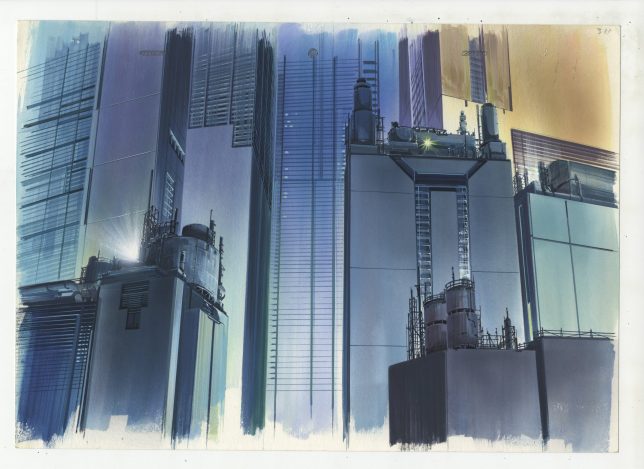
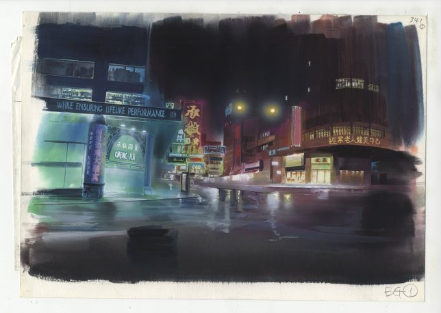
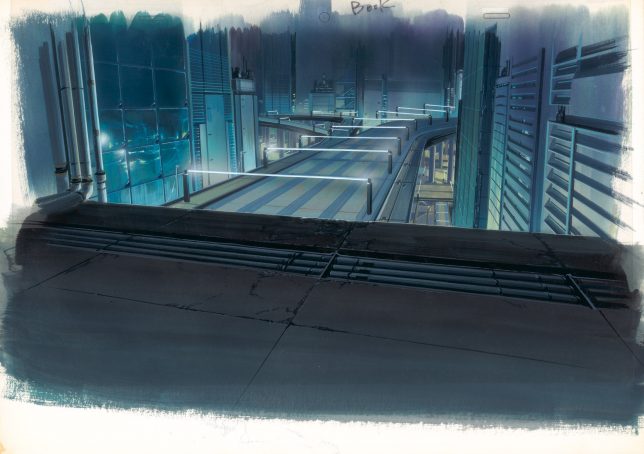
Visions of fictional cities – whether optimistic, realistic, fantastical or dystopian – tend to take on a haze of mystery and grandiosity in Japanese anime, as epitomized in ‘Ghost in the Shell.’ Dark jumbles of nearly-identical skyscrapers lurk over the protagonists in futuristic metropolises, often emphasizing feelings of desolation, industrialization and technology run amok. If you’ve ever sighed over a particularly incredible work of fictional architecture, you might be interested in an exhibition currently on display at London’s House of Illustration.

‘Anime Architecture: Backgrounds of Japan’ is the first UK exhibition of architectural illustrations for classic anime films, featuring over 100 technical drawings and watercolor illustrations. Most of these works come from series that debuted or were most popular during the anime heyday of the 1990s, including Hiromasa Ogura’s paintings for ‘Ghost in the Shell’, Takashi Watanebe’s pencil drawings from Ghost in the Shell 2: Innocence and work from the films ‘Patlabor: The Movie’ (1989) and ‘Metropolis’ (2001) by Mamoru Oshii and Atsushi Takeuchi.

Sure, there are great anime works that came after these with fictional architecture that’s just as beautiful, but these days, artists use computer animation instead of hand-painting the backgrounds. In an interview with It’s Nice That, curator Stefan Riekeles explains that it took quite a bit of nudging and late-night meetings at bars to convince the artists that people would want to see these works outside the context of the films, and that they’d translate well to gallery walls.

“[Ghost in the Shell], released 1995, was the continuation of [director Mamoru Oshii’s] reflection of the Asian mega-city, which he started with Patlabor in 1989 and continued after Ghost in the Shell: Innocence in 2004. Patlabor is set in a realistic urban depiction of Tokyo. Innocence is located in a purely fictional Asian world. The world of Ghost in the Shell is a hybrid of these poles.”

“The idea was to evoke a feeling of submerging into the deep levels of the city, where a flood of information overflows the human senses and a lot of noise surrounds the people. The artists were looking for an expression of a crowded space. They found a blueprint for such a place in Hong Kong, which is exotic enough for a Japanese audience to evoke a feeling of alienation and strangeness but familiar enough to relate their daily life to.”

Anime Architecture: Backgrounds of Japan will be open through September 10th, 2017 at the House of Illustration in King’s Cross.

Share on Facebook


[ By SA Rogers in Art & Drawing & Digital. ]

[ WebUrbanist | Archives | Galleries | Privacy | TOS ]


WebUrbanist

 
Comments Off on Anime Architecture: Exhibition Showcases Japan’s Fictional Buildings

Posted in Creativity


6 Helpful Tips for Doing Interior Architecture Photography

28 Jul

Shooting interior architecture photography can be challenging to get just right. Here are six tips to help you have more success with this type of photography.

Interior architecture tips 01

21mm focal length, f/11, ISO 100, 1/200th. One off-camera flash used.

1) Always use a tripod

There are two main reasons why you always want to use a tripod for architecture photography.

First, a tripod will perfectly stabilize your camera/lens setup, which fully mitigates any possibility of motion blur from hand-holding the camera. Additionally, if you’re on a tripod, it’s much easier to make sure your camera is level (I’ll discuss the importance of a level camera later in this article).

Secondly, there’s no good reason NOT to use a tripod (I follow the general rule that, unless there’s a good reason not to have a tripod, I always use one). If you were tracking subjects which required quick movement and recomposition, then a tripod would be a hindrance. But, for architecture photography, your composition will always sit nice and still for you, giving you all the time in the world to set the shot up right. The ideal situation for a tripod.

Interior architecture tips 02

21mm focal length, f/11, ISO 100, 1/120th. One off-camera flash used.

2) Whenever possible, use a flash

If you shoot a room indoors without a flash, you will typically get shadows scattered around the room. Using a flash for interior architecture will help balance the exposure across the entire frame.

This is how I typically use a flash. Put the flash on a tripod or a stand, and place it a few feet away from the camera (on each side of the camera if you use two flashes for larger rooms), and a foot or so behind the camera. Aim the flashes so they are pointing up at the ceiling, but also slightly away from the room you’re shooting. At this angle, the light from the flashes will illuminate the room indirectly (i.e. bouncing off the ceiling and walls), creating a soft, even, fill-in light for the room you’re shooting. Set the flashes manually at half power (one stop below full power) and fire away!

Interior architecture tips 03

This was a tricky shot because my flash was reflecting off the windows no matter where I positioned it. So I took two shots (one with flash and one without) and masked them together in Photoshop. The windows you see in this image are from the shot without a flash, while the rest of the room is from the shot with the flash.

3) When shooting whole rooms, don’t get too wide

When I first started taking practice photos of architectural photography, I used the widest angle lens I could get my hands on to shoot entire rooms. My thinking was that with an ultra-wide lens, I could get more of the room in the frame. But more isn’t always better. I quickly noticed the high level of distortion towards the edges of the frame, especially in smaller rooms where the edges of the frame were at wide angles to the camera.

So, I experimented with different focal lengths and came to the conclusion that between 21mm and 28mm gives you the most practical balance between limited distortion and a wide enough frame to capture the character and presence of the scene. Ultra-wide lenses (i.e. 14 or 15mm) will make the sides of the frame look oddly stretched and off the horizontal plane, even when corrected in post-production.

If you’re in a situation where 21mm won’t capture enough of the scene, a panorama is always an option – which segues nicely into the next tip:

Interior architecture tips 04

This was an extremely dark room, even with all the lights on. So, like the previous image, I stacked two shots: one exposed for the room, and one exposed for the windows, and combined them in Photoshop.

4) Try panoramas for ultra-wide shots

Set up your camera vertically on the tripod (which creates a taller pano). Then, making sure you adequately overlap the scene in each shot, do your best to make the camera rotate on a perfectly level, horizontal plane, with the pivot point being roughly where the lens meets the camera.

If the pivot point is too far forward (i.e. somewhere on the lens), or too far backward (i.e. on the body of the camera), the panorama will appear distorted. For example, in the picture below, the pivot point was on the body of the camera (behind the ideal spot where the lens meets the camera). As a result, the panorama has a weird sort of convex distortion.

Interior architecture tips 05

This is a seven image panorama. See how artificially “rounded” the walls are? This will happen when shooting a panorama if your camera/lens are not properly situated on the tripod.

5) Whenever possible, try to shoot only one or two walls

Two wall shots typically give the viewer the most geometrically pleasant image to view. When three (or more) walls are introduced, the photograph can have a tendency to appear somewhat awkward-looking if you aren’t careful with the composition.

Interior architecture tips 06

21mm focal length, f/11, ISO 100, 1/120th. One off-camera flash used.

The above shot is a generic two-wall scene, with the walls meeting at a standard 90 degree angle. The image below is the same room, except I backed up several feet to purposely include the third wall on the left edge of the frame.

Interior architecture tips 07

The “third wall” on the left side of this shot creates an unnatural and visually-displeasing scene.

I don’t know about you, but to me, the photo above looks compositionally awkward and disorienting because of the third wall on the left. All of that said, just like the Rule of Thirds can occasionally be broken to make a photo work, sometimes getting three walls in the shot is okay – provided everything is geometrically aligned.

Interior architecture tips 08

A properly-aligned three-wall shot. 21mm focal length, f/11, ISO 100, 1/200th.

6) Make sure your camera is perfectly level

Last, but definitely not least, you will want to make sure your camera isn’t tilted up or down, or tilted to the left or right. Doing so, even slightly, will require post-production cleanup. Here’s an example of what I’m talking about:

Interior architecture tips 09

In this shot, the camera/lens were not level on the tripod. They were slightly slanted down towards the ground, creating the artificially slanted walls.

See how slanted the windows are? Clearly, this is not an accurate depiction of the room, it’s the result of the camera being tilted ever-so-slightly down. Now, see what a difference makes if we get the camera nice and level.

Interior architecture tips 10

Camera/lens properly level on the tripod. 21mm focal length, f/8, ISO 100, 1/120th. No flash (this room had plenty of sunlight to illuminate it without artificial help).

Being level makes a HUGE difference. There are several ways to help you get the camera perfectly level when you compose your shot. Most cameras these days have a built-in level, so when you look into the viewfinder, there are lines across the focusing screen that will tilt when the camera tilts. When these lines are level, you know the camera is level.

You can also use a bubble level that slides onto the camera’s hot shoe. When the little bubble is centered, the camera is level. You can buy a hot shoe bubble level at any photography store for just a few bucks. I use a bubble level because they tend to be more accurate than the lines inside the viewfinder.


Interior architecture tips 11

In this shot, I used Photoshop to remove the camera, lens, and tripod, which were all reflected in the mirror. Sometimes shooting into a mirror is inevitable, and when you do, cloning in Photoshop is a requirement.

Conclusion

As is the case with any type of photography, the most important aspect of getting the shot right is to take your time, and make sure your composition and exposure are exactly what you want. One good thing about architectural photography is that the composition and subject will never move (unless you move it), so there’s no need to rush the photograph.

The post 6 Helpful Tips for Doing Interior Architecture Photography by Jeb Buchman appeared first on Digital Photography School.


Digital Photography School
 
Comments Off on 6 Helpful Tips for Doing Interior Architecture Photography

Posted in Photography


Out of This World Architecture: 16 Real Buildings Inspired by Science Fiction

20 Jul

[ By SA Rogers in Architecture & Public & Institutional. ]

From a Star Wars-inspired house in South Korea to a blob-shaped ‘friendly alien’ museum in Austria, these structures make no attempts to hide the sci-fi sources of their inspiration. All 16 of these futuristic buildings are completed or in progress – not just concept art – including flying saucers, pavilions that quiver in the wind, spaceship houses and even murals of Neo from the Matrix in a Buddhist temple.

Faraday Future Campus by MAD Architects

MAD Architects has designed a science-fiction inspired campus for Faraday Future, a company in the midst of producing “the world’s fastest-accelerating electric car.” Set on a former Navy base in Northern California, the campus features a reflective ‘user experience center’ tower that rises above the low complex of buildings. A bridge shoots the customers’ cars right out of the warehouse and into the showroom to meet them.

Star Wars House in Korea by Moon Hoon

The Star Wars House in suburban South Korea by Moon Hoon pays tribute to the film series with its blocky concrete proportions and horizontally banded windows. Inside, there’s a secret room hidden within the shelving water on a wall, and the top floor is conceived as “a control room for the future Darth Vader or Jedi.”

2010 UK Pavilion for the World Shanghai Expo by Thomas Heatherwick

When the renders were released for this incredible pavilion by Heatherwick Studio, many people thought it could never be built as it was illustrated. Its strange blurred form seemed difficult to translate into a 3D structure. But the architects managed to pull off the ‘Seed Cathedral,’ which is made of 60,000 slender transparent fiber optic rods that move in the wind. Each one contains embedded seeds as well as built-in lighting

The United States Air Force Academy Cadet Chapel

Designed by architecture firm Skidmore, Owings & Merrill (SOM) and built in 1962, the United States Air Force Academy Cadet Chapel in El Paso, Colorado mimics the speaks of the Rocky Mountains in which it’s set, featuring seventeen rows of 150-foot-high spires. A steel frame of 100 identical tetrahedrons makes up the base of the structure, enclosed with aluminum panels, the gaps between them filled with colored glass.

The Atomium by Andre Waterkeyn & Andre and Jean Polak

Originally built for the 1958 Brussels World’s Fair, the Atomium stands 335 feet tall, with nine 60-foot-diameter stainless steel spheres connected into the shape of a unit cell of an iron crystal. Five of the spheres are habitable, containing exhibition halls and other public spaces, and the top sphere holds a restaurant with panoramic views of the city.

Next Page – Click Below to Read More:
Out Of This World Architecture 16 Real Buildings Inspired By Science Fiction

Share on Facebook


[ By SA Rogers in Architecture & Public & Institutional. ]

[ WebUrbanist | Archives | Galleries | Privacy | TOS ]


WebUrbanist

 
Comments Off on Out of This World Architecture: 16 Real Buildings Inspired by Science Fiction

Posted in Creativity


Photographer duo captures incredibly creative architecture portraits

17 Jul

$ (document).ready(function() { SampleGalleryV2({“containerId”:”embeddedSampleGallery_7260825413″,”galleryId”:”7260825413″,”isEmbeddedWidget”:true,”standalone”:false,”selectedImageIndex”:0,”startInCommentsView”:false,”isMobile”:false}) });

Artist duo Daniel Rueda and Anna Devis have one of the most creative, fun, not to mention OCD-friendly Instagram partnerships you’ll ever stumble across. They travel the world finding creative, strange and colorful architecture, and then come up with creative, strange and colorful ways to interact with it.

Surprisingly (or maybe not) Devis and Rueda are not photographers who love architecture, but architects who love photography. The architectural education gives them a better understanding and appreciation of the spaces they’re working with, while the photographer’s need to tell a story is what inspires them to insert themselves into each pictures as ‘characters.’

As Rueda explained in an interview with design website More with Less, in addition to lending a sense of scale, “the role of these characters in my pictures is to tell a story that goes beyond aesthetics. That is, it is not enough to just have an image that looks more or less beautiful; it has to tell something without the need of putting it into words.”

Devis and Rueda’s work is, plain and simple, a treat for the eyes. You can find many more creative shots like the ones above on Instagram at @drcuerda and @anniset.

Articles: Digital Photography Review (dpreview.com)

 
Comments Off on Photographer duo captures incredibly creative architecture portraits

Posted in Uncategorized


Flat-Pack Mobile Architecture: This Building Will Self-Construct in 8 Minutes

11 Jul

[ By WebUrbanist in Architecture & Offices & Commercial. ]

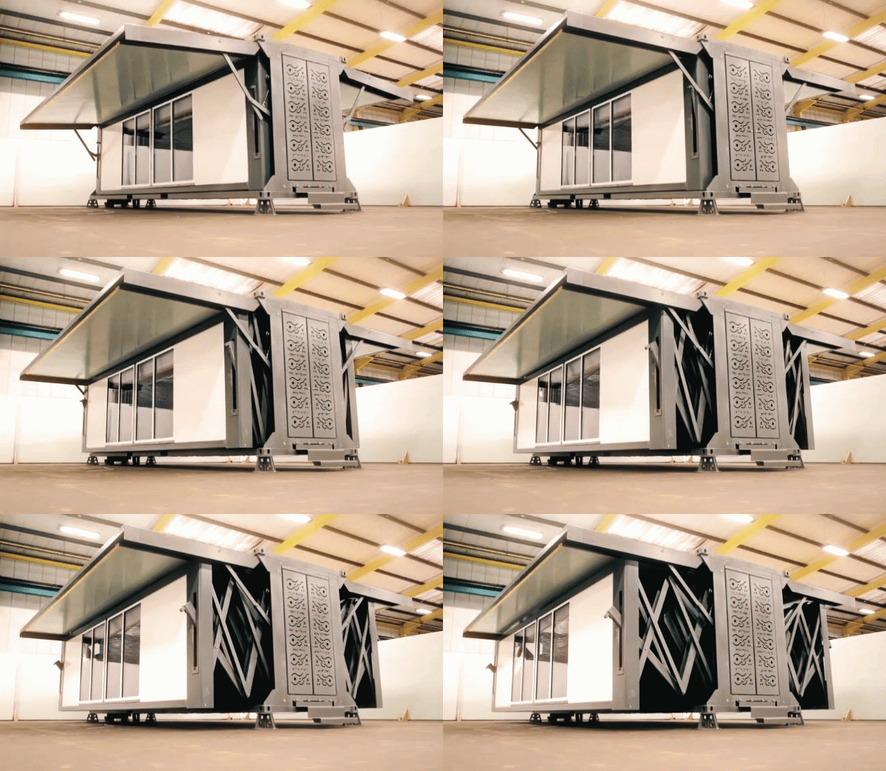
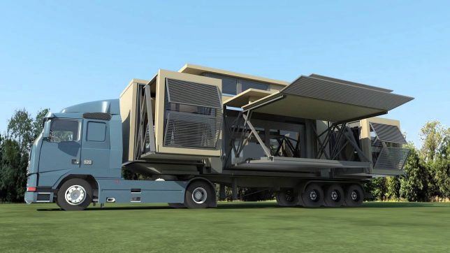
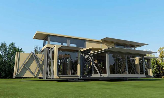
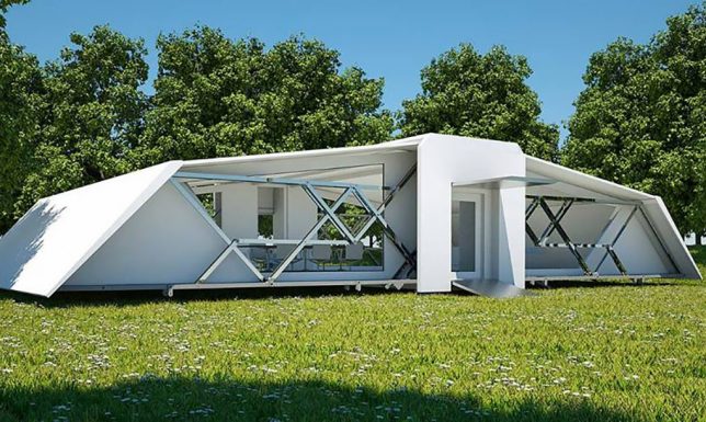
Requiring a single tool and very little power, these self-deploying structures are ready for use in minutes, expanding themselves to multiple times their compact travel size.
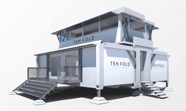
Based in the United Kingdom, Ten Fold Engineering’s structures can be packed onto ordinary trucks, conforming to road-worthy dimensions for maximum flexibility.

The company boasts myriad possible uses, from medical clinics and mobile hotels to on-demand offices and private retreats — the sale pitch in the video above is a bit blandly corporate, but the mechanics of the thing unfolding are gorgeous.

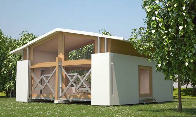
Their custom pin-jointed linkages help them open and close easily with minimal energy requirements and using just a single (presumably sonic) screwdriver. They are modular and can be customized with various arrangements of floors, doors, windows and dividers — they can even be shipped with furniture inside.

The company is also experimenting with designs for multi-story structures as well as stackable variants, opening up a whole world of possibilities.

Even the designs show an appealing variety of aesthetic possibilities, including dynamic modern looks and spacious expanding ceilings that go a step beyond typical prefab home possibilities.

Thanks to their variable footings, the units can be put up on uneven or sloped ground, stabilizing to sit flat from the perspective of the occupant.

The buildings can go off the grid but also feature optional attachments for solar panels and batteries, presenting an array of potential power possibilities.

At around 700 square feet and $ 130,000 the base models aren’t cheap, but for someone with the urge to roam they make a pretty stylish and comfortable option for a semi-mobile home.

Share on Facebook


[ By WebUrbanist in Architecture & Offices & Commercial. ]

[ WebUrbanist | Archives | Galleries | Privacy | TOS ]


WebUrbanist

 
Comments Off on Flat-Pack Mobile Architecture: This Building Will Self-Construct in 8 Minutes

Posted in Creativity


Acclaim for the Reclaimed: 14 Cool Upcycled Architecture Projects
11 Jul
[ By SA Rogers in Architecture & Houses & Residential. ]

Going beyond simple stacks of shipping crates and ripped-apart pallets, these creative upcycled architecture projects reclaim stuff like corrugated iron, 5-gallon water bottles, old doors and even junk left over from the London Olympics as building materials and truly elevate them to new heights. These projects offer some fresh ideas, use the materials in new ways or demonstrate how recycled and upcycled architecture integrate into modern designs.

Stedsans in the Woods: Upcycled Permaculture Farm in Sweden

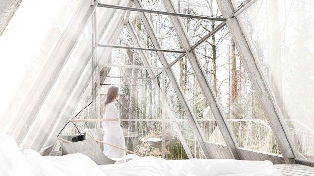
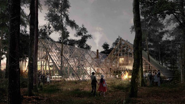
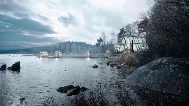
This permaculture farm and retreat nestled in the woods of southern Sweden will function as a “lab for discovering better ways to eat, live and connect with nature,” including a farm-to-table restaurant and a collection of beautiful treehouse-like cabins made of waste wood, fragments of old barns and glass from abandoned greenhouses.

Rising Moon Pavilion Made of Recycled Water Bottles

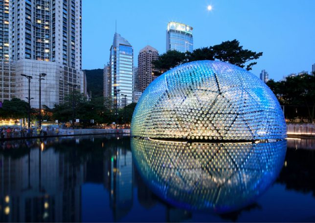
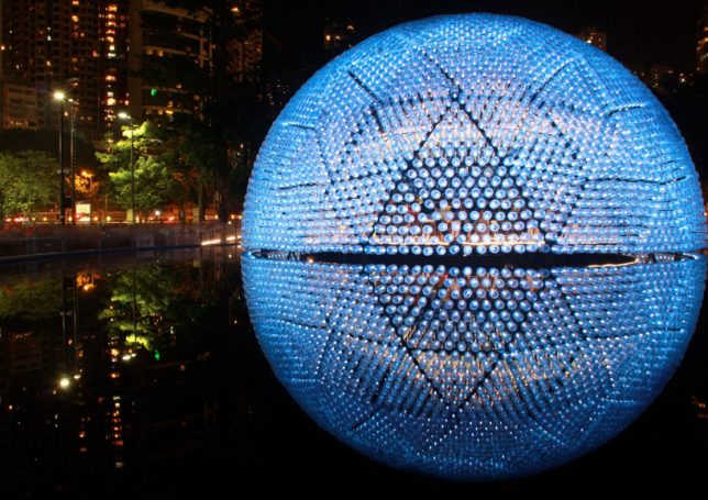
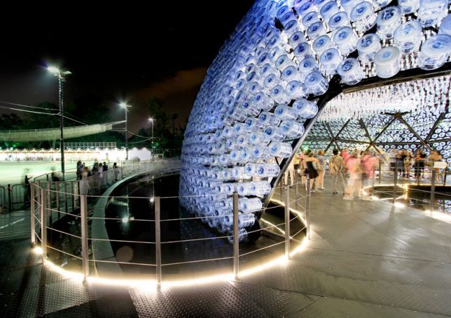
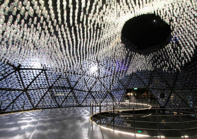
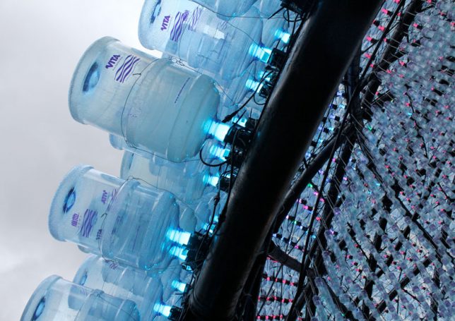
Reflecting itself into a perfect sphere on the surface of a still pool, ‘Rising Moon’ by Hong Kong-based studio Daydreamers Design is a geodesic dome fitted with 4,800 five-gallon polycarbonate water bottles, each acting as a lantern to help the structure glow. At night, they transmit light from inside out, while during the day, the interior is illuminated by the sun. LED torches are attached to pre-fabricated triangular modules with the bottles fitted over them, and an additional 2,300 bottles hang from the ceiling.

Parasitic Student Residences Made of Pallets for Paris

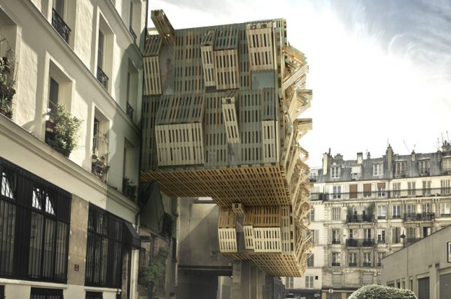
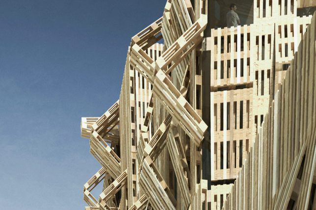
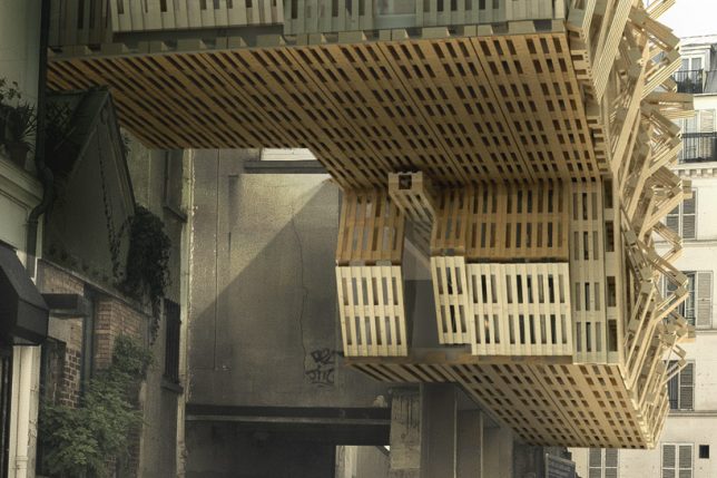
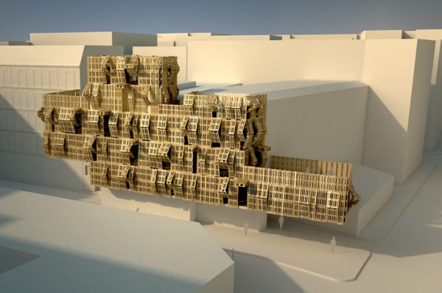
French architect and graffiti artist Stephane Malka proposes ‘Ame-Lot,’ a series of parasitic structures made of upcycled pallets and other reclaimed materials that attach to existing architecture. The pallets fold and unfold to let more light into the interior, and the structures can be constantly rearranged and added to as necessary for growth, becoming a visual meter of consumption in the city.

Collage House Made of Recycled Doors by S+PS Architects

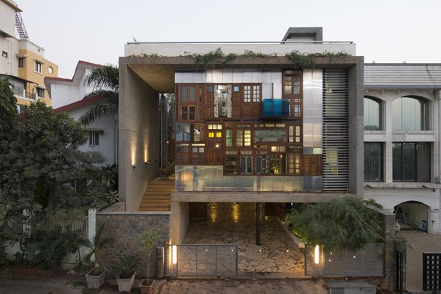
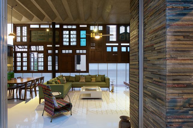
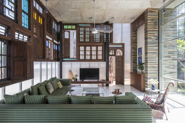
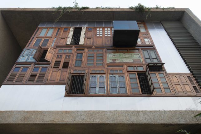
Over a dozen reclaimed doors and windows salvaged from demolished houses in the city make up a highly unusual and creative collage-style facade for a Mumbai residence by S+PS Architects. This double-height curtain wall makes for some seriously striking curb appeal, and sets the tone for the living room as well. The architects also incorporated other found materials into the home, like metal pipe leftovers pieced together like bamboo to form a ‘pipe wall,’

K Valley House Clad in Reclaimed Iron by Herbst Architects

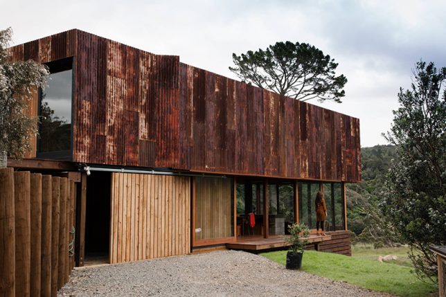
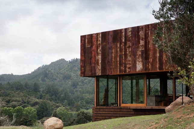
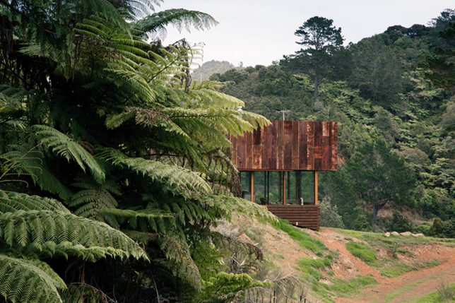
Rusted corrugated iron sheets resembling the sheds often seen in the New Zealand countryside contrast beautifully with the greenery of the Kauaeranga Valley in ‘K Valley House’ by Herbst Architects. “We positioned the form straddling the ridgeline, engaged with the slope at the high end and floating above the land as it falls away,” they say.

Next Page – Click Below to Read More:
Acclaim For The Reclaimed 14 Cool Upcycled Architecture Projects
Share on Facebook


[ By SA Rogers in Architecture & Houses & Residential. ]

[ WebUrbanist | Archives | Galleries | Privacy | TOS ]


WebUrbanist

 
Comments Off on Acclaim for the Reclaimed: 14 Cool Upcycled Architecture Projects
Posted in Creativity


Architecture for Animals: 13 Structures Designed with Non-Human Use in Mind

29 Jun

[ By SA Rogers in Architecture & Public & Institutional. ]

If we’re going to keep animals in artificial environments to make money off gawking at them, you’d hope we’d at least design these structures sensitively, hiring top architects to give them the kind of loving care we’d give to our own homes. Whether building spacious zoo enclosures mimicking natural environments, bat-friendly bridges, stables to house horses in ultimate comfort or wildlife crossings over highways, this collection of animal-centric architecture aims to be the next best thing to leaving animals in the wild where they belong, and giving them plenty of space from human activity.
Panda House by Bjarke Ingels Group / BIG

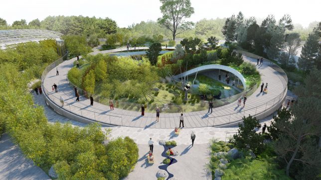
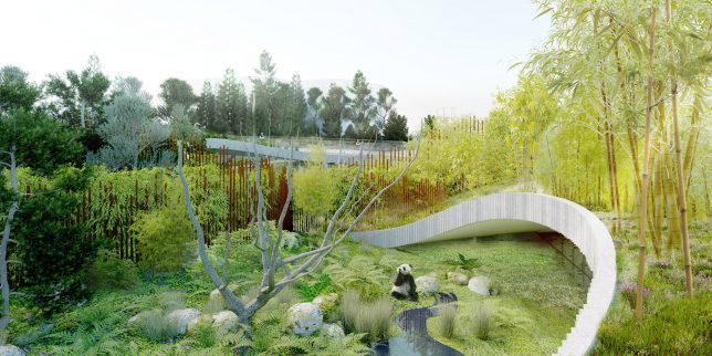
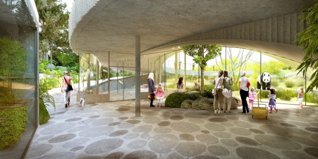
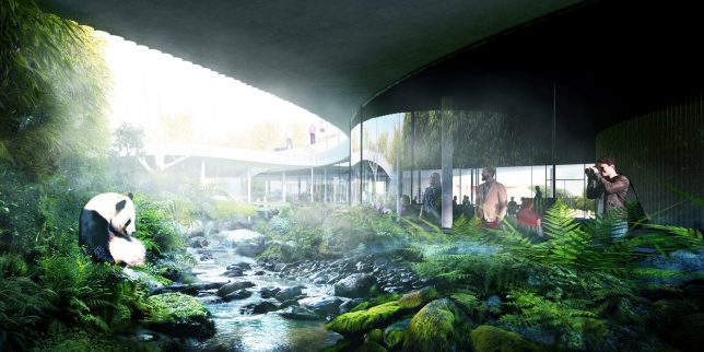
BIG designed a circular indoor/outdoor enclosure for giant pandas at the Copenhagen Zoo, set to open in 2018. The spacious and lushly planted structure will house two pandas relocated from Chengdu, China in a layout inspired by the Chinese yin-yang symbol, with each half tilting up at either end. There’s a bamboo forest on one side and a denser ‘misty’ forest on the other to represent the panda’s habitats in the wild.

Bat-Friendly Bridge by NEXT Architecture

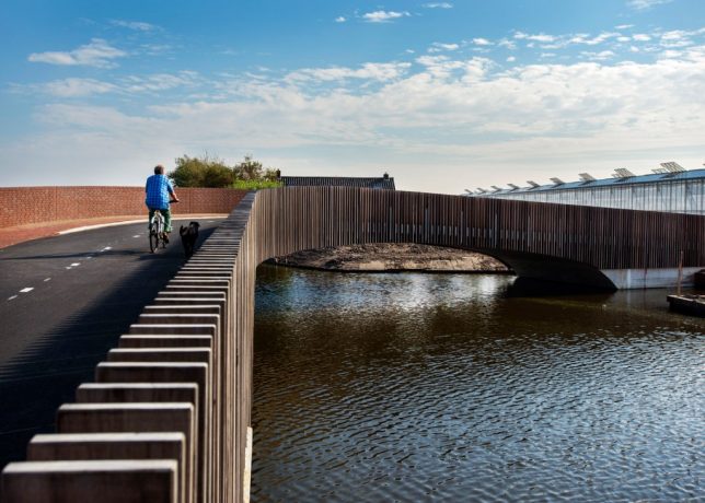
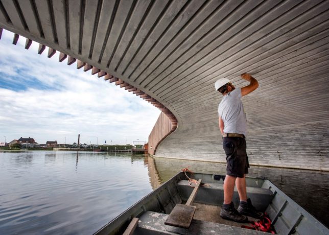
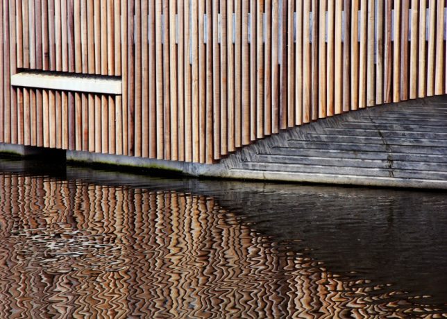
This bridge by Next Level Architecture in South Holland doubles as a bat habitat, with just a few modifications to a conventional bridge design, providing an example that could be replicated all over the world. Spanning a river that’s an important natural pathway for the local bat population, the bridge features extra-thick concrete to increase its thermal mass, making it warm for winter hibernation and a cool summer nesting spot.

Raven Enclosure at the Tower of London by Llowarch Llowarch Architects

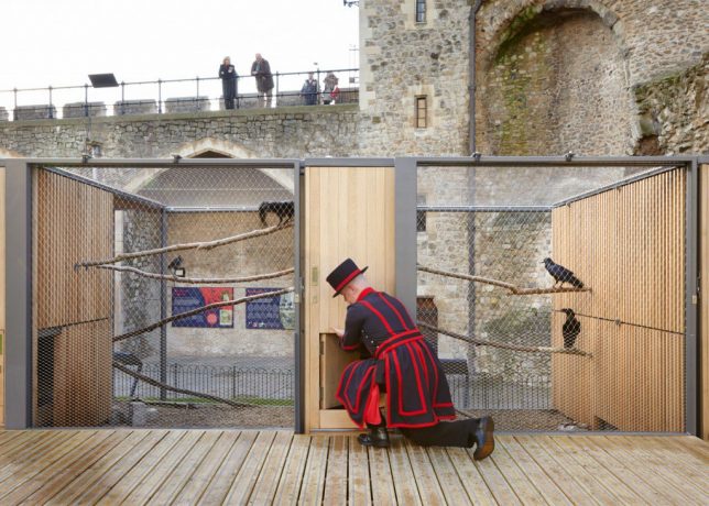
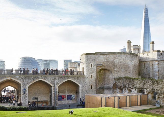
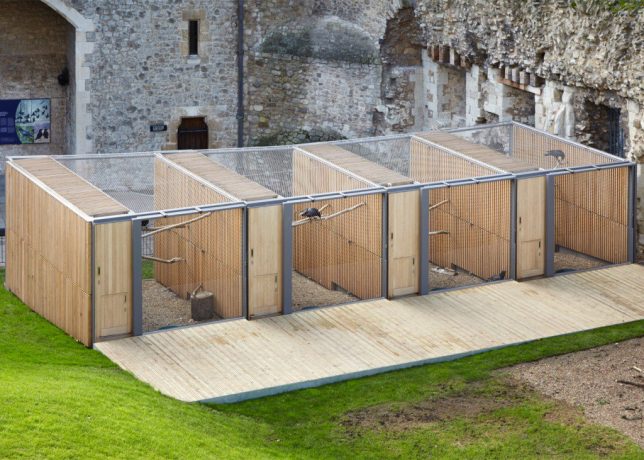
Five oak and mesh aviaries by Llowarch Llowarch Architects contrast with the ancient forms of the Tower of London, replacing the ‘ad hoc collection of sheds’ once used to house the complex’s famous resident ravens. According to English legend, if the ravens ever leave the Tower of London, the kingdom will fall – so the birds have been protected inhabitants of the historic palace, fortress and prison since the 17th century. Of course, different ravens have come and gone over the years.

Finnish Stables by Pook

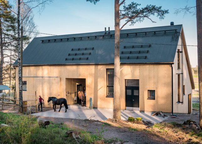
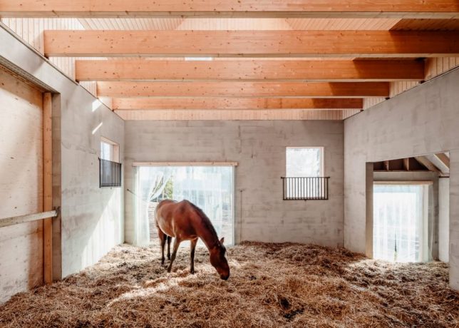
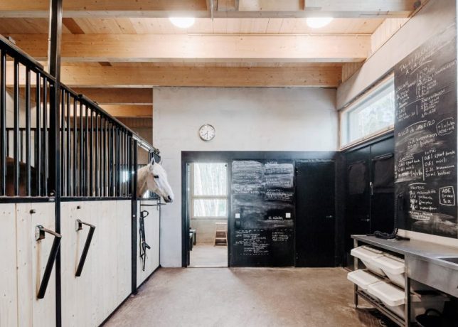
Local architecture studio Pook designed this stylish stable on the edge of a Finnish forest to blend in with the rural setting and complement the local architectural vernacular. The layout creates wind shelters in outdoor spaces to protect the horses against the southwestern winds. Inside, there’s an open room for feeding and walking the horses, storage for equipment and a barn for manure. The use of untreated pine in the cladding helps naturally control the humidity of the environment for the horses’ health.

Kangaroo Enclosure by White Arkitekter

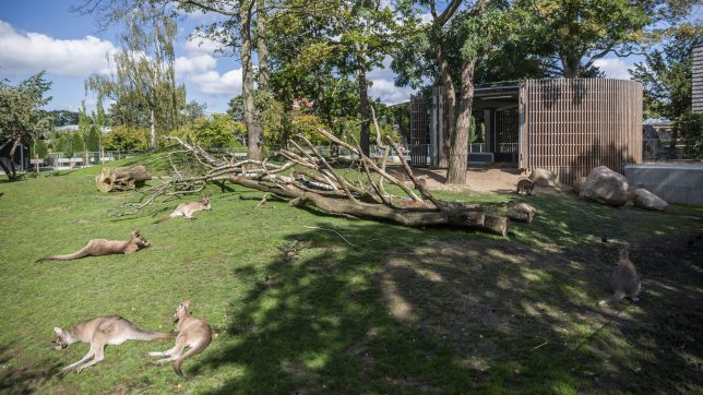
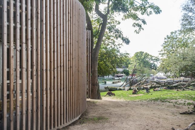
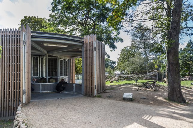
Another modern addition to the Copenhagen Zoo is this cylindrical house for Tasmanian kangaroos by White Arkitekter, which allows visitors to enter the kangaroos’ enclosure without stressing the animals. Part of the enclosure is for the kangaroos themselves, with a heated concrete floor to keep them warm in winter. The slatted timber doors can be folded back to open parts of the space to the wider enclosure, while others remain closed so shy kangaroos can have their privacy.

Next Page – Click Below to Read More:
Architecture For Animals 13 Structures Designed With Non Human Use In Mind

Share on Facebook


[ By SA Rogers in Architecture & Public & Institutional. ]

[ WebUrbanist | Archives | Galleries | Privacy | TOS ]


WebUrbanist

 
Comments Off on Architecture for Animals: 13 Structures Designed with Non-Human Use in Mind

Posted in Creativity