RSS
 

Posts Tagged ‘apply’

How to Apply the Look of Hand Coloring in Lightroom

23 Mar
Give a photo the look of a hand tinted image in Lightroom

Give a photo the look of a hand coloring in Lightroom

Before there were color photos there were black and white photos, colored by hand using paints or dyes. Today, courtesy of any good photo-editing program, you can apply your own hand coloring effect to your photos.

Here’s how to apply the look of hand coloring in Lightroom.

To get started, open the image in the Lightroom Develop module. You will want to make the usual basic edits to the image so it shows a good tonal range and contrast.
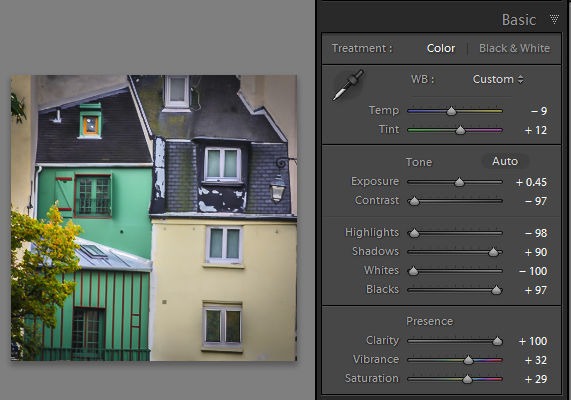
Before colorizing the image, make sure to adjust the tonal range and contrast.

Before colorizing the image, make sure to adjust the tonal range and contrast

Then convert the image to a black and white by clicking B&W panel and adjust how the underlying colors in the image are converted to black and white using the sliders. Lighter areas will show the color better and darker areas will show a more subtle tint.
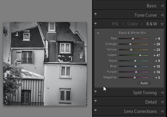
Use B&W to create a black and white image.

Use the B&W panel to create a grayscale or monochromatic image

When you’re ready to add color to the image, click the Adjustment Brush and return all the sliders to zero by double clicking on the word Effect at the top of the panel (circle in red below).
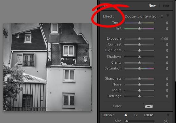
Double click Effect to reset all the Adjustment Brush sliders.

Double click Effect to reset all the Adjustment Brush sliders

Click on the color sampler and choose a color to use.
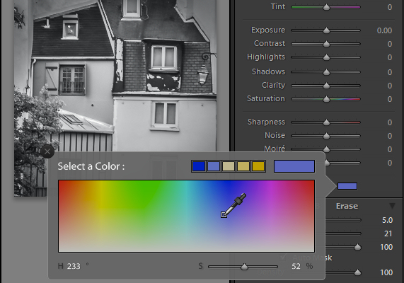
Select a color to tint the image with from the Color selector

Select a color to tint the image with from the Color selector as shown here

Now click on the area that you want to recolor to set an Edit Point. Paint over the area to apply the color to it. As you paint with the Adjustment Brush a layer of partially opaque color is applied to the image.

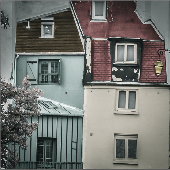
Select the Auto Mask checkbox if you are working on an area of the image that has distinct edges. Doing this makes it easier to limit the painting to only the desired area. The roof tops and buildings here are good examples of areas with distinct edges.
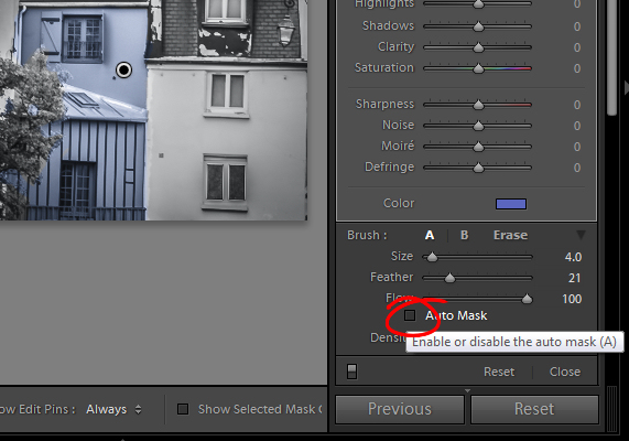
Selecting Auto Mask helps paint in areas with defined edges.

Selecting Auto Mask helps paint in areas with defined edges (stay within the “lines”)

When painting an area that is less defined, disable the Auto Mask checkbox. The tree in this image has less defined edges so you should disable Auto Mask when coloring this area.
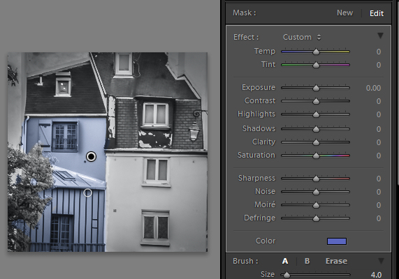
The buildings have defined edges so use Auto Mask when painting them. The tree does not, so disable Auto Mask when painting it.

The buildings have defined edges so use Auto Mask when painting them. The tree does not, so disable Auto Mask when painting it.

If you mistakenly paint over an area and want to undo the painting click the Erase brush link or hold Alt to select Erase and paint to remove the mistake.

To zoom into the image press Z on the keyboard and click on the image to zoom in or out. To move the image hold the spacebar so the mouse pointer turns into a hand and drag on the image.
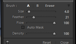
Size the brush using the Size slider

Size the brush using the Size slider

To resize the brush either use the [ and ] keys on the keyboard or adjust the size using the Size slider.

When you have finished working with the first color, click New to set a new Edit Point. Select a different Color and paint that onto the image.

Continue creating a new Edit Point for each color until the coloring is complete.

If desired, you can alter a color or adjust a painted area by selecting the Adjustment Brush and then click the Edit Pin for that adjustment. You can then change the color using the color picker.
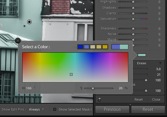
Give a photo the look of a hand tinted image in Lightroom

Give a photo the look of a hand tinted image in Lightroom

Do you have some other tips:

If you have some other ways of doing this technique in Lightroom please share. Or share your images if you give it a try!

For more Lightroom tips and tutorials try these:

  • Processing an Image in Lightroom 5 – a Video Tutorial
  • 6 of Lightroom’s Hidden Treasures
  • Why Lazy Photographers Should Use Lightroom Smart Collections
  • 3 Uses for the Radial Filter Tool in Lightroom 5
  • Lightroom 5 Tips – Hidden Gems

The post How to Apply the Look of Hand Coloring in Lightroom by Helen Bradley appeared first on Digital Photography School.

Digital Photography School

 
Comments Off on How to Apply the Look of Hand Coloring in Lightroom

Posted in Photography


Lose the Bubbles: How to Properly Apply a Screen Protector on Your Camera’s LCD

26 Jul

So why put up with them on your camera’s LCD? If you’ve ever tried to apply, or thought about applying, or even looked at a screen protector before – you might want to read this. Fancy receiving a ‘spanking new Nikon D800, only to find a wafer thin scratch down the main screen within weeks. You were careful with it, Continue Reading

The post Lose the Bubbles: How to Properly Apply a Screen Protector on Your Camera’s LCD appeared first on Photodoto.


Photodoto

 
Comments Off on Lose the Bubbles: How to Properly Apply a Screen Protector on Your Camera’s LCD

Posted in Photography


How To Create Your Own Unique Textures and Apply Them To Your Photography

16 Jul

I would like to take you through a journey today and show you how some very ordinary looking photographs of the world around us can be combined to create some very interesting and one-of-a-kind pieces of art. Some might argue that what I’m doing is no longer considered photography, but I’d argue that everything presented within the final image was at one point captured using a camera, and therefore still falls under the category of photography albeit slightly manipulated.

The world around us is filled with textures and abstract patterns that often go overlooked in pursuit for larger more dramatic subjects. No matter what type of photographer you are and whether or not you’d go so far as to do what I’m sharing today I do think it’s worth it to spend some time learning about how to capture these kinds of images as it will help you see the world differently.

Texture-11

So What Is A Texture?

Texture in art (at least in how we’re using it today) can be defined as: the visual ”feel” of a two-dimensional work.

When I first started getting into photographing textures I wasn’t sure that it could be all that interesting. I thought that a texture had to be something very traditional like sand, or wood, or rust. I soon realized that in reality just about anything can be considered a texture if you want it to be, you just have to use it as such in your final image.

That said I do think the best textures are more abstract images with a bit of depth to them. If the image you’re using as a texture is too clearly defined then you’ll end up having a difficult time separating your texture from the subject of the image you end up applying it to.

Capturing Textures

texture2

There are simple textures like – wood, rust, paint, sand, stone – and more complex textures like – a dirt path through the woods, a canopy of a forest, a collection of flowers, the list goes on forever.

Ideas to Keep in Mind When Capturing Textures

  • Fill the Frame
  • Look for Compositional Elements (Like the beam in the photo above)
  • Don’t rule something out just because it doesn’t look like a texture.
  • Don’t worry too much about your camera’s settings
  • Be creative

Texture-8

Creating & Using Textures in Your Workflow

The first step in the process is to take the individual textures that you’ve collected and create your own unique texture.

Texture-8

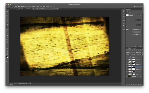
This texture is the image that I applied to the lightning bolt photo at the bottom of this post and is a combination of the three textures that you’ve already seen above (the waterfall, the ceiling and the frozen lake).

I won’t go through every step, but instead I’ll give you a general idea of how I went about creating this texture in a simple five step process that you can use as a guideline to create your own.

Screen Shot 2013-07-14 at 4.01.37 PM

Click to Enlarge

  • Bring all your textures into photoshop as different layers
  • Determine what you’d like the strongest element of your texture to be – here I choose the ceiling and placed it as the bottom layer (the background).
  • Determine if you want to duplicate any of your textures for a stronger appearance . Here I choose to duplicate the frozen lake a total of 7 times.
  • You don’t have to keep all your layers in the same orientation. Here I’ve rotated two of the frozen lake layers slightly and flipped one upside down. I then applied various layer masks and blending modes to get the final look that I wanted.
  • Play with different blending modes. I find that overlay is my go to blending mode, but subtraction and soft-light work well too. Try them all and have some fun – after all this is creative expression through experimentation!

Once I create the texture I save it as a JPEG and toss the PSD. I find that there’s no need to really save the PSD as they take up more space and if I want to change the texture in the future I’d rather just try and create something completely different than make subtle changes to one I already have. Of course you’re free to do that differently if you so choose.

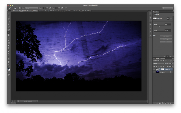
The next step is to apply our newly created texture to our subject photo and create our final piece of photographic art. To do this you pretty much do the same process as we went through above. Bring your texture and your photo into Photoshop as layers, set your photograph as the background and then blend your texture into your photograph.

Screen Shot 2013-07-14 at 4.44.02 PM

Click to Enlarge

For this photograph I dropped my texture in on top of the lightning bolt photo, popped it to an overlay and reduced the opacity slightly. I then applied a quick mask to remove some of the brightness that was created around the base of the lightning bolt, and finally converted the textured layer to black and white to let the true colors of the background layer show through.

I realize this style of processing photography isn’t for everyone and I might be pushing the limits of creativity and for some this might be too much, but I do find it fun and enjoyable to go about creating these images and I hope you’ve learned something today and maybe even got inspired to try it yourself.

A Few Examples Before I Go

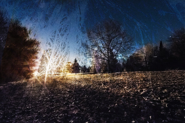
In closing I’d like to share with you a few examples of what I’ve been able to come up with so far and I hope you enjoy what I’ve created.

Some Fun with Textures

TexturedExample3

lightningtextured

Post originally from: Digital Photography Tips.

Check out our more Photography Tips at Photography Tips for Beginners, Portrait Photography Tips and Wedding Photography Tips.

How To Create Your Own Unique Textures and Apply Them To Your Photography


Digital Photography School

 
Comments Off on How To Create Your Own Unique Textures and Apply Them To Your Photography

Posted in Photography


Enhance Color, Apply Lomo, High Contrast Effect in Photoscape

18 Oct

Make you photos look more prefessional by enhancing color and apply high quality color, contrast effects like cross-process etc. in Photoscape. Details : www.snaphow.com

Facebook Page: www.facebook.com Twitter: www.twitter.com Ask TutCast: www.tutcast.com This video will show you a few ways you can repair old photos in Photoshop! Music: Kevin MacLeod – www.incompetech.com Photo by Carolyn Williams – www.flickr.com
Video Rating: 4 / 5

 
Comments Off on Enhance Color, Apply Lomo, High Contrast Effect in Photoscape

Posted in Retouching in Photoshop


Microsoft PowerPoint 2010 – Apply Artistic Effects Including Blur, Cement, Chalk Sketch, Film Grain

25 Sep

Apply artistic effects to pictures / photos in a PowerPoint 2010 presentation without loading an external image editor.

Artistic effects can help photographs stand out in a presentation, and in some cases when needed, blend in. Instead of editing images using an external editor, Microsoft PowerPoint 2010 comes built-in with a variety of effects.

For example, “Blur” may be useful when trying to place text on top of a picture, making it more readable. “Glow Edges” makes a photo look as if it is lit in neon. “Light Screen” creates a cubist / 8-bit / blocky image. “Paint Brush” may alter some photographs to look instead like paintings. PowerPoint comes built-in with 22 such artistic effects….

Read more at MalekTips.
New Computer and Technology Help and Tips – MalekTips.Com

 
Comments Off on Microsoft PowerPoint 2010 – Apply Artistic Effects Including Blur, Cement, Chalk Sketch, Film Grain

Posted in Technology


Photoshop Tutorial, Retouch Skin : How to apply a fake tan

21 Feb

Follow me on Twitter ! www.twitter.com DIGG THIS IF YOU LIKE ! 🙂 In this tutorial i show you how to apply a fake tan very easily without getting into not complicated methods anyone can do this and takes seconds ! Deivid Joe Colkevicius Cimg Creative Ice Media Group
Video Rating: 4 / 5