RSS
 

Posts Tagged ‘apply’

5 Ways to Apply Artistic Expression for Memorable Photography

21 Dec

The post 5 Ways to Apply Artistic Expression for Memorable Photography appeared first on Digital Photography School. It was authored by Jeremy Flint.

Rickshaw rider, Kathmandu, Nepal © Jeremy Flint

Photography can be a wonderful way to express your creativity and artistic flair. Artistic expression is all about you and allowing yourself the freedom in your photography to satisfy your visual curiosity. Fundamentally, it is a means to fuel your imagination and a way of being artful, according to your mood. The subject matter is entirely your choice, whether you decide to capture wildlife, landscapes, architecture or abstract scenes.

You can apply photography techniques that inspire you, from motion blur to creative arrangements. Alternatively, work with what you find.

Here are 5 ways you can use artistic expression in your photography to capture some memorable shots:

1. Sharpness and blur

Freezing the action of your chosen subject can be achieved with short exposure times and result in sharper images. Photography doesn’t have to be about capturing the beauty of a scene in its sharpest and most natural form. You can be playful in your creations and apply a bit of artistic blur from time to time. Adding artistic blur is a great way to put some art and movement into your photographs.

Sharp images are dynamic and provide an obvious and real static representation of a scene. However, using blur can make an image more compelling. Using a slower shutter speed helps to provide motion and movement to photographs while adding drama and vitality.

Hyena Pan, Tanzania © Jeremy Flint

2. Light trails at night

At nighttime, as darkness falls, lights come on and provide excellent subjects to capture. Roads become lit by light trails from vehicles that give unique patterns.

© Jeremy Flint

Fairgrounds are great for artistic shots. This is due to their unique atmosphere, as well as the fairground’s color and excitement. Be inventive and artistic in your approach to capturing these scenes. Look for elements such as the vibrant and attractive Christmas lights and car light trails as shown in the image below.

London Xmas Lights © Jeremy Flint

3. Shoot a silhouette

While many shots taken during daylight hours tend to show all details in an image, get creative by shooting a silhouette. You can achieve a silhouette by mainly photographing a subject’s outline and making it featureless against a bright background.

Stonehenge, Wiltshire, UK © Jeremy Flint

In the image example here, I have used the famous landmark of Stonehenge in the UK with a vibrant sky behind. Make sure you choose a strong subject for a silhouette such as the distinct shape of a person or animal. The best way to shoot a silhouette is to position your subject in front of a bright background and to expose for the background, rendering your subject dark and underexposed.

© Jeremy Flint

Silhouettes are an interesting way to convey drama and energy into your images and makes them stand out.

4. Shoot an abstract

Abstract photography can be made up of several characteristics. Usually, abstraction takes place when a photographer focuses on a section of a natural scene isolating it from its context. This could be a color, texture, line, shape, geometry, symmetry or reflection of a scene. The photographer changes our perception of the real and familiar subject or object. The viewer doesn’t immediately recognize it.

Abstraction facilitates a move away from the specific, the concrete and the obvious. You achieve abstraction by isolating, or eliminating an object and its texture, shape, and form. Color and tones can become strong elements in an abstract photograph.

Slot Canyon, Arizona, USA © Jeremy Flint

Details can be used to create abstract photographs by moving closer to our subjects. Alternatively, you can achieve abstraction through movement. Through subject motion, photographer motion, camera movement or a combination of any of these, information gets reduced, and impressions are created. For example, moving the camera upwards or downwards when photographing trees leaves behind colors, patterns, and lines.

5. Find patterns

Patterns are a wonderful way to add interest to your abstract photography. Our day to day visual life consists of patterns, shapes, and textures that evoke a certain mood or atmosphere.

We are visually drawn to patterns because they provide us with a graphic element that looks appealing and interesting.

© Jeremy Flint

Photographing patterns can make for good compositions. For example, you could show a small area of a broader subject. Macro lenses can be used to get in close and add more interest.

Conclusion

Learning to apply artistic expression in your photos can be a great way to create intriguing and unusual images that make a viewer stop and think about your image. Try out the 5 techniques outlined above and share your images with us below.

The post 5 Ways to Apply Artistic Expression for Memorable Photography appeared first on Digital Photography School. It was authored by Jeremy Flint.


Digital Photography School

 
Comments Off on 5 Ways to Apply Artistic Expression for Memorable Photography

Posted in Photography


How to Apply Compositional Theory to Still Life Photography

21 Nov

The so-called ‘rules of composition’ aren’t so much rules as guiding principles.

Rules of Composition for Still Life Photography-Darina Kopcok-DPS

Why? Because not every compositional tool works for every image. Art is subjective, and what works well for one image may not work so well for another.

That being said, good photography involves not only technical skill but also choosing the right composition.

It’s especially true in still life photography, where composition can really make or break an image. So here are some tips on how you can apply these compositional ‘rules’ to your still life photography.

Rules of Composition for Still Life Photography-Darina Kopcok-Dps

The Golden Ratio

If you’re new to photography, you may have not heard of the ‘Golden Ratio’ (also known as the ‘Divine Proportion,’ the ‘Golden Mean,’ and the ‘Greek Letter ?’).

Don’t worry if you haven’t heard of them. While artists and architects have been using this principle for hundreds (if not thousands) of years, I was well into my stint at photography school before I’d even heard about it.

It’s a mathematical expression that can describe a wide variety of phenomena found in nature. But when it’s used in art, the results are harmonious and aesthetically pleasant compositions.

You can find the Golden Ratio everywhere – from the works of Michelangelo to the great Egyptian pyramids to a nautilus shell. It’s also found in the human face and body, and even in our DNA.

Rule of Thirds Grid

Most photographers are familiar with the ‘Rule of Thirds.’ This compositional guideline divides an image into nine equal sections using two horizontal and two vertical lines, just like a tic-tac-toe board. The important elements in the scene should fall along these lines or at the points where they intersect.

Rule of Thirds

The rule of thirds works well for images such as landscapes but can be limiting for still life photography. The resulting images often feel awkward or unbalanced.

The Phi Grid

The ‘Phi Grid’ uses a similar concept but is much more powerful than the Rule of Thirds. Its center lines are closer together and express the Golden Ratio of 1:1:618.

Phi Grid

The Phi Grid is one expression of the Golden Ratio.

Rules of Composition for Still Life Photography-Darina Kopcok-DPS

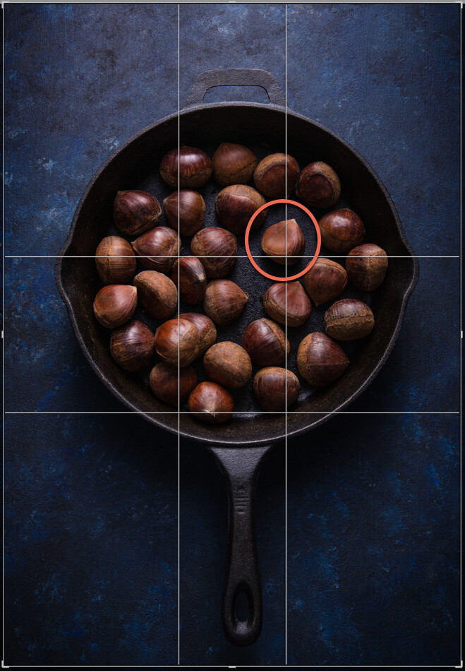
This image uses the Phi Grid. Notice how the chestnut in the focal point is placed differently to the others, drawing the eye.

Fibonacci Spiral

Another expression of the Golden Ratio is the Fibonacci Spiral, which exhibits the same numerical pattern that makes up the Golden Ratio.

You can use this numerical pattern to draw a series of squares. If you draw an arc from one corner to the opposite corner in each square starting from the smallest square, you’ll end up with the Fibonacci Spiral.

This is a guiding principle you can use in your still life photography. By setting your subjects along a curve rather than a straight line you create flow and movement, and help guide the viewer’s eye through the image. It works particularly well in overhead shots that have several elements in the frame.

You can flip or turn the spiral so long as your focal point falls in the smallest part of the spiral. Other important elements should be placed along the curve.

Fibonnaci Spiral

Golden Triangle

Using triangles is a powerful way to create tension in a still life image, and retain the attention of the eye within the frame.

Here’s an image that expresses this principle.

Rules of Composition for Still Life Photography-Darina Kopcok-DPS

Notice the diagonal line going from one corner to the opposite, and the lines meeting that diagonal from the other corners? Where the lines meet are your points of interest, which you should use to place your focal point and divide your frame.

While horizontal and vertical lines suggest stability, triangles add a sense of flow and movement.

You can compose your image to imply triangles, rather than being strict about composing them exactly this way.

Other Helpful Principles

Rule of Odds

In still life photography, having an odd number of elements in a frame is more visually interesting than having an even number of elements.

Odd numbers create harmony, balance and a resting point for the eyes, whereas even numbers compete with each other and can divide our attention.

Aim to have three or five elements in your image. You can have more, but the mind has trouble registering higher numbers meaning your photograph will not have the same effect. If you do have more, put them into groups of odd numbers wherever possible.

Rules of Composition for Still Life Photography-Darina Kopcok-DPS

Odd numbers create tension

Negative Space

Positive space is the area your subjects take up.

Negative space is the empty area where the eye can rest.

Negative space can provide the feeling of movement, and emphasize your subject. Without any space for the eye to rest, a picture can feel chaotic or claustrophobic.

You see negatives space a lot in magazines or product packaging, where it’s used for text placement.

Rules of Composition for Still Life Photography-Darina Kopcok-DPS

Color

You may not think of color as a compositional tool. But it’s actually a very important one. It evokes emotion and creates the mood of the photograph.

Cool and dark colors such as navy blue and black recede, while light and warm colors such as yellow bring objects forward.

Color combinations can be monochromatic, or any of those found on the color wheel.

One of the most powerful combinations is complementary colors (i.e. colors that are directly opposite each other on the color wheel). Blue and yellow is one such combination, which you see a lot in food photography.

Take into account the color of the background or surface you’re shooting on. Colors that are too bright can detract from your subject. Make sure your background matches the mood you’re trying to create and works harmoniously with your chosen elements.

Rules of Composition for Still Life Photography-Darina Kopcok-DPS

Complementary colors make your images pop

In Conclusion

It can take years for a photographer to learn to shoot intuitively using compositional principles. Visualizing your focal point on a Phi Grid is one thing, but visualizing the Fibonacci Spiral while you’re shooting may be more difficult.

Thankfully, with still life photography, you can tether your camera to your computer or use its Live View function to estimate where your subject and focal point should fall.

Editing software such as Lightroom and Photoshop can help you place the various elements in your frame with overlays of compositional guides. You can shoot wider than you need for the final result and crop in post-processing.

The more you implement these compositional guidelines and work with them in post the more you’ll internalize them, which can only improve your still life photography.

The post How to Apply Compositional Theory to Still Life Photography appeared first on Digital Photography School.


Digital Photography School

 
Comments Off on How to Apply Compositional Theory to Still Life Photography

Posted in Photography


Three Ways to Apply Tonal Effects in Photoshop

13 Jun

We are used to thinking about photography in terms of color or black and white, but before we arrived here, though, there were a series of processes that resulted in images being monochrome. In this tutorial, I’ll show you how to get those looks so you can think outside the box and achieve different tonal effects that will make your photos unique.

Intro Tonal Effects Photoshop Tutorial

Adding a tonal effect can give your photos from different collections a unified look. It can also help to set the atmosphere of a scene, or simply give a nostalgic and antique look. Before photography became as we know it to be today, there were many experiments and formulas chemists used that became popular throughout history.

Many of them had a particular color. The most popular are sepia and cyan and now it’s possible to achieve these and any other tonal effect with just a few clicks. I’ll show you three different ways to achieve it so you can choose which method suits you best.

#1 – SOLID COLORS

First of all, you need to work with a black and white image. There are many different ways to achieve this in Photoshop. The one I’m choosing is Menu > Image > Adjustments > Black and White because it gives you a lot of control.

Three Ways to Apply Tonal Effects in Photoshop

Once you have your starting image as black and white, you need to add a solid color adjustment layer. To do this go to the Layers palette and click the adjustment layers button on the bottom and choose the Solid Color option from there.

A pop-up window will open where you can choose the color you want for that layer. There’s no right or wrong here, it’s a matter of taste but for a sepia tone go somewhere in between the yellow and the red and when you’re happy just click OK.

Solid Color Tonal Effects Photoshop Tutorial

Now the color should have covered the entire image, which is normal as you added a solid color. But you still need to merge it with the image, so open the blending options menu from the top of the Layers palette and choose Soft Light.

Solid Color Soft Light Tonal Effects Photoshop Tutorial

You can also check out the other blending possibilities to see if there’s something that suits you better, but Soft Light usually works best for me. You can make a final adjustment on the layer opacity if you think it needs tweaking and that’s it!

Sepia Tonal Effects Photoshop Tutorial

#2 – ADJUSTMENT LAYERS

To achieve a cyan tone on your photo you need to start with a black and white image the same as the previous process, so I’ll use the opportunity to show you another way of converting your color photo into black and white.

Go to the Layers palette, add an adjustment layer. and from the drop-down menu choose Black and White. On the Properties window, you’ll have the same adjustments as the previous method as I used above.

The difference is that now you’ll have the black and white adjustment on a different layer so you can come back and tweak it or change the opacity at any time.

Adjustments Layer BlackandWhite Tonal Effects Photoshop Tutorial

Next add another adjustment layer, this time choosing Levels from the menu. In the Properties window, you can see a histogram of your image that shows you the blacks, whites, and mid-tones in your image and a corresponding slider to each of them for you to adjust.

Start moving the sliders to increase the contrast of your image as this will give a better result when you apply the cyan color to it.

Adjustments Layer Levels Histogram Tonal Effects Photoshop Tutorial

The final step you need to do is to add a third adjustment layer, this time using the Hue/Saturation option. On the Properties window move the Hue slider towards the blue end until you find a tone that you like, around the 215 is usually pretty good. If you feel the blue is too intense just decrease the saturation value a little until you are satisfied with the result.

Adjustments Layer Hue Saturation Tonal Effects Photoshop Tutorial

Now you have a snowy photo with a nice cold tone to boost the mood!

Cyan Tonal Effects Photoshop Tutorial

#3 – DUOTONE

If you are thinking that sepia or cyan are very nice effects but it would be even better if you apply both or even more, you don’t have to worry. Photoshop has thought about that too.

First, you have to open your black and white image (or convert your image to black and white as we did above). Then go to Menu > Image > Mode and choose the Duotone option. This is correct even if you want three or four tones, you will modify that later.

Duotone Tonal Effects Photoshop Tutorial

A pop-up window will open where you can choose the number of inks (tones) that you want in your image just by clicking on the drop-down menu. For this example, I’m choosing Tritone so three fields will be available to choose the inks.

Triotone Tonal Effects Photoshop Tutorial

You can set the color of each ink by clicking in the second square which will open a pop-up window with a color picker. So just click on the tone you like and hit OK. Then name it in the field to the right of the ink. Repeat this process for each ink color.

Duotone Color Picker Tonal Effects Photoshop Tutorial

Now the colors you selected are all covering the image in the same way. But you can modify that by choosing which ink will affect more which tones. For example, I choose the magenta for the darkest tones and the yellow for the lighter tones, but you can choose any tone and any adjustment you want.

Just click on the first square which will open the Curves window. By default, it will have a diagonal straight line that goes from 0 (black) to 255 (whites) you can experiment moving it all you like until you get the look of your image right.

Duotone Curves Tonal Effects Photoshop Tutorial

Because of all the possibilities, this is the hardest technique but also the more personalized one that will give you a very unique result. Try it out and let me know in the comments how it goes!

Duotone Tonal Effects Photoshop Tutorial jpg

Your turn

So there you have three methods for applying tonal effects using Photoshop. Do you use any of these for your images? Which method do you prefer? Do you have another technique you like? Please share your tonal effects images and ideas in the comment area below.

The post Three Ways to Apply Tonal Effects in Photoshop appeared first on Digital Photography School.


Digital Photography School

 
Comments Off on Three Ways to Apply Tonal Effects in Photoshop

Posted in Photography


How to Apply Creativity to Your Images with Texture Overlays Using Luminar

28 Nov

How to Apply Creativity to Your Images with Texture Overlays Using Luminar

Layers of fun

One advantage that Luminar has over the average Raw processor is the ability to work with Layers. “What is a layer?” I hear you ask.

Well, your basic image is a single layer, like a sheet of paper on a table. Adding another layer is akin to adding another sheet of paper on top. With layers, you get the benefit of being able to control the layer opacity (the transparency effectively) as well as what parts of the layer are shown – a bit like choosing tracing paper or cutting holes out of the paper.

How to Apply Creativity to Your Images with Texture Overlays Using Luminar

Think of layers like a stack of paper. By cutting out parts of the sheet you can see the one below, or like with tracing paper, you can see through to the layer before.

Originally you’d need to erase the bits of the layer you didn’t want showing, which could be messy if you made a mistake erasing. These days you’d use a layer mask instead. A layer mask is a greyscale map running from white, where everything is visible, to black, where everything on the layer is hidden. Varying shades of gray indicate how visible a part of the layer is or the mask opacity. Lighter is more visible.

There’s a mantra I learned many years ago that helps you remember. “White reveals, and black conceals”.

The beauty of Luminar (by Macphun, soon to be Skylum) is that it hides some of the mechanics of this because rather than painting in black or white, you have a brush that either paints in, or erases the mask. It’s really great!

When you have a few layers together, the combined set of layers is called the layer stack. Working in layers allows you to apply effects to only certain parts of your photo, or to combine more than one photo into a more interesting composition.

Beginning

Let’s open Luminar and choose a photo. Click Open Image to begin.

How to Apply Creativity to Your Images with Texture Overlays Using Luminar

Luminar opening screen.

Navigate to your photo and select it. This process will be easier when the new DAM (Digital Asset Management) module for Luminar 2018 comes next year. I’m going to work with this shot of an old cottage.

How to Apply Creativity to Your Images with Texture Overlays Using Luminar

Original image.

Making a Layer

Luminar provides a few options for creating new layers. In the right panel, you have the Layers panel. To make a new layer, click the + icon in the panel header and select one of the following options:

How to Apply Creativity to Your Images with Texture Overlays Using Luminar

Layers: click the plus symbol to make a new layer.

  • New Adjustment layer; which creates a layer that contains only the filters that you add.
  • Create Stamped Visible Layer; which copies the results of all the underlying layers (combining them) to a new flattened layer.
  • New Original Layer; which copies the base layer on top of the currently selected layer.
  • Add New Image Layer; which allows you to add any other image to the layer stack. This is the one that allows you to add texture and other files!

Add a texture file

Luminar doesn’t store textures, but you can use any texture file you like. Personally, I keep my favorite textures in a folder on Dropbox for easy access from anywhere, but you can use any cloud service you like for this.

From the Layer options, choose Add New Image Layer and navigate to your textures folder. Choose the texture you want to add to the current photo. Viola. It’s loaded.

How to Apply Creativity to Your Images with Texture Overlays Using Luminar

Texture image.

Now obviously the texture file will load over your original image. This is fine, you’ll fix this shortly. But first, you should check that the file fits how you like. By default, Luminar will make it fit over the layer below, but you’re not stuck with it.

You have three options in the Layers menu for this. Right-click on the layer and from the Image Mapping option in the menu, choose from Fill, Scale to Fit, or Fit (as seen below). If you don’t like how these look, you have another option:  the Transform tool.

How to Apply Creativity to Your Images with Texture Overlays Using Luminar

You can pull and drag your textures file into shape as required. It doesn’t have to retain its original aspect ratio as it’s adding to your original image and isn’t the actual focus of the final composition. In my case, the texture looks fine for now in regards to size.

Blending Modes

The next step is to go through the different blending modes to find one that suits the images best. Different ones work for different images, so it’s best to experiment. Overlay and Soft Light tend to get used a lot, but often Multiply or Screen can work too. Even Hard Light can be perfect sometimes.

How to Apply Creativity to Your Images with Texture Overlays Using Luminar

Overlay Blend Mode.

How to Apply Creativity to Your Images with Texture Overlays Using Luminar

Soft Light Blend Mode.

Whichever one you use, you’ll probably find that the effect is really strong. That’s fine because you’re working with layers, you can just reduce the opacity until the texture looks good.

For this image, I thought both Multiply and Color Burn looked great. I loved the saturation that Color Burn gave to the photo, but reducing the opacity to bring back some shadow detail removed too much of that. For that reason, I went with Multiply.

How to Apply Creativity to Your Images with Texture Overlays Using Luminar

Multiply Blend Mode.

How to Apply Creativity to Your Images with Texture Overlays Using Luminar

Color Burn Blend Mode.

Masking

You may not want the texture to appear on all parts of the photo. So you’ve got two options. Paint in the texture, or just paint out where you don’t want it. To access the masking functions, click on the brush icon on your texture layer. This opens a menu allowing you to choose the type of local adjustment you want to apply. Your options are Brush, Radial Mask, or Gradient Mask. You can also go with a Luminosity mask. For this image, the brush is the best option.

How to Apply Creativity to Your Images with Texture Overlays Using Luminar

Access the masking tools.

Once the brush is selected, the options appear at the top. I’m going to remove the texture from the house. If you want to remove (hide) part of a layer, click the Erase option on the Brush settings menu. Set Size, Softness and Opacity to taste as you paint.

How to Apply Creativity to Your Images with Texture Overlays Using Luminar

You will see this menu at the top of your screen when you active the Brush tool. Choose Erase to paint away effects, choose Paint to add it in. This allows you to make corrections if you go too far with your painting as well.

Once you’re finished, click Done on the end of the brush options bar.

How to Apply Creativity to Your Images with Texture Overlays Using Luminar

Adjusting the Texture

One good thing about Add Image is that the layer you’ve created has full access to all the Filters in Luminar. Let’s say you’re using either the Overlay or Soft Light blend mode. Any part of the image that’s mid-grey will be unaffected by the texture.

If your texture is dark, or light, the image will reflect this. You can easily change this by adding a Tone filter and adjusting the exposure. If the color from the texture is too strong, you can use Saturation to reduce this or use Hue Shift to change it.

How to Apply Creativity to Your Images with Texture Overlays Using Luminar

Apply filters to the texture layer to fine tune it.

Finishing the image

Of course, you can also apply filters to the original image. Being a landscape, this would be a good time for you to try the Landscape workspace. When you click on the original image, layer Luminar hides the layers above it. To get to the workspaces, click on Clear Workspace and choose Landscape from the menu.

How to Apply Creativity to Your Images with Texture Overlays Using Luminar

Landscape workspace.

Using the suggested filters in the workspace, it’s easy to add back the saturation I saw when I used Color Burn blending mode on the texture.

How to Apply Creativity to Your Images with Texture Overlays Using Luminar

To activate the texture again, simply click on the texture layer.

How to Apply Creativity to Your Images with Texture Overlays Using Luminar

Saving the file

Once you’re done, you’ve got a few options for saving your image. Using Save will create a .lmnr file, which is Luminar’s native editing file format – this will retain all layers and filters you’ve applied (similar to a PSD file in Photoshop).

By using Export instead, you can choose a range of other options, like JPEG, PSD or TIFF.

How to Apply Creativity to Your Images with Texture Overlays Using Luminar

Export options.

Using Filters to add Texture

You’re not forced to use a layer to add textures with Luminar though. They also have a handy new filter called Texture Overlay. Pretty much everything you can do on a layer can be done with this filter. The only thing you can’t really do is rotate the texture at a random angle via Transform, but it’s very rare that you’d ever need to do this.

Start with the image you want the texture on again. Click the blue Add Filter button. Use the Search Bar in the Filters Catalog menu that appears to find the “Texture Overlay” filter. Click to add it.

The Texture Overlay filter added. These are the options and sliders for this filter.

To add your texture file, click “Load Texture…” This will open your file on top of the background photo. The default amount of 50, means you can see the mix of the original image and the texture at 50% opacity; it’s also in Normal blend mode.

The texture added at the defaults – 50% and Normal blend mode.

The Amount control can also run to negative figures, so you can add an inverse version of the texture, which is a cool feature. Here’s how -20 on the Amount slider looks.

If your texture is a different aspect ratio to your original image, you can use Keep Aspect Ratio to force it to fit the image. The two buttons below this allow you to flip the texture file horizontally, or vertically, or both (they appear blue when applied so you know if it’s been flipped).

Zoom will let you scale the texture file to fit the features of your underlying photo. Below Zoom is the Blend mode menu. From here choose the blend mode that suits in the same way as with our first method. Again Color Burn looks great at 100 Amount.

The effect is still a little strong, so you could pull it back by reducing the Filters Amount slider. Here 67 looks great.

Amount = 100, Filters amount = 67

Masking the Filter

Filter masking is really straightforward with this method too. You simply hover over the panel header to reveal the brush icon. Click on this to choose the mask type: Brush, Radial or Gradient. Choose Brush to apply your mask in a specific area.

Filter masks are useful and are applied the same way as a layer mask.

If you’re only looking to remove a small area of texture, switch to the Erase Brush in the brush toolbar that appears above the photo.

In this photo, I’ve brushed the texture away from the cottage.

You can add as many texture overlay filters as you like, just remember that the Filters Amount affects the whole filter set.

Getting Texture files

You can get plenty of commercial texture packs to get you started, but there are free ones out there too. When you’re out and about, consider capturing any textures you find interesting to try out yourself!

Please share your finished textured masterpieces created with Luminar in the comments below. We’d love to see what you make.

Disclaimer: Macphun is a dPS advertising partner.

The post How to Apply Creativity to Your Images with Texture Overlays Using Luminar by Sean McCormack appeared first on Digital Photography School.


Digital Photography School

 
Comments Off on How to Apply Creativity to Your Images with Texture Overlays Using Luminar

Posted in Photography


How to Make and Apply a Bokeh Overlay Using Photoshop

08 Jun

Bokeh overlays are an excellent way to add a trendy stylized look to your portraits. You can purchase overlays, but I would instead suggest making your own. It’s easy, fun, and best of all, it’s free!

In this video, I take you through the process of making and applying a bokeh overlay to a portrait using Photoshop. You will also learn to how to color tone your image to create a stylized look.

How to Make Your Own Bokeh Overlays

You can create bokeh overlays from almost any photo that is not too bright, and which has good contrast. The photos themselves do not have to be great photos at all; they can even have boring subjects and be totally out of focus.

To demonstrate the power of this technique, we will work with two bad cell phone pictures; a photo of a hamburger and a photo of a street.

How to Make and Apply a Bokeh Overlay Using Photoshop

It’s a good idea to look through your phone and experiment with the photos that you already have.

To create a bokeh overlay, place the image into your working document by going to File > Place Embedded. Once the image is in the Layers panel, right-click on it and select Convert to Smart Object. This will make it so that any filter that you apply is non-destructive and you can edit it later if you need to.

To blur the image, and get the bokeh effect, go to Filter > Blur Gallery > Field Blur.

Start by dragging the Blur slider to the right to make the image blurrier. In most cases, you’re going to want to keep the bokeh small, so don’t take the blur slider past 200px.

How to Make and Apply a Bokeh Overlay Using Photoshop - field blur

You can then fine-tune the effect by adjusting the Light Bokeh, and the black and white points in the Light Range. You can introduce more colors to your bokeh effect by dragging the Bokeh Color slider to the right.

Here are my results:

How to Make and Apply a Bokeh Overlay Using Photoshop

How to Applying a Bokeh Overlay to Your Photo

Once you have made your bokeh overlays, you can apply them to any image by using layer Blending Modes.

For this type of effect, the Screen Blending Mode will be the best to use in most cases. But you can try any of the Blending Modes in the Lighten Category to see if they can give you a result that works better for your image. If you’re not familiar with Blending Modes and how they work, then check out this comprehensive look at Blending Modes where I explain each one in detail.

The Screen Blending Mode allows you to keep the bright pixels of an image and hide the dark ones. In this case, the bokeh is bright, so it will stay, and it will hide the darker background.

How to Make and Apply a Bokeh Overlay Using Photoshop

How to Use Layer Masks to Hide Problematic Areas

Some overlays will not be perfect matches for your photos. Sometimes the bokeh may cover up important parts of the portrait, such as the eyes or even the entire face. Create a layer mask and paint on the mask with black to hide those problematic areas.

When you paint with black on a layer mask, you hide pixels. To reveal them again paint on the mask with white. Painting with different levels of gray will give you different levels of transparency.

How to Make and Apply a Bokeh Overlay Using Photoshop

Use Levels to Change How the Bokeh Blends

The bokeh overlay may not give you the best results by simply changing the Blending Mode to Screen. In many cases, you will have to modify the luminosity of the layer to change how the bokeh blends. Remember, the Screen Blending Mode reveals bright pixels and hides dark pixels.

By using a Levels or Curves Adjustment Layer, you can control the brightness of the layer which will control how much of the bokeh is revealed. When using an Adjustment Layer add a Clipping Mask to make sure that the changes only affect the bokeh layer. To clip an Adjustment Layer to the layer blow it, you can press Command/Control+Option+G.

How to Make and Apply a Bokeh Overlay Using Photoshop

Apply a Color Tone to the Image

To finalize the stylized effect, you can color tone your image by using a Selective Color Adjustment Layer.

Under the Colors dropdown menu select Blacks and slide the Cyan slider to the right, and move the Yellow slider to the left to subtract yellow. Doing so will add a blue tint to the shadows, and it will give your image a retro feel.

How to Make and Apply a Bokeh Overlay Using Photoshop

You can watch a video of the whole process below:

Conclusion

Here is the before and after comparison of the image.

Before tutorial

Before

Finished tutorial

After

There it is, a quick and easy way to make and apply your own bokeh overlays. Try it and please share your images in the comments below.

The post How to Make and Apply a Bokeh Overlay Using Photoshop by Jesus Ramirez appeared first on Digital Photography School.


Digital Photography School

 
Comments Off on How to Make and Apply a Bokeh Overlay Using Photoshop

Posted in Photography


4 Things You Can Learn From Film and How to Apply Them to Your Digital Photography

15 Apr

Since the introduction of digital cameras, photography is becoming more and more popular amongst everyone. This is largely due to the fact digital has dramatically reduced the cost of taking photos, as they no longer required to be developed, and the recording media (SD or CF cards) can be reused. Another fantastic advantage of digital, is the instant replay it gives you of the photo just taken, giving you the option to correct any flaws in the image. This is something that could not be done with film, and each photo taken would cost money; regardless of how great it was, or was not.

Digital Film

Digital technology has come so far in the last several years that it is out-performing film on almost every level; for example, camera’s can now go up to ISO 3.2 million – an ASA (film equivalent to ISO) level that was never even considered during the films days.

But does this mean that film is useless, and has nothing to offer? Absolutely not. Regardless of whether film is making some sort of a resurgence or not, there are still many things that film can teach you about photography, that digital simply cannot. Here are some thing that shooting with film can teach you better than what digital capture can do:

1. SELF CONFIDENCE

With the immediacy of the feedback that digital cameras provide you, it is all too easy and tempting to continually check your camera’s LCD to see how your photo has turned out. This tendency to keep looking at the LCD is often referred to as chimping. You may chimp for various reasons, ranging from ensuring your photo is correctly exposed (the most common reason), in focus, or seeking self-gratification that you’ve done a good job.

Now, imagine you were photographing with film. You would not be able to see your photos straight away; you’d have to wait a week or even two! You would not be able to see if the photo was correctly exposed, or pat yourself on the back about getting a great frame – at least not right away!

Film taught photographers to read the light and tones within their environment, and to learn how to use their tools correctly. This built confidence within photographers to trust in their own abilities and decisions. It meant that photographers would worry less about receiving positive reassurance on the photo they’d just taken; they knew that they had exposed and focussed correctly and kept going. There was no ,”Hold on, I’ll just check to make sure your wedding dress is correctly exposed”, or “I missed that shot because I was checking my exposure.”

Fredrik Holmberg

By Fredrik Holmberg

So why is chimping a bad habit? Because it says that you are not that confident in your own abilities and judgement, and you need the constant reassurance that you are doing a good job. It results in you potentially missing a great opportunity for a photograph, as your attention has now shifted from your subject to your camera. Wedding, sport, and action photographers may miss a critical moment, a defining moment, if they are always looking at their screen. If you’re looking at your screen, you’re not ready for the moment and you most certainly are not taking photos.

For portrait photographers, taking your camera way from your eye breaks that connection between yourself and your subject. It also says that you’re more interested in the result than you are them.

Apply this to your digital photography

To increase your confidence in your own abilities, I challenge you to only look at your LCD once or twice the next time you’re out photographing. These times should really only be to help you achieve the exposure you wish. If the lighting conditions are consistent, there is no reason you should need to look at your LCD again.

2. PUSH YOURSELF MORE

All too often you may see an outstanding result on the back of your camera. You stop taking photos because you are convinced that it cannot be bettered; only to see your friend take a better image right next to you. The instant replay of your work on the back of your camera can often prevent you from pushing yourself just that little bit further, and getting that great shot. That instant replay didn’t exist on film cameras, so photographers didn’t know if they had “the shot” or not; they had to keep pushing themselves to ensure that they did get it.

Calvinnivlac

By calvinnivlac

If you’re tempted to keep looking at your screen, I’d encourage you to turn preview or replay to off in your camera menu. If you are still tempted to press play and have a sneaky peek, tape a little piece of paper or card over the screen so you cannot see the image.

Apply this to your digital photography

Do not be tempted to keep looking at your screen, and being satisfied with what you see after the first one or two frames. Keep going. Perhaps you could try different angles, settings, lighting etc., but you should always keep pushing a little further to get a better shot. Even if it is just three or four additional frames.

3. YOU THINK MORE

Taking a photo with digital cameras costs nothing; just the minuscule amount of electricity the camera needs to operate and a little bit of storage. Memory cards can hold thousands of photos – far more than the 36-exposure roll of film. But that limitation of 36 exposures can teach you something that digital cannot – discipline.

John Goode

By John Goode

Think about the last time you went out taking photos. How many did you come back with? I would bet that you might have hundreds of photos to go through, maybe even thousands. Now, divide that number by 36. That’s how many rolls of film you went through. When you have such a limited number of exposures until you have to change your roll (which takes a lot more time than switching memory cards, by the way), you don’t just take photos every time you see something you like. You look at the subject or scene and consider it more carefully. In doing this, you evaluate if it is indeed worth taking a photo of or not.

Apply this to your digital photography

Try shooting with a smaller memory card like 1gb, or even smaller if you can find some old cards. Limit yourself to 36 shots per day or per outing. Do not delete images as you go, only fill the card or your limit of shots and no more. It will help you be more intentional with your shooting. If you are always deleting images, that defeats the purpose of having a smaller card!

4. GREATER VARIETY IN YOUR WORK

Have you ever gone through photos that you’ve taken and realized that you took so many images of the same thing, with little or no difference between many of them? Do you find it boring going through your photos sometimes because there is such little variation in so many images? With film, each frame cost more money than digital, so photographers made each frame count.

Phil

By Phil

Apply this to your digital photography

Do you really need 10 photos of the same object, from the same angle? No, you don’t – those 10 frames are all the same, so therefore are really just one photo taken ten times. You can still have 10 photos of the same subject, but vary them; try different angles, focal length, exposures. Even try photographing it with a different lens (wide angle versus telephoto). Make each frame different to the next, and make each frame count. Not all the images will work out, but you will have much more variety in your work from the same number of subjects. It will also help you greatly in the future when deciding on what approach to take for your next subject.

Summary

So there you have it, some simple and practical things that shooting with film can teach you better than digital. If you have a film camera laying about collecting dust, why not pick it up, put a fresh roll of film in (extra points if you shoot on slide film) and start using it? It will be quite a strange sensation using a film camera and the the images you take may not be that fantastic to start. Should you stick with it, it will help you on your journey to improving you photography and in my experience, nothing is more satisfying that nailing a photo on film over digital.

googletag.cmd.push(function() {
tablet_slots.push( googletag.defineSlot( “/1005424/_dPSv4_tab-all-article-bottom_(300×250)”, [300, 250], “pb-ad-78623” ).addService( googletag.pubads() ) ); } );

googletag.cmd.push(function() {
mobile_slots.push( googletag.defineSlot( “/1005424/_dPSv4_mob-all-article-bottom_(300×250)”, [300, 250], “pb-ad-78158” ).addService( googletag.pubads() ) ); } );

The post 4 Things You Can Learn From Film and How to Apply Them to Your Digital Photography by Daniel Smith appeared first on Digital Photography School.


Digital Photography School

 
Comments Off on 4 Things You Can Learn From Film and How to Apply Them to Your Digital Photography

Posted in Photography


8 Quotes From Master Photographer Ansel Adams and How You to Apply Them to Your Photography

22 Jan

The technology of photography has been evolving at a very rapid rate. Most of our cameras are almost obsolete by the time we purchase them! But one thing about photography hasn’t changed over the years and that is the art of photography. We can learn so much about the that from the masters of yester-years. Ansel Adams was one of these great masters, best known for his iconic black and white images of the American West. Let’s review some quotes from Mr. Adams and consider how we might apply them to modern day photography.

This image was part of a digital display that ran alongside the temporary exhibition, Ansel Adams: Photography from the Mountains to the Sea on at the National Maritime Museum, Greenwich from 9 November 2012 - 28 April 2013.

This image by Bruce Wunderlich was part of a digital display that ran alongside the temporary exhibition, Ansel Adams: Photography from the Mountains to the Sea on at the National Maritime Museum, Greenwich from 9 November 2012 – 28 April 2013.

“Expressions without doctrines, my photographs are presented as ends in themselves, images of the endless moments in the world.”

You surely have heard the expression, “A picture paints a thousand words.” Ansel thought of his images as expressions of how he felt in the moment he released the shutter. These expressions require no words of explanation. He was also quoted as saying “A true photograph need not be explained, nor can it be contained in words.” Likewise, we should look for moments in the world around us worthy of a captured image, which affects us emotionally before we click the shutter.

“Twelve significant photographs in any one year is a good crop.”

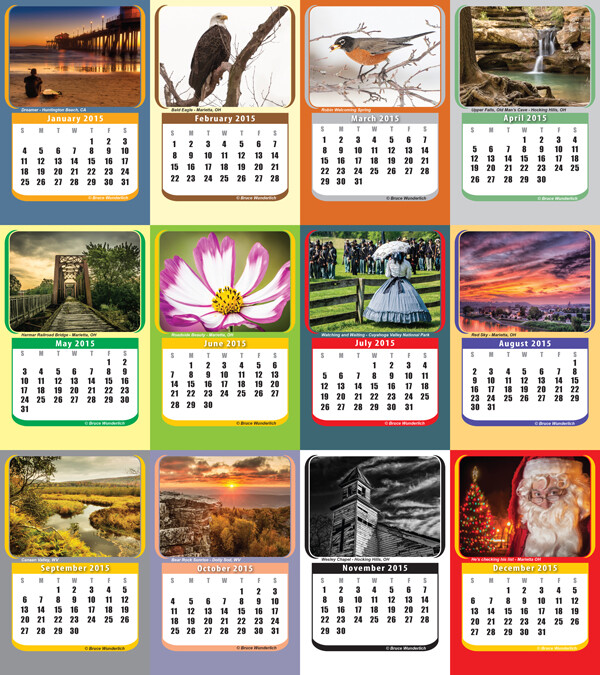
It is always a good idea to keep your portfolio up-to-date. A yearly inventory of your work, examining what you captured well and what you need to improve upon will help keep you focused on your artistic expressions. Photographers with digital technology have the tools to take many more images than Adams could with film and plates, so here’s a suggestion: Perhaps the number 12 suggests aiming for one memorable image each month. Take these most significant images and create a calendar featuring your art that you can give to friends. Regardless, keep your favorite images, your “crop”, organized and ready to share.

My 2014  "crop" in my 2015 desk calendar

2014 “crop” presented in a 2015 desk calendar.

“Sometimes I do get to places just when God’s ready to have somebody click the shutter.”

One favorite story about Ansel Adams centers around the circumstances of one of his most iconic images, “Moon rise over Hernandez”. As he was driving from what was described as a very unsuccessful day of shooting in New Mexico, suddenly Ansel pulled the car off the road when he saw the now famous subject. The light was changing so quickly that he was only able to get one exposure before the light was gone. Never think a day of shooting is a waste, that iconic image might just be around the next bend.

“There are no rules for good photographs, there are only good photographs.”

In a statement for a 1932 exhibit in San Francisco, Ansel listed his two “rules” of photography:

  1. The completed image must directly reflect how the subject appeared in the camera.
  2. He had to see the finished photograph in his mind before the shutter was released.

One of the most important things Ansel Adams left with us was this principle of pre-visualization. This mental vision of what he was expecting to communicate with the images he created is what makes them so prominent even today, some three decades after his death. We see too many photographers out in today’s world just aiming and shooting, not taking the time to think about the subjects before them and how the resulting image will speak to (or not) the viewers of the image.

Using Ansel's previsionalization method, When approaching this image I immediately visualizied this image as a black and white by adding a polarzing filter I was able to make the blue sky more saturated which can in handing later during processing to create dark and contrasting sky. I also intentionally under-exposed the image to ensure that the white boards of the abandon church are not to bright, to help convey the abandon feeling of theimage.

Using Ansel’s pre-visualization method when approaching this shot, I immediately visualized this image as a black and white. By adding a polarizing filter, I was able to make the blue sky more saturated which helped later during processing to create a dark and contrasting sky. I also intentionally underexposed the image to ensure that the white boards of the run-down church would not appear too bright, to help convey the abandoned feeling.

 “Ask yourself, “Why am I seeing and feeling this? How am I growing? What am I learning?” Remember: Every coincidence is potentially meaningful. How high your awareness level is determines how much meaning you get from your world. Photography can teach you to improve your awareness level.”

What a powerful quote! “Every coincidence is potentially meaningful”. To develop the creative eye that it takes to create great photos we need to be on the constant lookout for unexpected opportunities. So, must we carry our camera at all times? How many times have you come across a great scene only to find you do not have your camera ready and available? It happens to all of us, but don’t get caught up in the fact that you don’t have your camera with you. Instead, use this opportunity to think about the shot and visualize how you would have shot it, how you would compose it, and what camera settings and filters you might have used to capture the scene. Even though you may have missed the shot, you can use this as a learning experience to be prepared in the future.

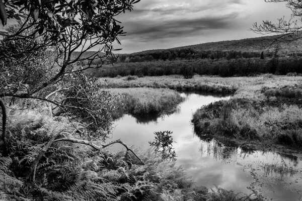
By studying the images of great photographers of the past and present we can learn how to approach our own images. This image, captured in the Canaan Valley Resort State Park in West Virginia, reminded me of Ansel's image The Tetons and Snake River.

By studying the images of great photographers of the past and present we can learn how to approach our own images. This image, captured in the Canaan Valley Resort State Park in West Virginia, reminded me of Ansel’s image The Tetons and Snake River.

 “The machine-gun approach to photography – by which many negatives are made with the hope that one will be good – is fatal to serious results.”

With the new digital age of photography it is so easy to take the “spray and pray” approach to photography, but we must learn to slow our approach and think about every piece of the image that we are capturing. One way to take a more deliberate approach with a landscape shoot is to place your camera on a tripod, which will allow you to concentrate more on the composition of your image. There are plenty of situations where the machine-gun approach to photography can be helpful, for example, action subjects such as sports or wildlife, but in other areas this approach can be fatal.

“A photograph is never finished until I burn the corners.”

Ansel considered it important to keep the viewer’s eye in the frame of his images, so he would burn (darken) any light areas near the edges of the image. These adjustments were quite time-consuming and tedious to produce in the darkroom of Adams’ era. Today, however, we can easily accomplish these steps in Photoshop or Lightroom. Be careful not to overdo it, as these changes should be made in a way that is completely imperceptible to the viewer of the image.

“I am sure the next step will be the electronic image, and I hope I shall live to see it. I trust that the creative eye will continue to function, whatever technological innovations may develop.”

Many fans of Adams’ photography ask, “Would Ansel Adams have shot digital?” This quote indicates he would have! Ansel was never overly concerned about the process of taking photos as much as he was about the creative experience and how a photograph made him feel. Ansel Adams would not only be shooting digital, but also he would be a Photoshop guru, probably working closely with Adobe to develop and improve the photographer’s experience.

Where do we go from here?

So in conclusion, has photography changed over the years? Yes, the process has changed, but the art of photography remains the same. By studying the guiding principles of great photographers of previous generations, like Ansel Adams, we can sharpen our skills to become the best photographers of our day. Please leave a comment below: What is your favorite photographer’s quote and how has it inspired you?

googletag.cmd.push(function() {
tablet_slots.push( googletag.defineSlot( “/1005424/_dPSv4_tab-all-article-bottom_(300×250)”, [300, 250], “pb-ad-78623” ).addService( googletag.pubads() ) ); } );

googletag.cmd.push(function() {
mobile_slots.push( googletag.defineSlot( “/1005424/_dPSv4_mob-all-article-bottom_(300×250)”, [300, 250], “pb-ad-78158” ).addService( googletag.pubads() ) ); } );

The post 8 Quotes From Master Photographer Ansel Adams and How You to Apply Them to Your Photography by Bruce Wunderlich appeared first on Digital Photography School.


Digital Photography School

 
Comments Off on 8 Quotes From Master Photographer Ansel Adams and How You to Apply Them to Your Photography

Posted in Photography


How to Apply LAB Color Adjustments in Photoshop to Enhance Your Photo

05 Nov

In this video we explore the most powerful color space in Photoshop LAB. You can do things in the LAB that are impossible in any other color mode, but in this video we keep it simple to start. We show you how LAB can help not only boost saturation in an image, but also how it can help separate colors Continue Reading

The post How to Apply LAB Color Adjustments in Photoshop to Enhance Your Photo appeared first on Photodoto.


Photodoto

 
Comments Off on How to Apply LAB Color Adjustments in Photoshop to Enhance Your Photo

Posted in Photography


How To Apply Lighting In The Real World

08 Jul

Image from Alana Tyler Slutsky's Surrealia series featured on Fashion Photography Blog (FashionPhotographyBlog.com)

LIGHT: REAL WORLD APPLICATIONS


Hey FashionPhotographyBlog.com readers! So, you have sucked it up and battled your way through the past two days learning about the science behind lighting as well as the Inverse Square Law and color temperature.  You’re probably sitting there thinking “GREAT. HOW DOES ALL THIS MUMBO JUMBO HELP ME IN THE REAL WORLD?”  I’m glad you asked.

Additive Primaries (RGB)/Subtractive Primaries (CMY)

Knowledge of these actually become very helpful in post-production.  Is your image looking a little red?  Throw in a tiny bit of it’s compliment (cyan) in the areas that are too red and it will balance out the colors, making the image more neutral.

Qualities of Light


Direction & Contrast

Want a very contrasty image? Don’t place the light directly in front of your subject, it will create a “flat” image (low contrast lighting).  Want a more dramatic image?  Try placing the light more to the side, this will create a higher ratio between the light/shadow relationship – aka the image will have more contrast.

Shot With Dramatic Lighting High Contrast
Dramatic Lighting (High Contrast)

Source

Shot With Flat Lighting Low Contrast
Flat Lighting (Low Contrast)

Source

Diffused & Specular

How do you want to light your image? What is the image for? What is your subject? If you’re going to be taking head shots for an actor, you’re going to want to use a more diffused light source to compliment their features. Using a specular light source for a head shot wouldn’t end with a very pretty result. There would be ugly harsh shadows which would distract the viewer.

Inverse Square Law

I know this one is confusing. Know this: the Inverse Square Law has to deal with fall off of light. Need a black background but you only have a white wall? The farther you get from the wall, the more your light source will fall of, creating a darker and darker background as you move your light and your model farther from the wall. Granted, depending on how big/bright your light source is, you may have to move far away from the wall in order to get your background completely black.

Color Temperature

Want your image to have a blue color cast but you’re shooting in daylight? Set your white balance to “Tungsten.” Since tungsten light is orange in color, your camera knows to add more blue to the image to balance the colors. If you’re already shooting with a blue light source (Daylight/Daylight balanced Flash) and set your white balance to “Tungsten,” you camera is going to over compensate and the result will be a cooler, blue image.

Play around with white balances and color temperatures! You can get some cool results.

Shot With Daylight White Balance Setting
Originally shot with white balance set to “Daylight”

Shot With Tungsten White Balance Setting
White balance changed to “Tungsten” to give the image a blue color cast

Made it through? Good! I know it was a bit rough but it’s over now. I promise next post on light will be the information that everyone wants to know – how to shape and modify it! Thanks for sticking it through and hopefully you learned something.

As always, if you have any questions, feel free to shoot over an email! alana@alanatylerslutsky.com

– Alana

IMAGE SOURCE:

Feature image & image 1: photography by Alana Tyler Slutsky from her Surrealia series. To view the rest of the photos from this series visit her website.

Image 2: Adorama

Image 3: DPS

Image 4 & 5: Alana Tyler Slutsky


Fashion Photography Blog

 
Comments Off on How To Apply Lighting In The Real World

Posted in Uncategorized


How to Apply the Look of Hand Coloring in Lightroom

27 Mar
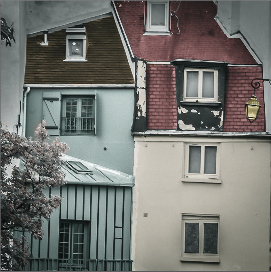
Give a photo the look of a hand tinted image in Lightroom

Give a photo the look of a hand coloring in Lightroom

Before there were color photos there were black and white photos, colored by hand using paints or dyes. Today, courtesy of any good photo-editing program, you can apply your own hand coloring effect to your photos.

Here’s how to apply the look of hand coloring in Lightroom.

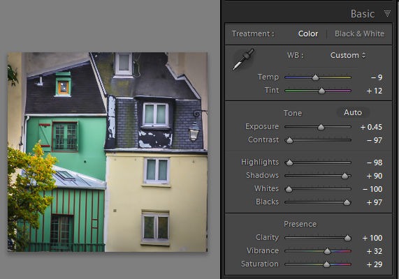
To get started, open the image in the Lightroom Develop module. You will want to make the usual basic edits to the image so it shows a good tonal range and contrast.

Before colorizing the image, make sure to adjust the tonal range and contrast.

Before colorizing the image, make sure to adjust the tonal range and contrast

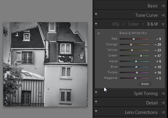
Then convert the image to a black and white by clicking B&W panel and adjust how the underlying colors in the image are converted to black and white using the sliders. Lighter areas will show the color better and darker areas will show a more subtle tint.

Use B&W to create a black and white image.

Use the B&W panel to create a grayscale or monochromatic image

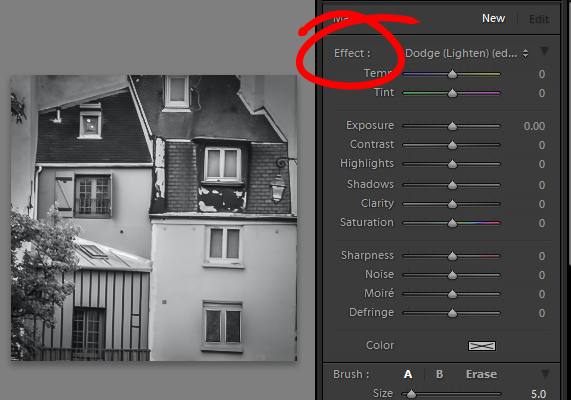
When you’re ready to add color to the image, click the Adjustment Brush and return all the sliders to zero by double clicking on the word Effect at the top of the panel (circle in red below).

Double click Effect to reset all the Adjustment Brush sliders.

Double click Effect to reset all the Adjustment Brush sliders

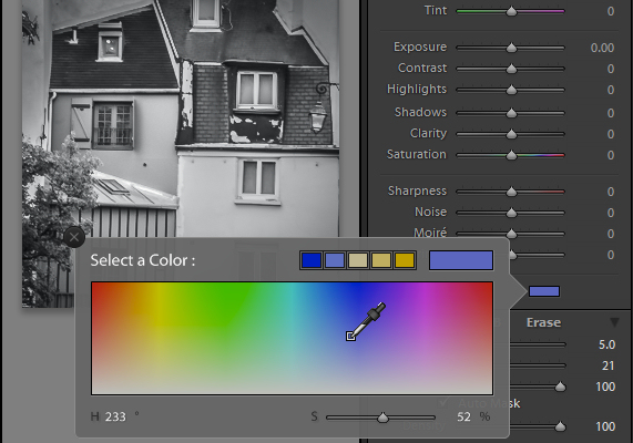
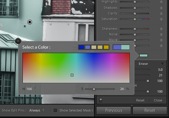
Click on the color sampler and choose a color to use.

Select a color to tint the image with from the Color selector

Select a color to tint the image with from the Color selector as shown here

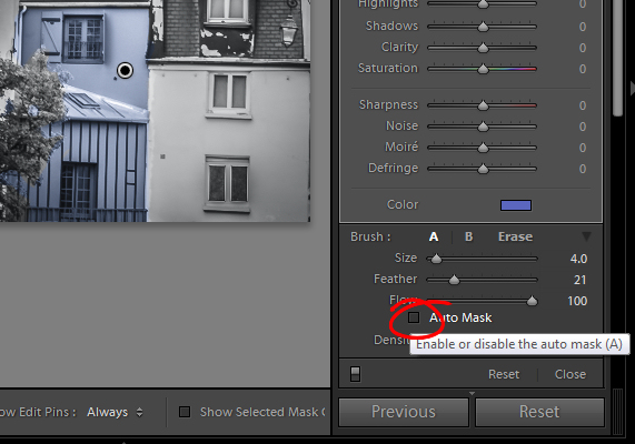
Now click on the area that you want to recolor to set an Edit Point. Paint over the area to apply the color to it. As you paint with the Adjustment Brush a layer of partially opaque color is applied to the image.

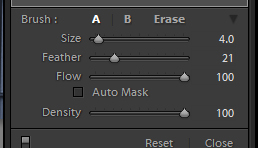
Select the Auto Mask checkbox if you are working on an area of the image that has distinct edges. Doing this makes it easier to limit the painting to only the desired area. The roof tops and buildings here are good examples of areas with distinct edges.

Selecting Auto Mask helps paint in areas with defined edges.

Selecting Auto Mask helps paint in areas with defined edges (stay within the “lines”)

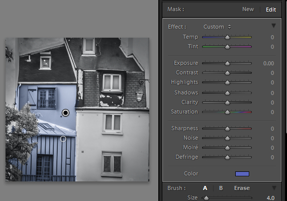
When painting an area that is less defined, disable the Auto Mask checkbox. The tree in this image has less defined edges so you should disable Auto Mask when coloring this area.

The buildings have defined edges so use Auto Mask when painting them. The tree does not, so disable Auto Mask when painting it.

The buildings have defined edges so use Auto Mask when painting them. The tree does not, so disable Auto Mask when painting it.

If you mistakenly paint over an area and want to undo the painting click the Erase brush link or hold Alt to select Erase and paint to remove the mistake.

To zoom into the image press Z on the keyboard and click on the image to zoom in or out. To move the image hold the spacebar so the mouse pointer turns into a hand and drag on the image.

Size the brush using the Size slider

Size the brush using the Size slider

To resize the brush either use the [ and ] keys on the keyboard or adjust the size using the Size slider.

When you have finished working with the first color, click New to set a new Edit Point. Select a different Color and paint that onto the image.

Continue creating a new Edit Point for each color until the coloring is complete.

If desired, you can alter a color or adjust a painted area by selecting the Adjustment Brush and then click the Edit Pin for that adjustment. You can then change the color using the color picker.

Give a photo the look of a hand tinted image in Lightroom

Give a photo the look of a hand tinted image in Lightroom

Do you have some other tips:

If you have some other ways of doing this technique in Lightroom please share. Or share your images if you give it a try!

For more Lightroom tips and tutorials try these:

  • Processing an Image in Lightroom 5 – a Video Tutorial
  • 6 of Lightroom’s Hidden Treasures
  • Why Lazy Photographers Should Use Lightroom Smart Collections
  • 3 Uses for the Radial Filter Tool in Lightroom 5
  • Lightroom 5 Tips – Hidden Gems

The post How to Apply the Look of Hand Coloring in Lightroom by Helen Bradley appeared first on Digital Photography School.


Digital Photography School

 
Comments Off on How to Apply the Look of Hand Coloring in Lightroom

Posted in Photography