In digital photography, just like exposure, colors too have a triangle of their own.
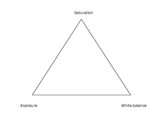
Color adjustment triangle
The triangle of color adjustments in Lightroom. The three attributes that form the triangle are shown above, now let’s see how they affect the colors of an image.
Exposure
This attribute controls the brightness level of all the pixels that constitute an image. Whenever the brightness level of the pixel is altered, the color value too gets changed. You can easily identify this effect in a photograph of a landscape. Apply a Graduated Filter on the sky area with a value of -2.00 on the exposure slider and then take a look at the sky area. You will immediately notice that the blue color has become richer. You would do well to remember that you didn’t change any other value in that sky area except the exposure.
Let’s look at some examples of exposure adjustments and how it affects the color:
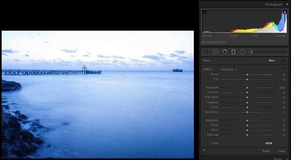
No adjustments applied on graduated filter
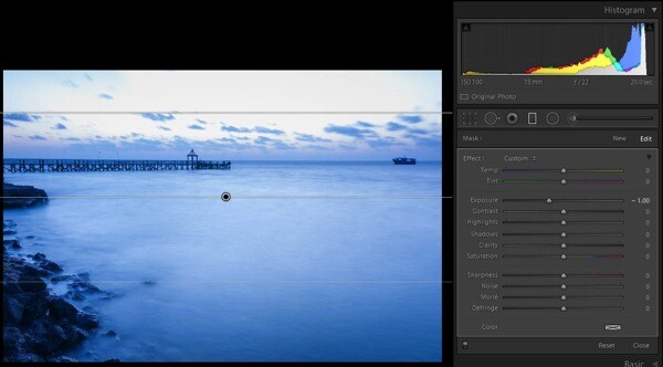
-1.0 stop exposure adjustment applied
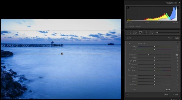
-1.5 stop exposure adjustment applied
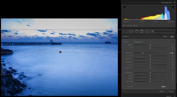
-2.0 stop exposure adjustment applied
Saturation
This attribute controls the intensity of all colors in all of the pixels that constitute an image. Since the effect of this tool is global, it needs to be used with caution; otherwise it is guaranteed that the picture will end up looking artificial. To check the effect of this tool, keep the same graduated filter applied and active, reset the exposure values by double clicking the exposure slider (or the word Effect), then move the saturation slider towards the right; you will notice the changes that are wrought in the sky area.
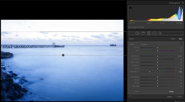
Saturation set to -50
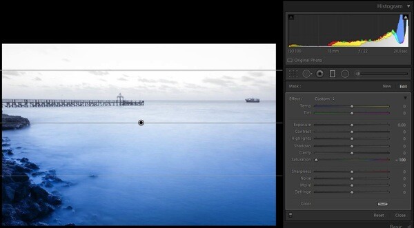
Saturation set to -100
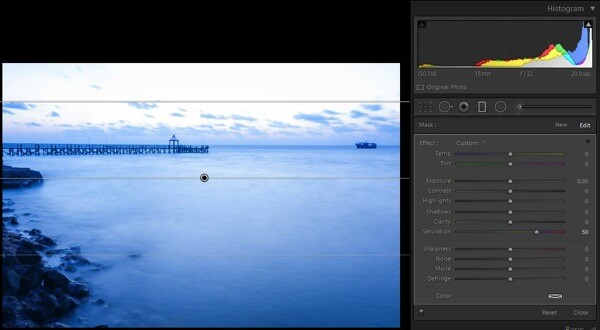
Saturation set to +50

Saturation set to +100
There is another tool called Vibrance, just above the saturation slider. I have considered this as part of saturation tool. It plays only with the less intense colors, one of the smartest tools in Lightroom (Note: this tool can be found only in the Basic Deveolop panel not in the Graduated Filter or any other local correction tools).
White balance
This is one of the most discussed topics in the internet. What white balance exactly does is to change all of the color values of all the pixels in the photograph; yes I mean all three RGB values of a pixel. When you move the White Balance slider towards the right the photograph gets warmer, specifically towards yellow side. When you move it towards the left, the photograph gets cooler, specifically towards blue side. (Note: this tool is at its full power when the image is captured in RAW format) To check this effect, reset the previous graduated filter and move the White Balance slider either way to see for yourself.

White Balance adjustment made to -50
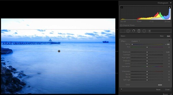
White Balance adjustment made to -100
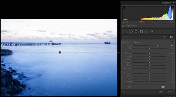
White Balance adjustment made to +50
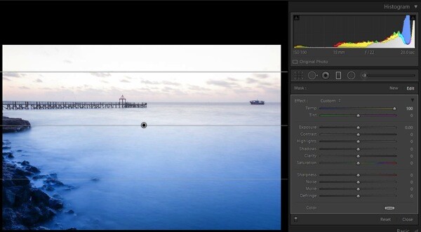
White Balance adjustment made to +100
There is another tool below White Balance called tint, it is part of adjust the white balance. This tool needs to be used cautiously, as the name suggests the tool can be used to add or remove the tint primarily green or magenta in color, and mostly helps to bring out the real colors. If this tool is used carefully, it will help you to remove the color cast from your photograph if any.
Putting it all together
Now that you know how all three major tools control the colors in a photograph, the question is how to apply this knowledge. There is no universal prescription, and each photograph demands its own treatment. Understanding how all these tools work, and developing your skill by practicing on a few photographs, will make you so much better in visualizing and bringing out the colors in any given photograph.
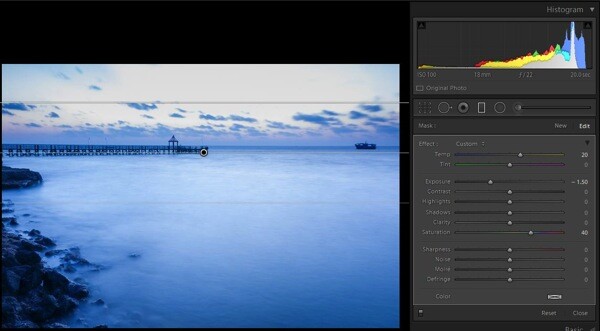
Graduated Filter all sliders applied
Now, you know the major tools controlling the colors in an image and how they are being applied on this sample image (see screen shot above) but I still felt something was missing in the sky region. So I applied a slight color tint from the color picker tool (see image below).
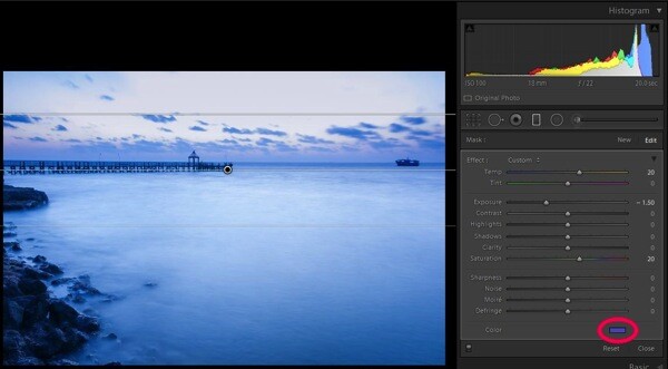
Graduated filter slider adjustments plus a color tint added, see red circle
Some photographs might be underexposed, whereas others might be under saturated to some extent. Remember RAW images tend to be less saturated, lower in contrast, and less sharpened. In some photographs a little adjustment to the White Balance slider may fix almost all the problems.
Final image
Here is a look at the sliders in all the panels used to produce the final image.
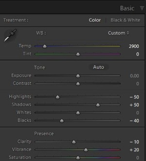
Basic panel slider adjustments |
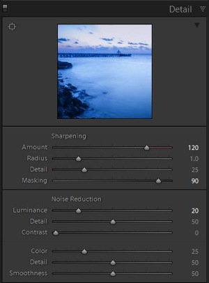
Detail panel slider adjustments |
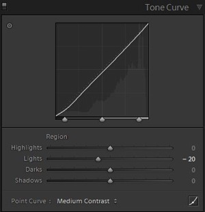
Tone curve panel adjustments |
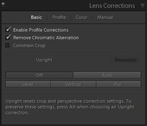
Lens correction panel adjustments |
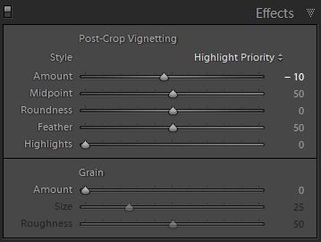
Post-crop vignette added
After using almost all the panels in Develop module here are the before and after photographs.

As shot right out of camera

Final image after all corrections have been applied
All said, you are the creator of your photograph. You have to decide which tool needs to be used and in what proportion with other tools, to give you the results you hoped for when you pressed the shutter button. Hope this article helps you make more beautiful photographs.
If you have any other Lightroom color adjustment tips of tricks please share with us in the comments below.
The post The Triangle of Color Adjustments in Lightroom by Navan Viswa appeared first on Digital Photography School.