RSS
 

Posts Tagged ‘adjustments’

Photo software Exposure X6 brings 3x faster processing and a host of new auto adjustments

08 Oct

The Exposure photo editing software application, that was formerly Alien Skin, has been updated with enhanced GPU optimization that allows some oft-used functions to run at three times the speed. Exposure X6 also introduces a collection of new automated adjustments that aim to make image processing simpler and to save photographers time.

Available as a standalone application or a plug-in for Adobe’s Photoshop and Lightroom, Exposure X6 introduces Auto White Balance, Auto Exposure, Auto Haze Level, Auto Dynamic Contrast and Auto Tone for creating one-click fixes for common problems. Tonal and contrast adjustments are said to avoid shifts in color saturation and hue, and the Auto White Balance adjustment is based on camera metadata. The sensor used is also taken into account in the new noise reduction feature, along with information about the ISO setting and an estimate of likely electronic noise.

Before and after examples of the new Color Editor tool that allows colors to be selected and replaced. Changes can be saved as a preset to apply to further images

A new Color Editor allows users to select and replace specific selected colors, and to make multiple color changes within the same image. These changes can be mapped and saved as presets to be used in further images so sets of pictures can have consistent adjustments made.

Exposure X6 is available for download now, and costs $ 119. If you bought Exposure X5 on or after July 15th 2020 your upgrade will be free, and those who bought it before that, and users of previous versions, can upgrade for $ 89. For more information, and a free 30-day trial, visit the Exposure website.

Press release

Exposure Software Announces Exposure X6, Image Editing Software for Creative Photographers

Exposure X6 features dramatic speed improvement, one-click automatic adjustments, advanced color replacement, innovative shadow/highlight and noise reduction processing, and more

Exposure Software, formerly known as Alien Skin Software, today announced the release of Exposure X6, the newest version of their award-winning RAW photo editor for creative photographers. Exposure is a standalone image editor that handles a full photography workflow. It includes plug-in support that enables Exposure’s advanced editing and creative effects in Adobe Photoshop or Lightroom.

New in Exposure X6 is advanced GPU optimization, which dramatically speeds up image processing. GPU support works in concert with Exposure’s existing multi-core optimization to enable Exposure to leverage the full power of modern computer hardware. Many frequently used editing operations have been sped up by a factor of three on typical GPU hardware. This improved performance enables editing at greatly improved speeds, reducing distraction so photographers can focus on creativity.

“The introduction of GPU support in Exposure X6 enabled us to achieve amazing speed and image processing quality improvements,” said Finley Lee, CEO of Exposure Software. “This further advances our goal of making Exposure the best available image editor for creative photography.”

New automatic adjustments select optimized values for the most frequently used controls in a single click, freeing time for creative editing. They can even be applied in batch to significantly ease the time spent editing large photoshoots. Exposure’s new automatic adjustments include the following:

  • Auto White Balance adjusts white balance based on camera metadata. Corrects for tungsten, artificial, shade, and sunlight illuminant scenes.
  • Auto Exposure sets image exposure for both under and overexposed images.
  • Auto Haze Level changes the level of atmospheric haze present in the image. This is particularly useful for backlit subjects and images shot into the sun.
  • Auto Dynamic Contrast lowers and raises the overall image contrast without changing saturation or hue.
  • Auto Tone sets values for Blacks, Shadows, Highlights, and Whites sliders that affect overall image tone.

Using an innovative tonal-zone approach, Exposure’s redesigned shadows and highlights controls are more reliable, consistent, and accurate. These intuitive controls are particularly adept at recovering lost details in the highlight and shadow areas. The adjustments are applied intelligently to prevent unwanted color casts or hue shifts. They are exceptionally well-suited in preserving high or low key scenes.

Exposure’s new profile guided noise reduction capability reduces noise based on camera sensor characteristics, ISO, and estimated electronic noise. Luminance and chrominance noise can be reduced independently. The smoothing option applies an adaptive noise-sensitive algorithm which preserves sharp edges while further reducing noise.

The new Advanced Color Editor builds on Exposure’s innovative 3D color masking to enable vastly greater control of color modifications. For example, a model’s blue dress can be changed to red in just a few clicks. Photographers can select source and target colors based on luminance, hue, and saturation attributes. It is even possible to select multiple color replacement mappings and save them as a preset to be reused.

  • Additional enhancements to Exposure include the following:
  • Updated user interface provides a refined, modern aesthetic
  • New haze level slider, for counteracting the decrease in contrast caused by atmospheric haze. It can also add haze as a creative effect.
  • Customization of the hue and opacity of the selection mask overlay.
  • Optional black background for the mask to view selected pixels without distraction.
  • Optional luminance or saturation background for the selection mask, which helps visualize the mask region when adjusting luminance or saturation constraints.
  • DNG converter integration enables conversion of RAW photos to DNG format using Adobe’s DNG Converter software. Conversion can be performed automatically when copying photos from a camera card, or manually invoked from a photo’s thumbnail view.

About Exposure
Exposure began in 2005 as a film simulation plug-in for Photoshop, and was immediately embraced by digital photographers of all genres seeking to recapture the organic look of film. Over the years, Exposure became a legend among plug-ins, and evolved into a standalone full-featured editing and organizing solution for creative photographers.

Pricing and Availability
Exposure X6 is available now from https://exposure.software for $ 119. Upgrade pricing is available to owners of previous versions of Exposure for $ 89. Additionally, anyone who purchased Exposure X5 on or after July 15, 2020 will automatically receive a free upgrade to Exposure X6.

Exposure X6 is also available in the Exposure X6 Bundle. This integrated collection combines Exposure with Exposure Software’s award-winning Blow Up and Snap Art tools to add high-quality upsizing and natural media special effects. It is available for $ 149. Owners of one or more of the current apps in the Exposure X6 Bundle can purchase for $ 99.

A 30-day fully-featured free trial of Exposure is available. Visit https://exposure.software to learn more and download the trial.

Host Requirements
Exposure X6 may be used as a standalone program or as a set of plug-ins. When used as a set of plug-ins, it requires one of the following host applications:
* Adobe Photoshop CS6 or Adobe Photoshop CC 2015 or newer
* Adobe Lightroom 6 or Adobe Lightroom CC 2015 or newer

System Requirements

Mac
* OS X 10.11 El Capitan or newer
* Intel Core 2 processor or newer
* Monitor with 1280 x 768 resolution or greater
* 8GB RAM minimum, 16GB recommended
* For GPU support, a recent (2015 or later) Metal compatible GPU with 2GB RAM is recommended

Windows
* Windows 10 64-bit or newer
* Intel Core 2 processor or newer
* Monitor with 1280 x 768 resolution or greater
* 8GB RAM minimum, 16GB recommended
* For GPU support, a recent (2015 or later) OpenCL compatible GPU with 2GB RAM is recommended

Articles: Digital Photography Review (dpreview.com)

 
Comments Off on Photo software Exposure X6 brings 3x faster processing and a host of new auto adjustments

Posted in Uncategorized


Take Control of Color Adjustments in Lightroom

16 Sep

The post Take Control of Color Adjustments in Lightroom appeared first on Digital Photography School. It was authored by Simon Ringsmuth.

With all the sliders, options, and numerical values to tweak in Lightroom, there is no end to the editing possibilities at your disposal. Sometimes, you just want an easy way to make your images stand out and shine without all the hassle of adjusting dozens of individual options.

Fortunately, you don’t need to go overboard with editing to do some really incredible color adjustments in Lightroom. Three basic parameters can work wonders for your images: the Hue filter adjustment, as well as the Saturation and Vibrance sliders.

Color Adjustments in Lightroom Purple Flower
Nikon D7100 | Nikon 50mm f/1.8G | 50mm | 1/750 sec | f/1.8 | ISO 100

Adjusting Hue with filters and brushes

Along with White Balance, Hue is one of the most basic color adjustments you can make to a photo. Strictly speaking, Hue refers to the actual color of an image or a part of the image. It’s one of the building blocks of a photo that, along with Saturation and Luminance, affects your pictures on a foundational level.

The HSL panel in the Develop module lets you adjust the Hue of various colors. Essentially, you can make the reds shift from purple-ish to orange-ish. Or change your greens to be more yellow or teal.

Hue allows you to precisely control the overall appearance of your image, but the HSL panel works on an all-or-nothing basis. Moving the sliders affects the hue of every red, orange, yellow, and so on across the entire photograph.

Color Adjustments in Lightroom Red Cardinal
Nikon D500 | Nikon 70-200 f/2.8G ED VR II | 200mm | 1/500 sec | f/4 | ISO 3600

Hue works well in a picture like the red cardinal above because the colors are clearly distinct and separate. Adjusting the Hue slider for the color red will affect the bird but nothing else because there are no other reds in the picture.

A recent update to Lightroom turbocharges the Hue editing tool by also allowing it to be used with filter adjustments. You can make precise Hue adjustments using the Radial and Graduated filters as well as the Adjustment Brush. These are incredibly powerful tools that help you get the precise color adjustments in Lightroom that you were never able to get before.

Color Adjustments in Lightroom Hue
Hue can now be edited using the Adjustment Brush, Radial Filter, and the Graduated Filter.

The usefulness of this new approach to Hue adjustment is amazing, and using it could hardly be simpler. Just create a new filter or Adjustment Brush, then click and drag the Hue slider to change the colors of the portion of your image affected by the filter or the brush.

The top of the color rainbow stays locked in place while the bottom shows you the degree to which your colors are being changed. For precise control, check the Use Fine Adjustment box or hold down the Alt key (or the Option key on a Mac), which reduces the effect of your left-to-right dragging to give you finely-tuned adjustments.

To illustrate how this works, here is a picture of two yellow flowers. Adjusting the Hue using the HSL panel would allow me to change the yellow of both flowers. Using a Hue Adjustment Brush lets me change the color of one single flower. This is a maneuver that used to require jumping over to Photoshop and using multiple layers and tools, but can now be accomplished in mere seconds in Lightroom.

Color Adjustments in Lightroom Yellow Flowers
Nikon D500 | Nikon 50mm f/1.8G | 50mm | 1/1000 sec | f/2.8 | ISO 100

To change the color of the flower in the foreground from yellow to red, all I have to do is click the Adjustment Brush and paint in a new adjustment over the yellow flower. Then click and drag the Hue slider to the left, and you have an instant red flower.

The Auto Mask option helps ensure that my edits stay within the yellow flower. I can also hold the Alt key (or the Option key on a Mac) to erase parts of the adjustment that I don’t want.

Color Adjustments in Lightroom Yellow and Red Flower
Transforming the flower from yellow to red took me less than 15 seconds in Lightroom. All I did was use an Adjustment Brush and change the Hue.

Using the Hue adjustment with a Radial Filter or Graduated Filter follows much of the same process as the Adjustment Brush. Apply a filter and adjust the Hue accordingly to change the colors of a portion of your image. These additions to Hue options in Lightroom are a bit like selective color editing, where most of a picture is black and white with one portion displayed with color.

Hue adjustments for the filters and Adjustment Brush go one step further by giving you total control over individual colors in specific parts of your pictures. If you haven’t yet tried it, I recommend checking it out and seeing how easy it really is! And if you want even more control over your color adjustments in Lightroom, there are the Saturation and Vibrance sliders to look at.

Saturation and Vibrance

These two sliders can go a long way towards giving your photos an extra degree of refinement. However, they are often misunderstood and misused. They both complete the same basic function, in that they make the colors of a photo punchier or more exaggerated. Where they differ is in the method used to adjust the images and the way the colors are adjusted.

Saturation is kind of a blunt instrument, like editing your image with a hammer. It allows you to adjust the intensity of all the colors in a photo equally, which isn’t necessarily a bad thing if it gets you the result you are aiming for. It’s easy to overdo it with saturation, though, so adjust carefully.

Vibrance takes a more intelligent and subtle approach. This slider analyzes the colors of an image that are already saturated and, therefore, don’t need much adjustment. When you move the slider to the right those colors are generally left alone, as are common skin tones. The result is an image that feels punchier without being overwhelmed with color.

Adjustments with portraits

The image series below shows the difference between these two sliders. The first is an unedited RAW straight out of camera.

Color Adjustments in Lightroom Family Forest
Nikon D750 | Nikon 70-200 f/2.8G ED VR II | 180mm | 1/500 sec | f/2.8 | ISO 1600.
Original unedited RAW photo, no color adjustments.

Adjusting Vibrance up to a value of +60 makes the background colors more noticeable and also punches up the blue clothing. Faces and hands are relatively untouched, as are some of the clothing colors like orange and green that don’t need much adjustment.

Color Adjustments in Lightroom
Same photo, but with Vibrance +60. The image feels more lively and dramatic without being overbearing.

In contrast, the Saturation color adjustment in Lightroom ramps up every color indiscriminately. The final image looks like it was run through a series of poorly-implemented social media filters and is a little jarring and unpleasant to look at.

Color Adjustments in Lightroom
This is the original image, but with the Saturation increased to +60. This picture feels overprocessed and unpleasant.

This example is a bit of an exaggeration, though! Saturation is a perfectly acceptable adjustment, as long as you use it carefully. Generally speaking, ramping up Saturation to such extreme values will not yield the best results. I like to keep it around the +5 to +15 range, which gives a more subtle effect and makes all the colors pop just enough to stand out while not being overbearing.

Another way to take control of color adjustments in Lightroom without getting too complicated is to lower Saturation and Vibrance.

Color Adjustments in Lightroom Siblings
Nikon D750 | 70-200 f/2.8G ED VR II | 200mm | 1/250 sec | f/2.8 | ISO 220.
Original unedited RAW, no color adjustments.

Lowering the value of Saturation and/or Vibrance can give your images a subdued look, almost like a sepia filter. I like this effect on portraits, and if you shoot for clients you might find this to be a useful adjustment to keep in your back pocket when editing. Many people like a desaturated look, because it can feel comforting and a bit nostalgic.

Color Adjustments in Lightroom
This is the same image, but with Saturation decreased to -45. Lots of clients like this type of appearance for portraits.

When working with portraits, I find that little Vibrance and Saturation adjustments in Lightroom go quite a long way. Generally, I do just a little bit of one or both and don’t exceed a value of +10. It might not seem like much, but those small edits can give your images that little extra push to really stand out.

Working with nature images

Vibrance and Saturation color adjustments in Lightroom really come in handy when working with landscapes, flowers, animals, or anything else in nature. Here’s where I like to put my foot on the throttle and really push the sliders a lot more than I would with portraits. Rather than jarring and unpleasant, the results are often dramatic and even captivating.

I shot the photo below in Minnesota just south of the Canadian border, just as the sun was coming up. The image looks fine, but it’s a little bland and doesn’t quite convey the emotion I want the viewer to experience. Thankfully, a little Saturation and Vibrance can fix it.

Color Adjustments in Lightroom Forest
Fuji X100F | 23mm | 1/125 sec | f/8 | ISO 5000.
Original unedited RAW, no color adjustments.

Bumping Saturation up to +55 yields a much-improved image, albeit with a few tweaks that still need to be implemented. Colors are richer, contrast is greater, and the scene is much more similar to how it was when I was standing among the trees listening to the birds chirp overhead.

Color Adjustments in Lightroom
+55 Saturation has improved the photo quite a lot.

Even though the picture is better with increased overall Saturation, adding some Vibrance gives it just the final touch it needs. I would never add this much Vibrance and Saturation to a portrait or street photograph. When working with shots of nature, these adjustments can make a huge difference without feeling ostentatious or overbearing.

Color Adjustments in Lightroom
Adding +30 Saturation brings out the colors in the background trees while keeping the foreground intact.

The best of both worlds

If you really want to get creative with Vibrance and Saturation, you can use a combination of both adjustments, but not in the way you might thing. Color adjustments in Lightroom are all a matter of personal preference, but one trick I like to use, especially with people in everyday life and not necessarily formal portraits, is to raise the vibrance while lowering the saturation.

Color Adjustments in Lightroom Woman Riding a Horse
Nikon D750 | Sigma 40mm f/1.4 Art | 40mm | 1/180 sec | f/1.4 | ISO 360.
Original RAW with no color adjustments.

Some of the best editing can be almost invisible. I lowered Saturation while raising Vibrance, which shifted everything just enough to give the picture a low-key-but-slightly-enhanced look. It’s a small but noticeable edit when compared to the original, and shows how using both adjustments together can yield impressive results.

color adjustments in Lightroom
+57 Vibrance combined with -22 Saturation gave me just the look I was aiming for.

This technique combines Saturation and Vibrance for a result that is more than the sum of its parts. The entire image feels a little more subdued and welcoming, while important colors are emphasized just a little more. The end result is, like a lot of good adjustments, subtle but effective.

Image editing doesn’t have to be complicated. While there are many tools and options for color adjustments in Lightroom, often just these simple basic features will get the job done just fine. I particularly like the new Hue tools and the unparalleled freedom they offer photographers.

If you have not yet tried this, or if it has been a while since you played around with simple Saturation and Vibrance, you might be surprised at how much these can do to make your images go from just okay to absolutely astonishing.

The post Take Control of Color Adjustments in Lightroom appeared first on Digital Photography School. It was authored by Simon Ringsmuth.


Digital Photography School

 
Comments Off on Take Control of Color Adjustments in Lightroom

Posted in Photography


Final Cut Pro X 10.4.9 adds ProRes Raw camera setting adjustments, improved vertical editing and more

26 Aug

Apple has released its latest update to Final Cut Pro X, bringing with it a number of new features, including the ability to finally adjust ProRes Raw camera settings.

Although it’s listed under ‘Other new features,’ one of the most welcomed additions in the update is the ability to adjust ProRes Raw camera settings, such as ISO, color temperature and exposure compensation in the new controls within the inspector.

These new options address what was a big hole in the ProRes Raw workflow with FCPX. We asked our own Jordan Drake of DPReview TV for his thoughts on these new additions and he had the following to say:

’Working with ProRes Raw was initially jarring, as it did not respond like other photographic or cinematic raw formats. White balance and ISO were not directly adjustable, and attempting to use the built in tools to simulate those adjustments often led poor colors or noisy shadows. This new update allows adjustments to white balance, exposure and ISO and will hopefully allow ProRes Raw to behave more like R3D Raw, or Apple’s primary competition Blackmagic BRaw. Camera manufacturers aside from Blackmagic seem to be moving towards ProRes Raw, so this added functionality will be a big benefit for many current and future cameras.’

Also new is an improved proxy workflow with the ability to generate proxy media in custom frame sizes (1/8, 1/4, 1/2, or full resolution), the ability to create proxies in either ProRes Proxy or H.264 and the ability to create a proxy-only copy of a library to reduce the size of a project.

It’s now easier to compose footage for use in vertical-preferred platforms, such as Snapchat, Instagram TV, TikTok and others.

Apple has also added a number of new social media tools within FCPX, including automated project transformation for square of vertical delivery via the new ‘Smart Conform’ tool, the ability to view footage outside the viewer boundary for easier composing in non-traditional formats, as well as custom overlays for guides and a new ‘Duplicate Project As’ option that works with the new ‘Smart Conform’ tool to make creating videos for multiple platforms easier.

For other minor feature updates and bug fixes, head on over to Apple’s changelog for FCP 10.4.9. The update should be available as a free update in the macOS App Store if you’ve already purchased FCPX.

Articles: Digital Photography Review (dpreview.com)

 
Comments Off on Final Cut Pro X 10.4.9 adds ProRes Raw camera setting adjustments, improved vertical editing and more

Posted in Uncategorized


Lightroom Local Adjustments – Radial Filter Versus the Adjustment Brush

18 Aug

Adobe Lightroom is image editing software that allows you to edit and make color adjustments to your photos. Among many, the Radial Filter and Adjustment Brush are two very useful local adjustment tools in Lightroom.

But often people get confused between both of these tools and are not sure which one to use in which situation. So I thought I’d share a few tips on the basis of which you can easily figure out the importance of each respective tool.

Radial Filter Tool

This tool is a blessing for portrait, event, wedding, and wildlife photographers. The reason why I am pointing to these genres of photography is that such photos usually have a single subject in the frame which needs to be highlighted.

The Radial Filter allows you to select an area using an elliptical mask. Then the shape of the ellipse can be changed by dragging one of the points. Once the area is selected, you can make adjustments inside or outside the shape using the new Brush component depending on your requirements.

radial filter Lightroom local adjustments

Adjustment Brush Tool

The Adjustment Brush is like painting the image canvas with the required adjustments. You can use the mouse pointer, drag and select the area manually where you wish to make desired adjustments. You have the ability to increase or reduce the size of the brush to make a fine and precise selection.

 Lightroom local adjustments - adjustment brush

Radial Filter or Adjustment Brush? How to Decide?

As you saw in the example above, using the Radial Filter allows you to select a particular area using the elliptical mask whereas the Adjustment Brush allows you to manually select the area using the cursor.

As a photographer and a creative person, you have to first visualize the result you want to achieve for your picture. If you believe that using the Radial Filter would suffice for your editing needs, go ahead with it. But if you feel that you need more manual and precise control over the selection of the area where you need desired changes, go with the Adjustment Brush.

It may sound easy but it might be challenging in some situations, so let me help you with this by looking at two examples.

Example 1: When to use the Radial Filter

 Lightroom local adjustments - radial filter image of an Indian boy

In the image above, my intention was to make changes to the area around the face of the boy. Now as the shape of the face is defined, I can easily select the area using the elliptical shape of the Radial Filter tool. Later, if I feel that I need to change the shape of the selection I can easily do that by dragging the points or using the Brush feature.

It does not make any sense to use the Adjustment Brush in this particular scenario as I can save my time by simply using the Radial Filter.

Basically, you should use the Radial Filter when the shape of your subject is defined and you can easily make the selection using the ellipse. Weddings, portraits, wildlife, events, and sports are some of the genres of photography where you can use the Radial filter to make changes faster.

Example 2: When to use the Adjustment Brush Tool

 Lightroom local adjustments - landscape scene sky selected

In this particular image, I wanted to make exposure and highlight changes selectively in the sky region. As you can clearly see, the shape of the sky area in this photo is not defined therefore I can not use the Radial Filter. If I use the Radial Filter I would either select unwanted areas of the mountains or would miss out some parts of the sky.

But by using the Adjustment Tool I can manually select the area I want to make changes in and I was able to do that precisely. Though this approach is a bit time consuming as compared to the Radial Filter, but you surely get an accurate selection. Now whatever changes I make would perfectly be made only on the sky region.

Conclusion

So the conclusion is that you should be using the Adjustment Brush when the shape of the area that you wish to select is not well defined. Landscapes, Cityscapes, or any photo where the shape of the subject is very complex, the Adjustment Tool would give you much accurate selection than the Radial Filter.

If you want to read more about each of these tools check out these dPS articles:

  • Creative Use of the Radial Filter in Lightroom
  • Lightroom’s Secret Weapon: The Radial Filter and How to Use it
  • Lightroom Mastery: The Power of the Adjustment Brush
  • 5 Tips for Using the Lightroom Adjustment Brush Tool
  • How to Use the Local Adjustments Tools Inside Lightroom

The post Lightroom Local Adjustments – Radial Filter Versus the Adjustment Brush appeared first on Digital Photography School.


Digital Photography School

 
Comments Off on Lightroom Local Adjustments – Radial Filter Versus the Adjustment Brush

Posted in Photography


How to Make Color Adjustments Using Tone Curves in Lightroom

14 Jul

In this article, you’ll learn how to use tone curves in Lightroom to make color adjustments to your images and bring your visions to life.

Color and RAW format

If you photograph in RAW file format, you know that the images straight out of the camera are often a bit flat compared to photographing in JPEG format. Most RAW images require some sort of editing to make them look close to how you envision the scene when you took the shot.

Adjusting color in an image is a very powerful component in editing and can really make an image go from okay to wow when done correctly. Of course, it goes without saying that too much color and the image will appear unreal.

Color Adjustment Bread Still Life Photo - How to Make Color Adjustments Using Tone Curves in Lightroom

Lightroom color adjustment options

Whether you photograph in RAW or JPEG, Lightroom is one of the many editing software you can use to bring out the color in your images. Even within Lightroom, there are multiple ways to edit your image based on the look you want to create.

To understand how to edit the color, you need to first understand color in an image and how it is affected. One of the main things that impacts color in an image is the quality of the exposure. Apart from the exposure, there are other factors that can be adjusted to affect the color.

  • White Balance (read Adjusting White Balance in Lightroom)
  • Color Profile
  • HSL Panel (read Understanding the HSL Panel in Lightroom for Beginners)
  • Color Curves
  • Split-toning (read How to Rescue an Image in Lightroom With Split Toning)
Color Adjustment in Lightroom Blueberries in a bowl Still Life Photo - How to Make Color Adjustments Using Tone Curves in Lightroom

This image was straight out of the camera. You can see on the histogram that the image was slightly overexposed and the color temperature is that of a warm day.

You don’t need to adjust each and every one of these editing elements, but understanding how they work will help you figure out which one to use based on the desired outcome of your editing skills.

Color Adjustment Blueberries in a bowl photo still life image

The same image edited to my specific style and brand aesthetics – light, bright and airy – with some Tone Curve adjustments to the red and green channels applied.

I want to focus on the Color Curves Panel for the purpose of this article. I recently stumbled upon this panel and once I understood all of its capabilities, it quickly became one of my favorites in terms of experimenting with different colors to get the look and feel I wanted for my images.

Now, I am not saying that you have to use only the color panel for your images. But it is simply one of the tools you can use to edit your images.

What are Color Curves?

Color Adjustments in Lightroom Tone Curve Adjustments

Color Curves are located within the Tone Curve Panel in the Develop Module in Lightroom. The Tone Curve is one of Lightroom’s more powerful panels and it represents all the tones of your image.

The bottom of the Tone Curve is the Tone axis that represents the Shadows on the left and Highlights on the right. In the middle, you have mid-tones, which are then further split into darker mid-tones, called Darks, and brighter mid-tones, called Lights. The left axis represents the brightness or darkness of the specific tonal regions. The further up the left axis you go, the brighter the tones get.

Now within the Tone Curve, you can select RGB (all the colors) or you can select the curve for each specific color individually (Red, Green, and Blue).

When you adjust the RGB curve, you will find that your image starts to have a lot of depth. I typically adjust the RGB Curve first when I use Curves in my editing workflow.

Adjusting the Curves

To adjust the Tone Curve you can move the sliders or directly drag the line of the curve itself up or down to get the desired effect by changing the shape of the curve. To do this, you must first click the box in the lower right corner of the tone curve so that the sliders go away.

One of the most commonly used techniques for adjusting images is called an S-curve where the graph actually looks like the letter S. You can do this by dragging the lower third of the line down a bit and raising the upper third just slightly. The S-curve deepens the shadows and brightens the lighter portions (adding contrast), really helping the image pop.

Color Adjustments in Lightroom Public Transportation in Rural India Photo

Using Color Curves

The Color Curves in Lightroom can be used to fine-tune the color in specific regions of your image. For example, you can adjust the blues in your shadows or the greens in your mid-tones. You don’t have to adjust all three tone curves for every image.

When deciding what direction to adjust your Color Curve remember:

  • Red is the opposite of cyan.
  • Green is the opposite of magenta.
  • Blue is the opposite of yellow.

Reducing any one of those colors using Color Curves, increases that color’s opposite.

One of the most common reasons for using Color Curves is when correcting skin tones in images with people. Yes, you can adjust the skin tones by adjusting the White Balance. But if you want to adjust it even further if you’re not quite getting you the look you want, you can use Color Curves.

Color Adjustments in Lightroom Girl eating summer ice cream

An exaggerated example of using the Red tone curve to add a warm summer glow to an image and enhance the skin tones.

Applications

With Color Curves, you can adjust the color in a limited part of the tonal range versus the global adjustment (the whole image) you get with the temperature slider. For example, if your shadows are overly red you can reduce the red in the shadows through the Color Curve without impacting red globally.

Save your Color Curves as presets

Adjusting Color Curves can take a lot of time. So when you find a Color Curve combination that really works for you, you can save it as a preset. You can then use this as a starting point for your images and fine-tune the curve as each individual image necessitates.

To do this, click on the “+” button at the top of your Presets Panel on the left side of Lightroom. When the preset box pops up, just make sure you only check “Tone Curve” so that when you use this on other images, your preset is adjusting only the Tone Curve.

Not many people use the Tone Curve as an essential part of every edit. Most people just stick to the basics panel and make global edits to the image and call it done. I use the color panel when I want to elevate my image and/or when the basic adjustments are really not giving me the look I want for my image.

Another way to get acclimated to the tone curve is to study the tone curve adjustments for presets you already own and use. This gives you more insight into how to use the tone curve for subtle and specific changes.

Conclusion

There is no right or wrong way to edit color in an image. Each photo shoot has its own unique feel, and accordingly, will have its own unique color edit as well. There are multiple ways to achieve similar editing results in Lightroom. But what is most important is that you understand all the tools available to you within Lightroom so that you can take full creative control over the direction of your edits.

How do you use Color Curves? Please share in the comments below.

The post How to Make Color Adjustments Using Tone Curves in Lightroom appeared first on Digital Photography School.


Digital Photography School

 
Comments Off on How to Make Color Adjustments Using Tone Curves in Lightroom

Posted in Photography


DxO updates Nik Collection, releases PhotoLab 1.2 with U Point local adjustments

07 Jun
DxO Photolab 1.2 includes improved local adjustments.

DxO Labs – which split from DxO Mark in January – announced bankruptcy a few months back, but with a silver-lining: its flagship desktop software, Photolab, would receive a free update by summer. The company also announced that the Nik Software Collection – purchased from Google in late 2017 – would receive its first update since 2017.

As of today, both promises have been fulfilled, in a welcome indication that DxO Labs seems committed to its desktop editing business.

Nik Collection 2018

DxO engineers spent about six months working on code improvements to the Nik Collection, mostly with the aim of fixing bugs to ensure operational stability on the latest 64-bit Macs and PCs. There are no new features, but all seven plugins should also now work properly with the latest versions of Adobe Photoshop and Elements.

This is the first update to the collection since 2017, but it will come at a cost: until July 1st you can download the collection for $ 49.99 / £39.99 / €49.99. But after July 1st it will cost $ 69 / £59 / €69. There’s no word yet from DxO on how much future updates will cost, but we’re told that the company plans on releasing a new version yearly and it seems likely that those who download version 2018 will get a discount on future versions.

Download Nik Collection 2018 here.

Photolab 1.2

The latest version of Photolab, which is free for current users, incorporates the Nik Collection’s U Point technology, adding a much-loved set of local adjustments to the popular editing software. This update also adds hue and selective tone local adjustments, as well as support for recent cameras.

Download Photolab 1.2 here.

RIP DxO ONE Camera

This final bit of news should come as no surprise, but the DxO ONE camera is officially discontinued. The camera will continue to be sold by some retailers in the USA and France as long as they have inventory, so if you’ve been sitting on the fence about buying one, you’d better hurry.

Press Release:

With the Nik Collection 2018 by DxO and DxO PhotoLab 1.2, DxO continues to develop innovative solutions for photographers and creative professionals

The first update of the plugin suite that DxO acquired in late 2017, the Nik Collection 2018 by DxO offers full compatibility with the latest Mac and PC OSs and Adobe CC products, while DxO PhotoLab 1.2 enhances its local setup tools that incorporate exclusive U Point technology.

PARIS – June 6, 2018 – DxO, one of the world’s most innovative consumer imaging companies, today announced the immediate availability of the Nik Collection 2018 by DxO, an updated suite of Adobe Lightroom and Photoshop plugins for photographers and creative professionals. Eagerly awaited by the user community, this “by DxO” update marks the return to the market of the Nik Collection with the first stable version and with customer support. Also available today, DxO PhotoLab 1.2, an update of DxO’s acclaimed RAW and JPEG image processing software, adds new local correction features and adds support for seven additional cameras.

Nik Collection 2018 by DxO: Better user experience and stability

Since the acquisition of the Nik Collection from Google in late 2017, the DxO development team has spent several months analyzing and optimizing the code of the seven plugins that make up the software suite to make them stable and operational. “The process was long and complex,” explained Bruno Sayakhom, Product Owner at DxO. “It was necessary to recover and recompile source code that had not been maintained for a long time in order to make it compatible with the latest versions of Adobe products and the latest Apple OS updates. This is a first step that allows us to start afresh.”

The Nik Collection 2018 by DxO is now fully functional and compatible with all 64-bit Windows and Mac platforms, as well as with Adobe Lightroom Classic CC, Photoshop CC 2018, and Photoshop Elements 2017/2018. In addition, DxO now provides support in four languages on its website (http://nikcollection.dxo.com/), which will soon include exclusive tutorials. The software suite update, including the seven plugins, is now available in 13 languages, and includes a free 30-day trial period.

“We are proud to relaunch the Nik Collection, which users have been waiting for,” said Jean-Marc Alexia, DxO’s VP of Product Strategy and Marketing. “We have put all of our know-how into offering photographers and creative artists the best possible user experience. This is just the first step: using Uservoice-type surveys, we will be reaching out to the user community, from whom we greatly desire to gather feedback about their experiences and gain insight into their expectations.”

Designed for expert photographers and graphic designers, the Nik Collection includes seven powerful plugins for Adobe Lightroom, Photoshop, and Photoshop Elements that offer a full range of creative effects and filters:

  • Analog Efex Pro applies analog film, camera and lens simulations to digital photos.
  • Color Efex Pro includes a set of filters for color correction, touch-up, and creative effects.
  • Dfine reduces the noise of digital images by analyzing the specificities of each device.
  • HDR Efex Pro processes images in HDR.
  • Sharpener Pro increases the accuracy and enhances the detail of digital images.
  • Silver Efex Pro is a black and white image conversion solution inspired by darkroom techniques.
  • Viveza locally adjusts the color and tone of specific areas of the image.

Thanks to exclusive U Point technology, the Nik Collection plugins allow you to apply local settings to specific areas in a fluid and precise way.

The Nik Collection 2018 by DxO is available for download on the DxO website (http://shop.dxo.com/us/photo-software/dxo-nikcollection) for $ 49.99 / £39.99 / €49.99 instead of $ 69 / £59 / €69 until July 1st, 2018.

DxO PhotoLab 1.2 improves its local adjustment tools that integrate U Point technology

Recently awarded the 2018 TIPA Award for Best Image Processing Software, DxO PhotoLab (formerly DxO OpticsPro) offers a complete RAW and JPEG processing solution based on optical corrections from mathematically established laboratory models, as well as such exclusive features as PRIME noise reduction technology and DxO Smart Lighting intelligent exposure optimization.

DxO has integrated Nik Software’s U Point technology, acquired from Google in late 2017, into DxO PhotoLab. This exclusive technology allows photographers to apply local settings in a non-destructive RAW stream to specific areas in an image.

With version 1.2 of DxO PhotoLab, DxO continues to enhance its software by adding the Hue (HSL) and Selective Tone settings, to unblock locally dark areas or recover overexposed areas. The tool’s equalizer system has been redesigned accordingly, and local settings are now grouped by categories: Light, Color, and Detail. Each category can be shown or hidden with a single click, for an efficient workflow.

In response to user requests, we have added a new keyboard shortcut that displays the U Point mask in grayscale and shows the area that will be affected by the correction.

Finally, DxO PhotoLab 1.2 adds support for images from the Sony A7 III; the Panasonic Lumix DMC-G9, TZ90, and GF9; the Canon EOS 2000D; and the Apple iPhone 8 Plus and iPhone X. Thanks to the quality of DxO PhotoLab’s RAW conversion, which is based on prior calibration of each sensor in the laboratory, images taken with these cameras and smartphones will automatically be corrected for optical defects.

The ESSENTIAL and ELITE editions of DxO PhotoLab (PC and Mac) are available for download on the DxO website (http://shop.dxo.com/), and from retailers at $ 129 / £99 / €129 and $ 199 / £159 / €199, respectively (recommended retail prices).

Photographers who own a version of DxO OpticsPro can acquire an upgrade to DxO PhotoLab by logging into their customer account at www.dxo.com. A fully-functional trial version of DxO PhotoLab, valid for one month, is available on the DxO website: https://www.dxo.com/us/photography/download.

About DxO

For over 10 years, DxO has been developing some of the world’s most advanced image processing technologies, which have already enabled more than 400 million devices to capture images of unparalleled quality. DxO develops DxO PhotoLab (formerly DxO OpticsPro), as well as other image processing software for Mac and PC, which have been acclaimed by the world’s leading photographers.

Articles: Digital Photography Review (dpreview.com)

 
Comments Off on DxO updates Nik Collection, releases PhotoLab 1.2 with U Point local adjustments

Posted in Uncategorized


How to use Filter Masks in Luminar for Powerful Local Adjustments

07 Nov

Luminar is a powerful, full-featured photo editor, with a massive array of features and editing tools. A great deal of its workflow is built around the fairly simple concept of applying filters. It’s much like the way you might edit a photo in Instagram or other similar programs – but you get much more power and control with Luminar.. You can use Luminar to add one or more filters to a picture in order to change properties like color, brightness, saturation, or even add fog effects or convert it to black and white.

However, this is where the similarities between Luminar and simple phone-based editing tools stops. Luminar’s filters are far more than just surface-level adjustments. They can be combined, layered, and customized in infinite combinations for photo editing far beyond what you might be used to in other programs. Add to that the use of filter masks to selectively choose where the edits to a filter are applied, and you have the recipe for a program that can become a very important part of your photography workflow.

How to use Filter Masks in Luminar for Powerful Local Adjustments

Understanding Filters

Luminar is built on a foundation of powerful editing algorithms that let you tweak every aspect of your photos. But unlike some other image editors on the market, it is extraordinarily simple to use the tools available to you. Rather than hundreds of confusing options, tiny buttons, and labyrinthine menus, many of the editing options in Luminar are available within a few clicks as Filters. Or you can access them by opening an image and clicking the “Add Filters” button on the upper-right portion of the user interface.

How to use Filter Masks in Luminar for Powerful Local Adjustments

Clicking “Add Filters” opens a menu that allows you to select from dozens of filters such as Clarity, Color Balance, Soft Focus, Tone, Vignette, and many others. If you’re unsure as to what all these filters actually do, just hover your cursor over one. A brief description will pop up along with a small sample image illustrating the type of editing that filter will do.

How to use Filter Masks in Luminar for Powerful Local Adjustments

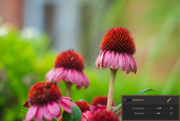
The easiest way to apply one of these is to simply click it and adjust any of the parameters available for that filter. For example, if you click on Brilliance/Warmth, you can adjust two different aspects of the filter; Vividness and Warmth.

How to use Filter Masks in Luminar for Powerful Local Adjustments

A few quick adjustments with a single filter made this bland RAW file go from ho-hum to frame-worthy.

Using Multiple Filters

You can combine as many filters as you want. You can even use layers, just as in Photoshop, to apply one or many filters. Then you can edit all of them at once with options like layer masking, which shows and hides everything on a single layer, and layer opacity.

It may sound complicated, but in actual use, the process is very simple: Load an image, add a filter, adjust the filter, and you’re done. The procedure only starts to get complicated if you want it to, at which point Luminar has a deep enough feature set to accommodate even the most highly demanding photographers.

Controlling the Effects with Filter Masks

Filters are all well and good, but the ace in Luminar’s sleeve is in the way it lets you apply them selectively with filter masks. If you have ever used a filter on Instagram you know that all your edits are applied across the entire image. That can be good but can also be quite frustrating if you only want to edit specific portions of the photo.

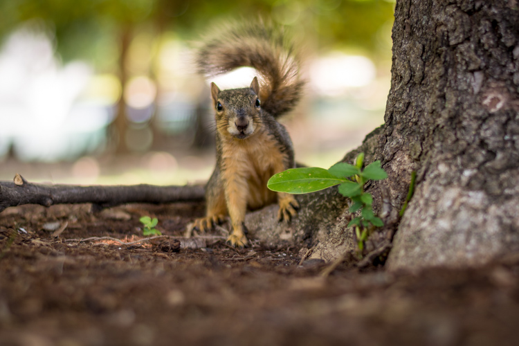
That’s where the simplicity and brilliance of Luminar’s approach really shine because you can control exactly where your edits are applied when you use a filter. To illustrate how this process works, I started with this photo (below) of a squirrel that was clearly in need of some editing.

I shot it in RAW in order to give myself the most amount of flexibility when editing the image, but Luminar works fine with JPG files too. Just know that you won’t have quite the same degree of control when editing JPG compared to RAW files.

How to use Filter Masks in Luminar for Powerful Local Adjustments

Apply Global Edits First

Before I started doing selective editing with filter masks, the first thing I did was to use two filters on the entire image. I used the Brightness/Contrast filter to make the picture brighter and then used Highlights/Shadows to lower the highlights a bit.

How to use Filter Masks in Luminar for Powerful Local Adjustments

So far so good, but I wanted to really make the squirrel stand out from the fountain in the background. Next, I added a Color Temperature filter but here I used the Brush icon in the top corner of the filter control box to apply it only to the squirrel.

Add Local Adjustments

This lets you literally paint in the filter adjustment in the same way you might use the Adjustment Brush tool in Lightroom to selectively edit an image. As you’re painting, you can use the toolbar at the top left of your screen to control the size, softness, and opacity of your brush as well as other settings that will feel right at home to most photographers.

How to use Filter Masks in Luminar for Powerful Local Adjustments

Click the Show Mask icon in the top left corner of the Luminar interface to show where you are applying (painting) a filter to the image.

By far, the most useful option here is Show Mask which you can select by clicking the eye icon in the top left, or by pressing the / key on your keyboard. This lets you see exactly where you are applying your adjustments in real-time while you paint. It is highly useful for making sure your edits are only applied where you want them to show up.

You can use the scroll wheel on your mouse to zoom into the image while brushing your filter adjustments. This allows you to fine-tune your editing to be exactly where you want it applied.

How to use Filter Masks in Luminar for Powerful Local Adjustments

With Show Mask enabled your filter adjustments show as red markings on the photo.

Add a Vignette on the Bottom Only

After editing the color temperature of the squirrel I used the Vignette filter. But instead of applying it to the whole picture I brushed it in just on the bottom corners (something users of Apple’s now-defunct image editing program Aperture might remember doing years ago).

How to use Filter Masks in Luminar for Powerful Local Adjustments

The icon in the top left corner of the filter window shows a black-and-white preview of where the mask has been applied. White reveals, black conceals – just like Photoshop. So anything shown in white is where that filter will be showing.

The ability to brush on filter adjustments is a huge game-changer for anyone who is used to the limited brushing options in Lightroom or overwhelmed by the prospect of doing this type of granular editing in Photoshop. And I say this as someone who uses both Lightroom and Photoshop!

Sometimes I just need a quick and simple editing workflow and the more I use Luminar the more it has replaced much of the work I do in those and other programs. To add a bit of icing to the editing cake, Luminar ships with full plugin support for many popular image editing programs including Photoshop and Lightroom. So you can still use those for your traditional workflow while simply hopping over to Luminar if you want to make use of that program as well.

Filter Mask Options

While my favorite aspect of filter making is the ability to brush adjustments precisely where I want them. But there are two other options that can be quite useful depending on the type of editing you want to do. In addition to a brush, you also have the option of applying Luminar filters with a Radial Mask, Gradient Mask, or Luminosity Mask.

Radial Mask

This applies the filter in a circular pattern which can be rotated, expanded, and contracted. It allows you to apply a filter in an even and controlled fashion. It works almost exactly like the Radial Filter in Lightroom. But instead of only letting you adjust the basic exposure, color, sharpness, and noise you can use it to apply any of Luminar’s dozens of filters.

Think of it like the Lightroom Radial Filter but much more powerful and customizable.

How to use Filter Masks in Luminar for Powerful Local Adjustments

The Radial Mask in Luminar can be used with any of its powerful Filters.

Gradient Mask

Similar to the Radial Mask, the Gradient Mask lets you apply a filter smoothly across an entire image while gradually changing the degree to which it is applied. Once again it works just like its Lightroom counterpart but for filters. Once you have either of the Radial or Gradient masks applied you can choose several additional options such as Disable, Invert, Density, and Feather.

How to use Filter Masks in Luminar for Powerful Local Adjustments

Luminosity Mask

This is an option that is somewhat unique to Luminar. Even though you can re-create this type of mask in Photoshop and other programs I have never seen it implemented so easily and smoothly as it is here.

When you enable a filter and click on the brush icon you have the option of creating a mask that applies the filter only to the brightest portions of the image. This is incredibly useful if you want to make changes and edits quickly without zooming in and painstakingly brushing in your adjustments at a granular level.

This feature is especially useful for landscape photographers who frequently have images with a lot of contrast between the lightest and darkest parts of the image. They often need to edit the sky separately from the rest of the image.

Luminosity Mask in Action

As an example of how this works, I have used the following image of a sunrise that I took in Nebraska one chilly winter morning.

How to use Filter Masks in Luminar for Powerful Local Adjustments

I wanted to make adjustments to the sky while also brightening the dark portions, but not have my edits interfere with each other.

The first step was to add a Brilliance/Warmth filter and then generate a Luminosity Mask. That would make sure any changes would be made just to the sky and not the foreground. I confirmed this by showing the Mask Overlay which gave me a clear idea of where the mask was being applied.

How to use Filter Masks in Luminar for Powerful Local Adjustments

I edited the values of the Brightness/Warmth slider to get the sky looking just right, then added a Highlight/Shadow filter to brighten up the foreground. After that, I finished with a Color Temperature filter which I applied only to the ground by using an inverted Luminosity Mask. That ensured it would apply only to the shadows and not the highlights.

The final image gave me a result that would have been much trickier to create in Lightroom, and require a lot of complicated selection editing and layer adjustments in Photoshop.

Note: the new version of Lightroom (Classic) that Adobe just released now has the ability to add a Luminosity mask to local adjustments as well. 

How to use Filter Masks in Luminar for Powerful Local Adjustments

Simply Powerful Editing

The real advantage for me when using Luminar’s Filter Masking is that it’s a way for me to do creative, complex edits to my images in a simple and efficient manner. Some people have asked me if it’s better than Photoshop and Lightroom, and my answer is a rather vague. “it depends”.

I think there is room for all three programs in a photographer’s workflow depending on that person’s individual needs. But there certainly is a lot to be said for how Luminar gives you access to such powerful and highly customizable image filters while making the adjustment process so easy to use.

If you just want to click a few filters and save your image, as you would in Instagram, then you can be on your way in seconds. However, if you want more fine-grain control over which parts of your photos that those filters are editing, then using Filter Masks in Luminar might be the answer you’ve been looking for.

Have you tried Luminar’s filter masking feature? I’m curious to know about your experience and any tips or tricks you might have uncovered. If you have not yet given these tools a chance you might be surprised at the results you can achieve.

Disclaimer: Macphun is a dPS advertising partner.

The post How to use Filter Masks in Luminar for Powerful Local Adjustments by Simon Ringsmuth appeared first on Digital Photography School.


Digital Photography School

 
Comments Off on How to use Filter Masks in Luminar for Powerful Local Adjustments

Posted in Photography


Olympus OM-D E-M10 III offers 4K video, bigger dials and beginner-friendly UI adjustments

31 Aug

$ (document).ready(function() { SampleGalleryV2({“containerId”:”embeddedSampleGallery_1279730804″,”galleryId”:”1279730804″,”isEmbeddedWidget”:true,”standalone”:false,”selectedImageIndex”:0,”startInCommentsView”:false,”isMobile”:false}) });

Olympus has announced the OM-D E-M10 Mark III, a subtle update to its entry-level OM-D body. The addition of a TruePic VIII processor brings 4K video capture at 30/25/24p, and an ergonomic update introduces bigger dials and a curved handgrip to the still-diminutive camera.

The E-M10 III continues to use its predecessor’s 16MP Micro Four Thirds sensor, meaning image quality is largely unchanged, though you will be able to apply a new Bleach Bypass Art Filter to your images. The E-M10 II’s 81 autofocus points have been upped to 121 points, and burst shooting gets a smidgen faster: up to 8.6 fps compared to 8.5 fps.

Maintained from the previous model is 5-axis in-body stabilization, which can be used in conjunction with digital stabilization for videos – even while recording at 4K resolution. Also consistent with its predecessor are a 2.36M-dot OLED viewfinder and a tilting 3″ 1.04M-dot touchscreen.

The rest of this model’s updates center around usability, specifically for a beginner. Auto mode has been updated with more intelligent scene and subject recognition, and modes for more specialized use-cases (such as focus bracketing and Live Time) are now organized under an Advanced Photo mode on the dial. A new shortcut button offers access to relevant settings based on the camera mode in use.

The Olympus OM-D E-M10 III is expected to ship in late September for $ 650 body only and $ 800 bundled with an M.Zuiko 14–42mm EZ lens.

Press release

NO PHONING IT IN: OLYMPUS OM-D E-M10® MARK III HELPS TAKE YOUR PHOTOGRAPHY TO THE NEXT LEVEL

Compact Interchangeable Lens Camera with New Touch Screen Interface Effortlessly Captures and Shares Blur-Free, High-Quality Images in Any Scene

CENTER VALLEY, Pa., August 31, 2017 — Olympus’ new OM-D E-M10 Mark III is a compact, lightweight, easy-to-use interchangeable lens camera that offers the performance and image quality of the OM-D® lineup to the snapshooter looking to expand their photography. The OM-D E-M10 Mark III includes best-in-class image stabilization compensation performance and the same TruePic VIII Image Processor used in Olympus’ acclaimed flagship OM-D E-M1 Mark II camera. This combination delivers high-quality images even in situations when camera shake typically causes blur, such as night scenes or handheld telephoto shooting.

Consumers looking to step up from their smartphone camera to an interchangeable lens system will instantly benefit from the OM-D E-M10 Mark III’s 5-Axis Image Stabilization. With an image stabilization system built into the camera body, it can provide blur-free images no matter which lens is attached, and can also record crisp, shake-free handheld 4K videos in cinemalike quality.

The camera is compact and lightweight to easily be taken anywhere to capture and share standout, like-worthy images on social media. Designed for ease of use, both in form and functionality, the grip rests nicely in the hand, and buttons and dials are thoughtfully positioned for effortless operation. The body is equipped with a variety of features for different shooting styles and situations, including a high-resolution electronic viewfinder, a tilting rear LCD monitor with touch controls similar to a smartphone and a built-in flash.

First-time interchangeable lens camera users benefit from four shooting assist modes to capture brilliant images right out of the box. The intelligent AUTO Mode detects the shooting scene, subject, camera movement and light transmitted through the lens, then automatically chooses the optimal settings. The other assist modes include Scene Mode (SCN), Advanced Photo Mode (AP), and Art Filter Mode (ART), each of which appear on the mode dial alongside AUTO Mode for easy access.

The Touch AF shutter, which now takes advantage of 121 autofocus points, allows users to choose the precise area of focus and trip the shutter simply by touching the LCD screen. Continuous AF (C-AF) Mode maintains focus on moving subjects when the shutter is pressed halfway.

The OM-D E-M10 Mark III is equipped with built-in Wi-Fi®, which can be used in conjunction with the Olympus Image Share (OI.Share®) app to easily connect to a smart device and wirelessly transfer images for quick editing and uploading to social media.

Pricing and Availability
The Olympus OM-D E-M10 Mark III will be available in a black and silver body or black body beginning in late September with an estimated street price of $ 649.99 USD/$ 799.99 CAD (body only) and $ 799.99 USD/$ 999.99 CAD (M.Zuiko 14–42mm EZ Lens kit). For a complete list of specifications, visit the Olympus website: http://getolympus.com/digitalcameras/omd/e-m10-mark-iii.html.

Olympus OM-D E-M10 II Specifications

Price
MSRP $ 649 (body only), $ 799 (w/14-42mm PZ lens)
Body type
Body type SLR-style mirrorless
Body material Metal, Composite
Sensor
Max resolution 4608 x 3456
Image ratio w:h 4:3
Effective pixels 16 megapixels
Sensor photo detectors 17 megapixels
Sensor size Four Thirds (17.4 x 13 mm)
Sensor type CMOS
Processor TruePic VIII
Color space sRGB, Adobe RGB
Color filter array Primary color filter
Image
ISO Auto, 200-25600 (expands to 100-25600)
Boosted ISO (minimum) 100
White balance presets 6
Custom white balance Yes (4 slots)
Image stabilization Sensor-shift
Image stabilization notes 5-axis
Uncompressed format RAW
JPEG quality levels Fine, normal
File format
  • JPEG (Exif v2.3)
  • Raw (Olympus 12-bit lossless compressed)
Optics & Focus
Autofocus
  • Contrast Detect (sensor)
  • Multi-area
  • Center
  • Selective single-point
  • Tracking
  • Single
  • Continuous
  • Touch
  • Face Detection
  • Live View
Autofocus assist lamp Yes
Manual focus Yes
Number of focus points 121
Lens mount Micro Four Thirds
Focal length multiplier 2×
Screen / viewfinder
Articulated LCD Tilting
Screen size 3
Screen dots 1,040,000
Touch screen Yes
Screen type TFT LCD
Live view Yes
Viewfinder type Electronic
Viewfinder coverage 100%
Viewfinder magnification 0.62×
Viewfinder resolution 2,360,000
Photography features
Minimum shutter speed 60 sec
Maximum shutter speed 1/4000 sec
Maximum shutter speed (electronic) 1/16000 sec
Exposure modes
  • Auto
  • Program
  • Aperture priority
  • Shutter priority
  • Manual
Scene modes
  • Portrait
  • e-Portrait
  • Landscape + Portrait
  • Night + Portrait
  • Children
  • Night scene
  • Sport
  • Hand-held Starlight
  • Fireworks
  • Light trails
  • Sports
  • Panning
  • Landscape
  • Sunset
  • Beach & Snow
  • Backlight HDR
  • Candlelight
  • Silent
  • Macro
  • Nature Macro
  • Documents
  • Multi Focus Shot
Built-in flash Yes
Flash range 5.80 m (at ISO 100)
External flash Yes (via hot shoe)
Flash modes Auto, redeye, slow sync, 2nd-curtain slow sync, redeye slow sync, fill-in, manual, off
Flash X sync speed 1/250 sec
Drive modes
  • Single
  • Anti-shock
  • Sequential high
  • Sequential low
  • Anti-shock sequential low
  • 12 sec self-timer
  • 12 sec anti-shock self-timer
  • 2 sec self-timer
  • 2 sec anti-shock self-timer
  • Custom self-timer
  • Custom anti-shock self-timer
Continuous drive 8.6 fps
Self-timer Yes (2 or 12 secs, custom)
Metering modes
  • Multi
  • Center-weighted
  • Spot
Exposure compensation ±5 (at 1/3 EV steps)
AE Bracketing ±5 (3, 5 frames at 2/3 EV, 1 EV steps)
WB Bracketing No
Videography features
Format MPEG-4, H.264
Modes
  • 3840 x 2160 @ 30p / 102 Mbps, MOV, H.264, Linear PCM
  • 3840 x 2160 @ 25p / 102 Mbps, MOV, H.264, Linear PCM
  • 3840 x 2160 @ 24p / 102 Mbps, MOV, H.264, Linear PCM
  • 1920 x 1080 @ 60p / 52 Mbps, MOV, H.264, Linear PCM
  • 1920 x 1080 @ 50p / 52 Mbps, MOV, H.264, Linear PCM
  • 1920 x 1080 @ 30p / 52 Mbps, MOV, H.264, Linear PCM
  • 1920 x 1080 @ 25p / 52 Mbps, MOV, H.264, Linear PCM
  • 1920 x 1080 @ 24p / 52 Mbps, MOV, H.264, Linear PCM
  • 1280 x 720 @ 120p, MOV, H.264, Linear PCM
  • 1280 x 720 @ 30p / 14 Mbps, MOV, H.264, Linear PCM
  • 1280 x 720 @ 25p / 14 Mbps, MOV, H.264, Linear PCM
  • 1280 x 720 @ 24p / 14 Mbps, MOV, H.264, Linear PCM
Microphone Stereo
Speaker Mono
Storage
Storage types SD/SDHC/SDXC (UHS-I/II supported)
Connectivity
USB USB 2.0 (480 Mbit/sec)
HDMI Yes (micro HDMI)
Microphone port No
Headphone port No
Wireless Built-In
Wireless notes 802.11b/g/n
Remote control Yes (via smartphone)
Physical
Environmentally sealed No
Battery Battery Pack
Battery description BLS-50 lithium-ion battery & charger
Battery Life (CIPA) 330
Weight (inc. batteries) 410 g (0.90 lb / 14.46 oz)
Dimensions 122 x 84 x 50 mm (4.8 x 3.31 x 1.97)
Other features
Orientation sensor Yes
Timelapse recording Yes
GPS None

Articles: Digital Photography Review (dpreview.com)

 
Comments Off on Olympus OM-D E-M10 III offers 4K video, bigger dials and beginner-friendly UI adjustments

Posted in Uncategorized


Tips for Understanding the Lightroom Adjustments Panel

28 Sep

Lightroom can be an intimidating program. Even longtime users sometimes find themselves confused at all the options or unsure of exactly what to do to achieve a specific type of look for their pictures. Fortunately much of this can be mitigated by learning new things slowly and carefully, and taking the time to master just one new tool, option, or set of sliders at a time. The first thing I usually recommend to beginners is the Basic panel because, as its name implies, those sliders can go a long way towards improving your pictures. However another set of sliders in the Develop module, called the Adjustments panel, can take your images to a whole new level if you learn to use it properly.

lightroom-adjustments-panel-squirrel

What is the Adjustments panel?

While the Basic panel allows you to adjust global settings on an image related to things like white balance, overall tint, and highlights/shadows, the Adjustments panel lets you get much more specific with selective color editing. To access this panel click on the Develop module and then look on the right-hand side of your screen. If you do not see it (it’s the third one down), right-click (ctrl-click on a Mac) on any of the Develop panels and make sure the Adjustments option in the pop-up menu is checked.

lightroom-adjustments-panel

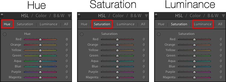
Right away you might be a little confused because the options have odd-sounding acronyms with no explanation. But once you understand how they are related it should get a little easier. For starters, here’s a brief explanation of the three main categories of HSL / Color / B&W.

  • HSL: Allows you to control the Hue, Saturation, and Luminance of all the main colors that make up a picture (Red, Orange, Yellow, Green, Aqua, Blue, Purple, and Magenta)
  • Color: This is essentially the same thing as the HSL panel, as you will see shortly, but the options are organized in order to help you focus on specific colors, and then specific types of adjustments within those colors.
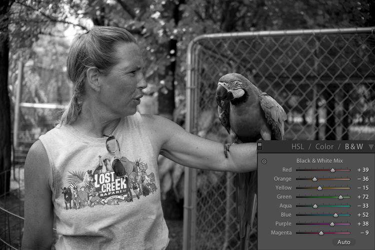
  • B&W: This panel is often the most misunderstood, but one of the most powerful tools available in Lightroom when it comes to converting your images to black and white.

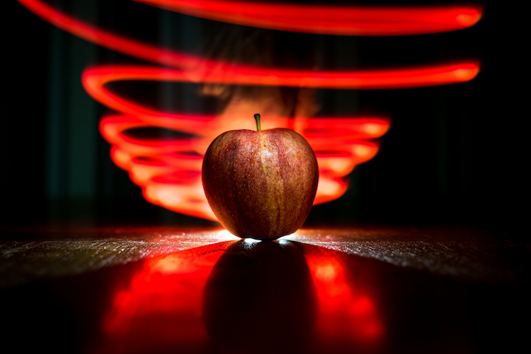
lightroom-adjustments-panel-apple

The HSL tab

This abbreviation stands for Hue, Saturation, and Luminance and allows you to control these parameters all at once for the various colors in your image. When you click the HSL option in the Adjustments panel you can then choose each of these three options to control, or you can click the “All” option and have access to all of the parameters at a glance.

lightroom-adjustments-panel-hsl

Hue sliders

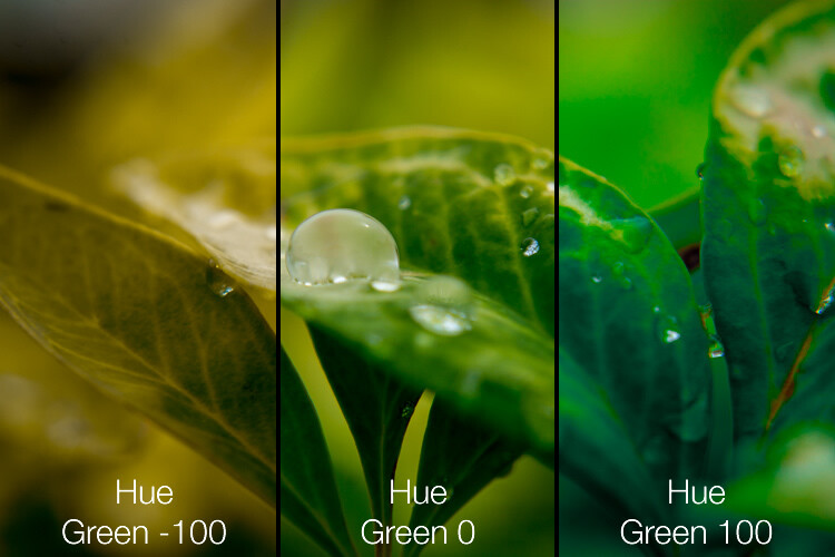
Click the Hue option and you will be able to change the look of specific colors such as Red, Green, Yellow, etc. for the entire image. For example, you could make your greens have more of a yellow tint to them, or make them look almost fluorescent just by changing the Green slider. You can give your skies a deep, rich blue or tone it down to make them look a bit pale. Your purples can be anywhere from reddish to deep violet, all with the click of a mouse button.

Simply adjusting the green hue can give your nature photos an entirely different look and feel.

Simply adjusting the green hue can give your nature photos an entirely different look and feel.

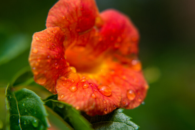
Adjusting the hue, as is the case with many editing decisions, can be most effective when used subtly and in combination with other options such as the tone curve or white balance. Too much editing can come across as obvious and give your images a look that seems overly processed, especially when it comes to portraits. Still, it’s a powerful and valuable adjustment that can greatly affect your pictures.

If you are not sure exactly which color option to select from the ones that are available to you, you can click the target button in the top-left corner of the Hue panel (circled in red below) then click and drag on a specific point in your image. This will adjust the hue that matches the target area, and all similar colors for your entire photo.

lightroom-adjustments-panel-hue-click-drag

One tip I like to use when adjusting the values is to click on the 0 and enter numerical values using my keyboard. I’ll start with something small like 5 and then press the up and down arrows on my keyboard to raise the value in increments of 1. Or you can hold down the shift key while tapping the arrows to raise and lower values in increments of 10. It’s a good way of making more precise adjustments rather than moving the slider with your mouse.

Saturation and Luminance

The Saturation and Luminance tabs function in much the same way. You use sliders or enter numerical values in order to adjust how much of each color is present (Saturation) or the brightness of each color (Luminance). Finally, clicking “All” will let you edit all three parameters at once. I find that a bit overwhelming but others can think is quite useful. See what works best for you.

Subtly editing the HSL values on this picture helped me bring out more vibrant colors and produce the final image I was really going for.

Subtly editing the HSL values on this picture helped me bring out more vibrant colors and produce the final image I was really going for.

The Color tab

At first when you click on the Color tab of the Adjustments panel you might be hit with a feeling of déjà vu. The options look remarkably similar to what you might have already seen in the HSL tab, in that you can once again change the Hue, Saturation, and Luminance. The difference here has to do with how things are organized, and it’s why I find myself working more often in the Color tab than the HSL tab.

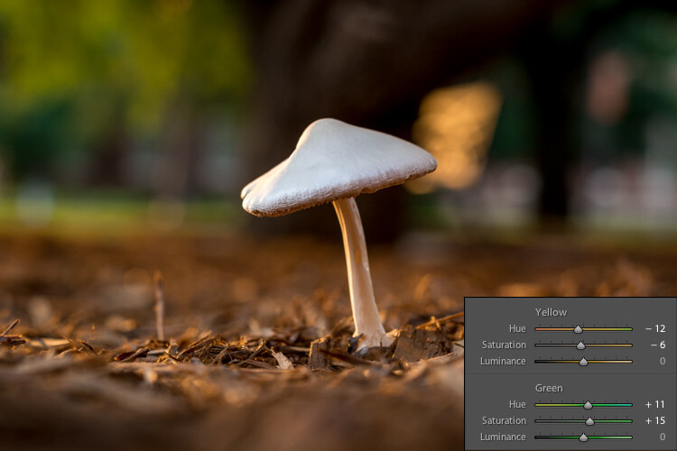
Here all three adjustments are available to you at the same time for each individual color, which makes it very easy to work with your image on a per-color basis as opposed to a per-adjustment basis. If I’m shooting portraits and want to tweak the color of my subject’s purple shirt I will probably want to adjust all three parameters at once, but just for the color purple. This tab gives me the option to do exactly that, and once again you can click on the All option to see all the colors, along with all their corresponding adjustment options, at the same time.

Working in the Color tab of the Adjustments panel let me tweak various parameters of the greens and yellows to get the final image I was going for.

Working in the Color tab of the Adjustments panel let me tweak various parameters of the greens and yellows to get the final image I was going for.

The B&W tab

lightroom-adjustments-panel-bwThis part of the Adjustments panel is often the most confusing because as soon as you click on it, your image turns grey, and yet you still have all the same color sliders as on the other tabs. What’s going on here?
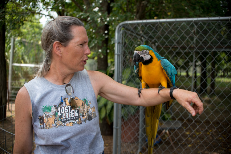
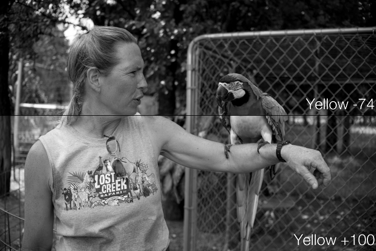
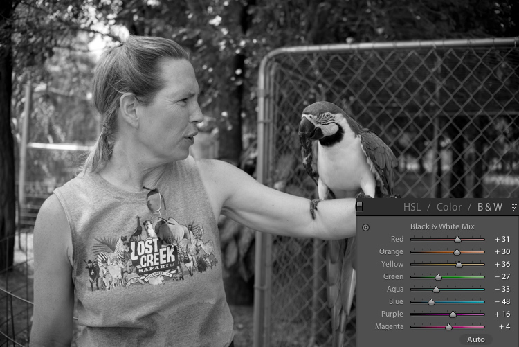
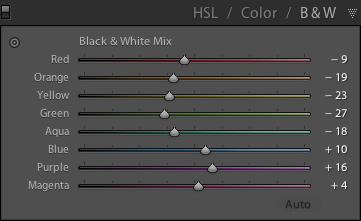
The answer lies in how Lightroom essentially tries to mimic the effect of black and white filters on color pictures. What you are doing with this panel is turning your image into a grayscale version of its colorized counterpart, then adjusting the tone of each of the individual colors as the image is processed. Incidentally, if you open this panel and then click on one of the Black and White filter presets in Lightroom (in the presets panel on the left side of LR) you will see the sliders move around because they are really just specific values for the sliders you see here.

An example B&W conversion to see how the sliders work

To demonstrate how these Adjustment options work, here’s an image of a woman who owns a wildlife refuge in Oklahoma holding a macaw.

lightroom-adjustments-panel-macaw-color

There are several distinct colors in this image such as yellow, aqua, and green, which makes it an ideal candidate for understanding how the B&W adjustments work. In this first example I have clicked the B&W filter and left all sliders at their default values, but changed the yellow option for two different results.

lightroom-adjustments-panel-macaw-bw-yellow

Most of the image remains unaffected except for the bird’s bright yellow chest, which is starkly different depending on the values I have selected for the Yellow slider. Increasing the numerical value of yellow has made the corresponding areas much lighter, and decreasing it has made them appear significantly darker. Once again you will likely find that in this B&W panel the best edits are the most subtle, and you can use the sliders to creatively adjust the look and feel of a monochromatic image. To further illustrate the effects of these sliders, compare the following images. The first one has higher values of colors that correspond to the skin tones of the woman and the chest plumage of the bird, and darker greens for the foliage in the background.

lightroom-adjustments-panel-macaw-bw-all-1

Be careful not to go too far

In the next example, the colors of the bird’s chest have been significantly darkened while the background is much lighter, and the woman’s skin tone has been toned down quite a bit as well. I find the top image much more natural and pleasing, whereas the bottom one significantly alters the appearance of the bird and makes the woman look almost as though her face has been burned, particularly if you look where her jawline meets her neck.

lightroom-adjustments-panel-macaw-bw-all-2

As you play around and experiment with the B&W sliders you will start to get a feel for how you might prefer various adjustments in your images. If you are the type of person who likes to try black and white photography this panel is significantly more useful than just clicking on a preset or using built-in filters in a program like Instagram.

Conclusions

I hope this article has helped you understand a bit more about some of Lightroom’s useful editing options. If you have never used the Adjustments panel before go ahead and try it out! Lightroom is non-destructive which means your edits are not permanent and can be undone at any time, so it never hurts to try something and see what happens.

If you find the Adjustments panel to be useful, or have your own tips to share, please leave your thoughts in the comments below. I’m sure other readers would enjoy hearing them.

googletag.cmd.push(function() {
tablet_slots.push( googletag.defineSlot( “/1005424/_dPSv4_tab-all-article-bottom_(300×250)”, [300, 250], “pb-ad-78623” ).addService( googletag.pubads() ) ); } );

googletag.cmd.push(function() {
mobile_slots.push( googletag.defineSlot( “/1005424/_dPSv4_mob-all-article-bottom_(300×250)”, [300, 250], “pb-ad-78158” ).addService( googletag.pubads() ) ); } );

The post Tips for Understanding the Lightroom Adjustments Panel by Simon Ringsmuth appeared first on Digital Photography School.


Digital Photography School

 
Comments Off on Tips for Understanding the Lightroom Adjustments Panel

Posted in Photography


How to Blend in Adjustments Using Layer Masking in Photoshop

26 Apr

In a recent article called: Getting Started with Layer Masks in Photoshop – a Beginners Tutorial, I showed you the basics of layer masks and why they are such powerful tools. Layer masks are essentially what gives Photoshop layers much of their power. They allow you to tell Photoshop exactly where you want your changes applied, and to what degree.

In that article, I also showed you how to use layer masks in pictures where you had a defined edge to the areas you wanted to change. Photoshop has a lot of great tools that allow you to make selections, which you can then use to define the mask.

Here is a picture I took in Florida where I used layer masks and to accentuate parts of the image without changing other parts.

Here is a picture I took in Florida where I used layer masks and blending, to accentuate parts of the image without changing other parts.

But what about pictures where you have a soft edge? Or where you want to blend in the effect gradually? That’s what I will cover in this article. It will pick up where the prior article left off, so if you haven’t seen that one yet, check it out. Once you have reviewed the basics of layer masks in that article, come back here and we will get started.

Step 1: Create an Adjustment Layer

The first thing to do is make the changes you want to the image, which will then be blended into the selected areas later. To make those changes, I am going to create a Curves adjustment layer. As mentioned in the prior article, Curves adjustment layers are one of the most powerful tools in Photoshop. They allow you to selectively effect brightness, contrast, and/or color. To create one, just select Layer > New Adjustment Layer > Curves. You can also click on the Curves icon in the adjustment layer panel. Don’t worry though – we are not going to do anything complicated with the Curves Adjustment layer.

Graphic9-NewAdjustmentLayer

Of course, you don’t have to use a Curves adjustment layer to make adjustments to your picture, you can use any of the adjustment layers offered by Photoshop. If you are more comfortable with Levels, use that. If you want to change the brightness levels, there are Exposure and Brightness/Contrast adjustment layers. If you want to make changes to color, you can use the Hue/Saturation or Vibrance adjustment layers. I consider Curves to be one of the most powerful tools in Photoshop, so that is what I use, but you can use whichever one you want, or you are most comfortable using.

Step 2: Add in the Effect

Once your Curves adjustment layer is created, just add the effect that you want. Remember that a white mask is automatically applied to all adjustment layers – so it reveals everything – but we will change that in a second.

I want to add contrast, therefore I will just scoot in the endpoints of my curves adjustment layer. You can also drag the line up or down in places. The idea is to steepen the curve where you have a lot of pixels. Doing so adds contrast, which is what we want.

You don’t need to do anything fancy here. Go ahead and add the effect to a greater extent than you will want it in your picture. In other words, overdo it. Don’t worry if the picture doesn’t look quite right.

Graphic1-Curves

In addition, don’t worry that the effect is occurring across the entire picture at this point. We will make the changes apply selectively in just a second. For now, just look at the area of the picture where you want the effect to be applied and add it in accordingly. For example, in this picture below, my change is added to the entire picture, even though it results in effects I don’t want (like blowing out the sky on the right). We will fix that in the next step.

Graphic2-InitialChanges

The left side of this image shows the original image, the right side shows it after the application of the curves adjustment layer. Notice the far right portion of the sky is blown out, but we’ll remedy that by limiting where the effect applies in the next step.

Step 3: Brush it in

Now comes the part when you limit the areas where your changes apply to the image.

Start by masking off the entire image, just press CTRL/CMD+I to do so. You will notice that two things happen. First, the effect you just added to your picture is hidden, it’s as if you never made any changes (don’t worry, the changes are still there, they’re just hidden). Second, the box next to the adjustment layer you created turned black. The box represents the layer mask. As we discussed in the last article, a white layer mask means the changes show through to the image (which is why you saw the effect of the changes when the layer mask was white). A black layer mask means the effect does not show up on the picture. Since our layer mask is now black, the effect does not apply anywhere in the picture.

Graphic3-BlackLayerMask

Now we can begin the process of adding the effect in gradually. To do so, we will use the Brush tool. You can select it from the list of tools on the left side of your screen (tool panel), or you can just press B to call it up. While you are at it, go ahead and press the D key on your keyboard. This will ensure that the brush is set to its default foreground color, which is white, which is what you want since you will be adding the effect to the picture.

If you just left the brush as is, when you used it to paint in your picture, it would add the effect 100%. That is not what you want here. You want to add the effect in gradually, so it blends in. Therefore, go to the top of your screen and find Opacity. Pull the Opacity to the left until it is in the range of 5% to 15%. In my case I will use 10% (you can also just type 15 on your keyboard and it will apply to the opacity of the brush while that tool is selected). The lower the opacity, the less the effect gets added with each brush stroke – and the more gradual the change. If you have the patience to keep the Opacity very low (some people go as low as 2-3%), you will be rewarded with very gradual changes.

Graphic4-BrushTool

Now you will just paint in the effect. Before you do so, also make sure that the hardness of your brush is set to 0%. You want as soft a transition as possible. In addition, use as large a brush as your picture allows. The larger the brush, the softer the transition. The easiest way to change the size of your brush is with the square bracket keys. The left bracket [ makes the brush smaller while the right bracket ] makes it larger.

Now just click in the areas where you want the effect applied. You will have to do this multiple times because you have the opacity set very low. That is okay though, be patient. By doing it this way you are ensuring that it’s blended in gradually. You can also add the effect more in some places and less in others. Just click a few more times where you want the effect to be the most visible.

Graphic5-BrushingIn

Step 4: Check Your Work and Adjust

You can check your work by clicking the eyeball next to the layer. When you turn off the layer, Photoshop will show your image without your effect added. Click the eyeball again to see your progress and turn the layer back on.

Here is the histogram after using the brush tool to paint in white. It shows only the pixels that were selected via the brush.

Here is the histogram after using the brush tool to paint in white. It shows only the pixels that were selected via the brush.

If you found you overdid the effect, you can always back it off. You do so by turning the color of your brush from white to black. Remember that white reveals the adjustments, black hides them. You could undo the effect by stepping backward (Edit > Step Backward), but the easiest way to do so is just press the X key (that switches the foreground and background colors so you now have black on top). Now when you use your brush it will be removing the adjustment you created. Remember that your opacity percentage applies whether your brush is painting with white or black. When you are done removing the adjustment, press the X key to go back to a white brush and continue adding the effect where you want it.

You can also go back and adjust your Curve after you have brushed it in. In fact, you should get in the habit of checking the curve your originally set. Once you have used your brush tool, the histogram will show only those pixels within the selected area (where you painted white). In general, you will want to make sure that the steepest part of the curve corresponds with the part of the histogram where you have the most pixels. Make a tweak to your curve to make sure it looks how you want.

Step 5: Repeat

Another great thing about this technique is that you can do it over and over again. It’s not uncommon to see photographers with a long list of layers, where they have made adjustments to specific parts of the image. You can use this technique to change the brightness values of the picture, making parts lighter or darker. You can also change the contrast, as we did above. You can even change the colors by going into the individual color channels of the Curves adjustment layer. Of course you could also use the brushing techniques above on a Hue/Saturation adjustment layer.

Here I used the same process that was set forth above to brighten the water. I created another Curves adjustment layer, turned the layer mask black, and then brushed in the effect with brush set to white at low opacity.

Graphic7-WaterAdjustmentToo

Other Changes to Your Image

In this particular image, I also wanted to sharpen the pier without sharpening the rest of the image. To do this, I will use the High Pass Filter (which is a remarkably powerful sharpening tool) and apply a layer mask to limit the effect to the pier. This will demonstrate the use of this layer masking technique outside the context of adjustment layers, which we have been using so far.

First, let’s quickly walk through the use of the High Pass filter. To sharpen with the High Pass filter, first duplicate the layer (CTRL + J). Then change the blending mode to Overlay (don’t worry about how this makes your image look). After that, call up the High Pass filter (Filter > Other > High Pass). This will result in a small dialog box where you set the amount. Here I will go with an amount of about 4, which I find is pretty typical. Press ok and the effect will be applied to the entire image. This is a pretty handy sharpening technique, but we’ll make it better by applying it only to a specific area (the pier).

To do this, we’ll add a layer mask and use the same brushing technique. Since we are not starting with an adjustment layer, we will need to add a layer mask. Just click on Layer > Layer Mask > Hide All, which will create a black layer mask. After that, select your brush (press B), set the color to white (press D for default), and set your opacity. Whereas you had been using a very low opacity earlier, in this case you can use a much higher Opacity. Brush in the effect just on the pier and watch it become sharper.

Graphic8-Sharpening

Conclusion

Although this technique is fairly simple, it is a pro move. I know photographers that edit their photos with nothing but a series of Curves adjustment layers where they blend in the effect in this manner. Give it a shot on some of your photos and I believe you will like the results.

googletag.cmd.push(function() {
tablet_slots.push( googletag.defineSlot( “/1005424/_dPSv4_tab-all-article-bottom_(300×250)”, [300, 250], “pb-ad-78623” ).addService( googletag.pubads() ) ); } );

googletag.cmd.push(function() {
mobile_slots.push( googletag.defineSlot( “/1005424/_dPSv4_mob-all-article-bottom_(300×250)”, [300, 250], “pb-ad-78158” ).addService( googletag.pubads() ) ); } );

The post How to Blend in Adjustments Using Layer Masking in Photoshop by Jim Hamel appeared first on Digital Photography School.


Digital Photography School

 
Comments Off on How to Blend in Adjustments Using Layer Masking in Photoshop

Posted in Photography