[ By Steph in Design & Guerilla Ads & Marketing. ]
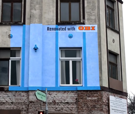
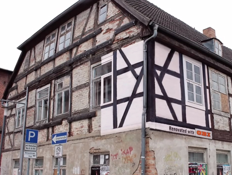
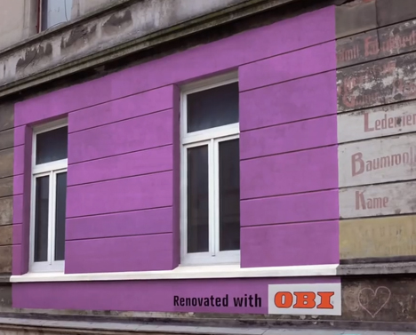
Billboard-sized paint jobs on buildings that have seen better days give passersby a glimpse of how much fresher and brighter the structure could look with a little care – the ideal advertisement for paint company OBI. They may be promoting a product, but these miniature renovations get their message across by proving what the product can do rather than just plastering photos of it on ugly billboards.
The campaign by Hamburg-based agency Jung Von Matt came about as a result of price wars between independent stores in Germany, causing a sudden increase in unsightly billboards all over the country. OBI, the largest DIY store in Germany, asked “Why do people advertise products that are supposed to make our homes look nicer using adverts that make everything look uglier?”
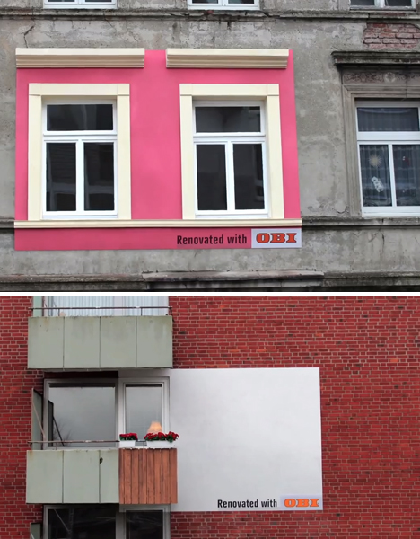
It’s a refreshing twist on the usual public advertisement, using the old show-don’t-tell method. In some cases, just half a window is included in the re-paint, making it glaringly obvious how much newer and more cheerful the building would look if the whole thing received the same treatment.
These days, as we collectively develop blinders that make conventional ads in public spaces virtually invisible, marketers have to get a lot more creative to be noticed. Check out 300+ shocking, brilliant and unmissable ad campaigns that force us to sit up and pay attention.


[ By Steph in Design & Guerilla Ads & Marketing. ]
[ WebUrbanist | Archives | Galleries | Privacy | TOS ]

You must be logged in to post a comment.