RSS
 

Posts Tagged ‘Paint’

Ricoh launches ‘Street Edition’ version of its GR III with new paint and custom accessories

11 Jun

Ricoh Imaging has announced the release of the GR III Street Edition Special Limited Kit, a limited edition camera package that includes a new look and exclusive accessories.

The updated look gives the GR III a textured metallic grey paint job that Ricoh claims was chosen ‘to appeal to a street photographer, evoking the asphalt pavement in the city.’ Also new in this limited edition camera is the orange-yellow lens barrel ring that Ricoh says is ‘reminiscent of traffic lines painted on streets.’

Beyond the new paint job, the Ricoh GR III Street Edition comes with a detachable viewfinder with the same metallic grey finish (the standard version of this finder retails for $ 250), as well as a genuine- leather hand strap, the latter of which has an orange-yellow stopper meant to match the lens barrel ring. When turned off, the camera will also display a street-view image as well as a specialized product logo.

$ (document).ready(function() { SampleGalleryV2({“containerId”:”embeddedSampleGallery_0437025215″,”galleryId”:”0437025215″,”isEmbeddedWidget”:true,”selectedImageIndex”:0,”isMobile”:false}) });

Internally, the new Street Edition version of the GR III is identical to its less-colorful counterpart, complete with the 24MP APS-C sensor, the 28mm equiv. F2.8 lens and the hybrid autofocus system.

However, this camera will include Ricoh’s new ‘Full Press Snap’ feature, which allows users to pre-define a focal point and have the lens immediately snap focus to that point upon fully depressing the shutter and/or tapping the back LCD display. Ricoh notes this feature will be available on the standard GR III via a firmware update after the release of this limited edition camera, but no specific timeframe is mentioned.

The Ricoh GR III Street Edition Special Limited Kit is limited to 3500 units worldwide and is set to launch mid-July for $ 1199/£1099. If you don’t care for the entire kit or miss out on the limited-run, don’t fret — this coming autumn, standalone GR III Street Edition units will be available (no pricing information has been shared at this time).

Press release:

Ricoh launches RICOH GR III Street Edition Special Limited Kit

Limited-quantity package featuring high-end digital compact camera with a stylish metallic gray body and exclusive accessories

PARSIPPANY, NJ, June 10, 2020 – Ricoh Imaging Americas Corporation today announced the launch of the RICOH GR III Street Edition Special Limited Kit. Available in a limited quantity of 3,500 units worldwide, the kit combines the RICOH GR III camera body, finished in a metallic gray color, with a compact, detachable viewfinder and a genuine-leather hand strap, both designed exclusively for this package.

Offering the same high image quality as the standard RICOH GR III, the small, lightweight camera body has been treated with a metallic gray finish designed to appeal to a street photographer, evoking the asphalt pavement in the city. The finish features an elegantly grained texture that is smooth in appearance but helps improve camera grip. It’s accentuated with an orange-yellow lens barrel ring, reminiscent of traffic lines painted on streets.

In addition to the camera, the kit includes a pair of exclusive accessories: a compact, detachable viewfinder featuring the identical metallic gray finish and a genuine-leather hand strap. The viewfinder has the number 28 imprinted on its top panel to highlight the camera’s angle of view, while the strap’s stopper is finished in orange-yellow identical to the camera’s lens barrel ring.

This camera allows the photographer to instantly activate the Full Press Snap feature* with a single touch on the LCD panel. This feature shifts the lens to a preselected focal point the moment the shutter release button is fully pressed. It can also be assigned to the LCD screen, assuring the photographer of flawless point-and-shoot photography to capture once-in-a-lifetime shutter opportunities. One of the strong points of the GR series, this feature comes in handy when taking snapshots on the street and will be available in the standard GR III via a firmware update that is scheduled for release later this year.

The RICOH GR III Street Edition, a high-grade digital compact camera that doesn’t include the viewfinder and the strap, is also scheduled to be launched in the autumn of 2020.

Pricing and Availability

The RICOH GR III Street Edition Special Limited Kit will be available mid-July at www.us.ricoh- imaging.com as well as at select Ricoh Imaging-authorized retail outlets nationwide for a manufacturer’s suggested retail price of $ 1199.95.

Main Features of the RICOH GR III Street Edition Special Limited Kit

The camera body has been treated with an attractive metallic gray finish that designed to appeal to a street photographer, symbolizing the asphalt pavement in the city. It’s also accentuated with an orange-yellow ring encircling the lens barrel. The exterior finish features an elegantly grained texture created by repeatedly spraying droplets of a coating material onto the camera body. Although smooth in appearance, this special paint also helps improve camera hold.

The camera comes with a pair of exclusive accessories: a compact, detachable viewfinder featuring the identical metallic gray finish, and a genuine-leather hand strap. The viewfinder has the number 28 imprinted on its top panel to highlight the camera’s angle-of-view, while the strap’s stopper is finished in orange-yellow identical to the camera’s lens barrel ring, to enhance the product image.

This camera allows the photographer to instantly activate the Full Press Snap feature* with a single touch on the LCD panel positioned on the camera’s back panel. This feature shifts the lens to a preselected focal point the moment the shutter release button is fully depressed. It can also be assigned to the LCD screen positioned on the camera’s back panel, assuring the photographer of flawless point-and-shoot photography to capture once-in-a-lifetime shutter opportunities. One of the strong points of the GR series, this feature comes in handy when taking snapshots on the street.

* This feature can be added to the standard GR III model by installing function expansion firmware, which is scheduled to be released after the time of the camera’s launch.

When the camera’s power is turned off, the camera displays an original termination screen consisting of the specially designed product logo and a street-view image that symbolizes the camera’s “street snapshot” concept.

Notes:

• The camera’s other specifications are identical with those of the standard GR III model.

• The design and specifications are subject to change without notice.

Articles: Digital Photography Review (dpreview.com)

 
Comments Off on Ricoh launches ‘Street Edition’ version of its GR III with new paint and custom accessories

Posted in Uncategorized


GANPaint Studio uses neural network to ‘paint’ new elements into images

24 Jan

A team of researchers with IBM Research, MIT CSAIL and MIT-IBM Watson AI Lab has launched a new online tool called GANPaint Studio that utilizes a GAN neural network and semantic brushes to ‘draw’ entirely new elements into existing images. In the case of this particular tool, the elements include grass, clouds, brick, doors, trees, sky and domes.

Unedited before image.

As demonstrated in the images above and below, GANPaint Studio is more of a fun demonstration rather than a serious tool for modifying images. The input images are stripped down to a very low resolution when uploaded; the resulting images are clearly edited, though the neural network is capable of some surprisingly realistic edits.

After adding grass, trees and clouds.

In addition to drawing elements into the images, the tool also features an eraser icon that, when clicked, enables the user to erase elements from the input image. This isn’t the first time we’ve seen a demonstration of a neural network capable of producing realistic elements in an image using a basic ‘drawing’ tool.

In March 2019, for example, NVIDIA Research demonstrated a similar tool it calls GauGAN to generate a photorealistic image from a series of crudely painted marks, each mark made to represent types of elements like water, trees and sky. NVIDIA has published a sizeable body of research on AI and its potential for generating photorealistic images.

As for GANPaint Studio, anyone can access the photo editor here; it comes populated with a selection of preloaded images, but users also have the option of uploading their own image. While using the tool, we found that the images need to be at a fairly low resolution, such as 800 x 500, for the editor to successfully upload the input image.

The MIT and IBM researchers have made their research on the project publicly available [Note: This is a 48MB PDF].

Articles: Digital Photography Review (dpreview.com)

 
Comments Off on GANPaint Studio uses neural network to ‘paint’ new elements into images

Posted in Uncategorized


Paint Shop Pro 2019 Ultimate Review

14 Oct

About a year ago I reviewed the 2018 version of this software. It was an interesting comparison for me, as I started using it back when it was still owned by Jasc Software (before Corel bought it).

Now we have the 2019 version, dubbed Paint Shop Pro 2019 Ultimate. And as someone who uses Lightroom and Photoshop, I was interested to see how it stacks up.

The Basics

Corel Paint Shop Pro 2019 is a Windows-only product that comes in two editions – Standard and Ultimate.

The Standard edition features creative presets powered by AI, 360-degree photo editing, enhanced performance, features, enhanced usability and ease of use, and new creative content.

The Ultimate edition includes everything in the Standard edition as well as:

  • Photo Mirage Express
  • Painter Essentials 6
  • Perfectly Clear 3.5 SE
  • Aftershot 3
  • Creative Collection of brushes, textures and backgrounds.

Note: Painter Essentials 6, Perfectly Clear 3.5 SE and Aftershot 3 will run only on the 64-bit version of Windows.

Both come with a 30-day free trial, and the $ 99.99 USD price tag is for a perpetual one-off licence, not a subscription.

For more information, check out the website.

Workspaces

PSP 2019 Ultimate has two workspaces – Essentials and Complete.

Essentials is a cut-down version aimed very much at beginners, while Complete has all the features and options. To distinguish between them, Corel has made the interfaces different shades of grey.

Essentials is a light grey, although you can adjust it to one of three different shades. You can also adjust the size of the buttons on the toolbar to make them bigger (as shown  below), and move the toolbars and palettes around to suit.

Complete is a dark charcoal grey, and has the filmstrip of images along the bottom.

Layers comes up by default in Complete, whereas I had to manually add it in Essentials and dock it where I wanted it to go. So if you plan on using layers I’d opt for the Complete workspace, although you can switch between them quite easily.

Performance

I tested the performance of PSP 2019 Ultimate on my standard Photoshop machine. It has:

  • an Intel Core i7 processor
  • 24GB of memory
  • two 180GB SSD in a Raid 1 configuration for the operating system
  • two 500GB SATA drives in a Raid 1 configuration for extra backup (PSP was installed on this array)
  • network attached storage (NAS) for all my RAW files.

Admittedly my system is about seven years old. But it works fine with Photoshop CS6 and images with many layers.

PSP found my NAS files and let me access them easily. But performance was generally slow and noticeably laggy. When I moved sliders on the RAW image import I had to wait for the software to catch up.

Loading an image file as a layer was quite slow. And if I moved the layer it stuttered instead of moving smoothly.

Image Management and Editing

While RAW files can be imported into the program, the editing features are extremely limited compared to Lightroom and Adobe Camera Raw. Corel does offer AfterShot3 as a RAW image editor, but it’s a separate program and not included in this review.

You can perform basic image edits and compare the Before and After results as shown below.

It also gives you some quicker options for editing photos. One-Shot Photo Fix is a one-click option that does it all. I preferred the Smart Photo Fix, which gives you more control over the edits as shown below. I did like the large preview panes when using this feature.

Other Editing Tools

PSP caters for layers and masks as you would expect. In the image below I applied a text layer to the original photo, changed the blend mode to soft light, and reduced the opacity. I then added a mask to brush out parts of the text.

All the usual suspects are present: adjustment layers, brushes, painting, text, selections and masks. But the creative additions to this version of PSP are interesting.

Art Media

Art Media is a new function that lets you paint over an image in a range of different painting styles (watercolour, acrylic, oil, etc.) It picks up the colour of the image underneath as you paint, allowing for a different creative approach to editing your images.

There’s also a built-in tool that lets you mix colours on a digital palette and paint with various brush styles. Here’s a short video showing how it can be used.

My machine struggled a lot with this. Every stroke was very slow, and as a result wasn’t very accurate.

Here’s an example of a test paint in watercolour mode on top of the original image

When you remove the base image and look only at the painted layer, it looks like this.

Having the paint strokes on a separate layer is a good choice as it lets you apply various layer controls such as blend modes, masks and opacity changes.

Pic to Painting

This is the new AI-assisted painting feature that, glancing at the sample images supplied, looks similar to Topaz Impression. (Here’s a quick video demonstration.)

It provides effects similar to mobile apps such as iColourama, Waterlili and Prisma, but lets you apply them on your computer. Controls are very limited. Choose the style, choose the strength, then apply.

It took a long time to download and install onto my computer. Even previewing the first style took several minutes. While graphics-intensive processing like this can be a bit slow (Topaz Impression can take a minute or so to gather its resources when you first start it up), this was a very long time to wait. Especially for just a preview.

After trying several times, and giving the last test 17 minutes to process, I gave up. Later I discovered that Pic to Painting only works in Windows 10, even though that isn’t stated in any of the advertising.

360-Degree Support

If you have a 360-degree camera (or take a lot of panorama shots), PSP can apparently process these images and let you create different effects. (I didn’t test this.)

Makeover Tools

A set of tools are included to help remove blemishes, lines and red eye, whiten teeth, and even out skin tones. I don’t shoot closeups of faces, so I tested the blemish remover on a blueberry shot.

Here’s the BEFORE shot. The blueberry was a bit old, and when zoomed in you can see creases, bruises and scuff marks.

The Blemish remover settings are essentially a brush. About all you can do is change the size and opacity.

I reduced the brush size to suit. I didn’t see much effect at 40%, so I increased it to around 90%. It seems to do a content-aware fill, as it picked up other lines from the area I was working on. It ended up requiring much more work to solve those extra problems.

Here’s the finished experiment.

Other Useful Features

The size of the buttons on the toolbars can be increased – handy for those with high-resolution monitors and those of us who should probably wear glasses when we edit.

If you click the ‘+’ symbol at the bottom of the Tools palette, a search window appears that lets you search for functions by name in several different ways. This is a great way to find things you don’t necessarily know the name of but can guess what they do.

And being able to change the colour of your workspace backgrounds in both Essentials and Complete mode is a nice touch.

Conclusion

Overall, I found this particular version of Paint Shop Pro Ultimate a bit disappointing. It performed very poorly on my compute, and some of the new features only work if you’re running 64-bit Windows, Windows 10 or both.

It does add AfterShot3 for Raw editing, Perfectly Clear for intelligent photo adjustments, Painter Essentials for the more artistic and Photo Mirage Express for animations. There are also some free bonus additions, and a lot of extras you can purchase (presets, textures, etc.)

Corel has certainly included all the options a photographer might want to process and edit images, as well as a variety of options for further creative exploration. But the hardware requirements needed to access all the extra features is a problem, especially when they’re only mentioned in the technical specifications.

I should note that I joined the PSP Support community to get answers to my questions, and the people there were extremely helpful and responsive. I got several responses to my queries over the course of a few days. The user guide is a bit vague, so if you do have PSP I strongly recommend checking out the Support Community if you need help.

While it is quite cost effective, and a one-off purchase rather than a subscription, I highly recommend downloading the trial version first to see f it will work on your current computer.

Overall score: 3/5

The post Paint Shop Pro 2019 Ultimate Review appeared first on Digital Photography School.


Digital Photography School

 
Comments Off on Paint Shop Pro 2019 Ultimate Review

Posted in Photography


Tutorial: How to light paint product photo backgrounds on the cheap

17 May

Dustin Dolby of workphlo is great at creating professional product shots using just one or two speedlights and some compositing in Photoshop. In this tutorial, he combines that approach—it takes just two speedlights to light these bottles, and he could have made due with one—with some simple smartphone light painting to create a dynamic and colorful soft drink product shot.

Here are the four exposures he composited together to light just the bottle. One shot using a stripbox through a diffusion panel on the right, one with a reflector added in on the left, another to light the label, and a fourth to give the bottle a bit of pop from behind:

$ (document).ready(function() { SampleGalleryV2({“containerId”:”embeddedSampleGallery_2436914201″,”galleryId”:”2436914201″,”isEmbeddedWidget”:true,”selectedImageIndex”:0,”isMobile”:false}) });

Combine that with a long-exposure light painting shot done in darkness by simply waving a smartphone with a solid color background around behind your product, and you get these two final images—one for each flavor:

Check out the full video up top to see how all of these images were composited together to create the final product photos. And if you’re just getting into product photography and enjoy simple, one or two-light setups, definitely give the whole workphlo YouTube channel a look.

Articles: Digital Photography Review (dpreview.com)

 
Comments Off on Tutorial: How to light paint product photo backgrounds on the cheap

Posted in Uncategorized


Art of Deception: Pencil Drawings Look Like Colorful 3D Splashes of Paint

01 Oct

[ By WebUrbanist in Art & Drawing & Digital. ]

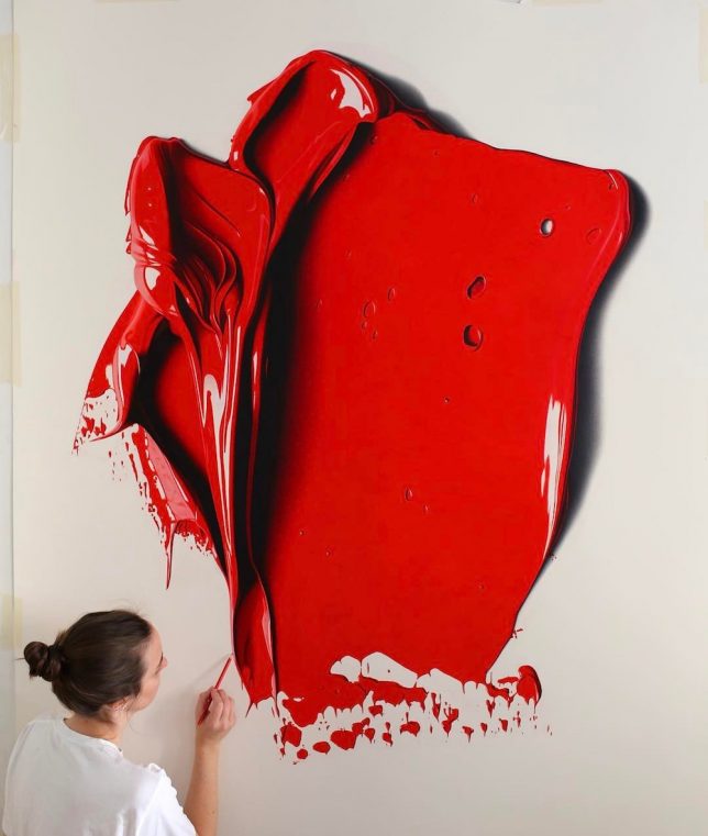
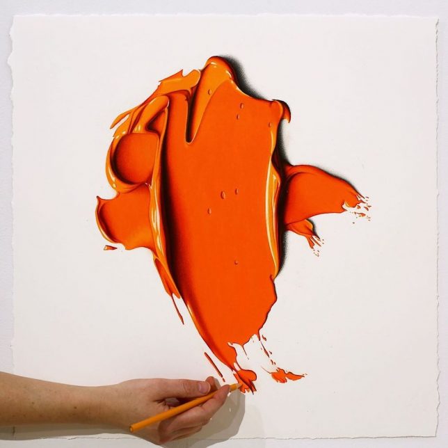
Seeming to rise up off the canvass, a viewer would be impressed to discover these swaths of paint to be two-dimensional in nature, but then further shocked to realize the material isn’t paint at all but pencil.

Australian artist Cj Hendry has an eye for hyper-realism, but in this series: instead of using it to draft convincing landscapes or portraits has turned to emulating oil paint.

Layers of carefully applied pencil slowly add depth and dimension to the flat surface, capturing the lush appearance of semi-liquid paints. The effect is so convincing the artist often includes a hand and pencil in photographs of the work to highlight the fact that what is being seen is both two-dimensional and drawn with pencils.

It is a dramatic shift from previous work by Hendry done in black and white. And going to color didn’t mean just picking one per piece, either — each of these colorful works employs a number of different colors, which is not at all obvious at a glance.

Share on Facebook


[ By WebUrbanist in Art & Drawing & Digital. ]

[ WebUrbanist | Archives | Galleries | Privacy | TOS ]


WebUrbanist

 
Comments Off on Art of Deception: Pencil Drawings Look Like Colorful 3D Splashes of Paint

Posted in Creativity


Secrets in the Shadows: Urban Objects Transformed with Sidewalk Paint

29 Aug

[ By SA Rogers in Art & Street Art & Graffiti. ]

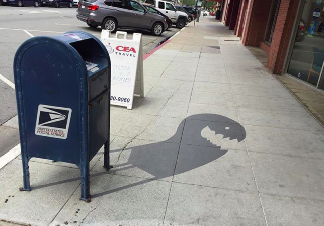
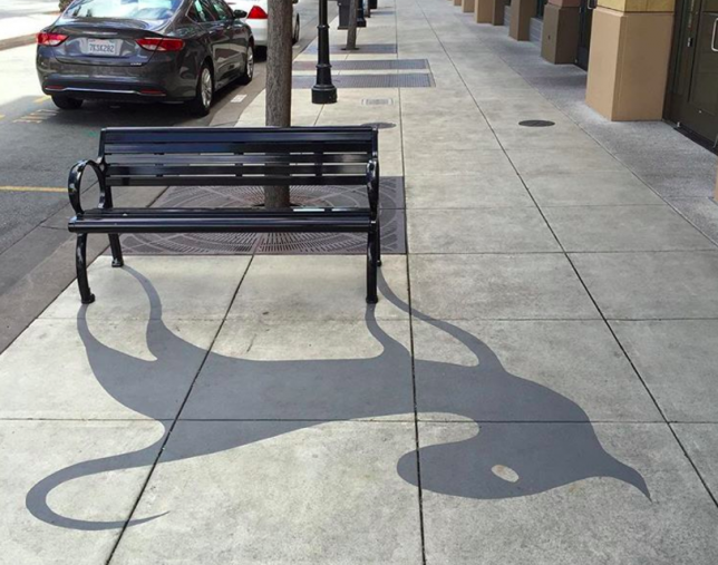
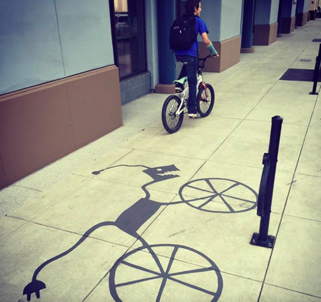
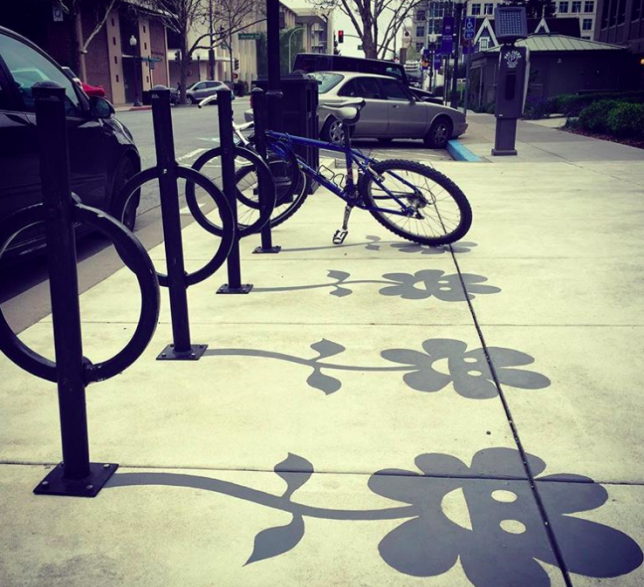
You might not even notice there’s anything unusual about these shadows until you’re right up on them, wondering why in the world a mailbox looks like a grinning monster, fearing that somebody slipped you a psychedelic drug. There’s nothing wrong with your perception of the world. You’re just lucky enough to spot one of Damon Belanger’s shadow art creations in the wild, painted on urban surfaces all over Redwood City, California. Depending on the time of day, the shadows can be surprisingly convincing, catching passersby off guard.

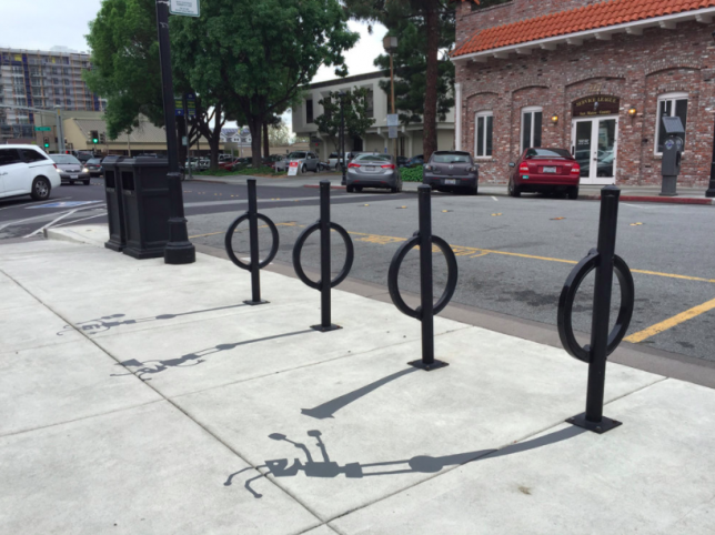
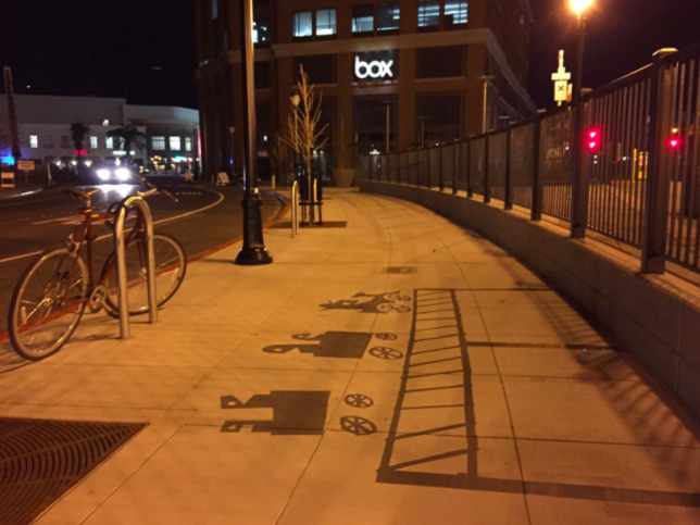
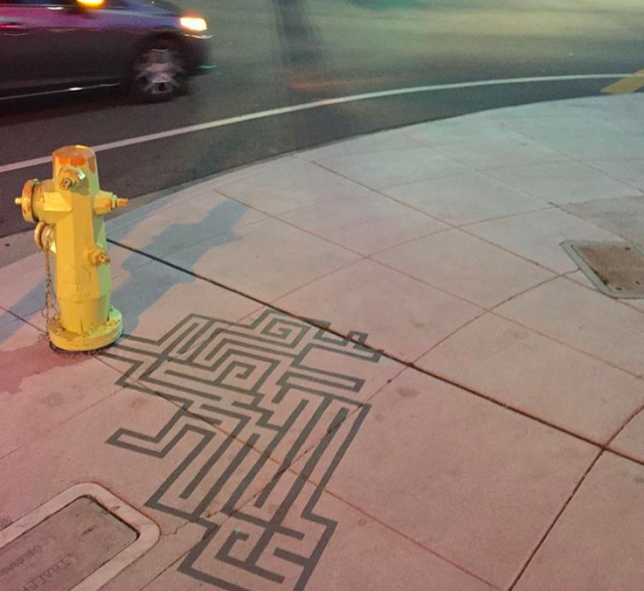
A public bench becomes a cat, a bicycle has a mind of its own and a cartoon train scoots along the top of a fence. A fire hydrant sprouts a maze, and smiling flowers grow from the bases of bike racks. The work was created in partnership with the Redwood City Improvement Association, and though it may be simple, it’s sweet, and a fun way to liven up public spaces. You can see more on Belanger’s Instagram.

“The shadow art has allowed me to bring out a more whimsical side of my art and allows me to play with shadows,” Belanger told the Daily Journal. “The shadows give regular mundane objects a lively spirit so people can have a little fun in their everyday lives.”

Share on Facebook


[ By SA Rogers in Art & Street Art & Graffiti. ]

[ WebUrbanist | Archives | Galleries | Privacy | TOS ]


WebUrbanist

 
Comments Off on Secrets in the Shadows: Urban Objects Transformed with Sidewalk Paint

Posted in Creativity


Mattest & Flattest: Blackest Paint You Can Buy Turns Solids into Voids

13 Jul

[ By WebUrbanist in Art & Drawing & Digital. ]

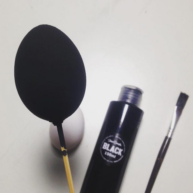
In a weird ongoing war over the blackest black and pinkest pink in the world, a new contender has hit the market — and unlike Vantablack, anyone can purchase some to make really dark artwork (great for black holes!).

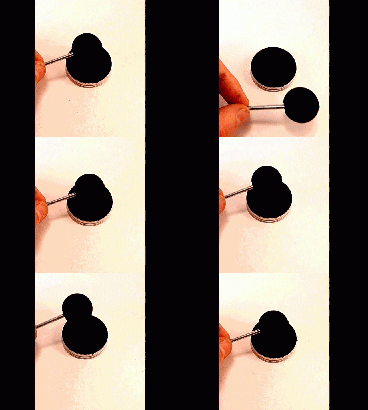
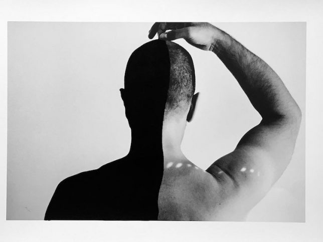
Stuart Semple’s blackest salvo to date in this pigment war is Black 2.0, which can create mesmerizing effects in real life that also translate to images and videos. In them, painted objects appear flat, or like voids rather than solids.

According to its creators, “its the most pigmented, flattest, mattest, black acrylic paint in the world,” a claim backed up by a lot of black-coated objects juxtaposed with lighter and brighter surroundings.

This pigment “was created in close collaboration with color chemists, specialists from the cosmetics industry and architectural coatings experts. It’s foundation is Stuart’s ‘Super-Base’ which enables this paint to hold more pigment than any other whilst drying to an anti-reflective, super flat finish.”

An implicit stab at the Vantablack exclusivity arrangement: “It has been developed in close collaboration with thousands of artists from all over the world. Their amazing insight, support and inspiration has formed this unique super-black paint for the benefit of all artists.”

Semple admits it’s not truly the blackest paint when compared to Vantablack, clarifying that it is just the blackest acrylic and blackest paint available to all artists, not just one who secured exclusive rights — note: this black is available to everyone but that artist (via MyModernMet).

Share on Facebook


[ By WebUrbanist in Art & Drawing & Digital. ]

[ WebUrbanist | Archives | Galleries | Privacy | TOS ]


WebUrbanist

 
Comments Off on Mattest & Flattest: Blackest Paint You Can Buy Turns Solids into Voids

Posted in Creativity


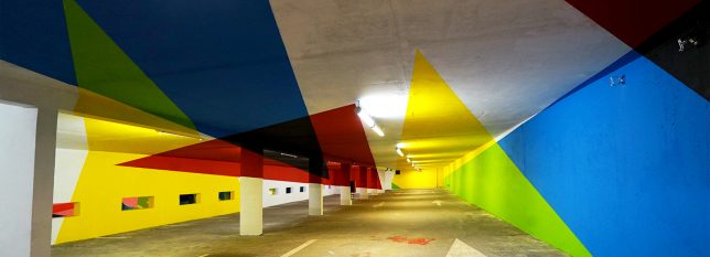
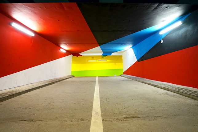
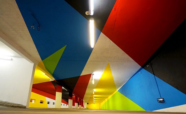
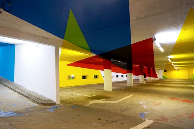
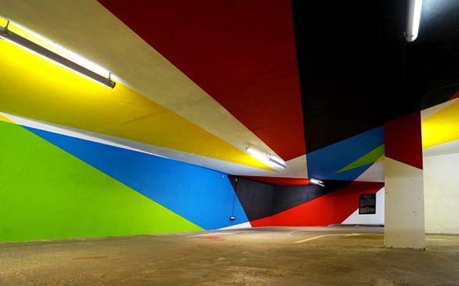
Underground Illusions: Anamorphic Parking Lot Turns Flat Paint into Sculpture

06 Jul

[ By SA Rogers in Art & Installation & Sound. ]

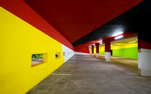
You’re driving through an underground parking garage when suddenly, the colorful geometric shapes splashed all over every surface pop out into three dimensions. Try not to crash your car! When optical illusions line up right, they can be really disorienting, and it’s always cool to see them carried out on a large scale. Argentinian artist Elian Chali got to take over an entire parking lot in the Saint-Gervais Mont Blanc region of France, transforming it into a trompe l’oeil canvas.

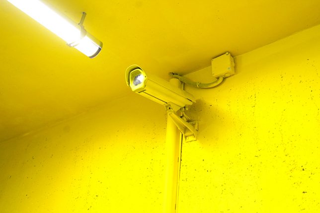
“This artwork, which uses basic geometry and primary colors, makes use of the architectural factors where it inhabits,” says Chile. “Each element adopts a new function and the space becomes a huge sculpture. The relationship with the environment is not easy to achieve, therefore not only the walls will be intervene, but the painting will invade everything that you find in your way in order to offer to the users of the parking, the possibility of breathing inside a work of art.”


It’s a pretty cool effect, with some triangles stretching dozens of feet and crossing ceilings, support pillars and walls to end on the floor. Presented by 2KM3 Contemporary Art Platform and curated by Hugues Chevallier and Zoer, the piece comes together as an optical illusion when you hit just the right spot while driving through.

Chali is known for applying his signature vivid style to buildings around the world in the form of massive murals, often taking up entire multi-story facades. Each one takes its respective environment into account in its composition, paying homage to the history of the building and its setting, the materials it’s made of, and the ways in which it has aged or weathered. Keep up with his work on Instagram.

Share on Facebook


[ By SA Rogers in Art & Installation & Sound. ]

[ WebUrbanist | Archives | Galleries | Privacy | TOS ]


WebUrbanist

 
Comments Off on Underground Illusions: Anamorphic Parking Lot Turns Flat Paint into Sculpture

Posted in Creativity


Getting the shot: macro photos of paint and water that look like CGI

24 Jun

Vibrant colors of acrylic paint billow into clouds inside a water tank. © Photo by Alberto Seveso

Illustrator and photographer Alberto Seveso’s paint photography is out of this world. His images – macro photos of billowing clouds of color – look like they were generated by an animation program. But as he tells DPReview, it’s all very real.

The process itself, says Seveso, is quite easy: just pour varnish or acrylic colors into a water tank and take a burst of photos. Understanding exactly how to do that – what light you need, what works, and just as importantly, what doesn’t work – is the time-consuming part.

‘I spent a lot of time building all the stuff I use to shoot varnish into the water, and it’s still a work in progress,’ Seveso tells DPReview. ‘It’s very important to find the right light and, the hardest part, find the perfect mix between varnish and water and the way to pour this mix into the tank… not too fast not too slow.’

For his pictures, he uses either a Canon EOS 60D or Canon 7D Mark II with a Canon EF-S 60mm F2.8 macro lens attached. The tank is lit by either fluorescent light (personal projects) or higher quality tungsten Fresnel lights (for commercial assignments), two on either side of the tank, placed in front of either a black background or a softbox if he’s shooting on white.

You can see the setup for yourself in the BTS shots below:

$ (document).ready(function() { SampleGalleryV2({“containerId”:”embeddedSampleGallery_9818299609″,”galleryId”:”9818299609″,”isEmbeddedWidget”:true,”standalone”:false,”selectedImageIndex”:0,”startInCommentsView”:false,”isMobile”:false}) });

And here is a video Sony made to show off Seveso’s paint work (and sell some phones and tablets while they’re at it):

Seveso says he was inspired to create this kind of photography in 2009, when he saw ‘something similar but classic,’ probably ink drops in water.

‘I realized there was more to explore, different materials to mix, so I started to experiment with different kinds of liquid like acrylic colors, different types of oils, sparkling water, gels, metallic colors, ice, food coloring, and other things,’ he says. ‘Over the years, I’ve tried to develop a personal approach to this technique, developing the project in a very personal way and trying to focus on the details.’

Translation: macro photography.

These close-up, colorful photographs have become Seveso’s calling card. And what a gorgeous calling card they are.

$ (document).ready(function() { SampleGalleryV2({“containerId”:”embeddedSampleGallery_4295038061″,”galleryId”:”4295038061″,”isEmbeddedWidget”:true,”standalone”:false,”selectedImageIndex”:0,”startInCommentsView”:false,”isMobile”:false}) });

Before we let Alberto go, we asked him one more question. Does he have any advice or tips for people who would like to try this kind of paint photography for themselves?

His answer?

‘Practice,’ he told us emphatically. ‘It takes a lot of practice to understand the exact mix between liquids to get separate colors, details and color filaments – this is perhaps the hardest part.’

To see more of Alberto’s work, visit his website or follow him on Behance, Facebook, and Instagram.

Articles: Digital Photography Review (dpreview.com)

 
Comments Off on Getting the shot: macro photos of paint and water that look like CGI

Posted in Uncategorized


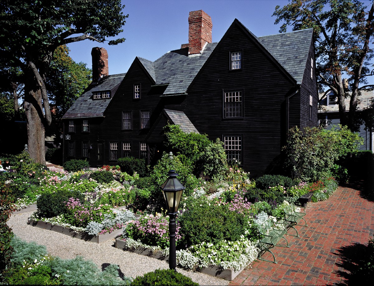
Paint it Black: 16 Mysterious Houses That Have Joined the Dark Side

20 Oct

[ By SA Rogers in Architecture & Houses & Residential. ]

black-houses-seven-gables-2

Most people can be divided into two pretty clear-cut categories: those who think black houses are creepy in a bad way, and those who love them for all their mysterious allure. Victorian houses in San Francisco, famously witchy mansions in Salem, modern homes in Japan and gingerbread houses in the woods of New York all get cool points when they’re painted top-to-bottom in shades of coal and pitch, though one abandoned black house in North Carolina looks legitimately scary in its dark disarray.

Black Ocean Firehouse, New York

black-houses-ocean

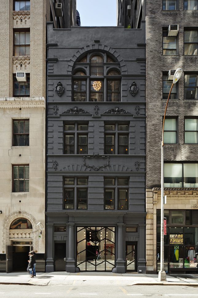
The black paint on this facade of a former New York City firehouse highlights all of the ornate neo-gothic architectural details, modernizing the 1890s structure for its new life as the headquarters for Black Ocean, a digital media company.

Haus in Schwarz, Germany

black-houses-schwarz-1

black-houses-schwarz-2

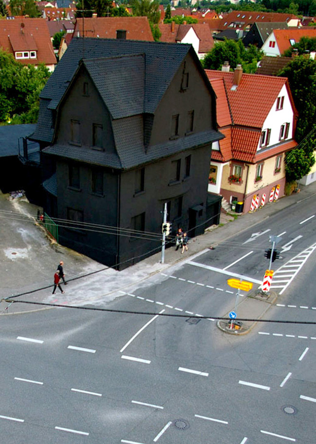
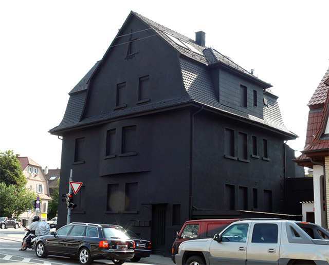
This house in Germany wasn’t painted pitch black all over until after it was condemned, as a sort of tribute before it was demolished, and that’s kind of a shame. It looks way cooler than its similarly-shaped neighbors on the same street. At night, it virtually disappears into the sky.

Shingle House by NORD

black-houses-shingle-1

black-houses-shingle-2

black-houses-shingle-3

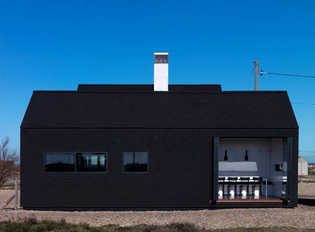
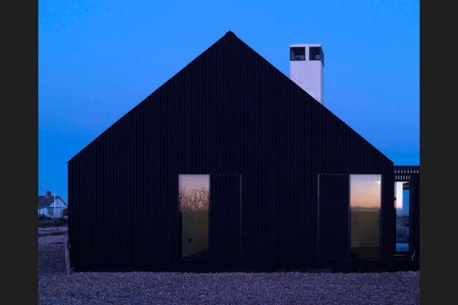
Located on the shingle beach of Dungeness, one of England’s most unique landscapes, this home by NORD stands out from a sea of fisherman’s huts with its pitch paint and tarred black roof. It’s available for rent as part of Living Architecture, a project offering vacations in striking works of modern architecture.

Abandoned Black House in North Carolina

black-houses-abandoned-1

black-houses-abandoned-2

black-houses-abandoned-3

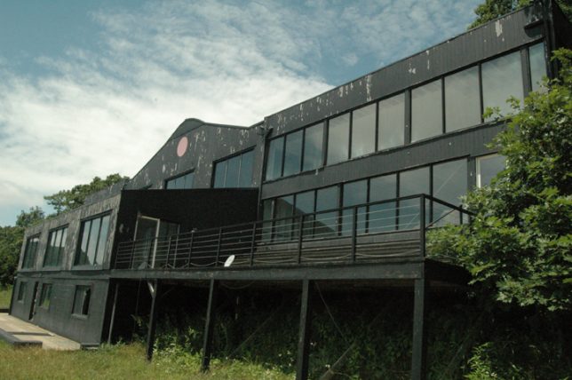
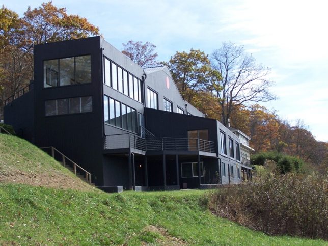
Unlike the other houses on this list, which simply don harmless black exteriors, this home on a peak in mountainous Western North Carolina is truly creepy. Located on Howard’s Knob in Boone, the home known as “The Cult House” has been abandoned for many years since its owners were went to prison, and has deteriorated after being broken into, vandalized and used as a party house. Once a million dollar home, it’s now peeling and crumbling.

Black-Fronted Residence for Park Place, London

black-houses-park-place

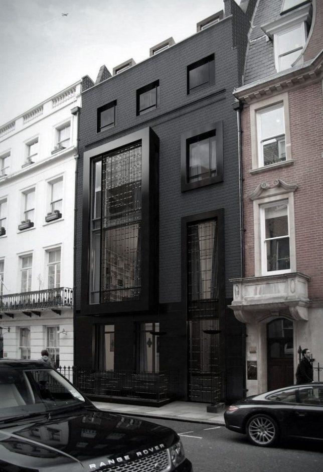
In London, SHH Architects won permission to convert a 1960s office into a home with a black facade. The original seven-story building was demolished and replaced with black brick, a double-story Oriel bay window with a decorative metalwork screen, and polished granite window frames.

Next Page – Click Below to Read More:
Paint It Black 16 Houses That Have Joined The Dark Side

Share on Facebook


[ By SA Rogers in Architecture & Houses & Residential. ]

[ WebUrbanist | Archives | Galleries | Privacy | TOS ]


WebUrbanist

 
Comments Off on Paint it Black: 16 Mysterious Houses That Have Joined the Dark Side

Posted in Creativity