RSS
 

Posts Tagged ‘What’s’

Panasonic Lumix GH5S vs GH5: What’s new?

10 Jan

Introduction

The Panasonic GH5 is one of the the most capable video cameras available, but it’s a hybrid camera that aims to please a stills-shooting crowd too. So what kind of camera could it be if it was only focused on shooting video? The GH5S is the product of Panasonic engineers grappling with that question. Here’s a breakdown of what’s changed from the GH5 in the quest to make it an even stronger video camera.

Low light / Dual Gain

The new sensor features dual gain design, which Panasonic refers to as ‘Dual Native ISO’ technology. The sensor uses two separate read-out circuits – one that maximizes dynamic range at lower ISOs, and one that maximizes noise performance (at the cost of dynamic range). The first is used from ISO 160-640, with the camera switching to the second at ISO 800, allowing better high ISO performance than the standard GH5.

We’ve seen this technology before but we’ve not previously seen the option, present on the GH5S, that allows the camera to be locked into one of its modes (and limiting the available ISO options). We’re not entirely sure what the benefit of this is supposed to be.

Note that, while Panasonic refers to ‘Native’ ISO settings of 400 and 2500, this is rather woolly videography terminology, which should not be confused with the concept of ‘base’ ISO.

Multi-aspect sensor

We’ve long been a fan of Panasonic’s multi-aspect sensors for stills shooting, and it makes an appearance in the GH5S. The camera’s total resolution is 12.5MP with a sensor larger than the Micro Four Thirds image circle: it offers up to 10.2MP crops of that total area, rather than further cropping in from the 4:3 area. This makes native DCI and UHD 4K recording possible, without having to keep cropping in further and further.

This means devoting the most possible sensor area to each of its crop modes, which benefits image quality and means that your wide-angle lenses are just as wide in ~17:9 DCI 4K mode as they are for standard 4:3 stills.

DCI 4K at 60/50p

The GH5 is capable of UHD 4K 60p/50p capture, but DCI capture tops out at 24p. Not so on the GH5S: it’s capable of 60p, 50p, 30p and 25p DCI as well as 24p. Thanks to that multi-aspect sensor, the GH5S’ angle of view when capturing DCI footage should also be noticeably wider.

14-bit Raw but slower shooting

The GH5S adds a 14-bit Raw option, which as we all know, means greater potential for dynamic range capture. The GH5 was already bumping up against the limits of how much DR could be fitted into a 12-bit file, and the GH5S’s larger pixels mean that it should benefit from a little more room. That said, the real-world differences will only become apparent if you use those really deep shadows in your images.

It can be used in burst shooting, though at a cost to speed: 7 fps with autofocus and auto exposure, versus 9 fps at 12-bit in the GH5. The GH5S can be switched to 12-bit mode, at which point it’ll reach 8fps with continuous AF.

No Stabilization

The camera’s sensor-based stabilization is gone, which may on the surface sound like an odd decision, but makes a lot of sense for pro video shooters who are often working with their own stabilized rigs and gimbals. The floating sensor design used by the GH5’s stabilization system can interact with gimbals even when it’s turned off, so removing it entirely solves the problem. It’s another clear appeal to pro video shooters, rather than a stills shooter looking for an occasional ‘run and gun’ video solution.

We’ve seen a degree of scepticism about Panasonic’s reasoning but, if you assume there’s some heat dissipation benefit for bonding the sensor to a solid object and you recognize that the camera is already shooting out to the edges of the Micro Four Thirds image circle, there may be no way of doing what the GH5S does and providing stabilization.

More VFR options

Variable framerate options have been expanded. The GH5S can capture a maximum of 240 fps in full HD and 60 fps for both DCI and UHD 4K, for slowdown to between 24 and 60p. The GH5 only offers up to 180 fps in FHD and its 60 fps 4K is limited to UHD mode. This makes it possible to create up to 10x slow-motion footage in FHD with the GH5S, though we’re told there’s an additional crop and loss of quality if you exceed 200 fps capture.

Timecode in/out synchronization

Timecode in/out synchronization is supported via the camera’s flash sync terminal. This makes it easier to incorporate the GH5S into a multi-camera setup; when files are brought into an editor like Final Cut Pro, the timecodes are automatically detected and synchronized.

A flash sync socket to BNC adaptor lead is included in the box.

Mic options

While the GH5 offers a standard microphone plug-in, the GH5S offers a more robust option that supports line in and phantom power, allowing its use with a wider range of audio sources.

120fps viewfinder

The GH5S uses the same 3680k-dot OLED panel used by the GH5 with one key difference – and improved 120 fps refresh rate. We’d wager a guess that this possible because less pixels need to be read out from the sensor. Whether or not that’s true, 120 fps will give a more natural view of the world that anyone looking at it can appreciate.

VLogL as standard

V-LogL came to the GH5 after launch as an optional firmware upgrade. In the GH5S, it’s a standard feature. An LUT (look up table) can be uploaded to the camera via SD card, making it possible to preview grading corrections that will eventually be applied to the flat-looking V-LogL footage.

Whereas a Log-upgraded GH5 can apply this correction LUT to its live preview, the GH5S can also apply it when playing back the footage.

Different AF performance

Panasonic claims the GH5S can autofocus down to -5EV, or roughly as dark as a moonlit night with no other light source. This appears to come at a slight cost of speed, however. The GH5 claims a maximum AF acquisition speed of 0.05 seconds; the GH5S claims 0.07 seconds.

Cost of lower resolution

The most easily identifiable difference between the two cameras’ spec sheets is sensor resolution: the GH5S offers 10.2MP resolution compared to the GH5’s 20.3MP. It provides the 4K resolution that video shooters require, but allows Panasonic to use larger pixels. Coupled with 14-bit Raw mode, this presents a dynamic range benefit, but it also means there are fewer pixels to read out. This should result in less rolling shutter.

So the move to a 10MP sensor seems like a no-brainer: do away with resolution that video shooters don’t really need. It also means the GH5S can have an anti-aliasing filter tuned to reduce the risk of moiré when video shooting. But in addition to this benefit, there are some drawbacks.

The sensor’s lower resolution means it can’t offer the GH5’s ‘6K’ high resolution anamorphic modes, but it can still show a de-squeezed preview with framing guides. The GH5’s ‘6K Photo’ modes are also absent from the GH5S.

Conclusion

With the GH5S, Panasonic’s engineers have taken on a challenge to convert a hybrid camera into an even more movie-centric shooter. While the two cameras are identical on the outside, Panasonic has made some interesting moves to optimize the camera for video pros’ needs.

Articles: Digital Photography Review (dpreview.com)

 
Comments Off on Panasonic Lumix GH5S vs GH5: What’s new?

Posted in Uncategorized


Film artist explains what’s wrong with new ‘Spiderman: Homecoming’ poster

27 May

There’s a new Spiderman movie coming out (yes, really – another one) and the most recent poster been generating a lot of comments. Mostly they’re comments about how it looks like the creation of a fevered teenager that just discovered Photoshop.

While the film itself looks like it might not be terrible, the poster is a technicolor mishmash of disparate elements from the movie, thrown together with gleeful disregard for scaling or uniform lighting:

In an interview with The Verge, veteran illustrator Tommy Lee Edwards explains what probably went through the designer’s mind: “Here’s a bunch of references I got from the movie. Let’s put it all together and see how it looks.’ From there, you might be inspired to do a real poster. Instead, they just stopped at that point”.

Well, to be fair, nobody ever said graphic design was easy.

Read more at The Verge

Articles: Digital Photography Review (dpreview.com)

 
Comments Off on Film artist explains what’s wrong with new ‘Spiderman: Homecoming’ poster

Posted in Uncategorized


Joe McNally asks, ‘What’s not possible?’

04 May

Joe’s latest blog post takes Nikon SB-5000 speedlights and a ton of talented folks to transform portrait subjects from the ordinary to the surreal.

Articles: Digital Photography Review (dpreview.com)

 
Comments Off on Joe McNally asks, ‘What’s not possible?’

Posted in Uncategorized


Google software engineer shows what’s possible with smartphone cameras in low light

27 Apr
Image: Florian Kainz/Google

On a full moon night last year, Google software engineer Florian Kainz took a photo of the Golden Gate bridge and the City of San Francisco in the background with professional camera equipment: a Canon EOS-1D X and a Zeiss Otus 28mm F1.4 ZE lens. 

When he showed the results to his colleagues at Google Gcam, a team that focuses on computational photography, they challenged him to re-take the same shot with a smartphone camera. Google’s HDR+ camera mode on the Google Nexus and Pixel phones is one of Gcam’s most interesting products. It allows for decent image quality at low light levels by shooting a burst of up to ten short exposures and averaging them them into a single image, reducing blur while capturing enough total light for a good exposure. 

However, Florian being an engineer, wanted to find out what smartphone camera can do when taken to the current limits of technology and wrote an Android camera app with manual control over exposure time, ISO and focus distance. When the shutter button is pressed the app waits a few seconds and then records up to 64 frames with the selected settings. The app saves DNG raw files which can then be downloaded for processing on a PC. 

He used the app to capture several night scenes, including an image of the night sky, with a Nexus 6P smartphone, which is capable of shutter speeds up to 2 seconds at high ISOs. On each occasion he shot an additional burst of black frames after covering the camera lens with opaque adhesive tape. Back at the office the frames were combined in Photoshop. Individual images were, as you would expect, very noisy, but computing the mean of all 32 frames cleaned up most of the grain, and subtracting the mean of the 32 black frames removed faint grid-like patterns caused by local variations in the sensor’s black level.

The results are very impressive indeed. At 9 to 10MP the images are smaller than the output of most current DSLRs but the photos are sharp across the frame, there is little noise and dynamic range is surprisingly good. Getting to those results took a lot of post-processing work but with smartphone processing becoming even more powerful it should only be a question of time before the sort of complex processing that Florian did manually in Photoshop can be done on the device. You can see all the image results in full resolution and read Florian’s detailed description of his capture and editing workflow on the Google Research Blog.

 Image: Florian Kainz/Google

Articles: Digital Photography Review (dpreview.com)

 
Comments Off on Google software engineer shows what’s possible with smartphone cameras in low light

Posted in Uncategorized


Fujifilm X100F vs X100T, what’s new, what’s changed and is it enough?

30 Jan

Apparent similarities

Glance too fleetingly at the X100F and you might think nothing had changed, compared with the X100T. Or the X100S, the original X100 or the film rangefinders their styling harks back to. But, in keeping with continuous improvement approach (‘Kaizen’ if you must) Fujifilm appears to be adhering to, just about every aspect of the camera has been updated in some small way.

But is the sum of those changes enough to make it worth upgrading or to attract new customers?

New Sensor

The single biggest change to the X100F is the use of the latest 24MP sensor. As we’ve seen the the X-Pro2 and X-T2, it’s capable of some excellent results and is a bigger step forward from its 16MP cousins than the 22% increase in linear resolution would suggest.

Arguments still rage about the merits of X-Trans, especially now that Bayer sensors are reaching high enough pixel counts that manufacturers can cut out the costly AA filter without too many downsides/complaints. Clearly X-Trans strikes a different balance of luminance/chroma resolution than the Bayer design and isn’t as universally well supported, when it comes to Raw processing, however, we’ve seen the 24MP version and Fujifilm’s latest processing give some great results, so we find it hard to get that worked-up about it.

What hasn’t changed?

The X100 series’ core features are, broadly speaking, unchanged. The OLED panel in the hybrid optical/electronic viewfinder is being run at a faster refresh rate, but it’s still essentially the same spec as on the previous model.

Likewise, the lens is unchanged from the X100F’s predecessors. This means that it’s still a increasingly soft when shot close-up and wide-open but also that it’s not exactly fast to focus (though this is the snappiest X100 yet). The good news, though, is that the the lens seems to me more than sharp enough to resolve the higher-res sensor at all but the closest working distances, and remains as impressively small as ever.

Handling differences: Joystick

Many of the differences between the X100T and F come down to small changes in the cameras’ handling. The first thing to note is the addition of the AF joystick that first cropped up on the X-Pro2.

In its own way, it’s as big an upgrade as the 24MP sensor. It speeds up AF point selection immensely (which is needed, since the X100F can offer up to 325 individually selectable points). Or, at least, it does once you’ve got out of the habit of trying to use the four-way controller to do so.

The other thing the joystick does is resolve the tension between using the four-way controller as Fn buttons or to directly access AF points. This means that, while the X100F still offers the same number of customizable buttons as its predecessor, it’s more likely that you’ll be able to use them all.

Handling differences: Buttons

There’s been a considerable re-shuffling of buttons between the X100T and the F though, as already mentioned, the net result is still that there are still seven customizable control points.

The buttons to the left of the rear screen, which date back to the original X100, have been eliminated, with most of them being pushed across to the right. There’s also an extra function button at the center of the viewfinder mode switch on the front panel, to make up from the one lost on the rear plate. The ‘Drive’ mode function is now irrevocably assigned to the four-way controller, while the function of the rear dial’s push-in button can now be re-configured.

For most users we think it’s likely to be a case of swings and roundabouts, unless there’s some very specific but vital combination of buttons that we’ve not been able to envisage. Generally it seems likely that the certainty of being able to use the four-way controller (or, at least, three of its buttons) as Fn keys will be enough to keep most users happy.

Handling differences: Extra dial

The bigger change to the camera’s handling is the addition of a clickable dial set into the camera’s front plate. By default, this does nothing while shooting, and is primarily used for jumping between images in playback mode. However, there is a menu option that allows its use to control ISO if the top plate ISO dial is set to ‘A.’

While this makes it possible to use the rear dial to set shutter speed (by setting the shutter speed dial to ‘T’), and the front dial for ISO, there’s no way to use anything other than the aperture ring to control aperture value. We’re not sure why you’d want to, but if that’s something you were hoping for, you’re out of luck.

The final big change is the use of the focus ring as a control ring. There are four settings for this: Standard, White Balance, Film Simulation and (if you’re shooting JPEG-only), Digital Teleconverter, all of which are overridden if you switch to manual focus mode. Personally I found that assigning anything to the focus ring just meant that I’d inadvertently make a change, every time I changed the aperture, so I just left it on ‘Standard’, which leaves the ring inactive in most drive modes.

Handling differences: ISO Dial

The final two changes in the X100F’s dial behavior are modifications that were introduced with the X-Pro2. Note that I say ‘modifications,’ rather than ‘improvements.’

The first, which I’m all for, is the addition of a ‘C’ position on the Exposure Comp dial. Set to this position, the newly added front command dial takes charge of Exposure Comp and extends the controllable range from ±3EV to ±5EV.

The other modification is the arrival of the pretty-but-pretty-impractical ISO control set within the shutter speed dial. I don’t hate it, but, given that I change ISO more frequently than once every 36 frames, I just don’t think that lifting, turning and dropping a dial is the most sensible way of controlling sensitivity. Thankfully there are two effective workarounds: pushing ISO control to the camera’s front dial or, better still, setting a couple of Auto ISO presets and switching between them.

Finer control

The X100F has the latest ‘X Processor Pro,’ which not only sees the addition of the more-detailed black-and-white ‘Acros’ film simulation, but also the option to control the JPEG output with a higher degree of precision.

Whether it’s for straight-out-of-camera JPEGs or for subsequent in-camera Raw conversions, the highlight and shadow portions of the tone curve can now be adjusted between +4 and -2, while most other parameters, including sharpening, noise reduction and color (saturation) can be adjusted on a ±4 scale.

Latest UI

As you might expect (assuming you’ve been reading our recent X-series reviews, start-to-finish), the X100F gets Fujifilm’s improved menus.

The latest version of the menu system breaks the options down into sensible categories with icons to distinguish between them, as opposed to the numbered tabs in the older scheme.

On top of this, there’s a ‘My Menu’ tab that can be populated with your most-accessed menu options. Add to this a wider range of flash control options, for use with external flashguns and the X100F manages that rare trick of being both more powerful and easier to operate.

In the moment:

The thing that’s most noticeable when you pick up the X100F is that it’s quicker than the T or any of the previous models. It’s the little things: start-up time, especially from sleep mode, or a focus re-acquisition if there’s been very little change of depth, they all add up.

Continuous focus still isn’t going to help you win any sports photo competitions but it too is noticeably improved. Overall, then, the camera just feels responsive to an extent that the series hasn’t really done, previously. Hell, even the Wi-Fi connects faster, making it that bit more likely that you’ll use it.

This newfound responsiveness is something that will be almost immediately apparent to existing X100 series owners and, perhaps just as importantly: unnoticed by new users whose expectations have been set by contemporary cameras.

Overall

Fujifilm’s approach to the its X-series cameras has been one of constant improvement, which has meant that each generation of camera is better than the last (bickering about X-Trans notwithstanding). However, while this has made it easy to recommend which model a new customer should buy, it’s meant it’s not always been clear-cut whether the sum of the differences is sufficient to prompt existing owners to upgrade.

Obviously the specific decision will depend on the needs, expectations and level of satisfaction of individual users but, even in pre-production form, this feels like more of a step forwards than the bare specs led me to expect. We’ll revisit this question as part of the full review, once we’ve spent more time with the camera, but our initial impressions are pretty positive. Well, except for my bank account.

Articles: Digital Photography Review (dpreview.com)

 
Comments Off on Fujifilm X100F vs X100T, what’s new, what’s changed and is it enough?

Posted in Uncategorized


What’s changed? Comparing the Olympus OM-D E-M1 and E-M1 II

21 Nov

Olympus OM-D E-M1 versus E-M1 II

The new Olympus OM-D E-M1 II is quite a camera. Capable of shooting at up to 60 fps at full resolution and packing high-bitrate 4K video and in-body stabilization, the E-M1 II is a powerhouse. But if you already have an E-M1, is it worth the upgrade?

In this article, I’ll compare several of the key areas of differentiation between the E-M1 II and its predecessor, to help you answer that question. 

Sensor

The E-M1 II’s maximum output resolution of 20MP might not match the 24MP+ sensors of larger-format competitors, but 20MP is quite enough for most purposes, and a nice step up from the 16MP of its predecessor. 

If 20MP isn’t enough, the E-M1 II incorporates Olympus’s high-resolution multi-shot mode, first seen in the OM-D E-M5 II. This allows the camera to produce 50MP JPEG and Raw files by combining several exposures taken with the sensor shifted by single-pixel increments. This mode is best suited to still life subjects (to avoid issues created by movement in the scene) but from our initial testing it seems like the E-M1 II does a good job of correcting some of the nasty artifacts that limited this mode’s usefulness in the E-M5 II. 

Speed

Resolution isn’t everything, of course. As well as more pixels, the sensor in the E-M1 II can also output data 3 times faster, allowing for full-resolution capture at up to 60 fps in electronic shutter mode. A maximum shooting rate of 18 fps with continuous autofocus makes the E-M1 II a significantly more interesting camera for shooting fast action than the original E-M1.

The E-M1 II’s high-speed USB 3.0 interface (C-type) is handy for quickly transferring files to a laptop if you’ve forgotten a card reader. Finally – a good reason to buy a new MacBook Pro…

Autofocus

The original E-M1 wasn’t exactly a slouch in the AF department, but the E-M1 II takes things to a whole new level. This new, faster sensor features 121 on-sensor phase-detection AF points, which cover 75% of the imaging area vertically, and 80% horizontally. All of these AF points are cross-type. The original E-M1 offered 37 phase-detection AF points, in a smaller central area of the frame.

The extra phase-detection AF points and the broader coverage mean that the E-M1 II is even more versatile when used with one Olympus’s range of older Four Thirds (non-Micro) lenses.

AF Tracking

These improvements, coupled with a dedicated processor for AF, means that the E-M1 II is capable of full-resolution shooting at up to 18fps with AF tracking. Compare this to a maximum frame-rate of 9 fps with AF from the E-M1 (running firmware 4.0). 

With the new E-M1 II, it’s also possible to use the rear LCD screen as a touch-pad to manually position the active AF point by touch, with your eye to the viewfinder. In addition, adjustable AF-C tracking sensitivity, and four ‘AF Target Modes’ allow the E-M1 II’s autofocus system to be quickly tweaked to suit different kinds of subjects. 

Ergonomics

The E-M1 II is ergonomically very similar to the E-M1. A slightly deeper hand grip makes the new camera feel a little more secure in the hand (depending, I suppose, on your hand size) and the tripod socket has been centered in the E-M1 II, in line with the lens axis. This is generally a good thing (and can be very handy for things like nodal panoramas) but it does mean the tripod socket is now closer to the battery door. The door has increased in size thanks to the bigger battery, which combines to incresae the risk of the door being occluded when the camera is mounted to a tripod.

The only thing that some users might argue has gone backwards in the E-M1 II compared to the original E-M1 is the rear screen’s articulation. If the E-M1 II is incorporated into a video rig, with microphone or headphones plugged in and video output to an external recorder over HDMI, the folding screen can foul these cables when extended. The tilting screen of the original E-M1 is arguably less versatile, but can be used without snagging the I/O ports.

In-body Image Stabilization (I.B.I.S)

Both the E-M1 II and its predecessor feature 5-axis in-body image stabilization, but the Mark II improves the feature to offer a maximum benefit of 5.5EV, compared to 4EV in the older model. For anyone used to shooting according to the ‘one over equivalent focal length’ rule this means that at 50mm (equivalent) the E-M1 II should be hand-holdable down to as low as half a second, in favorable conditions, whereas the E-M1 would be safe down to ‘only’ around a quarter of a second. With the new stabilized 12-100mm zoom, the E-M1 II offers up to 6.5EV of shake compensation.

As well as stills, the E-M1 II’s I.B.I.S is also useful when shooting video footage. The E-M1 was capable of capturing extremely smooth and shake-free video, and the E-M1 II is even better.

Video

One of the most significant improvements offered by the E-M1 II compared to its predecessor is a totally revamped video mode. Capable of 4K video at up to 30p, the E-M1 II boasts a maximum bitrate of 237 Mbps during DCI 4K/24p capture. A ‘flat’ picture profile in movie mode is a nice addition to the E-M1 II’s video feature set, too.

The E-M1 produces very nice-looking video (and as previously noted, it’s tilting screen doesn’t foul the camera’s I/O ports) but it’s limited to 1080/30p in normal use, and isn’t capable of clean output over HDMI to an external recorder. The E-M1 can capture 4K footage, but only in time-lapse movie mode.

One final note – it’s not really fair to call it a ‘downside’, but if you plan on shooting 4K with the E-M1 II, do make sure to budget for a high-capacity UHS-II or UHS-I Speed Class 3 card. 

Durability

The E-M1 and E-M1 II are both tough cameras, built to a high degree of quality and intended to withstand use in unfavorable conditions. As such, both are weather-sealed and both can operate in freezing conditions. The E-M1 and E-M1 II have the same rated operating range of -10 to +40 degrees C, and both can handle being left out in the rain, but the E-M1 II’s shutter is rated to a higher count of 200,000 exposures (the E-M1 is rated to 150,000). Whether this translates to substantially better durability in normal use is hard to say, but more pictures = more better.

Battery life

A less abstract measure of durability is battery life, and in this respect the E-M1 II also outperforms its predecessor, offering a maximum endurance of 440 shots (CIPA) in normal use from its larger, beefed-up battery and up to 950 when ‘quick sleep’ mode is used. These figures actually seem conservative judging from our shooting so far, during which we’ve routinely experienced 1000+ shot endurance in normal (stills) shooting.

The original E-M1 can shoot for a rated maximum number of 350 shots but the same applies – you can expect better endurance if you’re not shooting video or constantly reviewing images. 

Twin card slots

Speaking of shots, the E-M1 II offers two SD card slots, as opposed to the E-M1’s single slot. The additional card can be used as overflow or backup storage, or as a dedicated card for storing video clips. Note that only the upper slot is UHS-II compatible, so that’s where you’ll want to save those 4K video clips.

Verdict

There’s absolutely no doubt that the new OM-D E-M1 II is a better camera than its predecessor in virtually every way. It’s rare these days that we see successor models which so roundly outperform the models that they replace. We might have expected the viewfinder and / or rear LCD screens to get a bump in resolution, but arguably, neither really needed improvement.

All told, the E-M1 II is a very impressive update to the original E-M1. But it’s also heavier, and more costly. We’d strongly suggest spending the extra cash if you can afford it (we can’t see the E-M1 II being outmoded any time soon) but if you’re mostly a slow-speed stills photographer, the original E-M1 won’t disappoint. 

Articles: Digital Photography Review (dpreview.com)

 
Comments Off on What’s changed? Comparing the Olympus OM-D E-M1 and E-M1 II

Posted in Uncategorized


What’s In My Bag: A Look at the Camera Gear of a Nature Photographer

27 Oct

Being a landscape or nature photographer is like enjoying ice cream and having unlimited choice in the ice cream shop. There are so many different kinds of images to make, and different ways of making them in the outdoors, that having a wide variety of gear to choose from is important. This article will take you on a little journey through what’s in my bag. From my own camera gear to the different tools that I use to help me photograph the scenes in nature that capture my attention, and turn ordinary life into extraordinary art.

whats-in-my-bag-a-look-at-the-camera-gear-of-a-nature-photographer

sunset reflected in water

Hudson Bay Mountain Sunset

The Backpack

camera-bag-gear-02

The biggest piece of gear I use is the Tilopa backpack from f-stop. It’s a rugged 50L pack that’s well suited for a wide variety of outdoor scenarios. There are all manner of straps and zippered compartments both outside and inside the pack that are useful for attaching and storing both large and small pieces of equipment. There are three things however that have proven to be especially valuable to me:

  1. Rear Panel Access – instead of just having access to the inside from the top, the Tilopa has a zippered section that allows you access to the bag when you lay it on the ground. This is helpful when you have gear at the bottom of the pack and you don’t want to excavate everything on top of it to get access (as you’d have to do when going in from the top as is typical in a lot of other backpacks).
  2. Internal control unit (ICU) – ICU’s come in different sizes and shapes and allow you to organize and protect your camera equipment. My Tilopa allows for a large ICU with space at the top of the pack for a jacket or food depending on my needs. The backpack also has attachment points that you can use to secure your ICU to the inside of the pack. One really nice feature is that the ICU itself can be zippered shut and removed or carried. If you fly a lot and find that your pack is overweight, you can remove the ICU with your valuable gear and take it with you on the plane while checking the rest of the bag.
  3. Padded Hip Belt – to carry some of the weight on my hips.

Backup Camera Bodies

camera-bag-gear-03

The first digital SLR I owned was the Canon 5D. It was such a huge step up, both in price and quality from its predecessor (a film Canon Rebel). I remember being amazed at how much more of the scene I saw when looking through the viewfinder (thanks to the full-frame sensor). In 2007 I purchased an additional body (Canon 5D Mark II), which meant that I now had a backup. Having two cameras available for use provides a nice sense of security, knowing if one has issues, there won’t be any loss of productivity. The main differences between the two bodies that I appreciate are the live view, greater dynamic range, and higher resolution screen that the 5D MK II provides.

Extra Batteries – Charging Devices

Having spare batteries is especially important when I am out shooting for extended periods of time, or I am photographing winter scenes. I also appreciate having grips for each of my camera bodies that gives me the option of going out with two batteries at a time.

Another situation where a longer battery life is appreciated is when I shoot time-lapse sequences. I can shoot several thousand images at a time and it’s nice to know that I can leave the camera firing away with ample power, and not have to continually come back and check to make sure the battery hasn’t died.

Not only do I have backup camera batteries, but I also had a portable battery charger (Goal Zero Switch 8) for my phone. I say HAD because I used it so much it’s worn out. I am planning on purchasing an upgraded power charger soon. This device can be charged at home by plugging it into a USB port, and then used in the field to recharge a phone (or other devices such as headlamps).

Image Storage

camera-bag-gear-04

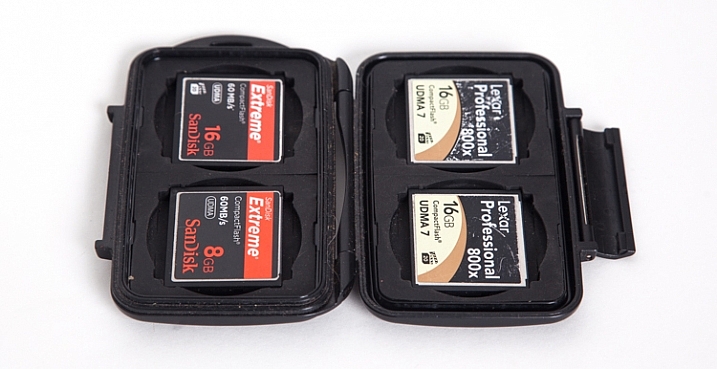
Apart from the Compact Flash (CF) cards in the cameras, I also carry a small (older model) Pelican case with room for 4 CF cards. The majority of my cards are 16GB, but I also carry a 2GB one as an emergency backup in a small pocket in my backpack.

Apart from the flexibility that having multiple cards provides, I sincerely believe in redundancy. You never know when a card might fail, and so to be ready on the occasion that one does, it’s nice to know you can keep shooting. Most of the time I don’t fill the 16GB cards to capacity when I’m out for the day on a photo-adventure. There are occasions however when I’m on a commercial job where having multiple cards is an absolute must.

Lenses

camera-bag-gear-05

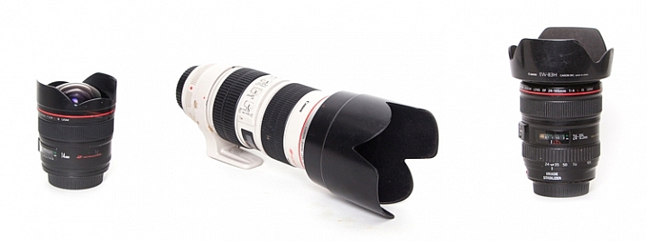
The three lenses I have are all Canon L-series glass.

  • 14mm, f/2.8: This wide-angle prime lens is really useful for capturing wide open vistas. It also comes in handy when you find yourself in tight quarters and don’t have a lot of physical depth between you and your subject. The trick when you’re really close though, is to make sure your main subject is near the center of the frame. Because of the nature of this almost fish-eye lens, objects near the corners of the frame have exaggerated perspectives. It’s almost as if they are unnaturally stretched. (Price it out on Amazon or at B&H)
  • Canon 24-105mm, f/4: This is the lens that I have on my camera the most, primarily because it has the greatest degree of flexibility when it comes to focal length.
  • 70-200mm, f/2.8: Every once and while I go out with the goal of focusing on more detailed aspects of nature, rather than a wide-angle view of a scene. The added focal length as compared to the 24-105mm lens helps me to do that. The large aperture can also provide a nicely blurred background when the need arises.

Tripod

camera-bag-gear-06

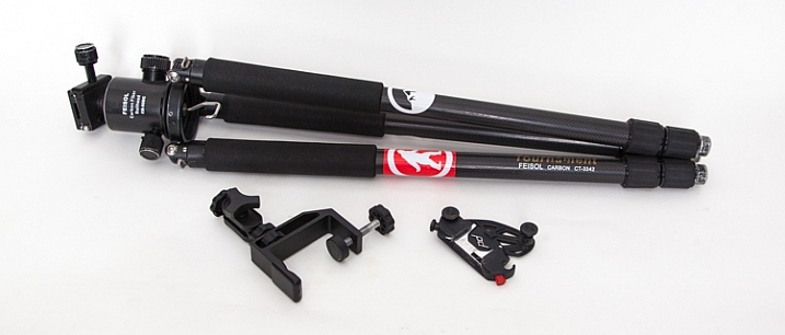
My current tripod is the carbon-fibre Feisol CT-3342 with a Feisol CB-50DC ball head. This allows for flexibility when composing your image and also has the capability to rotate when the camera is locked in place (there are degree markings to help when specific movements are required, for example when doing panoramas). There is a tiny removable hook (which you can hang things from) that screws in underneath the head which is useful when it’s windy and you need that extra measure of stability.

The tripod has 3-section adjustable legs that extend or contract with the simple twist of a rubber ring. One of my favourite features (as I do a lot of winter photography), is the screw-in metal spikes that attach to the bottom of the tripod legs. These come in handy when I’m out on ice, or other slippery situations, to keep the tripod secure during each exposure the camera makes.

I also have a small tripod clamp that comes in handy in situations where using a tripod simply isn’t possible.

A relatively new purchase has been the Capture Pro from Peak Design. This is a device that I attach to the shoulder strap of my backpack and then click my camera (with the appropriate shoe) into it. So the camera is always close at hand when I go out on my adventures. It means every time I want to make a photograph, I can just reach down and release the camera from the clip instead of stopping and getting the camera out of the backpack.

Shutter Release Mechanisms

camera-bag-gear-07

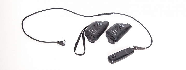
There are two different ways that the shutter on the camera can be activated. First of all, a wired shutter release can be plugged into the side of the camera.

You can accomplish hands-free shutter release wirelessly as well. The Pocket Wizard PlusX transceivers are the ones that I use. One gets attached on your camera’s hot-shoe and plugged into the appropriate port on the side of the camera. Then as long as that device and the second one you can hold in your hand (or even on another camera) are both set to the same channel, when the remote device is triggered, the transceiver on the hot-shoe will fire the camera.

Why remote triggering? It’s very useful in low-light situations where a sharp image is required and hand-holding the camera is not possible. It’s also absolutely essential when doing long exposures.

Promote Control

camera-bag-gear-08

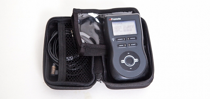
This remote control device can be used for a number of different things, including bulb-ramping and focus stacking. However the most commons things I use it for are my time-lapse sequences and HDR bracketing.

LEE Big Stopper

camera-bag-gear-09

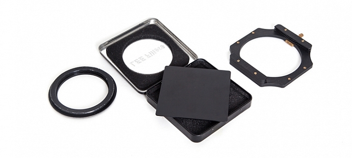
Essentially this is a piece of glass that allows me to make long exposures beyond the normal capabilities of my camera. Practically, it’s a 10-stop neutral density filter that allows me to make a long exposure of a waterfall and turn raging water into silky smoothness. I also use it to capture the motion of clouds in the sky. There is the 4″x4″ piece of glass that slides into a holder, which itself attaches to the camera via a ring that screws into the end of the lens.

Waterfall: 30 seconds, f/4, 12:36pm
Clouds: 30 seconds, f/14, 12:03pm

Other Equipment

There are a few other pieces of equipment that find their way into my pack every once and a while:

camera-bag-gear-10

  • Tools for cleaning the camera sensor: I have an older version of the Visible Dust Arctic Butterfly as well as a sensor gel stick.
  • A laptop CF card reader adapter for extended trips where I’m away from my office and need image storage and editing capability.
  • An external hard drive for image backup.
  • Camera battery charging devices
  • Phone for safety
  • Lens cloth
  • Leatherman multi-tool device
  • Headlamp

Final Thoughts on Camera Gear

There you go, a fully-loaded backpack that weighs 35 pounds (15.9 kg). Thankfully not everything comes with me all the time, my back would definitely have something to say about that. With the years I’ve been doing photography, picking and choosing the tools that best suit the goals I have on any given day is what helps me turn ordinary life into extraordinary art.

What tools do you use? Please share in the comments below.

googletag.cmd.push(function() {
tablet_slots.push( googletag.defineSlot( “/1005424/_dPSv4_tab-all-article-bottom_(300×250)”, [300, 250], “pb-ad-78623” ).addService( googletag.pubads() ) ); } );

googletag.cmd.push(function() {
mobile_slots.push( googletag.defineSlot( “/1005424/_dPSv4_mob-all-article-bottom_(300×250)”, [300, 250], “pb-ad-78158” ).addService( googletag.pubads() ) ); } );

The post What’s In My Bag: A Look at the Camera Gear of a Nature Photographer by Curtis Cunningham appeared first on Digital Photography School.


Digital Photography School

 
Comments Off on What’s In My Bag: A Look at the Camera Gear of a Nature Photographer

Posted in Photography


Sony a6300 versus a6500: what’s changed, and what still needs to change

18 Oct

Sony a6300 versus a6500

That was quick.

Just eight months after Sony introduced the a6300, a higher-end sister model to the a6000, we now have another higher-end sister model in the a6500. The sheer speed of Sony’s product releases lately is somewhat appropriate, given the outright shooting speed these cameras are capable of.

Both cameras feature the same 24MP APS-C CMOS sensor, the same 425-point on-sensor PDAF system, the same viewfinder, the same video specification, and the same 11 fps burst shooting rate (8 fps with Sony’s implementation of ‘live view’). Wait a second – what exactly is new to the a6500?

Turns out, there’s a handful of changes that can have big implications for how photographers will interact with and use these cameras, but are they worth the $ 400 premium on the new model? Let’s take a look.

Continuous shooting

Patrick Murphy-Racey discusses using the a6500 for peak action (like drag races) due to its burst speed and autofocus system.

A deeper buffer combined with a newly developed front-end LSI (which stands for Large Scale Integration – it’s basically an additional chip providing more processing power) promise more responsive performance when shooting bursts – 300 JPEG or 107 Raw images can be captured at 11 fps with full autofocus and autoexposure. Users can also instantly review or check focus on the last image that the camera has written to the card (though that might not necessarily be the last image in that burst), with the added plus of an indicator showing just how many images remain to be written to the card.

Comparatively, the a6300 can still shoot at 11 fps with full autofocus and autoexposure, but only for 44 JPEG or 21 Raws. And while the camera is writing to the card, you can’t enter playback, or magnify the displayed image (if you have image review on). We’re particularly happy to see that last limitation go, as it makes the camera eminently more usable.

In-body 5-axis stabilization

Sony consolidated the shutter charge and shutter mechanisms to one side to make room for the IBIS unit in the a6500.

Without increasing the depth of the camera body, Sony has redesigned the a6500’s shutter mechanism to not only be more durable (tested – though not guaranteed – to 200,000 cycles), but also to incorporate 5-axis stabilization with non-stabilized lenses. What’s more, when you pair an optically stabilized lens with the a6500, the camera knows to pass of pitch and yaw correction to the lens’ stabilization system. This doesn’t increase the effectiveness more than the rated 5 stops, but is likely to help maintain effectiveness when shooting at longer focal lengths.

There’s also the intriguing possibility of shooting full 4K stabilized video with any lens – but we’re withholding our verdict on the resulting image quality until we can test it for ourselves. After all, core video specification and performance hasn’t changed from the a6300 to the a6500, and we’re curious to see if the stabilization system has any effect on the rather lackluster rolling shutter performance of the a6300.

And, of course, the a6300 offers no in-body stabilization.

Touch and see

The a6500’s screen is touch-enabled, whereas the a6300’s isn’t. They share the same resolution (and the touch-panel doesn’t seem to have affected glare or fingerprint-resistance), but on the a6500, you can now use the screen to quickly place an AF point, move your AF point around by acting as a ‘touchpad’ with your eye to the finder, and also double-tap to zoom and swipe around an image in playback.

So while AF performance will likely remain the same on the a6500, you may now find you’re more quickly able to adapt to a scene in front of you by using the touchscreen as opposed to the cumbersome sequence of button presses most Sony cameras require for focus point movement.

That said, in touchpad mode, the control of the AF point is unfortunately always relative, rather than (at least an option for) absolute, so you swipe to move the AF point from its current position, rather than touching exactly where you want it to be. This meant we found ourselves often swiping repeatedly to get the AF point from one side to the other. This could be obviated with absolute positioning in combination with limiting the touchpad area to the upper right quadrant, something we suggested to Sony in-person. Lastly, we found the touchpad performance to be decidedly laggy, especially when compared to competitors’ offerings.

When it comes to video, the a6500’s touchscreen is particularly useful for focus pulls, since you can just tap to change the focus point and initiate a rack focus (and as always, you can control how quickly the camera will rack focus). Less easy is getting the camera – in video – to continue to track your subject around the frame after you’ve tapped on it, since Lock-on AF is unavailable in video (something we continue to request Sony to address).

There appears to be a workaround, though: if you turn the old, vesitigial ‘Center Lock-on AF’ on, then tapping appears to initiate subject tracking. Unfortunately, ‘Center Lock-on AF’ isn’t always the most reliable, and it’s still somewhat cumbersome to work this way as you have to first turn this feature on, which requires either a (Fn/main) menu dive or a dedicated button assigned to it, plus a couple more button presses before you tap.

Controls and usability

Autofocus and video options are among the new ‘groupings’ within the updated Sony menu system.

Besides the touchscreen, the other major control change on the a6500 compared to the a6300 is the addition of C2 | C1 custom buttons on the top plate, a7-style. They’re nicer buttons than the soft-press C1 button of the a6300, providing more haptic feedback. The a6500’s grip has also been redesigned to be ‘chunkier’ and deeper than that on the a6300, again much like the a7 Mark II cameras, which should help when using heavier or longer lenses.

The a6500 also inherits the redesigned menu interface that debuted in the a99 II which is, in our opinion, much more user-friendly than the interface on the a6300 (and a6000, for that matter). The tabs are now color-coded, but more importantly, similar functions like autofocus, image parameters and movie settings are grouped. This makes it much less likely that you’ll miss a moment while rocketing through the menu to find a setting you swear you saw somewhere in there last week. It’s one of our favorite additions to the a6500, and it’s about time.

Unfortunately, you still can’t make a custom ‘My Menu’-like page in this menu system. A shame, as it’s an easy way to group most-used menu items into one section for quicker access, particularly ones – like movie options – that can’t be assigned to the custom Fn menu.

What hasn’t changed (and should have been)

There’s no question that the a6500 is incredibly well-specified camera in an impressively small package. In terms of usability, Sony has made great strides on this new model with the addition of a touchscreen and a revamped menu system. Unfortunately, there’s still a few aspects of the a6500 that we can’t help but wish Sony would have addressed.

Unfortunately, like the a6300, the a6500 lacks a control dial on the front of the camera – an omission that is all the more glaring at its higher position in the market. Unlike the a6300, all of the a6500’s direct peers offer twin control dials, and a front control dial would further aid usability in our opinion (though we’d also happily take the ‘Tri-Navi’ system of the old NEX-7 flagship as a compromise).

The core stills and video specification hasn’t changed at all since the a6300 (although the new front-end LSI is supposed to help with JPEG performance at higher ISO values). Now, the a6300 already produced great results under almost any circumstances with one big exception – rolling shutter in 4K. While the detail level is impressive and the capture aids are extensive (S-Log, zebra patterning, focus peaking, etc.), we would really have liked to see Sony address the rolling shutter issue in this new model. And a headphone monitoring port wouldn’t hurt, either.

Limited battery life is a problem endemic to mirrorless cameras as a whole, and the a6000-series is no exception. Still, probably thanks to the additional processing and touch-screen, the a6500’s battery life rating has actually decreased compared to the a6300 by over 10%. It goes without saying that’s a change in the opposite direction than we would like.

Adding it all up

The a6500’s additions over the a6300 are small in number, but potentially huge for what they offer users. Sure, the new model comes at a $ 400 premium over its mid-range sibling, but the upgrades in the new flagship model have the potential to be significant.

Of course, whether they’re significant to you depends on whether they line up with what you like to shoot. If you don’t shoot long bursts, or don’t find yourself checking focus all that often, the additional buffer performance isn’t likely to matter. If you shoot a lot of video and want more flexibility with lens choice, the in-body stabilization is likely to be very helpful. One thing that we feel will positively impact all users – even those who primarily use the viewfinder – is the touchscreen. That said, its laggy behavior is disappointing considering just how much processing power this camera has.

We generally feel that, given the sheer capability of this camera, the price premium over the a6300 is warranted. The Sony a6500 represents a lot of camera in a very lightweight package, and it’s encouraging to see that Sony is continuing to refine its APS-C offerings.

Articles: Digital Photography Review (dpreview.com)

 
Comments Off on Sony a6300 versus a6500: what’s changed, and what still needs to change

Posted in Uncategorized


What’s special about the Lensbaby Velvet 56 and is it for you?

17 Oct

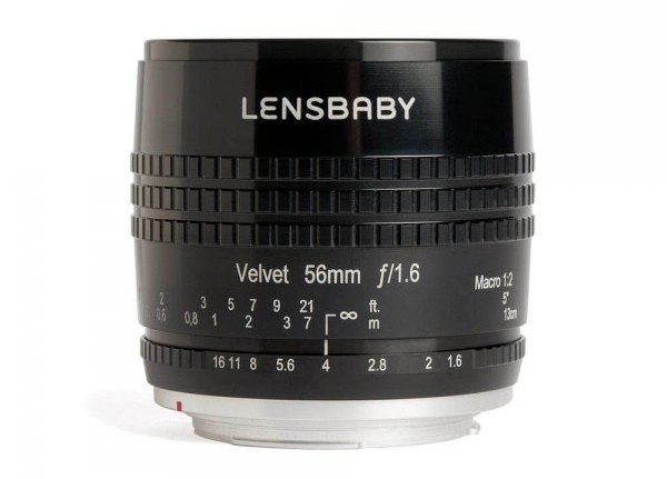
Usually, when you buy a new lens you are trying to get a wider angle or maybe more of a telephoto view, but with some lenses, you are trying to get more of a special effect. The Lensbaby Velvet 56 lens (price it out on Amazon.com or B&H Photo) is one of those. You can almost get normal images, but it is far better for giving you soft focus ones, not to mention some great blurred backgrounds, or to give you the bokeh effect.

lensbaby-velvet-1

The Lensbaby Velvet 56

A portrait lens and more

If you look around at reviews you see it described everywhere more as a portrait lens, but it can be used for so much more. It is a 56mm fixed lens with manual focusing and you basically get a lens very similar to a 50mm, but with some differences.

There is a range of apertures from f/1.6 to f/16 and each one creates a different effect. When you use the widest, f/1.6, you get very soft images, and the more you close it down the sharper it gets. The wider settings help you get that soft focus and bokeh look.

leanne-cole-lensbaby-velvet56-02

Flower from the garden.

Size and quality

It is reasonably compact, though made from metal it is heavier than other lenses in the same range. My Nikon 50mm f/1.8 lens is much lighter than the Velvet 56 f/1.6. You can tell when you are holding it that there is quite a bit of metal in it, as it ‘s cold to the touch. It is bigger than the Nikon lens, but not by much. It also has a very cool metal lens cap.

Painterly effects

Without a doubt, this lens is known for its effects and one that is highly desirable is the painterly result. The wide apertures give images that look as though they were painted. Some say they can get the same type of image in Photoshop, but it would never have the same softness.

leanne-cole-lensbaby-velvet56-06

A flower shot with a wide aperture giving it a very soft focus look.

Works on a full frame or cropped sensor

It is a lens for a full frame camera, but that doesn’t mean you can’t use it with your cropped sensor if that is what you have. If you do have the latter, in theory, you should be able to get closer to your subject as well.

It is also available for a number of different mounts, so whether you have a DSLR or a mirrorless camera you can find it for your model.

The different apertures

As stated, each aperture gives you a different effect to your image. Play around with those. As you start changing them and closing down the aperture, the image in the viewfinder does start to get darker. It is because not as much light is coming through, however, it doesn’t affect your final image, as long as you have the correct exposure.

Your camera won’t recognize the lens and you will have to change the aperture the old fashioned way, with the aperture ring on the lens. This also means that when you look at your metadata on your computer you will have no idea what setting you used. If it is important then you should record it as you take photos.

leanne-cole-lensbaby-velvet56-03

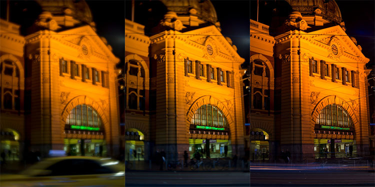
Flinders Street Station, with a wide aperture, then around f/8 and the third at f/16. See how the image slowly comes into focus.

Manual focusing

One of the aspects that a few people seem concerned about is that it’s a manual focus lens. Perhaps it is just the people that I hang around with, and as we are getting older our eyesight is affected. But having to manually focus is one thing that is (or seems) much harder.

It does take some getting used to, but it gets easier the more you do it. With most macro lenses you always seem to get the best results when you manually focus, though, so perhaps that shouldn’t be considered an issue.

When you are using wide apertures, even with macros, you are going to get very soft images which will mean you will never get very sharp images with this lens. In some ways, that can make it a lot easier to focus as the sharpness isn’t as important. This is how you get the painterly effect.

leanne-cole-lensbaby-velvet56-07

A close up image of the clocks and sign of Flinders Street Station in Melbourne.

Landscapes

Doing distance shots can be tricky as everything can appear too blurry. You really need to play around with the aperture to get the best effect. However, as stated previously if you play around with them you can get more in focus. The downside is once you close it down you lose the special effect of the lens and the softness it creates.

In reality ,you wouldn’t really use this lens for landscapes or architecture. I would use it mostly for macro, it really shines for that. It is too soft for landscapes and architecture if you ask me. But people do it, and you get some great effects, but it is never going to work like a normal lens, which is the point I suppose.

What would you use the Lensbaby Velvet 56 for?

For many, it is a great lens for portraits. Photographing people and getting great bokeh behind the subject is very desirable. As most portraits are done in an intimate environment, meaning the photographer is very close to the subject, the softness of the lens can enhance that and add an artistic feel to the images.

Like portraiture, macro photography is another great use for the Lensbaby Velvet 56. You can get very close to flowers and can create some very painterly images using different apertures. The lens is also suitable for attaching extension tubes and close-up filters to use with it. I’ve used the extension tubes on it. Plus, from time to time, I put on a 5+ close-up filter on to allow me to get even closer.

When you are focusing on a subject, if it is further away than  3-4 meters (9.8-13.1 feet) then the lens will be focused at infinity. So you don’t have to worry about focusing for landscape or architecture shots, just twist the focus ring all the way to the right so it is on infinity and shoot. It is only when your subject is closer that you need to start manually focusing the lens more critically.

It is good to use the soft focus look on subjects up close. But it doesn’t look as good when objects are further away, like large buildings, though that may be something that you like, so it’s your call.

leanne-cole-lensbaby-velvet56-05

Using the aperture to focus on one part of the image, in this case, the lock and chain.

One of the things I have found with architecture and city shots it that while it does a great blurred effect, it can make the images seem busier than normal. While some may not like that, you could make it work for you. If you keep trying you can get some interesting images. You might even get images that give everything a tilt-shift look, so the city looks miniature.

It is about experimenting, trying on different subjects to see what works best for you and which you like the best.

leanne-cole-lensbaby-velvet56-04

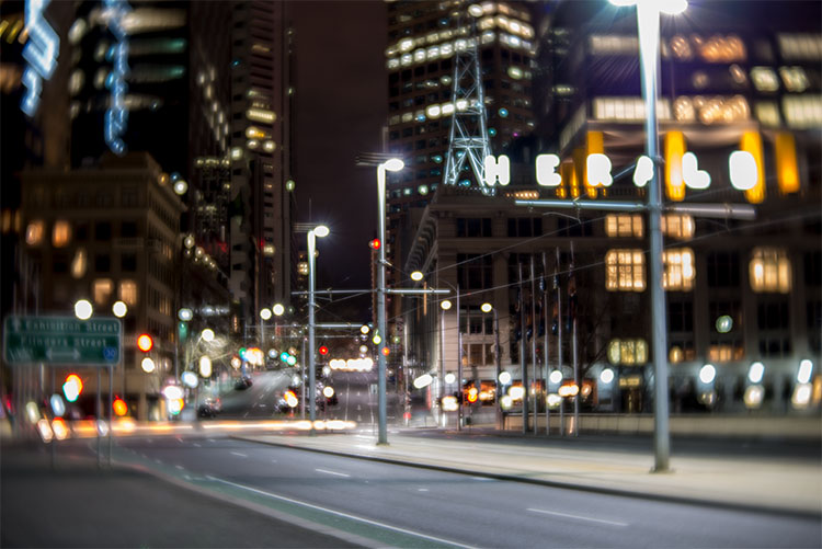
A night view of the city with the aperture opened up a little gives it an almosttilt-shiftt look.

The price

The price of most 50mm lenses are around two to three hundred dollars, whereas the Velvet 56mm is a bit more expensive, selling for around $ 500 USD. However, if you like the specific types of photography mentioned in this article, then the money spent on it would be worth it.

Is it for you?

There is no doubt that you have to get used to it, but most people will fall in love with the lens straight away. It is good to play and experiment with and the more you do, the more you will discover. It could be a great way to add something new to your photography. I think it is amazing, and I love using it for macro photography.

leanne-cole-lensbaby-velvet56-01

A flower photographed with the Velvet 56.

Have

googletag.cmd.push(function() {
tablet_slots.push( googletag.defineSlot( “/1005424/_dPSv4_tab-all-article-bottom_(300×250)”, [300, 250], “pb-ad-78623” ).addService( googletag.pubads() ) ); } );

googletag.cmd.push(function() {
mobile_slots.push( googletag.defineSlot( “/1005424/_dPSv4_mob-all-article-bottom_(300×250)”, [300, 250], “pb-ad-78158” ).addService( googletag.pubads() ) ); } );

The post What’s special about the Lensbaby Velvet 56 and is it for you? by Leanne Cole appeared first on Digital Photography School.


Digital Photography School

 
Comments Off on What’s special about the Lensbaby Velvet 56 and is it for you?

Posted in Photography


White House photographer Pete Souza reveals what’s in his bag

02 Jul
 ‘The Situation Room’, photo by Pete Souza. President Barack Obama and Vice President Joe Biden, along with members of the national security team, receive an update on the mission against Osama bin Laden in the Situation Room of the White House, May 1, 2011. 

There’s no photographer in the world with a job quite like Pete Souza’s. As Official White House photographer, Souza has to be ready to move at a moment’s notice. Familiarity with and trust in his gear is essential. So what’s in his photo bag? Surprisingly little, which actually makes a lot of sense.

Souza uses two Canon EOS 5D Mark III bodies. Introduced in 2012, it’s a full-frame 22MP DSLR that earned a gold award for its excellent image quality and versatility when we reviewed it.

Popular Science recently got a look at Souza’s kit and found two Canon 5D Mark III bodies and a trio of L-series lenses: a 135mm F2, 35mm F1.4 and a 24-70mm F2.8 II. Souza also keeps it simple when he isn’t shooting visiting dignitaries and state dinners: he uses a Fujifilm X100S in his downtime. 

You can keep up with Souza and the POTUS on Flickr and Instagram. 

Articles: Digital Photography Review (dpreview.com)

 
Comments Off on White House photographer Pete Souza reveals what’s in his bag

Posted in Uncategorized