RSS
 

Posts Tagged ‘Ugly’

How to Capture Beauty in Ugly and Mundane Subjects

26 Feb

A huge part of your job as a photographer is to make people pause, and linger over a photograph. Sometimes it could be a stunningly lit portrait, or maybe an epic landscape. But, if you’re like me, more than likely you don’t live in an area that will provide you with daily majestic shots, and you likely don’t have a full studio set up. So, you need to find inspiration around you, in the day-to-day grind, which is not always obvious.

Roots

Albrect Dürer, the masterful Reformation period painter and engraver said, “Nature holds the beautiful, for the artist who has the insight to extract it. Thus, beauty lies even in humble, perhaps ugly things, and the ideal, which bypasses or improves on nature, may not be truly beautiful in the end.” His studies, such as The Great Piece of Turf, are great examples of this concept.

Even if you live in a concrete jungle, or the strip-mall suburbs, there is some sort of nature around you. And in nature lies the capability and potential for endless creativity. Nature may be trees, flowers and plants to you, but it’s also in the weeds, the decay, or in the ugly, neglected bits along the side of the road.

Snail

The other part to this truth of beauty in ugly is this – we are drawn to imperfection and fascinated by it, it’s human nature. Think about it – the last photo that captured your attention, was it a Photoshopped model with flawless skin in a magazine ad, or was it a side-lit portrait of an older man with a grizzled beard, and experience etched into his face? The more interesting things in life are usually the imperfect ones. We connect more to reality, not ideal perfection. So this search for interesting, compelling images in ugly, may turn you towards the neglected and forlorn places, where decay and rust run rampant.

Seed pod

In your search for beauty in ugliness, try to switch your mindset and look past the obvious subject matter.

A great way to start is to take a walk around where you live, or where you work. All the photos in this post were taken either on a 5-minute walk around the neighborhood, or a 15-minute walk around the campus where I teach. The goal is to stretch your mind on what could be an interesting photo. You could easily do this with your smartphone, as a way to actively work on photography at any time.

If you’re having difficulty getting started, think about these tactics:

Look down and look closely

Much of the decay and imperfection is at your feet, or at the edges of things. Peeling paint, rusting hinges, grass and leaves – all can make compelling images, equal or even more so than the roses or pretty blooms. You need to slow down, and look at the things you normally pass by quickly.

Grass

Shoot tight

Are you fortunate enough to have a macro lens? Use it. No such luck? Experiment with your lenses and find the minimal focal distance that works for you. Even without macro or close focus, think about shooting a quality image (ISO, resolution, etc.) that you can crop in on later. And if you’re doing this as a creative exercise, remember that your smartphone has an incredible macro on it–it’ll focus inches away from your subject. Ugly often works best as a subject in small details rather than big, wide shots.

Seeds

Go for contrast

You’re not just looking for tonal contrast, but any contrast is a magical photo trick. Contrasting textures? Check. Contrasting colors? Check.

Peeling paint

Texture, texture, texture. It’s really your best friend in the search for interesting shots in not-so-pretty settings.

Think deeper

Don’t underestimate the power of symbolism. You intuitively know that there are inherent themes of loneliness, isolation, or neglect in a powerful stark image of something ugly. There is a huge fascination in current society with photographing abandoned spaces, and areas that have been forgotten. These images resonate within people. Alternately, there is a hope that occurs when you see a small bloom emerging from a pile of rubble. Remember the power of a simple visual.

Sprouted pod

Remember the ultimate subject in photography – light.

Ordinary objects can be transformed through your use of light. When you find an object to shoot, circle around it and look to see if you have shafts of light streaming in, or if there’s misty diffused light to add a mood. Just remember that if you’re shooting at noon with a harsh direct sun, it’s a good time to head for the shaded areas.

Condensation

In the end, you’ll find that by concentrating on finding interesting images in the weeds and gutters, it will actually help you in your other photography projects as well. By only documenting the ideal, perfect moments in life, you miss out on the whole story. Next time you’re shooting a wedding, or a child’s birthday party, you’ll be better prepared to capture the unplanned, imperfect moments. Those shots will be the ones that get talked about, and laughed over, for years to come.

googletag.cmd.push(function() {
tablet_slots.push( googletag.defineSlot( “/1005424/_dPSv4_tab-all-article-bottom_(300×250)”, [300, 250], “pb-ad-78623” ).addService( googletag.pubads() ) ); } );

googletag.cmd.push(function() {
mobile_slots.push( googletag.defineSlot( “/1005424/_dPSv4_mob-all-article-bottom_(300×250)”, [300, 250], “pb-ad-78158” ).addService( googletag.pubads() ) ); } );

The post How to Capture Beauty in Ugly and Mundane Subjects by Sharon Zoetewey appeared first on Digital Photography School.


Digital Photography School

 
Comments Off on How to Capture Beauty in Ugly and Mundane Subjects

Posted in Photography


Ugly Architecture: 15 of the World’s Most Hideous Buildings

02 Nov

[ By Steph in Architecture & Offices & Commercial. ]

ugly architecture elephant 3

Some buildings are so ugly, the only thing that could possibly improve them is a wrecking ball. It’s even worse when the structures are high-profile and expensive, making you wonder how many people who had to sign off at each stage of planning and construction actually thought to themselves, “Yes, this looks good.” Here are 15 examples of astonishingly ugly architecture that only a mother (or rather, the designers responsible) could love.

The Rock, Wellington International Airport, New Zealand
ugly architecture the rock

Perhaps this addition to the Wellington International Airport by Warren and Mahoney was designed to resemble a robotic cockroach in order to remind us of what will rise up and take our places on earth once we’ve succeeded in making ourselves extinct.

Renmin Ribao Building, Beijing, China
ugly architecture penis building

Beijing’s ‘penis building’ aka the headquarters of the communist People’s Daily newspaper has drawn wonder and incredulity from local residents, as well as worldwide notoriety. But the building will soon be sheathed, as the architect decided to give it a makeover after all the backlash. There’s probably a joke about state-sponsored journalism in there somewhere.

Frank Gehry’s Australian Blunder
ugliest buildings gehry 1

ugliest buildings gehry 2

“The building so ugly, it has to wear a paper bag” is Frank Gehry’s first project in Australia, inspired by a mashup of Sydney architecture and a treehouse. The curving structure was created using 320,000 custom-designed bricks.

ArcelorMittal Orbit Sculpture, London, England
ugly architecture arcelor mittal

ugly architecture arcelor mittal 2

Famed artist Anish Kapoor teamed up with engineer Cecil Balmond to create a sky-high tower in London that looks like a tangle of junk you pulled out of a drawer in your garage. The ArcelorMittal Orbit is a 376-foot-tall sculptural observation point overlooking the Queen Elizabeth Olympic Park.

The Elephant Building, Bangkok, Thailand
ugly architecture elephant building 2

ugly architecture elephant building
Shaped like Thailand’s national animal, the Elephant Building in Bangkok is a 32-story mixed-use complex housing condos, offices and a language school.

Next Page – Click Below to Read More:
Ugly Architecture 15 Of The Worlds Most Hideous Buildings

Share on Facebook


[ By Steph in Architecture & Offices & Commercial. ]

[ WebUrbanist | Archives | Galleries | Privacy | TOS ]


WebUrbanist

 
Comments Off on Ugly Architecture: 15 of the World’s Most Hideous Buildings

Posted in Creativity


New Frank Gehry Building So Ugly it Has to Wear a Paper Bag

09 Feb

[ By WebUrbanist in Architecture & Public & Institutional. ]
frank gehry building exterior

Featuring over 300,000 custom-designed bricks, the latest work of one of the world’s most famous architects is an impressive feat of engineering, but hard not to compare to a crumpled grocery bag. Even Australia’s governor general Peter Cosgrove introduced it as “the most beautiful squashed brown paper bag I’ve ever seen” at its opening ceremony. Gehry himself reportedly does not mind the comparison, but there is not much he could do or say about it even if he did.

frank gehry bag building

paper bag building gehry

Gehry’s first work in Australia, the structure’s inspiration supposedly came from a combination of local sources (Sydney architecture) and a treehouse, with branching supports holdings organic shapes. Its fenestration is designed to reflect views of the surrounding neighborhood – this, at least, is an intriguing idea that has a demonstrable and interactive effect.


frank gehry glass walls

dancing house image gehry

While Gehry states that this building will not be replicated elsewhere, it is quite recognizable as his work, and thus raises the question: is it sufficiently different from his other amorphous and sculptural buildings to be deemed truly unique in the first place? The resemblance to one half of The Dancing House (aka Fred and Ginger), a nickname given to the Nationale-Nederlanden building in Prague (shown above), is hard to miss.

frank gehry classroom space

frank gehry abstract room

The complex and chaotic-seeming shapes percolate into the interior as well, showing via details and spatial configurations in the main atrium space, multiple lecture halls and multimedia rooms and a student center above. Ugly or lovely, a grand metallic entry staircase is also reminiscent of other Gehry projects.

frank gehry reflective forms

frank gehry main staircase

frank gehry paper bag

Ultimately, only time seems to tell whether an unusual building can become an icon, but one has to wonder whether something can become iconic if it is not sufficiently different from other work by the same creator. Perhaps one of his few works to still stand out (and stand the test of time) remains his original Santa Monica house remodel – a reconfiguration that shows a learning process that has arguably since stagnated. There is no doubting his influential roll in contemporary deconstructivist architecture, but he has had failures and rejections as well and his projects increasingly look like muddled remixes of one another.

Share on Facebook


[ By WebUrbanist in Architecture & Public & Institutional. ]

[ WebUrbanist | Archives | Galleries | Privacy | TOS ]


WebUrbanist

 
Comments Off on New Frank Gehry Building So Ugly it Has to Wear a Paper Bag

Posted in Creativity


Flowering Potholes: Lovely Tile Plants Fill Ugly Street Voids

05 Nov

[ By WebUrbanist in Art & Street Art & Graffiti. ]

flower art street rose

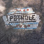
An uniquely elegant solution to a dirty everyday problem, these gorgeous handcrafted tile mosaics are turning unfilled potholes back into functional pieces of city street surface all over Chicago.

flower art context view

This time with an emphasis on beautification, mosaic maker Jim Bachor is back at it again. He is somewhat widely known in the area for using Chicago flags and and other city-themed infill to patch problematic holes in the urban fabric previously.

flower tiles city streets

flower tile chicago artwork

More on the artist’s background and inspiration: “Volunteering to work on an archaeological dig in Pompeii helped merge these two interests in to my art. In the ancient world, mosaics were used to capture images of everyday life. These colorful pieces of stone or glass set in mortar were the photographs of empires long past. Marble and glass do not fade. Mortar is mortar. An ancient mosaic looks exactly as intended by the artist who produced it over two millennia ago. What else can claim that kind of staying power? I find this idea simply amazing.”

flower artist tile chicago

In part, his work on the streets aims to draw attention to the 500,000+ potholes that remain unfixed at any given time, in part a byproduct of the harsh temperature shifts from winter to summer and back again (or as is said in the Midwest: ‘winter and road repair’ seasons).

flower pothole infill art

flower mosaic pot holes

“Using the same materials, tools and methods of the archaic craftsmen, I create mosaics that speak of modern things in an ancient voice. My work locks into mortar unexpected concepts drawn from the present … it surprises the viewer while challenging long-held notions of what a mosaic should be. Like low-tech pixels, hundreds if not thousands of tiny, hand-cut pieces of Italian glass and marble comprise my work.”

Share on Facebook


[ By WebUrbanist in Art & Street Art & Graffiti. ]

[ WebUrbanist | Archives | Galleries | Privacy | TOS ]


WebUrbanist

 
Comments Off on Flowering Potholes: Lovely Tile Plants Fill Ugly Street Voids

Posted in Creativity


Infographics 101: Selfie Boom – The Good, The Bad, and the Ugly

06 Sep

Unless you’ve been hiding under a rock (or just never check social media), you’ve likely heard of, or even participated in, the selfie trend. Although the trend first started back in the MySpace days, things really took off when Apple released the front-facing camera on the iPhone 4 in 2010. Since then, elementary schoolers, teenagers, and young adults alike have Continue Reading

The post Infographics 101: Selfie Boom – The Good, The Bad, and the Ugly appeared first on Photodoto.


Photodoto

 
Comments Off on Infographics 101: Selfie Boom – The Good, The Bad, and the Ugly

Posted in Photography


The Ugly Truth About Image Theft: How to Protect Yourself

14 Jan

Back in the Middle Ages, you could have your ears or hands cut off as a punishment for theft. Though in today’s civilized society, lots of things have changed, and we no longer deprive people of the parts of their body. Instead, we, in the worst case, put them to jail, with their ears safe! While theft is an issue Continue Reading

The post The Ugly Truth About Image Theft: How to Protect Yourself appeared first on Photodoto.


Photodoto

 
Comments Off on The Ugly Truth About Image Theft: How to Protect Yourself

Posted in Photography


City Camouflage: Ugly Public Buildings in Disguise

31 Jan

[ By Steph in Architecture & Cities & Urbanism. ]

City Camouflage Buildings in Disguise 1

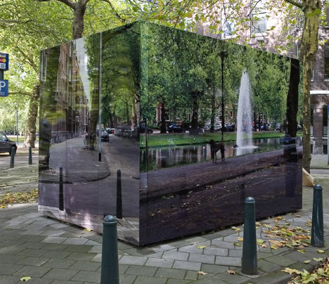
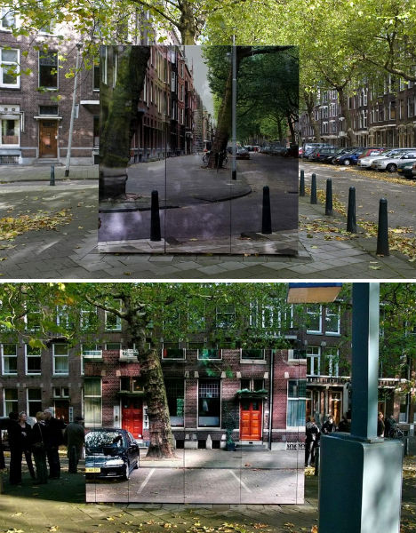
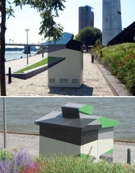
Electricity substations, bathrooms and other less-than-aesthetically pleasing public buildings can stand out as eyesores on the street, taking away from the beauty of their surroundings. Dutch designer Roeland Otten decided to disguise some of Amsterdam and Rotterdam’s worst offenders by making them blend into their environments, in both abstract and highly realistic ways.

City Camouflage Buildings in Disguise 2

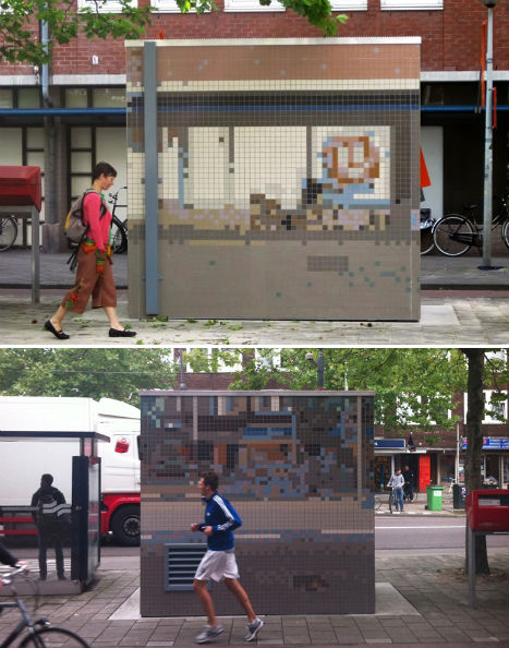
‘City Camouflage’ employs mosaic tiles, paint and photographic prints affixed to the outside of these small buildings to make them less visually offensive. The 1970s structures were unmaintained and beginning to rust.

City Camouflage Buildings in Disguise 3

High-resolution photography printed on sheets of aluminum make some of the buildings seem almost invisible. Gazing down the street, one’s view is no longer interrupted; you can see exactly what is behind each of these camouflaged buildings.

City Camouflage Buildings in Disguise 4

Others are covered in tiles that create a more subtle pixelated effect. One electricity substation on the water was given a bold, graphic treatment with acrylic paint so that it blends in from some angles and looks merely artistic from others.

Share on Facebook


[ By Steph in Architecture & Cities & Urbanism. ]

[ WebUrbanist | Archives | Galleries | Privacy | TOS ]


WebUrbanist

 
Comments Off on City Camouflage: Ugly Public Buildings in Disguise

Posted in Creativity


Photographers: The Good, The Bad & The Ugly

30 May

As a photographer I consider myself fortunate to be alive during an amazing time where a resurgence in photography, thanks to digital, has paralleled an unprecedented revolution in communication, thanks to the Internet.  The Internet has facilitated a constant buzz and chatter relating to everything photography enabling us to learn, gain inspiration and even compete. Every moment of the day we are bombarded with photography whether we’ve taken and shared our photo(s) or someone else has shared their photo(s) with us in the news, on a forum, on a social media site, etc. If you take a moment to put that Internet chatter and buzz on pause and strip away our cameras and computers we are left to see the individuals behind it all. We may not literally see every photographer worldwide, but in our day to day interaction we can see the qualities these people bring to the photography community. We see human nature at its best, worst and ugliest form.

Over the past year I’ve had a couple of experiences that warranted a discussion on photographer ethics, but I put it off. I put off the discussion because it was so disheartening. I was witness to the bad and the ugly, but recently I experienced the good… in fact the very good. Given the nature of my most recent experience I felt I could share my stories so that there was some perspective if not balance. After all I didn’t want to leave you feeling as disheartened as I had and I wanted to highlight an example of where photographers acted their best, exemplifying how our community could be and should be… all the time.

The Bad & The Ugly
Less than a year ago I was in one of my favorite locations, Glacier National Park. It was one of the few times I’ve had the opportunity to visit Logan Pass, home to amazing high altitude meadows. The scenery in this location is jaw dropping with craggy mountain peaks of exposed rock towering above fragile green meadows filled with alpine flowers and softly running creeks and waterfalls. At certain times of the year visitors are confined to boardwalks to minimize foot traffic across the meadow helping them stay healthy and productive.

photographer behaving badly
On the morning I was visiting I witnessed a photographer walking across an area outside the permitted boardwalk, along a perpendicular stone ledge (non continuous) that stretched out to the small valley below. He was returning to the boardwalk. As it so happens the valley below is home to a highly sought after waterfall to photograph. I approached the photographer to let him know that the meadow was closed in case he missed the signs and to make small talk as opposed to being confrontational. Here the wild ride begins and to keep it short I’ll summarize the events that transpired in our conversation:

  • When discussing the meadow closure the photographer felt he knew better than the park service stating the meadow does just fine with foot traffic, after all he’s been visiting the park for decades and there has been no impact to the meadow that he’s seen.
  • When asking where the highly sought after waterfall was I was told it was still under tens of feet of snow given the time of year. This turned out to be a lie as the waterfall could be seen if you knew where to look. I was able to see it later on my hike up the boardwalk.
  • When making small talk to learn about his photography and workshops I was told a fake name and given a fake web site URL
  • When asking about good alternate photography subjects, not subject to the meadow closure, I was pointed to subjects in the opposite direction of the highly sought after waterfall and told times that were polar opposite to when the best time to take photos truly was. If it was a sunset location I was told to go there at sunrise and vice versa.

Fortunately on this trip I had enough information and experience to know that the photographer I had run into was unscrupulous and untrustworthy. It was a very unfortunate encounter, but one that was an eye opener to a side of photography I’ve rarely seen.

The Good (If Not Great)
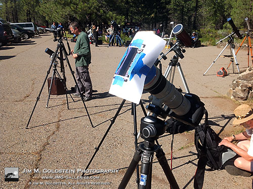
Recently I ventured out to Lassen National Forest to photograph the annular solar eclipse. The goal was to see the moon centered over the sun revealing a perfect ring of fire around the moon. I had an idea of where to go to make this happen, but not an exact location. Referencing a NASA Google Maps mashup I found a stretch of highway that would allow me to get well positioned to get the photo I had in mind. After driving 5 ½ hours I knew I was in the right place after seeing a small cluster of photographers and astronomy enthusiasts set up at a turnout. What made me realize this was the spot? Easy the astronomy enthusiasts had gigantic telescopes, up to 16”, set up.

cameras and tripods setup to see the May 2012 annular eclipse from northern California

I arrived with an hour to go before the eclipse began, but after I set up my camera I realized I was not going to be capturing any photos worth my while. My plan to stack two vari-ND filters on my 400mm lens was a failed plan as it was introducing too much reflection and ghosting of the sun. Before I gave up hope though I talked with the people around me who knew what they were doing. While I didn’t know any of the people around me, they were well versed in photographing solar eclipses and I was able to glean enough information from them allowing me to create a makeshift solar filter from a pair of eclipse glasses I received from a friend. By holding the filter over my lense I was one step closer to getting a decent shot.

2 minutes later another photographer came over to set up his camera. Space filled up quickly at the rest stop so I offered to remove my extra tripod & camera so he could set up. We got to talking and low and behold he lived about a mile from me. Seeing that I was holding up a filter to my camera by hand he offered to give me a piece of thick paper, blue painters tape and scissors. I instantly took him up on his offer and made an impromptu custom fitted solar filter from my eclipse glasses. It was because of the generosity of several people (my friend providing the eclipse glasses, a stranger providing various supplies and the collective knowledge of the people around me) that allowed me to successfully photograph my first solar eclipse.

Final Thoughts
Back when I was in Glacier National Park it seemed that the ethos of fellow photographers were as bad as they could be. My outlook on the photography community was at an all time low. After my time in Lassen my faith was completely restored. Yes there are always bad apples out there, but at the same time there are some incredible people who are always happy to help.

Over the past year I’ve continued to probe and experiment to see exactly what is the state of ethos and camaraderie amongst photographers and along the way I’ve learned a few important things that lay the foundation to the “good” (if not great):

  1. It always pays to talk to your neighboring photographers.
  2. Be as generous to others as you’d like others to be with you
  3. Never assume anything when sizing up a photographer as you never know who might be setting up next to you.
  4. Always share your contact info to swap notes and see each others photos after the shoot
  5. Don’t get so caught up in your shoot that you lose sight of having fun and making new friends.

So while there’s always a presence of photographers that are good, bad and ugly, the ratio of these types of photographers is dependent on you. The more generous and considerate you are with others, the more generous and considerate others will be with you and those they encounter on their future outings.

Copyright Jim M. Goldstein, All Rights Reserved

Photographers: The Good, The Bad & The Ugly

flattr this!


JMG-Galleries – Jim M. Goldstein Photography

 
Comments Off on Photographers: The Good, The Bad & The Ugly

Posted in Equipment


Meg & Dia – My Ugly Mouth

21 Jun

Music video for My Ugly Mouth by Meg & Dia. From the EP “It’s Always Stormy In Tillamook” You can download this video along with the EP from: megdia.bandcamp.com Tour dates: www.facebook.com Director/Editor: Bryan Schlam Director of Photography/Colorist: Pat Scola Aerial Photographer: Isaac Alongi Gaffer/2nd Unit Photographer: Adam Martin
Video Rating: 4 / 5

Miss Egypt World 2010 Photoshoot With McVirn Etienne London Music Info: Performer: Despina vandi Title: gia nhertz dubstep
Video Rating: 4 / 5


Figaro Pho – Wretchophobia (Ugly)

06 May

Figaro pompously unveils a freshly painted portrait of himself, only to receive a karmic tickle in the nose and sneezes a gallon of snot on the portrait. In a Dorian Grey moment, we see how the ugliness on the painting is reflected on Figaro’s face! Brown paper bag here we come!
Video Rating: 4 / 5