RSS
 

Posts Tagged ‘Treatment’

The iPhone 11 Pro Max gets the teardown treatment from iFixit

26 Sep

As it does with nearly every Apple smartphone, tablet and computer that hits shelves, iFixit has torn down an iPhone 11 and iPhone 11 Pro Max to reveal what technological goodies are hidden within. The teardown didn’t reveal too many surprises, overall, but a few interesting things did pop up.

From left to right: the iPhones XR, XS Max and 11 Pro Max.

Before cracking into any of the devices, iFixit teamed up with Creative Electron to X-ray the phones before they were opened up. As seen above, there’s not a millimeter of free space within the frames and although the same general layout was used, there are a few noticeable differences between the iPhone 11 models and the iPhone XS models. Considering the iPhone 11 Pro Max is the most interesting of the devices from a photography standpoint, that’s the teardown we’ll be focusing on here, although the full teardown of the iPhone 11 is available on iFixit.

Most notably, the iPhone 11 Pro Max uses a single-cell L-shaped battery, instead of two separate batteries found inside previous Plus/Max models. Apple also dropped down the logic board, presumably to make room for the much larger three-camera array.

In ‘Step 6,’ iFixit gets to the camera modules. The team at iFixit also had X-rays performed on the camera modules, which revealed the optical image stabilization on the wide and telephoto camera modules. According to the teardown, iFixit plans on doing a more detailed analysis of the camera unit, so when that goes live we’ll be sure to cover accordingly.

The black bars in the two larger camera modules are the OIS units.

Moving on, the iFixit team digs into the nitty-gritty details of the logic board and all of the individual chips, memory units and sensors within.

At ‘Step 13’ the battery gets some attention and iFixit reveals it was ‘pleasantly surprised to find some relatively repair-friendly features.’ The battery analysis also reveals the battery inside the iPhone 11 Pro Max ‘pumps out 3969 mAh at 3.79 V, for a total of 15.04 Wh […] a whopping 2.96 Wh more than the XS Max battery, and 1.52 Wh less than the Galaxy Note 10+ 5G battery.’ Of course, this increased capacity comes with a slight size increase. The battery inside the iPhone 11 Pro Max is 4.6mm thick and weighs 59.6g, which is 0.7mm thicker and 13g heavier than the dual-cell battery arrangement inside the iPhone XS Max.

The remainder of the teardown covers the bottom section of the devices, which includes speakers, microphones, charging ports, additional cables and more. iFixit gives the iPhone 11 Pro Max a repairability score of six out of ten, mostly due to the fact that if the back glass cracks the entire device essentially needs to be stripped away to repair it.


Image credits: Courtesy of iFixit

Articles: Digital Photography Review (dpreview.com)

 
Comments Off on The iPhone 11 Pro Max gets the teardown treatment from iFixit

Posted in Uncategorized


Senior Treatment – 4 Tips for Retrofitting The home

05 Mar

Getting old set up would be the time period utilized for retrofitting present homes to meet the shifting wants of senior citizens. It can help the elderly by giving the required safeguards and conveniences which allow these people to stay within their properties,Home Care in columbus hold their independence and defend their dignity. 4 basic adjustments will make the residences of our seniors safer and simpler for them and any caregivers who assist them.

The 4 uncomplicated retrofits most often instructed by senior care experts are:

1. Brighter lights

Special lighting on stairways, techniques and hallways conserve the elderly from falls. Senior care industry experts will make an in depth analysis of your household and recommend more lights or brighter mild bulbs exactly where needed.

2. Rest room

Including seize bars over the rest room or in the shower improve consolation and security for your personal liked one and presents peace of mind for spouse and children.

3. Actions / Stairs

Ramps as an alternative of stairs or simply a lift chair for a flight of stairs are suggestions commonly created by senior treatment gurus. They permit the mobility impaired the freedom to use their household fully without problems about falls.

4. Rearrangement

The well-trained, expert staff of a community senior care service provider can assist people with rearranging cabinets, closets and rooms to accommodate present-day abilities and wishes. A few easy improvements deliver independence and also the particular pleasure of being able to perform it by themselves.

Owners acquire observe: test your local setting up codes just before you start a retrofitting challenge that entails stairs and ramps. Depending upon the county and city through which you live, setting up codes may possibly change in addition to a permit may very well be wanted ahead of you begin. This provides on the cost but is properly definitely worth the comfort you can get realizing your venture is lawful and harmless.

Almost all of the retrofits prompt right here are not high priced. Property treatment and residential well being care suppliers can be quite valuable to you for those who are thinking about a retrofit for just a liked one particular. They may be familiar with other ways of carrying out things and just how every single sort of movement restriction impacts men and women aging set up. This information enables these gurus to satisfy the altering desires of seniors. Numerous of these businesses will offer you a free of charge consultation on retrofitting a house. Moreover, their treatment solutions can be found over a short-term or full-time basis, from a couple of hrs per month to around-the-clock treatment. They can be accurate experts devoted to preserving a senior’s dignity, providing guidance and bringing peace of mind to all anxious.

The post Senior Treatment – 4 Tips for Retrofitting The home appeared first on Photonovice.

Photonovice

 
Comments Off on Senior Treatment – 4 Tips for Retrofitting The home

Posted in Equipment


How to Give Your Images the Hollywood Treatment Step by Step

27 Mar

fig 1-1

Do you have an image that you would like to give the Hollywood treatment to, and really help make it pop? In this article, I’ll be showing you a method that you can use to give your images the blockbuster treatment, and take them to the next level. The best part about it is that you don’t have to be a Photoshop genius to do it!

The technique that we’ll be exploring is referred to as color-grading. The term color-grading is generally reserved for motion pictures where the editors would apply a creative color correction to films, but now it’s something that is appearing more and more in the vocabulary of still photographers. Color-grading is not to be confused with color correcting; it’s something quite different. Where color correcting is the process of ensuring that color casts are removed and colors are more accurate as a result, color grading is the process of altering and/or enhancing colors in specific areas in your image, such as shadows and highlights, to communicate a particular emotion or simply make the subject pop more, for example. If you have seen a movie then chances are extremely likely that you have seen color-grading at work.

The most common, and easiest color-grading, is the use of  complimentary colors; for example teal/blue tones in the shadows and the opposite color, yellow/orange, in the highlights. These two groups of colors sit opposite each other on the color wheel and being complimentary colors, they work harmoniously together and help the subject stand out more. See these other examples of complimentary colors in action. There are other types of color-grading using different color theory methods, such as analogous and triad, however complimentary is the simplest to learn and it can provide great results.

Before you begin, please ensure that the image you wish to work on has no color cast already, as this will affect the final result. Correcting your white balance is a great place to start. If you are unsure how to do that, 3 Ways to Change White Balance in Lightroom may help you.

In this article, I’ll be using curves in Photoshop to add the color-grading, so if you are unfamiliar with curves, How to do a Quick and Easy Curves Adjustment in Photoshop. As with many other things in Photoshop, there is always more than one way to get the job done, but for a straight forward process that gives fantastic results, you cannot beat curves! (Curves would have to be one of my favourite adjustments in Photoshop, as you can control so many aspects to your image with this function alone.) I won’t be giving you exact numbers to dial in with each adjustment, as your tastes may vary to mine, and you will also be working on an image different to mine, so what will work for my image will not necessarily work for yours.

Step 1: Add two adjustment layers

Base Image

I have the image that I would like to color-grade, and I want to add the teal/orange color combination, to give it that blockbuster look. I’ve ensured that there are no color casts already so I am good to go with this file. Get your image ready, and follow along.

The first step now is to add two curve adjustment layers; name the first one Luminosity and the other Color (I always like to name each of my layers as part of my workflow as it quickly helps me remember what each layer is doing). Now change the blend mode of the Luminosity layer to Luminosity. To do this, simply click on Normal in the layers panel; this should bring up a drop-down menu. Now scroll all the way to the bottom and select Luminosity.

Next, do a similar process with the Color layer selected; only instead of selecting Luminosity blend mode, you’ll be selecting Color. What these two steps are doing is very helpful when making adjustments to the curve in each layer. By changing one layer to a luminosity blend, you are effectively making only adjustments to the luminosity, or light levels of the image, and not adjusting color in any way. This is very help when increasing contrast, for example, as increasing contrast can alter the saturation of colors in the image.

Conversely, altering the blend mode of the Color layer to Color ensures that only color adjustments in the curve layer will be applied, and it will have no affect on the luminosity values of the image at all.

Step 2: Adjust the curve layers

Now that you have the two curve layers made and named, it’s time to adjust them and let the magic happen. Firstly, we want to increase the contrast of the image. So with the Luminosity curve layer selected, add a simple S-Curve to the curve layer. This is referring to a curve that is in the shape of an S, and this style of curve increases contrast.
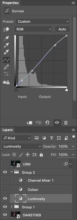
Contrast Curve Layer

As you can see, I have made a very slight adjustment with contrast here; the shadows have been darkened slightly and the highlights increase slightly. The image was already quite contrasty so I didn’t want to add too much more to it.

Contrast Curve

Here’s the effect of adjusting the contrast curve.

Step 3: Add color-grading

With the overall contrast of the image looking pretty good, it’s now time to move on to add the color-grading. To add teal to the shadows and yellow to the highlights, select the Color curve adjustment layer and click on the RGB drop down menu. First up is red. we need to remove red from the shadows, but add some to the highlights. If you click on the bottom left of the curve and drag the shadow anchor point to the right, you will see a drop in red from the shadows and green begins to appear. To add red in the highlights, simply click the anchor point at the top right and slide it toward the left.

Repeat this step for each of the green and blue colors in the drop-down menu.

There is no set amount as to how much each should be moved. Start off with small amounts and increase as, and if required. To prevent the skin tones from being affected, I added an anchor point to the middle of the curve. To do this, I simply clicked on the curve in the centre of each color curve. This will lock that specific part of the curve and skin tones are around the mid-tone area.
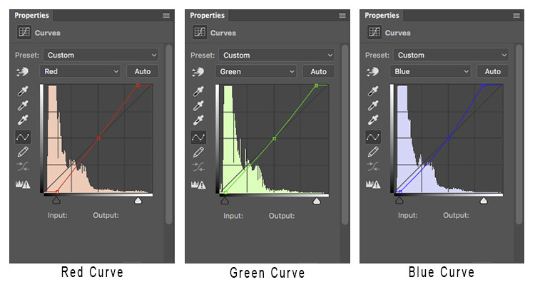
Curves

Here is how each of the color curves looks with this image.

If there are areas where you feel the color has been affected too much – perhaps you have too much red in the face, for example – clicking on the targeted adjust tool (TAT) will allow you to pinpoint the exact area on the curve that needs adjusting. Simply select the TAT and click in the image, on the area you want to target, and this will place an anchor point on the curve. You can now move that anchor up or down to suit. Using the keyboard keys to move up and down is most accurate.

Colour Curve

Now I have adjusted the colors in the curve to how I would like them to look. Switch this adjustment layer on/off to see what impact the adjustments have for you. You may need to revisit each of the color curves and readjust slightly.

Step 4: Add a Channel Mixer layer

The final step in this is to add a Channel Mixer adjustment layer. For this image, I selected the Black and White with Red Filter, but feel free to experiment with different options for your image. You want to use one that creates a nice amount of contrast in your subject and background. You can also adjust the RGB sliders to suit, and finally, reduce the opacity of this layer (I usse 34%).

Here is the final product.

fig 2

There is quite a difference when compared with the original image below.

Base Image

Let’s look at them side by side:

Before

Before

After

After

Where to now?

Now you have an introduction to color-grading using curves in Photoshop. With this example I showed you how to add a teal cast to the shadows, and a warmer orange tone to the highlights, but don’t feel that you are trapped with just this color combination. Experiment with moving the shadow and highlight anchor points in each color channel in a different direction; not just horizontally. Just remember that as a general rule, cooler colors such as greens and blues are more prevalent in shadow areas, and warmer colors such as reds and yellows should be in the brighter areas.

Here is a run down on the effects of moving the shadow and highlight anchor points for each color channel:

Table

If you ever forget what the opposite colors are, here is a handy color wheel.

Color Wheel

googletag.cmd.push(function() {
tablet_slots.push( googletag.defineSlot( “/1005424/_dPSv4_tab-all-article-bottom_(300×250)”, [300, 250], “pb-ad-78623” ).addService( googletag.pubads() ) ); } );

googletag.cmd.push(function() {
mobile_slots.push( googletag.defineSlot( “/1005424/_dPSv4_mob-all-article-bottom_(300×250)”, [300, 250], “pb-ad-78158” ).addService( googletag.pubads() ) ); } );

The post How to Give Your Images the Hollywood Treatment Step by Step by Daniel Smith appeared first on Digital Photography School.


Digital Photography School

 
Comments Off on How to Give Your Images the Hollywood Treatment Step by Step

Posted in Photography


Masterpiece Mashups: Classic Art Gets the GIF Treatment

03 Mar

[ By Steph in Art & Drawing & Digital. ]

van gogh gif

Vincent Van Gogh is having a good pop culture week on the interwebs with multiple humorous GIF treatments and stunning animations of his works exposing classic art to new generations. In this series, artist Kajetan Obarski (known as Kiszkiloszki) mashes up masterpieces by the infamous Dutch painter and others with contemporary life, bringing them firmly into the computer age.

gif 3

gif 7

gif 8

gif 11

Leonardo da Vinci gleefully photoshopping a range of different animals into his ‘Lady with an Ermine,’ Michelangelo’s Sistine Chapel God plays pool, a 17th-century lady rocks out with a skeleton and Van Gogh himself receives a very insensitive gift. There’s chocolate flinging, baby throwing and sexting gone awry, not to mention the inevitable conclusion to Magritte’s men falling from the sky.

output_p1ZRb8

gif 2

gif 9

gif 10

gif 1

classic art memes

Classic art has gotten a big cultural boost lately thanks to projects that appeal to our sense of humor, like the excellent Classical Art Memes. While more conservative art historians may lament that the works aren’t being appreciated in their original context, as the artists meant for them to be, these projects have centuries-old paintings flying around the internet like cat videos, so it’s hard to complain.

Share on Facebook


[ By Steph in Art & Drawing & Digital. ]

[ WebUrbanist | Archives | Galleries | Privacy | TOS ]


WebUrbanist

 
Comments Off on Masterpiece Mashups: Classic Art Gets the GIF Treatment

Posted in Creativity


Flagship Canon imagePROGRAF PRO-1000 gets the L-series ‘red line’ treatment

21 Oct

Canon has introduced a new flagship professional photo printer, the 17″ imagePROGRAF PRO-1000. Offering a new print head, ink set and image processor, it boasts an L-series-esque red line to reflect is top-end specification. Read more

Articles: Digital Photography Review (dpreview.com)

 
Comments Off on Flagship Canon imagePROGRAF PRO-1000 gets the L-series ‘red line’ treatment

Posted in Uncategorized


Street Retouch: Bus Riders Get Live Photoshop Treatment

24 Jun

[ By Steph in Art & Photography & Video. ]

Street Retouch Live Photoshop 1

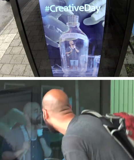
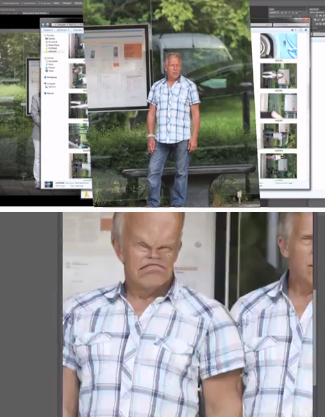
Unsuspecting travelers waiting to catch a ride were shocked to see their own photos integrated into humorous advertisements on the walls of the bus stop shelter. Berlin-based Photoshop artist Erik Johansson took surreptitious photos from a van across the street, altered them in Photoshop, and projected the edited images onto the ad space on the shelter.

Street Retouch Live Photoshop 2

Johansson had to work fast, getting only a few minutes to take the photo, make his changes, insert it into a funny pre-made background and transmit it to the bus shelter. He also filmed the reactions of the surprised subjects, who suddenly found themselves integrated into ads for fictional films and products.

Street Retouch Live Photoshop 3

Street Retouch Live Photoshop 4

Street Retouch Prank was developed for Adobe Creative Days, an annual event that showcases creativity and innovation using Adobe products. It may be a prank, but it’s also an interesting look at how interactive the future of advertising is likely to be.

Share on Facebook


[ By Steph in Art & Photography & Video. ]

[ WebUrbanist | Archives | Galleries | Privacy | TOS ]


WebUrbanist

 
Comments Off on Street Retouch: Bus Riders Get Live Photoshop Treatment

Posted in Creativity