RSS
 

Posts Tagged ‘Transformations’

Trippy Transformations: Makeup Artist Creates Unreal 3D Illusions

26 May

[ By SA Rogers in Art & Drawing & Digital. ]

Makeup artist Mimi Choy slices, disjoints, stretches, blurs and otherwise radically transforms her own face in stunningly realistic optical illusions using nothing but makeup. No templates, prosthetics or Photoshop go into the creation of her surreal photos – she freehand them all, often using standard cosmetics from brands like MakeupForever and Kryolan theater makeup. The Vancouver, Canada-based artist shows off her trippy looks on Instagram alongside her more standard everyday makeup looks.

Mostly using herself as a canvas for her optical illusions, Mimi says, “To be honest, I never thought anybody would be interested in following my bizarre late-night creations a few years ago because it wasn’t ‘on trend.’ But I continued because illusion art is challenging and I like having to push limits each time. Later on, I realized it’s not about creating looks that are ‘popular’ or would guarantee likes/follows, it’s about creating our own trend and breaking barriers.”

Mimi says she rarely even has a specific plan in mind when she starts painting – she just goes for it, and allows the result to come about spontaneously. Check out her Instagram @mimles for lots more wild and intricate makeup creations.

Share on Facebook


[ By SA Rogers in Art & Drawing & Digital. ]

[ WebUrbanist | Archives | Galleries | Privacy | TOS ]


WebUrbanist

 
Comments Off on Trippy Transformations: Makeup Artist Creates Unreal 3D Illusions

Posted in Creativity


Modern Home Makeovers: 15 Dramatic Before & After Transformations

08 Nov

[ By SA Rogers in Architecture & Houses & Residential. ]
main

Not every radical home makeover turns an ugly duckling into a beautiful swan, but they sure can render the original structures completely unrecognizable, for better or worse. Sometimes no more than the bones of the home stay in place as an entirely new sort of residence rises in its place, while other renovations maintain a starkly visible division between the old and the new. These transformations certainly prove the value of looking past a building’s flaws to its potential, as no matter what a house may look like when it’s purchased, it can ultimately be anything the homeowners want it to be.

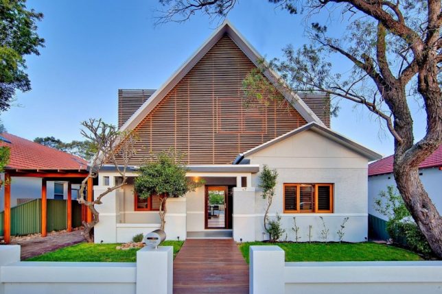
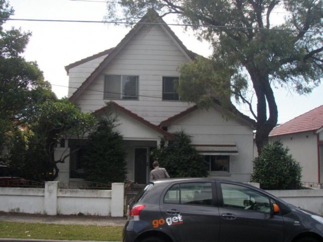
Kensington Residence, Sydney, Australia
kensington-before

kensington-after

There was nothing particularly special about this two-story 1920s bungalow residence in Sydney, Australia, before CplusC Architects got ahold of it and transformed it into a sustainable home. An existing extension to the first floor is vastly improved by a timber screen that improves natural ventilation and gives it loads more curb appeal.

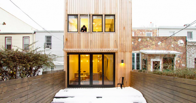
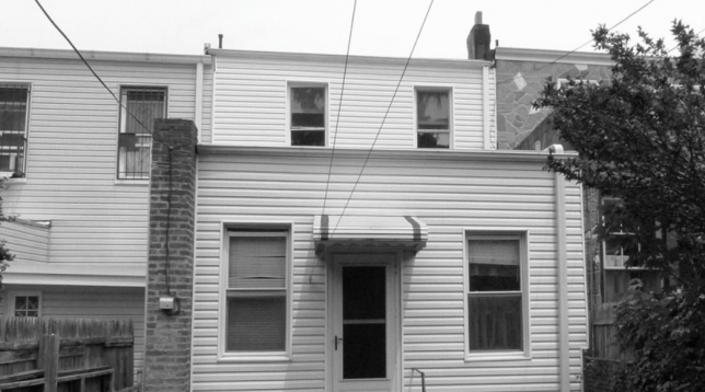
Brooklyn Row House by Office of Architecture
screen-shot-2016-11-06-at-6-48-28-pm

screen-shot-2016-11-06-at-6-48-38-pm

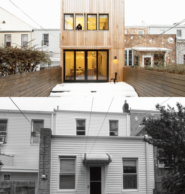
A 110-year-old Brooklyn row house looked very 1980s with its vinyl siding, boring sash windows and afterthought of an awning, not to mention missed opportunities for vertical expansion and a visual connection to the private outdoor space. Office of Architecture renovated the space inside and out, integrating a second-floor extension, lots of glass and a wooden facade.

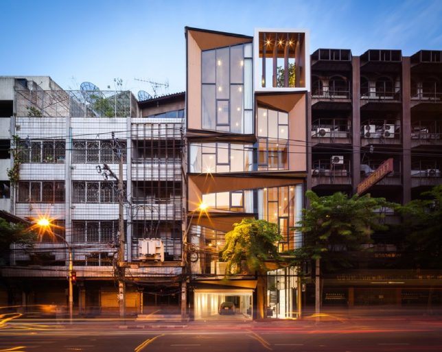
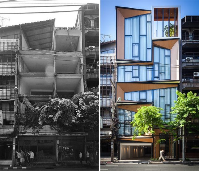
Commercial Building to Modern Residence in Thailand
thailand-before-and-after

thailand-after-2

A gutted five-story commercial building becomes a spacious, luxurious home for an extended family of siblings, their spouses and children in this stunning Bangkok renovation project by IDIN Architects. The first level accommodates the family’s jewelry store, while the rest serves as their private home, full of atriums planted with live trees.

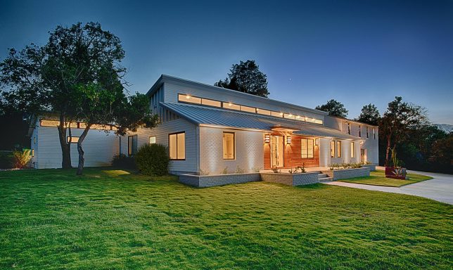
Texas Ranch House Transformation by MF Architecture

pugh-residence-before

pugh-residence-after

Who would ever think that a ranch house had so much potential? This residence east of Austin, Texas had already been expanded several times and was full of dark, disconnected interior spaces. MF Architecture conserved most of the exterior envelope while knocking out lots of the interior walls, but gave the facade a fresh look with white brick, timber cladding and a high row of narrow windows that bring light inside.

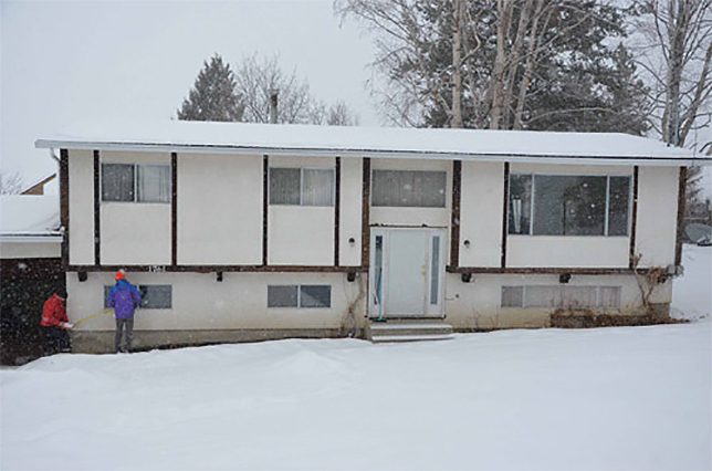
Modest Home in Salmon Arm, Canada
salmon-arm-before

salmon-arm-after

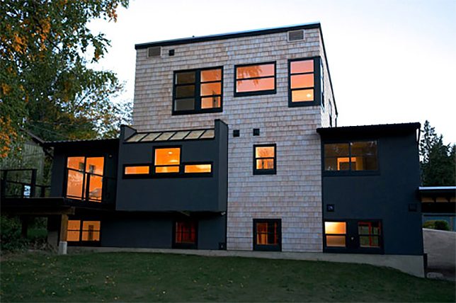
The couple who bought this property in Canada called it a “run-down, boring sausage-box cookie-cutter house built in ’73 on a large lot with ramshackle garbage-filled sheds.” But they knew it could be more, and took on the project of renovating it themselves, adding a third-floor volume that extends to the ground in the front and back, transforming the facades and tacking on two carports.

Next Page – Click Below to Read More:
Modern Home Makeovers 15 Dramatic Before After Transformations

Share on Facebook


[ By SA Rogers in Architecture & Houses & Residential. ]

[ WebUrbanist | Archives | Galleries | Privacy | TOS ]


WebUrbanist

 
Comments Off on Modern Home Makeovers: 15 Dramatic Before & After Transformations

Posted in Creativity


Timber Transformations: 13 Space-Expanding Wood Interior Inserts

10 Nov

[ By Steph in Design & Fixtures & Interiors. ]

wood built ins main

Customized to each particular interior, these wooden built-ins add lofted bedrooms, closet space, bookshelves, reading nooks, hidden laundry rooms and elevated workspaces in incredibly compact packages. Often performing like massively oversized furniture, custom timber creations can help make tiny apartments livable, taking full advantage of vertical space.

Bookcase Loft
wood bult in bookcase loft

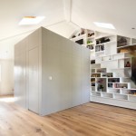
A loft living room gets the addition of a library-style bookcase, closet, lofted wardrobe space, stairs and a small bedroom. Made of heartwood pine, the box insert measuring 16x17x10 takes full advantage of the ceiling height in the space.

Cabin in a Brooklyn Loft
wood built in cabin loft

wood built in cabin loft 2

A loft in Brooklyn gets a fun and functional new bedroom space reminiscent of a rustic cabin in the woods, creating a private room that also adds architectural interest to the space.

Garage to Studio Transformation
wood built in garage studio

wood built in garage studio 2

A garage in Moscow is now a studio space for an architecture student thanks to the addition of a bunch of built-in wooden elements, including a grid shelving system, work desk, sofa and suspended loft bed.

Sculptural Laser-Cut Shelving
wood built in laser cut

wood built in laser cut 2

Far more visually interesting than the average bookcase, this laser-cut built-in wall of shelves continues onto the ceiling in a single flowing form to become a sculptural focal point.

Multi-Level Artist Retreat
wood built in artist retreat 1

wood built in artist retreat 2

wood built in artist retreat 3

This artist-in-residence project at department store de Bijenkorf in Amsterdam fills the uniquely tall space of a historic tower with a beautiful series of stacked rooms decked out with cabinets, tables and bed platforms.

Next Page – Click Below to Read More:
Timber Transformations 13 Space Expanding Wood Interior Inserts

Share on Facebook


[ By Steph in Design & Fixtures & Interiors. ]

[ WebUrbanist | Archives | Galleries | Privacy | TOS ]


WebUrbanist

 
Comments Off on Timber Transformations: 13 Space-Expanding Wood Interior Inserts

Posted in Creativity


Dream Rooms: 14 Unreal-Feeling Art Gallery Transformations

27 Jan

[ By Steph in Art & Installation & Sound. ]

surreal art flat side 1

You might have to pinch yourself to ensure that you’re still awake as you walk into surreal dreamscapes of billowing clouds, seemingly endless fields of stars and rooms that appear to bend and shift in physically impossible ways. These installations completely transform gallery spaces into strange new environments that feel disconnected from the waking world. See 15 more surreal art spaces.

Cloudscape Made of Soap Bubbles

surreal art cloudscape 1

surreal art cloudscape 2

Eight pumps around the room in a Japanese gallery continuously alter a surreal cloudscape entitled ‘Foam.’ The installation, by artist Kohei Nawa, is made up of a pliable combination of glycerin, detergent and water that holds its shape and isn’t affected by gravity. The mixture billows gently, making it seem as if visitors are really in the sky.

Spatial Confusion by Sarah Oppenheimer

surreal art oppenheimer 1

surreal art oppenheimer 2

Doorways bend, walls lift up their corners to provide glimpses into adjacent rooms and skewed apertures make it seem as if people walking in nearby spaces are upside-down. Sarah Oppenheimer’s work seems to distort physical spaces, changing the gallery itself to create confusion.

The Flat Side of the Knife by Samara Goldstein

surreal art flat side 2

flat side 2

Do you ever dream about spaces that make no physical sense, with platforms seeming to hover in midair and staircases leading to apparently endless new rooms? With ‘Flat Side of the Knife,’ artist Samara Golden manages to capture that feeling in physical form with a combination of objects made of reflective foam insulation and live video projection. The installation spanned the entire floor-to-ceiling space of MoMA PS1’s first-floor duplex gallery, the various levels representing ‘layers of consciousness.’

Crawling from the Wreckage by Simon Birch

Student visitors pose from inside an installation titled "Crawling from the Wreckage" as part of Simon Birch's solo art exhibition in Hong Kong

surreal art crawling 2

You’ll feel like you stepped inside a 1980s video game with Simon Birch’s ‘Crawling from the Wreckage,’ a highly convincing three-dimensional replication of a computer-generated model. The effect is achieved using glow-in-the-dark paint on gridded furniture within a gridded ‘cell.’

Next Page – Click Below to Read More:
Dream Rooms 14 Unreal Feeling Art Gallery Transformations

Share on Facebook


[ By Steph in Art & Installation & Sound. ]

[ WebUrbanist | Archives | Galleries | Privacy | TOS ]


WebUrbanist

 
Comments Off on Dream Rooms: 14 Unreal-Feeling Art Gallery Transformations

Posted in Creativity


Face Hacking: Transformations via 3D Projection Mapping

22 Jan

[ By Steph in Conceptual & Futuristic & Technology. ]

face hacking 1

Actors gain access to thousands of different faces instantaneously as their facial topography is scanned and altered in real-time using 3D projection mapping. Japanese artist Nobumichi Asai collaborates with makeup artist Hiroto Kuwahara and French digital image engineer Paul Lacroix to create transfixing transformations that track the actor’s movements to keep their ‘new faces’ in place.

Screen shot 2015-01-21 at 7.50.42 PM

Screen shot 2015-01-21 at 7.51.31 PM

Screen shot 2015-01-21 at 7.52.41 PM

The Facehacking and Omote projects consist of real-time face tracking and projection mapping to ‘re-write’ the actors’ faces in a virtually endless variety of ways. As the actors turn their heads, animations are projected onto the surface of their skin.

Screen shot 2015-01-21 at 7.53.14 PM

Screen shot 2015-01-21 at 7.54.30 PM

facehacking 2

The effect can be quite creepy, especially when these new characters open their eyes as if they have suddenly inhabited the bodies of their hosts. The result looks like especially detailed stage makeup, but changes on demand. While it could certainly be used in film, it’s especially intriguing as a possible element of live performances.

Share on Facebook


[ By Steph in Conceptual & Futuristic & Technology. ]

[ WebUrbanist | Archives | Galleries | Privacy | TOS ]


WebUrbanist

 
Comments Off on Face Hacking: Transformations via 3D Projection Mapping

Posted in Creativity


Decaying Detroit: Google Street View Shows Transformations

05 Jun

[ By Steph in Abandoned Places & Architecture. ]

Detroit Decay 1

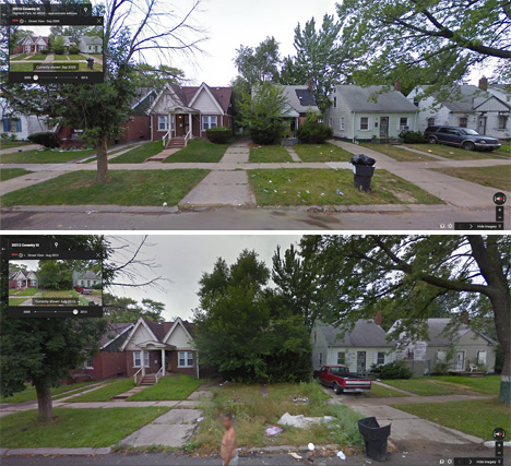
The architectural equivalent of ‘Faces of Meth,’ these compiled Google Street View images of Detroit from 2009 through 2013 paint a poignant portrait of decay in the city. Entitled ‘GooBing Detroit,‘ a tumblr blog uses Google Street View Time Machine to follow the fast transformation of houses from cute and cheerful suburban residences to overgrown vacant lots.

Detroit Decay 2

Detroit Decay 4

Much has been said about the decline of a once-great city, and the seemingly diminishing chances of a comeback. The city’s 78,000+ ‘feral houses‘ are the stuff of legend, seeming to revert back to a wild state the way domesticated animals tend to do when left to their own devices.

Detroit Decay 3

The Street View images are often astonishing in the rapid transition in a span of just a few short years. A stretch of houses may have cars parked in the driveways, toys on the lawn and other signs of life all around in the first image, while by the third or fourth they’re barely discernible among the overgrowth.

Decaying Detroit 5

Decaying Detroit 6

Decaying Detroit 7

While these images really drive home how much Detroit has lost over the last three decades, many residents aren’t ready to give up hope, despite the fact that the city’s population has declined from a peak of 1.8 million to just 700,000. There are indeed areas of the city that still thrive, but the question of an overall plan (either to break the city into manageable pieces or reinvigorate it as a whole) remains an open one.

Share on Facebook


[ By Steph in Abandoned Places & Architecture. ]

[ WebUrbanist | Archives | Galleries | Privacy | TOS ]


WebUrbanist

 
Comments Off on Decaying Detroit: Google Street View Shows Transformations

Posted in Creativity