The so-called ‘rules of composition’ aren’t so much rules as guiding principles.

Why? Because not every compositional tool works for every image. Art is subjective, and what works well for one image may not work so well for another.
That being said, good photography involves not only technical skill but also choosing the right composition.
It’s especially true in still life photography, where composition can really make or break an image. So here are some tips on how you can apply these compositional ‘rules’ to your still life photography.

The Golden Ratio
If you’re new to photography, you may have not heard of the ‘Golden Ratio’ (also known as the ‘Divine Proportion,’ the ‘Golden Mean,’ and the ‘Greek Letter ?’).
Don’t worry if you haven’t heard of them. While artists and architects have been using this principle for hundreds (if not thousands) of years, I was well into my stint at photography school before I’d even heard about it.
It’s a mathematical expression that can describe a wide variety of phenomena found in nature. But when it’s used in art, the results are harmonious and aesthetically pleasant compositions.
You can find the Golden Ratio everywhere – from the works of Michelangelo to the great Egyptian pyramids to a nautilus shell. It’s also found in the human face and body, and even in our DNA.
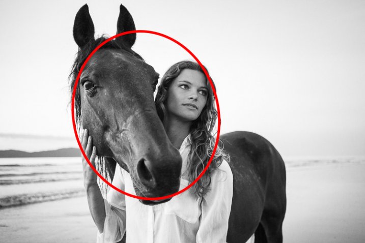
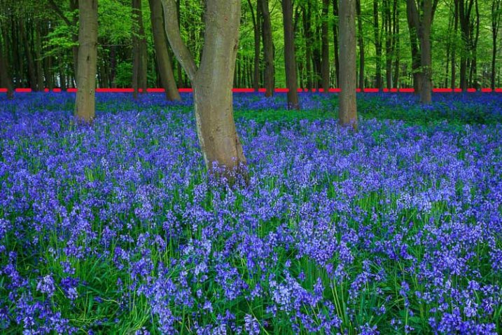
Rule of Thirds Grid
Most photographers are familiar with the ‘Rule of Thirds.’ This compositional guideline divides an image into nine equal sections using two horizontal and two vertical lines, just like a tic-tac-toe board. The important elements in the scene should fall along these lines or at the points where they intersect.

Rule of Thirds
The rule of thirds works well for images such as landscapes but can be limiting for still life photography. The resulting images often feel awkward or unbalanced.
The Phi Grid
The ‘Phi Grid’ uses a similar concept but is much more powerful than the Rule of Thirds. Its center lines are closer together and express the Golden Ratio of 1:1:618.

Phi Grid
The Phi Grid is one expression of the Golden Ratio.
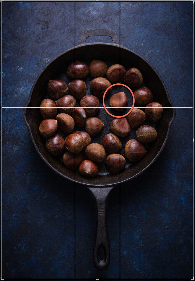
This image uses the Phi Grid. Notice how the chestnut in the focal point is placed differently to the others, drawing the eye.
Fibonacci Spiral
Another expression of the Golden Ratio is the Fibonacci Spiral, which exhibits the same numerical pattern that makes up the Golden Ratio.
You can use this numerical pattern to draw a series of squares. If you draw an arc from one corner to the opposite corner in each square starting from the smallest square, you’ll end up with the Fibonacci Spiral.
This is a guiding principle you can use in your still life photography. By setting your subjects along a curve rather than a straight line you create flow and movement, and help guide the viewer’s eye through the image. It works particularly well in overhead shots that have several elements in the frame.
You can flip or turn the spiral so long as your focal point falls in the smallest part of the spiral. Other important elements should be placed along the curve.

Fibonnaci Spiral
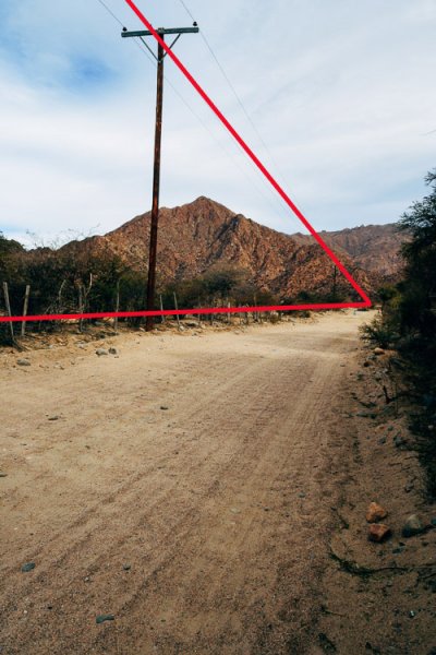
Golden Triangle
Using triangles is a powerful way to create tension in a still life image, and retain the attention of the eye within the frame.
Here’s an image that expresses this principle.

Notice the diagonal line going from one corner to the opposite, and the lines meeting that diagonal from the other corners? Where the lines meet are your points of interest, which you should use to place your focal point and divide your frame.
While horizontal and vertical lines suggest stability, triangles add a sense of flow and movement.
You can compose your image to imply triangles, rather than being strict about composing them exactly this way.
Other Helpful Principles
Rule of Odds
In still life photography, having an odd number of elements in a frame is more visually interesting than having an even number of elements.
Odd numbers create harmony, balance and a resting point for the eyes, whereas even numbers compete with each other and can divide our attention.
Aim to have three or five elements in your image. You can have more, but the mind has trouble registering higher numbers meaning your photograph will not have the same effect. If you do have more, put them into groups of odd numbers wherever possible.

Odd numbers create tension
Negative Space
Positive space is the area your subjects take up.
Negative space is the empty area where the eye can rest.
Negative space can provide the feeling of movement, and emphasize your subject. Without any space for the eye to rest, a picture can feel chaotic or claustrophobic.
You see negatives space a lot in magazines or product packaging, where it’s used for text placement.

Color
You may not think of color as a compositional tool. But it’s actually a very important one. It evokes emotion and creates the mood of the photograph.
Cool and dark colors such as navy blue and black recede, while light and warm colors such as yellow bring objects forward.
Color combinations can be monochromatic, or any of those found on the color wheel.
One of the most powerful combinations is complementary colors (i.e. colors that are directly opposite each other on the color wheel). Blue and yellow is one such combination, which you see a lot in food photography.
Take into account the color of the background or surface you’re shooting on. Colors that are too bright can detract from your subject. Make sure your background matches the mood you’re trying to create and works harmoniously with your chosen elements.

Complementary colors make your images pop
In Conclusion
It can take years for a photographer to learn to shoot intuitively using compositional principles. Visualizing your focal point on a Phi Grid is one thing, but visualizing the Fibonacci Spiral while you’re shooting may be more difficult.
Thankfully, with still life photography, you can tether your camera to your computer or use its Live View function to estimate where your subject and focal point should fall.
Editing software such as Lightroom and Photoshop can help you place the various elements in your frame with overlays of compositional guides. You can shoot wider than you need for the final result and crop in post-processing.
The more you implement these compositional guidelines and work with them in post the more you’ll internalize them, which can only improve your still life photography.
The post How to Apply Compositional Theory to Still Life Photography appeared first on Digital Photography School.


 Mastering Composition


You must be logged in to post a comment.