RSS
 

Posts Tagged ‘takes’

Meike iPhone lens adapter case takes ring light and Sony QX1

18 Jun

$ (document).ready(function() { SampleGalleryV2({“containerId”:”embeddedSampleGallery_5756523953″,”galleryId”:”5756523953″,”isEmbeddedWidget”:true,”standalone”:false,”selectedImageIndex”:0,”startInCommentsView”:false,”isMobile”:false}) });

Hong Kong accessory manufacturer Meike has introduced a new case for the Apple iPhone 6/6s that accepts three accessory lenses and offers a mount for a ring light and Sony’s ILCE-QX1 E-mount ‘lens-style camera’. The MK-H6S PRO comes with a hand grip that has a Bluetooth-enabled shutter release button to deliver a more camera-like experience for mobile phone photographers.

The kit includes three lenses – a 0.65x wide-angle adapter, a 180° fisheye and a 2.5x macro lens – that screw into a mount over the device’s built-in camera. A larger mounting ring in the middle of the case accepts an optional ring light with built-in mirror for selfies. The same ring is also compatible with Sony’s 20MP APS-C QX1 adapter so users will be able to fit Sony E lenses to the device, preview the image on the phone’s screen and control capture via the grip’s shutter release.

The Meike MK-H6S PRO will cost £45/$ 65. For more information visit the Meike website.

Articles: Digital Photography Review (dpreview.com)

 
Comments Off on Meike iPhone lens adapter case takes ring light and Sony QX1

Posted in Uncategorized


iFixit takes a look inside the Olympus PEN E-PL7

11 Jun

Inside the Olympus PEN E-PL7

The Olympus PEN E-PL7, like its Micro Four Thirds peers, is a pretty impressive little piece of engineering. It houses a 16MP Four Thirds sensor and a 3″ LCD that flips up 180-degrees. It accepts Micro Four Thirds lenses and ships with a pocket-sized external flash. Being curious types of people, we wanted to know how Olympus squeezes everything into a camera of the E-PL7’s size. Thankfully, there’s iFixit. Their disassembly guide gives an up-close look at what’s inside the camera – and you don’t have to void your warranty in the process.

Inside the Olympus PEN E-PL7

This disassembly starts the way so many projects do: with a screwdriver. Screws are removed from the bottom plate and sides of the camera.

Image via iFixit

Inside the Olympus PEN E-PL7

With some screws removed from the lens mount, this inner ring is revealed and carefully removed.

Image via iFixit

Inside the Olympus PEN E-PL7

With even more screws gone a pair of tiny springs can be taken out of the mount.

Image via iFixit

Inside the Olympus PEN E-PL7

Removing even more screws makes it possible to gently pull the chassis apart, but not quite all the way with a ribbon cable connecting the two pieces. 

Image via iFixit

Inside the Olympus PEN E-PL7

A camera divided. Highlighted in red is the ZIF connector keeping the ribbon cable attached to the motherboard.

Image via iFixit

Inside the Olympus PEN E-PL7

With the cable disconnected, the camera can be handled one half at a time.

Image via iFixit

Inside the Olympus PEN E-PL7

Here’s another look at the motherboard, with even more ribbon cables attached.

Image via iFixit

Inside the Olympus PEN E-PL7

Up top, the plate that holds the mode dial and shutter release can be removed once one more screw is out of the way. 

Image via iFixit

Inside the Olympus PEN E-PL7

…And with some ribbon cables disconnected, the sensor comes free of the camera body too.

Image via iFixit

Inside the Olympus PEN E-PL7

 E-PL7’s 16MP sensor lies 

Here’s a front view of the E-PL7’s 16MP sensor. 

Image via iFixit

Inside the Olympus PEN E-PL7

The camera is looking quite empty at this point. Here’s a sense of how small that motherboard is.

Image via iFixit

Inside the Olympus PEN E-PL7

…And with a few last cables disconnected and screws removed, the E-PL7 disassembly is complete.

Image via iFixit

Articles: Digital Photography Review (dpreview.com)

 
Comments Off on iFixit takes a look inside the Olympus PEN E-PL7

Posted in Uncategorized


Student takes 2016 Zeiss Photography Award top prize

13 Apr

$ (document).ready(function() { SampleGalleryV2({“containerId”:”embeddedSampleGallery_3406645931″,”galleryId”:”3406645931″,”isEmbeddedWidget”:true,”standalone”:false,”selectedImageIndex”:0,”startInCommentsView”:false,”isMobile”:false}) });

A 25-year-old photojournalism student beat a host of professionals to Zeiss’s €15,000 top prize in its first Zeiss Photography Awards. Tamina-Florentine Zuch’s project about train travel in India took her six weeks to shoot, and explores how the nation behaves on the world’s most extensive railway network. Zuch wins Zeiss lenses to the value of €15,000, and will receive her prize during the Sony World Photography Award ceremony in London this month.

Zeiss says its inaugural competition, with the theme ‘Meaningful Places’, attracted 22,000 images from 3139 photographers across 116 countries and was successful enough that the company will repeat the exercise next year.

Runners up in the competition included Melanie Hübner (Germany), Francisco Salgueiro (Portugal), Patricia Ackerman (Argentina), Helen Mountaniol (Ukraine), Jorge Lopez Munoz (Spain), Erez Beatus (Australia), Lasse Lecklin (Finland) and each of them will have their work shown at the Sony World Photography Awards exhibition.

For more information on the awards, and to see the entries of all of those shortlisted, visit the Zeiss Photography Award website.


Press release:

ZEISS award for new perspectives

The winner of the first-ever ZEISS Photography Award has been chosen. The prize goes to Tamina-Florentine Zuch from Hannover with her photo series documenting a train journey through India.

“Meaningful Places” was the theme of the first-ever ZEISS Photography Award “Seeing Beyond,” which invited professional photographers and ambitious amateurs to showcase for the first time their talent to a renowned jury and to the broader public. The contest attracted 3,139 photographers from 116 countries – from Albania to Zimbabwe. A total of 22,000 images were submitted. “The results are superb – we were really excited by the breadth and quality of the applications,” praised Scott Gray, CEO of the World Photography Organisation, which organizes the ZEISS Photography Award.

In Tamina-Florentine Zuch, 25, the ZEISS Photography Award has found a worthy winner. Zuch, a student of photojournalism and documentary photography in Hannover, traveled through India by train last year for a period of six weeks. Her pictures show children sleeping in hammocks in stuffy train carriages, men risking their lives as they ‘surf’ railway cars, and exotic landscapes as they pass by. Her “Indian Train Journey” brings this journey to life. Some of the images, which are very intimate, demonstrate Zuch’s photographic mastery at such a young age, her patience, and her sensitivity and tact in dealing with subjects from a completely different culture. “Tamina Zuch has an incredible eye for composition, light and a feel for the right moment. She combines these characteristics again and again in her pictures,” said Steve Bloom, one of the three jurors, enthusiastically. “‘Indian Train Journey’ is a very personal and poetic journey that is told by a fresh, young voice,” added Hans-Peter Junker, juror and editor-in-chief of the reportage magazine View.

As the winner, Zuch will receive ZEISS lenses of her choice for a total value of EUR 15,000, as well as an offer to cooperate further with ZEISS. Seven other photographers – Melanie Hübner (Germany), Francisco Salgueiro (Portugal), Patricia Ackerman (Argentina), Helen Mountaniol (Ukraine), Jorge Lopez Munoz (Spain), Erez Beatus (Australia), Lasse Lecklin (Finland) – made it to the shortlist, which gives them the opportunity to present their work at the Sony World Photography Awards Exhibition at Somerset House in London from April 22 to May 8, 2016.

In 2017 the ZEISS Photography Award will enter a new round, with a different theme. “We want to create a platform for photographers to show their art and their idea of creation to an interested public, and to pay tribute to that,” said Dr. Winfried Scherle, Executive Vice President Consumer Optics Business Group of Carl Zeiss AG. And Scott Gray praises: “The ZEISS Photography Award provides photographers with an exciting opportunity to expand their creative boundaries. We look forward to working with ZEISS on more contests in the coming years.”

Articles: Digital Photography Review (dpreview.com)

 
Comments Off on Student takes 2016 Zeiss Photography Award top prize

Posted in Uncategorized


Samsung Galaxy S7 edge takes top spot in DxO Mobile rankings

19 Mar

DxOMark has put the Samsung Galaxy S7 edge through its testing, and with a score of 88 the device moves into the top spot in DxO’s mobile rankings. The S7 edge and slightly smaller S7 use a 12MP sensor with on-chip phase detection and an F1.7 lens with optical image stabilization. By taking the top position in the mobile rankings, the S7 edge relegates its Galaxy S6 edge plus and the Sony Xperia Z5 to a joint number two spot.

Articles: Digital Photography Review (dpreview.com)

 
Comments Off on Samsung Galaxy S7 edge takes top spot in DxO Mobile rankings

Posted in Uncategorized


Modular Skyline: Pixelated Skyscraper Takes Shape in Bangkok

02 Mar

[ By WebUrbanist in Architecture & Offices & Commercial. ]

pixelated tower

A joint project of Büro Ole Scheeren and the Office for Metropolitan Architecture, this skyscraper nearing completion in Bangkok, Thailand, features shifted box elements that break up its surface to create balconies and terraces.

deconstructivist skyscraper bangkok

Located downtown, the 77-story building features hundreds of apartments, a hotel and other mixed-use functions, including, plazas, shops, bars and restaurants. It is also the tallest building in the city. Originally scheduled for completion in 2010, the structure will now be finished this year (recent photographs above and below by Simon Rawlings, benstinyplanet and tsa.p).

modern glass tower deconstructed copy

Renderings below illustrate the street-level entrances, an aerial perspective and close-up views of the pixelation effects, as well as showing how the design evolved from concept to reality (as compared to photographs of its current state above).

pixelated tower renderings

pixelated tower detail

From the architects: “The design moves beyond the traditional formula of a seamless, inert, glossy totem, and instead actively engages the city: MahaNakhon’s pixilated and carved presence embraces and connects to the surrounding urban fabric rather than overpowering it.”

pixelated tower from above

“Its glittering stacked surfaces, terraces and protrusions will simultaneously create the impression of digital pixilation and echo the irregularity of ancient mountain topography.”

Share on Facebook


[ By WebUrbanist in Architecture & Offices & Commercial. ]

[ WebUrbanist | Archives | Galleries | Privacy | TOS ]


WebUrbanist

 
Comments Off on Modular Skyline: Pixelated Skyscraper Takes Shape in Bangkok

Posted in Creativity


Mystery Oreo Vault in NYC Takes You on a Weird Tasty Trip

04 Feb

[ By Steph in Design & Guerilla Ads & Marketing. ]

oreo vault 1

What’s behind the giant Oreo-shaped vault door mounted to a bright blue garage in midtown Manhattan? Curious passersby who decide to approach and find out for themselves will have the most authentic and rewarding answer to that question, but the rest of us can live vicariously through photos and video of this clever interactive ad installation promoting the cookie brand’s new flavor.

oreo vault 2

oreo vault 3

Once you open that portal-like door, a sign greets you with this message: ‘Welcome to the Oreo Wonder Vault – Pull the lever to begin.’ Follow the directions and a box of free cookies will come sliding down a conveyer belt, delivered directly to you via slide. This time, it’s ‘Filled Cupcake’ flavor.

oreo vault 4

oreo vault 6

Oreo tells Ad Week that as many as 50 prototype flavors and over 100 additional ideas can be in the Wonder Vault at any time, and it can take up to 18 months to perfect each one before it’s ready for release. “The limited edition process never stops; we have lot of flavor ideas just waiting to make their way to the world.”

oreo vault 5

The fun installation is located somewhere near 18th street between 7th and 8th Avenues, and appears to have already delivered all the free cookies it had to offer. The new flavor will be in stores on February 8th.

Share on Facebook


[ By Steph in Design & Guerilla Ads & Marketing. ]

[ WebUrbanist | Archives | Galleries | Privacy | TOS ]


WebUrbanist

 
Comments Off on Mystery Oreo Vault in NYC Takes You on a Weird Tasty Trip

Posted in Creativity


Drone maker DJI takes ‘strategic minority’ stake in Hasselblad to gain camera technology

05 Nov

Medium format and aerial camera maker Hasselblad has sold a minority stake to the Chinese drone giant SZ DJI Technology Co Ltd, in what the two companies describe as a ‘corporate partnership’. The exact size of the stake has not been revealed, but both sides are keen to point out that there will be no merging of the businesses and from an external viewpoint nothing will change. Read more

Articles: Digital Photography Review (dpreview.com)

 
Comments Off on Drone maker DJI takes ‘strategic minority’ stake in Hasselblad to gain camera technology

Posted in Uncategorized


DxOMark Mobile report: LG G4 takes second place in rankings

24 Sep

DxOMark has released its test results for the LG G4, which boasts a 16MP 1/2.6″ sensor and F1.8 lens. Other camera features include a laser system to support autofocus speed and accuracy, 3-axis optical image stabilization and an LED flash. We’ve updated our LG G4 camera review with a summary of DxO’s findings – find out what makes the G4 worthy of DxO’s top 10 mobile rankings. Read more

Articles: Digital Photography Review (dpreview.com)

 
Comments Off on DxOMark Mobile report: LG G4 takes second place in rankings

Posted in Uncategorized


Modern Wooden Architecture: 16 Fresh Takes on Timber

17 Sep

[ By Steph in Architecture & Cities & Urbanism. ]

wooden architecture metropol parasol 4

Wood may be most closely associated with cabins, stick-frame housing and other conventional forms of architecture, but a new wave of architects is adapting its usage for this century and beyond, using it as a primary material for large commercial structures, pavilions, energy-saving facades and even skyscrapers. Lightweight, flexible and renewable, wood is having a moment in modern architecture, transcending its rustic origins as one of the world’s most ancient building materials.

Curving Timber Shell for Swatch Headquarters by Shigeru Ban
wooden architecture swatch 1

wooden architecture swatch 2

wooden architecture swatch 3

wooden architecture swatch 4

A sinuous timber shell structure stretches between buildings owned by sister companies under the Swiss watch giant Swatch umbrella in this concept by Shigeru Ban. Connecting older buildings with new ones and forming semi-enclosed public spaces, the new addition will act as the company’s headquarters. Large pale crosses dot the lattice in a nod to the company’s brand identity.

Metropol Parasol by J. MAYER H. Architects
wooden architecture metropol parasol 1

wooden architecture metropol parasol 2

wooden architecture metropol parasol 3

wooden architecture metropol parasol 4

“Realized as one of the largest and most innovative ended timber-constructions with a polyurethane coating, the parasols grow out of the archaeological excavation site into a contemporary landmark, defining a unique relationship between the historical and the contemporary city,” says J. Mayer H. Architects of their creation Metropol Parasol. The waffle-like structure in Seville, Spain incorporates the archaeological site as well as a farmer’s market, bars and restaurants over 18,000 square meters. The parasols form plazas and also offer an elevated rooftop walkway from which to view the city.

Contemporary Hillside Home by Jose Ulloa Davet + Delphine Ding

wooden architecture hillside home 1

wooden architecture hillside home 2

wooden architecture hillside home 3

wooden architecture hillside house 5

This mountain home in Tunquen, Chile is anything but a rustic cabin despite its raw timber construction, with a path snaking its way from ground level all the way up onto the roof. Conceived as both a private space and a platform for outdoor activities, the “Metamorfosis” house is raw and modern at once, providing breathtaking views of the scenery.

Space Lab by Kohki Hiranuma Architect & Associates

wooden architecture space lab 1

wooden architecture space lab 2

wooden architecture space lab 3

wooden architecture space lab 4

Stacked cedar planks alternate with glass to create an irregular pattern of light inside the ‘Space Lab,’ a temporary structure at the University of Tokyo made of discarded wood. The experimental space makes a statement on the use of diminishing resources and will also investigate the strength of this construction method over four years. “This ‘Azumaya” architecture of today does not separate inside and outside, and is expected to be variably used for a promotion of domestic materials to just a resting space. And finally this architecture, which utilizes domestic thinned materials, shows one way of regeneration the balance of nature we have destroyed.”

Woven Lattice Dessert Shop by Kengo Kuma + Associates
wooden architecture lattice 1

wooden architecture lattice 2

wooden architecture lattice 3

wooden architecture lattice 4

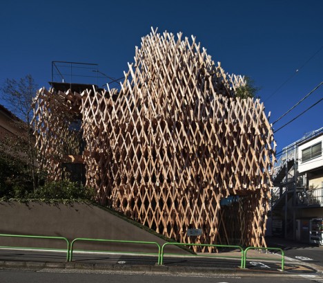
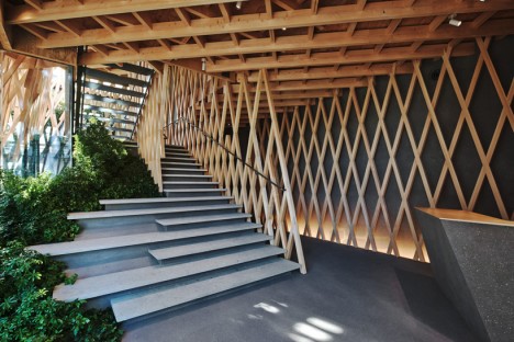
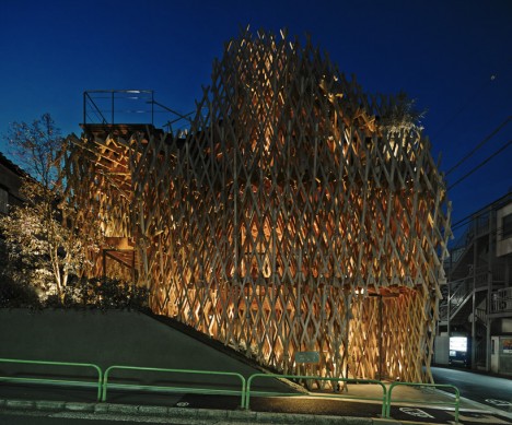
Thin, criss-crossing timber beams create the effect of a dense forest in this latticed wooden facade on a dessert shop in Tokyo by Kengo Kuma + Associates. The basket-like arrangement ploys an ancient Japanese construction technique called ‘jiigokugumi,’ which joins the individual pieces of wood together without using glue or fasteners.

Next Page – Click Below to Read More:
Wooden Architecture In The Modern World

Share on Facebook


[ By Steph in Architecture & Cities & Urbanism. ]

[ WebUrbanist | Archives | Galleries | Privacy | TOS ]


WebUrbanist

 
Comments Off on Modern Wooden Architecture: 16 Fresh Takes on Timber

Posted in Creativity


Zenith of Zen: 13 Nontraditional Takes on Japanese Gardens

10 Sep

[ By Steph in Design & Fixtures & Interiors. ]

zen gardens xyzen 2

Broken down to its most basic characteristics, the traditional Japanese zen garden inspires innovative design in everything from toys and candy to the most impossibly relaxing modern bathrooms you’ve ever seen. These unexpected takes on the traditional play on the meditative activity of dragging a rake through sand, the pleasingly minimalist aesthetic of the resulting lines and the sense of tranquility a zen garden can bring to a built environment.

Sugar Art: Edible Zen Garden
zen garden edible

zen garden edible 2

This miniature zen garden is entirely edible, with sugar standing in for sand and rocks made from black sesame candies. Created by designer Tomonori Saito, the Shinan-ji Temple Rock Garden provides you with a tiny wooden rake so you can play with your food before you eat it.

Kinetic Drawing Machine Creates Sand Art

zen garden shapiro 1

zen garden shapiro 2

zen garden shapiro 3

Instead of a rake in the hands of a human, the patterns of lines in these circles of sand are created by steel marbles controlled by a kinetic drawing machine. The Sisyphus Machine by Bruce Shapiro produces mandala-like designs that swirl and change as the marbles move.

Interactive Zen Garden Installation in Quebec
zen garden interactive 3

zen garden interactive 2

zen garden interactive 1

This new take on the traditional Japanese zen garden replaces sand with gravel and uses three spinning tools inspired by agricultural machinery to create the patterns. Created by Talmon Biran Architecture for the International Garden Festival in Quebec, the ‘Dry Landscape’ installation requires participants to work in tandem to create their own circles without bumping into each other.

XYZen Garden Works Like an Etch-A-Sketch
zen gardens xyzen 1

zen gardens xyzen 2

zen gardens xyzen 3

Create your own relaxing DIY zen garden game with a tutorial at Instructables, which even includes shop drawings and templates. The XYZen Garden by Jonathan Odom works like an Etch-a-Sketch toy, using a pulley system to move the stylus across the sand.

Next Page – Click Below to Read More:
Zenith Of Zen 13 Nontraditional Takes On Japanese Gardens

Share on Facebook


[ By Steph in Design & Fixtures & Interiors. ]

[ WebUrbanist | Archives | Galleries | Privacy | TOS ]


WebUrbanist

 
Comments Off on Zenith of Zen: 13 Nontraditional Takes on Japanese Gardens

Posted in Creativity