RSS
 

Posts Tagged ‘Structures’

Tetris House: Modular Structures are Made to be Stacked

18 Dec

[ By Steph in Architecture & Houses & Residential. ]

tetris house 6

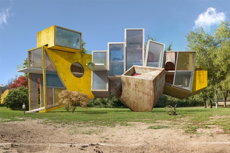
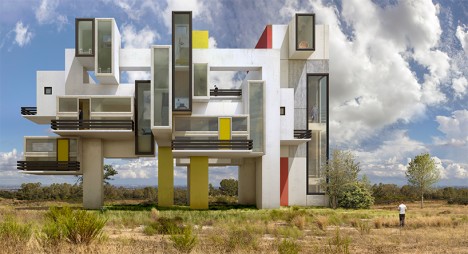
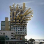
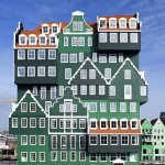
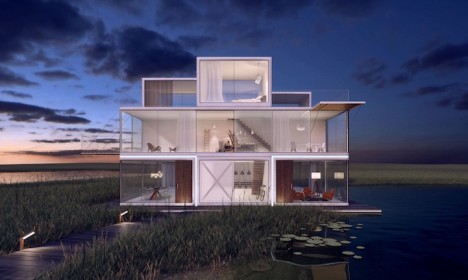
Modular living units in a range of sizes can be stacked, spun and cantilevered over each other to create unique custom dwellings with views in every direction. The Tetris House makes it possible for homeowners to design their homes to their own specifications, from the size of each room to the orientation of the windows, and enables developers to create apartment complexes that can be easily expanded or reduced in size.

tetris house 2

tetris house 3

tetris house 4

Dutch design studio Universe Architecture offers three basic sizes of steel units that can be enhanced with balconies, shutters, glazing and rooftop terraces. Plug three or more units together in pretty much any configuration you can think of, orient some of them to face the sun or your desired view, and stick on some pop-up decks with glass railings to take it all in.

tetris house 7

tetris house 8

tetris house 1

The company teamed up with interior design firm i29 to create minimalist, compact and efficient interiors that can adapt to all the different possibilities in each building’s individual floorpan, adding interior walls, staircases, fireplaces and other basic elements. The prototype will soon be completed in the Netherlands, with plans to expand availability to other countries in the future.

Share on Facebook


[ By Steph in Architecture & Houses & Residential. ]

[ WebUrbanist | Archives | Galleries | Privacy | TOS ]


WebUrbanist

 
Comments Off on Tetris House: Modular Structures are Made to be Stacked

Posted in Creativity


Brutalist but Beautiful: 12 Spacey Sci-Fi Soviet Structures

20 Oct

[ By Steph in Abandoned Places & Architecture. ]

bulgaria-communist-monument

The single most divisive architectural movement, Brutalism is harsh, jagged and geometric, calling to mind massive concrete spaceships – and nobody did it better (or stranger) than the Soviets. Some people say that these stark structures, which were most popular in communist countries, are too cold to be beautiful, but they often manage to be both sculptural and unapologetically utilitarian at once.

Abandoned Circus, Chisinau, Moldova

brutalist circus

brutalist circus 2

brutalist circus 3

(images: abandoned journey)

This incredible abandoned circus in Moldova’s capital city remains surprisingly intact inside, decades after a revolution and political upheaval destroyed the small nation’s economy and rendered such structures unusable. Hank Snaffler of Abandoned Journey traveled to Chisinau and got inside, taking a striking series of photographs that give us an idea of just how magnificent the building must have been at its prime.

Palace of Ceremonies, Tbilisi, Georgia

brutalist palace of ceremonies

(images: frederic chaubin)

Crowning a hilltop in Tbilisi, Georgia, the Palace of Ceremonies could easily stand in for a mythical castle in a futuristic fantasy movie made in the 1970s. It was built as a secular wedding venue by the Soviets, and still performs that function today. The Palace of Ceremonies is one of dozens of stunning Soviet Brutalist buildings captured on film by French photographer Frédéric Chain for his book ‘CCCP: Cosmic Communist Constructions Photographed.’ Chaubin began traveling throughout the former Soviet Union in 2003, ultimately photographing 90 buildings in fourteen former Soviet Republics.

Druzhba Holiday Center Hal, Yalta

brutalist druzhba

CIT38 ARCHI SOV 18

CIT38 ARCHI SOV 18

(image: frederic chaubin)

When this joint creation of the Russians and the Czechs was built in 1984 to pay tribute to space exploration, Czechoslovakia was the only nation that had sent a man to space with a Russian launcher. Rising from the ground on pillars, the circular Druzhba Holiday Center was so strange, the United States Department of Defense was worried it was some kind of functioning rocket launcher. In reality, it was just a summer camp.

Georgia Ministry of Highways, Tbilisi

brutalist georgian ministry

(image: frederic chaubin)

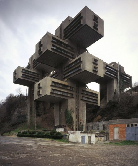
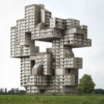
A Jenga-like stack of concrete rectangles looms rather ominously on the outskirts of Tbilisi in Georgia, bringing together Brutalism and Russian constructivism into one strange structure. The 18-story building is lifted off the ground to enable nature to proliferate below it. Built as the headquarters for the Georgian Ministry of Highways, it was abandoned for a while before being renovated by the Bank of Georgia in 2007.

Shumen Monument, Bulgaria

brutalist shumen

brutalist shumen 2

shumen monument 3

(images: yomadic)

The sheer scale of the Monument to 1300 Years of Bulgaria, especially with all of the harsh lines on those statues embedded into the walls, arguably makes it one of the most impressive Soviet structures and one that will likely still stand as imposing as it looks today many centuries into the future. Towering 230 feet into the air, it’s officially the heaviest Communist monument and has been well maintained. It’s captured here by the blog Yomadic.

Het Poplakov Cafe, Ukraine

brutalist het poplakov cafe

(image: frederic chaubin)

Built in 1976, the Het Ppoplakov Cafe in Ukraine seems to hover above the surface of the water, perfectly doubled in its reflection, looking like nothing more than a flying saucer that has remained stationary and earthbound for decades.

Polytechnic Institute of Minsk, Belarus

brutalist polytechnic

(image: frederic chaubin)

A series of stacked lecture theaters call to mind the decks of a cruise ship in the long and narrow Polytechnic Institute of Minsk in Belarus, built in 1983.

Monument of the Bulgarian-Soviet Friendship, Varna, Bulgaria

brutalist bulgarian monument

brutalist bulgarian monument 2

brutalist bulgarian monument 3

(images: yomadic, bohemian blog)

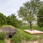
The Monument of the Bulgarian-Soviet Friendship in Varna is actually a nuclear bunker and is made of over 10,000 tons of concrete and 1000 tons of armature wire. Standing atop a mass grave of soldiers lost to the Russian-Ottoman War, it was built at the end of a grand boulevard designed to run through the city for Communist parades and other celebrations, though this boulevard was never completed. The Bohemian Blog has a haunting series of images of this structure in its abandoned and vandalized state.

Read the rest of this entry »

 
Comments Off on Brutalist but Beautiful: 12 Spacey Sci-Fi Soviet Structures

Posted in Creativity


Picturesque Pavilions: 12 Experimental Temporary Structures

23 Jul

[ By Steph in Drawing & Digital. ]
pavilions korean 1

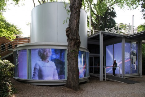
Each year, architects around the world design and construct temporary structures for events like the Milan Expo, showing off their skills in a setting that enables them to be more bold and experimental than they can be with more traditional architecture. Often interpreting a set theme, these pavilions use unexpected materials, play with spatial relationships and incorporate multimedia for an immersive experience.

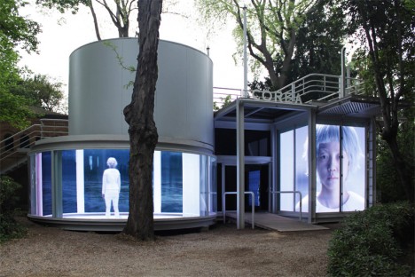
Korea Pavilion: The Ways of Folding Space & Flying
pavilions korean 2

pavilions korean 3

“An archaeological quest into human civilization,” this pavilion entitled ‘The Ways of Folding Space & Flying’ enchanted visitors to the 56th International Art Exhibition. Representing Korea, the pavilion by Moon Kyungwon & Jeon Joonho is part architecture, part film installation juxtaposing the past, present and future and can be experienced from both outside and in.

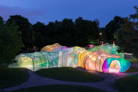
Serpentine Pavilion by Selgascano
pavilions selgascano 1

pavilions selgascano 2

pavilions selgascano 3

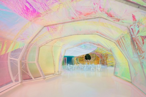
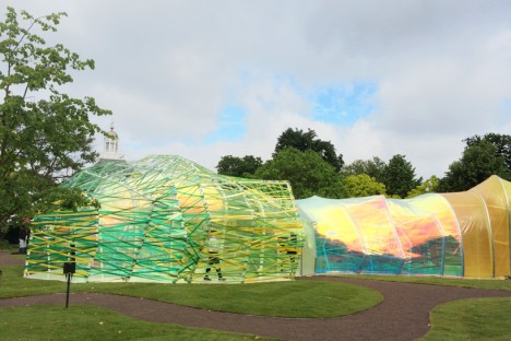
This year’s Serpentine Pavilion by Spanish studio Selgascano looks a bit like a stretched-out glow worm, glimmering in iridescent pastel shades. The polygonal frame is covered in panels of translucent florins-based polymer. “We sought a way to allow the public toe experience architecture through simple elements: structure, light, transparency, shadow, lightness, form, sensitivity, change, surprise, color and materials,” say the designers. “The spatial qualities of the pavilion only unfold when accessing the structure and being immersed within it. Each entrance allows for a specific journey through the space, characterized by color, light and irregular shapes with surprising volumes. This is accomplished by creating a double-layered shell, made of opaque and translucent fluorine-based plastic (ETFE) in a variety of colors.”

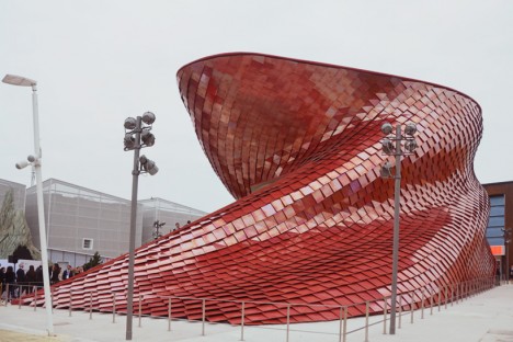
Vanke Pavilion by Daniel Libeskind
pavilions vanke 2

pavilions vanke 3

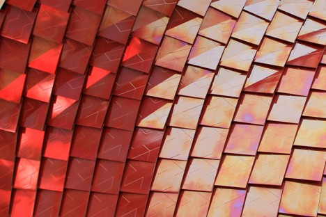
Representing China at Milan’s Expo 2015, the Vanke pavilion by renowned architect Daniel Libeskind explores the theme ‘feeding the planet, energy for life’ through the lens of Chinese culture. The design is influenced by the shi-tang, a traditional Chinese dining hall, as well as natural landscapes and the dragon, which is associated with farming. The pavilion is covered in over 4,000 red scale-like tiles with air purification properties, and inside, 200 screens are mounted to bamboo scaffolding, displaying video of city life contrasted with the slow-motion of a meal being prepared and consumed.

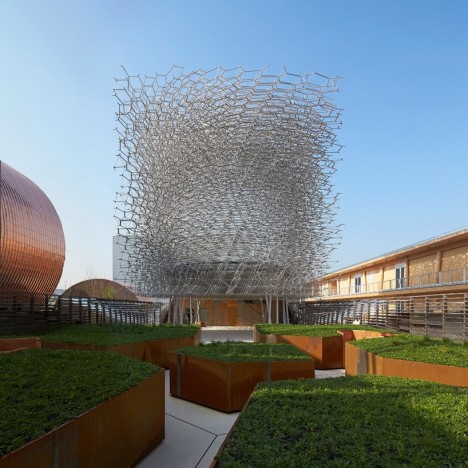
UK Pavilion at Expo Milan 2015
pavilions UK 1

pavilions UK 2

pavilions uk 3

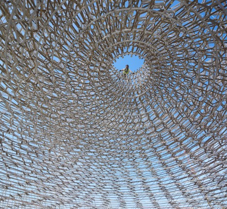
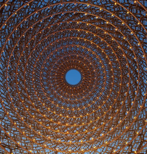
On display in Milan though October 31st, 2015, this pavilion representing the United Kingdom at Expo 2015 reflects the theme ‘Grown in Britain and Northern Ireland’ through a spiraling mesh of metal lattice. As visitors pass through it they experience five different settings inspired by orchards, meadows, terraces, the architectural program and the ‘hive.’ The whole thing buzzes, pulses and glows thanks to accelerometers and other audio-visual devices embedded in the structure, taking live signals from a real beehive.

The Orangery in Northern Denmark
pavilion orangery 1

pavilion orangery 2

pavilion orangery 3

pavilions orangery 4

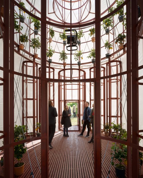
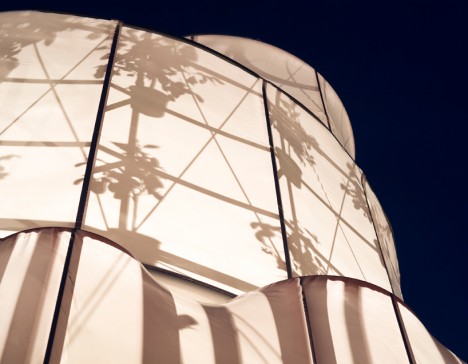
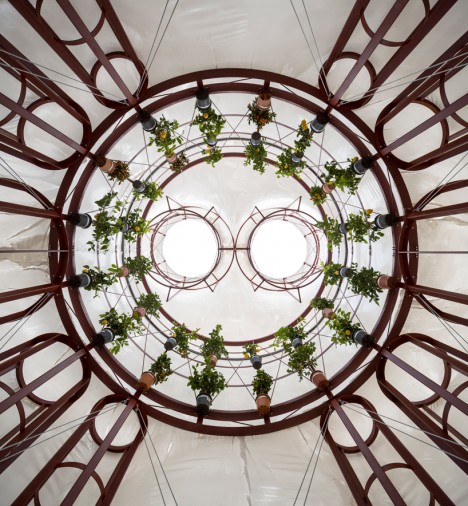
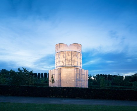
Translucent white fabric stretched across a wooden frame puts the silhouettes of a bunch of potted citrus plants on display once the interior is illuminated after dark at ‘The Orangery’ by Lenschow & Pihlmann and Mikael Streström. Taking inspiration from the floor plan of Rome’s San Carlo Alle Quattro Fontane Church, the interior is appropriately cathedral-like with its circle of suspended plants.

Next Page – Click Below to Read More:
Picturesque Pavilions 12 Experimental Temporary Structures

Share on Facebook


[ By Steph in Drawing & Digital. ]

[ WebUrbanist | Archives | Galleries | Privacy | TOS ]


WebUrbanist

 
Comments Off on Picturesque Pavilions: 12 Experimental Temporary Structures

Posted in Creativity


Architecture of Your Dreams: 11 More Surreal Fantasy Structures

10 Jul

[ By Steph in Architecture & Houses & Residential. ]

trans actions 6

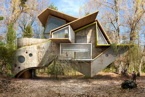
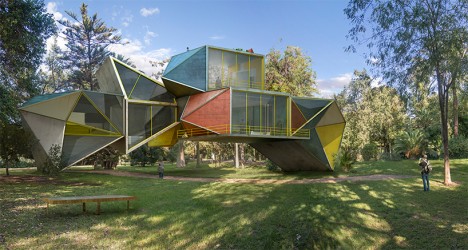
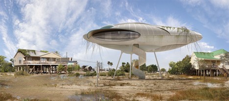
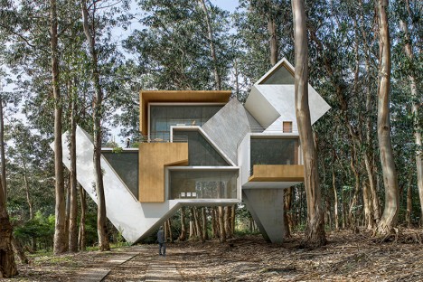
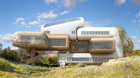
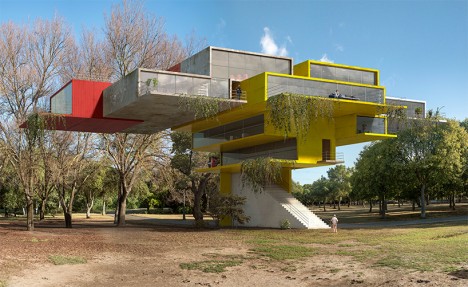
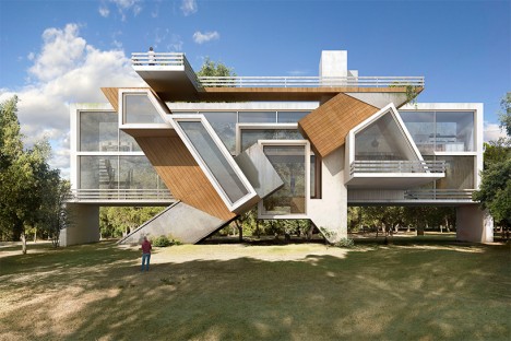
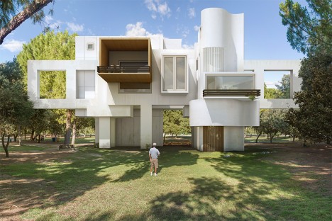
While a spaceship-like pod balancing upon four impossibly tiny poles may not be the most realistic architectural concept ever proposed, some of these innovative fantasy structures from artist Dionisio Gonzalez make us wonder, ‘why not?’ Curving cast concrete forms interact with geometric volumes tilted at odd angles, and faceted glass and metal shapes hover off the ground in what look to be modular parametric designs. Other homes seem like contemporary buildings that have been taken apart like building blocks and put back together slightly off-kilter.

trans actions 1

trans actions 2

trans actions 5

trans actions 3

Perhaps architects and engineers could confirm whether or not any of these surreal architectural visions could actually be built. Entitled ‘Trans-Actions,’ the new series consists of raised residences with complex shapes, some seeming to take a common motif from contemporary architecture and simply repeat it over and over again in slightly different ways. Many seem to balance precariously upon the earth, as if one strong wind could blow them right off their foundations.

trans actions 4

trans actions 11

trans actions 10

Each one is a bit past its prime, with surfaces that have gotten dirty or weathered over time. Half-dead vegetation clings to balconies as if nature is beginning to take back over, suggesting that what we are looking at is actually the remains of a structure no longer in use.

trans actions 9

trans actions 8

trans actions 7

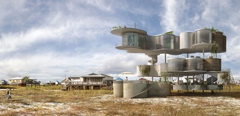
Gonzalez previously released a series of post-apocalyptic shell-like structures envisioned for Dauphin Island, a locale off the coast of Alabama that keeps getting slammed by storms. Check out 35 more bizarre and intriguing examples of ‘impossible architecture.’

Share on Facebook


[ By Steph in Architecture & Houses & Residential. ]

[ WebUrbanist | Archives | Galleries | Privacy | TOS ]


WebUrbanist
 
Comments Off on Architecture of Your Dreams: 11 More Surreal Fantasy Structures

Posted in Creativity


Enter the Void: 14 Creatively Concave & Sliced-Out Structures

24 Jun

[ By Steph in Architecture & Public & Institutional. ]

concave twin moon 2

Cutting curves or slices into the facades of buildings doesn’t just make them more visually dynamic, it can create terraces, divert prevailing winds, concentrate sunlight and direct the eye to particular views.  These seemingly random depressions and voids completely transform the shapes of each structure, often leading to an alien appearance.

Twin Moon Cut-Outs

concave twin moon 3

concave moon 5

concave twin moon 1

Two buildings set side-by-side look like they were dented by a massive sphere, the concave cut-out creating two moon shapes recessed into the concrete facades. Architect Moon Hoon designed the mixed-use Two Moon buildings for a South Korean client who needed one building for himself and another for his brother. The structures were envisioned as twins, with one sitting ever-so-slightly closer to the street than the other.

TEK Building by BIG Architects

concave tek 2

concave tek 3

concave tek 4

concave tek

Each ‘slice’ that you see in the main volume of the TEK building by BIG Architects is a functional step, with the entrance spiraling throughout the interior to create one big continuous outdoor staircase leading to a series of terrace-like spaces before finally exiting onto the roof. The building, which is full of exhibitions paces, conference rooms, shops, restaurants and galleries, consists of a system of stacked plate-like pieces that also create solar shading for the interior spaces.

Barn House Sliced Like a Cake

concave barn house 1

concave barn house 2

concave barn house 3

This barn-shaped house looks like a massive black-frosted cake that’s had slices randomly taken from its perimeters, revealing its white interior. These concave cut-outs act as terraces, reflecting and maximizing natural light.

DUO Skyscrapers with Concave Walls

concave duo skyscrapers

Singapore’s historic Kampong Glam district is set to get a pair of curving skyscrapers arranged in a half-circle, one containing apartments, the other offices and a hotel. The DUO towers by Buro Ole Scheeren feature a stepped design that creates large outdoor spaces at various levels, and are covered in a distinctive grid of hexagonal windows.

The Bow by Foster + Partners

concave the bow 1

concave the bow 2
Calgary’s tallest building, The Bow by Foster + Partners is a 58-story wave-like structure with a concave side gathering sunlight and a convex side reducing the load of prevailing winds. Atriums within the concave side separate the glass facade from the offices within, offering meeting spaces, lounges and sky gardens.

Next Page – Click Below to Read More:
Enter The Void 14 Creatively Concave Sliced Out Structures

Share on Facebook


[ By Steph in Architecture & Public & Institutional. ]

[ WebUrbanist | Archives | Galleries | Privacy | TOS ]


WebUrbanist

 
Comments Off on Enter the Void: 14 Creatively Concave & Sliced-Out Structures

Posted in Creativity


Stealth Structures: 10 Buildings That Aren’t What They Seem

23 Apr

[ By Steph in Travel & Urban Exploration. ]

superhero supply

How many houses that you pass each day aren’t really houses at all, but just realistic-looking facades hiding a secret function? Speakeasies and secret clubs masquerade as run-down stores in New York, faux suburban residences hide unexpected operations and weird-looking towers all over Los Angeles contain something you’d never expect.

Top Secret Bar You’d Never Find On Your Own
secret toy shop bar 1

secret toy shop bar 2

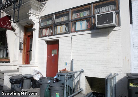
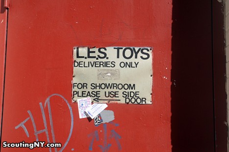
New York City hides all sorts of secrets, among them a number of fake storefronts hiding secret bars, clubs and meeting spaces. Scouting New York listed out eight of the best, including ‘Lower East Side Toys’ on Norfolk Street in Manhattan. It definitely doesn’t look like much from the street, and the door marked with a peeling sign that says ‘Deliveries Only’ seems innocuous enough. But those in the know step right through into The Back Room, a speakeasy-style bar. The takeaway here is that if you think a New York City business is a front for something else, you’re probably right.

Fake Brooklyn Brownstone Hides an Underground Portal

secret brooklyn brownstone 1

secret brooklyn brownstone 2

secret brooklyn brownstone 3

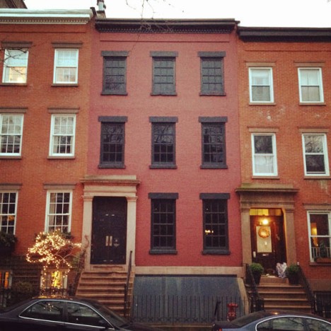
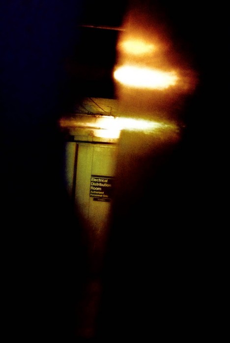
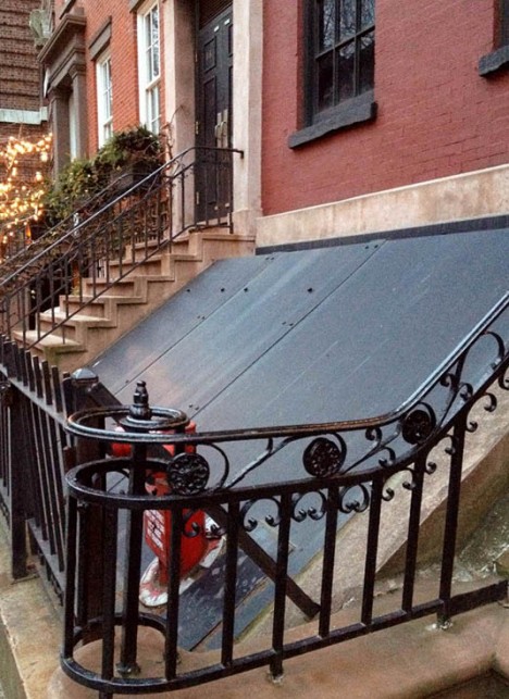
If you’re very observant, you might have noticed when passing by that the windows in this otherwise normal-looking Brooklyn brownstone are curiously blacked out. But that’s just about the only clue that anything is amiss – unless you walk right up to the door and peer through the crack, which reveals not a home but rather a concrete-lined, windowless industrial space. 58 Joralemon Street stands directly above the tracks for New York City’s subway lines 4 and 5, and functions as a ventilation shaft. The MTA disguised it as a courtesy to the residential neighbors.

Chicago Mansion Is Really a Power Substation
Screen Shot 2015-04-21 at 7.41.13 PM

Screen Shot 2015-04-21 at 7.40.54 PM

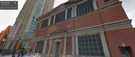
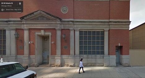
A faux Georgian mansion stands at a Chicago intersection with front doors that don’t open and windows that are never illuminated, no matter the time of day. It’s actually a substation for electrical company Commonwealth Edison, which goes to some trouble to camouflage many of these typically unsightly structures when they’re located in conspicuous spots. This one was designed by Stanley Tigerman, former director of the School of Architecture at the University of Illinois in Chicago. Triggerman made it as authentically Georgian as he could, down to the sturdy brickwork pattern that will help it stand the test of time with minimal maintenance. The blacked-out windows are actually vents.

Superhero Supply Store Doesn’t Really Sell Superhero Supplies
secret superhero supply 1

secret superhero supply 2

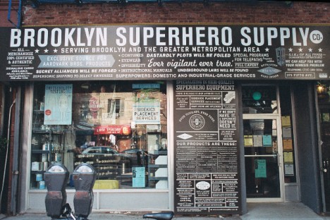
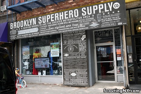
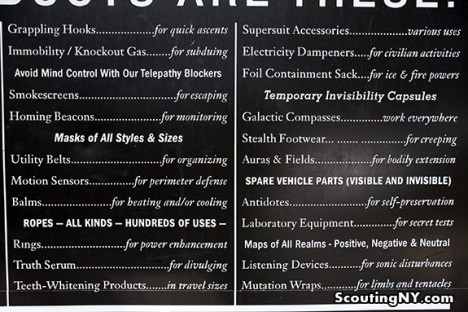
You might suspect that something’s amiss with the Brooklyn Superhero Supply Co, given that the products on display in the window and listed on a card outside include antimatter, a collapsible portal, galactic compasses and manuals for all sorts of fantastical weapons that don’t really exist. If you know the secret of the place once inside, you’ll head directly for a secret door hidden in a bookcase, which leads not to the headquarters of the Justice League but rather a student learning and activity center focusing on literacy. A viewing portal in the wall gives visitors a glimpse into this space. Disappointed? You can actually buy a number of products from the shop and the website, including superhero disguise kits, costumes, and even one-gallon cans of immortality. There’s even a musical inspired by it.

Swiss Fortress in Disguise
secret fortress villa rose

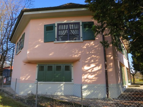
Would you ever guess that this little pink house in Switzerland is really a fortress? Villa Rose is located on the Toblerone defensive line, built to defend the country from invasion during World War II. If you opened the garage door you’d come face-to-face with a pair of gigantic cannons, a third hidden deeper inside. The fake windows painted onto the second story would only fool onlookers from afar, but when the fortress was active, nobody would have made it close enough to notice. The Villa Rose is now open to the public as a museum.

Next Page – Click Below to Read More:
Stealth Structures 10 Buildings That Arent What They Seem

Share on Facebook


[ By Steph in Travel & Urban Exploration. ]

[ WebUrbanist | Archives | Galleries | Privacy | TOS ]


WebUrbanist

 
Comments Off on Stealth Structures: 10 Buildings That Aren’t What They Seem

Posted in Creativity


Architectural Fiction: 35 Impossibly Surreal Structures

24 Mar

[ By Steph in Art & Drawing & Digital. ]

Fantasy Architecture Dujardin 1

Unbound by gravity, the need for structural soundness or any sense of real-world aesthetics, architecture becomes like a life form of its own, multiplying and mutating in strange and unsettling ways. These fictional architectural assemblages explore unlikely configurations that are only possible with digital art and photo manipulation.

Surreal Structures by Matthias Jung

fantasy architecture jung 1

fantasy architecture jung 2

fantasy architecture jung 3

fantasy architecture jung 4

fantasy architecture jung 6

fantasy architecture jung 7

The architectural creations of Matthias Jung seem to inhabit a fairytale realm where gravity doesn’t apply, raising Brutalist concrete structures on tiny stilts, floating stained glass windows like balloons and untethering some from the earth altogether. Some designs, however, seem like they might actually occupy some hidden rural meadow in Europe where aging country homes are actually topped with sheep-dotted hills. Jung is a German-based graphic designer who refers to his strange photo collages as “architectural short poems.”

Fictional Architecture by Victor Enrich

fantasy architecture enrich 1

fantasy architecture enrich 2

fantasy architecture enrich 3

fantasy architecture enrich 4

fantasy architecture enrich 5

Victor Enrich’s ‘architecture gone wild‘ twists, bends and turns, splitting down the middle as if the buildings are being unzipped or seeming to disassemble before our eyes. Balconies become giant slides leading down to the street, staircases meander off into the sky and individual apartments stretch out of their building toward the sun like leaves on a plant. The Barcelona-born designer travels the world and takes photographs of cities, digitally manipulating them for results that would generally be impossible in the real world.

“Once the object is chosen, it is shot from a point easy to recognize by users, not pretending to achieve the greatest picture ever, but instead, a picture that anybody could do. The shot is the basis to produce a replica of the building by using very detailed photogrammetric techniques that end with the creation of a three-dimensional model that fits almost perfectly into the picture.”

Jim Kazanjian

fantasy architecture kazanjian 1

fantasy architecture kazanjian 2

fantasy architecture kazanjian 4

fantasy architecture kazanjian 5

fantasy architecture kazanjian 6

Shadowy passages and strange interiors from horror films like The Shining and the fiction of H.P. Lovecraft tinge the disorienting and disquieting work of Portland-based photographer Jim Kazanjian, who’s inspired by “our inherent anxieties about isolation and vulnerability.” Kazanjian draws on his experience as a CGI artist working on games to create these ‘hyper-collages,’ cobbling together images of buildings, sinkholes and foggy landscapes from an archive of over 30,000 photos.

“My interest in gaming stems from my fascination with architecture and its potential to generate narrative structures,” says the artist. “My time in game development has definitely informed my photographic work. I find that the immersive qualities in both mediums have a strong correlation.”

Next Page – Click Below to Read More:
Architectural Fiction 35 Surreal Fantasy Structures

Share on Facebook


[ By Steph in Art & Drawing & Digital. ]

[ WebUrbanist | Archives | Galleries | Privacy | TOS ]


WebUrbanist

 
Comments Off on Architectural Fiction: 35 Impossibly Surreal Structures

Posted in Creativity


See Through Stone: 13 Aging Structures with Glass Extensions

03 Feb

[ By Steph in Architecture & Houses & Residential. ]

modern ruins sant francesc 1

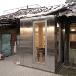
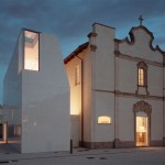
The crumbling stone ruins of churches, farmhouses and barns are integrated into new structures that preserve and display their historic character while adding playful modern elements, like glass additions that adjoin disparate buildings or fill in damaged areas. These 13 renovations to historic architecture include examples of when the process is done right – honoring the original structure’s heritage – as well as cases where the changes are less than welcome.

Convent de Sant Francesc by David Closes

sant francesc

modern ruins sant francesc 2

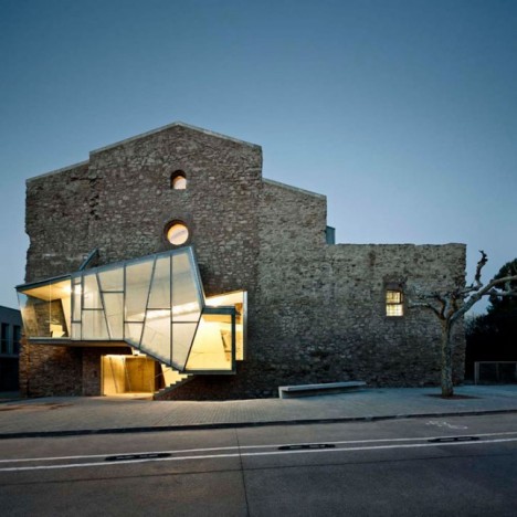
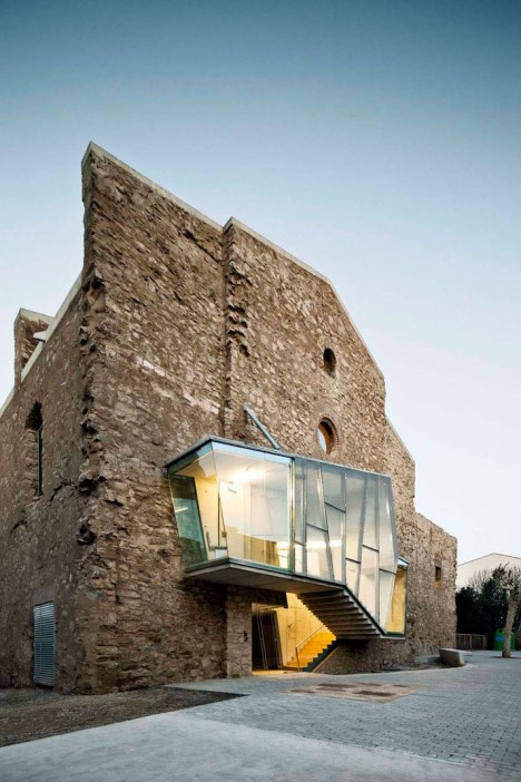
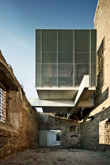
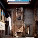
A gaping hole created during the demolition of an adjacent convent was filled in with a geometric modern glass addition at the Sant Francesc church in Santpedor, Spain, a stone building dating back to 1721. The renovation added contemporary elements to both the interior and exterior while leaving the evidence of the building’s decay over time in place, creating skylights where the ceilings had caved in.

Contemporary Studio Extension to Historic Church

modern ruins studio 1

modern ruins studio 2

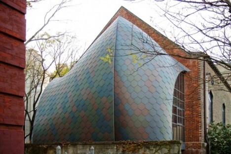
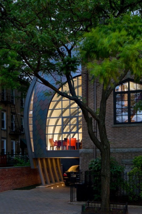
A historic brick church in Hoboken, New Jersey in use as a studio for Marchetto Higgins Stieve Architects is extended with an unusual glass canopy, curving down from the upper portion of the existing structure to the ground.

Two Stone Cottages Connected by a Glass Staircase

dublin stone 1

dublin stone 2

dublin stone 3

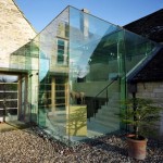
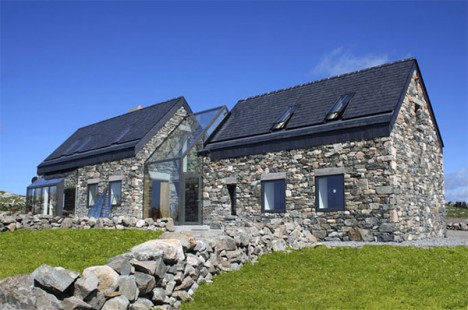
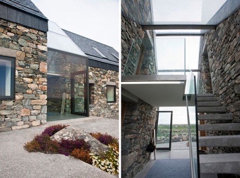
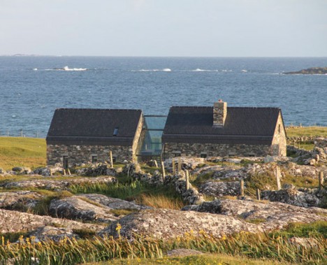
A pair of dilapidated stone farmhouses in Ireland are now connected via a transparent, glass-enclosed staircase. Architect Peter Legge maintained the rustic character of the rural buildings but added the glass atrium to unite them, as well as a transparent dining area with folding doors.

Modern Addition to a Historic Farmhouse

ballymahon 2

ballymahon 1

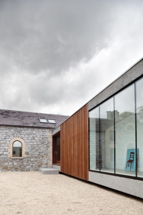
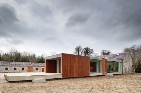
ODOS Architects transformed a collection of 18th century stone farm buildings in Ireland with a new single-story wing made of glass and timber. The new wing unites the trio of existing buildings to create a courtyard and enables views to the adjacent woodlands with large expanses of frameless glazing.

Glass Extension to a Private Farmhouse in Gloucester

gloucester

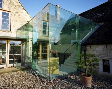
Having absorbed “changes and layers of occupation from the 17th century onwards,” this farmhouse in Gloucester has now evolved into a contemporary home with the removal of incongruous additions from previous eras and the addition of a modern glass structure. The award-winning renovation encloses and extends a portion of the living area, bridging a gap between the two original buildings.

Next Page – Click Below to Read More:
See Through Stone 13 Aging Structures With Glass Extensions

Share on Facebook


[ By Steph in Architecture & Houses & Residential. ]

[ WebUrbanist | Archives | Galleries | Privacy | TOS ]


WebUrbanist

 
Comments Off on See Through Stone: 13 Aging Structures with Glass Extensions

Posted in Creativity


Holdout Houses: 10 Stubborn Structures That Won’t Make Way

01 Jan

[ By Steph in Architecture & Cities & Urbanism. ]

holdout houses

Despite the emergence of highways, shopping malls, frighteningly deep pits and even moats around them, the tenacious owners of these older structures refused to give in to developers, remaining in their increasingly incongruous homes. In China, they’re referred to as ‘nail houses,’ like stubborn nails in wood that can’t be pounded down; American developers call them ‘spikes.’ Most of them are ultimately demolished, but some stand like strange little monuments to the past.

Edith Macefield’s ‘Up’ House, Seattle

holdout houses up seattle

Framed on three sides by concrete, Edith Macefield’s tiny cottage in the Ballard neighborhood of Seattle is strikingly out of place. But really, what’s out of place is the development that has sprung up around her 108-year-old farmhouse, which served as inspiration for the Pixar movie ‘Up’. Macefield purchased the house in the ’50s and lived there until her death in 2008, even after the rest of the homes on her street were gone, refusing to give in to developers who ultimately ramped up their compensation offers to $ 1 million plus a new home and nursing care for the rest of her life. Macefield felt she was too old and frail to move. But during the last years of her life, she struck up a friendship with the superintendent of the construction project, and left her home to him. Instead of allowing it to be swallowed by the complex, he sold it to someone who turned it into an office. As of 2014, the house still stands.

Luo Baogen House

holdout houses luo baogen

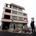
Drivers cruising along a highway in Wenling, China, had to slow down and drive around one heck of an unusual roadblock: the five-story home of duck farmer Luo Baogen, the sole holdout from a neighborhood that was demolished to make way for the new thoroughfare. When Luo refused developers’ offers, they simply built around him, assuming that being in the middle of a construction zone and later, a highway would drive him out. In the end, it was all the media attention that did it. Despite having paid $ 95,000 to build it just a few years earlier, Luo accepted an offer of $ 41,000 and consented for the house to be razed.

Pinghe Crossroads House, Fujian Province, China

holdout houses pinghe crossroads

What happens when multiple people own space in a single building, and some sell while others won’t? In some cases, builders literally tear down everything but the sliver of the structure belonging to the holdout. This jagged nail house at a crossroads in Pinghe, China is all that’s left of an entire apartment building.

Austin L. Spriggs House, Washington D.C.

holdout houses washington dc

A tiny townhouse clung to its little plot of land in Washington D.C. even as a four-story-deep crater appeared around it, with just three feet of earth separating its walls from a 40-foot drop-off. Owner Austin L. Spriggs, who used the building as an office for his architecture firm, refused to even engage with the developers, who finally decided they would just build around it. It’s now a curiosity crammed between condos and commercial buildings. In 2011, it sold for $ 800,000 to someone who plans to turn it into a restaurant.

Next Page – Click Below to Read More:
Holdout Houses 10 Stubborn Structures That Wont Make Way

Share on Facebook


[ By Steph in Architecture & Cities & Urbanism. ]

[ WebUrbanist | Archives | Galleries | Privacy | TOS ]


WebUrbanist

 
Comments Off on Holdout Houses: 10 Stubborn Structures That Won’t Make Way

Posted in Creativity


Schematic of Structures: 90 Buildings, Prehistory to Present

12 Oct

[ By WebUrbanist in Design & Graphics & Branding. ]

pop charts architectural poster

This stunning blueprint-inspired poster takes you on a visual tour of 90 celebrated structures around the world, highlighting architectural achievements from the Greek Parthenon to Buckingham Palace to Taipei 101 to the Freedom Tower, “a lineup of landmark landmarks and eminent edifices erected and perfected throughout history.”

ImgAB_ThumbAB_IfYouLikeThis

An 18-by-24-inch print available from Pop Chart Lab for around $ 30, this frame-worthy work of art and design may solve your architectural gifting needs for the foreseeable future. The juxtapositions of old and new, Classical and Modernist, help show off the rich historical variety of buildings and monuments. Some structures made the cut for being canonical classics, while others are record-setters or unusual examples of unique typologies. Rendering them all in a way that would make them consistent but bring out their different characters was also a challenge for the creators.

pop charts full size

More from the creators: “Each breathtaking building has been beautifully hand-illustrated to scale in blueprint-like style—and is accompanied by notations for location, height, year of construction, and architectural mode. For the serious sight-seer, history hobbyist, or architectural aficionado, this collection of captivating cornerstones is sure to tower above all others. Using 100 lb. archival stock certified by The Forest Stewardship Council, this poster is pressed on an offset lithographic press with vegetable-based inks in Long Island City.”

Share on Facebook


[ By WebUrbanist in Design & Graphics & Branding. ]

[ WebUrbanist | Archives | Galleries | Privacy | TOS ]


WebUrbanist

 
Comments Off on Schematic of Structures: 90 Buildings, Prehistory to Present

Posted in Creativity