RSS
 

Posts Tagged ‘Stand’

4 Ways to Make Your Photos Stand Out with the Clarity Slider

28 May

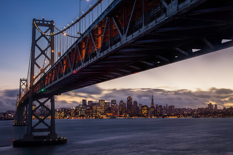
Clarity - Bay Bridge example

You want your photos to be as sharp as possible. Of course, there is no substitute for good technique in the capture phase, but you would like to add something in the post-processing to make the pictures clearer and sharper. You may already be adding sharpening, but how to add that extra crispness to make your pictures pop? The answer is clarity. This article will show you how to add that to your photos.

Clarity - before and after

What Exactly Is Clarity?

What is clarity? Clarity is a local contrast increase that focuses on the mi-tones of the image. If differs from sharpness, because whereas increasing sharpness increases the contrast between dark and light tones, clarity increases the contrast within the middle tones of the image. The effect is similar to sharpening, but it brings out textures a bit more. In addition, digital noise isn’t as much of a problem as it is with sharpening increases.

Adding Clarity in Lightroom (or ACR)

How do you add clarity to your photos? The best-known, and simplest way, to add clarity is to use the Clarity slider in Lightroom (there is an equivalent in Adobe Camera Raw – or ACR). To do that, just find the Clarity slider in the Basic panel of the Develop module. Increase the clarity by moving the slider to the right a bit. That’s all there is too it.
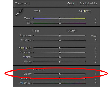
Clarity - Lightroom slider

The Clarity slider makes a global adjustment to your image (meaning it affects the entire image). If you want to add clarity only to specific portions of your image (referred to as local adjustments), you can do so by using the Adjustment Brush (or Radial or Graduated filters). When you select that brush, you will see clarity among the sliders that you can use. Increase the clarity to the desired amount and brush the effect where you want it, on your image.

I find it best to apply a slight, to moderate amount, when making Lightroom adjustments. Think of it as a baseline. Other areas of the image that you want to draw out can be targeted later. You may find it easier, and more precise, to make local adjustments using Photoshop, so that will be the next topic.

High Pass Filter in Photoshop

Within Photoshop, there is no Clarity slider. If you want to add clarity to your photos within Photoshop, there is still a way to do it. It is called the High Pass filter.

Why should you use this filter, and not the Clarity slider in Lightroom (assuming you have both)? Mostly because, with the High Pass filter you can take advantage of all the masking and blending tools available within Photoshop. The primary reason is the ability to mask the changes, which is a much more precise and powerful way to create localized adjustments, than using Lightroom’s adjustment brush. Use the High Pass filter for targeted adjustments to specific areas that you want to draw out in your picture.

It takes a few steps to use this tool, so follow this process:

  1. Make a copy of the background layer (Ctrl+J) of your picture.
  2. Set the blend mode of the new layer to Overlay. The picture will look terrible for now, but don’t worry about it.
  3. Select the High Pass Filter by going to Filters – Other – High Pass.
  4. Set the radius, which is the equivalent of setting the strength of the effect.

Clarity - high pass filter

Note that this process will create a global adjustment to your image. To turn it into a local adjustment, create a layer mask to apply the effect only where you want it. To do that, with the new layer selected go to Layer – Layer Mask – Hide All. That will create a black layer mask. A black layer mask hides the effect everywhere. Now use a white brush to paint (on the mask) in the effect where you want it. Use the Opacity slider to control the degree to which the effect is applied by your brush (you can also adjust the layer opacity).

Local Contrast Adjustments in Photoshop

Another way to add a degree of clarity to your photos is to increase the local contrast, with the best way being a Curves Adjustment Layer. You’ll be surprised at how much clearer and more detailed things look after you increase local contrast in this way. This is another tool for making targeted adjustments.

They key here is to select an area and then increase the contrast just within that area. Here’s how:

  1. Select the area you want to affect. Use the Quick Selection tool to select those pixels.
  2. Create a Curves Adjustment Layer (Layer – New Adjustment Layer – Curves) with those pixels selected. When you do so, Photoshop will create a new adjustment layer, but it will mask off all the pixels except those you previously selected. Therefore, the changes you make will only apply to your selection.
  3. Increase the contrast of your selected area. You can either drag in the endpoints of the curve, or you can push down the line on the left (dark) side and pull up the line on the right (bright) side of the histogram. (You can also use Levels to increase the contrast, if you are uncomfortable with Curves).
  4. Clean up with your brush tool. If there are harsh transitions, use a soft brush to feather out the change (paint ON the mask only, not on the layer). You can increase or lessen the effect using the brush tool as well.
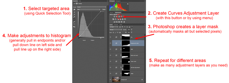
Clarity - Photoshop curves adjustment layers

Be sure you select targeted areas and use this method to draw out the contrast. It will add clarity and texture to that portion of the picture you want only, not the entire image.

Clarity by Topaz

There is another tool you can use to add clarity to your photos. It is a plug-in by Topaz that is named, appropriately enough, Clarity. It costs $ 50 and acts as a plug-in to Photoshop or Lightroom.

Clarity by Topaz divides contrast into different components ranging from Micro contrast, to High contrast, and provides a slider for each. That allows you to reach different parts of the picture and affect contrast in different ways.

The best part of Clarity is the Micro contrast, although this often requires offsetting adjustments to other areas of contrast. That is the greatness of this plug-in: you are not confined to a simple contrast adjustment that pushes all bright areas toward white, and all dark areas toward black. It allows you to add some clarity and texture to your pictures without blowing out your highlights or losing your shadow detail. You can also effect saturation, brightness, and other controls from within Clarity.
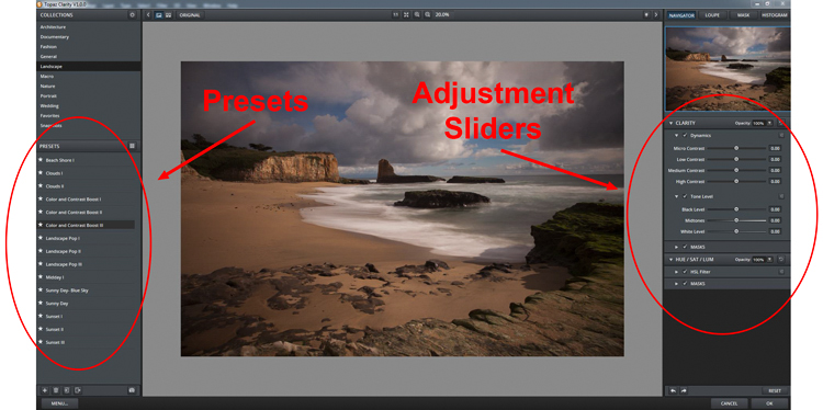
Clarity - using Topaz Clarity

The best way to use Clarity is by creating a duplicate layer of your image in Photoshop (Ctrl+J) and then opening the plugin. That way, after you have made your changes in Clarity and you have gone back to Photoshop, you can mask in or out the effect to whatever degree, and in whatever areas of your image, you wish.

Clarity - Davenport example

Application

The best part about these tools is that you can combine them to get exactly the effect you want. For example, you might make a minor global adjustment to Clarity in Lightroom, then take it into Photoshop and make a series of Curves Adjustment Layers to bring out certain areas. You might also do the same with Topaz’s Clarity and mask off the effect. When you are done, you can use the High Pass filter to highlight key areas of your photo in Photoshop. Of course, you’ll need to be careful not to overdo the effect, which can happen quickly, especially if you use multiple tools listed here. But judicious use of these tools, in conjunction with your normal input and output sharpening, can really make your photos pop.

googletag.cmd.push(function() {
tablet_slots.push( googletag.defineSlot( “/1005424/_dPSv4_tab-all-article-bottom_(300×250)”, [300, 250], “pb-ad-78623” ).addService( googletag.pubads() ) ); } );

googletag.cmd.push(function() {
mobile_slots.push( googletag.defineSlot( “/1005424/_dPSv4_mob-all-article-bottom_(300×250)”, [300, 250], “pb-ad-78158” ).addService( googletag.pubads() ) ); } );

The post 4 Ways to Make Your Photos Stand Out with the Clarity Slider by Jim Hamel appeared first on Digital Photography School.
Digital Photography School

 
Comments Off on 4 Ways to Make Your Photos Stand Out with the Clarity Slider

Posted in Photography


5 Macro Photography Tricks to Make Your Images Stand Out

27 May

Editor’s Note: This is the first article in a series on macro photography this week. Look for a new one each day for the next 7 days. The next newsletter will have them all if you miss any! 

In the world of macro photography, most of discussions seem to surround the technical aspects of this photographic art form. Amongst my colleagues, lens choice comes up a lot, along with the use of a flash, extension rings, and bellows.

_DSC5144W

Dynamic and creative macro photographs.

I’d like to switch gears away from the technical, and share some of my tricks to help you creatively enhance your macro shots for added impact and emotive value. If you’re a photographic purist, (not that there is anything wrong with that!) you may not want to keep reading. These tricks provide definite enhancements to the natural environment – so if real is what are shooting for, this article may not be for you.

However, if you are looking to inject more creativity into your macro images, you may appreciate these easy, but high-impact, techniques and tricks.

 Creative Backgrounds

1) Macro Blues

Most macro shots seem to be of natural subjects, such as; flowers, plants, insects, webs, etc., that live under the blue sky of planet Earth. To enhance the point of view for these kinds of shots, try a using an old blue J-Cloth (it must have been washed many times to work well) as a background. You can drape it across nearby branches or rocks to provide a soft blue background that will make your flowers and spiderwebs pop.

Use a shallow depth of field (f/2.8 or less, depending on your lens) and keep the background at least 12 inches from your subject for best results. I use a Sigma 105mm for my macro work, and these settings work well for this lens. You may need to experiment a bit with your lens and subject.

_DSC0785_0026

A macro background made from an old well-washed J-Cloth.

_DSC0093Wjpg

Creatively draped J-Cloth background.

I like J-Cloths because I always have one handy at home, to grab and put in my pocket when I go on spontaneous photo walks and drives, and it fits easily in my camera bag or my pocket.  An old well-washed J-Cloth is the perfect shade of blue for my type of macro art. Newer ones that are out of the box, or that haven’t been used, are okay too but I find the blue is a little too dark. But try one for yourself and see which you prefer.

2) Better with Bokeh

If you really want to get really creative, go for big bokeh, those soft round(ish) blurred shapes in the background. I like the following technique because it emulates tiny light sources and adds a bit of mystery to your photos. Using this technique, you can create ethereal micro landscapes that look like they are from another planet!

_DSC2670W

Mysterious Macro

Again this involves using a background material, in this case holiday wrapping paper. Look for plastic foil with a metallic coating. It costs a bit more than paper but it works great for creating macro bokeh, and you’ll have lots left over for actually wrapping gifts (of your amazing macro photos).

wrapping-paper

Crinkled metallic gift wrap.

First crinkle the wrapping paper – scrunch it into a ball. If it’s the plastic type it will instantly “un-ball” itself, and you’ll have a wrinkled many faceted metallic backdrop. With this set up, you may also need a light source to bounce off the reflective metallic wrap, depending on where the sun is when you’re shooting. If I need light I usually use my iPhone flashlight, but if you have any other flashlight in your gadget bag it will work just as well. Just aim your light at about a 45 degree angle to the background, out of view of your subject, compose, use Live View if you have it, and your preview button to check the depth of field and bokeh effect. Adjust as needed. Make sure you have no big hot spots of light. Try using different colors of wrap as well. I always keep this gold colored stuff in my bag because I also use it as a reflector – which brings me to trick number three.

3) Reflectors

Just as in regular photography, there are times when you’ll need some additional brightness to light up parts of your macro subject. Once you’re up close and personal, you’ll often find shadows you didn’t see from your higher vantage point. In macro photography you may find a flash is often too much light, and the close quarters between your camera and the subject make soft lighting tricky. So try using a reflector.

I often use the gold side of the wrapping paper to reflect sunlight into shadows or dark spaces in my subject. I also have (but seem to have misplaced) a 12″ square of copper foil sheeting (you can find this in craft shops or stained glass shops). It’s thicker than aluminum foil so it stands up on its own, and can be bent into angles to suit your needs each time. The copper color gives a nice warm tone to your subject, and again it’s light weight, cheap, and tucks nicely into your bag. I duct taped the edges to avoid getting cut – copper edges are sharp!

Dew Drop In

Nature photographers either love or hate these last two tricks.

_2DS0492

4) The Spray Bottle

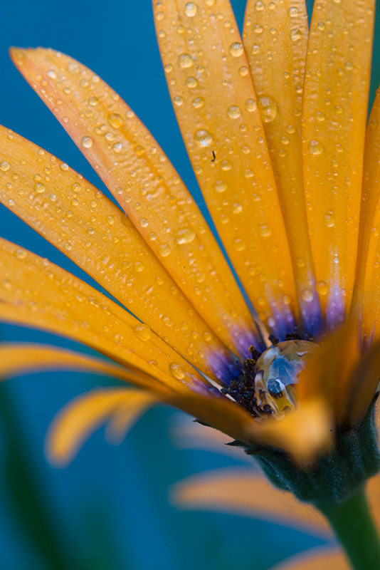
There’s nothing more crushing than getting up at 4:30 am in the summer to capture the sunrise and the morning dew, only to arrive at your destination to find things dry as a bone. Fear not Grasshopper. With your handy spray bottle of water, you can create dew drops for spiderwebs, leaves, flowers, and everything else you choose to photograph.

With a good soaking of water from your bottle, colors become more rich and saturated (is this where the term came from?), making for more vibrant and rich-looking photos.

_DSC5428w

Water drops add interest, and a sense of a moment.

5) The Ultimate Droplet

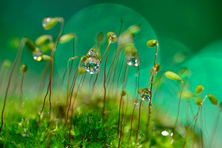
Finally, if you need large drops, drips, or tears, nothing beats glycerine and an eye dropper.

_DSC5095-(2)W

Micro macro landscapes with bokeh and glycerine drops

Glycerine is thick and viscous, and stays on your leaves and petals giving you a longer time to compose and shoot. The drips are syrupy and seem to stretch slower, so again you have more time to shoot. I don’t use glycerine in the natural environment though, only in my indoor macro studio. If you need thick drops for work in nature use white corn syrup, and use it sparingly. It’s super sweet and you don’t want the critters getting addicted.

sprayW

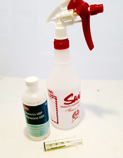
The creative macro photographer’s tool kit.

_DSC0152W

Color contrast with a creative background and a spray of water.

Let’s wrap this up (excuse the pun).

To keep in your bag for your macro photography:

  • J-Cloths
  • Glittery plastic gift wrap
  • A sheet of Copper foil
  • Small spray bottle for water
  • Eye dropper and small container of white corn syrup (for outdoor shots) or glycerine for indoor macro work.

I’d love to know what other creative macro shots you can take using some or all of these tools and techniques. How do you feel about enhancing the environment for your macro shots?


macro-coverWant to learn more about macro photography? Check out Ed Versosky’s Introduction to Close-Up & Macro Photography ebook – just $ 10 (over 30% off) this week with coupon code: DPS. You will need to enter the code to apply the discount.

googletag.cmd.push(function() {
tablet_slots.push( googletag.defineSlot( “/1005424/_dPSv4_tab-all-article-bottom_(300×250)”, [300, 250], “pb-ad-78623” ).addService( googletag.pubads() ) ); } );

googletag.cmd.push(function() {
mobile_slots.push( googletag.defineSlot( “/1005424/_dPSv4_mob-all-article-bottom_(300×250)”, [300, 250], “pb-ad-78158” ).addService( googletag.pubads() ) ); } );

The post 5 Macro Photography Tricks to Make Your Images Stand Out by Alex Morrison appeared first on Digital Photography School.

Digital Photography School

 
Comments Off on 5 Macro Photography Tricks to Make Your Images Stand Out

Posted in Photography


Fotoskulpturen oder Der Stand der Dinge

26 Feb

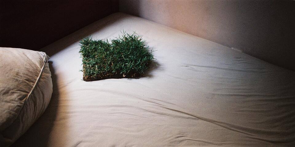
Ein Stück Rollrasen liegt auf einem Bett.

Zum ersten Mal so richtig begegnet sind mir zufällige Skulpturen letztes Jahr beim Streunen durch die Berge Islands. Zwischendurch haben wir immer wieder gestapelte Steinberge gefunden, die einen einsam in der Landschaft, manche zu Hunderten auf einem Pass. Einige waren stabil, unversehrt und voller Moos, andere fragile Bauten, die beim nächsten Sturm mit Sicherheit umgeweht worden sind. Sie werden also danach nur noch auf dem Foto existieren, das ich von ihnen gemacht habe.
kwerfeldein – Fotografie Magazin | Fotocommunity

 
Comments Off on Fotoskulpturen oder Der Stand der Dinge

Posted in Equipment


6 Tips for Creating Leading Lines to Make Your Photos Stand Out More

04 Dec

There is perhaps no more important tool in composition than lines. The eye will virtually always follow an actual or implied line across the picture. Because of this tendency, many lines are referred to as leading lines They are actual, or implied lines that control the eye of the viewer through the frame.

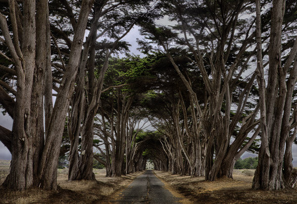
PointReyesTrees

Some leading lines guide the viewer entirely through the frame. Some lines are the subject of the photo themselves. But others, and my favorite sort of leading lines, are the ones that draw the viewer into the picture. They add depth to your image. So today I want to focus on that particular kind of leading line, giving you some examples and ideas for how to create them.

1.  Plan for opportunities

Lines that you can use to lead into your viewer into the frame are everywhere, but you’ve got to look for them. In fact, it is a good idea to plan a few shots ahead of time so that you can consider what to use as a leading line. Leaving it to chance when you are out shooting will often result in the idea of leading lines being overlooked while you are focused on other things.

When you are thinking about possible lines leading into the frame, think about roads and paths, which work great. Plus they are everywhere so you almost never have to search for them. The edges of the road will converge in the distance, thereby pointing the viewer to the center of the frame. Although certainly not as prevalent as roads, railroad tracks also work great. Finally, don’t overlook the use of shadow to create a line toward the center of the picture.

QueensWalk

2.  Finding and using urban opportunities

In an urban environment, besides roads, you can use buildings and other structures. Obviously rows of buildings can work. Perspective will make the buildings appear smaller as they become more distant, resulting in lines pointing to the center of the picture. Fences are another good choice.

Keep your eye open for rows of streetlights, which we often overlook, but which can work great. In addition, don’t forget to look up, as the natural convergence of buildings toward the center of your frame (due to the distortion of your lens) can actually work for you in this context, and create lines that point to the center of the frame.

TubeEscalator

3.  Opportunities in nature

When you are out in the wild, nature often provides you with the leading lines you seek. Patterns on the ground, whether it be paved, sand, or grass, can often provide markings that lead to the center of the frame. In addition, similar to the convergence of buildings mentioned above, looking up into tall trees will create the same effect.

Sand

Leading lines on the ground can be difficult if not impossible to see with the naked eye though. There are times you have to walk around with the viewfinder held to your eye (or looking through your LCD with the camera in Live View) in order to see the lines on the ground. Moving water can also provide lines toward the center of the frame. Again, however, these might not be visible to you. Frequently looking at a a long exposure after the fact is the only way you can actually see these lines. Take test shots when you can.

4.  Manufacture your own lines

Sometimes there are no leading lines tha to use and you have to make your own. There are many ways to do this. One of my favorites is by adding streaking lights that go into the frame. Taking a long exposure of moving water will also result in lines.

GreyWhaleRock

5.  Stay cognizant of lines when shooting

Once you identify leading lines to draw your viewer into the frame, you need to take your picture in such a way that it will show them. We already mentioned shutter speed, which is particularly important when you are allowing lights or water to flow through your frame to show a leading line. But you will also want to keep an eye on your aperture setting. Most of the time you will want the entire leading line sharp, along with the subject that you are leading the viewer’s eye toward. You’ll want to use a small aperture in that case, which will create a large depth of field for your shot. On occasion, however, you want to blur out the background by using a large aperture. In any case, the important thing is to have a plan for showing the leading line in the final picture.

WiseCoRoad

6.  Accentuate the lines in post-production

Finding and using leading lines to draw your viewer into the picture does not end when the shutter closes. Usually you can accentuate them in post-processing. The main way is through selective brightening and darkening. Oftentimes you will want to brighten your leading line to draw the viewer’s eye to it. Sometimes you might want to darken other parts of the frame for the same reason. You also might want to increase the contrast in, and around, your leading lines since the eye is attracted to contrast.

The best way the accomplish this selective lightening and darkening is through curves adjustment layers. Just create a curves adjustment layer (Layer – New Adjustment Layer – Curves). Then brighten the picture by pulling the middle of the curve upward bit. Use whatever selection tools you are most comfortable with to mask away the brightening everywhere you don’t want it (which will be pretty much everywhere except for your leading lines). To darken portions of the picture, just do the same thing on a new adjustment layer, but instead of pulling the curve up, pull it down. Again, mask away the effect where you don’t want it (which, this time will be areas away from your leading lines).

NYC

Effort and reward

The use of leading lines to draw the viewer into the frame is a great way to add depth to your pictures. Rather than looking at the picture the viewer is looking into the picture. But it isn’t always easy. It requires thought before, during, and after the shot. But with the right pre-planning, a little attention while shooting, and some accentuation during the post-processing, you can add an element to your photos that sets them apart.

googletag.cmd.push(function() {
mobile_slots.push( googletag.defineSlot( “/1005424/_dPSv4_mob-all-article-bottom_(300×250)”, [300, 250], “pb-ad-78158” ).addService( googletag.pubads() ) );
} );

The post 6 Tips for Creating Leading Lines to Make Your Photos Stand Out More by Jim Hamel appeared first on Digital Photography School.

Digital Photography School

 
Comments Off on 6 Tips for Creating Leading Lines to Make Your Photos Stand Out More

Posted in Photography


6 Tips for Creating Leading Lines to Make Your Photos Stand Out More

03 Dec

There is perhaps no more important tool in composition than lines. The eye will virtually always follow an actual or implied line across the picture. Because of this tendency, many lines are referred to as leading lines They are actual, or implied lines that control the eye of the viewer through the frame.

PointReyesTrees

Some leading lines guide the viewer entirely through the frame. Some lines are the subject of the photo themselves. But others, and my favorite sort of leading lines, are the ones that draw the viewer into the picture. They add depth to your image. So today I want to focus on that particular kind of leading line, giving you some examples and ideas for how to create them.

1.  Plan for opportunities

Lines that you can use to lead into your viewer into the frame are everywhere, but you’ve got to look for them. In fact, it is a good idea to plan a few shots ahead of time so that you can consider what to use as a leading line. Leaving it to chance when you are out shooting will often result in the idea of leading lines being overlooked while you are focused on other things.

When you are thinking about possible lines leading into the frame, think about roads and paths, which work great. Plus they are everywhere so you almost never have to search for them. The edges of the road will converge in the distance, thereby pointing the viewer to the center of the frame. Although certainly not as prevalent as roads, railroad tracks also work great. Finally, don’t overlook the use of shadow to create a line toward the center of the picture.

QueensWalk

2.  Finding and using urban opportunities

In an urban environment, besides roads, you can use buildings and other structures. Obviously rows of buildings can work. Perspective will make the buildings appear smaller as they become more distant, resulting in lines pointing to the center of the picture. Fences are another good choice.

Keep your eye open for rows of streetlights, which we often overlook, but which can work great. In addition, don’t forget to look up, as the natural convergence of buildings toward the center of your frame (due to the distortion of your lens) can actually work for you in this context, and create lines that point to the center of the frame.

TubeEscalator

3.  Opportunities in nature

When you are out in the wild, nature often provides you with the leading lines you seek. Patterns on the ground, whether it be paved, sand, or grass, can often provide markings that lead to the center of the frame. In addition, similar to the convergence of buildings mentioned above, looking up into tall trees will create the same effect.

Sand

Leading lines on the ground can be difficult if not impossible to see with the naked eye though. There are times you have to walk around with the viewfinder held to your eye (or looking through your LCD with the camera in Live View) in order to see the lines on the ground. Moving water can also provide lines toward the center of the frame. Again, however, these might not be visible to you. Frequently looking at a a long exposure after the fact is the only way you can actually see these lines. Take test shots when you can.

4.  Manufacture your own lines

Sometimes there are no leading lines tha to use and you have to make your own. There are many ways to do this. One of my favorites is by adding streaking lights that go into the frame. Taking a long exposure of moving water will also result in lines.

GreyWhaleRock

5.  Stay cognizant of lines when shooting

Once you identify leading lines to draw your viewer into the frame, you need to take your picture in such a way that it will show them. We already mentioned shutter speed, which is particularly important when you are allowing lights or water to flow through your frame to show a leading line. But you will also want to keep an eye on your aperture setting. Most of the time you will want the entire leading line sharp, along with the subject that you are leading the viewer’s eye toward. You’ll want to use a small aperture in that case, which will create a large depth of field for your shot. On occasion, however, you want to blur out the background by using a large aperture. In any case, the important thing is to have a plan for showing the leading line in the final picture.

WiseCoRoad

6.  Accentuate the lines in post-production

Finding and using leading lines to draw your viewer into the picture does not end when the shutter closes. Usually you can accentuate them in post-processing. The main way is through selective brightening and darkening. Oftentimes you will want to brighten your leading line to draw the viewer’s eye to it. Sometimes you might want to darken other parts of the frame for the same reason. You also might want to increase the contrast in, and around, your leading lines since the eye is attracted to contrast.

The best way the accomplish this selective lightening and darkening is through curves adjustment layers. Just create a curves adjustment layer (Layer – New Adjustment Layer – Curves). Then brighten the picture by pulling the middle of the curve upward bit. Use whatever selection tools you are most comfortable with to mask away the brightening everywhere you don’t want it (which will be pretty much everywhere except for your leading lines). To darken portions of the picture, just do the same thing on a new adjustment layer, but instead of pulling the curve up, pull it down. Again, mask away the effect where you don’t want it (which, this time will be areas away from your leading lines).

NYC

Effort and reward

The use of leading lines to draw the viewer into the frame is a great way to add depth to your pictures. Rather than looking at the picture the viewer is looking into the picture. But it isn’t always easy. It requires thought before, during, and after the shot. But with the right pre-planning, a little attention while shooting, and some accentuation during the post-processing, you can add an element to your photos that sets them apart.

The post 6 Tips for Creating Leading Lines to Make Your Photos Stand Out More by Jim Hamel appeared first on Digital Photography School.

Digital Photography School

 
Comments Off on 6 Tips for Creating Leading Lines to Make Your Photos Stand Out More

Posted in Photography


Photokina 2014: Sony stand report

21 Sep

It’s the second day of the photography industry’s biggest tradeshow and we paid a visit to the Sony booth. Hoping to catch a glimpse of the Alpha QX1 ‘lens-style camera’ paired with a gigantic 70-200mm lens, Sony did not disappoint us. We also got our hands on a pair of new lenses. Take a look around Sony’s Photokina 2014 stand with us. Read more

Articles: Digital Photography Review (dpreview.com)

 
Comments Off on Photokina 2014: Sony stand report

Posted in Uncategorized


Photokina 2014: Samsung stand report

20 Sep

Samsung’s hall is a far cry from the over-the-top extravaganza that is its CES booth. There are big tables for every camera it produces, usually paired with smartphones. In fact, it felt like their stand was as much about mobile devices as it was with cameras. The camera that everyone was playing with was the NX1, and we took a look at that as well as a 300mm telephoto prime concept. Click through to read more.

Articles: Digital Photography Review (dpreview.com)

 
Comments Off on Photokina 2014: Samsung stand report

Posted in Uncategorized


Photokina 2014: Olympus stand report

20 Sep

The Olympus booth was relatively quiet compared to the madhouses at Nikon and Canons’ stands, which made it easier to get up close and personal with the company’s new lenses. We also took a look at some of their recent cameras, and have a few cutaways, as well. Read more.

Articles: Digital Photography Review (dpreview.com)

 
Comments Off on Photokina 2014: Olympus stand report

Posted in Uncategorized


Photokina 2014: Ricoh stand report

18 Sep

Behind Nikon’s Photokina 2014 stand is the Ricoh booth, the most colorful we’ve seen thus far. It’s not the design of the booth that’s colorful. Rather, it’s the dozens of color combinations available for the company’s DSLRs and mirrorless cameras. The waterfall in front was pretty cool, too. Take the tour.

Articles: Digital Photography Review (dpreview.com)

 
Comments Off on Photokina 2014: Ricoh stand report

Posted in Uncategorized


Photokina 2014: Nikon stand report

16 Sep

We swung by Nikon’s Photokina 2014 stand to see the new D750 in action and investigate what else they have in store for show attendees. The booth itself is a bit less flashy than some of the competitions, and distinctly lacking in cars and ladies wearing sequins, but that doesn’t mean that it doesn’t make an impression.

Articles: Digital Photography Review (dpreview.com)

 
Comments Off on Photokina 2014: Nikon stand report

Posted in Uncategorized