RSS
 

Posts Tagged ‘Stand’

How to Stand Out as a Photographer in a Crowded Market

20 Jan

In today’s world of rapidly changing technology, there’s one big problem that you and every aspiring photographer must face; you are one among many. It no longer takes years of practice or even an expensive camera to make someone a talented, and in some cases professional, photographer. Whether you are an aspiring pro or just taking up photography as a hobby, here are five ways to challenge yourself and stand out as a photographer in today’s crowded market.

How to Stand Out as a Photographer in a Crowded Market

1. Keep evolving your craft

Let’s start with the good news; just because someone has a camera doesn’t mean they know how to take great photos. In fact, there are very few people who desire to shoot in anything other than the automatic program function of their cameras.

Dedicate yourself to mastering every aspect of photography. If you’re shooting in full auto, learn how to shoot in Aperture Priority, then Shutter Priority, and then finally Manual mode. If you’ve mastered natural lighting, move on to off-camera flash and other lighting techniques. Keep pushing forward and challenging yourself to master new aspects of photography, and you’ll always be a step ahead.

How to Stand Out as a Photographer in a Crowded Market

2. Focus on one area of expertise

Just as the photography market has become saturated, so has the industry for teaching photography skills. From websites like dPS to local workshops, there are many avenues to learn about every aspect of photography. In order to keep evolving your craft and not get overwhelmed by the plethora of information out there, focus your studies on one aspect of photography to start. Also, limit the resources you use for the sake of consistency.

This same strategy of limiting your areas of expertise is also true if you’re aiming to start a photography business. Narrowing your focus makes it much easier to grow your skills quickly, and also attract clients that you actually want to work with.

How to Stand Out as a Photographer in a Crowded Market

3. Only implement new technology if it’s working for you

No matter how many features are packed into a camera, your job is ultimately about producing a good photo. Sometimes, having the latest camera packed with tons of fancy new high-tech features can actually overcomplicate your work. I remember the first time I tried shooting tethered for a new corporate client. It was only my third time using that process, and I was so overwhelmed by other factors on set that my attempt at using technology just caused more frustration.

If you invest in new technology, be sure it is actually enhancing your workflow and not holding you back. Take the time to practice using it over and over until it feels like second nature. And always have a fallback plan, since technology notoriously fails at one point or another.

How to Stand Out as a Photographer in a Crowded Market

4. Work your people skills

Being a skilled photographer isn’t just about growing your technical abilities. You should also have excellent people skills. As a professional photographer, it’s not uncommon to be hired for a photo shoot or complemented on my work before my client even looks at my photos. I’ve come to realize it’s all about people skills and making people feel comfortable even before delivering a service.

Even if you don’t photograph people, you still interact with them to set up photo shoots and sell your services. Practice your people skills and get good at putting a smile on someone’s face even when they’re not in front of your camera.

How to Stand Out as a Photographer in a Crowded Market people skills

5. Continue to network and put your work out there

Another positive aspect to a growing interest in photography is the huge uptick in communities for photographers. From Instagram and Facebook Groups to local Meetups, there are tons of places to meet fellow photography enthusiasts. Take part in communities such as the Digital Photography School Group. Check out the questions and conversations others are having. Put your work out there to get feedback from others and make improvements accordingly. Also, don’t be afraid to chime in and offer your own constructive criticism.

In Conclusion

What are your thoughts on the role of evolving camera technology today? Do you have your own tips and strategies for standing out as a photographer in a saturated market? Let me know in the comments below!

googletag.cmd.push(function() {
tablet_slots.push( googletag.defineSlot( “/1005424/_dPSv4_tab-all-article-bottom_(300×250)”, [300, 250], “pb-ad-78623” ).addService( googletag.pubads() ) ); } );

googletag.cmd.push(function() {
mobile_slots.push( googletag.defineSlot( “/1005424/_dPSv4_mob-all-article-bottom_(300×250)”, [300, 250], “pb-ad-78158” ).addService( googletag.pubads() ) ); } );

The post How to Stand Out as a Photographer in a Crowded Market by Suzi Pratt appeared first on Digital Photography School.


Digital Photography School

 
Comments Off on How to Stand Out as a Photographer in a Crowded Market

Posted in Photography


Add Motion to Your Fall Photography to Help it Stand Out

30 Sep

This tutorial brought to you by The New York Institute of Photography. NYIP is the largest and longest running online photography school in the world. Offering ten online photography classes to choose from, the school makes learning photography fun and accessible to aspiring artists on a global scale. Whether you are interested in a new career or are in pursuit of a hobby, NYIP students get the personal attention they need to achieve their goals. They have access to professional photographers as their teachers and mentors to guide them through the course and help them improve.

NYIP is a paid partner of dPS.

Motion fall photography01

If you are gearing up to capture foliage photos this fall, you may want to brainstorm some ways to adjust your typical compositional style in an effort to produce more unique shots within such a commonly photographed category. How to add some motion to your fall photography will help it stand out.

Add motion to fall photography

One interesting way to update a lackluster landscape is to display some motion in your image. People are more likely to be drawn to your pictures if you can effectively incite some feeling that may be attached to the subject you are shooting. Considering the topic of the changing seasons, including some motion is a fun way to invoke that feelings associate with a shift from summer to fall.

Motion fall photography02

Bulb

Many photographers, new and experienced alike, overlook the BULB mode feature on their cameras. Some aren’t entirely sure what it does and therefore tend to skip past it altogether while adjusting their shutter speeds. This year, take a closer look at this functionality and explore its potential for adding some spark to your seasonal shots.

When working in BULB mode, you will be able to use shutter speeds that are several minutes long. For example, by keeping the shutter open for a mere few seconds, you will have just the right amount of time to move your camera during the actual exposure, allowing you to create a dreamy effect many others are only able to achieve on a computer with the help of post-production tools.

Motion fall photography03

In practice, let’s say you are trying to capture a shot of two different sunflowers growing several feet away from each other in a field. Rather than stepping back to include both flowers in a static, motionless frame, this is a great opportunity to slow your shutter speed and get creative with some movement. To capture a fluid, wistful effect while including both plants in the shot, simply focus on one flower first, start your exposure, and then quickly move the camera to the second flower while the shutter is still open.

Motion fall photography04

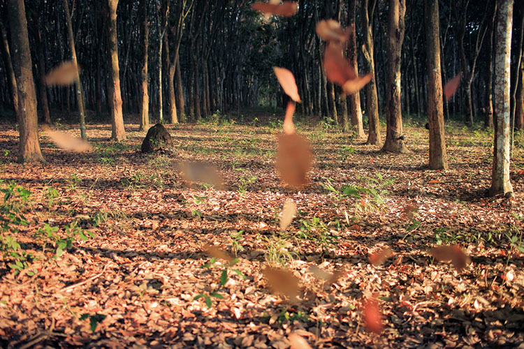
Capture falling leaves

Falling leaves are another perfect subject to explore when experimenting with slower shutter speeds. This autumn, try heading to a local park or hiking trail on a windy day to try out these new techniques. Find a tree with some pretty foliage that you’d like to use as your subject. Set up your gear and wait for the right moment to capture the natural motion of the outdoors.

As a gust of wind blows a handful of leaves from the nearby tree, get creative with the ways in which you can capture that windy motion. One method could be to try zooming in and out mid-exposure. Another could be to get into manual focus mode. Start capturing your shot in focus, then abruptly twist out of focus at the end of the exposure. You could even physically start moving your camera while the shutter is still open.

Motion fall photography05

Fall décor

If you’re interested in capturing some similarly unique shots of Halloween decorations, you can employ the same aforementioned techniques in an effort to add a dragging, spooky motion effect to candles or outdoor lights. Again, with open shutter exposure of a few seconds, you can create a look much more compelling than an otherwise stationary image of a home’s exterior décor. When experimenting with creative compositions such as these, you can toss the typical rulebook aside and just focus on trying to produce something innovative and exciting.

Motion fall photography06

Moving water

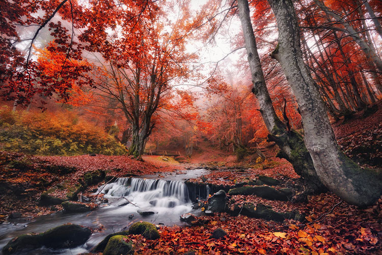
If you’re traveling to a hiking trail in search of captivating foliage shots, make sure to keep your eye out for any opportunity to capture images of water as well. At a speed like 1/30th of a second, you can transform an ordinary waterfall shot into a compelling silky cascade with a flourishing fall backdrop. If you can’t locate a waterfall and are instead working with a more slower-moving subject like a stream or brook, you might want to try a speed a bit slower, such as 1/15th or 1/4th. In general, we recommend you try fluctuating between speeds of around ¼ and 1/60 until you find one that you’re comfortable with. Make sure to experiment with the exposure time to find your favorite water effects.

Motion fall photography07

Getting Started

Before you head out to try these new techniques this year, here’s a checklist of some last minute tips you might want to keep in mind.

Keep the camera steady

When you’re working with such slow exposure times, your shot is prone to be affected by even the slightest jostle of your camera. You might want to consider packing a tripod. If you don’t own one (or lugging one along isn’t practical for your excursion) try to find something outdoors like a boulder as a means for stabilizing your camera before you get started. If you can’t locate a helpful natural prop, you could also try using the 2-second timer and propping the camera up on your gear bag.

Waterfalls

When shooting waterfalls, if you want to capture a more even exposure without the often inevitable inclusion of heavy, distracting shadows, try to head out very early in the morning. If this doesn’t work with your schedule, a cloudy day is your next best option for avoiding this.

Raise the ISO

If you’re trying to photograph fall décor indoors but the exposure is repeatedly too dark, try cranking your ISO (and using a simple noise reduction software).

Blur the background

If you’re trying to focus on a foreground subject but struggling to effectively blur the background, try using the widest possible aperture, and the longest focal length of your lens. Slowly move your subject further and further away from the background as you capture your shot.

Motion fall photography08

By effectively employing these tips and displaying the motion of your subjects, you’ll be able to capture the essence of autumn in a uniquely captivating way.

This tutorial has been brought to you by The New York Institute of Photography. NYIP is the largest and longest running online photography school in the world. Offering ten online photography classes to choose from, the school makes learning photography fun and accessible to aspiring artists on a global scale. Whether you are interested in a new career or are in pursuit of a hobby, NYIP students get the personal attention they need to achieve their goals. They have access to professional photographers as their teachers and mentors to guide them through the course and help them improve.

NYIP is a paid partner of dPS.

Jacob Boller is the School Director at The New York Institute of Photography and has been in his role for the past decade. Jacob first fell in love with photography taking wildlife photos with his Grandfather and still uses that same Olympus 35mm from time to time. Jacob is honored to be the Director at NYIP, the largest and longest running online photography school in the world, and is proud that via the NYIP Online Learning Center, course updates are made as fast as the camera technology develops.

googletag.cmd.push(function() {
tablet_slots.push( googletag.defineSlot( “/1005424/_dPSv4_tab-all-article-bottom_(300×250)”, [300, 250], “pb-ad-78623” ).addService( googletag.pubads() ) ); } );

googletag.cmd.push(function() {
mobile_slots.push( googletag.defineSlot( “/1005424/_dPSv4_mob-all-article-bottom_(300×250)”, [300, 250], “pb-ad-78158” ).addService( googletag.pubads() ) ); } );

The post Add Motion to Your Fall Photography to Help it Stand Out by Jacob Boller appeared first on Digital Photography School.


Digital Photography School

 
Comments Off on Add Motion to Your Fall Photography to Help it Stand Out

Posted in Photography


Photokina 2016: Nikon stand report video

21 Sep

Nikon may have introduced the D5 and D500 many months ago in anticipation of the 2016 Olympic Games in Rio, but that doesn’t mean they’re out of new releases for Photokina 2016. The ambitious KeyMission lineup shows that Nikon is taking the 360 and action camera market awfully seriously, while the D3400 should continue to offer entry-level DSLR users impressive image quality. Lastly, the Nikkor AF-S 105mm F1.4 is a gorgeous piece of glass that we can’t wait to get out into the real world with.

Watch as DPReview’s Barney Britton talks with Steve Heiner, Nikon’s senior technical manager, about these new products (and even a new market segment) from Nikon.

Articles: Digital Photography Review (dpreview.com)

 
Comments Off on Photokina 2016: Nikon stand report video

Posted in Uncategorized


How to Use Split Toning to Make Your Photos Stand Out

10 Aug

Have you ever taken a picture and then been disappointed, because it didn’t capture the moment? Maybe it looked exactly like what you saw, but when you viewed the image afterwards it was lacking something.

This is one of the greatest challenges photographers face, to express a feeling or vision in a two-dimensional medium. One of the most overlooked tools in the photographer’s processing kit is color.

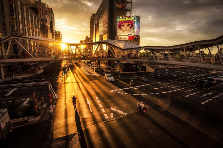
Osaka Sunset

Example of a warm split tone.

I’m not talking about the color of the things in your photograph, like a red car or yellow dress. I mean the overall color cast, the tone of your image, is important too.

Colors affect the way people feel, so much so that there is a whole body of science around it. Even some basic knowledge of color theory can help improve your photography.

Beyond White Balance

The first place to head when you want to change the tone is white balance. For instance, if it’s a gray cloudy day you might want to move the temperature slider towards the warmer side, making your image appear more yellow-orange, or sunny. Move it in the opposite direction, and your image will get cooler or more blue.

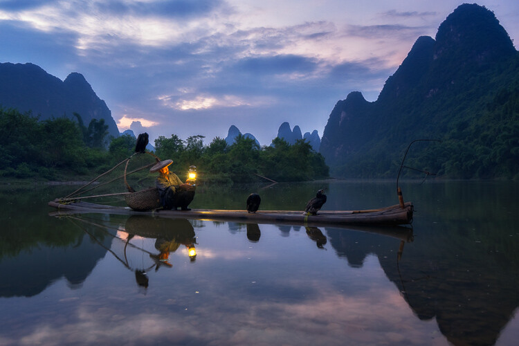
Fisherman in Xingping China

Example of a cool split tone.

Although changing the white balance of an image is helpful, it is still a global adjustment – it affects the entire image. In other words, editing the tone of your image with just the white balance is like a mechanic trying to fix an engine with a sledgehammer. It may not be the right tool for the job.

To make more fine-tuned adjustments, and thus have greater control on the overall mood of your images, you may want to have a look at Split Toning.

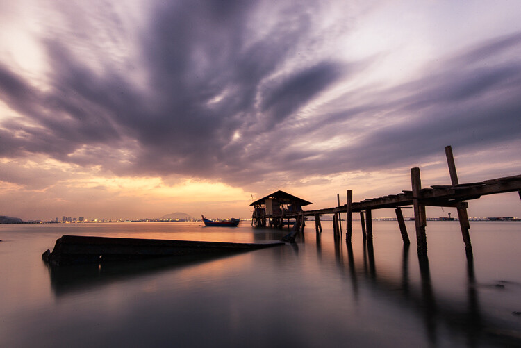
Penang Sunrise at Fisherman Jetty

Magenta and warm tones.

A Bit of History of Toning

Toning first started as a way to change the color of black and white photographs. For instance, in the past, chemicals were added to the development process to give prints a sepia tone. Later on, other chemicals toners were used to give images two different tones like red and blue.

It may sound complicated, but in today’s digital darkroom, all split toning really means is that you add color to the shadows, highlights, or both. There are a number of ways you can split tone an image. One of the most common is to make the highlights yellow and shadows blue or vice versa. However, let’s take a look at how you can also adjust a single color, to create a particular mood in Adobe Lightroom (also possible in Photoshop and Bridge).

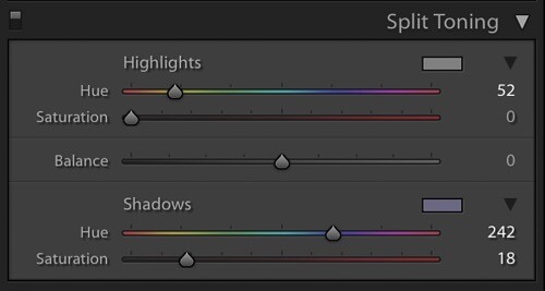
Split Tone Window in Adobe Lightroom

This is what the Split Toning slider looks like in Adobe Lightroom.

Magenta Zen

My favorite color cast to add to my images is magenta. Like a yin and yang varnish, this color (a purplish-red) represents harmony, balance, love, and personal growth. It has a calming effect that stimulates creativity and happiness.

When split toning for magenta, I usually make my adjustments to either the shadows or highlights. I rarely make changes to both, as it tends to be overkill. More often than not, I adjust the shadows, as it’s usually the underexposed darker parts of the image I am trying to bring out. If the image is very bright then I edit for the highlights.

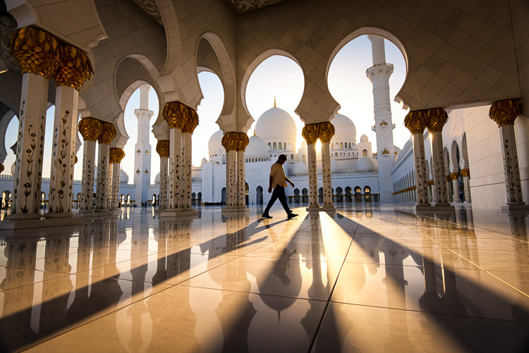
Dubai Cityscape

There is no rule as to how far you should move the sliders. However, I tend to move the hue slider somewhere between 230-250 and the saturation slider between 10-20. It all depends on the image and the intensity of the colors, shadows, and highlights. You can also use the eyedropper to choose the color.

Another added bonus to adding some magenta is that it tends to take off the rough color edges. Browns, greens, and yellows are smoothed out, giving your photos a softer tone.

Pudong Shanghai Cityscape

Split Toning Keyboard Shortcuts for Lightroom

There are a couple of shortcuts in the Lightroom Split Toning panel you’ll want to know about.

First, it can be difficult to to choose the right color when the saturation strength is low. To briefly boost the hue up to %100 saturation, just press and hold Option on Mac (or Alt on Windows), then move the hue slider to either side. This will show the color at full strength so you can select it more easily.

Second, to more easily view the colors split in the image, hold down Option/Alt and then drag the Balance slider in the Split Toning panel.

Experiment

Split Toning is much more than just magenta. Try adjusting the warmth or coolness in your photographs in the split toning panel, instead of using white balance for something different. You can also give your photos a cinematic feel, old film look, and more by split toning. Have fun, get creative, and find what works for you.

Sunset at Sheikh Zayed Mosque in Abu Dhabi

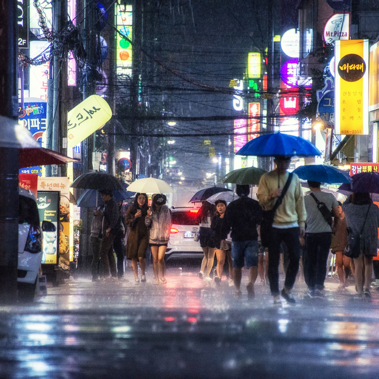
Umbrellas in Busan Rain

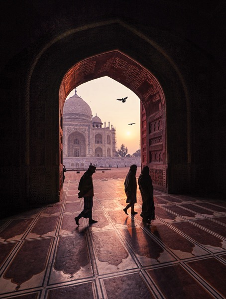
Sunrise at Taj Majal

googletag.cmd.push(function() {
tablet_slots.push( googletag.defineSlot( “/1005424/_dPSv4_tab-all-article-bottom_(300×250)”, [300, 250], “pb-ad-78623” ).addService( googletag.pubads() ) ); } );

googletag.cmd.push(function() {
mobile_slots.push( googletag.defineSlot( “/1005424/_dPSv4_mob-all-article-bottom_(300×250)”, [300, 250], “pb-ad-78158” ).addService( googletag.pubads() ) ); } );

The post How to Use Split Toning to Make Your Photos Stand Out by Pete DeMarco appeared first on Digital Photography School.


Digital Photography School

 
Comments Off on How to Use Split Toning to Make Your Photos Stand Out

Posted in Photography


5 Tips to Improve Your Background and Make the Subject Stand Out More

30 May

If you are looking for a quick, simple, hassle-free way to make your images pop more and stand out, this is the article for you!

You don’t have to be a Photoshop genius – in fact, this may help you spend less time in Photoshop. These simple tips can elevate the photos you take. If there was one element in many images I see that could greatly improve it, it would have to be this: backgrounds. An ugly or distracting background can easily reduce the impact of even the best subjects. A clean, un-distracting background will help improve your images and make your subjects stand out even more. The best past is, you wont even have to spend a cent to do this.
Even though the background here works quite well with the subjects, using a wider aperture has ensured that the subjects do not get lost, but stand out. © Daniel Smith / Getty Images.

Even though the background here works quite well with the subjects, using a wider aperture has ensured that the subjects do not get lost, but stand out. © Daniel Smith / Getty Images.

All too often we overlook the background and what is in it. You swear that those power lines weren’t in the viewfinder when you took that picture, and that post, where did that post come from?! That surely wasn’t protruding from your partner’s head when you clicked the shutter button. This occurs for a number of reasons:

  • You’re too focussed on the subject alone that it’s almost like you have blinders on and the subject is all you can see.
  • You may get too obsessed with the camera settings and making sure you nail the photo that you miss all those little annoying things that pop in to the frame.
  • Or you are simply unaware of the importance that a good background can make.

So how can you improve your backgrounds, or at the very least, reduce the negative impact they can have on your images? By following these simple strategies, you’ll be well on your way to a better background and improving your images.

#1 – Location, Location, Location

If you have the option, do try and choose a location that has a nice background – that will make it as easy as it can get. What defines a nice background will depend on your subject, but as a very general guide, look for a spot that has a uniform look to it. Brick walls, corrugated iron roller doors, metal cladding on walls, or even something as simple as a painted white wall, can all make for a nice clean background. Ultimately, what you are not looking for is something that has a lot of other elements in the frame, that do not add to your subject.

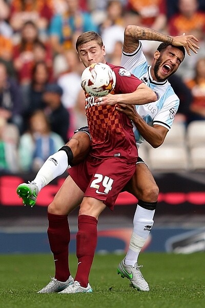
If you cannot find a location that has a clean background, looking for somewhere where the background complements – or works with – your subject will also work, too. An example of this would be with sport photography. You simply cannot decide where the game will be played, so you have to work with what you have. In this situation, think about what would look good as a background. Would a stand full of supporters look better than a car park full of cars or a building site? I think it would. The stand full of supports, while not clean, works with your subjects and in fact, has more impact as the supporters add a nice element of atmosphere to the image.
Cluttered BG 1

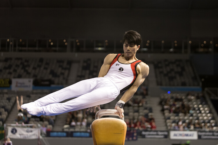
Even though this image has the stadium in the background, it is a little cluttered. The seats are mostly empty, so it’s not really portraying any sense of atmosphere in the sport.
Clean BG 5

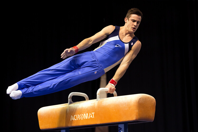
By changing my position, I was able to use a the large black cloth in the background to make the athlete stand out much more. Nothing more than moving was required; much easier.
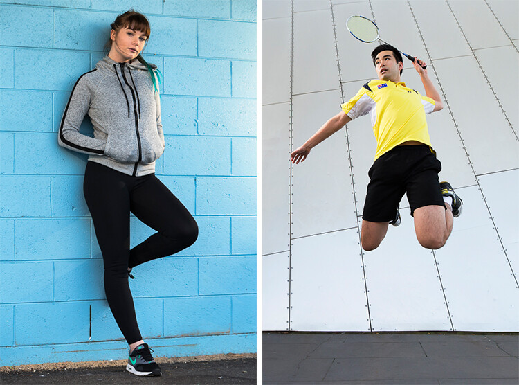
Here, the backgrounds in these two images are quite plane. They help make the subjects the heroes of the images, as there is nothing else to compete with them.
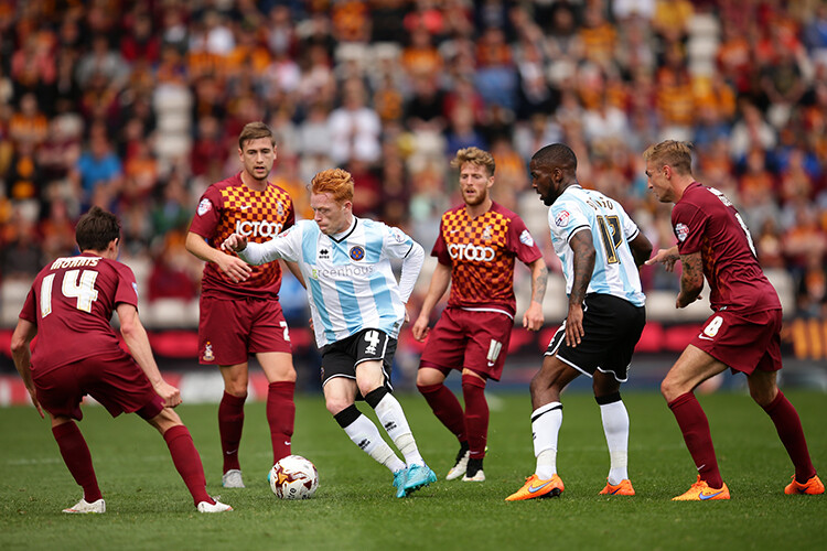
With this image, the stands in the background have much more people in them. This works nicely to complement the subjects which, in this case, are the players. © Daniel Smith / Getty Images.
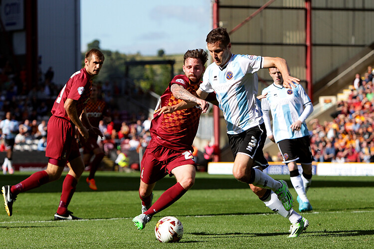
While this is a nice action frame, the background is not that fantastic. It’s in between areas of the different stands at this venue. It would look much better if it were against the full stadium, as in the previous image. © Daniel Smith / Getty Images.

You’ve found your location, but a clean background just cannot be had. What do you do?

#2 – It’s All About Perspective

A good backgrounds can be anywhere, and it can change quite a lot depending on the angle at which you photograph your subject. You may be in a very busy space, but within that space will exist areas of calm and peace. By this I mean that your backgrounds can be clean; even when it just looks cluttered in all directions.

When this happens, consider photographing from a different perspective. Photographing your subject from down low will make the sky your background. Conversely, if you’re looking down on your subject, whatever is below them will be the background. So if you cannot find an ideal background, don’t forget to look up and down – that’s where the best one may be hiding.
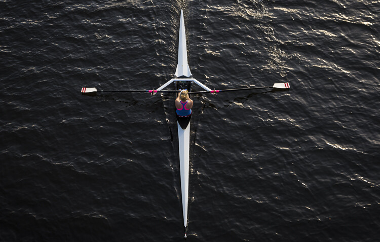
Relevant BG 1

This rower was photographed from a bridge, making the water the background. in this case, the background works quite well with the subject.

Clean BG 7

This time, I was photographing this plane landing. This meant that I would be looking up, and the sky became the background here. The complementary colour set of the blue sky and yellow light on the plane also help to make the subject stand out more.

You may have the best background sorted. But it’s not always possible to be lucky enough to have that perfect background all the time. So what else can you do to help your subject?

#3 – Camera Craft

There will be times – more often than not – where you simply cannot win with your background. No matter which way you stand, you just can’t seem to find a nice clean backdrop. What now? Here’s where a little camera craft comes in to play and you have a couple of tricks up your sleeve with this.

First point of call is aperture. You know that you can simply open your aperture up a little more, and give that background some nice bokeh (or blur) to reduce its impact. Even when you do have a nice complementary background, it’s still a good idea to use a wider aperture to blur it out a bit and make your subject stand out against it more.

What if you can’t open your aperture any further, though? There’s still hope. Our next strategy is to play with shutter speed and use a panning technique. This can help greatly in rendering a busy background into a nice blurry mess. It also helps to add a great sense of movement and action, as well as give a sense of excitement to an image. If you’re unsure about how to do panning, have a read of this article – it will help greatly. But in a nutshell, panning is the technique of using a slower shutter speed (usually around 1/60th or slower) while tracking a moving subject. The combination of a slow shutter speed, coupled with the panning action, will result in a nice motion blur affecting the background, and if done correctly, the subject will remain sharp.
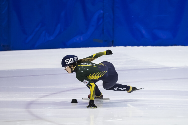
Cluttered BG 2

This background is clean; there are no real distractions in it, but it could be improved upon.
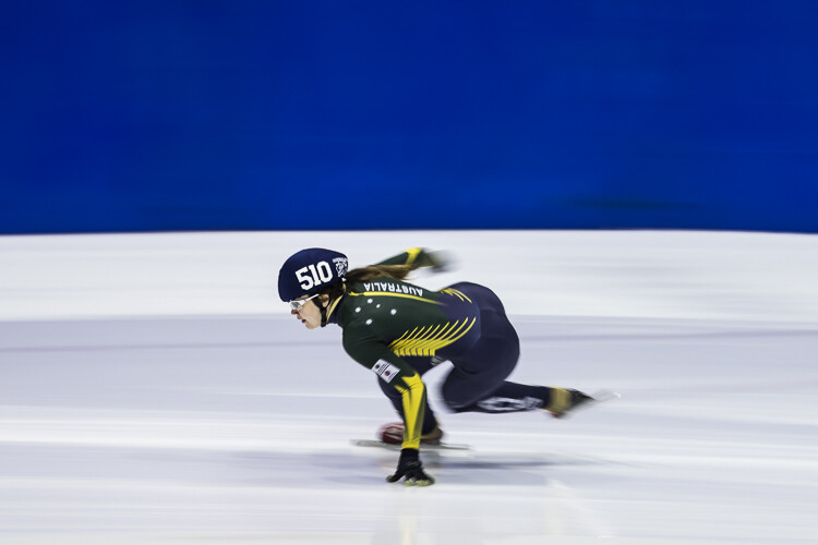
Clean BG 6

Here’s a different frame but this time, a panning technique has been used to remove all the creases in the blue backdrop. This has made the background cleaner again, and the added motion blur gives a sense of speed which works well with the subject.
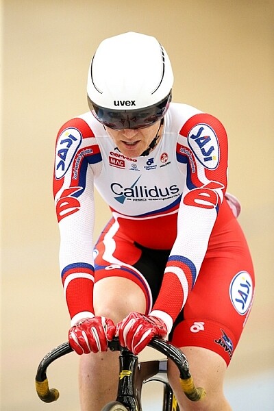
Clean BG 8

The use of a wide aperture here has dramatically blurred out the background making it much cleaner. The result is that the subject stands out much more. © Daniel Smith / Getty Images.

#4 – Can You See the Light?

Something that seems to always be overlooked in photography is light. This seems to me like quite a remarkable thing since without light, we don’t have much of a photo. But using light, and the contrast it can provide, is another way to reduce the appearance of a distracting background. With this strategy you need to look for a higher amount of contrast between your subject and the background; that is, you’re subject is (ideally) brighter than the background. By exposing for your subject (the brightest area) you effectively make shadowed areas in the frame darker, thereby affecting your background. This can be achieved with both natural light and flash.
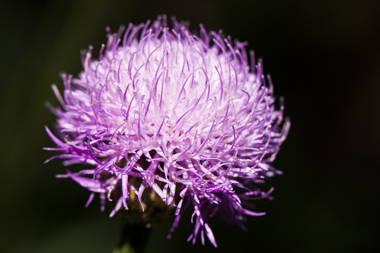
Contrast1

In this image, the flower was in the daylight; whereas the background was in the shade. I exposed for the flower and this made the background darker.

Again, the background here is much darker than the subject; helping to isolate the subject more. © Daniel Smith / Getty Images.

Again, the background here is much darker than the subject; helping to isolate the subject more. © Daniel Smith / Getty Images.

Clean BG 2 Clean BG 1

These photographs were taken in an undercover car park. I used two flashes (both off-camera) as my only light source. This removed any ambient light affecting the image.

#5 – The Final Stop

You’ve done what you can with the background. You’ve tried everything, but your background still doesn’t want to play ball. There will be times when you simply cannot control any of the aspects that have been mentioned. Don’t worry – it isn’t uncommon. Now all you can do is hope that there is something that can be done later, and there is!

If you’ve done everything you can to help improve your background and you’re still not winning, the last port of call is post-processing. You may be thinking, “Hold on, I’m not that great with selecting and masking in Photoshop yet.” but you needn’t worry. There is no selecting or masking with this one. (As a side note, if you intend on making a selection around your subject and replacing the background, you will need to photograph your subject accordingly to make this much easier and more natural).

All you need do is crop your image. That’s it. Cropping is about all you can do now. By cropping, you are effectively removing as much of the background as possible without cropping into your subject. Don’t worry about how much you are cropping out – unless of course you intend on doing a large print. You’d be surprised at how much many photographers are willing to crop.

Do you have any other tips for making the subject stand out, or improving the background? Please share your thoughts and images in the comments below.

googletag.cmd.push(function() {
tablet_slots.push( googletag.defineSlot( “/1005424/_dPSv4_tab-all-article-bottom_(300×250)”, [300, 250], “pb-ad-78623” ).addService( googletag.pubads() ) ); } );

googletag.cmd.push(function() {
mobile_slots.push( googletag.defineSlot( “/1005424/_dPSv4_mob-all-article-bottom_(300×250)”, [300, 250], “pb-ad-78158” ).addService( googletag.pubads() ) ); } );

The post 5 Tips to Improve Your Background and Make the Subject Stand Out More by Daniel Smith appeared first on Digital Photography School.


Digital Photography School

 
Comments Off on 5 Tips to Improve Your Background and Make the Subject Stand Out More

Posted in Photography


Review: Manfrotto 5001B Nano Light Stand

27 Mar

Rating: 10/10

Among the most essential parts of a photographer’s lighting kit, is a sturdy light stand. While there are a wide variety of options that definitely fall into the sturdy category, many of these light stands are also heavy, bulky, and difficult to travel with. One light stand that is pretty much the complete opposite of every other option out there, is the Manfrotto 5001B Nano. Compact, lightweight, and surprisingly tall for its size, this light stand is my go-to favorite that accompanies me on every one of my photo shoots, however it won’t necessarily meet the needs and expectations of every photographer. Here are some reasons why you might love this light stand, and why you might opt for another option.

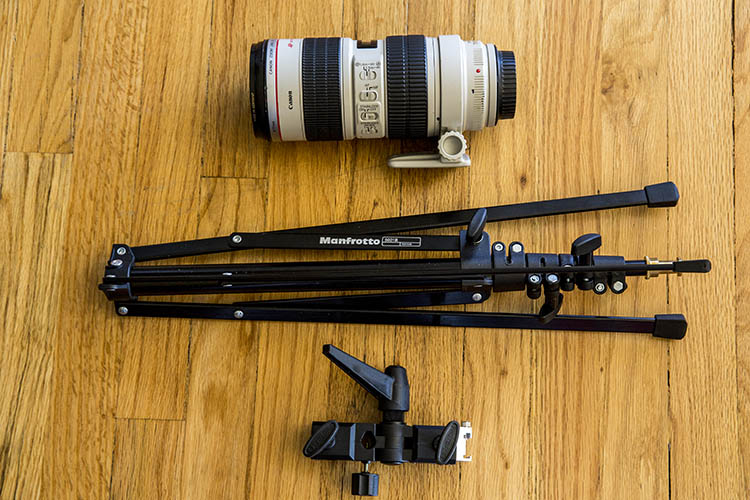
Manfrotto 5001B Nano Lighting Stand 1

Manfrotto Nano 5001B shown next to the Canon 70-200mm f/2.8 lens and light stand adapter (neither of these is included and must be purchased separately).

Manfrotto 5001B Nano Specifics

Weighing in at a mere 2.2 pounds (1kg), this aluminum light stand stands at just around 19-inches (0.48m) when it is collapsed, and can extends up to 74.8 inches (1.9m) tall when all of its 5-sections are fully extended. According to the product manual, it has a maximum payload of 3.3 pounds (1.5kg) . Compared to other light stands, most of these stats aren’t particularly impressive, and it should now be apparent why the Manfrotto 5001B Nano won’t be suitable for every photographer. But, here are some situations when this light stand absolutely shines.

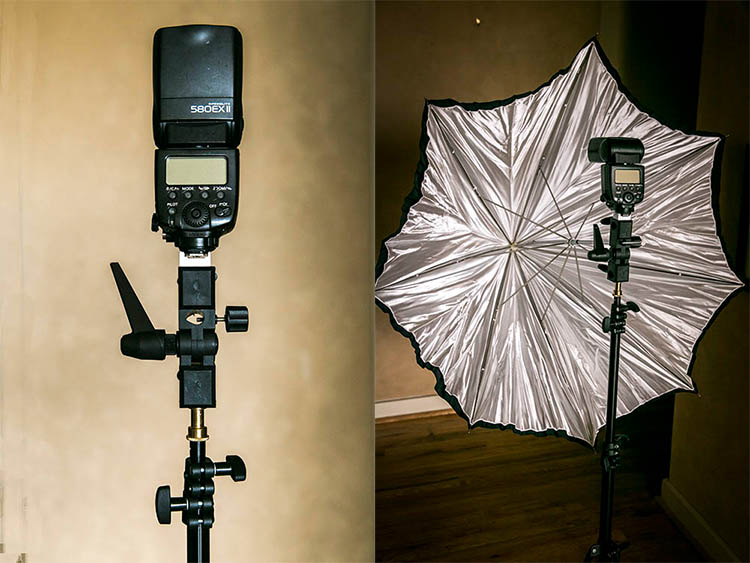
Manfrotto 5001B Nano Lighting Stand 1

Lighting stand as seen with a Speedlight adapter attached. Adapter sold separately.

Extremely Compact and Travel-Friendly

The main benefit of this light stand is its compact size, which makes it easy to carry when shooting on location, or in situations when you need a stand or two without carrying an excessive amount of gear. When pairing this light stand with a speedlight, and simple lighting modifiers like an umbrella or any of the Westcott Rapid Box series, you get a simple yet effective lighting setup that won’t take up a ton of room when assembled for use, and when transporting it.

Flexible Light Stand Legs

Unlike most other light stands, the Manfrotto Nano’s legs have little rubber tips to prevent sliding, and the legs themselves are very thin and not rounded, allowing the stand to fold down to 19 inches. The method of folding the stand can take some getting used to, but another unique aspect of the stand is its ability to get extremely low to the ground, thanks to the unusual folding of the legs. This increases the light stand’s overall footprint, offering increased stability, as well as the option of lighting areas close to the ground, without taking up a ton of floor space.

Manfrotto 5001B Nano Lighting Stand 1

Light stand with adapter, speedlight, and umbrella attached. The ideal use for this stand.

Trading Stability for Compact Size

As mentioned earlier, not every photographer will be in love with the Manfrotto 5001B Nano, as it often trades stability for its compact size. Flexible legs are great for packing up small, but also a recipe for disaster if the gear it holds is not balanced or is too heavy. Being very lightweight, without the option of suspending sandbags, this stand is also susceptible to being knocked over by even a slight bump or gust of wind, so outdoor photographers will want to have an assistant to hold it in place.  It’s definitely not as sturdy or as beefy as other light stands, meaning you won’t want to rely on it if you use heavy strobes, or big lighting modifiers.

In Summary

If you’re a location shooter, who doesn’t carry a ton of camera gear and has compact lighting equipment, the Manfrotto 5001B Nano will be your new best friend. Having one or two as travel light stand alternatives, will give you the flexibility to do a quick and easy lighting setup in tight spaces, without carrying extra weight. However, steer clear of these light stands if you prefer uncompromised stability and/or have heavy, valuable lighting gear.

amzn_assoc_placement = “adunit0”;
amzn_assoc_enable_interest_ads = “true”;
amzn_assoc_tracking_id = “dpsgeneral-20”;
amzn_assoc_ad_mode = “auto”;
amzn_assoc_ad_type = “smart”;
amzn_assoc_marketplace = “amazon”;
amzn_assoc_region = “US”;
amzn_assoc_linkid = “6710d26f550e9793f41475ee806fee9e”;
amzn_assoc_emphasize_categories = “13900861”;
amzn_assoc_fallback_mode = {“type”:”search”,”value”:”digital cameras”};
amzn_assoc_default_category = “Photo”;

googletag.cmd.push(function() {
tablet_slots.push( googletag.defineSlot( “/1005424/_dPSv4_tab-all-article-bottom_(300×250)”, [300, 250], “pb-ad-78623” ).addService( googletag.pubads() ) ); } );

googletag.cmd.push(function() {
mobile_slots.push( googletag.defineSlot( “/1005424/_dPSv4_mob-all-article-bottom_(300×250)”, [300, 250], “pb-ad-78158” ).addService( googletag.pubads() ) ); } );

The post Review: Manfrotto 5001B Nano Light Stand by Suzi Pratt appeared first on Digital Photography School.


Digital Photography School
 
Comments Off on Review: Manfrotto 5001B Nano Light Stand

Posted in Photography


10 Winter Miles of Stand Up Paddling on South Platte River

09 Jan

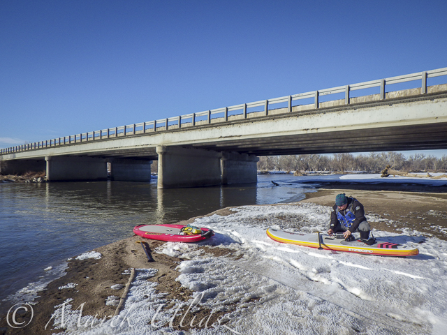
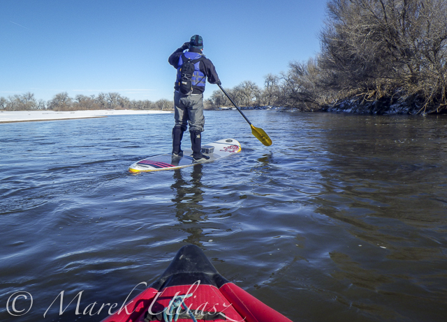
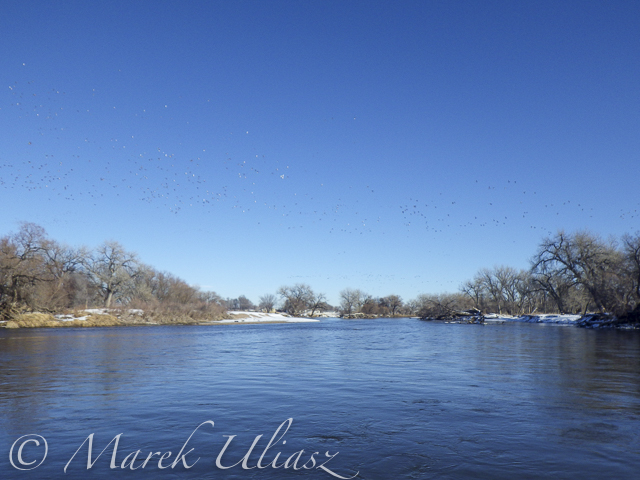
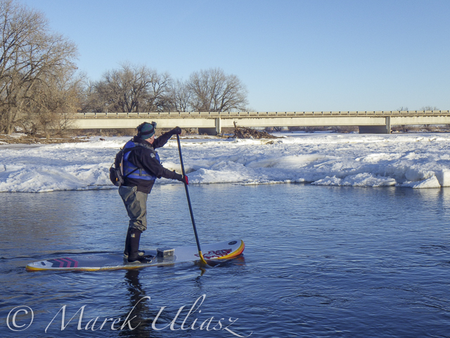
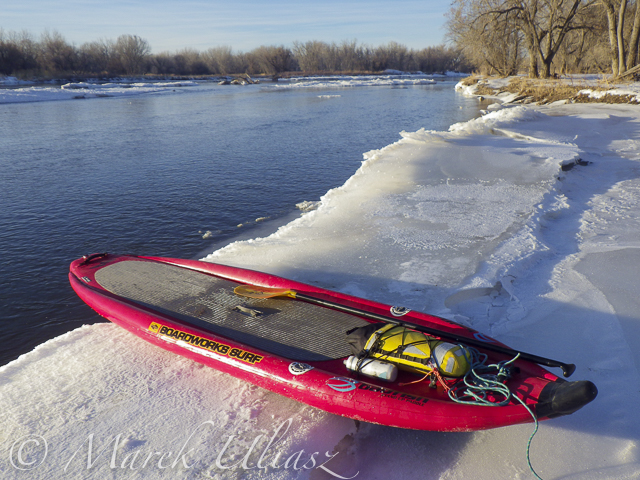
January 3, 2016. First SUP paddle of the year with Rob Bean. We paddled 10 miles on the South Platte River from highway 58 to Kuner. Great weather, river flow ~900 cfs at Kersey, several bald eagles and hundreds of ducks. There are no portages on this river section since we started just below the Plumb Ditch Dam (the second diversion dam if you paddle from Evans).

We started from a gravel bar under the new bridge on highway 58 – a right river shore with parking on a wide shoulder, a shorter, steeper route with barbed wire fence on the upstream bridge site. Downstream bridge site may be more convenient without the fence, but with a little longer walk. You can reach the bridge by turning into the new highway 49 at traffic lights from Colorado highway 34 between Evans and Kersey.

Rob posted his pictures on facebook. They actually show much better our launching site.

Start at gravel bar under the new highway 58 bridge

Start at gravel bar under the new highway 58 bridge

Somewhere on the river around Kersey

Somewhere on the river around Kersey

Ducks, ducks, and more ducks. Hundreds of them.

Ducks, ducks, and more ducks. Hundreds of them.

winter SUP paddling on South Platte River

Finishing 10 mile trip at Kuner

A little bit icy  landing at landing (left shore upstream of the bridge)

A little bit icy landing at Kuner (left shore upstream of the bridge)

Related posts:
South Platte River below Denver – river guide
Starting 2015/16 Winter Paddling Season on South Platte River
Paddling SUP on South Platte River from Kersey to Kuner
South Platte River from Wildcat to Evans by SUP


paddling with a camera

 
Comments Off on 10 Winter Miles of Stand Up Paddling on South Platte River

Posted in Photography


Mustard’s Last Stand: 10 Abandoned Hot Dog Kiosks

27 Jul

[ By Steve in Abandoned Places & Architecture. ]

Carneys-Corny-Dogs-1
Easy come and easy go (just like their product), hot dog stands like these abandoned frankfurter kiosks are the fly-by-night black sheep of the fast food trade.

Carneys-Corny-Dogs-1c

Now gone but not forgotten thanks to the wonders of photography and the internet, the abandoned Carney’s Corny Dogs stand (images c/o Noel Kerns above and Steve Snodgrass below) stood unloved and unappreciated long after the last piping-hot, mustard-swathed frank was served.

Carneys-Corny-Dogs-1a

Carneys-Corny-Dogs-1b

For better or worse, images of the decrepit kiosk were for a time the most popular photos taken in southwest Shreveport, Louisiana.

It’s Crunch Time

Munkfors-abandoned-Hot-Dogs

Standing alone and neglected with its skewed striped awning flapping in the breeze, this squarish hot dog stand in Munkfors, western Sweden appears to be closed for the season… wait a minute, it’s mid-July of 2008 according to Flickr user Rolfen – that IS the season! Perhaps the unfortunate closeness of “hamburgare” and “glass” on the sign tended to put off potential customers.

Friendly Ghost Town

abandoned-Kaspers-hot-dog-stand-3a

abandoned-Kaspers-hot-dog-stand-3

Established in 1929, Kasper’s Hot Dogs in Oakland’s historic Temescal neighborhood was closed to perform temporary maintenance… in 2004!

abandoned-Kaspers-hot-dog-stand-3b

abandoned-Kaspers-hot-dog-stand-3c

Hopefully city authorities will find some way to preserve the unique flatiron-style structure from the wrecking ball. Kudos to Flickr users Ian Ransley and japanesejack for the above images taken in 2014 and 2010, respectively.

Next Page – Click Below to Read More:
Mustards Last Stand 10 Abandoned Hot Dog Kiosks

Share on Facebook


[ By Steve in Abandoned Places & Architecture. ]

[ WebUrbanist | Archives | Galleries | Privacy | TOS ]


WebUrbanist

 
Comments Off on Mustard’s Last Stand: 10 Abandoned Hot Dog Kiosks

Posted in Creativity


How to Make a DIY Newborn Photography Background Stand

11 Jul

Have you ever wondered how professional newborn photographers get their backdrops so smooth and wrinkle free? Are they Photoshop masters? Do they have a team of highly paid assistants pulling the fabric? No. The answer is a DIY backdrop stand that costs less than $ 20 and that you can make in less than 15 minutes.

Image 9 1

When I first started in the world of newborn photography I used the tools that I had available. I would use a traditional background stand to hold the back of my fabric backdrops. I would then ask my clients if I could borrow a vacuum, dining room chair or some other house hold object to clamp the side of my fabrics to. This, of course, was very unprofessional and delivered substandard results. I would find myself spending 30 minutes just editing the backdrop in Photoshop. I knew there had to be a better way. So, with a little imagination and $ 20 I saved myself countless hours of Photoshop madness. Now, besides some simple blemish removal and softening, the images are basically perfect, straight out of camera.

Image 8

This tutorial will teach you how to build a background stand that stretches your backdrop fabrics. This stand will help to eliminate wrinkles in your background fabric, and cut down on post-processing time. It will also help you present your newborn photography business in a more professional manner.

Supplies needed

What you will need:

Image 1

All of the supplies should be readily available at your local hardware store. You will need to look in the plumbing section. All PVC fittings are Schedule 40.

  • Four – 10 Foot lengths of 3/4 inch PVC pipe (SCH 40)
  • Four – 3/4 inch elbow joints
  • Four – 3/4 inch tee joints
  • Two – 3/4 inch 3-way joints

Step 1. Cut the PVC pipes to the correct lengths

You can use a PVC cutter, a miter saw, or a handsaw. I used a handsaw and was able to complete the entire stand in 15 minutes.

Lengths needed:

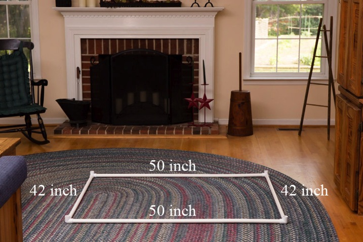
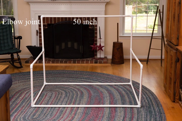
  • Three – 50 inch pieces
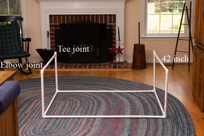
  • Four – 42inch pieces
  • Six – 20inch pieces

Recommended cuts:

  • Pipe 1: 50 inches + 50 inches + 20 inches
  • Pipe 2: 50 inches + 42 inches + 20 inches (discard 8 inches)
  • Pipe 3: 42 inches + 42 inches + 20 inches (discard 16 inches)
  • Pipe 4: 42 inches + 20 inches + 20 inches + 20 inches (discard 18 inches)

Step 2. Connect the bottom frame

Connect two 50″ pieces and two 42″ pieces with the four 3-way joints to make a rectangle.

Image 2

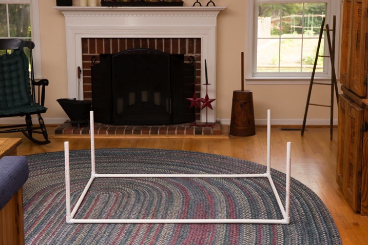
Step 3. Add the vertical leg pieces

Connect four of the 20inch pieces to the rectangle.

Image 3

Step 4. Connect the middle supports

Connect a tee joint and an elbow joint to either end of a 42inch piece of PVC. Repeat. Connect these to the backdrop stand.

Image 4

Step 5. Connect the back support

Connect two 20″ pieces to the back of the stand. Now connect the remaining 50″ piece to the top with two elbow joints. It should look like this at this stage (below).

Image 5

Step 6. Place a beanbag underneath

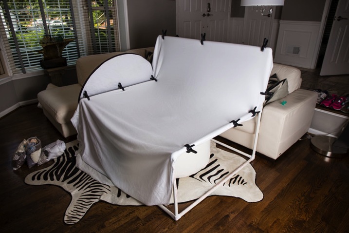
Place your beanbag in the center of the stand, and you are ready to stretch your backdrop fabric.

Image 6

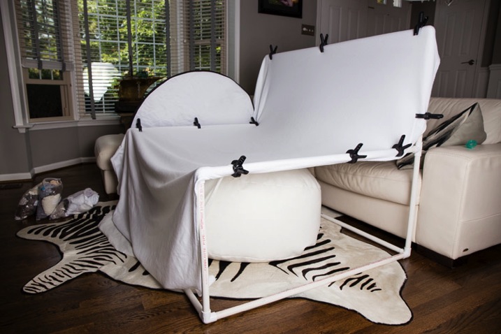
Here is a picture of the backdrop stand in use at a client’s home.

Image 7

Here is a final newborn image using the backdrop stand.

Image 10 1

This stand is purposely designed to be wide. This allows you to take those much needed angled pictures without losing your backdrop fabric. You may however, prefer to have a square backdrop stand. This would allow you to use a smaller area in your studio or client’s home. Just keep in mind that you will need to really watch your angles.

Recommended lengths for a square backdrop stand:

  • Seven – 45inch pieces
  • Six – 20inch pieces

NOTE: This stand is only to be used with a newborn posing beanbag placed under the center of the stand. The posing beanbag is what supports the newborn, not the fabric. NEVER leave a newborn baby unattended on the beanbag or on any prop. As a newborn photographer the safety of the newborn baby must be your top concern at all times.


googletag.cmd.push(function() {
tablet_slots.push( googletag.defineSlot( “/1005424/_dPSv4_tab-all-article-bottom_(300×250)”, [300, 250], “pb-ad-78623” ).addService( googletag.pubads() ) ); } );

googletag.cmd.push(function() {
mobile_slots.push( googletag.defineSlot( “/1005424/_dPSv4_mob-all-article-bottom_(300×250)”, [300, 250], “pb-ad-78158” ).addService( googletag.pubads() ) ); } );

The post How to Make a DIY Newborn Photography Background Stand by Clifton Man appeared first on Digital Photography School.


Digital Photography School
 
Comments Off on How to Make a DIY Newborn Photography Background Stand

Posted in Photography


5 Tips That Will Make Your Food Photos Stand out from the Crowd

01 Jul

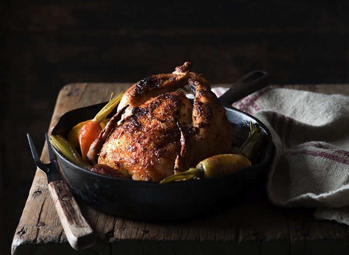
1 Cornish Game Hen

Food photography may be more popular now than ever before. The blogosphere is exploding with pictures of food, and social media sites like Pinterest and Instagram are flooding you with never-ending streams of food photos 24/7. Creating food images that stand out in this massive sea of content is a difficult task. Here are five tips to help you get your food photos noticed.

#1 Don’t be afraid of shadows

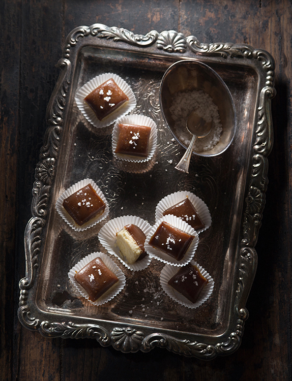
Shadows make a scene look realistic, give your food texture, and create mood, so don’t hesitate to make them part of your food photo. To create nice, dark shadows let your light fall onto your food either from the back or the side at a fairly low angle, from just a little bit above the surface of your set. Use reflectors sparingly, or not at all. Reflectors bounce light back into the areas of your photo that your light source doesn’t reach, in other words, into the shadows. So to keep the shadows dark, don’t reflect the light.

1 Salted Caramel Candy

In the salted caramel candy photo above my light was falling onto the set from the back at a low angle and I didn’t use any reflectors.

#2 Imply action

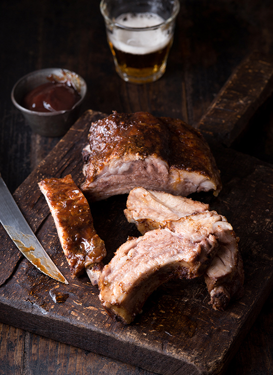
Action makes your viewers feel as if they are part of your scene; that kind of engagement is always a good thing. Action can be literal, such as a hand holding a hamburger or pouring syrup over a stack of pancakes, but there are other (and actually easier) ways for you to suggest that something is happening in your photo. One example is a glass of freshly poured beer. Your viewers likely know that the lifespan of the foam top on a beer is only a minute, so seeing a fresh beer tells them that someone must have just been at the scene to pour it.

2 BBQ Ribs

#3 Point your lens up at food that is tall and stacked

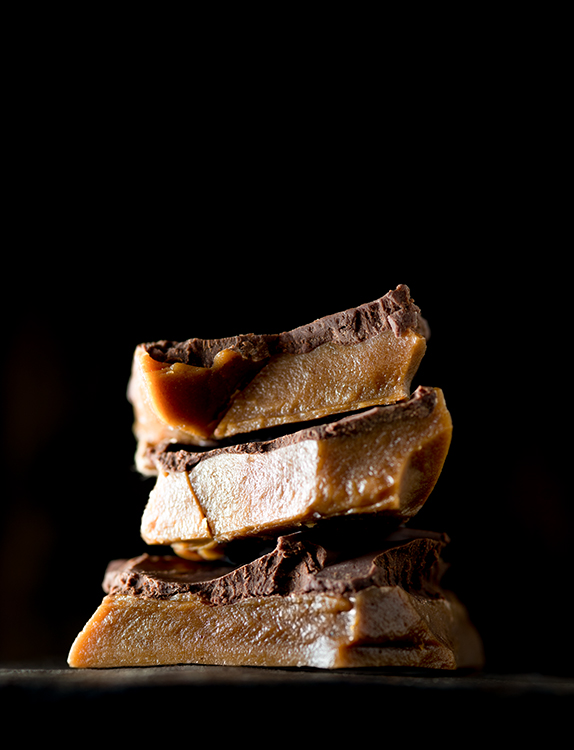
Shooting up from slightly below the food is an unusual angle for food photography; but it can create really compelling images of tall items such as cakes, and things that are stacked, like burgers or, as in the example below, shards of toffee. The food will be towering above the viewer which makes it look big and impressive. Needless to say this angle doesn’t work for flat food, so don’t shoot a pizza with this method.

3 Toffee

#4 Create visual contrast

Contrast comes in many varieties and helps make your food photo look interesting. You can create contrast by incorporating different shapes into your photo, such as round and rectangular (or square). You can also create contrast by including colors in your photo that are on opposite sides of the color wheel (complementary), like red and green, or blue and orange. The lettuce cup photo below illustrates both of these concepts, the square dish contrasts the round lettuce cups and the red sauce provides contrast to the green lettuce.

4 Lettuce Cups

#5 Leave negative space in the image

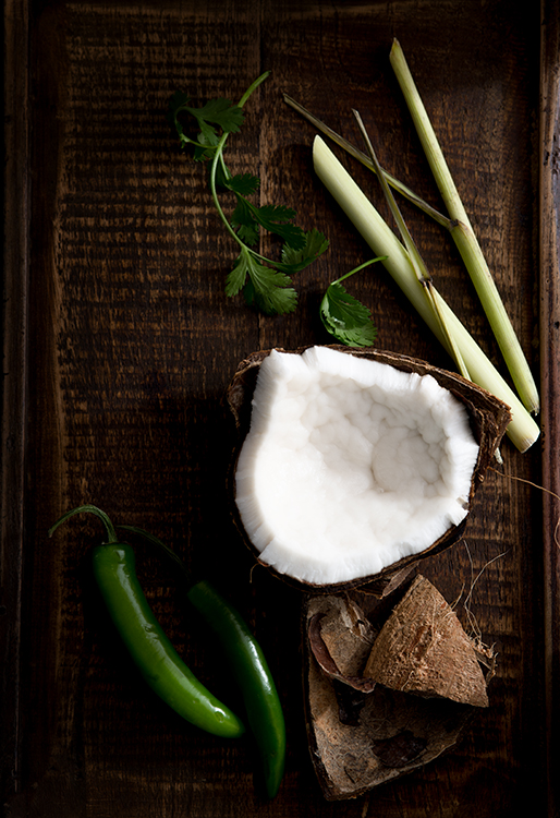
Don’t feel that you have to fill every square inch of the frame with food or props. A little negative (empty) space gives the food room to breathe, and will keep your viewers from getting overwhelmed and feeling claustrophobic. There are no hard and fast rules that dictate where to leave negative space in a food photo but the rule of thirds is always a good place to start. Imagine your photo dissected into thirds, both vertically and horizontally, and place your subject on or near one of the four points where those lines intersect. Leave the rest of your photo empty and take a test shot. Does the scene look good to you or is it too barren? If it looks like it’s missing something, add more elements to the frame, one by one and along the imaginary lines that dissect your frame, until you have a composition that looks pleasing to you. That’s how I went about composing the Thai curry ingredients shot below.

5 Thai Curry Ingredients

I hope these tips give you some new ideas for your food photography. If you have any others please share them in the comments below.

googletag.cmd.push(function() {
tablet_slots.push( googletag.defineSlot( “/1005424/_dPSv4_tab-all-article-bottom_(300×250)”, [300, 250], “pb-ad-78623” ).addService( googletag.pubads() ) ); } );

googletag.cmd.push(function() {
mobile_slots.push( googletag.defineSlot( “/1005424/_dPSv4_mob-all-article-bottom_(300×250)”, [300, 250], “pb-ad-78158” ).addService( googletag.pubads() ) ); } );

The post 5 Tips That Will Make Your Food Photos Stand out from the Crowd by Nicole Branan appeared first on Digital Photography School.


Digital Photography School
 
Comments Off on 5 Tips That Will Make Your Food Photos Stand out from the Crowd
Posted in Photography