RSS
 

Posts Tagged ‘Shine’

How to Use Auto Mask in Lightroom to Make Your Photos Shine

04 Aug

Lightroom is a fantastic tool for organizing, editing, sharing, and even printing photos and is an essential tool in the workflow of many photographers today. Unfortunately, it sometimes gets a bad rap when compared to its big brother Photoshop since the latter can do far more in terms of altering, enhancing, changing, or otherwise editing pictures and images. That’s not to say it is a slouch by any means, and you might be surprised at what it can do when you start to learn to use more of its powerful, yet sometimes hidden, features like Auto Mask in Lightroom.

How to Use Auto Mask in Lightroom to Make Your Photos Shine - rabbit photo

You mean Lightroom has advanced image editing capabilities I don’t know about? Go on, tell me more…

What is Auto Mask and how to find it?

The best way to get started with the Auto Mask feature is to navigate to the Develop module in Lightroom and then click on the Adjustment Brush tool. This lets you change all sorts of parameters like exposure, contrast, clarity, sharpness, and more, but only on specific parts of a photo instead of altering the entire image at once. You can select from various brush presets or move the sliders to create your own adjustments, then click and drag on the image itself to implement those adjustments.

You can even use multiple brush adjustments on the same photo and selectively erase your adjustments in case you want to undo anything. When you look at all the features the adjustment brush tool offers, you can start to see just how powerful and useful it really is. What’s more, at the very bottom of the adjustment brush panel is a little check box called Auto Mask that can dramatically increase both the usefulness and effectiveness of this tool in general.

How does Auto Mask work?

In a nutshell, the Auto Mask option constrains the edits of the Adjustment Brush to a narrow band of colors that are very close to where you originally started brushing in your adjustments. Because the Adjustment Brush is circular in nature it can be tricky to confine your adjustments to specific areas, especially when working with angles or hard edges.

To show you just what the Auto Mask does, I’m going to make a few changes to this image of a water valve. It’s not the most stunning picture and won’t win any awards, but thanks to the Auto Mask feature it can at least be made to look a little more interesting.

How to Use Auto Mask in Lightroom to Make Your Photos Shine - before photo

Editing this is going to be tricky. Or, rather, it would be tricky without the Auto Mask feature.

Using the Auto Mask

In this picture I want the reds and greens to really stand out, and while this could be accomplished with the Color sliders and adjusting the overall saturation of the red and green color values, I want a little more granular control of exactly what parts of the image I’m going to edit. By using the Adjustment Brush Auto Mask feature, I can do exactly that.

To do this process on your own, navigate to the Adjustment Brush panel, select a preset or move the sliders to your own liking, adjust the size of the brush, and then tick Auto Mask. Then click the “Show selected mask overlay” option at the bottom of the Develop window (or press O on your keyboard) so you can actually see where your adjustments are being applied. In the example below, I used this process to apply extra saturation to just the yellow circle. I only brushed on the top-left quadrant and left the Mask Overlay turned on so you can see how the adjustment brush was confined to just within the yellow circle.

How to Use Auto Mask in Lightroom to Make Your Photos Shine

The red portion is just an overlay showing where the adjustment brush was applied. Auto Mask is a great way to make sure you always color inside the lines, just like your kindergarten teacher told you to do.

Auto Mask helps you work fast!

To finish off this particular edit, I filled in the rest of the yellow circle with the same method and within about seven seconds I had a picture that was much improved over the original.

How to Use Auto Mask in Lightroom to Make Your Photos Shine

To finish off the image I applied an adjustment brush to the red portions of the water control valve, and because I used Auto Mask I was able to do it in 34 seconds. Literally. I even used a stopwatch to time it.

How to Use Auto Mask in Lightroom to Make Your Photos Shine

The finished picture has adjustments applied only to the red and yellow areas, without anything creeping over into the green background.

The process can be even faster if you increase the size of your Adjustment Brush as far as it can go, making it easy to instantly apply an adjustment to virtually the whole picture at one time. As long as you have Auto Mask enabled, the brush adjustments will be limited to only the parts of the picture that are similar in color to where you actually click your pointer.

Auto Mask with the Radial and Graduated Filters

There’s another way to use the Auto Mask setting in combination with the Radial or Graduated filters, which can be extremely useful if you shoot landscapes, architecture, or other scenarios which often are enhanced by those two types of filters. Frequently there are objects in landscape or architecture shots that don’t necessarily benefit from having a radial filter applied, and yet unless you use the Brush tool with Auto Mask it can be very difficult to work around them.

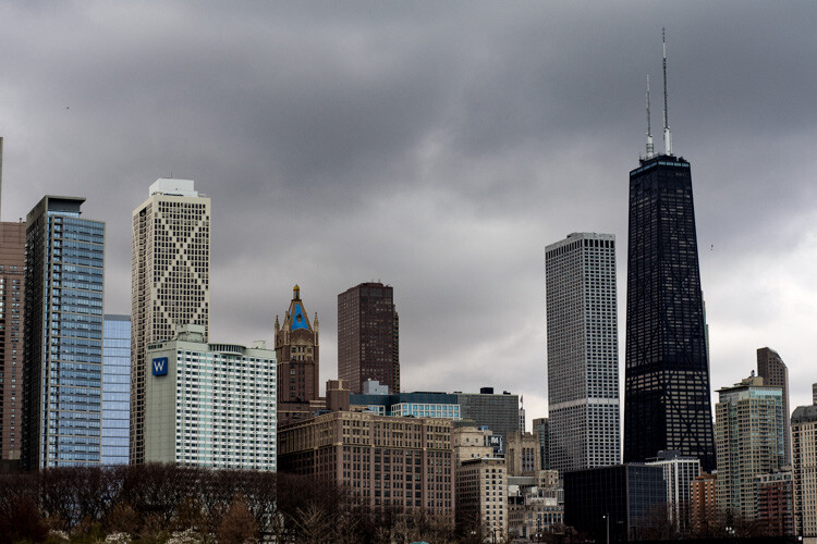
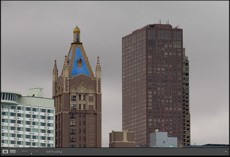
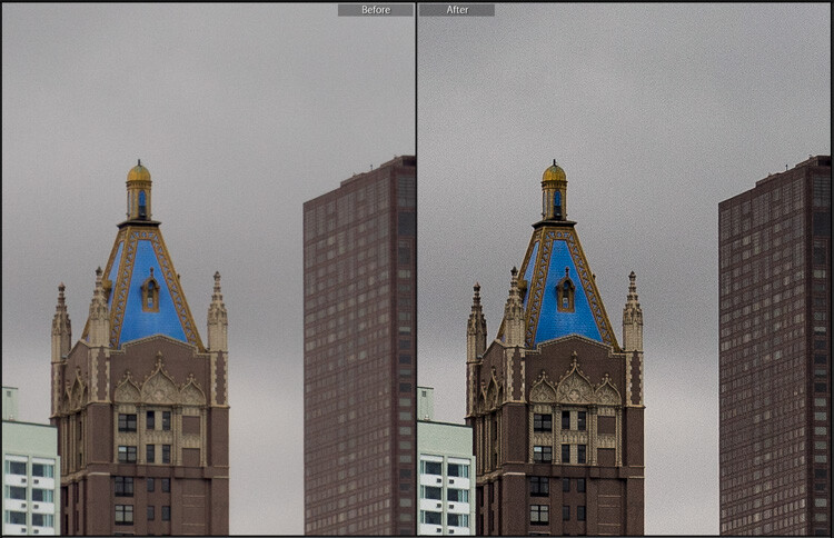
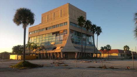
To illustrate how this works, here is a shot of a building that would be an ideal candidate for using the Graduated Filter as a way of enhancing the sky, except for the columns rising upwards from the structure.

How to Use Auto Mask in Lightroom to Make Your Photos Shine

This kind of image is ideal for a Graduated Filter, but the columns make it a little tricky unless you kick it up a notch with Auto Mask.

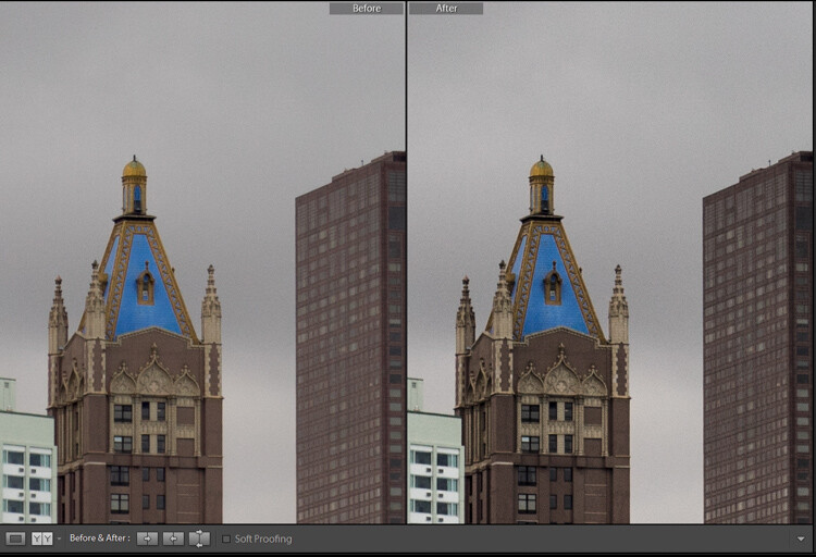
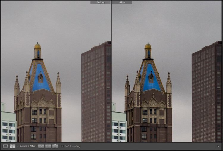
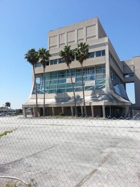
Here’s the same shot, but edited with a Graduated Filter applied that increases saturation and slightly adjusts white balance.

How to Use Auto Mask in Lightroom to Make Your Photos Shine

Adding a Graduated Filter made the sky significantly improved, but also altered the color of the columns.

The issue

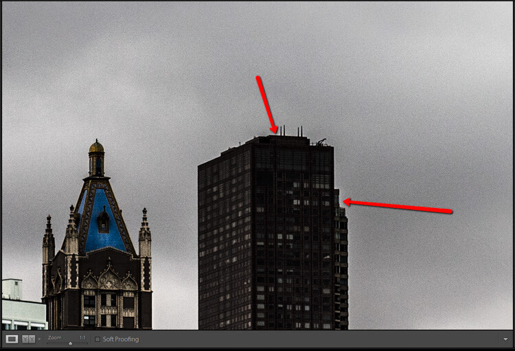
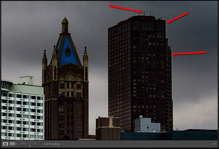
The image is much better, but when Show Selected Mask Overlay is selected, it’s clear that a few problems have cropped up.

How to Use Auto Mask in Lightroom to Make Your Photos Shine

Showing the Overlay lets you see exactly where the Graduated Filter has been applied. The same thing works for the Radial Filter as well.

At issue here is the fact that applying the gradient to the sky has also changed the saturation and white balance of the building itself, particularly the columns. Normally, the solution to this would involve painstaking work in Photoshop to create and edit separate layers, but Lightroom has an easy solution thanks to the Adjustment Brush tool and Auto Mask.

Auto Mask with the Graduated Filter

With the Graduated Filter option still selected, click the “Brush” option at the top of the panel. Not the icon, but the text option that shows up just to the right of “Edit” (shown below).

How to Use Auto Mask in Lightroom to Make Your Photos Shine

You can now use the brush to apply the same edits in the Graduated Filter tool. But rather than applying more edits using this method I like to remove the effect from unwanted areas, especially with Auto Mask enabled. To fix the image of the building and sky so that the gradient is not applied to the columns or to any part of the building, press the [alt] (or [option] on a Mac) key which causes the brush tool to change from a plus (+) with a circle around it to a minus (-) with a circle around it. Then while still holding down your modifier key double-check that Auto Mask is enabled, and brush the parts of the image from where you wish to remove the gradient (see below).

How to Use Auto Mask in Lightroom to Make Your Photos Shine

You don’t have to worry about staying inside the lines. Auto Mask takes care of that for you.

A few clicks of the mouse later and the image now has the Graduated Filter applied only to the parts where you want it, without altering the areas of the photo where it is not needed. All thanks to the power of Auto Mask.

How to Use Auto Mask in Lightroom to Make Your Photos Shine

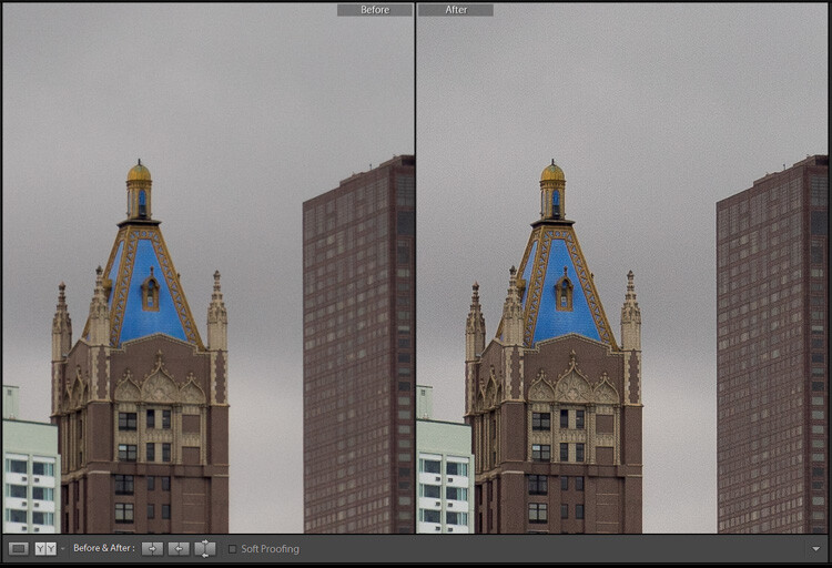
The finished image, with only the sky affected by the Gradient Filter. I also brushed away any traces of the filter from the roof and side of the building.

Notes:

This particular example involved the Graduated Filter, but the same process can be used to modify any edits you make with the Radial Filter as well.

Note: I also want to note that this is only available in current versions of Lightroom, so if you aren’t on Version 6 or the Creative Cloud plan you may not be able to use the Brush tool to edit the Graduated or Radial filters. But the Auto Mask will still work with your Adjustment Brush tool.

Conclusion

While this is clearly a long way from Photoshop’s powerful and meticulous editing capabilities, hopefully, it illustrates that Lightroom is not exactly a slacker in the editing department. I’m curious to hear your thoughts on this as well and also know if there is anything I might have missed. Please leave your responses in the comments section below.

The post How to Use Auto Mask in Lightroom to Make Your Photos Shine by Simon Ringsmuth appeared first on Digital Photography School.


Digital Photography School

 
Comments Off on How to Use Auto Mask in Lightroom to Make Your Photos Shine

Posted in Photography


How to Make Your Photos Shine Using Clarity, Sharpening, and Dehaze in Lightroom

01 May

The goal of any photographer is to make each and every photo stand out from the crowd. Making an image that pops is something that we all strive to achieve, but it’s not always easy to do. Luckily, there are tools at our disposal in Adobe Lightroom that can go a long way to help us achieve an image that we can be proud of, and that catches the attention of the viewer. What are these tools? They are many and varied, but there are three central processing techniques that can make your images transcend the average, and reach the potential you intended. They are Clarity, Sharpness, and Dehaze.

These three tools are deceptively simple and subtle. When used properly, the enhancements they will make to your photos will be nearly imperceivable. They can take your image from good to great, with just a few simple clicks of the mouse. In this tutorial, I will show you how each one of these processing tools affect your photos, and how they can be put to best use, so that your photographs really stand out from the rest. Let’s get started!

After CSD

Clarity

The clarity slider has been around virtually since the inception of Lightroom. You can find it in the Basic panel of the Develop module. It functions to add definition and well, clarity, to your images. It accomplishes this by darkening the lines surrounding the perimeter of objects within your photo. Think of it as contrast on steroids. The clarity slider can really add a lot of punch to your photos, and add drama.

Clarity

Tips for Using the Clarity Slider

  • Don’t add too much. If you push the clarity slider too far to the right, you can begin to see unattractive halos around objects within the frame, resulting in a fake or unnatural looking photograph. If using it globally (applies to the entire image), do so judiciously. Be careful when applying the clarity slider to an entire image, most areas of your photo probably won’t need to be clarified.
  • It’s best to apply clarity after everything else. Since the clarity tool will add a good amount of contrast to your photo, it’s best to apply it towards the end of your workflow. While this is not always true, it is a good guideline to follow in order to avoid the need to backtrack.
  • Use the Adjustment Brush or Graduated Filter tools to apply it to select areas of your image that need clarity. This will enable you to apply clarity only to foregrounds or backgrounds and to specific points you want to emphasize in the image.

Clarity Adjustment

Clarity applied, viewing at 1:1

Clarity applied at +30, viewing at 1:1

Clarity slider taken too far, viewed at 1:1 (100%)

Clarity slider taken too far, viewed at 1:1 (100%)

Sharpness

The art of sharpening an image can often make or break the composition. Sharpening is one of those awesome features of Lightroom which has been around from the beginning, and it only seems to be getting better with time.

Sharpening

The sharpening tool is located under the Details panel in the Develop module. Basically, sharpening is accomplished by adding contrast between pixels so that the area being sharpened appears to have more definition, compared to its surroundings. There are a few key tweaks that you can perform in order to get the most from the sharpening panel.

Make use of the radius slider. The radius controls how many pixels around the perimeter of objects are affected by the sharpening. Think of this as the halo of sharpness. The greater the radius, the more apparent the sharpening will become. Don’t over do the details. You might think the more details you preserve in your sharpening, the better quality your image will be. This is not true. Usually, the farther you move the detail slider to the right, the more grainy and gaudy the image will be. Find a happy medium here and you will be happy in turn.

Global sharpen at +50

Global sharpen at +50

Over sharpened

Over sharpened – this is what too much sharpening looks like at 1:1

Apply sharpening only to the areas you need to sharpen. It’s easy to simply sharpen an entire image instead of taking the time to selectively apply the edit. Rest assured though, if you apply your sharpening using the Adjustment Brush tool you will have a much more aesthetically pleasing result. Much like clarity, you usually do not need to sharpen the whole photograph.

Use the masking slider with the Alt key (Option key on Mac). The masking slider can be considered the most underrated asset in the sharpening panel. It dictates what areas will be sharpened. However, by itself the masking slider is rather lacklustre. This is where the Alt key comes into play. Hold down the Alt key while you adjust the masking slider.

Sharpening Mask

You will see that the image is transformed into a black and white relief image. The areas in white are where the sharpening will be applied; the areas in black will not be sharpened. This is a great way to fine tune your sharpening when adjusting globally. (Note: to keep people’s skin from becoming overly sharp and showing every pore and bump, move the masking slider until the skin areas are black and therefore unaffected by the sharpening adjustment)

Dehaze

This is a feature that was introduced very recently in Lightroom CC. It is a magical little function that people seem to either hate or love.

Dehaze Slider

I for one love this little guy. It’s located under the Effects panel. The explanation of how exactly it works is somewhat cryptic. Here is an answer pulled directly from Adobe Blog:

The Dehaze technology is based on a physical model of how light is transmitted, and it tries to estimate light that is lost due to absorption and scattering through the atmosphere.

Simply put, the dehaze slider can reduce haze within your images. It can also add a mystical fogginess as well if you choose (just slide it the other way).

Dehaze

Basically, it will make an otherwise hazy photo more clear. This comes in handy for photographs of the night sky when your want to make the stars more pronounced, or when you have to deal with physically dense atmospheric conditions.

Tips for Using the Dehaze Slider

  • Keep an eye on your black points within the image. The dehaze slider can cause loss of shadow detail if you push it too far. Use the J key to show highlight and shadow clipping in order to preserve details.
  • Perform your white balance adjustments BEFORE you apply dehaze. The dehaze tool can do some incredible things for your photo, but it can also cause some funky color distortions if you adjust white balance after the fact. As always, strive to obtain optimal white balance before you ever begin to post-process an image.
  • Sometimes an image will benefit from added haze instead of dehazing. Experiment with adding a small amount of haze by moving the dehaze slider to the left. This can add an ethereal glow to some landscapes and even portraits.
Dehaze +20 at 1:10 view

Dehaze +20 at 1:10 view

Dehaze pulled too far

Dehaze pulled too far

As with all post-processing, the less you have to adjust after the image has been made, the better off you will be. The tools in Lightroom are a fantastic way to bring out the true power of your photographs, if you use them deliberately, and with good judgment.

Before clarity, sharpening and dehaze

Before clarity, sharpening and dehaze

After

After

After clarity, sharpening and dehaze were applied

After clarity, sharpening and dehaze were applied

Any adjustments you make to the clarity and sharpness of your photo should never make them appear unrealistic (with exceptions) or detract from your original vision. Even the dehaze tool should be used sparingly and only when required. Just as the saying goes that one brush stroke can ruin a painting, so too can one more click of the slider. The goal of post-processing is to enhance a photograph to the point of meeting your pre-visualzation. No more and no less. Experiment with the tips you’ve learned here and witness the hidden potential within your own photographs!

googletag.cmd.push(function() {
tablet_slots.push( googletag.defineSlot( “/1005424/_dPSv4_tab-all-article-bottom_(300×250)”, [300, 250], “pb-ad-78623” ).addService( googletag.pubads() ) ); } );

googletag.cmd.push(function() {
mobile_slots.push( googletag.defineSlot( “/1005424/_dPSv4_mob-all-article-bottom_(300×250)”, [300, 250], “pb-ad-78158” ).addService( googletag.pubads() ) ); } );

The post How to Make Your Photos Shine Using Clarity, Sharpening, and Dehaze in Lightroom by Adam Welch appeared first on Digital Photography School.


Digital Photography School

 
Comments Off on How to Make Your Photos Shine Using Clarity, Sharpening, and Dehaze in Lightroom

Posted in Photography


Shunned Shine State: 10 More Abandoned Wonders Of Florida

25 Apr

[ By Steve in Abandoned Places & Architecture. ]

abandoned-florida-1a
Florida may be America’s Sunshine State but these odd abandoned wonders reveal a darker side to the land of oranges, alligators and retirement communities.

abandoned-florida-1b

abandoned-florida-1d

Speaking of ‘gators, who ever thought that primeval, carnivorous reptilian monsters would make an alluring and enduring tourist trap? Lotsa folks, actually, though often as not their efforts were unsuccessful – more on that later. Jungleland Zoo in Kissimmee, Florida was one such failed alligator-themed attraction. Originally established in the 1970’s as “Alligator Safari Zoo”, the place changed both its name and its management in 1995.

abandoned-florida-1c

abandoned-florida-1e

The more things change, the more they stay the same… such was the case with Jungleland. Criticism from state and federal wildlife and animal welfare agencies punctuated by the widely-publicized escape of a 450-lb lioness led the the place being shut down and abandoned in 2002. The 126-foot long alligator statue which stood in front of the on-site Gator Motel was demolished in October of 2014. Flickr user amysusanne’s photo set dating from August of 2012 allows us to recall the singular glory of an enormous artificial alligator eating a car.

Heart Of Glass

abandoned-florida-2a

Let the Space Age begin! The First Federal Savings and Loan Association of Cocoa, Cocoa Beach Branch opened in 1962 and featured the Sky Room restaurant – a likely hangout for Major Nelson and Jeannie.

abandoned-florida-2b

abandoned-florida-2c

Dreams must confront reality sometime, however, and in 2004 Hurricane Frances damaged the Glass Bank‘s lower floors so severely it never re-opened. Shattered windows enabled ingress by vandals and encouraged the spread of toxic mold. By 2014 the City had had enough: demolition (watch it here) was approved and within a year this iconic building was no more.

Flying Saucerful Of Secrets

abandoned-florida-3a

abandoned-florida-3b

The so-called “Alien House” in Homestead, Florida, was built in 1974 – purportedly by a big-time drug trafficker whose cover was being a big-cat exotic animal importer. Sounds legit!

abandoned-florida-3c

abandoned-florida-3d

The house was purchased by a doctor from New York shortly before Hurricane Andrew struck in 1992; the powerful storm rendered the unconventional abode uninhabitable by man or beast. The structure then sat abandoned, accumulating an abundance of graffiti, until late 2013 when it was finally demolished.

To The Bat Tower!

abandoned-florida-4a

abandoned-florida-4c

When the late great Robert Burns wrote “the best laid schemes of Mice and Men oft go awry, leaving us nothing but grief and pain,” he could have been describing the sad saga of the Sugarloaf Key Bat Tower (also known as the Perky Bat Tower) in Monroe County, Florida.

abandoned-florida-4b

Built in 1929 at a (for the time) staggering cost of $ 10,000 in a well-meaning effort to house mosquito-eating Mexican Free-Tailed bats, the 30-foot-tall tower was immediately abandoned by the hundreds of bats procured to stock it. Great depression then ensued – in more ways than one. Over 80 years later the still bat-less tower still stands on Sugarloaf Key, mocked by man and mosquito alike.

Next Page – Click Below to Read More:
Shunned Shine State 10 More Abandoned Wonders Of Florida

Share on Facebook


[ By Steve in Abandoned Places & Architecture. ]

[ WebUrbanist | Archives | Galleries | Privacy | TOS ]


WebUrbanist

 
Comments Off on Shunned Shine State: 10 More Abandoned Wonders Of Florida

Posted in Creativity


Rain or shine: Fujifilm XF 35mm F2 R WR real-world sample gallery

30 Nov

Fujifilm’s XF 35mm F2 strikes an appealing balance between size, cost and durability. It’s sealed against moisture and dust, making it a great candidate for use with the weather-resistant X-T1, and at $ 399 is a fairly affordable ‘normal’ prime for Fuji’s X-system. The Pacific Northwest is just the place to test weather-resistant gear, though thankfully we’ve had enough unseasonably dry and sunny days to put together a real-world sample gallery with the 35mm F2. Read more

Articles: Digital Photography Review (dpreview.com)

 
Comments Off on Rain or shine: Fujifilm XF 35mm F2 R WR real-world sample gallery

Posted in Uncategorized


Rain or Shine it’s Photo Taking Time

13 Nov
Check it out

The weather may have decidedly taken a turn for the grey, but our new Digital Time-Lapse Camera doesn’t mind. It wears a weather resistent jacket that lets it shoot time-lapse videos no matter the atmospheric conditions.

It’s true, the temperature might drop, but your camera sure won’t. The Three Way Camera Strap offers three camera slingin’ styles from one super-sturdy strap.

Click through to check them out in the Photojojo Shop (just don’t forget to bring your umbrella).

The Digital Time-Lapse Camera Tweet It!
$ 180 at the Photojojo Shop

The Three Way Camera Strap Tweet It!
$ 40 at the Photojojo Shop

No related posts.


© laurel for Photojojo, 2012. |
Permalink |
No comment |
Add to
del.icio.us

Post tags:


Photojojo

 
Comments Off on Rain or Shine it’s Photo Taking Time

Posted in Equipment


Best Photography Themes Of 2012 To Make Your Portfolio Shine

16 Oct

There are so many photography themes on the market, but not all of them really make your portfolio shine.

Photography Themes of 2012

In this article, you will see a variety of WordPress photography themes with their own styles. Although they’re all very differnt, they have a very important purpose. To show off your portfolio.

Photocrati

photography themes

Remained at the top as the best there is for a WordPress photo gallery theme.

  • Build a beautiful photography website, fast.
  • Galleries management system
  • Sell images with ecommerce galleries!
  • Dozens of styles, customize everything.
  • Great SEO and social media so you’ll be found!

 Poise

poise

  • jQuery driven
  • Contact form
  • Multiple portfolio styles

Noblesse

Noblesse

  • Over 20 page templates
  • Built in contact form
  • Built in Twitter widget
  • Multiple layout arrangements
  • 1 and 2 columns theme

PhotoPics

PhotoPics

  • Uses CSS2 and CSS3
  • Contact form
  • jQuery Driven

Gleam

gleam
  • Full Screen
  • Elegant Framework
  • Shortcodes

Sideways

Sideways

  • PrettyPhoto lightbox gallery
  • Fullscreen background images
  • Contact form
  • Portfolio and Gallery page templates

Pacifico

Pacifico

  • Fullscreen
  • Video Background
  • Contact Form

Project 10

Project10

  • Gallery
  • Audio Player
  • Shortcodes

Amplify

Amplify

  • jQuery driven
  • 5 different Skins
  • Unobtrusive Javascript, Fallback scenarios if Javascript is turned of by the user
  • Images for thumbnails and slider are resized and added automatically

Leviathan

Leviathan

  • Responsive
  • Drag & Drop Module Homepage
  • Widgetized Homepage Block, Footer, Sidebars

Shutter

Shutter
  • Responsive
  • Contact form
  • NextGEN Gallery intergration
  • Html5 slider with fallback
  • PrettyPhoto lightbox integration

Limitless

limitless
  • 4 Home page sliders
  • 8 Home page styles
  • Services page
  • Meet Our Team page
  • Testimonials page
  • 4 Portfolio types (Video portfolio included)

Your Turn

Are you using one of these themes? Comment below with link to your website so we can see.

dslrBlog

 
Comments Off on Best Photography Themes Of 2012 To Make Your Portfolio Shine

Posted in Photography


20 September, 2010 – Photography, Rain or Shine

17 Oct

Is the weather rotten? Raining? Snowing? Too hot? Too cold? A good day to stay in bed and read LuLa on your iPad?

Fugedaboutit. Get up, grab your camera and get outside. That’s the lesson learned by many photographers over the years. Get outside your comfort zone. Push yourself. You may come home at the end of the day, cold and wet, and possibly without a single worthwhile shot. Or you might have captured something wonderful.

You can read more on this thought by Contributor Mark Dubovoy in his latest essay – Photography, Rain or Shine.

Speaking of Mark, he is now on his way to Germany for this week’s bi-annual Photokina show. Mark will be reporting regularly throughout the week on the major product announcements as well as many of the more obscure ones that we know will interest LuLa readers.

"Awesome video presentation.
 
I have learnt so much more after looking through this on the weekend.  The tip about pushing blacks and fill light in the Basic Module was worth the price alone.  My images of a recent trip to the Australian Outback are popping and punching with delight!
 
Thanks Michael and Jeff – I really appreciate you taking the considerable time to share your in-depth knowledge and insights."


The Luminous Landscape – What’s New

 
Comments Off on 20 September, 2010 – Photography, Rain or Shine

Posted in News


Golden “Shine” 3D HD Music Video – for Superbowl 3D & Colorcode(TM) compatible anaglyph glasses

07 Jul

Watch in HD with yellow/blue 3D glasses. The 3D music video for “Shine”, the first single from the new album “Night Reminds the Day”, available from iTunes at tinyurl.com and www.goldentheband.com To view this video you will need yellow-blue glasses with the blue lens on the right eye. This was not encoded using the Colorcode (TM) process, but it is compatible with any yellow-blue glasses that also work with the Superbowl 2009 3D commercials featuring characters from the Dreamworks film “Monsters vs. Aliens” and Sobe lizards. These glasses also promote Intel’s Intru3D ™ concept. If you do not have yellow-blue glasses, you can get red-cyan glasses from http and then watch the red-cyan anaglyph version of this video. If you have the correct hardware, you can view this video in full color at www.dzignlight.com For more information about stereoscopic video, please visit www.dzignlight.com .
Video Rating: 4 / 5

3d Video – 2D to 3D with Adobe After Effects – Part One – Simple Channel Shift. This is part one of a series of Adobe After Effects Tutorials on converting 2D footage to Stereoscopic 3-D with Adobe After Effects. This tutorial covers conversion using a simple channel offset technique. FREE Stereoscopic 3D Birthday Cards, 3D Stock Video and other 3D goodies can be downloaded from enhanced-dimensions.com/wordpress For more info on Enhanced Dimensions: Contact us on 3d@enhanced-dimensions.com +++++++++++++++++++++++++++++++++++ The Stereoscopic 3D Channel on Vimeo vimeo.com/channels/stereoscopic3d The Stereoscopic 3D Channel TESTBED on Vimeo vimeo.com/groups/steroscopic3dchanneltestbed +++++++++++++++++++++++++++++++++++ Built and tested in Adobe After Effects to be viewed with Red Cyan 3D Glasses (Red Blue 3D Glasses). A 3D Stereoscopic Production for Enhanced Dimensions by Andrew Murchie. For details of our FREE 3D Glasses offer please visit our website.
Video Rating: 4 / 5