RSS
 

Posts Tagged ‘Setup’

ZTE launches Axon 9 Pro with super-wide-angle dual-cam setup

04 Sep

ZTE is one of the few smartphone manufacturers who have decided to launch their 2018 flagships at IFA in Berlin. The Chinese manufacturer announced the Axon 9 Pro at the show and with its super-wide-angle dual-camera setup the device looks like a viable alternative to LG’s G7 THinQ and V30/V35 – the only current high-end phones with a similar camera concept.

The secondary camera is an ultra-wide-angle with a 130-degree field of view and 20MP resolution

The ZTE’s main module uses a 1/2.55″ Sony IMX363 sensor with 12MP resolution and 1.4 µm pixel size in combination with a F1.75 aperture. Optical image stabilization and dual-pixel AF are featured as well. The secondary camera is an ultra-wide-angle with a 130-degree field of view and 20MP resolution. Its image data is also used to create a background-blurring “fake-bokeh” effect in portrait mode.

Software features include AI-powered intelligent motion and facial recognition functions, as well as smart portrait compositions. At the front the device features a 20MP selfie camera with F2.0 aperture and fixed focus. The front module can be tasked with face recognition duties but there is a fingerprint sensor on the back for added security as well.

All the components are housed in a body with scratch-resistant glass back and IP68 certification for water and dust resistance

Other specs include a Snapdragon 845 chipset, 6GB of RAM, 128GB of built-in storage and a microSD card slot. The large 4,000mAh battery supports fast charging and the 6.21-inch 1080p+ AMOLED display is HDR10-capable and features an RGB sensor for optimized color balance.

Like previous Axos generations, the 9 Pro comes with Dolby Atmos-enabled stereo speakers but with the new model you have to make do without the 3.5mm headphone jack. All the components are housed in a body with scratch-resistant glass back and IP68 certification for water and dust resistance.

The ZTE Axon 9 Pro will first be launched in Europe and set you back 650 Euros (approximately $ 755). Availability will expand to other markets in the future but no detailed information has been provided yet.

Articles: Digital Photography Review (dpreview.com)

 
Comments Off on ZTE launches Axon 9 Pro with super-wide-angle dual-cam setup

Posted in Uncategorized


More detail on Samsung Galaxy S10 triple camera setup revealed

14 Aug

Last week, Samsung revealed its latest high-end smartphone, the Galaxy Note 9. The Note 9’s camera hardware is identical to last year’s Galaxy S9 Plus dual-camera, but we’ve already seen rumors of the 2019 Galaxy S10 Plus featuring a triple-camera.

Next year’s flagship is likely to be the first smartphone to combine a super-wide-angle and a tele-lens with the primary camera. The super-wide-angle is expected to come with a 123-degree angle of view, and the tele lens with a 3x magnification, offering a wider zoom range than any other smartphone.

Today a report from South Korean publication ET News has provided more detail on the Galaxy S10 camera specifications and if the sources can be trusted all three cameras will come with a different sensor resolution. The main camera will offer a 16MP pixel count, the telephoto camera captures 13MP images and the wide angle is expected to feature a 12MP sensor.

…it’s likely that the output image size will be the same, no matter the zoom setting

Samsung is likely going to merge image data from all three sensors to leverage the combined sensor surface for improved light gathering, and provide a stepless zoom experience. Therefore, it’s likely that the output image size will be the same, no matter the zoom setting. That said, as usual we can’t know for sure at this point.

The ET News report contains another interesting piece of information: While Samsung initially planned to implement the triple camera only in one model of the Galaxy S10 series, the company’s plans changed and there will now be two triple-camera models. Hopefully this should increase the chances of a triple-camera model becoming available at a (halfway) affordable price point.

Articles: Digital Photography Review (dpreview.com)

 
Comments Off on More detail on Samsung Galaxy S10 triple camera setup revealed

Posted in Uncategorized


Avoid Blurry Long Exposure Images with Proper Tripod Setup

05 Apr

A tripod is an important piece of gear for all photographers, but even more so for those who are hooked on shooting long exposure photography at the blue hour like myself (I primarily shoot waterfront cityscapes). Those photos require exposures lasting for minutes with a use of neutral density (ND) filter. Therefore, a sturdy tripod is absolutely essential to keep photos sharp.

Avoid Long Exposure Photographers’ Worst Nightmare by Setting Your Tripod Low

A sturdy tripod is a must for long exposure photography, as there is no chance at all of shooting sharp photos by hand-holding a camera for minutes.

Get a Best Tripod Within Your Budget

This article is not your ultimate tripod buying guide (dPS already has an excellent article on that here), but let me mention a few brief pointers first.

First of all, unlike your camera body, a tripod isn’t something you will upgrade very often. In fact, a good one could last a lifetime, so it’s advisable to get the best possible tripod within your budget. Here are a few other things to look out for when choosing your tripod.

Load Capacity:

The maximum load capacity of your tripod should be at least twice or preferably three times the maximum weight of your camera body and biggest lens combined. For example, my trusty Manfrotto MT190CXPRO3 Carbon Fiber Tripod supports up to 7kg, which is more than sufficient for my Nikon D610 (850g) and Nikon 18-35mm (f/3.5-4.5) (385g) combined (1.25kg).

Tripod Head:

Your tripod head also has a maximum load capacity, and it should at least match that of your tripod. If your tripod supports up to 7kg, but the head only supports up to 5kg, then the load capacity of the entire tripod system is to be 5kg, as the maximum load comes from the weaker component. For your information, I own the SIRUI K-20X Ballhead, which supports a whopping 25kg.

Tripod Weight:

Decent tripods are commonly made of aluminum or carbon fiber. Both are equally good, but carbon fiber tripods are lighter yet more resistant to vibration (hence they are also pricier, too). My Manfrotto Carbon Fiber Tripod weighs 1.6kg (3.5 lbs.) while its aluminum counterpart the Manfrotto MT190XPRO3 weighs 2kg (4.5 lbs.), with all the other specs being pretty much identical).

Tripod Leg Sections:

While 3-section legs provide a more stable platform, tripods with 4-section legs have a shorter closed (folded up for transportation) length and make it easier to pack into a suitcase when traveling. For example, closed length for my 3-section leg Manfrotto MT190CXPRO3 Carbon Fiber Tripod is 61 cm (24 inches), but its 4-section counterpart the Manfrotto MT190CXPRO4 is only 52 cm (20.5 inches).

If you ask me, I recommend choosing nothing but 3-section tripod legs. I personally won’t compromise stability for convenience. That said, my tripod still fits into my check-in luggage (after taking out the center column). Before purchasing, I even tested it by bringing my luggage to the camera shop!

Tall Isn’t Always Cool

Having a good tripod is one thing, but using it correct way is another. I see way too many photographers fully extending tripod legs even when it’s not necessary. The rule of thumb is that the higher the tripod legs are extended, the less stable it gets, leaving more prone to high winds and undermining your chance of taking sharp photos. The photo below (at Victoria Peak in Hong Kong, with an altitude of 552m) is a good example.

Victoria peak - Avoid Long Exposure Photographers’ Worst Nightmare by Setting Your Tripod Low

To take blur-free shots here, I kept the tripod low and put the lens through the bars, rather than fully extending the tripod legs and center column to shoot from above the railing.

Instead of fully extending the tripod legs (and even the center column, which is a big NO-NO) to position the camera above the railing, I put the lens through the bars and kept the tripod as low as needed to minimize the risk of vibration.

Actually, I learned this from a previous mistake. I shot at this exact location the previous year but screwed up the opportunity by setting up the tripod too tall (over the railing by extending the center column) in high winds, and none of the photos came out sharp.

Center column - Avoid Long Exposure Photographers’ Worst Nightmare by Setting Your Tripod Low

Extending the center column in high winds or when shooting long exposure photography is a recipe for a disaster. It’s very unlikely that you’ll be able to capture sharp photos this way.

Long Exposure Photographers’ Worst Nightmare

Let’s say you’re shooting waterfront cityscapes at blue hour with a few minutes of long exposure at a tourist-centric area (places like Victoria Harbour in Hong Kong, The Bund in Shanghai, etc.) on your holiday. It may be your once-in-a-lifetime trip, and the weather is clear and perfect.

Such places are always crowded especially at sunset and dusk times with herds of tourists flocking to take snaps, selfies, and groupies. Extending all the tripod legs inevitably takes more space on the ground, which has a huge risk of someone accidentally kicking it during long exposure and ruining your potentially epic shot. This is long exposure photographers’ worst nightmare (and happened to me once).

Crowded spot - Avoid Long Exposure Photographers’ Worst Nightmare by Setting Your Tripod Low

At a crowded photography location like this (Merlion Park in Singapore), keep your tripod setup as low as possible so that it takes less space on the ground and reduces the risk of someone accidentally kicking your tripod legs.

Tripod Alternatives

To avoid such a nightmare, I’m also using a sort of a tripod alternative that helps stabilize my camera setup. A clamp tripod like the Manfrotto 035 Super Clamp without Stud comes in handy at places with high winds or at crowded city shooting locations where you feel worried about someone accidentally kicking your tripod legs.

It’s not that you can use a clamp tripod anywhere you want, as it needs a railing or something that it can be clamped onto. But where possible, this setup can be rock solid (with a load capacity of 15kg) and the resulting long exposure photos are appreciably sharper than those shot using a regular tripod.

Super clamp in use - Avoid Long Exposure Photographers’ Worst Nightmare by Setting Your Tripod Low

A Super Clamp is like a game changer, it’s small and strong.

Set up clamp - Avoid Long Exposure Photographers’ Worst Nightmare by Setting Your Tripod Low

To mount a DSLR on a Super Clamp, first, plug a separately-sold Manfrotto 208HEX 3/8-Inch Camera Mounting Platform Adapter (or a cheaper alternative Manfrotto 037 Reversible Short Stud) into a Super Clamp socket and secure it with the double lock system. Then mount a tripod head with DSLR on the mounting platform adapter, just like you do with your regular tripod.

Conclusion

I hope these tips help you avoid making the same mistakes I did. Don’t blindly follow the mantra that says, “Extend your tripod and place the viewfinder at your eye level” (you’ve probably heard about that before!).

There’s nothing wrong with setting up your tripod low and bending down. This increases your chance of capturing sharp long exposure photos in high winds and also prevents your tripod legs from getting accidentally kicked.

If you have any other tips or experiences to share, please do so in the comments below.

The post Avoid Blurry Long Exposure Images with Proper Tripod Setup appeared first on Digital Photography School.


Digital Photography School

 
Comments Off on Avoid Blurry Long Exposure Images with Proper Tripod Setup

Posted in Photography


Sony is working on high-sensitivity dual-camera setup

26 Feb

If you were hoping for the new Sony Xperia XZ2 models to feature a dual-camera setup, you were disappointed. Sony is by far the largest maker of image sensors but the Japanese manufacturer’s own smartphone models still have to make do without the dual-cam technology that has almost become a standard on high-end devices.

That said, there is a good chance the wait for a Sony-branded dual-camera smartphone might be worth it. Sony executives told us the company was working on a dual-camera solution that would allow for low light shooting with ultra-high sensitivities – ISO 51200 in stills mode and ISO 12800 for video.

A test scene with extremely low illumination inside a black box is used to demonstrate the performance of the the dual-cam prototype (top) compared to a current model (bottom).

No further technical detail was provided at this point but given the camera module will be powered by a new “Fusion” Image Signal Processor, it’s fair to assume the high sensitivities will be achieved by some kind of computational imaging process, merging image data captured simultaneously on the two sensors of the dual-camera.

This is not a totally new concept – for example Huawei is merging image data from an RGB and a monochrome sensor on some of its dual-camera models – but given Sony’s bold high ISO claims there is a good chance its engineers have found another secret ingredient to boost performance to new levels.

Sony claims the new system is pushing smartphone low light performance into ILC territory.

A low-light demo setup behind the scenes at the Sony booth shows that the new system is capable of capturing good exposures in extremely dim lighting. Given Sony’s typical announcement cycles, we’ll probably have to wait around 6 months (i.e. until IFA in September) to see how the system performs in a production device but it’s definitely something to look forward to.

The Fusion ISP is an essential component in Sony’s upcoming low-light dual-camera setup.

Articles: Digital Photography Review (dpreview.com)

 
Comments Off on Sony is working on high-sensitivity dual-camera setup

Posted in Uncategorized


How to do Clamshell Lighting: A Reliable Two Light Setup

15 Sep

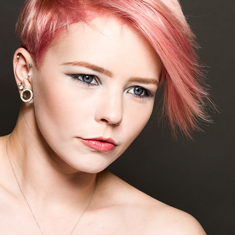
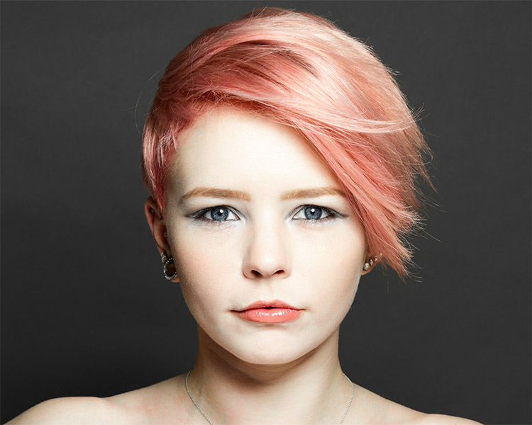
When it comes to lighting, there is an infinite choice on how you can light your portrait subjects. That’s great and it’s addicting, but when you are starting out it can also be overwhelming. To counter the inevitable information overload that you will get researching lighting, it is a good idea to know a few basic setups that you can fall back on should you be pressed for time or should you need a backup. This article will introduce you to a basic two light setup often called clamshell lighting.

It will provide you with a beautiful soft light with faint shadows and glorious catchlights. Clamshell lighting works very well and it is very flattering for men and women of all ages and it could be a very useful technique in your toolkit.
How to do Clamshell Lighting: A Reliable Two Light Setup

What is clamshell lighting?

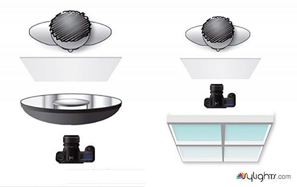
In a nutshell, clamshell lighting is a configuration where two lights are placed facing toward your subject at a 45-degree angle. Your key light is facing downwards at a 45-degree angle and your fill light is a facing upwards at a 45-degree angle. The resulting appearance of your lights from the side somewhat resembles an open clamshell (imagination may be required).

How to do Clamshell Lighting: A Reliable Two Light Set-Up

Apologies for my stick figure skills, but here you can see just how easy clamshell lighting is to do.

If you start with your main light on axis (directly in front of your subject), raised up and pointed downward, you have a basic butterfly lighting set-up. Adding the second light from below serves as fill and eliminates any heavy shadows caused by the key light. This combination results in soft, flattering light that works well with almost any subject.

What you need

How to do Clamshell Lighting: A Reliable Two Light Set-Up
To create a clamshell lighting setup, you need two light sources. If you have modifiers to soften your light, all the better, but as long as you have two light sources you can get started with clamshell lighting.

I do recommend starting with a pair of softboxes roughly the same size. Once you’ve mastered that, you can then start experimenting with other modifiers such as beauty dishes and strip boxes.

Setting it up

How to do Clamshell Lighting: A Reliable Two Light Setup
Start with your key light (your main light source) and place it in front of your subject. Go closer for softer light and faster light fall off, or further away for a harder light. Place it above your subject, pointed directly at their nose. Meter for your desired aperture (we’ll use a hypothetical f/11 from this point) and take a test shot.

If everything is setup correctly you should have a decently lit image with deep shadows under your subject’s nose and chin.

How to do Clamshell Lighting: A Reliable Two Light Setup

Now, take your fill light and place it directly underneath your key light. Point it upwards toward your subject at 45-degrees and meter this light for two stops below your preferred aperture, which would result in f/5.6 for our hypothetical aperture of f/11. If the effect is too strong and your fill light is obliterating the shadows, turn the power down. If it isn’t doing enough, turn it up. The main thing to look out for is that you need to ensure that your fill light is not overpowering your key light. This would result in your image being lit from below with your shadows being filled in from above. This is not a good look to go for.

How to do Clamshell Lighting: A Reliable Two Light Setup

What to watch out for

The main thing to look out for is that you need to ensure that your fill light is not overpowering your key light. This would result in your image being lit from below with your shadows being filled in from above. This is not a good look.

Now that you have two lights sharing the same vertical space, stand behind them and shoot through the gap. If there isn’t much of a gap, raise and/or lower both of your lights (change the angle of each and take another meter reading if you need to) until you have enough room to work in the middle.

That’s all there is to it. Clamshell lighting is really is easy to set up and with a bit of practice you will be able to get it up and running in a couple of minutes.

How to do Clamshell Lighting: A Reliable Two Light Setup

Note: The softbox at camera left is NOT on so isn’t doing anything.

Alterations

Although I suggested using two evenly sized softboxes, to begin with, that is by no means a restriction of any kind. Feel free to use any kind of modifier you want and experiment liberally. Have a pair of strip boxes you want to use? Go for it. Do you want to use a beauty dish as your key light and an umbrella as fill? Sure. How about a snoot and a small soft box? Absolutely. Use what you have at hand.>

Also, you are not limited to just using two lights from the front. Feel free to add rim and hair lights and a background light as your images require.

Examples


How to do Clamshell Lighting: A Reliable Two Light Setup

How to do Clamshell Lighting: A Reliable Two Light Setup

How to do Clamshell Lighting: A Reliable Two Light Setup

How to do Clamshell Lighting: A Reliable Two Light Setup

This image included a third light serving as a background light.

How to do Clamshell Lighting: A Reliable Two Light Setup

How to do Clamshell Lighting: A Reliable Two Light Setup

Conclusion

If you’ve made it this far, hopefully, you can see how useful a basic clamshell lighting setup is, and how it might serve you. It’s easy, fairly compact and produces lovely, flattering light. If you’re still not sure, I urge you to try it for yourself. You may very well fall in love with it.

The post How to do Clamshell Lighting: A Reliable Two Light Setup by John McIntire appeared first on Digital Photography School.


Digital Photography School

 
Comments Off on How to do Clamshell Lighting: A Reliable Two Light Setup

Posted in Photography


Back to basics: A simple three-point lighting setup for headshots

16 May

Music photographer PJ Pantelis points out that three point lighting is nothing new, but it’s not something every self-taught photographer has learned. If that sounds like you and you’re looking to experiment with studio portraiture, his recent demo provides a great starting point. 

Articles: Digital Photography Review (dpreview.com)

 
Comments Off on Back to basics: A simple three-point lighting setup for headshots

Posted in Uncategorized


How to Use 1 Natural Light Setup to Create 3 Different Portrait Looks

22 Sep

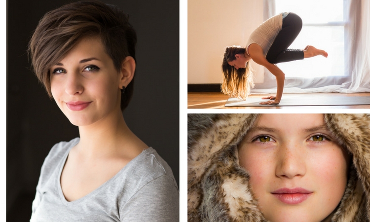
As a portrait photographer, the majority of my work is shot on location. This can be outdoors or in my clients’ homes or places of business. I mostly shoot using natural light and have become adept at finding the best light source in any location as well as creating backgrounds that won’t interfere with the subjects. In this tutorial, I want to show you an easy, natural light portrait setup you can recreate in your own home. Simply by repositioning yourself and your model, you can create three distinctly different portraits from this one setup.

one natural light setup - 3 looks

No special lighting or fancy equipment is needed, and the techniques are straightforward and easy to master. Experiment to create different looks using various backdrops such as plain walls or sheets, or different outfits for your subject. You can also get different effects by changing your lens, distance to the subject, and experimenting with different apertures.

Equipment

Below is a list of the items I have used for this setup and suggested substitutes:

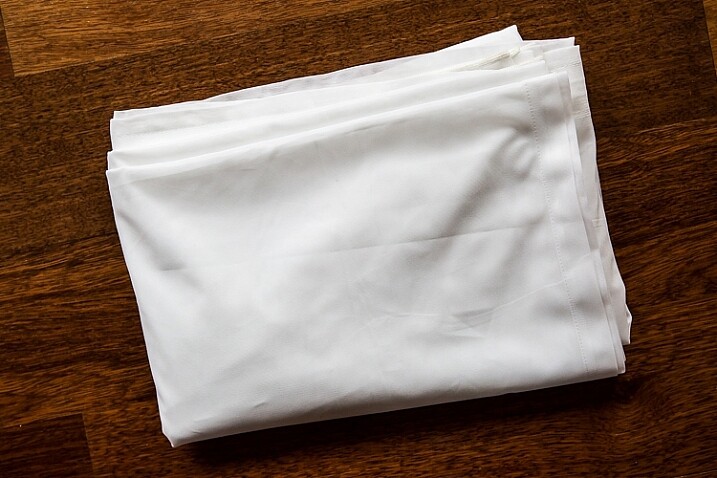
  • SHEER CURTAIN or FABRIC: You can buy a sheer curtain or length of fabric from any fabric or haberdashery store. I picked this one up from the clearance table at my local Spotlight store (Australia) for under $ 20.
Image showing basic natural light portrait setup using a white cloth

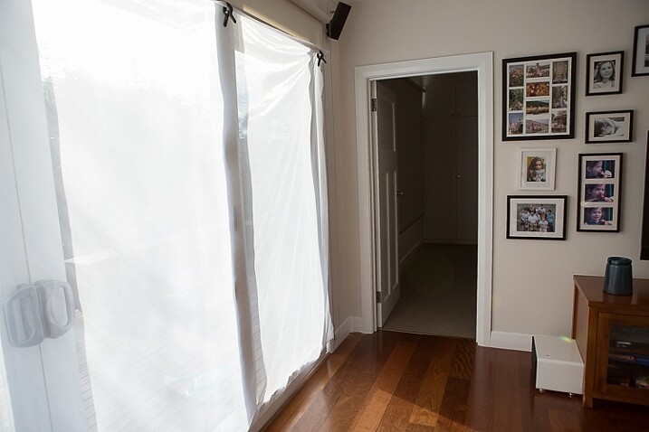
A white sheer curtain or large sheet of sheer fabric will filter the window light.

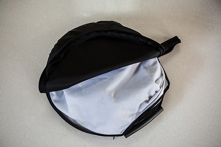
  • REFLECTOR: I have a circular, five-way reflector that follows me everywhere. Each side has a different colour; white, silver, gold, and black, plus a diffuser. It folds into a neat little disc, is lightweight, and can be thrown into the back of my car. You will get endless use out of a portable reflector, and at around $ 30 from Amazon, it’s a worthwhile investment. However, if you don’t want to rush out and buy a reflector (or wait for your order to arrive before you start shooting) a large piece of white card, polystyrene, or foam board, will work equally well.
Image showing basic natural light portrait set-up with a reflector

This reflector was a great investment at around $ 30. It is lightweight and folds up compact to the size of a dinner plate.

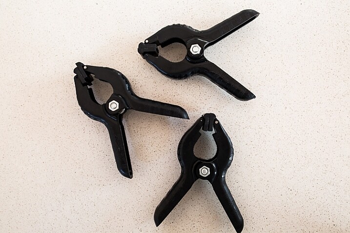
  • BACKDROP CLAMPS: another Ebay or Amazon purchase, my backdrop clamps come in packs of 12 for under $ 20. These are infinitely useful for creating makeshift studios. In this instance, I used them to attach the sheer curtain to the rolled-up window blind. You can also use masking tape to stick the curtain directly onto the window, or use heavy-duty stationery clips.
clamps can be helpful for a natural light portrait setup

Backdrop clamps can be purchased inexpensively from Ebay or Amazon and similar.

Lens

My favourite portraiture lens is the Canon EF 85mm f/1.8, but you can use a 50mm, a 100mm – whatever works in the space you have. A tighter space will require a shorter focal length.

Basic portrait setup

Look for a window or glass door with a good strong light source coming through, so that you can shoot at the lowest possible ISO. If the window has a sheer curtain, pull it across to filter the light. If there is no curtain, you can attach a piece of sheer fabric to the window using the backdrop clamps or masking tape.

As you can see, the setup couldn’t be simpler. This is the corner of my living room, with sliding glass doors to the left of the shot. The strong afternoon light is filtered with a sheer curtain clipped to the bottom of the roller blinds. I have closed the curtains in the adjoining room to create a dark background for my subject. If your room layout doesn’t allow this, you can hang a sheet or large piece of coloured fabric behind your subject, or just use a plain wall.

natural light portrait setup background

The setup couldn’t be simpler.

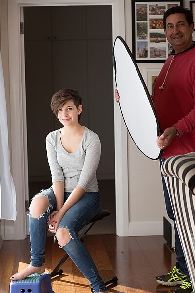
As you can see in the setup below, I brought my model forward (away from the open door behind her). This is to ensure she has good light on her face, and that there is sufficient distance between her and the room behind her to make sure it is completely out of focus. In this pull-back shot, you can see some detail in the room behind her. However, in the first pair of portraits, further along, you can see no background detail. The room behind looks like a studio backdrop.

Add a reflector

If you are going to use a reflector, you’ll need someone to hold it for you. If there is no-one to help, try propping it on a chair. Let your creative photographer’s brain get to work and figure out a creative solution.

natural light portrait setup reflector and assistant

You’ll need an extra person to hold the reflector – in this case, my husband!

Portrait #1: side lighting and a reflector

This is my most-used natural light setup. Side lighting contours and shapes the face, and is flattering for most subjects. If your subject is male, or if you want to create a moodier portrait, you can try moving the reflector further away from your model or removing it altogether. This creates more contrast by increasing shadow on one side of the face.

Your model can sit, stand, or even lie on the floor if the window is low enough. How you position your model’s face and body is up to you. To recreate the look below, your model’s face needs to be at a 90° angle to the main light source (the window). Her body turns 45º away from you. The door behind my model is opened and I darkened the background room to minimize distracting elements. Position the reflector on the shadowed side of her face, to bounce the light back and fill in the shadows

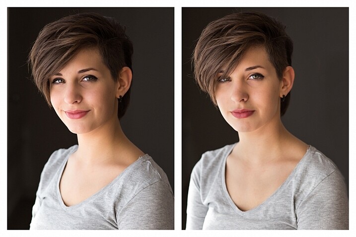
In the photos below, the image on the left is shot without a reflector. The one on the right is shot with a reflector. The effect in this example is subtle because the light in this room is already balanced somewhat by small, high windows on the opposite wall to the main window. In the photo on the right, you can see how the reflector brightens the face and fills in the shadows, particularly the under-eye shadow of her left eye. It also brings out more detail and highlights in her hair and improves separation from the background.

natural light portrait setup with and without reflector

Left (no reflector): ISO 320, f/4, 1/200th. Right (with reflector): ISO 320, f/4, 1/320th.

Portrait #2: shooting into the backlight

I love this technique for photographing women and girls. It creates soft, non-directional  lighting on the face, so is flattering to every age group. And the backlighting creates a gorgeous halo around the hair. This works especially well if the model wears her hair out, or wears a dress with some sheer elements – think darling little girls in fairy costumes and tutus!

Technique for backlighting

Using the same window setup as before, your model sits or stands with her back to the window. Position the reflector in front of her, bouncing the light back into her face. Your light meter will try to read the light coming from the window, and will underexpose your model’s face. You can obtain the correct exposure by getting in close to her face to set your exposure. You might also bracket your exposures and check the back of the camera until you’re happy with the result (review the histogram but note that the background area may show clipping – that’s okay). To get the exposure right on the face, you will lose detail in the background, which is the idea!

natural light portrait setup backlighting

ISO 320, f/4, 1/160th

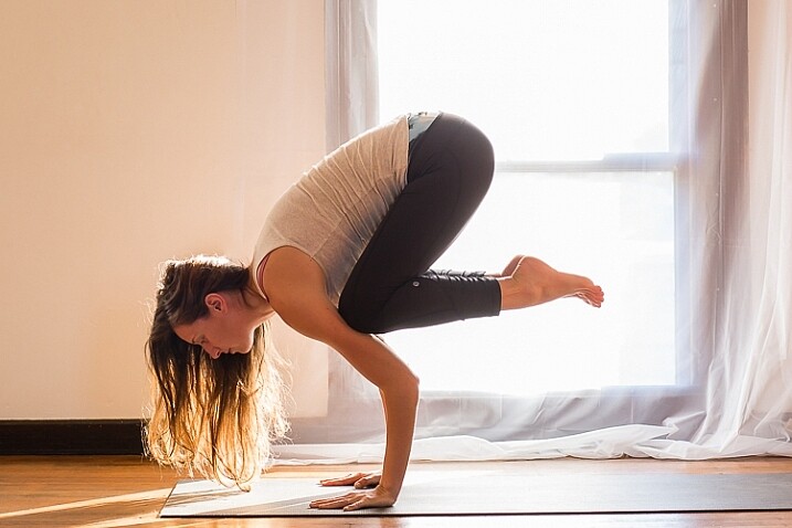
The photo below is a yoga instructor posing in front of a window on the floor of her studio. The backlighting is beautiful through her hair, and the warm tones of the timber floor reflect back on her skin to give her a golden hue. The lighting technique is identical to the previous photo. But in this photo, I have allowed the curtain and window to be visible as I think it adds something to the scene.

natural light portrait setup backlighting

ISO 500, f/5, 1/80th.

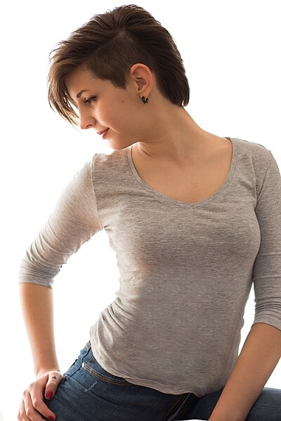
Portrait #3: shooting with front-on light

For this set-up, the sheer curtain remains in place. Your model faces the window, and you position yourself between your model and the window. If you are taking a wider shot than the example below, you may be able to bounce light into the back of her hair with a reflector.

Frontal lighting removes virtually every shadow on the face. It brings out detail and colour in the eyes, and can be quite striking with the right subject. However, this technique is not for everyone. It can give the face a flat, two-dimensional appearance, and if the light source is too strong, your subject will squint. This lighting tends to highlight every imperfection, which is fine if your subject happens to be young and gorgeous. But, it can be too harsh for a mature model, or someone with a lot of blemishes.

Examples of front lighting

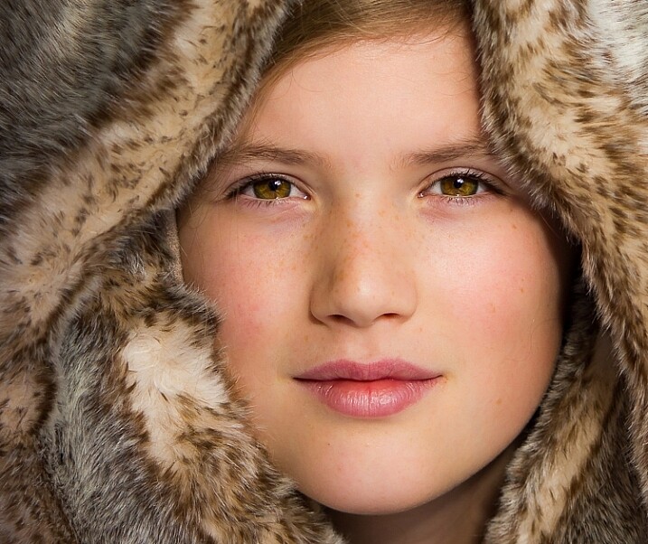
The photo below of a young girl snuggled into a faux-fur hood has been enduringly popular on my social media sites. It was shot using this lighting technique in warm, late-afternoon light.

natural light portrait setup front lighting

ISO 400, f/4.5, 1/200th.

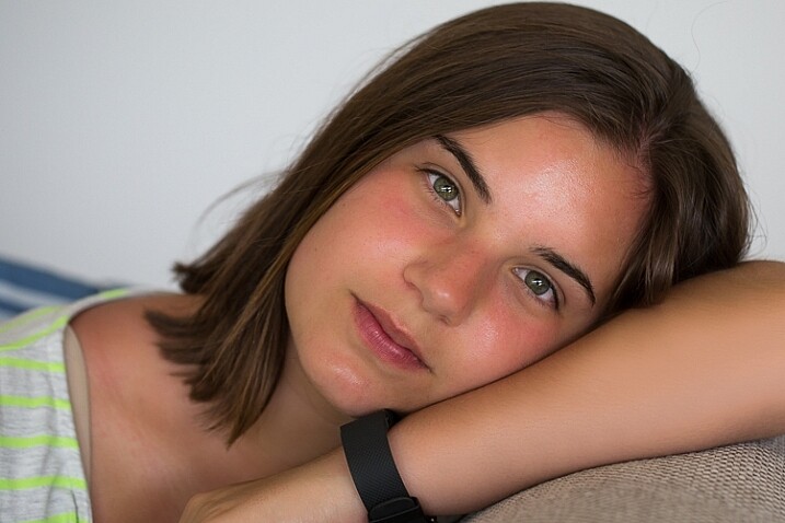
The photo below of my daughter, sun-kissed after a day at the beach, was photographed with front-on lighting. As we were  on vacation and I didn’t have my usual bag of tricks at hand, I didn’t use a sheer curtain to filter the light. As you can see, the highlights are more pronounced than those in the first photo, but the effect is similar.

natural light portrait setup front lighting

ISO 250, f/3.5, 1/125th.

Now it’s your turn

I’d love to hear how you get on trying this setup at home. Please post any questions, comments or examples of your portraits in the comments section below.

Don’t forget, there is also our dPS Facebook Group, which you can join to share your photos and get a critique from other dPS readers.

googletag.cmd.push(function() {
tablet_slots.push( googletag.defineSlot( “/1005424/_dPSv4_tab-all-article-bottom_(300×250)”, [300, 250], “pb-ad-78623” ).addService( googletag.pubads() ) ); } );

googletag.cmd.push(function() {
mobile_slots.push( googletag.defineSlot( “/1005424/_dPSv4_mob-all-article-bottom_(300×250)”, [300, 250], “pb-ad-78158” ).addService( googletag.pubads() ) ); } );

The post How to Use 1 Natural Light Setup to Create 3 Different Portrait Looks by Karen Quist appeared first on Digital Photography School.


Digital Photography School

 
Comments Off on How to Use 1 Natural Light Setup to Create 3 Different Portrait Looks

Posted in Photography


How to do a Simple Inexpensive Setup for Newborn Photography

28 Apr

When I first started taking on clients, as a new photographer I thought newborns would be my favorite. They seemed so easy, lying around, ready to be molded into any pose I desired, nothing to it. Fast forward five years and hundreds of dollars later, they are still my favorite, but I’ve wasted a lot of money, sweat, and tears trying to figure out how to do it correctly. If you are just starting out, either with new clients, or your own baby, this article is for you, before you throw away a lot of money.

How to get started doing newborn photography

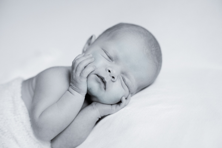
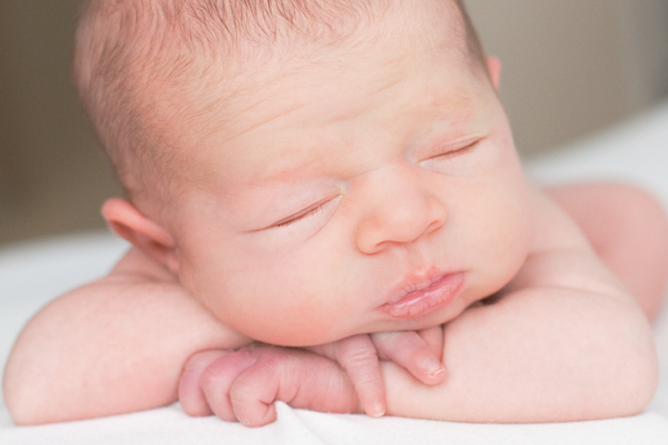
Newborn

Keep it simple with props

I figured to get the cutest newborn portraits I needed lots of hats, bows, blankets, and baskets. Then I needed colors that worked for boys, and ones that worked for girls. I bought tiny cribs, and big wooden letters to match the baby’s first initial of his or her first name. My house was so cluttered with photography gear we weren’t able to house our guests in our guest room, and I’m not even done.

I had a fake wood floor that was made of paper so I also had a pull out shelf from our armoire that was big enough to support the fake floor on the carpet. I had heaters, and backdrop stands, and so many blankets and backdrops they over took me. Every time I read an article about a photographer and what gear she used to get ONE specific photo, I would hunt down those items for myself. They mentioned she used rolled up receiving blankets under the baby’s head? Fire up Amazon, I need to get myself some of those. When would I be satisfied? I wanted to spend money on lenses, and photography classes, but I was so sure one more prop would produce the most amazing baby portrait, so that’s where all my money went.

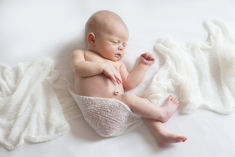
Last year I read a photography article called, Less is More. It opened my eyes. It struck me that the baby is the art, not the props. The props will probably date your photograph (have you seen the photos that are black and white except for a red rose in color?). But a baby, on a simple background, with only the simplest of accessories, will be stunning, because of the baby. That is why I’m here to tell you, save your money, especially if you’re just starting out. You can achieve phenomenal photographs of babies with only the very basics, and it’s so much easier than trying to fit her into that basket while trying to keep her asleep!

Scarf

Setup

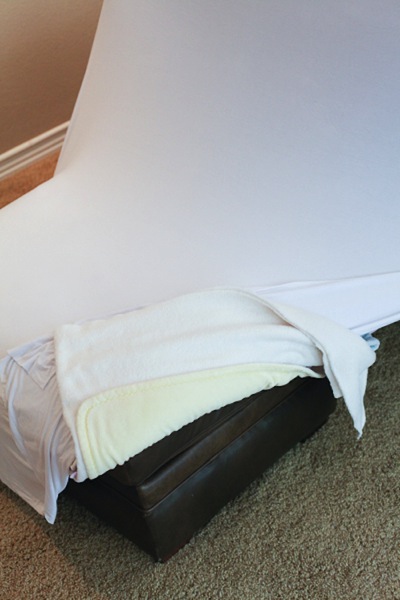
First of all, you need something to put the baby on. If you are working on posing the baby (versus lifestyle photography which requires no posing), you need something that is slightly malleable. Many professional photographers buy expensive beanbags, but you don’t need that. I actually use a leather ottoman we have here in our house, and when I do sessions at client homes I bring it with me.

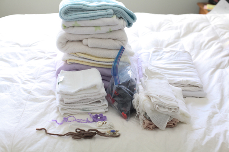
Of course, last week I forgot to load it in my car for a newborn session. I got to the house and realized it was missing. They didn’t have any ottomans of their own, so instead I pulled the two large bottom cushions off their couch and stacked them on top of each other. For both the cushions and the ottoman I layer multiple blankets on top of each other. In between the blankets I have a few layers of waterproof sheets that are leftover from my own children, and a heating pad. The multiple layers of blankets make it soft and pliable, and the top few layers are the various backdrops I use to photograph the babies on, so I just keep removing layers for the different backgrounds (see below).

Ottoman

I only shoot on black, white, and cream. I have gotten away from colored blankets, but that’s my choice. I used to have colored blankets as well, and you may still want that, but don’t buy the expensive options off of etsy, use blankets you already own. I do recommend neutral colors though because bright reds, pinks, and greens can cause colorcasts on baby’s skin.

Positioning the baby

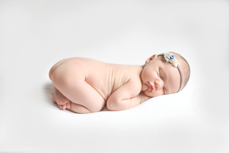
The stack of blankets help the baby to sink down a little bit if you want her to, and I also bought a stack of white washcloths from Costco, that I bring with me to roll up and stick in between the blankets and the baby to get her propped and curled exactly how I want her. A boppy (feeding pillow) under a blanket may be a good way to get some of the poses you want, and I’ve found that if you can’t use a boppy, another good option is a neck pillow like you’d use on the plane. I actually prefer that to the boppy because it’s small, and perfectly sized for a baby’s body, so it helps keep the baby propped in place if you lay her on her belly with her arms and head resting on the pillow.

Gear

Background

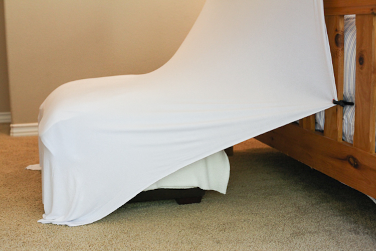
I like a continuous look for my backdrop, so I use the same material under the baby and stretch it up to create the background behind the baby. I own a stand that I bought for the purpose of holding up backdrops (or you can make your own), but you don’t need one of those. Invest in some heavy-duty clips, and you can pin up the material or blanket to anything above the baby. I’ve used bed frames, chair backs, stepladders, tables, etc., it’s just a matter of looking around you to see what will work. When I’m at a client’s house I pull stuff from all over the house to use during the session. I always put it all back the way I found it, and no one has ever had any issues.

Setup

Lifestyle or unposed photography

So I mentioned lifestyle photography. It’s something that is becoming ever more popular. Essentially, it’s about capturing photos without posing the family too much. Of course you will set the scene. You might move some furniture around, lay a blanket on the ground, and tell the family members where to sit or stand. But beyond that, you let them sort of do their thing. The photos are natural, realistic, and lovely. But I think lifestyle alone is not enough when we’re talking about newborn photos. Of course they are easier, and require almost no additional props at all, but most people want at least two or three posed photos of the baby alone.

Details

Accessories

Now for the accessories. Again, you don’t have to spend a ton of money on this stuff, and believe me, it’s easy to rack up a pretty big bill once you start purchasing. My favorite backdrop is a stretchy knit fabric that when smoothed over my blankets, has no wrinkles. I bought it at a craft store. I also bought an extra, smaller piece of the same fabric to wrap the babies in. I love the continuous look. But if you don’t want to buy anything at all, look around – you probably have some scarves, shawls, or small baby swaddling blankets you can use. I’m not a huge fan of big bows, but I do like small tiebacks. You can purchase one of two of them, or make your own with some twine and pretty beads.

Tieback

Once you start looking around at what you already own, I bet you can find many different options for positioning, backdrops, and wraps. To add some variety you can purchase some scarves, head ties, or small pieces of material at the fabric store that won’t set you back a lot of money, but will bring the needed variety in your photos.

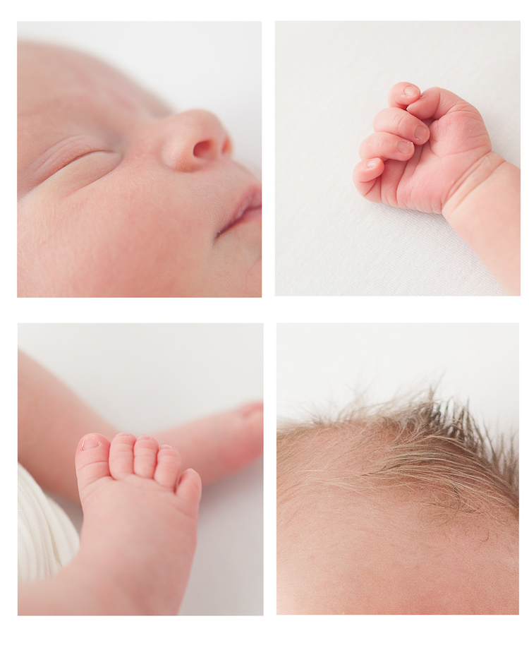
Good luck, and remember it’s the baby you’re trying to capture, not the props. Don’t forget those long eyelashes, those tiny toes, and those perfect pouty lips.

Small details

People photography week

This week on dPS we’re featuring articles all about different kinds of people photography including portrait, event and travel photography. See all the previous ones below, this article is the last one in the series.

  • How to Take Low Key Head-shots
  • How to Do a One Light Portrait Setup and Use it as Your Back-up Plan
  • Travel People Photography – Tips and Pitfalls
  • 8 Tips for Photographing Men
  • 24 Diverse Images That Showcase People Photography
  • Weekly Photography Challenge – People Photography
  • Tips for Getting Yourself to Relax as a Photographer and Have More Successful Portrait Sessions
  • 5 Good Reasons to Add People into Your Landscape Photography
  • 6 Must-Have People Shots to Capture When Photographing Corporate Events
  • 4 Tips to Help You Get Started Doing Lifestyle Photography
  • 3 Tips for Photographing Children Without Losing Your Mind

googletag.cmd.push(function() {
tablet_slots.push( googletag.defineSlot( “/1005424/_dPSv4_tab-all-article-bottom_(300×250)”, [300, 250], “pb-ad-78623” ).addService( googletag.pubads() ) ); } );

googletag.cmd.push(function() {
mobile_slots.push( googletag.defineSlot( “/1005424/_dPSv4_mob-all-article-bottom_(300×250)”, [300, 250], “pb-ad-78158” ).addService( googletag.pubads() ) ); } );

The post How to do a Simple Inexpensive Setup for Newborn Photography by Kim Kelley appeared first on Digital Photography School.


Digital Photography School

 
Comments Off on How to do a Simple Inexpensive Setup for Newborn Photography

Posted in Photography


How to Do a One Light Portrait Setup and Use it as Your Back-up Plan

21 Apr

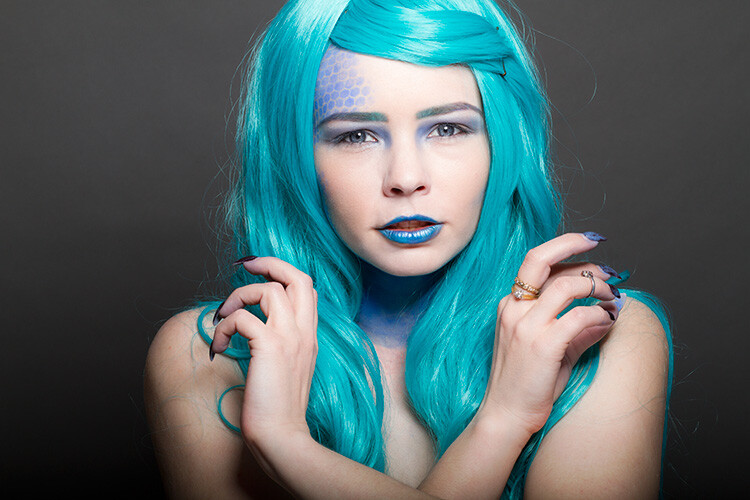
one-light-beauty-setup-3320

When photographing people, every session is different and every subject is different. This leads to a lot of scope when it comes to lighting choices and experimentation. This variety is fantastic, and it’s a large part of why portraiture is such a rewarding pursuit.

Unfortunately, with too much experimentation, it is all too possible to end a session with a collection of sub-standard images. Yes, this exactly how to grow and develop as a photographer, but where does that leave your subject? Often enough, this situation means that you’ve gotten what you need from the session, chiefly experience, but the subject is left with less than stellar photos for their time. This isn’t much of a problem if you’ve wrangled your kids to sit for you, or if you have paid someone else to pose for you. If you’ve been paid for this portrait session, however, this becomes problematic and can be devastating to your future efforts.

A good way to alleviate this is to always include a technique that you’ve practiced thoroughly. Doing this may not ignite your creative spark, but once it’s done, you can experiment until your heart’s content, while safe in the knowledge that you will still have something usable at the end of the day.

one-light-beauty-setup-3251

This article will give you a simple, yet solid, one light technique that works with strobes, flashguns (speedlights) and even window light. It will work with just about any modifier and suits men, women, children, and other subjects just fine.

Equipment

Here’s a list of what you need:

  • A light source: Either flash or window light will work. In terms of modifiers, beauty dishes and softboxes are a great starting point.
  • A white reflector: Don’t have a dedicated reflector? A sheet of white poster board or foam core is a perfect and cheap substitute.

Set up

First, have your subject stand or sit where you need them. If possible, keep them at least five feet from the background. Place your light source directly in front of them, between two and four feet away (60-120cm). Angle the light source (if using flash) so it’s pointing directly at your subject. Watch the shadows falling under their nose and mouth. For this technique, you’re looking to minimize the contrast on your subject’s skin. If the shadows are too long, lower your light source until they are minimized (also make sure you can see the light in their eyes as a catch-light).

Place your reflector directly against your subject, and parallel to the ground at waist level. For ease, you can place it on a stool or a card table. If your subject is sitting, just have them hold it across their knees.

one-light-beauty-setup-diagram

Because the light source will be so close to your subject, you will need to shoot from directly underneath it. Calculate or meter your exposure and take a test shot. If all is well, you should have a good, clean portrait with soft light.

one-light-beauty-setup-3205

Backgrounds

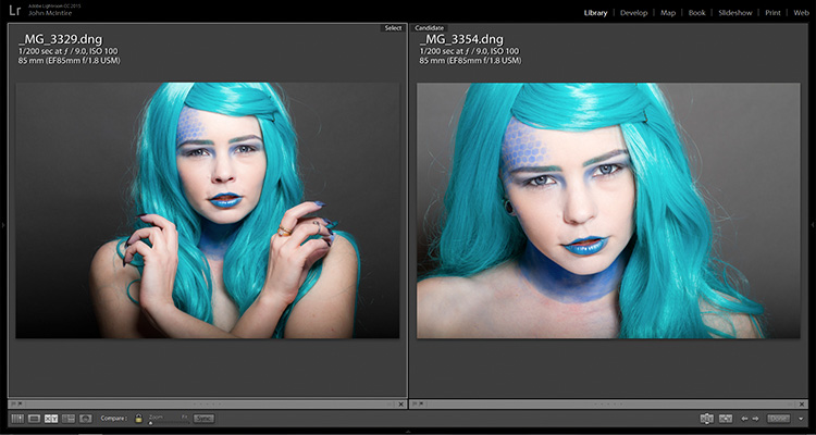
You can change the way your background appears in the image by moving your light source if you’re using flash, or by moving your subject if you’re using window light.

With flash, to get a darker background, you simply move your light source closer to your subject. To get a lighter background, move your light source away from your subject. Moving your light source will require you to change your exposure. You can do this with your aperture settings or on the flashes themselves (turn the power up or down accordingly); it’s your choice.

With window light, you’re forced to move your subject instead. For a darker background move your subject closer to the window. For a lighter background, move them farther away. As with flash, this will also result in changes to your exposure. This time you can choose between shutter speed and aperture.

one-light-beauty-setup-3354-2

Farther from the window

one-light-beauty-setup-3329

Closer to the window

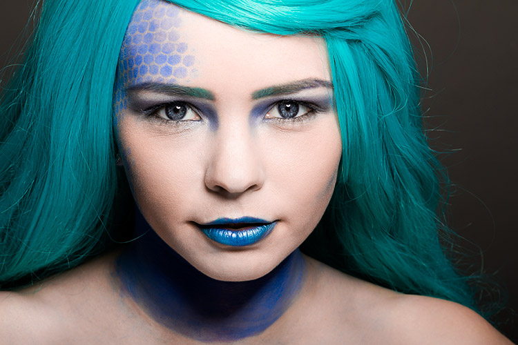
one-light-beauty-setup-comp

You should also be aware that the softness of the light is changed when you adjust the distance between your subject and the light source. If the distance between your light source and your subject decreases, the light will be softer. If that distance increases, the light will be harder.

Tip: If there are shadows falling on the background in your frame, your subject is too close to the background. Try moving your whole setup away from the background a few feet.

Angle of light

You can place your light as high as you want and still get good results; however, for really soft, bright skin you will want to minimize the contrast in blemishes and skin texture. To do this, make sure your light is only slightly higher than your subject, and pointing directly at them. As above, watch for the shadows under the mouth and nose. If they’re long and pronounced, try lowering your light until they disappear.

Window light

If you’re using window light for this technique, the biggest thing to watch out for is you. Because you are lighting your subject from the front, it is all too easy to find yourself blocking your light source. With extremely large windows, this isn’t much of a problem, but with a window in an average home, it can be a pain. One way to sort this is to have your subject sit. That way you can sit, squat or kneel and avoid blocking any light.

In the end

one-light-beauty-setup-3318

This technique may seem simplistic in writing, but it is effective and it yields good results. It also takes only a few attempts to nail down. By adding this technique to your toolkit, you’ll be giving yourself something solid to fall back on, should things not go to plan in other ways.

If you decide to give it a go, please feel free to share your results or ask any questions you may have.

People photography week

This week on dPS we’re featuring articles all about different kinds of people photography including portrait, event and travel photography. See all the previous ones below, and watch for more people photography articles over the next few days.

  • How to Take Low Key Head-shots

googletag.cmd.push(function() {
tablet_slots.push( googletag.defineSlot( “/1005424/_dPSv4_tab-all-article-bottom_(300×250)”, [300, 250], “pb-ad-78623” ).addService( googletag.pubads() ) ); } );

googletag.cmd.push(function() {
mobile_slots.push( googletag.defineSlot( “/1005424/_dPSv4_mob-all-article-bottom_(300×250)”, [300, 250], “pb-ad-78158” ).addService( googletag.pubads() ) ); } );

The post How to Do a One Light Portrait Setup and Use it as Your Back-up Plan by John McIntire appeared first on Digital Photography School.


Digital Photography School

 
Comments Off on How to Do a One Light Portrait Setup and Use it as Your Back-up Plan

Posted in Photography


How to Make a DIY Tabletop Studio Setup

22 Oct

When it comes to studio accessories, photographers are spoiled for choice. There are a lot of great options available, whether they be dedicated studio tables, extra large reflector panels or even backgrounds that studio lights are fitted onto. These accessories can all be brilliant, but one thing they are usually not is portable. They can also be cost prohibitive. What do you do if you get into a conversation with an acquaintance or a shop-owner, and they ask you to do some photos for them on the spot? You could, of course, decline, and attempt to get them to come to you sometime in the future, but this may lead to complications for what could be an otherwise easy task.

The easiest way to get around some of these problems is to build your own solution. This may bring about visions of complicated engineering skills and power tools, but it really does not have to be that way. In the end, all you really need is the ability to shape and modify the light you have available to you, and that doesn’t need to be complicated.

DIY-studio-setup-1845

This tutorial will teach you how to make a simple tabletop studio setup with things you are likely to already have on hand, or at the very least, you’ll have little trouble obtaining: paper and tape. As it is so simple, this setup is ideal for straightforward record and product shots.

It can be modified in a variety of ways for different effects, but if you’re looking for an elaborate and permanent solution, this is probably not what you need. However, if you need something that can be set up in moments, with next to no cost, then read on.

What you need

  •  Two sheets of black paper/ card (thicker paper provides more stability)
  •  One sheet of white or colored paper/card
  •  Tape
  •  A base (a block of wood or similar that will raise your subject above the bottom of the setup.) Simply choose something that will look good in your photos.
  •  Extra paper (assorted colors, plus extra black and white)

Putting it together

Assembly is as easy as taping the sheets of paper together as illustrated in the diagram below. The only thing to watch out for is to ensure that the edges of the paper are flush and not overlapping. You should be able to fold each sheet over one another without difficulty.
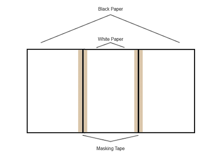
DIY-studio-setup-studio-diagram

Here it is is in all of its unbridled glory:
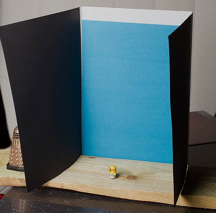
DIY-studio-setup-1849

Fortunately, it doesn’t matter what it looks like on the table. You’re the only person who ever has to see it. What matters is the results you can get in lieu of having no other options.

Putting it to use

The entire point of any studio equipment is to modify light. It doesn’t matter what the source of that light ism and this setup will work as well with strobes, as it will with natural light. With that said, the best results from this setup will come with a single directional light source.

With your light source illuminating the subject from the front, the black sides are acting as flags and are controlling how much light hits your subject. This creates, and emphasizes, a narrow strip of light on your subject. It also increases contrast and can help to illustrate depth.
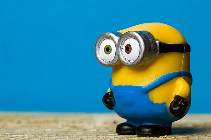
DIY-studio-setup-1827


Because the sides are not fixed into position, you can move them inward and outward as you see fit to alter the effect. When doing this though, you need to watch the background. Make sure that the sides are not casting any shadows over any part of the background that will be in your final images. Any such shadows will show up as ugly gradations in your photos.

Because your subject is mere inches from the background, a proper exposure for your subject should, in most cases, allow for a correct exposure of the background as well. However, if you’re using a white background and the results aren’t satisfactory, try to insert a piece of colored paper and compare the results.

It really is as easy as that: meter for your subject and go.

However, you do need to take special care with your compositions. Because of the small amount of space you have to work with, you will need to pay extra attention to ensure that the edges of the background do not make it into the frame.

Reflectors
DIY-studio-setup-1836

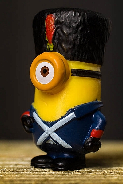
In most situations, especially in natural light, your light will probably be coming from above your subject. This can cause deep shadows where you may not want them. The easiest way to combat this is by adding a small reflector and laying it flat in front of your subject. In most cases, this will be enough. Reflectors are easy enough to make, but there are also inexpensive 12″ circular varieties on the market, that are portable and fold up. These make good additions to any camera bag, especially if you find yourself photographing small subjects, such as flowers, a lot.

In situations, like the photo above, where there isn’t a lot delineation between the subject and the background, you can add a reflector from behind. Anything white or silver will do the job. Try something like an index card. In this example, I used the white balance portion of my ColorChecker Passport.
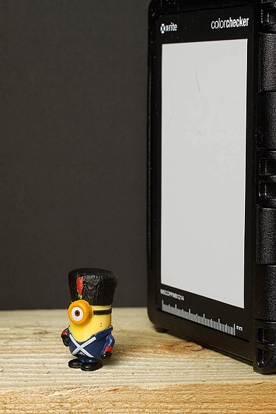
DIY-studio-setup-1835

The spice of life

Aside from simplicity, the real beauty in this setup is the scope of variations. The only limitations for how much you can change things to suit your needs are only limited by your imagination. Here are a few changes you can make to get wildly different results.

Side panel colors

Instead of the black cards acting as flags, tape aluminum foil to the inside of the panels. This will still shape the light falling onto your subject, but instead of deepening contrast it will fill in the shadows, and result in brighter images. If the effect is too strong, try making only one side a silver reflector. For a more subtle effect, try using white paper as the sides. The shadows will still fill in, but the effect will not be as strong.

Exploring these options may result in flatter images, but depending on your needs and taste, that may be perfect.

Backlighting

If the paper or card you’re using for a background is thick enough, you can cut most of the center of it out, being sure to leave enough to allow it to be taped to the sides. You could then tape tissue paper to the inside of the background, covering the hole and acting as diffusion material.

Then face the back of the setup toward your directional light source, effectively back lighting your subject. When doing this, it’s best to use a reflector to fill in the inevitable shadows and high contrast this will cause. To fashion a makeshift reflector, simply tape a bit of foil to a scrap of cardboard.

Backgrounds

DIY-studio-setup-1790

Of course, you’re not limited to solid color backgrounds. As long as the material you choose to make the setup will support the weight, you can use anything from fabric to wood. If it seems like it might work: try it.

A favorite trick of mine is to use old prints that I have scattered about. Once they’re in position you can have anything from an abstracted, colorful background to a landscape.

Scalability

Everything here has been on a pretty small scale, but you can make this setup as big as you need, provided you can find the materials. You may have trouble trying to build one for an elephant, but a trip to a hardware store should provide the right materials to make an affordable portrait sized setup.

In the end

This solution may not reek of elegance or creativity, but what it is in fact is: fast, cheap, and effective. Folded up, the whole thing can fit, undamaged, in a bag with a laptop, so it can go anywhere you do. Of course, this is only one option. As such, you could pull it out to isolate a wildflower in a field for a record shot. Or you could build one in minutes to create product photography for a friend’s e-commerce site.

googletag.cmd.push(function() {
tablet_slots.push( googletag.defineSlot( “/1005424/_dPSv4_tab-all-article-bottom_(300×250)”, [300, 250], “pb-ad-78623” ).addService( googletag.pubads() ) ); } );

googletag.cmd.push(function() {
mobile_slots.push( googletag.defineSlot( “/1005424/_dPSv4_mob-all-article-bottom_(300×250)”, [300, 250], “pb-ad-78158” ).addService( googletag.pubads() ) ); } );

The post How to Make a DIY Tabletop Studio Setup by John McIntire appeared first on Digital Photography School.


Digital Photography School

 
Comments Off on How to Make a DIY Tabletop Studio Setup

Posted in Photography