RSS
 

Posts Tagged ‘realistic’

How to Use Neutral Tones to Craft Realistic Edits for Landscape Photos

24 Jul

When you look at a white wall, how does it make you feel? Dingy? Cold? Warm and radiant? Modern? Sophisticated? Clean?

White and light gray, sometimes referred to as “neutral tones”, are some of the most powerful colors in the spectrum. We can distinguish many shades of white, and bounced light from a neutral source influences the tint of every other color nearby.

Neutral tones set the mood of an image more than any other colors. You’ve probably transferred a photo to your computer where the white balance was noticeably off: a night shot where everything was too green and cool, or an indoor photo that was orange. White balance is an easy fix in most photo editing software, but neutrals don’t end there: by tweaking them creatively, you can take your photos to the next level.

Sella towers - How to Use Neutral Tones to Craft Realistic Edits for Landscape Photos

What are the sources for neutral tones?

It’s possible to have a photo without white and grays, but most of the time scenes are full of them. These are some of the more common sources in landscape photography.

Clouds

Those water-saturated cotton balls do a great job of reflecting light. On a sunny day they tend to be slightly warm, while storm clouds are a fantastic source for chilly gray tones. However, clouds are not a good source for neutrals when shooting after golden hour or before sunrise.

Overblown sky

When shooting after sunrise and before sunset, the sky will typically be overexposed if you properly expose the rest of the image. It’s not usually desirable, but in a few instances an overblown sky is a good source of white.

Sass de putia - How to Use Neutral Tones to Craft Realistic Edits for Landscape Photos

Water

Lakes and shorelines are my favorite method to introduce strong neutral tones to landscape photos. You can use bodies of water to reflect an overcast sky, and along the coast, you can shoot a long exposure to blur the white foam from the waves.

Both tend to create pure neutrals, so you can completely change the mood of an image with tiny adjustments.

Man o war - How to Use Neutral Tones to Craft Realistic Edits for Landscape Photos

Fog

The most powerful way to introduce mystery and dreariness, fog is often the largest source of gray tones in your image.

Hohenwerfen castle - How to Use Neutral Tones to Craft Realistic Edits for Landscape Photos

Snow

Winter photography enjoys the most magical source for neutral tones. Tinting snow just a bit cooler or warmer profoundly impacts the scene’s mood.

Mount hood - How to Use Neutral Tones to Craft Realistic Edits for Landscape Photos

Moon and stars

When shooting astrophotography, the stars tend to cast a cold white light, and the moon a warmer light.

Gimmelwald - How to Use Neutral Tones to Craft Realistic Edits for Landscape Photos

Haystack rock - How to Use Neutral Tones to Craft Realistic Edits for Landscape Photos

Architecture

Man-made structures that ought to be white or gray such as; lighthouses, white-washed brick houses, winding gravel roads, and expansive castles — are often the subject of an image. Consequently, they make a compelling neutral source.

South stack lighthouse - How to Use Neutral Tones to Craft Realistic Edits for Landscape Photos

Why are neutral tones important?

Out of the camera, even after editing, your neutral tones may not really be neutral. They may be heavily tinted. Introducing off-white into your neutral sources is an important technique for crafting compelling edits.

Keep in mind that the viewer will expect those subjects to look neutral, so if you push the white balance too far or don’t balance the warms and cools, it will begin to look over-edited. A tiny change in neutrals has 10 times the power of changing your colors and blacks.

So, in general, start with subtle adjustments and revisit the photo often under different lighting conditions. Some of the most common ways to pollute neutral tones are:

  • Pushing saturation or vibrance.
  • Over-saturating an image shot at a high ISO.
  • Shifting the white balance too far from pure white to bring out colors in the sky or a dark foreground.

With those caveats in mind, here are four ways your neutral tones can support the rest of the image.

Strumble head lighthouse - How to Use Neutral Tones to Craft Realistic Edits for Landscape Photos

1. Neutral tones root an image’s color palette

With strong neutrals, viewers can believe almost any edits in an image: sunsets that pop, overly blue skies, or glassy teal water. But the moment you introduce color into an element that should obviously be white or light gray, the image’s believability disintegrates.

This is why split toning is rarely a magic pill for making a great photo. Toning the highlights and mid-tones often ends up tinting your neutral sources.

The foam in this shot of Spirit Falls (below) is pure white, but the rest of the image has been significantly warmed and tinted green to bring out the beautiful colors. The contrast between the pure white foam and warm greens creates the impression that the water is refreshingly chilly.

Spirit falls - How to Use Neutral Tones to Craft Realistic Edits for Landscape Photos

2. Neutral tones help you resurrect the colors you remember

After shooting a stunning sunset, it can be disappointing to open the RAW image in your editing software and find that the colors are missing. In most cases, the detail and colors are there, but it’s up to you to revitalize them. Neutral tones will help.

Start by identifying elements in the photo that ought to be white or gray, then adjust white balance and tint accordingly. This will give you a great starting point.

It may still be underwhelming, but now that your neutrals are about right, start selectively bumping the saturation, temperature, and tint on the colorful subjects in your composition. You might add a graduated filter to the sky portion of the image and warm or cool it to help them pop.

Roads end - How to Use Neutral Tones to Craft Realistic Edits for Landscape Photos

Sunsets create a powerful contrast between the warm sky and cool shadows. The image of Road’s End above is primarily cool since the most of the image is in shadow.

However, the sea foam reflects both the warms and cools, so in post-production, I played with the global white balance until both tones came out. Afterward, I introduced a strong magenta cast to bring out the pinks in the sky and foreground.

3. Neutral tones set the overall mood

In reality, neutral tones are rarely neutral. By slightly tinting neutrals, you can communicate aspects of the scene. Here are some examples.

Time of day

Night photography is typically cooled, while sunset or midday photos are warmed. This shot of Mount Bachelor was taken after during civil twilight, so the only source of warm light was the grass in the foreground and hints of alpenglow on the snow. Everything else was left cool.

Mount bachelor - How to Use Neutral Tones to Craft Realistic Edits for Landscape Photos

Temperature

An overly warm image can communicate a hot day, and on chilly days, the overall white balance can be left cool. This is especially powerful if your image has a small, warm light source to draw the viewer’s eye.

Morning fog over this lake in Snowdonia introduced a neutral source and warming the color raises the perceived temperature.

Snowdonia - How to Use Neutral Tones to Craft Realistic Edits for Landscape Photos

Weather

Clear days can be tinted slightly pink to warm the scene, while an incoming storm should incorporate a greener tint.

Oregon is rich with various biomes, and Smith Rock State Park feels like a desert on a clear day. The strong magenta cast brings out colors in the rocks and reinforces the cloudless sky.

Smith rock - How to Use Neutral Tones to Craft Realistic Edits for Landscape Photos

Clarity

When the fog rolls in, it tends to chill the image and evoke mystery. A hazy day adds depth and layers to an image and tends to warm the image at golden hour.

In this shot from Bavaria, the haze on the mountain range adds warmth and communicates just how distant the mountains are.

Geroldsee - How to Use Neutral Tones to Craft Realistic Edits for Landscape Photos

4. Neutral tones help to bring out or tone down a region

Neutrals don’t have to be the same color or white balance! They can help root the mood and color palette of a local section of the image.

For example, snow beneath some trees in the foreground should be cool, and snow on a mountain under sunrise should be warm.

The different white balances communicate the temperature contrast between the foreground and background. Furthermore, since cool colors recede while warm colors pop forward, the warm snow in the background entices the viewer’s eye up from the ice-covered lake in the foreground.

Lost lake -- How to Use Neutral Tones to Craft Realistic Edits for Landscape Photos

What if my image doesn’t have any neutral tones?

It’s not impossible to realistically edit images without strong neutrals. But since your viewer has no neutral reference to root the color palette, you will need a compelling balance of warms and cools to convince the viewer you didn’t artificially crank up the white balance.

This shot from the village of Brunate (below) doesn’t have any substantial neutrals. Although the fog could be considered a neutral source, it strongly reflects the colors in the sky. However, the overpowering warmth in the top left sky is balanced by cooler tones in the rest of the image, which keeps the white balance from being entirely warm and pink.

The contrast also draws the viewer’s eye from the village in the foreground to the beautiful sky in the background.

Brunate - How to Use Neutral Tones to Craft Realistic Edits for Landscape Photos

Conclusion

Crafting realistic edits in landscape photography is a subjective experience. But by carefully preserving your neutrals, you grant yourself almost unlimited creative liberties in the editing process.

So next time you want a fall photograph to feel like a shot from Rivendell, identify the sources of neutral tones in your image and apply these techniques.

The post How to Use Neutral Tones to Craft Realistic Edits for Landscape Photos appeared first on Digital Photography School.

Digital Photography School

 
Comments Off on How to Use Neutral Tones to Craft Realistic Edits for Landscape Photos

Posted in Photography


Editing Gently: 3 Tips for Processing Realistic Landscape Photos

11 Jul

A well-processed photograph should be just like a good haircut. That’s one of my favorite analogies when it comes to explaining my approach to editing my own photographs. Not only does it confuse people and make them think I’m weird but it is also incredibly accurate when it comes to processing realistic landscape photographs.

What I mean is that when an image is well-processed the viewer will know something has been changed while not being overly apparent and in the end, they like what they see. Just like a good haircut.

sand dunes - Editing Gently: 3 Tips for Processing Realistic Landscape Photos

Before we get further into this, I want to go on record and say that in my opinion there is no “correct” way to process any photograph. So the tips you’re about to learn here come from my own creative tastes and style for landscapes which lean towards an “enhanced” realism but solidly anchored in reality nonetheless.

Now, let’s talk about some ways you can give your landscapes a good haircut and push your processing right up to the boundaries of realism without tipping over the edge.

#1 – Directional Light

Photography is all about light and in landscape photography, 99% of the time the only light source in your compositions will be the sun, or in some cases the moon, which is just reflected sunlight (science).

Sunlight comes from that big ball of fire in the sky and that makes it very directional by nature. Meaning, your main light source for your photographs comes from one spot. When you process your landscape images it’s very important to pay attention to the direction from which the natural light is falling in the image.

The reason for this is because there’s nothing more telling that a photo has been blatantly over-processed than sunlight appearing to miraculously illuminate the frame from different directions. This is especially true when the sunlight is close to the horizon in the early morning or late afternoon. Have a look at the photo below.

zion canyon - Editing Gently: 3 Tips for Processing Realistic Landscape Photos

Notice how the light comes in from the right of the frame and illuminates the tops of mountains? Yet the foreground is in shadow and so are the areas where the sun is blocked by the cliffs.

When processing a photo with such stark lighting as this be mindful that you don’t create overly artificial light where it shouldn’t be. Sure, bring up those dark areas but don’t go too far as I have with this example (below).

zion bad edit - Editing Gently: 3 Tips for Processing Realistic Landscape Photos

See how “off” the lighting is now? Sure, it’s not terrible but there is bright illumination in areas that should be in shadow on the right. There is no longer a natural feeling gradient to the light as it falls on the foreground.

Let’s look at a more harmonious example of the same photo that has been processed to work with the direction of the available light.

zion good edit - Editing Gently: 3 Tips for Processing Realistic Landscape Photos

In this example, the entire photo feels much more comfortable without having bright spots, uneven shadows, or that odd appearance in the first version.

Most of the editing you’ll do to selectively adjust the luminance of landscapes will be done with local adjustment tools like the gradient filters and adjustment brush. We’ll get into using local adjustments in a moment but first, let’s talk about another aspect of landscape processing that can truly ruin any great photo if you’re not careful.

#2 – Match Color Tones in Reflections

Walking hand in hand alongside working with directional light is how you manage reflections in your landscapes. More specifically, matching reflections in water is a little detail that can make or break a convincing landscape photo.

So often I see reflections in water which are either too bright or too dark or perhaps more noticeable, reflections which do not match (or reasonably approximate) the color tone of the light which it is literally reflecting. Have a look at this. I’ve warmed the sky in this image somewhat from its original blue hour cool tone.

yosemite sky - Editing Gently: 3 Tips for Processing Realistic Landscape Photos

Notice how the light reflecting from the river also carries a hint of the orange color from the sky? Not too much but just enough to add some realism. This is because I intentionally warmed the color of the water a wee bit in order to be more harmonious with the warmed sky. If I had not, we would have something of a tonal mutant on our hands…

yosemite cool water - Editing Gently: 3 Tips for Processing Realistic Landscape Photos

Notice how the color tones in the water don’t match the sky and overall scene here?

When it comes to working with your reflections the name of the game is remembering that the light reflecting in the water comes from the sky…usually. So it should also carry some of the same attributes of that light in terms of luminance and color.

Of course, the type of water plays a role in skewing this a bit but just use good judgment and keep in mind that the reflection should almost always carry a hint of whatever color the ambient light brings to the scene.

#3 – Make Realistic Local Adjustments

I’ve talked about how much I love using local adjustments in other dPS articles. I’m admittedly a radial filter junky and the majority of my photos carry some use of either the gradient or radial filter and adjustment brush edits, often times all three. When it comes to making edits using any of these tools it’s important to know how NOT to use them.

My old friend the gradient filter comes into play quite a bit when processing realistic landscape photos to even out bright skies and for illuminating dark foregrounds. What’s more, used with the radial filter and local adjustment brush, it can work wonders.

good adjustments filters yosemite - Editing Gently: 3 Tips for Processing Realistic Landscape Photos

Good adjustments using the filters in Lightroom.

Or it can look absolutely horrifying when used poorly.

Yosemite - Editing Gently: 3 Tips for Processing Realistic Landscape Photos

Bad use of a graduated filter in editing.

The same is true for its circular counterpart, the radial filter. This little gem works beautifully for applying custom vignettes and brightening (or darkening) areas or for adding in a host of other great adjustments to your photos. However, much like the gradient filter, it can be easily blundered.

saguaro cactus bad edit - Editing Gently: 3 Tips for Processing Realistic Landscape Photos

Bad edit with a radial filter in Lightroom.

The local adjustment brush also carries the same caveats. Few things make a picture look worse than the application of a “finger-paint” local adjustment brush. Actually, it gives finger-painting a bad name.

death valley - Editing Gently: 3 Tips for Processing Realistic Landscape Photos

The key to making effective and realistic local adjustments in any photograph comes down to remembering a few important guidelines:

  • Less is usually more. Local adjustments are just that, local. So when applying them remember that they will become more and more apparent when you use them to make drastic edits.
  • Feathering is your friend. Whether it’s the radial or gradient filters or event the adjustment brush, most times you will want to apply your adjustments gradually with very soft borders which blend well with the surrounding pixels. Set your feathering all the way to 100 and then if you need a harder edge for more defined work back it off from there.
  • Don’t be afraid to stack adjustments. When done judiciously, many local adjustments can be applied one over the other. For example, you might use three graduated filters each with a varying color temperature to give the sky a creamy color tone or multiple radial filters to layer out an exposure adjustment.

Final Thoughts

Landscape photography is a long-loved standby in the photography world. It is also one of the most ethereal and easily mismanaged types of photography when post-processing is done unconvincingly.

There are so many aspects of processing realistic landscape photos and most go beyond simply moving a few adjustment sliders around. In fact, I think of my landscapes as more of an exercise in digital painting than as simply editing a picture.

Whatever your persuasion may be in terms of how much you choose to make edit, having a solid basis in reality is a great jumping off point for making a dynamite landscape.

zion - Editing Gently: 3 Tips for Processing Realistic Landscape Photos

Remember, pay close attention to the direction of the light in your frame and make sure that the rest of your edits stay somewhat true to the natural lighting already present.

The same goes for reflections. Make sure the light reflecting from surfaces like water looks like it came from the ambient light source even if that light source has been changed by you. And lastly, don’t mess up the endgame but applying freakishly obvious local adjustments.

Always remember, there are no rules for processing a landscape photograph but there are ways you can make sure your photos stay true not only to your visualized outcome but also to the natural splendor from whence they were born. Yes, I used “whence” in a sentence.

Happy editing!

The post Editing Gently: 3 Tips for Processing Realistic Landscape Photos appeared first on Digital Photography School.


Digital Photography School

 
Comments Off on Editing Gently: 3 Tips for Processing Realistic Landscape Photos

Posted in Photography


Snapchat launches more realistic AR face masks for iPhone X users

07 Apr

It looks like more and more third party developers are starting to make use of the iPhone X’s TrueDepth front camera that was originally implemented on the device for Apple’s FaceID unlocking feature. Yesterday, Bellus3D launched a 3D face scanning app for the iPhone X. Today, Snapchat has delivered an update to its iOS app which lets iPhone X users decorate their selfie images with augmented reality masks that take advantage of Apple’s advanced facial mapping technology.

Apple’s TrueDepth front camera will help the masks more realistically superimpose onto the user’s face, and face motion will be tracked more precisely than for Snapchat users with other mobile devices. To start with, there are three Snapchat lenses that utilize the TrueDepth technology: a Mardi Gras-style mask, a Day of the Dead skull, and a gold-plated eye cover. More masks are expected to be made available in the near future.

The TrueDepth camera also allows for DSLR-style blurring of the background, and more accurate application of small details and 3D objects that reflect and react to ambient light in the image.

If you happen to own the iPhone X, let us know in the comments how the new feature works for you. With similar technologies being adopted by other smartphone makers, we’d hope the new Snapchat masks make it to Android devices (at least high-end ones) in the nearer future as well. Snapchat for iOS can be downloaded free of charge from the App Store.

Articles: Digital Photography Review (dpreview.com)

 
Comments Off on Snapchat launches more realistic AR face masks for iPhone X users

Posted in Uncategorized


How to Create Realistic Bokeh and Blur Effects using Photoshop

07 Jan

Perhaps you want to creatively improve your image, already taken with a depth of field and bokeh or create this effect from scratch for a specific composition. In this article, you will learn how to work with new and old filters and their features, creatively apply textures, even create a bokeh texture from scratch.

Also, you’ll learn some small secrets and useful features of digital artists. Described techniques and features will be available depending on Photoshop versions, which I will mention in the process. You can use these techniques on any image and get surprising results, I just want to show you the principles and workflow.

Everything is about the creative approach, so do not hesitate and experiment!

How to Create Realistic Bokeh and Blur Effects using Photoshop

Shallow Depth of Field and Bokeh

A shallow depth of field (DOF) is when the desired object (focus point) appears sharp and everything else is blurred. Under certain shooting conditions on a blurry background, there may appear some beautiful circles or blurred highlights – that is called bokeh.

This effect can be done during the shooting process or synthetically added in post-processing. You can use this as an artistic style, to pay attention to a certain object or interesting composition. It’s very handy to use such effects if you want to hide some flaws or unsuccessful or empty parts of the composition.

Also, it is often used to create lighting and foreground effects, additional details that help to immerse the viewer in the atmosphere of the scene much more. Areas for using this technique and the creative possibilities are huge, so I suggest that you start with a practice.

How to Create Realistic Bokeh and Blur Effects using Photoshop

Blur Gallery – Field Blur

So, let’s start with the most interesting and powerful features of Photoshop CC – the Blur Gallery and Field Blur filter. Blur Gallery is available in the filter menu, starting with Photoshop CC 2014, and has five blur effects with additional features, such as Motion Effects, Noise, and Bokeh. Note that this does not work in older versions of Photoshop!

Open the image, to which you want to apply the effect in Photoshop via File > Open or use Cmd/Ctrl+O shortcut or just drag and drop the image from your file explorer into Photoshop.

Next, on the Layers panel, right-click on a layer and choose “Convert to Smart Object” (Layer > Smart Object > Convert to Smart Object). Go to Filter > Blur Gallery > Field Blur. Your workspace has been changed to the Blur Gallery dialog box and you are shown a control pin in the center of the image (if there are no pins visible, try Cmd/Ctrl+H or go to View > Extras, to hides/shows guides, controls, etc.).

How to Create Realistic Bokeh and Blur Effects using Photoshop

Setting Your Blur Effects

So, for a pin in the center, set the Blur value to 0px and move it to the place in your image that should stay in sharp focus. Begin to apply a blur from the edges of the image and in problem areas that you want to hide by clicking on the place where you want to add pins or drag and drop existing pins to the desired place.

Adjust the blur intensity or remove it on the Blur Tools panel or use the blur handle around the pin itself. For the edges of the image, start with larger Blur values, and then reduce it, if necessary. Also, I used several pins with a smaller Blur values near the area in focus in order to create a softer transition from blurred to sharp areas. If you want to remove any of the pins, select it and press Delete on the keyboard.

How to Create Realistic Bokeh and Blur Effects using Photoshop

Creating Bokeh

Now let’s set the settings for the bokeh. Start adding a bokeh by setting Light Bokeh to 100. Next work with the Light Range sliders and start moving white, then black, until finding the optimal ratio of values.

You can slightly reduce Light Bokeh values so you do not get large overexposed areas. At this stage, you need to be careful and change the blur settings along with others to get the best possible, most realistic result.

Adjust Color Bokeh values to vary the texture with a color and add unexpected shades. Just do not make this value too big, otherwise, it will increase saturation or a lot of additional shades will reveal themselves.

How to Create Realistic Bokeh and Blur Effects using Photoshop

Iris Blur and Tilt-Shift

The following filter, which we will consider is Iris Blur. The principle of this filter is the same, but now you are working with the focus field. You see the white circle frame, that you can deform and rotate, four small points around it to control blur distribution (shape), pulling by a square you can specify the focus area. You can still use several pins but blur values are the same for all of them.

This filter is very convenient if you want to highlight a specific area. In the previous example, you could specify exactly which areas of the image stayed in sharp focus and had more flexibility to work with the form, here you have less control over the details.

How to Create Realistic Bokeh and Blur Effects using Photoshop

Top image – Iris Blur. Bottom image – Tilt-Shift.

Tilt-Shift is very popular for the fact that it creates the impression of a miniature scene. It is especially good for photos of architecture and everything that is at a distance.

As an artist, I use it when I want to emphasize dynamism and distortion (especially, in abstract artworks) or to create a background when I work with portraits.

Path and Spin Blur

Path Blur is very useful if you decide to add motion to your composition or emphasize it. Unlike the Motion Blur filter, you can control the effect and set the most unusual directions for blur. Unfortunately, this filter does not have the ability to add a bokeh to the blur, but Motion Effects are available.

How to Create Realistic Bokeh and Blur Effects using Photoshop

Top image – Path Blur. Bottom image – Spin Blur.

Spin Blur, also a motion blur, but in a radial form. With it, you can turn your photos into a painterly image and if you add color effects, it will turn out very well. I use this filter for various artistic techniques, mostly when I work with very abstract creations. With this filter, you can create a very simple simulation of long exposure photography.

The Blur Gallery

You can apply several filters from the Blur Gallery at once. Just checkmark desired filters, adjust their settings and click Ok to apply. Depending on the image size and performance of your computer, it may take time to render a preview of the effect and after once you apply the desired settings, so be patient.

Also, you can edit the settings of the applied filter if you convert the layer into a Smart Object and add the filter on it. It’s automatically a Smart Filter, so just double-click on the name of the filter and edit the settings. This is a non-destructive way of editing photos and creating artworks.

The advantage of a Smart Object is that you can go back and make changes to the filter or adjustment, apply it several times, even delete it if something went wrong and keep the original image intact.

How to Create Realistic Bokeh and Blur Effects using Photoshop

Lens Blur Filter

Now let’s look at another powerful and fast solution for adding blur effects. The Lens Blur filter first appeared in Photoshop CS. So whatever version you use, CS or CC, this filter will be available for you. Take into account that this filter will not work on Smart Objects, so you can’t edit and apply this filter as a Smart Filter.

Again, open the desired image. Duplicate the original image layer (Layer > Duplicate layer or use the shortcut Cmd/Ctrl+J) to work non-destructively. In order to only apply an effect to a specific object or area, I made a selection with Quick Selection Tool (W) and added a layer mask to it (Layer > Layer Mask > Reveal Selection or use “Add layer mask” icon at the bottom of Layers panel).

How to Create Realistic Bokeh and Blur Effects using Photoshop

To achieve a more realistic effect, blur the layer mask or its edge a bit because the hard edges of the mask can spoil everything. You can use Gaussian Blur filter (Filter > Blur > Gaussian Blur) or Feather option on Properties panel (Window > Properties) with the settings to your taste.

Lens Blur Settings

Highlight the layer thumbnail and go to Filter > Blur > Lens Blur… In the window that appears, first set Preview to Faster because this filter sometimes takes a long time to process changes. Next, in the Depth Map section, you can set Source to a Layer Mask to not apply a blur to a masked area, or leave this parameter at None to blur an entire image.

Checkmark Invert if only the selection from a layer mask is blurred and adjust Blur Focal Distance for more accurate blur distribution. If Lens Blur effect does not appear on a layer, just delete a layer mask (right click on a layer mask > Delete Layer Mask).

How to Create Realistic Bokeh and Blur Effects using Photoshop

In the Shape drop-down menu, you can choose a form of bokeh. In this example, I will use a triangle because this is a rather unusual form, but shapes like Octagon produce more normal blurred results. Radius value controls the size of that shape and the amount of blur that is applied. Blade Curvature quite creatively changes the form and makes the shape more circular. Rotation sets the angle (direction) of the bokeh shape.

How to Create Realistic Bokeh and Blur Effects using Photoshop

To control where the bokeh will appear, change the settings in the Specular Highlights section. Brightness increases the strength of the highlights within the blurred area.

Threshold controls which tonal range (pixels) need to be affected to create bokeh. This means that pixels brighter than a Threshold value can be used for creating a bokeh effect. Do not overdo with these two values, otherwise, bokeh shapes can merge into a single mass or even fill a part with white.

Adding Texture or Bokeh Overlays

You can always use additional textures in your artwork, created digitally or by using a camera. Open your image in Photoshop and go to File > Place Embedded (File > Place in older versions), then choose the desired texture. In my case, I made some photos with bokeh on a black background (to separate the bokeh).

How to Create Realistic Bokeh and Blur Effects using Photoshop

Next start to experiment with the different layer Blending Modes, such as Screen, Linear Dodge (Add), Color Dodge, etc. You can always reduce the effect of the texture by reducing the layer Fill or adding a contrast to the texture with a Levels adjustment or adjustment layer to add more Blacks and greys, to make it more like “transparent”.

Or if you like texture but don’t like a color in it, then use a Hue/Saturation or Color Balance adjustment to change the hue or remove the color completely. Sometimes in different artworks, I use a bokeh layer with some blurred objects (mostly invisible).

How to Create Realistic Bokeh and Blur Effects using Photoshop

Create Your Own Bokeh

This makes artwork more interesting and adds texture and details. There are a lot of opportunities for creativity with layers, and it’s simply impossible to describe them all in this article. But now I will show you one more interesting trick for creating bokeh texture from scratch using only Photoshop filters. If you like to experiment with filters and settings, then this is a very interesting direction, with a lot of options and discoveries in the process.

Create a new layer at the top of all layers by using the shortcut Cmd/Ctrl+Shift+N or going to Layer > New > Layer. In the dialog box that appears set Mode to Screen and checkmark “Fill with Screen-neutral color (black)”. Next, go to Filter > Noise > Add Noise and set following settings – Amount: 15%, Distribution: Gaussian and click Ok. If you want black and white texture, checkmark the Monochromatic option.

How to Create Realistic Bokeh and Blur Effects using Photoshop

Next apply Mezzotint filter from Filter > Pixelate > Mezzotint with Type: Coarse Dots. This filter is needed to make noise texture sharper and add highlights to it. Now you need to soften the texture and blend colors. Apply Gaussian Blur filter (Filter > Blur > Gaussian Blur) with a radius 2.0 pixels.

How to Create Realistic Bokeh and Blur Effects using Photoshop

Go to Filter > Other > Maximum and set Radius: 20pixels, Preserve: Roundness. Depending on Radius value and size of your working document, the texture becomes larger or smaller. Apply a Levels adjustment (Image > Adjustments > Levels or use Cmd/Ctrl+L) and move the Blacks until you are satisfied with the result.

Play around and experiment with values of each of these filters and you can find a lot of interesting options.

How to Create Realistic Bokeh and Blur Effects using Photoshop

You can add more details to bokeh texture if you want, by using the Unsharp Mask or Find Edge filters. And if you repeat this technique again, but instead of using Mezzotint and Gaussian Blur, apply a Pointillize filter (Filter > Pixelate > Pointillize) with Cell Size: 35 you will get a completely different kind of bokeh texture. So do not hesitate to experiment!

On the internet, there are a lot of paid and free plugins available for Photoshop to create similar effects, for example, the Nik Collection. It’s a free and powerful addition to Photoshop CS4 through CC 2015 with a lot of interesting tools for photographers and artists. There also is the blur, depth of field and bokeh effects produced by Analog Efex Pro 2. In the image below you can see the work of this filter.

How to Create Realistic Bokeh and Blur Effects using Photoshop

Conclusion

And at the end some pieces of advice for you.

More is not always better! Sometimes too many effects (unfortunately any) can give the opposite effect and hide the beauty of the original image or idea. Therefore, try to achieve harmony in color, composition and use these techniques with an intention. If you decided to experiment, then embody the idea entirely, do not hesitate! Do so as you like it.

Bokeh is a lighting effect, use it carefully, so as not to overexpose the overall image. This effect can add excessive brightness to highlights (the right part of the histogram), unwanted light peaks, or increase the overall brightness of the image. It’s important, for example, if you decide to share the picture on the internet or print your image.

The more contrast that is applied with a clear, not overexposed bokeh, the better it looks. So keep your eye on the histogram (you can find it in Window > Histogram).

How to Create Realistic Bokeh and Blur Effects using Photoshop

Also, your bokeh should not be underexposed as well. This is important, by the fact that very often people try to remove unnecessary brightness incorrectly, so get a pale, not realistic bokeh. In exceptional artistic cases, this is permissible, but it is better not to do this.

Pay attention to where you have located or placed bokeh textures and where are the focus and blurred areas in your image, in order to express it more realistically and logically, through a visual image (in photo or artwork).

I will be glad to see your creative inventions, discoveries, and final results. If you have questions, please use the comments section below.

The post How to Create Realistic Bokeh and Blur Effects using Photoshop by Maria Semelevich appeared first on Digital Photography School.


Digital Photography School

 
Comments Off on How to Create Realistic Bokeh and Blur Effects using Photoshop

Posted in Photography


Video Tutorial: How to Make Realistic Images Faster with Aurora HDR 2018

18 Oct

As a landscape photographer who relies heavily on HDR to pull off much of my work, I’m always keen to learn about better ways of doing what I do. Most of the time my art tends to run towards natural looking images in contrast to the wild and crazy stuff of HDR’s reputation. The HDR software I use matters when I’m going for a more natural looking photo in my post-processing.

Going natural with Aurora HDR 2018

Aurora hdr 2018 cactus before after

You can see several examples of the natural-looking results I’m getting in from Aurora HDR in the accompanying video and the several before and after images included here in the article.

Aurora HDR 2018 delivers, even more, natural-looking photos than before

The latest version of Aurora HDR is fresh out of the factory and I’ve been in a tire-kicking session with it for a few days making several photos. As expected, it’s a worthy upgrade. Do you want to see what’s new and how it helps when you want to keep the look of your HDR photos on the natural side?

Before

After processing with Aurora HDR 2018.

Under the Hood of Aurora HDR 2018

The Macphun engineers have been very busy for many months re-building Aurora HDR from scratch. It’s like Walter White always says in Breaking Bad, “It had to be done.” In order to create a cross-platform Windows/Mac application, all new code was required. Big job.

The resulting product is something they can be proud of. The new HDR algorithm in Aurora HDR 2018 churns out very natural looking HDR images when it’s used correctly and with natural HDR being the goal. Of course, Aurora HDR 2018 is a perfect fit for my landscape photography work. It uses the most modern tone-mapping technology and an advanced image-processing engine, which makes very clean images, as you’ll notice in my examples.

Before

After processing with Aurora HDR.


Video tutorial: Keeping it natural and real in Aurora HDR 2018

All the new features, just added to Aurora HDR 2018 in this release, bring it ever closer to becoming the only app you’ll need to process your HDR images and keep them as natural looking as you want. When you watch the video you’ll see how I use some of the new major features packed into Aurora HDR 2018 when creating my natural looking HDR landscapes. Watch the demo video:

Embracing the faster workflow using Aurora HDR 2018

You probably love photography as much as I do. Getting new tools that really help me get to my intended vision faster, or easier, or just better in any aspect, are quite welcome. They make it even easier to love what I do.

Kudos to the completely rewritten HDR algorithm and the advanced image-processing engine in Aurora HDR 2018. I’m finding that it’s speeding up my workflow significantly. That’s because of how good my photos usually look immediately after tone mapping even without even doing anything else in Aurora.

If I were brand new to photography, I’d be totally happy leaving my photos in that initial tone-mapped state with no further processing. They are that clean!

Before

After

Back in the day (before Aurora HDR), it could take me up to a couple of hours to finish an HDR photo. Even then, it wasn’t all that natural looking much of the time. Thankfully, things are always evolving in exciting ways.

Ever since my foray into HDR photography eight years ago, my skills have improved. But I honestly have to credit the improvements in software, like Aurora HDR 2018, for dramatically reducing the time it takes me to finish a photo to just a few minutes while getting better, more realistic, results.


My intention is keeping my post-processing time to five minutes per image and striving for consistently higher quality photography. Aurora HDR 2018 is a big piece in my HDR workflow making that happen so it’s now a permanent tool in my HDR arsenal.

Be sure to watch the video, then I invite you to check out more Aurora HDR images in my SmugMug gallery.

Disclaimer: Macphun is a paid partner of dPS.

The post Video Tutorial: How to Make Realistic Images Faster with Aurora HDR 2018 by Keith Cuddeback appeared first on Digital Photography School.


Digital Photography School

 
Comments Off on Video Tutorial: How to Make Realistic Images Faster with Aurora HDR 2018

Posted in Photography


3D-Printed Muscle Straight Out of ‘Westworld’ Makes Robots More Realistic

21 Sep

[ By SA Rogers in Conceptual & Futuristic & Technology. ]

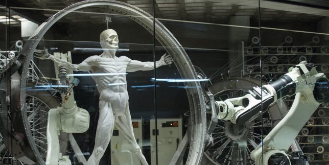
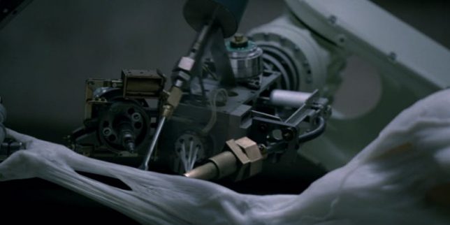
If you watched HBO’s ‘Westworld’ earlier this year, you probably remember the scenes where the nascent humanoid robots were strung up on circular frames like Leonardo da Vinci’s ‘Vitruvian Man,’ with machines printing white muscle fibers onto their skeletons. While the process of constructing androids doesn’t quite resemble this sci-fi vision just yet, it’s surprisingly close, especially with a new breakthrough in synthetic muscle tissue announced by researchers at Columbia Engineering. Their tests show a bundle of white muscle held in the palm of a researcher’s hand, moving and expanding in response to low power sent through a thin resistive wire.

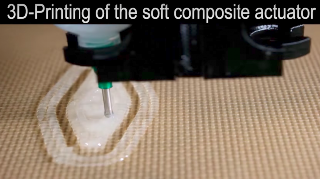
This self-contained ’soft actuator’ is three times as strong as natural muscle, so yes, it’s true: Skynet is going to kill us all. The creators took inspiration from living organisms, using a silicone rubber matrix with ethanol distributed through micro-bubbles to simulate muscle tissue. It’s capable of expanding up to 900% when electrically heated to 80 degrees celsius, and can perform all sorts of motion tasks when controlled by computers.

“We’ve been making great strides toward making robots minds, but robot bodies are still primitive,” says Hod Lipson, Professor of Mechanical Engineering at Columbia and leader of the project. “This is a big piece of the puzzle, and, like biology, the new actuator can be shaped and reshaped a thousand ways. We’ve overcome one of the final barriers to making lifelike robots.”

“Our soft functional material may serve as robust soft muscle, possibly revolutionizing the way that soft robotic solutions are engineered today,” adds Aslan Miriyev, a postdoctoral researcher in the Creative Machines lab and lead author of the study ‘Soft Material for Soft Actuators,’ published by Nature Communications. “It can push, pull, bend, twist and lift weight. It’s the closest artificial material equivalent we have to a natural muscle.”

Share on Facebook


[ By SA Rogers in Conceptual & Futuristic & Technology. ]

[ WebUrbanist | Archives | Galleries | Privacy | TOS ]


WebUrbanist

 
Comments Off on 3D-Printed Muscle Straight Out of ‘Westworld’ Makes Robots More Realistic

Posted in Creativity


Almost Human: 15 Frighteningly Realistic Robots & Androids

01 Jul

[ By Steph in Conceptual & Futuristic & Technology. ]

Creepy Androids Main

How would you react if you were chased down the street by a sprinting android wearing head-to-toe camouflage and a gas mask? Probably about the same way you’d react to finding a dead-eyed mannequin convulsing alone in a closet with blood streaming from its mouth. Android technology is getting more disturbingly realistic every year, and these 15 represent some of the most jaw-dropping examples yet.

World’s First Android Newscaster
Creepy Androids  Newscaster 1

Creepy Androids Robot Newscasters 2

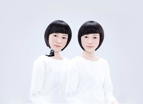
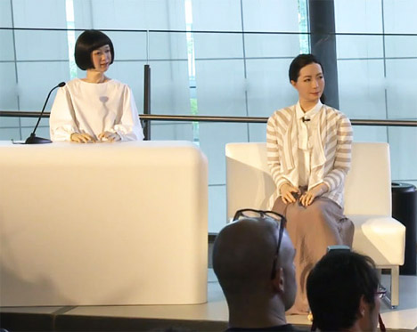
The world’s first news-reading android reported on an earthquake and an FBI raid in Tokyo on June 24th, 2014. The pair of remarkably realistic humanoid robots include a child (kodomoroid) that can recite reports gathered from around the world in a variety of voices and languages, and an adult woman (otonaroid) who will serve as a robot science communicator for Japan’s museum of emerging science and innovation.

BINA48

Creepy Androids BINA 1

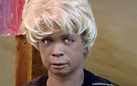
The memories, beliefs and core personality of a real-life woman have been transferred to a robot called Bina48, who’s sophisticated enough to detect and reach to racism, discuss philosophy and tell jokes. The woman the android was modeled after, Bina Rothblatt, was interviewed for more than 20 hours on topics that ranged from her childhood to her career, and the conversation was transcribed and uploaded to an artificial intelligence database. Robot designer David Hansen crafted the bust-only robot for $ 125,000.

SimMan 3G Patient Simulator
Creepy Androids SimMan 1

Creepy Androids SimMan 2

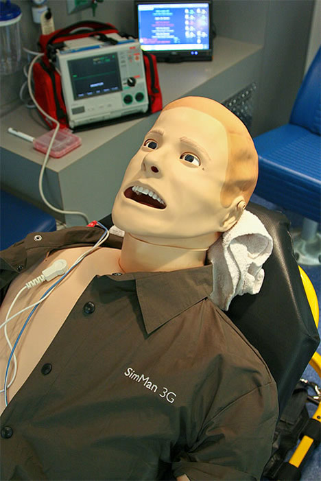
The SimMan 3G might be a great way for medical professionals to practice, but that doesn’t make it any less disturbing to look at, especially when it starts bleeding, convulsing, crying or foaming at its gaping mouth. It’s designed to simulate virtually every emergency medical situation in the book and it can withstand four hours of surgery. Just imagine being the cleaning person who opens a closet at the hospital to find this thing staring back.

Geminoid F
Creepy Androids Geminoid F 1

Creepy Android Geminoid F 2

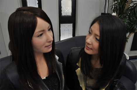
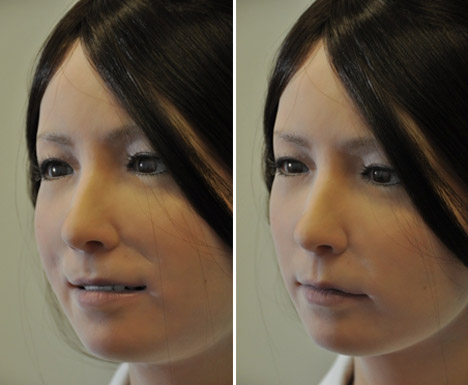
Japanese robot designer Hiroshi Ishiguro outdid himself with Geminoid F, a female android who can smile, furow her brows, talk and sing. Her face is equipped with 12 motorized actuators powered by air pressure to mimic human expressions, and she’ sso realistic she was actually used as an actress in a Tokyo play.

Geminoid DK
Creepy Androids Main

Creepy Androids Geminoid DK 1

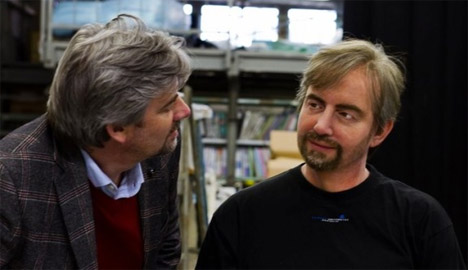
With Geminoid DK, Ishiguro made an android copy of Henrik Scharfe, an associate professor of Aalborg University in Denmark (the roboticist’s first non-Japanese creation.) The purpose, he explains, is to understand the ‘emotional affordances’ in human-robot interaction. In the video you can see just how realistic the robot’s facial movements are, blinking and moving its mouth.

Next Page – Click Below to Read More:
Almost Human 15 Frighteningly Realistic Robots Androids

Share on Facebook


[ By Steph in Conceptual & Futuristic & Technology. ]

[ WebUrbanist | Archives | Galleries | Privacy | TOS ]


WebUrbanist

 
Comments Off on Almost Human: 15 Frighteningly Realistic Robots & Androids

Posted in Creativity


Getting Real with HDR – a Step by Step Tutorial for Realistic Looking HDR

11 May
Try to make your HDR images look as realistic as possible

Try to make your HDR images look as realistic as possible

If you have been photographing for more than a year or two, you will have heard about HDR (which stands for High Dynamic Range). We have probably seen them, the “overcooked”, over processed HDR images that float around the photo websites. For some photographers, the process seems to force them to overdo their images and after a while that seems to be the only result they are trying to achieve. Do a Google search on “bad HDR” and you will see what I mean. The images have halos,  the colours are surreal and look metallic, the contrast is off and in short, the image is really messy.

When I first shot HDR, I fell into this trap too. These results caused many photographers to say that HDR is not a useful technique and is really gimmicky. That perception is partly true. HDR in the hands of someone who cannot use it effectively can result in some weird looking images, however, HDR done properly can produce some incredible results. To see some good examples of HDR done properly, visit the website HDR Spotting and take a look at the editors picks. There are some astounding images there. The colours are amazing, the contrast is perfect and the detail in the shadows and highlights, sublime. That is what HDR should be. It should be the best combination of the highlights and the shadows properly exposed, the image should look as real as it can. So, how do you get this right you might be asking, read on to find out.

What is HDR?

As I said earlier, HDR stands for High Dynamic Range. Your cameras sensor has the ability to capture light and colour. The extent to which your camera can do this is called the dynamic range. More specifically, if your camera can render lots of details in the shadows and the highlights in the same shot, then it has a high dynamic range. Over the past few years, digital sensors have become so much better at capturing more detail. This is a huge benefit for photographers and of course for HDR photography. This means that we can get more details out of every image and as a result, the HDR images will be that much more detailed.

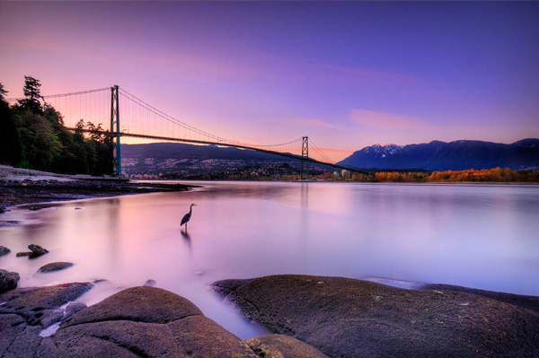
Lions Gate Bridge Vancouver - HDR image

Lions Gate Bridge Vancouver – HDR image

How do I shoot HDR?

Making an HDR image involves 3 distinct and separate processes. I will go into detail on each one, but at a high level, they are as follows:

  1. Image Capture
  2. HDR Processing
  3. Image editing in Photoshop

Lets start with image capture first. This is the photography part of this process. It’s pretty simple really. Set up for your shot as you normally would. Make sure you have your subject well composed and you are ready to go. The difference between HDR and normal photography, is that with HDR you will take either three to five bracketed images of the same scene. The reason for the number of images is that you will blend these images together in a dedicated HDR product.

My recommendation for HDR software is Photomatix Pro. It is a programme that has been around for many years now and has some really good editing functions. It’s probably the most widely used software when it comes to HDR. Photoshop also has an HDR function, but in my opinion, its not as refined as the Photomatix Pro yet. Don’t get me wrong, I am a huge Photoshop fan, it is an incredible tool, I am sure that Photoshop will have something within their functions that will be competitive in time, but for now, I still use Photomatix.

Step #1 –  Image capture

These are the steps I follow when I intend to do an HDR shot. They are not rules, nor are they inflexible, they just work for me. You need to find what works for you and gives you the best results, this method has helped me get my best results, so try it out. Tweak it and change it as you need.

  1. Use a tripod – it is a good idea to put your camera on a tripod for HDR, especially if you are shooting in low light. I have done some handheld HDR but only in bright conditions. The tripod will also help you get your composition right.
  2. Put your camera into Manual mode “M”
  3. ISO Settings – it is a good idea to keep your ISO settings at 100 or as low as your camera will go. That way you will avoid introducing unnecessary noise into your images. The process of HDR allows you to capture the dynamic range of light and colour in the scene. Using high ISO settings is great when you are trying to shoot a low light scene and capture it in one shot, but for HDR you will want to keep it as low as possible.
  4. Set your aperture to anywhere between F/8 and F/ 11 and don’t adjust your aperture between shots.
  5. Adjust your shutter speed so that you are exposing the scene perfectly according to your cameras light meter.
  6. Capture one image at this reading
  7. Underexpose by one or two stops (depending on the scene) and capture another image by adjusting your shutter speed.
  8. Do this twice on either side of the perfectly exposed image.

This will result in five images being captured.

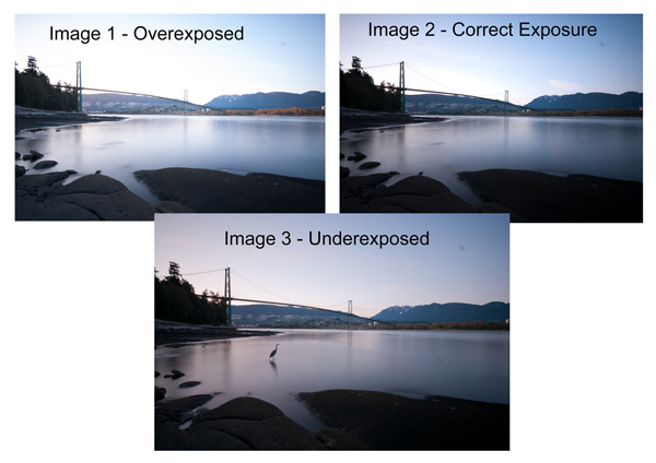
Below are the three images I used in making the HDR image you see above. Take a look at how the colours and exposure don’t look good at all.

3 Different exposures for the HDR image above

3 Different exposures for the HDR image above

Some photographers use five shots for their HDR shots, some use seven or up to nine. I have found that three to five shots seem to work best for most scenes. I have only used nice shots on a few occasions, but have not been happy with the results. The colours seem to be “muddy” and unclear once processed. If necessary, shoot seven images and see how that works.

Once you have completed the shoot, download the images to your computer. It is important NOT to edit the images before blending them into an HDR image. Some of the shots might look over exposed or under exposed, thats OK, in fact they must look like that. The software will deal with these issues, so don’t be concerned that the images look bad out of camera, they need to be processed and then the magic begins.

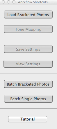
Click on - Load Bracketed Photos

Click “Load Bracketed Photos”

Step #2 – HDR processing

I will be explaining the Photomatix software in this article. I have tried HDR with each new version of Photoshop and I am still happier with the results I get from Photomatix Pro. You can download a trial version of Photomatix from their website. It is fully functional, the only thing is that the trial version puts a watermark on the image. This is OK for trying it out, you will see exactly what the software can do, if you think it is worth it, then you can buy it. Ok, so here is how you take your images into Photomatix Pro

  1. Open Photomatix Pro (or if you’ve set it up as a Lightroom plugin, select your bracketed images, right click and choose “edit in” and Phototix Pro)
  2. Click  ”Load Bracketed Photos” and then click on “Browse” and select the images you have taken (you can also drag and drop them into the box)
  3. Click OK once the images appear in the box
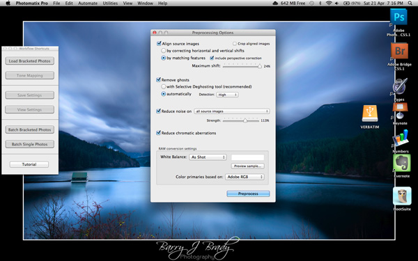
Select the options displayed on the screen above

Select the options displayed on the screen above

Preprocessing options are available.  Make selections on the box as shown in the screenshot above. Then click preprocess and Photomatix Pro will begin to tone map the images into a composite 32-bit image. This process is generally quite quick, between 30 seconds and a minute.  Once complete, click on the Tone Mapping button.

Use the “Remove ghosts” function if you have people or moving objects in your images. If you don’t have this, then you wont need to use this function.

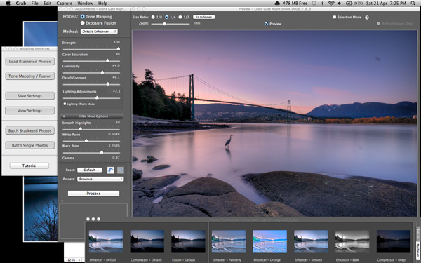
The HDR editing screen

On this screen, you are able to select a variety adjustments that will create an overall change to the image. There are no absolutes here. Each adjustment makes minor or major differences to the image and the combination of the adjustments provides diverse options.

HDR-Screen-600

At the bottom of the screen you will see different “treatments” (or presets) which you can use as a starting point to your image editing process. I would avoid using these as they are generally overdone. Try and use the functions on the left hand side to edit your image.

Below are the details about each function on the left hand side of the screen and what each does. One of the best ways to see what a function does is to slide it all the way over to the left and then to the right and see how it affects your image, but here are the details:

General Settings

  • Strength – affects the degree to which contrast and detail are enhanced in the image. A value of 100 gives the maximum amount of enhancement. To get a more natural effect, move the slider to the left. The default value is 70.
  • Color Saturation – controls the saturation of the RGB color channels. The greater the saturation, the more intense the color. Move the slider right or left to change the setting. A value of zero produces a grayscale image. The value affects each color channel equally. The default value is 46.
  • Luminosity – controls the compression of the tonal range, which has the effect of adjusting the global luminosity level. Move the slider to the right to boost shadow details and brighten the image. Move it to the left to give a more “natural” look to the resulting image. The default value is zero.
  • Detail Contrast – controls the amount of contrast applied to detail in the image. Move the slider to the right to increase the contrast of the details and give a sharper look to the image. Note that increasing the contrast also has a darkening effect. Move the slider to the left to decrease the contrast of details and brighten the image.
  • Lighting Adjustments – affects the overall ‘look’, controlling the extent to which the image looks natural or surreal. When the Lighting Effects Mode box is unchecked, move the slider to the right to make the image look more natural and to the left to make it look more ‘painterly’ or ‘surreal’. Use this carefully as it can have an unpredictable effect on your image.
  • Lighting Effects Mode – the checkbox lets you switch between two modes for the Lighting Adjustments setting,where each mode produces slightly different results. Checking the box tends to produce results with a type of ‘Magic Light’ effect.

More Options

  • Smooth Highlights – reduces the contrast enhancements in the highlights. The value of the slider sets how much of the highlights range is affected. This control is useful for preventing white highlights from turning grey or uniform light blue skies becoming dark blue-grey. It is also useful for reducing halos around objects placed against bright backgrounds. The default value is zero.
  • White Point and Black Point – these sliders control how the minimum and maximum values of the tone mapped image are set. Moving the sliders to the right increases global contrast. Moving them to the left reduces clipping at the extremes. The White Point slider sets the value for the maximum of the tone mapped. The Black Point slider sets the value for the minimum of the tone mapped image.
  • Gamma – adjusts the mid-tone of the tone mapped image, brightening or darkening the image globally. The default value is 1.0.
  • Temperature – adjusts the color temperature of the tone mapped image relative to the temperature of the HDR source image. Move the slider to the right to give a warmer, more yellow-orange colored look. Move the slider to the left for a colder, more bluish look. A value of zero (default) preserves the original color temperature of the HDR source image.

Advanced Options

  • Micro-smoothing – smoothes local detail enhancements. This has the effect of reducing noise in the sky, for instance, and tends to give a “cleaner” look to the resulting image. The default value is 2. Important note: The Loupe may not properly show the effect of the Micro-smoothing setting when the area magnified is uniform. If you want to see the effect of the Micro-smoothing setting at 100% resolution on a uniform area such as the sky, you will have to select an area that contains an object in the scene in addition to the sky.
  • Saturation Highlights – adjusts the color saturation of the highlights relative to the color saturation set with the Color Saturation slider. Values higher than zero increase the color saturation in the highlights. Values lower than zero decrease it. The default value is zero.
  • Saturation Shadows – adjusts the color saturation of the shadows relative to the color saturation set with the Color Saturation slider. Values higher than zero increase the color saturation in the shadows. Values lower than zero decrease it. The default value is zero.
  • Shadows Smoothness – reduces the contrast enhancements in the shadows. The value of the slider sets how much of the shadows range is affected. The default value is zero.
  • Shadows Clipping – the value of the slider sets how much of the shadows range is clipped. This control may be useful to cut out noise in the dark area of a photo taken in a low-light situation. The default value is zero.

Once this part of the process is finished, then it is time to take the image into Photoshop. Save the tone mapped image and then re-open it in Photoshop.

Step #3 Image Editing in Photoshop

This is a very basic workflow. It will enhance the lighting and tonality in your images. These techniques are discussed here at high level.

Shadows and Highlights

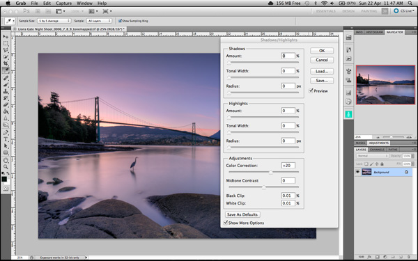
Photoshop has a function called Shadows and Highlights. Use this tool to bring out detail in the shadows of your image. Use it carefully, if you overdo the treatment on the shadows, there may be some unsightly image degradation or “noise”. This function is not great for adjusting highlights, so use it for the shadows only. This tool is found in Photoshop as follows: IMAGE > ADJUSTMENTS > SHADOWS AND HIGHLIGHTS. The adjustments of AMOUNT, TONAL WIDTH and RADIUS should all be kept aligned close to one another to ensure that the adjustment looks realistic.

Shadow and Highlights function in Photoshop

Shadow and Highlights function in Photoshop

Levels Function

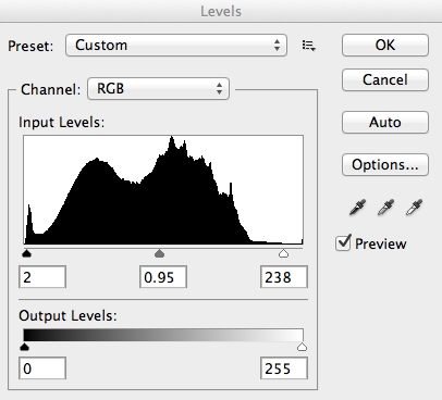
The levels function in Photoshop is for adjusting the lighting in an image. This means that if your image is a little dark you can push up the exposure slightly and see more details in the image. The levels function shows a representation of a histogram. Move the sliders in to touch the edge of the histogram as a general rule. This will ensure that your image has a good representation of highlights and shadows.

The Levels functioning Photoshop

The Levels functioning Photoshop

Hue and Saturation

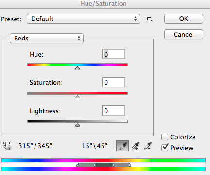
Once the exposure and lighting has been adjusted and looks correct, then you may begin adjusting the colour in the image. The tool to use will be the Hue and Saturation tool. The important tip here is not to adjust the master channel but rather to adjust by each channel independently. To do this, click on the top toggle button that says “default”. A drop down menu will appear and each colour channel will be available from there. Slide the Saturation Slider to the left to desaturate (remove colour) or to the right to saturate. That way you have the best control of the colour in your image.

Hue and Saturation Function in Photoshop

Hue and Saturation Function in Photoshop

Dodging and Burning

These functions are localized adjustments. By using a brush tool, you are able to make certain areas of the image darker and other areas of the image lighter. This is useful for adding the finishing touches to your image. There is also the sponge function which is a saturation tool which can saturate colours at a local level.

Sharpening

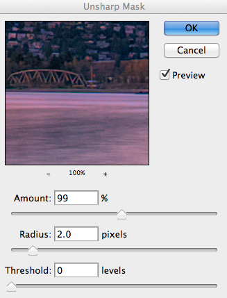
Almost every image that comes out of a digital camera requires sharpening of some sort. The easiest and quickest tool to use is the Unsharp Mask tool and it works effectively.

Unsharp Mask Tool in Photoshop

Unsharp Mask Tool in Photoshop

The Unsharp Mask has three separate sliders: Amount, Radius and Threshold. As a general rule you can keep the Amount anywhere between 80 and 120%, Radius can be set between 1.0 and 3.0 pixels and Threshold is generally at zero. Adjust the sharpness of the image according to each image requirement and beware of degrading the image by over sharpening. You will easily notice if an image is over sharpened by the appearance of a “halo” around certain edges in the image. The idea is to sharpen the image but not make it overly sharp and lose image quality.

Once you are done, save your image and thats it! Have a go, try different settings in different light, let me know what you think and how your images turn out. If you have any questions, drop them into the comments box below.

Please leave your comments and questions below. If you want more HDR tips, try some of these articles:

  • HDR Vertorama Photography – How to Create Mind-bending Images
  • Five Minutes to Realistic HDR using Lightroom and a 32-Bit Plugin
  • The 10 Steps Every HDR Photographer Goes Through
  • Exposure Blending Using Luminosity Masks Tutorial

The post Getting Real with HDR – a Step by Step Tutorial for Realistic Looking HDR by Barry J Brady appeared first on Digital Photography School.


Digital Photography School

 
Comments Off on Getting Real with HDR – a Step by Step Tutorial for Realistic Looking HDR

Posted in Photography


Five Minutes to Realistic HDR using Lightroom and a 32-Bit Plugin

19 Dec

Easy Peazy HDR in Adobe Lightroom to make realistic HDR images!

HDR photography used to be time consuming, difficult to learn, and required expensive software. Recent new technology now allows anybody, even beginners, to make perfect HDR in less than 5 minutes – while eating a bowl of ice cream. It’s that easy!

Cuddeback_DSC5809_10_1132-bit-HDR-2

Using Adobe Lightroom for HDR

Just wait until you see how awesome this is!

The Perfect HDR Workflow takes place completely within Adobe Lightroom 4 or 5, a very robust, yet inexpensive, state of the art software. There is also an inexpensive plugin you will need. It’s made exclusively for Lightroom by the smart Photomatix people and is the secret sauce which makes this workflow possible and so elegant. It’s called “Merge to 32-bit HDR plugin” and is available for $ 29. They also have a trial version available so you can test it out first. These are the same people who make the world’s leading HDR tone mapping software, Photomatix Pro. So, take comfort, there’s no smoke & mirrors in this HDR workflow and you’ll be working with the best software available today. At the same time, your photography will now blow away 95% of the HDR images which are still being made using the old, harder to learn, HDR tone mapping process.

Notice, you don’t need to own Photoshop or endure the pain & suffering of learning how to use Photoshop to do this method! This, in itself, is huge and a welcome departure from the way HDR photography is typically done.

Advantages of 32-bit HDR Processing

The process I’m going to show you is technically called 32-bit HDR processing. The Perfect HDR Workflow is just my name for the particular workflow I designed with the beginning photographer in mind. My criteria was that total cost be under $ 150 US, which immediately rules out Photoshop in the workflow. Another requirement was that it be so easy that even a beginner can learn to make extraordinary HDR photos in minutes.

The advantages of the 32-bit process are:

  • It’s fast
  • It’s inexpensive
  • It yields realistic looking images
  • It’s very easy to learn

HDR doesn’t have to be complicated anymore. In fact, the Perfect HDR Workflow obliterates the complex technical barriers of making outstanding HDR which used to exist. Now, anybody with a digital camera and the desire can play a much bigger game when it comes to HDR photography, can do this!

Are you ready to see how it’s done?

Five Minutes to Perfect HDR

Here we go. Start with the three bracketed RAW images right out of the camera (you can download these for free if you want to follow along):

Easy realistic HDR in Lightroom

-2 shot at: ISO 200, F8, 1/1500

Easy realistic HDR in Lightroom

0 exposure shot at: ISO 200, F8, 1/350

Easy realistic HDR in Lightroom

+2 exposure shot at: ISO 200, F8, 1/90

In less than 5 minutes you’ll end up with an HDR photo looking like this:

Cuddeback_DSC5809_10_1132-bit-HDR-2

Start your stopwatch:

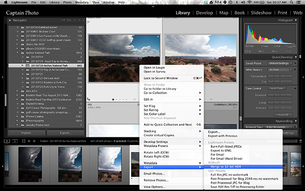
The first thing you want to do is create the 32-bit image. With the three RAW files selected in Lightroom, right click and in the dialog box which appears, select “Export>Merge to 32-bit HDR” as shown below.

Screen Shot 2013 11 23 at 10 17 57 AM

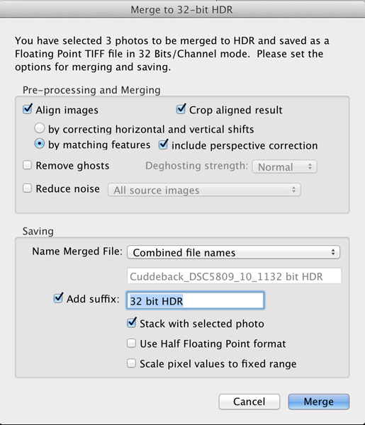
A new dialog box opens up where you choose your options for merging the RAW files (see image below). Always choose to “Align Images” and then one of the alignment options. If your three photos were taken handheld, select the alignment option “by matching features”. When you shoot on a tripod, you would chose the other option, “by correcting horizontal and vertical shifts”.

If there are moving objects in your scene such as: cars, people, clouds, trees, or anything else – select “Remove ghosts” and the software will usually do a great job of producing a non-blurry merged image, with no ghosts. For this landscape photo, nothing was moving so this option was not selected.

Noise reduction is usually necessary in HDR photography, however, I recommend not using the “Reduce noise” option which the plugin offers up. Instead, you are better off using the noise reduction built into Lightroom. So, leave that unchecked, as well.

Moving down to where you choose how the resulting 32-bit file is saved. I recommend simply combining the file names and adding a suffix like “32-bit HDR” so that, at a glance, you know that is the 32-bit file you want to work with in Lightroom.

The final dialog box selection you want to make is; “Stack with selected photo.” It’s so easy and elegant how this plugin makes your HDR workflow when this is selected. After the 32-bit file is created, the plugin automatically imports it right back into Lightroom and places it neatly next to the original RAW files. This keeps my OCD mind happy. Leave the final two options unselected then click the “Merge” button.

Here’s what the dialog box should look like

Screen Shot 2013 11 23 at 10 18 08 AM

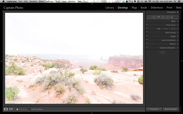
In a few seconds, your newly created 32-bit file appears in Lightroom and looks something like this:

Screen Shot 2013 11 23 at 10 20 14 AM

Okay, well that’s not too pretty! That’s because this is a 32-bit file which your computer monitor can’t correctly display. But Lightroom 4 or 5 can process it, so let’s do that.

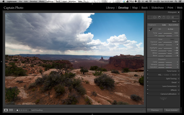
We’ll be working mostly in the Basic panel of the Develop module in Lightroom. The first step is to simply click the “Auto” button which gives you Lightroom’s best guess at the right setting for the image:

Screen Shot 2013 11 23 at 10 20 25 AM

It’s already looking much better. But let’s take it a step further!

Adding Your Artistic Touch

Now it’s time to add your personal artistic mark on your photo! At this point, you take over the processing manually to create an HDR image that is most pleasing to you. There are no right or wrong settings. However, my 5 minute process to Perfect HDR does follow some general guidelines so let me show you how this image evolved for me.

Working in the Basic panel, you first will reduce the “Highlights” (slide it left) and increase the “Shadows” (push it to the right) sliders until the image looks best to you. Then you might adjust the “Clarity” to a slight positive value, which adds local contrast between pixels. It makes the HDR photo “pop.” Please be careful not to push clarity too far right. My advice is to keep it below 30, for now anyway. Now let’s jump out of the Basic panel.

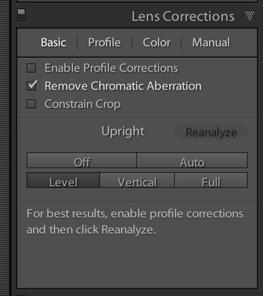
For just a couple of quick automatic adjustments, open up the “Lens Correction” panel. I recommend that you always check the box to “Remove chromatic aberration.” Also, you may want to straighten your horizon and/or vertical lines using the “Upright” adjustment tool. Here is what the “Lens correction” panel looks like when you make these simple adjustments:

Screen Shot 2013 11 23 at 10 24 24 AM

Now, go back to the Basic panel to finish. Set the white and black points as shown in the video below. The other sliders in the Basic panel can then be fine tuned to your taste and that’s it! Woooo Hooooo, done in less than 5 minutes! You’ve just made your first Perfect HDR photo! Send it to Mom and your friends and be ready to receive their adoration!

Watch The Full Perfect HDR Workflow Video

In the video below, I show the complete processing of this image including how to set the white and black points correctly. It’s easier to show some of the steps in a video, rather than try to describe it all in written form.

Try the Perfect HDR Workflow

If you want to give the Perfect HDR Workflow a try yourself right now, you can download my RAW files of this image for free. Get the free trial download of the merge to 32-bit plugin from the Photomatix website. The plugin you want is the last item on the page. Install the plugin with your copy of Lightroom 4 or 5. Then follow along to get the hang of the Perfect HDR Workflow and find out for yourself how easy this really is! If questions come up, I hang out on Google+ every day and you are welcome to circle & chat with me there or on my blog.

Become an HDR Wizard

Next time, in Easy Peazy HDR in Lightroom Part II, we’ll take this image further using the other panels of the Develop module in Lightroom. I think you’ll be amazed at the power and control you have using Lightroom to process your HDR photos. It’ll be like you’ve evolved into this unstoppable HDR Wizard!

The post Five Minutes to Realistic HDR using Lightroom and a 32-Bit Plugin by Keith Cuddeback appeared first on Digital Photography School.


Digital Photography School

 
Comments Off on Five Minutes to Realistic HDR using Lightroom and a 32-Bit Plugin

Posted in Photography


Modern Gingerbread Museums: Realistic Edible Architecture

05 Dec

[ By Steph in Art & Sculpture & Craft. ]

Modern Gingerbread Museums 1

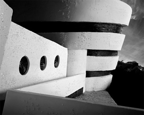
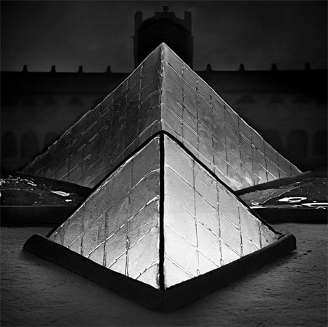
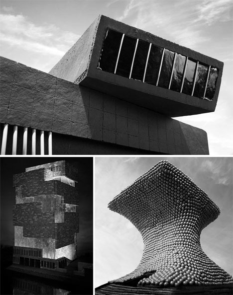
The pyramids of the Louvre shine in hard candy, the Guggenheim gleams in solid sugar, and gingerbread makes for convincing concrete on Zaha Hadid’s Maxxi museum in this series of edible modern architecture. Photographed in black and white and illuminated from within, the collection of gingerbread museums by photographer Henry Hargreaves and food artist Caitlin Levin looks strikingly like the real deal.

Modern Gingerbread Museums 2

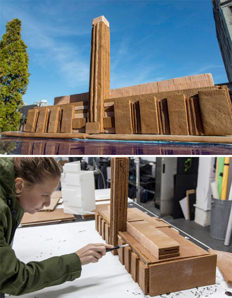
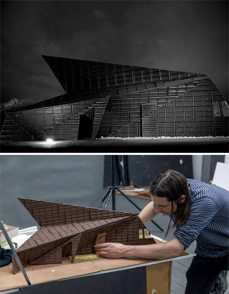
The landmark museums depicted also include the Tate Modern, the Museum Aan de Stroom, Mexico City’s Museo Soumaya and the Karuizawa Museum in Nagano, the latter of which is constructed almost entirely of Hershey’s chocolate.

Modern Gingerbread Museums 3

Modern Gingerbread Museums 4

Bubble gum, candy balls, taffy, lollipop sticks, icing and licorice help create the illusion of bricks, textured stone, glazed walls and other architectural elements for the scale models.

Modern Gingerbread Museums 5

The pieces go on display today at Dylan’s Candy Bar in Miami for Art Basel 2013.

Share on Facebook


[ By Steph in Art & Sculpture & Craft. ]

[ WebUrbanist | Archives | Galleries | Privacy | TOS ]


WebUrbanist

 
Comments Off on Modern Gingerbread Museums: Realistic Edible Architecture

Posted in Creativity